#process post
Explore tagged Tumblr posts
Note
i don't know if you've ever been asked this, but which game do you like drawing for the most? Scarlet Hollow or Slay The Princess?
I'm absolutely in love with your STP designs, and I've been studying it for weeks :3
Aw, thank you!! I had sooo much fun designing Princess forms, I could gladly do it all day honestly. It's like designing digivolutions...
As for which is my favorite, I love all my children equally. They both bring different things to the table, and I found I usually missed working on one while working on the other!
Scarlet Hollow has:
• Characters and backgrounds that are rooted in reality, so I can do my favorite thing of adding 10,000 little details to backgrounds and outfits to help reveal more about who they are, as well as adding easter eggs for Hollow-heads to hunt for. It's so satisfying when they find one of the little clues I hid for them :3c

• I feel very connected to the characters, who are like my friends.
• It's all in pen and ink, which is my favorite medium by a country mile. Pencils are fun and fast, but are a little stressful considering the smudging that can happen. It also gets my hands covered in graphite, so I'm constantly washing my hands, which get all dry and crackly as a result. I don't like to get messy... I do not like to use messy tools....
While Slay the Princess has:
• More opportunities for dynamic art, which is the really big exciting one for me. The player and Princess are constantly doing things, interacting, changing position, which leads to really interesting comic-style posing and blocking.
• More opportunities for drawing horrific things, since the player can die. This was the other major fun bit of working on Slay the Princess. I could really go ham on the body horror! Which ties into the other major difference/benefit to StP:
• I can draw the player character interacting with the world, which was a big relief compared to the un-bodied player in Scarlet Hollow. It is definitely tricky to draw a lot of things from a first-person PoV, but at least I didn't have to juggle that AND work around the fact that you can never see your body.
#slay the princess#scarlet hollow#process post#my nightmare is having to use chalk or oil pastels#those are my least favorite#paint is okay but I'm not amazing at it and it can get on my clothes which is evil
234 notes
·
View notes
Text


Working on a potential project. Don’t have the story even started, but these guys stood up and said, “Me! Me!”
The cat foxes are twins and the big guy is their engineer friendo
The girl with the eyes a new friend of the last three. Are they all cats? They might all be cats
Lastly we have a couple of villainous associates, a warlord and his temper tantrum of an underling.
#ohthatseanart#my arts#artists on tumblr#sean pendleton#art#comics#drawing#characterdesign#character design#process#process post#comicart#comic process#cartoons
50 notes
·
View notes
Text
I did a chapter cover redraw for Trigun!
Post for completed piece over here:
Here's a complete progress breakdown post~!
Initial Sketch:

Colored Lineart:

Color Pencil Detailing:

Final Result:

#Artie's Art#traditional art#traditional drawing#wip#art#work in progress#process post#trigun#vash the stampede#trigun vash#my art#sketch#lineart
30 notes
·
View notes
Text
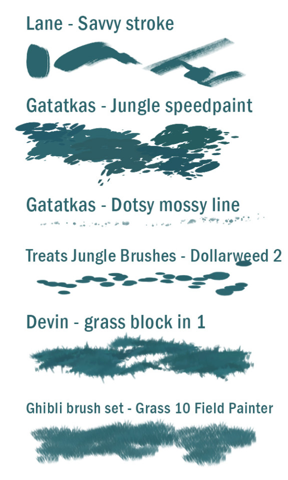
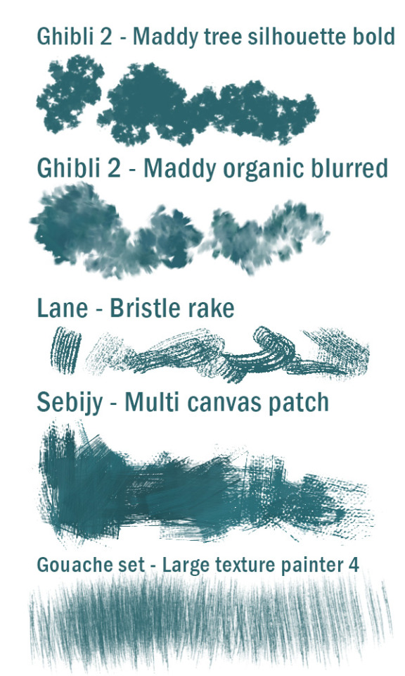
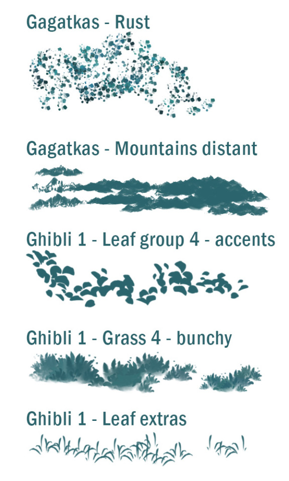
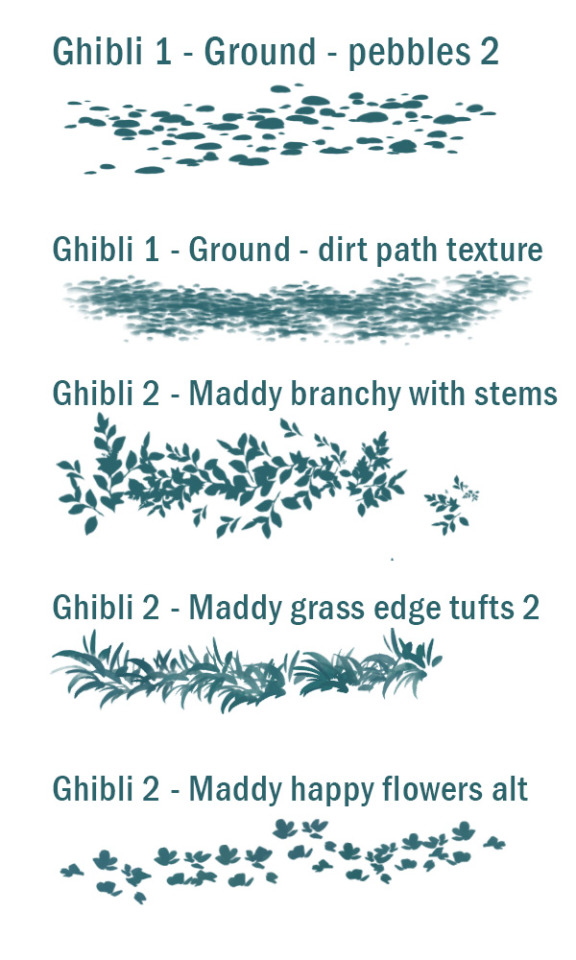
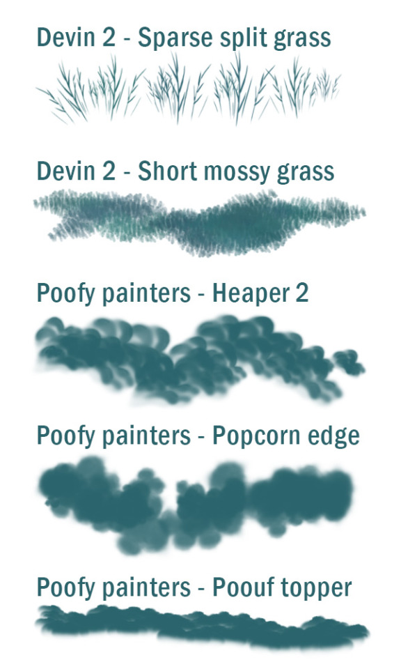
Some of my favourite environment brushes for Photoshop!
Lane master pack - overall painting brushes, great dynamics and texture: https://lane339.gumroad.com/l/MasterPack
Gagatkas brushes - really cool textures and shapes for environments: https://gagatka.gumroad.com/l/PzmiN
Ghibli-inspired brushes - awesome soft environment brushes: https://maddybellwoar.gumroad.com/l/ghiblibrush
Ghibli-inspired 2: EVEN MORE awesome enviro brushes: https://maddybellwoar.gumroad.com/l/ghibli2
Devin Elle Kurtz foliage and grass - essential brushes for environments: https://tamberella.gumroad.com/l/UrGvW
Devin Elle Kurtz Grass 2 - even more awesome grasses etc: https://tamberella.gumroad.com/l/grass2
Poofy painters - my favourite cloud painting pack: https://sydweiler.gumroad.com/l/sydweilerPoofyPainters
#idk thought this just might be interesting!#I highly recommend these brush packs#and i love buying on gumroad so I buy right from the creator#photoshop brushes#process post#yes I spend a lot on brush sets don't ask questions
95 notes
·
View notes
Text


4 notes
·
View notes
Text


Here’s some process shots from the fight scene btw. The hardest parts were: coming up with the actual fight moves, making the motions legible and at the same time violent enough, and the goddamn fucking action lines that I’m still not happy with. Anyone who has the low down on doing action lines hit my dms please I want to talk shop.
#my art#process post#It’s finalized I’m pretty much done lining it I just need to tweak some action lines and finish.#yknow#the rest of the comic#lmao
10 notes
·
View notes
Text


A lil look at some recent personal work (in this case a gift) turning a signature into a professionally made rubber stamp✍️
Some idiot once said that brevity is the soul of wit, and this sig made me laugh & I knew I had to adapt it
Definitely thinking about designing one-off stamps for order envelopes🤔
#illustration#drawing#ze golden sombrero#art#zegoldensombrero#artist#draw#artists on tumblr#ink#pen and ink#stamps#rubber stamps#custom made#process post#private commission
2 notes
·
View notes
Text
UPDATE: double vision UE post process material
IT WORKED!!!!!!!!!!!!.........kinda
2/?
< prev | next >

so everything i figured out at home translated beautifully to unreal
and i can't believe it worked!
I'm keeping the b/w version in to visualize what you're masking, and it feels pretty nice to play with the sliders
there's just one problem...
as you might've noticed, an object completely masked in black still appears doubled because it is directly next to a white pixel

so now the question stands:
how can we "grow" the black sections exactly 1 pixel left and right?
my current idea is to multiply every pixel with its neighbors, this way any white pixel (val 1) next to any black pixel (0) turns black. or even if it's close to black, it will adopt the value of that pixel. multiplying pixels like this can only darken them. but that feels inexact and potentially costly? i wonder what kind of noises this might generate? not to mention I have no idea how to get this to work (i have very little experience scripting)
maybe some kind of blur?
...
ok wait. this is a really stupid idea, but it just might work:
We duplicate the entire depth pass, move it over 1 pixel, and multiply that with the original.
we might have to do this twice (per L + R)
this feels way more costly processing-wise than the kernel thing, but it will probably take less time to figure out
i guess there's only one way to find out!
#process post#ue 5#post processing#adventures in post process materials#sorry this is very much a stream of consciousness messy word vomit#unreal engine
2 notes
·
View notes
Text


Behind-the-scenes of this art!
Top is the final version I posted; middle is the flats, rim lighting still visible, but with the shading layer turned off; bottom is just the shading layer, no base colors and no highlights.
4 notes
·
View notes
Text


ARCANE LEAGUE OF LESBIANS: 2x08 - “Killing is a Cycle”
#I MADE A PROMISE YEARS AGO AND OFC I WILL DELIVER and I WILL make a better version next time for now enjoy it in its original quality#arcane#arcaneedit#wlwedit#caitvi#piltover's finest#arcane league of legends#league of legends arcane#vi#vi arcane#caitlyn kiramman#type: gif#media: arcane#league of legends#arcane season 2 spoilers#arcane s2#arcane season 2#caitlyn x vi#vi x caitlyn#also i want to complain WHY DID IT HAVE TO BE SO DARK....... i havent fully post processed this so i'll just make a better version next tim#im going to reserve more yapping to friends but anyways enjoy#s2 ep8
46K notes
·
View notes
Text


Finally now that the comic is fully public on comicfury, I get to share it with all of you here, too <3
If you enjoyed, please consider supporting by buying a PDF of the comic on itch.io: https://tawnysoup.itch.io/home-in-the-woods
#I'd rather not clutter the caption so I'll ramble a little in the tags#HitW is short but special to me as it represents and encapsulates some hard life experiences I was going through at the time of its creatio#Ofc in a more metaphorical manner! but. I have been very much enjoying reading people's comments and speculation as its been posting#the interpretations are so meaningful and varied and i love that and really want to encourage anyone to reflect on what it means to them#for me making this comic was a way to process and move past trauma. i feel like it ends anti-climactically but i wanted to be true to#where i thought things were actually going in my life moreso than to veer towards impact. ultimately im glad i managed to finish it#and for it to finish going public right before the new year? maybe i can see this as shedding that old pain in time to become something new#so thank you for reading for supporting and for still being here. lets wake up to 2025 with wind in our sails#Home in the Woods#my art#my comics#original comic#cw guns#cw blood#cw body horror
32K notes
·
View notes
Text
my snowflake opinion is that subtitles should always be on by default, and their incorporation should be considered an essential part of the design process tbh
#vasira rambles#“i don't like subtitles cuz it spoils what's happening” skill issue tbh#but also if subtitles were more considered in the design process and less added in post haphazardly that would likely resolve that issue#a girlie can dream
37K notes
·
View notes
Text

Fleshing out this idea for a postman deer guy (the top drawings are before he became a deer)
#ohthatseanart#conceptart#concept art#process post#chracter design#my arts#artists on tumblr#sean pendleton#comics#art#artwork
5 notes
·
View notes
Text
i queued up some polaroids that i finished scanning in and adjusting. i'll probably queue up some more when i can.
most of the queued photos were taken several years ago, so i don't have the exact dates on them, unfortunately.
most of the polaroids i take are of flowers and plants, though there are a few of buildings and other things i find interesting. when using my polaroid cameras, i try to take photos of things that look either timeless or difficult to discern if it was taken in the 70s thru the 90s.
i also have several photos that were taken with my sx-70 when its pick-arm was in the middle of breaking down, resulting in some very weird, trippy results. i may queue those up next, but we'll see.
as for the adjustments i've made, they're mostly sharpening off of the scanned image. the polaroids themselves are (typically lol) in-focus due to manual focus controls on the older cameras and sonar auto-focus on the... not-so-old ones i use. but because the integral film has a sheet of clear acetate covering the actual exposure, moire rings and other focusing issues can occur when they're scanned in. it also can affect the brightness and contrast since the scanner "focuses" on the sheet of acetate rather than the content of the exposure.
just wanted to explain briefly what adjustments are actually being done on my polaroids! i hope you enjoy them. :)
1 note
·
View note
Text
FALSE MIRACLES PROCESS!!
I had the privilege to take a class this semester focused around developing a nonfiction comic in collaboration with the Ohio History Center. I got to peruse their collection and research a chosen topic.
I knew from the start I wanted to do something involving medical history, and the museum had a display case of bottles from patent medicines from the late 1800s/early 1900s.

After a quick Google search, Piso's Cure for Consumption yielded the most results, so I decided to make it my focus. I did a lot of digging. This comic wouldn't be possible without the help of the public library system of Warren, Pennsylvania, or the Warren County Historical Society, which by sheer luck had an exhibit running about Piso's Cure while I was in the research stage.


My brainstorming process was a bit of a mess, as my sketchbook tends to be (pictured above, featuring bonus doodles of my OCs). I entirely redid my thumbnails several times.
Here's a page of the comic in each stage from thumbnails to what I presented at the final critique. This page actually didn't go through nearly as many revisions as some of the others lol.
Note: My thumbnails normally don't have text in them, this was refined a bit for the purposes of showing to the client!


I did my pencils entirely digitally, which I hadn't done before but ended up really liking. Turns out I can get way tighter pencils that way. I printed them out as blueline to ink traditionally on Bristol, then scanned them back in to touch things up and color digitally. Digital lettering was also a gamechanger and saved a lot of time (although I did hand letter the fancier fonts).


It was quite a journey, but I ended up with a comic I'm quite happy with! (I'll be posting it tomorrow once I finish some revisions, and will link it to this post when I do.)
#peters art corner#peters comic corner#process post#art process#wip#work in progress#historical comic#nonfiction comic#history comics
0 notes