#project3-1
Explore tagged Tumblr posts
Visit Tumblr Blog
Explore Tumblr blogs with no restrictions, modern design and the best experience.
Last Seen Tumblr Blogs


Fun Fact
There are dozens of funny blogs to kill time on Tumblr.
Text
CSCE 311 Operating Systems Programming Project 3
Objective: To implement a deadlock avoidance algorithm in OSP2. You will need to implement all of the functions in the ResourceCB.java (Resource Control Block), RRB.java (Resource Request Block) and the ResourceTable.java. Incorporating your implementation and running the simulator. 1. Download the attachment to the Project 3 assignment on Dropbox (Project3.zip). 2. Move Project3.zip into your…
0 notes
Text
Selected Assignment 1- Making it Real
youtube


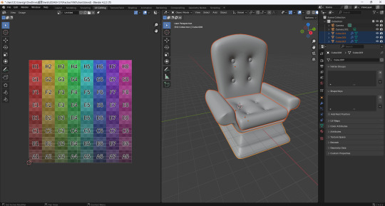


To push my project3: making it real further more, I plan to restrict the projection mapping inside my 3D printing chair, so that the vedio of the flower flying will only show in the chair area. There are some challenges, for example in Blender, I made the chair with mirrow tool, so when it comes to Touch Designer, the mapping seems symmetrical. Also the flowers in the vedio curve into strange shape because the chair isn't flat.
As my tutor Ian suggested, I will try another way which is layout the outline of the chair and try to map it in 2D instead of 3D.


Miyamoto, H. (2023) ‘28th(3/4)Map your 3D model[Blender TouchDesigner]’, YouTube video, 12 August. Available at: https://www.youtube.com/watch?v=rr64rbJwUAw (Accessed: 3 January 2025).
0 notes
Link
#AtzeEli#Audiophant#dynamischerRhythmus#eingängigeVocals#elektronischeTanzmusik#hypnotischeSynths#pulsierendeBasslines#RossBohlen#TechHouse#TheAlienBrainchildProject#TimothyBale#WhatTimeisLove
0 notes
Text
Lowongan Kerja Customer Care Officer
PT. Patria Anugrah Sentosa ialah group dealer motor honda yang sedang mencari Customer Care Officer. Kami memerlukan Customer Care Officer yang kompeten dibidangnya. Tanggung Jawab Pekerjaan : 1. Memonitoring Pelayanan2. Membuat Project3. Membuat Laporan4. Handling Complaint Customer Keahlian : 1. Mahir menggunakan excel2. Memiliki kesanggupan komunikasi 2 arah3. Memiliki kesanggupan Leadership4.…
View On WordPress
0 notes
Text
Project 3
Research
We began the process with research. I looked at multiple portfolio sites including Jessica Hische and Erik Marinovich, Pentagram, and Carpenter Collective. Below are my takeaways from studying each site.

Top 3 Portfolio Site Wireframes
We then selected 3 sites to create wireframes for. I selected Jessica Hische, Pentagram, and Firebelly. I chose these 3 because I felt they were fairly different in style, and there were elements that I liked of each. I liked Hische’s process documentation, Pentagram’s neutral color scheme, and Firebelly’s simple/minimal presentation.
Hische:

Pentagram:
Firebelly:

My Static Wireframe
Gathering inspiration from the above wireframes, we next developed our own. My intended home page was strongly influenced by Carpenter Collective, and my project pages by Jessica Hische.

Inspiration
Carpenter Collective:

Jessica Hische

Interactive Wireframe
Below is the link to my interactive wireframe, which was based upon my static wireframe.
Link: https://mhennes3.github.io/project3/index.html
Style Tiles
The next phase of the process was making style tiles. I sought to use both a serif and san serif typeface in my design (one for headers and one for subheads/body text). I initially intended to use one color throughout my portfolio site, however I ultimately chose a unique color for each project page.
Tile 1:

Tile 2:
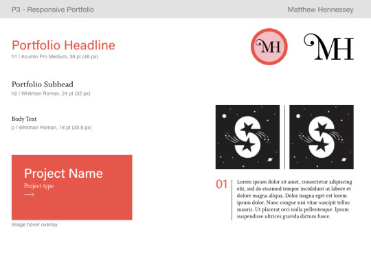
Tile 3:

Static Digital Layout
After style tiles, we moved on to construct static digital layouts (content included). It was also during this phase where I completed asset compilation. I chose 3 projects from Visual Communication Design 1. Although I had projects from other courses, I wanted to maintain the same style of process documentation throughout my site. This was easiest to accomplish with VCD1 projects.

Final Site
Below is a link to my final site. I was able to incorporate every intended element except one: the left-oriented header bar on my desktop-sized pages. As much as I tried to implement this, I was unable to master the code. I studied Carpenter Collective’s code itself, however I feel they may have used a template or other site to construct their portfolio. I will keep attempting to implement this feature, however I am still satisfied with how my site turned out.
Link: https://mhennes3.github.io/project3final/index.html
Other Assets:
Below is the logo that I created for my portfolio site. It changes color across project pages, and it links to the home page from my project pages, About Me page, and Resume.

1 note
·
View note
Text
Responsive Portfolio Website - Project 1
Part 1 & 2
I started this project as I would any project by looking up examples and getting some inspiration online. Some of the websites that I found that inspired me were Heather Shaw’s website (http://heathershaw.com/index.html), Jessica Hische’s website (http://jessicahische.is/anoversharer) and Raoul Gaillard’s website (https://www.raoul-gaillard.com/). I liked individual pieces of each website and tried to incorporate all of the things that I liked into my website. Below are the wireframe sketches for mobile, tablet and desktop that I made for each website. I made one wire frame for their home page and one for an work page.
Part 3
After making the wire frame sketches for the portfolios that I liked, I made my own ones for mobile, tablet and desktop, which incorporated the elements that I liked the best on the portfolio websites that I had found.

Part 4
After I made the wireframe sketches, I made three different style tiles to further digitally sketch out what I would want my website to look like. Originally, I wanted my main page’s images to be overlaid by a color like Heather Shaw’s website, which is what I did for my style tiles. However, it was really hard for me to make the style tiles and after talking it out with my classmates and professor, I realized I wanted a more simple and less colorful front page. Therefore, the color on these style tiles isn’t like my website that I made but the type and overall format is similar. I decided to use DIN as it is used for the Bill and Melinda Gates Foundation website and I think that their website is beautifully designed.


Part 5
After getting feedback from my style tiles I realized that I wanted a more simple front page so that the artwork would standout so when I went to create my static digital layout that is what I did. My static digital layout is very similar to my wire frame sketches, with only minor changes. I actually tried to map out or at least have a layout for every page on a mobile, tablet and desktop layout, which is why there are so many layouts. This actually ended up being very helpful though because once I had a clear idea of what I wanted the website to look like, I just had to make the html and css to match that instead of trying to design the page with html and css.

If you are interested in seeing the end result, please follow this like https://linadomenella.github.io/project3/index.html
1 note
·
View note
Text
Project 3: Responsive Portfolio Site
Part 1:
I began by researching portfolio sites of other artists and picking out a few that I liked. I compiled the links to the sites I liked and took notes on what it was that made me like them:
- https://dennisberti.com/ - Once the website loads, the hover state on the designer’s name and descriptor is really cool.
- https://www.craftedbygc.com/ - The effect of the heading as the website loads as well as the separation of the text when you scroll is a unique interaction. Parallax scrolling is present once you reach actual projects.
- https://livekaufman.com/ - The way color-changing effect in the logo is attractive and I think the slight bounce on scroll at the bottom of the screen is an effective way to bring attention to how to navigate the website.
- https://buzzworthystudio.com/ - Plain background and then hover on project name and the screen is filled with a full-screen image of that project. Mobile switches to full screen images that are always present with the project name on top.
- https://www.marcomarino.design/project.html - Similar hover properties as the buzzworthy site, but more simple and not full screen pictures. Also, has different images depending on size – tall pictures on desktop, wide pictures on tablet/mobile
- https://juliebonnemoy.com/ - The parallax scrolling on the website is a little distracting but also pretty cool to interact with. Other interesting interactions include: letters on hover in about me, the logo changing on hover, blurring of pictures on hover. Parallax scrolling somewhat remains in mobile.
- https://www.little-jacket.com - Another hover property that then shows full screen background image of the project. Full screen image on individual project pages with a constant padding. Smaller images that are in a 2 column wide flex.
-------
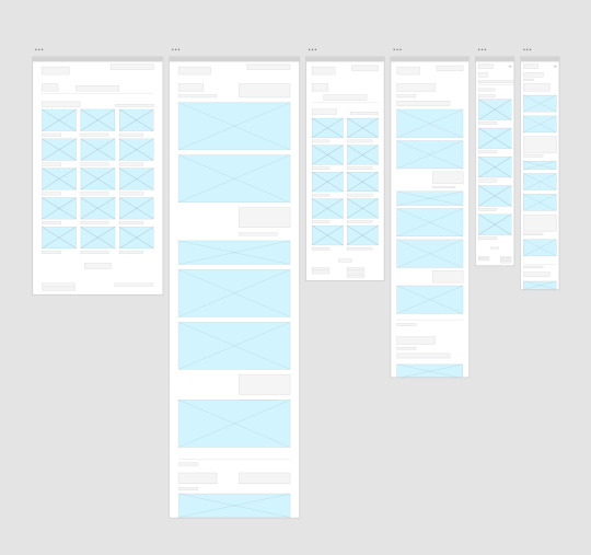
Part 2:
I then created wireframes for the homepage and project pages in mobile, tablet, and desktop for my three favorite sites.
First, the Buzzworthy homepage:


Next, the Buzzworthy project pages:


The next wireframes are for Julie Bonnemoy’s home page:

Then for Julie Bonnemoy’s project pages:


The last site was Marco Marino’s portfolio and the wireframes for his home page are:


Finally, the project pages for Marco Marino:


-------
Part 3:
Using the wireframes of websites I liked, I developed my own wireframes for my portfolio.
The wireframes for the home page:


And the wireframes for the project page:


A coded digital wireframe can be found at the following link: https://mmarino97.github.io/project3.wireframe/index.html
------
Part 4:
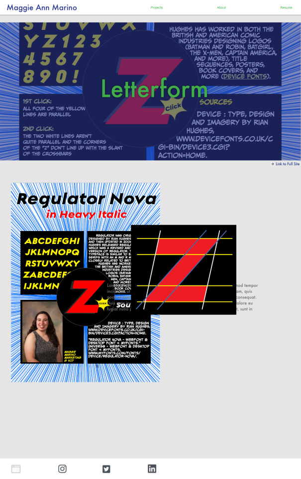
In gathering my content, I decided to make this website to represent all of the Web Design projects that I have done the past semester including the two from class and my thesis. As a result, I knew the styling and colors I was planning on using prior to starting the site, because I wanted to create a similar feel to my full portfolio website (https://www.maggieannmarino.com) and my resume.
------
Part 5:
Next, I created digital mockups of what the final product would look like on Adobe XD.
The homepage at different sizes:


and for the project pages:


------
The complete website can be found at: https://mmarino97.github.io/project3/index.html
1 note
·
View note
Photo
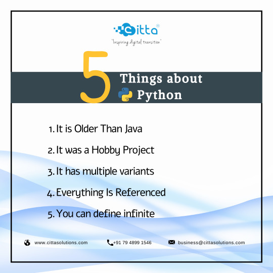
Python is one of the most popular and used programming languages in the world right now. The thing that makes python much popular is that you can develop anything with it. Python is used by many big companies like Google, Facebook, Netflix, and more. Facts about Python: 1. It is Older Than Java2. It was a Hobby Project3. It has multiple variants4. Everything Is Referenced5. You can define infinite values Visit: https://cittasolutions.com/hire-python-developers
#Citta CittasolutionsdevelopmentPython Pythondevelopment Pythondeveloper#HirededicatedPythondeveloper#HireDedicatediosdeveloperprogramming developer#languageProgrammimg Softwaredeveloper Hirededecateddeveloper Hirewebdeveloper
0 notes
Text
CSE575 Project3- Classification Using Neural Networks and Deep Learning Solved
CSE575 Project3- Classification Using Neural Networks and Deep Learning Solved
In this part, we will revisit the Handwritten Digits Recognition task in Part 1, using a convolutional neural network. The basic dataset is the same MNIST dataset from Part I, but you may choose to use only a subset for training and testing, if speed performance with the entire dataset becomes a bottleneck. For example, you may use only 6000 samples for training (each digit with 600 samples) and…

View On WordPress
0 notes
Note
how does it feel that khadah disappeared for like five years? must have felt good for a bit huh akhena?
“At f1r3t 1t wa3 l1ke, ‘Man now 1 can 6et 3h1t done w1thout 6ett1n6 ha3tled by that dumba33!’ But 1′ve k1nda m133ed h13 3tup1d mu6. 3t1ll don’t m133 h1m try1n6 to hack up my mo1ra1l for h13 art project3, but what relat1on3h1p 13 perfect?”
0 notes
Text
Non Non Biyori Anime Launches Countdown Project for Its 3rd Season "Non Stop"
To promote its highly-anticipated TV anime third season Non Stop, the Non Non Biyori anime franchise has launched a countdown project on its official website and official PR Twitter account.
Colored papers written/drawn by the anime's main voice cast members and staff will be posted until the new season's premiere day in Japan. In addition, one person will get a countdown colored paper by lot by following the Twitter account (@nonnontv) and retweeting the corresponding tweet.
The first entry featuring Renge Miyauchi is drawn by the anime's character designer Mai Otsuka.
????あと11日なのん???? 「のんのんびより のんすとっぷ」放送まで…あと11日???? 今日は大塚 舞さん(キャラクターデザイン)なのん! ウチを描いてくれたーん! ????色紙プレゼントキャンペーン???? ①@nonnontvをフォロー ②このツイートをRT でこの色紙が抽選で1人に当たるのん!#なのん pic.twitter.com/tTrvabVUy9
— 「のんのんびより」公式PRツイッター (@nonnontv) December 30, 2020
Following the TV anime first season Non Non Biyori (12 episodes / October-December 2013), the second season Non Non Biyori Repeat (12 episodes / July-September 2015), and the 71-minute feature film Non Non Biyori Vacation (August 2018), the much-awaited TV anime third season Non Non Biyori Non Stop is set to premiere in Japan on January 10, 2021.
PV:
youtube
Key visual:
Source: TV anime "Non Non Biyori Non Stop" official website / PR Twitter
©2021 Atto, KADOKAWA CORPORATION/asahigaoka project3
By: Mikikazu Komatsu
0 notes
Text
Week 10


This week's course is to continue to Project3. I wrote my five questions, which are all my own curiosity about the architectural designer.
1. You are one of the greatest architects of the 20th century. Do you have faced any difficulties as a designer? How did you overcome these difficulties?
2. Mr Mies, as we all know, your design is very famous, such as the Barcelona chair and many architectures, what are the most important things when you design?
3. As an architectural designer, what do you think of architecture?
4. Will you design all the works according to the requirements of customers?
5. Do you have a favourite designer?
0 notes
Photo

@waveformmagazine has been out for a few months now, and each issue features an amazing new DIY project. We have tackled Project 2 (Gateway Oscilloscope) and Project 3 (the Switchenator), but had yet to take on the first Project…. Project 1 - The PT2399 Delay Module. Check out this months review, time lapse build video, galleries and more over at the main site. Build video features music by @hhnoise! Link is below and in Bio! #EurorackModule #Module #euroracksynth #eurorack #synth #modularsynth #modular #waveform #delay #2399 #Project1 #switchenator #DIY #Build #timelapse #gateway #oscilloscope #synthDIYguy #timelapsebuild #WaveformMagazine #Project2 #Project3 #attenuator #utility #tools #synthesizer #fiN . . . https://finstudios.com/waveform-magazine-pt2399-delay-diy-build/ (at fiN Studios) https://www.instagram.com/p/B_MLdCohwEe/?igshid=uco0iw9lq905
#eurorackmodule#module#euroracksynth#eurorack#synth#modularsynth#modular#waveform#delay#2399#project1#switchenator#diy#build#timelapse#gateway#oscilloscope#synthdiyguy#timelapsebuild#waveformmagazine#project2#project3#attenuator#utility#tools#synthesizer#fin
0 notes
Text
Final Evaluation
Final Evaluation - To be completed before your tutorial.
1. Assess the effectiveness of one of your songs on the audience. - Post a video of the song
Make reference to any musical devices, structure, chords, lyrics/themes, timbre used when answering the following:
Did your song suit the theme of the event?
Did you get a positive response from the audience?
How did the song keep the audience engaged?
How could you make the song better for next time?
2. Assess the effectiveness of own and others’ performances.
How would you rate your performance out of 10 for each song you performed in and why?
Look at the other bands and upload 2 performances you thought were performed well and say why you liked them? - Make reference to any technical skills used.
Look at the other bands and upload 2 performances you thought could be improved and say how they could be better for next time? - Make reference to any technical/performance skills
What technical skills did you use well in your own performance? - Give examples
What technical skills could you improve on for next time? - Say how you will do this
3. Assess the effectiveness of own and others’ contribution to the production process.
How would you rate your performance in your production role out of 10 and why?
Look at the other production roles (Sound, Lighting, Social Media Promotion, Venue/Stage designer) and discuss what was successful and what could be improved on for next time and how they should do this?
What new production skills have you learnt? - Give examples
Link to Brief
https://miskin-music.wixsite.com/project3/tasks
Link to Youtube playlists
My playlist
https://www.youtube.com/playlist?list=PLXh1gorSUJrWKBbP91kToKq8qkX8CKu_R
Ants Playlist
https://www.youtube.com/channel/UC80Gt70vq1FHac9CJSlY1qg/videos?view=0&sort=dd&shelf_id=0
0 notes
Photo

【 喵星日常 原創插畫貼圖project 2-今日工事】 五小福一起盯著你,大家新的年度計劃規劃好了嗎? 十隻橘貓九隻胖,看看那個下巴(抓抓抓),新的一年小心不要跟橘貓一樣胖呀~ + 雖然project2進度才三分之二,但是project3的新花色喵喵已經偷偷(?)先混進來看熱鬧了,有看出是哪一隻的歡迎留言~ + 動物插畫創作的專用專頁整理中唷,各種風格、各種動物主題的創作都會整理到Mao Mao More毛毛不嫌多,屆時歡迎覺得毛毛小可愛們不嫌多的朋友過來按讚追蹤❤️ :::喵星日常Project 1 貼圖購買頁面 ::: 👉https://line.me/S/sticker/9412013/… #毛毛不嫌多 #MaoMaoMore #插畫 #電繪 #原創插畫 #line #貼圖 #MeowsDailyLifeProject2 #illustration #cat #blacknwhite #tuxedocat #cowcat #mixedtobby #2020HappyNewYear #新年快樂 #sketch #linestickers #animal #十橘九胖還有一隻特別胖其他花色也跟著胖 - 歡迎合作:品牌識別設計、插畫、展覽/活動主視覺設計、商品攝影、型錄/DM設計 https://www.instagram.com/p/B63EQPRnhc9/?igshid=1l386azhjd3bv
#毛毛不嫌多#maomaomore#插畫#電繪#原創插畫#line#貼圖#meowsdailylifeproject2#illustration#cat#blacknwhite#tuxedocat#cowcat#mixedtobby#新年快樂#sketch#linestickers
0 notes
Text
Research Journal Project3 : Identity
We stand here, two unknown people. Eyes cast to a screen of knowledge and content far to vast for us to ever consume it all. In that, within ourselves, still yet we know ourselves.
My research went in several directions. I spent a great deal of time introspecting about the “ concrete notions of what builds our identites” after doing the reading. But I also found myself using them as a metric by which I would measure against what made the identity.
That identity that comes as an expression of our core essence, and instead of considering every aspect that may or may not have shaped our personality.
I will focus my research on inward identity because it is what is calling to me. Group identity is important still to explore and I hope some of my classmates will take their project into this direction for myself however, I will look to identity that comes from quiet hidden places. Issues and battles personal, rather than the wars for justice by the collective group.
1. Frida Kahlo “The Two Fridas.”

Now, I know she was used in the reading but Frida is so icon, she is patron saint of feminine rage. Her identity screams with the dynamic music she lived her life dancing to. When I think about artists that knew fiercely who they were and what they were about I am drawn to beautiful Frida. I walk through Detroit and I feel the grit of the air and I wonder if she too liked the iron taste of blood Detroit gives to visitors born outside of the motor city.
Form: 1939, oil painting, 5′ 8″ x 5′ 8″ one of fridas first super large works. depicted is frida sitting with a second of herself. the traditional frida is connected by the heart to new frida. They support one another while considering the audience.
Content: Two fridas sit together, one traditionally dressed, the other dressed more modernly, one has a broken heart/ removed... and she is giving this whole heart to the functioning modern frida. She is sitting with herself and expressing her willingness to move on. She is granting herself permission to move on even. Her declaration of the new part of herself while still acknowledging her meeker side.
Process: Frida would have painted this shortly after her divorce from Diego Rivera. ( despite them remarrying a year or so later. ) To her identity this might have been about being her own friend, being for herself what she felt she needed. Her pain is palpable in this painting. It is clear in each careful shade, the sullen expression they hold on their faces as they regard the viewer. Not angery, or sad, Just simply tired.
2. Gustave Courbet “ The desperate man”

Form: 1843–45 oil painting 1′ 6″ x 1′ 10″, painted from very low light building into the super bright white highlights.
Content: A man is pictured, it is Courbet himself staring at the viewer as he tugs at his hair. lips slightly parted as he stares stunned out at the viewer, almost as if he is about to plead with us.
Process: Courbet was only 24 when he painted this moderately sized picture. He was young and had little clout as of yet. This painting was an honest mark of his building career. When he decided he no longer wanted to be a lawyer he vowed to live life like a savage, I can get behind that. I feel this piece definitely was part of his blossoming savage dom. I read a very interesting essay on him I will include because I believe it says what I would like to express very well.
https://www.artsy.net/article/artsy-editorial-probing-gustave-courbets-inner-thoughts-the-desperate-man
( I highly recommend it, it is a refreshing and funny article. )
3. Rembrandt “ Self-portrait at the age of 34 “

Rembrandt made over forty self portrait paintings. thirty two etchings and seven drawings. He like Frida Kahlo had a unique preoccupation with self portraiture and exploring his physical personage. I wanted to find a artist that explored themselves in a non representational way but I was so drawn to these three. I do intend to have my project contain a representation of me ( I have done a lot of thought on this I think the best way to do it includes
Form: 1640, 40 in × 31 in oil on canvas. Low light with heavy dark tones.
Content: This depicts Rembrandt at the age of 34 in a classic 3/4th view with a inquisitive expression. He is in a costume of the past century, the look seems distant as if his mind were in a different space. It sort of reminds me of that enigmatic quality some people describe getting from the Mona Lisa. That of course is a matter of my personal opinion. He was taking himself quite seriously while painting this at any rate.
Process: Rembrandt is at his most talented and promising part of his career. His romanticism style lent to his super detailed representations.
Thank you for following the development of Project 3
0 notes