#reminded my why i should learn html and css
Explore tagged Tumblr posts
Visit Tumblr Blog
Explore Tumblr blogs with no restrictions, modern design and the best experience.
Last Seen Tumblr Blogs


Fun Fact
Tumblr has a 66 index score for customer satisfaction in the US.
Text
damn, I had forgotten how fun it is to customize your spacehey profile
#reminded my why i should learn html and css#not me acting like adding more blinkies and buttons is the pinnacle of programming#spacehey
2 notes
·
View notes
Text
#2 - Programming is not for everyone
2022/12/9 Friday

"Programming is not for everyone. You either have it or you don't, and YOU should not do it because you don't like it," my friend Jake told me. He's doing a Ph.D. in Computer Science. He got into programming in the 3rd grade when he wanted to hack things. He tried quitting programming and doing something else but he always ended up coming back to it. I guess he "has it," in his words.
A year ago, I started learning web development online on free code camp to try and make a career out of it. My friend Conor, who used to be a library technician, started learning web development online for free using the Odin Project, and a year later he got hired at a startup. I thought, "If he can do it, so can I."
Fast forward a year to today. I've finished the HTML and CSS portion on free code camp but haven't even gotten to the projects section of JavaScript. I was struggling with the intermediate algorithm scripting exercises and dreading the projects, which were described as "similar (to the exercises) just much more difficult."
Why had I made such little progress in a year? You could say lack of discipline. Each time I had to force myself to sit down and code. I only did it a little bit at a time.
Recently I reconnected with an old elementary school friend from Korea. When she found out I'm learning programming, she told me to find something less stressful that I enjoy more. She said she's seen friends who got a job in that field after forcing themselves through school, but it wasn't a good fit, so they ended up quitting and doing something else. This got me questioning myself.
I reached out to a web developer friend who recently got fired during a massive layoff. She said, "There are many awesome roles in the IT field, but it is a highly competitive market. Everyone can join with low barriers of entry. You have to learn things after work since the framework changes every 2-3 years. Working in IT means you have to work over 40 hours (people will tell you that you can have work life balance but it is not true; they spend weekends studying) and you gotta do it for 30 years. It is especially stressful debugging when you can't find help from colleagues or stack overflow. Layoffs can come every few years."
This reminded me of Jim Carrey's dad, who went into accounting to pay the bills but got fired one day.
“I learned many great lessons from my father–not the least of which is that you can fail at what you don't want, so you might as well take a chance on doing what you love.” - Jim Carrey
So what else could I do if I'm going to give up programming? The only thing that comes to mind is video editing. I only know the barebones as I am self-taught and just use the bare minimum to make videos myself.
I recently got paid to do video editing for a friend, and it was doable. Not frustrating or stressful, like I find programming. I could learn to be a better video editor and get a job doing that.
So I've made up my mind. Ditch programming and get into video editing. I wish I would have made this decision a year sooner, but better now than later.
1 note
·
View note
Text
How to build an art website
My first attempt at building an art website was in 2016. Back then I didn't know how to write a single line of code. I bought a year's hosting with Bluehost, tried setting up a wordpress site, struggled, decided it wasn't worth it, and got a refund.
One and a half years later, in 2017, I taught myself how to code for a summer internship. I first learnt Python for data analysis, but soon realised that I could also learn HTML, CSS, and the rest while I was at it.
I finished the Codecademy course for website building in three days. Half a year later I tried coding my own Wordpress site. And, at the start of this year, with Wordpress completely revamping their website editor, I fled to GitHub Pages.
Currently my site (quietdistance.net) costs me 15 USD per year since I pay only for my domain name. That's a far cry from my first venture with Bluehost, which would have cost me 120 USD a year!
If you have no coding knowledge, and are interested in making a simple website, here are some steps I would suggest.
Learn some basic website coding. It's not as hard as some might think! Codecamy has a free course which holds your hand through the entire process: https://www.codecademy.com/learn/paths/learn-how-to-build-websites
Learn Git version control. There's another Codecademy course for that, and it can be completed in an hour!
Push your website onto Github. Github Desktop makes the process much simpler.
If you're serious about this art website endeavour, register a domain name and point that to your Github site. This step is entirely optional! Your website will already be accessible via its Github URL.
The entire process is free except the very last step, which costs less than 20 bucks. This is how I wished I had set up my site in the first place -- it would have saved me lots of money anxiety and frantically phoning technical support when I accidentally broke my Wordpress site!
Many artists these days make websites with Wix or Weebly. While these drag-and-drop, what-you-see-is-what-you-get website buiders are popular, I don't like them because:
You have to pay 5 USD every month to remove the website builder branding which is kinda ugly :( And that adds up to 60 USD a year!
Their code is clunky, bloated and slow.
Your creativity is limited to what editing options they offer you. Want links that flash rainbow when you hover over them? Cool transitions? Extra plugins? They're much easier to achieve with raw code.
If they revamp their site builder you'll need to check that your design still works the way you want it to. Since their site builders are constantly being worked on, you never know if an update might break your site.
And why Github is cool:
Github doesn't use your site to advertise themselves. They're run by Microsoft and have other revenue streams, so they don't resort to using your website as their billboard.
Unlimited sub-sites! In addition to your main portfolio site, you can easily make a separate site for every new creative project -- at no cost.
It loads super fast because it's used by professional geeks. My old Wordpress site took 10 seconds to load, and would sometimes not load at all. After moving to Github, everything could load in under 3 seconds.
You can test all changes on your computer before syncing it onto the online repository. No more accidental website breakages! Github Desktop records every file change, and you can undo them at will.

And why make a website at all?
If you post art to more than one platform, you'll realise that the number of likes/shares/comments is rather arbitrary, influenced by how long you've been active on the platform, your posting schedule, whether you've been featured, and other factors.
Instead of reflecting the quality of what you create, these numbers reflect how much value you are to the platform's advertising business. These two criteria can overlap, but often they don't. Yet these numbers can affect how other people perceive your work.
Your own website creates a safe space where you have control over how your work is presented to the world. Instead of conforming to platforms designed to maximise views and advertising profits, you have the power to create a place as weird and wonderful as you want.
It'll serve as a reminder that you're not just a data point, not just a cog in the wheel. That you should draw to make yourself happy, not just to please other people. That you're a precious and irreplaceable human being.
So sally forth and create! And may it bring you joy.
171 notes
·
View notes
Text
January 25th-January 31st, 2020 Creator Babble Archive
The archive for the Creator Babble chat that occurred from January 25th, 2020 to January 31st, 2020. The chat focused on the following question:
When dealing with criticism, how do you personally decide what is and isn’t legitimate criticism for your story?
Deo101 [Millennium]
For me, the only criticism i take from any critique (even professors) are the ones that I feel push me closer to my goals as an artist. I also only consider critique that comes with my consent and from a place of trying to help me grow. This second bit (trying to help) is something I can't really explain how to tell, you just kind of start to learn over time.
malverav
My philosophy regarding criticism is twofold: I don't take crit from people that I wouldn't take advice from, and I don't take unsolicited crit. I tend to seek out crit from people I know, respect, and trust who also get what I'm doing with my work and get what I'm aiming for. That, and after a certain level, crit is a matter of taste. Saying "this anatomy is squirrelly" or "push your contrast in values" is very useful and somewhat objective, but something like "you should shade like this, not like that" or "use a different colour" is simply a matter of taste in my opinion. It's why I don't take crit from everyone as everyone's tastes are different. I don't take crit from, say, @xX_roxas_fan_69_Xx saying 'your story sucks' with a three paragraph rundown of why. Random commenters? I don't listen to them if they're not paying my bills. Besides, a lot of those randos seem to enjoy tearing someone down and looking like the smartest person in the room, rather than doing something useful. It really speak to entitlement that someone thinks they can swan in and offer an artist their great and wise critique - who made you the boss of art, @xX_roxas_fan_69_Xx? There's a certain danger in listening to too much crit and advice, and after a certain point you just have to pay attention to your own instincts.
Tuyetnhi
Rip I usually don't take crit from folks on the internet or irl if I don't ask for it. Most of the time I often check with my peers to give advice because I know they'll help me push forward in my work. Though I'm thankful that I had advice from some industry folks but dang, that kind of stuff is uncommon.
I do have comments that really doesn't address the story at all and some superficial comparisons. Those I don't respond.(edited)
keii4ii
Everyone's brought up excellent points, many of which I personally employ as well. Here's one I haven't seen yet: If a criticism is extremely negative, to a point where "if this is correct, then my entire comic is garbage and I should start over" is the only logical conclusion, then I'm not going to consider it. Because yeah, I'm not going to start over. Doesn't matter how genuine their intentions at that point. Either they're right and I have an irredeemable pile of garbage -- which I'm not willing to throw out, so rip. Or they're "wrong" (as in, they got that negative because they are 10000% not my target audience) in which case, it'd be pointless trying to please them.
To clarify, "extremely negative" doesn't have to be a literal "your comic sucks at everything." Maybe they'll have some positive things to say, but with regards to my most important goals with the story, they'll have nothing but total negatives to say. e.g. "None of your jokes are even remotely funny, but hey, nice art" for a comedy comic.
DaemonDan (The Demon Archives)
I like to think I'm fairly opened minded with regards to most crit, as long as it feels well intentioned, and as long as I can see where they're coming from.
That doesn't mean I'm necessarily going to change anything on that given page (too expensive for me since I have to pay my artist for everything), but it's something to consider going forward
Especially if it is a concern/question about plot or something that I haven't explained well yet and didn't have planned to explain/show.
Cap’n Lee (Flowerlark Studios)
I can’t put into words exactly how I ‘tell’ if it’s legit or not. If it’s just ripping my work apart and delivered in an aggressive tone, I know that it’s ill-intended and not to pay it any mind. If it’s also from a serial nitpicker, I usually disregard it as well. If it’s polite and well thought out, I’m more likely to pay attention. Even then, I’m usually able to tell if it’s good, applicable advice or well-meaning, but subjective opinions that simply don’t apply. I’m usually pretty aware of the flaws in my work and can hold it at arms length to see if a crit really does have a good point. If I think it will genuinely help me improve, I’ll start incorporating the advice into my work. Because if a critique helps me get better at what I’m already trying to do, then I’m all ears. I’m always open to con crit, and I think carefully about what was pointed out, but I also take it with a grain of salt. Probably the biggest thing I learnt as an art student wasn’t about making art, but how to parse critique I received.(edited)
snuffysam (Super Galaxy Knights)
There's really only two types of criticism I completely disregard - 1) Something that shows the critiquer's vision of the comic is completely different from my own (e.g. "I liked the bad drawings better, you should have stuck with that"). 2) Some variation of "stop making the comic" (e.g. "you should stop posting art until you improve more") (both of which are real criticisms I've gotten. the latter one surprisingly recently.) Also, sometimes a criticism is... difficult to understand? Like I'll try to take "the dialogue doesn't pull me into the next page" into consideration, but... it's hard to nail down exactly what that means, y'know? Fortunately I haven't really gotten any bad faith criticism or un-asked for criticism, so, that's nice.
LadyLazuli (Phantomarine)
Luckily I haven't received too much critique/criticism on my comic work, and (so far!) certainly nothing harsh or insulting. In all honesty, I could use a bit more critique, and should probably actively seek it out, so I could keep learning and improving! As such, I've taken all the criticisms into account to varying degrees. If I can't easily go back and fix something, I can always keep that note in mind for future pages. I'm usually most concerned about clarity of plot/progression - aesthetic choices are a matter of preference, but if a reader just plain can't tell what's happening, that's my biggest concern. A comic can be many things, but it should at least be legible, both in words and in images. I take notes on legibility/clarity very seriously.(edited)
varethane
I liked deo's comment at the top about considering crit if it gets you closer to your goals... for me, that's often the most important aspect. Feedback from someone who understands what I'm trying to do is really valuable, because it can help me pin down things that I was already kind of aware weren't working but couldnt put into words. When it comes to unsolicited crit, honestly the most useful ones I've gotten were from readers who didnt even realize they were making a crit. When I start to see comments that appear to be misunderstanding what i intended to put into a page, then I know I need to make some changes.
AntiBunny
In a world of very quiet readers I've had to seek out criticism. Much of what I've gotten is pretty legitimate as a result. I find that legitimate criticism usually can back up its argument. You'll have examples of what's wrong, point out counterexamples, of have suggestions to how to make it better.
Illegitimate criticism is usually cases of personal insults or just saying "it's bad." However there are also cases of people attempting to give legitimate criticism, but missing the point. Usually those who didn't do their homework.
For instance in AntiBunny http://antibunny.net/ one of the biggest failings I've seen at giving legitimate criticism was "I didn't finish it, but it seems incomplete." That's a good example of someone not doing the reading necessary to back up their comment.
And lastly those who just don't realize that the subject matter isn't for them, and confuse that with a judgment of quality such as "I don't like black and white comics," and "I don't like anthropomorphic animal comics."
More legitimate arguments I've gotten, that actually did help me improve were comments on the old site design, which was really stuck in my rather late 90's HTML coding skills, so I took the time to learn a bit of CSS, and improved upon it. Others were about the early art style, which I've grown and evolved from since then. And of course about the text being hard to read, so I moved away from hand written text, and tried several fonts before settling on a free and open font. Jr Hand if anyone is interested.
In short, legitimate criticism helps you improve, illegitimate is either an attack, or just misses the point.
kayotics
I tend to seek out crit from people who I trust, first and foremost. Usually before I even start the work. Unsolicited critique, I think about it for a few days and then decide whether it’s appropriate or not. I do this because I’ve gotten critique before that HAS hurt me enough for me to stop a project. Other people’s opinions of me affects me a lot, and I have to mull on their words to decide whether or not they’re being honest or if they’re saying something to me in bad faith. Sometimes it’s hard to separate what’s legitimate criticism and what’s just entirely incorrect, so that’s why I take a few days to mull on it before acting on it.
keii4ii
Yeah, sometimes even a good faith critique can just... miss the point entirely, and it can demoralize me in a unique way. 'They're genuinely trying to be helpful, so they have to be right..........' kinda thing -- which is not always the case, I've had to remind myself.
Deo101 [Millennium]
Another thing about critique, is if it is truly in good faith and trying to help you grow... They won't mind if you don't take it.
kzuich
I've always said thanks no matter the feedback...but I've definitely gotten crappy critique that wasn't helpful before. One of the worst I've ever received when I was soliciting feedback was from someone who couldn't pinpoint what they didn't like about my comic, but said it was "wasted potential" and needed to be more serious. (Wut.) They then tried to tell me that they'd be willing to help me if I'd invite them on as a writer/editor, and now I'm thinking that person didn't even read my comic and was just trying to neg me into giving them a spot on my site so they'd have a project with their name attached to it or something xD(edited)
(For the record...my comic is a very lighthearted comedy. Like...way to miss the point! xD)
Cherryzombs
Oof. -_- Reminds me of an art teacher once putting "Not Creative Enough" on one of my works. I dunno what to do with that...
kzuich
Lol art teachers like that always got under my skin.
keii4ii
Yeah, critics missing the point is a big part of why I've become extremely selective about who to ask crits from!
kzuich
I don't really solicit feedback much anymore.
Not because I don't want critique
It's just...There are not a lot of people who actually know -how- to critique
keii4ii
Sometimes you can glean some good things from a critique that just missed the point -- like, sometimes it can help you see why they missed it and how you can maybe prevent that. But.... I don't have the spoons for that kinda gleaning anymore.
kzuich
I don't mind people reviewing my comic, because, well, hey exposure! But if I ask for feedback, I'm asking people who make comics. Because the best critique I've ever gotten was over on the SF discord. A user actually gave critique that was extremely helpful and on-point.
keii4ii
Even fellow comickers can be unhelpful, too. Every person whom I've asked for critique was making a comic, but the helpfulness has varied a lot.
kzuich
Yeah that's true
keii4ii
"I hate, hate, HATE your MC, so you should kill him off or otherwise get rid of him forever" was told to me by a fellow comic creator.... and I was already doing like, chapter 7, so yeah, removing the MC wasn't really an option X'D
Cap’n Lee (Flowerlark Studios)
YIKES WHAT
kzuich
You could always do a 180 and really trip out your readers
very ~experimental~
The critic who hated my comic would've loved that
I gotta dig up that critique because it was really funny. My husband and I will make jokes about it from time to time lol
keii4ii
XDD
kzuich
Like have I totally turned this on its head? I'm critiquing the critic
Cherryzombs
When someone asks me for feedback I tend to ask what specifically they want notes on.
Otherwise I don't really offer it. >.>
Cap’n Lee (Flowerlark Studios)
I usually ask if they want critique first and then do the compliment sandwich if they say yes.
And try to really emphasise the things I like and feel are working.
Cronaj (Whispers of the Past)
@Cap’n Lee (Flowerlark Studios) "compliment sandwich" I love that.
Cap’n Lee (Flowerlark Studios)
I didn’t come up with it, but thank you! XD
Cronaj (Whispers of the Past)
In regards to how I myself determine what critiques are worth my consideration... I like what @Deo101 [Millennium] and @varethane spoke about with the idea of our personal vision for our work. Whether or not someone gets what I'm trying to accomplish from my work or not plays a huge role in whether I'll take their critique seriously. An example of this is in my comic Whispers of the Past, there was a scene where a character had a flashback, and to show that it was a flashback, I made the background behind the panels black instead of white. A commenter told me I should make the background behind all the panels black because it adds more contrast. By itself, the critique wasn't that harmful or incorrect, but in the context of "this story is gonna have a bunch of flashbacks and I need a way to differentiate them from present time," it definitely was a critique that wasn't really helpful to me. The commenter clearly didn't understand that it was a flashback. Another type of critique I don't pay attention to are critiques where the critic is pointing out something that I can't really change. Or are being unintentionally rude, "It's too short." "I can't remember what happened in the past updates because of the infrequent postings." "I would rather you wait until you have X pages before posting." Um... I can't just simply draw FASTER. I'm not a GOD. And finally, critiques that have to do with taste and not quality. I had an art professor whose common critiques of my work included, "This is too illustrational," and "The colors are too saturated." To which my responses were: https://media.tenor.com/images/7dfa6d3d76a277b8c204945ae8fd3161/tenor.gif(edited)
renieplayerone
for me, I tend to ignore a lot of random critique, or at the very least put it aside and ask a friend later. What I do trust for critique is when the critique comes from other comic writers and artists who I know, and I seek out the critique on my own. I also tend to take more to critique when it's constructive or from a good-faith helpful place, like "hey this page could use some more clarity to get your point across" rather than "whut? Idk what this is". I also am in some writer groups where we do crit nights, which are very structured and from a "I want to see you succeed, lets help make that happen" standpoint, so Im much more likely to listen to them than a rando on the internet saying "draw it, but gud"
carcarchu
@keii4ii i once read a webcomic where the author killed the main love interest after 100 chapters and replaced him with a clone xD i really respect the author's boldness there
kzuich
lol what a legend
DanitheCarutor
Usually I try to put any criticism for anyone into consideration, sometimes a stranger might have more knowledge of what I'm trying to do than I do, and I have gotten really good advice for randos popping in with critique and suggestions. Although, due to my story being super tight, I usually end up weeding out whatever doesn't apply to what I'm currently trying to accomplish with it. This sucks because that's a lot of story critique, and it makes me look like some child who can't handle negative feedback. There has been comments that I should make more happy scenes or get rid of some heavy stuff, make the comic more like Breaking Bad (Never seen this show. ) because it's too boring, having romantic scenes to fit the title, make my MC Julian less "weird" and more likable. I can change small things, but big stuff that has an affect on the main plot would make me have to rework the entire story... which then it wouldn't really be TGtaHR. I can do some tweaking to the main stuff, but the person giving the critique would have to know the whole story, and what I'm trying to accomplish. At least in my extremely anal opinion.
Art wise I'm more open, there have been really good suggestions about me using more contrast and values to draw the audience's eyes to what I want them to see, I've been told to simplify my backgrounds or use less bold colors which is a problem for me since I'm REALLY into drawing detail, or that I need to make my speechbubbles more readable. These are valid critiques because these things do hinder the comic, and I have been trying to work on improving, although admittedly I do have a lot of trouble changing up my coloring and details. There have been a few interesting ones that I've kinda ignored since they don't really help? A couple people have said I should switch to drawing digitally because it looks more professional/polished, I've been told to stop drawing backgrounds entirely, someone said I should draw in a more aesthetically appealing style, and another one was that I drew too many dynamic angles. There is a critique I've gotten a few times in particular that I've kinda ignored, but I'm not sure if I should apply, which is that my shading is weird. As in my style of complementary shading looks bad, and while I really like that type of shading I'm not sure if I'm applying it correctly. The people who usually say this don't ever elaborate on what they mean, or how I can do better... except one person who said I should use a darker version of the same color or black for shading, which is kinda gross looking to me.
But yeah, I generally try really hard to take in criticism, but if I can't make it work for what I'm currently trying to do I move on.
varethane
Too...... many?? dynamic angles.....??
Tuyetnhi
wut omg there can't be too many dynamic angles
varethane
Yeah, uh, pretty sure you can disregard that one lmao
Cronaj (Whispers of the Past)
Lol, I WISH I had that problem
DanitheCarutor
Yeah, that one totally caught me off guard, I've never heard of drawing too many angles. Usually the criticism is that you're not drawing enough. I told them I was practicing my perspective, which I am, but... yeah, didn't know what to say to that.
LadyLazuli (Phantomarine)
God, what I wouldn't give to have more angles I guess too much detail can be an overload, but still, better too many than too few
Cronaj (Whispers of the Past)
Actually, one of the most legitimate critiques I ever got was from a professional editor at a convention where he was doing portfolio reviews. And you know what he said? That I should have more interesting camera angles.
SAWHAND
Lol! I do think most people have to force themselves to think about the camera angles. I certainly do at least! I think the key to good critique is to understand that it's not really about liking or not liking something. It's not about preference at all. It's about letting the artist know what the audience is likely seeing or experiencing so that they know whether their intentions are coming across. And if you're getting that advice from other artists usually they can tell you why something feels a certain way. For example, a reader might say, "it seems really hectic", but an experienced artist might be able to say "I think having a lot of different camera angles so quickly is making the scene feel very hectic." (just using camera angles as an example, since it came up) And then as the artist, you can say oh great, that's exactly what I was going for, or you can think about changing it. But critique is just about helping an artist refine their vision, letting them know if the tools/techniques they're using are matching up well with their intentions.
RebelVampire
Yeah. Somewhat to the above, I could see a critic saying "too many dynamic angles" if they meant that there wasn't a good visual flow and it was hard to follow in that regard
It's always good to remember a lot of the people who have time to give critiques for a whole webcomic are actually not professional artists. So they can't always accurately describe in that realm what theyre seeing.(edited)
mariah (rainy day dreams)
This conversation reminded me of a Tumblr tutorial from m forever ago by one of the Adventure Time folks. It talks about a lot of things, but specifically I could see someone thinking the camera is "too dynamic" if a comic artist is breaking the 180° rule a lot in their panels or not following screen direction. Though screen direction is probably a little more forgiving in a non-animated format. Anyway, I'll put the link for that tutorial in #art_resources
Mei
Critique is a tough one. Because for the most part I accept critique from close friends that I trust and from my professors. Sometimes though, I personally feel like my art will be going one direction and will waylay the critique for another project. If that makes any sense. I guess what I mean is that sometimes you've already done so much on one piece or comic and when someone gives you critique it's like "okay thank you, I hear you, and I will implement it in the next thing I do, not this page that I am currently doing." I also tend to ask my friends if they don't mind critique? For things that are WIPs and shared. My friend once said "I mean what do you say to that... Can you even say no?" And I was like, "Yes you can completely say no and I wouldn't give critique it's as simple as that", but I guess when you're closer friends,it's less apprehension maybe. That being said, I haven't really run into the unsolicited critique category quite yet. I mean, I feel as if I'll run into that eventually, I've just been lucky enough not to. Plus, a lot of critique I get is actually about things I'm already aware that I need to improve on? I got some pretty fair critique from several people on several projects that I should work on backgrounds, layouts, and location. Which I know is a weakness I have, and honestly I avoid it a lot because I'm really scared of it? And I know that I have to just... work on it and do more visual studies if I ever want to improve. It's just a very daunting task, especially since I'm studying as a character animator, so the backgrounds are almost always secondary (I kept handing off backgrounds to friends to help do rip) And with what was said above about 'too many dynamic angles', I can see why that might be a critique for action sequences. Something like Boku Aca actually suffers visually from that! It's so dynamic that pages can end up looking clunky? I guess?!
DanitheCarutor
Urm to cover my ass, I do agree and see how too many dynamic angles can be a hindrance, but for out of the norm stuff like that I unfortunately need to be shown an example or elaboration on why that isn't working for me. I don't remember how far back the critique was, maybe around chapter 2 or 3. They never pointed anything out, but I believe they were responding to pages like these. Edit: DON'T actually read the contents of these pages, a couple of them might have some heavy stuff that could make you uncomfortable.(edited)
(I do agree that the circular perspective page is awful, it was my first attempt and I didn't have a drawing table at the time to make a larger circle. I might redraw that page at some point.) But it's really hard to know exactly what they mean. Should I do more eye level shots? More talking heads? I'm super thick in the head, and need a little hand-holding, when it comes to understanding critiques like that. I do agree, though. There are so comics that have so much going on that they can be really hard to read.
Mei
I think in terms of dynamism it's just important to keep in mind that if EVERYTHING is dynamic ALL THE TIME, then it ceases to be 'dynamic' and becomes the norm, and it can be as whip-lashy as a movie that uses far too many jump cuts in an action movie. Like you want to be able to follow that continuous string of motion and jumpcuts can disturb that? So similarly in comics it's something people will say to keep in mind
I mean I don't see anything particularly wrong with the angles you're using in the pages you've linked! And at the end of the day, if it works for you then it works? And it's also a personal taste thing i think
some people LOVE comics with tonnes of dynamic panelling and angles. Other people prefer things really grounded in reality and more gentle in terms of the cuts
So I guess to string this back to the critique stuff, it's things you can take note of and be more aware of but doesn't necessarily mean that what you've already made is 'bad' or whatever, because it definitely isn't. I always see Critique as just things that other people notice that you don't, and sometimes they're helpful and sometimes it's like "Okay thanks for pointing that out"
Cronaj (Whispers of the Past)
Yeah, those pages look good to me.
I particularly love the lighting in the last page.
Desnik
Oh this is a good creator question. So, for me, legitimate critique is when a person labels specific things in the story and proves that they actually read it, whether they do or don't like it. I might not take that person's suggestions but I do think about how the story's coming across. For instance one of my writing group friends hounded me over explaining each and every little thing in my story...but honestly I'm not going to infodump upfront. But her feedback is terribly important because if she's asking this kind of question about what's going on, she can't possibly be the only person who will be a bit lost(edited)
even though I'm not implementing her suggestion specifically the way she wants it (big simple infodump), at least I'm thinking about what information is clear and what's waiting to be explained later
There's also observing people because that can give me bigger clues than what they say. If they trip over a sentence when reading aloud, then I definitely check it out and see if I can make the prose easier to read. Little stuff like that.
DanitheCarutor
@Mei Sorry, haven't been online much this week. Oh yeah, that is totally understandable, and I have seen how too many odd camera angles or jump cuts can be jarring! I just thought it was an interesting critique since they never elaborated on what they meant, plus even though I've heard of certain angles ruining a scene, I've never actually heard about having too many dynamic angles so it just surprised me. A good chunk of webcomic creators default to more standard angles since perspective can be such a pain in the ass, and takes up extra time, so the feedback I usually see is to have more variety. Sorry if any of this came off like I was complaining! I really wasn't, I just wanted to answer the question with some examples of different types of criticism I've received. Talking about some of the ones that were odd, or I couldn't take for one reason or another. Didn't mean to draw so much attention to myself. xD That is true, though. It might have been personal taste, who knows, we can always improve more.
@Cronaj (Whispers of the Past) Thank you! I was really satisfied with how that page turned out!
Mei
@DanitheCarutor Oh no I never thought you were complaining at all! I was just responding haha sorry if that made you think I was being overly critical or anything. But yeah, I mean some people have different tastes or they point out different things that may or may not be problems. I think having a lot of critique can be a double edges sword anyway. On the one hand, it's great to hear outside opinions. On the other hand, they can give such varying advice that's all based on personal taste that it could not even apply to you. So it's like... take what you can and leave the rest or something?!
RebelVampire
While I normally don't participate in these, I will this week as a fiction writer and as someone who used to do webcomic reviews. For me, when it comes to dealing with criticism and critiques and deciding what's legit is to look for trends - which is the advice I generally give for anybody who doesn't know what to look for. Creativity is not an exact science, and as such, critiquing creative projects is not an exact science. While there are certainly foundations, in the bigger scheme of things, every critique is going to be different and unique. Every critic/reviewer/etc. has their own personal tastes, their own personal goals and aims when giving the criticism, their own personal style for giving a critique, and so on. This is why you can have two reviews that are completely opposite from each other in opinion, because each person is not only influenced by what they think makes a work good, but just their own personal focuses no matter how objective a critic tries to be. But, to me, this is why when you get several people all saying the same thing, that's the time to get concerned and consider changing something. Cause again, every critic is coming from a different place, and if people coming from different places are reaching the same approximate conclusion, they're actually probably on to something. So, I play the patience game, gather multiple critiques, and look for trends before putting stock into any one piece of criticism.
Eightfish (Puppeteer)
But what do you do when a bunch of people all say the same thing, but fixing that issue would take a ton of time and effort? A lot of people have said that my font is too small and hard to read. Is it worth it to spend a day just changing a bunch of letters on 70+ pages and saving and resizing them again? Despite all the people telling me it's an issue, I still don't really think it's that bad. I'm used to reading page format comics, and my font size is comparable to other page format comics. I think a big part of why people are complaining is because I'm a page-format comic on webtoons. But also I'm using a custom font which is my own handwriting. Obviously I'm used to reading my own handwriting and find it very legible, but other people aren't and so might find it more difficult to read. Maybe I can't look at the font objectively because of that : /
Kabocha
I think font issues and readability are... A different issue. One thing I noticed as I got older is that the small fonts I used to tend towards got harder and harder to read. So finding a balance between page legibility on the web and print is... Challenging. But it can be done. If you have a small screen with a high resolution (more than a cell phone), might be worth seeing how much you have to zoom in or focus to read it
Granted, I'm not yet 35, but my eyesight hasn't improved...;;!
mariah (rainy day dreams)
I'm not sure about updating the old stuff, but if it's something that's been repeatedly brought up I would definitely increase the size on pages going forward and see if that helps. I can see the value in also updating the old pages if people are dropping off because the type is too small, but also I feel like 70 pages is like right on the board for me of not worth it for the time it would take. The value of your time is a personal decision though.
snuffysam (Super Galaxy Knights)
Even when taking critique, I almost never apply that to old pages. Webcomic readers generally expect a level of improvement, so they can understand if early pages have issues that are fixed later on.
Kabocha
Agreed, though if you have a way to batch process files for export, that might not be bad? It really depends on how much of a barrier to readability it is.
But in the context of critique? Eh, worth knowing for future projects at minimum!
Kabocha
Anyway, to answer the question I suppose... How do I determine what's legitimate and what's not... I guess it depends -- I saw a few people mentioning whether the interests of the critique align with your growth (or I think I saw that; admittedly, I'm not really inclined to scroll up too far right now), or whether or not you trust the person giving the critique. I think those are two good things look at, for sure! I also think it's worth considering whether or not you care. Like, at the end of the day, if it's not a show-stopper or making the work unreadable or unenjoyable, then... Meh? Make a note of it for the future, see if it's something you can incorporate if you solicited the critique. If it's entirely unsolicited... bigger meh.
DanitheCarutor
@Mei Nooo you didn't make me feel that way, I just know it can come off that way to a lot of people and wanted to clarify. Differentiating critique based on personal taste from you doing something objectively bad can be really hard to do sometimes! I usually do what Rebel Vampire said and collect them until I see a trend, but sometimes I wonder if that single critique is someone noticing a flaw no one else does. Although that might be me over-thinking things. @RebelVampire That is a good reminder of how different people are, and how variety there is in how they view things. Man, I wish I knew about your reviews back when you still did them... and I also magically had a decent chunk of my comic finished, I really liked your style. For the most part I try to apply the idea of going off trends. Unfortunately there is one I do tend to ignore since it feels like ends up fitting with my intentions, which are critiques about making my story less sad/uncomfortable/heavy. It probably is a legit flaw, and I might be executing my story poorly for all I know, but I did want to make a comic that could be really sad and/or uncomfortable. Due to that I kind of ignore those critiques... even though I probably shouldn't, it's hard to tell for those ones specifically. But yeah, hoarding critiques like they're playing cards, then finding patterns to see what needs to be improved is a good way to find a quality in your work that might be objectively bad.
keii4ii
@DanitheCarutor I think that's a great point, especially for those of us making very niche stories. Even if you get 99 people telling you they don't like your work because of X, sometimes it is the 100th person that you're writing for, the one who LOVES that (very intentional and pivotal) X in your work.
Cronaj (Whispers of the Past)
ESPECIALLY if those 99 critiques are not aligned with your artistic vision to begin with.
DanitheCarutor
Yeah, the hardest thing about making something niche is a lot of people aren't going to like it no matter how well you pull it off, also getting feedback that works with what you're trying to accomplish is kinda hard. I went into my comic know it wouldn't get a whole lot of people who would understand or enjoy it, so I decided it would be for myself to vent and whoever does like the story can tag along. That seemed like the best plan to keep from getting discouraged. It IS really nice when that 100th person comes along who loves that weird stuff as much as I do.
RebelVampire
@Eightfish (Puppeteer) To add my own two cents to previous replies about fixing old pages, I think this depends first off, what others have said, how you value your own personal time and whether you think its worth the effort. Second, though, I think is to consider what the issue is that needs to be fixed. Some issues are definitely more minor than others, and ppl accept if you fix them later. However, then there's issues like readability, too much front-loading of information, etc. that can be a bit more major because its effecting readers' ability to understand your comic. It's at that point I personally believe that it'd be better to fix earlier pages. Cause the average new reader isn't going to show up to the comic and go "Maybe this will improve with this major issue later." The average new reader is going to give your comic 20 pages at most and then leave if the issues are still there and they can't follow the comic. In other words, always remember readers still have to read the beginning pages in order to get to the improved pages. So the question is, do you think the issue is something that will make readers drop the comic before they even get to that point? Again, though, emphasis, this is a personal decision. There are people who would put in the effort, and people who wouldn't. And both are right because what you do with criticism is ultimately your business.
#ctparchive#comics#webcomics#indie comics#comic chat#comic discussion#comic tea party#ctp#creator interview#comic creator interview#creator babble
1 note
·
View note
Text
Codeland: My First Conference
Let me tell you: it was an adventure. We need to start at the very beginning.
Arriving in NYC
I (last minute) bought tickets via Grayhound and booked a hotel to the New World Hotel. The Grayhound bus driver didn't accept my e-ticket so I had to dig around my phone for a printable receipt. I landed in Port Authority around 9.30pm on Sunday. But I didn't know how to use the subway and was too anxious to ask for help so I walked from there all the way to the hotel. Of course, my phone ran out of battery so I had to drop by a Duane Reid to purchase an emergency batter pack. The hotel wasn't obscenely far but I am poor with direction, thus I arrived at 11.30pm. The hotel reeked of cigarettes and there was an unkempt mattress propped against a wall along with hand towels strewn in random places. I checked in, got my keys and went to my (very small) room. The bed sheet was disgusting and there was a loud TV blasting the benefits of Chinese healing cream that could make you look significantly younger. I tried to go to sleep but couldn't because I felt super itchy. By 4.45am I gave up, checked out of the hotel and wandered around Bower St. looking for a place to shower. At 6am I stumbled into a YMCA. They were generous and because it was my first time there, let me shower for free. I almost passed out in the shower from sleep deprivation.
At the Conference
Finally after an hours' respite (thanks YMCA!), it was off to the conference! The line to the NYC Skirball was decently sized. Getting inside was easy. The conference was super well organized. I got a small pink tote bag that was filled with goodies (hey Flatiron, thanks for the battery pack). The breakfast was much needed. I was beyond thankful for Flatiron's lattes.
The beginning. talks had dancing-which made me really nervous (I didn't want people to see how visibly sleepy drunk I was).
Luna Malbroux's talk was hilarious. It reminded me of Starbucks' #racetogether movement (one question the Bux posed was: how many people did you eat with who wasn't the same race as you? And how often? Well my brother is a different race and I, a Chinese person, am surrounded by white people so this is often. However, this absolutely doesn't make me more #woke). I loved the fake app and everything about the talk.
Pedro Cruz's speech was inspiring. A lot of the programming hype is around the fat paychech or making beaufitulf design or having a snazzy "programmer" lifestyle, but I love how he talked about an existing problem and how he tried to solve it using existing technology. He's truly made a difference in Puerto Rico, moreso I can easily see his solution being used globally (it probly is). His DronAid tackled many problems, from recieving "Help" messages from people in need, to seeing what they actually needed, to making sure non profits weren't getting redundent information to creating a form of communicatlion between various groups.
I chose Raymond Camden's Real Person's Guide to Vue.js. I'm new to learning JavaScript (I only know HTML and CSS) but I've always wanted to know: why do people always talk about Vue, React and Angular? What's the big deal? Although this talk was aimed towards more advanced web developers (aka not COMPLETE noobies), I gained so much from this workshop (plus cats!! A lot of them!!). I learned how useful Vue could be for acquiring data and also allowing interactions between the user and the site. I've been able to go over his github and Codepen at a (much) slower pace to fully peice together the workshop.
The closing talks were very fun and entertaining. I loved Ali Spittal's talk about blogging (I'm going to try to put real effort). It is necessary for me to explain what I'm learning to someone so I can sort of figure out what I'm learning. It is also a good way to keep myself organized. Building a Gendered Dictionary and An Immigrant's Journey into Tech hit home with me as I think we should consider what we are doing and how they impact society.
Coding is a tool. It's what we do with it that matters.
I didn't go to the afterparty but next year, now that I know better how to plan my trip, I will!
2 notes
·
View notes
Text
My Personal Profile Site
Hello, Wolrd!
Welcome back to my blog! I feel super excited today. Do you know why? I am about to show you, the work of my hands, my sweat, and my hardwork that turned to a success.
I created a Profile Site for myself. Yea.. that’s right. This was an assignment given to us in school. We were asked to create a 2-page website, with stylesheet. Each page must have a title of my name and student number.
I am going to show you the first page. For the first page, we were asked to feature an image of ourselves, a paragraph about us and a quote we like. This was what your girl created.

To be honest, I’m prettier than I look in pictures. I should work on becoming photogenic, but I guess that’s a discussion for another day, lol. Now, I am going to reveal the second page to you guys. Before I do that, let me tell you what we were asked to do. So, we were asked to write 5 things about ourselves, our 5 favourite movies, and lastly, our 5 favourite websites.

Incase you’re wondering what would happen to me if my phone gets lost or stolen, well, I’m still going to survive, yea, like a walking dead, lol...
So, as you can see, the back ground color is light grey, the header and footer has the same background color, which is black, you can notice my school logo on the bottom right of both pages. All those things are part of what we were asked to do.
It looks quite easy does’nt it? hahaha... Well, it’s only going to be easy for those who listen in class, for the rest of us, who always forgot to close our tags, even when my lecturer always reminded us to, will be frustrated, The assignment frustrated me! But Guess what guys! you’re looking at a survivor. I had sleepless nights, I cried..lol...I cried, i’m not gonna lie. I’m actually a very emotional person and I cry when I get frustrated, I’m human, and I can’t help it, kikiki. But look at me now, I did it, and It may not be a 100% but I worked so hard, and I am proud of myself, irrespective of what my lecturer grades me, lol. But mehnn, I don’t mind getting a 100% I need it...hahaha. So, I hope I have not only been able to convince you guys that HTML and CSS is something you can learn, but I have also been able to let you guys know a liitle bit about me. Atleast, now you know I hate chips and I love eating raw onions..kikiki and ummm...I am a dead man, walking, without my phone, I’m sure its like that for so many of us, so I do not feel lonely, lol.
0 notes
Link
How to Build an eCars App on Heroku and Salesforce (Part 4)11x Certified Salesforce professional and developer with 10+ years experience and an MBA from UCLA Anderson School. This is the fourth article documenting what I’ve learned from a series of 10 Trailhead Live video sessions on Modern App Development on Salesforce and Heroku. In these articles, we’re focusing on how to combine Salesforce with Heroku to build an “eCars” app—a sales and service application for a fictitious electric car company (“Pulsar”) that allows users to customize and buy cars, service techs to view live diagnostic info from the car, and more. In case you missed my previous article, you can find it here. Just as a quick reminder: I’ve been following this Trailhead Live video series to brush up and stay current on the latest app development trends on these platforms that are key to my career and business. I’ll be sharing each step for building the app, what I’ve learned, and my thoughts from each session. These series reviews are both for my own edification as well as for others who might benefit from the content. The Trailhead Live sessions and schedule can be found here: Last time…Last session, we did some data modeling in Salesforce using point-and-click methods and also went over some of the data modeling and scalability features of the Heroku platform. If you remember from the last article, I absolutely think that proper data modeling at the outset is critical to setting up an app for success. In this episode, we’re looking at a topic that is paradoxically both anathema to me and something that makes me love the Salesforce platform: creating front-end app experiences. I promise this will make sense as we get deeper into the article. Ever since I first got into app development, designing and building front-end experiences for an app or website has probably been my least enjoyable experience. With back-end development, things either worked the way they should, or you had clear bugs or errors: there was no middle ground. On the other hand, I found front-end to be far too subjective of a topic for my liking—everyone had a different opinion about how something should flow, how it should look, whether to use rounded or square edges, which shade of blue would get more clicks, etc. Then, when you finally get to release the end product after much colorful debate, a group of users out in the wild invariably figures out a way to get confused by the front-end experience you worked so hard on. The fact that there is massive controversy over this meme is why I dislike working on both However, I think my early distaste for front-end related things is actually something that drew me deeper into the Salesforce ecosystem. I was naturally attracted to the platform’s meta-data driven architecture that allows me to quickly get an app concept up-and-running with a working and extensively customizable user interface without having to write a bunch of front-end HTML, CSS, and Javascript. Many of my clients are very visual in the way they process information, and oftentimes they need something in front of them they can play around with and “kick the tires” on before they’re able to provide substantive feedback on ways we can improve their experience. Being able to prototype this way has saved me countless hours iterating on designs. As a result, this session really had me thinking about how much one can do with the front-end experience of a Salesforce app before having to do anything with code. Let’s look at some of those features in the context of our eCars app. Personalizing and Branding the Salesforce AppA nice feature that’s been added to the Salesforce Lightning Experience interface is the Themes and Branding section of the User Interface area of app setup. Without needing code to customize the color palette, banners, logo, and images, we can completely personalize a Salesforce app to match the branding of the company. We can literally take theme customizations for a test-drive You can try out this feature yourself in the context of the Pulsar eCars app by uploading the app package to a developer edition or scratch org. You can get the GitHub repo for the eCars app at the following URL and if you need a review on how to deploy a Salesforce app to a scratch org from a GitHub repo, you can refer back to the very first article I wrote on this series. https://github.com/trailheadapps/ecars Creating Custom Record Pages Without CodeBeing able to customize the theme colors, logos, and images is certainly a nice appetizer, but the main course is really when we get into the user interface components of record pages without having to use any code. Lightning Experience has really taken this to the next level as well—those of you too new to have known Classic Experience might not fully appreciate all the new features Lightning offers. For the eCars app, we get to design, from scratch, a record page for the standard Lead object. Regardless of which object we’re working with, displaying relevant information to the user in both a logical and functional way is paramount. With the Lightning record pages, we’re presented with a plethora of variations on how we can optimize things for the user, all without code: Page Templates How should we organize information on the page? Do we need a header and two equal regions? A header, main section, and a sidebar? No header and three columns? Even if none of the many out-of-the-box layouts work, we can create a custom page template that can be achieved with some light coding. If none of these options work, you could be overthinking things Drag-and-Drop Components After the page regions are defined, we can simply start building out the record page using a number of drag-and-drop components such as tabs, record details, record highlights, related list items for the sidebar, etc. Basically, we can include anything that someone interacting with the record might need to access. Page Activations for Different Use Cases Once the page has been built and defined, we also have the option of activating it as a single org-wide default, or going a few levels deeper and then defining multiple versions of the same record page for different apps, user profiles, and record types. One user may need to see more, less, or different information for the same record. This reality makes defining multiple versions a handy tool to achieve that use case. The page activations can even be as granular as desktop vs. phone for added optimization for the different form factors. Even More Granular UI Elements Without CodeIn addition to the customizations of the Lightning Record Pages, there are other, more specific ways to customize without code. Compact, Search, and Page Layouts If we need to customize which fields appear and in what order—in places like the Record Highlights component, the Global Search results, or the Record Details component— we can use drag-and-drop methods on the Compact Layouts, Search Layouts, and Page Layouts sections of the Object Manager in Setup. I use these frequently as they’re essential to organizing information for the users. Dynamic Actions with Conditional Visibility This is a relatively new feature at the time of this writing (only a few releases old), and it’s already helped me with those client requests that go something like, “Can we hide this button until so-and-so has filled out x,y,z or the record has gotten to this stage?” I used to hack this functionality together by creating a mess of record types and different page layouts, or I’d just code a custom visualforce page. But now, hiding/rendering actions is as easy as defining the filters for them with a few clicks. The one consideration here is that this only works (currently) for desktop interfaces. Dynamic Forms Dynamic forms take the whole “conditional visibility” thing to a new level. This feature applies not just to buttons and actions, but to individual fields. Similar to the above use-case example for hiding buttons, sometimes a record just might present too many fields to the user at once. Dynamic forms solve this by allowing you to define under which conditions certain fields should be visible. As a result, users can go on about their business of filling things out and updating records. Then, as things progress, dynamic forms hide irrelevant fields and present new, relevant ones. This creates a nice, streamlined user experience. One “gotcha” we have to keep in mind is that this is only available for custom objects, not standard ones like Leads, Accounts, Contacts, and Opportunities. That being said, I’m betting this will change soon enough. Screen Flows – Multi-Step Wizards Without CodeScreen flows are probably one of the most powerful tools we can leverage when it comes to custom user experiences without crossing into the “code zone.” If an app builder needs to hold a user’s hand during a complex and multi-step design process, then the screen flow is the likely tool of choice. I’ve found that there is a bit of a learning curve with screen flows. Although it’s hard to design them nicely from the outset, once someone gets the hang of it, they’ll need very little time to build out a totally bespoke data-entry wizard user experience during those times when even dynamic forms don't get the job done. And once Lightning Components get involved, flows can even launch and exchange information with Lightning Components in the middle of a flow. The possibilities really are endless. Concluding Thoughts and Other Helpful ResourcesAs I said earlier, designing front-end experiences is not one of my strong suits. I’m pretty sure that if I had not found Salesforce on my app-building journey, I probably would have quit and found a different line of work, or I would have just become a purely back-end developer. The UI/UX tools and features on the Salesforce platform have instead helped me to deliver complete app experiences, front to back. For more information and specific practice on some of the topics covered, check out the links to the Trailhead modules and resources below: In the next article, we’re going to shift gears and dive into some actual coding for the eCars app with Lightning Web Components. If you haven’t already joined the official Chatter group for this series, I certainly recommend you do so. That way, you can get the full value of the experience and also pose questions and start discussions with the group. Oftentimes, there are valuable discussions and additional references available there, such as the slides from the presentation and links to other resources and references. https://sforce.co/34Ld7xz About me: I’m an 11x certified Salesforce professional who’s been running my own Salesforce consultancy for several years. If you’re curious about my backstory on accidentally turning into a developer and even competing on stage on a quiz show at one of the Salesforce conventions, you can read this article I wrote for the Salesforce blog a few years ago. Also published at https://dev.to/jasonomnivo/building-front-end-app-experiences-with-clicks-not-code-2m6e Join Hacker Noon Create your free account to unlock your custom reading experience.
0 notes
Text
Journey to the end of the line
Web Authoring Blog 8:
So the web authoring journey continues. My last blog was not my best work, I’ll continue to blame tiredness. Maybe it’s arrogant to say this but I feel I had to work twice as hard as some just to get the assignment done. But maybe that’s unfair on others who worked really hard on the assignment too. Just I really had to put in the work. I was struggling with HTML a lot. I remember Gemma said it’s like learning a new language, in which I had to inform Gemma that I got a D2 in ordinary French in my leaving cert. So in other words, languages were not my strong suit. I may have said this story in a previous blog. Anyway the point was, HTML was a struggle for me. But I know that achievements a in life are down to both natural skill and hard work. Which aspect plays a bigger role in each ones achievements is down to the person I suppose. For me, this one was going to have to be some good old fashioned hard work. Anyway, Most of this was discussed in the last blog but I said I would go into a bit more detail in this blog, so here we go. I did intend on doing this blog a bit earlier this week but I’ll explain why that didn’t happen towards the end of the blog.
Right, so I’ll give a breakdown on how I tackled my assignment and give a bit more detail on what worked (which I feel was most) and what didn’t. Firstly, I printed off the brief. I then numbered each task in the brief so I knew how many tasks I had to do in the assignment and could tick them as I went. I rarely talk myself up, in case you haven’t noticed, but I really feel this was a system that worked. There were two sections, both HTML and CSS. The HTML started out with the basic e.g. header, title, paragraphs and a footer. These tags actually were fairly easy. I had done all of this in the labs but I blame my own work ethic for not having a better understanding of it all. If the labs were worth marks I would have done a lot better, I know that doesn’t speak very well of my work ethic and the labs are great, but hard work is not in my nature unless the pressure is on, fortunately for this assignment, it was. I mean I did learn a lot in the labs and could use the some of the experience from past labs to help, as well as my past practice on sites such as W3 schools and especially code academy. Youtube was a big help this time. So I continued to tick off each task one by one, some more challenging than others but all doable as long as the focus was put in. I also took some notes as I went as well just as reminders and what not (I’ll include a photo below). I was constantly checking my progress on both a HTML viewer which I had downloaded as well as refreshing my tab in chrome and it continued to look better and better as the coding went on. I must admit, it was really satisfying when the code worked. Adding the links was also a lot easier than I had remembered, probably thanks to the lab practice. The main challenge of the HTML was probably adding the photos and when I had them in their own files they wouldn’t show. I knew I had to add more code to make sure it was aware it was in separate files but it wouldn’t work. I failed on this front but the photos were viewable by the end. As a whole, the HTML was very doable as long as you were willing to put in a bit of graft, which I was.

The next part was the CSS, this part was a lot more of a struggle for me personally. I was speaking to John in the class who said he actually struggled with the HTML more. Before this, I thought the HTML was just known for being easier, but personal preference does play a part, excuse my ignorance. So I did a bit of practice CSS first as well as re-watching some of the past lectures on CSS then jumped straight in. Changing the colour of the body of the site and changing the fonts was easy. Changing the colours of the footer was also easy enough after a few tries. What seemed to be happening sometimes was that I was using certain code and it wouldn’t work then I would try the same code after a load of goes and it would work out of nowhere. It was a bit brain melting but it’s over now so let’s not get caught up over it. My main struggle was differentiating between the tag for both photos. So I wanted to move the logo to the right and keep the main photo on the left. I couldn’t differentiate both tags to do this so the layout of the logo doesn’t look as it should, so unfortunately, I failed at this task and it kills me. I 100% aim on going back and finding out how to do this, I know the marks are gone, but just for myself more than anything. My divs didn’t seem to be working either for some reason, this was after a few attempts and I couldn’t find hat I was doing wrong so I tackled most of the CSS without the need for divs. Thankfully the main div which was requirement finally came through for me, it felt oh so good. Everything was starting to look really good as a whole bar a few minor parts. Now the part that killed me the most, and the reason it killed me the most was because I had it working, then it stopped and I don’t know why. I had to look it up a good bit and watch a few videos back but the positioning of the main a paragraph to the main photo on the index page wouldn’t work> I eventually got it but for some reason there was a huge gap between the photo and “facts” which should have been directly under it. Once I fixed this look, the writing wasn’t to the left of the photo anymore. I just couldn’t get both to work, I was tearing my hair out and was also up against a deadline because so much of my time had been consumed on a few parts in CSS. This was another part which I failed at. Bar that most of the other CSS worked and I got majority of it ticked off. My “Facts” page looked perfect to me and the index page was so close to perfect. I gave it a really good go and feel it was a very good assignment as a whole.
So yeah, the assignment reminded me of just how rewarding hard work can be. As a whole, I feel I did great with the HTML and really well with the CSS bar a few minor slip ups. We will just have to wait and see. As I said, I wanted to go into more detail in my last blog but was just too tired. Looking at videos through past lectures and Youtube were probably my greatest help. I’ll attach the Youtube video below, both from the same guy which helped with the HTML and CSS. It had an index in the comment section of what he covered and the time beside it so if there was a certain part I was struggling with e.g. links, I could just go to the index and go to that part.
https://youtu.be/UB1O30fR-EE <--HTML
https://youtu.be/yfoY53QXEnI <--CSS
Unfortunately I missed class on the Saturday and still have to catch up. If I’m being honest, I crashed hard and felt a bit sick. I was doing assignments and working non stop for the last few weeks and it had caught up on me. Tomorrow I aim on catching up on what I missed. this will mean emailing Gemma and watching the lecture. It seems we’re moving on to Word Press. And I never thought I would say this, but I can’t wait for the challenge.
0 notes
Text
30 HTML Best Practices for Beginners
The most difficult aspect of running Nettuts+ is accounting for so many different skill levels. If we post too many advanced tutorials, our beginner audience won't benefit. The same holds true for the opposite. We do our best, but always feel free to pipe in if you feel you're being neglected. This site is for you, so speak up! With that said, today's tutorial is specifically for those who are just diving into web development. If you've one year of experience or less, hopefully some of the tips listed here will help you to become better, quicker!
You may also want to check out some of the HTML builders on Envato Market, such as the popular VSBuilder, which lets you generate the HTML and CSS for building your websites automatically by choosing options from a simple interface.
Or you can have your website built from scratch by a professional developer on Envato Studio who knows and follows all the HTML best practices.
Without further ado, let's review 30 best practices to observe when creating your markup.
1: Always Close Your Tags Back in the day, it wasn't uncommon to see things like this:
1 <li>Some text here. 2 <li>Some new text here. 3 <li>You get the idea. Notice how the wrapping UL/OL tag was omitted. Additionally, many chose to leave off the closing LI tags as well. By today's standards, this is simply bad practice and should be 100% avoided. Always, always close your tags. Otherwise, you'll encounter validation and glitch issues at every turn.
Better 1 <ul> 2 <li>Some text here. </li> 3 <li>Some new text here. </li> 4 <li>You get the idea. </li> 5 </ul> 2: Declare the Correct DocType
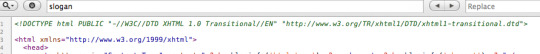
When I was younger, I participated quite a bit in CSS forums. Whenever a user had an issue, before we would look at their situation, they HAD to perform two things first:
Validate the CSS file. Fix any necessary errors. Add a doctype. "The DOCTYPE goes before the opening html tag at the top of the page and tells the browser whether the page contains HTML, XHTML, or a mix of both, so that it can correctly interpret the markup."
Most of us choose between four different doctypes when creating new websites.
http://www.w3.org/TR/html4/strict.dtd">
http://www.w3.org/TR/html4/loose.dtd">
http://www.w3.org/TR/xhtml1/DTD/xhtml1-transitional.dtd">
http://www.w3.org/TR/xhtml1/DTD/xhtml1-strict.dtd">
There's a big debate currently going on about the correct choice here. At one point, it was considered to be best practice to use the XHTML Strict version. However, after some research, it was realized that most browsers revert back to regular HTML when interpretting it. For that reason, many have chosen to use HTML 4.01 Strict instead. The bottom line is that any of these will keep you in check. Do some research and make up your own mind.
3: Never Use Inline Styles When you're hard at work on your markup, sometimes it can be tempting to take the easy route and sneak in a bit of styling.
1 <p style="color: red;">I'm going to make this text red so that it really stands out and makes people take notice! </p> Sure -- it looks harmless enough. However, this points to an error in your coding practices.
When creating your markup, don't even think about the styling yet. You only begin adding styles once the page has been completely coded. It's like crossing the streams in Ghostbusters. It's just not a good idea. -Chris Coyier (in reference to something completely unrelated.)
Instead, finish your markup, and then reference that P tag from your external stylesheet.
Better 1 #someElement > p { 2 color: red; 3 } 4: Place all External CSS Files Within the Head Tag Technically, you can place stylesheets anywhere you like. However, the HTML specification recommends that they be placed within the document HEAD tag. The primary benefit is that your pages will seemingly load faster.
While researching performance at Yahoo!, we discovered that moving stylesheets to the document HEAD makes pages appear to be loading faster. This is because putting stylesheets in the HEAD allows the page to render progressively. - ySlow Team
1 <head> 2 <title>My Favorites Kinds of Corn</title> 3 <link rel="stylesheet" type="text/css" media="screen" href="path/to/file.css" /> 4 <link rel="stylesheet" type="text/css" media="screen" href="path/to
/anotherFile.css" />
5 </head> 5: Consider Placing Javascript Files at the Bottom Place JS at bottom Remember -- the primary goal is to make the page load as quickly as possible for the user. When loading a script, the browser can't continue on until the entire file has been loaded. Thus, the user will have to wait longer before noticing any progress.
If you have JS files whose only purpose is to add functionality -- for example, after a button is clicked -- go ahead and place those files at the bottom, just before the closing body tag. This is absolutely a best practice.
Better
<p>And now you know my favorite kinds of corn. </p>
<script type="text/javascript" src="path/to/file.js"></script>
<script type="text/javascript" src="path/to/anotherFile.js"></script>
</body>
</html>
6: Never Use Inline Javascript. It's not 1996! Another common practice years ago was to place JS commands directly within tags. This was very common with simple image galleries. Essentially, a "onclick" attribute was appended to the tag. The value would then be equal to some JS procedure. Needless to say, you should never, ever do this. Instead, transfer this code to an external JS file and use "addEventListener/attachEvent" to "listen" for your desired event. Or, if using a framework like jQuery, just use the "click" method.
$('a#moreCornInfoLink').click(function() { alert('Want to learn more about corn?'); }); 7: Validate Continuously validate continuously I recently blogged about how the idea of validation has been completely misconstrued by those who don't completely understand its purpose. As I mention in the article, "validation should work for you, not against."
However, especially when first getting started, I highly recommend that you download the Web Developer Toolbar and use the "Validate HTML" and "Validate CSS" options continuously. While CSS is a somewhat easy to language to learn, it can also make you tear your hair out. As you'll find, many times, it's your shabby markup that's causing that strange whitespace issue on the page. Validate, validate, validate.
8: Download Firebug download firebug I can't recommend this one enough. Firebug is, without doubt, the best plugin you'll ever use when creating websites. Not only does it provide incredible Javascript debugging, but you'll also learn how to pinpoint which elements are inheriting that extra padding that you were unaware of. Download it!
9: Use Firebug! use firebug From my experiences, many users only take advantage of about 20% of Firebug's capabilities. You're truly doing yourself a disservice. Take a couple hours and scour the web for every worthy tutorial you can find on the subject.
Resources Overview of Firebug Debug Javascript With Firebug - video tutorial 10: Keep Your Tag Names Lowercase Technically, you can get away with capitalizing your tag names.
<DIV>
<P>Here's an interesting fact about corn. </P>
</DIV>
Having said that, please don't. It serves no purpose and hurts my eyes -- not to mention the fact that it reminds me of Microsoft Word's html function!
Better
<div>
<p>Here's an interesting fact about corn. </p>
</div>
11: Use H1 - H6 Tags Admittedly, this is something I tend to slack on. It's best practice to use all six of these tags. If I'm honest, I usually only implement the top four; but I'm working on it! :) For semantic and SEO reasons, force yourself to replace that P tag with an H6 when appropriate.
1 2 <h1>This is a really important corn fact! </h1> <h6>Small, but still significant corn fact goes here. </h6> 12: If Building a Blog, Save the H1 for the Article Title h1 saved for title of article Just this morning, on Twitter, I asked our followers whether they felt it was smartest to place the H1 tag as the logo, or to instead use it as the article's title. Around 80% of the returned tweets were in favor of the latter method.
As with anything, determine what's best for your own website. However, if building a blog, I'd recommend that you save your H1 tags for your article title. For SEO purposes, this is a better practice - in my opinion.
13: Download ySlow
download yslow Especially in the last few years, the Yahoo team has been doing some really great work in our field. Not too long ago, they released an extension for Firebug called ySlow. When activated, it will analyze the given website and return a "report card" of sorts which details the areas where your site needs improvement. It can be a bit harsh, but it's all for the greater good. I highly recommend it.
14: Wrap Navigation with an Unordered List Wrap navigation with unordered lists Each and every website has a navigation section of some sort. While you can definitely get away with formatting it like so:
<div id="nav"> <a href="#">Home </a> <a href="#">About </a> <a href="#">Contact </a> </div> I'd encourage you not to use this method, for semantic reasons. Your job is to write the best possible code that you're capable of.
Why would we style a list of navigation links with anything other than an unordered LIST?
The UL tag is meant to contain a list of items.
Better <ul id="nav"> <li><a href="#">Home</a></li> <li><a href="#">About</a></li> <li><a href="#">Contact</a></li> </ul> 15: Learn How to Target IE You'll undoubtedly find yourself screaming at IE during some point or another. It's actually become a bonding experience for the community. When I read on Twitter how one of my buddies is battling the forces of IE, I just smile and think, "I know how you feel, pal."
The first step, once you've completed your primary CSS file, is to create a unique "ie.css" file. You can then reference it only for IE by using the following code.
<!--[if lt IE 7]> <link rel="stylesheet" type="text/css" media="screen" href="path/to/ie.css" /> <![endif]--> This code says, "If the user's browser is Internet Explorer 6 or lower, import this stylesheet. Otherwise, do nothing." If you need to compensate for IE7 as well, simply replace "lt" with "lte" (less than or equal to).
16: Choose a Great Code Editor choose a great code editor Whether you're on Windows or a Mac, there are plenty of fantastic code editors that will work wonderfully for you. Personally, I have a Mac and PC side-by-side that I use throughout my day. As a result, I've developed a pretty good knowledge of what's available. Here are my top choices/recommendations in order:
Mac Lovers Coda Espresso TextMate Aptana DreamWeaver CS4 PC Lovers InType E-Text Editor Notepad++ Aptana Dreamweaver CS4 17: Once the Website is Complete, Compress! Compress By zipping your CSS and Javascript files, you can reduce the size of each file by a substantial 25% or so. Please don't bother doing this while still in development. However, once the site is, more-or-less, complete, utilize a few online compression programs to save yourself some bandwidth.
Javascript Compression Services Javascript Compressor JS Compressor CSS Compression Services CSS Optimiser CSS Compressor Clean CSS 18: Cut, Cut, Cut cut cut cut Looking back on my first website, I must have had a SEVERE case of divitis. Your natural instinct is to safely wrap each paragraph with a div, and then wrap it with one more div for good measure. As you'll quickly learn, this is highly inefficient.
Once you've completed your markup, go over it two more times and find ways to reduce the number of elements on the page. Does that UL really need its own wrapping div? I think not.
Just as the key to writing is to "cut, cut, cut," the same holds true for your markup.
19: All Images Require "Alt" Attributes It's easy to ignore the necessity for alt attributes within image tags. Nevertheless, it's very important, for accessibility and validation reasons, that you take an extra moment to fill these sections in.
Bad 1 <IMG SRC="cornImage.jpg" /> Better 1 <img src="cornImage.jpg" alt="A corn field I visited." /> 20: Stay up Late I highly doubt that I'm the only one who, at one point while learning, looked up and realized that I was in a pitch-dark room well into the early, early morning. If you've found yourself in a similar situation, rest assured that you've chosen the right field.
The amazing "AHHA" moments, at least for me, always occur late at night. This was the case when I first began to understand exactly what Javascript closures were. It's a great feeling that you need to experience, if you haven't already.
21: View Source view source What better way to learn HTML than to copy your heroes? Initially, we're all copiers! Then slowly, you begin to develop your own styles/methods. So visit the websites of those you respect. How did they code this and that section? Learn and copy from them. We all did it, and you should too. (Don't steal the design; just learn from the coding style.)
Notice any cool Javascript effects that you'd like to learn? It's likely that he's using a plugin to accomplish the effect. View the source and search the HEAD tag for the name of the script. Then Google it and implement it into your own site! Yay.
22: Style ALL Elements This best practice is especially true when designing for clients. Just because you haven't use a blockquote doesn't mean that the client won't. Never use ordered lists? That doesn't mean he won't! Do yourself a service and create a special page specifically to show off the styling of every element: ul, ol, p, h1-h6, blockquotes, etc.
23: Use Twitter Use Twitter Lately, I can't turn on the TV without hearing a reference to Twitter; it's really become rather obnoxious. I don't have a desire to listen to Larry King advertise his Twitter account - which we all know he doesn't manually update. Yay for assistants! Also, how many moms signed up for accounts after Oprah's approval? We can only long for the day when it was just a few of us who were aware of the service and its "water cooler" potential.
Initially, the idea behind Twitter was to post "what you were doing." Though this still holds true to a small extent, it's become much more of a networking tool in our industry. If a web dev writer that I admire posts a link to an article he found interesting, you better believe that I'm going to check it out as well - and you should too! This is the reason why sites like Digg are quickly becoming more and more nervous.
Twitter Snippet If you just signed up, don't forget to follow us: NETTUTS.
24: Learn Photoshop Learn Photoshop A recent commenter on Nettuts+ attacked us for posting a few recommendations from Psdtuts+. He argued that Photoshop tutorials have no business on a web development blog. I'm not sure about him, but Photoshop is open pretty much 24/7 on my computer.
In fact, Photoshop may very well become the more important tool you have. Once you've learned HTML and CSS, I would personally recommend that you then learn as many Photoshop techniques as possible.
Visit the Videos section at Psdtuts+ Fork over $25 to sign up for a one-month membership to Lynda.com. Watch every video you can find. Enjoy the "You Suck at Photoshop" series. Take a few hours to memorize as many PS keyboard shortcuts as you can. 25: Learn Each HTML Tag There are literally dozens of HTML tags that you won't come across every day. Nevertheless, that doesn't mean you shouldn't learn them! Are you familiar with the "abbr" tag? What about "cite"? These two alone deserve a spot in your tool-chest. Learn all of them!
By the way, in case you're unfamiliar with the two listed above:
abbr does pretty much what you'd expect. It refers to an abbreviation. "Blvd" could be wrapped in a <abbr> tag because it's an abbreviation for "boulevard". cite is used to reference the title of some work. For example, if you reference this article on your own blog, you could put "30 HTML Best Practices for Beginners" within a <cite> tag. Note that it shouldn't be used to reference the author of a quote. This is a common misconception. 26: Participate in the Community Just as sites like ours contributes greatly to further a web developer's knowledge, you should too! Finally figured out how to float your elements correctly? Make a blog posting to teach others how. There will always be those with less experience than you. Not only will you be contributing to the community, but you'll also teach yourself. Ever notice how you don't truly understand something until you're forced to teach it?
27: Use a CSS Reset This is another area that's been debated to death. CSS resets: to use or not to use; that is the question. If I were to offer my own personal advice, I'd 100% recommend that you create your own reset file. Begin by downloading a popular one, like Eric Meyer's, and then slowly, as you learn more, begin to modify it into your own. If you don't do this, you won't truly understand why your list items are receiving that extra bit of padding when you didn't specify it anywhere in your CSS file. Save yourself the anger and reset everything! This one should get you started.
html, body, div, span, h1, h2, h3, h4, h5, h6, p, blockquote, pre, a, abbr, acronym, address, big, cite, code, img, ins, kbd, q, s, samp, small, strike, strong, dl, dt, dd, ol, ul, li, fieldset, form, label, legend, table, caption, tbody, tfoot, thead, tr, th, td { margin: 0; padding: 0; border: 0; outline: 0; font-size: 100%; vertical-align: baseline; background: transparent; } body { line-height: 1; } ol, ul { list-style: none; } blockquote, q { quotes: none; } blockquote:before, blockquote:after, q:before, q:after { content: ''; content: none; }
table { border-collapse: collapse; border-spacing: 0; } 28: Line 'em Up!
Line em up Generally speaking, you should strive to line up your elements as best as possible. Take a look at you favorite designs. Did you notice how each heading, icon, paragraph, and logo lines up with something else on the page? Not doing this is one of the biggest signs of a beginner. Think of it this way: If I ask why you placed an element in that spot, you should be able to give me an exact reason.
Advertisement 29: Slice a PSD Slice a PSD Okay, so you've gained a solid grasp of HTML, CSS, and Photoshop. The next step is to convert your first PSD into a working website. Don't worry; it's not as tough as you might think. I can't think of a better way to put your skills to the test. If you need assistance, review these in depth video tutorials that show you exactly how to get the job done.
Slice and Dice that PSD From PSD to HTML/CSS 30: Don't Use a Framework...Yet Frameworks, whether they be for Javascript or CSS are fantastic; but please don't use them when first getting started. Though it could be argued that jQuery and Javascript can be learned simultaneously, the same can't be made for CSS. I've personally promoted the 960 CSS Framework, and use it often. Having said that, if you're still in the process of learning CSS -- meaning the first year -- you'll only make yourself more confused if you use one.
CSS frameworks are for experienced developers who want to save themselves a bit of time. They're not for beginners.
Original article source here : https://code.tutsplus.com/tutorials/30-html-best-practices-for-beginners--net-4957
1 note
·
View note
Text
End of August
My work out routine and relationship kinda both took hits this past week as I’m PMSing. I’ve been feeling more fatigued and therefore haven’t been in the mood to work out (as I read my old post it sounds like I was so enthusiastic). Instead of using dumbbells, I recently did more cardio and did dance workouts which are actually quite fun. It forces me to move my body quickly and tests my range of motions.
Work has been dead, I feel less productive and bored. I like the work that I do, I just don’t like the confinement of office job. I listened to a podcast about bullshit jobs recently- jobs that if the employee suddenly disappears the next day, there wouldn’t be a difference. Apparently a lot of office workers and corporate lawyers feel this way. Our system has grown to be more extensive and complicated, to create unnecessary jobs for our population and to make seemingly easy tasks harder to reach so there could be a middleman (new job). I feel like my job is only important during some seasons of the year. Also discussed in the podcast is how there’s uncertainty in employees to be open about the amount of free time to colleagues and superiors. I don’t talk about what I actually do (or don’t do) at work to most people, just my close work friends. There’s also that struggle of needing to “look busy” without actually dedicating time to what you would actually be doing if no one was around. More exciting things at work to look forward to are: tomorrow’s meeting about resident union agreement, and program coordinators retreat.
A stranger messaged me yesterday on LinkedIn because she saw that I completed a UX/UI course at UCLA and she wanted to get my opinions on it. I stalked her profile and saw that she graduated college a year after I did, and has been in a similar Admin Assistant path while dabbling in other fields. And similar to me, she reached out to a few people and researched as much as she could to see if the class would be worth it and prepare her for a career change. I told her simply, you get what you put into it. During the time my course ended was the time I was learning a lot of new things at work. I ended up choosing HR. Now that It’s slowing down, I’m getting back to UX/UI and coding. I looked at some of my classmates’ LinkedIn profiles to see where they’re at. I think 2 or 3 have good UX/UI related jobs now. The other ones who I thought were more skilled, are still doing freelance. So then I thought, it’s the ones who are good looking and are confident who get ahead, and the whole “fake it til you make it” is real. After being in slow paced office jobs for most of my working career, I definitely feel like I don’t belong with real professionals. I realize that the less productive I feel at work, the less competent, intelligent and skilled I also feel. At this point, I’m almost scared of productivity and contribution in a career because of how different it is.
This led me to listen to an ABG podcast about imposter syndrome, both in professional and personal lives. The hosts are three yuppie Asian American females in high/high-ish paying jobs. One of them is actually in UX/UI as well. They noted that at least 75% of people experience this, and it’s more common or felt more heavily in females. I think Asians who also grow up with the notion of never being enough or always having to improve are also prone to this. They also tied imposter syndrome to dating life, as one of the girls mentioned she questioned why this well sought after guy back in college wanted to date her. She also spoke about struggles of not being as gorgeous as other girls so she makes up for it by doing well in her career and in personality and hanging out with other smart and attractive women. One new term I learned was cheerleader effect/group attractiveness effect, meaning if you are in a group of attractive girls, you’re most likely regarded as attractive too (until they single you out and see that you’re actually not as hot LOL).
I’ve also been listening to hey bitch podcast by the girls from the JK family. They’re more crude and funnier and talk about things without filters- which reminds me of how the ladies at my workplace can be. It’s nice because I feel like I have a funny and empowering group of female friends to accompany me on my drive home to work/home. Their perspectives are also drastically different as they come from various backgrounds, so I enjoy that as well- instead of listening to just other Asian girls talk lol.
So, I’m okay at HTML and CSS for the most part. I recently started watching ilovecoding videos by this guy named Aziz. So far he’s been really great at explaining concepts and the bigger picture of how to even begin/which field to concentrate on. He emphasized that JS can be applied to multiple fields to I thought I should start there. I bought a JS book to learn on my own, which will be arriving today. I bought an iMac that will also be arriving today, since I don’t like coding on my 13 inch laptop.
It took a weekend and a fight on each day (Fri-Sun) to get here, but Matt and I finally booked our flights for our November trip. We decided on London (4 nights) and Amsterdam (2 nights). Again, that combination of me PMSing and him being stressed out is not good. However, he’s becoming more and more stressed out than he was as he has a test this week and a bigger all day test next week for which he hasn’t really studied for. He became really moody and “bipolar” at times. He took his stress out on me when things didn’t go his way. We both felt that we do more for the relationship than the other. He talked about it in relative terms because the amount of effort he puts in given his schedule/lack of time and energy is tenfold. However, he admits that in absolute terms, I probably do more. We also take each other for granted in ways we don’t really know about. He tends to initiate more (calls, facetime), drive the conversation more, introduce crazy, future-oriented ideas like moving in together and overseas traveling. I think if a car symbolized our relationship, he handles the wheel, and I keep the engine going. On Friday night after our talk, he didn’t text me to tell me goodnight which he always does (via phone or text). I realized then that these little things (keeping me up to date when he gets off work, going home, going to sleep, etc) are thought and care on his part that I take for granted.
I also realized that he doesn’t talk to anybody the way he talks to me. He only texts his friends back at home sometimes, and only talks to family about practical things. He doesn’t hang out with anyone outside of the hospital. Literally. So I think at least 60-70% of his socializing (outside of professional interaction) is with me. I think it’s reached a point of concern because he doesn’t really have a way to destress with other humans (or by himself) and I have to end up eating his stress. And it can’t be all on me, as I can’t offer that much over the phone either. We’re here to navigate residency together. He’s currently 2 months in. His dad said simply “don’t worry, you’ll get adjusted in 6 months”. Even with residency application related things, he asks me for help. For example, headshots and requesting letters of recommendations. I can look online for advice and try my best to help, but I’m also thinking like “you’re asking the wrong person”. Luckily, I email with a lot of residents/doctors at my job so I have an idea of what they’re like. Too easily, I would be like, “why don’t you ask your co-resident/doctor friends?”, to which he says “oh yeah” but doesn’t actually do I think because he respects their time and thinks asking them for help will be a nuisance (which may be true).
September will be a busy month for fun. Upcoming events include:
- Mammoth Lakes/Yosemite
- Hearst Castle family trip
- Cambodia town film festival
- Paint night at a friend’s place
- New York
- Alive & Running 5k
- Jimmy O’Yang stand up comedy show
0 notes
Text
In Search of a Stack That Monitors the Quality and Complexity of CSS
Many developers write about how to maintain a CSS codebase, yet not a lot of them write about how they measure the quality of that codebase. Sure, we have excellent linters like StyleLint and CSSLint, but they only help at preventing mistakes at a micro level. Using a wrong color notation, adding a vendor prefix when you’re already using Autoprefixer, writing a selector in an inconsistent way... that kind of thing.
We’re constantly looking for ways to improve the way we write CSS: OOCSS, SMACSS, ITCSS, utility-first and more. But where other development communities seem to have progressed from just linters to tools like SonarQube and PHP Mess Detector, the CSS community still lacks tooling for deeper inspection than shallow lint rules. For that reason I have created Project Wallace, a suite of tools for inspecting and enforcing CSS quality.
What is Project Wallace?
At the core, Project Wallace is a group of tools that includes a command line interface, linter, analysis, and reporting
Here’s a quick rundown of those tools.
Command Line Interface
This lets you run CSS analytics on the command line and get statistics for any CSS that you feed it.
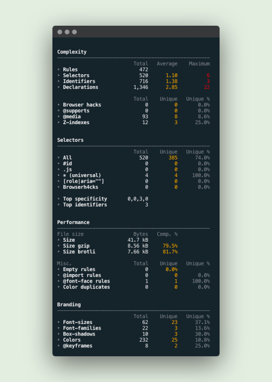
Example output for projectwallace.com
Constyble Linter
This is a linter designed specifically for CSS. Based on the analytics that Wallace generates, you can set thresholds that should not be exceeded. For example, a single CSS rule should not contain more than 10 selectors, or the average selector complexity should not be higher than three.
Analysis
Extract-CSS does exactly what the name says: Extract all the CSS from a webpage, so we can send it over to projectwallace.com for analysis.
Reporting
All analysis from Extract CSS is sent over to projectwallace.com where a dashboard contains all of the reporting of that data. It’s similar to CSS Stats, but it tracks more metrics and stores the results over time and shows them in a dashboard. It also shows the differences between to points in time, and many, many more features.
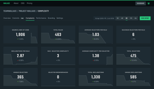
A complexity analysis generated by projectwallace.com
Analyzing CSS complexity
There aren’t many articles about CSS complexity but the one that Harry Roberts (csswizardry) wrote got stuck in my brain. The gist of it is that every CSS selector is basically a bunch of if-statements, which reminded me of taking computer science courses where I had to manually calculate cyclomatic complexity for methods. Harry’s article made perfect sense to me in the sense that we can write a module that calculates the complexity of a CSS selector — not to be confused with specificity, of course, because that’s a whole different can of worms when it comes to complexity.
Basically, complexity in CSS can appear in many forms, but here are the ones that I pay closest attention to when auditing a codebase:
The cyclomatic complexity of CSS selectors
Every part of a selector means another if-statement for the browser. Longer selectors are more complex than shorter ones. They are harder to debug, slower to parse for the browser and harder to override.
.my-selector {} /* 1 identifier */ .my #super [complex^="selector"] > with ~ many :identifiers {} /* 6 identifiers */
Declarations per ruleset (cohesion)
A ruleset with many declarations is more complex than a ruleset with a few declarations. The popularity of functional CSS frameworks like Tailwind and Tachyons is probably due to the relative "simplicity" of the CSS itself.
/* 1 rule, 1 declaration => cohesion = 1 */ .text-center { text-align: center; } /* 1 rule, 8 declarations => cohesion = (1 / 8) = 0.125 */ .button { background-color: blue; color: white; padding: 1em; border: 1px solid; display: inline-block; font-size: normal; font-weight: bold; text-decoration: none; }
The number of source code lines
More code means more complexity. Every line of code that is written needs to be maintained and, as such, is included in the reporting.
Average selectors per rule
A rule usually contains 1 selector, but sometimes there are more. That makes it hard to delete certain parts of the CSS, making it more complex.
All of these metrics can be linted with Constyble, the CSS complexity linter that Project Wallace uses in its stack. After you’ve defined a baseline for your metrics, it’s a matter of installing Constyble and setting up a config file. Here’s an example of a config file that I’ve pulled directly from the Constyble readme file:
{ // Do not exceed 4095 selectors, otherwise IE9 will drop any subsequent rules "selectors.total": 4095, // We don't want ID selectors "selectors.id.total": 0, // If any other color than these appears, report an error! "values.colors.unique": ["#fff", "#000"] }
The cool part is that Constyble runs on your final CSS, so it does its thing only after all of your preprocessed work from Sass, Less, PostCSS or whatever you use. That way, we can do smart checks for the total amount of selectors or average selector complexity — and just like any linter, you can make this part of a build step where your build fails if there are any issues.
Takeaways from using Project Wallace
After using Project Wallace for a while now, I’ve found that it’s great for tracking complexity. But while it is mainly designed to do that, it’s also a great way to find subtle bugs in your CSS that linters may not find because of they’re checking preprocessed code. Here’s a couple of interesting things that I found:
I’ve stopped counting the amount of user stories in our sprints where we had to fix inconsistent colors on a website. Projects that are several years old and people entering and leaving the company: it’s a recipe for getting each and every brand color wrong on a website. Luckily, we implemented Constyble and Project Wallace to get stakeholder buy-in, because we were able to proof that the branding for our customer was spot on for newer projects. Constyble stops us from adding colors that are not in the styleguide.

A color graph proving that our color game is spot on. Only a handful of colors and only those that originate from the client’s styleguide or in the codebase.
I have installed Project Wallace webhooks at all the projects that I worked on at one of my former employers. Any time that new CSS is added to a project, it sends the CSS over to projectwallace.com and it’s immediately visible in the projects’ dashboard. This makes it pretty easy to spot when a particular selector of media query was added to the CSS.
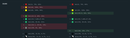
"Hey, where did that orange go?" An example diff from projectwallace.com.
The CSS-Tricks redesign earlier this year meant a massive drop in complexity and filesize. Redesigns are awesome to analyze. It gives you the opportunity to take a small peek behind the scenes and figure out what and how the authors changed their CSS. Seeing what parts didn’t work for the site and new parts that do might teach you a thing or two about how rapidly CSS is moving forward.
A large international company based in the Netherlands once had more than 4,095 selectors in a single CSS file. I knew that they were growing aggressively in upcoming markets and that they had to support Internet Explorer 8+. IE9 stops reading all CSS after 4,095 selectors and so a good chunk of their CSS wasn’t applied in old IE browsers. I sent them an email and they verified the issue and fixed it right away by splitting the CSS into two files.
GitLab currently uses more than 70 unique font sizes. I’m pretty sure their typography system is complex, but this seems a little overly ambitious. Maybe it is because of some third party CSS, but that’s hard to tell.

A subset of the 70+ unique font-sizes used at GitLab.
When inheriting a project from other developers, I take a look at the CSS analytics just to get a feel about the difficult bits of the project. Did they use !important a lot? Is the average ruleset size comprehensible, or did they throw 20+ declarations at each one of them? What is the average selector length, will they be hard to override? Not having to resort to .complex-selector-override\[class\][class][class]...[class] would be nice.
A neat trick for checking that your minification works is to let Constyble check that the Lines of Code metric is not larger than 1. CSS minification means that all CSS is put on a single line, so the Lines of Code should be equal to 1!
A thing that kept happening in another project of mine was that the minification broke down. I had no idea, until a Project Wallace diff showed me how a bunch of colors were suddenly written like #aaaaaa instead of #aaa. This isn’t a bad thing necessarily, but it happened for so many colors at the same time, that something had to be out of order. A quick investigation showed me that I made a mistake in the minification.
StackOverflow has four unique ways of writing the color white. This isn’t necessarily a bad thing, but it may be an indication of a broken CSS minifier or inconsistencies in the design system.
Facebook.com has more than 650 unique colors) in their CSS. A broken design system is starting to sound like a possibility for them, too.
A project for a former employer of mine showed input[type=checkbox]:checked+.label input[type=radio]+label:focus:after as the most complex selector. After inspecting carefully, we saw that this selector targets an input nested in another input. That’s not possible to do in HTML, and we figured that we must have forgotten a comma in our CSS. No linter warned us there.
Nesting in CSS preprocessors is cool, but can lead to buggy things, like @media (max-width: 670px) and (max-width: 670px), as I found in Syntax.fm.
This is the tip of the iceberg when it comes to Project Wallace. There is so much more to learn and discover once you start analyzing your CSS. Don’t just look at your own statistics, but also look at what others are doing.
I have used my Constyble configs as a conversation piece with less experienced developers to explain why their build failed on complex chunks of CSS. Talking with other developers about why we’re avoiding or promoting certain ways of writing CSS is helpful in transferring knowledge. And it helps me keep my feet on the ground too. Having to explain something that I’ve been doing for years to a PHP developer who just wanted to help out makes me re-think why I’m doing things the way I do.
My goal is not to tell anyone what is right or what is wrong in CSS, but to create the tools so that you can verify what works for you and your peers. Project Wallace is here to help us make sense of the CSS that we write.
The post In Search of a Stack That Monitors the Quality and Complexity of CSS appeared first on CSS-Tricks.
In Search of a Stack That Monitors the Quality and Complexity of CSS published first on https://deskbysnafu.tumblr.com/
0 notes
Photo

Using the web on a 50 MB budget
#402 — July 31, 2019
Read on the Web
Frontend Focus

I Used The Web For A Day On A 50 MB Budget — Data can be prohibitively costly, especially in developing countries. Chris Ashton puts himself in the shoes of someone on a tight ‘data budget’ and offers (a lot of) practical tips for reducing our own sites’ footprint. There is genuinely a lot of useful stuff in this post — read it! (And I might be showing my age here but I remember when aiming for 30KB total was a thing..!)
Chris Ashton
Form Design: From Zero to Hero All in One Blog Post — A quick and to-the-point guide for designing forms that “everyone can use and complete as quickly as possible”.
Adam Silver
Image & Video Management Made for Front-End Developers — Simplify and automate the process of uploading, manipulating, optimizing, and delivering images and videos across every device at any bandwidth. Try Cloudinary. See how easy media management can be. Get your own free account today.
Cloudinary sponsor
The Real 'Dark Web': The Quiet Majority of Web Developers? — An interesting opinion piece that reflects upon the quiet majority of Web developers, and how the minority of developers using cutting edge tools and techniques are not truly representative.
Charlie Owen
Sites Could Be Liable for Helping Facebook Secretly Track Your Web Browsing, Says EU Court — The argument is that users should have to consent to being tracked with 'Like' buttons.
Adi Robertson
New (US) Bill Would Ban Autoplay Videos and Endless Scrolling — US lawmakers are taking aim at Web-based features that are ‘designed to be addictive.’ Early days, but this could become a commonly discussed topic in years to come.
Makena Kelly
💻 Jobs
Senior UI Designer (Munich) — Shape the product design of the leading digital wealth management FinTech in Europe, located in the heart of Munich.
Scalable Capital GmbH
We’re Trusted by Over 100k Developers to Help Them Find Their Dream Job — Get matched with companies like Apple, Skyscanner and KPMG based on your skills. They apply to you, salary upfront and no recruiters.
hackajob
📙 Articles, Tutorials & Opinion
Creating an Accessible Inline List with Bullets Between Items — Basically a horizontal list with a character between each item, a · bit · like · this.
Artem Sapegin
output: HTML's Native Live Region Element — A look at the output element and it’s suitability for creating a native toast element (plus accessibility considerations and quirks).
Scott O'Hara
▶ Design System Magic with CSS Houdini — A look at how Houdini features can be used in your design systems today.
Samuel Richard
Backend for Frontend – How to Develop Custom SPAs with Tailored API — Need to refresh your software without breaking the business logic on the backend? Introduce the Backend for Frontend.
The Software House sponsor
An Overview of CSS Animation Libraries — A look at the current landscape of CSS animation libraries and how they vary.
Chris Coyier
▶ Writing Tests For CSS Is Possible! Don’t Believe The Rumors — Overcoming “egoprogrammophobia” by writing tests to refactor your CSS.
Gil Taylor
How to Add Flexbox Fallback to CSS Grid — Adding a flexbox fallback to a calendar built with CSS Grid.
Zell Liew
Quick Tip: Responsive Iframes — What you need to do to make an iframe responsive on a website. It’s trickier than it looks and CSS is definitely involved.
Chris Coyier
The State of JavaScript: 2019 and Beyond. Get the Whitepaper
Progress Kendo UI sponsor
Why You Should Definitely Learn How to Use CSS-in-JS
Brent Jackson
🔧 Code, Tools & Resources

A Satisfying Liquid Simulation — Merges WebAssembly and WebGL together. Shake the window about to see it in action. Uses the LiquidFun engine and the regl WebGL library.
Lorenzo Cadamuro
A Web Tool to Create 'Striped Text' and Get Styled Components Code — One of several visual design tools on Components.ai. This one lets you dynamically create a stripy text effect and provides CSS and Styled Components code to use in your apps.
Components.ai
x-autosuggest: Autosuggest Results Based On Input — A JavaScript autosuggest input. Here’s a demo.
Ivan Nikolić
Gradient Magic — A growing gallery of unique CSS Gradients.
Jordan Marshall
🗓 Upcoming Events
WebAIM: Web Accessibility Training, August 13-14 — Logan, Utah — Covers everything from basic web accessibility principles to advanced accessibility techniques.
Front Conference, August 29-30 — Zurich, Switzerland — A two-day double-track conference for everyone involved from concept to implementation.
Web Unleashed 2019, September 13-14 — Toronto, Canada — Covers a variety of front-end topics leaving you 'informed, challenged and inspired'.
CSSConf, September 25 — Budapest, Hungary — A community conference dedicated to the designers and developers who love CSS.
🐦 ...and finally

A good reminder that it's always worth knowing about the actual technology you're using as well as the interfaces to it. A bit like knowing how to add by hand as well as how to use a calculator..
by via Frontend Focus https://ift.tt/2LTdNJi
0 notes
Text
Goodbye Judas
Or, A Theme I Notice I Love
I have weird Unemployment Restlessness right now, and so I have been piddling at many things such as pointlessly organizing my tumblr things in a behind the scenes way that literally no one cares about. I was trying to find a theme to maybe switch to, then started to work on one myself. Now I’m getting too damn tried to continue for now, but while I was thinking about what feel I wanted for my theme an the fiction I’ve been enjoying most-recently, I was kind of caught on two of my favorite lines from stuff right now. One is from my long-time and probably all-time love, Doctor Who, while the other is from Wonder Woman, the thing I didn’t even expect to like. Then, I was reminded of something else, too.
I have skipped around Doctor Who this year. I still haven’t seen what seemed to be the thematic pin for the season, Extremis. (I got really behind and skipped to TDF, and I’ll catch up later.) But a friend of mine in the roleplaying community pointed ou the quote to me around the time it aired, and it was echoed literally and thematically in The Doctor Falls. The quote that the theme of this season centers around is:
Only in darkness are we revealed. [...] Goodness is not goodness that seeks advantage. Good is good in the final hour, in the deepest pit, without hope, without witness, without reward. Virtue is only virtue in extremis.
Then, my new love, Wonder Woman had Diana learning a hard lesson through experience that, while not the same, complements this very well, in my opinion. Steve Trevor puts it into words when he says:
It’s not about ‘deserve.’ It’s about what you believe.
I say he put it into words, but that doesn’t mean he’s the only one getting the idea. Steve is great and here’s a Mary Sue article chewing over gender equality and Wonder Woman. But the point here is, Diana sort of sees and already knows the lesson she has to learn, in some ways, before she ever enters the world of men. Her character arc has a lot to do with learning how to accept and deal with that lesson. No matter what inspiring genesis of humanity story she believes, that anyone believes, whether it is true or whether it’s not, one can only look to it as one facet of where we are now. Even if we believe that humans were created to be good, to love, and to be just, we must accept that we have taken on many traits that are at odds with that fact.
Diana, in her innocence and optimism, wanted to believe that the negative, horrible traits she was seeing in humanity (and men in particular) were caused by the influence of the God of War. That made things neat, tidy, and gave a particular, singular thing to blame and to destroy in order to save the world. However, she must come to terms with the fact that there is no simple way to put things back the way they once might have been. Hippolyta (I think) warns Diana that men are easily corrupted. No matter what the original, pure potential might have been, the fact is that war and evil have found their way into the hearts of humans. But the hope remains that, at their core, they may have well been created with a better and higher purpose. And that belief, that love should win, even when it doesn’t, is what becomes Diana’s banner in the end.
And while I was sort of meditating on this while trying to figure out the mysteries of HTML and CSS, something I hadn’t even thought about in a while came to mind. If you’re a long-time mutual, you know that in 2015, I got really into Fate/stay night: Unlimited Blade Works. It’s available on Netflix and good, part of a much larger, mind-bogglingly and stupidly complicated thing (universe?) called Type Moon, which consumed me in good ways and bad. In some ways, as a result of fandom experience and prejudice, I kind of quickly left behind the particular installment that hooked me into this network of stories in the first place.
I don’t want to spoil the Big Twists of UBW, in the off-chance a person who hasn’t seen it wants to watch it, since it is my good guess that of the three stories I am referencing in this post, Fate is the least likely most of my followers will have consumed. Because anime, and stuff. But I know some of you have or at least have a functional knowledge of what I’m talking about, so I am just talking about this because it really pricked a little scab, in a good way. In so many stupid, awful ways, 2016 was a trying year for me that made the things I loved feel like burdens, like chores, and like there was no real meaning but distraction behind them. I hate that, and this little moment I’m having has kind of revivified something I lost in the muck. It’s really strange, how good it can feel to just feel like you found a link to fuse past-you to present-you that feels good rather than like a weight of regret and embarrassment. And this is one of those things for me, realizing that 2015 me valued the same lesson that now-me is so enchanted with and trying to take to heart.
I won’t summarize Fate UBW because I’d be here for another thousand words. But I will suffice to say that its male protagonist, Emiya Shirou, is intended by the creator to be a critique of the typical shounen hero, common to anime anime at teenage boys. He experienced a great trauma as a child of which he was the sole survivor, rescued by one of the catalysts of that trauma and raised by him. Being raised by his father-figure-savior, he wants to become just like him because of the joy he saw on this man’s face when he saved him. Shirou, on the surface, seems pretty normal, but he basically was allowed to respond to his trauma by living vicariously, unchecked. He functions as a dutiful, typical exampleo f the above trope in pretty much all ways, prior to his involvement in The Plot as it pertains to him.
He carries a certain self-spun ideology with him into The Plot. If you need a pointer, i will cheekily describe it as The Hunger Games with Mythical Heroes and Witches and Wizards. (They’re called magi in this, so actual fans won’t kill me.) His ideology is that he wants to achieve a world that is fair and just enough that no one will ever need to cry. This brings about a whole heap of trouble of him, both seen and unseen, because he is actually presented as selfless to a fault. For those of you who do know what I am talking about, this is why Unlimited Blade Works feels like the most natural progression to me. In this story, rather than the other two canon-AUs (routes), he actually confronts this and deals with it rather than Option A) Embracing it Fully or Option C) Burn it All Down for My Equally-Needs-Help Girlfriend.
Anyway, in UBW, Shirou’s ultimate confrontation with his ideology is not necessarily what one would think. I don’t speak Japanese, so I cannot be completely sure of the purest import of the line, but when Shirou’s foil is arguing with him about what nonsense all of it is, one subbing ground translated it in a way that I really liked. (And if I’m remembering it correctly, it isn’t the official translation of the line.) He says, in response to the refutation of his ideology:
Just because you are correct doesn’t mean you’re right.
And I just love that, in terms of excessively hedonistic or utilitarian arguments against doing the right thing. Sometimes, even if a person can make a point about why it’s frankly stupid or inefficient to do the right thing, you just do it because it’s kind.
I found a subbed clip of the part I want to quote. If you even think you might watch, don’t watch past 2:00.
For this part to work, to explain what I remembered tonight that makes me feel like there might be some spark of continuity between what has moved me for the past several years, I have to transcribe a conversation. (Again, I’m copying subs, so like, people who understand Japanese forgive me.)
Archer: Hey, that’s Hell you’re walking into. Shirou: This is what you forgot. I admit that at first it was just admiration. But at the heart of it all was a wish. The wish for this hell to be undone. The unfulfilled wish of a man who only wanted to help others, but who lost everything in the end. Archer: Even if that life will be that of a machine? Shirou: Yeah. Even if that life is dripping with hypocrisy. I'll keep striving to be a champion of justice.
And I just love that my mind came back around to this at last. Even if that life is dripping with hypocrisy. That feels like something the Doctor might say. That feels like what Aries tried and failed to shake Diana with. And it just... means a lot to me, as a person, and I hope that I’ll keep learning why and what it means in practice.
By the way, the title of this post is my favorite little line in ‘Last Stardust,’ the song playing in above-linked clip.
#doctor who#wonder woman#fate stay ubw#fate stay series#emiya shirou#conventional blogging tag#archer#mine#mymeta#long post#like a super long post#like you should only read this under three circumstances#circumstance 1: you love me#circumstance 2: you love all three of these fandoms#circumstance 3: you love one or more of the fandoms and are curious about one of the others AND like me rambling about shit
4 notes
·
View notes
Text
First week!
Just wrapped up the first week of my program, and I’m EXHAUSTED. But I’m also still really excited, even though it’s a lot of work being thrown at me and it’s not going to slow down anytime soon. For the first week we covered:
Full-Stack Development (what is it, what does it all mean, what is our particular stack?)
Intro to the terminal/ Git Bash
HTML Syntax
Git concepts and commands
CSS syntax + styles
Floating, positioning, box model
Chrome developer tools (SO GREAT!)
Keep in mind, this was a short week due to President’s Day, so we covered all of that in just four days AND had our first homework assignment due Friday at midnight.

Lucky for me, a lot of these topics I was able to cover myself in the time between leaving my job and class starting. That being said, I’m really glad I’m taking the class instead of trying to go it alone. Having structure, context, and pre-made exercises really helps a lot. For example, I had been using GitHub for my first couple projects before class and I didn’t really understand how to use it or why things were (or weren’t) working. Going through the git process of add, commit, and push, gave me a much clearer understanding of how deploying a project in GitHub works. I wouldn’t say I’m an expert, but after just four days of structured projects using GitHub I feel much more comfortable with it. I’m looking forward to our first group project where I’ll actually be collaborating on code with other people!
Our first assignment was to make a portfolio website, which I had already done. Of course I thought “Oh, I’ve already done this! It’ll be a breeze!”. And while I don’t think I struggled as much as some folks in the class for who this was literally their first introduction to HTML/CSS, it wasn’t as easy as I thought it would be. First of all, the assignment had very specific design specifications, so I couldn’t just jump in and make whatever I wanted. I found working within that restraint to be difficult - somehow it was harder for me to make a website that replicated something that already existed than it was for me to create something from scratch. Secondly, the code for my first website is not very clear or well organized. There’s no readme, I didn’t use comments ANYWHERE, so trying to use it as a frame of reference became very time consuming and, ultimately, not worth it. I’m glad I went through the process of making another website because I learned a lot and I’m already refactoring my first website using what I’ve learned.

Overall, I’ve felt really great about the first week. I had a minor freak out because I felt like I was struggling “too much” with the website assignment. After all, I’d already made a website, one that was much more complicated than the assignment was asking for, so I thought it should just be a slam dunk. But it wasn’t, and that’s okay. Actually, that’s great! I learned a lot and that’s what matters.
I’ve spent the weekend looking ahead to week two. Bootstrap is a big focus of the first part of the week, so I’ve spent the weekend reading up on Bootstrap and making some very basic sites. Honestly, right now I don’t love it. In fact, it makes me pretty uncomfortable. I don’t like that I can’t see the code that makes the “magic” happen, and because I’m so new I don’t full understand how to take advantage of that “magic”. Conceptually I know these shortcuts will really come in handy in the future, but right now I’m a bit frustrated because I feel like I could finish the assignment faster NOT using Bootstrap.
BUT! That’s not what the assignment asked for. So I’m going to spend the rest of the weekend learning Bootstrap and hopefully making something cool.
I also started the Wes Bos 30 Days of Javascript! I finished the first project, which was to assign a sound to the keys A S D F G H J K L and when one of those keys was pushed the corresponding sound would happen and the letter would be highlighted on the screen. You can see this project on his GitHub here. It took me about 20 minutes, and was really fun in the process. I learned:
How to use anonymous functions. In the end, Wes has us change the anonymous function to playSound(), but the way he approached the project was different than I had before
Removing transitions after the desired effect has been applied
querySelectorAll and querySelector
It was also the first time I’d had JavaScript interact with HTML/CSS in such a structured way. I did a little bit of that work with my Kitty Bitty Thunderdome site (rock, paper, scissors but with different types of Felines) but that was all on my own and I stumbled through most of it. Codecademy has been great, but so far it’s just been pure JavaScript and not as much of using Javascript with class and id selectors.
Which reminds me! I officially finished Codecademy’s Javascript course! It took me WAY LONGER than I thought it would, but that’s okay. Once things started getting more complicated with classes and methods, I slowed down a lot because I wanted to be sure I understood it all. I think it’s the perfect time to transition to Wes’ 30 Days of Javascript and keep learning, and keep creating. My goal is to start applying this to Kitty Bitty Thunderdome so I can make an actually publishable project (spoiler: it’s not published yet ;)
All in all, I’m celebrating my first week and looking forward to what’s ahead!

**I also got the meta data on my blog page to work properly, so now when I share on LinkedIn it doesn’t just say “weblink” and look really sad! Victories!**
0 notes
Text
Monthly Web Development Update 2/2019: Web Authentication And The Problem With UX
Monthly Web Development Update 2/2019: Web Authentication And The Problem With UX
Anselm Hannemann
2019-02-15T11:42:15+01:002019-02-15T12:04:43+00:00
The only constant in life is change, they say. And it’s true, even if we think nothing changes at all. Whether you notice change or not is only a question of how you perceive and how you observe things. In the tech industry, it’s easy to see how fast things evolve — read a summary article like this one, and you’ll suddenly become aware of how much has happened in just one month. Since I took up meditation again, I gained a new perspective, and it helps me to deliberately appreciate such change and find personal value and gratefulness even in things that didn’t seem particularly positive at first.
Like this week, for example. I was reminded of a fact we usually forget: how the Internet is structured. If you browse the web, most traffic is directed through Amazon at some point, so if you block their servers, — or Google’s or Apple’s, or all of them —, there’s not much left of the Internet. I have used a Pi-Hole DNS blocker in my network for three years now, but never really appreciated it, until I learned about its real value this week — the security and privacy it provides considering our dependency on tech giants. Isn’t it remarkable how a big part of my perceived online security relies on one piece of open-source software that the authors spent so much time and efforts on to provide it for free in the end?
News
Firefox 65 was released. The new version dispatches events on disabled HTML elements and comes with support for the referrerpolicy attribute on script elements, CSS environment variables (the env() function), Intl.RelativeTimeFormat for JavaScript, and WebP images.
Safari Tech Preview 74 brings abortable fetch, support for U2F HID Authenticators on macOS, and new Web Authentication API features.
With Chrome 72, Chrome introduced the User Activation API. The new version also disallows popups on pageunload.
The Chrome 72 update for Android shipped the long-awaited Trusted Web Activity feature, which means we can now distribute PWAs in the Google Play Store.
Safari 12.1 release notes are up (iOS 12.2, macOS 10.14.4). What’s new? Dark mode for the web, intelligent tracking prevention, the push notification prompt for Safari on macOS now requires a user gesture, motion and orientation settings on iOS to enable DeviceMotionEvent and DeviceOrientationEvent (this means it’s disabled by default now). Also new are the Intersection Observer API, Web Share API, and the <datalist> element.
Front-end is messy and complicated these days. That's why we publish articles, printed books and webinars with useful techniques to improve your work. Even better: Smashing Membership with a growing selection of front-end & UX goodies. So you get your work done, better and faster.
Explore Smashing Membership ↬
General
Max Böck shares his thoughts on why simplicity is the most valuable and important thing in projects.
Ian Littman on Twitter: “Moving 50% of servers to PHP 7 from PHP 5 would save $2.5 (edited to 2.0) billion in energy costs per year, and avoid billions of kilograms of CO2 emissions. Upgrade to PHP 7. Save the planet.”
How did you start to learn web development? I guess most of us relied on our browsers’ “view source” functionality and still do. But with JavaScript SPAs and more tooling that mangles, minifies and uglifies sources, we block this road of self-education for countless people out there. Let’s move to a more open approach and at least provide source maps on production servers so that people can access the actual sources via Developer Tools.
UI/UX
What makes the difference between a good digital product and a great digital product? Two letters: UX. User Experience Design. But there’s a fundamental problem with that. Johannes Ippen on why we should see humans, not users.
This is a nice roundup of how popular websites have changed over the past ten years — including Google, YouTube, Amazon, Facebook, Apple, and eBay. You can clearly see that we’re in a different era today.
Colin Eagan sums up the dozens of possibilities we have to personalize a web experience for the user and which of them work and which don’t. He concludes with a valuable piece of advice: to start simple instead of following the cult of complex, no matter how tech-savvy the company and its team are.

To create stellar user experiences we need to see our users as humans. (Image credit)
HTML & SVG
Sara Soueidan wrote a 101 course on SVG filters to help you understand what they are and how to use them to create your own visual effects.
Accessibility
Rob Dodson shares a great summary on how to build better accessibility primitives.
Privacy
Google is one of those companies which always find new, clever ways to expose user location data and sell it to third parties. Now Google wants to sell the exact location data of users to improve planning for urban planners, for example. Useful on the one hand, but still worrying for all users of Google products who might not be aware of what happens with their data.
“I was wrong about Google and Facebook: there’s nothing wrong with them (so say we all),” says Aral Balkan. This piece explains how even the most honorable open-source projects struggle to make ethical choices and the fallacies of offering the best UX instead of promoting ethically correct solutions.
Web Performance
Jens Oliver Meiert shares his research on how the way you write HTML influences performance. Leaving out optional tags and quotes can make a difference, even though we’re able to use gzip or other techniques to optimize the document response in the browser.
JavaScript
With most data breaches happening due to weak and reused passwords, web authentication is a hot topic these days. The new Guide to Web Authentication is an excellent example that a security implementation guide can be beautiful, too.
Mathias Schäfer summarized his lessons learned from maintaining large JS codebases in long-term projects.
Dr. Axel Rauschmayer describes what is still missing in JavaScript and what could be implemented in the future.
Intersection Observer landed in WebKit, and the Webkit team wrote a helpful tutorial for it.

The Guide to Web Authentication is a handy introduction to securing sensitive information online. (Image credit)
CSS
Rik Schennink explains how to use smart CSS to apply styles based on the user scroll position.
It’s incredible how Fabricius Seifert created this Solar System 3D animation with pure CSS.
Preethi Sam explains how to use the little-known CSS element() function to create a minimap navigator.
Roman Komarov shares his approach to a flexible blog layout with an optional sidebar. Made with CSS Grid and Custom Properties.

Explore the solar system in Fabricius Seifert’s fantastic CSS experiment. (Image credit)
Work & Life
Paul Greenberg is in search of lost screen time and explores what our lives could look like and how much more time we’d have if we escaped the screens. There are some revealing numbers in the article: The average American spends $14,000 per decade on smartphones. That’s $70,000 over the course of an average working life. More than 29% of Americans would rather give up sex for three months than give up their smartphone for a single week. Or you could plant 150 trees and buy half an acre of land for the amount of money you’d spent on your smartphone and apps per year.
Are you a patient person? Regardless of if you are or not, the experiment that Jason Fried wants to try is certainly a challenge: Try to pick the longest line at the supermarket, cancel Amazon Prime so that delivery takes longer, and take the chance to wait whenever possible. Embrace slowness.
“In Praise of Extreme Moderation” shares an interesting perspective on why the culture of over-committing, over-working, and over-delivering in all areas of life isn’t healthy, and how we can shift towards a more moderate, calmer path.
Going Beyond…
“It must be free.” On services we obviously don’t need but want to have. My essay about the importance of seeing value in the things we really need and why less is more.
How can we make our lives better? By maintaining essential relationships, avoiding technology, and embracing values instead of lifehacks, says Eric Barker.
Watch this talk of Greta Thunberg, a sixteen-year-old woman who tells all the well-known and influential people out there that she doesn’t care about money and why we need to view climate change from a perspective like hers — her life is in danger and no money will be able to save it. We need more people like her who aren’t led by corporate or financial rules.

(cm)
0 notes
Text
i have a lot of text files called “linkfarm-$TOPIC.md” that’s all links
here’s the last month or so’s worth of links from a growing file called “tab slurry.md” which is where i’ve been saving links (from e-newsletters, rss feeds, and twitter) of things that interest me but i don’t have the time to really really digest thoughtfully:
es218 https://www.bbc.com/worklife/article/20200121-why-procrastination-is-about-managing-emotions-not-time https://github.com/fpereiro/backendlore https://github.com/justinamiller/SoftwareArchitect https://evilmartians.com/chronicles/what-i-learned-as-a-developer-from-accidents-in-space https://github.com/anvaka/city-roads https://uxdesign.cc/burnout-the-ugly-side-of-ux-1a6b436a8f46 https://browserdefaultstyles.com/ ** - default browser styles for html elements https://logobly.com/colors/ https://inkbotdesign.com/futuristic-patterns-in-graphic-design/ https://www.psl.com/feed-posts/psl-studio-kill-xylo https://webflow.com/blog/ux-design-process https://blog.marvelapp.com/holistic-design-system/ https://uxdesign.cc/why-design-systems-fail-and-how-to-make-them-work-in-2020-c1eb89c35aa0es217 https://growth.design/case-studies/morning-brew-newsletter-retention/ https://onezero.medium.com/we-finally-figured-out-who-makes-wikihows-bizarre-art-6c5d69b71347 https://webflow.com/blog/ux-design-process https://digiday.com/media/publishers-planning-end-third-party-cookie/ https://www.booooooom.com/2020/01/22/artist-spotlight-liz-hernandez/ https://cdm.link/2020/01/how-not-to-vj/ https://medium.com/non-fiction/my-airbnb-story-cafb5cd7fcbe https://www.frankchimero.com/blog/2020/burnout-list/ https://uxdesign.cc/invisible-design-systems-7bb7fac53236 https://cdm.link/2020/01/painting-with-eurorack/ https://cdm.link/2019/05/frgtwn-video-art-gear/ https://theoutline.com/post/8589/podcast-ads-are-a-very-hot-media-trend-right-now https://theoutline.com/post/8590/the-myth-of-the-millennial-friendly-city https://blog.dashlane.com/dashlane-rebrand/ https://uxdesign.cc/rediscovering-information-architecture-8f27e5ac6257 https://designshack.net/articles/graphics/what-is-a-lookbook-examples https://www.webdesignerdepot.com/2020/01/how-to-keep-designing-when-tragedy-strikes/ https://theoutline.com/post/8604/jazz-guys-stereotypes-music-genre https://feltinstruments.com/Jasno https://www.awwwards.com/deplace-maison-a-case-study-by-niccolo-miranda.html https://reactnicedates.hernansartorio.com/ https://medium.com/@bluepnume/javascript-tree-shaking-like-a-pro-7bf96e139eb7es216 https://github.com/feathersjs/hooks https://github.com/FormidableLabs/spectacle https://raw.githack.com/FormidableLabs/spectacle/master/one-page.html#/ https://www.jackfranklin.co.uk/blog/letting-tools-make-choices/ https://dev.to/keydunov/d3-dashboard-tutorial-with-cube-js-ehb https://cube.dev/ https://www.jetbrains.com/lp/mono/ 😍 https://designsystemchecklist.com/category/design-language/ https://tiny-helpers.dev/ *** https://github.com/retejs/rete - awesome visual programming lib https://sscaffold-css.com/ - v nice css base lib - https://doc.sscaffold-css.com/ https://d3-dashboard.cube.dev/ - Learn how to build a D3 dashboard with an example in React, Material UI, and Cube.js. https://css-tricks.com/how-to-turn-a-procreate-drawing-into-a-web-animation/ - https://catalin.red/copy-clipboard-js/ https://github.com/rikschennink/fitty https://github.com/jxnblk/microicon/ - svg icon service (for prototyping) https://github.com/jxnblk/microicon/blob/master/icons.md https://palx.jxnblk.com/ ***** - PALX: AUTOMATIC UI COLOR PALETTE GENERATOR Provide a single color value and Palx returns a full-spectrum color palette, well suited for UI design and data visualizations that work harmoniously with brand colors. https://github.com/jxnblk/mdx-deck - generate presentation deck from mdx docs (include react components too) https://www.ths.nu/artwork/ - just a reminder, THS rules
es215 https://www.booooooom.com/2020/01/15/photographer-spotlight-bridget-collins/ https://react-spring-visualizer.com/ (cool lib? def cool design) http://harpjs.com/ https://v-fonts.com/ cute & weird https://medium.com/this-should-exist/prose-a-distraction-free-e-ink-laptop-for-thinkers-writers-4182a62d63b2 https://calcolor.co/ https://www.witchernetflix.com/ https://theoutline.com/post/8538/the-building-blocks-of-my-sanity-come-from-phone-tetris https://theoutline.com/post/8539/payless-shoesource-brands-come-back-from-the-death https://www.smashingmagazine.com/2020/01/mythical-man-month/ https://digiday.com/media/rundown-seeds-discontent-workplace/ https://uxdesign.cc/pet-peeves-of-a-designer-8-things-you-should-probably-stop-doing-5149f0357c28 https://github.com/sindresorhus/execa https://github.com/sindresorhus/open
es214 https://abduzeedo.com/node/85778 https://theoutline.com/post/8522/i-am-beginning-to-suspect-that-having-a-massive-following-on-youtube-does-not-make-people-happy https://dribbble.com/stories/2020/01/08/color-palette-exploration https://cdm.link/2020/01/roland-go-livecast/ https://www.newsweek.com/milky-way-huge-wave-collision-1480799 https://www.vox.com/recode/2019/12/10/18656519/what-are-cookies-website-tracking-gdpr-privacy https://www.underconsideration.com/brandnew/archives/new_logo_and_identity_for_fisher_price_by_pentagram.php https://fvsch.com/body-copy-sizes/ https://www.creativeapplications.net/member-submissions/loud-matter-utilising-classic-animation-techniques-in-a-custom-made-performative-instrument/ https://theoutline.com/post/8508/australia-fires-climate-change-response https://zenhabits.net/wolves/ https://theoutline.com/post/8509/revolution-q-conspiracy-theorists-media-literacy https://liveplanet.net/ https://ishadeed.com/article/min-max-css/ https://www.fastcompany.com/90444298/the-next-decade-of-design-is-about-fixing-a-century-of-excess https://www.smashingmagazine.com/2020/01/html5-article-section/ https://theoutline.com/post/8502/stop-giving-companies-free-money https://abduzeedo.com/node/85773 https://nplusonemag.com/online-only/paper-monument/free-your-mind/ https://theoutline.com/post/8506/how-to-be-wrong https://craft.js.org/
es213 https://www.dazeddigital.com/life-culture/article/47199/1/the-rise-of-the-personal-brand-how-selling-out-became-cool-in-the-2010 http://2012portal.blogspot.com/2019/01/bubbles-of-heaven.html https://www.fastcompany.com/90446035/is-the-era-of-major-rebrandings-over https://dev.to/codyhouse/flash-grid-learn-css-grid-by-building-a-grid-system-2c4f https://www.smashingmagazine.com/2020/01/understanding-css-grid-container/ https://metatags.io/font-generator *** https://waitbutwhy.com/2020/01/its-2020-and-youre-in-the-future.html https://theoutline.com/post/8500/iraq-war-again-iran https://reallifemag.com/go-with-the-flow/ https://www.yanlinma.com/flat-ui-and-a-half/ https://www.filamentgroup.com/lab/dontbreakthings/ https://imagecompressor.com/ online image compression!
es212 https://redflag.org.au/node/6974?__cf_chl_jschl_tk__=164e8fca23f997b51cb1d7477d7183fcd32d0201-1578327352-0-AZM26jGLwfBWQGhEseObDxmXD8zi13qNGU4Z0fq1FJQ_h93flp_reQR8jt-jqrC0NK8IwGQCStI3_LpxMNXmPLFCy-5j4U_OvW760__ihYrbKqta2A4D1oD35XJbZEn0HDHbtWsBsO_kXkA4HYzjBt3NlCglpDON6xacsxOnR1JmSvFHDL9421iwXmu0f6e0WZMnWeLiBhbxtOK6WJ4BIifTtXxTGrBjUMXkLV-mj0fqTdqaqComlJGlLn0brjp1DMTP6XiL_NtZsH_2dtDPlq0 | How the rich plan to rule a burning planet | Red Flag https://uxdesign.cc/neumorphism-will-not-be-a-huge-trend-in-2020-67a8c35e52cc | Neumorphism will NOT be a huge trend in 2020 - UX Collective https://blogs.scientificamerican.com/beautiful-minds/why-creativity-is-a-numbers-game/?utm_source=UX+Links&utm_campaign=478290dccf-UX_Collective&utm_medium=email&utm_term=0_44948c461b-478290dccf-105921921 | Why Creativity Is a Numbers Game - Scientific American Blog Network https://www.nytimes.com/interactive/2019/12/02/nyregion/nyc-subway-map.html?utm_source=UX+Links&utm_campaign=478290dccf-UX_Collective&utm_medium=email&utm_term=0_44948c461b-478290dccf-105921921 | The New York City Subway Map as You’ve Never Seen It Before - The New York Times https://generative-placeholders.glitch.me/?utm_source=UX+Links&utm_campaign=478290dccf-UX_Collective&utm_medium=email&utm_term=0_44948c461b-478290dccf-105921921 | Generative Placeholders https://hackernoon.com/7-hard-truths-about-starting-a-career-as-a-developer-z56u301p | 7 Hard Truths for New Software Developers - By Fahim ul Haq https://thoughtbot.com/blog/five-tips-for-more-helpful-code-reviews | 5 Tips for More Helpful Code Reviews https://undraw.co/illustrations | Illustrations | unDraw https://github.com/sw-yx/spark-joy | sw-yx/spark-joy: ✨😂easy ways to add design flair, user delight, and whimsy to your product. https://www.thirtythreeforty.net/posts/2019/12/my-business-card-runs-linux/ | My Business Card Runs Linux • &> /dev/null https://github.com/tiehuis/2048-cli | tiehuis/2048-cli: The game 2048 for your Linux terminal (https://github.com/gabrielecirulli/2048) https://github.com/imsnif/bandwhich | imsnif/bandwhich: Terminal bandwidth utilization tool (formerly known as "what") https://blog.emberjs.com/2019/12/20/octane-is-here.html | Ember.js - Octane is Here https://thehustle.co/price-tags-retail-markdowns/ | Inside the secret world of price tag codes https://twitter.com/awwstn/status/1213215748979445761 | Austin Petersmith on Twitter: "1 like = 1 fun fact about SaaS pricing" / Twitter https://cbor.io/ | CBOR — Concise Binary Object Representation | Overview https://tjcx.me/posts/i-wasted-40k-on-a-fantastic-startup-idea/ | I wasted $40k on a fantastic startup idea https://lethain.com/digg-acquihire/ | How the Digg team was acquihired. https://twitter.com/chris_herd/status/1212412869251350529 | Chris Herd on Twitter: "The 2020s will be known as the Remote Work decade A few predictions of what is likely to emerge [ a thread ] 💻🏠🌍" / Twitter https://www.theatlantic.com/technology/archive/2020/01/ice-contract-github-sparks-developer-protests/604339/ | ICE Contract With GitHub Sparks Developer Protests - The Atlantic https://www.theatlantic.com/technology/archive/2017/05/rethinking-ethics-training-in-silicon-valley/525456/ | Rethinking Ethics Training in Silicon Valley - The Atlantic
es211 https://www.inc.com/nate-klemp/try-this-neuroscience-based-technique-to-shift-your-mindset-from-negative-to-positive-in-30-seconds.html https://www.cbc.ca/radio/thesundayedition/the-sunday-edition-for-may-12-2019-1.5130771/too-much-niceness-is-bad-for-critical-thinking-michael-s-essay-1.5130792 http://bofh.bjash.com/ https://blog.robertelder.org/linux-productivity-tips/ https://github.com/spypunk/sponge https://www.buzzfeednews.com/article/katherinemiller/the-2010s-have-broken-our-sense-of-time https://coss.media/ https://react.design/terminal https://blog.stephaniestimac.com/posts/12-29-2019-bullet-journal/ https://towardsdatascience.com/a-data-visualization-adventure-55876196f7f8
es210 https://viljamis.com/2019/why-we-use-web-components/ https://www.smashingmagazine.com/2019/12/things-stop-doing-mobile-app-design/ https://uxdesign.cc/neumorphism-will-not-be-a-huge-trend-in-2020-67a8c35e52cc https://theoutline.com/post/8479/the-decade-in-cancellation https://theoutline.com/post/8480/unpopular-opinions-twitter-please-stop https://jeffhuang.com/designed_to_last/ https://www.rtlstyling.com/ https://medium.com/swlh/re-imagining-the-bottom-navigation-bar-f6f4cb64afa6 https://www.zerohedge.com/news/2019-09-04/will-everything-change-2020-2025-or-will-nothing-change https://generative-placeholders.glitch.me/ https://uxdesign.cc/accessibility-tools-for-designers-and-developers-ea400a415c0a https://www.webdesignerdepot.com/2019/12/metatags-101-a-simple-guide-for-designers/ https://www.24a11y.com/2019/pixels-vs-relative-units-in-css-why-its-still-a-big-deal/ https://nypost.com/2019/12/28/ghost-boat-with-decapitated-heads-corpses-washes-up-in-japan/ https://theoutline.com/post/8484/sore-winners-decade http://endoftheamericandream.com/archives/earths-ecosystems-are-on-a-collision-course-with-extinction-insect-populations-have-declined-by-up-to-98-percent-in-some-areas-of-the-world
es209 https://css.gg/ https://www.24a11y.com/2019/select-your-poison/ https://abduzeedo.com/node/85750 https://photostockeditor.com/ https://www.bravostudio.app/ https://www.theatlantic.com/technology/archive/2019/12/from-prison-to-silicon-valley/603406/ https://blog.prototypr.io/8-tips-choosing-the-right-font-for-your-design-5b1060fae6d8 https://krabby.netlify.com/ https://design.google/library/google-design-2019/ https://medium.com/@zbigniewgecis/good-enough-design-how-to-boost-your-efficiency-e49abcfe5d76 https://mystery.knightlab.com/ | The SQL Murder Mystery https://marketplace.visualstudio.com/items?itemName=vsls-contrib.gistfs | GistPad - Visual Studio Marketplace https://runninginproduction.com/interviews/9-running-a-website-monitoring-service-with-a-boring-technology | Running a Website Monitoring Service with a Boring Technology — Running in Production Interview 9 http://web.eecs.utk.edu/~azh/blog/challengingprojects.html | Challenging projects every programmer should try - Austin Z. Henley https://www.scmp.com/news/china/society/article/3042991/china-flight-systems-jammed-pig-farms-african-swine-fever | China flight systems jammed by pig farm’s African swine fever defences | South China Morning Post https://github.com/dwarvesf/hidden | dwarvesf/hidden: A ultra-light MacOS utility that helps hide menu bar icons https://www.vinaysahni.com/best-practices-for-a-pragmatic-restful-api | Best Practices for Designing a Pragmatic RESTful API | Vinay Sahni https://github.com/paulirish/lite-youtube-embed | paulirish/lite-youtube-embed: A faster youtube embed. https://instadeq.com/blog/posts/things-end-users-care-about-but-programmers-dont/ | Things end users care about but programmers don't | Instadeq Blog https://github.com/tj/staticgen | tj/staticgen: Static website generator that lets you use HTTP servers and frameworks you already know https://selfhostedsource.tech/ | Lucid Index https://chrisbowler.com/journal/naming-things | Finding the right name • chrisbowler.com https://www.figma.com/blog/the-rise-of-ux-ui-design-a-decade-in-reflection/?utm_source=UX+Links&utm_campaign=afd3f133c6-UX_Collective&utm_medium=email&utm_term=0_44948c461b-afd3f133c6-105921921 | "The Decade of Design”: How 10 years transformed design’s role in tech https://uxdesign.cc/neumorphism-in-user-interfaces-b47cef3bf3a6 | Neumorphism in user interfaces - UX Collective https://www.websitecarbon.com/ | Website Carbon Calculator | How is your website impacting the planet?
es208 https://medium.com/playstudio/what-its-like-managing-10-million-users-as-a-solo-developer-6f55ba9e8f14 https://theoutline.com/post/8453/a-good-place-going-home-with-google-street-view http://m.nautil.us/blog/this-test-for-machine-consciousness-has-an-audience-problem https://24ways.org/2019/flexible-captioned-slanted-images/ https://www.designsystems.com/starting-a-newsletter-is-the-best-thing-you-can-do-for-your-design-system/ https://flowingdata.com/2019/12/19/best-data-visualization-projects-of-2019/ https://cdm.link/2019/12/mutek-japan-visuals-2019/ https://www.newfangledaudio.com/elevate https://24ways.org/2019/there-is-no-design-system/ https://vimeo.com/367853694 Marcy Sutton on Garbage Pail Components at SmashingConf NYC 2019 https://www.dan-davies.co.uk/print-to-css https://illlustrations.co/ https://www.smashingmagazine.com/2019/11/online-environments-older-users/ https://www.smashingmagazine.com/2019/11/future-beyond-writing-great-code/ https://blog.coleadership.com/how-to-make-sense-of-your-impact-when-youre-no-longer-coding/
es207 https://brainworldmagazine.com/how-our-dreams-ready-us-to-face-our-fears/ https://logicmag.io/nature/water-is-life-nick-estes-on-indigenous-technologies/ https://hackernoon.com/new-job-imposter-syndrome-wj4d30yx https://hackernoon.com/how-to-launch-a-product-successfully-1zr32sg https://brettterpstra.com/2019/12/17/tm-wrapper-for-tmux-redux-with-fish-tab-completion/ https://designshack.net/articles/software/zenscrape/ https://tannerchristensen.com/blog/2019/12/16/everything-is-as-simple-or-complex https://dropbox.design/article/a-love-letter-to-spreadsheets https://www.booooooom.com/2019/12/18/artist-spotlight-bradley-kerl/ https://www.webdesignerdepot.com/2019/12/less-is-almost-definitely-more-an-introduction-to-hicks-law-for-web-designers/ https://theoutline.com/post/8442/internet-nostalgia-2010s-geocities-tumblr- https://zenhabits.net/manage-time/ https://www.factmag.com/2019/12/17/techno-is-technocracy/ https://doist.com/blog/organize-your-life/ https://www.reddit.com/r/sysadmin/comments/eaphr8/a_dropbox_account_gave_me_stomach_ulcers/ https://fivethirtyeight.com/features/millennials-are-leaving-religion-and-not-coming-back/ https://github.com/ziishaned/dumper.js https://blog.atulr.com/nodegui-intro/ https://www.theverge.com/2019/12/16/21021005/google-youtube-moderators-ptsd-accenture-violent-disturbing-content-interviews-video https://gothamist.com/news/e-bikes-amazon-ups-delivery-immigrants https://emilkowalski.github.io/css-effects-snippets/ https://dev.to/emmawedekind/10-html-element-you-didnt-know-you-needed-3jo4 https://frontendmasters.com/books/front-end-handbook/2019/ https://theoutline.com/post/8444/customs-and-border-patrol-is-cutting-corners-to-put-boots-on-the-border https://theoutline.com/post/8445/defense-of-the-microwave https://rangle.io/blog/styled-components-styled-systems-and-how-they-work/ https://theoutline.com/post/8446/bowl-shaped-mugs-are-bullshit https://m.signalvnoise.com/only-15-of-the-basecamp-operations-budget-is-spent-on-ruby/ https://theoutline.com/post/8451/the-wework-effect https://responsivebreakpoints.com/ https://www.smashingmagazine.com/2019/12/struggling-handle-traffic-surges/ https://www.core77.com/posts/91822/Meet-the-Dutch-Company-Transforming-Plastic-Debris-into-Floating-Parks
0 notes