#responsive horizontal menu
Explore tagged Tumblr posts
Visit Tumblr Blog
Explore Tumblr blogs with no restrictions, modern design and the best experience.
Last Seen Tumblr Blogs


Fun Fact
The average Tumblr user visits about 67 pages every month.
Text
𝜗𝜚˚ ⋆₊ LOVE iN THE AiR — tension all over the aircraft 😇


⌗ masterlist :: next :: prev
The sun had barely crested the horizon when yn stepped onto the private jet, iced Americano in one hand, tablet in the other. Amber was in the galley, stacking energy drinks like a bartender with a caffeine problem, while Karina arranged throw blankets like she was starring in a flight themed lifestyle shoot.
“Ten says they’re late,” Amber muttered, squinting into the fridge.
“Fifteen says they come in like a Kdrama cast, dramatic slowmo and wind machines,” Karina replied, smoothing down a velvet cushion with precision.
Yn didn’t look up. “I’m betting emotional damage in the form of glitter and lost chargers.”
They all snorted. The world’s favorite chaos factory, known for their impeccable vocals, infuriating charm, and total disregard for packing essentials.
“I’m just hoping no one takes their shoes off mid-flight and declares war on the cabin with socks,” Yn muttered, scanning through the final checklist.
“No promises,” Amber said, then glanced at Karina. “We still hiding the spicy ramen from last time?”
“Top shelf, behind the hummus,” Karina whispered.
The unmistakable sound of SUV doors slamming outside the hangar pulled them all to attention.
“Showtime,” Amber said, jokingly pretending she’s choking herself
The loyalist filed in like a movie cast—hoodies up, sunglasses on, expensive cologne and perfume already trailing behind them. Yn was handing off a drink menu to Karina when a voice interrupted.
“Hey, sorry quick question?”
Yn turned to find Yumi by the entrance, crop top perfectly sitting at her waist showing off her abs, lips curled into a warm, curious smile.
“Yeah?” Yn said with a warm smile.“Who’s responsible for this interior upgrade? This actually feels… cozy. Like someone gave a fuck.”
Karina perked up with a smile. “I gave several fucks, thank you for noticing”
Yumi’s eyes lit up as she took it all in—the soft lights, the carefully arranged snack corner, the mood playlists already cued up. “Okay, but this is a serious glow up. Last flight we were on, I think the seatbelt nearly took my finger off.”
Yn cracked a smile. “We aim for safety, not combat.”
“Big improvement,” Yumi said, then glanced at yn. “And I like your aura. You seem like the one who actually keeps everyone in check.”
Karina leaned over with a wink. “oh she does. Yn’s the boss around here.”
Amber added, “And immune to celebrity nonsense. Which is great for you guys, not so great for the flirts.”
Yumi laughed. “Good to know. I’ll try not to test the boundaries… too much.”
Yn chuckled. “As long as no one spills anything green on a pillow case, we’re good.”
Yumi mock gasped. “Wow. One time.”
They shared a look that lingered just a second before a voice called Yumi back to her seat. She gave a little wave and smile.
“See you guys up there.”
As she walked away, Karina looked at Yn knowingly teasing her. “So… you’ve got a favorite already?”
Yn kept her face neutral. “I like people who don’t treat the plane like a jungle gym. That’s all.”
Amber grinned. “Sureeee boss.”
ִֶָ𓂃 ࣪˖ ִֶָ🪷་༘࿐
Thirty minutes later, the jet was still grounded. A minor delay on the runway. The rest of the crew was inside the cockpit waiting to get an update from the captain, and Yn had stepped off the plane for a breath of fresh air. The early morning was quiet, warm wind cutting the chill.
Then came footsteps.
Heeseung, heartthrob, and certified walking distraction, emerged from the plane with a stretch and a soft groan.
“Didn’t think anyone else would be out here,” he said, spotting Yn.
“Didn’t think any of you would be awake,” Yn replied, admiring the runway and scenery.
He laughed, deep and low. “Fair. I’m usually horizontal with an eye mask on by now.”
Yn glanced over. His hoodie pulled over his head, sipping from a green smoothie.
“You’re brave drinking that before a long flight.”
“It’s a power move,” he said with a grin. “Mind if I hang out here for a minute?”
“It’s your plane after all. You can hang out wherever you want.”
“Nah,” Heeseung said, leaning against the metal stairs. “You’re the boss here. That much is clear.”
Yn shrugged with a faint smile. “Well someone has to be.”
He looked at her for a second too long, head tilted just a bit. “You’re pretty yk that?”
Yn gives a soft and low laugh. “Is this you trying to charm my socks off to try and break every safety rule that I’m trying to enforce on the plane?? ”
He chuckled, eyes playful but not too intense. “You got me. I was *this* close to sneaking back there and raiding the snack cabinet.” His hands very close together.
“I’d tackle you before you even make it to the fridge.”
“Oh wow,” he said, smiling. “Maybe I’ll behave. just maybee.”
Before Yn could respond, Amber stuck her head out of the cabin.
“We’re cleared for takeoff in five. Chip chop, Romeo and Juliet.”
Heeseung raised a hand in surrender and looked back at Yn.
“Guess I’ll see you in the air,” he said, then added with a sly grin, “Try not to miss me too much while I’m gone.”
Yn rolled her eyes, but the corner of her mouth twitched.
As he jogged back up the stairs, Karina passed Yn with a knowing smirk.
“Not too flirty, huh?”
“Don’t start.”
ִֶָ𓂃 ࣪˖ ִֶָ🪷་༘࿐
A few minutes later, as the group settled in and the band scattered across the cabin, a conversation had broken out between the group members, half lounging across the couches.
Amber walked past the group with a basket of snacks when Sunghoon’s eyes flicked up. His gaze lingered a second longer than necessary.
“Be right back,” he said to the group, standing up smoothly without waiting for a reply.
Amber didn’t notice him at first until he was suddenly next to her, casually leaning against the counter as she reorganized protein bars.
“You always walk around like you run the place beautiful?” he asked, voice low, eyes scanning her face with that unreadable calm expression.
Amber didn’t flinch and let that flirty comment slide. “Only when I do.”
Sunghoon let out a quiet laugh admiring her features. “Makes sense. You’ve got that look I guess.”
She turned slightly toward him, brow raised. “What look is that?”
He shrugged. “The look that can emotionally wreck someone”
Amber tilted her head teasing him. “So… you wanna be emotionally wrecked..?”
Sunghoon smirked. “Only if you’re the one doing it.”
They locked eyes, the tension subtle but clearly there, like two people testing the temperature of the water before jumping in.
Yn passed by and blinked. “Am I interrupting something?”
Amber, without missing a beat “Just teaching Sunghoon the difference between bold and reckless.”
“Oh,” Sunghoon said, eyes still on her. “Pretty sure I’m both.”
ִֶָ𓂃 ࣪˖ ִֶָ🪷་༘࿐
A little later, after takeoff had been cleared and everyone was settling in, yumi wandered into the galley where karina, amber, and yn were catching their breath before takeoff.
“Okay,” Yumi said, clapping her hands once. “I need to know, who made the playlist?”
Karina raised her hand. “It was me. I spent a questionable amount of time creating it.”
“It’s giving… soft main character energy,” Yumi said approvingly. “I almost cried and we haven’t even taken off.”
“I almost cried because someone put four versions of the same song on there,” Amber muttered.
Yn grinned. “To be fair, one’s acoustic and that’s a whole different emotional journey.”
Yumi laughed and leaned her hip against the counter. “This is honestly the best flight energy we’ve ever had. You guys are so cool.”
Karina smiled. “We try.”
Amber raised her water bottle. “To no mid-air meltdowns.”
Yumi raised her invisible drink. “And no matcha disasters.”
They all burst into laughter, the vibe casual, warm, and full of lowkey chaos—just the way Yumi liked it.
ִֶָ𓂃 ࣪˖ ִֶָ🪷་༘࿐
Two hours later, back near the lounge area, heeseung stepped out from the cabin bathroom, spotting Yn near the crew curtain. His eyes lit up instantly.
“Hey,” he said, casually strolling over like he had nowhere else to be.
Yn looked up. “You again.” playfully rolling her eyes.
He feigned offense. “You wound me. I thought we bonded.”
“Over you admitting your smoothie tastes like sadness? yea sure.”
“Exactly,” he said, grinning. “And yet I’m still here, charming and full of vitamin C.”
Yn crossed her arms, eyebrows raised. “You’re not sneaking snacks, are you?”
“Nope,” he said, inching a little closer. “But if I did, would you tackle me again? Or was that a one time offer?” giving her a playful smirk.
Yn raised an eyebrow. “Depends. Your into public humiliation???”
He blinked. “Wow. That escalated quickly.”
“You asked for it.”
“Yeah,” Heeseung said, tilting his head. “And I kind of don’t want it to stop.”
They stared at each other for a beat too long. His smirk was lazy, his bambi eyes soft but undeniably flirty.
Yn shook their head with a smile and rolling her eyes, walking past him toward the galley. “You’re lucky you’re not ugly.”
He turned, watching her go. “So you think I’m cute???”
“Not what I said uglyy.”
“sure sure miss bossy.”


༘˚⋆ . ݁₊ ⊹ . ݁˖ . ݁༉‧༘˚⋆ . ݁₊ ⊹ . ݁˖ . ݁༉‧༘˚⋆ . ݁₊ ⊹ . ݁˖ . ݁༉‧༘˚⋆ . ݁₊ ⊹ . ݁˖ . ݁༉‧༘˚⋆ . ݁₊ ⊹ . ݁˖ . ݁༉
ᶻ 𝗓 𐰁 — taglist :: @heesexual74 @starbyeol1512 @naevisringring @urmomssneakylink @lovenha7 @ari3ll4 @t1iqaa @gweoriz @millis-diary @androgynouscrownorbit @reibelhearts @melodiessvy @desssss-0
>ᴗ< authors note — ALOT of written chapt r coming so pls b prepared to read some shitting writing 😇😇💔 but taglist is still opened!!!!!!
#enha smau#enha x y/n#enhypen fluff#enhypen smau#enhypen social media au#enha#enha fluff#enha reactions#enha x reader#enhypen#enhypen socmed au#enhypen social au#enhypen soft hours#enhypen heeseung#enhypen x reader#enhypen x you#enhypen x female reader#enhypen x y/n#enhypen x oc#enha social media au#enha heeseung#enha scenarios#enha imagines#heeseung enha#heeseung smau#lee heeseung#lee heesung x reader#heeseung#heeseung fluff#kpop smau
89 notes
·
View notes
Text
Enshittification examples I'm dealing with today that aren't even related to Google because THAT's a pile that's been explored at length already:
Those are at work, where I don't control which OS or software versions I use.
It didn't use to make any difference, but now it's way harder to stretch a window from the top than from the bottom or the sides. It's not impossible, but it's way harder. It didn't use to be.
The latest advances in signing security require two-steps verification. I'm not saying it's not more secure, for all I know it is, but it's certainly WAY more annoying to have to whip out my phone to sign in again at random times. And when I got a new phone, I had to call the help desk to set up the thing again, it's literally designed to not let me do it by myself (that desgin choice did not extend to including any information anywhere I might find it that this was the case).
I now have to keep an eye on Microsoft Team chat, in addition to emails and texts. And if I'm looking to look up something someone told me, I can have fun searching there as well as my emails.
If you have a split screen or freeze panes in Excel, going down your workbook with page down no longer works. The screen is going to move. It's going to look like the cell on which the focus is is moving. But when you get close and switch to the up or down key to relocate exactly, you're brought back to the top. This is consistent with freeze panes, it's random with split screens.
Using filters on a tab with a pivot table is no longer allowed. It crashes Excel completely when you try to use them, including on older workbooks. It will let you create them. But if you try to use them, Excel self destructs.
And older one but still a fun one: In Excel (or any office program) every window is now a separate instance with its own menu. So the menu is repeated on every window if you stack them horizontally, forcing you to collapse them or lose half your screen, or if you stack your windows vertically, it just gets squished into uselessness.
-Bonus: you want to minimize all of excel or move it all to one side? LOL. Nope. One window at a time baby!
So with all these independent separate windows that are probably eating up more CPU (Excel certainly has more trouble handling bigger workbooks and calculations than it used to) and that make screen management way harder and obliterated the idea of workspaces, at least if one window crashes the others are fine, right? ROFL. No. Crash one, they all go.
Did I mention crashes happen way more often now? Remember Windows 95? Yeah, like that. We're back to impulsive saving, honey! If you leave your desk, you never know what's waiting for you when you get back! Life is full of fun surprises.
Online help now has two varieties of response for these performance issues that didn't use to exist:
1. From microsoft: that's not a thing. You did something wrong somehow. Try re-installing everything. If it's still happening, try not using that function anymore and make your workbooks smaller. It used to work fine in the previous version? No it didn't. What previous version? You're hallucinating.
2. From other users: go in the registry and either learn a lot of things about registries or just trust that this random internet user is not suggesting something that will make several things worse. Assuming of course you even can access the registry.
5 notes
·
View notes
Text
Ibara Saegusa - Caution or Warning?
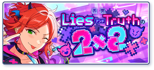
Event: Two Sides◆The 2×2 of Lies And Truth
Episode 1:
(Location: Cafe)
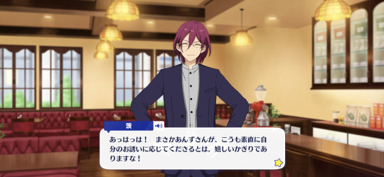
Ibara: Ahaha! I never expected Anzu-san to accept my invitation so readily. I’m very happy to hear that!
…… And that’s enough flattery. To my understanding, you accepted the invitation because you felt guilty, right?
The people who decided to accept the 2x2 job were the two from 2wink. You were just respecting their wishes.
Option 1: But……
Ibara: There’s no “but” about it. Arrangements have already begun, and you must have been making preparations for some time.
Is this a time to brood? For now, take responsibility for the new program and the idols appearing on it, and focus on seeing it through to the end.
Option 2: I apologize for the inconvenience……
Ibara: I don’t know what will happen in the future, but…… So far, I haven’t had any trouble.
It’s true that no matter how active 2wink is on that program, there’s nothing in it for us, so I can’t exactly be thankful for it!
Option 3: Thank you……
Ibara: Instead of saying “thank you,” your face looks like it’s saying “I’m sorry.”
This time, I’m not involved in the program at all. If you would like to show your gratitude, then please give generously to our office’s idols.
Episode 2:
(Location: Cafe)
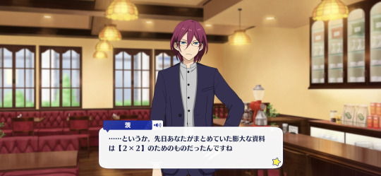
Ibara: …… Or rather, the huge amount of material you were compiling the other day was for 2x2.
I got the point from both your unclear answer and your unsatisfied attitude.
Factional conflicts are common. Wouldn’t it be better to learn more about tactics and strategies to not only survive, but to also advance yourself?
Option 1: Hm~mm……
Ibara: I don’t think there’s anything wrong with increasing the number of weapons you can use on the battlefield.
If you think that it’ll be a burden to you or a negative, I won’t force you to do it. It’s just a suggestion.
Option 2: Is there a way to prevent it?
Ibara: Hold on, how could you have prevented this situation?
…… If you’re thinking about self-defense in the future, I think you should take this opportunity to learn. For you, and for the idols.
Option 3: You mean the secret of success in life?
Ibara: Ah, I think you’re missing that too. The world is not so kind that you can get by with only good humanity.
Kindness can sometimes hurt the dignity of others. Therefore, I think it’s a necessary skill to “not hurt others.”
Episode 3:

(Location: Cafe)
Ibara: —Now then. If we keep talking like this, you’ll get bored and won’t be able to relax.
You may be dissatisfied with the long wait when your menu has only been opened. Shall we choose something and order it?
A seasonal limited menu, a meal set only available during lunch…… Has Anzu-san already decided what she wants to eat?
Option 1: Have you decided yet?
Ibara: Yes. Since I only order drinks, I just have to look at the pages that have drinks and decide quickly.
Even if you tell me to eat properly…… I understand. I’ll eat something, so please don’t be so aggressive at times like this.
Option 2: I’m still worried.
Ibara: If I could give Anzu-san one piece of advice, it would be to use the calorie index as a reference at restaurants.
See, it’s listed next to each menu item. Looking beyond photos and prices may help solve your problem.
Option 3: I want to think about it a little more.
Ibara: You’re having trouble deciding which of the three limited menu items to choose…… Then, let’s make a quick decision using Ghost Leg lottery. (1)
And if you want to try other things, just visit again during the offer period. If you do that, you’ll eventually conquer the menu♪
---
TL NOTES:
Ghost Leg is a method of lottery where vertical lines are drawn between the players and an outcome, with horizontal legs between those lines (as added by the players, who don't know which end of the vertical lines equals what/who). From there, the players trace down from the top of the vertical line, crossing between lines whenever a horizontal leg is encountered until they reach the bottom and receive whatever outcome that indicates. In Japan, it's referred to as "阿弥陀籤" (Amidakuji). It's also known as "사다리타기" (Sadaritagi) in Korea and "鬼腳圖" (Guijiaotu) in China.
19 notes
·
View notes
Text
Choosing Between Flexbox and Grid for Your Basic Layout Structure

Introduction
Beyond the aesthetics of web design, the choice of layout structure forms the backbone of a project's responsiveness and adaptability. At the heart of this decision lie two powerful CSS tools: Flexbox and Grid. These elements are more than mere design choices; they dictate how a webpage responds to different screen sizes and user interactions, impacting usability and visual appeal.
Understanding the Basics

Flexbox: Flexbox is a one-dimensional layout model best suited for organizing items within a container, offering flexibility in managing space distribution, alignment, and order. Its strength lies in its ability to handle complex layouts while maintaining simplicity in code structure. Grid: Grid is a two-dimensional layout system that creates a grid-based design, allowing precise placement and alignment of elements in rows and columns. Its advantages include fine control over both the rows and columns, making it ideal for overall page structure and layout alignment. Both Flexbox and Grid can be effectively utilized for basic layouts by structuring a header, main content area, and footer with distinct approaches tailored to their strengths.
Comparative Analysis

Flexbox Pros: - Efficient for arranging elements in a single direction, vertically or horizontally. - Great for small-scale layouts like navigation menus or individual components within a page. - Simplified syntax and intuitive approach make it easier to learn and use. Cons: - Complex layouts might require nested flex containers, leading to potential complications. - Challenges in controlling the alignment of both rows and columns simultaneously. Suitable Scenarios: Ideal for smaller, simpler layouts or for organizing elements in one direction, such as in menus or single-axis content layouts. Grid Pros: - Perfect for managing both rows and columns simultaneously, enabling more precise layouts. - Best for complex and multi-dimensional layouts, especially entire page structures. - Offers fine control over placement, making it suitable for responsive designs. Cons: - Complexity in understanding and implementing for beginners due to its comprehensive grid structure. - Not as effective for single-axis layouts compared to Flexbox. Suitable Scenarios: Best suited for larger-scale layouts or designs that demand strict control over both rows and columns, like entire webpage structures or responsive grid systems.
Usage Scenarios

Flexbox Scenarios Where Flexbox Shines: - Small-Scale Components: Flexbox excels in organizing smaller elements within a webpage, like menus, buttons, or individual sections. - Single-Direction Layouts: It's perfect for arranging elements in a single direction, simplifying the structure for one-dimensional layouts. - Mobile-First Designs: Ideal for mobile-responsive designs where content needs to adapt to smaller screens with straightforward layout adjustments. Grid Scenarios Distinct Advantages of Grid: - Full-Page Layouts: Grid is optimal for structuring entire pages, managing complex alignments in multiple directions (rows and columns). - Multi-Dimensional Layouts: Perfect for designs that require precision in both row and column placement, ensuring a cohesive and responsive layout. - Responsive Grid Systems: Offers extensive control for building responsive grid systems that adapt seamlessly across various screen sizes.
Responsiveness and Adaptability
Flexbox and Responsiveness Catering to Responsive Design: Flexbox simplifies responsiveness by allowing elements to adjust based on available space and container size. It facilitates flexible resizing of components within a single direction, aiding in responsive designs. Adaptability in Viewport Sizes: Flexbox is particularly suitable for smaller devices where elements need to flexibly adjust in a single axis, making it easier to adapt content to varying viewport sizes. Grid and Responsiveness Catering to Responsive Design: Grid systems provide a more comprehensive approach to responsiveness by allowing precise control over both rows and columns, enabling intricate adjustments for various screen sizes. Adaptability in Viewport Sizes: Grid excels in handling complex layouts across different viewport sizes, ensuring elements maintain their specified placement and alignment in both axes, enhancing adaptability in various screen sizes.
Best Practices and Recommendations
Choosing Between Flexbox and Grid When to Choose Flexbox: Opt for Flexbox when dealing with simpler, single-direction layouts or smaller components within a webpage. It's ideal for basic layouts requiring flexibility in one axis. When to Choose Grid: Prefer Grid for more complex, multi-dimensional layouts or when structuring entire pages. Choose it when precise control over both rows and columns is necessary. Combining Flexbox and Grid Effective Combination: Consider using Flexbox within specific sections or components within a grid-based layout. For instance, employing Flexbox to organize elements within grid-defined areas can harness the strengths of both techniques. Hybrid Approach: Experiment with combining both Flexbox and Grid to achieve optimal results. For instance, using Flexbox for header and footer elements while implementing Grid for the main content area can leverage the strengths of each method within a single layout.
Real-world Application
Flexbox in Real Projects Project Example: Portfolio Website In a portfolio website, Flexbox was utilized to arrange sections within the main content area. Each project section was organized in a single direction, allowing for easy adaptation to various screen sizes. This choice enhanced responsiveness, especially for mobile devices, providing a seamless browsing experience. Grid in Real Projects Project Example: E-commerce Platform An e-commerce platform used Grid to structure its product listings and category sections. The complex layout demanded precise alignment in both rows and columns, ensuring scalability across different viewport sizes. This choice significantly improved the scalability and responsiveness of the platform, offering a consistent and visually appealing layout.
Conclusion
Flexbox and Grid stand as powerful tools in the realm of web design, each offering distinct advantages based on the nature of the layout and design requirements. Distinguishing Factors: Flexbox excels in simpler, single-direction layouts and smaller components, offering flexibility and ease of use. On the other hand, Grid shines in complex, multi-dimensional layouts, providing precise control over both rows and columns. Significance of Choosing the Right Layout: The choice of layout structure forms the foundation of a project's scalability and responsiveness. A well-thought-out decision between Flexbox and Grid, or a strategic combination of both, is pivotal in ensuring a website's adaptability across various devices and screen sizes. Read the full article
2 notes
·
View notes
Text
Responsive Sliding Hamburge Menu System
A responsive navigation system that transforms the regular horizontal navbar into a mobile-friendly hamburger menu when visiting on small screens. How to use it: 1. Add the hamburger toggle button to your navbar. <header> <nav class="navbar"> <a href="#" class="logo">Logo</a> <ul class="nav-menu"> <li class="nav-item"> <a href="#" class="nav-link">Home</a> </li> <li class="nav-item"> <a href="#"…
View On WordPress
2 notes
·
View notes
Text
QR Codes 101: What Are They and How to Use Them| Complete Guide

QR Codes have become a vital tool in today’s digital world. In 2025, they are everywhere—from product packaging and restaurant menus to transport tickets and payment systems. Short for Quick Response codes, QR Codes store information that can be scanned instantly using smartphones or barcode readers. AIDC Technologies India plays a major role in providing reliable and customized QR Code solutions for various industries, helping businesses transition to smarter, contactless operations.
As QR Codes continue to evolve, AIDC is ensuring Indian enterprises can access, use, and benefit from this technology seamlessly and securely.
What Are QR Codes? Meaning & Overview by AIDC
QR Codes are two-dimensional barcodes that store data such as website links, product details, contact information, and more. Unlike traditional barcodes that only store data in a straight line, QR Codes can store data in both horizontal and vertical directions, making them more efficient and versatile.
AIDC Technologies India defines QR Codes as a modern tool for fast, accurate, and paperless data transfer. They allow businesses to simplify user interaction, improve tracking, and offer quick access to digital content. AIDC provides both static and dynamic QR Codes based on customer needs, ensuring flexible implementation across various sectors.
How QR Codes Work: AIDC’s 2025 Tech Breakdown
The working of QR Codes is simple yet effective. A QR Code consists of black squares arranged on a white background. When scanned with a smartphone or a QR-compatible device, the code is decoded into usable data, such as opening a website or triggering a digital payment.
AIDC ensures their QR Codes work flawlessly by using high-quality printing, error correction levels, and advanced encoding methods. Their solutions are tested across multiple devices and environments, so users always get fast, accurate responses. Whether for digital payments or product authentication, AIDC ensures smooth operation.
Types of QR Codes Used in AIDC Systems
There are two main types of QR Codes: static and dynamic. AIDC Technologies India offers both, depending on the purpose and flexibility required.
Static QR Codes store fixed information and cannot be edited once generated. These are ideal for basic uses like contact details or promotional content. Dynamic QR Codes, on the other hand, can be updated even after printing, allowing for better tracking and changes over time. AIDC’s dynamic QR Code systems are ideal for businesses that need performance reports, engagement metrics, and flexible data updates.
By offering both types, AIDC ensures clients get the right solution for their goals.
How to Scan and Use QR Codes: AIDC’s Simple Tutorial
Using QR Codes is easy. All a user needs is a smartphone camera or a QR scanning app. When the code is scanned, the device reads the data and redirects the user to the relevant information or action.
AIDC Technologies India offers support and training on how to implement and use QR Codes effectively. They help clients set up scanners, integrate QR Code readers into apps or systems, and educate staff on proper usage. This ensures that businesses can get the most value from their QR Code-based operations.
QR Codes vs Barcodes: AIDC’s Industry Comparison
While barcodes are still widely used, QR Codes offer several advantages. Barcodes hold less data and require a specific orientation for scanning. QR Codes, however, can store much more information and can be scanned from any angle.
AIDC provides solutions for both barcode and QR Code technology. However, for businesses that need more interactive, mobile-friendly solutions, QR Codes are often the better option. AIDC helps clients choose between the two based on their workflows, systems, and growth plans.
QR Code Applications in Retail, Education, Healthcare & More
QR Codes have applications across nearly every industry. In retail, they link to product info, payment portals, and feedback forms. In healthcare, QR Codes can store patient history, prescription details, or lab reports. In education, QR Codes are used for attendance, digital notes, and exam schedules.
AIDC Technologies India has successfully deployed QR Code systems in each of these industries. Their solutions are tailored to the specific needs of businesses, ensuring effective usage and easy adoption. From product authentication to document access, AIDC’s QR Code systems are reliable and scalable.
Benefits of QR Code Technology from AIDC India
There are many benefits to using QR Codes. They simplify customer interaction, speed up transactions, support contactless communication, and reduce the need for printed materials. QR Codes also help businesses collect and analyze data in real time.
AIDC Technologies India helps clients experience these benefits by offering ready-to-deploy QR Code systems. Their technology is tested for durability, readability, and integration, making it suitable for everything from marketing to logistics.
AIDC also enables businesses to customize QR Code designs, adding logos or brand colors while ensuring readability.
AIDC’s Secure and Customizable QR Code Solutions
Security is often a concern when dealing with digital tools. AIDC ensures that its QR Codes are secure from duplication and unauthorized use. Their systems include access controls, encryption options, and audit trails for dynamic QR Code activity.
Clients can also customize the appearance of their QR Codes without affecting performance. This branding flexibility makes QR Codes look professional and match business themes. AIDC supports creative QR Code designs for marketing campaigns, packaging, and customer engagement.
Why Choose AIDC India for QR Code Integration
AIDC Technologies India is one of the most trusted names in automation and tracking solutions. Their experience in implementing barcode and QR Code systems across India makes them a go-to partner for businesses aiming to upgrade their operations.
From planning and generation to deployment and support, AIDC manages every step. Their team offers on-site setup, technical support, and ongoing maintenance, ensuring smooth and reliable use of QR Code systems. Businesses that partner with AIDC benefit from long-term technology solutions built for growth.
Book Your QR Code Automation Demo with AIDC Technologies
If you're ready to modernize your business with QR Codes, AIDC Technologies India is here to help. Whether you're a retailer, hospital, school, or manufacturer, AIDC can design and deliver a QR Code solution that suits your workflow and budget.
#QR Code Basics#What is a QR Code#How to Use QR Codes#QR Code Technology 2025#Scan QR Codes with Phone#QR Codes for Business#Smart QR Code Uses
0 notes
Text
A Beginner’s Guide to Responsive Web Design
Picture this: You've just discovered an amazing website pages on your laptop, but when you try to view it on your phone, you're greeted with tiny text, overlapping elements, and a horizontal scroll bar that makes navigation feel like a puzzle. Frustrating, right? This is exactly why responsive web design has become not just important, but essential in today's digital landscape.

If you're new to web development or looking to understand why responsive design matters so much, you've come to the right place. This guide will walk you through everything you need to know about creating websites that look stunning and function perfectly on every device.
What is Responsive Web Design?
Responsive web design is an approach to web development that ensures your website automatically adapts to different screen sizes and devices. Instead of creating separate mobile and desktop versions of your site, responsive design uses flexible layouts, images, and CSS techniques to create one website that works beautifully everywhere.
Think of it like water taking the shape of its container. Whether you pour water into a tall glass or a wide bowl, it adapts perfectly. That's exactly what responsive websites do—they reshape themselves to fit phones, tablets, laptops, and desktop monitors seamlessly.
Why Responsive Design Matters More Than Ever
The Mobile Revolution is Here
Here's a statistic that might surprise you: over 60% of web traffic now comes from mobile devices. Your potential visitors are browsing on everything from compact smartphones to large tablets, and they expect a smooth experience regardless of their device choice.
Google Rewards Responsive Websites
Search engines, particularly Google, prioritise mobile-friendly websites in their rankings. This means responsive design isn't just about user experience—it's crucial for your website's visibility and SEO performance.
Cost-Effective Solution
Instead of maintaining separate mobile and desktop sites, responsive design gives you one website that works everywhere. This means lower development costs, easier maintenance, and consistent branding across all platforms.
The Three Pillars of Responsive Web Design
1. Fluid Grid Layouts
Traditional web layouts used fixed pixel widths, which worked fine when everyone used similar-sized monitors. Responsive design uses percentage-based widths instead of fixed pixels, allowing content to flow and resize naturally.
Example: Instead of setting a sidebar to exactly 300 pixels wide, you'd set it to 25% of the container width. This way, it automatically adjusts whether someone's viewing on a small phone or a large desktop monitor.
2. Flexible Images and Media
Images and videos need to scale down (or up) without breaking your layout or becoming pixelated. This involves techniques like setting maximum widths and using CSS to ensure media elements never exceed their container size.
3. CSS Media Queries
Media queries are like conditional statements for your CSS. They allow you to apply different styling rules based on device characteristics like screen width, height, or orientation.
Simple Example:
css
/* Styles for screens smaller than 768px */
@media (max-width: 768px) {
.sidebar {
width: 100%;
margin-bottom: 20px;
}
}
Essential Responsive Design Techniques for Beginners
Start with Mobile-First Design
Instead of designing for desktop and then trying to squeeze everything onto mobile, start with the mobile experience first. This approach ensures your core content and functionality work perfectly on smaller screens, then you can enhance the experience for larger devices.
Use Relative Units
Replace fixed pixel measurements with relative units:
Percentages for widths and flexible layouts
Em or rem units for fonts and spacing
Viewport units (vw, vh) for full-screen elements
Create Flexible Navigation
Mobile navigation needs special attention. Consider these approaches:
Hamburger menus that expand when tapped
Tab bars for primary navigation items
Collapsible sections for secondary content
Optimize Touch Interactions
Mobile users interact with their fingers, not mouse cursors. Ensure:
Buttons are at least 44px tall for easy tapping
Links have adequate spacing between them
Interactive elements provide visual feedback when touched
Common Responsive Design Breakpoints
Breakpoints are specific screen widths where your design changes to accommodate different devices. Here are the most commonly used breakpoints:
Mobile: 320px to 768px
Tablet: 768px to 1024px
Desktop: 1024px and above
Large Desktop: 1200px and above
Remember, these are guidelines, not rules. Your content should dictate where breakpoints are needed, not arbitrary device categories.
Tools and Resources for Responsive Design
Browser Developer Tools
Every modern browser includes built-in tools for testing responsive designs. Simply right-click on any webpage, select "Inspect," and look for the device toolbar icon. This lets you preview how your site looks on different devices without owning every gadget on the market.
CSS Frameworks
If you're just starting out, consider using CSS frameworks like:
Bootstrap: Comprehensive framework with pre-built responsive components
Foundation: Flexible framework with advanced responsive features
Tailwind CSS: Utility-first framework for custom responsive designs
Testing Tools
Google's Mobile-Friendly Test: Check if your site meets mobile usability standards
BrowserStack: Test your site on real devices and browsers
Responsive Design Checker: Preview your site at various screen sizes
Best Practices for Responsive Design Success
Prioritize Performance
Mobile users often have slower internet connections, so optimize your site for speed:
Compress images and use appropriate file formats
Minimize CSS and JavaScript files
Consider lazy loading for images below the fold
Keep Content Hierarchy Clear
On smaller screens, every pixel matters. Ensure your most important content is prominently featured and easy to find. Use clear headings, plenty of white space, and logical content flow.
Test on Real Devices
While browser tools are helpful, nothing beats testing on actual phones and tablets. Borrow devices from friends or visit electronics stores to see how your site performs in real-world conditions.
Consider Touch and Gesture Navigation
Mobile users expect to swipe, pinch, and tap. Ensure your design supports these natural gestures and doesn't rely solely on hover effects that don't work on touch devices.
Common Responsive Design Mistakes to Avoid
Hiding Important Content on Mobile
Just because you have limited space doesn't mean you should hide crucial information. Instead, reorganize and prioritize content to fit smaller screens effectively.
Ignoring Load Times
Responsive doesn't mean loading the same heavy resources on every device. Responsive images, minify code, and consider what mobile phone users actually need.
Forgetting About Landscape Mode
Many users hold their phones horizontally, especially when watching videos or playing games. Test your design in both portrait and landscape orientations.
Using Tiny Fonts
Text that's readable on desktop might be microscopic on mobile. Ensure your base font size is at least 16px for comfortable mobile reading.
Getting Started: Your First Responsive Project
Ready to dive in? Here's a simple roadmap:
Plan your content hierarchy: What's most important for mobile users?
Sketch mobile layouts first: Start small and work your way up
Choose your breakpoints: Based on your content, not arbitrary device sizes
Build and test incrementally: Don't wait until the end to test responsiveness
Optimize performance: Ensure fast loading across all devices
The Future of Responsive Design
As new devices emerge—from smartwatches to large-screen TVs—responsive design principles become even more valuable. Techniques like container queries and intrinsic website designed are evolving to make responsive layouts even more flexible and intuitive.
Conclusion
Responsive web design isn't just a trend—it's the foundation of modern web development. By mastering these fundamentals, you're not just creating websites that work on different devices; you're building experiences that truly serve your users regardless of how they choose to access your content.
0 notes
Text
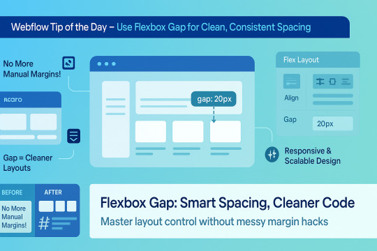
🌟 Webflow Tip of the Day – Use Flexbox Gap for Clean, Consistent Spacing
When building layouts in Webflow using Flexbox, don’t manually add margins between elements. Instead, use the “Gap” property for smarter, scalable, and more elegant spacing.
🔧 How to Use Flex Gap:
Select your Flex container
In the Style Panel → under Layout → enable Flex
Use the Gap field to set uniform spacing (e.g., 20px)
This works both for horizontal and vertical spacing!
✅ Why It’s Better Than Margins:
Maintains consistent spacing across breakpoints
Cleaner code — no messy margin overrides
Easier to manage on large-scale layouts
Improves responsiveness and scalability
💡 Practical Examples:
Equal spacing between buttons in a CTA
Neat rows of cards or feature boxes
Structured menu items in navbars
🔄 Bonus Tip: Use with Grid layout too — Gap is a game-changer there as well!
🚀 Want to build pixel-perfect, responsive Webflow sites like a pro? 📌 Connect With Me:
🌐 Portfolio: www.webflowwork.com 🎯 Upwork: https://bit.ly/4iu6AKd 🎯 Fiverr: https://bit.ly/3EzQxNd
#webflow#freelancewebdeveloper#web design#web development#webflowdesign#webflowexperts#webflowlandingpage#website#nocode#ui ux design#fiverr tutorial#fiverr#freelancing#upwork
0 notes
Text
5 Website Conversion Barriers (and How to Overcome Them)
Your site could be stunning, but if visitors aren’t converting into leads or customers, there’s something that needs to be adjusted under the surface. Conversions are not accidents, they are the result of deliberate design, unambiguous messaging, seamless navigation, and a plotted user journey.
In this post, let's discuss five common website conversion barriers and how you can navigate each of them. If you’re a business owner or a marketer, it’s good to know what the hurdles are, and you can make adjustments to maximize site performance and revenue.
1. Slow Loading Speed
The Obstacle:
People have little patience. If your website takes too long to load, they will bounce out before they even see your content. Simply having a wait time of only 2-3 seconds can significantly increase bounce rates.
A Solution:
Compress image files when you can without sacrificing quality
Keep heavy scripts or plugins to a minimum
Implement browser caching and content delivery networks (CDN) if applicable
Choose a speedy, reliable hosting service
Fast-loading websites improve your link to users and their experience, along with SEO. Remember, Google favors fast sites in its ranking algorithm, too.
2. Confusing Navigation
The Barrier:
If people cannot find out where to go or what to do next, they are going to leave. Complicated menus, unclear calls-to-action, or too many options can overwhelm your user.
How To Fix This:
Use a straightforward and consistent navigation structure
Group relevant pages under clear categories
Keep your menu short
Add a clear Call-To-Action (CTA) button - "Get a Quote" / "Contact Us"
A smooth navigation experience will build trust, which will lead users to spend more time on your site and take action.
3. No Signals of Trust
The Barrier:
If your website has an outdated design, no reviews, or does not include any information about credentials, people may hesitate to make a purchase or reach out to you for help.
How To Fix This:
Add customer testimonials and Google reviews
Add trust badges or certifications if you have them
Add real photos of your team and a professional “About Us” section
Mention your privacy policy and secure payment options
Brands are typically trusted because of credibility. If you add these signals, users will feel more comfortable and be the decision to take action.
4. A Bad Mobile Experience
The Barrier:
With multiple users on mobile devices, a website that is not mobile-friendly is a huge conversion killer. Unreadable text, broken buttons, or horizontal scrolling can cause users to bounce.
How to Fix:
Utilize a responsive design that works on all screens
Regularly test your site on various devices
Make sure your buttons are large and easy to tap
Ensure the text is readable without zooming in
A smooth mobile experience will improve conversions and show your level of professionalism.
5. Weak Value Proposition
The Barrier:
If your website doesn't clearly define what you do, why it matters, and what you offer, there's little chance anyone will convert. In seconds, a visitor should know who you are, what you do, and how you can help.
How to Fix:
Write an effective headline that summarises your primary offering
Focus on benefits, not features
Use visuals to enhance your message
Include CTAs above the fold, as well as at critical parts of the page
Limit your message and focus on what the user cares about.
Bonus Tip: Don't Forget to Test
After you've made enhancements, it’s also a good idea to test improvements and measure performance. You can do this with tools like:
Google Analytics to monitor user behavior
Hotjar or Crazy Egg to see heatmaps and click tracking
A/B testing to compare two different designs or CTAs
Remember, conversion optimization is not a finished job, it is continual learning and measurement with data.
Final Thoughts: Break These Barriers and Convert
Improving the conversion rate on your website isn't just a matter of changing the color of a button or changing text. ItÕs about finding out what is keeping your users from doing what you want them to do, and then optimizing improvements that follow the user's journey.
At Xplore Intellects, we create websites that do more than simply look good. We specialize in quality and performant websites. We are the best web development company in Coimbatore because we understand the balance between design, user experience, and conversions. Our team will help make your website a driving force or tool for your business, and not just a digital brochure.
If you still have high traffic but low conversions, or if you are planning a website redevelopment, let's build something that actually works. Contact us and let's take your digital presence to the next level.

1 note
·
View note
Text
Superfly Responsive Menu nulled plugin 5.0.30

The Superfly Responsive Menu nulled plugin is a powerful tool designed to enhance your website's navigation with sleek, customizable, and fully responsive menu options. Perfect for WordPress users, this nulled version provides all the premium features you need, including multiple menu styles (vertical, horizontal, and off-canvas), mobile optimization, and easy integration with any WordPress theme. Enjoy the full functionality of the plugin without any cost, making it an ideal choice for budget-conscious users. With its user-friendly interface, you can easily design and implement a modern, professional menu on your site. Whether you're running a blog, business website, or e-commerce store, the Superfly Responsive Menu nulled plugin ensures your site’s navigation is smooth, stylish, and accessible to all users.
0 notes
Text
Develop Visual Brand Guidelines in 7 Steps

Designing your visual brand identity is about more than choosing colors and font combinations — it’s about creating a cohesive aesthetic that embodies your brand’s voice. Follow these steps to create successful guidelines for a visual brand identity:
1. Propose a Brand Logo Placement and Usage Guidelines
Your logo is the center of your brand guidelines cover. It should be simple, memorable, and versatile enough to work across different mediums (digital, print, merchandise, etc.).
Include specific guidelines for logo placement, sizing, spacing, and variations (e.g., horizontal vs. stacked). Also, specify what NOT to do ��� like altering the logo’s colors or proportions.
Example: Mailchimp’s brand guidelines The illustrator template includes detailed instructions on spacing and clear zones around the logo to maintain its integrity.
2. Pick a Brand Color Palette
Colors evoke emotions and convey meaning. Pick a main color scheme that shows what your brand stands for and how it acts. For example, blue often represents trust and professionalism, while yellow suggests optimism and energy.
Provide exact color codes (HEX, RGB, CMYK) for both digital and print use. Also, include secondary colors for accents or highlights.
Resource: Adobe offers excellent tips on selecting and using brand colors effectively.
3. Choose Brand Fonts That Reflect Your Unique Identity
The choice of typography is crucial in defining the tone of your brand. Modern sans-serif fonts like Helvetica convey simplicity and professionalism, while script fonts add elegance and creativity.
Limit yourself to 2–3 fonts to avoid clutter. To guarantee readability and consistency, specify font weights and sizes for the body of the text, subheadings, and headings.
Example: Google’s brand guidelines specify clear rules for font usage, ensuring a clean and modern aesthetic across all platforms.
4. Select Branded Iconography That Represents Your Niche
Icons might be tiny, but they have a huge impact on enhancing the user experience. You can think of them as small visual aids that direct your audience and give your design some character.
When you select icons, go for ones that seem to match your brand. For example, if you run a tech company, you might prefer streamlined and simple icons. But if you’re in charge of a lifestyle brand, something that looks hand-drawn or fun could feel more genuine and captivating.
The main thing is to keep it uniform — make sure all your icons have the same look, whether that’s in how thick the lines are, what colors you use, or the overall feel. When everything looks like it belongs together, it not only appears neat but also makes the experience more straightforward and fun for the people using it.
5. Set Photography and Videography Style Guidelines
Visual content is a critical part of your brand identity. Decide on the type of imagery that best represents your brand — whether it’s candid shots, studio portraits, or abstract compositions.
Specify guidelines for lighting, angles, filters, and subject matter. For example, Airbnb’s photography guidelines emphasize authentic, natural images that showcase real experiences.
Don’t forget to include rules for video content, such as transitions, music, and voiceovers.
6. Collect Web-Specific Brand Guideline Elements
Websites need special attention to things like button styles, navigation menus, and designs for calls to action (CTAs). These elements should match your overall brand identity. Set up rules for responsive design, animations, and hover effects to make sure users have a smooth experience on all devices.
Example: Shopify’s web rules give detailed steps for UI parts such as buttons and banners, which keeps the look and feel the same across the site.
7. Create Shareable Brand Guidelines Tied to Your Brand Story
Once you’ve defined all the visual elements, compile them into a shareable document or online portal. Make sure the guide is easy to access and update.
Tie everything back to your brand story to give context to the visual elements. Explain why certain colors, fonts, or imagery were chosen and how they reflect your brand’s mission and values.
Websites like Canva or GraphyPix can help you create visually appealing guides that are both functional and inspiring.
Don’t Forget, Better Brand Guidelines Get Results!
When you follow these steps and use the ideas from GraphyPix LLC, you’ll be ready to make a strong brand guideline that lasts. Keep in mind, your brand is more than just a logo — it’s something people experience. Browse our website, search from 50,000+ templates, and get free & premium templates for your design needs.
#brand guidelines#personal branding#branding#branding services#branding strategy#business branding#print template#template design
0 notes
Text
Adobe Illustrator Classroom in a Book Chapter 15 & 16 Exercises - VCDM Visual Literacy: Elements of Design, Color and Typography
Chapter 15 Review Questions
Describe the difterence between linking and embedding in Illustrator.
2. How do you show options when importing masks?
3. What kinds of objects can be used as masks?
4. How do you create an opacity mask for a placed image?
5. Describe how to replace image with another image in a document.
My Responses
A linked file is a separate, external file connected to the Illustrator file by a link. A linked file does not add significantly to the size of the Illustrator file. The linked file must accompany the Illustrator file to preserve the link and ensure that the placed file appears when you open the Illustrator file. An embedded file becomes part of the Illustrator file. The increased Illustrator file size reflects the addition of the embedded file. Because the embedded file is part of the Illustrator file, no link can be broken. You can update linked and embedded files using the Relink button in the Links panel.
2. When placing an image using the File > Place command, in the Place dialog box, select the Show Import Options option. Selecting this will open the Import Options dialog box, where you can set options before placing. In macOS, if you don't see the options in the Import Options dialog box, click the Options button.
3. A mask can be a simple or compound path, and masks (such as an opacity mask) may be imported with placed Photoshop files. You can also create layer clipping masks with any shape that is the topmost object of a group or layer.
4. You create an opacity mask by placing the object to be used as a mask on top of the object to be masked. Then you select the mask and the objects) to be masked and either click the Make Mask button in the Transparency panel or choose Make Opacity Mask from the Transparency panel menu.
5. To replace a placed image with a different image, select the image in the Links panel. Then click the Relink button (or the Relink From CC Libraries button, and locate and select the replacement image. Click Place or Relink (if you clicked the Relink From CC Libraries button).
Chapter 16 Review Questions
Describe what packaging an Illustrator document does.
2. Why do you align content to the pixel grid?
3. Describe how you export an artboard.
4. Name image file types that can be chosen in the Export For Screens dialog box and Asset Export panel.
5. Describe the generic process for exporting assets with the Asset Export panel.
My Responses
Packaging is used to gather all of the necessary pieces of an Illustrator document. Packaging creates a copy of the Illustrator file, the linked images, and the necessary fonts (if desired), and gathers those copies into a folder.
2. Aligning content to the pixel grid creates a crisp appearance at the edges of artwork. When Snap To Pixel is enabled for supported artwork, all the horizontal and vertical segments in the object are aligned to the pixel grid.
3. To export an artboard, choose file > Export > Export As or File > Export > Export for Screens. In the Export For Screens dialog box that appears, you can choose between exporting artboards and exporting assets. You can choose to export all or a specific range of artboards.
4. The image file types that can chosen in the Export For Screens dialog box and the Asset Export panel are PNG, JPEG, SVG, PDF, OBJ, USDA, and GLTF.
5. To export assets using the Asset Export panel, the artwork to be exported needs to be collected in the Asset Export panel. Once it's in the panel, you can select the asset(s) to be exported, set the export settings, and then export.
0 notes
Photo
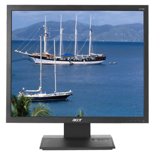
Acer V173 DJbm 17" LCD Monitor The V173 DJbm 17" LCD Monitor from Acer is an environmentally-friendly display that provides clear, high-resolution images. With its vivid 20,000:1 contrast ratio, wide 160° horizontal viewing angles, and resolution support up to 1280 x 1024, the monitor is excellent for watching movies, playing games, or editing pictures. Built-in stereo speakers. Panel/Display Type: LCD Flat Panel Display Viewable Size: 17" Brightness: 250cd/m² Contrast Ratio: 20,000:1 Dynamic Contrast Ratio Viewing Angle: Horizontal: 160° Vertical: 160° Pixel Dot Pitch: 0.264mm Response Time: 5ms Panel Life: Not Specified by Manufacturer Colors Supported: 16.7M Signal Internal Interface: Analog Frequency Horizontal: 30-80KHz Vertical: 55-75Hz Sync Type: Not Specified by Manufacturer Resolution: 1280 x 1024 Input/Output Connectors Analog 1 x VGA Audio Input: 3.5mm Stereo Mini Jack Headphone Jack: Not Specified by Manufacturer Hub Ports None Speakers Built-in 1W Stereo Speakers Mount VESA 100 x 100mm Controls Buttons Power, Select, Menu, Auto-Adjust On-Screen Display: Yes Auto Configuration: Yes Touch Screen: No Tilt/Swivel Range Tilt: -5/+15° Security: Kensington Security Slot Compliant Standards: Energy Star EPEAT: Silver TCO: '03 System Requirements: Not Specified by Manufacturer Power Requirements: AC 100-240V 50/60Hz Environmental Requirements: Not Specified by Manufacturer Dimensions: 376 x 370 x 160 mm Weight: 3.8kg Power cable, VGA cable not included
0 notes
Text
Platformer Development Update
{Week 4} (Would be Week 3 but Cyclone Alfred had other plans...)
This week marked the first hands-on development sprint for Max Power, my 2D action-platformer centered around progression and upgrades. I focused on building out the game’s core mechanics and foundational systems using GDevelop.
What I Worked On:
Core Mechanics: Max now runs, jumps, and responds to gravity within the “Dungeon Arena.” Movement feels responsive and sets the stage for tight platforming.
Coin Pickup System: Coins increase a global PlayerCoins variable, designed for use in future upgrade scenes. Coins persist between sessions, laying groundwork for long-term progression.
Enemy AI: Basic enemies use simple AI to track Max’s horizontal position and move toward him continuously.
Health & Damage System: Max has 3 health points, a health bar UI, and now takes knockback on hit. An invincibility window prevents repeated damage spam. If health hits zero, a death animation plays and the game resets.
Custom Start & Instruction Scenes: Designed a stylized title screen with animated buttons that transition into gameplay or an instructions page. The instructions scene outlines controls and objective flow, helping onboard players clearly and quickly.
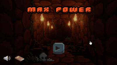
Challenges Faced:
Implementing Boolean checks for death states and damage cooldowns required a workaround using the health bar’s internal values.
Enemy damage initially stacked all at once—this was solved using event timers and invulnerability states.
Scenes Built: Start Menu, Instructions, and Dungeon Arena. Tools Used: GDevelop, Piskel, royalty-free assets.
Full asset references listed below.
CraftPix.net. (2024, October 28). Free RPG Battleground Asset Pack. https://craftpix.net/freebies/free-rpg-battleground-asset-pack
Blender Artists. (2021, February 19). Pixel Dungeon 3D. https://blenderartists.org/t/pixel-dungeon-3d/1286296
Pixilart. (2025). 2D Stone Platform Bottom. https://www.pixilart.com/art/2d-stone-platform-bottom-f3a5875622b5509
RVros. (2018). Animated Pixel Adventurer. Itch.io. https://rvros.itch.io/animated-pixel-hero?download
CraftPix.net. (2024, October 8). Free Orc, Ogre and Goblin Chibi 2D Game Sprites. https://craftpix.net/freebies/free-orc-ogre-and-goblin-chibi-2d-game-sprites
CraftPix.net. (2025). Free Currency Loot Vector Icons. https://craftpix.net/freebies/free-currency-loot-vector-icons
Freepik. (2022). Pixel Art Muted Speaker Icon. https://www.freepik.com/premium-vector/pixel-art-muted-speaker-volume-icon-vector-icon-8bit-game-white-background_28763381.htm
Icons-for-Free. (2019). Cross Icon. https://icons-for-free.com/cross-131982518918328745
Vecteezy. (2025). Pixel Art Book Icon. https://www.vecteezy.com/vector-art/9726611-pixel-art-book-notebook-vector-icon-for-8bit-game-on-white-background
Backgrounds.gallery. (2025). Open Book Background. https://backgrounds.gallery/backgrounds/753/207420-Open%20Book
FontMeme. (2025). Pixel Fonts Generator. https://fontmeme.com/pixel-fonts
0 notes
Text
```markdown
Mobile Page Optimization: Enhancing User Experience for the Modern Age
In today's digital landscape, mobile optimization is no longer a luxury but a necessity. With more than half of internet traffic coming from mobile devices, it's crucial to ensure that your website or application is optimized for these users. This article will delve into the key aspects of mobile page optimization, providing actionable tips and insights to help you improve your site's performance and user experience.
Why Mobile Optimization Matters
Mobile users have different needs and expectations compared to desktop users. They are often on-the-go, looking for quick access to information, and expect seamless navigation. A poorly optimized mobile site can lead to high bounce rates, lower engagement, and ultimately, a loss of potential customers. By focusing on mobile optimization, you not only cater to this growing demographic but also improve your search engine rankings, as Google prioritizes mobile-friendly sites in its search results.
Key Elements of Mobile Page Optimization
1. Responsive Design
Responsive design ensures that your site adapts to different screen sizes and resolutions. This means that whether a user is accessing your site from a smartphone, tablet, or desktop, they will have a consistent and optimal viewing experience. Implementing responsive design involves using flexible layouts, images, and media queries to adjust the layout based on the device's screen size.
2. Fast Loading Times
Speed is critical for mobile users. Studies show that if a mobile site takes longer than three seconds to load, users are likely to abandon it. To improve loading times, consider optimizing images, minimizing HTTP requests, and leveraging browser caching. Tools like Google's PageSpeed Insights can help you identify areas for improvement and provide recommendations.
3. Simplified Navigation
Mobile screens are smaller, so it's essential to keep your navigation simple and intuitive. Use clear labels, minimize the number of menu items, and ensure that important links are easily accessible. Consider using a hamburger menu (three horizontal lines) to save space and make navigation easier.
4. Mobile-First Approach
Adopting a mobile-first approach means designing your site with mobile users in mind first, then scaling up for desktop. This approach ensures that your site is optimized for the most common use case—mobile—and provides a better overall user experience.
Conclusion
Mobile page optimization is about more than just making your site look good on a small screen; it's about enhancing the user experience and ensuring that your site performs well across all devices. By focusing on responsive design, fast loading times, simplified navigation, and a mobile-first approach, you can create a site that not only meets but exceeds the expectations of modern mobile users.
What strategies have you found effective for mobile page optimization? Share your thoughts and experiences in the comments below!
```
加飞机@yuantou2048

負���刪除
EPP Machine
0 notes