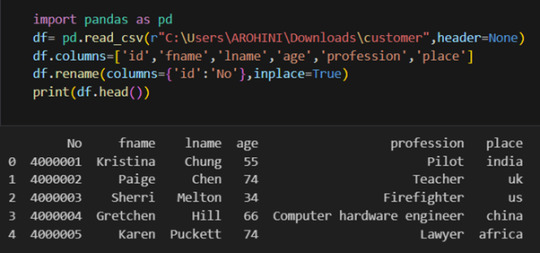
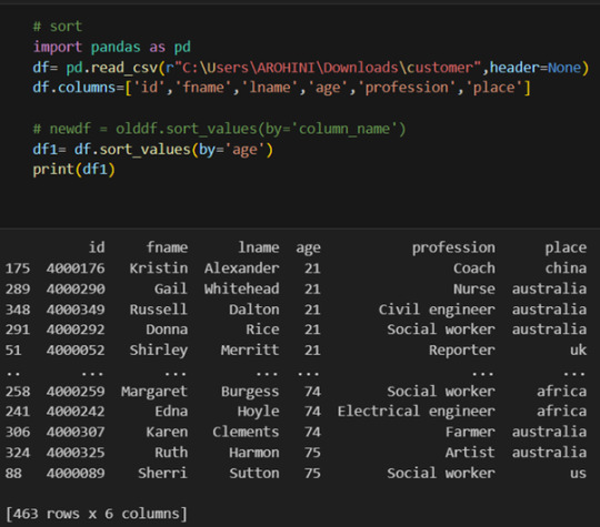
#select rows in pandas dataframe
Explore tagged Tumblr posts
Visit Tumblr Blog
Explore Tumblr blogs with no restrictions, modern design and the best experience.
Last Seen Tumblr Blogs


Fun Fact
Tumblr posted its first advertisements in May 2012 and subsequently earned $13M in revenue.
Text
Frequency tables for selected variables
I post here the python script, the results and the comments:
Python script:
libraries/packages
import pandas import numpy
read the csv table with pandas:
data = pandas.read_csv('C:/Users/zop2si/Documents/Statistic_tests/nesarc_pds.csv', low_memory=False)
show the dimensions of the data frame:
print() print ("length of the dataframe (number of rows): ", len(data)) #number of observations (rows) print ("Number of columns of the dataframe: ", len(data.columns)) # number of variables (columns)
variables:
variables related to the background of the interviewed people (SES: socioeconomic status):
building type
data['BUILDTYP'] = pandas.to_numeric(data['BUILDTYP'], errors='coerce')
number of persons in the household
data['NUMPERS'] = pandas.to_numeric(data['NUMPERS'], errors='coerce')
number of persons older than 18 years in the household
data['NUMPER18'] = pandas.to_numeric(data['NUMPER18'], errors='coerce')
year of birth
data['DOBY'] = pandas.to_numeric(data['DOBY'], errors='coerce')
biological/adopted parents got divorced or stop living together before respondant was 18
data['S1Q2D'] = pandas.to_numeric(data['S1Q2D'], errors='coerce')
marital status
data['MARITAL'] = pandas.to_numeric(data['MARITAL'], errors='coerce')
number of marriages
data['S1Q3B'] = pandas.to_numeric(data['S1Q3B'], errors='coerce')
highest grade or year of school completed
data['S1Q6A'] = pandas.to_numeric(data['S1Q6A'], errors='coerce')
variables related to alcohol consumption
HOW OFTEN DRANK COOLERS IN LAST 12 MONTHS
data['S2AQ4B'] = pandas.to_numeric(data['S2AQ4B'], errors='coerce')
HOW OFTEN DRANK 5+ COOLERS IN LAST 12 MONTHS
data['S2AQ4G'] = pandas.to_numeric(data['S2AQ4G'], errors='coerce')
HOW OFTEN DRANK BEER IN LAST 12 MONTHS
data['S2AQ5B'] = pandas.to_numeric(data['S2AQ5B'], errors='coerce')
NUMBER OF BEERS USUALLY CONSUMED ON DAYS WHEN DRANK BEER IN LAST 12 MONTHS
data['S2AQ5D'] = pandas.to_numeric(data['S2AQ5D'], errors='coerce')
HOW OFTEN DRANK 5+ BEERS IN LAST 12 MONTHS
data['S2AQ5G'] = pandas.to_numeric(data['S2AQ5G'], errors='coerce')
HOW OFTEN DRANK WINE IN LAST 12 MONTHS
data['S2AQ6B'] = pandas.to_numeric(data['S2AQ6B'], errors='coerce')
NUMBER OF GLASSES/CONTAINERS OF WINE USUALLY CONSUMED ON DAYS WHEN DRANK WINE IN LAST 12 MONTHS
data['S2AQ6D'] = pandas.to_numeric(data['S2AQ6D'], errors='coerce')
HOW OFTEN DRANK 5+ GLASSES/CONTAINERS OF WINE IN LAST 12 MONTHS
data['S2AQ6G'] = pandas.to_numeric(data['S2AQ6G'], errors='coerce')
HOW OFTEN DRANK ENOUGH TO FEEL INTOXICATED IN LAST 12 MONTHS
data['S2AQ10'] = pandas.to_numeric(data['S2AQ10'], errors='coerce')
variables relatred to personality disorder: low mood (dysthemia) or major depression
AGE AT ONSET OF ALCOHOL DEPENDENCE
data['ALCABDEP12DX'] = pandas.to_numeric(data['ALCABDEP12DX'], errors='coerce')
0: No alcohol dependence
1: Alcohol abuse
2: Alcohol dependence
3: Alcohol abuse and dependence
variables related to the major depression (low mood I)
EVER HAD 2-WEEK PERIOD WHEN FELT SAD, BLUE, DEPRESSED, OR DOWN MOST OF TIME
data['S4AQ1'] = pandas.to_numeric(data['S4AQ1'], errors='coerce')
EVER HAD 2-WEEK PERIOD WHEN DIDN'T CARE ABOUT THINGS USUALLY CARED ABOUT
data['S4AQ2'] = pandas.to_numeric(data['S4AQ2'], errors='coerce')
FELT TIRED/EASILY TIRED NEARLY EVERY DAY FOR 2+ WEEKS, WHEN NOT DOING MORE THAN USUAL
data['S4AQ4A8'] = pandas.to_numeric(data['S4AQ4A8'], errors='coerce')
FELT WORTHLESS MOST OF THE TIME FOR 2+ WEEKS
data['S4AQ4A12'] = pandas.to_numeric(data['S4AQ4A12'], errors='coerce')
FELT GUILTY ABOUT THINGS WOULDN'T NORMALLY FEEL GUILTY ABOUT 2+ WEEKS
data['S4AQ4A13'] = pandas.to_numeric(data['S4AQ4A13'], errors='coerce')
FELT UNCOMFORTABLE OR UPSET BY LOW MOOD OR THESE OTHER EXPERIENCES
data['S4AQ51'] = pandas.to_numeric(data['S4AQ51'], errors='coerce')
Choice of thee variables to display its frequency tables:
string_01 = """ Biological/adopted parents got divorced or stop living together before respondant was 18: 1: yes 2: no 9: unknown blank: unknown """
replace unknown values for NaN and remove blanks
data['S1Q2D']=data['S1Q2D'].replace(9, numpy.nan)
data['S1Q2D']=data['S1Q2D'].dropna
string_02 = """ HOW OFTEN DRANK ENOUGH TO FEEL INTOXICATED IN LAST 12 MONTHS
Every day
Nearly every day
3 to 4 times a week
2 times a week
Once a week
2 to 3 times a month
Once a month
7 to 11 times in the last year
3 to 6 times in the last year
1 or 2 times in the last year
Never in the last year
Unknown BL. NA, former drinker or lifetime abstainer """
replace unknown values for NaN and remove blanks
data['S2AQ10']=data['S2AQ10'].replace(99, numpy.nan)
data['S2AQ10']=data['S2AQ10'].dropna
string_03 = """ EVER HAD 2-WEEK PERIOD WHEN FELT SAD, BLUE, DEPRESSED, OR DOWN MOST OF TIME:
Yes
No
Unknown """
replace unknown values for NaN and remove blanks
data['S2AQ1']=data['S2AQ1'].replace(99, numpy.nan)
data['S2AQ1']=data['S2AQ1'].dropna
create the tables:
print() c1 = data['S1Q2D'].value_counts(sort=False) # absolute counts
print (c1)
print(string_01) p1 = data['S1Q2D'].value_counts(sort=False, normalize=True) # percentage counts print (p1)
c2 = data['S2AQ10'].value_counts(sort=False) # absolute counts
print (c2)
print(string_02) p2 = data['S2AQ10'].value_counts(sort=False, normalize=True) # percentage counts print (p2) print()
c3 = data['S2AQ1'].value_counts(sort=False) # absolute counts
print (c3)
print(string_03) p3 = data['S2AQ1'].value_counts(sort=False, normalize=True) # percentage counts print (p3)
Results:
length of the dataframe (number of rows): 43093 Number of columns of the dataframe: 3008
Biological/adopted parents got divorced or stop living together before respondant was 18: 1: yes 2: no 9: unknown blank: unknown
2.000000 0.812594 1.000000 0.185661 9.000000 0.001745 Name: S1Q2D, dtype: float64
HOW OFTEN DRANK ENOUGH TO FEEL INTOXICATED IN LAST 12 MONTHS
Every day
Nearly every day
3 to 4 times a week
2 times a week
Once a week
2 to 3 times a month
Once a month
7 to 11 times in the last year
3 to 6 times in the last year
1 or 2 times in the last year
Never in the last year
Unknown BL. NA, former drinker or lifetime abstainer
11.000000 0.647072 10.000000 0.160914 9.000000 0.062718 8.000000 0.022304 7.000000 0.033474 5.000000 0.018927 1.000000 0.006198 6.000000 0.020003 3.000000 0.006828 2.000000 0.004045 4.000000 0.010094 99.000000 0.007422 Name: S2AQ10, dtype: float64
EVER HAD 2-WEEK PERIOD WHEN FELT SAD, BLUE, DEPRESSED, OR DOWN MOST OF TIME:
Yes
No
Unknown
2 0.191818 1 0.808182 Name: S2AQ1, dtype: float64
Comments:
It is too early to make any conclusions without further statistical analysis.
In regard to the computing: the sort function of pandas eliminates by default the nan values and blank cells, therefore the percentages are referred to the sum of cells with a numerical value within.
In regard to the content:
One interesting thing is the amount of people that felt sad, blue, depressed or down most of the time for a period over two weeks (80,81%). More variables would be necessary in order to find out the depth of these mood states.
Another interesting fact is that almost 35% of the interviewed people felt intoxicated by alcohol consumption at least once in the last 12 months. That is a high figure.
Finally, it is remarkable that although the divorce rates are very high, only 18,57% of the interviewed individuals reported parents divorcing or living separately before they were 18 years old.
0 notes
Text
0 notes
Text
Generating a Correlation Coefficient
This assignment aims to statistically assess the evidence, provided by NESARC codebook, in favor of or against the association between cannabis use and mental illnesses, such as major depression and general anxiety, in U.S. adults. More specifically, since my research question includes only categorical variables, I selected three new quantitative variables from the NESARC codebook. Therefore, I redefined my hypothesis and examined the correlation between the age when the individuals began using cannabis the most (quantitative explanatory, variable “S3BD5Q2F”) and the age when they experienced the first episode of major depression and general anxiety (quantitative response, variables “S4AQ6A” and ”S9Q6A”). As a result, in the first place, in order to visualize the association between cannabis use and both depression and anxiety episodes, I used seaborn library to produce a scatterplot for each disorder separately and interpreted the overall patterns, by describing the direction, as well as the form and the strength of the relationships. In addition, I ran Pearson correlation test (Q->Q) twice (once for each disorder) and measured the strength of the relationships between each pair of quantitative variables, by numerically generating both the correlation coefficients r and the associated p-values. For the code and the output I used Spyder (IDE).
The three quantitative variables that I used for my Pearson correlation tests are:


FOLLWING IS A PYTHON PROGRAM TO CALCULATE CORRELATION
import pandas import numpy import seaborn import scipy import matplotlib.pyplot as plt
nesarc = pandas.read_csv ('nesarc_pds.csv' , low_memory=False)
Set PANDAS to show all columns in DataFrame
pandas.set_option('display.max_columns', None)
Set PANDAS to show all rows in DataFrame
pandas.set_option('display.max_rows', None)
nesarc.columns = map(str.upper , nesarc.columns)
pandas.set_option('display.float_format' , lambda x:'%f'%x)
Change my variables to numeric
nesarc['AGE'] = pandas.to_numeric(nesarc['AGE'], errors='coerce') nesarc['S3BQ4'] = pandas.to_numeric(nesarc['S3BQ4'], errors='coerce') nesarc['S4AQ6A'] = pandas.to_numeric(nesarc['S4AQ6A'], errors='coerce') nesarc['S3BD5Q2F'] = pandas.to_numeric(nesarc['S3BD5Q2F'], errors='coerce') nesarc['S9Q6A'] = pandas.to_numeric(nesarc['S9Q6A'], errors='coerce') nesarc['S4AQ7'] = pandas.to_numeric(nesarc['S4AQ7'], errors='coerce') nesarc['S3BQ1A5'] = pandas.to_numeric(nesarc['S3BQ1A5'], errors='coerce')
Subset my sample
subset1 = nesarc[(nesarc['S3BQ1A5']==1)] # Cannabis users subsetc1 = subset1.copy()
Setting missing data
subsetc1['S3BQ1A5']=subsetc1['S3BQ1A5'].replace(9, numpy.nan) subsetc1['S3BD5Q2F']=subsetc1['S3BD5Q2F'].replace('BL', numpy.nan) subsetc1['S3BD5Q2F']=subsetc1['S3BD5Q2F'].replace(99, numpy.nan) subsetc1['S4AQ6A']=subsetc1['S4AQ6A'].replace('BL', numpy.nan) subsetc1['S4AQ6A']=subsetc1['S4AQ6A'].replace(99, numpy.nan) subsetc1['S9Q6A']=subsetc1['S9Q6A'].replace('BL', numpy.nan) subsetc1['S9Q6A']=subsetc1['S9Q6A'].replace(99, numpy.nan)
Scatterplot for the age when began using cannabis the most and the age of first episode of major depression
plt.figure(figsize=(12,4)) # Change plot size scat1 = seaborn.regplot(x="S3BD5Q2F", y="S4AQ6A", fit_reg=True, data=subset1) plt.xlabel('Age when began using cannabis the most') plt.ylabel('Age when expirenced the first episode of major depression') plt.title('Scatterplot for the age when began using cannabis the most and the age of first the episode of major depression') plt.show()
data_clean=subset1.dropna()
Pearson correlation coefficient for the age when began using cannabis the most and the age of first the episode of major depression
print ('Association between the age when began using cannabis the most and the age of the first episode of major depression') print (scipy.stats.pearsonr(data_clean['S3BD5Q2F'], data_clean['S4AQ6A']))
Scatterplot for the age when began using cannabis the most and the age of the first episode of general anxiety
plt.figure(figsize=(12,4)) # Change plot size scat2 = seaborn.regplot(x="S3BD5Q2F", y="S9Q6A", fit_reg=True, data=subset1) plt.xlabel('Age when began using cannabis the most') plt.ylabel('Age when expirenced the first episode of general anxiety') plt.title('Scatterplot for the age when began using cannabis the most and the age of the first episode of general anxiety') plt.show()
Pearson correlation coefficient for the age when began using cannabis the most and the age of the first episode of general anxiety
print ('Association between the age when began using cannabis the most and the age of first the episode of general anxiety') print (scipy.stats.pearsonr(data_clean['S3BD5Q2F'], data_clean['S9Q6A']))
OUTPUT:

The scatterplot presented above, illustrates the correlation between the age when individuals began using cannabis the most (quantitative explanatory variable) and the age when they experienced the first episode of depression (quantitative response variable). The direction of the relationship is positive (increasing), which means that an increase in the age of cannabis use is associated with an increase in the age of the first depression episode. In addition, since the points are scattered about a line, the relationship is linear. Regarding the strength of the relationship, from the pearson correlation test we can see that the correlation coefficient is equal to 0.23, which indicates a weak linear relationship between the two quantitative variables. The associated p-value is equal to 2.27e-09 (p-value is written in scientific notation) and the fact that its is very small means that the relationship is statistically significant. As a result, the association between the age when began using cannabis the most and the age of the first depression episode is moderately weak, but it is highly unlikely that a relationship of this magnitude would be due to chance alone. Finally, by squaring the r, we can find the fraction of the variability of one variable that can be predicted by the other, which is fairly low at 0.05.
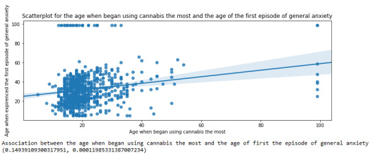
For the association between the age when individuals began using cannabis the most (quantitative explanatory variable) and the age when they experienced the first episode of anxiety (quantitative response variable), the scatterplot psented above shows a positive linear relationship. Regarding the strength of the relationship, the pearson correlation test indicates that the correlation coefficient is equal to 0.14, which is interpreted to a fairly weak linear relationship between the two quantitative variables. The associated p-value is equal to 0.0001, which means that the relationship is statistically significant. Therefore, the association between the age when began using cannabis the most and the age of the first anxiety episode is weak, but it is highly unlikely that a relationship of this magnitude would be due to chance alone. Finally, by squaring the r, we can find the fraction of the variability of one variable that can be predicted by the other, which is very low at 0.01.
0 notes
Text
Your Essential Guide to Python Libraries for Data Analysis
Here’s an essential guide to some of the most popular Python libraries for data analysis:
1. Pandas
- Overview: A powerful library for data manipulation and analysis, offering data structures like Series and DataFrames.
- Key Features:
- Easy handling of missing data
- Flexible reshaping and pivoting of datasets
- Label-based slicing, indexing, and subsetting of large datasets
- Support for reading and writing data in various formats (CSV, Excel, SQL, etc.)
2. NumPy
- Overview: The foundational package for numerical computing in Python. It provides support for large multi-dimensional arrays and matrices.
- Key Features:
- Powerful n-dimensional array object
- Broadcasting functions to perform operations on arrays of different shapes
- Comprehensive mathematical functions for array operations
3. Matplotlib
- Overview: A plotting library for creating static, animated, and interactive visualizations in Python.
- Key Features:
- Extensive range of plots (line, bar, scatter, histogram, etc.)
- Customization options for fonts, colors, and styles
- Integration with Jupyter notebooks for inline plotting
4. Seaborn
- Overview: Built on top of Matplotlib, Seaborn provides a high-level interface for drawing attractive statistical graphics.
- Key Features:
- Simplified syntax for complex visualizations
- Beautiful default themes for visualizations
- Support for statistical functions and data exploration
5. SciPy
- Overview: A library that builds on NumPy and provides a collection of algorithms and high-level commands for mathematical and scientific computing.
- Key Features:
- Modules for optimization, integration, interpolation, eigenvalue problems, and more
- Tools for working with linear algebra, Fourier transforms, and signal processing
6. Scikit-learn
- Overview: A machine learning library that provides simple and efficient tools for data mining and data analysis.
- Key Features:
- Easy-to-use interface for various algorithms (classification, regression, clustering)
- Support for model evaluation and selection
- Preprocessing tools for transforming data
7. Statsmodels
- Overview: A library that provides classes and functions for estimating and interpreting statistical models.
- Key Features:
- Support for linear regression, logistic regression, time series analysis, and more
- Tools for statistical tests and hypothesis testing
- Comprehensive output for model diagnostics
8. Dask
- Overview: A flexible parallel computing library for analytics that enables larger-than-memory computing.
- Key Features:
- Parallel computation across multiple cores or distributed systems
- Integrates seamlessly with Pandas and NumPy
- Lazy evaluation for optimized performance
9. Vaex
- Overview: A library designed for out-of-core DataFrames that allows you to work with large datasets (billions of rows) efficiently.
- Key Features:
- Fast exploration of big data without loading it into memory
- Support for filtering, aggregating, and joining large datasets
10. PySpark
- Overview: The Python API for Apache Spark, allowing you to leverage the capabilities of distributed computing for big data processing.
- Key Features:
- Fast processing of large datasets
- Built-in support for SQL, streaming data, and machine learning
Conclusion
These libraries form a robust ecosystem for data analysis in Python. Depending on your specific needs—be it data manipulation, statistical analysis, or visualization—you can choose the right combination of libraries to effectively analyze and visualize your data. As you explore these libraries, practice with real datasets to reinforce your understanding and improve your data analysis skills!
1 note
·
View note
Text
What is Pandas in Data analysis
Pandas in data analysis is a popular Python library specifically designed for data manipulation and analysis. It provides high-performance, easy-to-use data structures and tools, making it essential for handling structured data in pandas data analysis. Pandas is built on top of NumPy, offering a more flexible and powerful framework for working with datasets.
Pandas revolves around two primary structures, Series (a single line of data) and DataFrame (a grid of data). Imagine a DataFrame as a table or a spreadsheet. It offers a place to hold and tweak table-like data, with rows acting as individual entries and columns standing for characteristics.
The Pandas library simplifies the process of reading, cleaning, and modifying data from different formats like CSV, Excel, JSON, and SQL databases. It provides numerous built-in functions for handling missing data, merging datasets, and reshaping data, which are essential tasks in data preprocessing.
Additionally, Pandas supports filtering, selecting, and sorting data efficiently, helping analysts perform complex operations with just a few lines of code. Its ability to group, aggregate, and summarize data makes it easy to calculate key statistics or extract meaningful insights.
Pandas also integrates with data visualization libraries like Matplotlib, making it a comprehensive tool for data analysis, data wrangling, and visualization, used by data scientists, analysts, and engineers.
0 notes
Text
Beginner’s Guide: Data Analysis with Pandas
Data analysis is the process of sorting through all the data, looking for patterns, connections, and interesting things. It helps us make sense of information and use it to make decisions or find solutions to problems. When it comes to data analysis and manipulation in Python, the Pandas library reigns supreme. Pandas provide powerful tools for working with structured data, making it an indispensable asset for both beginners and experienced data scientists.
What is Pandas?
Pandas is an open-source Python library for data manipulation and analysis. It is built on top of NumPy, another popular numerical computing library, and offers additional features specifically tailored for data manipulation and analysis. There are two primary data structures in Pandas:
• Series: A one-dimensional array capable of holding any type of data.
• DataFrame: A two-dimensional labeled data structure similar to a table in relational databases.
It allows us to efficiently process and analyze data, whether it comes from any file types like CSV files, Excel spreadsheets, SQL databases, etc.
How to install Pandas?
We can install Pandas using the pip command. We can run the following codes in the terminal.

After installing, we can import it using:

How to load an external dataset using Pandas?
Pandas provide various functions for loading data into a data frame. One of the most commonly used functions is pd.read_csv() for reading CSV files. For example:
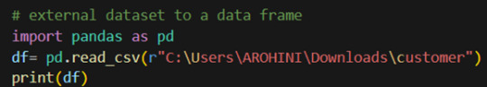
The output of the above code is:
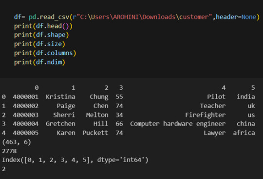
Once your data is loaded into a data frame, you can start exploring it. Pandas offers numerous methods and attributes for getting insights into your data. Here are a few examples:
df.head(): View the first few rows of the DataFrame.
df.tail(): View the last few rows of the DataFrame.
http://df.info(): Get a concise summary of the DataFrame, including data types and missing values.
df.describe(): Generate descriptive statistics for numerical columns.
df.shape: Get the dimensions of the DataFrame (rows, columns).
df.columns: Access the column labels of the DataFrame.
df.dtypes: Get the data types of each column.
In data analysis, it is essential to do data cleaning. Pandas provide powerful tools for handling missing data, removing duplicates, and transforming data. Some common data-cleaning tasks include:
Handling missing values using methods like df.dropna() or df.fillna().
Removing duplicate rows with df.drop_duplicates().
Data type conversion using df.astype().
Renaming columns with df.rename().
Pandas excels in data manipulation tasks such as selecting subsets of data, filtering rows, and creating new columns. Here are a few examples:
Selecting columns: df[‘column_name’] or df[[‘column1’, ‘column2’]].
Filtering rows based on conditions: df[df[‘column’] > value].
Sorting data: df.sort_values(by=’column’).
Grouping data: df.groupby(‘column’).mean().
With data cleaned and prepared, you can use Pandas to perform various analyses. Whether you’re computing statistics, performing exploratory data analysis, or building predictive models, Pandas provides the tools you need. Additionally, Pandas integrates seamlessly with other libraries such as Matplotlib and Seaborn for data visualization
#data analytics#panda#business analytics course in kochi#cybersecurity#data analytics training#data analytics course in kochi#data analytics course
0 notes
Text
Data Manipulation: A Beginner's Guide to Pandas Dataframe Operations
Outline: What’s a Pandas Dataframe? (Think Spreadsheet on Steroids!) Say Goodbye to Messy Data: Pandas Tames the Beast Rows, Columns, and More: Navigating the Dataframe Landscape Mastering the Magic: Essential Dataframe Operations Selection Superpower: Picking the Data You Need Grab Specific Columns: Like Picking Out Your Favorite Colors Filter Rows with Precision: Finding Just the Right…
View On WordPress
#data manipulation#grouping data#how to manipulate data in pandas#pandas dataframe operations explained#pandas filtering#pandas operations#pandas sorting
0 notes
Text
week_3
My dataset is gapminder.csv
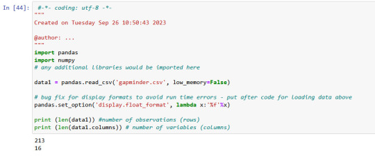
There is 213 rows ans 16 columns in gapminder data, which I used.
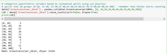
Displaying of selected variables (country, breastcanserper100th and Co2emissions) as a pandas dataframe.

Value 'breastcanserper100th'

Here I used .describe() command to see important statistical values
total 213 countries
but we have only 173 rows for breastcanserper100th information rows.
it means there are some informations (40 rows for countries) not available.
mean value of breastcanserper100th is 37,4
max value is 101,1 per 100000 womens
min value is 3,9 per 100000 womens
distribution of breastcanserper100th is below in 10 groups
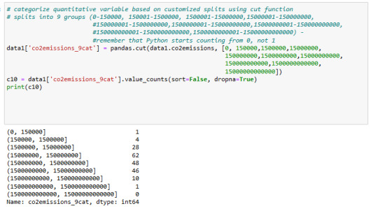
Value 'co2emissions'
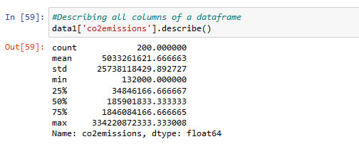
Information about co2emissions in using .describe() command for statistic
There is 200 values available
min co2emission value is 132000metric tons and max 334220872333.. metric tons
This is a very big difference.
distribution of co2emissions is below in 9 groups
value 'lifeexpectancy

value 'lifeexpectancy' is for my subset data interesting. I converted it to numeric format and used describe() command to see statistic informations like mean and count. total 191 values available.
mean 69.75 years
max,83.39
min is 47,79
distribution of 'lifeexpectancy' is below in 10 groups

--------------------------------------------------------------------------
I think i have to check the cases , where the life expectancy< 69 and Co2 > 150000000 metric tons
which effects I can find out for breastcanserper100th
What is the distribution of breast cancer in different cases of lifeexpectancy and Co2 emissions?
it will be my next step.
0 notes
Text
Exploratory Data Analysis: Unveiling Insights from the Influenza ViroShield Dataset
Introduction; Data analysis serves as the bedrock for informed decision-making, and exploring datasets is the first step in this process. In this blog, we'll embark on an exploratory analysis journey using Python's data manipulation and visualization tools. We'll be working with the InfluenzaViroShield Dataset, leveraging libraries like Pandas and Matplotlib to uncover insights that might inform future studies or interventions related to influenza vaccination coverage.
Exploratory Analysis: Exploratory analysis is a crucial phase in data science where we dig into a dataset's structure, characteristics, and relationships between variables. We'll use Python libraries such as Matplotlib and Pandas to visualize and analyze the data.
The provided script starts by importing essential libraries like Matplotlib, Pandas, and NumPy. These libraries facilitate data visualization, data manipulation, and mathematical operations, respectively. The script then reads the dataset into a Pandas DataFrame, which is a tabular data structure ideal for data analysis.
The script includes functions for generating various types of plots, including histograms, correlation matrices, and scatter plots. These plots are invaluable for understanding the distribution, relationships, and patterns within the data.
Histograms: Histograms offer insights into the distribution of data. The plotHistogram function generates histograms for selected columns, focusing on those with a reasonable number of unique values. It uses the Matplotlib library to create subplots of histograms, allowing us to visualize the distribution of each column's data. The function is parameterized to control the number of histograms per row and the number of unique values in a column.
Correlation Matrix: The plotCorrelationMatrix function generates a correlation matrix, highlighting relationships between numerical variables. Correlation matrices are valuable for identifying patterns of positive or negative correlation between variables. The function uses Matplotlib to visualize the matrix, color-coding correlations and displaying column names on the axes.
Scatter and Density Plots: Scatter plots reveal relationships between two numerical variables, helping us identify trends, clusters, or outliers. The plotScatterMatrix function generates scatter plots for numerical variables, along with kernel density plots on the diagonal. Kernel density plots display data distribution more smoothly than histograms.
Visualizing the InfluenzaViroShield Dataset: The script loads the InfluenzaViroShield Dataset and applies the plotting functions to analyze its contents. It reads the dataset into a Pandas DataFrame, allowing for manipulation and analysis. It provides a summary of the dataset's size (number of rows and columns) and displays the first few rows using the .head() method.
By using the provided functions, the script generates histograms, correlation matrices, and scatter plots for the InfluenzaViroShield Dataset. The histograms offer insights into the distribution of various attributes, while the correlation matrix reveals potential relationships between variables. Scatter plots showcase potential correlations and patterns in a visual format.
Conclusion: Exploratory data analysis is an essential step in understanding a dataset's characteristics, uncovering trends, and identifying potential areas of interest. By leveraging Python's powerful libraries, such as Matplotlib and Pandas, analysts can create informative visualizations and gain valuable insights.
In this blog, we've demonstrated how to apply exploratory analysis techniques to the InfluenzaViroShield Dataset, providing a foundation for further analysis, modeling, and decision-making in the realm of influenza vaccination coverage. This analysis showcases the power of data exploration and the tools available to data scientists to extract meaning from complex datasets.
1 note
·
View note
Text
Mars Study Final Submission
Dear Readers,
This is the final article on Mars Crater Study. This week I have studied the graphical representation of the selected variables to find the answer to my initial research questions. All the visualizations and findings are mentioned in this article.
I have selected following variables to plot:
For univariate graph :
- Crater diameter
- Crater depth to diameter ratio
- Crater latitude
For bivariate graph :
- Crater depth vs Crater diameter
- Crater depth vs Latitude
- Crater depth to diameter ratio vs latitude
- Number of layers vs Crater depth
I also decided to get a simple statistical description for the following variables:
- Crater diameter
- Crater depth-to-diameter ratio
Here is my code [in Python] :
#importing the required library
import pandas
import numpy
import seaborn
import matplotlib.pyplot as plt
#Set PANDAS to show all columns in DataFrame
pandas.set_option('display.max_columns', None)
#Set PANDAS to show all rows in DataFrame
pandas.set_option('display.max_rows', None)
#reading the mars dataset
data=pandas.read_csv('marscrater_pds.csv', low_memory=False)
print('number of observations(row)')
print(len(data))
print('number of observations(column)')
print(len(data.columns))
print('displaying the top 5 rows of the dataset')
print(data.head())
#dropping the unused columns from the dataset
data = data.drop('CRATER_ID',1)
data = data.drop('CRATER_NAME',1)
data = data.drop('MORPHOLOGY_EJECTA_1',1)
data = data.drop('MORPHOLOGY_EJECTA_2',1)
data = data.drop('MORPHOLOGY_EJECTA_3',1)
print('Selected rows with diameter greater than 3km')
data1=data[(data['DIAM_CIRCLE_IMAGE']>3)]
print(data1.head())
# Frequency distributions
# Crater diameter
print('Count for crater diameters (for diameter greater than 3km)')
c1=data1['DIAM_CIRCLE_IMAGE'].value_counts(sort=True)
print(c1)
p1=data1['DIAM_CIRCLE_IMAGE'].value_counts(sort=True, normalize=True)*100
print(p1)
# Crater depth
print('Count for crater depth')
c2=data1['DEPTH_RIMFLOOR_TOPOG'].value_counts(sort=True)
print(c2)
p2=data1['DEPTH_RIMFLOOR_TOPOG'].value_counts(sort=True, normalize=True)*100
print(p2)
#Number of layers
print('Count for number of layers')
c3=data1['NUMBER_LAYERS'].value_counts(sort=True)
print(c3)
p3=data1['NUMBER_LAYERS'].value_counts(sort=True, normalize=True)*100
print(p3)
#creating the copy of the subset data
data2=data1.copy()
#computing the depth to diameter ratio as a percentage and saving it in a new variable d2d_ratio
data2['d2d_ratio']=(data2['DEPTH_RIMFLOOR_TOPOG']/data2['DIAM_CIRCLE_IMAGE'])*100
data2['d2d_ratio']=data2['d2d_ratio'].replace(0, numpy.nan)
# Split crater diameters into 7 groups to simplify frequency distribution
# 3-5km, 5-10km, 10-20km, 20-50km, 50-100km, 100-200km and 200-500km
data2['D_range']=pandas.cut(data2.DIAM_CIRCLE_IMAGE,[3,5,10,20,50,100,200,500])
#frequency distribution for D_range
c4=data2['D_range'].value_counts(sort=True)
print('Count for crater diameter (per ranges)')
print (c4)
p4=data2['D_range'].value_counts(sort=True, normalize=True)*100
print('Percentage for crater diameter (per ranges)')
print (p4)
# Split crater depth-to-diameter ratios into 5 groups to simplify frequency distribution
# 0-5%, 5-10%, 10-15%, 15-20% and 20-25%
data2['d2d_range']=pandas.cut(data2.d2d_ratio,[0,5,10,15,20,25])
#frequency distribution for d2d_range
c5=data2['d2d_range'].value_counts(sort=True)
print('count for crater depth to diameter ratio')
print(c5)
p5=data2['d2d_range'].value_counts(sort=True,normalize=True)*100
print('percentage for crater depth to diameter ratio')
print(p5)
# Making a copy of the subset data created previously (data2)
data3=data2.copy()
# Ploting crater diameter as a bar graph
seaborn.distplot(data3['DIAM_CIRCLE_IMAGE'].dropna(), kde=False, hist_kws={'log':True});
plt.xlabel('Crater diameter (km)')
plt.ylabel('Occurrences')
plt.title('Crater diameter distribution')
# Ploting crater depth-to-diameter ratio as a bar graph
seaborn.distplot(data3['d2d_ratio'].dropna(), kde=False);
plt.xlabel('Depth-to-diameter ratio in percent')
plt.ylabel('Occurrences')
plt.title('Depth-to-diameter ratio distribution')
# Ploting crater latitude as a bar graph
seaborn.distplot(data3['LATITUDE_CIRCLE_IMAGE'].dropna(), kde=False);
plt.xlabel('Latitude (degrees)')
plt.ylabel('Occurrences')
plt.title('Crater latitude distribution')
#Statistical description
print('Describe crater diameter')
desc1 = data3['DIAM_CIRCLE_IMAGE'].describe()
print(desc1)
print('Describe depth-to-diameter ratio')
desc2 = data3['d2d_ratio'].describe()
print(desc2)
# basic scatterplot: crater depth vs crater diameter
scat1 = seaborn.lmplot(x='DIAM_CIRCLE_IMAGE', y='DEPTH_RIMFLOOR_TOPOG', data=data3)
scat1.set(xlim=(0,500))
scat1.set(ylim=(0,5))
plt.xlabel('Crater Diameter (km)')
plt.ylabel('Crater Depth (km)')
plt.title('Correlation between depth and diameter')
# basic scatterplot: Crater diameter vs latitude
scat2 = seaborn.lmplot(x='LATITUDE_CIRCLE_IMAGE', y='DIAM_CIRCLE_IMAGE', data=data3)
scat2.set(xlim=(-100,100))
scat2.set(ylim=(0,300))
plt.xlabel('Latitude (degrees)')
plt.ylabel('Diameter (km)')
plt.title('Relationship between crater diameter and latitude')
# basic scatterplot: d2d_ratio vs latitude
scat3 = seaborn.lmplot(x='LATITUDE_CIRCLE_IMAGE', y='d2d_ratio', data=data3)
scat3.set(xlim=(-100,100))
scat3.set(ylim=(0,30))
plt.xlabel('Latitude (degrees)')
plt.ylabel('Depth-to-diameter ratio (%)')
plt.title('Relation between depth-to-diameter ratio and latitude')
#Bivariate bar graph: Number of layers vs Crater Depth
seaborn.catplot(x='NUMBER_LAYERS', y='DEPTH_RIMFLOOR_TOPOG', data=data3, kind='bar', ci=None)
plt.xlabel('Number of Layers')
plt.ylabel('Depth of the crater')
plt.title('Relationship between the Number of Layers and the craters Depth')
The output for the code :
number of observations(row) 384343 number of observations(column) 10 displaying the top 5 rows of the dataset CRATER_ID CRATER_NAME ... MORPHOLOGY_EJECTA_3 NUMBER_LAYERS 0 01-000000 ... 0 1 01-000001 Korolev ... 3 2 01-000002 ... 0 3 01-000003 ... 0 4 01-000004 ... 0
[5 rows x 10 columns] Selected rows with diameter greater than 3km LATITUDE_CIRCLE_IMAGE ... NUMBER_LAYERS 0 84.367 ... 0 1 72.760 ... 3 2 69.244 ... 0 3 70.107 ... 0 4 77.996 ... 0
[5 rows x 5 columns] Count for crater diameters (for diameter greater than 3km) 3.02 317 3.03 309 3.06 308 3.05 305 3.01 305
60.07 1 69.95 1 100.78 1 118.24 1 67.50 1 Name: DIAM_CIRCLE_IMAGE, Length: 6039, dtype: int64 3.02 0.398356 3.03 0.388303 3.06 0.387047 3.05 0.383277 3.01 0.383277
60.07 0.001257 69.95 0.001257 100.78 0.001257 118.24 0.001257 67.50 0.001257 Name: DIAM_CIRCLE_IMAGE, Length: 6039, dtype: float64 Count for crater depth 0.00 12821 0.07 1564 0.08 1534 0.10 1475 0.11 1448
3.80 1 2.82 1 2.95 1 2.94 1 3.03 1 Name: DEPTH_RIMFLOOR_TOPOG, Length: 296, dtype: int64 0.00 16.111439 0.07 1.965392 0.08 1.927693 0.10 1.853551 0.11 1.819621
3.80 0.001257 2.82 0.001257 2.95 0.001257 2.94 0.001257 3.03 0.001257 Name: DEPTH_RIMFLOOR_TOPOG, Length: 296, dtype: float64 Count for number of layers 0 60806 1 14633 2 3309 3 739 4 85 5 5 Name: NUMBER_LAYERS, dtype: int64 0 76.411526 1 18.388479 2 4.158237 3 0.928660 4 0.106815 5 0.006283 Name: NUMBER_LAYERS, dtype: float64 Count for crater diameter (per ranges) (3, 5] 32084 (5, 10] 23135 (10, 20] 13470 (20, 50] 8818 (50, 100] 1766 (100, 200] 255 (200, 500] 45 Name: D_range, dtype: int64 Percentage for crater diameter (per ranges) (3, 5] 40.320209 (5, 10] 29.073932 (10, 20] 16.927852 (20, 50] 11.081648 (50, 100] 2.219346 (100, 200] 0.320460 (200, 500] 0.056552 Name: D_range, dtype: float64 count for crater depth to diameter ratio (0, 5] 41025 (5, 10] 15957 (10, 15] 8973 (15, 20] 773 (20, 25] 18 Name: d2d_range, dtype: int64 percentage for crater depth to diameter ratio (0, 5] 61.464357 (5, 10] 23.907051 (10, 15] 13.443502 (15, 20] 1.158122 (20, 25] 0.026968 Name: d2d_range, dtype: float64 Describe crater diameter count 79577.000000 mean 11.366228 std 16.695375 min 3.010000 25% 3.940000 50% 6.060000 75% 12.150000 max 1164.220000 Name: DIAM_CIRCLE_IMAGE, dtype: float64 Describe depth-to-diameter ratio count 79577.000000 mean 4.120458 std 4.076532 min -1.639984 25% 0.915192 50% 2.636440 75% 6.709265 max 23.076923 Name: d2d_ratio, dtype: float64
From the above results it is clear that the distribution of craters diameter is very scattered : the mean is around 11km, but the standard deviation is nearly 17km, indicating a high variability of the crater diameter, as expected.
On the other hand, the depth-to-diameter ratio seems to be much less scattered, the mean value is around 4%, with a standard deviation around 4%, indicating that this ratio is less “volatile” than the diameter itself.
The Univariate Graphs are shown below :

This graph is displayed with a logarithmic y-scale in order to make it more readable. As expected, it shows that the majority of the craters have smaller diameters, while the larger craters are less frequent.
Up to about 400km, this variable (diameter) shows a consistent negative slope, which confirms the relationship mentioned earlier in the project : the larger the craters, the less frequently they occur. Above 400km size, the number of craters are too small and it makes no sense to try to derive any statistics from those.
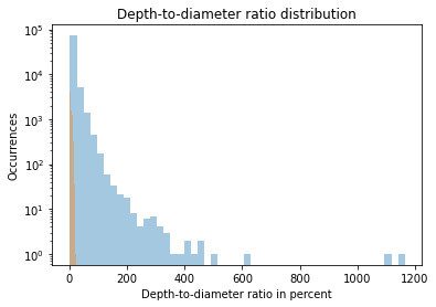
This graph shows Skewed Right distribution. We can see more number of craters for smaller value of the ratio. Which means smaller craters have a smaller depth-to-diameter ratio, while the bigger craters seem to have a bigger depth-to-diameter ratio as well.
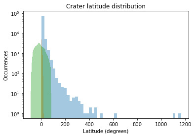
The crater latitude graph also shows the Skewed Right Distribution. We can conclude from the graph that the maximum numbers of craters are located near the Equator.
The Bivariate Graphs are shown below :
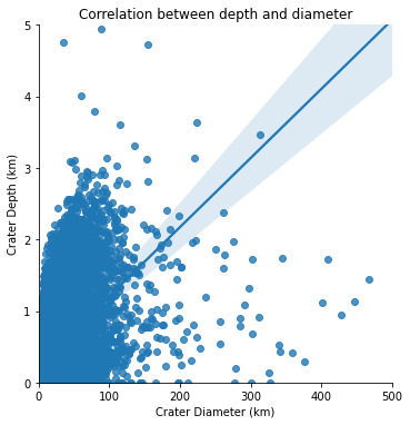
From the graph it is obvious that there is a relationship between these two variables : the greater the diameter, the greater the depth. But the relationship between depth and diameter is somehow weak, as there is a high variability of the scattered plot around the best-fit linear regression.
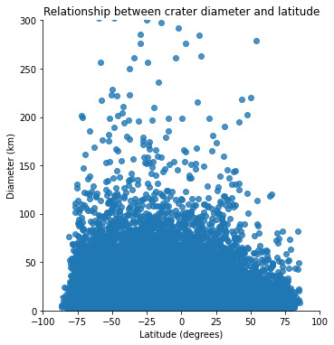
When we plot diameter vs latitude, we see that there is no relationship between these two variables : the location of the impact has apparently no influence on its amplitude.
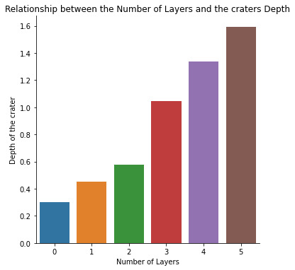
A positive correlation is observed between the number of layers and the depth of the crater. The number of layers of the the crater increases with the increase in the depth of the crater.
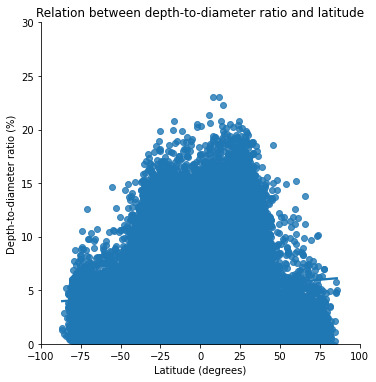
The graph depicting the relationship between the latitude and the depth to diameter ratio. To be honest, I think this is the most interesting plot out of all.
From this graph it is quite obvious that this ratio is higher for lower latitudes (between -40° and +40° approximately). This correlates with the hard, volcanic terrains which are concentrated around these lower latitudes.
On the other hand, the depth-to-diameter ratio is lower for higher latitudes (below -40° and above +40°). This correlates with the soft, ice-rich terrains which are concentrated around these higher latitudes (closer to the poles).
Which proves my initial hypothesis that the depth-to-diameter ratio depends on the type of terrain where the impact occurs. The harder the terrain, the higher the depth-to-diameter ratio, and the softer the terrain, the lower the depth-to-diameter ratio.
Across the surface of a planetary body, one might expect the ratio of a crater's depth to diameter to be constant since it is a gravity-dominated feature (Melosh, 1989). But, while gravity dominates, terrain properties control this final ratio. Craters are shallower near the equator and deeper near the poles, and this effect persists up to the D <= 30 km range.
Congratulations on making to the end of this article!!
Thank You for your time and patience.
#mars#martian craters#data#data science#data management#datavisualization#nastya titorenko#planet of the apes#craters#college#students#course#research#education#technology#astronomy#marscraterstudy
8 notes
·
View notes
Text
0 notes
Note
It seems like Python (or a similarly architected language) would need a specially designed data structure for efficiently manipulating large arrays/matrices. Furthermore, there would be a huge performance hit if you used native loops rather than broadcasting ops. So, do you object to the basic setup of Pandas, or do you think it just did a shit job of being a good library that does that?
Pandas gets these fast linear algebra tools from numpy, and I don’t object to numpy. Pandas adds things on top of numpy, and I object to those.
Pandas is not a package for fast linear algebra, it’s a package for running queries on 2D data structures that resemble queries on a relational database. So it introduces things like:
Named and typed “columns” (AKA “fields”). This means we are thinking about matrices from a very different perspective from abstract linear algebra: not only do we fix a preferred basis, but the columns may even have different types that cannot be added to one another (say float vs. string). (I mention this to emphasize that pandas is not just an obvious extension of numpy, nor is numpy obviously the right foundation for pandas.)
A typed “index” used to identify specific rows.
Operations similar to SQL select, join, group by, and order by.
In other words, interacting with a data table in pandas is similar to running SQL queries on a database. However, the pandas experience is (IME) worse than the SQL experience in numerous ways.
I’ve used pandas almost every day of my life for around three years (kind of sad to think about tbh), and I still frequently have to look up how to do basic operations, because the API is so messy. I never forget how to do a join in SQL: it’s just something like
SELECT [...] FROM a
JOIN b
ON a.foo = b.bar
To do a join in pandas, I can do at least two different things. One of them looks like
and the other looks like (chopped off at my screen height!)
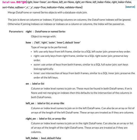
If on is None and not merging on indexes then this defaults to the intersection of the columns in both DataFrames. Got that?
Let’s not even talk about “MultiIndices.” Every time I have the misfortune to encounter one of those, I stare at this page for 30 minutes, my brain starts to melt, and I give up.
As mentioned earlier, the type system for columns doesn’t let them have nullable types. This is incredibly annoying and makes it next to useless. This limitation originates in numpy’s treatment of NaN, which makes sense in numpy’s context, but pandas just inherits it in a context where it hurts.
There’s no spec, behavior is defined by API and by implementation, those change between versions.
Etc., etc. It’s just a really cumbersome way to do some simple database-like things.
16 notes
·
View notes
Text
Classification Decision Tree for Heart Attack Analysis
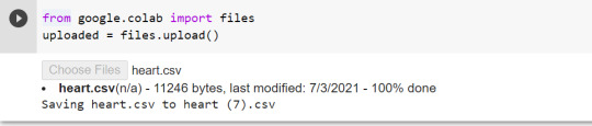
Primarily, the required dataset is loaded. Here, I have uploaded the dataset available at Kaggle.com in the csv format.
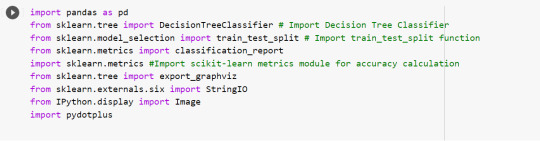
All python libraries need to be loaded that are required in creation for a classification decision tree. Following are the libraries that are necessary to import:
The following code is used to load the dataset. read_csv() function is used to load the dataset.
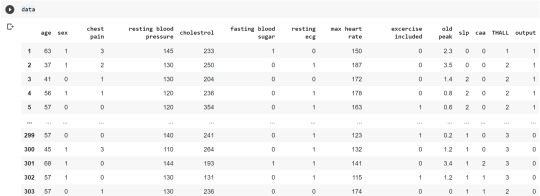
column_names = ['age','sex','chest pain','resting blood pressure','cholestrol','fasting blood sugar','resting ecg','max heart rate','excercise included','old peak','slp','caa','THALL','output']
data= pd.read_csv("heart.csv",header=None,names=column_names)
data = data.iloc[1: , :] # removes the first row of dataframe
Now, we divide the columns in the dataset as dependent or independent variables. The output variable is selected as target variable for heart disease prediction system. The dataset contains 13 feature variables and 1 target variable.
feature_cols = ['age','sex','chest pain','chest pain','resting blood pressure','cholestrol','fasting blood sugar','resting ecg','max heart rate','excercise included','old peak','slp','caa','THALL']
pred = data[feature_cols] # Features
tar = data.output # Target variable
Now, dataset is divided into a training set and a test set. This can be achieved by using train_test_split() function. The size ratio is set as 60% for the training sample and 40% for the test sample.
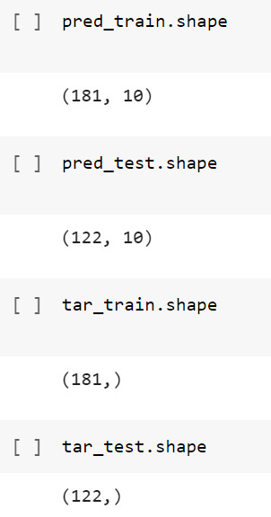
pred_train, pred_test, tar_train, tar_test = train_test_split(X, y, test_size=0.4, random_state=1)
Using the shape function, we observe that the training sample has 181 observations (nearly 60% of the original sample) and 10 explanatory variables whereas the test sample contains 122 observations(nearly 40 % of the original sample) and 10 explanatory variables.
Now, we need to create an object claf_mod to initialize the decision tree classifer. The model is then trained using the fit function which takes training features and training target variables as arguments.
# To create an object of Decision Tree classifer
claf_mod = DecisionTreeClassifier()
# Train the model
claf_mod = claf_mod.fit(pred_train,tar_train)
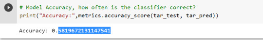
To check the accuracy of the model, we use the accuracy_score function of metrics library. Our model has a classification rate of 58.19 %. Therefore, we can say that our model has good accuracy for finding out a person has a heart attack.
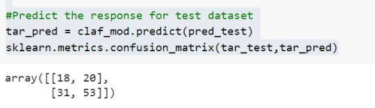
To find out the correct and incorrect classification of decision tree, we use the confusion matrix function. Our model predicted 18 true negatives for having a heart disease and 53 true positives for having a heart attack. The model also predicted 31 false negatives and 20 false positives for having a heart attack.
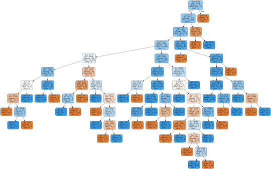
To display the decision tree we use export_graphviz function. The resultant graph is unpruned.
dot_data = StringIO()
export_graphviz(claf_mod, out_file=dot_data,
filled=True, rounded=True,
special_characters=True,class_names=['0','1'])
graph = pydotplus.graph_from_dot_data(dot_data.getvalue())
graph.write_png('heart attack.png')
Image(graph.create_png())
To get a prune graph, we changed the criterion as entropy and initialized the object again. The maximum depth of the tree is set as 3 to avoid overfitting.
# Create Decision Tree classifer object
claf_mod = DecisionTreeClassifier(criterion="entropy", max_depth=3)
# Train Decision Tree Classifer
claf_mod = claf_mod.fit(pred_train,tar_train)
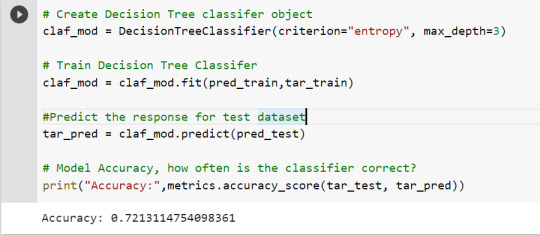
#Predict the response for test dataset
tar_pred = claf_mod.predict(pred_test)
By optimizing the performance, the classification rate of the model increased to 72.13%.
By passing the object again into export_graphviz function, we obtain the prune graph.
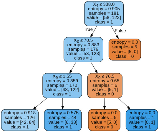
From the above graph, we can infer that :
1) individuals having cholesterol less than 338 mg/dl, age less than or equal to 70.5 years, and whose previous peak was less than or equal to 1.55: 84 of them are more likely to have a heart attack whereas 42 of them will less likely to have a heart attack.
2) individuals having cholesterol less than 338 mg/dl, age less than or equal to 70.5 years, and whose previous peak was more than 1.55: 6 of them will less likely to have a heart attack whereas 38 of them are more likely to have a heart attack.
3) individuals having cholesterol less than 338 mg/dl and age less than or equal to 76.5 years: are less likely to have a heart attack
4) individuals having cholesterol less than 338 mg/dl and age more than 76.5 years: are more likely to have a heart attack
5) individuals having cholesterol more than 338 mg/dl : are less likely to have a heart attack
The Whole Code:
from google.colab import files uploaded = files.upload()
import pandas as pd from sklearn.tree import DecisionTreeClassifier # Import Decision Tree Classifier from sklearn.model_selection import train_test_split # Import train_test_split function from sklearn.metrics import classification_report import sklearn.metrics #Import scikit-learn metrics module for accuracy calculation from sklearn.tree import export_graphviz from sklearn.externals.six import StringIO from IPython.display import Image import pydotplus
column_names = ['age','sex','chest pain','resting blood pressure','cholestrol','fasting blood sugar','resting ecg','max heart rate','excercise included','old peak','slp','caa','THALL','output'] data= pd.read_csv("heart.csv",header=None,names=column_names) data = data.iloc[1: , :] # removes the first row of dataframe (In this case, ) #split dataset in features and target variable feature_cols = ['age','sex','chest pain','chest pain','resting blood pressure','cholestrol','fasting blood sugar','resting ecg','max heart rate','excercise included','old peak','slp','caa','THALL'] pred = data[feature_cols] # Features tar = data.output # Target variable pred_train, pred_test, tar_train, tar_test = train_test_split(X, y, test_size=0.4, random_state=1) # 60% training and 40% test pred_train.shape pred_test.shape tar_train.shape tar_test.shape
# To create an object of Decision Tree classifer claf_mod = DecisionTreeClassifier() # Train the model claf_mod = claf_mod.fit(pred_train,tar_train) #Predict the response for test dataset tar_pred = claf_mod.predict(pred_test) sklearn.metrics.confusion_matrix(tar_test,tar_pred) # Model Accuracy, how often is the classifier correct? print("Accuracy:",metrics.accuracy_score(tar_test, tar_pred)) dot_data = StringIO() export_graphviz(claf_mod, out_file=dot_data, filled=True, rounded=True, special_characters=True,class_names=['0','1']) graph = pydotplus.graph_from_dot_data(dot_data.getvalue()) graph.write_png('heart attack.png') Image(graph.create_png())
# Create Decision Tree classifer object claf_mod = DecisionTreeClassifier(criterion="entropy", max_depth=3) # Train Decision Tree Classifer claf_mod = claf_mod.fit(pred_train,tar_train) #Predict the response for test dataset tar_pred = claf_mod.predict(pred_test) # Model Accuracy, how often is the classifier correct? print("Accuracy:",metrics.accuracy_score(tar_test, tar_pred)) from sklearn.externals.six import StringIO from IPython.display import Image from sklearn.tree import export_graphviz import pydotplus dot_data = StringIO() export_graphviz(claf_mod, out_file=dot_data, filled=True, rounded=True, special_characters=True, class_names=['0','1']) graph = pydotplus.graph_from_dot_data(dot_data.getvalue()) graph.write_png('improved heart attack.png') Image(graph.create_png())
1 note
·
View note
Text
Data Management And Visualization - Assignment 4
Assignment 4 Python Code for Assignment 4 # -*- coding: utf-8 -*- """ Created on Wed Dec 23 15:49:41 2020 Assignment 4 @author: GB8PM0 """ #%% # import pandas and numpy import pandas import numpy import seaborn import matplotlib.pyplot as plt # any additional libraries would be imported here #Set PANDAS to show all columns in DataFrame pandas.set_option('display.max_columns', None) #Set PANDAS to show all rows in DataFrame pandas.set_option('display.max_rows', None) # bug fix for display formats to avoid run time errors pandas.set_option('display.float_format', lambda x:'%f'%x) #define data set to be used mydata = pandas.read_csv('addhealth_pds.csv', low_memory=False) #data management- create happiness types of 1 and2 don't get sad, 4 &5 get sad def happiness(row): if row['H1PF10'] == 1: return 1 elif row['H1PF10'] == 2 : return 1 elif row['H1PF10'] == 4 : return 0 elif row['H1PF10'] == 5 : return 0 mydata['happiness'] = mydata.apply (lambda row: happiness (row),axis=1) # Count of records in each option selected for happiness print("ph1 - % of happiness") ph1 = mydata["happiness"].value_counts(sort=True, normalize= True) * 100 print(ph1) # plot univariate graph of happiness seaborn.countplot(x="happiness", data=mydata) plt.xlabel('happiness') plt.title('happiness level') #%% #data management-creating satisfaction types of 1 and2 satisfied, 4 &5 Not Satisfied 3 neither def satisfaction(row): if row['H1PF5'] == 1: return 1 elif row['H1PF5'] == 2 : return 1 elif row['H1PF5'] == 4 : return 2 elif row['H1PF5'] == 5 : return 2 mydata['satisfaction'] = mydata.apply (lambda row: satisfaction (row),axis=1) # you can rename categorical variable values for graphing if original values are not informative # first change the variable format to categorical if you haven’t already done so mydata['satisfaction'] = mydata['satisfaction'] .astype('category') # second create a new variable that has the new variable value labels mydata['satisfaction'] =mydata['satisfaction'].cat.rename_categories(["Satisfied", "Not Satisfied"]) # % of records in each option selected for mother satifaction print("ps1 - % of satisfaction - Satisfaction with Mother") ps1 = mydata["satisfaction"].value_counts(sort=True, normalize=True) * 100 print(ps1) # plot univariate graph of satisfaction seaborn.countplot(x="satisfaction", data=mydata) plt.xlabel('Mother satisfaction') plt.title('Relationship with Mother satisfaction') #%% #data management-creating selfesteem types of 1 and2 good selfesteem, 4 &5 not good selfesteem def selfesteem(row): if row['H1PF33'] == 1: return 1 elif row['H1PF33'] == 2 : return 1 elif row['H1PF33'] == 4 : return 0 elif row['H1PF33'] == 5 : return 0 mydata['selfesteem'] = mydata.apply (lambda row: selfesteem (row),axis=1) # Count of records in each option selected for selfesteem print("% of selfesteem") pse1 = mydata["selfesteem"].value_counts(sort=True, normalize= True) print(pse1) # plot univariate graph of selfesteem seaborn.countplot(x="selfesteem", data=mydata) plt.xlabel('selfesteem') plt.title('selfesteem level') #plot bivariate bar graph C->C satisfaction and hapiness seaborn.catplot(x='satisfaction', y='happiness', data=mydata, kind="bar", ci=None) plt.xlabel('Relationship With Mother satisfaction') plt.ylabel('happiness') Variable 1 – happiness (H1PF10) Univariate graph of happiness. Created two groupings of “0” and “1”. 0 is for adolescents who felt sad and 1 is for adolescents who were not sad. 4435 of adolescents felt sadness, and 932 of adolescents were happy (not sad). Variable 2 – Satisfaction with Relation with Mother Created a Univariate graph of satisfaction with Mother relationship. Created two groupings of “Satisfied and “Not Satisfied”. Around 5404 adolescents were satisfied with the relationship with their mother, and around 363 were not satisfied with the relationship with their mother Variable 3 – Self Esteem Created two groupings of “0” and “1”. 0 is for adolescents who do not like themselves (have low self esteem), and 1 is for adolescents who like themselves (have high self esteem) . 5022 adolescents had high self esteem, and 592 had high self esteem Relationship with Mother Versus Happiness Created a bivariate graph between satisfaction with mother relationship to happiness. It looks like from the graph the 17.8% of adolescents who are satisfied with their relationship and are happy, whereas only 5% of adolescents who are not satisfied are happy
1 note
·
View note
Photo
How to Select Rows from Pandas DataFrame in Python ☞ https://bit.ly/3drU798 #python #programming
3 notes
·
View notes