#several shades
Text


lesbian bed death - goth girls are easy
Support me on Patreon <3
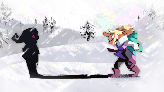
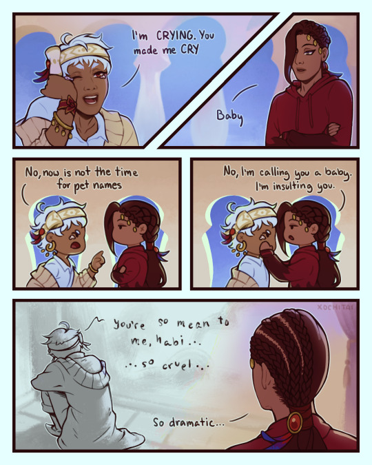
#fucking emergency. the girl at the bar is butch bait and she knows it and will use it to her advantage#i spend several hours shading this and then i realised it looks better flat#anyways this isnt the end of them in bars and clubs. i still have a very vivid image in my mind of karlach fucking shad in the bathroom#and i want to draw them as a band as well :))#and shadowheart and nocturne modern au. goddd#i could not come up with a better caption. but this song was my soundtrack to drawing this so!#bg3#bg3 fanart#bg3 art#shadowheart#karlach#karlach cliffgate#lae'zel#baldurs gate 3#fanart#art#shadowlach#shadowzel#bg3 modern au
8K notes
·
View notes
Text

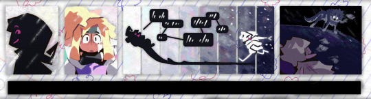
kind of a redraw of a manga panel but honestly just me being emotional abt them as per usual
(recommended listening: cosmo sheldrake's cover of green grass)
#dungeon meshi#dungeon meshi spoilers#dunmeshi spoilers#laios touden#falin touden#cave scribbles#dunmeshi#ik in the manga he didn't cry#and i don't rlly think he does like. Consciously#its more of just a physical response to the stress of everything#also i didnt intend for the shading to be so severe but it just ended up that way lol
2K notes
·
View notes
Text
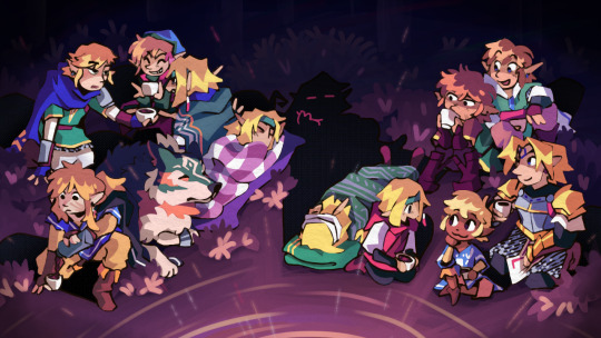
did a piece in the LU server's gift exchange ! something of survival and reunions and smug little shadowguys
#LU5thGiftX#linked universe#lu#shadow lu#four lu#vio lu#green lu#wolfie lu#twilight lu#warriors lu#wild lu#legend lu#blue lu#red lu#wind lu#hyrule lu#sky lu#time lu#dragon doodles#I really hope my giftee ends up liking it! this was my first exchange and I was somewhat stressed but I'm pretty happy with the end result#ended up doing several art things I haven't done in ages AND tried several new art things. was a pretty good experience! :D#why did I decide to manually cel-shade those patterned blankets though. something's wrong with me LOL#next day bonus fun fact this was initially conceptualized as an animated short. this obviously didn't work out xD but the heart's there
2K notes
·
View notes
Text
I think 90% of my gripes with how modern anime looks comes down to flat color design/palettes.
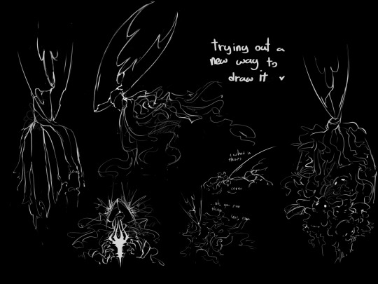
Non-cohesive, washed-out color palettes can destroy lineart quality. I see this all the time when comparing an anime's lineart/layout to its colored/post-processed final product and it's heartbreaking. Compare this pre-color vs. final frame from Dungeon Meshi's OP.


So much sharpness and detail and weight gets washed out and flattened by 'meh' color design. I LOVE the flow and thickness and shadows in the fabrics on the left. The white against pastel really brings it out. Check out all the detail in their hair, the highlights in Rin's, the different hues to denote hair color, the blue tint in the clothes' shadows, and how all of that just gets... lost. It works, but it's not particularly good and does a disservice to the line-artist.
I'm using Dungeon Meshi as an example not because it's bad, I'm just especially disappointed because this is Studio Trigger we're talking about. The character animation is fantastic, but the color design is usually much more exciting. We're not seeing Trigger at their full potential, so I'm focusing on them.
Here's a very quick and messy color correct. Not meant to be taken seriously, just to provide comparison to see why colors can feel "washed out." Top is edit, bottom is original.
You can really see how desaturated and "white fluorescent lighting" the original color palettes are.
[Remember: the easiest way to make your colors more lively is to choose a warm or cool tint. From there, you can play around with bringing out complementary colors for a cohesive palette (I warmed Marcille's skintone and hair but made sure to bring out her deep blue clothes). Avoid using too many blend mode layers; hand-picking colors will really help you build your innate color sense and find a color style. Try using saturated colors in unexpected places! If you're coloring a night scene, try using deep blues or greens or magentas. You see these deep colors used all the time in older anime because they couldn't rely on a lightness scale to make colors darker, they had to use darker paints with specific hues. Don't overthink it, simpler is better!]
#not art#dungeon meshi#rant#i'm someone who can get obsessive over colors in my own art#will stare at the screen adjusting hues/saturation for hours#luckily i've gotten faster at color picking#but yeah modern anime's color design is saddening to me. the general trend leans towards white/grey desaturated palettes#simply because they're easier to pick digitally#this is not the colorists fault mind you. the anime industry's problems are also labor problems. artists are severely underpaid#and overworked. colorists literally aren't paid enough to do their best#there isn't a “creative drought” in the anime industry. this trend is widespread across studios purely BECAUSE it's not up to individuals#until work conditions improve anime will unfortunately continue to miss its fullest potential visually#don't even GET ME STARTED ON THE USE OF POST-PROCESSING FILTERS AND LIGHTING IN ANIME THOUGH#SOMEONE HOLD ME BACK. I HATE LENS FLARES I HATE GRADIENT SHADING I HATE CHROMATIC ABBERATION AND BLUR
2K notes
·
View notes
Text

Unknowing
Close-ups:


#my art#witch hat atelier#tongari boushi no atelier#wha#tbna#wha fanart#tbna fanart#witch hat atelier fanart#coco#coco witch hat atelier#coco wha#iguin#iguin witch hat atelier#iguin wha#fanart#“Oh yeah this will be a simple drawing” *spends several hours on shading*#anyways I love Iguin's design#I didn't draw it accurately though forgive me I just had enough
407 notes
·
View notes
Text
#hollow knight#thk#the hollow knight#pure vessel#my art#genias hk aus#genias art#hk siblings#hk shades#oro is here but its just his hand#he's givin it some hopper jerky#also featuring several collected and bundled up siblings#image description in alt text
509 notes
·
View notes
Text
I finally have art to share

Technically, they're all my comfort characters
#comfort character#undertale yellow#uty#uty starlo#starlo#lost silver#pokepasta#creepypasta#creepypasta lost silver#fnf#fnf hypno lullaby#hypnos lullaby#professor layton#professor layton luke#luke triton#homestuck#homestuck dirk strider#homestuck dirk#dirk strider#creepypasta jeff the killer#jeff the killer#epithet erased#epithet erased prison of plastic#epithet erased pop#rick shades#ee rick shades#epithet erased rick shades#i stole this image from tiktok and it had like several fucking names#i had to shitily fix it#bfb
196 notes
·
View notes
Text

At the start of this project all I wanted was to 'learn how to draw' using comics as a medium and the MDZS audio drama as inspiration.
I've come *very* far from making simple, 3 panel black and white comics, and I truly do intend to go even further. Thank you to everyone who cheered me on throughout 2023, it has been an incredible year in so many ways I never could have imagined. I look forwards to drawing throughout 2024 B*)
#poorly drawn mdzs#art summary#It's so interesting looking back at how my style and technique changed throughout the year!#I used PD-wwx as the consistent factor (October is an exception) and you can see so many processes going on.#My little petri dish amoeba (with a little red bow to tell him apart from the other amoeba) <3#Whether it's getting new markers or trying out a new shading style - it's cool seeing a snapshot of my journey like this B*)#There's certainly been a slower curve to my overt improvement *but* I have become so much faster!#My life outside of drawing has been hectic and at several points extremely stressful this year. For all the work this blog has been-#-It has truly been a life saving anchor when the darkest of times have hit.#Love is hard work. Change is even harder work. Sticking to a goal I set out for myself and striving to keep going was worth it.#And I love drawing. I think there has always been something in me that longed for this. And it is finally tangible! I can draw!!!#I wanted to make a more elaborate year reflection where I looked back at my favourite comics and jokes.#but I'll leave that to the one year anniversary.#I have also been collecting a ton of statistics throughout the year and I am desperate to share them. I'm that kind of nerd B*)#I can never say it enough: Thank you all for the kindness and support. I wish everyone a lovely 2024!!!
653 notes
·
View notes
Text
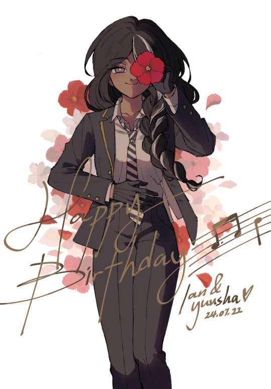
Happy birthday to @crystallizsch and the lovely Yuusha! May you have another wonderful year full of happiness and currynoodles💜
#my art#others ocs#yuusha tala#twst#twisted wonderland#hi ian#if youre reading this#yes my question about flowers was... planned www#though while researching the jasmine i learned it had several different cultivars#i picked the easiest one to draw LOL sorry if it's not the same one you have in mind#a few process notes here for fun#i shaded with as much purple as I could to subtly include her signature colour#though after all the post-editing it isn't very obvious rip#i asked a friend to inspect the lineart and they said she looked kinda evil and i was like 🧍♀️#that's not intentional...#hope the colours fixed that#its likely obvious but i added the sheet music because of her affinity for instruments#it's the first 3 notes of “happy birthday”#based off sheet music i got off google images#first time trying out some charcoal brushes for the bg and theyre pretty nice to use!#hope you can tell i had fun www#finished early so i queued for what i hope is 12 am your time#ill send you the textless version later!
195 notes
·
View notes
Text


having a normal one about @pinetreevillain's timothy 🥹
#rottmnt#tmnt#rise of the tmnt#donnie#donatello#rottmnt timothy#admin draws#fanart#had so much fun drawing him i love him smmmm#collecting other ppls ocs that i get unreasonably attached to like infinity stones#and special thanks to timtim the 3rd addition to that collection for cracking my artblock severely#i was gonna go for a limited palette on the top pic but then i was like#what if it was all neons and weird shading instead#also the last one was actually the first i drew jgkdsg#i was stuck at an election thing for an Activity and all i had on me was a pen and a crumpled reciept
786 notes
·
View notes
Text
The road to being normal is... rocky
inspo:

i think there was more i was gonna type down here but i am tired. will edit later if i remember
#i need to stop shading jamil w purple#bc whenever i upload it to tumblr it makes him look red#i turned down the saturation and adjusted the tone curve several times#still red#he's a normal color on my drawing program#hopefully it is just my browser and the colors look normal to yall#twst#twisted wonderland#scarabia#kalim al asim#jamil viper
378 notes
·
View notes
Text
Apparently my most controversial Minecraft Opinion is that there are no ugly blocks and that any block can be pretty in the right context and environment.
#rain rambles#minecraft#minecrafting#acacia is gorgeous on mountainsides#the orange looks so pretty next to the shade of the grass there#as long as you don't overdo it#and the leaves are such a nice shade too#i have several acacia trees growing in my front yart#that i originally grew for wood for sticks#and then they were too pretty to cut down
254 notes
·
View notes
Text

found a baby yaku amidst the Sketchbook-glitch-corruption wreckage..... wondering if he flipped skin tones between black and red and everything in between until he saw his to-be-grandparents (and started mimicking THEIR skin tone....... )
#thinking about yakumo having weird lil homunculus proportions or other such variations#what if he just always had massive hands compared to body size. yaoi hands from birth-transformation#he was so anti-snake that he looked at hands and said YES. THIS IS THE LEAST SNAKEY I CAN BE. I WILL GO 600% ON THIS FEATURE SPECIFICALLY#changing forms from entirely obsidian... or red in patches.... or striped... or other combinations...#because he only had murals to base his human form off of? at least at first?#were the murals in colour? shaded with gradients and lighting oh so conveniently?#then how was he to know what skin tone humans are supposed to have???#imagining the first few times he encountered his grandparents in his cave#maybe they only saw a shadow with eyes darting back into the darkness#just a really long black noodle with semisnake semihuman eyes (just a hint of sclera)#and every time they visited#yakumo observed more of their features#and took on something similar to their proportions...? or hair colour? or skin colour?#and maybe even when he's first adopted into the family and leaves the cave#he's still a vibrant pink and everyone thinks he somehow got sunburnt inside a cave or smth#but then he starts seeing all the other people in the village#including diff age groups and kids who are supposedly around his age#so he starts to slowly morph his body toward those characteristics#his skin gets beige-r. reshapes his eyes a bit.... grows a bit of nose.....lengthens his limbs a bit...#(the big humans seem to treat me the same as that speCIFIC group of smaller humans... so maybe i should use them as a Model)#like... how do you even age in a human body when you have no reference for how humans age?!??!#did yakumo stare at several children in the village and watch their growth year by year#and match his body to their changes just to fit in?#did nature just know what to do?? and he just naturally grew like a human without manual manipulation?#I DEMAND ANSWERS#nu carnival yakumo
94 notes
·
View notes
Text
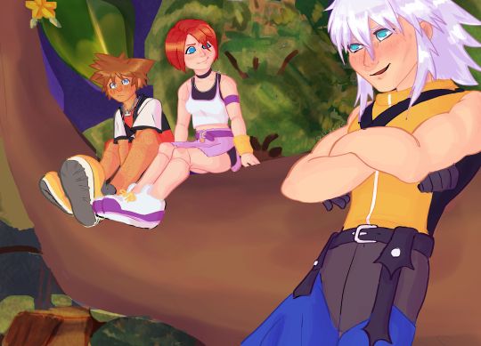
obligatory kh1 Paopu tree scene redraw
og under cut <3
#click for better quality as always#this is so messy but it was so fun#ITS ALSO LIKE SOMEHOW THE FIRST TIME IVE PROPERLY DRAWN KAIRI <3 SORRY GIRL IDK HOW IT TOOK THIS LONG#i wanted to shift this a lil more toward my style but other than riku i got kinda lazy icl ASKDNKJASNDKJSN#yes the bg is a bunch of squiggles. no i have not drawn a bg in several years. no i do not care. dont @ me#still tryna figure out how to shade on krita#ALSO ACTIVELY SPREADING DESTINY TRIO FRECKLE PROPAGANDA !!!!!!!!!#blue eyed freaks. miss them <3#Sora's hair i hate drawing u but its so iconic#not intended sorikai but do what u want !!!#this was soooo fun to do#i should do more redraws and drawovers#drawing is so fun but beware. time will pass#it is (checks watch) 3:30am#well im gonna have a lovely sleep gn guys LMAO#i cant tell if i like the end product tbh so this either will be here tomorrow or it will disappear ig#but again it was so fun to do#OK ENOUGH TAGGS BYBYE#kingdom hearts#destiny trio#destiny islands#kh1#kh sora#beverly says stuff#kh kairi#kh riku#soriku#kairi kingdom hearts#riku kingdom hearts#sora kingdom hearts
177 notes
·
View notes
Text
the parasites in me are telling me i need another deep dark red lipstick
98 notes
·
View notes
Text
Woof, ok, finally drew something!
I started playing Regretevator recently! It’s very fun, I’m enjoying it a lot! Since I’m in a hint of art block, I decided that I’d draw NPC’s as I meet them in game! Unpleasant was my first encounter so I’m starting there!
I went for a sheet ghost look, seeing at they’re flat! And of course I had to use comic sans, seeing as it is the Most Unpleasant Font! Haha

[ID: A digitally drawn page containing multiple drawings of Unpleasant Gradient from Regretevator against a purple background. Unpleasant is depicted as a floating piece of cloth reminiscent of a sheet ghost. It is colored using a gradient that goes from bright green, to bright pink, to brown. Throughout the page it is seen floating around, minus the bottom right image where they are seen entering an elevator and the top right where they stare down a Roblox avatar, making them sweat. The avatar is an anthro dog that wears a witch hat and an orange and black outfit. /End ID]
#regretevator#regretevator fanart#regretevator unpleasant#Regretevator unpleasant gradient#regretevator roblox#my art#I severely underestimated how much of a hassle shading the colors was gonna be lol#I like how the bottom right picture turned out tho!#EDIT: I FORGOT THE ID NOOO#Whole year of posting and it finally happened lmao#fixed it tho
65 notes
·
View notes
Last Seen Blogs

furgaz3r
Fur and other things

xanderprescott-blog
Good cop or bad cop, I'll let you decide.
madara9598
Untitled

jelly-fish-wishes
You Must Be New Here Òwó
littlegoblincreature
Florbow