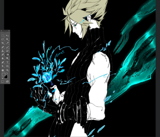
#so I had to take a screenshot of the actual drawing to upload it
Text

i forgot i draw and i'm supposed to upload it
random bob because i didnt know what to draw


wanted to draw my old animal jam outfits but i dont have access to the account anymore (let alone have membership). luckily in one of my really old aj vids i show my change animal screen for like half a second.
+ bonus old oc drawing

rouge the bat from memory
(i have never drawn her before so without a ref was something. since i was on vc with a friend she corrected me a bit without me seeing a ref of her.)

this was drawn before rouge. i didnt know what to draw and friend asked for pvz sunflower. then got asked to draw rouge.
also golzay and me at the bottom.

murderdrones sona, drew this before i started the finished murderdrones comm
#artluli#i forgot i dont always have to upload finished pieces and i can just upload a sketch#i had to actually go back in my files and take screenshots of these so a few of these are old#the rouge the bat one and pvz sunflower are around about a month old#the others are a few days pretty sure#eg the animal jam one and bob animal crossing#other than that the murderdrones is one i did before i started that one drawing#am good at talk very yes#need to dump some more art so see you in part 2 of this i guess lul
8 notes
·
View notes
Text
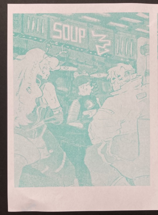
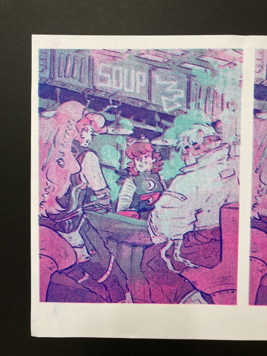
23rd Feb '24 - [arch] OH RISO my beloved!!!!!! ft. cyberpunk hermitcraft soup group
A cliffhanger!!!! And now I have to wait a month for you to upload the second half?? How will I cope :’’0
For real, it’s so awesome to see your process and the sheer amount of inspiration you take! In particular, I thought ‘Sit on Two Chairs’ and ‘This Was Our Pact’ were particularly yummy.
I think book covers are really hard. You have to sum up a book’s energy in one image, make it stand out and show just enough so people want more. Exploring the narrative through those full pages is really interesting - though this is something you did for fun, it could be a really useful technique for getting to know a narrative. When I’m designing my comic covers, I always do it last - that way I’ve had practice with the visual style and I’m thoroughly familiar with the themes, so I guess spending a bit of time with the characters and narrative in this way helps for standalone book covers too. Of course, it helps if you have the time for that XD
Okay!! Onto what I've been up to!!! [warning this is a beefy post I'm sorry for your poor reading brain]
The past two weeks have been really enjoyable! I’ve been playing a lot with slow world-building, in sketchbooks, google documents, and voice notes to friends. Letting myself really sit with concepts, think about the characters, let them play in my head with no expectations. With this relaxation and lack of pressure, some beautiful narratives and interactions have been developing. I’m starting to need a name for a world/ the story. I’m not quite ready to give them a full introduction to the internet - I know it doesn’t but it feels like there’s some accountability to *produce something* and this slow development is really important for the quality and my skill building.
It’s really hard to take on, but we actually don’t have to make the perfect thing now! In fact, it’s impossible. Pressure on ourselves makes it so hard to make something good if we’re always grasping at the final result.
In the meantime, while those characters develop, I have been working hard on my basic skills. I wrote about characterization last post, but this week I focused on setting and colour. I was inspired (once again) by Hermitcraft. I’ve seen some really incredible illustrations of Minecraft builds in the fandom, and it seems like a great exercise.
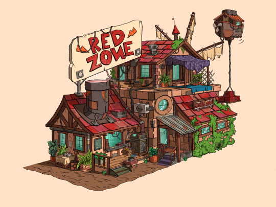
Bdouble0's Season 10 Base illustrated by @applestruda [source] and The Red Zone, built and illustrated by Bdouble0 [source]
One of the creators on Hermitcraft, ImpulseSV, created this build in a recent episode. It takes inspiration from the last season of Hermitcraft, where he was part of the ‘soup group’ with two other players, and his current base concept - a cyberpunk city. I also LOVE his new character design, so I wanted to place him in the scene.
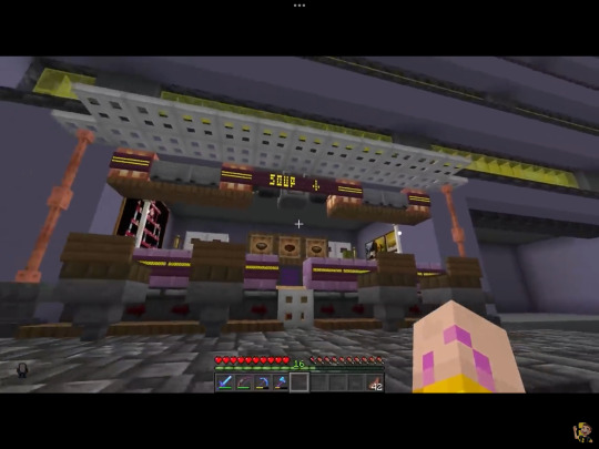
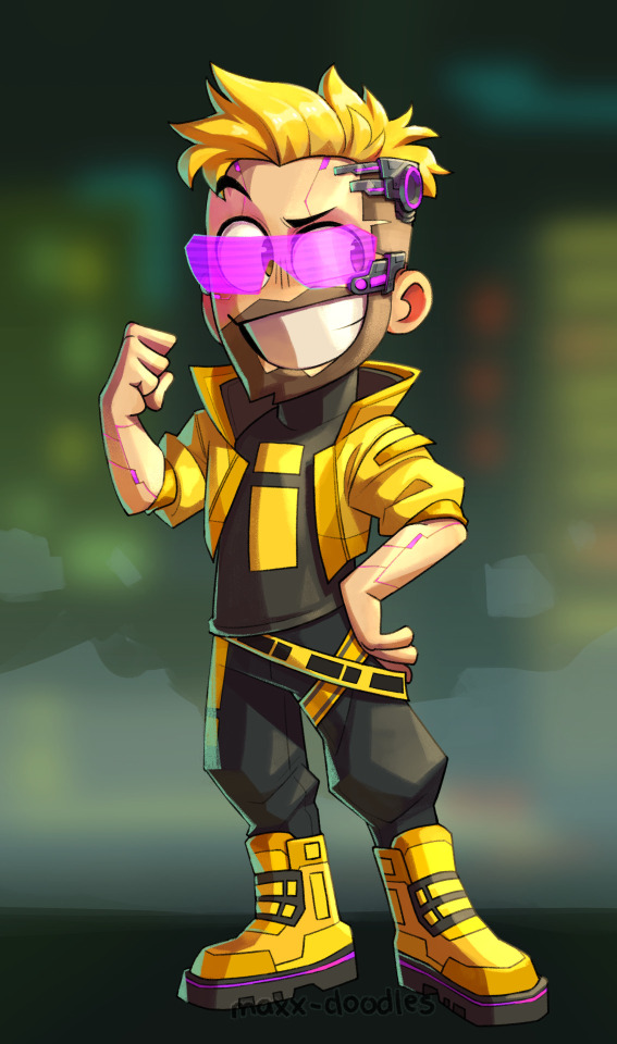
Screenshot from Impulse's video and new impulse design by @maxx-doodles
Here are some initial thumbnails I did, trying to figure out the composition. I wasn’t sure of the vibe yet, so I tried some rough thumbnailing, and drawing on an isometric grid and other perspective techniques. I’m going a bit mad for characters at the mo, so I wanted to place some in the scene. I found the angle of the isometric grid steep to place characters comfortably, so decided against that.
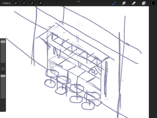
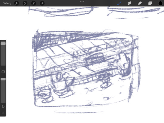
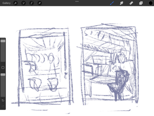
Looking back at it, I love the second! But I believe I was struggling with the perspective. I decided on the last one eventually.
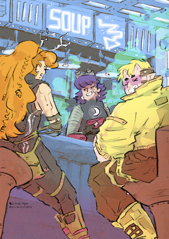
Now, I absolutely adore all of the players in the Soup Group, and I am BIG fan of redesigning their notable characteristics to suit different settings. So yes, I decided to put all of the soup group in the image.
PearlescentMoon (left) from my comic and GeminiTay's Hermitcraft Season 10 design [from this thumbnail] (right)
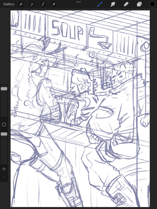
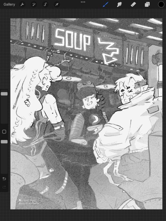
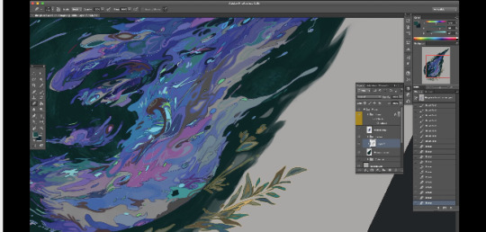
Here's the sketch of the final image. I really enjoyed coming up with cyberpunk versions of them all. I used the impulse design almost exactly, with a few extra interesting details since he's mostly viewed from the back. For PearlescentMoon (middle) I kept her fringe, dark hair and gave her a glowing moon symbol on her top. For GeminiTay, I kept her long ginger hair, antlers (but glowing!) and took inspiration from her new season 10 design - a dark blue jumpsuit to match her dark blue clothes in her new design, and the braids she is often drawn with. I also gave them edgy new hairstyles. And a robot arm. I don't have lore for that.
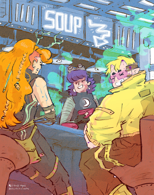
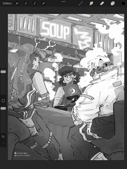
As usual, I filled each flat colour-to-be with black and lowered the opacity to play with the values. Then I added colours one at a time, aware might be riso printing it. Originally I stuck to trying to make it printable (making the colours out of ones I could make my layering 2-3 colours at different opacities), but as I went on, I decided to drop that and focus on the quality of the image in a digital format alone. I did keep the grayscale version above with all the separate layers in case I needed that if/when I came to riso printing it. Below are the main two digital colour schemes I tried out.
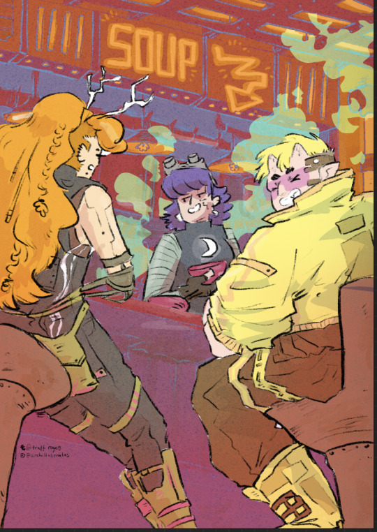
I settled on the one on the left, with the blue tones - the foreground characters really pop. I put a few details in Gem's hair, colour variations etc, and cropped it for Instagram. I actually much prefer the cropped version - it sits better in a rule of thirds.
Now the moment we've all been waiting for :'')
RISO!!!!!!!!!!!
I returned to Cardiff after a couple of months away and was delighted to spend my first day back at The Printhaus, an awesome shared print studio where I have basically made my home. A few of my awesome friends happened to be there, so I spent the day playing around with this image with their help! (please check them out they're very cool - Gavin helped me a lot (we hung out at Thought Bubble, remember? and Rhi gave good crits too!!)
For those who don't know, risograph is basically a shitty photocopier that can only print one colour at a time. However, you can play with gradients and opacities, and layer colours really nicely to combine. I've done a lot of single-colour tonal work with riso but this is my first go really layering.
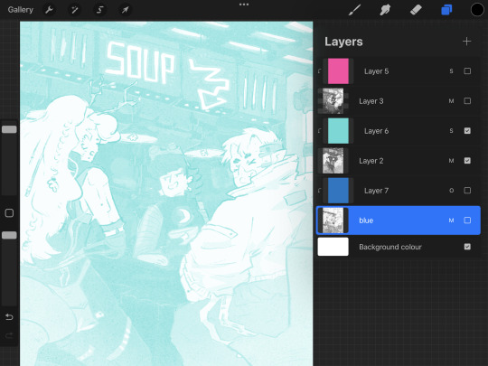
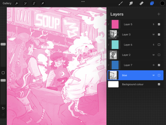
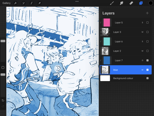
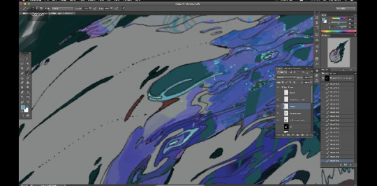
First, Gavin showed me how to separate the channels in Photoshop, using the flat image uploaded to the 'gram. We copied and pasted these layers in grayscale and added blending modes to each layer to replicate what they might look like when printed.
With blending modes, the digital mockup looked like this!!
This bit goes into technical details for replicating what the print might look like for those who might want it - feel free to skip :)))
I copied and pasted the Cyan, Black and Magenta layers as greyscale (as you can see above)
I made all of the greyscale layers multiply layers since risograph ink is transparent and we wanted to see how it layers. The ink usually comes out a bit lighter than you think, so it's good to bear that in mind. I used a clipping mask over each greyscale layer and a blending mode. WHEN YOU PRINT, PRINT IN GREYSCALE, NOT COLOUR.
Here's how I split the colours from CMYK to the riso colours, their hex codes and the blending mode I used to replicate the colours:
Cyan - Mint [HEX#82D8D5] Screen
Magenta - Fluorescent Pink [HEX#FF48B0] Screen
Black - Blue [HEX#0078BF] Overlay
Yellow - scrapped for colour scheme purposes
Blue, Mint and Florencent Pink layers in greyscale in Procreate.
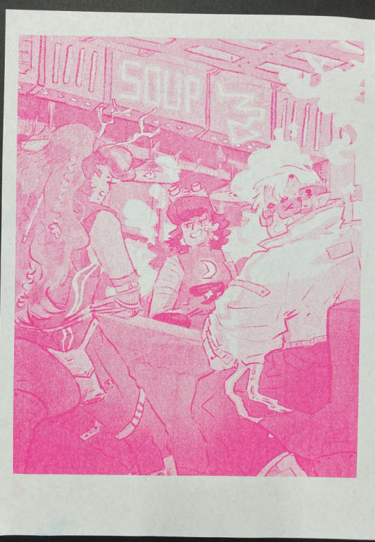
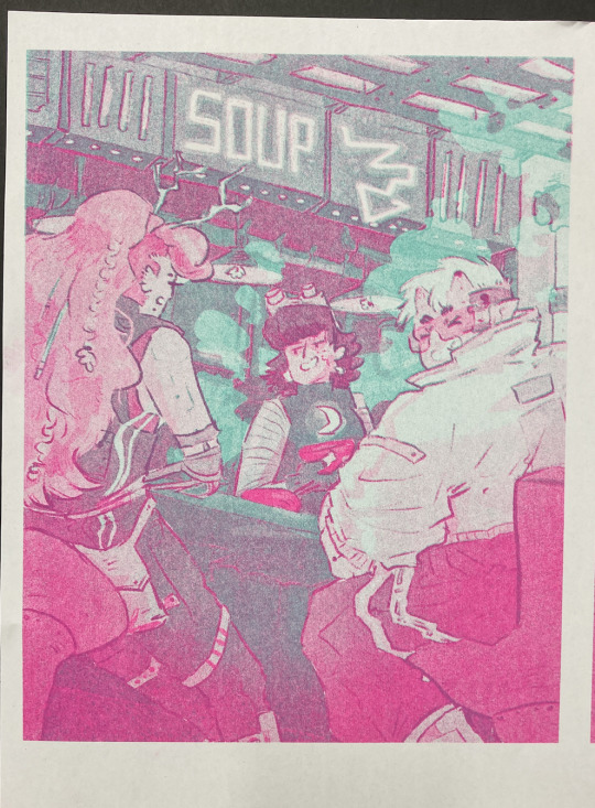
Riso printed Mint and Florescent Pink layers on separate paper, followed by the two layered together.
We always start with the lighter colour inks first, because sometimes the rollers can pick up the ink and cause extra marks where you don't want them. The first two colours came out great!
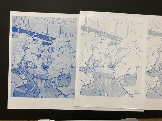
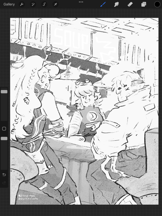
The first time we printed the blue, it came out very dark (left, first image). I have had this issue before - my last book, Winter Wellbeing, came out much darker than I wanted. Now I realise that the blue ink is super sensitive. All the 'white space' that is covered by a low-opacity blue on the left is only 2%, and yet it has come out pretty strong. We tried printing it on one of the misaligned images just to see, but it took all of the brightness out of the neon soup sign at the top of the image (second image). So I changed the values and pushed them way lighter, so it just pushed the values of the darker bits slightly, and brightened some of the lineart (right, first image)
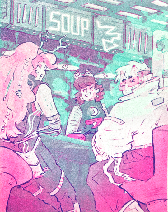
And this is the final riso printed version!! I'm so so happy with how this came out. It's so different from the original digital version, and I actually love that.
I didn't create new colours in the way that I intended to - I wanted to play with overlaying purposefully to create specific colours eg. orange for the hair etc. But!!! I'm really happy with how it came out. That will have to be a project for next time.
Also, many copies are slightly misaligned, so in future I think I'd do flat layers for the colours a more blobby style with the linework on one layer only so there's less of a chance for obvious misalignment. design for the riso, rather than riso the design.
Overall though, this feels like a super cool step up and a milestone for me. Super happy with how it came out!! And I'm excited to play with colour some more.
Can't wait to see the rest of the Lionheart brothers! Enjoy your weekend :)))
Archie 🕺🕺🕺🕺🕺🕺🕺🕺🕺🕺🕺🕺 <3
#archillustrates#arch is learning#smileyshri#project development#art#art process#art resource#process#artists on tumblr#illustration#comic#picture book#small art blog#art blog#illustration blog#female artists on tumblr#queer artists on tumblr#illustrator#book illustrator#female illustrator#queer illustrator#comic artist#comic art#female artists on instagram#artists on instagram#procreate#digital artwork#digital artist#artist blog#artist on tumblr
19 notes
·
View notes
Note
Mr. Rad Guy, I've wanted to get your opinion on something for a while now, and finally snagged what I was looking for on twitter. I normally don't pay any of those transphobic Bridget discourse peddlers any mind, but they bring up her appearence in the canon pachinko game Vastege as supposed "proof" that Strive's story direction for her is a contradictory retcon. This game's plot takes place just three months before Xrd's, and they claim that through her voicelines she is still insisting sternly that she's a man and not to call her cute, but also that she STILL hasn't broken her village's superstition at this point in time. This is the only image they ever have as so-called evidence, so I wanted to see if you know if these lines are legitimately in the game, scrapped content, or made up altogether. I don't trust these lunatics as far as I can throw them when it comes to telling the whole truth 🤨
This screenshot is from same manuscript of dialog that is in the lore server archives and in the GG VXT archive pack that I compiled and uploaded to Archive.org. As far as I know, these lines were all used in the game and no unused lines have been (or even could be) datamined. Two of the lines here are highlighted so I'm assuming they're the ones these dorks are using to try to prove their point. I've translated them.
First line:
I want to break the village's rule/law*, and return to the village as a young man.
*In the official localizations I think they might translate this as "tradition" or "superstition" instead of rule or law.
"Young man" in that line is 男の子 (otokonoko). Do not let anyone convince you Bridget is using the other otokonoko there (男の娘;"young man with a feminine aesthetic"). They like to do that a lot, argue that it's the one that uses 娘.
Second line:
Cute is uncalled for... I'm a man.
In conclusion: Yes. Bridget is using almost 1:1 recycled dialog in Vastedge that she used in XX and the spinoffs. The Twitter grifters' Google Translating was correct this time.
Vastedge's plot may take place only 3 months before Xrd, but Vastedge itself came out in 2013—8 entire years before Strive released in 2021. A lot can change in 3 months in real life, but after almost a decade most people are entirely different altogether (wrt Daisuke and his plot decisions). Also it's a friggin pachislot machine lmfao Like, are people really expecting something as earth shattering as a character as irrelevant to the general plot like Bridget suddenly stopping all of the action to explore her identity on a slot machine? I have no patience for these people anymore. They're just stupid and arguing because they have no hobbies.
There's also the fact that Daisuke originally planned for Bridget to be a cis girl until the very last minute. So if anything her coming out in Strive was just returning to the starting concept. He mentions this in the interview in the back of Artworks of Guilty Gear X 2000-2004. Translation by fairymisao.
(27)---The character Bridget, introduced in Guilty Gear XX, looks like a girl but is actually a boy, right? What was your intention in deciding on creating this kind of character?
Ishiwatari: The creation of Bridget as a boy happened at the very last second; during development I was drawing him as purely a girl. It's just that when there is a need to give a worldly backbone (to the game), in order for me to try to not forget each character, and in order to revive the character, I give them my very heart. As a result, the creation of Bridget as actually a boy instead of a girl was because I thought he could become my alter ego. [...]
It's also important to note that Vastedge was the first thing ASW made for Guilty Gear after getting the full rights to the IP back from Sega after the Sega-Sammy merger in 2011 (which they had started to lose a bit before Overture's release in 2004). They were absolutely more focused on making something that would generate income and looked flashy than they were a compelling cinematic experience.
#asks#bridget discourse#long post#VXT doesn't really offer anything meaningful for any of the characters outside of the immediate main cast tbh#Friggin Zappa and Jam both have more lines than Bridget does in VXT#Like I do actually enjoy Bridget as a character. She's fun and lighthearted in a cast of very serious & gritty characters#But My God are people vastly overestimating just important she was to anything at all until Strive#I mean come on she was introduced in XX. You know. The series with 3 story writers that isn't even canon?#Also I apologize if my tone comes across as hostile. It's not directed towards you I promise lol#The people on Twitter still arguing against this shit AFTER A YEAR have sent me more than 20 death threats *because of the Brisket meme*#My patience for them is thinner than wet tissue paper#They have no genuine human connections and it really shows#They weren't even good/entertaining death threats!!!#Anyway whipping this out into cyberspace and then going to sleep nighty night
22 notes
·
View notes
Text
On Flags
A few days ago, I had to block a terf in the notes of a post, and occasionally I grab dumb terf posts for r/insanepeoplefacebook (which allows tumblr screenshots) so I decided to glance around for some free reddit karma. One of the posts I found was something about flags that was... so stupid. To prove I’m not making up a strawman, heres the post.
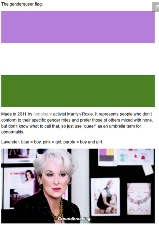


The argument here is that the genderqueer and nonbinary flags are appropriated, even if unintentionally. While she doesn’t outright accuse the creators of flag theft, the tone of the post is rather accusatory. Like most terf takes, this is moronic, and I’m gonna
First of all, the GQ flag. I decided to take this terf’s word for it and googled “purple white and green flag”, and I got the suffragette flag on the 5th result. However, I ALSO googled the creator’s response to accusations of theft, and noticed that the terf put something in quotations that was not a direct quote. That may sound like nitpicking, but I feel like putting something in quotation marks when it isn’t a direct quote is dishonest. The actual direct quote reads as follows;
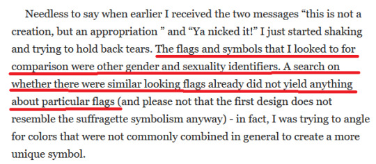
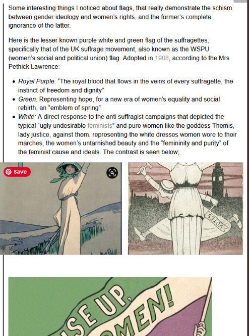
Two points of interest: “first design” and that Marilyn didn’t find the flag.
The terf in the post speaks about Marilyn’s design like it was made within minutes and poorly thought out. Upon doing my own research, I found out that Marilyn had started working on this flag in June of 2010. The initial design looked like this, aka nothing like the suffragette flag.

So why was it changed? Well, I can’t answer that for certain. But as an art student, I can see one issue: The letters.
My design class had a unit on vexillology, aka flag design. My teacher stressed that one of the cardinal sins of flag design was using lettering on flags. While not all good flags strictly adhere to common flag design principles (the Welsh flag violates the “simple enough for a child to draw” rule and it fuckin rocks), maybe Marilyn, who was working towards a Digital Arts degree at the time they were designing the flag, might have wanted to simplify it. The second design for the flag looks like the final version with the white and green reversed.
Okay, so clearly the terf either didn’t do enough research for the post where she accused someone else for not doing enough research, as Marilyn’s response is easy to find here on tumblr, or she wanted to make a petty jab at a trans person’s design skills. But how come Marilyn couldn’t find the suffragette flag when I found it in seconds?
Well, Marilyn was researching this in 2010-2011. While google doesn’t let you put custom ranges on images specifically, the general results can be searched by a custom time range. So I checked everything from January 1st,1908 to May 31st, 2010. Here is what I found, and no, the suffragette flag was not on the Wikipedia page at all.
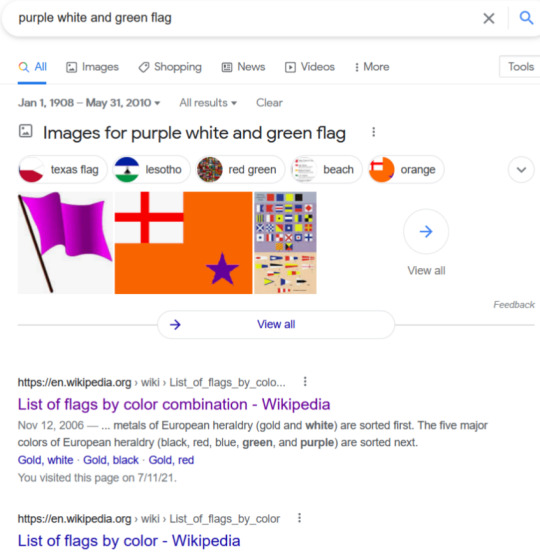
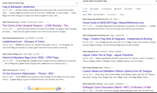
The first mention of the suffragette flag doesn’t show up until page 4 of the results. And then I got an idea. I searched for things up until June 1, 2010. Then June 2, 2010. Then June 3rd, and so on. Up until June 10, the results looked the same.

Then on June 11th, the suffragette flag suddenly showed up in the image results, and the page with the image source was bumped up to page three. Google's algorithm tends to show popular pages first. So why was this page suddenly getting enough hits to boost it higher in the results than links from the Wall Street Journal, Encyclopedia Britannica, liturgical (Church) calendars, and NASCAR, when the first mention of the suffragette flag prior to this had been at least three results under the aforementioned other pages and the website on the third page was brand new?
Well, I did a bit of digging on the wayback machine and found that Roxie posted the first design for the genderqueer pride flag on June 7th. After this point, Marilyn was likely no longer researching colors as they’d already been decided, and was taking suggestions for the flag up until the final design was uploaded in June 2011. The first time anybody actually decided to point out the similarity to Marilyn was in February 2012.
My searches found that the flag had been mostly forgotten until June 2010. Now, maybe in the UK it was still a major symbol in 2010. However, google results differ based on your location. Marilyn and I both live in the US, so it’s not that surprising it took us longer to find results mentioning the suffragette flag. Even when I searched the same dates with a vpn changing my location to the UK though, there was no image result until the 10th and the first site talking about it was on the second page. Until the original genderqueer flag was posted, nobody seemed to care about the old suffragette flag. For fucks sake, it took someone a year to notice the similarity and find it important enough to message Roxie about it.
Now for the nonbinary flag. While the terf correctly named Kyle Rowan as the creator of the flag, she neglected to mention that there was a call for someone to create a design for folks who didn’t feel like the genderqueer flag represented them, and several designs were submitted. While the initial call for submissions came from a blog which no longer exists and was never archived, Rowan’s posts on the matter are archived and used as sources on the page for the flag on Nonbinary Wiki, which is the 5th result when you search “where was the nonbinary flag first posted”.
This one is even more of a reach. Assuming that Rowan also googled the color combination to avoid using one that was already common, they would have included black in the search. When you search for “yellow white purple black flag”, you will not find anything about suffragette flags. Mostly because the American suffragette flag is gold, white, and purple, without a black stripe. Even the quote the terf used to explain the meanings calls the color on the suffragette flag gold. The nonbinary flag has a yellow stripe. Yellow and gold are different colors.
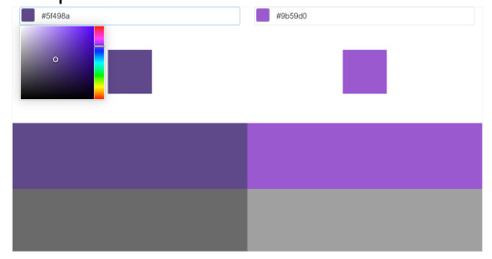
Rowan was kind enough to provide exact hex codes for the flag on their blog. Obviously Alice Paul had no way to do this, so I eyedropped an image of the flag. Here’s a comparison.
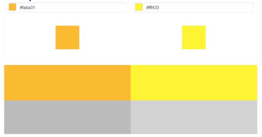
On the left is the gold on Alice Paul’s flag, on the right is the yellow from Kyle Rowan’s. Pretty obvious they aren’t the same, unless you’re colorblind. The suffragette flag also usually has stars, which the nonbinary flag lacks.
Also, in the post, the terf mentions that Alice Paul changed the green to gold as a homage to Susan B. Anthony. Anthony was known to exclude Black women from her activism. So that’s a bit of uncomfortable symbolism. Groundbreaking.
Anyway, do the flags look kinda similar? Yeah, I’m not denying that. But why are Roxie and Rowan responsible for flags not being used since the suffrage movement? By 2010, they both faded into relative obscurity.
idk this stupid post made me mad so i went digging.
100 notes
·
View notes
Photo

I rendered Wilson... I am going to go insane if I don’t take a break from drawing Maxwell. Wilson do be lookin weird though, no wonder they are dating.
Also note: sorry for the poor quality Tumblr won’t let me upload the actual png so I had to screenshot it
I liked the sketch also so here it is:

I might actually like the sketch better than the render.
#wilson#digital drawing#dst wilson#wilson dst#dst#ds fanart#ds wilson#DS#dst fanart#don't starve#dont starve#dontstarve#don'tstarve#dont starve together#dontstarvetogether#rendered#render
25 notes
·
View notes
Text
List of my in progress fic WIPs because if I share them, then I am more likely to finish them:
Damaged Nerve, the only one I've actually managed to publish anything for.
You know the B99 meme? "I've only had Arlo for a day and a half, but if anything happened to him, I would kill everyone in this room and then myself"? That's Vox with Vark, and I want to see what he does when something does happen to his beloved pet.
Title is from, "absence can be present, like a damaged nerve, like a dark bird," quote. It will eventually be about Vox and Val being unable to stay apart even as they cross so many lines with each other. Val hurts Vox's pet, and Vox still can't stay away from him for long. Vox kills Val and threatens to do it again, and Val still wants him. It's also about Vox being so deranged in ways that aren't just about his relationship with Val. He deserves to get so unhinged while tearing people apart with his bare claws that he starts thinking about how Alastor broadcasted his rampages and Vox could totally do that too (he's better than the Radio Demon and he doesn't miss that old geezer) 🥰 The people he's tearing apart in this case are Exorcists, because he was bound by a Deal to draw them away from the veterinarian stitching up his pet shark.
None of the angels actually permanently die, but Vox did make them look bad on live TV. So, unfortunately, now Vox is getting blamed for the doubling of Exterminations, on top of having to deal with Val and his relationship problems.
Working title: "this was supposed to be about Redemption. it isn't. It Isn't.". I'll probably give it a Bastille lyric, because I'm me.
A rival Overlord seizes the chance to knock The Vees down a peg, publicly. The triumVirate scrambles to maintain their joint reputation as Vox struggles to recover physically and emotionally.
Or: The Vees are given an opportunity for self reflection, realization, and possibly a chance at redemption... They do not take it.
I love a non-con and torture recovery and support fic. You have no idea how much a story about recovery from something horrible means to me. This is... Technically that. Twisted and villainized.
In Hell, power is safety. Overlords can't look weak, can't be beatable. Can't have their rape uploaded online across every platform with memes made about their smashed screen and broken body, screenshots and reuploads from the masses posted faster than their bots could delete it. You get what you deserve, the populace cheers, as Vox gets a taste of every depravity the Vees profit from.
Working title: road trip! road trip!!
What can I say? It's the Vees on a road trip! An exploration of their characters, their dynamics, and of the worldbuilding of Pride. There cannot be only one city.
Working title: "horrifically aphobic"
It's a Vox-centric story, it's always a Vox centric fic for me. Right now this is all just Vibes and Concepts but I am Thinking Constantly about Vox and internalized aphobia and ableism and transphobia. He has all the issues. He externalizes a lot of them too, things don't just stay internal when they are on someone's mind that much. It's part of the reason why Alastor is no longer his friend!
Angel!Vox AU
This will likely just be a one shot. Vox is not actually an angel, but he does have wings! Messy, misshapen things made of wire and shattered glass. He was a televangelist in life, and now the his sins weigh quite literally heavy on his shoulders. Heaven is a constant light above him, always visible in the sky, but his wings are cumbersome things that could never allow him to fly.
He doesn't even realize they are meant to be wings until he sees his reflection.
He was always talented at looking good for a camera. If he preens his wings, organizes the mess of cables and glass shards, he can make them look pristine. Purposeful. He can make himself become the beautiful, technological angel he is meant to be. He can make everyone else see him as he should have been. Heaven is forever out of his reach, but no one else needs to know that. And angels here, well, demons are terrified of them. What is more powerful than an angel? Vox can work with that.
Working title: Vees 5+1
It's about Velvette joining the Vees <3 Five times Velvette interrupted VoxVal getting it on, + 1 time she joined them from the start.
Working title: evil AngelVoxVal
As though there's any way for that ship to not be evil, lol
Valentino wants his favorite lovers to join him together for a threesome. Valentino is an expert at getting what he wants.
#mine#long post#there are other ideas rattling around in my mind but these are the only ones getting written out#Televangelist Vox#my wips
6 notes
·
View notes
Photo

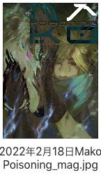
{2022生2月} February Screenshots
// Spirit & Strife Zine
I watched Advent Children 5 times between end 2021- beginning 2022 and practiced on his outfit before finally deciding to draw CC Cloud instead. I usually tackle full-bodies for zines, it was a pleasant change to paint a portrait for once~
These are wip-screenshots from both painting and standee I designed (I think they look really cool, I’m happy to share hehe)! This standee is the first piece of merchandise I ever made and it holds a very special place in my heart! Thank you very much for the opportunity ♥ !!
I am currently uploading the timelapse of the painting and I should get to uploading the standee BTS once my package arrives *crosses fingers!* I’ve been keeping for so long, but I’d love to have the entire experience of traditonal-to-digital-to-final_product in one video so I’ll hold for as long as it needs..! ☆ UPDATE FURTHER DOWN, the video is mADE!!
youtube
As a surprise for being here, here’s the little eerie edit I ended up inserting in the timelapse as an add-on
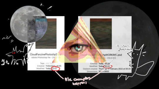
I had 2 files corrupted while working on this. I don’t remember what happened anymore (let me check discord).
..
right

I don’t remember mentioning if I lost any work, but I will assume I lost a couple of hours (+2hrs of trying to restart my pc and make it work again 💀).. Gladly this time there was a very pleasant recovery file which I duplicated and feared every time I saved in PS //cries
Unfortunately file corruptions occur more often now, that's my signal that my poor pc needs an upgrade (who can afford one in this economy??? Prolong the lives of your machines, friends!). I'll live in fear and 5 backup files until I decide my hardware hates anything above 5000px+ files and I go smaller (which is not happening, sorry friend, we'll have to keep being fried a little longer.. hang in there..)
[9月2日Update]
I have uploaded the second (and final) timelapse with a little assembly video at the end and some extras~
youtube
I have the habbit of working at least x2 bigger in file than what goes into print. First lesson learned was this is unnecessary in merch-making of small sizes (I actually worked x3~4 times bigger and it shows in the video why it was a bad idea //wheeze) especially since my lineart is very thin and it gets lost if shrinked. I’ve watched so many merch-making vlogs in the past years, print-test got drilled in my brain and forced myself to test it at least once (gotta be professional about it, right? ;3) It wasn’t too early on, but it was early enough to change the composition of the piece as it set realistic expectations to what would work out or not (the size was so important, I hadn’t realised it would shrink so much because I obviously read very well and was fully aware of the OG size provided by the lovely mods). From the original design to the final I made a lot of changes and I was too obsessed with the meteor to let go. I cut at least 5mins (already sped-up) of me trying to lineart it and failing miserably so I switched back to PS and did it there. I cannot watch my own timelapse anymore without feeling dread and bored lmao, my convolution makes my skin crawl, so meticulous.. If it’s interesting to anyone I’ll be happy, if not then I am not surprised, I am not either! It made a beautiful base regardless, so it was worth it~ On a final note, no I did not 100% forget what kind of idea I had for the flaming buster sword (the meteor was supposed to reflect-in-tiny over it) and completely ignored my initial sketch to polish something I wasn’t sure what it was. It works out in the end so we’re good ok.
If there’s one thing I am taking from working on this is; don’t experiment when merch-making, it will make your life so much easier to stick to a process but knowing myself this is not happening. It’s just not me lol //runs
I am in denial that the zine is finally wrapping up.. It’s been such a wonderful experience sharing the Cloud love between us (for ~7 months?? time flies ;;;;;;!!) //is emotional..
I am very grateful and honoured to be part of this wonderful project ♥ thank you everyone for your lovely company during this time ;; I will always hold our little chit-chats and cloud-love-sharing dearly in my heart. Mod team, you are STELLAR and I hope one day our roads cross again💫!!
---
Thank you for making it this far 🌦️
Leftover sales will be up soon, so follow @strifezine // Spirit & Strife zine as it’s your last chance of grabbing a copy or merch item if you missed out on the first round!
#digjsketch#digisketch#digitalsketch#screenshotception#screenshotbsession#myart#ffvii#ffviicc#ff7cc#crisis core cloud#cloud strife
49 notes
·
View notes
Note
Your work reminds me of Euclase, who used to be in the fandom long ago before she went pro. Except it looks like you do paintovers and smudging, which is like Petite-Madame, another great artist who used to be in the fandom. You fit in the middle, but either way it's lovely to see beautiful art being made for our favorite characters.
Oh hey, thank you! 😊💜
I have been in fandom when they were around still and I definitely took some inspiration from their art! I admire Euclase's painterly soft but still very precise realism and the work of color/glow in her later spn paintings and I have definitely looked at a few of her tutorials to figure out my own style (this one for example). I also always loved Petite-Madame's Destiel art, especially the highlighting, and well, I will never forget her beautiful Twist and Shout fanart.
About the latter part of the ask, I actually don't do smudging at all :D I tried it once here, but the smudge tool really overwhelms me. I instead blend with the pipette tool and a soft brush (or, if I keep it more painterly, with a textured brush). It just personally works better for me! And about the paintovers, I actually had to google what that means, but I think as I understand it I don't do that either (I think?) xD I did paintovers back in 2014/2015 when I first eased my way into digital art but did then stop painting completely since it felt like I was cheating and it catapulted me into a 5-year long art block until I felt brave enough to pick up a pen again (sorry if that's too personal and I am being awkward) 😅 I do sometimes stay very close to a reference or a screenshot of the show but I don't paint over it, I just try to recreate it and make it more pretty (in my personal perspective, that's of course very subjective) :D I also try to "loosen" up more with the 'realism' aspect of things lately, and just keep it more textured and painterly, or do some doodles and sketches, and go more nuts with the colors, because I always have the feeling that my perfectionism limits me in what I allow myself to paint (I say while I work on a painting that references a screenshot of the show, but I am trying, I swear, if you look at my latest art! Sometimes a more 'realistic' attempt at painting sneaks into it but I definitely want to be more flexible and upload more stylized stuff as well 😂)
I think when we are talking about styles, I also have to mention other awesome artists in this fandom that I take a big chunk of inspiration from and that influence my own style and processes as an artist :D For example, Winchester-Reload, who obviously is just 💚💙 with her paintings and shading (those cheekbones!!! the beards!!!) and especially the facial expressions and emotions transferred by her art, Diminuel with the highlights and blush and absolutely adorable cuteness, and Clickbaitcowboy with his peak gender art and the way he draws bodies and does stylized illustrations that look very realistic at the same time (how??? sir your art is so pretty). Also Scenteddean, Artmetica, C-Kaeru, Feredir, Werepires, Free-To-Be-Impaled, Naughtystiel, and so so so many more artists who created beautiful art for this fandom and who are just so talented <3
Sorry if my answer was a little bit on the long side! Again, thank you so much. I think it's such a great compliment to be associated with Euclase's and Petite-Madame's styles whose art I definitely looked up to growing up in the fandom 😳 And thank you for being so lovely, I hope my 4 am answering attempt does your ask justice 😭💜
10 notes
·
View notes
Photo

This art piece made me scream into the fucking void omfg, this was brutal. 77 layers and a lot of folders on Ibis Paint X. Hopefully I didn’t miss any mistakes cause I did when I showed this to Discord, and while I was posting this I almost forgot to unhide Ben’s pillow.
In one of the Ben 10 Discord’s I’m in, someone was like “Hey I’m working on a Ben 10 character mixtape and was tempted to add Brutal by Olivia Rodrigo for Ben just for these lines.” And I was like “Yo I’m tempted to draw that!” And here we are 4 days later. (In app time says like 16 hours and 18 minutes lmao.)
More details about the drawing under the cut cause, boy oh boy does Allie have a lot to talk about with this piece.
I used a lot of screenshots from the show as a reference in order to draw how I saw this in my head. The second one was actually a reference to Young Justice episode Misplaced where Billy saw Robin, Kid Flash, and Aqualad on the TVs from the store he was walking past.
“I feel like no one wants me” I was originally just going to do only Azmuth and Ben, but I wanted to do a three thing and I ended up going with Julie since their relationship in UA was rocky. (I also debated using Grandpa Max over her, but I couldn’t think of a time where Max was like that.) Also fun fact everytime I kept writing “feel” I did “fell” and took me so long to get it right. I was gonna go with a school background, but I couldn’t get it right so I went with what I did.
Y’all know how when your life is a mess everyone seems like a shadow to you and everything around you is fuzzy? That’s what I was going for there. Also the fact that people want Ben for his aliens, not himself.
“And I hate the way that I’m perceived” For the news report I did use the screenshot of that pose itself because I honestly couldn’t get it right when trying to freehanded it nor did I want to straight up trace it cause of how I had the TV screens. Figured there was no harm in using the screenshot itself for it. Just like “feel”, I had a tough time writing “perceived” correctly, I kept doing “pre-” over “per-”. Listen pretty sure I’m dyslexic so bare with me, English is hard.
“I only have two real friends” Despite the fact that Kevin and Gwen are in their Season 3 Alien Force outfits, this takes place in UA. I went with those outfits for that lyric simply because I wanted to lmao. (And I guess cause it makes more sense cause before Vilgax came back the trio was having a good time? It makes sense I swear.)
“And lately, I’m a nervous wreck” I was originally using a photo of Danny from Danny Phantom as a reference cause he’s been a nervous wreck in some episodes, and I couldn’t remember Ben ever being nervous like how I wanted to draw him to do a reference. But Danny just ended up being thrown out the window when that wasn’t working out, ended up doing what I did though.
I was originally gonna color the floor, but I was playing around with brushes on Ibis and that happened. I kept it cause it worked for what I was going for lol.
Also just a FYI, my DeviantArt is Kira Sema so that’s why my watermark in the panels say that over my actual name/username here. I’m trying to keep my newer artwork with a consistent watermark that leads somewhere if someone were to look up the name. (Despite the fact I’m still very backlogged on uploading old/current artwork to my DA.)
#Ben 10#ben 10 fanart#ben 10 uaf#ben 10 alien force#ben 10 ultimate alien#ben 10 art#ben tennyson#gwen tennyson#kevin levin#azmuth#julie yamamoto#brutal olivia rodrigo#lyric art#Fun fact I don't even have this song on my playlist yet I drew a whole goddamn art piece of it#Sad Ben hours#One of these days imma make an animatic cause I've had ideas for my own stuff lol
19 notes
·
View notes
Text
Not Going Through This Kind of Relationship Again
I didn't want to write a rant like this. But after the actions of these individuals, I think it's time I shed some light on them.
WARNING
A lot of these screenshots contain some incredibly smutty comments.
I used to be in a server on Discord operated by KendraEevee. Looking back, I only joined this server because the owner seemed like a nice person. But after I joined, I was met with some unwarranted skepticism by an arrogant guy named Jon. I thought he was a bit stuck-up. But that didn't stop me from visiting the server from time to time.
As time passed, however, I got tired of some of the things the other users in the server did. They get mad about shows like Teen Titans GO when it mocks nostalgic fanboys like them who can't take the fact that Teen Titans GO is a self-parody and state that "cartoons from the 80s and 90s will ALWAYS be better." They also shamelessly show off their immense lust by sharing risqué artwork in channels that are appropriately labeled as being for all ages. There would be points where members would role-play in the same channel and say questionable things.
Even with all this, I continued to visit the server. It wasn't until Thursday night when my relationship with both the moderator and her server took a sudden decline.
While looking through the servers I was in, Kendra sent me a message asking if she could share some artwork I made for her on her server. (She was one of the people I planned to make Christmas gifts for this year.)

I wanted to respond. But I couldn't since I had a final exam to take. When I tried to talk to her the next morning, I discovered that I was mentioned in an art channel. That's when I saw that she uploaded the art piece without my consent or knowledge.
This was uploaded a minute after she asked for my permission. Not only that, but someone else butted in and shared some artwork he made with an AI art program right when Kendra shared mine.


Yes. These are actual messages that were on the channel.
My artwork was re-uploaded without my consent. But it didn't matter anyway because it was tossed to the side by some furries who don't know how to keep their thoughts to themselves. And that's what I hate the most about this server. The people there are not only AGES older than I am, but they're also perverted, condescending, and aimless. I thought the people here were nice. But after the things I saw, I don't want to see them again. (That also goes for Kendra.)
Whenever I talk about how awful my life is, they have the nerve to say that they care for me and that they love me. But whenever I upload anything, they brush it off or call my work amateurish. At least I work hard to make sure my drawing abilities are on a somewhat professional level. Meanwhile, Kendra's artwork continues to look like this:
The anatomy is poor, the background and set pieces are so basic, a child could draw them, and the angles for the characters are incredibly off, given the view of the chair. There's a lot of issues in Kendra's art that have yet to be fixed. (Like focusing too much on sexual undertones to the point that the art piece could be labeled as pornographic.) Yet, people like the ones in her server think this stuff is as good as the Mona Lisa.
We all know her female characters never wear anything under their clothes. (Seriously, if they wore bras, you'd never be able to see the shape of each breast.)
0 notes
Text
Fundamentals 1: Week 8
26th April
In this week's Fundamentals class we were given a task to make two Illustrator pieces, each piece with a different brief on what we need to follow (the second piece will be in the following post). The instructions for the first piece was to pick and recreate a drawing from reference or imagination, a graphic that is shown as a silhouette. Before we get started we had to create a suitable drawing to work from, make points on the drawing to show where the anchors should go, use the drawing as a graphic to put as a background layer to help with tracing, and document everything.
I remember not long ago that I loved the idea of drawing a monstera-like plant with its long fronds so I decided to find a silhouette image of one of these plants for my task. Here's the one I found:

I wanted to use a hand drawn reference to have some sort of differentiation from the original image so I traced this image onto a piece of paper that you can see below. I feel like it looks complicated but its actually quite simple line work that will have a lot of long curves as well as a lot of broken points, which is great because I haven't done an awful lot of broken points in recent drawings and it's something I'd like to get the hang of. I can also see that because the silhouette has some white spaces I'll need to use the Pathfinder tool to remove the lines on the centre of each leaf.


In the image above and on the left I had marked out where I think the anchor points will be on the drawing (I didn't try to draw the handles because I forgot, but probably would've gotten a bit confused doing this with so many broken points anyway). I tried to place anchor points at important points where I will be using broken points to change the direction of the handles and also in key points where the curve may start to change direction. I did forget to put anchor points on the centre lines of the leaves but I feel like those are pretty straight forward. My next step was to take a photo of the drawing and upload it to Illustrator so that I could use it as a base layer with a low opacity to trace over while drawing the design.

Here's how it looked as my base layer on Illustrator with a low opacity. I then created a second layer where I would drawing the design using the pen tool.

As you can see above I have gotten about halfway through the drawing and had just remembered to take a screenshot before I finished the whole thing. I was finding it really easy to execute the appropriate sorts of curves and broken points in this drawing which gave me a lot of confidence in my abilities. I also made an effort to be as efficient as possible with the number of anchor points that I was using, although it is a fairly curvy and pointy plant drawing so it was bound to quite a few anchor points anyway.


Above you can see the completed outlines of the design. I think it looks so good! I was really happy with how it had turned out and felt great about how quickly I could do it while it still looked pretty much identical to the original drawing underneath. On the right I also highlighted all of the anchor points and handles used in this drawing. It is hard to identify each anchor point but I think I guessed most of it right as to where the anchor points needed to be and how many I'd have to use. This gave me a lot of confidence in my ability to visualise how a design will be carried out and what steps I need to take for it to look that way I want it to.


The next thing I needed to do was to fill in the space with black to create the silhouette finish. I swap the fill and stroke over so it is now a black fill with no stroke. However, this means that it fills in the whole object and now my centre lines on the leaves are also black when we want them to be white. The best tool to use here is the Pathfinder tool.


In the two images above I tried to show the process that I did with Pathfinder. Whilst highlighting both the entire plant shape and the inner line together (done by holding down shift while selecting the two) I then opened up the Pathfinder palette and selected to second shape mode which is "Minus Front". This means that because of the order that I drew these in and also selected them, technically the inner line is at the front while the body of the drawing is at the back. It then removed the black-filled line from the drawing, leaving it as a white space. I then did the same process to the inner lines of the two other leaves and that was pretty much everything finished!


Okay so it might be hard to tell, maybe not, but the drawing on the left side here is what I recreated in Illustrator, copying the image on the right. I'm extremely happy with how this drawing turned out. It has boosted my confidence a lot that I can do a pretty good job at drawing from reference, even if it is a simple silhouette design, I was very proud of it. I feel like the process became a lot easier after putting in some effort to plan out where the anchor points will go and what tools I'll need to use to get the desired result. I also realise that I've come a long way compared to the very first Fundamentals class we had when we were just getting used to the pen tool and drawing straight lines. This experience makes me want to do a lot more Illustrator practice in my own time so I can really excel in making designs and hopefully putting them to good use in the future!
0 notes
Text
Costume analysis: Flowers of Shanghai (1998) and Raise the Red Lantern (1991)
Continuing the ask from @d-m-a-c , I will review the costumes in the movies Flowers of Shanghai and Raise the Red Lantern.
Flowers of Shanghai (1998) 海上花
Flowers of Shanghai is a Taiwanese film directed by Hou Hsiao-Hsien. Set in 1884 Shanghai, it tells the story of four courtesans and their struggles for freedom. The costume designer is Sung Ming-Huei. Somebody uploaded the whole thing to Youtube so I watched it, the costumes are surprisingly good and accurate. It’s a bit difficult to judge the costumes in this movie because the lighting is usually very dark so it’s hard to see and there are few full body shots of characters. The female characters are Han women so they wear aoqun and aoku, the robes seem to be all either antique or recreated based on antiques since they have a convincing 1880s shape. However I think some of them looked like they were from the 1890s or 1900s, but compared to a lot of Qing Dynasty dramas that use literally costumes from the 1940s for stories set in the 18th century I guess this is much better. I’m not yet very well versed with patterns and design details of the 1880s so I’m just relying on the impression. Aside from issues with hair and collar height everything is pretty legit, in general this movie recreates the 1880s vibe pretty well. I also love that the dialogue is all in Shanghainese, I feel warmth 🥰

Source here
Not sure if you could see but the lady on the left basically recreated the iconic 1880s round bun with a thick hairpin look.

Source here
Late 1880s drawing showing this hairstyle.

Source here
This lady here, I swear I’ve seen an 1880s outfit that looks exactly like this, just with a lower collar.

Source here
Yup.
There is this brothel manager and servant girl whose outfits look suspiciously 1900s. It mostly boils down to the trimmings used, but the proportions are also too straight cut for the 1880s, which still had pretty big pagoda sleeves.


Screenshots from the movie

Source here
1900s photograph. Wavy, geometric trims like these were more of a staple of the 1890s and 1900s.
The biggest problems I had was the hair and collar height. A lot of the younger female characters are wearing these loose, airy bangs, which weren’t really a thing in the 1880s. The only bangs in the 1880s were those super short and neat ones that sat close to the scalp. They remind me of the hairstyles worn by 小燕子 in the iconic 90s period drama 还珠格格, which makes sense since that also came out in 1998 (btw that drama has shite costumes do not take clues from it). As to the collar height, a lot of robes worn by female characters have collars that are too high; in the 1880s, the super low collar with only one button was popular.

Source here
A younger female character with long bangs. The collar is also too high and loose fitting.

Source here
What was commonly worn in the 1880s and 90s. The collar is lower and much more form fitting.
Overall this movie has pretty solid costuming. On top of the convincing historical accuracy, their costumes also have a very nice texture and look fabulous in contrast to many Taiwanese Qing Dynasty dramas of the same time which used very flashy colors and plastic-y fabrics. The funny thing is, I don’t know if that was because the costume designer knew what they were doing or just owing to the fact that most antique Qing Dynasty clothing you could buy back then was from the late 19th century. The Taiwanese costuming industry was also very heavy on producing late 19th century costumes for Qing Dynasty shows, no matter what the actual period they were set in, so maybe the fact that this movie was set in the 1880s was a convenient coincidence. I’d rate the costuming in this movie a 7/10.
Raise the Red Lantern (1991) 大红灯笼高高挂
Raise the Red Lantern is a 1991 film directed by Zhang Yimou about a young woman who becomes the concubine of a wealthy man in the 1920s. So we are looking at 1920s fashion here. I skimmed the whole movie (which you could also watch on Youtube) and have to say that the costumes here are not as strong as the previous three movies. It’s set in the 1920s (didn’t specify which year, which is kinda important) but frequently features looks from the 1910s and 30s as well as clothing with darts, which wouldn’t be used until the 1950s. I’m just going to drag this movie as I watch along.

Songlian, the protagonist played by Gong Li, is wearing a 1926-28 aoqun outfit. She has rolled up hair and bangs, acceptable in the 1920s. The robe has a tapering collar and mid length pagoda sleeves, and is also hip length, which is legit. It does use darts at the waist area which is not historically accurate; 1920s clothes sat flat at the chest and weren’t supposed to accentuate the breasts or waist. The skirt has the accurate tubular shape and flower trim at the bottom but is slightly too long. Claire Zhang recently made a video about how to make this type of 1920s skirt do check it out. This outfit probably serves characterization, it looks very youthful and reminiscent of the outfit worn by female students, symbolizing Songlian’s innocence at this stage.
The lady on the right, however, is wearing straight up a mid 1910s robe with the super tall collar, which is not ok. She is portrayed as a reserved, religious person, so the anachronism was probably to make her appear older, more authoritative and conservative. Doesn’t excuse the time traveling though.

Source here or see watermark
Late 20s aoqun outfit.

Source here
1914-15 aoqun on the left. I guess you could brush it off as the older lady’s personality but ten years is too big of a leap in my opinion.
A continuous theme with the costuming in this movie is that a lot of the outfits are almost accurate, but make this or that mistake here and there. There’s this servant girl whose aoku outfit is pretty solid until I noticed that the trim is missing around the neck area... It should be more like the old lady’s here. Aside from this most of the servants’ costumes are pretty legit.

And then there’s this outfit, which is trying very hard to serve cheongsam realness, but it looks very weird. Not only does it use darts, which were non existent, and neglect the binding at the neck area, it also has slits at the front??? Does Songlian think she’s a Qing Dynasty male aristocrat or something. Cheongsam should only have slits at the sides where it is natural because of the seam and closures, or no slits at all which was frequently the case in the late 20s, not at the front and back. Late 1920s cheongsam were also very baggy and had mid length pagoda sleeves, tight fitting cap sleeves like the ones here did not become a thing until the late 30s. This is again time travelling.


Source here
Late 30s cheongsam. This is what they were trying to do but failed.

Source here
1928 cheongsam on the right. This is how it’s supposed to look like.
They tried to do this again with this dress. Although this time the slits are on the side and the sleeves look ok, it still uses darts and the shape looks too 1930s. It’s a shame because I think this white dress would look very cute as a modern cheongsam, it’s just definitely not appropriate for the 1920s, or any historical decade for that matter because it is a conglomeration of different styles.

Once again with this one we time travel to the late 1930s. The purpose here is likely to imply that the third wife is pompous and cunning, since these late 30s sleeveless/cap sleeved cheongsam were worn by socialites in the public perception. But is it really worth it to time travel for characterization though?

There’s this outfit, which is again almost accurate to the late 20s except the sleeves are too short. The second wife wears a lot of muted dark colors, I read that this was to characterize her as hypocritical and evil underneath the surface.


All of this makes this scene very comical; the oldest lady is wearing mid 1910s, the second oldest 1920s, Songlian and the third wife late 1930s. Couldn’t y’all just pick a year and stick with it? They’re trying to use the different decades as an indicator of position i.e. the oldest and most respected wife wears the oldest clothes, and we do see Songlian move on to older, 1910s style clothing as the movie progresses. However this is anachronistic af and totally unnecessary in my opinion, the diversity of 1920s clothing allows for very subtle differences in power level.

This outfit confuses me a lot. I think they’re trying to do the late 20s cheongsam with vest look but it doesn’t look anything vaguely like it. The vest should be shorter and much more tight fitting. The shape looks like 1900s Manchu fashion, which makes it incorrect for both time and ethnicity. The slits are also way too high, 20s cheongsam usually had tiny slits and 1900s Manchu gowns with slits (changyi) were always worn over another gown without slits (chenyi), so the legs wouldn’t be showing at all.

Source here
Late 20s cheongsam with vest look. The vest is short and tight fitting.

Source here
Ca. 1905, the outfit on the right is Manchu.
Later in this scene, Songlian is in a ceremonial 裙褂 qungua (skirt and jacket) outfit for some reason. Qungua was usually reserved for weddings and other important occasions, which isn’t what’s happening in the movie. At this point in the movie Songlian becomes more power hungry, so she wears brighter colors, particularly a lot of red.

Toward the end Songlian wears this dress which looks like the bastard child of the 1910s and 1930s. The shape is giving 1930s cheongsam but the collar is serving mid 1910s ingot collar realness. I am so confused. The only thing keeping me from spitting at the screen atm is the fact that Gong Li is very pretty.

And then with this fur trim, I officially declare that this movie has reached peak 1910s. Dang I didn’t know these people experience time backwards. In the 1920s, for cold weather women usually wore Western style coats, especially fur trim wrap coats toward the end of the 20s.


You’re trying to tell me this isn’t early 1910s.

Source here
Late 1900s/early 1910s photograph.
Ok so the thing with this movie is that, the costumes are very well made (the textures, fabrics and embroidery look quite convincing), but are a mishmash of fashion from three different decades. They do successfully create the aesthetic and atmosphere of a republican era rural estate, although somewhat stereotypically. They also make weird mistakes here and there that ruin the entire outfit and break the suspension of disbelief. I think it’s very likely that the costume designer wanted to use the different decades and colors as indicators of power and personality, but they do so by relying on stereotypes about the fashion of each decade: the oldest wife is reserved and always in 1910s aoqun, the third wife is cunning and contriving and always in 1930s cheongsam. I get very turned off whenever someone uses 1910s Chinese fashion as a shorthand for conservative and prudish, it was fierce back in its day too ok? Historical fashion didn’t progress the way it did to become molds for character stereotypes, what in Chinese opera would be called 脸谱 lianpu.
The costume designer obviously put a lot of thought and effort into this movie, but came up short due to either a lack of knowledge about 1920s fashion or pressure from the producers for more exaggerated effects. Personally, I would’ve loved it more if the female characters wore more Western accessories such as shoes, but I guess the Chinese accessories are appropriate for the non urban setting. Overall, 4/10 rating. I have to give it points for the excellent characterization and craftsmanship of the costumes, also just for the fact that the time span is three decades and not entire centuries; the bar is low.
What cringed me out the most is not this movie though, but rather the way people write reviews about its costumes. I appreciate the in depth analysis of colors and characterization (I consulted this article about it, the way the author kept calling everything cheongsam is highly concerning), but none of the costume reviews I’ve read mention historical accuracy and the jarring anachronism; instead they chose to focus on some shifty “traditional philosophy”. None of the outfits featured in this movie were traditional besides the wedding qungua, they were all fashionable looks from the 1910s-30s. Costume design cannot move forward if we don’t get nitpicky with the historical accuracy. Thank you for coming to my TED talk, see you next time :)
#historic fashion#chinese fashion#chinese history#1880s#qing dynasty#republican era#1910s#1920s#1930s#flowers of shanghai#raise the red lantern#costume analysis#chinese film
130 notes
·
View notes
Text
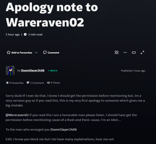
Calling out DoomSlayer2406
Okay so I’m not one to make a callout post, BUT! There has been one person who has been borderline stalking me.
Everything will be under the Read More, explanations, evidence, and all that.
BUT DON’T PROCEED IF YOU’RE GOING TO WITCH HUNT! Just block and move on yeah?
So some followers here may remember me talking about how someone took my Villain!Croissant design back in early January.
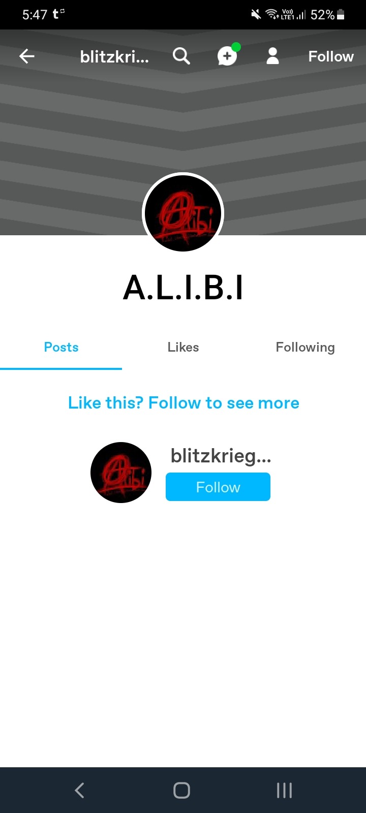
It all happened on DeviantArt, when they commented on my first design for Villain!Croissant. They said that it reminded them of a Dead by Daylight killer, whom they want to call Clockwork. And I expressed an interest in the DbD statement.
But then they later uploaded a drawing of DbD fankiller concepts, one which looked exactly like Villain!Croissant’s first design. Then they tell me on my own post that they took her design and made her into a fankiller.
Read the full convo here.
I didn’t know what to say. This person admitted to taking my design, admitted that they knew they should’ve asked, and claimed that they were rushed?
I decided to just block them. But that wasn’t the end of it.
I told my sister about this, and she decided to check out this account to see what they could be up to. And she saw that the person made an apology note.
Now, when I heard about this, I had already unblocked them to check if they kept the fankiller post up (they took it down), foolishly not thinking about asking my sister or friends to help me check instead. And DeviantArt doesn’t allow you to block a person again until 48 hours have passed.
And guess what, they noticed, and they DMed me.
Now at this point, I have a feeling that this person’s a kid (not an excuse btw).’
And you guys may be noticing that they’re apologizing still, but I didn’t accept it. Because they were not apologizing for taking my design. They were apologizing for tagging me, which I will talk about next.
When I didn’t reply to their DMs within a few minutes, they come to my profile and comment there instead. And there, they apologized again, but not for the right reason. Furthermore, their apologies for taking my design was lackluster, and as you can see in the screenshots linked, they seemed to be more of an afterthought.
Read the full convo here.
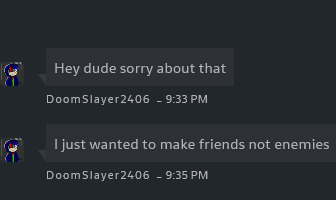
I gave up replying to them there, and finally responded to their DMs. I didn’t cuss, I didn’t insult, I didn’t type everything in caps. I just wanted them to know what they did wrong.
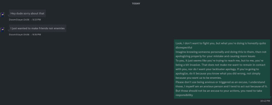
I went to sleep shortly after sending my message. But when I woke up, i found these in my Chat.

Seeing these, I just didn’t want to respond anymore, and waited the full 48 hours without contacting them before blocking them again.
Now, you would’ve thought that was the end of it, right?
NO. Absolutely not.
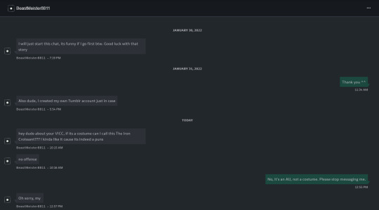
They made another account to bypass my block. And I’ll explain how I knew.
This happened on my second Villain!Croissant design a few days after DoomSlayer. And at first when I saw this person, I thought it was a different person.
View it all here.
But after seeing the edited comment made 3 days ago, as well as the replies to my comment labelled 2 days ago, I started having my suspicions. Having a username with 2 capitals and 4 numbers can be quite common, but it only added on to my suspicion after reading the edited comment. However, I didn’t want to jump to conclusions, and tried to be as polite as possible.
But when I stopped replying to their comment, they went ahead and DMed me, even thought I never actually gave them permission to. And here is how it went.
Their obsession over my Villain!Croissant au was telling. I even sent these to my friend and sister (the friend being someone else whom I have talked to about this) and asked if they think it was DoomSlayer. They both said yes.
The name format, their grammer, their interest over my AU.
Or in the words of my friend:
Also, notice how I tell them to stop messaging me. Also notice how they said they made a tumblr blog just in case. Well, I received a new follower a few minutes before they sent me that. And this is the blog, @/blitzkriegslayer.
They followed no one but staff, whom you automatically follow, and me.
I was uncomfortable, and blocked them here immediately. This was when I told them to stop messaging me on DeviantArt and blocked them there too.
Just yesterday, my sister checked this blog to see if they said anything, and saw that they still only followed staff.
Now look at the profile picture. On the same day I discussed with my sister and friend if this was the same person, my sister went to their DoomSlayer account on DA and saw this.

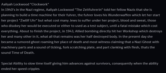
The profile picture is the same. I know it’s not impossible for different people to have the same profile pic by coincidence, but look at the post. They reuploaded the post, and have changed Clockwork’s design so that she no longer resembled my first Villain!Croissant design, though my friend said it was obvious that something was changed. And they kept the exact same information within the description.
And you might think ‘Well at least they changed their design’, but this is till not the end of it.
I wanted to ignore it, but my sister checked their DeviantArt profile today and saw this.
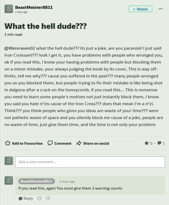
I laughed. They checked on me. After blocking them twice, they had the nerve to say this? Their little anxious act was gone, their apologies thrown out the window. They said it was just a joke? Really?
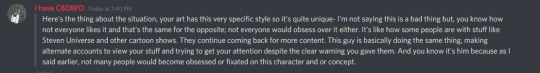
My final point is that they were aware that I hated nazis, it’s in my profile description after all.
But in their original post, and in their reuploaded post, they stole my design and made it a nazi, knowing about my discomfort and hatred for them.
If anything, this journal only added more to my claims, as they referred to the post on their DoomSlayer account. Not only that, but they wanted to call my AU design a costume, with a name that possibly referred to nazis.
But despite all this, I don’t condone witch hunting, doxxing, threatening, or any of the sort. I made this for people to be aware.
Stay safe everyone.
#callout#callout post#beware#beware post#i honestly pitied the guy until they did this#haiyai#tw nazi#tw nazis#tw stalking
23 notes
·
View notes
Text
Rose Painted Glasses (A Lila Exposed Fic)
First Next
Inspired by @chatonbean post.
The first part is by another lovely user by the name of @time-is-a-pain. This is their original post here.
The part after this one, that I will make sure is indicated, is by another amazing user @lenoreofraven. Their original post is also here. Their entry is after the cut.
I want to quickly thank both of the amazing people above for letting me use their additions for setting up this fic. It is very much a collaborative effort between many talented writers, I cannot take entire credit for this. 😏
time-is-a-pain’s entry:
Nathaniel had noticed lately that a bunch of the art Lila claimed as hers were in wildly different styles. At first he tried to rationalize it, maybe she’d been branching out style-wise? Maybe she hadn’t actually found her own style yet?
It got much harder to rationalize away the differences when he caught a glimpse of an oddly colored part of a background. Only a shade or two off, but it was there. And it looked like it might cover a signature? Now that he was thinking about it, only a few of the art Lila had shown the class had a signature.
It was harder, but it was Lila. They’d talked a lot about how horrible it felt to have your hard work stolen like that. She wouldn’t steal from anyone. Right?
Nathaniel shuddered, he hated the idea that someone would try claiming his work as their own. He made extra sure that his signature was on the picture, and would be hard to cover when he posted it to insta. H was proud of it, and no art thief would stop that.
And he was right to be proud. It quickly became one of his most popular posts. So when he got to school on Monday. and saw Lila showing off his work, he snapped at her.
Of course, most of the class took Lila’s side. But when Alix and Marinette got there, and saw what was happening, they took his side immediately.
“How can you prove it’s yours?” Kim asked.
A chorus of agreement swept through the room. Nathaniel took a deep breath, his hands were trembling, and pulled out his sketchbook. Flipping to the right page, he stalked over to Lila’s desk, and slammed the book down in front of her.
There it was. The original sketch. Clear in view of the whole class. Nathaniel’s work.
Lila peeked out from behind her fingers when the class went deathly silent, and Alya pulled away from her.
“How many others?” Nathaniel asked quietly, watching the panic appear, and get locked behind Lila’s mask. “Were any of them actually yours?”
lenoreofraven’s entry:
“How could you say that? How could you do this? After all the conversations we had about art theft.” Lila exclaimed back, trying to extinguish the doubt in the eyes of those that watched her. Not everyone was convinced. Alix stood by Nathaniel, trying her best to offer support. While Adrien gently touched Marinette’s wrist, as if signaling for her to stay back.
It was obvious Lila couldn’t win these artists over, artists who have had their work stolen. Instead her eyes settled to Ivan, Rose and Juleka. After the situation with XY, they were fuming the moment the accusation touched the air. It was their weak spot really. Took any logic they may have away.
“You said you wanted me to do a quick sketch, and lent me your notebook as I had left my tablet at home. Then you do this to me?”
“Lila just stop it.” Marinette growled, but she wasn’t the audience for this little stunt. Lila could claim they were in France, and Marinette would check google maps to make sure they hadn’t moved. This was about everyone.
Even Adrien, who glared at her from Marinette’s side, was part of the intended audience. As he could make, or break, her reputation if he so desired. Considering how Ivan responded to the demand. perhaps, just possibly, she could deal with two birds at once. Use this as Marinette was an expert on plagiarism, and if she picked the wrong side it could be ruin for her.
“Stop what? Trying to take credit for my own work? I know you don’t like me much, but do you honestly condone this? I thought you would be the first person to support the victim of art theft.” Marinette just looked back with a blank stare, not even humoring the accusation with a response.
All eyes were still on Lila and Nathaniel. Not ideal, but it could be managed. It was the wrong time for crocodile tears. Her eyes scanned the work again. When she had erased the signature from the upload she had been careful, after this she would start adding her own sign. For now she just needed proof. This was a draft, not the official upload. She just needed something.
“Maybe I have been experimenting with styles a bit, but this is mine. See, there’s an L, as in Lila. I made it subtle so it couldn’t be erased, like how you stitch your name into designs in clever ways, Marinette.” Lila explained, pointing at something that could be an L, but was just as likely to be miscellaneous lines. Alya, Sabrina, and a few others that were still on the fence squinted at it, tilting their heads to try and see it. The members of Kitty Section instantly took it as fact. Max, Alix and a few doubters all shook their heads, realizing the stretch.
Nathaniel glared back at her.
“That’s not an L. That’s just lines. I don’t erase signatures like some people because if you look on my insta it clearly had my signature, matches all my other work, and is clearly mine!”
“Then you must have added it. We all know how disrespectful you can be of other’s art.” Lila remarked, as she flinched away from Nathaniel. She made it as dramatic as possible, acting as if the artist would hit her.
“LILA!” Snapped Alix, not sparing any notice for Ivan, who now stood as a shield for Lila.
Lila simply sighed with a shake of her head, moving slightly to the side so she could be seen, but Ivan still acted like a bodyguard.
“I know Marc didn’t want to mention it, but that couldn’t have been easy to witness. I don’t know what happened, I wasn’t here for it, but I do know you tore apart someone’s journal. I can’t imagine anyone doing that. It’s cruel. Sure you’re friends and have made up, now working on the comic, but doing that to someone’s notebook? I’d rather eat glass than have my precious sketchpads or notebooks damaged in anyway. I’m just saying, someone who does that may be the type of person to disrespect other people’s art.”
My entry:
Nathaniel flinched back, looking at the others in class. Rose and Juleka glared at him while Ivan stood in front of Lila, unmoving.
“How dare you!” Alix started toward Lila only to be held back by Kim. Max frowned at Lila while adjusting his glasses, he looked at the drawing again, and looked between Lila and Nathaniel.
“Don’t you dare talk about something you have no idea about- You Snake!”
Lila smiled her condescending smile at her opposers.
“It’s not my fault he caused an akuma because of his jealousy. I know he was angry with-”
Alix made another lunge for her, Kim had to quickly catch her body from the air before she could attack the other girl.
Marinette was fuming, she was burning with rage. Her face was slowly turning red, before she suddenly took out her phone.
Adrien looked concerned. He could feel the heat coming off of her body. He looked to the windows, and the classroom door, fro any akumas. He knew it needed to be resolved, and fast. Rose and Juleka were yelling in defense of Lila, while Alix was screaming in defense of Nathaniel. Lila was still ‘cowering’ behind Ivan, and Nathaniel looked like he was on the verge of becoming another akuma. Adrien was about to speak up when someone else did.
“Actually-” A voice broke through the yells of the classroom. Alya looked uncomfortable, with Nino standing, just as uncomfortable, next to her.
Lila looked triumphant, she knew Alya would be on her side. She sent a smug look at the oposing group, one that earned a glare from Nathaniel, a growl from Marinette, and a lunge from Alix, again.
Nino stepped forward, his expression placating.
“All we have to do is see where Nathaniel says his signature is, and see if the spot was altered on the photo posted to both accounts.”
The request seemed reasonable, if the nodding heads of the other classmates were anything to go by, if it weren’t all a lie.
Lila started crying her crocodile tears, lip wobbling at the pair closest to the door.
“Y-You don’t believe me?” She sniffed as Rose comforted her, and Juleka glared at them.
“Not at all!” Alya walked up, her hands waving in front of her.
“We’re not accusing anyone.” Nino clarified.
“We’re just comparing the pictures, that’s all!” Alya hastened to add.
Lila didn’t look happy at all, but Rose was already pulling up the picture on Lila’s instagram. Marinette doing the same on her phone of Nathaniel’s instagram.
They both laid out their phones on a desk for everyone to compare. Max was looking at the two closely, as well as his own phone.
“Oh Marinette, that’s a screenshot.” Max pointed out.
Lila smiled through her tears, sure that she could convince the class that she edited the photo for Nathaniel, because he accused her that one time too.
“Oh, my bad” She said in a falsely sweet voice, something was up.
“Here. Oh!” She made it look like she was backing out of her photo gallery, when she just swiped over, and let the class see another piece of art work.
“Hey! That looks like one of Lila’s pictures!” Rose, oh so helpfully, pointed out. And it was, one of the ones she posted to her instagram anyway.
“Oh but that’s from this artist. See? I screenshoted it when they posted it, two weeks ago. See?”
They looked closer, and sure enough the artist posted it two weeks before, They looked at the same picture on Lila’s instagram that she claimed she finished two days prior. With a suspicious bloch where the other artists signature was was on their post.
Max pulled back, pushed his glasses back up, and nodded.
“Yup. That picture is the original, you can see the watermark. And the convenient spot that covered the watermark from the original picture, right there on Lila’s instagram.” Rose and Juleka looked at her, confused. Ivan turned around, looking for answers as well. Before Lila could get a word in Marinette took that moment to completely pounce.
“Oh, but what about these pictures? Do they also have erased watermarks, because they look an awful like the other artists I follow that have had their work stolen from them too.”
Alya and Max descended on the photos like vultures on a carcass, picking apart every screenshot in Marinette’s phone, and every post Lila had made on her instagram with Rose’s phone.
Rose didn’t protest as the hovered over her phone, she looked at Lila with tears in her eyes.
“Is it true? Did-Did you s-steal them?” Juleka wrapped her arm around her shoulder, but gave a hesitant glance to Lila. Ivan looked lost, Mylene currently being out sick, he didn’t know who to side with.
Kim didn’t have to hold Alix back, she stood back on her won. Her arms crossed, and a smug look on her face, she knew Lila had been caught. She gave a smile to Marinette, who gave a thumbs up in return. Nathaniel looked relieved, he also gave Marinette a grateful smile that she returned.
Lila knew she was losing her hold. She looked to Adrien, but he was busy looking (out for akumas) around the room.
She had to play her ace in the hole.
She burst into tears, sobbing.
“I-I’m so sick of this lying disease!”
The others looked at her confused.
Alix snorted.
“Yeah, you are lying, and you are a disease.” Kim elbowed her for that, but he didn’t say anything.
Lila had to move fast.
“I w-was going to take them down. B-But I really do like the pictures. I h-had no idea they had b-been stolen b-by those artists-”
“That doesn’t explain the watermarks!” Alix cut across.
“I didn’t steal them! Someone else did! I-I got permission f-from whoever stole the art f-first. A-and-” She hastened to add when she saw that Alix and Marinette were about to interrupt her.
“A-and I couldn’t help but put that I drew them, because of my lying disease! R-Remember?” Marinette looked enraged, Alix and Nathaniel looked at her in disbelief. Max also looked skeptical.
“L-lying disease?” Rose asked tentatively. Lila nodded.
“Yes! R-Remember? W-When I accidentally got Marinette expelled.” At the memory being brought up, Marinette’s face darkened further, Adrien looked uncomfortable, and Alix and Nathaniel shared a look of realization.
“I didn’t mean to get her expelled! It was my disease! It acts up during times of stress! And with all of the charities I help with, and my disabilities, I get too stressed out and start lying again!” She looked to Alya, who looked like she was almost convinced. Nino was looking to Alya. Rose, Juleka, and Ivam were firmly back on her side again.
She just needed to convince Alya, and the majority would follow, or join Marinette in exile.
“I-I’ve been getting so stressed out lately! And I can’t control the urge when it happens! I am so sorry you guys! I didn’t mean-”
“That still doesn’t explain why you accused Nathaniel of stealing your supposed artwork.” Marinette pointed out.
“Or the fact that you brought up something that you have no idea about and threw it in his face!” Alix added.
Lila schooled her face to guilt.
“I’m sorry that I offended you Nathaniel. I didn’t mean to.” She let a few tears come to the surface of her eyes, but never let them fall.
It was all Juleka and Rose needed to flock to her and comfort her. She looked to Alya, who looked on the verge of joining her. She just needed a little more.
“I can understand what made you want to draw that picture you posted, it looks a lot like mine. You drew inspirations from that, I get that!” Nathaniel looked livid, and Alix was ready to blow.
But Lila only worried about the two that were in front of her that weren’t at her side yet. She needed them to keep her hold of the class.
“I can understand drawing inspiration from what’s around you, Marinette does that all the time no?” Said girl glared at her. Adrien had finally stopped his tour of the room with his eyes, and looked at the group. He glared at Lila, but she could deal with that later. As long as he kept his arm out in front of Marinette, and out of her way, she could deal with him later.
She just needed Alya and Nino.
“I don’t blame you for being inspired! Not at all! I just want an apology for accusing me of stealing.” At the start of the protests from Marinette, Alix and Nathaniel, she looked to Nino and Alya.
“Right Alya? Nino?”
Alya hesitantly nodded. Nino didn’t react one way or the other, Hmm...
“See? It;s alright! We just needed to communicate!” Rose cheerfully added.
At that convenient time, Madam Bustier entered the room.
“Alright class! We have a busy day ahead of us! Finish up your chat and get to your seats!”
Lila looked to Nathaniel, an expectant look on her face that made his stomach turn.
Was this how Marinette felt?
Rose, Juleka, and Ivan looked at him expectantly too.
Madam Bustier looked back at the group, waiting. Kim slapped him on the back.
“Hey! It’s resolved now! Just apologize and it’s all good man!”
Alix glared at him, but Nathaniel just sighed.
“I’m... Sorry Lila.”
She smiled her condescending smile once again, that Nathaniel was beginning to realize was the one she always gave to Marinette.
“I accept your apology.”
And everyone started to go back to their seats.
Nathaniel didn’t missed the way Marinette opened her mouth again, but stopped when Adrien touched her arm with his hand. He whispered something to her and shook his head. Alix noticed this too.
She looked angry, and gave him a look of disgust before she subtly tore her arm away from his. He looked sad, but retreated back to his seat anyway. Marinette looked back at Nathaniel and Alix, to see them already looking at her.
She gave them a sad smile and looked to her desk, to see Lila already seated there. She let out a quiet sigh, and made her way to the back of the classroom.
“Hey Marinette?” Nathaniel asked quietly. She looked between him and Alix, who was toeing the floor.
“Do you want to sit in the back with us?” She was about to ask why Alix would sit at the back when she saw her bookbag in her hand.
She smiled at them and nodded. They made their way to the back, not noticing Adrien’s frown of sadness or Lila’s frown of annoyance.
She didn’t like reminding them of her ‘lying disease’. It might give them a reason to not totally believe her,though it was a great skeleton key to get her out of any situation because of her lies.
She turned back around in her seat, plotting her next move for the two new people that joined her exiled list.
Oh well, looks like she’d be adjusting her plans to fit two more.
What she didn’t know, was that there was another person that was beginning to catch on to all of her little lies. He just had to catalog them all on his phone first, before bringing the evidence to light.
Tag List:
@bean2342 @chris-pixie @pirats-pizzacanninibles @multifacetedfangirl @might-as-well-happen @legallyspawned @firesong323 @kuroko26 @runestarchild @mariae2900 @laadychat
#Rose Painted Glasses#lila salt#lila rossi#marinette dupain cheng#adrien agreste#alya cesaire#nino lahiffe#max kante#alix kubdel#nathaniel kurtzberg#rose lavillant#juleka couffaine#ivan bruel#le chien kim#lila reveal in progress
479 notes
·
View notes
Note
Storytelling asks 12, 13 and 14 ❤️
𝐒𝐓𝐎𝐑𝐘𝐓𝐄𝐋𝐋𝐈𝐍𝐆 𝐀𝐒𝐊𝐒 / accepting !
these were fantastic questions !! thank you !! ❤️❤️❤️
12. do you actually play the game or do you just use it as a storytelling medium?
lately, it’s been 100% storytelling, but i am so eager to actually play the game soon. i’ve been working on my historical legacy for ........ geez, like five years or so? i guess it began as my bastard version of the decades challenge, lmao. anyway, long story short, i haven’t finished it, and i need to so i can replay the parts i miss. additionally, my plan is to finally get the cottage one when i finish part ii of the story !!!!!!! and do some legacy gameplay (haven’t decided if it’ll be canon yet but it will, as i’ve said, be jered circa 2007).
13. from basic planning to a finished post, how long does that take you?
OOF. it varies? here are the steps u didn’t ask for
get an idea, scribble some notes in my journal or on scraps of paper i then stuff into the journal. draw diagrams as needed.
scour the internet for poses (detour to make my own sometimes)
build a set (this is what i do 65% of the time. sometimes it takes half an hour, sometimes it takes a few hours. depends on if i need to download cc, build an exterior, spend 45 minutes arranging deco items NO ONE WILL SEE ssdjflksgfs)
occasionally, a detour to recolor / convert objects (not often but often enough that i know how to do these things now djfshgkjsg)
dress up my sims !!! make sure they have different versions with accessories as needed, etc. (ex. for the bachelor party, alf & his friends each had six outfits. nightmare.)
take screenshots !!!!! i do this... based on the mental script in my head. so 60% “i know what happens,” and 40% “vibes only.” takes longer if i have to mess around with lighting (using reshade and/or by ... breaking everyone’s poses to adjust the light fixtures. usually for night scenes.)
pick max of 10 screenshots from the 1287398494 i took. i just upload them to photoshop & click around until i’ve got the best of the bunch. sometimes i post the rejects as previews or outtakes.
upload screenshots to tumblr drafts & let them marinate.....
add captions !!!! i’ve started writing them in photoshop, aka the most cursed approach. i just revise & rearrange until it reads well & hits all the marks i had in mind for the scene. i’m WORDY so seeing the text on the image helps them ... not be giving a monologue in every episode. just most. then, replace drafted shots w/ captions screenshots.
potentially, after marinating, i decided i hate the screenshots & redo them !!!!!!!!! not all the time, but maybe 3-4/10 times.
write the scene. this varies wildly bc sometimes i slap two sentences & call it a day, but other times i pull out my writing laptop & pour over it for ... anywhere from a week to twenty minutes.
ideally, the draft marinates again, then i queue it at least 10 minutes before midnight
SO ........ overall, i would say this process can take anywhere between 2-3 hours to a few days. the longest i’ll have an average draft waiting is a week ??
14. do you have any regrets about your story so far? if you could go back in time, how would you fix these?
my number one regret is ... not realizing how invested in this hobby i would be, so therefore not bothering to properly plan things !!! winging it was fun and easy, but now i’ve learned so much—from both trial and error & the amazing storytellers i’ve met. still, rather than going back in time, i’m excited to apply all of this to the upcoming parts. hopefully the story will be much tighter, richer, and visually pleasing as a result !!!! also. wish i’d known about the tool mod sooner ......... sigh. lastly, i wish i’d learned how to make my own cc any of the previous times over the years i’ve attempted it. sure would come in handy, what with all the period specific fashion i want >:^( maybe next time.
11 notes
·
View notes
Text
Thoughts on the Ranger One Manga
So I read the R1 manga for the second time ever about a year ago, and for some reason never found the time to post my thoughts. I suppose I should change that!
If you somehow haven't heard of it, the Ranger manga is an adaptation/retelling of the post-game Deoxys mission, with a hint of the downloadable Manaphy mission because they had a main series game to plug. As far as I'm aware, it never received an official English translation, so most of the available translations are fanmade.
It's kinda notorious for it's often hilariously bad artwork and weird OOC moments, though different characterisation is par for the course with any Pokémon manga 😂
-It's not as bad as I remember; most of the artwork looks pretty good and there are some genuinely cool looking panels. Annoyingly though, all the dumb/weird/fucking cursed panels are reserved for scenes with the Go-Rock Quads, which take up the bulk of the manga.
-There's also numerous scenes of Solana and Tiffany covered in suspicious white Bug-type splooge, so I'll leave that mental image with you.
-It has a suuuuuper slow beginning like fuck me it takes forever to get to the actual meat of the story. I get they wanted to explain what a Ranger does and how they differ from trainers but it goes on for so damn long!
-The writer seemed to forget that Lunick and Solana are meant to be stationed Ringtown; it opens with Lunick doing a mission seemingly by himself in Fall City and ends in them doing a mission together in Fall City. At least in the game the excuse is there's nobody else around to help, here it just seems like they were sent because they're the main characters.
-Also the character writing is... kinda odd. Especially on the Quads. Tiffany is the only one who seems to have any personality, the other three are just... interchangeable, as well as being badly drawn.
-There's literally... no point to Cameron or Elita being there. Spenser I obviously get since he's the MCs leader, and Joel I kinda get too since the Deoxys would technically have to involve his input since the mission takes place in the Krokka Tunnel, but the other two are just their to spout exposition (that could easily be delivered by other characters) and get their asses kicked, which WOULD make the Quads look like more of a threat if Cameron and Elita weren't the most useless base leaders already.
-(Part of me DOES wonder if they only included Elita to be Spenser's moral support, since I know people ship them and the games seemed to hint slightly at it, and since this is translated from Japanese I kinda wonder if their dialogue is meant to be more affectionate in terms of honourifics and politeness but it was just lost in translation.)
-Also why do these mangas like making Solana Lunick's angry jealous wannabe girlfriend, is that just some Japanese humour I'm not accustomed to? Like between this and the Mobilise manga I'm expecting the next one I read to make her a full on Yandere stereotype
-I like how they gave Joel a bigger role, if anything he does the most out of all four leaders. Cameron and Elita I've mentioned, and Spenser just kind of sits around and mopes. Which he does in the game anyway after he fails the Deoxys bonus mission so eh.
-Also props to the artist for choosing to give Joel the biggest role out of the base leaders, like out of the four you could choose from you chose the most difficult to draw by far that's bold.
-The styler now has a built in camera capable of filming missions and uploading them to a cloud in the event the styler is damaged, which is a cool concept.
-I like how it shows how the Quads hybrid instrument/stylers work, that's pretty neat. Shame they all look like shit.
I might re-read it again and come back with some screenshots, so stay tuned!
#Pokemon ranger#Ranger one#Not sure if i should redraw some scenes since the last one didn't do so well 😅
7 notes
·
View notes
Last Seen Blogs

voltdad-blog
♥LordZuuko's Keith♥

torizs
TORIZS
underwater0firework
Star Tsar

dazeddoodles
Mediocre art but I try

nami-wav
nami.wav