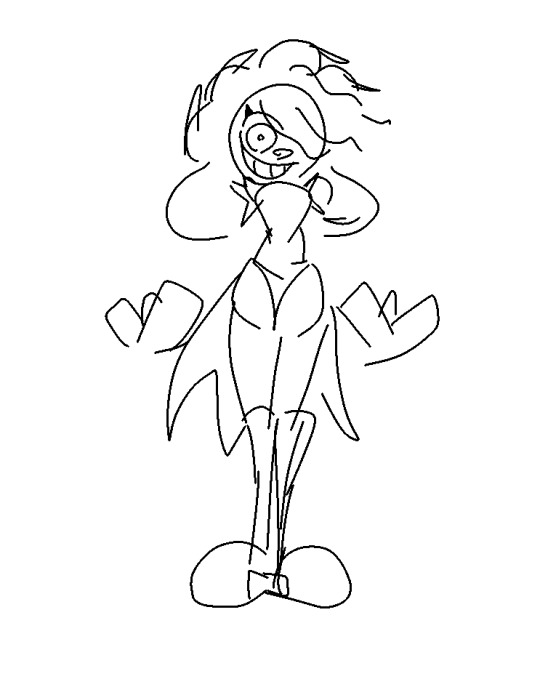
#so i just redrew it completely and it was so much better lol
Text
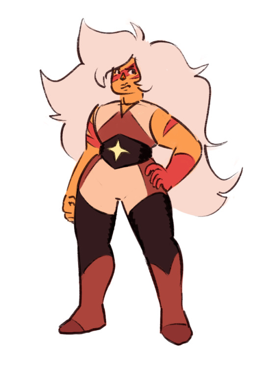
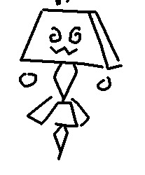
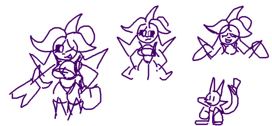
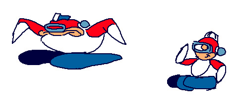
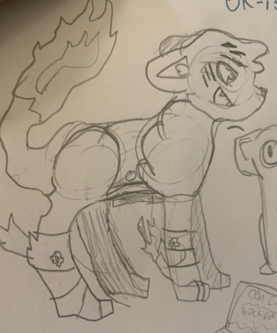
jasper for the swap au! her outfit is very much wrestling inspired
#steven universe#jasper#su au#momswap au#my art#ALMOST POSTED THIS WITH HER FACE STRIPES THE WRONG WAY ROUND BC I DIDNT REALIZE THE CANVAS WAS FLIPPED WHOOPS#anyways she was giving me sooooooo much trouble to draw compared to peridot#so i just redrew it completely and it was so much better lol#fun fact i changed some details here but i had her design down first
72 notes
·
View notes
Text
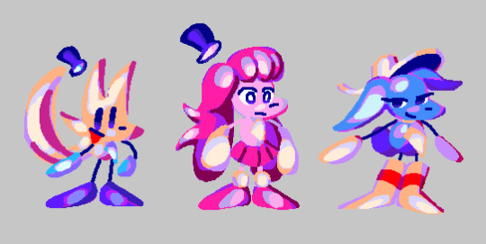
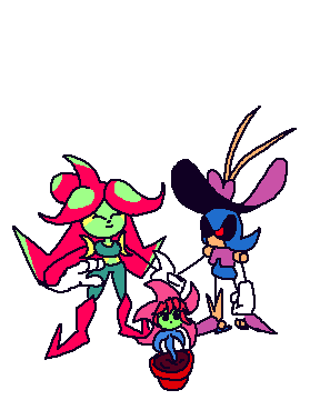
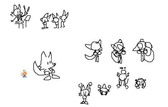
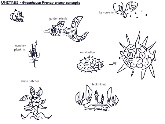
nearly all of the character designs from 'UNITRES Dreams'

(once again, this post didnt have a “read more” part in da original cohost post, so im putting it here... click more if U Dare !!)
so, trying to get back into making art again, i decided to draw brand new references of all the character designs from my game, UNITRES Dreams. cus why not. anyways these references arent Perfect.. some of em ive made better reference sheets before (while for this i just wanted to draw em all together with a sort of consistent color style and their current, up-to-date designs) and also i didnt get to draw Every character as it is Too Much and i am Too Lazy to draw all of the enemies and boss designs ... so ive just included the enemy and boss sprites for now.. but ill probably draw new art for them sometime.
Anyways. let me tell ya a bit about making Character Designs for this game. as ive talked a bit about in my post about making Character Sprites , making stuff for the game is hard because i am pretty much the Only person working on the game and i have to split my time working on the sprites between working on Every Other Aspect Of The Game , meaning i dont get to spend as much time making the artwork as detailed and polished as id want to.
and the same thing goes for making the Character Designs. sadly, i didnt get to make as many Actual Characters as i wanted (you can tell which are the Actual Characters as theyre the ones i Actually Redrew Here). when the project started, i only really had the Main Three Playable Characters in mind.. in fact most of the other Actual Characters didnt even Exist until the Very Very End of development.. which is the part im sad about. i just didnt have enough time to think about adding any complex new characters or figure out how i would Make a new character design . Which leads me to the Other Characters... which includes Most (but not All) of the Bosses and Enemies. Their designs are well , Basic . their designs werent really thoughtout ;they were created to serve a single purpose: to be made quickly so that the game could Have enemies and bosses. if i were remaking this game now, id probably remove or even completely Redo a Ton of the enemy designs (except the post-UNITRES Dreams enemies ... im kind of proud of them Lol !!)
thats just how things were. i didnt have enough time to focus on making character designs, so i didnt get to make a Ton of them and i had to make them Fast . in fact, early on in development, i hadnt really had much experience making character designs (as , before UNITRES, i didnt really make too many Original Characters for my games before), so i struggled experimenting and making characters for a lot of its development. And The Designs themselves .. a lot of them (even the ones i like) are pretty simple. Most characters are comprised of simple shapes and details , making them easy to draw and animate. and a lot of the early designs used Very Few Colors , which made drawing them quicker.
Despite All Of This , However, i am actually pretty proud of a lot of the designs ive made for this game (Especially the ones with the fancy new drawings i made here ..). while theyre simple, and while i wish i couldve made More characters with more unique designs , i really like the designs i got to make for this game ,with some of em being my favorite to draw even when im bored .. and i just felt like id talk about em.
And Well , Im Gonna Talk About Em !! click da 'read more' thingy if u want to Read More ..
the Main three characterz
"trees"
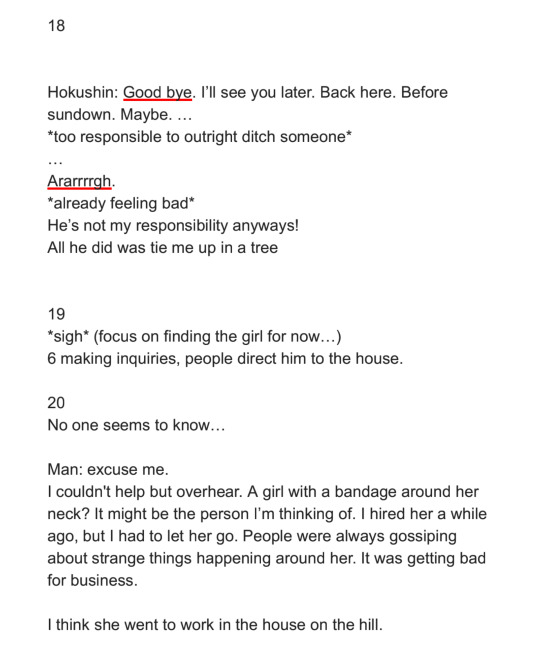
so first off , let me talk about "trees". before i can get into their Actual Design , let me tell u a bit of history so u can understand why theyre designed the way they are.
So . around November 6, 2018 , before UNITRES was really a thing , i designed the very first version of Trees that u can see above. while i didnt know what the game was going to Be , i had a Basic idea of what i wanted the Character to be from the very beginning. you see, Trees (the character) ,while having the same name as me , is Technically Not a self insert , Kind Of . I designed this character near the beginning of when i started entering a Very Low Point mentally in my life (which involves some personal stuff im not going to get into , Aswell as this point happening Around when Among the Others released) and i thought Very Negatively of myself . And So , this character is sort of an exaggerated version of the negative thoughts i had about myself at the time .
the main characteristics of the character was they Did Not Show Their True Emotions , instead bottling up their feelings and showing a very Fake , happy version of themself. theyre also kind of Fucked Up in the head and try to hide it . anyways theres more stuff going on with them that you can probably extract from both the games and the old descriptions in this concept art , but i wanna leave that as a surprise for when i get to make my next game. There Are some outdated things from the descriptions in the concept art , such as an idea where Trees would be Always Facing Forward , hiding away their backside. And Also , you may notice theyre referred to as "it" and "his" in this , which has well. Changed . teehee.
as for The Design Itself , i wasnt really sure what i wanted to go for at first. this character was actually one of the Few first Actual Character Designs i made at that point , so i didnt really have any idea on what to do. One day , i thought up of a Little Bear Looking character , and i tried drawing that character .. only for it to Sort Of look like a little fox-like character. and i imagined this character emoting mainly by very subtle details , such as the Hat and Ears changing shapes based on their emotions ..
Anyways , later that month , i drew the very first sprite of Trees , which ended up being used as the Idle sprite for the UNITRES tech demo. i wont be sharing What that sprite was originally for , as im saving it for Something , but i Will show you Trees' sprite evolution:
from left-to-right , it starts with the very first Trees sprite. Then there's the first revision, which was done when UNITRES Dreams started development. Then there's the second revision , done for the Newgrounds update in 2021. And finally, there's the TREES' ADVENTURE version, which is the current version of the sprite.
with the first version, the sprite is Pretty Close to the first concept art. However , iremoved the blue part in the tail as i couldnt get it to look good in sprite form (or i just forgot to include it.. idont remember). I also removed some details , such as the little hair and the red blush, as i couldnt really include them on such a small sprite.
Anyways , so how did the design mutate into the current design ? Well , over time , i ended up drawing their ears and tail Longer , and ended up giving them longer and longer limbs (as it was Hard to animate them with the tiny limbs they had). Eventually , it got to the point where i decided to just redo the sprites to make em consistent with how i was drawing them , and thats how i got the second revision.
But Then , i started consuming media Other Than Sonic ! i think the main thing that infected my brain was Spinel from Steven Universe ... while Trees' design Did have a bit of the sort of rubberhose , silly limbs before (along with a Bit of contorting their form , as u can see with the expressions in the original concept) , when i saw the steven universe movie , i saw spinel and was Immediately like " Oh My Goodness Gracious . I Need To Make My Character As Silly As Her". And so , I leaned more into the silly , stretchy limbs . You can see this in the following sprites:
Anyways , as i kept drawing them and consuming more Non Sonic media , i ended up experimenting more with their design and adding some small elements from my inspirations .. one of the other main inspirations was Wander Over Yonder ,where i decided to draw Trees' hat to be more Silly and Big , like Wander's hat. i also ended up perfecting how i drew Trees , giving them more Sharp lines , Bigger and Sillier "hands" and "feet" , making their tail Huge , and just giving them a nice silhouette that i like . By the time of the Newgrounds update , i realized Trees' sprites were kind of Outdated , so i ended up redrawing Most of their sprites , and ended up with the version you can see in the current version of UNITRES Dreams ..
And well , Im Really Really proud of how their designed turned out . I Like to draw them a lot. and i think the way their design evolved has ended up fitting with their Actual Character really well .. the sort of Round , Soft elements such as their Big , Blobby hands/feet and their cute , silly face make them look , on the surface , cute and Silly . But then you have the more Sharp lines and elements , such as with their head and tail which i think makes their character have a bit of depth .. if that makes sense .
Idk . im not good at words or describing things . i just think their design now works really well with what i want to go for . and hey , a lot of my friends have drawn them and have drawn them Really Really Well .. i particularly like how people interpret their design .. with some people leaning into the more Soft , cute elements of their design , while some have drawn them Really Really accurately .. its really cool and im thankful for everyone whos drawn them before ..
Last Thing ill mention about their design (and i guess this goes for Most of the other designs) : Most of the characters in UNITRES aren't really supposed to be any Specific Species . Theyre all just sort of weird , ailen-like characters who do not abide to any sort of rules or reality or whatever. Trees is just Trees ; they're not supposed to be a Fox or any sort of Real animal or species or whatever, and that goes for every other character.
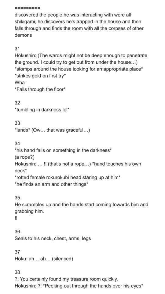
??????
so here's the very first designs of ?????? , who for now ill unofficially refer to as The Pink Character. When i first started development on UNITRES , i Knew i wanted there to be Three main characters: Trees, and two mysterious characters. and when i started work on UNITRES Dreams (back when it was known as UNITRES - BRAND NEW WORLD Edition) , i needed to create designs for them .. However , at this point i was still learning how to Properly Make Character Designs , and so i created the first sketch above ,and then created their first sprites , which . Well. I Ended Up Not Liking Their Design Very Much !
So . The whole point of this character is that they dont really know their own identity , with them not even having a Real Name . Their design was Supposed to be sort of Ambiguous .. However i was Not Sure what to do for their design . i wanted to make it so you couldnt really tell what their gender was (as originally , they were a girl ... but they do not have No Gender anymore) . However , when people first started testing the game , they just . thought they were a guy.
anyways . i just Did Not Like This Design . they didnt really have a Clear Silhouette .. they just didnt look like an appealing or memorable design to me. and i also i didnt like their color palette. So . when the game became UNITRES Dreams , i decided to completely redo their design . And Well ..
This is the first drawing of the new design. At First , i wasnt sure about their design , with things such as them being Pink and Having A Skirt, i was worried about Some People immediately being like "Oh , Theyre A Girl !".. but you know what ? Ive grown Very Very Attached to this design .. i think theyre both Cute and Recognizable , while still fitting the sort of character i was going for . Their sillouette , while not as Recognizable as the other characters , has enough goin on to where i think it is a bit recogniable and easy to read while still giving them a sort of Mystery regarding their identity .. if that makes sense . And their more monochrome palette compared to every other character helps sell that , i think .
i think theres probably some people out there who see this character as a girl , but i think theyre a good Non Gender Having character design . just cus theyre pink doesnt mean they gotta have Gender ! anyways , i love them. theyre my silly little strange creature. i hope you love them too .. there is so much i want to explore with this character in a future game .. and i think their new design has really stuck with me.
???
So , ??? , who i will refer to unofficially as The Blue Character, is supposed to Sort Of be the opposite of Trees (the character). they're Very Tired and Chill , not really too crazy or anythin. and i wanted their design to illustrate that, and well , out of every design ive made , theirs was pretty much perfect from the very moment i created them.
I dont know if i have any old concept of them on hand, but i Do have both the original sprites ,aswell as the newer ones which are pretty much the same as the old sprites , but more polished and with redone colors..
And, well. Yea . they didnt really change much ! The only aspects that changed was that i removed like , Two details that i felt cluttered up the sprites too much , that being the little Tired Eyebag/ whatever its called line beneath their eyes, along with the little Red Dot that was on their boots. Other than that , their design was pretty much Perfect. they were also pretty easy to make , as , with them being a sort of Opposite version of Trees , theyre pretty much based off Trees' design , except with a bunch of differences to make them feel like their own character (such as different body/head shape , a big silly hat , and Actual Boots).
there's nothing much for me to say about them. they're perfect.
the really gay ones
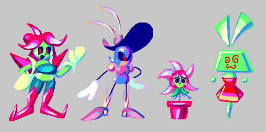
suzy, wavey, and their little Shine Catcher
Alright . so before i can explain These characters , u need a little bit of History .
So. when UNITRES - BRAND NEW WORLD Edition was "finished" , i went on to help with RRThiel and his game, MEGA MAN PERFECT BLUE. as you can see here, i worked on various backgrounds and tilesets for the game. Anyways , at one point , ithought itd be cool to remake the Intro Stage in UNITRES , as a sort of tribute to the game and also as a little extra thing for the new update i was planning on making (which ended up becoming UNITRES Dreams).
at first, this was Just going to be two levels based off the Intro Stage from Perfect Blue , However , later in MMPB's development , one of the backgrounds I did for one of the levels ended up being Completely Redone by other people on the team ,as my background didnt really fit the game's style .. However , i still really liked this background .. so I decided to reuse it for a new level in UNITRES , with it also being a tribute to the level in MMPB (though its a lot more loose compared to the Intro Stage level , Lol).
This level ended up becoming Greenhouse Frenzy in UNITRES , and i ended up turning what once was just going to be a two level bonus into an entirely new campaign with its own story in UNITRES Dreams. and with it being a whole new campaign , i wanted there to be New Bosses and New Enemies ..
So , for Greenhouse Frenzy - Section 1 , I was planning on a new boss ... and this boss was going to be ... Mr. Sauceman !
You See , for UNITRES Dreams i wanted to go Hard with including all sorts of little tributes to my friends and the people who helped with the game . Mr. Sauceman , being one of the composers of the game , let me use his character from the game hes working on as a boss in the game , and i thought itd be nice to have him be in Greenhouse Frenzy ,since that level is pretty much a big tribute anywayz.
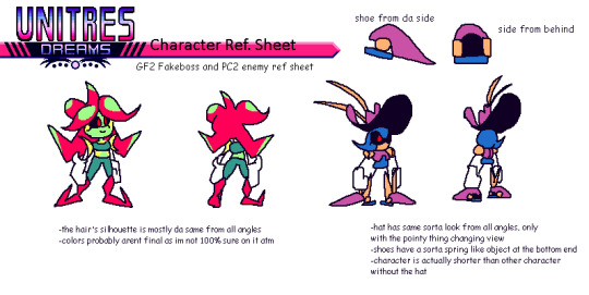
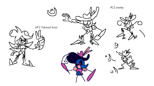
So , Originally , i wanted the Sauceman boss to start out with a little Fake Out . You See, the MMPB level that Greenhouse Frenzy is based off has a robot master that i asked RRThiel if i could use for the level , but he said no. So , I decided for this boss that i would create a silly character Inspired by the robot master from the MMPB as a silly little joke , but then Mr. Sauceman shows up and that character explodes . And So , I Designed Suzy , a character who , while inspired a bit by the character MMPB , was made to be a bit different and also to be used for a silly little fake-out intro and to die in 5 seconds . You can see this on the reference sheet , where she didnt even have a name and is just referred to as "GF2 Fakeboss".
However . Two Things Happened : 1) I Grew Kind Of Attached To This Little character I Designed , And 2) I Ran Out Of Time. i couldnt implement the fakeout that i had planned ... and i didnt have a boss fight for Greenhouse Frenzy - Section 1.... So. I decided to just. Make her the boss fight of GF1. it just made sense ! i Originally had planned a boss fight based on the Magik Master boss from Chaotic Carnival , but reusing the character design for the silly fakeout ended up being quicker , and so she ended up being an Actual Character in the game.
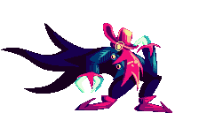
And Then There's Wavey . she is a robot. i originally designed her as an enemy for the Intro Stage tribute level (a.k.a , Perfect City) , as i wanted it to have its own enemy. Her design is also Some What inspired by one of the robot masters from MMPB , though not as much as Suzy's is.
Anyways , despite Suzy and Wavey being inspired by characters from MMPB , i wanted them to be different and have their own sort of Character . And well .. their actual Personalities are different to the ones from MMPB , at least . In UNITRES Dreams , there is a hidden "Storybook" mode , which contains various stories which add a bit of Worldbuilding into the game .. and one of the stories details Suzy and Wavey . Basically , Suzy is a lonely gardener , who lives alone on her own strange little planet , who then travels across the galaxy to the Perfect City , where she ends up meeting Wavey , a military robot who Suzy becomes fascinated with ..
Anyways . my writing aint exactly the best , and i Refuse to go and reread the stuff i wrote for the storybook mode in unitres . but i tried my best to make suzy and wavey their Own sort of characters , having their own identity compared to the characters theyre based on. Oh , and by the way , suzy and wavey are gay LOL !! and they have a little baby plant that they raise . this is also told in the storybook but i unfortuately didnt get to explore this Much outside of that in the game... though there Is a secret you can find in one of the levels.
So. what do i think of these characters and their designs ? Well. Honestly. Im Not Sure . when i designed them both , i still wasnt Totally comfortable with character designs as i am now , and honestly . theyre not my Favorite designs . Wavey in particular is just . Well . Shes Just Metal Sonic in A Hat . she has her own little differences , but i cant lie . i probably coulda done better with her design . and suzy i think hasnt aged as well either . Idk. Also. In Case You Cant Tell , I am BAD with coming up with names . I Genuinely cant do it. i came up with both of their names on a Whim . i justdidnt know what to call them and i was running out of time LOL !!
anyways. last things ill mention are : the plant is a species known as Shine Catchers, which appear as enemies in Greenhouse Frenzy. Oh , and also , here's some concept art of them Lol !!
(oh , and i also forgot to mention: originally , suzy had green dots on her "hair", but i didnt know how to properly draw them on the sprites , so i left it out)
the Silly ones (a.k.a my favorite ones)
Millie
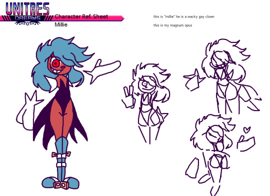
So . Millie is the most self-indulgent design Ive created .
Here's how it went: one December day in 2020 , I was sitting around bored as hell , when all of a sudden , the Silly Brained part of me Saw an idea pop up: A Tall , Hot , Cute Clown Man . And Instantly , I KNEW I had to draw him . But I Was in the middle of a Zoom call ... So . I opened up IbisPaint on my old Android phone , and drew the First sketch with my fingers that you can see above . And Instantly I Knew : I Had Done It . I Made Perfection .
More ideas grew , and i realized : I Could Do Something With This ! So , later , I came up with a whole reference sheet for him , and started planning on something: I was going to make More characters for UNITRES Dreams . You see , at the time , I was working on the v3.0.0 update for the game. This was Very Very late in development , before i even Planned there being a Newgrounds version (and before ninjamuffin convinced me to Make the newgrounds version LOL !!). Anyways. for so long , iwas disappointed that i didnt get to make a whole lot of original characters for the game .Most of the characters were either Enemies or Bosses. there was Barely any NPCs (aside from the guest character apperances).
i Also Realized: Chaotic Carnival , one of the most Important levels in the game , needed More love . So. I decided i was going to make new NPCs just for it , so that the level could feel even More alive and lived in. And that's when i created the Silly Trio , which started with Millie.
As for Millie's design , there isn't much for me to say. he is perfect. i love him and he is one of my favorite things ive designed. Yes , it Is self indulgent . Yes , i Do Want Him Carnally . teehee. Anyways , after designing Millie , i knew i had to design more characters .. which leads me to..
Goldian and Ellie
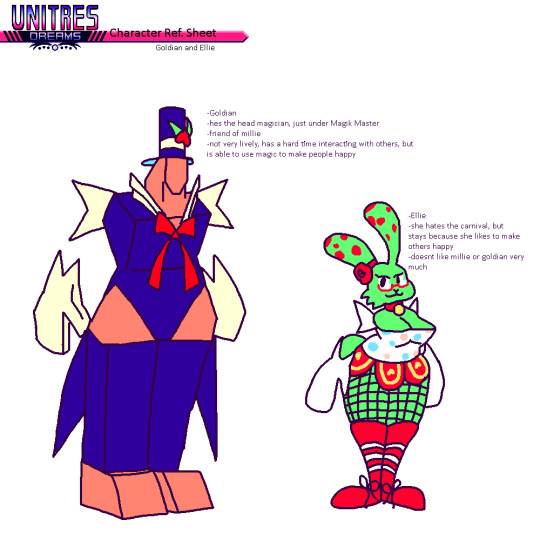
Goldian is a tall , polygonal magician man. He is in love with Millie. They are canonically dating.
Ellie is a bunny-like clown girl. She likes to entertain people with magic. I think she might be asexual , but i wasnt very sure when i created her.
Anyways. there isnt much for me to say. i Could get into some of the Character Lore perhaps . Millie , Goldian , and Ellie are all characters with troubled pasts.. they all had to run away from their homes due to circumstances , and they managed to find the mythical Chaotic Carnival, where they all met and decided to become entertainers. It gives them purpose , to see people happy. And they work under the Magik Master , a strange magician who has the ability to bend reality at will. They're all like a sort of Found Family .
that's all ill say about them. theres so much more i want to do with them in the future... i love these characters so much. theyre my favorite designs ever.
Oh ! Iforgot to mention . these characters (including millie) names also suck LOL ! Im not good with coming up with names !! all their names i came up with at the last minute
All The Other Characters I Forgot To Mention
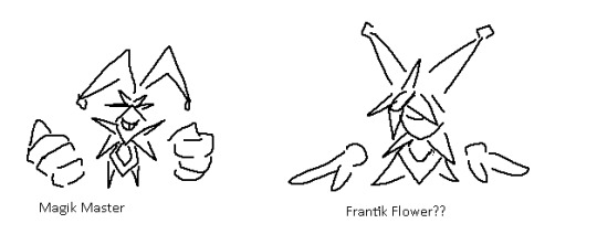
the magik master
nothing much to say about them. theyre one of the first bosses i created, and i Kind Of like their design still , though i might consider redoing it so it fits with the rest of The Silly Ones ..
vie

nothing much to say about Vie . she's a flower girl, who spreads flowers to every level in the game. she got the flowers from the Suzy's Greenhouse ..
Misc. Concept Art
#TreesThinks#UNITRES#UNITRES Dreams#art#artists on tumblr#character design#characterdesign#gamedev#game dev#game development#indiegame#indie game#indie dev#indiedev#indie development
30 notes
·
View notes
Note
1, 23, 27 for the oc questions?
This contains super old drawings so I’m putting it under a cut, beware my middle school art. Thanks for asking these were fun to answer :)
1. Your first OC ever?
I’ve answered a similar question to this a couple of times before, and I mentioned like the ocs I made when I was like 8 years old. This time, I wanted to use like my first legit developed OC who I put effort into building as a character (this was when I was 13-14), but I wanted to put a specific drawing of her that I was really proud of at the time and I couldn’t find the notebook it was from, so maybe another time. Instead, here’s my wings of fire OC I made when I was 11. Her name is Bobcat and I did not put any effort into building her personality at all unfortunately.
From this image I assume she was nice, but who is to say. I like talking about really early ocs though bc sometimes there’s not even a concept I just drew a person with random shapes on their face or outfit and then like an out of context line of dialogue and that was it. It’s also like fun to see the ideas I came up with that I have NO memory of whatsoever. I made a couple of sparkledog type characters and drew them each once and never again. I had no idea I ever did that it was news to me
As you can see the one on the left is fire themed (he was a supervillain) and the one on the right is technology themed (superhero). I found this context from the writing on the page which I cropped out bc it is dialogue I wrote at age 12
23. Introduce OC that has changed from your first idea concerning what the character would be like?
Ok let’s see I’ve talked abt Angel and Gloria before so who’s left… I don’t think I’ve talked abt Daisy before. The like cyberpunk style characters originated as an idea for a DND campaign I had, and then decided to write out instead. However, I only came up with like one character, so I abandoned the idea. Coming back to it like 8 months later, I made it sci-fi themed instead. The first character I had like solidified was Remy, who was a pop star basically. For some reason, I later on came up with an incredibly similar idea of a like super rich diva girl type. Not only was this almost exactly the same as him, the design was also very very difficult to draw. So I was like ok this isn’t working so I redrew the character a couple of different ways, and one of them was like a repairman type character with super curly hair, who I thought looked cool, so I basically replaced everything abt the character (personality name gender backstory) except narrative role + role in the heist itself (<it was a heist at the time it’s not anymore).
Also Anjara was originally an ace attorney oc (<from when I knew absolutely nothing abt ace attorney but I had seen objection funk) with like a smug personality but then became like a samurai type personality instead.
27. Any OCs that were inspired by a certain song?
Yes. Many. An embarrassing amount. My creative process is essentially listening to a song I like that doesn’t have anything to do with any of my ocs, so I come up with a new oc to channel the emotion through. To better enjoy the song. I don’t do this as much now though because 1) I already have a lot of different ocs to cover various song types 2) I’m better at developing characters from nothing I would say. But enough abt that let’s get into specific songs.
every like sci fi oc I have: daft punk around the world/harder better faster stronger from alive 2007
Laura: Dynasty by rina sawayama
Saida: Grace Kelly by Mika. She’s totally different from her original characterization. It used to be like she had no sense of identity and now she’s like, the complete opposite of that LOL
Melanie: baby one more time by Britney Spears, not because her character had anything to do with the song whatsoever, but because at the time I had a bunch of ocs that were just like visual designs made for fight scenes I would choreograph in my mind. To songs. So her design, but not personality, was one of the ones I made for this. Later on it was Honey I’m Home by Destroy Boys
Tane: The Pop Team Epic OP and also Ironina by nilfruits
Aurelia: Wonder What She Thinks of Me by Chloe x Halle, which is interesting in that that song has a very specific and obvious story which the character here has pretty much nothing to do with. Vibes I guess and massive recontextualization
Henry: Friends in Low Places by Worthikids even more egregious than the above since that’s literally a character song abt an ocs backstory. It was also very recontextualized
Luke: Electric Feel Justice Remix
^This is all a little embarrassing to admit, but I’m not going to lie on ocs ask memes I take ocs very seriously. Also I like how it said “an OC” and I just completely ignored that
#an interesting fact abt my ocs is that I came up with several of them while I was in therapy#and I would drew them while talking to the therapist#and sometimes I’d talk about oc lore to her#I was too embarrassed to talk abt what are now my main ocs#but she did know the lore for Anjara Aya and Remy#I lied abt Remy’s gender for no reason he was too gnc for therapy I guess#my ocs#Also since the drawings I put here are all animal characters I feel like saying I was actually more into making human ocs even then#it’s just that I’m too embarrassed to post the drawings I made of them 🥲
2 notes
·
View notes
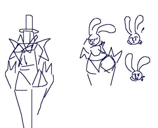
Photo

So here’s my redesign of Snowflake and Safespace. I like the names this person came up with a lot better though. Snowstorm and Barricade. So I’ll call them that here.
Here are the originals and the descriptions for them.


Out of all the redesigns I’ve done so far, I’ve changed their designs the most. I just hate the color and design of their outfits. For Snowstorm I went with a more a more winter themed outfit. I know the cold probably doesn’t bother them anyways (lol) with their powers, so they wouldn’t really need to keep warm. But I like the aesthetic of it. I also think the long coat looks really cool and I like it a lot.
I tried to go with a bit more of an androgynous look for Snowstorm, I know being non-binary doesn’t necessarily mean being androgynous but I still wanted to give them more of that look.
Snowstorm is the younger of the twins by a few minutes. They are the more reckless one. Very energetic. They fun twin. Really wanted to be a ninja when they were a kid, they were inspired by an anime they used to watch. They still watch a lot of anime and are a bit of a nerd despite their more abrasive personality. Their power is still the snowflake shuriken thing. They like to base some of their moves on stuff from anime. Especially since they already have the whole shuriken thing going on. I know Screentime was supped to be the one who like memes, but I changed his personality completely. Snowstorm is the one who likes memes a bit now, not annoyingly so, but they quote some every now and then. For example, Don’t mess with them! They have the power of God and Anime on their side! Yeah, I know it’s kind of cringe, but I kinda kept thinking of that clip when I was designing them, and kinda based a bit of their personality on it.
Barricade is like the protective older brother, even if he’s only older by a few minutes. Since Snowstorm can be pretty reckless at times, always jumping into a fight without much thought, he worries about them a lot. He isn’t the biggest fan of fighting but he mainly got into the whole hero thing because Snowstorm did, and he wanted to make sure they didn’t end up doing something stupid. Snowstorm is a very capable fighter and doesn’t really need protecting but does make some dumb decisions a lot. So Barricade always has their back. Using his shield as defense while Snowstorm is the offence. Snowstorm thinks he can be a bit overbearing sometimes, and they bicker quite a bit like most siblings do, but they really do care about each other and make a good team.
I tried to make his costume sort of like practical looking, he doesn’t care to much about adding any flare to it. Unlike Snowstorm, who is all about the style.


These are just some of their casual outfits. Also Snowstorms right hand looks really wack but I just gave up, I looked at references, I redrew it a few times, but I was just so sick of it I gave up.

Both of them as kids.

#marvel#marvel new warriors#new warriors#snowflake#safespace#redraw#Character Design#screentime#trailblazer#b-negative
37 notes
·
View notes
Text
So, if you’ve been reading my tags, you might have noticed me talking a bit about the fact I got back into drawing recently. Since then I’ve been aiming to do three sketches every day and yesterday I got a calendar and stickers with the intention of setting up a reward thing for every day I did just that. And since I’d messaged my sibling the first day of my daily sketches I was able to go back and mark when I’d started up until I got the calendar. And I noticed I’d been able to keep up with the whole daily sketches thing for a month. So in celebration, I’m showing them all off here.

first page! I was so proud of myself. when I started I actually didn’t have an eraser which was a bit annoying lol. I got one by the third day though, so the dunsparce was my first picture where I could clean it up a bit. also I was using Pokemon Go as my main reference for pokemon (and sometimes XY), but I didn’t know how to take pictures of pokemon in it until the horsea pic lol.

around this time I acquired some markers with the intention of finishing up at least some of my pictures (I prefer finishing them up on my computer, but my tablet needs a new cord, so for now I can’t do that) but I found they bled through my pages more than I liked so I haven’t really used them since. So my pics will remain unfinished until I can get a new tablet cord (which might actually be soonish, since I’ve figured out what cord I need. just need to find the time to get one)

around this time I realized that I could use Let’s Go as reference for first gen pokemon and started using that for pokemon I didn’t have in Go yet. also redrew Castform which let me see how much I’d improved. this was also the two week mark of how long I’d been doing my daily drawings, and I remember how happy I was to realize that.

I started getting more confidant at this point, and made a point of drawing some pokemon designs I’d been a bit intimidated by before (like the nidorans, poochyena, charmander, and to an extent ekans). didn’t want to do that constantly though since I knew I often have issues if I tackle stuff too difficult for me, since that often led to me deciding my art sucked and I should just quit in the past. I’ve been able to avoid that so far currently thankfully, even when I’m not entirely happy with how my sketches come out. I guess I’m just getting better at reminding myself that even if the drawing didn’t turn out how I wanted, the most important part is that I’m having fun with it ^^

not as much challenging myself here, in part because I saw my nephew around now and while I love him dearly, being around him can be rather tiring and that tends to carry over to the day afterwards too.

oh hey, I finally started drawing non-pokemon stuff lol. part of that was PMD RTDX being announced, and I was stuck on that for a few days (starting with the skitty and chikorita, ending with the makuhita) part of it was me seeing advice on how to draw straight lines and wanting to test it, and another part was me getting back into neko atsume.
also a few drawings I know I made while that last page was being worked on, but I’m not completely sure when (I know it was after the skitty and chikorita drawing, since the first one is meant to be my RTDX hero in her human form and was done on the same day as them)


they were drawn on a seperate page since I wanted to be able to keep track of my daily sketches and since I was doing a set amount every day, I could do so by counting them (probably won’t do that from now on since I have the calendar). the first drawing of Kay was really good for my confidence in drawing humans, since it helped remind me that I don’t have to make my pictures of humans realistic/serious to look nice ^^

and my most recent page! the crow was an experiment/study for me (wanted to figure out more about how feathers work. since drawing wings can be pretty fun, and I have a race I’ve created that I’ll need to know how to draw feathers to depict them well) and I think it turned out pretty okay. also starting at the espeon, I started using pokemon models I downloaded on my computer as my main references. also the drawing of a human here is that first one I used a pose reference for, which I really think helped a lot with how well she came out ^^
so anyways, that’s all I’ve done so far! it’s nice to have an excuse to look back and see my improvement in just a month. I’ll try to keep it up and get even better ^^
3 notes
·
View notes
Photo

Anyway look at this beta me and my tiny lil noodle legs
One on the left was my first attempt back when I was gonna let’s play Pokemon Platinum, which has now been put on the Eventually pile because it turns out hacking sprites into it is Unreasonably Complex and also my new laptop isn’t strong enough to run DS emulation and recording software together at a good framerate.
Then on the right we have my fresh attempt today when I was like “ehh lets not keep frustrating myself with something thats not working, let’s just give it another go”. Also I’m gonna use it in the cool fangame Pokemon Reborn, which has actual developer-intended support for custom sprite edits, and makes it much easier to stick them in! Woo!!
I think I was struggling with the first one cos I was using the Pokefan trainer class as a base, and it has kind of a weird subtle pose with the slight leaning and odd head angle. I couldn’t really manage to turn that pose into anything else, especially with the kind of stylized cartoony anatomy I tend to give to my drawings of myself. I was also still developing that doodle-self, honestly, I’ve kinda realised that I’m a bit more top heavy in the shoulders so maybe it’d look better if I still drew the noodle legs but more realistic arms instead? Tho beta 1 is before I even decided on the noodle legs lol.
And then the second version uses the Collector/Supernerd ruby and sapphire version, as you can tell by the top 20% of it. It has a similar awkward angled head but I’m gonna completely change the face anyway so its no big deal. Actually lol since I redrew the entire body there won’t really be anything left?? But using existing sprites as a base even for your scratch spriting around the outline will help you get a better idea of the scale and anatomy of each game’s particular style, yknow? Tho I also changed it up to be diamond and pearl sized since Reborn’s trainer sprites use that.
Anyway, I wanna make a less maniacal and more Me kind of face, tho maybe still SLIGHTLY maniacal? The first sprite attempt just uses the outfit I was wearing IRL at the time I drew it, but I wanna try and invent a cool new trainer-lookin style for this one! Maybe even cosplay as a hex maniac since ghosts are my forever fave? but maybe the ruby and sapphire hex maniac since the modern design is a lot more..uhh..drawn as a sexy supermodel by the fandom. I kinda don’t wanna butt in on those people’s weird fun by shoving a fugly potato shaped me in their face XD
Oh! also also!! i like the idea of changing my trainer’s outfit each time I start a new Episode in Pokemon Reborn, or after other big plot events! I would have loved to do that in a lets play of the regular games too, but yeah hacking is much more time consuming and I’d like to minimize the work. It’s a simple plug n play for this game, plus the smaller overworld sprites can be edited more quickly.
OH YEAH! here have those too!

Top row is me fiddling around with trying to display my glasses in such a tiny sprite, ended up just giving up. Bottom row is the lil map sprite icon, compared to the canon NB protag one from the game and the one I made for my Platinum LP. And then a Hatless Update on my VS sprite that I showed last time. Also a Bunni Sucks At Shading White Sweaters Update?? I decided to just do a plain base version of all my sprites first, if I’m gonna indeed go with the idea of multiple outfits.
Oh also have

Complete crack: Bunni vs canon protags
6 notes
·
View notes
Note
answer questions 1 to 25 >:D
LMAO OMG THATS ALL OF THE QUESTIONS OK HERE WE GOOO
1. Favorite drawing from this year
lol so i actually somehow forgot i never posted it on here and only posted it on twitter but there's this BeatNeku fanfic that I really like and i drew something from it, in one chapter Neku had a nightmare and Beat comforts him ;u; The colouring could have been done better but i'm happy with the pose and their expressions here

when i'm done with this ask post i'll make a new separate post for this art and also link the fic for any beatneku enjoyers out there who have not read it yet
2. least favorite drawing from this year
some of the things i drew for the "draw every Neo character from memory" challenge were absolutely awful lmao, but i'm not going to count that, i'll also not count sketches that i never fully finished
so out of all the coloured arts i did this year, i think this Yew one is my least favourite, he was part of a series of 10 drawings i did and out of all of them, his pose is just the most boring and he also got stuck in a job outfit i just don't like as much as the others

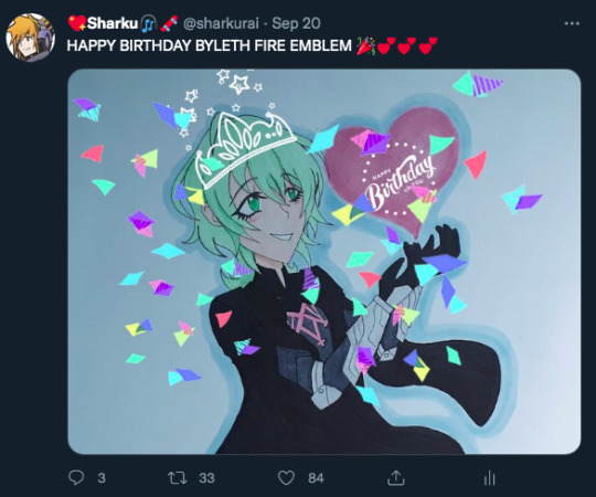
3. first drawing from this year
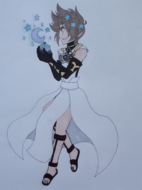
there's absolutely no way this one is actually the first, i'm SURE i must have doodled Byleth at least once in the Jan-Feb time period before Bravely Default 2 released, but i must not have saved any of them to my laptop, so here's a sketch of Seth in the Beastmaster job lol
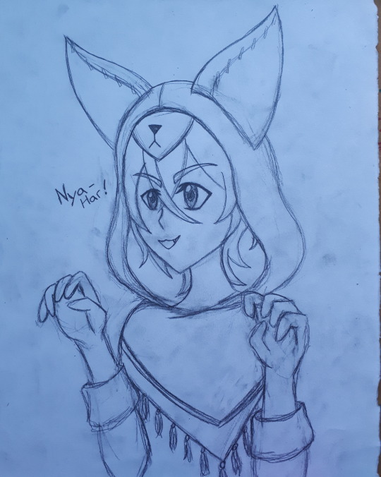
(in game he says "ya-haar!!" like a pirate a lot so i thought it'd be funny if he said "nya-haar" when wearing the cat hood lmao)
4. favorite character you've drawn
i love my boy Neku so much
5. favorite little detail in a drawing you did
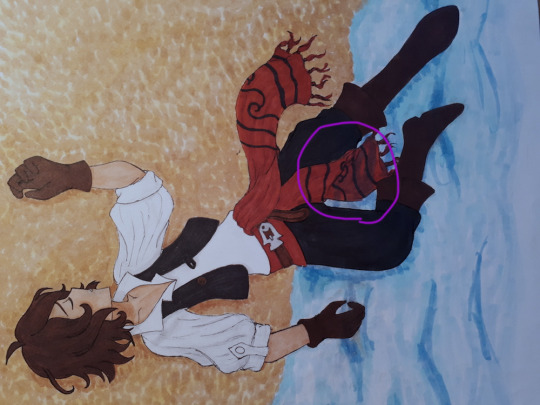
the way i drew Seth's scarf here, for once i actually drew clothes folding in a believable way lol
6. longest a drawing has taken to finish
dang i never actually keep track lol.. many hours
7. most popular drawing
the Byleth birthday art was a big hit on twitter
8. underrated drawing you did
i really liked this Astrologian Tiz that i did, but it only ever got 7 notes, while the uncoloured sketch version has 26 lol
this has happened with some of my other stuff too, i guess my sketches just look better than my coloured arts lmao
9.any new art mediums youve tried (or overall styles if you havent tried new mediums)
not sure if this really counts as trying a new style, but i've noticed that when i started drawing more twewy fanart i sometimes end up doing thicker lineart on my drawings lol
aside from that though i don't think i experimented much this year
10. favorite art medium
pencil and markers
11. artist(s) that influenced/inspired your art style
not sure about this one, i guess the general style of whatever fandom i'm in ends up influencing my style a bit when i start drawing the characters from it a lot
12. fandom youve drawn the most for
last year this answer would have been Fire Emblem, but for 2021 only the fandom i drew most is probably Bravely Default, though TWEWY is defo catching up lol
13. favorite fandom to make fanart of
Bravely and TWEWY, an answer that probably surprises absolutely no one lol
i do still like to draw Byleth Fremblem sometimes tho, even if not as often as i used to
14. how many drawings did you complete this year
28, if i counted correctly and didn't forget anything
15. any upcoming planned drawings
i really want to draw another mega soft cuddling BeatNeku kinda like the one i did in the first answer, after being stuck in Inverted Shinjuku alone for 3 years Neku is probably sO TOUCH STARVED HE NEEDS SO MANY HUGS AND I WILL MAKE SURE HE GETS THEM
16. favorite piece of art from someone else (if you have one)
THERE'S TOO MANY
17. favorite oc/sona drawing
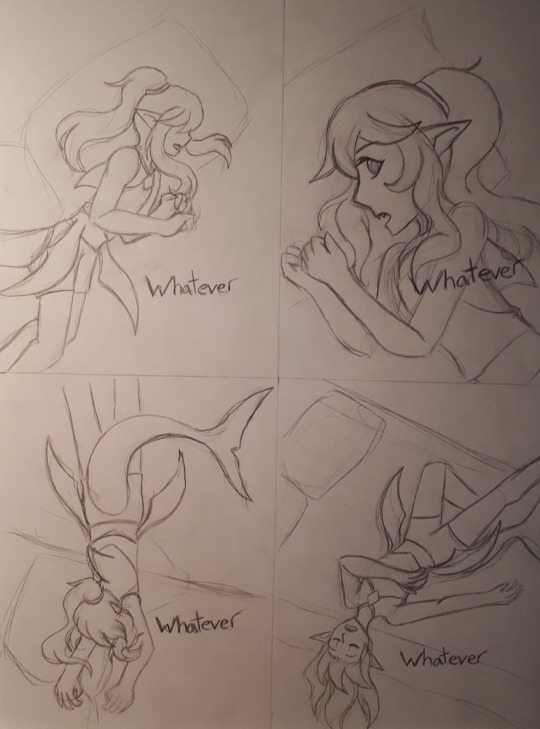
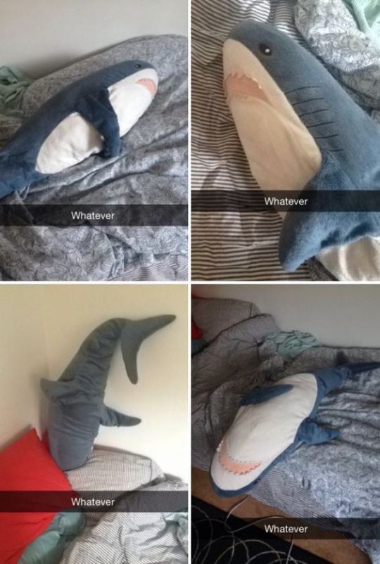
i barely ever draw OC content but there was this ikea shark meme that i redrew with my oc Reiko
18. any art events youve participated in
i only ended up drawing for 1 day but there was a BeatNeku Week event on twitter
19. any collabs youve done/would want to do
i'm too shy for collabs :'D
20. what do you think youve improved on the most over the past year
this year i've drawn better poses i think
21. what do you want to work on the most next
i want to work on expressions more, i think the way i draw faces is cute, but sometimes my drawings lack a certain amount of energy maybe?
22. what are you best at drawing/doing (ex: youre good at lineart, or drawings hands, etc.)
despite having just said i need to improve more on it, the head/face is what i draw best, everything below the neck can be a real struggle for me, which is why sometimes i'm only in the mood to draw busts lol
though i have also been told i'm good at drawing armour by some discord friends whenever i show them my Dragoon Seth stuff
23. favorite pose youve drawn
i might have twisted his spine a bit too much but i'm still really happy with how the pose looks on this one

i really like this one too, probably the most dynamic pose i've drawn ever lol
24. what do you like most about your art style
it's cute, there's a lot of things i want to improve with my art, but it being cute is one thing that does make me genuinely happy about the style i have
25. best advice youve recieved this year or something new you learned about art
sometimes i'll see a post that gives off a vibe of just not giving a fuck and i actually find those pretty inspirational lol
the ones like this or that are like "post sketches!! who tf cares if you don't finish everything!! post it anyway!!!" or i remember seeing one that was like "i may not be a great artist but i've got hands and a pencil and i WILL make that everyone else's problem" thats the kind of energy i want to have lmao
it can be really disappointing to not get the numbers you wanted on a piece you worked hard on but i try to remind myself in the end that as long as i had fun drawing something it was worth the effort even if it doesn't get much attention
#aaa how do i tag this#with my art tag i guess?? since its art related lol#sharkurart#thank you for giving me all the questions this was actually a lot of fun to do lol
1 note
·
View note
Photo
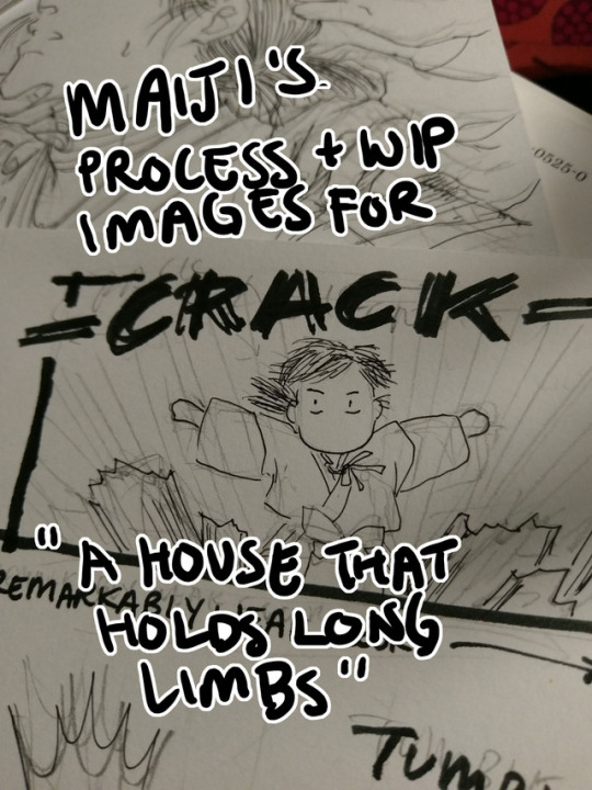
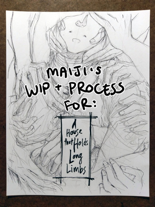
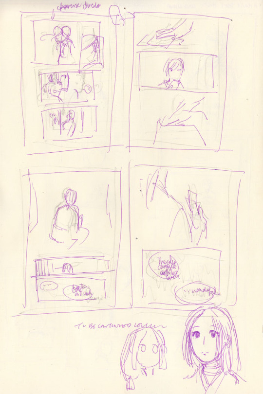
Process and wip images for A House That Holds Long Limbs (Part 4)
Previous process and wip documentation: Part 1 / Part 2 / Part 3
Read the pages for part 4 here (full complete version will be linked from YYH North Bound master post)
This is a rare glimpse into how I tackle action scenes!! It’s rare because I rarely do it. Action is honestly one of the hardest things for me to draw, and as I’m sure I’ve said here many times before, I have the utmost respect for shounen manga artists whose works are steeped in them. It’s a really impressive skill to be able to do it well - to create a cinematic, dynamic sense of motion that doesn’t dissolve into visual confusion and incomprehensibleness.
This was as interesting for me to document my thought process as it hopefully is for you to read and discover what the heck was going on in my head (a big honking mess, that’s what). There was much screaming and crying while working on this hahaha.
Aside from Hokushin’s beautiful face (lmao), Part 4 is packed with things I don’t usually draw. Specifically: action, things taking place in the dark, and corpses. For things taking place in the dark, I heavily referenced the dark room rounds from the tournament for Genkai’s successor in volume 4, because it involves action and Togashi used practically zero screentones in it and I didn’t want to either. For the dead rokurokubi, I looked up photos of skulls and drew on my memory of various horror comics I’ve read, like Kurosagi Corpse Delivery Service. (At one point I also googled photos of rotting skulls, but TBH I didn’t really want to spend a lot of time looking at detailed photographic references of corpse and decomposing bodies for obvious reasons, especially as I usually work on these comics late at night before I go to bed. The last thing I need is for images to get stuck in my brain when I’m sleeping.)
The rest of this post focuses mainly on action and redrawing things.
Script
The original script for this section actually ran a little further in the story than what’s shown here, but in order to convey the sequence effectively, I ended up stretching a number of key moments out and have booted the later ones to be completed for Part 5.
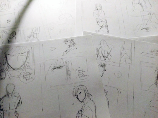
Thumbnails
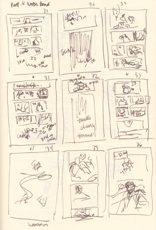
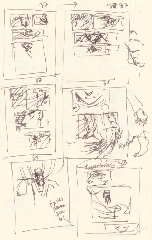
In the thumbnails above, you’ll notice quite a few are redraws of the same page as I struggle - pages 31-33 repeat immediately in the rows after, page 37 was attempted three times, etc.
Page count growth
A script of 8 pages turned into 10 pages at the thumbnail stage, and then ultimately netted out at 12 pages in the final version that was posted. As you can see, effective action sequences generally take me more pages than I think they will. With an exception (documented below).
Thumbnailing/storyboarding things out should theoretically minimize the page count creep! But because I tend to treat my thumbnails as such a loose stage (to avoid later disappointment when I can’t recreate it as nicely in the final page), I rush through them. Unfortunately, action sequences require me to think a lot more carefully through the scene as a director - staging the shot and the experience of the motion and coordinating people’s limbs and all the items in the scene more carefully and whatnot than, say, just a couple of heads talking. So inevitably, when I rush to get ahead to the finished pages, that’s when I realize it doesn’t flow as well as I was imagining (or not really imagining it).
As a result, the actual “live” pages turn into constant mental checks and runthroughs of the panels, realizing it’s not flowing as well as I’d like, and restarting. By restarting I mean mentally reenvisioning the sequence, sometimes quickly doodling alternate thumbnails (I didn’t bother in this case, so I have no alternate examples from after I started redrawing), and erasing and redrawing and adding pages. I guess I could probably avoid this if I just stop and put more time into thinking through the thumbnails… but it seems like I end up revising no matter what. So, constant juggling forever.
The evolution of the key action sequence
In my head, the main sequence was:
Hokushin lands.
He gets up and feels something in the dark.
He discovers the rokurokubi corpse.
He turns around to discover a swarm of hands in the dark!
Ahhh hands!! Ahhhh!!
Then he gets sealed and stringed up. End action sequence, back to people standing - or hanging out, I guess - and talking.
I roughed out my panels and pencils for all the pages following my thumbnails instead of doing one page at a time, because I’m impatient and also tend to think of all the pages as a wholistic narrative and then drilling down to the details on each page (big to small perspective).
As I went back over each page and detailing the base pencil art more, I began noticing more issues with the flow of the action and the pagination. Things started really shifting and changing at point 4. Here’s essentially how my thinking played out as I drew:
He turns around to discover a swarm of hands in the dark! - WAIT he just sees the corpse and then turns around? I should have him sense something is behind him first to get you more into his head and experience. OK, insert another panel of him sensing and whatever. THEN he can turn around. This is also good because I can erase the panel where he’s turning around and give the first panel a bit more room so I can draw more of his body in the first one and make his startled falling back motion a bit clearer.
HANDS!! AHHH HANDS!! - Wait, I have hands coming from BEHIND him and don’t effectively show that before they just appear to grab his hair. Which I suppose they do, but when I review panel flow it seems jarring, like a poorly directed cut and something was missing. Let’s try adding some hands behind him in the panel where he looks shocked. Never mind, this looks dumb and he looks dumb and basically seems even more like an afterthought. Ooh, better idea: let’s have him dodge the first wave of hands. That’ll be kinda cool and more interesting. And then he can land and be like OH SHIT MORE HANDS FROM EVERY DIRECTION
Ahhh hands!! Ahhhh!! - Hmm, maybe I should add a page here to better capture his dodge sequence. So the panels will be hands, dodge, and then the next page is he lands, then he realizes there are more hands behind him. How crouched down should he be? I guess in the later pages I basically drew him in a practically fully upright position… eh.. Working this out...
*starts drawing extra page* … Mmm, thinking about this again, no. It stretches things out too much. Now it feels like he lands, the new page adds an extra pause that could be interpreted unconsciously as he thinks he’s ok, then he gets attacked by hands from behind. But that’s ridiculous because he’s a rokurokubi, he KNOWS the hands can come back around or whatever, and he’s a good and cautious fighter, the extra pause doesn’t seem to fit. Thinking this through, basically I need it to feel faster - he lands (typed “he hands” there first time around haha), and he doesn’t have a chance to react again before it turns out hands are coming from all directions. So, I’ll keep it to the one original page and draw the reaction to the sound of the hands coming from everywhere. Done. (one of the few instances where I reduce page count in an action sequence)
Oh yeah, I forgot about his arms and legs getting sealed. Er, add another page. OK done.
For comparison, below are photos of the pencils for pages 35 and 36 before the above process:
... and after:

Redraws
I generally try to avoid redrawing an entire image/page from scratch if I don’t have to. Even if I don’t like the overall drawing, I’m still terrified of effing up the parts that turned out OK the first time around. However, sometimes you gotta know when to cut your losses and start anew and save yourself time and grief (I’m definitely still learning how to know lol). I do have a few strategies to ease my mind - I often take photos of something before I proceed to the next step or change direction (which is where many of these wip photos come from). This helps calm me down because at least now I have a reference for what it was before I took the leap of faith to move forward. Another option is to just leave it and draw on a completely new blank page.
Page 37, where Hokushin is getting his head pulled back by the hands, was an incredibly rare instance of the pencils for a page turning out almost exactly how I wanted on the first try, so I was loathe to redraw or adjust it. This means I basically forced myself to shuffle things before and after to accommodate not having to change it.
On the flipside, page 40, where the shot backs away so you can see Hokushin tied up with the hands, is one I full-on redrew from scratch. I was having a hard time with his pose and how all the hands were wrapped around him and how everything was actually working. I wasn’t happy with the drawing the first time around, but inked it anyways to see if I would like it better the next morning (sometimes this works, to wait and look at it with a distanced frame of mind). Spoiler, I didn’t lol. However, the process of inking the entire thing helped me better hone in on what parts I liked and didn’t like, so when I sketched it out again I was better able to adjust.
This photo shows the original (with the words REDRAW :/ at the bottom), a sketch I did trying to figure out his posture and where all the hands were/how the wrapping actually worked, and then the pencils of the redraw.

Final miscellaneous things
The end page of Part 4 is once again a last minute addition that resulted because I was facing a blank page (again!) after adding the page where Hokushin gets his arms and legs sealed. I changed the spoken line multiple times. First it was a line that’s been pushed to the upcoming part 5, then it was the “You certainly found my “treasure room” quickly” (that’s on the previous page). In the end, I just wrote a completely new line for it. It seemed to work better with the panel and closing off this part at a good point.
Last but not least, I somehow broke my pen inking this part lmao. Fortunately it’s a Muji pen so I only broke the tip off the cartridge somehow, probably in my intense scribbling/shading at some point. It’s not super clear in the photo but if you look closely at the point you’ll see this thin line coming out of the tip of the pen - it was this metal filament that basically scratched the paper without any ink coming out. I had to make an emergency run to two Mujis, neither of which had the black refills, so I ended up just buying two pens with similar thicknesses. Worst case scenario, I would have just inked with my blue cartridge, since the scanning would turn everything black and white anyways... the original pages would have just looked weird.

Phew! Hopefully it worked out and isn’t a totally incoherent mess!
#yu yu hakusho#comics#fanart#hokushin#wip#process#drawings#yyh north bound#art by maiji/mary huang#action sequences#redrawing#art supplies
5 notes
·
View notes
Photo

*WHEEZE* THANK YOU, I never had someone go in such detail about something I did, I should draw more stuff for ya ;) and it’s like you dissected this piece by piece lol this took me about 4 to 5 hours Finished it at 12am, I was thinking about using blue but I redrew the scene of Ichigo and I decided on a blue background and I wanted to contrast it since blue and orange complement each other. Then just plain orange was boring. It took me so long to mix the blue for his hair and eyes cuz I wanted it to look perfect. Hehe I love redrawing scenes but I’m such a perfectionist when I do my art. I actually drew another scene of grimmjow in 2016 ((which is the other pic I’ll submit with this message, uggh I hate it so much, just the mistakes makes me cringe at the younger me, and you have no idea how long it took me just to get that damn six to come out right. I actually painted the six black, I don’t have a pic of it tho)) but most importantly I wanted to see if I made progress. I was thinking about drawing all his hair but I would die doing it but I should still do it. Also I WISH I COULD PIN IT ON MY WALL!! Sadly..I do not have this artwork with me, I had to turn it in for a Contract piece in art class ;-; R.I.P. grimmjow..he’s some where in my art teachers room for the summer lol. Thank you again for your tips as well. Ahhh Just you replying makes me feel like I can die happy now --- by @midnightmadness5.
This cuz most people can’t appreciate art or simply don’t realize how much time it can cost, also it takes me only a few minutes to write a long comment B)) also i love making people happy back if they made me happy. AND WOAH THAT LONG?! Well art definitely can kill time if you put effort into it and all, horrible is then if you know you could have done it better or you wish you wouldn’t have put so much time into it, since not always turns out the result well, god art can be so frustrating, ne? At least for me. THEY DO, those two colors, yet I am personally not fond of them, sorry B’) M not a fan of this ship after all but yeah, personally I think that Ichigo looks much better with blue background than Grimmjow with orange one, maybe because Grimm is simply such a cold-hearted asshole, mostly. While Ichigo is always this bright sun, which shows his hair color already enough, especially there on your drawing looks the hair color so awesome! With the mix from yellow and orange. Something I would make differently next time though, is lineart the hair with a brighter color, and only where the hair doesn’t touch the skin or leaving it away completely, so it keeps more its realism, after all is our hair not framed. But otherwise pretty awesome, also with his outfit and the mini stars upon it, makes it all more beautiful *^* Meanwhile back to the grimm drawing. OH YES THE SIX, honestly I would search for pictures where you can see his back and the six, because there exist this one six.png file in google images which might be nice, but actually looks his six a tad differently, still I think for the first try, or even if not, it still came out mostly well, I SUFFER WITH HIS SIX quite a lot too whenever I bother to draw it too, which happens luckily rarely. I find it forever funny how grimm cares more about his espada title than the king title which he got from his fracción. oh actually black? tbh just in white it doesnt look bad either, might like it even more but cant rly tell in the end, cuz idk the end result, a shame u cannot show it. if you ever consider drawing him again, draw him from the side, there is hair rather easy to draw in my opinion. ASDFghj damn , well hopefully will the teachers appreciate this motherfucker B)) And no problem!!! I love getting art and seeing the process by artists, by your last drawing was the anatomy definitely much better and all seemed kinda cleaner, idk anyway thank you so much for showing your art again!! ♥
#♚「 submission. 」#midnightmadness5#♚「 saved. 」#yesss#all the fanart <333#i redraw many fanarts too in the past#or just art from others#with the pencil#looking at it now IF I STILL FIND THOSE PIECES#m woah...#idk it simply looks bad by me XDD#submission
6 notes
·
View notes
Photo
Process and wip images for A House That Holds Long Limbs
You can read the pages for part 1 here (full complete version will be linked from YYH North Bound master post whenever it’s done.)
Every so often I get questions about how I work, and I also enjoy reading about how other creators make things, so perhaps this might be interesting and useful to somebody out there too. I’ve talked about my process before but never really documented and shared it WHILE working on a project, so here you can see some of my thinking and decision-making (and poor habits lol) a bit more immediately, alongside screenshots, photos and scans.
Very long, everything is below the cut, and apologies to people on mobile and anywhere else this goofs up.
One question I get a lot is “do you start with words or pictures when creating a comic?” I jump between both a lot. That said, I tend to lean more heavily on words when documenting ideas in the early stages of a project. This is because, for me:
Words pack a lot of punch in conveying detail quickly. They work better when I need to quickly communicate something extremely specific to future me. I’m a sloppy drawer, so my sketches tend to make future me squint and go, “What the hell was this supposed to be?!”
A great deal of my thinking and planning is done during crowded commutes. It’s more convenient to jot notes on my phone than to whip out my sketchbook and a pen.
(For a while I thought it’d be awesome to have some sort of app where I can type notes AND have an accompanying thumbnail sketch, and be able to drag them around or break them out into more or fewer pages. At one point years ago I thought about creating a custom app... but ultimately too lazy/busy and my current process works well enough. If anyone wants to take this idea and run with it, please feel free to do so and just let me know about it so I can try it haha.)
I usually start with a few lines summarizing the gist of the idea, enough that’s recognizable and I don’t forget the important things to build off from. From there, I start point-form outlining the stuff that needs to happen, structuring them into key scenes/parts. These scenes are not always fleshed out in order - I just add to them whenever I have ideas for that part.
Long Limbs, for example, had a progression like this:
Overall story idea: “horror story with rokurokubi, key plot point(s) happens, the end.” (There was a bit more detail than this, obviously, but we’re avoiding spoilers here.)
Initial description for Part 1 of the story: “Hokushin lured to go to somewhere. Separated from Raizen. HOW??????”
After letting it simmer for while, a solution: “Hokushin annoyed at Raizen. Opportunity for him to get away and go do his own thing.”
Gradually more detail: “Stranger invites him to go to this place to look into something/maybe has a paid job that needs to be done and Raizen is busy goofing off or whatever.”
Problem. I couldn’t resolve this chain of thought to my satisfaction. What kind of task/job can someone convince Hokushin to do on his own when he doesn’t know this person/it seems questionable? And how long will the conversation need to run to establish this as believable?
This was starting to get convoluted and I was getting annoyed because it was turning into a burden in being able to continue the story AND IT WASN’T EVEN THAT IMPORTANT. I decided to abandon this path of thinking, and left the entire story for a while.
Much later (like months?), I had an idea: “Mysterious person drops something, piques Hokushin’s curiosity.” Aha! Hokushin’s own initiative. Simple and plausible enough. HOORAY NO MORE THINKING. LET’S DRAW.
Then I realized, oh shoot, I need to figure out who this mysterious person is and what they dropped. More time passes. And so on… in between I’m always working on other things, so there’s no real creator’s block - at some point I start thinking about this comic again, and ideas work themselves out to some decent level of satisfaction and link together. Thanks subconscious!
Eventually, enough key scenes are fleshed out that I feel confident enough to turn this into a real thing. At present, for example, not all scenes in Long Limbs are totally worked out, but I’ve got enough that I ran ahead with Part 1.
Screenshot of the Google Docs notes/script for Part 1:
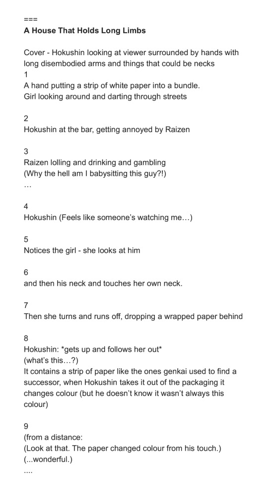
This is a close-to-final version. The === on top is just to separate this from notes on other stories or ideas. This is the beginning of the document, but this document actually includes many other notes and stories for North Bound. I delete them as I finish and post the pages. Every so often I wonder if I should bother keeping them, but they’ve been refined throughout the process and usually don’t bear much resemblance to the original jotted notes anymore. Long Limbs was originally planned to be a later story in North Bound, but I got especially excited about it and fleshed it out further than the others. When I reviewed the earlier stories, I didn’t think there’d be a big continuity or reader experience issue if this was finished and posted first. So I moved the messy notes for this story to the top of the document.
The page breakdown for the script is done by me generally picturing in my head how I might want the scene to go and how much action I might be able to fit on the page for good effect. I’ll sometimes start paginating without thumbnails, and sometimes will do both side by side (thumbnail and update pagination in tandem).
As you might imagine, pagination frequently changes. For example, you’ll see the script above is 9 pages instead of 10.
The original script for this section was broken up into maybe 4-6 pages, with 5-7 being more condensed.
When I started thumbnailing, I found it felt too cluttered and moved too fast.
So I stretched out the part of Hokushin and the mystery girl exchanging glances, and added pages to be able to create a (hopefully) more cinematic feel and really focus on the reason they catch each other’s eye - the bandages on their necks.
I then went back to the Google Doc and updated the script to line it up better.
I was also tweaking the dialogue at the same time and didn’t want to forget any key phrasing I liked. Dialogue is another thing I get really hung up over, often changing words up to the last second. (Sometimes this is because I messed up the size of the speech bubble, if I’m lettering on the computer...)
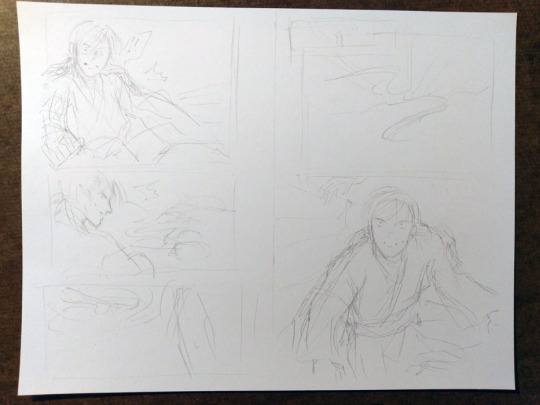
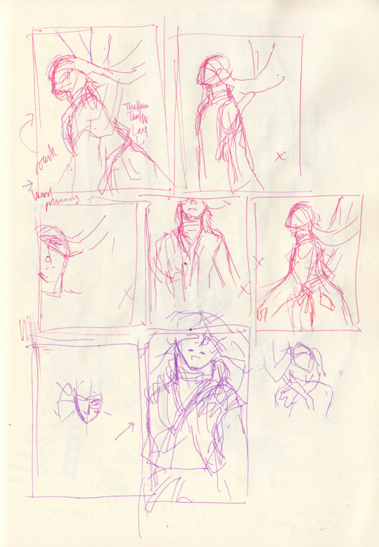
Thumbnails:
Pretty close to the final in this case - mainly because the sequence is pretty simple and straightforward and not many people are involved. I keep my thumbnails very crappy and rough so that I don’t get upset later when I can’t redraw something as good as the thumbnail. Bottom right was a quick attempt at designing the mystery girl.
Once I think the thumbnails are good enough - translation: I get impatient and just want to start drawing - I proceed to pencils for the actual page.
Throughout all this, I’m repeatedly reviewing script and thumbnail and playing sequences out in my head and then trying to figure out how to better direct the “camera” and the action. I may go back to the script and the thumbnails even as I’m finetuning the actual page if I encounter issues. You can see in both the script and the thumbnails that there are still deviations in the dialogue and the art from the final. Here are a few examples:
Page 3: The panels were originally 1) the setting, 2) Hokushin with his arms folded, 3) Raizen laughing, 4) we see that Hokushin is watching Raizen. After reviewing the thumbnail, I felt it’d be a better setup to flow into the scene if I switched panels 2 and 3. That’s closer to how you’d experience it in real life, or how it might be directed in a shot sequence: you enter an area/place, you hear the sound of some guy’s loud laughter filling the air, then the camera zooms up to the annoyed expression of this one particular dude and you see he’s staring at the laughing guy. Moving from bigger ambience to smaller details around the room.
Page 7: The girl was originally turning in the other direction (hard to tell because I redrew it right on top of the original sketch lol). However, this meant all the directional action would be pointing to the right - Hokushin is facing the right, and when he leaves the bar he’s angling towards the right side of the page. Facing the direction that readers will read in gives a sense of driving the action forward, while facing the opposite direction provides a bit of a mental stop. (This is something from Scott McCloud that always stuck with me.) So, I flipped the girl around.
Page 8: Script has Hokushin going “What’s this?”. When thumbnailing, I thought, “obviously it’s self-evident he’s wondering what this is when he picks it up”. It added nothing to the panel, and the speech or thought bubble would have interrupted the smooth action of him picking up the paper. So, axed.
The damn friggin’ bar and gambling: You’ll see the script mention this, and at one point I actually had the guy standing across from Raizen saying “Is this guy drunk?” I’m actually not sure if they’re in a bar or if Raizen is drinking, but neither were important to the actual story because I just needed Raizen and Hokushin to be in a place where Raizen could hang out with humans and be stupid. So I dropped these details. This is mainly because I ran into historical research problems about bars and alcohol during the Kamakura period (more on that near the end of this post), and this was the only way to stop myself from getting hung up on trying to make it “perfect” and “correct” and just get it done.
Drawing the actual pages. This part is fun!
Inking the actual pages. THIS PART IS NOT FUN :(
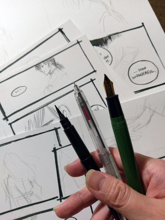
I don’t have very steady hands and I get very anxious about messing things up, so inking always takes me the longest. (I also get distracted easily, e.g., ink two lines and then surf tumblr for ten minutes lol). I’ve improved a lot since I started drawing comics much more frequently a couple years ago, and my choice of tools and style has helped a lot (I lean to variable lines and sketchy style, which is more forgiving than, say, a very precise art style with fixed-width pens) but I still get nervous at this stage.
I’m very lazy so I usually stick with one tool for inking. For Long Limbs I tried to effort more and actually used three. Right to left: Sailor fude de mannen for panel borders and text, Muji pen for artwork (0.4 because that was the only size available at the store when I went to get my refill), Pentel pocket brush for filling in blacks. I refill the fude de mannen and the pocket brush with fountain pen inks.
I usually ink panel borders first, then speech bubbles, then everything else. I hop all over the place and pages are generally in varying stages of completion. I also sometimes add in some more text lines because it seems like a good idea at the time - Hokushin’s complaint on page 3 about how he should have left Raizen when he got into a fight with a fish-seller in a previous story, for example. Sometimes these work, sometimes I regret it later and edit it on the computer.
Cover thumbnails and pencil sketch:
The one in the page thumbnails was the original idea, but then I thought, “seems kinda cliched. Can I get a more interesting angle where he’s not looking straight at the viewer?” (OK, his eyes are covered, but you know what I mean.) I quickly tried a few other angles and compositions, didn’t like them and ended up going with pretty much the original idea, but more zoomed in.
In the thumbnails, you can see all my little x’s indicating “ehhhh I don’t like this”. I wanted something with a particular mood/atmosphere especially with all the hands and arms, and I was conflicted between zooming out (for more environment and more arms, and the focus on the “long limbs” part of the title) or having a tighter, more close up shot. Ultimately I think the latter works better as it conveys a sense of claustrophobia, and it’s more intimate which supports the idea of psychological horror. ALSO IT’S SEXY (maybe???). The end.
Other random thoughts:
I took a lot of heart/inspiration/motivation from Togashi’s last few volumes of Yu Yu Hakusho to keep the backgrounds as lazy - I mean sparse - as possible and also speech bubbles over plain backgrounds lmao. I think it takes a lot of confidence (or maybe laziness) to be so minimalist and restrained, and it’s an impressive and economical way of working. I was always impressed that when reading those pages of his for the first time, the lack of detail never really bothered me - you had everything you needed for your brain to comfortably fill in the gaps and complete the sense of narrative and story progression, and there are still visual flourishes when the situation calls for it. So I’m trying to bring a bit of that tighter philosophy in.
Research. I struggle a LOT with not getting bogged down by details, especially when it’s something “just” for fun or “just” a fancomic. I have very lovely and helpful friends and family who every so often patiently allow me to whine and bounce things off of them, help me look things up, and/or tell me when I’m getting myopic about stuff. For all the North Bound comics, finding quick and useful historical references for the time period has been a challenge. There’s a ton about aristocracy and warriors but very little about the ordinary/common people, not surprisingly. I frequently question my instincts about what makes sense because I tend to automatically draw on similar/equivalent Chinese culture (there was certainly lots of cross-over, but not always appropriate/relevant) or Edo period references (wrong time frame! Too far in the future). I often end up losing a ton of time trying to find something with roundabout searches, and then give up and look at other comics I have close enough to the time period. And then referencing those and compounding whatever historical errors they have in them. (e.g., “Well if it was good enough for Osamu Tezuka’s Phoenix it’s good enough for this rando fancomic!”) I just would like historical/subject matter experts to know I did try...
#yu yu hakusho#comics#hokushin#raizen#fanart#process#wip#art by Maiji/Mary Huang#sketches#art supplies#yyh north bound
9 notes
·
View notes
Photo

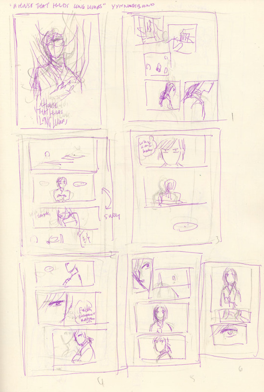
Process and wip images for A House That Holds Long Limbs (Part 2)
See Part 1 process and wip documentation
Read the pages for part 2 here (full complete version will be linked from YYH North Bound master post)
As a story progresses, I tend to become more comfortable with jumping ahead and around in my so-called process. This is mainly because the idea of getting deeper into the action is exciting and I want to get to drawing the pages as quickly as possible. The downside is that it usually results in a lot of “oops” and rework on what was supposed to be a final page.
Here you’ll see that script/pagination/thumbnailing and final pages are all starting to drift even more than in Part 1.
The (last version of the) script
Earlier versions were even more point form and incoherent with typos. But, it only needs to capture enough that I can recognize key actions, points of dialogue, the mood, things to draw in the panels, etc. A few specific items to point out:
“[new part 2]”: The script originally had no exposition on rokurokubi - it went straight to Hokushin telling Raizen he was leaving. It occurred to me later, after I’d started thumbnailing, that inserting a few pages of storytelling narrative right here would help to further solidify the kaidan (traditional Japanese ghost story) effect and mood. More importantly, it creates a baseline reference for what the reader will know about rokurokubi for the purposes of this story. I was lucky that Part 1 and Part 2 were cut neatly enough that this wouldn’t be jarring.
I’m still not entirely happy with the text for this section, mainly the “features of note” about rokurokubi. Not just the fact that it’s oversimplification and slight adaptation of actual Japanese folklore - which can’t be avoided unless I want to write a historical essay here. I’m mainly not super keen on how each of the three items has been phrased. It’d be nice to make the three points more parallel in terms of length, but I couldn’t seem to edit, increase the number of points (by splitting them up), or reorder it effectively without negatively impacting other aspects of pacing and information reveal. More points would draw out the pages longer than I wanted, and some points were clearly sub to other points. The final here is the “good enough” version. JUST GET IT DONE ALREADY SO THAT IT CAN GO OUT INTO THE WORLD.
Sooo many word choice changes. The biggest one, done at the last second, was “They are almost always female” to “They are rarely male”. Other phrasings I debated - “They are very rarely male”, “They are almost never male”, etc. Lemme tell ya, it’s easy to get lost in the weeds… Anyways, the main reason for this was because after I drew it and ran the text through my head, the originally-intended juxtaposition of Hokushin on this page with the word “female” felt too subtle. I felt it would create a brief moment of cognitive dissonance that didn’t serve the flow of the story, so I changed it to create emphasis on the same gender instead with the rationale that it will flow more smoothly and allow the reader to focus their attention on the fact “males are very rare” more than the mental hiccup of processing the juxtaposition. DOES THAT MAKE ANY SENSE?? It made sense in my head.
Anyhow, I’m sure there are people who will disagree with many of the decisions I’ve made, but at least you can see what I was trying to do.
Thumbnails
As mentioned, these thumbnails were done BEFORE I decided to insert the exposition at the beginning.
The first two rows on the left hand page are actually the same set of pages - you can see little arrows pointing down or to the right whenever I’m dissatisfied with a thumbnail and attempt to redraw it.
WIPs
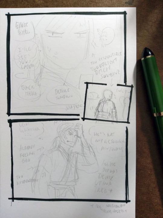
I really like how Hokushin turned out in the last panel here; I like the pencils more than the final inked version. It’s also another example of changing text up to the last second. In case it’s hard to make out, it says (along with what happened to them in the final):
First thought bubble: Ugh, whatever… (moved to the next page, seemed to work better as the end exclamation for this sequence of thoughts before he turns his attention to something else)
Over Hokushin’s head: Aaaargh (moved into the thought bubble)
Second thought bubble: He’s not my responsibility anyways! (no change)
First arrow: *already feeling bad* (no change)
Second arrow: *too responsible* (dropped, since a previous panel already said “too responsible”. Too redundant)
Next to Hokushin: All he did was tie me up in a tree (no change)
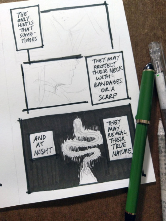
The above panel “And at night...” was a thrilling and scary thing for me lmao. I don’t usually tackle large patches/fills of black, since many of my comics are scribbly in style (pencils, hatching) or colour. I’m too lazy for screentones, traditional or digital. It’ll be interesting as parts of the story coming up will involve poorly lit/dim/dark spaces. I’ve been reviewing how other artists handle it, particularly those with styles driven by pure-ink or minimalist type approaches. Two immediate examples from Yu Yu Hakusho that I’ve been going back to are the dark room fights during Genkai’s successor trials (I’ve taken a similar approach here), and the haunted bedroom case in volume 19. Hardcore cross-hatching seems like a likely route, but that freaks me out when I have to do it over faces. I’d like to minimize or avoid screentoning out of principle, but I still want to create a clear mood, so we’ll see how it goes...

This was my view while inking this page - holding the book in one hand while inking Hokushin with the other. Using the more freehand, sketchy inking style for this comic was so helpful in terms of reducing my inking anxiety and allowing me to work faster.
It’s always great when you can find a reference for period armor (because I find armor very difficult) that is so close to the pose you’re already drawing. There are some small differences - for example, Hokushin’s head is turned more to the right; his left arm is turned and raised more as he’s pulling the sword upwards. But it’s close enough.
Also, spotlight on a few of the books I’ve referenced over the course of working on North Bound in general and this part specifically.
Clockwise from top left:
日本服飾史 女性編 and 男性編 (History of clothing/costume in Japan female and male editions). This marvelous set of books highlights Japanese fashion throughout history. I’ve actually been referencing these photos for a long time before I ever picked up these books - you can see them at the Costume Museum’s website here, alongside helpful line drawings and translations of some of the details. But the books allow me to see a lot more detail.
Hokusai manga vol 1 (this book is published as part of a set of 3). Sketches by Hokusai. This one focuses on “The life and manners of the day” and includes drawings of youkai, including rokurokubi, as well. You can check out the drawings online at places like The Pulverer Collection Online Catalogue.
Action references!! Real Action Pose Collection 02 (focuses on sword fights) and my favourite Samurai & Ninja Action Scene Collection. Not used as much in Long Limbs, but was helpful in some of the other chapters. The time frame is really much later than what I need for ideal clothing references, but it’s helpful for things like movement.
Kekkaishi volume 32. SPOILER a key flashback takes place about 500 years ago, which is actually a few centuries off give or take from but at least it’s closer than the Edo period. I’ve been looking at it for houses, some clothing.
Osamu Tezuka’s Phoenix - Civil War parts 1 and 2. I reference this so much while working on North Bound in general. It has scenes with peasants and commoners and some appropriate street and interior environments, not just stuff focused on the aristocracy or warrior classes. Just have to remember that they flipped all the artwork in the English version lol
Bunch of Yu Yu Hakusho manga and anime references from the end of the series, mostly for Raizen, the kudakusushi and just to check against things he or Hokushin said. The actual clothing and environments are not helpful at all lol
Last minute edits
After I posted, I discovered a few mistakes (of course). I used to freak out a lot and drop everything to fix it. Now I just sigh and laugh (and still freak out a little bit, depending on the mistake) and then decide what’s important enough to fix and what is like, “Oh well, whatever, move on with my life”.
I feel that seeing other artists share their frustrations and mistakes helps a lot of people feel better about it when they realize IT HAPPENS ALL THE TIME TO EVERYONE (including professionals. There are errors like this in professionally published series, like Yu Yu Hakusho, too). YOU’RE NOT ALONE.
So, these ones bugged me enough that I quickly redrew them on the computer.

#yu yu hakusho#comics#fanart#hokushin#process#wip#art supplies#sketches#art by Maiji/Mary Huang#yyh north bound#raizen
6 notes
·
View notes
Last Seen Blogs