#sorry for the overall low quality images in this post. Got a new camera and wasn't the best at using it this trip
Text
fiber art adventures in egypt
I recently got back from a trip to Egypt & finally got around to organizing some pictures to share. One of the things I was most excited about was seeing what I could find on fiber arts and textiles.
Dropping everything under a read more, 'cause this will be a long post haha
first visit: the National Museum of Egyptian Civilization (NMEC)
At the time of visiting, they had a special textiles exhibit. It covered Pharonic Egypt all the way up to modern times, although I only had time to check out the dynastic & a bit of the Coptic portion of the exhibit (which was what I was really hoping to see anyways)


Was super excited to see this diorama in person. I knew about it but had never seen good pictures of it. From the little I've seen of ancient Egyptian spinning, spinning with two spindles seems to be the norm rather than a master technique? It also shows up in tomb art, which the exhibit also shared:

They also used a different fiber preparation (splicing to create a rove of fiber, no traditional drafting to my understanding) so that probably made a difference? Regardless I really want to see if I can replicate the technique, especially because their spindles look so similar to modern spindles??


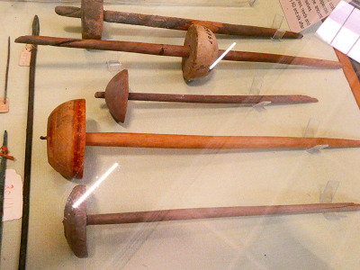
I took so many pictures of spindles, guys, and I fully intend to either have a few replicas made or to learn to make some myself. Also, although they were unlabeled... I'm pretty sure those are beaters for weaving? That was a bit of a trend with this trip, so much stuff was unlabeled :( I would've killed to at least get some date estimates for some of the stuff they had on display. I was nerding out in here though, and my family took a few pictures of how excited I was getting. A bit embarrassing, but eh haha
The exhibit also had a section on natural dyes used with a fun visual;
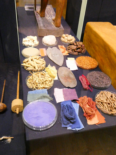
There was several diagrams specifically describing each dye source, but in the interest of not overloading on pictures I'll just list them out. For blues; woad, Yellows; turmeric, safflower, saffron, or yellow ochre; reds; madder, henna, pomegranate, and kermes. I originally thought kermes was another way to say cochineal, but it only seems to be distantly related.
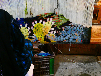
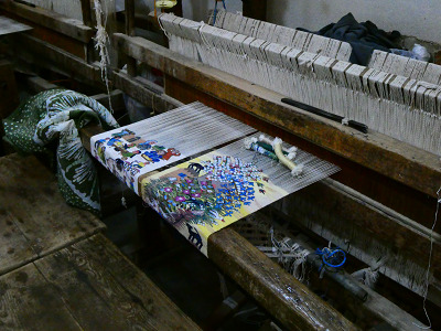
next visit: Ramses Wissa Wassef Art Center
A small art center dedicated to hand-weaving wool and cotton tapestries. All of their work was museum quality & awe inspiring!!


Was even invited to their back rooms to watch a few of their weavers working; no I don't have room to put a room-sized loom anywhere but heck do I want one now

Our guide that took us through talked a bit about the natural dyes they use (all of their dyes are dyed in house with what they grow in their dye garden!!!) and got excited to hear I was also interested in natural dyes! He seemed a bit disappointed I'd never worked with indigo and. while indigo scares me, I'll take it as a sign that maybe I should try some time this year haha.
final visit; the Egyptian Museum
we really had to rush through this one which was a huge shame because it's packed full of artifacts. Also, the lighting in there is atrocious, so apologies for the not great pictures ahead.
They had a fascinating display of textile tools, more than what the NMEC had;


(Hand for size reference) I want all of these spindles! So badly! But a few of them look so much like a few of the spindles I own already?? A few of them had a spiraling notch, that's so cool? But also, what's going on with the one with two whorls? I have no idea. I'm fascinated.
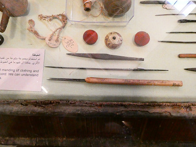

Look at these whorls!! Although again, I'm a bit confused; the lack of labeling strikes again. Unsure why some of these "whorls" have two holes, or what the metal object with the wooden handle is. The display implies sewing needles, and some of them do look like it, but others.... really don't look like sewing needles. I'm absolutely enchanted by this little whorl though. I think it has birds on it?


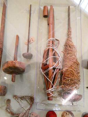
More objects that I'm baffled by- the signage doesn't really indicate what some of this stuff is, if it's even known. Also confused by the object wrapped in white string in the right pic; it looks like a distaff but to the best of my knowledge the (ancient at least) Egyptians didn't use distaffs. It probably popped up in later times and was put in this display since it was still relevant, but I'm still not sure.
I have so many more pictures & thoughts but I'll save those for more specific future projects. I've been doing research outside this trip on ancient Egyptian spinning techniques and desperately want to go deeper into that, this trip just solidified how excited it makes me. If you made it all the way through this, many thanks for reading!
Bonus; look at this ancient linen 🥺

#hand spinning#archaeology#extant artifact#weaving#fiber arts#long post#letters from skylark#sorry for the overall low quality images in this post. Got a new camera and wasn't the best at using it this trip#also the raw image files were huge so I heavily downsized them to make sure this post wasn't a beast to load#would be happy to share the raw images if desired though
247 notes
·
View notes
Text
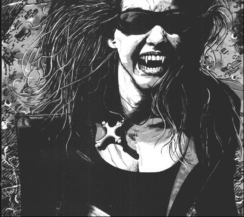
V5 Corebook, no gloves review P.1
Y’all know me, it had to be coming. Sorry it took me so long. Part 1 is about the physical aspect of the PDF (I don’t have the physical book at hand yet), Part 2 is going to be about mechanics and “content”, since I’m still testing that out.
So first and foremost, the small Mature Content Warning that was added last minute to the PDF. It has been published online on its own so I have no issues posting it here:
Mature Content Warning
For the past several decades, Vampire: The Masquerade has addressed the
darkness in the real world through horror stories: it has talked about
AIDS, capitalist exploitation, sexual predation, the resurgence of far-right
political extremism, religious fanaticism, state and private surveillance,
and many other issues. This version of the game does not shy away from
any of the above, and we believe exploration of subjects like these is as
valid in roleplaying games as it is in other media. Including a problematic
subject in a Storytelling game is not the same as glorifying it, and if you
take the chance to explore it critically, it can be the exact opposite. If we
understand the problems facing us, we are better armed to fight them.
V5 includes in-world references and expressions of the following:
sexual violence, political extremism, physical violence and gore, mind
control, torture, abuse, imprisonment and kidnapping, racism, sexism,
and homophobia, to name a few. It’s a game about monsters.
“Why are you telling me this?” you might be saying.
Someone at your table is not familiar with this game. Someone at your
table has dealt with some of these issues in real life. Someone at your table
wants to know that you read this warning and know you will be considerate
to them as players, while putting their character through the wringer.
In the Appendix, you will find concrete techniques on how to handle
difficult subjects in your game in a manner that is respectful to your players
and their experiences. Calibrate beforehand which techniques your
group wants to use. People have different needs and not every method
works for every person.
This is a game about monsters. But it is only a game.
Don’t use it as an excuse to be a monster yourself.
This is something I consider good (that last sentence is more necessary than I’d like to know), considering the rest of the contents of the game, but I wish they had taken a far more respectful approach to the mature themes instead of name-dropping horrors without meaning.
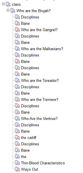
Now, the PDF itself has MAJOR issues in terms of book-making. The bookmarks are terrible, they integrate stuff from the side boxes that just make no sense, there’s little to no proper hierarchy, some are even missing, the internal links don’t work very well, it’s just poor, poor design.
Seriously look at this:
How can I navigate this? Like seriously ? I know there’s a table of contents, but it should be in the navigation bar as well, that’s how PDFs work.
(The Nossies are missing, it makes me laugh because it’s the Nossies, but they’re there, that’s why Malks seem to have two sections about Disciplines and Banes)
Now, the layout itself isn’t the worst I’ve ever seen, and some parts of what I’m going to be saying may fall upon “personal taste”, but I’ve been editing PhD thesis for long enough to recognize bad layout when I see one :p
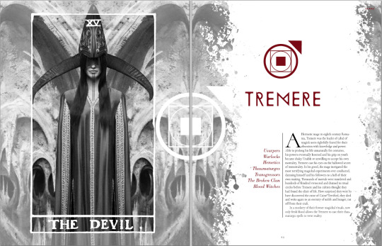
Like, this is fine, I really like the new Tremere Clan Symbol (all the clan symbols are pretty neat tbh, and the Disciplines symbols are the VTES ones so that makes me extra happy), and they’ve used beautiful fonts, even if we disregard that they couldn’t be bothered to spell HERMETIC correctly...
However there are two major issues with the book layout as it stands, as you flip through the pages. First, the text isn’t justified (aka aligned left and right), and second, the text is sometimes in two columns, sometimes in three. Quite often, the titles are at the end of a column (see here “The Anarchs”) and some paragraphs have poor lonely lines in the precedent page or column and it just looks bad. I screenshot some pages with low res: the text itself does not matter so it’s ok if you can’t read it ;) But notice how “Relationship” is hyphened because of the three columns there...


Then, you have plenty of pages which have either black background or colorful background. That would be fine if some of the pages weren’t the kind of pages you’d want to print out to give as handouts to players...
My poor eyes.
These four pages would be far more useful with black on white, even if plenty of us like reading white on black because it’s easier on the eyes on a tabler, but this isn’t printer friendly when you sell a pdf... This should have been in the Appendix with a printer friendly version.
Sometimes the placement of elements is just weird or off putting in certain pages:
This image touches the bottom of the page, but there’s three meters of white space above. There are examples of the exact opposite (the image touching the top of the image with extra space at the bottom).

This chart should be centered, I think.

Something’s wrong here, isn’t there something missing above the first page? And that block alone on the second column, it’s very common across the book.
Now, on a tablet or phone, it’s easy to double tap and match the column length, and the fact that the text isn’t justified isn’t much of an issue when reading plain text, but I find that the text not being justified in any of the pages is just Bad Design.
I did like the separations, the small lines between the columns and all, they looked great, the change of fonts in between “boxes”, “quotations”, “examples” and so on was also well made.
Now, the Art.
Some of the art is old WWP art, some of it is WoD MMO art, some of the art is newly commissioned illustrations, and some of the art is photography with (or without) filters.
Old WWP Art is clearly to link back. The old Helena art is there. Theo Bell got new art (I think it’s new?), but Helena didn’t.

They also reused MET By Night Studios photography for Jeanette and Therese, and cropped the photo, taking away the key composition of the original. Did Bradstreet give the rights to alter his work with such cropping?

Note that I personally dislike this picture, cropped or not, a lot, simply because being a Bloodlines fan I don’t think it represents either Therese or Jeanette properly. Jeanette wouldn’t be caught with a power stance and serious face like that, Therese wouldn’t be caught with such a non imposing, reserved pose, and coming from Bradstreet, I am VERY disappointed, because he has done official art for Jeanette for the video game before and it was far better representative of her; the model from the OG picture looks far closer to the Jeanette we meet in the game, but this is truly a matter of personal taste and opinion so I won’t scream again about it.
The MMO art is overall great quality, and sometimes it’s even used in a very smart, beautiful way:

(I’d have put this image on the Embrace and not on Predators, tbh...)
They also used the fashion spreads looks for the MMO in the corebook, some of it is plain silly, and I’m very much afraid they’re used literally as how PCs look like. Here’s the Gangrel Fashion splat:
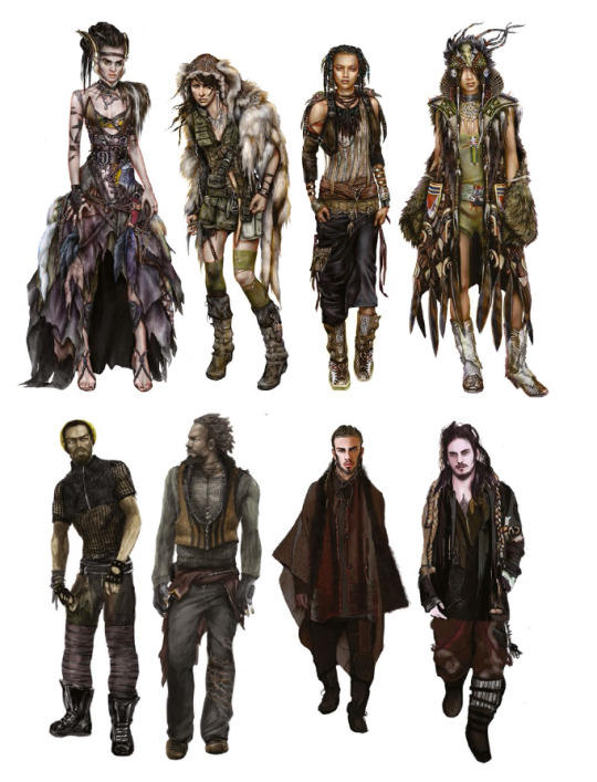
I consider the art to be good, and to be great concept art for a MMO, and great fashion shots, but.. in VtM? this is not Masquerade Friendly. Also these types of art (as well as the Investigator image you can see on the first few pages I pasted above) are all 20 something model-like people, and yes that involves the Nosferatu, because they’re fashion drawings. Fashion drawings have stupid proportions and no realism, since they’re meant to show the clothes, not the model. And for a book about characters, well, why? This was suitable for the MMO because MMOs have transmogs and such and such.
I just find them to have completely missed the “Punk and Gothic Aesthetic of the World” and just stacked as much weird clothing as they could to look “hype and modern”. Hipster Instagram Fashion that’s unwearable.
Yes, vampires are marginal by nature, but please, their goal is to blend in, not be noticed, and considering how long they’re effectively inactive, and how age affects your will to stay on trend... Eh.
The New commissioned illustrations are hit and miss, and some of this criticism does fall on “personal taste”, but here I ranted about one of those art pieces (which was the page for the Vault, but it’s in the book). They’re all a little bit like this, some having a far better composition even if they all seem to be this saturated. They’re all overall good and I like most of them.

This one is “look at my butt” kind of situation. I’d have rather have this picture just without this foreground couple, it would have been a perfect street look example, and the two jumping above the roofs guys would have had the attention they deserved. I love the fog, the graffity, the textures are nice, i just hate the butt.
And finally, the big chunk, the Photography Art.
I understand how they made it so that most people would be able to “make their own art” (photography being now more accessible to the masses than illustration), and that is something I nod to, appreciate and completely understand. HOWEVER, Photography IS art and not everyone can be a Photographer with a snap of their fingers (or a click of the camera :p).
What’s good with photography art is that they picked diverse looking models of all sorts, and they put them in interesting and somewhat telling situations. What’s bad is that “suddenly” all “positions of power” are held by middle-aged (so plain old 60yo) looking vampires and all Anarchs Rebels looks like they’re in their twenties.
This goes against VtM. Older vampires tend to look younger because being a King or Queen at age 14 wasn’t uncommon until the 1800s. Embracing people right at the end of their teenage years, at their prime, at their best, as they’re “perfect” is the best a vampire could do (remember Dark Ages have rules against embracing the young, the elderly, the crippled, the insane...).
It’s only after WWII that embracing people over 40 wasn’t uncommon.
I’d have LOVED to see a 60yo looking Punk, and have the Dominating Prince on Their Throne look like, 15. And own the place.
Now there are plenty of issues with some of the photography art, and here’s one (page 232) that I’ve screamed at for like, two weeks now.
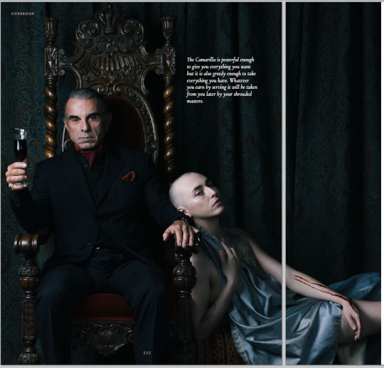
This picture had one of the best compositions, the diagonal works great, the leaning away, the androgyny of the chalice (despite them still having a personality and free will...). How he filled the glass with the blood from the chalice through this.. pinky finger condom thing, okay, sure, weird af but why not. Does’t explain why the chalice has two marks on their forearm but okay. Sure. Also, FINALLY a photography in VtM of a dude wearing a suit that’s actually his size? Great. And it doesn’t come out of a Goth Store (tm). Great! Amazing!
But there are in this picture TWO things I just cannot forgive.
First, the guy has his jacket buttoned. When you Suit 101, when you sit, you unbutton. You button up when you stand up. Now this is supposed to be The Ventrue (tm), this is just wrong.
Second, his fucking zipper is down. YES HIS FLY IS DOWN. How the hell did this not get photoshopped in like two seconds? Because of the jacket, I know this is an accident; the model just isn’t used to suit etiquette. You could explain this away by saying he’s a pervert or something, but in that case you’d have needed to add slightly more eroticism to the guy (jacket and maybe shirt open, no glass, slight smile, leaning towards the chalice and not away from them?).
Some of the photography-manipulated art is just beautiful, let’s be honest, this is the splat before Disciplines:
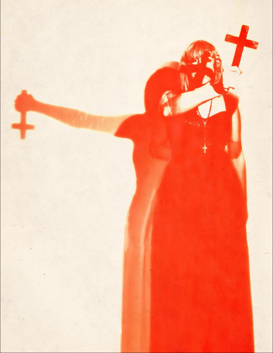
I’m not a fan of the orange (simply because I’m not a fan of orange in general), but this works just so well, the composition, the lines of sight, the shadows, the mirroring, just, top notch choice here, who did this??
But then you have post apo band :p
I mean I like this group shot, it’s very classical, it looks like a fine coterie with a specific turf.. But is this Mad Max? I know Gehenna happened, and I do know some people actually dress like that, but if you’re being tracked down and hunted into oblivion by the Second Inquisition, you.. just don’t do this.
Most of the photography is like this; marginal overdressed looks. Now this is personal taste again, I just wish we had more.. normal looking people. People who are exceptional, but not through their looks or clothing style. The back of the book claims “A Storytelling game of personal and political horror.” and I see little of it in the pictures and illustrations.
Anyway, want more Art Rants? click here
Stay tuned for part 2!
50 notes
·
View notes
Text
When I was heading to France last week, I considered taking my Nikon d750 with me, because I thought, not unreasonably, that France might be a photogenic country and that I might want to get some high quality photos of the place. I decided against it for a number of reasons, but one of the major reasons was that a couple of weeks ago I got myself a Pixel 3 phone, which reviewers have suggested may have the best camera on a phone out there. I’d previously had a Pixel 2, the former “best cell phone camera out there,” so I was curious as to how the Pixel 3 would improve on the camera.
So I left the Nikon at home and used only the Pixel 3 to take shots while I was in France. I ended up taking something around 500 pictures while I was in country (many of the best of which I have collected in this Flickr photo album), and can now tell you what I think about the experience. Here are my notes, in no particular order, with occasional art. Please remember that these thoughts are from someone who loves taking pictures but is not a professional photographer, so I’m not going to go into the weeds with technical issues and jargon. I’m mostly noting the experience of just trying to take pictures.
1. Overall I was very happy with the quality of the photos and the intelligence of the camera — the latter perhaps being a weird thing to say, but the fact is what separates the Pixel line of cell phones as cameras is not the hardware (which is mostly high-end but standard issue for a cell phone), but the processing Google applies to the photo data once the photo is taken. The camera makes choices, basically, about how it interprets the data you give it once you snap the photos.
And those choices are generally very good! There wasn’t a situation where I thought the Pixel 3 wasn’t capable of handling itself. As with nearly all cell phone cameras (and, honestly, nearly every camera, period), the Pixel 3 works best when it has a lot of good, bright, natural light, but it did very well inside and also very well in visually challenging environments with a lot of contrast between bright and dark (like, for example, the interior of the Notre Dame cathedral). Not every picture I took was perfect or even good, but the reason for that had as much to do (and perhaps even more so) with operator error as it did with the camera itself. Which is to say I can’t blame the bad pictures on the cell phone camera; a lot of it was me.
2. What do the photos look like coming out of the camera? Here are five, which I’ve not done any post-processing to (i.e., no tweaking with the various photo editors I have). These pictures were taken with the settings the Pixel 3 has right out of the box, including the HDR+ processing turned on, without zoom, and recording to jpg. Right-click on the pictures to get a larger versions of them (choose the “open image in new tab” option), and see the various details.
This slideshow requires JavaScript.
Right out of the camera, the Pixel 3 a pretty good job of things. The colors are correct and not overly saturated, and the HDR+ mode does a good job of bringing out details in shadows without making them look overly processed. Note in particular the picture of the musicians in the conference room; the light’s behind them and their faces are shadowed, but the Pixel 3 does a pretty good job of balancing the data so you can see their faces clearly. In the rose picture there’s decent depth of field — not a lot, but the Pixel 3 knows what it’s looking at. There are limits, and you can see some of the choices the Pixel 3 has to make in the photo of the Notre Dame alcove, but those limits mostly show themselves in challenging situations where most any camera would show limitations of some sort.
I personally do a fair amount of photo-editing of my pictures, both to bring up details and for aesthetic effect, and the Pixel 3 gives me a fair amount to work with, even as it records the data into a lossy format like jpg (there is an option to have the camera record in RAW — the lossless format that gives photographers the most information to work with — but I didn’t turn that on and don’t really plan to except on very special occasions, because the files sizes are huge). It’s a fact that for a lot of photos, I don’t really have to do much editing at all — I merely straighten out sightlines or crop for better composition as much as I tweak colors or bring up shadows.
Out of the box, the Pixel 3 takes pictures that are better than “good enough,” and that’s a good thing. For people who like fiddling with photos like me, what comes out of the camera is even better than that.
3. One of the — perfectly reasonable — knocks on the Pixel 3 is that where other high-end cell phone cameras have an optical zoom function, the Pixel 3 doesn’t, Google instead opting to try to deal with zoom through processing (involving the minute unsteadiness of the human hand, or something, to help fill in interpolative gaps). I used the zoom function a lot while walking around and trying to get details that would otherwise be too far away. My verdict on the zoom is: well, it does something, but razor-sharp details isn’t it.
This is again probably best viewed, so here are four photos at or close to full zoom, three of statutes or architectural details at the Louvre, and one, of that tower they have there in Paris. Again, right-click on the picture for details (or in this case, lack thereof). Again, these pictures are straight out of the camera and otherwise unedited:
This slideshow requires JavaScript.
My impression of these zoomed in pictures is that they don’t look like photos, they look like pastel drawings, or what happens when you use a very light “oil painting” photo filter from Photoshop or some other photo app. They don’t look bad? But at the same time, this is not what I want when I zoom in. I zoom in because I want a closer look at something, not an artful, detail-smoothed representation of that thing.
I read in a review of the Pixel 3 where a reviewer notes that the zoom works as intended up to about a 1.5x zoom, and after that things start getting overly interpretive. My experience has been that this estimation is largely correct. I have some pictures that are moderately zoomed in that are perfectly good. But too much zoom means you’re getting the AI version of impressionism. My thought on this is that this iteration of AI zoom is only the first, and that Google will probably get better at it as it goes along, because that’s what Google generally does. So two Pixel generations from now, this will likely be a solved issue (or alternately, Google will throw up its hands and just put an optical zoom on future Pixels). Here with the Pixel 3 and today, however, be aware that the zoom works up to a point (1.5x or so), and then it gets kind of wacky.
4. The only other real issue with the Pixel 3 that I’ve noticed is that it feels a bit slower than the Pixel 2; sometimes there seems to be a lag between when I press the button to take the picture and the camera registers the picture being taken. It’s a relatively small issue but it’s been noticeable to me, and I wonder if other people have been experiencing it as well. I’ve not missed any photos because of it, fortunately. But be aware of the possibility of a bit of shutter lag.
5. On the selfie front, the Pixel 3 features a “wide angle selfie” mode — an optical zoom out, if you will, thanks to two cameras on the front of the phone. This actually is very useful for when you’re trying to get a lot of people into frame while taking selfies:
Do be aware the the wide-angle selfie mode has some distortion. But then, selfie cameras have distortion anyway (it’s why your nose always looks big in a selfie), so I guess you pick your poison with selfie distortion. What I do know is that I’ve used the wide-angle selfie function several times already, so this was a smart add-on on Google’s part.
6. This is not meant to be an exhaustive review of the Pixel 3 camera, but one that touches on how I’ve been using it. I’m not covering a lot of the functionality of the thing — I haven’t used the video mode, or the panorama mode or tried the “HDR+ enhanced” mode, or sideloaded the apparently super-cool but not-officially-released “night mode” into the phone to try it out (the night mode apparently makes it possible to take super clear pictures in very low light, and the key as far as I can tell is a long exposure time, which, well, yes, it would be, wouldn’t it). I’m not covering any of those things because, as noted, this is not how I’ve been using the camera. I’ve been using the camera in a pretty straightforward fashion, as I suspect most people will.
And as a “daily driver” camera, the Pixel 3 really works. It takes great pictures and in all sorts of circumstances, and with the exception of the zoom above a certain point, steps up when you need it to (also, as an aside, the fact that the Pixel 3 comes with unlimited storage in Google Photos is a point well in its favor, since you can store your photos there and keep your phone’s memory relatively uncluttered). We’re now well past the point where the average person has to wonder whether they’re missing out on really excellent photos if they only have their cell phone with them. With the Pixel 3, the answer to that is definitively “you’re not missing out.” This phone will get that great shot for you, most of the time.
7. Does this mean I’m ready to ditch my dSLR for the Pixel 3 full time? No; the dSLR still has a better sensor, better lenses, and does specific things much better than the Pixel 3 does or will (like, sorry, Google, zoom). But this isn’t an either/or situation; this is a “this, and” situation. I no longer have one excellent camera and one camera that I just happen to carry around; I have two excellent cameras whose use cases overlap but are not a perfect circle on the Venn diagram. I don’t suspect I’ll ever stop using a dedicated camera for particular things where a high-end, single-use piece of machinery makes sense. But, as noted above, when I have my Pixel 3 with me, I don’t worry that I don’t generally have enough camera with me.
8. Does it make sense for people to upgrade to a Pixel 3? I’m very happy I did, but I also acknowledge I’m a tech geek with a particular interest in photography, and I have enough money to indulge in this sort of thing (my other phone stopped working, which prompted me to get the Pixel 3, but let’s not pretend there wasn’t a good chance I would have gotten one anyway).
If you already have a Pixel 2 (or the first generation Pixel), some of the new capabilities of the Pixel 3 camera are going to be available to you with software upgrades. So unless you’re already at the part of your upgrade cycle where you’re getting a new phone anyway, you can probably sit tight and be fine. If you have the latest generation of “flagship” phone from Apple, Samsung or any other high-end phone manufacturer, you’re also probably just fine. Cameras are the new hotness on phones and every manufacturer will tell you why their iteration of cellphone camera tech is the best. It’s getting a little silly (some upcoming phones will have up to five cameras on the back of a phone, which seems much of a muchness), but on the other hand if you’ve got a high end, recent phone, you probably have a very good cell phone camera no matter what. Finally, if you just don’t care about photos, either from your cell phone or in general, the Pixel 3’s camera capabilities won’t matter regardless.
But if you are looking to upgrade, do like taking pictures and want to have the possibility of taking genuinely good photos with your phone, are fine with Google knowing everything about your digital life, and (not trivially) have between $800 and $1,000 to splash out on a phone (or have Verizon, which will let you slide it into your existing plan for a monthly fee), then I can really very highly recommend the Pixel 3. Aside from (yes) taking some of the best photos possible on a cell phone, it is also otherwise a very solid high-end phone, with some features (call screening, I’m looking at you) that are amazing differentiators, and an operating system upgrade cycle that means you always have the best, most recent version of Android first.
For me, in any event, it’s been well worth the upgrade, and not just for the photos, although the photos probably would have been enough. I really like this camera, and I really like this phone.
Taking Pictures With the Pixel 3: Some Thoughts When I was heading to France last week, I considered taking my Nikon d750 with me, because I thought, not unreasonably, that France might be a photogenic country and that I might want to get some high quality photos of the place.
3 notes
·
View notes
Text
MY FIRST STORY ~ ALL LEAD TRACKS review「レビュー」
(c) Japanessie. Photo is mine (^^)
Back : ALL LEAD TRACKS 1st Edition (L), Amazon Edition (R )
Front : STORYTELLER Edition. The disc is the bonus DVD
MFS’s ALL LEAD TRACKS had been the fastest postal delivery I had ever experienced in all my time doing online shopping from overseas. The Amazon package reached me on 20th July 2017. The album release was 19th. Amazing, wasn’t it? Sadly, it reached me on the same date of Chester Bennington’s death and my musical world stopped for a moment. So, this post took a back seat. But here it is now.
Being the Limited Edition nutso that I am, just as I “declared” in a previous post, I got myself the 1st Edition, the Amazon Edition and of course the STORYTELLER Edition. Goodbye money ... XD. By the way, it’s called ALL LEAD TRACKS to reflect that each song on this album is a theme song.
I had ONE intention when I bought this album. That was to hear HOW Teruki Nishizawa would bring himself out of his shell and project that more into their music. Generally, MFS is not breaking any new ground with this one. Not an issue as they have never been that type of band to me anyway. What I was expecting was how they would revive and update already-explored musical territories, particularly Teruki and man, he did not disappoint me. I was a bit disappointed by his lack of solos on ANTITHESE. So, he kind of made up for it on ALL LEAD TRACKS. Though not up to the “guitar hero era” level he grew up with, it’s flashier than his guitar solo work on ANTITHESE.
These are my thoughts.
1. LET IT DIE
(Music: Nob, Lyrics: Hiro; Theme for PS4 Game LET IT DIE )
youtube
My first impression when I saw the trailer was that it sounded like it was something they had written to be given to ナノ @ nano. I could just hear her singing that chorus. There was a feminine quality to it of which its rock edginess was compensated by Hiro’s scream at the end. However, a few people gave feedback that they preferred this song over the earlier released trailer REVIVER. I, on the other hand, just felt the sweet chorus was contrasting to the image of Grim Reaper in that trailer.
Teru said on STORYTELLER that this song is his favourite from this album. I so believe him XD It’s easy to tell that the guitar riffs were created by a big Metallica fan. Not even the current Metallica but the classic Metallica from the 1980s. Teru knows his heavy metal history and it shows. Of course, he doesn’t do it quite as aggressive as them because MFS isn’t a straight-ahead metal band but it’s impossible for me not to hear influences of a certain classic Metallica song in it (^^)
The bass lines are particularly heavy on the intro and the breakdowns throughout. Not surprising when the song composition is credited to Nob. Ever since MFS became a 4-piece band, he has been making the bass sound more prominent in the band’s overall music arrangement. Then, I also feel that the combination of Teru’s clean guitar lines on top of the thick rhythm section steers the sound towards something that would fit Linkin Park around New Divide era.
* I wish Chester was still around and eventually discovered Taka’s little brother’s band. It was so close. He already befriended Taka and he did like the LET IT DIE game very much.
youtube
But still, despite the heavy rhythm and the Metallica-inspired guitar riffs, the overall feel of the song is still sugary sweet to me. I guess I was just expecting something "harsher”. It’s not that I think it’s bad but to me it’s just an odd pairing for a bloody survival game like LET IT DIE.
2. REVIVER MV Version
(Music: Hiro/ZENTA, Lyrics: Hiro; Theme for smartphone game Hortensia Saga)
The thing that caught me most about the MV was “Hey, this song is different from the Trailer!”. I noticed certain guitar line was missing from the intro and the echo produced when one holds the notes on the guitar strings at the end was not there either. I was looking forward to seeing Teru’s hand as he held the notes there but it didn’t happen. The camera shot showed him but his hand was in the power chord position instead.
youtube
Yes, as it turned out, MFS recorded another version. Overall, the rhythm guitars on this version are thicker. This one sounds like it would be the one to actually be played Live. It’s easier to handle onstage for a single-guitarist band. It’s power chords and then a short solo and then back to the crunchy power chords again. The faint here-and-there guitar embellishments can be left to backing tracks. Teru brings out his inner old-school rocker with the solo. Short but leaves an impression through the way he ends it. Hey, finger-tapping always will never fail anyone!
Hiro took a big risk changing the key at one point of the song a.k.a the part he fell underwater in the MV. Considering his naturally high-toned voice, low notes are not his forte. He had problems singing the lower notes Live when MFS showcased Last Call on Sukkiri. It’s understandable considering his natural voice. Which is why it surprised me he dared to change the key here. The key change itself is tricky but hitting low notes for a high-pitched vocalist is entirely another challenge.
youtube
As predicted, Hiro really did have problems handling that part when they performed it Live for Fukuoka Hawks.
As a theme song, to me REVIVER is more fitting to the game it is intended for compared to LET IT DIE. The entire song sounds like a journey and the way the song ends gives you the feeling that the hero of the story will meet his triumph in the end.
3. この世界で一番の幸せ者にはする事など出来ないかもしれないけど .....
(Music: Hiro, Lyrics: Hiro; Theme for Buzz Rhythm July 2017)
Who in the world would put THAT as a song title but Hiroki Moriuchi, huh? His version of “normal” is another world on its own XD.
Title reading & translation:
kono sekai de ichiban no shiawase-sha ni suru koto nado dekinai kamoshirenai kedo .....
Though being the happiest person in this world is something I may not be able to do .....
Just like my feelings towards LET IT DIE, this one also has that ナノ @ nano-ish vibe to me. Yes, I can imagine her appearing at the chorus.
My fav part is the bridge at the first half of the song (00:20 ~ 00:39). It’s such a sweet melancholic melody which suits Hiro’s soft voice perfectly. It brings out the yearning feeling for a person really well which is what the lyrics are about. Sadly, this part never gets repeated.
Teru’s solo on this one is moderate and well-paced. Not the flashy hair metal style at all but more towards what Steve Lukather of Toto would play. I'm sure the majority of my readers don't know who is Steve or Toto. Well, Steve Lukather is one of the most recorded guitarists in history because he played on so many records of major artists in the world.
Lyrics-wise, I am hoping that this is just an exaggeration of Hiro’s imagination because if it’s real, then the object-of-affection is likely to be ........... . I think I’ll just keep my thought to myself for that ....haha ...but I really do hope it is just an exaggerated story of his crush on a celebrity or something XD
4. The Storyteller
(Music: Hiro, Lyrics: Hiro; Theme for 全心 aka Zenshin Documentary)
This song is so like an updated version of old school Bon Jovi (^^). Back in 1986 and 1987. Never Say Goodbye to be exact. While the sound is not something new, to me it fits the purpose it was intended for.
The Storyteller has this somewhat lethargic feel like something you do while chilling out or recurperating from being drained out of energy after a long hard battle. Lethargic was also the exact word I used to describe Bon Jovi’s Never Say Goodbye back then
Like a badly wounded soldier after a war struggling to walk home on a lonely road and thanking the ones who came and offered to hold his hands along the way. Like somewhat apologetically saying to the kind-hearted supporters, “I'm sorry that I'm broken ..... but ..... thank you ..... thank you for your kindness and for believing in me,".
That's exactly what the song is about. With his bandmates by his side, Hiro fought long and hard. ..... and it's exhausting. The Storyteller feels exactly that. Hiro wrote it from that state of mind and his bandmates complemented it with the sound. Honestly, I don’t relate much to many song lyrics but I do relate to this one. It’s my story. I started this blog to help clear up so many misunderstandings towards them particularly Hiro. It takes hard work & sheer dedication and this song captures that feeling of exhaustion. I’m grateful for my journey though (^^)
The song topics are different but look at how both songs end with almost similar sentiments. What a co-incidence (^^):
Bon Jovi:
Holding on we've got to try .... holding on to never say goodbye
MY FIRST STORY:
So let's keep on walking till we reach the end .... till we reach the end
The moment I knew that this song was specially written as the Zenshin theme song and dedicated to the Storytellers, I could already imagine the video it would be presented with. Band members footage, fans footage, behind the scenes footage, onstage, offstage ... all in slow motion and black & white filters. Bon Jovi, Bon Jovi, Bon Jovi, eh?
Ooh ... even the MV is old school Bon Jovi circa Slippery When Wet album. All Bon Jovi MVs at that point were about the band and the fans. Bingo!
Written as a “gift" to Storytellers, they keep the MV private for the Fan Club. So, non-members may just trust my words on this.
My only gripe is it’s a missed opportunity for an emotional guitar solo. Ok, It takes a lot for Teru to show his emotions to the world. So, maybe it was still awkward for him to put one in. Someday dear (^^)
* Still it tickles me to hear Hiro's mumbled pronounciation especially when his "reach" sounds like "rish" (^^)
5. Smash Out!! Budokan LIVE version
(Music: Hiro* (?), Lyrics: Hiro; Theme for Shinjuku Swan II)
* This is confusing because in Zenshin, the music was credited to Nob
Now I'm contradicting myself. I openly admitted that I wasn’t fond of this song when I reviewed ANTITHESE because I was disapproving of some choices of words in the lyrics. Strangely, with this particular Live version, I get so drawn to Hiro shouting out the swear word “Uze!!!”. Besides him saying it out loud at the Budokan with his parents in attendance, I guess it tickles me because Teru once tweeted a photo of Hiro and captioned it “Uze~”. Aahh! Now they’re equal ^^
The music is louder and livelier than the recorded version. The guys played the music faithfully to the album. Teruki replicated his guitar solo perfectly note for note. From my experience watching him play this song in front of me, I think Teru enjoys doing this one Live. Then, Hiro's live vocals are ...... well, he's not Taka. But that's expected XD
Me : I'll take this version over the studio version.
Common sense : The lyrics are the same yo!
Me : But Hiro said “Uze~!!" here.
With that, I concluded that it's more worth it to listen to the Budokan Live version just to hear Hiro shout out .....
“UZE~!!"
Refer here and here for its meaning. Could be directed to his haters XD
6. 花0714 special acoustic version feat. UK from Moroha
(Music & Lyrics : MY FIRST STORY; Theme for a friend's wedding*)
* Reportedly it was for KTR
I have always been a fan of good acoustic guitar ballads. Glad to see this being kept alive by younger generation of guitarists like YouTube star Sungha Jung.
UK's playing is reminiscent of Artful Dodger or that kind of artists. A rock guitarist I can think of who has this kind of acoustic flair is Vito Bratta formerly of White Lion. A certain sound UK made is a technique my brother once tried to teach me many years ago. You do it by lightly pressing the string with your finger joint rather than your fingertip. It was bloody hell difficult and I gave up.
* UK is pronounced as "oo-kay". Check him out here. He’s the one with the acoustic guitar.
youtube
This version is also Nob's favourite from this album. He said so in this NO Music NO Life interview with Tower Records. Of all the tracks on this album, he hopes the most for people to listen to this one.
How fitting! I was thinking of Nob the whole time when I first listened to this version, knowing that he played the acoustic guitar on 21 Miles. I commented in my ANTITHESE review that Nob has this touch of gentleness with his guitar playing. No surprise he likes UK's style.
This version finally fulfils what I want a wedding song to be. At least for my kind of wedding. Romantic and intimate. Just like a wedding should be a celebration of you and your spouse, this one celebrates the intimacy of a soft singing voice and a gently picked guitar.
At the end of the day though, whether you choose this or the original, it depends on what kind of a wedding it is. I personally will take this one. But as romantic as it is, this one will get lost in a grand wedding XD
7. REVIVER Original Hortensia Saga version
(Music: Hiro & ZENTA, Lyrics: Hiro; Theme for Hortensia Saga smartphone game)
This is the one that originally went to the trailer. I have no idea why they made another version but "double REVIVER", I'm not complaining. Hey, I get to hear Teruki Nishizawa working it up TWICE!
The guitars really are different. This one has less crunchy rhythm guitar. The clean guitar line in the intro plays along interchangeably with the synthesizer instead. This version would sound stronger Live with actual TWO guitarists in my opinion. I would say once Sho comes back, they can opt to play this instead of the MV version.
Teru created a different and speedier guitar solo for this version. He left all the power chords to the other one. He also built up the guitar line towards the ending and held the notes there. This is the part that I initially found missing when I first watched the MV.
Both versions are good. I don't really prefer one over the other. I just feel that the MV version is more suitable for a single guitarist Live. This one needs two guitarists onstage to bring out the Live feel for the double guitar layering. One guitarist with backing tracks doesn't have the same impact, at least to my ears. But if you don't mind that, it doesn't matter which version they choose then (^^)
Additional thoughts:
I'm glad I got those 3 Editions of the album. Understandably, some musically younger fans can feel totally alienated by the old school references the guys kept making throughout the album. Looks like the members' tastes are from a different generation than their audience. Strangely, I did not mention Kid'z at all in any of the songs. He kinda not stood out too much this time. He's high-energy as usual. He played his parts well but he didn't dominate the band. Live is a different story I'm sure XD
39 notes
·
View notes
Text
Have a reply post :)
willky12
replied to your video
“Please take this video of a bear riding a horse and enjoy it as much...”
That's horse cruelty! XD
lmfao I think the horse agrees with you.
simblu
replied to your photoset
“The Druggist, pt 2”
Looks really intriguing
Thank you!
simblu
replied to your photoset
“The druggist, pt 3”
Neat place!
o3o I’m glad you like it
simblu
replied to your photo
“The pharmacist himself”
Interesting looking fellow.. not seen that skin before?
His skin isn’t anything special, I don’t think. Just the blue tone ramp from genies with a bunch of tattoos and markings put on him to make him look different.
sims3medieval
replied to your photoset
“The Druggist, pt 2”
I want to go there!
:D me too!
sims3medieval
replied to your photo
“The pharmacist himself”
He looks so good!
Thank you!
sims3medieval
replied to your video
“Please take this video of a bear riding a horse and enjoy it as much...”
Lol :D
hyperkaos
replied to your video
“Please take this video of a bear riding a horse and enjoy it as much...”
LMAO!!!!! XD
lifeasasim
replied to your video
“Please take this video of a bear riding a horse and enjoy it as much...”
Eeeeeweeeee ����������
sims3hasstoppedworking
replied to your video
“Please take this video of a bear riding a horse and enjoy it as much...”
Omg that green ooze ����
ashuriphoenix
replied to your video
“Please take this video of a bear riding a horse and enjoy it as much...”
That's wrong af. xD
nornities
replied to your video
“Please take this video of a bear riding a horse and enjoy it as much...”
:D You forgot to mention - riding a stinky horse. Awesome!
lmfao guys I’m so glad you liked that goofy little video. It is indeed extremely wrong, but oh so worth it xD
nornities
replied to your photo
“Goddamn you’re a stinky animal.” Horse: [:< *passing gas*”
The Bear Repellant doesn't seem to work well. I recommend changing the product.
lmfao now I have the mental image of bears buzzing around instead of flies. Thanks for that.
willky12
replied to your photo
“The pharmacist himself”
Nice!
Thanks!
willky12
replied to your photo
“My current cc wip. I extracted some art from the moonlight falls...”
I love these images also, top work!
caterpillarsims
replied to your photo
“My current cc wip. I extracted some art from the moonlight falls...”
I have always wished someone would do this. =D
nornities
replied to your photo
“My current cc wip. I extracted some art from the moonlight falls...”
Awesome! We need more simlish stuff!
ashuriphoenix
replied to your photo
“My current cc wip. I extracted some art from the moonlight falls...”
I approve! I've always loved those posters!
:D I’m so glad you guys like them as much as I do! I wondered if anyone had already done it but I’ve not seen it anywhere. There will be 2 versions, clean and grungy (like... super grungy) and I only have a few more to work on before I’m done.
nornities
replied to your photo
“The pharmacist himself”
Hu... never mess with him...
lmfao he’s likely to poison you with weird olden tymes chemical concoctions.
sims3hasstoppedworking
replied to your photoset
“Fuzzy wants to train this damn horse. The horse is less thrilled about...”
Oh Fuzzy, you should lose some weight first! But did anyone see a slim bear? Nope! Bad for you, horse!
lmfao!!! xD The horse suddenly becomes a low rider.
sims3hasstoppedworking
replied to your photo
“The pharmacist himself”
I love him!
:D thanks!
ashuriphoenix
replied to your photoset
“Fuzzy wants to train this damn horse. The horse is less thrilled about...”
.... I wouldn't care for it either, considering bear BO. D:
lmfao it’s not the bear, it’s the horse! XD for some inane reason ts3 has it set to where you can’t brush the damn horse and clean it unless you’re friends. The horse does not want to fucking be friends with these over friendly bears so it remains super fucking stinky XD
ashuriphoenix
replied to your photo
“The pharmacist himself”
He reminds me of a commoner from Morrowind. Morrowind specifically though. xD I like. :D
xD I’m glad!
willky12
replied to your photoset
“The Druggist, pt 2”
Look great, I love those tree roots!
I know, aren’t they great? They really make the room.
ninjaofthepurplethings
replied to your photo
“Magnus is continuing his writing career”
This story just cracks me up with every post! XD
lmfao I’m glad you’re enjoying it!
ashuriphoenix
replied to your photo
“Poor Fluffy, her plants died”
It's fine if there's still cake. xD
Totally true xD
sims3medieval
replied to your photoset
“The Druggist pt1”
Love the herb garden :D
xD thanks!
willky12
replied to your post
“I have a million ideas in my head for projects but I’m also an...”
Ugh, overactive brain, I feel your pain!
D: it’s the worst!
declarations-of-drama
replied to your photoset
“The Monastery ”
Such a warm feeling and lovely decor! My one in Praaven seems so dark and gloomy - though I like to think that's how Medieval, God-fearing Sims would like it :s
I don’t have the heart to make anything in Dragon Valley ‘gloomy’ really, it’s a very sunny-happy-fucky-faerie land, full of silliness and... well, bears riding horses and carving pumpkins....
lifeasasim
replied to your post
“I have a million ideas in my head for projects but I’m also an...”
Me everyday :(
It happens a lot but that day it was SO bad I was really struggling
declarations-of-drama
replied to your photo
“I could not get a damn picture of his face, but to tbh it’s ugly as...”
Camera mod maybe?
I have one
declarations-of-drama
replied to your photo
“Feel like this should be their rap album cover.”
Baby got Bear?
oh god
declarations-of-drama
replied to your post
“I have a million ideas in my head for projects but I’m also an...”
YES! I feel your pain! (And joy) Sometimes I am so excited about a story idea that I have to sit through the exhaustion and just get it out of my system. I think the longest i did was around 40 hours awake one time lol. Hubby just doesn't get it - he's like "You're fucking nuts!"
I can’t do that. I exist on 3-4 hours of sleep a day as it is, with my workload. I complain about overactive brain, but I still crashed out pretty soon
nornities
replied to your post
“I have a million ideas in my head for projects but I’m also an...”
This is what I like about the Sims. Even after all these years, you still get ideas for it.
It’s what I love too! It’s so versatile and we have such brilliant creators. Even so long after ts2 came out, people are still coming up with amazing mods for it.
nornities
replied to your photoset
“The Monastery ”
Very well done! Simple, but very interesting!
Thanks ^^
ashuriphoenix
replied to your photoset
“The Monastery ”
How pretty. :)
xD fits in well in a world filled with bears
simblu
replied to your photo
“Feel like this should be their rap album cover.”
HAH!
xD
declarations-of-drama
replied to your post
“I about have my queue filled back up. I would, if I had time to sit...”
You can so easily get used to sleeping alone - it really is a wonderful thing! Hubby and I would probably not be together now had I have had to have slept with his snoring, tossing-and-turning fartiness sleeping all these years :p (I just realised that's a lot of fucking have and hads, sorry!)
I’ve done it before, this is not the first time he’s been on days. It’s not that I can’t fall asleep by myself, it’s... I have a tendency towards night terrors without him there. They can keep me awake for days and before I met him, I’d go sometimes a week at a time with no solid sleep because of them. It wasn’t until we started sharing a bed that I apparently felt safe enough that they (more or less) stopped.
sims3medieval
replied to your photo
“Feel like this should be their rap album cover.”
That would be cool:D
lmfao Honey Honey Bear xD
ninjaofthepurplethings
replied to your photo
“Feel like this should be their rap album cover.”
BAAAHAHAHAAAHAAAaaaah! XD
lmfao xD
ashuriphoenix
replied to your photo
“Feel like this should be their rap album cover.”
Too bad Faith+1 was taken. xD
lmfao They’d be the Unbearables
ashuriphoenix
replied to your photo
“Feel like this should be their rap album cover.”
Beautiful. xD
lmfao isn’t it perfect?
kittythesnowcat
replied to your photo
“Feel like this should be their rap album cover.”
I am disappointed.. don't the bears and the monk do Heavy Metal? =( The bears with an e-guitar and a bass, the little one on the drums and the monk singing and headbanging with a flapping hood.
lmfao!! I can totally see that. Then the monk would cme out with some crazy high pitched voice like the singer from Coheed and Cambria xD The bears would be amazing growly screamers though, it’d just come naturally.
ashuriphoenix
replied to your post
“I about have my queue filled back up. I would, if I had time to sit...”
Despite the sleep thing, in theory you will experience an overall quality of life. :) I wish you both luck with the new transition!
Thank you! Today was his first day and I’m hoping it goes well for him. He’s finally back in doing what he wanted to do and I’m really begging the gods/fates/whatever the fuck might be up there maybe it’s a great rubber ducky in the sky for all I know, that this job works out because I cannot stand the anxiety of him switching jobs every six months XD This is like his fifth job in the last year, trying to find one that fits.
#willky12#simblu#sims3medieval#hyperkaos#lifeasasim#sims3hasstoppedworking#ashuriphoenix#nornities#caterpillarsims#ninjaofthepurplethings#declarations-of-drama#kittythesnowcat#replies#text#nonsims
12 notes
·
View notes
Text
Nikon's D850 DSLR blends speed with insane resolution
Nikon recently teased a full-frame D850 for its 100th anniversary, hoping it would fulfill the wish-lists of pro photographers. It has now unwrapped the DSLR and seems to have wildly succeeded with that goal. The D850 is entering medium-format territory, resolution-wise, with a 45.7 megapixel sensor, and can push those images through the camera at 7 fps, or 9 fps with the optional battery grip. And this time, Nikon didn't leave videographers out, as it can handle 4K video at 30 fps.
The D850's sensor is a pretty big jump in resolution over its predecessor, the 36.2-megpixel D810, and Nikon says it has an "unprecedented combination of resolution, dynamic range, ISO and processing power." It's the company's first DSLR to boast a back-side illuminated (BSI) CMOS sensor, and eschews optical low-pass filter (OLPF) to preserve maximum sharpness. Nikon didn't mention who built it, but Sony uses a pretty similar sensor on its 42-megapixel, full-frame Alpha A7R II.
ISO ranges from 64 to 25,600, but is expandable from 32-102,400. It borrows the D5's rapid-fire 153-point, multi-cam 20K autofocus, with 99 cross type sensors. Thanks to a new Expeed 5 image processor, you can buffer up to 51 frames of 45.7-megapixel 14-bit RAW imges, or 170 frames at 12-bits, making the higher frame rates more useful. The D850 also has a "silent shooter" mode, so you can operate in "complete silence" using Live View and the electronic shutter -- handy for shooting sensitive events.
Video-wise, you're looking at 4K UltraHD (3,840 x 2,160) resolution that uses the full width of the sensor at 16:9, "to increase lensing options and provide a true field of view," Nikon says. You can also capture 1080p video at up to 120 fps. Timelapse freaks get 8K images using the built in intervalometer, or 4K in-camera.
UltraHD video can be captured to the D850's memory cards (XQD or SDHC II). However, higher-quality 4:2:2 8-bit uncompressed video (no 10-bit, sorry) is only available via the HDMI output to an external recorder -- which is very similar to how Sony's A7R II works, by the way. Videographers also get focus peaking, zebra stripes, and inputs (3.5mm, but still) for headphones and a microphone.
As for the rest, there's a tilting, 3.2-inch touchscreen, radio flash control, three sizes of RAW files and a battery that offers 1,840 shots at full resolution or 70 minutes of video on a charge. You'll also get dual card slots, illuminated buttons, focus stacking and WiFi and Bluetooth connectivity. The magnesium body is weather sealed.
Nikon's D850 should really please landscape, event and portrait photographers, and even sports shooters, to a lesser extent. Though it can't quite keep up with the D5's 12fps shooting speed, the much higher resolution will give you more cropping options and better overall quality.
In that sense, it's also a pretty good response to Fujifilm's $6,500 GFX 50S, a medium-format 51.4-megapixel, $6,500 camera. In fact, Nikon specifically mentions the term "medium format" several times in its press release, likely in response to Fujifilm (and Hasselblad). Nikon also reminds of us its much more comprehensive FX lens collection compared to its medium-format rivals.
It's also got to at least keep up with Canon's 50.2-megapixel 5Ds -- it doesn't match that model's resolution, but it waxes it in nearly every other way. As for the Sony A7R II, that mirrorless model has very similar specs and is much lighter, but plenty of pro shooters still prefer a real optical viewfinder, and again, Nikon's lens selection is inarguably better. The closest rival to the D850 might actually be Sony's A99 II SLT, which can actually shoot a bit faster at 12fps and costs nearly the same.
Speaking of, you're going to pay a lot for Nikon's new model, but the price seems fair for what you get. The D850 costs $3,300 for the body only, and the MB-D18 Multi Power Battery Pack adds another $400. It'll arrive sometime in September, 2017.
- Repost from: engadget Post
0 notes
Text
When I was heading to France last week, I considered taking my Nikon d750 with me, because I thought, not unreasonably, that France might be a photogenic country and that I might want to get some high quality photos of the place. I decided against it for a number of reasons, but one of the major reasons was that a couple of weeks ago I got myself a Pixel 3 phone, which reviewers have suggested may have the best camera on a phone out there. I’d previously had a Pixel 2, the former “best cell phone camera out there,” so I was curious as to how the Pixel 3 would improve on the camera.
So I left the Nikon at home and used only the Pixel 3 to take shots while I was in France. I ended up taking something around 500 pictures while I was in country (many of the best of which I have collected in this Flickr photo album), and can now tell you what I think about the experience. Here are my notes, in no particular order, with occasional art. Please remember that these thoughts are from someone who loves taking pictures but is not a professional photographer, so I’m not going to go into the weeds with technical issues and jargon. I’m mostly noting the experience of just trying to take pictures.
1. Overall I was very happy with the quality of the photos and the intelligence of the camera — the latter perhaps being a weird thing to say, but the fact is what separates the Pixel line of cell phones as cameras is not the hardware (which is mostly high-end but standard issue for a cell phone), but the processing Google applies to the photo data once the photo is taken. The camera makes choices, basically, about how it interprets the data you give it once you snap the photos.
And those choices are generally very good! There wasn’t a situation where I thought the Pixel 3 wasn’t capable of handling itself. As with nearly all cell phone cameras (and, honestly, nearly every camera, period), the Pixel 3 works best when it has a lot of good, bright, natural light, but it did very well inside and also very well in visually challenging environments with a lot of contrast between bright and dark (like, for example, the interior of the Notre Dame cathedral). Not every picture I took was perfect or even good, but the reason for that had as much to do (and perhaps even more so) with operator error as it did with the camera itself. Which is to say I can’t blame the bad pictures on the cell phone camera; a lot of it was me.
2. What do the photos look like coming out of the camera? Here are five, which I’ve not done any post-processing to (i.e., no tweaking with the various photo editors I have). These pictures were taken with the settings the Pixel 3 has right out of the box, including the HDR+ processing turned on, without zoom, and recording to jpg. Right-click on the pictures to get a larger versions of them (choose the “open image in new tab” option), and see the various details.
This slideshow requires JavaScript.
Right out of the camera, the Pixel 3 a pretty good job of things. The colors are correct and not overly saturated, and the HDR+ mode does a good job of bringing out details in shadows without making them look overly processed. Note in particular the picture of the musicians in the conference room; the light’s behind them and their faces are shadowed, but the Pixel 3 does a pretty good job of balancing the data so you can see their faces clearly. In the rose picture there’s decent depth of field — not a lot, but the Pixel 3 knows what it’s looking at. There are limits, and you can see some of the choices the Pixel 3 has to make in the photo of the Notre Dame alcove, but those limits mostly show themselves in challenging situations where most any camera would show limitations of some sort.
I personally do a fair amount of photo-editing of my pictures, both to bring up details and for aesthetic effect, and the Pixel 3 gives me a fair amount to work with, even as it records the data into a lossy format like jpg (there is an option to have the camera record in RAW — the lossless format that gives photographers the most information to work with — but I didn’t turn that on and don’t really plan to except on very special occasions, because the files sizes are huge). It’s a fact that for a lot of photos, I don’t really have to do much editing at all — I merely straighten out sightlines or crop for better composition as much as I tweak colors or bring up shadows.
Out of the box, the Pixel 3 takes pictures that are better than “good enough,” and that’s a good thing. For people who like fiddling with photos like me, what comes out of the camera is even better than that.
3. One of the — perfectly reasonable — knocks on the Pixel 3 is that where other high-end cell phone cameras have an optical zoom function, the Pixel 3 doesn’t, Google instead opting to try to deal with zoom through processing (involving the minute unsteadiness of the human hand, or something, to help fill in interpolative gaps). I used the zoom function a lot while walking around and trying to get details that would otherwise be too far away. My verdict on the zoom is: well, it does something, but razor-sharp details isn’t it.
This is again probably best viewed, so here are four photos at or close to full zoom, three of statutes or architectural details at the Louvre, and one, of that tower they have there in Paris. Again, right-click on the picture for details (or in this case, lack thereof). Again, these pictures are straight out of the camera and otherwise unedited:
This slideshow requires JavaScript.
My impression of these zoomed in pictures is that they don’t look like photos, they look like pastel drawings, or what happens when you use a very light “oil painting” photo filter from Photoshop or some other photo app. They don’t look bad? But at the same time, this is not what I want when I zoom in. I zoom in because I want a closer look at something, not an artful, detail-smoothed representation of that thing.
I read in a review of the Pixel 3 where a reviewer notes that the zoom works as intended up to about a 1.5x zoom, and after that things start getting overly interpretive. My experience has been that this estimation is largely correct. I have some pictures that are moderately zoomed in that are perfectly good. But too much zoom means you’re getting the AI version of impressionism. My thought on this is that this iteration of AI zoom is only the first, and that Google will probably get better at it as it goes along, because that’s what Google generally does. So two Pixel generations from now, this will likely be a solved issue (or alternately, Google will throw up its hands and just put an optical zoom on future Pixels). Here with the Pixel 3 and today, however, be aware that the zoom works up to a point (1.5x or so), and then it gets kind of wacky.
4. The only other real issue with the Pixel 3 that I’ve noticed is that it feels a bit slower than the Pixel 2; sometimes there seems to be a lag between when I press the button to take the picture and the camera registers the picture being taken. It’s a relatively small issue but it’s been noticeable to me, and I wonder if other people have been experiencing it as well. I’ve not missed any photos because of it, fortunately. But be aware of the possibility of a bit of shutter lag.
5. On the selfie front, the Pixel 3 features a “wide angle selfie” mode — an optical zoom out, if you will, thanks to two cameras on the front of the phone. This actually is very useful for when you’re trying to get a lot of people into frame while taking selfies:
Do be aware the the wide-angle selfie mode has some distortion. But then, selfie cameras have distortion anyway (it’s why your nose always looks big in a selfie), so I guess you pick your poison with selfie distortion. What I do know is that I’ve used the wide-angle selfie function several times already, so this was a smart add-on on Google’s part.
6. This is not meant to be an exhaustive review of the Pixel 3 camera, but one that touches on how I’ve been using it. I’m not covering a lot of the functionality of the thing — I haven’t used the video mode, or the panorama mode or tried the “HDR+ enhanced” mode, or sideloaded the apparently super-cool but not-officially-released “night mode” into the phone to try it out (the night mode apparently makes it possible to take super clear pictures in very low light, and the key as far as I can tell is a long exposure time, which, well, yes, it would be, wouldn’t it). I’m not covering any of those things because, as noted, this is not how I’ve been using the camera. I’ve been using the camera in a pretty straightforward fashion, as I suspect most people will.
And as a “daily driver” camera, the Pixel 3 really works. It takes great pictures and in all sorts of circumstances, and with the exception of the zoom above a certain point, steps up when you need it to (also, as an aside, the fact that the Pixel 3 comes with unlimited storage in Google Photos is a point well in its favor, since you can store your photos there and keep your phone’s memory relatively uncluttered). We’re now well past the point where the average person has to wonder whether they’re missing out on really excellent photos if they only have their cell phone with them. With the Pixel 3, the answer to that is definitively “you’re not missing out.” This phone will get that great shot for you, most of the time.
7. Does this mean I’m ready to ditch my dSLR for the Pixel 3 full time? No; the dSLR still has a better sensor, better lenses, and does specific things much better than the Pixel 3 does or will (like, sorry, Google, zoom). But this isn’t an either/or situation; this is a “this, and” situation. I no longer have one excellent camera and one camera that I just happen to carry around; I have two excellent cameras whose use cases overlap but are not a perfect circle on the Venn diagram. I don’t suspect I’ll ever stop using a dedicated camera for particular things where a high-end, single-use piece of machinery makes sense. But, as noted above, when I have my Pixel 3 with me, I don’t worry that I don’t generally have enough camera with me.
8. Does it make sense for people to upgrade to a Pixel 3? I’m very happy I did, but I also acknowledge I’m a tech geek with a particular interest in photography, and I have enough money to indulge in this sort of thing (my other phone stopped working, which prompted me to get the Pixel 3, but let’s not pretend there wasn’t a good chance I would have gotten one anyway).
If you already have a Pixel 2 (or the first generation Pixel), some of the new capabilities of the Pixel 3 camera are going to be available to you with software upgrades. So unless you’re already at the part of your upgrade cycle where you’re getting a new phone anyway, you can probably sit tight and be fine. If you have the latest generation of “flagship” phone from Apple, Samsung or any other high-end phone manufacturer, you’re also probably just fine. Cameras are the new hotness on phones and every manufacturer will tell you why their iteration of cellphone camera tech is the best. It’s getting a little silly (some upcoming phones will have up to five cameras on the back of a phone, which seems much of a muchness), but on the other hand if you’ve got a high end, recent phone, you probably have a very good cell phone camera no matter what. Finally, if you just don’t care about photos, either from your cell phone or in general, the Pixel 3’s camera capabilities won’t matter regardless.
But if you are looking to upgrade, do like taking pictures and want to have the possibility of taking genuinely good photos with your phone, are fine with Google knowing everything about your digital life, and (not trivially) have between $800 and $1,000 to splash out on a phone (or have Verizon, which will let you slide it into your existing plan for a monthly fee), then I can really very highly recommend the Pixel 3. Aside from (yes) taking some of the best photos possible on a cell phone, it is also otherwise a very solid high-end phone, with some features (call screening, I’m looking at you) that are amazing differentiators, and an operating system upgrade cycle that means you always have the best, most recent version of Android first.
For me, in any event, it’s been well worth the upgrade, and not just for the photos, although the photos probably would have been enough. I really like this camera, and I really like this phone.
Taking Pictures With the Pixel 3: Some Thoughts
When I was heading to France last week, I considered taking my Nikon d750 with me, because I thought, not unreasonably, that France might be a photogenic country and that I might want to get some high quality photos of the place.
Taking Pictures With the Pixel 3: Some Thoughts When I was heading to France last week, I considered taking my Nikon d750 with me, because I thought, not unreasonably, that France might be a photogenic country and that I might want to get some high quality photos of the place.
0 notes
Photo
I love her photography
What can I say? OK, how about this... I love her photography, and her story (watch the documentary - it's very well done)... and the truth is I simply wish she was still alive, or had been alive when here work was "discovered" - she deserved to know the joy she brought to people, and perhaps would have benefitted from receiving our love, or a connection... but maybe it was the lack of those things that made her special - I'm not going to get that deep... get the book - it's beautiful.
Go to Amazon
Meeting Vivian Maier
In 1996 I was helping my friend at his stall in the Evanston Farmers Market in Evanston Illinois. The market was on Sat. morning, I would see this very odd woman,Vivian Maier. I had no idea who she was or what she did however she was a standout in the crowd, very different in dress and bearing. She looked like a spy from a 1940's B noir movie. When she came to our stall I always wanted to make a photograph of her. I am a street photographer however she had an aura and I didn't want to mess with her.She once asked me if something was wrong I didn't know what to say. Get the Book you will not be sorry.
Go to Amazon
Outstanding print quality and beautiful selections from Vivian's catalogue. Maier fans will love this.
The print quality is outstanding... among the best I've seen in any photo book. The photos themselves are all excellent. I am so glad that John Maloof stumbled on Maier's work and took the time & effort to present it so beautifully. Highly recommend this title for Maier fans.
Go to Amazon
Great photos, great story whatever others think of John ...
Great photos, great story whatever others think of John Maloof. I think he did good to bring these photos to publication. Just wish Vivian had gotten the recognition she deserved when alive
Go to Amazon
Amazing photographer
This book is really awesome. Saw the documentary on Netflix and wow was just blown away by this odd woman's talent. Very weird story. Better off seeing the documentary first. The blank pages were a bit annoying. I get it - artistic placement and all, but I wanted as many photos as I could get so it was annoying to have blank pages in there. Anyway, loved it so much bought one extra for my brother for his birthday.
Go to Amazon
Worthy Addition to Your Library
I've been waiting for the work of this obscure, solitary street photographer to make it to book form. As with most of us who have followed this story in blogs and news reports--and have had our interests piqued with low-res, sporadically-posted online images--I have been titillated by possibility of seeing Ms. Maier's work in a form that would really allow us to appreciate this quiet master of the street photography genre. This book does not fail to deliver. It is a joy. The physical size of the book, the size of the images, the quantity of images, the image selection, and the printing provide a wonderful introduction to Maier's effort. It is really a pleasure to have the chance to sit with these images, to enjoy how they reach across the decades and pull you back in time, and to see a whole new body of work from a time period that is arguably the heyday of the genre. Enjoy!
Go to Amazon
I reccomend it
It's wonderful! I was in a doubt of buying it because of some comments in the website. But finally I got it and I think that it's very beautiful. It's true that the pictures has no comments on them, and the color is not black and white but the photos are so amazing and I think it's very interesting to have the book. Enjoy it!
Go to Amazon
A shocking genius with her camera and a great unknown to the photography world
A shocking genius with her camera and a great unknown to the photography world. The pictures of children particularly stand out for their utter honest display, so unsentimental and true. Crowd scenes, well-dressed woman and dowagers, neighborhood life, workers, and the homeless, all wonderful. Let's not forget the cop and old lady: Is he consoling her, or is he the greatest pastor? Much has to do with the choices made by the editor, and they are very smart as well. Mostly the synchronicity of images works well, but maybe a bit overdone at a certain point. Introduction was too short and sweet, adding little.
Go to Amazon
Five Stars
Glad I bought it
a must read
Why the sepia toning of all the photos?
Smooth transaction
Beautiful book.
The overall effect of the film is not bad.
love her work
Five Stars
Good Book
0 notes
Last Seen Blogs

dailyfrnkiero
☆daily frank iero☆

anotheryearwithyou
Happy Second Year together

cncity
brooke:)

starboysbrainrot
starboy 🪐