#step-by-step paint tutorial
Explore tagged Tumblr posts
Visit Tumblr Blog
Explore Tumblr blogs with no restrictions, modern design and the best experience.
Last Seen Tumblr Blogs


Fun Fact
Tumblr has been providing a Korean-language service since 2013.
Text
How to Apply Water-Based Paint
#how to apply water-based paint#interior painting techniques#paint tips for beginners#step-by-step paint tutorial#water-based paint application guide
0 notes
Text
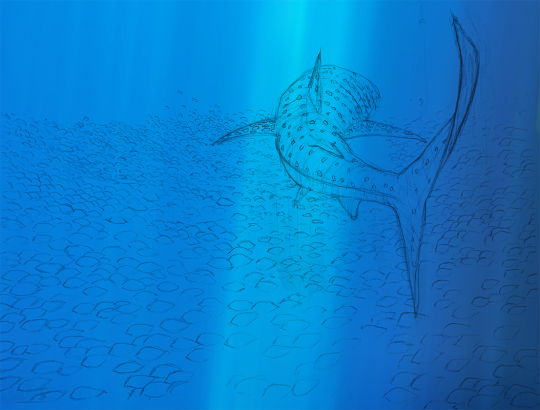
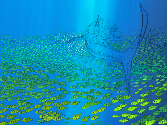

First sketch > Flat Colors > Finish | x
#whale shark#art process#art steps#ocean art#marine#sea life#golden trevally#schooling fish#pilot fish#swimming#diving#sharks#coloring#art tutorial#painting#drawing#artists on tumblr
341 notes
·
View notes
Text

#artist#art#drawing#painting#procreate#illustration#tutorial#art tutorial#step by step#sakura blossom#how to draw#drawing tutorial
82 notes
·
View notes
Text
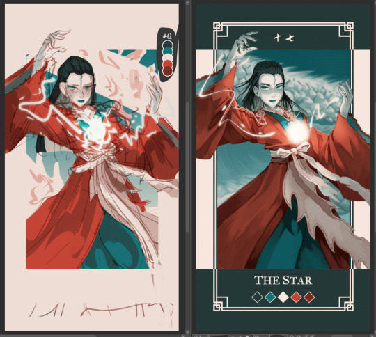
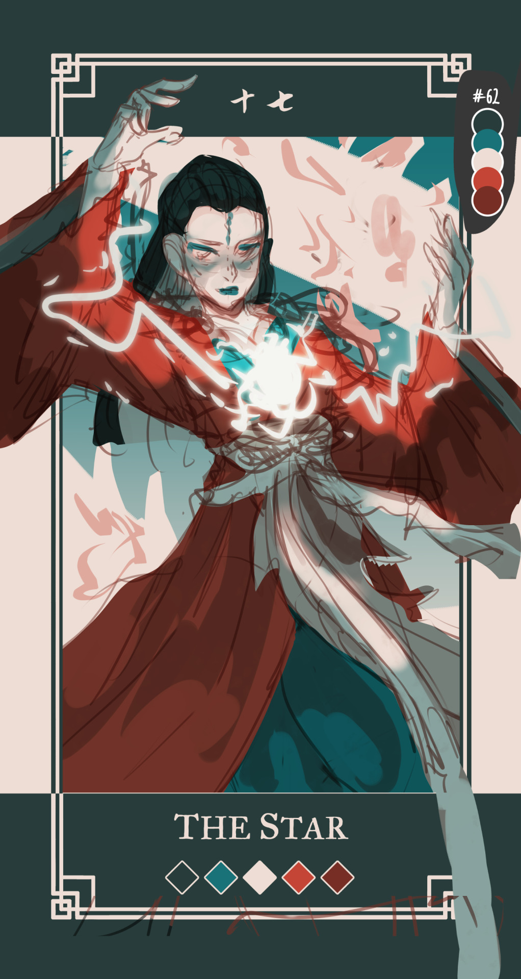
Had few people reach out on instagram to me about my art process and how tf I work with a 5 color palette, so I decided to make a post with each step explained.
Please note that this is just my workflow and what works the best for me - doesn't necessary mean it will work for you! Only advice I can give is to fuck around and find out what feels right for you 🫵🫵🫵
Step by step explanation + screenshots under read more. I use Clip Studio Paint for everything, most of the tools and functions are available in other drawing programs too, you may just have to spend some time googling to figure out where is what.
Every card you see is completely illustrated with five colors, using various layer modes and low opacity to mix and get different colors for me to use
Since I decided to work with limited color palettes for this project, I look at the card, character and then pick a color palette that I think suits the vibe the most from my color palette sheet. Color in the card frame and then start a messy sketch of how I want the pose to look like.
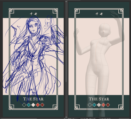
I used a 3D model to get the perspective of the pose right to use as reference. You can find the poses under Material -> 3D -> Body type and then click and drag the body you want from material into your canvas
You can change the body shape and height by going to the wrench tool in the tool bar and then "3D drawing figure" - play around with it and see what works the best for you!

I place the model and play with the camera around until I have the pose I want

I trace over the pose and add the character details and adjust some things until I'm happy with the second sketch.
Then I lock the opacity of the sketch layer, and use a darker color from the palette to change the lineart colors. Change the sketch layer mode to "Multiply" and set the opacity to 80%. When you set a layer to multipy + lower opacity, the lineart color will turn darker depending on the color layer put under the multiply layer.
Here is how it looks like in Normal layer mode + 80% opacity
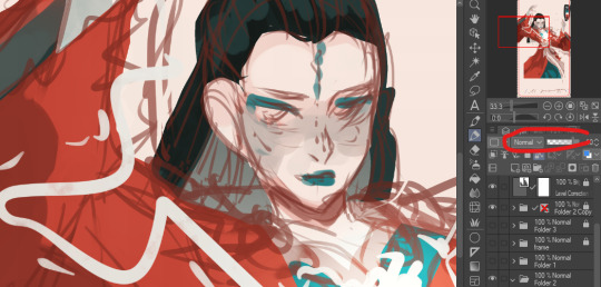
and here is the sketch layer in Multiply mode + 80% opacity
4. I start laying down rough colors and shading colors to get an idea of how I want it to look later. To get various shades, I either color pick shades from the multiply lineart shade or lower my brush opacity and blend in two colors to get the result I want.
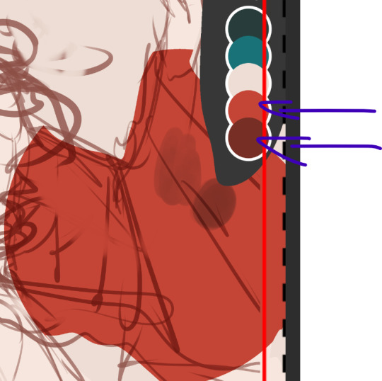
here for example, I use the bright red as my base color, and then lowered the opacity of my brush and lightly paint over the base red with the darker shade of red to get in total 3 different shades of rade. If you want to check the color value of the three shades, you can create a New layer -> correction layer -> hue/saturation/luminosity -> and set the saturation to the far left

I'm happy with the shades of gray and will keep using them. If I want to add another darker shade of red, I will pick the color created by the dark red + multiply layer

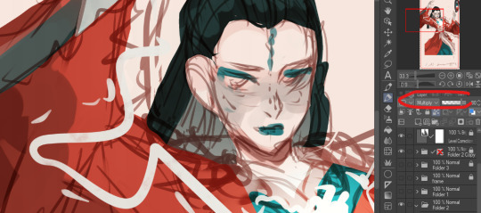
and I keep working like this, playing around with different layer modes until I have a rough colored sketch. I ONLY use colors from the color palette
I make a rough background but tbh my background drawing skills is non-existing so they usually exist on a simpler side LOL

I clean up the background, then clean up the sketch to a more clean sketch layer. I used to lineart everything but stopped doing it since I usually end up painting over the lineart and render it anyway so might as well save myself the extra step. I try to keep the sketch clean, but also not super clean, and change the color once again and set it to multiply + 80% opacity. don't shy away from using many layers for this clean sketch part, whatever works the best for you!
I tend to keep most of the lineart in one layer, EXCEPT for the eyes, which I will explain later why.
I use different layers to put down the colors, that way if I change my mind and want to change the colors entires for a certain part, I can just lock the opacity on my layer and change it there without getting in the way of the other colors. I group the clean sketch + colors into one folder: They usually look like this

I roughly put down the colors to get an idea how I want the folds and shading to look like. The only part where I do spend time properly coloring things is the face. After I'm done with it, I copy the entire folder and rename it to backup, lock it and untoggle the eye icon so it is not visible anymore, and then drag it down to the very bottom of the layers so I will not be touching it anymore. This is a back up in case something goes wrong and you want to be able to access separate layers again.
You can also save the file as a new file and keep the old ones with the layers intact as a back up. I don't like doing it bc I don't like having 3402 files lying around
and then I merge the sketch and color layers together EXCEPT for the eye lineart, I still keep that separate. This the part where I will be abusing my color picker (alt) a lot. I like to render with all the background toggled off, that way I can color pick directly from the transparent background and use that to erase colors as opposed to switching to the eraser tool:

the reason I do this is because I like to use a textured brush for rendering, and i don't know how to create a new eraser with the same texture, so I just use the transparency to erase things. The top right corner is me using the same brush to erase the color
when I render on one layer, I start with the things that are in the "back" and where I know it might get painted over a bit later. I think if you have done gouache/oil/acrylic paintings before, this step won't be too hard to understand :) for example:
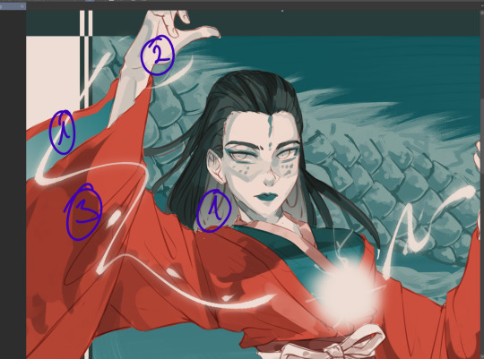
I would start with the back of the hair and sleeve (everything marked as 1), and then move to the hand, because the hand is "on top" of the inner sleeve, and then move to the whole sleeve, since the sleeve is covering the inner sleeve area + hand
Sometimes, I will also select certain parts and copy paste it into a separate layer to work with because I know that during the rendering process this part will get painted over a lot and having it on a separate layer makes it easier for me to keep the shape of things and then render it later:

for example, the rubbon on her belt I selected and copy pasted it into a new layer, because when I render the sleeve it will get painted over a lot. Make sure your selection tool is set to "add to selection". This way, when you are selecting a new area, it will add to your existing selection, as oppossed to remove the old selection and start a new one
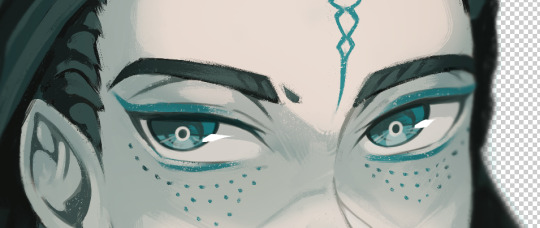
This is why I keep the eye lineart as a separate lineart, because I I don't want to have to draw the eyes again when I'm painting over it, so instead I will clean up the face, add eye colors and details AND THEM marge it with the rest to clean up the lineart

this is how she looks like after rendering, and now it is time to add the details such as dramatic lightning and the lightning ball. I create a new layer above the rendered image, fill it with dark color and then toggle the "Clip to alayer below"
This means that the colors will only fill up according to what is in the layer below. Then i set the clipped layer with the solid color to multiply, and lower the opacity. Play around and see what feels the best for you. For this one, I'm keeping it at 40%


Then I draw the electric ball on a new layer

in order to get a glow effect, I duplicate the layer of the electro ball, and then we will apply Gaussian blur to the layer underneath the "normal" layer.
Go to filter -> blur -> gaussian blur and play around with the slidr and see what works for you
once that is done, I go back to my darker shade multiply layer and use the soft eraser opacity to 50-60% to erase parts for the dramatic lightning. I don't really know how light works so I usually just eyeball and gauge what looks right 🫠🫠🫠
I'm happy with this, but I want to add more glow, so I will create a new layer above the character, but below the electro ball and set it to "overlay mode", and then use the soft airbrush tool to lightl add some more lights to the parts I have erased

Then I make another copy of the folder, lock it and put it away, and merge all the layers into one again. I keep the background and electro ball as a separate layers, and start using the blur tool to add some depth into my art:

I blur out the entire background, and then some bits of the art that are more in the back or in the front - play around and see what looks the best for you
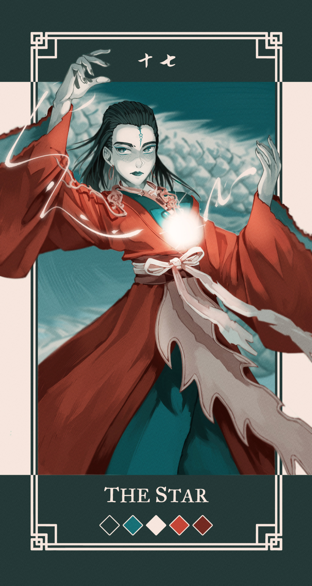
After aaaall of this is done, as the few last steps, I create a new Level correction layer that goes on top of everyyythiing to correct the colors a bit, make the dark bits pop out a bit more and the lighter bit pop out more too.
As the final last step, I like to add a noise filter to give my art some texture.
Create a new layer, and put it above the Level correction layer, and set it to Overlay. Make sure that both level correction and Noise overlay layer are NOT in a folder, otherwise it will only affect the images within said folder
to create noise, go to filter -> render -> Perlin noise. Set Scale to 1.0 and then play around with Amplitude and Attenuation to see what looks good to you
You can see the differences here, left is without any level correction and noise filter, and right is the final product :)
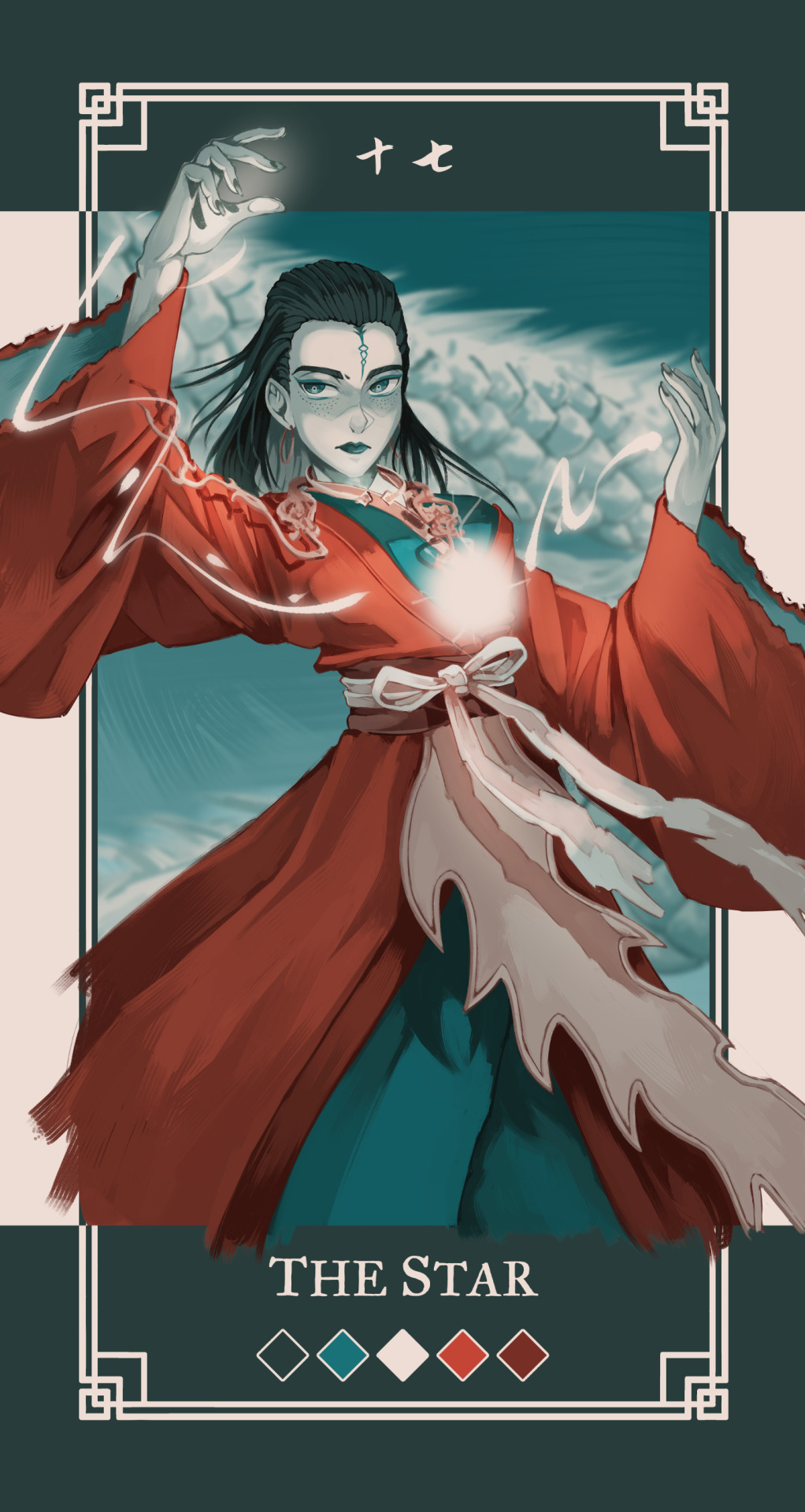
I hope this was helpful in some way, if anything is not clear let me know!
#szynkART#tutorial#art tutorial#step by step#clip studio paint#seriously when is clip studio paint gonna sponsor me LOL#kang jin star#black myth wukong
35 notes
·
View notes
Text

How to paint eyes ฅ^>⩊<^ ฅ ✨
Link bellow
#anime art#digital art#clip studio paint#digital illustration#posted art#original character#oc#oc art#art tutorial#art tips#assets#step by step#art process
7 notes
·
View notes
Note
Out of curiosity, would you ever do commissioned masks? Either way your work is absolutely gorgeous, I love seeing when you've made something new
I've been vaguely considering it! but there are a lot of wrinkles I'd need to iron out first (fair pricing, fitting a mask to a person who is not only Not Me but also possibly on a different continent, shipping a semi-fragile papier mâché object to said continent etc.). It would certainly have to be a case-by-case kinda deal where you'd have to approach me with your budget and concept so I can judge if it's something I'd want to take on.
TL;DR: pricy! scary! would require a lot of trust and communication! so Mmmaybe but not for the forseeable future probably
#A possible stepping stone towards custom work would be for me to come up with a design that fits most people —#— and can be taken off the base without destroying it#that way I could offer series of ready-to-paint blanks and/or finished masks#a project for the summer maybe? though i'd like to finish those tutorials I've been talking about first#asks#not art
10 notes
·
View notes
Note
Do you have any advice for drawing wolves?
Man I was gonna make a tutorial but idk about any good solid advice :’> I guess drawing them in different styles helps sometimes >> but there’s def good tutorials out there that make it easier ^^💖
#i mean first step is going back to 2007 and opening ms paint while your edgy music playlist is on#next step is have fun with it#Hsjsbdjd#pix answers#i know this doesn’t even help but thank you for asking ;v;💖#this is all I used to draw as soon as I picked up a pencil =w=#but i still have tutorials saved because you always keep learning new things#specially teef and anatomy
49 notes
·
View notes
Text

1. Paint the overall shape of the flower.

2. Paint the center shade(?) of the flower(??), paint the center petals over them(???)

3. ....success???!?
#original art#repost of sorts#gouache#gouache painting#gouache illustration#not a tutorial at all 🤪#more like an attempt to remember how exactly I painted this flower 🤪#mayhaps I should try painting another flower just so I could remember the exact steps 🥴🙃#camellia#flowers#plants#artists on tumblr#illustration#traditional art
10 notes
·
View notes
Text
I have opened my Ko-Fi shop! I published my basic painting tutorial here. If you are just getting started painting, or want some tips, check it out! I hope to add more tutorials, and other products, moving forward.
#customkits#hobby#fun#painting miniatures#table top games#star wars#dnd#artist on kofi#commissions open#painting tutorial#step by step
7 notes
·
View notes
Text
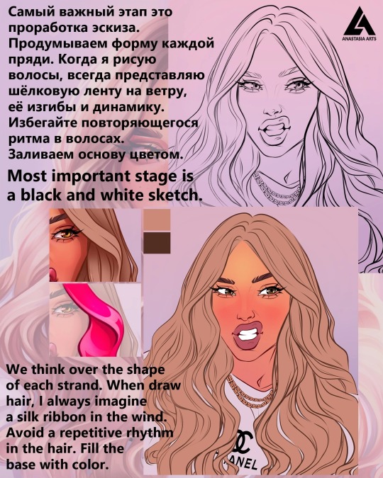
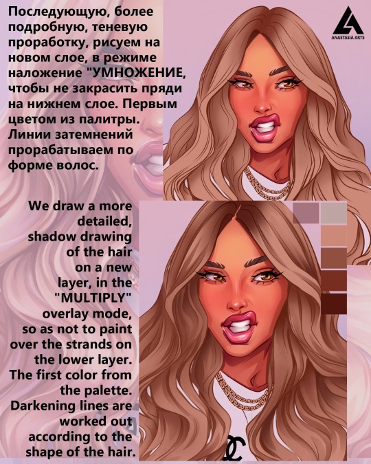
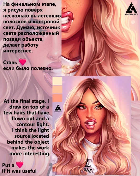
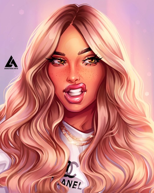
I often notice that when working with light, curly hair, artists have the most questions.
Today I will tell you step by step how to draw them 👌
Put a 🧡 so as not to lose.


#digital art#artists on tumblr#digital illustration#digital commisions#digital portrait#tuturial portrait#tutorial process drawing#drawing process#step by step#step by step drawing#art help#art resources#drawing tips#art tips#digital art hair#art commisions#tutorial paintings#tutorialart
56 notes
·
View notes
Text
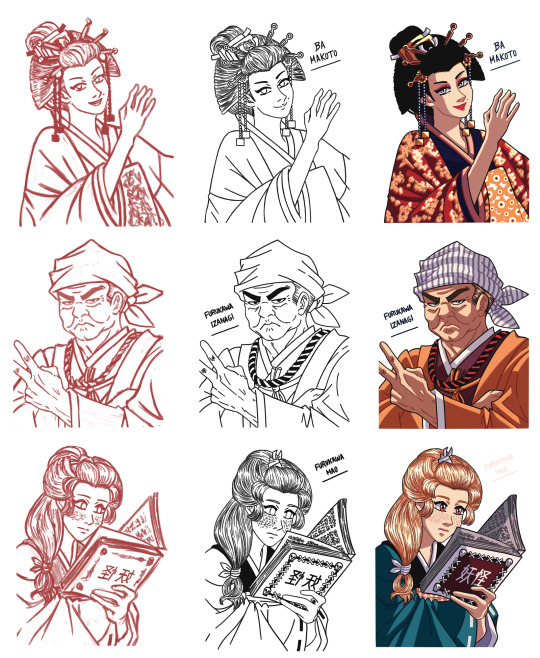
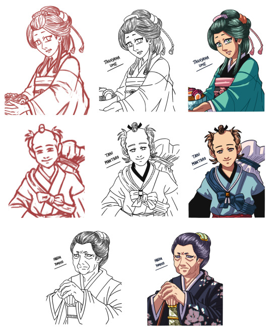
Here's a Step by Step compilation of the sketch (except for old Yumiko's because I forgot to save it, lol! 😂), lineart, and BG-free coloring stages of the Toyhouse portraits for my Hakuouki OCs that I've been posting recently!
#my art#no ai used#my ocs#hakuouki oc#my fics#a friend like you#original character#oc art#digital art#paint tool sai#oc#original character art#fanfic art#hakuoki oc#artists on tumblr#my wips#tutorial#step by step#ba makoto#tani mantaro#takayama ume#furukawa izanagi#maeda yumiko#furukawa mao
7 notes
·
View notes
Text
Painting practise with arm anatomy.
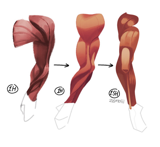
#started the first arm with past knowledge with painting and it didn't look good to me so I watched a marc brunet tutorial.#im so glad that I finally figured out the steps to paint stuff. tho I still have a long road with painting.
21 notes
·
View notes
Text


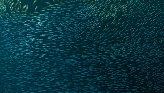
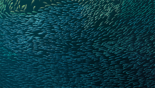
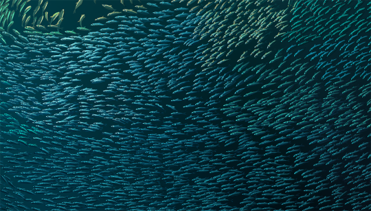
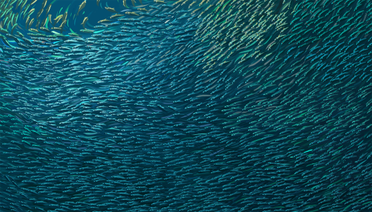
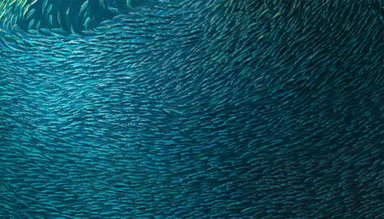

Painting a Bait Ball (in baby steps) | x
1. Line art and flat color 2. Sardine eyes 3. Sardine body highlight and dots 4. Sardine face/lips/gills detail 5. Sardine fins and shine 6. Adding more background fish and colors 7. Gradually mixing, rendering and re-arranging the flow of colors and values 8. Sunbeam and final polish
#artists on tumblr#art#nature#wip#tutorial#art steps#ocean art#bait ball#painting steps#art tutorial#painting tutorial#art process#drawing tutorial#art guide#drawing fish
58 notes
·
View notes
Text
The shape of all those rose petals might look complicated, but they are not THAT hard to draw! Let me show you:
youtube
#tutorial#how to draw#how to paint#instructions#basics#step by step#roses#flowers#art#drawing#Youtube
5 notes
·
View notes
Text

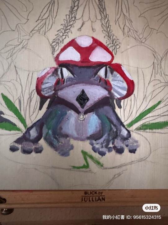

Frog 🐸
#female artists#aesthetic#frog art#new artist#trending#tutorial#step by step#green#cute#acrylic paint
2 notes
·
View notes
Text
Once upon a time, in a bustling city, a young woman named Amelia looked out of her office window at the concrete jungle that surrounded her. Amidst the stress and chaos, she found herself longing for something more. She yearned for nature, for open skies, rolling hills, and serene lakes. What if, she thought, she could bring these landscapes into her urban existence? And so, the seed of an idea was planted: she would learn how to draw landscapes.
Like Amelia, you may be yearning to create, to make your mark on a blank canvas. Well, you're in the right place! This comprehensive guide on "how to draw landscapes" will demystify the process, with step-by-step instructions to turn your artistic aspirations into reality. Let's embark on this journey together, picking up our pencils, brushes, and palettes, and create masterpieces from our minds and hearts.
#art#culture#art history#artwork#painter#painting#artblog#wall art#home decor#art tutorial#art techniques#how to draw#art help#drawing help#guide#step by step#landscape
50 notes
·
View notes