#painting tutorial
Explore tagged Tumblr posts
Visit Tumblr Blog
Explore Tumblr blogs with no restrictions, modern design and the best experience.
Last Seen Tumblr Blogs


Fun Fact
In Q3 of 2020, 31% of US users access the Tumblr app daily.
Text
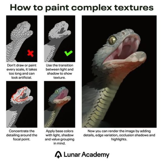
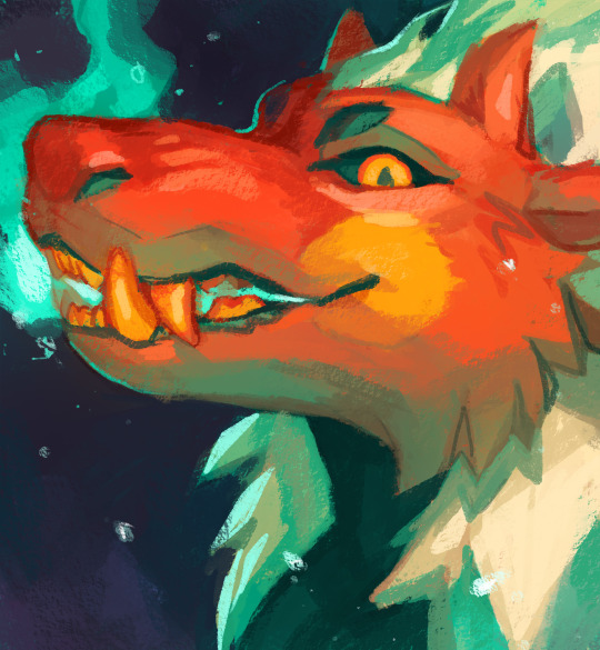
Excellent painting tutorial. In case you don't know the terms in the last description, "edge variation" means having "hard" or "soft" edges, where hard edges are crisp and good for high-detail, and soft edges are more blurry/smudged and are good for giving objects the appearance of receding in distance. In the painting above, the snake's eye uses hard edges, and its teeth and underside of the jaw use softer edges. "Occlusion shadows" are the absolute darkest parts because they are the areas where no light reaches, not even reflected or ambient light. They tend to be small and are used sparingly. Above, there's an occlusion shadow around the snake's eye. However, the shading of the eye was probably exaggerated to make it stand out more, since it's the focal point.
2K notes
·
View notes
Text


Hi guys, exciting new stuff has been added to my Patreon!
A color and light tutorial (with a speedpaint, art breakdown/analyses, step-by-step tutorials, and more) has been dropped. I've included previews of some of the many assets included in the tutorial. Check it out today!
459 notes
·
View notes
Text
youtube
Today's cosplay post is a tutorial! I sat down and put together a full breakdown on how I use fabric painting to get my cosplay details. In this world where it seems like everyone on the big social media pages has an embroidery machine, a desktop laser cutter, and a heat-transfer vinyl workflow, I feel like sometimes we need to get back to basics and understand how to achieve clean finishes without a $2k overhead.
Video is fully captioned using the script I read from (not auto-generated captions!) And includes timestamps for different parts of the process. I recreated Marcille's t-shirt from one of Ryoko Kui's illustrations in this video, but it's useful for way more than just shirts!
I've never tried my hand at video tutorials before so I hope this is helpful!
#cosplay tutorial#cosplay how to#fabric painting#painting tutorial#beginner tutorial#cosplay reference#cosplay ref#reference#dungeon meshi#delicious in dungeon#cosplay#my posts#Youtube
135 notes
·
View notes
Text
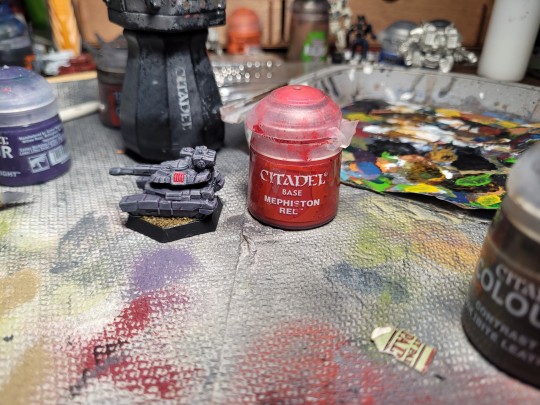
How to Paint: Glowing Heat Sink Effects
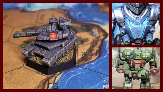
I already went over this briefly in text in the notes of the Awesome but I figured I should probably double this up and give it its own tutorial. Glowing effects are something that's extremely commonplace in a wargame like 40k but less seen in Battletech painting, despite being a great visual indicator of the effects of the game's heat mechanic. While it does take a little bit of work and some extra paints, adding these to your energy boats and pilot cooking clan mechs can be a great way to add a bit of visual flair to your forces.
Paints I Used
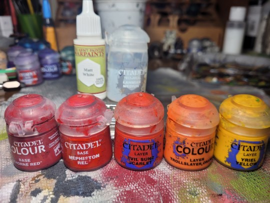
This is what I had on deck for this mini- substitute for your preferred colors, brands, and availability as you like
Army Painter Matt White (titanium white/pure white)
Citadel Khorne Red (dark red)
Citadel Mephiston Red (medium red)
Citadel Evil Sunz Scarlet (bright red)
Citadel Troll Slayer Orange (bright orange)
Citadel Yriel Yellow (bright yellow)
Citadel Lahmian Medium (thinning medium)
Method
Before you begin working on the heat sinks you want to complete the rest of the area around the place you want to do the glow effect. Light is an active environmental effect on a surface so you'll want to complete most of the base layers, highlights, shading, and other environmental effects before we work on the glow. Today our subject is a Manticore Heavy Tank that I used a modified pink-grey version of my weathered drab armor recipe to paint.
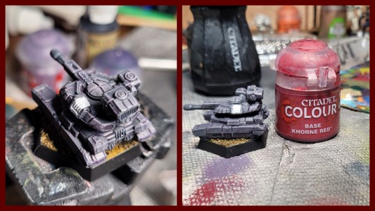
Once we've identified the sinks we want to paint and finished the rest of the model around them, our first step is going to be to paint the sink area white. This will increase the saturation on future layers and make the heat sink appear brighter, as well as giving us a consistent color to work up from. Try to stay within the vent area itself and avoid paining the outer frame- we want that to retain the color of the model. Once the white is dry, paint over all of it with our dark red color. Use one or two thin coats to do this.
Once the dark red is dry, go and get your medium red color. Make sure not to overthin this as we want to work this onto a pretty particular part of the model. Using the side of a small or medium sized brush, carefully paint just the ridges of the vent fins, leaving the dark red color in between. Leave this to dry briefly and then we can work on the interior of the vents.
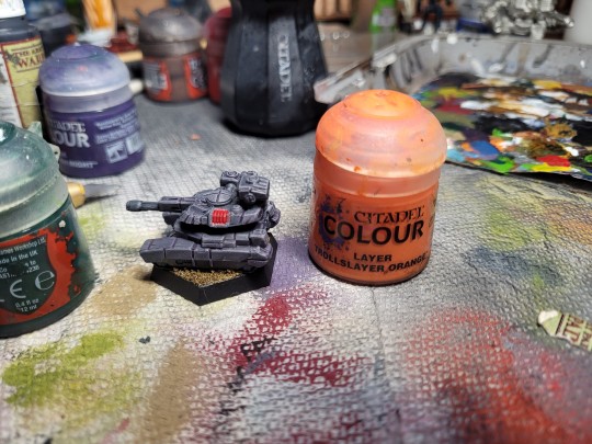
Get your bright orange paint and thin it pretty significantly- more than you would for a normal color. Then, take a very thin brush, load it with some paint, and carefully dab/drag it in between the vent fins. Capillary action should focus this thinned paint into feeding between the medium red fins and make the impression that the interior of the heat sink is glowing. Make sure to leave some of the dark red color at the tops and bottoms of the fins when doing this.
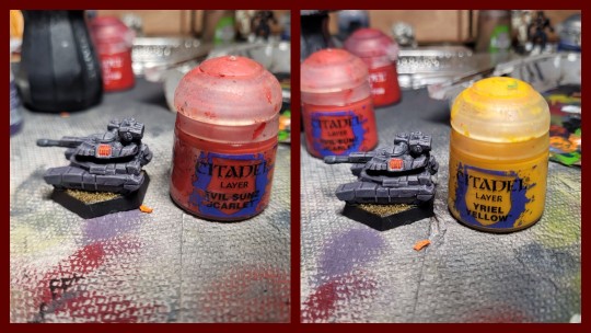
Once the medium red and orange are dry, repeat the same process with your bright red and yellow, but make sure to only apply the paint this time where you want the glow brightest. This might be a particular side of the heat sink but in this case it will be the middle for me, to follow the curve of the turret.
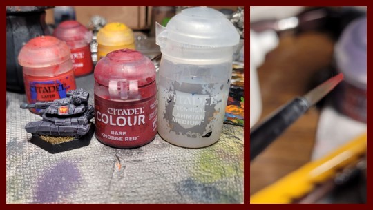
Finally, we will 'extend' the glow of the sink to the area around it slightly. You could do this by applying a quick and soft drybrush before you start using lighter colors on the sink itself, but I prefer to use a glaze for this as it produces smoother results. Once the entire sink is dry, take your darkest color (quick physics lesson: reflected light will always be less intense than the source) and some thinning medium. Mix the two together at a 1:1 ratio and then add some to a medium brush with a fine tip before wiping off the excess on your pallet. The brush should be just damp and produce a thin and regular line of color when dragged across your fingernail for the best results. Once you're happy, sketch the color onto the area around the glowing heat sink with little motions. You should be building up an even, translucent layer of color over top of your base paint job, making it look like the heat and light of the sink is radiating out into the area around it.
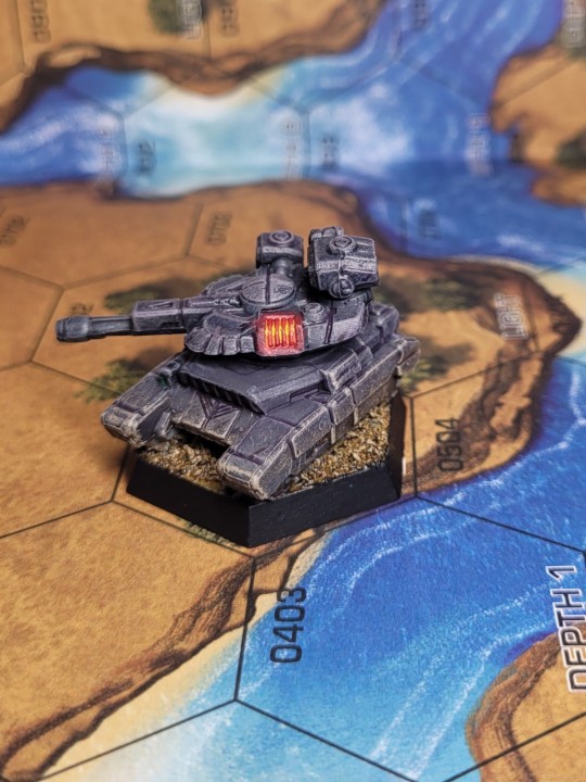
And now are heat sinks are done! I've painted these sinks with fairly high contrast hot tones to pop on the dull purple model but you can easily change the colors around to suit your needs. If you want darker, more desaturated glow, start with a dark brown instead of a dark red and have your brightest highlight colors be medium red and bright orange. If you want to go hotter, consider trading the red/orange/yellow pallet for blues and whites. More exotic forms of glow could be rendered with greens or purples. Get weird and have some fun with it!
227 notes
·
View notes
Text
I made a detailed rock painting guide (Includes some rendering basics too!)


You can find more tutorials on my Ko-Fi Shop if you've found this helpful! 🫶🍃
#art#drawing#tutorial#art tips#artistontumblr#artistsontumblr#digitalart#digitalpainting#art advice#rocks#painting#painting tutorial#advice#art help#drawing tips#art tutorial#art resources#rendering
93 notes
·
View notes
Text
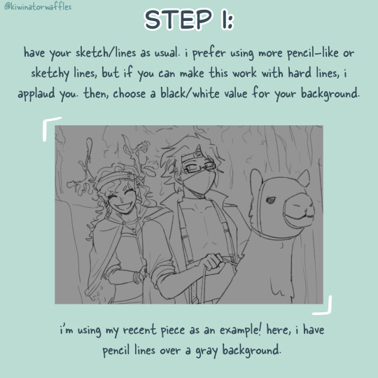
HOW I PAINT WITH GRADIENT MAPS

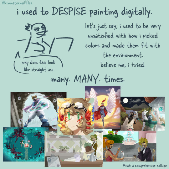
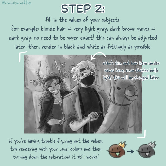
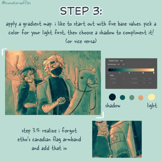

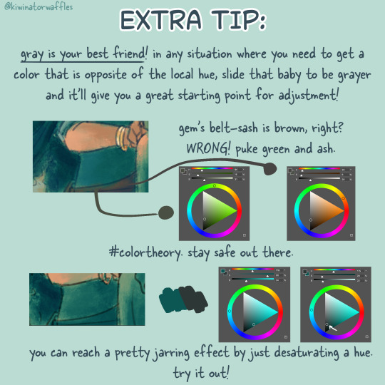
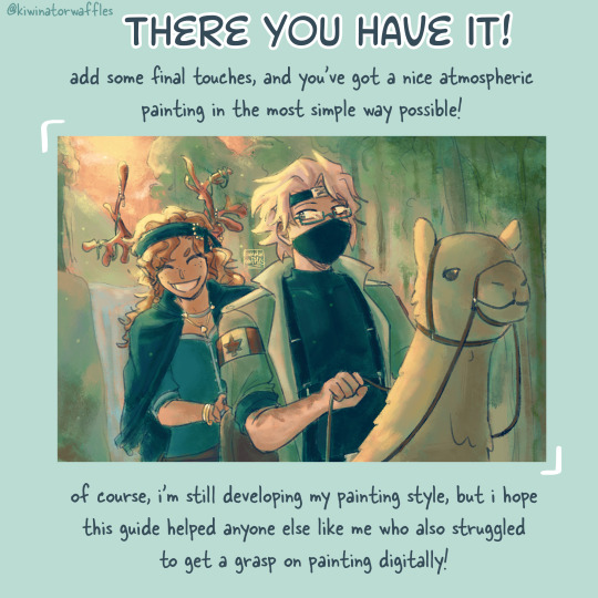
the post by arcanescribbles where i learned this technique! check out their works!
an even simpler version of this is to just lightly brush colors over a base color in the background and then go off of that. otherwise, i hope this can help!
a full version of my example piece here
#congrats to etho for being in all 3 of my gradient map paintings so far#art tip#art tips#art tutorial#painting tutorial#digital art tips#art help#drawing tips#digital art#kiwi’s scribbles#kiwisonator
753 notes
·
View notes
Note
Really curious, but how do you do the coloring part in your artworks? It looks so juicy and nice. Especially interested in how you did it with the recent Enki sketch you made! (the one with blue, yellow, and many many more colors)
While I couldn't really explain the methods in a brief text post, I did make this vid to articulate my thought process!!
youtube
finished art :))

#featuring my voice and fun jazz#corns ocs#corns empyrean#corns empyrean nem#corn ask :^]#corns art tag :0#art tutorial#painting tutorial#speedpaint#artists on tumblr#digital art#paint tool sai
87 notes
·
View notes
Text
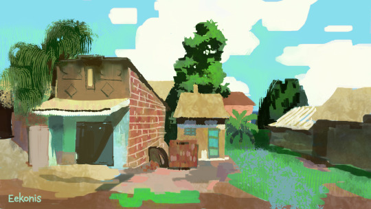
Here, take my industry secrets.
I don't want people to spend their money on art school when I can make resources for free for them.
Hey here's a step-by-step guide to making concept art pieces using the industry "Collage > Painting" pipeline. It's how artists pump out a shit ton of concept work for their bosses at record speeds. Intended for newer artists!

For more stuff join my discord! I'm a transfem streamer who makes art stuff!
#art#artist#digital art#illustration#digital painting#digital artist#tutorial#art tutorial#digital art tutorial#digital painting tutorial#painting tutorial#concept art#concept artist#concept art tutorial#transfem#transfem artist#trans artist#transgender artist#transgender
189 notes
·
View notes
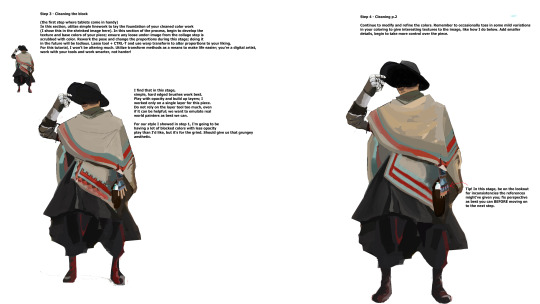
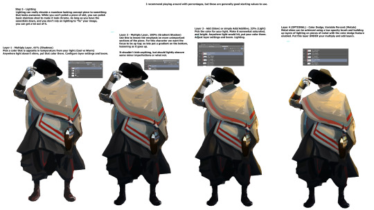
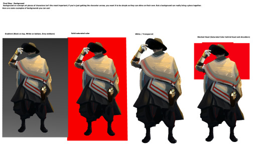
Text

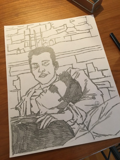
I painted over things after the initial shading to clean up the edges/better the forms and colors. Here's it layer by layer:


124 notes
·
View notes
Note
Hi! I was looking at some of your painterly stuff, and I am in awe of the emotion, softness, and texture of the pieces. I wanted to ask what your general process of making painterly artwork is? Do you freehand without a sketch, how long it takes you to finish a piece like that, how you utilize layering, etc!
You are, of course, not obligated to share about your process or answer questions! If these questions are too invasive on your work, I completely understand. Thank you!
My process for those particular pieces is super loose! I try to use art fights as an excuse to try new color combos and try to get fast and comfy with painting bc I rarely do it it any more. But basically it looks like this!
Loose sketch, I think this was the second or third sketch that I thought looked the best :)

2. I normally start with the complementary color to the character's main color (which was red here) unless I have a specific lighting goal or color palette in mind

3. I block in colors under the sketch layer! In this case I was just picking whatever colors but if I'm not feeling too confident I do color pick from photos or palettes I find on google images.

4. My emotional support overlay layer, of course <3. Not much thought process here, just trying to make it look good + more contrasty!
5. Then I make a layer on top of the sketch and just go ham! Try to separate the light and shadow, detail the teeth and stuff. I start with big blendy brushes and then scale down to smaller brushes towards the end.

All of my art fights take like 45 min-3 hrs (I definitely struggle on people faces so much). I think this one took a bit over an hour, which is where most of them fall! The one below was closer to 3, you can see I used a second sketch layer and did a lot of tweaks.
And finally, especially if you're focused on improving your skills, always collect inspiration pictures from artists who you want to emulate! My art fights draw LOADS of inspiration from @ikrutt + @polararts for example. I hope this gives you some insight to my process! As always, if you want to fuck with my brushes msg me, I can email you them :)
232 notes
·
View notes
Note
can you do a tutorial of the nuso esva rainbow-like skin?? still can't color him as well as you T^T
here's a tutorial i made a couple years ago :3

some notes:
make sure your shading is pretty much done before you start doing the holo effect
make your object a bit darker than you want it because the holo effect will make it appear lighter
i put the holo effect on a separate layer and use a soft round brush at 10-20% opacity
here's a holographic glitter ball i doodled more recently for practice

notice how the colors closer to the light source are lighter and the colors farther from it are slightly darker (but no less saturated!) and shift in hue a little. a great way to study the way holographic objects refract color is looking at a CD in sunlight. a great way to study how light behaves on curved holographic surfaces is buying one of those holographic makeup bags that are like $5 in stores or on aliexpress and look at them in different lightings
96 notes
·
View notes
Text
How to transfer sketches to watercolor paper
Ever created a drawing you really love, then decided that you wanted to paint it in watercolor (or transfer it to another type of paper)? Or maybe you just want to avoid smudges on your good paper? Or transfer a digital sketch onto paper?
This tutorial will help!
Start with a sketch on plain cheap copy or sketch paper (print if you need to, or photocopy your original sketch if you don't want to ruin it).

Next, flip the paper over (so you're looking at the blank side) and put it on a lightbox. Don't have one? No worries! Hold it up to a window, or put it on your iPad screen at max brightness.
Now, take an (ideally HB non-mechanical) graphite pencil and scribble all over the lines shining through, until it looks like a messy copy of your original sketch.
(First image is of just the graphite back, second is of the corner flipped so you can see the original sketch too)

Now, attach it to your nice paper graphite side down. Use tape on two corners (so it stays in place, but you can peel up the other corners to check it).
Tips for easily released tape: Cut the tape to your desired length and put it on fabric, like your pants, and pull it off. Repeat a few times. The oils from your fingers plus the fibers will make it less sticky!

Now, trace the original side of your sketch with a ball point pen! You need a very sharp tip and to be able to see where you’ve drawn, so definitely use a ball point pen for this. Use firm pressure!! (Your hand will probably be sore if you do this all at once). Make sure you’re on a hard surface, too.
Tip: start in a corner you can flip to check, and make sure it's transferring properly. If not, add more/a softer graphite to the back and/or press harder.
When you're done, you'll have a light but visible pencil guide to paint right over!

Want other tips? Send in an ask or check out my tutorial tag!
#watercolor#watercolor tutorial#art tutorial#painting tutorial#traditional art#illustration#artists on tumblr#paper transfer#tutorial#art tips
373 notes
·
View notes
Text
youtube
Watercolor Tutorial with Yoichi Nishikawa
"Follow along and learn more about the whimsical beautiful world of background art with Yoichi Nishikawa. In this 30-minute tutorial Yoichi walks through the process, shares techniques, and introduces the tools used to create his signature airy cloud backgrounds. Academy Museum family day programs are made possible in part by a grant from the City of Los Angeles Department of Cultural Affairs. To protect the health of our community, the Academy Museum enforces health and safety protocols that are kept up to date on our website." - Academy Museum Youtube Description
#art#traditional art#animation pipeline#watercolor#watercolor tutorial#background painting#studio ghibli#yoichi nishikawa#traditional art tutorial#painting tutorial#backgrounds in animation#academy museum#watercolor tips#watercolor hacks#watercolor lesson#watercolor painting#Youtube
59 notes
·
View notes
Text


been trying to improve my values and color through maprunch and photo studies and painting demos. haven‘t done many and it reaaaaally sucks when the pieces don‘t turn out how i want them to, but i feel like i‘m getting a bit better through this practice. tutorial below:
————————
I also tried to establish a workflow, so i don‘t get overwhelmed by tring to capture all the information at once.
At first i‘m looking for composition. I want to either put the horizon line at the upper 1/3 mark, or the lower one, never right in the middle (because thats boring). And the focal point / point of biggest contrast goes on one of the vertical 1/3 lines.


then i‘m looking for big shadow and light shapes. it’s easier for the eye to group smaller shapes together. kind of abstract.

Then comes the hardest part: colors, saturation and contrast. i think i still stay too much in the grays and whites. i almost never go into black and my contrast is always a bit low because of that. then i oversaturate stuff to keep it differentiated from one another because of the lacking contrast xDD
This is a very good example of this: everything is very oversaturated and bascially screaming at the viewer. everything is loud, contrasted and saturated and thus lacks a focal point, even though the buildings on the side are pointing towards the middle building.
Doing these studies is kind of boring sometimes, but very helpful in pointing out my weaknesses and hopefully one day i have learned so much from them, that i can use it to draw some imaginary scenes.
22 notes
·
View notes
Text

How To Paint: Lense Gemming
In the Heat Sink tutorial I mentioned that glow effects are really common in 40k paint schemes but see less use in Battletech so let's look at something that I frequently see go the other way- flat painted gem effects for lenses. These work well for Battletech energy weapons, but they can also be used for sensor clusters, glass eyepieces on things like a space marine helmet, or jewels on a more fantasy inspired mini. There's a variety of ways to do these- gem or contrast paints over a metallic base coat, gloss varnish, or just splashing the area with a little color all work just fine- but today I'm going to go over my basic recipe for a green reflective glass effect.
Paints I Used:
For as much of a love/hate relationship as I have with GW citadel paints their color system is remarkably good at getting proper highlight colors for things like this- I'm largely cribbing my color choices here from the old Duncan Rhodes videos and you can feel free to sub out for whatever colors work best for your particular project.

Citadel Caliban Green (dark green)
Citadel Warpstone Glow (green)
Citadel Moot Green (light green)
Army Painter Matt White (titanium white)
Method

Once you've completed the area around whatever you want to gem, start by painting this with your darkest color. Here we'll be using our dark Caliban Green, focusing on the Starslayer's two large lasers. If a little gets on the rim around the lense at this step that's fine.

Once your dark green is dry, take a very small brush and thin down your mid-tone green. Choose one of the bottom 'corners' of the lense and start carefully applying paint there. Ideally, we want to paint a 'crescent moon' shape centered on that corner, with a fatter middle section and thinner tips, leaving the darker green visible in the lense center and one of the upper corners. If the detail proves to small or your hand-eye coordination is too unwieldy for this, sketching a 'C' shape or simply putting a diagonal line thru the lense and coloring the lower half with your light color will also work at this scale.

Next, take your light green color and thin it with your smallest brush. Very carefully apply a thin line of this color along the outer edge of the area you painted with your green midtone.

Finally, apply a small dot of pure white to the upper corner of the lense that remains dark green.


And the gemming is done! Once you get the basic idea down you'll find that this is a pretty versatile technique (I use a variation of it for canopy glass as well). Definitely worth giving a try, and if you aren't a fan then like I said there's plent of other things to do to achieve similar results.
110 notes
·
View notes
Text
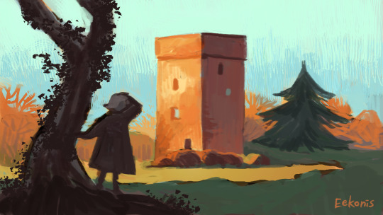
Phantomarine Painting Tutorial
Happy Webcomic Day! 🌈⭐
Here's a tutorial on how I paint Phantomarine!


And a full image of the tutorial if you'd like to share it around. Cheers!

119 notes
·
View notes