#such a difficult color palette. white... dark grey... AND yellow
Text

My Mane Six Human Design Headcanons. More about the design process under the cut:
Twilight Sparkle: Considering that she was Celestia's student and more into books and studying, I wanted to give her a preppy look that gives off the vibe of a school uniform. I decided to make her clothes have a blue-purple color palette, with her sweater being blue and her skirt being a plaid blue, indigo, and purple. I gave her grey-ish black knee-high socks and dark purple shoes so it could blend in and not stick out like a sore thumb, like if I gave her white socks instead.
Pinkie Pie: I wanted her clothes to give off a colorful and pastel aesthetic. For inspiration, I used the Japanese children's clothing lines Mezzo Piano and Daisy Lovers as a reference so I could get the vibe I was looking for. In general, I used jojifuku fashion to design Pinkie's shirt and skirt. Her skirt also has her cutie mark on the left side of the skirt.
Fluttershy: This was my favorite one to do! Using the fashion of Winx Club as a source for reference, I implemented some flowers and butterflies in her light green top and pink skirt. Because I didn't want to leave out the yellow part of her original design, I added a yellow sash to her skirt.
Rarity: This was a difficult one for me, despite the simple dress. I didn't want it to be too intricate, but I didn't want it to look bland either. Sadly, I'm not so happy with how it turned out, but it is what it is. I still kept her wavy hair style, and I added a white necklace to her outfit. Her dress has a diamond pattern on the bottom and she wears shoes with gems on them.
Applejack: I used the cowgirl aesthetic so I could create her design. On the right, I added a little braid in her hair as an artistic choice, and turned her hair tie into a cute bow. Her shirt is a light green plaid top with a light yellow undershirt underneath. To keep in the apple part of her character, I added apple patches to her jeans.
Rainbow Dash: I wanted to give her more of a tomboy look, nothing much to say. Under her shorts are black leggings that she cut herself to fit her style. Her shirt has a small rainbow on it, referencing her cutie mark with the red yellow and blue. She wears boots.
#Sumechiart#mlp#my little pony friendship is magic#my little pony#mane six#mlp redesign#twilight sparkle#pinkie pie#fluttershy#rarity#applejack#rainbow dash
31 notes
·
View notes
Text
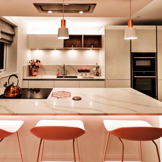
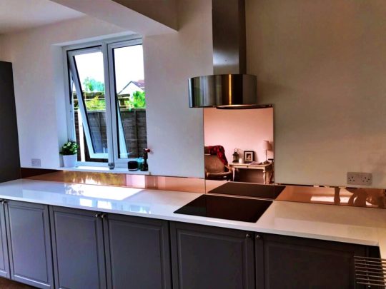
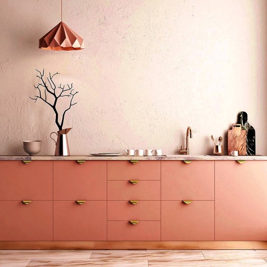
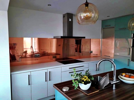
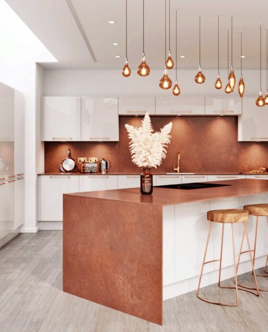
How to Use Rose Gold in Your Kitchen
How to Use Rose Gold in Your Kitchen if you're looking for a modern yet classic color palette, try pairing rose gold with navy. Both are light-absorbing colors, so the gold will radiate without looking garish. There are numerous ways to incorporate it into your rose gold kitchen, and it doesn't have to be overpowering. The color is most effective when paired with classy colors. Read on for some ideas. To create a sophisticated and elegant rose gold kitchen, try using a mixture of rose gold and grey.
Rose Gold Kitchen
Modern
If you've decided on a rose gold kitchen and grey color scheme, you may want to consider a worktop in contrasting colors. The contrast will help the color to stand out and counteract the dull tones of the kitchen. This idea includes a worktop in contrasting blue, which brings out the tones of grey and also gives the space a retro vibe. Yellow is also a great choice, and you don't have to use it as a full wall - try a large print or a backsplash instead.

Rose Gold Kitchen
A rose gold kitchen in these shades can be a dramatic addition to a room, and you can use accessories to add color and texture. Remember that contrasting colors tend to stand out against a dark background, so use bright colors on accessories. Try to look for dutch ovens in ombre or bright shades. This way, you can make your kitchen look even bigger. By adding these colors to your kitchen decor, you'll be sure to create a striking room.
Rose Gold Kitchen
The combination of rose gold and grey is also perfect for a modern kitchen. For instance, a rose gold kitchen sink is a great way to draw attention to an area of the kitchen. Rose gold taps and sinks can be very sophisticated and are a great alternative to islands. You can even buy rose gold appliances that don't compete with the rest of the decor, such as kettles. You can even buy rose gold kettles and teapots to create a unique focal sink area in your kitchen.
Rose Gold Kitchen
The combination of rose gold and grey is a great way to add color to your kitchen without breaking the monotone theme. You can even use a rose gold kitchen to add sparkle to your appliances and other accessories in your kitchen. Adding rose gold isn't too difficult and you can experiment with many ways to add it without going overboard. Whether you choose a brushed rose gold knob or cup pull handle, rose gold will add a subtle yet striking touch to your home.
Rose Gold Kitchen
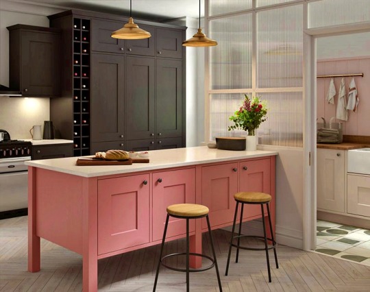
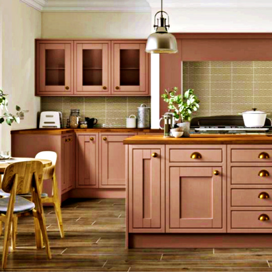
Traditional
Adding rose gold kitchen fittings to your kitchen is an easy way to create a sophisticated look without going overboard. These fixtures will look stunning when used in conjunction with grey worktops. For a dramatic effect, consider adding a rose-gold chandelier or pendant light over your island. A rose-gold pendant will add a striking touch to your kitchen, and a grey worktop will create a more muted, neutral atmosphere.
Rose Gold Kitchen
The best way to add some texture to a rose gold kitchen is to layer various shades of grey. Grey is a great balancing color and five shades of grey will look seamless together. You can use a grey floor to create more space on your floor. For an extra rustic look, add a few decorative touches, such as chopping boards in different shapes and hanging rails. A wood-effect Herringbone motif makes a kitchen look more spacious. Pair these pieces with dark grey cabinets to create a stylish yet practical kitchen.
Rose Gold Kitchen
For a bolder look, try a darker shade of grey. This hue looks stunning with a white kitchen. It would also look amazing on a tabletop, which is similar to the tone of the radiator. Use chrome accessories as accents throughout the kitchen to add a splash of color. You could also add some fresh flowers and fruits to the table to add an accent color. A rose gold kitchen with these colors will look incredibly stylish, and no one will notice that it's not your child's playroom!

Rose Gold Kitchen
A white and gold kitchen is an excellent option if you want to make a statement without breaking the bank. Gold accents are especially beautiful with the rose gold kitchen. You can include them in light fixtures and hardware for a sophisticated touch. If you have a limited budget, consider going with white and gold. There are endless possibilities with this combination of colors! And it's also very affordable. The most important aspect of decorating a kitchen with rose gold accents is that you know exactly what you're doing.

Rose Gold Kitchen
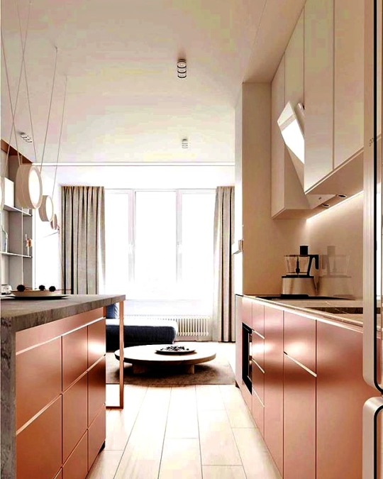
Two-tone
When choosing two-toned kitchen cabinets, keep in mind that two-toned schemes are more cohesive when all the cabinets are the same shade. However, if you're a fan of bold contrasts, choose a color combination with varying shades. In the following examples, you'll see how two-toned rose gold kitchen cabinets can add flair without overwhelming the space. If you don't like the idea of mixing and matching two-toned kitchen cabinets, choose other colors for accents.
Rose Gold Kitchen
Rose gold kitchen is a relatively new color and is also a great choice for a traditional kitchen. This warm, luxurious metal has a copper-like finish but is slightly warmer. It makes for a great replacement for traditional accessories and fittings. A great place to begin incorporating rose gold into your kitchen is the tap. It's one of the items that you use most often, so it's a good place to start.
Rose Gold Kitchen
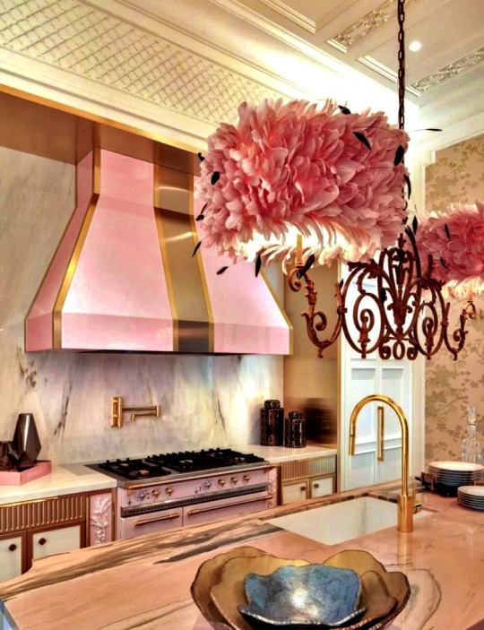
To add a touch of glamour to your space, add touches of the rose gold kitchen to the walls and cooker hood. A rose gold tap with a black Belfast sink creates a focal area in the kitchen and provides an elegant alternative to an island. Rose gold is also available in small appliances such as sink taps and pots and can be applied to your kitchen's cabinets and furniture to make it more aesthetically pleasing.

Rose Gold Kitchen
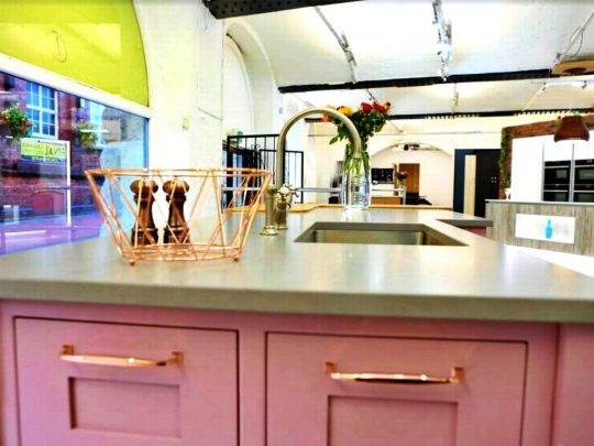
A rose gold kitchen isn't for the faint of heart, but the rosy copper handles on the cabinets match perfectly with the candy-colored walls. Mid-grey and teal work well together. An expanse of glass splashback mimics the glossy slab-style doors. These two-toned kitchen ideas will make your kitchen feel bright and spacious! So, if you're worried about the color combination, don't worry! Just keep in mind that grey will never go out of fashion!
Rose Gold Kitchen
Wallpaper
You can also find many options for grey and rose gold wallpaper. This romantic color combination is closely associated with jewelry and the precious metal, rose gold kitchen. This color combination will enhance the ambiance of any kitchen, whether it is modern or traditional. Besides plain, demure designs, rose gold wallpaper also comes in patterns such as stripes, leaf prints, and geometric prints. Here are some wallpaper ideas that will help you choose the perfect design for your space:

Rose Gold Kitchen
Appliances
If your kitchen is predominantly neutral and a little dull, a splash of color is all you need to add a contemporary edge. Rose gold kitchen accessories are a subtle and understated way to add a metallic touch without sacrificing the traditional feel of the room. A straight rose gold bar pull handle works well against light or navy units, while brushed rose gold cup or knob handles look fantastic on contemporary and traditional kitchens. Try adding a blushed handle to a feature dresser or cupboard.

Rose Gold Kitchen
If you're looking for an inexpensive way to inject a touch of rose gold into your kitchen, consider adding rose gold kitchen appliances. Toasters, kettles, and microwaves are all popular rose gold kitchen appliances. However, rose gold can overwhelm a room, so keep your appliances small and understated to avoid creating a cluttered look. Also, choose rose gold utensils that complement the overall look of the room.
Rose Gold Kitchen
Rose gold is the latest trend in kitchens. It splashed onto the scene several years ago but has recently become more popular. SMEG has recently launched a limited-edition range of appliances in a rose gold kitchen, including a retro-style Electric Kettle and a 2-Slice Toaster. You'll find a rose gold kettle at Williams Sonoma and other specialty stores. If you'd rather not buy appliances from SMEG, check out other rose gold brands that can fit in perfectly with the decor of your space.
Rose Gold Kitchen
Another option for a kitchen made from white and gold is a rose gold faucet. The rose gold faucet complements the white shaker cabinets. Stainless steel appliances look great with gold hardware. Coppery rose gold kitchen, which is a shade warmer than yellow gold, works well with white cabinets and cool white appliances. The kitchen's faucet is accented by golden bar pulls. They create a clean, elegant contrast between the rose gold and white cabinets.
Rose Gold Kitchen
Rose Gold Kitchen

Rose Gold Kitchen
Rose Gold Kitchen
Rose Gold Kitchen

Rose Gold Kitchen
Rose Gold Kitchen
Read the full article
0 notes
Photo
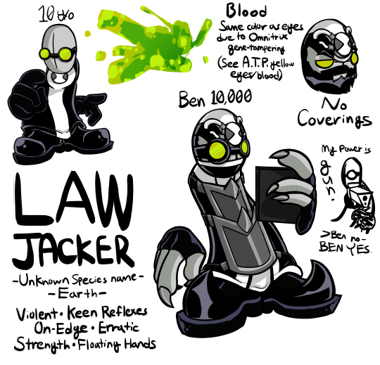
LAWJACKER {Ben 10/Madness Combat}
...Hello hello hello my dudes. How about a weird-ass crossover for your time? My explanation for this is that I've been on a bit of a Ben 10 kick lately (The Ink Tank keeps on appearing in my damn recommended lmao), and considering my current Madness Combat fixation... You get the picture. I decided to go more in line with the OS style, being that's what I have the best memories with (and I've honestly never been a fan of UA/AF's style). How he got unlocked this dude (save for it already being in the Omnitrix somehow)? No damn clue. Had some help from someone on Discord for the name: Other names I faffed around with were "Lawbreaker" and "Lawless". Either way, wonky to figure out what a 10 y/o would call this bundle of floaty limbs and murderous rage. Oh, he'll jack-up the law alright...
Info time! Prepare for a fuckton of text! Fokkit, have a read more-
Name: Lawjacker
Species: [UNKNOWN DESIGNATION]
Species Original Planet: Earth
DNA Donor: [UNKNOWN]
Omnitrix Location: Chest (10 y/o), Forehead (Ben 10,000)
Physical Qualities:
- Silvery-grey skin, texture of which feels similarly to clay. Skin is less elastic than human skin.
- Strange amount of similar-to-human characteristics, such as the ability to grow a beard.
- Four-fingered hands which seem to float from the body. Lacks proper shoulders as a result. Hands can only be taken so far away from the body without sustaining damage (signified by bleeding where the wrists would be) and forcing him to return to human form.
- Lack of ears and nose (and hair when younger). On face is a strange feature dubbed a "Facial cross" that seems to be over where the center of his face would be, intersecting down where the nose would be. Does have eyes and a mouth, though is capable of hiding either or both without inhibiting senses and the ability to speak, revealing eyes the same shade of green as his human form and his mouth having more pronounced canines.
- Extremely small (possibly nonexistent, further testing needed) legs combined with proportionally large feet. Surprisingly acrobatic and agile.
- Lack of distinction between neck, torso, and where the hips would be. Body shape is akin to that of a tube or column.
- Physically sexless (Though seems to lean masculinely, with a deeper voice and retaining the beard from Ben 10,000's base human form)
- Surprising physical strength despite lack of proper arms, capable of throwing blunt objects with enough force for them to easily pierce flesh.
- Keen physical reflexes and large amounts of endurance. High pain threshold and tolerance.
- More pronounced claws in older age
- Strangely reactive blood. Species normally has bright red blood akin to humans, but it can greatly and permanently change color in response to genetic tampering with the host. "A.T.P." units are a well-known example, having yellow blood from gene-altering for increased durability and physical strength, among other things. In the case of the Omnitrix's sample, tampering for optimal physical and mental status has conditioned Lawjacker to have green blood the color of the Omnitrix-wielder's eyes.
Mental Qualities:
- Sense of humor is noticeably off-color compared to wielder's usual humor.
- Keen reflexes, comparable to a "sixth sense" for sensing danger and watching eyes.
- Nature is immensely violent and aggressive. Coupled with his ability to sense incoming/possible danger, leaves him seemingly perpetually on-edge and often leads to immensely erratic behavior.
- Seemingly innate skill in combat and with weaponry in general. Melees, slug-throwers, energy weapons, bare hands. Oftentimes seen mixing acrobatics with weapon prowess and switching between weapons with ease, along with being prone to throwing his weapons.
- Sensitive to the presence of unnatural psychic phenomena, which this form consistently refers to as "Dissonance". This is most intense when in the presence of outright magic and other bizarre reality-altering phenomena.
- Sensitive to the scent of smoke. Particular form shows immense disdain for it.
- Not emotionally sensitive to the sight of brandished weaponry, immense violence, or gore.
- High pain tolerance.
Strengths:
- Very difficult to get the drop on. Keen senses mixed with being able to sense the presence of others and watching eyes.
- Agile and acrobatic despite bizarre anatomy. Coupled with physical strength, keen senses, and prowess with combat and weapons makes him a difficult combatant head-on.
- Floating hands, though not capable of reaching far, can still be used to bypass obstacles that would be impassable with attaching lengths getting in the way.
- High pain tolerance mixed with violent nature makes his onslaughts difficult to deter.
Weaknesses:
- Not the most diplomatic. Antsiness mixed with general aggressive nature and off-color sense of humor makes him not fit for non-violent negotiation unless being brought in for mere intimidation.
- Though has a high pain tolerance and threshold, is comparatively fragile compared to other aggressive heavy-hitters. Less-elastic skin is prone to being easily torn. Comparatively a glass cannon.
- Aggressive nature and pain tolerance means that they often don't know when to quit and retreat from a life-threatening encounter
- Not as flexible as a normal human, especially in the leg/feet area.
Outfit(s):
10 y/o : Black jumpsuit with a white stripe down the middle attached to a white ring around the Omnitrix on the chest. Black shoes and gloves, black goggles with bright green lenses.
Ben 10,000 : White jumpsuit with a long, black jacket over it. Jacket has a white stripe down the middle and around the bottom edge, along with a white ring mark around the neck/shoulders area. Most of the time wears a black-and-white bandanna around bottom of face, and wears similar green-lensed goggles to his 10 y/o outifit. Omnitrix location on forehead has synthetic growth over top of head connected by white wiring. Wears metal armor over front, held up by straps. Has black fingerless gloves and black shoes with pointed, upturned toes.
Design Notes (Meta Content):
- I used OS designs as reference
- I wanted to retain the primarily-dark color palette of normal MadCom designs. I ended up using designs like OS XLR8 and Diamondhead as reference. The "white stripe on black uniform" look ended up fitting even with Ben 10,000, as his older human design had a black shirt with a white stripe which contrasted young Ben.
- I originally wasn't sure what to but on young Ben's head/face, but eventually decided on goggles like Hank. Other lenses and head wrappings didn't work, and having nothing there felt weirdly naked.
- I referenced off of Jebediah Christoff for the armor on Ben 10,000. I originally attempted more head wrappings to go along with the bandanna akin to Hank, but it felt too cluttered and didn't want to cooperate.
- Ben 10,000 is holding a tablet like 2BDamned.
- 10,000 Lawjacker has claws akin to MAG Agents and how Krinkels has drawn DedmosRebuild Deimos.
- Figuring out the shade of green to use for the lenses/eyes was a massive pain in the ass. The green color did not stay consistent between aliens/characters in OS lmao.
- I gave 10,000 Lawjacker wires on his forehead Omnitrix like how it looks on his wrist in human form, implying that it's growing into him. Thought it fit the grungy-looking feel of regular MadCom.
- I used the sharp toe shoe design from the MadCom fangames illustrated by MindChamber (Madness Regent, Madness Accelerant, Madness Hydraulic) for Ben 10,000 because I thought it looked cool. I originally thought about doing it for 10 y/o Lawjacker, but it ended up looking out-of-place.
- I did the remark about disliking smoke because... you know what tends to happen to smokers in MadCom, right? >8}
- Ben 10,000's chest armor kicked my ass lmao
This took me way too damn long. I hope you like it!
57 notes
·
View notes
Note
Hello! May I ask how you draw? I'm currently learning how to myself and would be highly interested into a step to step process by you! Like from sketch to the done thing (no color necessary)
Hello there!
I dunno how I feel about showing how I work/giving advice to someone who’s learning (and I say it as a pro artist who went through years of traditional art education) because when I do the illustrations you see here on my tumblr I BREAK THE RULES you’d learn though life drawing routine, and give in to bad habits, and my methods are rather unplanned and chaotic which makes it difficult to pinpoint significant stages. But I used my portable potato to take some photos during working on my last piece, so I’ll throw it here with a bit of an explanation of what’s going on.
Before I begin - and because you’re about to look at a mess of a WIP - I’d like to give you some general advice that generally makes life easier when you draw (again, things that I learned in traditional arts education - another artist might advise you the complete opposite, dunno!)
Work holistically. Forget them satisfying-to-look-at clips on instagram showing someone produce a hyperrealistic portrait starting from an eye, with each and every element emerging being finished before they proceed to another part. It takes a lot of talent, yes, but these are ppl redrawing a photo in a kind of a mechanical manner. Most artists don’t work this way. Especially if you’re working without a reference, or if you’re doing a life drawing - your process will be layering and changing and finding what works best to give an impression of what you’re drawing rather than reproduce the exact image, and your artwork is likely to look messy most of the time.That said: don’t start with the details. Don’t spend too much time on a particular part while neglecting others. Your goal is to keep the whole piece at the same level of ‘finished’ (even though it’s unfinished - do I make sense?) before you’re confident that everything is where it should be and proceed to the details. So sketch out the composition first. See how things fit, what’s the dynamics. You’ll save yourself from limbs sticking out from the frame, odd proportions etc etc.
Because it’s a game of relationships between different parts of the picture/scene. I ask you not to worry about finishing a single element before laying out the rest because you’ll find that said element will look different once the other part appears! For instance - you might think that the colour you picked for a character’s hair is already very dark. But once you’re done with the night sky background, you’ll find that it’s in fact too light, and doesn’t work well with the cold palette. You’ll have to revisit different parts of the image as you go to balance these relationships and make the picture work as a whole.
Give an impression of something being there without actually drawing it ‘properly’- because details are hard, mate. You’ll see that my lineart usually has hardly any, and my colouring is large unrefined stains, but the finished thing looks convincing. Like, fuck, I can never focus on how Crowley’s eyes are really shaped. So I just turn them into large glowing yellow ellipses crossed by a line, and heard no protests so far.
Don’t panic if you messed up (you probably didn’t anyway). It might turn out to be a completely unnoticeable mistake - because, remember, things work together to balance each other, so another finished off prominent element will probably drown that badly placed line that looked so visible and out of place a second ago.
It might not look good before it’s finished. I’m mostly immune to it after years of drawing, and my recent illustrations all follow a specific method (ykno, my sunset glow effects and all that) so I can kinda predict the next stage. But I do my linearts on a specially picked crap paper, I don’t bother erasing the smudged graphite, and it looks messy af until I make the background white in Photoshop. Conclusion: you might have a moment of doubt as you work through a piece, but try to break through it - I often suddenly start to like what I cursed a minute before! - and try to finish it even if it’s meant to be bad. This way, looking through your past pieces, you’ll see the progress. And trust me, I can’t even look at my art from literally three months ago. It’s normal.
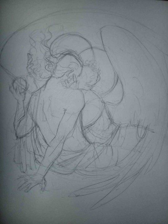
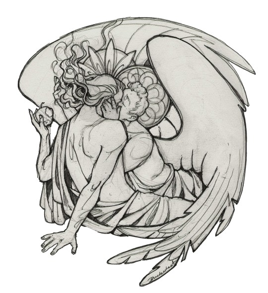
Now, pics! The sketches are paler in real life, but I increased the contrast a little so you can see something.
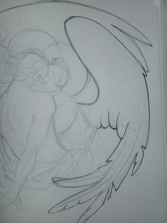
1. Laying out the composition!
I wanted to just show them kissing, but I got carried away due to some Art Nouveau inspiration. As you might have noticed, most of my illustrations are quite self-contained (ykno - they look like a sticker on a plain background). So I wanted a tight swirl bordered by Aziraphale’s wings creating a sort of rounded, yin-yang like bubble around them. Consequently I made the whole composition revolve around their heads.

2. Adding more details to the sketch. It’s messy af. It will be messy until I’m done. It’s fine.
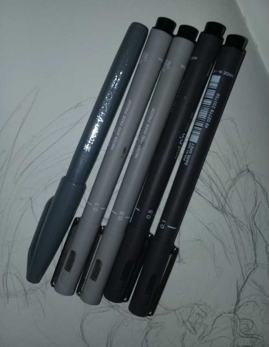
3. These are the fineliners I use for the linearts! They are made by Uni-ball and come in light and dark grey. I also sometimes use the guy on the left - ‘Touch’ sign pen by Pentel, when I want more brush-like, wider strokes. I work in grey because when I scan it and do my usual boring trick with sunlight highlights - which is an Overlay mode layer in Photoshop - the highlights ‘burn out’ the lines too and make them vanish a little, and the lighting effect gets more striking. I also like to use the light grey ones to make something look pencil-y without actually using pencil, because pencil fucking smudges.
4. It smudges! So because I am right handed, I start inking from the right hand side, no matter how tempted I am to do their faces first.
5. You can see the composition directions here. I made it intuitively, but ofc some ppl actually use grids etc to lay out their drawings.
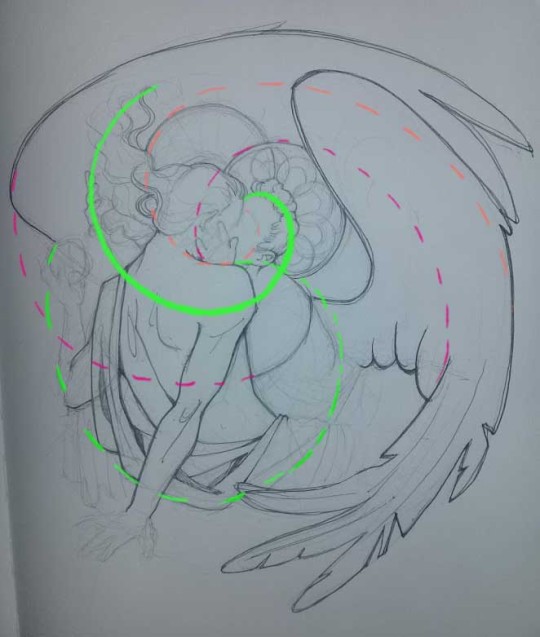
6. See how pale ans thin the lineart was at first? I kept adjusting it as new inked parts were appearing. It starts to look nice and consistent now!
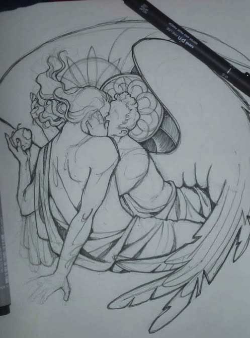
7. Finished lineart? There are some mistakes which I later corrected in PS. Notice that Aziraphale’s face has hardly any details on it - I tried to make the drawing suggest his expression rather than risk overdoing it.
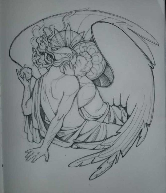
8. Photoshop time!! You can totally do what I did here even if you don’t have a graphic tablet. I used Curves tool to enhance the lineart, then Quick Selection Tool to select the background around around my sticker-like piece and filled it white (on a new layer ofc). I keep this white layer on top of the layer order so it works as a mask as I colour. I decided I did not like the hatching shading underneath Aziraphale’s halo, so I erased it with a Stamp tool (because I wanna keep the textured grey fill my crap paper naturally gives me!). It’s done roughly but won’t be visible once the thing is coloured.
9. And the reason why I keep the grey shade instead of easily getting rid of it by using Curves/Levels is because when I set this layer to Multiply mode and colour underneath, it gives me this nice desaturated look like from an old cheap paper comic page. It works as a natural filter! But of course I can’t do bright colours this way, so all my glowing highlights happen ABOVE the lineart layer - on a separate layer in Overlay mode!
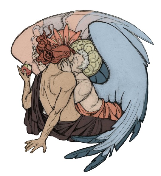
Finished thing here!
_____
Commission infoBuy Me a Coffee - help me with my transitioning expenses!Prints and stickers and things on my Redbubble!
#ask the buckwheat#long post#tutorial#drawing advice#drawing tutorial#good omens#ineffable husbands#good omens fanart#good omens art#my illustrations#doodles#toastedbuckwheat
1K notes
·
View notes
Note
I know you’re probably not doing palettes for the ones you finished anymore but I was just thinking about how cool it would be if they had palettes that reflected their opposite dark/light sides? Like a green/black palette for Roman/red/white for Remus, yellow/black for patton and blue/grey for deceit, uhh just orange for Logan...but thats not canon yet I guess?? And roman/remus might get confusin. And virgils oppoosite is uh. Wow Nevermind I suck at this. Um. Maybe I should just leave it to you
That's exactly why I dont do it, when you are fighting it can get difficult differentiating who is who if they have the exact same color scheme, and more so for people who cant tell colors apart very well aka colorblind play tester friend
#he managed to get og logan and witchy logan apart somehow but the sea logan its still there for more contrast#asks
51 notes
·
View notes
Text
The Tumblr Beta Version: an objective analysis
I was tempted to just type “it sucks.” And while that is an objective analysis, it’s not exactly helpful. I’ve sent several requests to @staff and @support to restore my account to the old tumblr dashboard format, and received the same automated reply twice now. I’ll copy/paste it here so everyone is on the same page:
(lol, I had to go back and edit this, because apparently the beta version doesn’t display block quotes on the dash. So I’ve also put the block quotes in italics... hopefully it’ll display properly... note after editing: nope, it doesn’t display italics either... how the heck am I supposed to differentiate quoted text? I’ll start each quoted bit with an asterisk, I guess...)
*Thanks for reaching out about the beta dashboard.
*We're currently testing it out, and your account seems to have been selected to take part in the test. Thanks for your patience while we work on it! At this time there is not a way to opt out of testing. You may see your Tumblr experience return to normal as we continue testing.
WE CAN ONLY HOPE.
*In the meantime, check out some of the new features available only in the beta dashboard:
OKAY TUMBLR, IF YOU INSIST, though I would MUCH rather have back all the functionality I personally invested into this website through xkit... you know... making the site ACTUALLY FUNCTIONAL. Let’s see what this beta version has given me instead of functionality:
*Change Palettes: Go to the person icon, then click "Change Palette." You'll find the classic Tumblr blue, dark mode, and a few other color palettes for your dash.
So I tried out all the color palettes. In addition to the ones mentioned here, there’s one that’s trying to look like a green screen terminal that gives me flashbacks to the early 80′s. There’s a reason we stopped using green screen terminals... Another one is “canary yellow.” It’s very yellow. The “classic tumblr” isn’t actually classic tumblr... all the post boxes are dark blue with grey type, not white with black type. And all the other colors are the insanely bright fluorescent of the new Dark Blue standard tumblr scheme. Which means links are practically invisible unless I highlight them. It’s migraine inducing. The one theme with a light colored background is called “Concrete” or “Cement” or something like that and even that only works for about half an hour before the migraine aura really kicks in. I just want my Old Blue via xkit back. You know, what tumblr actually used to look like. I don’t want any of these horrible color palettes. None of them work for me.
*The new "meatballs" menu: This is where you can copy the post link, unfollow the Tumblr who made or reblogged the post, or report a violation to our Community Guidelines.
I could do all of this from the user menus with xkit, too. I don’t regularly report violations or have the urge to block people I have chosen to follow. Why on earth would I want to do any of this? And why would I want these features located directly beside the post link copy feature?
You know what I do miss? I miss the xkit timestamps feature. I didn’t have to hover dangerously close to the KILL IT WITH FIRE meatballs menu in order to see when a post was made, and in this era of disinformation and misinformation spreading around this site faster than Covid-19, being able to see when a post was ORIGINALLY created is a far more useful feature than an easier way to block people. For reference: I currently have three blogs blocked. Two of them are pornbots. One is a nazi. If I don’t want someone’s content on my dash, I don’t follow them. This “feature” is entirely useless to me.
*A quick note: Pagination is not supported in this beta test, but we're collecting feedback to send to our engineers.
THIS IS THE ABSOLUTE WORST. This beta test might actually be tolerable if I wasn’t trapped into endless scrolling. If I could page through my dash, refreshing it every ten posts or so. You know why? Because once I scroll about 30 posts down my dash, tumblr starts overheating my laptop under the load of ALL THOSE POSTS. Things start malfunctioning-- it takes longer and longer to load new posts the farther I scroll. And the keyboard navigation (both page down and hitting J to advance to the next post, and even just using the down arrow to scroll as I read a long post) freeze and stop functioning. One of my laptop fans has actually begun to malfunction.
You know why this wasn’t a problem on the old version? If the data load got to heavy, I could open a post in a new tab, click view on dash with xkit, and voila! Brand new tab! I could close the malfunctioning tab and everything would be refreshed to normal! But without pagination, THAT IS IMPOSSIBLE.
Also, after reblogging a few posts, the beta version of this site breaks, and doesn’t open a post tab to add commentary or even tags. It just... reblogs the untagged post with no warning whatsoever. You know... that’s really really not cool. I tag EVERYTHING. Well, almost everything. The tags are the only way to keep track of the 40k+ posts on my blog. And warn people that I am posting potential spoilers, or other specific content. It’s REALLY inconvenient to have to either immediately go to my blog to edit the post and add tags, or even comments. The alternative is to scroll up to open individual posts I want to reblog in a new tab, and then reblog directly there. Ironically enough, THOSE pages actually open with xkit installed, and everything (surprise!) functions perfectly there.
It’s perfectly reasonable to understand why this specific issue has limited the number of posts I reblog. Reblogging content should not be this much of a hassle. Creators have been complaining for a while that reblogs have drastically slowed down, and I think making it even more annoying and difficult to reblog posts will not help this problem.
Also, with xkit enabled, there’s a function that auto-loads images as you scroll, so the images are always visible BEFORE they appear on screen. I don’t have to look at the colored boxes and wonder if this is a post I’ve already seen or something I should sit and wait for. Don’t even think about watching tumblr videos. Loading priority is given to the ads that you cannot pause or dismiss, so that video loads and plays in choppy two second bursts instead of being given priority. Since that’s the content I am actually here to consume, it kinda makes me want to do the opposite of patronizing anyone who advertises here with graphically intense ads. And then when you scroll away, with xkit, gifs and videos you’ve scrolled past STOP loading and playing, which I think might be contributing to the intensity of the resource hogging that’s literally melting down my laptop.
And for reference, I have a pretty decent little gaming laptop. A blogging platform shouldn’t be driving it to the brink of frying itself. I didn’t realize just how much xkit worked to streamline this and provide basic functionality to this site.
*And lastly, if you're an XKit user, know that the XKit team is working hard to update things on their end to make it compatible with the beta dashboard.
And this doesn’t even begin to scratch the surface of what I’ve lost without xkit. And this is a really REALLY garbage response to user complaints. “Oh, yeah, sorry we made our site suck even worse, but those nice people who do our jobs for free will surely fix our garbage soon!”
Dear wonderful people at @new-xkit-extension, I love you, and I miss you, and while I wish xkit worked with this beta version I’ve been forced into living with, I truly feel for y’all who are trying to deal with this nonsense on behalf of all of us.
And to the folks at Tumblr... maybe try to just... make your site actually more like xkit. You know, actually functional. None of these special new features are useful or functional to me. I respectfully request for a fourth time to be removed from this inane beta test.
Give us OPTIONS. Let us display ALL THE TAGS without having to click a button. Let me have back my Activity+ that actually allowed me to interact with people from my dash! That showed me real-time inline notifications in a way that I could reply to with a single click! Bring me back to my column of open messaging conversation icons so I have easy access to the people I talk with throughout the day instead of closing them all every time I refresh the page. I already feel socially isolated in freaking quarantine, please stop shutting off all my avenues of communication!
Let us have pagination! I mean, maybe it wasn’t the best idea to force heavy users of this site into a beta version that doesn’t allow us to opt out until your engineers had actually figured out how to make it work in a very basic way.
*Let me know if there's anything else I can help you with!
YES. PLEASE REMOVE ME FROM THIS BETA TEST NOW. I have let you know exactly what I want from this site. I just want it to ACTUALLY WORK. For someone who spends 12+ hours a day on this site, this beta test version is NONFUNCTIONAL. PLEASE ALLOW ME TO OPT OUT. I AM LITERALLY BEGGING YOU. I WILL ACTUALLY PAY YOU CASH MONEY TO ALLOW ME TO OPT OUT OF THIS AND GO BACK TO HAVING A FUNCTIONAL BLOG AGAIN. WHAT MORE DO YOU WANT FROM ME?!
PLEASE!
I AM OFFICIALLY AT THE END OF MY PATIENCE FOR ENDURING THIS NIGHTMARE.
(one final quick note... I’ve only been back on my dash long enough to make the parenthetical edits-- i.e. adding italics that don’t display and then adding the asterisks at the beginning of each section of quoted text, and already my laptop is overheating again. For reference, I originally typed this entire post from within my tumblr inbox page-- which still functions normally with xkit-- and spent over an hour on it. My laptop was fine the entire time. Clearly the issue is this beta version of the website. I will never forgive tumblr if y’all fry my literal only portal to the outside world at this time. PUT ME BACK TO NORMAL NOW. THIS IS ABSOLUTELY INFURIATING AND ENTIRELY UNACCEPTABLE. Thanks)
(oops apparently i lied... when the asterisks and the previous final note failed to display, I thought that seemed suspicious, and realized that I literally needed to refresh my entire dash in order to see edited changes. Funny how xkit enabled me to do that in real time, which is just another bit of functionality I’ve lost with this beta program. Please guys, this is really, really not working for me at all, just put it back.)
#tumblr problems#staff#support#xkit#was this good enough for you? because I am totally done with this if that wasn't completely obvious#please end my suffering
129 notes
·
View notes
Text
Scars You Can’t See - Chapter 3
Chapter Title: Under the Radar
Word count: about 2400 words (sorry it’s short)
(I’ve made one minor word choice change)
Note: I’m renaming brands so that the story flow works better- Chatter is this universe’s version of Twitter.
First | Previous | Next
Rouge had gone out undercover early in the morning, finding disguises for the team. Shadow hadn’t accompanied her and instead elected to sleep in, feeling ridiculously exhausted after the events of the last two days. He’d slept so well last night, and he refused to let it go now. So he had mumbled a drowsy “okay” as Rouge left, before falling back into bed and passing out for another hour.
He jolted awake to the sound of the door slamming open and a voice calling, “I brought breakfast!”
The smell of baked goods quickly filled the air, pulling Shadow out of bed. He snatched a glazed donut out of the box she’d set on the table, muttering a quick “Thanks, Rouge,” before he ate it in two bites. He wasn’t a heathen who spoke with food in his mouth, after all. Unlike a certain blue hedgehog.
“So, what did you find?” he asked curiously, noticing that she had multiple bags weighing her down.
“Well...I’m glad you asked. I got us disguises!” she replied, pulling out three cans of paint. “Omega, you’re getting a paint job.”
Omega immediately unplugged himself and shuffled rapidly to the other side of the room. “Negative. That is not an appropriate action.”
Rouge rolled her eyes. “Tails has a schematic saved for you in his lab, complete with a color palette. You’ll be alright.” She held up the cans- dark blue, white, and gold. “They’re not even that bad, see?”
“I suppose….fine. Why is this even necessary?” Omega asked, peeved.
“Well….you won’t be going into stores much- you’re too recognizable- but we should still probably disguise you so people don’t realize who you are at a distance.”
“What will you be doing?” he said sharply.
“I’m glad you asked!” she replied, pulling out a box of red fur dye. “I thought it was about time I looked a little more like you both, so….”
She produced a classic Team Dark outfit- all black and red, combat boots, and some golden punk earrings.
“Time to be edgy, it seems.” Rouge mused.
“And….what will I do?” Shadow asked nervously.
He didn’t really want to know what was in that bag, but knew he couldn’t look like himself either.
Rouge had another box of dye on the bed now- the same shade as his fur.
“That’s not going to be helpful…” he said flatly.
The bat smirked. “It will be on your stripes.”
Shadow grasped one of his quills instinctively. “Don’t you dare!”
“Oh, I do dare.” Rouge replied, advancing on him.
The makeover session began.
Rouge agreed to start with herself, since Omega was still hidden in a corner and Shadow looked absolutely horrified. She rubbed the dye all over her white fur- at least the parts that could be seen- and put on her clothing once it had set. The whole process took her about two hours, and when it was done, she looked like a completely new person. “And...some grey contacts for a final touch,” she added, putting in the contacts.
Even Shadow would’ve found it difficult to convince someone that the person in front of him was Rouge. He admitted that the disguises were useful, but that didn’t mean he had to like them.
“Alright, Shadow, you next.” she said firmly. “You’ll need some time to let your quills settle, so I’ll work on Omega then.”
They headed into the bathroom, and she put two bottles on the counter next to him.
“...what does that other one do?”
Rouge sat down and looked at him. “I’ll tell you everything I’m going to do right now, okay? I’m dying your stripes black, and that includes the ones on your arms and legs.”
Shadow sighed reluctantly. “What else?”
“I have some brown contacts here for you, a pair of fake glasses, and some new clothes. I got you some different boots too- don’t worry, I’ll cut the soles out and put them over your skates. You still need to wear those.”
“Good.” the hybrid said shortly.
“Now for the hard part…” She held up the second bottle. “I’m sorry, Shadow, this is going to burn a little. It’s a relaxer. All it means is that your quills won’t stick up at the back anymore.”
“Forever?!” Shadow gasped, baring his teeth in an unconscious snarl.
Rouge shook her head quickly. “No! No, once we’re all done with this, you can trim your quills and they’ll slowly start to get back to normal.”
He shook his head. “Is all this really necessary?”
“Shadow, we don’t know how long it’s going to take for G.U.N. to react once we’ve got the videos. It could be weeks, even months before the process starts. We need to be safe.”
Shadow winced. “Fine.”
Once Rouge had put in the different chemicals, she had him sit down and relax while she painted Omega. It burned, though, so he mostly spent his time trying very hard not to touch his quills.
Setting up an old piece of cloth she’d bought at a secondhand store, she began to paint over Omega’s logo with dark blue. Red gave way to gold, and yellow was replaced by white. She painted a small golden theta symbol on his front strip of metal, finalizing his new name.
Shadow got up after she’d finished and washed the products out of his quills, refusing to look in the mirror until he was done. Cringing as he shut the water off, he glanced up.
Oh, chaos.
He looked like Sonic.
His quills hung down his back, their signature red stripes completely gone. Shadow stared at his reflection weakly, shocked by the difference a couple of chemicals could make. Though he supposed he shouldn’t be- Professor Gerald had taught him a lot when he was younger, and he still remembered some of it. Thankfully.
He took the rest of his disguise into the bathroom, refusing to look at Rouge. With his new clothing on, his glasses, and some eyeliner to cover his red eye markings, he looked like a completely different person.
Shadow hadn’t put in the contacts yet, and he looked into his own eyes sadly. It was such a silly thing to be upset about, and yet….
Rouge came in, looking worried. “It’s only for a little while, Shadow.” she reminded him. “Soon, you’ll be back to looking like yourself again. I promise.”
He put the contacts in and looked at the stranger in the mirror. Shadow grimaced. “I look like an idiot- here, let me see that hair tie.”
Pulling his straightened quills back into a ponytail, he looked at his reflection again. He narrowed his eyes. Tested out a smirk. Pulled up his hood. “It’s….a little like trying new clothes on, I suppose.” he remarked. “I can handle it, for now.”
Shadow turned to walk out the door. “Let’s see how long Omega can stand still and watch his paint dry before he tries to launch a missile at the window.”
Rouge laughed loudly. “Haha! I bet he’ll do two.”
…
The team decided to test out their new identities in the afternoon and see if anyone would recognize them. Omega was still going to stay in the car- sulking, since he wanted to see inside the strip mall they’d stopped at- while Rouge and Shadow shopped around a little.
Nobody seemed to realize who they were at all. The two of them walked into a convenience store and grabbed some food, wandering through the aisles, but nobody said “Hey, look, isn’t that Rouge?” or “That looks like Shadow the Hedgehog!” or anything like that.
If anything, it was pretty interesting to see how normal, non-heroes went about their daily lives. As well as how much special treatment they’d been afforded before.
The cashiers, instead of looking interested, mostly seemed bored or tired. No one in the stores seemed to give them a second glance- except for suspicious looks at the sight of two teenagers hanging around for a long time. Rouge in particular got some looks that seemed to say don’t you dare try anything here. Shadow felt a little defensive, but was convinced (by Rouge) not to snap at the people making assumptions about them.
Rouge was lingering in the makeup aisle while Shadow stood around, making his way down from the adrenaline high of the last couple days. The hoodie he wore felt heavy on his body, and he blinked tiredly- the store’s overly powerful heating system gave him a warm, lazy feeling. Shadow stifled a yawn, smirking at some of the snarkier greeting cards on the shelves.
“We should probably go- that woman keeps glaring at me.” he muttered as Rouge came over to him, feeling a little annoyed.
“Sounds good to me, but could you help me decide on a lipstick color?” she said quietly. “I keep on thinking my fur is white still, and red won’t work on red.”
Shadow frowned critically, looking her outfit up and down. Tapping the golden shimmery one, he said, “You’re not wearing a lot of that. It’ll work with your color scheme.”
He’d discovered color coordination and planning outfits early on with Rouge as a friend. Shadow had never needed to worry about such things on the ARK, but here he knew more than he’d ever expected to learn about the color wheel, matching clothing, and accents...among other things.
They looked in a couple of the other stores, mainly clothing shops, but Rouge let Shadow spend a while in a little bookstore as well. He looked at one book in particular: one on a human who’d leaked an incredible amount of inside information to the press about the government and some of its agencies.
He frowned, reading about how the man had to flee the country as a result of his actions- even though he’d done the right thing. The hybrid didn’t like the idea of having to live the rest of his life in hiding…..but he supposed it was better than the alternative…...
Rouge took the book out of his hands suddenly, prompting a quick growl from him. “I was reading that, you know.”
“No, you weren’t. You were staring off into space and looking depressed again.” the bat retorted. “And as your friend, I refuse to let that happen.”
Shadow sighed. “Fine. Is there any place else to go, or are we heading back to the motel?”
“Well….I did have one more place in mind, but it’s a ways away.” Rouge said. “You up for a drive?”
…
An hour and a half later, they were at a library in a moderately sized city. Rouge and Shadow had gone inside, and together they sat down at a computer.
“Let’s check the news….” Shadow said, his voice monotone. He typed in team dark gun and bit his lip, the only motion betraying his thoughts.
G.U.N. Declares Team Dark Fugitives
Shadow the Hedgehog: Antihero or Anti-government?
Former Heroes Flee As G.U.N. Accuse Sabotage
Rouge bared her fangs. “While the publicity should be helpful later, it looks like our former employer doesn’t exactly value honesty.” she hissed. “Ignore these reporters. They know nothing.”
Shadow felt a little nervous- his friend looked positively deadly. “Let’s see what’s going on in Chatter.” he replied.
Most people were condemning the team or denying any ties to them- which was to be expected. However, there was one particularly high-profile post made by….of course.
@sanicthehedgehog.
just saying i don’t believe any of this. team dark are good people!! they’d never do smth like this without a reason. i know that!
It appeared that Tails and Knuckles had publicly defended Sonic as well, but mainly after the haters started pouring in. Shadow wasn’t sure whether this was a tactic or not, but he felt so much better knowing that he, Rouge and Omega weren’t alone.
Shadow tapped his earpiece. “Omega, we’re on Chatter and I know you haven’t had a chance to say anything much yet. Do you want to dictate a post and I’ll write it? I won’t change anything, I promise.”
He told Omega about the current news situation, and the robot had some very strong words for the public, specifically on a subthread of Sonic’s post where Tails had replied to some angry statements.
@milestailsprower: I agree with Sonic! I’m good friends with all of them, and they would’ve thought something like this through before doing it.
Omega wanted to respond to his friend on Team Sonic, so Shadow logged in as him and typed what he heard.
@e123Ω: THANK YOU, TAILS. YOU ARE CORRECT. WE HAVE THOUGHT THIS THROUGH, AND HAVE GOOD REASONS FOR DOING IT. EXPECT MORE INFORMATION IN A FEW DAYS.
Shadow hit post- interestingly enough, he hadn’t even been able to type in anything other than all caps. It seemed that having a genius as your close friend had some interesting benefits.
Immediately, the two fled the library and rushed back to their motel, not waiting to see what the response was. It was only once they were safely inside their room, with the door locked, that Shadow began to relax.
“Alright, now that we’ve had that little adventure, let’s just try and have a calm evening.” Rouge said, after a moment.
The group played lots of board games- Omega had an excellent holographic projector built in from Tails’s experiments- and tried their best to remain relaxed and have some….not necessarily fun, but decent time before their next major move.
This (occasionally agonizing) wait continued for the next two days, and they only ventured into a different library once after that, just to see the response to Omega’s post.
Chatter had exploded.
There were theory threads stretching for hundreds of posts, angry responses on both sides, agitators, a formal G.U.N. rejection of the post, and much more.
But the only one that mattered was Tails’s response.
I’m glad you’re okay, Omega. I miss working in the lab with you.
Omega was very quiet after that, but pleased that none of Team Sonic had let on that they knew the real reason behind their disappearance. After another painful afternoon of waiting, they all looked at each other and knew without saying anything what it meant.
It was time to invade G.U.N.’s facility.
#scars you can't see#sycs#ugh this one was LATE and SHORT#hopefully the infiltration one goes better#omega and tails are good friends :D#sorry about the quills shadow#shadow the hedgehog#rouge the bat#e 123 omega#sol’s fanfiction
31 notes
·
View notes
Text
12 High Fashion Trends to Dupe

High fashion typically sets the standards for the trends that circulate in the fashion industry for the following year after fashion week debuts in Paris, New York, and Milan. While many sit by the runway admiring the model’s graceful walk stunting the newest high-end attire, or sit at home flipping through
magazine pages, pointing out their favorite designs of the season, few get the opportunity to actually wear the particular pieces designed by the fashion greats. This is due to the daunting price tag that follows the fashion industry. High fashion brands such as Gucci, Chanel, Dolce and Gabbana, and Prade all differ in unique designs, but relate in expense, making the common man unable to purchase and flaunt much designer attire. While there is no way to receive the products themselves without paying the price, some trends are easy to replicate and dupe for little to no expense. Regardless of your income, you should be able to walk down your street in style. The following list includes 12 high fashion dupes for those wanting to rock the look without breaking their bank account.
1. Headscarf
The high fashion industry has been utilizing headscarves for a variety of different styles of attire. From cultural representation to women’s rights, brands such as Gucci, Hermez, and Dior have utilized head scarfs as a symbol for specific societal statements. Now, headscarves have become significantly more popular in the fashion industry and are circulating as a mainstream trend. A simple headscarf can be purchased for under $10 on Amazon.
2. Tech Wear
A recent trend to hit high fashion brands is tech wear. This attire is typically made out of polyester fabrics and lays lightly on the skin. It is typically made in either a dark grey color palette or a bright neons plethora of yellow, greens, and oranges. Tech wear is also known as camping gear. Less expensive and more known brands such as Patagonia carry nearly all tech wear, and the material is commonly purchased for outdoor purchases. This being said, a recent trend has sparked in which tech wear can be worn whenever, giving off a futuristic vibe. A simple way to dupe this trend is by purchasing an inexpensive neon puffer jacket. These can commonly be found in thrift stores or shops such as H and M.
3. Monochromatic and Color Blocking
An easy trend to dupe that costs little to nothing is monochromatic outfits or color-blocked outfits. The basic idea of monochrome is to wear an entire outfit made up of only one color. This outfit will typically include different shades of the same color, however, sometimes the coloring is entirely unanimous. This gives you a sleek look and is typically pleasing to the eye if done well. If you wear a lot of one color this trend can be easy to dupe by simply piecing together specific clothing items you already have in your closet to come together as one in a monochromatic format. Color blocking, on the other hand, is the opposite of monochrome, in which you choose two to three contrasting colors and base an outfit off of those. This can also be easy to recreate as long as you pick sharp contrasting colors from the fashion color wheel, and keep the tones of each chosen color consistent. For example, a bright blue, and light pink would not be good color blocking, but pastel blue and pastel pink would be.
4. Animal Prints and Plant Patterns
If you know anything about high fashion, you know of the iconic animal prints and plant patterns utilized within the fashion industry. Most commonly known for their extravagant designs centered around nature, both the brands Gucci and Dolce and Gabbana began this trend and have kept it up. Less expensive stores such as Urban Outfitters, H and M, and Zara have replicated this trend allowing nearly anyone to dupe it if you have the right eye. If you want to give off a high fashion nature vibe, look for shirts or jackets with tigers, bees, and unique flower designs because these will be the most similar to big brand name designs.
5. Mixing Patterns Up
The fashion industry has been known to come out with some whack designs on the runway, and weird patterns are nothing new. Try mixing up typical patterns such as stripes and spots, or floral and gingham to give off a unique, high-end look.
6. Camp
In 2019, Anna Wintour said “camp,” and the Met Gala was roaring. Although many did not understand the message or look of camp fashion, Wintour had a specific look in mind that was founded and achieved at the 2019 Met Gala. Camp is the idea of piecing items together that should look bad but ironically don’t. Camp also centers around the ideology of evading tacky fashion designs and accepting any look. Although this may seem difficult to pull off, Camp can be easy to find and flaunt. By shopping in your local thrift store and searching for interesting items that may typically be out of your comfort zone and combining them with other rare finds, you can create the camp outfit of Anna Wintour’s dreams.
7. Cyber Girl Versus E Girl
A recent trend circulating on social media and fashion is the idea of an “E-girl” which is essentially a reinvented version of a girly goth. Little do most know, this trend has been around for a very long time, however it is referenced as a cyber girl. Brands such as Moschino have been centered around this style since their creation, making the edgy punk look go viral. This has developed into modern-day media through brands such as Dollz Kill and Nasty Gal, allowing the purchase of Cybergirl products to become more obtainable price-wise.
8. Industrial Boots and Skull Stompers
Many influencers such as Emma Chamberlain have paved the way for the everyday wear of Dr. Marten’s industrial boots. Previously known and seen in the high fashion industry as skull stompers, brands like Dr. Marten allow for a basic everyday wear boot that gives off a fashionable, and edgy look, while still remaining affordable.
9. Wearable Art
A new trend that the brand Prada recently created is the idea that fashion products should be made and sold similar to art. This means that each piece is handcrafted and designed similar to a painting, or sculpture. Although many less expensive brands do not have the resources that Prada has to make this idea fully come to fruition, brands like Zara have attempted recreating this idea. Another way to dupe wearable art is to make it yourself by enhancing basic clothes such as jeans or simple blouses with your own creatives stitching or artwork.
10. Back to the Basics
Recently high fashion has gone back to the basics in which brands such as Balenciaga and Chanel have revisited simple designs that typically only include a black and white color combination. This gives off a clean, high-end look, and is luckily extremely easy to replicate. Brandy Melville, Zara, and other brands of the sort are known for their basic style in which you can pair nearly any shirt from the brand with nearly any pant and it will match.
11. Eye Wear Everywhere
The high fashion industry seems to be a strong believer in the phrase eyewear everywhere. Regardless of the outfit, sunglasses can be a staple accessory to nearly every look. Forever 21, Urban Outfitters, and Charlotte Russe are less expensive stores that tend to replicate the sunglass trends that are set by high-end brands.
12. Throwbacks and Comebacks
Although fashion trends come in waves, high fashion loves to surprise their followers by bringing back an old trend that failed in the fashion industry at the time it came out. This can be easy to dupe simply by purchasing vintage clothing from thrift stores, or wearing older trends as a statement.
2 notes
·
View notes
Text
fashion recap: his dark materials
hello there! once again i am procrastinating instead of doing things i should be doing, but nonetheless, i’m here today to rant about the fashion choices we’ve seen in the trailers so far. i am, by no means, a fashion expert, i’m more like an aesthetic enthusiast (and as a former literature major, i over analyse everything), and i’m just here to say some of my thoughts on the outfits in general.
i apologise for any definitions of outfits i may have gotten wrong, but writing in english about clothes is tough lol special thanks to @parslow and @cozcat for their help when getting some of the clothings names because my english knowledge does not fare that well.
also, a side note (two, in fact), i talk a lot about colour in here, but something i’ve noticed is that some of the editing makes the same outfit look differently in different scenes, so i’m just pointing out how i see the colours, so it can be divergent in some places and although i did some editing in the photos, i didn’t mess with saturation or vibrancy, only brightness and contrast. another thing, i did my best to make sure the detail were visible, but in some cases the quality of the images were reduced drastically, so sorry for that too. there’s also a chance the read more is broken on mobile, i did all that i could to avoid that, but it keeps on happening and i don’t know what else to do, i’m sorry. here we go:
LYRA’S FASHION JOURNEY
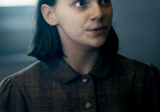
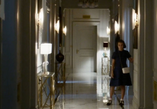
There has been this subtle similarity between the outfits Lyra wears in the show and the ones she wore in the movie, and I think that’s nice, especially how they drained away what they didn’t like about the movie outfits and stayed with what they liked, toning down so it matched their ambiance. The show is, by no means, pale, in fact, it is quite vibrant when we actually look at it, but Lyra stands out beautifully in her colours, be it blue, grey or red.
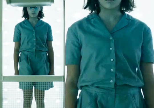
On Jordan, we see a casual and carefree Lyra, a child used to running around the campus and playing on the roofs, but a kid that was raised in a somewhat backwards society. In Lyra’s world, women do not wear pants under most circumstances, for example, and despite her extremely feral behaviour, Lyra’s fashion abides closely to the social rules.
She wears a red pinafore dress (very similar in tone, perhaps a bit less bright than movie!Lyra) that keeps her feminine label on, visually. Underneath, however, there’s this blouse in a very light sea-green, almost a neutral tone, with a very simple yet delicate print on it.
It’s almost like a coarse fabric, simple, we can see the folds it has and it’s a very large piece of clothing, if we consider it’s very loose on her arms and on her neck. She’s not portrayed as tomboyish (thankfully! the term in itself is very odd) and it’s clear she dresses to be able to play and to run wildly through Jordan in a way that’s comfortable.
We can’t see much, but she also wears white socks and boots or boot-like shoes. Her entire outfit feels as if her clothes were donated to her, such as the boots that don’t seem to be for children, the over-the-top large socks and the blouse; the only thing that seems to fit “correctly” in Lyra is the pinafore dress. Her whole look, even the short, messy hair, screams “neglected child raised by servants when they have time to look after her.” That’s a very Lyra-y mood.
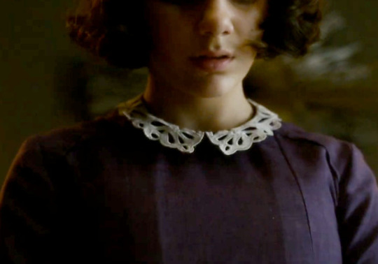
We only see this outfit once, but I’m mentioning it here because it really made an impression on me. This is a dress she wears, apparently, for her dinner with the scholars and Mrs. Coulter. I’m guessing it’s a dress because they wouldn’t dress her any other way for a dinner of such importance. It’s a simple, very worn-out dress, in the most unflattering colour they could possibly find and it also feels like she got it from one of the servants, who got from one of their cousins, who got it from one of their siblings. Her hair is brushed and she looks tidy, in an unflattering dress that is buttoned up to her neck, which I think suits the whole thing (her mother is with the Church and is a fashionable woman, so they wouldn’t dress her in a way Mrs. Coulter could point out as disappointing or inappropriate, although the outfit wouldn’t be to her taste). It’s often pointed out how difficult it was to keep Lyra clean and tidy, and how much effort it was put to keep her good looking for Mrs. Coulter and I love what they’ve done here. Mrs. Coulter died a little when she saw her child in that outfit.
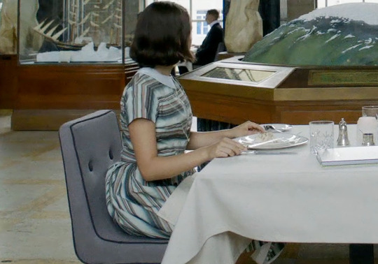
I love Lyra’s dress for the Arctic institute lunch, the patterns are beautiful and colorful, in pastel tones, but still inside the palette. It’s a looser dress, with shorter sleeves, and her hair still hasn’t been done in a more fashionista way, so this is a point of transition, where we still see Jordan’s Lyra while she slowly is falling into Mrs. Coulter’s Lyra and the way their outfits relate is just… it’s just so beautiful. I particularly like the collar, and I did some quick research, apparently it’s a peter pan collar but I can’t be a hundred percent sure of that. We see blues and light yellows/browns, dirty pale pinks but no reds, as if Mrs. Coulter is washing Lyra with bleach hoping to not make the girl a sinner (as in being a worldly woman, if that makes sense, not the fact that Mrs. Coulter wanted Lyra to kidnap children with her - that’s not sinful, that’s entrepreneurship lol).
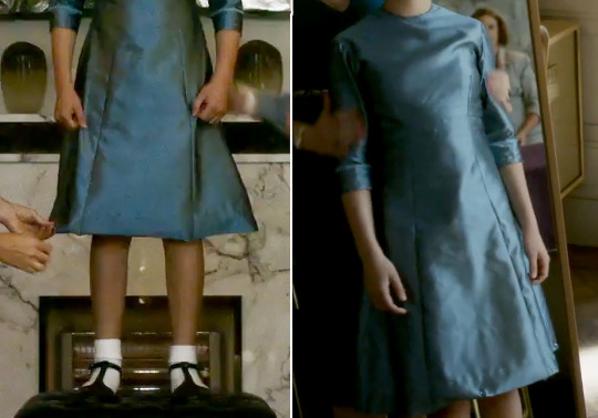
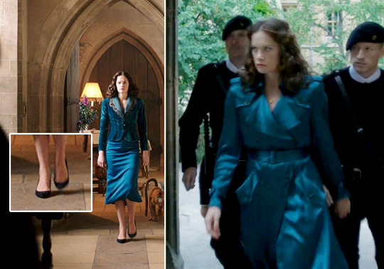
For all that is worth, Lyra’s outfits tell great things about her as her story progresses. In London, she is slowly being shaped by Mrs. Coulter, turned into a doll and manipulated into her little pet project, and we see it on many levels, but mostly and more importantly, in the way she dresses. The blue satin dress is by far the most glamorous of Lyra’s outfits and it echoes Mrs. Coulter in many ways, from the colour to its cut. The fabric is similar to shot silk, producing a fierce iridescent aspect to it and much like Mrs. Coulter’s, her dress goes a few centimeters below her knee. It’s a high neck collar, and the sleeves go up to her elbows, it’s a demure look, almost church-like if it wasn’t for the flamboyant fabric. It’s like seeing Mrs. Coulter’s imprint all over her, twisting and tainting her child. Lyra never loses her childish appearance though; although the dress feels a bit mature, her shoes bring back a boarding school innocent-like aspect to her, the white socks that are up to her ankles adds to her looking young. She never seems to wear any sort of jewelry too, when compared to Mrs. Coulter who relies on extravagant rings and earrings, or delicate necklaces.

At this point, Lyra is already tired and worn-out, probably because of her confinement to a London apartment. Her hair is done in a tidy, classic way, in a style similar to Nicole Kidman’s Mrs. Coulter (and I did some quick research, it’s inspired on 20s/30s hairstyles), which gives her a certain air of… aristocracy? Maybe a certain flair? One way or the other, when we see her in the mirror, beside a reasonably dressed Mrs. Coulter, it’s easy to notice how she is being manipulated and moulded into her “employer’s” image. Because she is young, her hair is shorter than Mrs. Coulter’s (or the other women) and her dress is longer and definitely less revealing. She evokes the image of children who are forced to behave like tiny adults, you know? These traits in her outfit are opposites for Marisa’s green dress.
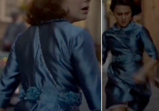
When she finally runs away, the dress has some tweakings, around the neck and her waist. They’re frilly, childish and girly embellishments (?), further visual proof of Marisa puppeteering Lyra to shape into her model daughter, washing away any sights of common folk/servant clothings or less feminine pieces.
She is in the distance here, so we can’t sort out many details, but it’s a simple, navy blue/deep dark blue, with a spread collar. It looks very angular, we can almost see the folds with precision, and she wears the same shoes as in the gala dress, with the same white socks, so I’m guessing this happens after she tries on the gala dress (or they’re just using the same shoes, which further scenes seem to back up). Her hair, plus the rest of the outfit, make her look so tiny and childish, with its short sleeves showing what’s left of her carefree mindset, which is so pleasant because that way she fits so well in the large apartment, trapped there whether she knows it or not, slowly becoming something she is not, yet. The white bag contrasts nicely against her dark dress, it stands out. I loved how they mirrored Lyra and Marisa, how their colours echo each other, especially when they live together. It’s creepy. @parslow pointed out the same mirror pattern in her post about Lyra’s fashion in the movie, and it’s honestly the best thing they could do, not only because it makes sense that Mrs. Coulter and Lyra dress similarly due to Mrs. Coulter’s meddling, but also because it shows how they are similar in general. Even as Lyra leaves her mother, their colours and outfits still relate to each other.

The cut on the purple dress is, wow. Look at how we can see the wrinkles (?), how angular and super straight it is. That horrid peter pan collar is a monstrosity on Lyra, when we think of that wild girl running through Jordan, in loose and second-hand clothes, this outfit is a cage on itself. Now she looks like she frequents a Catholic school and it unnerves me. The collar is delicate and chaste, and quite a contrast with the dark purple of the dress. It’s possible to see she wears the same shoes with the purple dress, and there is also a white detail on her sleeves, that also go up to her elbows.
We’re working with partial imagery here, but there’s a lot to say about Lyra’s gyptian clothes. This is after Lyra leaves Mrs. Coulter and once she is with the gyptians, she returns to her original behaviour: proud, careless, picking comfort over glamour. The blouse makes a comeback in a nice pattern, and the red colour from the beginning. Note that she never wears red when she is with Mrs. Coulter, a colour that is often associated with sin and hell, but once she is away from her controlling proxy parent (lol James McAvoy), the red makes a comeback on this shirt and later on her hat/cap/hood.
She wears a blue, denim overall, but I’m guessing it’s another pinafore dress since she doesn’t wear pants or so we assume (I’m not revising all of this, but recent behind-the-scene photos showed us Lyra in very loose pants, so maybe she moves on from her conservative world in season 2, but it’s also possible she wears pants here). So this is a mix of her original look, in darker colours, with a deeper red in a more simplistic pattern. Her outfit comes from the gyptians themselves, who suffer a lot under the tyrannical gaze and influence of the Magisterium, so their fabrics are of lesser quality, their colours are darker but less saturated, their clothing is focused on practicality over extreme quality. Her hair is back to loose and messy, as it was before. Her shirt is just as loose on her neck as the green/neutral one was too, as if it’s borrowed from someone larger than she is (maybe it’s from Billy or Tony, or even some gyptian girl - it’s a tough guess).
I accidentally forgot about this outfit lol but there isn’t much left to say about it. This is Lyra’s uniform from Bolvangar, and this is likely the cabin scene because of the lighting (it’s the same as Asriel’s shots with the blue lighting and the evil talk). Once again, Lyra makes a change of outfits, and once she is back to her actual journey, she has another pinafore dress/overall. This is thinner and is clearly worn-out, but considering she left Bolvangar and got stranded n Svalbard, it’s interesting that they made the choice of giving her another set of overalls. This one matches in colour the blouse underneath, except it’s darker, and the cold tones maker her stand out in the warm lighting of the room.
LORD ASRIEL’S “LESS IS MORE”
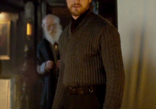
I was joking recently about Lord Asriel and his one and only sweater, but truth be told, this isn’t a man who either can afford to or would like to have a varied wardrobe. Asriel is a man that worries about theories and philosophy, he couldn’t care less about what shirt he is wearing and the show seems to get that nicely, and he also doesn’t have much money. As far as we can understand, this is his arrival at Jordan, he has a large bag and an aviator-like jacket, that doesn’t look very formal or indicative of his title. His sweater and shirt are in dark tones, along with the jacket, but he wears warmer tones than the other scholars, who wear dark (if not black) but colder tones. (Except the master and his burgundy gown and that dude with the red stripe (?) like, please sir, I am trying to make a point!). Compare him to Boreal, for example, who is another Lord and the discrepancy is loud and clear, through fabric, cut and style.

He dresses more stoically and more adequately, but we can still see his entire outfit is a bit rough and messy, like Lyra’s. It’s possible to perceive how he stands out amongst the scholars, especially because in the books, he even says to Stelmaria, “There’s probably some ancient etiquette that allows them to fine me a dozen bottles for coming in here dressed improperly”. So although he still is well-dressed, he doesn’t fit in as he should.
Despite mocking his only sweater, he does change his shirt after what I’d say is post-meeting with the Master. He is agitated, eager to leave, and he now wears a light-blue shirt with a darker red tie; he either took a bath or it’s a continuity problem, either way he still has a sweater lmao but this time it’s grey and not a desaturated navy-blue (and closer to the one in his shots in the cabin). Something I noticed about the navy blue sweater scene is that the greys in his hair also seems blueish, so I’m willing to bet he doesn’t necessarily change his sweater and the colour difference is happening because of colour correction on that particular scene. I noticed that the sweater doesn’t look blue anywhere else, so it’s a possibility, but I’m still rolling as if he has two sweaters.

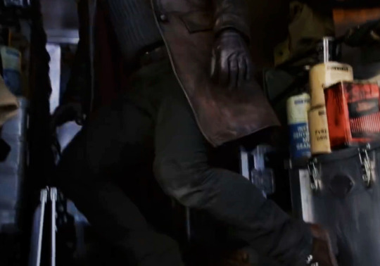
I’m not joking lmao I swear he has like two outfits, three if we take the winter gear into account, which is just him probably wearing a coat over - guess what! - his second (or his first, I don’t know anymore) sweater. He looks messier here, this is the grey sweater, but it looks darker than his second one, but also less blue. My theory is that he lost his clothes during the flood lol He does seem to be wearing a jacket over his sweater, but that seems to be made of the same fabric or something similar, and its collar is larger than the original sweater. It makes sense, though, since he is the middle of Svalbard.

MRS. COULTER’S FASHION ODYSSEY (I mean it)
If there’s a person who needs to be dressed appropriately, that person is Mrs. Coulter. From what we have seen, she arrives at Jordan during daylight in a silky trench coat-style, but there is also a darker scene where she is dressed the same way (from my point of view, I can’t really be sure it is the same outfit) and we can see the Master blurred when she is rising from her chair (I had to cut him out of the photo because of the zoom in, but he is there). I mean, we’re talking about a woman who would NOT wear the same outfit two days in a row, it’s why I’m guessing these happen in the same day, she probably intimidates the Master before having dinner with him and Lyra, because by the end of the dinner he is already aware she wants Lyra. We can see she wears a small, delicate gold necklace, in both these scenes, and I find her coat to be very slick and it has that silky glow to it that fits her so well. It’s flamboyant and nonchalant at the same time, if that is possible.

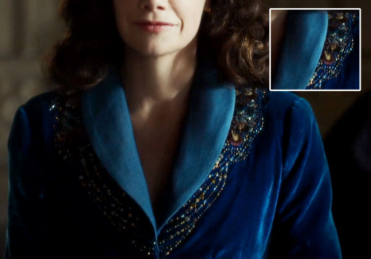
She comes in a very formal (I’m tempted to even call it frilly) and demure outfit, her heels look simple and humble, black (@cozcat pointed out they could also be navy) and basic, if there was ever anyone brave enough to call Mrs. Coulter basic. She wears a velvet/suede jacket over her silky dress and in the earlier teasers it was hard to notice it, but here we can see it. Then we have Marisa walking down the hall, and a much closer shot where we can see how ABSURDLY detailed the jacket is. There is a very, very flamboyant embroidery with tiny gems all over, in colours that vary from light-blue, turquoise, yellow/golden, and there is some hint of pink and purple, if not red and @cozcat also pointed out there is some beading in it. It’s a very detailed pattern, one that we can see from a distance and that screams “Extra” and “wealthy” from a woman who tries to dress in a very demure manner. It’s beautiful and classy.

The golden necklace, however, is gone or at least we cannot see it, but she wears the same jacket (it’s possible to see the embroidery slightly blurred) on the scene she is speaking to Lyra for what it looks like it’s the first time. There’s something so charming about the way the collar is set, the entire look is very Church-like in my opinion, and I think the colour is just so beautiful and it suits Ruth’s complexion perfectly. (There is also a divergency in colours here, in some scenes the outfits are closer to aqua blue/light teal and in other it’s closer to a deep, dark and saturated blue, but I’m guessing this has more to with lighting other than colour correction).
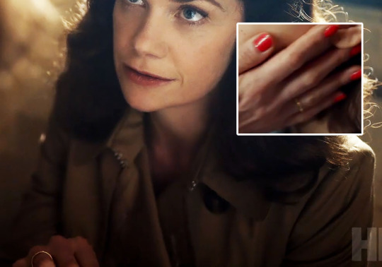
Here is likely moments before Lyra and Mrs. Coulter leave Jordan College, their creepy dialogue is about Roger, probably. Mrs. Coulter wears an actual trench coat, over her light-blue dress, and she is more earthy toned this time. It’s a very simple outfit, probably a change of colours to make her more relatable to Lyra before London. She still wears her wedding ring, apparently, we can see the gold band in that scene here and when she touches Lyra’s face. After some research, @cozcat found out widows tend to wear their ring on the opposite hand to indicate their status, so maybe that’s what they tried to achieve here, after all she still uses her married name, so it would make sense for her to wear her ring as a widow.
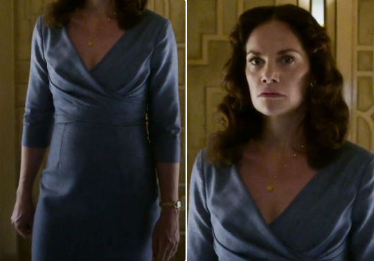
We can see the blue dress underneath the trench coat when Lyra and Mrs. Coulter arrive at her apartment (I tried zooming in, but I basically destroyed the image, so no pictures here). By what I could see, this is the same dress from the scene where she attacks Lyra, or it shares the same colours at the other one at the very least. It seems Mrs. Coulter is carrying a bag on this scene, perhaps they went shopping and this is their arrival, since Lyra wears the same outfit as she did in Jordan and we know a least a day passed between the dinner and their voyage to London.
This is a beautiful, simplistic and classy dress, with a low cut v-neck. Mrs. Coulter entire wardrobe has been toned down quite nicely as opposed her version in the film - hell, even her version on stage. This is a darker, slightly more down to Earth Mrs. Coulter (I’ve stated this multiple times, but it doesn’t hurt to say it again). She doesn’t need to exhale glamour here because her apartment does it for her; hence the softer fabrics, the lighter, pastelish colour, the modest pattern and the minimalist accessories.

Most of her dresses have been below-the-knee length, and I did some research, this is recurrent on 1940s fashion. I like how simple and straight this dress is, her delicate goldish watch (it looks like a watch, anyway) and the subtle necklace are beautiful additions to it all. She also seems to be wearing earrings, but it’s hard to say if they are also golden. Her shoes are also very simplistic, a high heel in snake skin in the most neutral colour she has worn so far. I like the pendant on her necklace, it’s delicate and it resembles a compass rose (or windrose or whatever it is called, I found multiple terms) which makes me quite happy. It’s an ode to her scholarly aspect, and despite her entirely demure and subtle outfit, her jewelry is made of gold. That alone speaks volumes.
I’d like to just make a remark on Mrs. Coulter’s dress in here, because we don’t see it again in the trailer: it’s about the same length as the others, with a slightly similar cut, her v-neck remains and so do the accessories. It’s so minimalist I find it insulting lol but it’s beautiful and very classy. Her sleeves are shorter here and with frilly details, though, and she has a thin belt in snake skin or something similar, that helps make the dress more shape-defining. Storywise, I believe this is the point where Lyra begins to distrust Mrs. Coulter, so they don’t have to conceal much of her nature. She seems less virtuous and demure, she shows more skin, even if she is just with Lyra and two random women. Actually, there seems to be an exponential situation when it comes to showing more skin as the story progresses: the closer we get to Mrs. Coulter’s reveal as “the villain”, the less demure she looks, the more skin we see, concerning her London appearances. (She can’t show her shoulders in the North because, you know, it’s cold).
The amount of thirst generated by the green dress is beyond human understanding lmao It’s honestly the most beautiful outfit Mrs. Coulter wore this far in the trailer, but I’m guessing this is the most Extra she is going for this season. A great deal of her outfits, as far as we’ve seen have a more classy, stoic and chaste approach, even though is all just a ruse to deflect people’s attention from Mrs. Coulter’s nature, be it her shameless seductive behaviour or her nasty temper. This dress has us all fucked up beyond all reason, says @cozcat, and I wish sometimes I could disagree lmao It’s a beautiful cut, the fabric in itself is gorgeous, it’s lustrous and reminds me of satin. The colour is beautiful, it really makes her pop, but I honestly think they should have made it copper or gold, it would really make her stand-out and as Ruth is a brunette, warm tones are just a beautiful match. But the green and gold are classic complementaries of each other, and the embroidery on her collar (?) is just one of my favourite things. It’s pretty yet very simple, and very similar in patterns to her blue jacket from the beginning.
We can’t see its length, but I’m betting on below-the-knee length, as the others, and while talking to @parslow we thought that dress seems to be open in the back. This is the most revealing outfit so far, and if it really is open in the back, even if just slightly, there’s a nice contrast to the long and loose sleeves; it’s a way of her compressing her true intentions and nature. This Mrs. Coulter conceals herself in her wardrobe, plain and simple. Her hair is just as it was before, and there is no necklace here. Instead, she trades her gold watch and necklace for a very big middle finger ring (which I love, by the way, it’s one of my favourite ways to wear rings) and it’s dark gold, similar in saturation and brightness to the embroidery on her dress, and so it’s her earring. For all her simplicity before this moment (this is likely the scene where Lyra runs away), this entire outfit is a change of personality in how Mrs. Coulter is translated to the audience. At this point, Lyra knows she is no saint, in fact she is quite the opposite, so she dresses in a more flamboyant way (also for the party), with lustrous fabrics and exuberant jewelry, honestly, Iorek Byrnison saw that earring from where he was, I can tell you that. Her colours are darker, more vibrant, including the nail polish that becomes a rich dark red as opposed to her vibrant red one when she tells Lyra children just disappear. (They don’t, Marisa, mind your business.)
Now for the red sweater, I have to say, I’m eager to know what kind of pants she is going to wear, because I doubt that outfit is a dress and I doubt they are going to make her wear a skirt in the snow. In the movie she wears a long dress and boots, but they favoured fashion over realism, and the show seems to be going the other way around. It’s why it makes sense for her to wear pants, in my opinion. Mrs. Coulter in red is just sinful, literally and metaphorically; it just suits her to wear red. I love the turtleneck style, and it looks like the sleeves are up to her elbows too. There’s just something beautiful in portraying overly sensual women in demure outfits, because it shuns away that idea that someone needs to be revealing to be sexy and that’s nonsense. And adding to Mrs. Coulter being an agent of the Church, it just fits her character to dress in a more chaste way and still fuck around like she does. Her entire persona is a façade and it can be read through her fashion. We can see the gold ring on her finger again, and she also wears golden earrings, I couldn’t identify if they’re the same as the other ones she wear, but it’s possible. (Except for the green dress one, since that one is bigger).
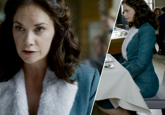
Lastly, it’s the Royal Arctic Institute outfit, I see it as either a two piece suit or a dress and a matching jacket (would that classify as a two piece? I don’t know, I did some research but found nothing conclusive). This whole scene is beautiful, the colours all harmonise with each other, and Marisa’s light blue, almost teal, it’s breathtaking, I really love that colour on its own, but on her it just… glows. There’s a slight shimmer to the fabric and the fluffy collar gives her an air of quirkiness and sweetness it feels uncanny for someone who knows her entire arc, but translates beautifully how she is seen by most people.
PAJAMA PARTY

Here’s one of my favourite things so far: from all the teasers and trailers, we get to see Mrs. Coulter twice in pajamas, different ones at that. The first one is the white, silky pajamas that she wears in the teaser. It has a strip/ribbon around the waist, tied in a similar way to the blue one, but this one feels more angular, as we can notice on her shoulders and how her arms feel like straight lines from the cut of it. She mirrors Lyra’s pearl pajamas when it comes to fabric, but her outfit seem more like a nightgown, as opposed to Lyra, who wears a two-piece pajamas, with buttons and a spread collar. Her pajamas also feels like a robe, I like how slicky it is.
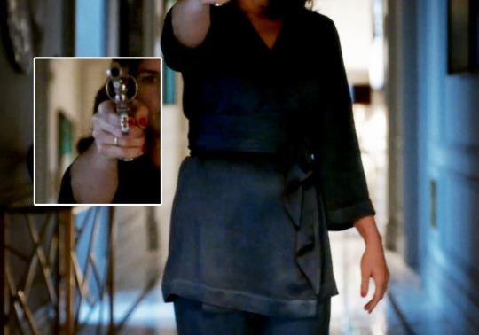
The second pajamas Mrs. Coulter wears is the dark blue one, in the same fabric or similar to the white one, slightly lustrous. This scene is probably after Lyra left, so her colour palette is consistently getting darker and with more vibrant colours. She seems to fit better in this one, which is a simpler piece of clothing than the white nightgown and it’s just visibly more comfortable, and more suitable to her personality. It’s as if she is finally allowed to be herself at her own home because Lyra is no longer there.
THE WINTER GEAR

We can see almost Lyra’s entire outfit from all of the scenes and it is bulkier than the movie version, clearly intent on keeping her warm in the North, which is, you know, the point. The red colour goes to her hat and gloves, in deeper tones, but not as saturated, yet quite visible and these two items are what make her stand out in Trollesund’s white ambiance. She wears a yellow scarf, in a very mustardy tone, and her coat is similar to Mrs. Coulter’s, as in the same details and the same colour, I dare say even the same cut. Asriel’s seems a bit darker, but it’s probably also the same beige, neutral colour. But Lyra’s coat resembles John Faa’s coat more, especially the clasps (?) in front, while Mrs. Coulter’s coats relies on buttons and a thick belt, which is a more feminine choice.

As Lyra goes to the North, saturation is left behind, traded for darker colours and neutral ones, as if to blend in with the landscape, but the colorful items really make her pop and it’s a nice way to identify your main character without trying too hard. She wears a very robust pair of boots, and we can see she has very thick socks (?); her pants are also very thick and of second-hand fabric, but it looks warm. Her red gloves have nice, colorful patterns, and underneath her coat we can see she wears some sort of blue sweater or maybe a cardigan (we can the tip of her sleeve in the square).
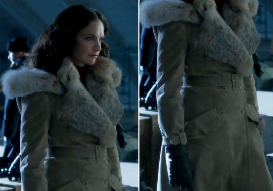
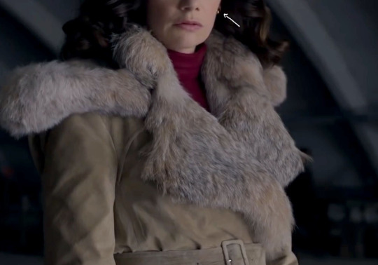
There’s nothing special about Asriel’s or Marisa’s winter gear, they both seem to wear similar coats, Asriel’s is a bit more rustic, but probably because it’s tailored for a man or because he got it in the North instead of Brytain. He also has goggles, which is honestly too cool for me.
A REMARK ON HAIRSTYLES
Taking into consideration what we’ve seen so far, Marisa’s hair stays the same throughout the first season. It’s a beautiful hairstyle, very classy and demure, but it’s the same. Asriel’s hair changes in length but I wouldn’t say it changes much in style. Lyra is the only one who suffers from a change during her time with Mrs. Coulter, then she returns to her old Jordan style. They seemed to have gone opposite to the movie: while Mrs. Coulter had shorter hair there, indicating maturity and she also had a constant 20s/30s hairstyle of a glamorous woman of that time, and Lyra had longer hair, curly and loose all the time, the show goes the other way around. Mrs. Coulter has longer, more voluptuous hair, that takes longer time to get done and it’s always done in an impeccable hairdo, while her daughter has a shorter, playful and childish hairstyle, that it’s easier to wash, brush and to keep tidy for her uncle’s visits, whenever necessary, because it is a necessity.
BOLVANGAR’S COLOUR PALETTE
This is just a quick note; the nurses all wear aquamarine blue and white caps, while the children wear light-teal pajamas, in soft and thin fabric. Lighter tones, especially blues, tend to mean innocence and purity, which is why all of Bolvangar’s victims wear variations of blues and light colours (light teal for the actual victims which is the children, darker blues for the brainwashed nurses who are also victims, in a sense). We can’t see the doctors, but I’m guessing they wear grey or black, which is a neutral position, underneath the white coat (that means purity, in this case a false purity to cover their darker, shady intentions), while Mrs. Coulter wears a deep red outfit, which is a colour associated with sin, wrath and hell, as I mentioned before, but also fierceness, passion and lust. A quick reminder that Mrs. Coulter also only wears red after Lyra is gone, and she also wears red in a Magisterium building, like, come on, that had to be intentional. They put a sinner dressed in red in the middle of a religious building where everyone is dressed in black (she is also besides a priest lol).
I also wanted to talk about Mrs. Coulter and her red outfit, but because it’s so distant, we can’t see much, so I’d rather wait for better footage than just ramble about her red hat now lmao.
And this is it. I only focused on the main trio because they have more footage and I’d rather have more on Lee and the gyptians to have more to talk about. Sorry for the long ramble lmao give Lord Asriel a new sweater 2k20 (please make him wear a linen shirt with rolled up sleeves, i never asked for any fucking thing).
#his dark materials#bbc his dark materials#fashion recap#this accounts every outfit for the main trio in every trailer and teaser#i left out lee and the gyptians bc there's little footage#and lee wears mostly leather i didn't have much to talk about it#i liked it but it was very nonchalant#but i intend on talking about him and the gyptians and even boreal and the church once we have more footage#i'm sorry for the long post#if you've read it i hope you enjoyed it#i welcome comments and all of that i really like talking about the meaning of colours and stuff#also when we have the show i will gif all of this so lmao
44 notes
·
View notes
Text
The Glam is strong with this one
Hokay. Yeah, this project is out of left field but this is what happens at the nexus of my nerdiness, a dim fantasy about what shenanigans I’d get up to if I was an influencer, and a Coastal Scents Hot Pot mega-sale.
(So Coastal Scents is an affordable cosmetics site primarily known for their eyeshadow, but even at $3 a pop for singles, that adds up quick. Ah, but when their singles go on sale for $0.99 each, now we’re talking.)
For a long time I’d thought to myself, if I could theme an eyeshadow palette around Star Wars, how would I do it? (Especially because, shockingly, this...hasn’t really been a thing before? I’m surprised that it hasn’t?) And then the sale appeared and I was like, why not do a palette per movie for the OT? Because I’m Extra™ AF.

The empty magnetic palettes themselves aren’t anything remarkable to look at, but I will say, they’re great quality for how cheap they are - weighty, sturdy plastic with a secure closure, full-sized mirror, and nice padding around the empty wells. 10/10 would totally recommend, not just for CS shadows but any standard-sized eyeshadow pot.
However, this part of the project is still a WIP, because I wanted logos for each of the movies on the top lid, not just to help me tell them apart when they’re closed but for the Aesthetic™ too, obviously. My original plan was to track down good-quality stickers or vinyl decals, but it’s turned out to be a lot more difficult than I anticipated. Decals are way too big, since they’re generally intended for car windows - these little dudes are only about 5x4″ roughly. The only other film logo stickers I could find that would work in a pinch came from a vintage 1997 set, but they’re pricey for what they are and I’d feel wasteful not using the rest of the stickers. In the future, as time allows, I might try to mock up the logos on their starry backgrounds as images on a USB drive or something to take to my local FedEX to print out custom stickers.
Anyhoops, on to the shadows!
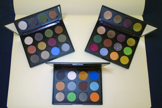
I know what you’re thinking - WTF is up with that color selection, those don’t look practical at all, etc. etc. I’m well aware of that. XD These weren’t made with logical use in mind; first and foremost they’re meant to retell the story in color. Each shadow represents either a character or an event in the films, placed in chronological order. And this is entirely subjective - I’m just one person with questionable tastes, this could have gone in so many other directions. But this is what I felt like crafting.
(Apologies for my shitty lighting, I’d have preferred to shoot these in full sunlight but I can’t really do that here at home, so I tried my best with a mix of window daylight and interior light plus some help from a handheld LED lamp.)
First up, A New Hope:
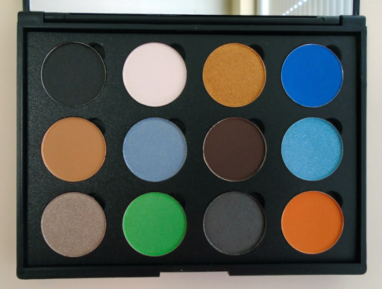
Shadow names in order from left to right, top row to bottom row [format - my label in “ ” followed by the actual shadow name in italics]:
“Dark Lord” - Incognito, a matte black representing Darth Vader’s first appearance
“Princess” - Cloud White, a matte white for Leia’s white senatorial gown
“Mindless Philosopher” - 18 Karat Gold, a rich golden shimmer for C-3PO (which didn’t come across accurately in these photos, it’s not quite as dark and dull as it looks)
“Astromech” - Electric Blue, a matte blue for R2-D2
“Farthest” - Pumpkin Pie, a matte light tan brown for Tatooine
“Skywalker” - Iceberg, a pale blue shimmer for Luke Skywalker, evoking both the color of the sky and his eyes
“Old Wizard” - Deep Roast, a matte brown representing Jedi robes and Obi-Wan Kenobi
“Legacy” - Azure Frost, a more vivid aqua blue shimmer for the blade of the Skywalker lightsaber
“Fast Ship” - Aluminum Taupe, a light taupe grey/brown shimmer - do I even need to say why I picked this shadow, it’s not just a stand-in for the Falcon, all I can think about is Robot Chicken’s “WHAT THE HELL IS AN ALUMINUM FALCON???!!?!” XD
“Superlaser” - Limelight, a bright acid-green satin for the Death Star’s primary weapon
“That’s No Moon,” - Thunderous, a deep gray satin for the Death Star itself
“Flyboy” - Orange Crush, a matte bright orange for the Rebels’ starfighter flightsuits
Next, The Empire Strikes Back:
“Ice Planet” - White Silver, an icy white shimmer for Hoth, natch
“Executor” - Ash Grey, a matte medium gray for Vader’s flagship and the Imperial Navy in general
“Slimy Mudhole,” Olive, a matte drab olive green for Yoda and the swamps of Dagobah
“Asteroids!” - Boca Mocha, a milk chocolate shimmer for Hoth’s asteroid belt
“Among the Clouds” - Peachy Copper, a...well, peachy copper shimmer, lol, for the luminous sunrise and sunsets of Bespin
“Baron” - Golden Avocado, a slightly olive-toned deep gold shimmer evoking the lining of Lando’s sweet, sweet cape
“Absolutely Beautiful” - Raisin Berry, a deep wine-burgundy shimmer for Leia’s Cloud City dress
“Bounty Hunter” - *Team Captain, a deep, grungy matte green for Boba Fett (*This is a Colourpop shadow single that I felt worked better than the original shadow from Coastal Scents, Olivewood - it wound up being too close to Olive above.)
“Carbonite” - Stone Cold, a deep, slightly brown-tinged gray satin for Han’s carbonite block
“Fatigues” - Ashen, a light warm gray satin for Luke’s military fatigues
“The Responsible One” - *Lost and Found, a matte cornflower blue for Lando’s blue shirt, meant to symbolize the shedding of his façade (notice how he somehow loses his cape after he begins helping Leia & Co. escape) and the revelation of his ethics as he tries to help keep both our heroes and his own people free from the Empire (*This is another Colourpop shadow; it’s nearly identical to the CS version but the CS pot came with a minor blemish, so I swapped this in.)
“Core Shaft” - Steel Grey, a medium cool gray soft shimmer for the location of Luke and Vader’s duel and that paternal bombshell
Last but not least, Return of the Jedi:
“Return” - Nectar, a pale tan shimmer representing the sun-baked sands of the Dune Sea as Luke comes back to Tatooine to rescue Han and face down Jabba
“Someone Who Loves You” - Kodiak, a deep bronze-brown soft shimmer for Leia’s Boushh attire
“Pit of Carkoon” - Chocolate Berry, a dark plum-brown satin for the depths of the sarlaac’s mouth
“Old and Weak” - Sage Sensation, a subdued yellow-green satin for Luke’s melancholy return to Dagobah for Yoda’s death and the revelation of his mentors’ deception
“Forest Moon” - Pinehurst, a rich matte cool green for the forests of Endor’s moon
“Bright Tree Village” - Harvest Brown, a matte red-toned brown for the redwood trees and Ewok village
“Father” - *Vale, a black pressed glitter symbolizing Anakin Skywalker’s gradual redemption, by showing the darkness of his anguished soul shot through with glimmers of light (*This glitter is from Dear Katie Brown, and while per their FAQs this is likely not an eye-safe glitter I couldn’t resist including it here, it was too perfect for what I was trying to get across.)
“ISYHCANL” - Spring Fever, a bright lime-green satin for Luke’s lightsaber blade, and a tongue-firmly-in-cheek nod at the crazy acronym this prop has been given in the replica prop community for the 5-second shot of it being turned over in Vader’s hands as he says, “I see you have constructed a new lightsaber.” Fun fact: that version of Luke’s lightsaber - also called the “Hero” version due to being mass-produced in toys, artwork, etc. as his official saber - is not the one he carries around for 90% of the movie. The prop most featured onscreen is known as the V2, a much more beat-up looking hilt.
“Conflict” - *One Night Stand, a rich metallic red shimmer for Vader’s blade and the turmoil within him as he attempts to turn his son to the Dark Side (*This shadow comes from Looxi Beauty.)
“So Be It” - *Dreamboat, a pale lavender-blue shimmer for the Emperor’s Force lightning (*Another Looxi Beauty shadow)
“Pyre” - Bahama Mama, a light orange shimmer for the flames of Anakin Skywalker’s funeral pyre
“Victory Celebration” - Fairy Gold, a yellow-gold satin that’s not exactly meant to represent the Rebellion’s party at the end of the film, but the actual yellow coloring of the Star Wars logo itself, showcasing how the OT saga has come to a satisfying conclusion
Am I tempted to create looks with these? Of course. But to be completely honest, I assembled these mostly for the fun of it when I saw I had an opportunity without breaking the bank. I already have more than enough eyeshadow to play around with (especially since I don’t have time to wear them on a daily basis), and I actually wish I could gift these to someone else who could get some creative enjoyment out of them, but I don’t know who would want them, lol. For now they’ll hang out in my collection, and hopefully I can get those decals done for them.
#sorry this is such a long-ass post#but i didn't want to hide it behind a read more cut#hi i'm threadsketch & i'm kind of a makeupholic#my projects#star wars#eyeshadow palettes#this was a small labor of love
50 notes
·
View notes
Note
Got any tips for writing a monochromatically colorblind character? As in, my dude can only see in shades of gray. My story has a medieval/fantasy-ish setting though (archaic, but no magic) so he probably couldn't be tested for it in a hospital or anything. I was wondering how he could initially realize he was black-and-white-colorblind? And do you have any tips on how I could portray this perspective from his POV without my own knowledge of other colors interfering?
Colorblind people each come to realize it a little bit differently–they all have their own stories. Perhaps the most common one is a child using “wrong” colors for their crayon pictures. My father is red/green colorblind in a way where if the color has a bright light behind it (say, a traffic light), it might be more difficult to distinguish. For him, a green traffic light is white and red is a kind of grey. He didn’t find out he was color-blind, however, until he signed up to be a pilot in the Navy (following his father’s footsteps) and they told him during testing. It shocked the whole family. People cope. People learn how to identify what other people call “red” even when, to them, “red” is similar to what other people call “grey.” They call that specific shade of grey “red” anyway, because apparently that’s what everybody else calls it.
For your character, monochromacy (or achromatopsia if you’re talking about the medical condition) is going to render the world in shades of black, white, and grey, and how that manifests is not dependent on what the color actually is, but the shade of it–the brightness of the color. The lighter the color, the closer to white it will be, and the darker the color, the closer to black, with as many variations of grey in between as there are colors.

I went and grabbed some color palettes and you can see how close the cornflower blue color is to the burlywood gold when seen at a glance, in monochromatic, or the fuchsia purple to the asparagus green, or even the burgundy to the dark purple.
Your character may easily misidentify colors that are a similar intensity, which may cause some confusion to their companions, or they may paint something that uses an unusual palette without realizing it until someone points it out: “Odd to have the sky that shade of green, but I can see what you were going for.” They may have difficulty with clothes, whether buying them from a shop, ordering them from a tailor, or choosing an outfit for the day. They may avoid distinguishing colors in front of others, instead choosing which tunic they’d like by pointing, “This one, please,” rather than saying, “That blue one, there.”
Remember that they will have learned what colors go with what things by living with non-colorblind people. The variation of grey of the grass will be green; they’ll see dirt or mud and call it brown because that’s what everyone else around them has called it, so not everything they name will be wrong. They’ll simply have a different sense of what “green” looks like. However things that change colors, like flowers, may trip them up. If they’re first introduced to roses being red, they may accidentally tell their neighbor, “Your roses are coming in quite nicely this year. What a wonderful shade of red,” when in reality, this particular bush is the pink/fuchsia variety, or plum depending on the depth of red they first saw.
All these examples are assuming the character would think in relation to color at all, and really it would be more likely discovered by someone else’s assumption of colored perception. “Fetch me the yellow shirt, will you? This one’s not right.” And instead they bring back a pale green. That kind of scenario is more likely to happen than your character trying to be winning with their colors, frankly, and your writing will likely reflect that.
They can still see properly, and your knowledge of colors wouldn’t interrupt that, only how you think of color. Rather than think of the literal color, instead consider how light and dark colors are in comparison to each other, and if you’re concerned about a scene, pull up a simulator to desaturate a picture or a palette generator that can let you put a monochromatic filter over the top.
Good luck! -Pear
How do the Colorblind Think and Talk about Color? from We Are ColorblindLiving with Colour Vision Deficiency from Colour Blind AwarenessChildren’s Books about Color BlindnessCoolors, a color palette generator with colorblind filter optionsColorblindly, a Chrome extension to simulate 8 types of color blindness
49 notes
·
View notes
Text
Big Character Energy cheat sheet
Big K Energy
Bats, dogs, crows, beetles
Has a large weakness for dogs, especially afterlife/ghost dogs. She often visits pet cemeteries to call the dogs to play.
Is an demon !! (Salt is the enemy)
Neutral and dark color palette, wears majority black or dark colors, but isn't opposed to lighter colors.
Is in fact a demon taking on a human form, but has strong doubts of the spirit world/afterlife/ghosts. Is very realistic and science based in her beliefs, (much like Christians vs agnostics)
She has been alive for hundreds of years, knows extensive history of the world, has witnessed the rise and falls of industries, and knows many languages such as Latin, English, Japanese, and Korean.
Musky and heavy scents appeal to her. Dark, cologne-y, woody.
Appreciates the earth, life, and things that are temporary.
Has an odd fascination with death, as she is (probably) immortal, often wonders what death is like.
Has dark night time energy, but values sleep and thoroughly enjoys the human experience of checking out for 10-12 hours. (This does not mean she likes the day either, she prefers to be inside doing things. Major homebody.)
Big Rose Energy
P L A N T W I T C H
Her familiars include birds, mostly local finches and songbirds, cats, and a snake or two.
Has a very green thumb, plants growing all over her home, and she tends to poke around in other peoples plants too, blessing them with a little green magic.
Intimidating Swamp recluse on the outside, chill swamp recluse (who enjoys friends and having fun) on the inside.
Is also an ancient being who is bilingual, speaking latin, English, Italian, and french.
Likes making new uses for used or found objects. She has MANY tips for storage in her cabin.
Listens closely. Although she is a powerful witch, she prefers to blend, but this Grants her access to knowledge most people wouldn't think she knows.
Uses potions and tinctures for benefitting her plants and crops. She grows a good majority of the food she eats in her garden, whispers healthy her spells to her growing plants, and buries sigils with her new seedlings to promote joy and good intentions.
Simple color palette based on nature, muted, and gentle on the eyes. Greens, browns, whites, blues.
Enjoys time alone in her bog! She loves the little marsh creatures, especially the frogs and lightning bugs. (She is very glad she found a home in the swamp! It makes her happy!)
Makes her own wine & grinds her own coffee
Big Cyphus Energy
Trust issues, wandering mind, indecisive, tendency to need validation.
Is always working on breaking old habits and doing better for herself.
Needs to be warm! She's a snake, idiot! Warm beds, warm coffee, warm house, warm clothes (someone to warm her heart?)
Loves her friends, even though she might come off a bit hesitant to open up.
Has a strong connection to animals, mostly reptiles (duh) and likes to keep them as pets. (She won't keep a snake in an enclosure, however, her "pet" snake, Syrup, is a free range snake who comes and goes as she pleases, but always returns to Cyphus's home at night when the weather cools down)
Is sometimes self conscious of her body, given her vitiligo and you know, snake body.
Loves yellows, greens, blues, and whites! Happy color palette!
Snake body is VERY STRONG. She often works out by stretching her Snakey muscles, climbing trees, and navigating rough terrain.
She sleeps in a canopy bed with blackout canopies. She can stretch out or curl up. She sometimes falls asleep on the support beams in her ceiling though, with her noodle body draped around the beams.
She loves coffee. Needs coffee. Constantly has it coursing through her veins. (She says it's a heat source but has she heard of like, tea?)
Can have very stupid moments, but has the best intentions.
Big Bunny Energy
Rabbit? Cryptid Thing with wings? Bird? Who knows.
Looks like she belongs, or came out of, the late 80s. Loves 80s music, fashion, the aesthetics. Everything.
Is a cryptid/legend of the town itself. Some tourist named her "the breezy bunny" online and it stuck. She is loved by the town, and the town keeps her, and her friends, safe from amature ghost hunters looking for their next article.
Obsessed with halloween and scary things. Loves skulls, skeletons, ghosts, trick or treating, and the creepy vibe of it all. She loves supervising the town children when they go out for candy.
She lives in a small treehouse-like home, built into an outcropping/little cave of a large, rocky hillside, supported by trees who are older than the town. Her home is high off the ground, accessible by a less than ideal trail, rock stairs, or flying.
She sleeps in a hammock in the rafters of her home (she does have a mattress on the ground though, just in case)
Loves to explore feelings and thought. She observes humans and their behaviors, and she offers what she's learned to her friends. She asked Dr. Shepherd at the clinic what it was to learn about peoples problems and want to help them, and he said it was called Psychology? Hm. That's really interesting! She loves helping and making people Better!
Often wears blues, deep reds, greys, and blacks. Very calming color choices, but is not afraid of brighter colors!
Loves to make others laugh. Often jokes to help people through things, but had to learn the hard way when enough was enough.
She has some issues concentrating and getting tasks done, she has a lot of energy that needs to be released (tics & stims based off IRL mental illness) and she often taps, fidgets, and has trouble structuring her words.
K, her best friend, taught her human behaviors, English, and helped shape her into less of a cryptid, and more into something society wouldn't balk at.
Is loyal, loving, empathetic, and wants to do her best to help and give to whoever she cares about.
Big Nola Energy
Voodoo witch!
Specializes in tarot cards, potion making, and spells. She also speaks spells and good intentions into her cooking.
Loves PURPLE ! Amethyst, lavender, flowers, anything!
Her hair is naturally red, but might be enhanced by her magic (and hair dye)
BIG into astrology, (is a VRIGO) she and Bunny always research astrology for their friends and the people they meet.
She is introverted and introspective, and can sometimes be difficult to open up and trust someone fully.
Loves practicing magic. She loves learning spells, whispering magic into her cooking, and speaking to the spirits and universe while doing tarot cards readings.
Although she is a witch, and will be alive for a long time, she is a very young witch, only being alive for roughly 40 years. She has not witnessed much rise and fall of the world around her. She has a lot to learn about practicing witchcraft, but is practicing a more modern form of magic, given that she is not several hundred years old. (a millennial witch for all intents and purposes)
she is rumores to be a rarity though, as not many redheaded witches made it to pass on their genes.
Her familiars include: cats, rabbits, and some butterflies and bumblebees.
She feels very connected to the moon and stars. She does her best work under the cover of night, but with the helpful light of the moon.
she has a small townhome in the middle of the town, but in her basement is a TOTAL witches lair! Can’t let just anyone see her practicing magic!
2 notes
·
View notes
Note
Do you have any coloring tips for beginner digital artists?
asdhjf I forgot to post this earlier smh I’m not sure if this will be covering everything you want to know, but here are a few tips I learned as I was starting out + habits I picked up along the way, hopefully they help! ^^
Colour PalettesThese are a great way to find colours that work together, and keep everything looking consistent. Some good resources that are easy to use for finding nice colour palettes are colorhunt and coolors. Overall most important thing is to use colours that you enjoy! Don’t be afraid to experiment!
Neutral BackgroundsSomething I do a lot, which is working on backgrounds that have a tint to them, so that they aren’t pure white. Working on a tinted background makes it easier to see how dark your colours actually are, and overall make the colouring process go smoother. This also applies to putting down your background colours first, so that you can coordinate what darks and lights to use for the rest of your drawing. A light, warm grey background is usually my go-to!
Using Off-WhiteThis is just a matter of preference, but I usually tend to stay away from using “pure white” in my art, unless its in very small quantities, like a tiny highlight in the eye. I go for a cream colour, a very light pink, or very light orange (I love warm tones ahaha). Using an off-white can make colouring seem more natural, while using pure white give a more “cartoon-y” look (again, a matter of preference).
Use of ColourOne of the most common pieces of advice I would always hear is to “avoid using black and gray to shade” since it will make your art look more dull. which I somewhat agree with, however, don’t feel like you have to follow these rules! If you feel more comfortable making art that way, more power to you! (I dabble with using grays to shade sometimes as well - gives a different look).
On the other hand, focusing more on using colour to shade can make your art look more lively and dynamic! You can give your art more dimension by using shades of multiple colours and moving around the colour wheel, instead of staying with the same colour. I tend to use oranges, pinks, purples, and blues when I shade. For highlights I do the same thing, going for colours instead of pure white. For example, highlighting something red with a light yellow/orange, or green with a light blue/purple, etc. (I tend to keep warm colours together, and vice versa).
This also applies to using black and gray; by using a slightly more tinted black or grey, it helps tone down the harshness of pure black or gray, and makes your colours look softer/ more muted.
Gradients!!A great way to add dimension to your art, I use gradients all the time (they’re my life tbh). The key to using gradients is to use them in moderation, and adjusting their opacity (applying layer styles as well which I’ll talk about later*). I like putting down gradients on a separate clipping layer above my flat colours before I start shading; it helps make your art look less flat (even after shading) and really makes it pop! I like using pink, purple, and orange for my gradients with a large airbrush tool; I usually focus on the top of the head, the chin & up the face, and from the bottom of the canvas going up. I then play with different layer styles like linear burn or multiply to make the colour darker, and colour dodge or pin light to make it lighter (these are different from piece to piece, I don’t stick with one set; experiment!)
*Layer styles are basically like filters that you can apply to the layer you’re on and change the overall look, so multiply will darken everything on the layer, while colour dodge will lighten everything, etc. You can find them in a little drop down menu that usually says “normal”. (This is how it is in SAI, Clip Studio Paint, and Photoshop, not sure about other programs).
OverlaysSimilar to gradients, using an overlay on top of your art can make all the colours look more cohesive. The way I use this is adding a colour layer on top of everything (ex. I’ll make an entirely pink layer), and applying a layer style to it so that it overlays on top of the image below it; this can make the colours you used look drastically different, and easily add some cool effects that would’ve been difficult to do manually.
Locking transparency/ Clipping LayersKinda hard to understand at first, but really useful once you get the hang of it! Locking transparency is when you have something down on the canvas, and you want to change the colour of it without having to redraw it, or painstakingly go over it. This is really useful for things like changing the colour of something, or, how I like to use it, is for adjusting the colour of my lineart. I always draw my lines using a darker version of colours that I’ll be using in the piece, and later recolour the lines to help them blend in more (ex. the folds of a shirt). To lock the transparency of a layer, you need to click a little symbol above the layers panel that will say “lock transparent pixel” or “preserve opacity” if you hover over it.
Clipping layers allow you to draw on another layer, while being restricted to the content of the layer that is below it. So if I have my flat colour layer all done, I’ll make a new layer, apply a clipping mask to said layer, and it’ll let me shade on top of my colour layer without going outside the lines (so its restricted to only the parts that are coloured on the layer below - super useful!). On SAI there is a little box above the layer panel that says “clipping group”, while for Clip Studio Paint you need to right click your layer, go to “layer settings”, and choose “clip at layer below” (p sure its the same for photoshop).
Man that was a wall of text haha;; but yeah, hopefully I helped answer any questions you might’ve had, or anything you didn’t understand! Let me know if there’s anything else you want me to give advice on/talk about; I’m happy to answer any questions! ^u^ (to the best of my ability lol)
85 notes
·
View notes
Text
HOW TO STYLE NEUTRAL FLORAL DRESSES
We enjoy revealing more flesh and wearing bold lipsticks that bring out our skin tone as the weather changes. Flowers and flowery designs are the undeniable hits in our spring and summer wardrobes. Should you choose a stunning bodycon dress, a flattering A-line dress, or a skin-tight seductive dress? Will you go for solids and stripes for a classy and sophisticated look, or will you go for flowery patterns to show off your confident femininity?

The variety of flower dresses and how to style them are all laid in this article. When paired with the proper accessories and outerwear, floral pattern dresses are a great way to brighten up the winter and fall and be a reliable style option in the summer and spring.
While a floral dress seems fantastic in principle, it can be challenging to pull off in practice. Flower patterns are frantic and colorful. Which color is the greatest to use? How do you choose your shoes and accessories, and how do you dress your hair? The following tips come from our in-house stylists and fashion experts. It teaches you how to style floral dresses and where to find them.
HOW TO CHOOSE A FLATTERING PRINT
Floral designs are expansive and limitless. Therefore, it is critical to select one that is both attractive and complementary to your shape and style. Tiny or huge flowers, spread apart or close together, vines or clusters of blossoms, and color palette? The possibilities are endless.
Color is vital to observe because the print will often tilt toward one side of the color wheel, from red, blue, and black through pastels, darks, brights, metallics, and more. This knowledge is the pattern’s host background color.
Consider the fact that larger flowers are more attractive to small women. We don’t advocate big floral motifs for shapely women because they can add a few pounds to your figure. However, on average, smaller flowers and floral motifs create a more solid color impression and flatter more shapely body types.
If you have a slender to average body type, try a mix of larger and smaller floral motifs. If you’re not sure if a design is flattering, add a belt or a stylish scarf to break it up.
Consider the hue of your floral dress in relation to the host’s background. The use of white backdrops with bright and cheery-inspired blossoms is perfect for hiding troublesome bulges. Darker ones give you a thinner appearance and give you a more fitted and tapered style.
FLORAL DRESSES PAIR GREAT WITH NEUTRAL COLORS
Whether you choose an enormous or tiny floral pattern dress, the accessories you choose are crucial to your overall look. Flowery dresses with an all-over floral theme that covers the cloth consistently should be toned down and combined with neutral or nude hues.
Floral patterns generally complemented with neutral colors like black, beige, white, nude, and silver are closet staples (so no extra shopping is needed). Adding a dollop of neutral colors to everything from your shoes to your jewelry to the purse you choose to carry ensures that the floral print is balanced and harmonized with your style.
PATTERN CLASHES ARE ACCEPTABLE
If you’re feeling diva-like and want more edgy sex appeal, skip the neutrals and try pattern mixing instead.
When you’re looking for anything to wear with your floral designs, you’re likely to gravitate toward solids. But, on the other hand, pattern mixing is acceptable and a simple approach to appear fashionable and elegant.
Wear your floral dress with a bangle bracelet or cuff with a dramatic striped motif. Also, pick one or two colors from your floral pattern dress and match all of your accessories to those hues.
A blue flowery bodycon dress with colors like red, yellow, and grey, for example, can be readily dressed by selecting only two colors from the palette for the accessories. Then, to add texture and depth to your ensemble, wear grey pumps or pointed-toe shoes with a red jacket, coverall, or scarf. Similarly, choose accessories in these colors, such as a hat, a bag, and jewelry, to complete the look.
HOW TO ACCESSORIZE A FLORAL DRESS
Floral dresses are naturally feminine and can be eye-catching on their own. As a result, finding accessories that complement rather than detract from the gown might be difficult.
Jewelry
Floral dresses are known for their bold, brilliant, and conspicuous hues; therefore, matching them with bold and vivid jewelry is a fashion no-no. Instead, accessorize a floral dress of any hue with delicate, modest, and simple accessories. A statement piece of jewelry may detract from the dress’s bright tones while also clashing with them. Simple drop earrings or studs, a thin chain with a small and delicate pendant or locket, and a light bracelet are preferable choices. Less or more is a good rule of thumb. Keep your jewelry basic, classic, and conventional.
SHOES
Your floral ensemble’s shoes have the potential to make or shatter them. Avoid pairing matching floral print shoes with these dresses, especially with a vivid or dark background color. Instead, wear your clothing with simple sandals, wedges, or stilettos in a neutral color. You might also match the color of your shoes to one of the dress’s neutral hues.
Pair your floral dress with all-black accessories for an edgier look. By pairing your feminine floral dress with tough black accessories like black gladiator stilettos or flats, black studs, a narrow black belt, and a cross-body black bag, you create an attractive mix of stylish and edgy.
Handbags
A good rule of thumb is to choose a purse that complements the most prominent hue in your flowery dress. If you believe this advice will make your entire outfit too loud, balance it out with a solid neutral bag in primary shades like blue, black, white, tan, or brown.
Consider going off the established path and choosing a purse in a stable, contrasting color like red if your dress has floral designs in only two colors.
Belts
A belt is one accessory that may give a floral dress a lot of contrast and a splash of color. A black-and-white flowery dress, for example, looks great with practically any opposing belt color—blue and red are also great choices. On the other hand, if you have a multi-colored dress, choose one color and pull it out with your belt.
WHAT ABOUT THE PCL FLORAL DRESS?
PCL has two beautiful floral dresses that are ideal for every occasion, from ethnic to modern festivities. But how will you do it when you don’t know how to style them? Check the style tips ideal just for them and rock your look.
White And Red Cotton Dress
This summer dress with a lovely red and white pattern is ideal for a casual outing or date. The dress features a small spaghetti strap, a V neckline, a red waist belt, and a flower design throughout. As a result, the ideal way to dress this outfit is to:
As the outfit has a “sweetheart V-neckline.” The best idea is to either go with chunky earrings or a cute necklace.
The outfit already has a red belt which is ideal and doesn’t require any changes.
However, if you like, you can add a beige color belt. Anyways, remember that if you do add a belt add chunky shoes in beige color.
As the color is romantic and you don’t want to do nude shade try adding heels to your ensemble.
Heels in red will look perfect for a romantic night out/ date night.
Brown Printed Dress
This Aline dress in a pale brown tone is ideal for a casual day out or romantic night. This floral ensemble has a button closure and puff sleeve details. The style tips for these are:
Style it well with a pair of strappy heels. As the dress’s color is neutral brown, it is ideal that you style it with the same color.
Next, you need to go with minimal makeup. Go for nude lipstick and comparatively bold eyes. Also, a straight, sleek hairdo and high ponytail will ace it.
Now the dress has a round neck, so pairing a necklace might take away the charm. So, earrings, frankly studs, would be ideal.
The sleeves are mid-forearm, so; a watch would look beautiful.
Ready to Stun, aren’t we? Now, if you loved our styling tips and like our collection, don’t wait up! Please navigate to our website at Priya Chaudhary Label and buy the dresses for your successive festivity.
Source: HOW TO STYLE NEUTRAL FLORAL DRESSES
0 notes
Text
Modern house design color plate
Due to the restricted space in HDBs, interior design planning might be difficult. Finding a balance between aesthetics and usefulness while also concentrating on space optimization requires knowledge gained over many years of experience. We can assist you in achieving this balance by providing appropriate home décor and furnishings. We will convert your house into a beautiful expression of your style and taste, regardless of the size of your housing unit.
Understand modern design.
Many people will start to confuse what a modern house design style is and this is very important to clarify to prevent it from mixing with others. Simple, clean lines are frequently used in modern home design concepts. Modernist architecture features strong horizontal and vertical lines, which are mirrored in furniture and décor styles. In modern homes, cylindrical columns are common; they provide clean vertical lines and demonstrate the groundbreaking usage of reinforced concrete that began in the late 19th century.
Color does matter.
Current social and economic issues will affect modern home design, décor, and paint color trends in 2021. The global economy and major events that change people's perspectives, interests, and preferences will have an impact on decorating trends in the coming year. Popular interior design, decor ideas, modern wallpaper patterns, paint colors, and decorative accessories will appear brighter and more hopeful when the world is changing for the better, and more intimate and comfortable when the world is changing for the worse.
Subtle interior design and decorating color schemes with soft interior paint colors, like Sage green, light green, bluish-gray, light gray or stone blue and Arylide yellow, will be attractive choices in 2021 for the large surfaces of walls and big pieces of room furniture.
The atmosphere in a modern home
People like neutral and light tones in their home design and decoration schemes, regardless of what color palettes they choose. White paint colors, light gray color tones, and mild beige provide a warm and soothing environment while also serving as a great backdrop for bold and adventurous decorative items and colorful accent wall designs. A reassuring color that calls to mind nature and simple pleasures.It has a warm, earthy tone that produces a sense of stability, development, and possibility in your house, as well as a solid foundation for change and innovation.
Grey and blue magic
Gray and off-white paint colors, for example, look great in any home interior and may be tastefully mixed with bright room decoration ideas or traditional black-and-white color schemes. Earth-toned colors provide a relaxing atmosphere that promotes creativity and inspiration. We should modernize our rooms to become a mix of utilities as our home and work lives continue to merge. This is the ideal palette for living with flexibility. Make use of nostalgia, familiarity, and safety. Allow for textures that are organically real, such as stained wood, and materials that are ethically sourced.
Elegant and cozy dark gray color tones will be utilized as the dominant color for modern interior design and décor in a contemporary manner, allowing fashionable, bold accents to take center stage.
0 notes
Last Seen Blogs
cuteandcreative
Cute&Creative

yujicafe
yunjicafe
couchpotatowithartistictalent
Random Fandom Mess
vocalheaven-blog
IF MICROPHONES COULD TALK

johnkatsmc5
return to the underground,the other side of music