#symmetrical-triangle-pattern
Explore tagged Tumblr posts
Visit Tumblr Blog
Explore Tumblr blogs with no restrictions, modern design and the best experience.
Last Seen Tumblr Blogs


Fun Fact
Tumblr posted its first advertisements in May 2012 and subsequently earned $13M in revenue.
Text
Symmetrical Triangle Patterns - Bullish and Bearish Insights
Learn about symmetrical triangle patterns, support and resistance levels, and how to identify bullish or bearish trends in trading.
0 notes
Text
XRP Price Could Hit $21 This Bull Cycle With 1.618 Fib Level As Next Target
Reason to trust Strict editorial policy that focuses on accuracy, relevance, and impartiality Created by industry experts and meticulously reviewed The highest standards in reporting and publishing Strict editorial policy that focuses on accuracy, relevance, and impartiality Morbi pretium leo et nisl aliquam mollis. Quisque arcu lorem, ultricies quis pellentesque nec, ullamcorper eu…
#altcoin#Fibonacci Levels#Javon Marks#Symmetrical Triangle Pattern#xrp#xrp news#XRP Price#XRPUSD#xrpusdt
0 notes
Text
https://bigul.co/en/index.php/symmetrical-triangle-pattern/
0 notes
Text
My updated John Doe design (he now has a cool cloak pattern how cool is that)
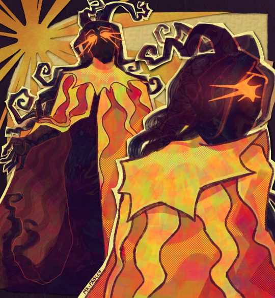
Close up shots
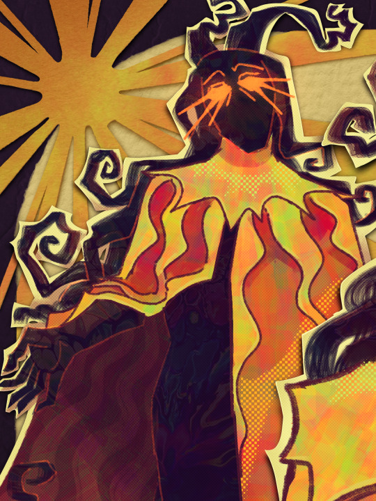
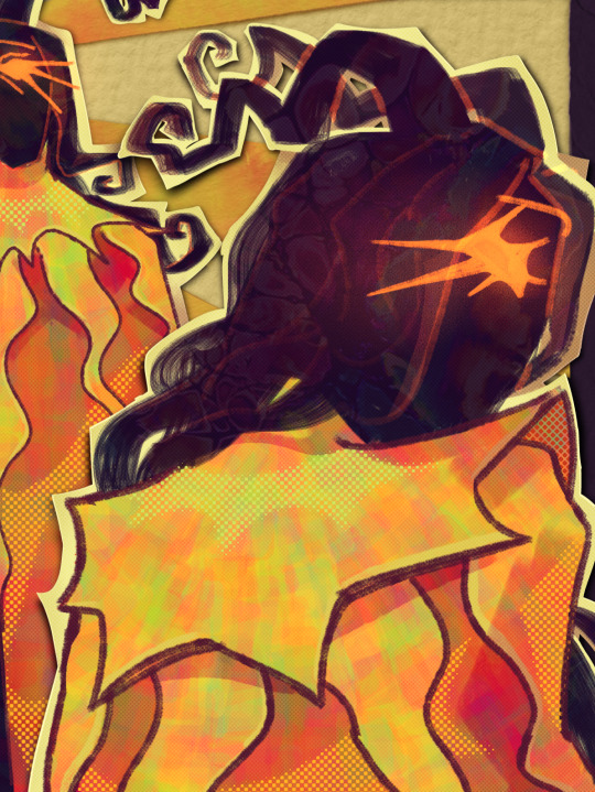
Read below bc i have so much to yap about
While swirls and curves are prominent in my John's design, spike shapes are still also present. spikes & triangles are generally associated with malice and evil in character design
This John has no consistent horns shape. So if ever youre gonna draw my john go crazy with it aha. The only thing you need to take note is his horns protrudes backwards and is never symmetrical
I looked back at my first sketches of john (below) Theres some elements in it that i really liked so i brought them back to my current design.

Still debating whether i want to implement these two in his design
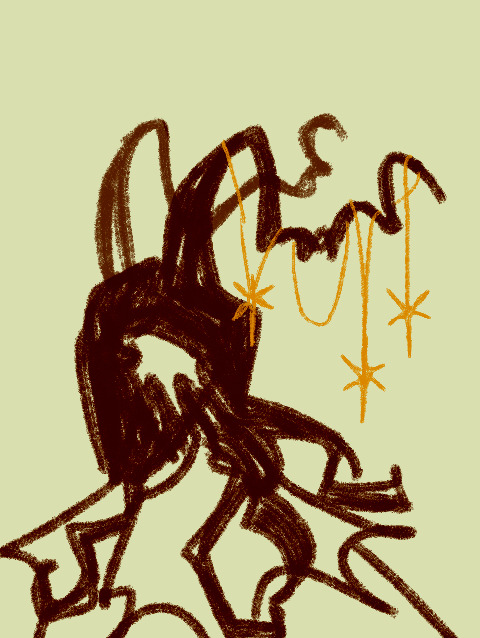
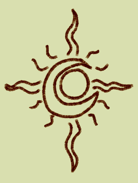
sun trapped inside moon symbol as pins maybe??? I still havent decided
OH OH what if his hair sorta floats gets all stiff, spikey and all that whenever he feels angry or any negative emotion

Ive had this idea for a while now. his cloak color would sorta like. shift from a singular hue of icky yellow to a warmer yellow with sublte hues of green and pink like
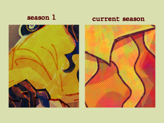
Yknow to show his character development through cloak color?? please tell me you understand
I think thats all. Go see my designs for Arthur🌙 and Oscar ⭐️ if you havent yet
#john doe malevolent#malevolent#malevolent podcast#fanart#malevolent fanart#expect that i will make holy trinity (john x arthur x oscar) fanart soon trehee#mxpaisleysart
1K notes
·
View notes
Note
How to write about someone’s appearance? Their physique, styles, face , clothes,?
How to Describe a Character's Appearance
-> dabblewriter.com
-> link to Character Description Prompts
Avoid Over-Describing
Overloading readers with too much information can be overwhelming and make your characters feel flat and one-dimensional. Focus on the details that are the most important to the story and the characters themselves.
If the character's appearance is not central to the story, then you may only need to give a basic description. If it plays a significant role, you may want to go into more detail. Always keep the purpose of your physical descriptions in mind.
Show Don't Tell
Don't blatantly state every little thing about your character's appearance, but rather show it through their actions and behaviors.
example: If they are tall, show that through their actions. They have to duck to get under a doorway, they help someone reach the top shelf, etc.
Include Personality Traits
A character's personality is what makes them memorable. Consider their motivations, values, beliefs, and quirks and give them a well-defined personality.
Avoid Stereotypes
Create characters that are more than just their cultural, racial, ethnic, or gender identity. Give them unique interests, hobbies, and personalities. Allow them to have flaws, contradictions, and diverse perspectives.
External Features
External features include a character's height, weight, body type, and general appearance. You can describe their skin color, hair color, eye color, and any distinctive features like freckles or scars. This type of description gives the reader a basic understanding of what the character looks like, which is helpful in creating a mental image.
Clothing
Describing the type of clothing they wear, including the colors, patterns, and how they fit, can reveal a lot about a character’s personality and social status.
For example, a character who wears tailored suits and expensive shoes might be a little snobby and concerned with their image, while a character who wears ripped jeans and t-shirts might be casual and relaxed.
Facial Features
Facial features can be used to give the reader a more in-depth understanding of a character's personality and emotions. You can describe their smile, the way they frown, their cheekbones, and their jawline. You can also describe their eyebrows, the shape of their nose, and the size and shape of their eyes, which can give the reader insight into their emotions.
Body Language
Body language can be used to give the reader an understanding of a character's emotions and personality without the need for dialogue. Describing the way a character stands, walks, or gestures can reveal a lot about their confidence level, mood, and attitude.
For example, a character who slouches and avoids eye contact is likely to be shy, while a character who stands up straight and makes direct eye contact is likely to be confident.
Words to Describe Various Features
Head and face
Oval: rounded, elongated, balanced, symmetrical
Round: full, plump, chubby, cherubic
Square: angular, defined, strong, masculine
Heart: pointy, triangular, wider at the temples, narrow at the chin
Diamond: angular, pointed, narrow at the forehead and jaw, wide at the cheekbones
Long: elongated, narrow, oval, rectangular
Triangular: angular, wide at the jaw, narrow at the forehead, inverted heart-shape
Oblong: elongated, rectangular, similar to oval but longer
Pear-shaped: narrow at the forehead, wide at the jaw and cheekbones, downward-pointing triangle
Rectangular: angular, defined, similar to oblong but more squared
Facial features
Cheeks: rosy, plump, gaunt, sunken, dimpled, flushed, pale, chubby, hollow
Chin: pointed, cleft, rounded, prominent, dimpled, double, weak, strong, square
Ear: large, small, delicate, flapped, pointed, rounded, lobeless, pierced
Eyes: deep-set, angled, bright, piercing, hooded, wide-set, close-set, beady, slanted, round, droopy, sleepy, sparkling
Forehead: high, broad, wrinkled, smooth, furrowed, low, narrow, receding
Jaw: strong, square, defined, angular, jutting, soft, weak, chiseled
Lips: full, thin, chapped, cracked, puckered, pursed, smiling, quivering, pouty
Mouth: wide, small, downturned, upturned, smiling, frowning, pouting, grimacing
Nose: hooked, straight, aquiline, button, long, short, broad, narrow, upturned, downturned, hooked, snub
Eyebrows: arched, bushy, thin, unkempt, groomed, straight, curved, knitted, furrowed, raised
Hair
Texture: curly, straight, wavy, frizzy, lank, greasy, voluminous, luxurious, tangled, silky, coarse, kinky
Length: long, short, shoulder-length, waist-length, neck-length, chin-length, buzzed, shaven
Style: styled, unkempt, messy, wild, sleek, smoothed, braided, ponytail, bun, dreadlocks
Color: blonde, brunette, red, black, gray, silver, salt-and-pepper, auburn, chestnut, golden, caramel
Volume: thick, thin, fine, full, limp, voluminous, sparse
Parting: center-parted, side-parted, combed, brushed, gelled, slicked back
Bangs: fringed, side-swept, blunt, wispy, thick, thin
Accessories: headband, scarf, barrettes, clips, pins, extensions, braids, ribbons, beads, feathers
Body
Build: slender, skinny, lean, athletic, toned, muscular, burly, stocky, rotund, plump, hefty, portly
Height: tall, short, petite, lanky, willowy, stocky, rotund
Posture: slouching, upright, hunched, stiff, relaxed, confident, nervous, slumped
Shape: hourglass, pear-shaped, apple-shaped, athletic, bulky, willowy, curvy
Muscles: defined, toned, prominent, ripped, flabby, soft
Fat distribution: chubby, plump, rounded, jiggly, wobbly, flabby, bloated, bloated
Body hair: hairy, smooth, shaven, beard, goatee, mustache, stubble
Weight: light, heavy, average, underweight, overweight, obese, lean, skinny
Body language: confident, nervous, aggressive, submissive, arrogant, timid, confident, relaxed
Body movements: graceful, clunky, fluid, awkward, jerky, smooth, agile, rigid
Build
Muscular: ripped, toned, defined, well-built, buff, brawny, burly, strapping
Athletic: fit, toned, agile, flexible, energetic, muscular, athletic, sporty
Thin: skinny, slender, slim, lanky, bony, gaunt, angular, wiry
Stocky: sturdy, broad-shouldered, compact, muscular, solid, robust, heavy-set
Overweight: plump, chubby, rotund, heavy, portly, corpulent, stout, fleshy
Fat: overweight, overweight, rotund, heavy, bloated, tubby, round, fat
Lean: lanky, slender, skinny, thin, wiry, willowy, spare, underweight
Larger: large, heavy, hefty, substantial, solid, overweight, portly, rotund
Skin
Texture: smooth, soft, silky, rough, bumpy, flaky, scaly, rough
Tone: fair, light, pale, dark, tan, olive, bronze, ruddy, rosy
Complexion: clear, radiant, glowing, dull, blotchy, sallow, ruddy, weathered
Wrinkles: deep, fine, lines, crow's feet, wrinkles, age spots
Marks: freckles, age spots, birthmarks, moles, scars, blemishes, discoloration
Tone: even, uneven, patchy, discolored, mottled, sunburned, windburned
Glow: luminous, radiant, healthy, dull, tired, lifeless
Tautness: taut, firm, loose, saggy, wrinkles, age spots, slack
Condition: healthy, glowing, radiant, dry, oily, acne-prone, sunburned, windburned
Style
Clothing: trendy, stylish, fashionable, outdated, classic, eclectic, casual, formal, conservative, bold, vibrant, plain, ornate
Fabric: silk, cotton, wool, leather, denim, lace, satin, velvet, suede, corduroy
Colors: bright, bold, pastel, neutral, vibrant, muted, monochrome
Accessories: jewelry, hats, glasses, belts, scarves, gloves, watches, necklaces, earrings, bracelets, rings
Shoes: sneakers, boots, sandals, heels, loafers, flats, pumps, oxfords, slippers
Grooming: well-groomed, unkempt, messy, clean-cut, scruffy, neat
Hair: styled, messy, curly, straight, braided, dreadlocks, afro, updo, ponytail
Makeup: natural, bold, minimal, heavy, smokey, colorful, neutral
Personal grooming: clean, fragrant, unkempt, well-groomed, grooming habits
Overall appearance: put-together, disheveled, polished, rough, messy, tidy
If you like what I do and want to support me, please consider buying me a coffee! I also offer editing services and other writing advice on my Ko-fi! Become a member to receive exclusive content, early access, and prioritized writing prompt requests.
#writing prompts#creative writing#writeblr#ask box prompts#how to write#how to describe a character's appearance#how to describe a character#character description#writing help#writing tip#writing tips and tricks#writing advice
2K notes
·
View notes
Text

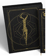
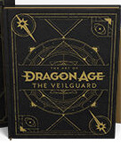
The Art of Dragon Age: The Veilguard Deluxe edition (DA:TV artbook bonus stuff). [source, via]
"The deluxe edition features: - An elegant foil-stamped slipcase and cover - Gilded pages - A ribbon book marker - Two lithographic art prints housed in a sleek portfolio" [source]
It looks like the two lithographic prints are this mural (which is from the 2020 TGA teaser iirc) and this art of Solas with a wolf by Matt Rhodes (which is from the Gamescom 2020 video iirc). The packaging's color theme-ing is black and gold, reminding of this version (that pic is from 2021) of the game's branding/color theme-ing, and also of course bringing to mind the Golden/Black City. the Golden/Black City was featured on the vinyl cover arts.
The knife here on this cover looks like the 'blue lyrium' [?] dagger, but also simultaneously not like it.

This artbook cover one is more gnarled in appearance and the 'ring' of the handle isn't complete (the way the 'broken' handle could almost be an Evanuris headpiece-shape... if it was a bit more symmetrical, it would look like Elgar'nan's headpiece).
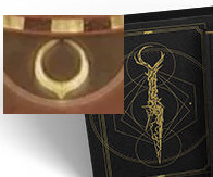
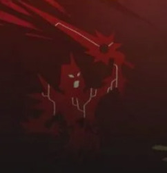
It has extra spiky bits protruding off it too and it looks like something is growing on it. Maybe this is what happens if/when the blue [lyrium?] dagger becomes red (Blighted)? because this gnarled kinda vibe reminds me a bit of Meredith's sword Certainty in DA2, and of that body horror way in which red lyrium growth looks on people. It also reminds me of the tendrils of Blight corruption on walls and the ground and stuff in DA:TV screenshots, and the gnarled red lyrium darkspawn we've seen (look at this darkspawn's back for example).

Or maybe there's simply more than one dagger? There's two rising Evil Gods.
in the background of that image is the now-familiar geometric patterning with the concentric rings around the outside that tend to represent the Veil, and also the multiple almooost-overlapping circles/spheres inside that is suggestive of an eclipse* (something which we can see in the DA:TV screenshot with the dragon, which keeps coming up, which speaks to a lot of the pertinent imagery/symbolism e.g. Elgar'nan overthrowing his father the Sun and darkening the sky, and something which to me makes sense in a Witcher-style Conjunction of the Spheres kinda vibe, multiple realms colliding, like, if you tear down the Veil, you're bringing two 'bodies' or realms together to 'overlap' once again - the Fade and the waking world). [*in the 'eclipse' link there it's just searching the word on my blog btw, since I've banged on and on about that lots before and I don't wanna repeat myself loads in this post hhh]. the placement of the dagger over that design and what it represents makes sense; as we saw in the gameplay reveal video, the dagger was part of Solas' ritual to tear down the Veil/move the Evanuris prison.
On this cover, we can see two eyeballs in two of the corners (the eyes remind me of the Inquisition hairy eyeball, the eye motifs cropping up around Lucanis, Pride, and the Fade peacock feather/eye motif [image from this post]). in the other two corners is a sword that reminds again of Certainty. Meredith brandishing the sword is part of this DA:TV mural in the bottom left, underneath Ghil. surely not a coincidence. :D maybe a Certainty-like sword is the final corrupted form of the dagger, or one of them? in TN, the red lyrium idol changed shape enough that a ritual-blade sprang from its base.
the background of this middle cover also contains triangles, reminding of ancient elven artifacts and ancient elven magic-tech (like with Bellara, the Veil Jumpers etc) and the recurring triangle symbols in DA art around Fade/Veil/magic-y stuff (example from the Tevinter Nights map below).

The cover on the right has more geometric patterns, circles, rings etc. (all these patterns remind of the art in the vinyl booklet btw). and, in the center, the eye again. 👁️
#dragon age: the veilguard#dragon age the veilguard spoilers#dragon age: dreadwolf#dragon age 4#the dread wolf rises#da4#dragon age#bioware#video games#solas#long post#longpost#body horror cw#dragon age: tevinter nights#an eye...? if so- who is watching and from where 👁️#🙏 clearer/higher quality images of these covers please
331 notes
·
View notes
Text
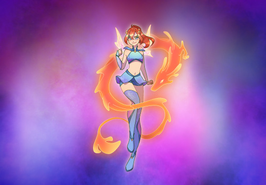
Bloom's turn!
I'm gonna admit, I don’t think Bloom's reboot design is bad. I was ranting about Aisha's a lot, but despite me generally disliking Bloom's recent pink trend, this new design is… fine?
Anyway, redesigning it out of principle:
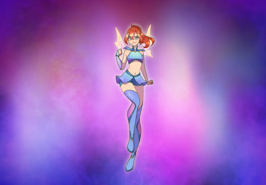

My main criticisms about the canon design are that the hair looks wack and the wings are too messy, but I do really like the added pinks for once! I still wish there was less of it, but combined with the more cosmic looking background (which I love!) it looks really celestial and warm. Idk I don’t have a lot of complains about the palette this time.
I wish her little half-sleeve was a bit less transparent, it’s barely visible like this and I really like that one shot where it appears on her arm. Deserves to shine a little more in my opinion. The shoulder pad… I like the idea behind it? I think it looks really awkward in execution though. I made it symmetrical and more collar-like because that made it more royal-looking in my opinion. Almost prince-ly, like some kind of ceremonial military uniform. Not because it reminded me of Utena haha noooo
Anyway, more thoughts under the cut:
I've kind of done the same thing I did with Aisha's wings in that redesign, but instead of making it look like water caustics I went for some more plain flame-looking patterns. It's very abstract, but as long as it vaguely resembles fire I’m happy. For the top, I tried to stick relatively close to canon — mainly because canon sticks very close to OG Bloom! Praise where praise is due, I appreciate the thought. Because the top part of the top is very narrow tho, that means the weird little shoulder pad ends up looking like an awkward little flap instead of armor. I’m deducting points for that. Granted, I also didn’t make it look like armor in my version, but I feel like that royal little suit-look would work AMAZING for that one shot where Bloom carries Icy bridal-style. You agree.
For the overall look, I went for much more symmetry than Aisha's redesign. I think Aisha being very headstrong and independent means she can afford to break patterns more, like she has her own way of doing things, even for clothing. But Bloom is still very new to being a fairy. I think she would be more than happy with just fulfilling her role as a fairy, so she can look a bit more… girl-next-door, I guess. That sporty little ponytail and singular sleeve should keep it from looking too well-behaved, I hope. I actually really like the ponytail in canon too, it’s just the sudden bangs that throw me off. Plus, I feel like the braids look odd. Don’t know why tho.


One detail I want to highlight: I made two version of her little headpiece. I feel like the first version is what Bloom should wear when she first starts out, and doesn’t yet know who she is. They’re just round little hair clips, mimicking the shape on her collar and creating a bit of a triangle, with Bloom's face at the center. But! They can also look like stunted little horn-stumps, in a way. So when Bloom regains her power in the finale, they can evolve into full little dragon horns, like she's molting out of her awkward hatchling stage.
I'm really happy with this! I feel like the vibe is a good blend between formal goody-two-shoes, and confident — maybe a little too cocky — little superhero. A bit girly, a tiny bit tomboyish, and a whole lot of kick-ass. Now if only I hadn’t set the resolution to like. 4 pixels in any direction. Wouldn’t that be fun.
125 notes
·
View notes
Text
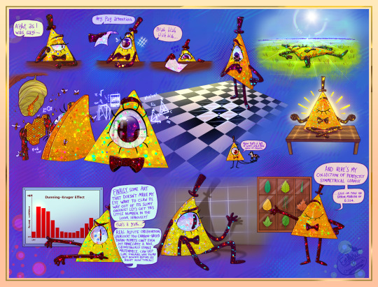
[Please zoom in, there's a lot of detail! And a massive file size...ouch]
Hi guys, long time no post! Been working on Art Fight and life stuff, but I've got something kinda fun for you.
This is a compilation exploring how a mortal Bill may interact with our world if there were still some kinda Euclidean instincts buried in there. Y'know, before the Book of Bill ruins all my headcanons >:P (EDIT: IT HAS BEEN READ. YAHOOOOOO)
Also quite an experimental piece as you can probably tell. Lots of details on both said headcanons and the art stuff under the cut, but I invite you to study the colorful texture yourself beforehand and think about what it might be representative of, just for fun because I got some really cool answers from my friends when asked :]c
TL;DR: the headcanon is that Euclideans have exceptional eyes for geometry. They find things like symmetry, tessellating patterns, graphs and fractals very aesthetically pleasing. If pushed into our 3D world, they feel comforted by the familiarity flat objects/spaces bring, as well as high-contrast patterns. Shadows especially are a familiar dimensional reduction that may bring them much comfort.
Bill would surely not be happy about these inclinations, constant reminders of a past long gone, but I'm not sure he's even aware of them here :P I think his ego gets in the way to the point where he just views these interests as common sense, which, of course, us lame humans just don't understand because we aren't nearly as cool as him. Of course he likes perfectly symmetrical leaves and staring at the kitchen floor, it's called taste, look it up!
And yet, he can't seem to shake the strange sense of melancholy he gets from viewing his own shadow.
~ End of TL;DR, long version below! ~
🔺 Headcanon Development
So, the catalyst of this idea was in relation to my friend and I's AU ( @love-triangles-au ). TL;DR, Bill's brought back mortal, meets another triangle named Y.V. (it's his hand holding the paper in the piece, actually), at some point they fall in yaois together, you know how it is. And, in writing a pair of triangles (or, more broadly, writing from the perspective of a different species), something I've had to consider was that you really can't get much further removed from a human being than sentient geometry.
The anatomical aspect was mostly figured out (see my piece on Bill's eye-mouth), but I wanted to consider what psychological differences might be at play. I wanted them to be weirder, more alien, double-so for Bill. At first I explored these possibilities through the lens of Bill and Y.V.'s relationship, specifically the question "what might a triangle find appealing about another triangle?"
Well, really the only things that came to mind were straight lines and symmetry, anything related to the geometric form of such a creature. That's more-or-less where that ended until the thought struck me that there's no reason this aesthetic appreciation couldn't extend to the rest of the environment, and then further when I realized, "wait, this is a species that is designed to live in a 2D environment. Like, they should seriously be really weird. I need to push this like 200% more."
So...yeah! I did some thinking and brainstorming with others and came up with a pretty long list of things a Euclidean in our world may be inclined to enjoy or find some level of comfort in. It's worth noting again that in this piece specifically this is a mortal/powerless Bill, so he can't really escape this Earthly environment. IF he's aware of these instincts at all (and that's a big "if"; when have you last been cognizant of your own instincts let alone known where they were stemming from?) I think he'd have snuffed them out in immortality and/or purposefully gone against them; he doesn't take kindly to being told what to do.
In order from left-to-right, top-to-bottom, here's an explanation for each!:
Flat objects such as paper are something he may find particularly engaging. It's basically 2D!
Tessellations are especially fascinating, and our world has them everywhere in the form of tile floors. Symmetry and such a predictable pattern...as the infinity of the starry sky might for us, the infinite potential of tessellations might invoke a similar sense of awe in him. Add on the maximum contrast of black on white kitchen tiles and the forms are only even better defined! A sensitivity to contrast would be very helpful for a 2D being navigating their environment.
Fields are flat and open, much like Euclydia itself. Laying flat may make him feel a little more at home.
More tessellation in the honeycomb of hymenopterans (bees, wasps and friends)! It helps that pain is hilarious.
The city is an absolute treasure trove. Rectangular buildings, precise architecture, square sidewalks and straight lines abound...he may as well be looking at a rainbow or an art gallery! I think a Euclidean's brain is very fine-tuned to mathematics, especially in regards to trigonometry. What may appear to be a straight painting might appear obnoxiously crooked to him.
Zebras are high-contrast :]
Another flat surface, another relaxing space <3
I think graphs are about as high as high art gets to most Euclideans.
I've touched on shadows before, and for good reason; truly they must be something borderline magical to the Euclidean and perhaps bitterly nostalgic.
This one kinda speaks for itself. Dweeb.
🎨 The Artsy Stuff
Lately I've been trying to find ways to fit more color into my work, as color is perhaps one of my favorite things in the world. My wardrobe is rather garish; my dad jokes that you could see me from space. My fursona is obnoxiously bright for a reason -- I feel my soul is a very colorful one!
I also realized recently that I don't actually know the exact style that speaks to me. I could talk about the phenomenon of the "style crisis" that many artists have all day, but in my mind the best cure for this feeling is to go against it entirely and begin stealing as much as possible.
So, I've tried to keep an eye out for more sources of inspiration everywhere I go, physical and digital. I've tried to train my mind into making a habit of considering, "can I do anything with this?" everywhere I go, and it recently paid off!
The glittery rainbowy texture you see plastered all over Billiam is this one, a photo-manipulated set of fruit stickers. I must confess I've been obsessed with this image for the past 72 hours, and this seemed like a good excuse to try it out!
I worried throughout the process if it might be so abstract that it loops back around to being horribly deliberate, if that makes sense -- like each sparkle was not a piece of a whole but rather an object in itself -- but it seems like that hasn't been a problem, so I'm grateful for that :Dc
I hope it can dazzle and delight you as it does me, but as long as you find it fascinating at the very least then I consider it a success! I really enjoyed hearing my friends' interpretations while workshopping it, and got tons of amazing answers from opal to kaleidoscope to fossilized bone marrow! I truly believe that the best art has some room for interpretation and it really excites me to be surrounded by that kind of creative energy that follows said pieces. That definitely adds to my pride in this work. It's weird, it's colorful, it's detailed and yet ambiguous. I'm feeling pretty autistic about it
Alright, I think that's about it. Thanks for listening!
#digital art#gravity falls#fan art#bill cipher#artists on tumblr#posting this and running! not returning to social media until my book is here and read front-to-back >:Dc#this may age terribly or it may not...i'm inclined to think it may not. bill's a flatass he already basically said as much#i use the term “flatland(er)” as a placeholder; he's not literally from the same universe as the book Flatland#...probably 👀#EDIT: YEP. words have been changed!
241 notes
·
View notes
Text
Symmetrically / Different
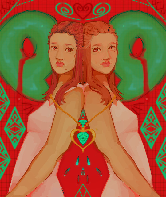
[ID: Art of Iris and Dahlia Hawthorne, identical twins. The canvas is perfectly symmetrical, everything the same but flipped on the left side of it. The right side is Dahlia Hawthorne, smiling at Iris while back to back with her sister. The backs of their heads pressed against each other as they lean against the other. Dahlias hair is a lighter ginger, her skin tone ever slightly more warm and she has a mole under her right eye. There is a giant green magatama behind her head, the left side of it slightly covered by the side of her face. The magatama bleeds the same red as the bright red canvas background. Underneath the magatama, there are three neonish green, magatama colour matching, diamond shapes with Dahlias lace dress pattern in them. Two of the diamonds are cut off by the screen. Above the magatama, in the corner, there's more triangles and diamond shape patterns in reds and greens. Towards the middle of the canvas, there's a swirling green coloured to match the magatama, and a red like the blood, love heart that curls in the middle. Iris' side is the same as Dahlias, but flipped. Her expression is upset as she looks at her sister, with pushed in brows and a slight frown. Her hair is more artificially red with dark roots, her mole just below her mouth on the left of her face, and her torso is very slightly thicker than her twins. The poison heart shaped necklace is chained around the two twins, keeping them stuck leaning against each other. The necklace faintly glows, leaking symmetrical tears that turn into blood. /end ID]
#ace attorney#described#art#described art#drawing#digital art#digital artwork#ace attorney trials and tribulations#dahlia hawthorne#iris hawthorne#iris fey#chinami miyanagi#satoko mukui#dahlia plantule#Meiliu Qiannaimei#wujiuing lizi#ayame miyanagi#hazakurain ayame#yeyingyuan caiya#eyestrain#tw eyestrain
973 notes
·
View notes
Note
(Unrelated to the white marking tournament lol)
I found this cool lookin' cat on reddit when he was posted in the tortie sub, but his markings are way too symmetrical to be a tortie imo. He looks more like a very densely striped black tabby!


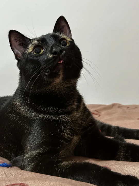
He actually really reminds me of the cats that have been called psuedomelanistic on Messybeast, so maybe it's some kind of abundism/charcoal pattern? What are your thoughts?
said cats on Messybeast:
Yeah, this is definitely not a tortie and imo totally the same thing as those messybeast cats. Good catch! They all have the gray crescent triangles above the eyes, rings around their neck and striped legs. This is systematic.
My personal opinion is that it's probably not directly related to charcoal (as in, it has not much to do with the leopard cat), at most it's an unrelated ASIP mutation. Both are a kind of pseudomelanism/abundism (if we as use these words in a strictly descriptive, "blacker than usual but not entirely black animal" meaning, and to my understanding that's the common use), but that doesn't really explains the genetics.
I think this is a very interesting phenomenon, and i hope someone tests a cat like these for at least agouti/asip and mackerel-blotched/taqpep
54 notes
·
View notes
Text
Nikodisgender
[PT: Nikodisgender].
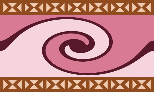
[ID: A rectangular flag with three stripes going in a spirally shape towards the center of the flag. The middle stripe is thinner than the rest. The colors from most top touching stripe to most bottom touching stripe are: deep blush, wine maroon and light pink. On the top and bottom of the flag there are thick light brown horizontal stripes. Inside of each of these stripes is a symmetrical pattern of tan colored triangles: 1 pointing right then 2 pointing top and bottom touching each other then 1 pointing left and repeated till the end of the stripe. End ID].
Nikodisgender: A gender that is connected to Nikola Orsinov and Michael/The Distortion from The Magnus Archives. It is a gender that is all over the place but in a neat and spirally way.
Etymology: niko(la) + dis(tortion) + gender

[ID: A purple thin line divider shaded at the bottom, End ID].
Requested by anon
Taglist [ask to be added or removed]: @radiomogai @rwuffles @zoeynovie @fangpunk @sevvys
@smilepilled @flutteringwings-coining @boingogender
#nikodisgender#nikola orsinov#the distortion#michael distortion#tma nikola#tma michael#mediagender#mediagenders#neogender#neogender coining#gender coining#mogai#liom#mogai term#liom term#mogai coining#liom coining#liomogai#mogai flag#liom flag#qai#qai coining#qai flag#qai term#liomoqai
29 notes
·
View notes
Text
Flags ranked by the difficulty of painting them on your own nails:
Trans flag 12/10, would paint again. Five stripes for five nails in a symmetrical colour pattern.
Nonbinary and intersex flags 6/10. Appreciate that the full flag one picks up two colours from the individual nails. Can't draw a circle so I did yellow with a purple French tip. Can't draw that either it turns out.
Palestine flag 3/10. Red triangle very difficult, doesn't stand out over the green/black, and just looks like my cuticle is bleeding heavily.
Pride flag 0/10. I did not kill Inigo Montoya's father. I do not have six fingers on my right hand.
7 notes
·
View notes
Text
Public domain designs for the narrator and the Sphere from Flatland: A Romance of Many Dimensions, which is public domain and can be read and watched and listened to in many formats for free.
All of the art and designs on this post are public domain. This means they have no copyright, and can be used by anyone for anything. Including making art you then sell. You can repost any you like to shorter posts, just please include the image description that goes along with it.
Image descriptions are in summary, the equivalent of subtitles for blind people.
Here is a link to a masterpost for Flatland: A Romance of Many Dimensions.
And now for the public domain designs. I made all of these last week and kept forgetting to post.
The narrator first. There's two sets of lineart I was using and I only remembered to make one of them glow.
Batesian mimicry:
Where Flatlanders appear to be completely different creatures when seen above, with eyes that seem to stare directly at you...but it's really just incredibly detailed coloration on their internal organs, evolved to ward off predation from 3D predators that Flatlanders aren't even aware of.

[ID: A digital drawing of a square against a dark grey background, with a thick black border. Inside the square is a squiggly pink shape like an alien fish, with a single purple eye staring upward. Around it are green and orange squiggles, with white triangles around the edges, one of which is the Flatlander's real eye and mouth. End ID.]
Valentines card:

[ID: A digital drawing of a square against a light grey background. He has a black outline that glows white, with a single eye at the upper right corner. His insides are dark purple-red, with brighter red inside a zig-zagging bordern, with five pinks hearts inside the red section, with the largest in the middle. End ID.]
Basic organs:

[ID: A square with a glowing border, with a simple cartoony oval eye on one corner with a narrow pupil like a cat. His inside is light blue, with two large rounded blobs stretching back from his eye to represent a lung and stomach, in pink and purple. Around these are smaller blobby organs in orange, red, and darker red-purple. End ID.]
Same lineart as above, but with patterns for fun:

[ID: The same lineart as directly above, but rather than solid colors, his insides are striped blue and ice blue, and the organs are pale pink with darker pink polka dots. End ID.]
based on very fuzzy memories of a quilt from my Nana Jana's house...

[ID: A glowing square against the grey background, still with the simple oval eye in one corner. This time his inside is colored teal, with many almost symmetrical shapes inside forming a random pattern,each with gaps between them. These shapes are in pale red, orange, yellow, pink, and purple, with a large section in blue filled in with some of them. End ID.]
pretty pattern 1:

[ID: The glowing square, now colored monochrome blue, with a pattern of overlapping lines forming many curved diamonds filled in with blue-black, dark blue, ice blue, and almost white. End ID.]
Needs More Glow:

[ID: The glowing square, now colored in dark brown, with a large pane orange eye and large round pupil,creating a gap at the corner that is filled in with glowing white. His insides are in tan directly behind the eye, with other blogs for organs leading off to the sides in different shades of yellow, brown, and red, including a small heart shape. End ID.]
Geode dude:

[ID: The glowing square, now with his insides dark red on two corners, and the rest filled in with squiggles of ever-lightening blue. On top of this are thin white lines showing the forms of a brain, heart, and organs. The brain is connected by many small tendrils to the line that comes in from the upper corner that is both his eye and mouth. End ID.]
the same but now with squiggles:

[ID: The same white lineart as above for the organs, but filled in solid black, with the backgroud of the square in different shades of blue wavy lines like water. End ID.]
This one should have been brighter but my phone lies to me about colors and I'm too lazy to fix it now.

[ID: The glowing square, now with a simple cartoon eye at the top right corner, with a large white zig-zag crossing the body behind it. One side is pink with purple spots, the other is purple with pink spots. The spots are connected to eachother with simple wavy lines like springs. End ID.]
Fiery rose:

[ID: A square with thick black outlines on a grey backround. The inside is colored in different shades of overlapping pink and red swirls, forming a pattern like flower petals, or fire. End ID.]
sunshine swirl:

[ID: The square with thick outlines, now colored in orange, with a paler yellow orange symmetrical spiral on the inside forming a swirly sun shape in the center. End ID.]
simpler...

[ID: The square with the thick outline, now colored in orange, with a large oval eye, a large purple heart shape, and two small purple circle shapes on either side. End ID.]
simplerer...

[ID: The square with thick outlines, now colored in sea-foam green, with a simple black spiral at the upper right corner for the mouth and eye. End ID.]
Now for The Sphere:
Starlight eyes, with pattern.


[ID: Three digital drawings. The first shows an original design for the Sphere from Flatland, drawn against a light grey background. The Sphere is light pink, with a swirling floral design in purple. He has two large eyes, whose pupils are black and covered in specks of white, like stars. The second image is just the circle with the pattern, and the last image is the pattern itself filling out the whole image. It is symmetrical four ways, with four swirls and points in a cross between a flower and a star. End ID.]
Cyclops with noodly arm-legs


[ID: Two drawings of a sphere against a grey background. He is medium blue, with darker blue, thick swirling stripes, like a mackerel tabby cat. He has a single large oval eye on his face, and from his top rear extend two long limbs, which he holds at his sides in the first drawing showing him from the side, then folds under him like a cat in the second, when he is shown from the front. End ID.]
Stained glass at night:

[ID: An original design for the Sphere, seen from the front. He is covered in an intricate pattern of dark purple, magenta, orange, gold, teal, and royal blue. His eyes are shaped like narrow, upside down teardrops, with dark grey sclera, black iris, and a white, four-pointed star pupil. End ID.]
Froggisphere + lineart for recoloring


[ID: Two images. The first is the sphere drawn as a frog-like creature with a dark orange and yellow spherical body, with dark red eyes with horizontal bar pupils, with dark red thick front legs with yellow webbing, and blue back legs.The second image is the black and white lineart by itself. End ID.]
and last for now:

[ID: MS Paint art from four angles showing an original design for the Sphere. He is monochrome green, with a pale yellow-green face with a greener triangle shaped marking, then a deep green belly and hood. Above and between his eyes are yellow-green swirls, and his mouth is a simple line. His eyes are the same yellow-green as the markings around them, and inside his mouth is lime green. A purple hand filled with white sparkles is scribbled next to him, labeled, "telekinesis". End ID.]
these characters are public domain. You can make any design for them you want instead of doing free advertising for the infamously racist conservative Ladd Ehlinger, who created the 2007 film.
#eye contact#public domain characters#Rjalker reads Flatland a Romance of Many Dimensions#Flatland#Flatlandaromanceofmanydimensions#A Square#A. Square#The Sphere#long post#public domain art#public domain
22 notes
·
View notes
Note
For the rainbow jacket swirls, is there any kind of strategy you follow for the pattern in which you embroider them? I love how your project is turning out
Thanks! For the sleeve, I wanted the transitions to not be super abrupt, but still be a noticeable difference between every color, not a gradual fade like I'm doing on the back panel. I tried not to do two swirls going in the same direction in a row, and to vary the sizing a bit. I also tried to make sure each color got roughly equal area, and to throw in a weird shape like a triangle or a circle every once in a while to break up the swirls Other than that, no real strategy? For the back panel, I wanted as gradual a color shift as I could manage, radiating out from the top center of that back panel of fabric, going through the colors of a sunset. This time I have not done circles or triangles, mostly just swirls, but I'm throwing in some disjointed perpendicular stitches every now and then to fill in blank spaces and also just because I can. I'm trying to keep the color distribution roughly symmetrical across the outer edges of the semi-circle as I go, but not worrying about it much because the colors are so close together it's not super visible if it's a little asymmetrical
#ask away!#rainbow swirls embroidered jacket#short version: when choosing colors for the sleeve I wanted it to be visible from a distance when I switched colors#but I also wanted the colors to kind of lead into each other#for the back I wanted it to be almost impossible to tell when I switched colors exactly from a distance#and so far I think it's working!
10 notes
·
View notes
Note

Hello, hope you feel ok now (just read about ur caution back then).
I'm show you that composite chart cuz I want to ask about the unique shape that it made, Will it give other perspective rather the aspects and overlay read?
Please note I'm not worth for your reading, so no need to do that cuz I just want to ask someone who more understand about it. I'm sorry cuz maybe if it disturb you for your schedule posts (please, no need to answer it if you to busy). Thank you 😉
Ps: that's not my chart so I'm not really known their real dynamic relation but it's really interesting how the on/off situation happen.
Hello! You don't have to be so humble lmao I never meant it like that.
Aspect patterns are quite interesting to look at, because in a way, it sort of gives you an idea of what the individuals are like in the relationship but not really as much as other aspects. It can also tells you more details about certain aspects. My favourite to see is the grand trine. A perfect, symmetrical triangle with a planet occupying every 4 planets in the same element.
For example: You have Chiron in the 1st house of Sagittarius (fire) which normally means that you'll struggle with body image, but if it forms say a grand trine (blue lines usually) to Venus in the 5th or Jupiter in the 9th it's likely that you'll receive a lot of support form those areas to lessen the burden you feel in regards to your appearance i.e have a more positive, and understanding mindset to overcome it. You are also more resilient.
Grand trine

In this chart however, I'll just point out the obvious one to explain.
What a grand cross looks like: it's not in this chart though.

There's a double opposition but it doesn't form a grand cross which usually makes the planets/houses they're in rather tensed or uneasy (because they're originally oppositions with squares added). Depending on the planets involved it can cause significant issues and hard lessons within the relationship.
In this case the cross (crossing oppositions) involves hard aspects between Saturn-Mars & Neptune-moon, but soft aspects between Saturn-Neptune & Mars-Moon. There could be a lot of clash between expectation and reality when it comes to this relationship. Perhaps both dreamt of it lasting in the long run but because of their own personal goals, feelings and general incompatibility it's just not looking too good. They'll find themselves getting frustrated over the smallest things when they're together. Intense connection that works in their head, but not realistically. Not to say they're hopeless however.
The spike

It's formed by two planets being sextile to one another, with a third planet being exactly 150° to the other two points, or quincunx.
Can be a pretty good thing to see although it depends on the chart. It can show you where the relationship can manifest itself or its potential,or where it can be difficult to manoeuvre but not as commonly observed, at least to me. Also referred to as yod. Look at the planets involved and where it's pointing especially if there is a cluster of planets in one house/sign.
Also, that 8th house stellium (a.ka cluster) is also probably a huge part of that on again off again cycle as it's the cause of that karmic pull. You hate them, but you want them, they love each other but they want the other out of their life lmao. Both likely have some sort of karmic debt to repay together.
Hope this helps!
#astrology observations#astrology notes#astrology blog#astro notes#astro observations#astrology content#astrology community#astrology#astrology ramblings#karmic relationships#grand cross#grand trine#aspects patterns#aspects patterns astrology#composite chart observations#composite observations#composite chart#composite
17 notes
·
View notes
Text

This Week's Sky at a Glance, January 26 – February 4
FRIDAY, JANUARY 26
Once it's nice and dark, spot the equilateral Winter Triangle in the southeast. Sparkly Sirius is its brightest and lowest star. Betelgeuse stands above Sirius by about two fists at arm's length. To the left of their midpoint is Procyon.
Can you discern their colors? Sirius (spectral type A0) is cold white, Betelgeuse (M2) is yellow-orange, and Procyon (F5) is very slightly on the yellowish side of white. Binoculars make star colors more evident.
As Saturday's dawn grows bright, Mercury and fainter Mars have a very difficult conjunction just above the southeast horizon as shown below. You'll need an open horizon in that direction and optical aid, maybe powerful aid.
SATURDAY, JANUARY 27
The Moon, two days past full, rises not long after the end of twilight. Once it's well up, spot Regulus to its upper right and Gamma Leonis a little farther to its upper left. These are the two brightest stars of Leo's Sickle.
SUNDAY, JANUARY 28
The biggest well-known asterism (informal star pattern) is the Winter Hexagon. It fills the sky toward the east and south these evenings.
Start with brilliant Sirius at its bottom. Going clockwise from there, march up through Procyon, Pollux and Castor, Menkalinan and Capella on high, over and down to Aldebaran, then to Rigel in Orion's foot, and back to Sirius. Betelgeuse shines inside the Hexagon, well off center.
The Hexagon is somewhat distended. But if you draw a line through its middle from Capella down to Sirius, the "Hexagon" is fairly symmetric with respect to that long axis.
Take the line from Aldebaran to Capella, turn it to go from Aldebaran to Betelgeuse instead, and the Winter Hexagon becomes the Heavenly G.
Yin Yang Cosmic Polarity Talon Abraxas
39 notes
·
View notes