#tailpiece
Text

Oh, hello!
The Art of drawing and painting in water-colours, 1731.
22 notes
·
View notes
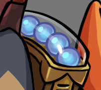
Photo

A Mountain Mahogany “Fleur de Lis” tailpiece on a cornerless 1704 “Betts” Stradivari model violin
#mountain mahogany#fleur de lis#tailpiece#violin tailpiece#violin#cornerless#1704#betts#stradivarius#Stradivari#antoniostradivari
5 notes
·
View notes
Photo

Guitar-bouzouki tailpiece. #guitarbouzouki #bouzouki #guitars #tailpiece #bespokeguitars #williamhancockguitars (at Melbourne, Victoria, Australia) https://www.instagram.com/p/ClCogEoy2DB/?igshid=NGJjMDIxMWI=
5 notes
·
View notes
Text

0 notes
Text
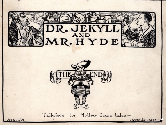
J. Quentin Jaxon “Dr Jekyll and Mr Hyde” title header (1921)
Source
39 notes
·
View notes
Text
Milestone Monday


Happy National Dictionary Day!
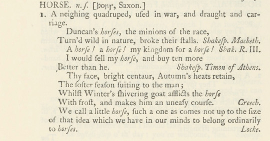
Although the day was introduced to honor the birthday of American lexicographer Noah Webster, we are more interested in his innovative predecessor Samuel Johnson (1709-1784). Johnson was an English writer with credits as a poet, playwright, essayist, literary critic, sermonist, biographer, editor, and lexicographer. In 1746, he was approached by a group of publishers to create an authoritative English dictionary and agreed, boasting he could complete the dictionary within three years. In the end, he single-handedly completed the task within eight years utilizing only clerical assistance.
Johnson’s A Dictionary of the English Language was first published in London by noted Scottish printer and publisher William Strahan on April 15, 1755. While certainly not the first dictionary, it was groundbreaking in its documentation of the English lexicon providing not only words and their definitions, but examples of their use. Johnson accomplished this by illustrating the meanings of words through literary quotes, often citing Shakespeare, Milton, and Dryden. He also introduced lighthearted humor into some of his definitions, most notably describing a lexicographer as “a writer of dictionaries; a harmless drudge that busies himself in tracing the original and detailing the signification of words”. Of equal amusement, oats are defined as “a grain which in England is generally given to horses, but in Scotland supports the people”.


A Dictionary of the English Language was published in two volumes with volume one containing A-K and volume two L-Z. Its pages were 46 cm tall and 51 cm wide, and it is said that outside of a few special editions of the Bible no book of this size and bulk had been set to type and that no bookseller could print it without help. Johnson’s dictionary was the pre-eminent dictionary for over 100 years until the completion of the Oxford English Dictionary in 1884. Despite some criticism about his etymology and orthoepic guidelines, Johnson’s dictionary was tremendously influential in its methodology for how dictionaries should be constructed and entries presented, casting a shadow over all future dictionaries and lexicographers.
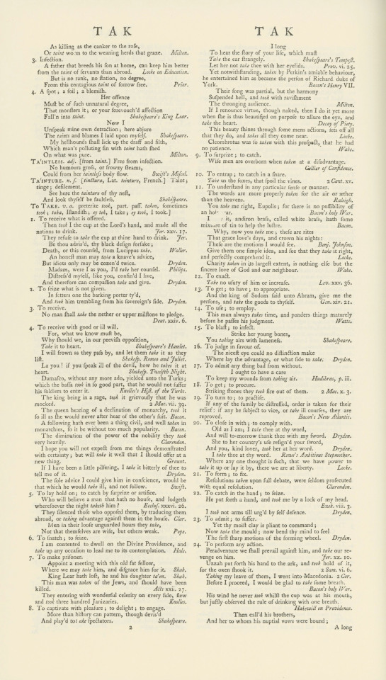
Several of the words in Johnson's dictionary were painstakingly defined. "Take" has 134 definitions running 8,000 words over 5 pages.

Woodcut tailpieces adorn the dictionary interspersed between letters.
Special Collections holds a facsimile reproduction of Johnson's dictionary, published in 1967 by AMS Press of New York.

View other Milestone Monday posts.
-Jenna, Special Collections Graduate Intern
#Milestone Monday#milestones#national dictionary day#holidays#a dictionary of the english language#samuel johnson#w. strahan#William Strahan#milestonemonday#lexicographers#woodcuts#AMS Press#tailpieces#dictionaries#English dictionaries#lexicography
29 notes
·
View notes
Text
hi

witness my struggle, ft: butter dish i was using as reference for rendering translucent glass, before i realized that i was going overboard for what is supposed to be a cartoon stylization

take 1: the most butterdish- i went overboard trying to copy the ref and also struggling because the ref is a clear dish on a white bg, so its hard to tell what's highlight and what's translucency. ultimately, i decided it looks overworked for such a small wearable, and also makes it hard to see the balls inside. also it looks lumpy
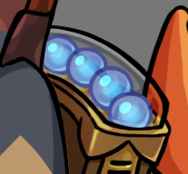
take 2: i actually kind of like this one, but if you zoom out it becomes clear its Also too overworked

take 3: mannn i was gonna be like 'and here's my ultimate version' but man.... its easier to see the balls in take 2.... this shit is difficult

take 4: okay it needs some kind of stronger highlight doesn't it. but also its at this point where i realize i'm overthinking it

tAKE 5: WHat if i combined 3 and 4... ohhhh fuck!!!!!!!!! (its overcluttered again)
okay so after take 5 i left this post to fuck around with it more and ended up with take 6
which i think is what i'm going to go with. i showed gill to ask for their opinion and i had to point out to them what i was even changing, because this area of the drawing is so small when zoomed out. im the king of obsessing over trivial details
#i need a text post tag#all of this for the johnny 5 aces reference... i still need to shade the boots and the tailpiece on this design#wips
14 notes
·
View notes
Text
I got inspired to make a cosmetic change on my Les Paul, tonight.
The tailpiece is from an Ibanez AF-55, that was traded out for a Bigsby.
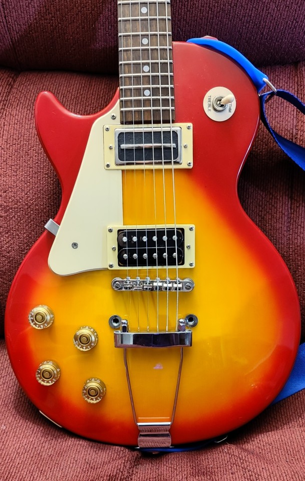
#left handed guítar#left handed electric guitar#trapeze tailpiece#epiphone les paul 100#epiphone guitar#epiphone#les paul
4 notes
·
View notes
Text

Source: Gregorius (Papa XV) — Motus proprius. Reverse title. It’s unusual in this period (ca. 1623) for there to be a graphic on the back of the title page. Such “devices” or “printer’s cuts” are more often found at the end of a chapter or on the back of the final page of text; in those locations they are often called “tailpieces”. (Compare with ”frontispiece” — an illustration facing the title page or on the page preceding the title page.) Printer’s cuts, unlike frontispieces, are seldom tailored to a particular work. Instead they — like most ornaments — go with the printer, and so you will often see the same ornaments over nad over in books from the same printing-house.
5 notes
·
View notes
Text

Is it too much to ask to live in this house!?
57 notes
·
View notes
Photo


An replica of Giuseppe Guarneri’s 1730 “Kreisler” violin, fitted with a mountain mahogany “Lady Blunt” tailpiece, “Alard” pegs, and a richlite Rippleboard
#violin#kreisler#guarneri#1730#cremona#ladyblunt#tailpiece#alard#pegs#tuningpegs#mountainmahogany#richlite#twoset#twosetviolin#cello#viola#lutier#luthiery#violinista#violinistsofinstagram#classicalmusic#soloist#stradivarius#violín#violinplayer#violinist#woodworking#housle#geige#viool
4 notes
·
View notes
Text
Welp, I brought my cello back to the apartment with me yesterday thinking I'd play it, so I took it out today and snapped my A string after about 10 minutes of unfruitful peg tuning attempts. Guess it's off to the music store tomorrow!
#cello#luckily no blood was spilt (it snapped at the top)#which i think means it was at the end of its life anyway lol#and i was already gonna go since i need a new bow as well#(good riddance. that thing was super nasty down at the frog)#how the hell are you actually supposed to peg tune anyway? i never got the hang of it#maybe my pegs are too tight?#i wouldn't know#i got a new tailpiece like two years into high school and it changed my life how much easier it was to fine tune#so hopefully this will be a similar experience
3 notes
·
View notes
Text
I love having a lego url while not actively legoblogging. U had 2 be there i guess.
#vani verbals#the aspheera minifig across from my bed on my minifig display. SHE understands.#speaking of i still gotta get her a custom tailpiece. eugh
5 notes
·
View notes
Text
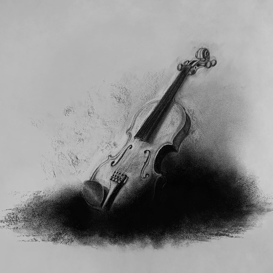
Charcoal drawing of a Violin
#art#drawing#pencil#charcoaldrawing#pencildrawing#desenho#dibujo#carboncillo#charcoalart#charcoal#arte#sketch#musical#instrument#sound#music#instrumento#tailpiece#scroll#pegs#fingerboard#neck#soundpost#bridge#finetuners#chinrest#endpoint#bow#musica#strings
1 note
·
View note
Text

#flowercore#illustration#gothic#art#vintage art#bookbinding resources#f2u#public domain#tailpieces#book illustration
1 note
·
View note
Text
looking at scans on archive.org that poorly trace over old illustrations in books:

#personal#such a tragedy…..#btw we need to bring back not only full page illustrations but also headers; tailpieces; page frames; the works!
0 notes
Last Seen Blogs

caramel-poptart
I Am But A Little Slug, Emerging When It Rains.
ourbygoneage
Our Bygone Age

fashioneditswebsite
FashionEdits

illyagnatyuk93
Untitled

pinfusawa
Smash Is Dead