#team section flexbox
Explore tagged Tumblr posts
Visit Tumblr Blog
Explore Tumblr blogs with no restrictions, modern design and the best experience.
Last Seen Tumblr Blogs


Fun Fact
In February 2021, Tumblr had 518.6 million blog accounts.
Text

Team Section UI Design
#team section design#team section flexbox#codenewbies#html css#html5 css3#webdesign#css flexbox layout#css flexbox#css#team section html css#html css tutorial
4 notes
·
View notes
Text
WordPress Theme Development: A Complete Guide
WordPress theme development is an essential skill for developers looking to create custom, high-performance websites. Whether you're building a theme for personal use, client projects, or to sell on marketplaces, understanding the fundamentals is crucial.
This guide covers everything from the basics to advanced techniques, helping you master WordPress theme development.
1. What is a WordPress Theme?
A WordPress theme is a collection of files that define the appearance and functionality of a website. It includes:
PHP Files – Control the structure and content.
CSS Stylesheets – Define the website’s look and feel.
JavaScript Files – Add interactivity and animations.
Template Files – Manage different parts of the website, such as headers, footers, and sidebars.
Themes can be either classic themes (built using PHP) or block themes (based on the WordPress block editor).
2. Tools Required for Theme Development
Before you start, set up a proper development environment. Here’s what you need:
Local Development Server: Install Local by Flywheel, XAMPP, or MAMP to test your theme locally.
Code Editor: Use Visual Studio Code or Sublime Text for writing clean code.
Version Control: Use Git for tracking changes and collaborating with teams.
Browser DevTools: Inspect and debug CSS, JavaScript, and responsive design.
3. Setting Up a Basic WordPress Theme
To create a custom theme, follow these steps:
Step 1: Create a Theme Folder
Navigate to wp-content/themes/ and create a new folder (e.g., mytheme).
Step 2: Add Essential Theme Files
Inside your theme folder, create the following files:
style.css (Main stylesheet)
index.php (Main template file)
functions.php (Handles theme functions)
4. Understanding WordPress Template Hierarchy
WordPress uses a hierarchy to determine which template file to load. Some important templates include:
index.php – Default template (fallback for all pages).
header.php & footer.php – Used for the site's header and footer.
single.php – Displays single blog posts.
page.php – Used for static pages.
archive.php – Displays category, tag, and author archives.
Understanding this hierarchy helps you create a structured theme.
5. Adding Dynamic Features with functions.php
The functions.php file is crucial for adding features like menus, widgets, and theme support.
Registering a Navigation Menu
6. Creating Custom Page Templates
To create a unique page design, you can build a custom template.
Example: Custom About Page Template
Now, when creating a new page in WordPress, you can select "About Page" from the Page Attributes section.
7. Making Your Theme Responsive
Use CSS media queries to ensure your theme works on all devices.
Additionally, using Flexbox and CSS Grid can help create a more flexible layout.
8. SEO & Performance Optimization
Optimize Code and Assets
Minify CSS & JavaScript using plugins like Autoptimize.
Load scripts asynchronously to improve speed.
SEO Best Practices
Use semantic HTML5 tags (<header>, <article>, <footer>).
Optimize images using WebP format for faster load times.
Install an SEO plugin like Yoast SEO to manage metadata and sitemaps.
9. Testing & Debugging Your Theme
Before deploying, ensure your theme is error-free.
Enable Debugging: Add this to wp-config.php: phpCopyEditdefine('WP_DEBUG', true); define('WP_DEBUG_LOG', true);
Use Theme Check Plugin: Install the Theme Check plugin to ensure your theme follows WordPress coding standards.
10. Publishing and Selling Your Theme
Once your theme is complete, you can:
Submit it to the WordPress Theme Repository.
Sell it on marketplaces like ThemeForest or TemplateMonster.
Offer premium versions on your own website.
Conclusion
WordPress theme development is an exciting and rewarding skill that allows you to build powerful, customized websites. By mastering the basics, following best practices, and continuously improving your designs, you can create themes that are functional, responsive, and optimized for SEO.
If you’re serious about WordPress development, start building and experimenting with your own themes today!
0 notes
Text
What is Requirements to Become a FullStackDeveloper ?

Introduction :
Full Stack Developers need to know the core of web architecture. Since their primary responsibility is to develop complex software applications from scratch, they must know how to structure the code, categorize the files, structure the data in databases, and perform the necessary computational tasks.
Code Structure:
Full stack developers need to comprehend how to structure their code for maintainability and scalability. This involves organizing files and directories, adhering to coding standards, and employing design patterns to create modular and reusable components.
Database Design:
Knowledge of how to structure data in databases is vital. Full stack developers should understand relational database design principles, normalization, and indexing for efficient data storage and retrieval. Additionally, familiarity with non-relational databases like MongoDB is beneficial for diverse application requirements.
Computational Tasks:
Full stack developers are responsible for implementing computational tasks efficiently. This includes writing algorithms, optimizing code for performance, and understanding the computational complexity of different operations. Proficiency in data structures and algorithms is valuable for addressing diverse computational challenges.
Web Architecture:
Understanding web architecture involves knowledge of the client-server model, request-response cycle, and the role of different components in the architecture. Full stack developers need to grasp how the front-end, back-end, databases, and external services interact to deliver a seamless user experience.
Scalability:
Full stack developers should be mindful of designing applications that can scale. This includes considerations for horizontal and vertical scaling, load balancing, and caching strategies to ensure optimal performance as the user base and data volume grow.
Security Considerations.
Awareness of security best practices is essential. Full stack developers must implement measures to protect against common web vulnerabilities, ensure secure data storage and transmission, and handle user authentication and authorization securely.
Code Versioning:
Proficiency in using version control systems like Git is crucial for collaborative development. Full stack developers should understand branching strategies, resolving conflicts, and utilizing version control effectively to track changes and collaborate seamlessly with team members.
Documentation:
Documenting the code base and architectural decisions is important for knowledge transfer and future maintenance. Full stack developers should be skilled in creating clear and comprehensive documentation that aids both themselves and other team members.
Adherence to Best Practices:
Full stack developers need to follow industry best practices in web development. This includes adhering to coding standards, using consistent naming conventions, and adopting design principles that promote code readability and maintainability.
Continuous Learning:
Given the dynamic nature of web technologies, full stack developers must engage in continuous learning. Staying updated on the latest trends, tools, and best practices ensures they can leverage the most effective solutions for application development.
Front-End Development:
HTML/CSS:
HTML5 and CSS3 Features:
HTML5 introduces semantic elements like <article>, <section>, and <nav>, providing more meaningful structure to web content. CSS3 brings advanced styling features such as transitions, animations, and flexbox, allowing for more sophisticated and responsive designs.
JavaScript:
Asynchronous Programming:
Asynchronous JavaScript, through mechanisms like promises and async/await, enables developers to handle operations such as data fetching without blocking the main thread. This promotes a smoother user experience by preventing the UI from freezing during resource-intensive tasks.
DOM Manipulation:
DOM manipulation involves dynamically updating the content of web pages. Understanding event handling and delegation is crucial for creating interactive and responsive user interfaces.
Front-End Frameworks/Libraries:
React.js, Angular, or Vue.js:
React.js, a popular library, employs a component-based architecture, allowing for the modular construction of user interfaces. State management, essential for handling application state, is efficiently managed through React’s state or external tools like Redux.
Responsive Design:
Media Queries:
Media queries in CSS enable the creation of responsive designs by applying styles based on the characteristics of the device or screen. This ensures that web applications look and function well across various platforms.
CSS Frameworks:
CSS frameworks like Bootstrap simplify the process of building responsive designs. Embracing the mobile-first approach ensures that designs are optimized for smaller screens before being adapted to larger ones.
Web Performance:
Optimization Techniques:
Web performance optimization involves implementing strategies like code splitting, where large bundles are divided to reduce initial load times. Lazy loading images and employing efficient algorithms further contribute to improved performance.
Package Managers:
npm or Yarn:
npm (Node Package Manager) and Yarn are essential tools for managing project dependencies. They enable developers to easily install, update, and share libraries or packages used in their projects.
Build Tools:
Webpack:
Webpack, a powerful build tool, facilitates the bundling and optimization of project assets. It supports features such as code splitting and tree shaking, helping reduce the size of bundles and improve overall application performance.
Back-End Development:
Server-Side Language:
Node.js (JavaScript) with Express.js:
Node.js, known for its event-driven and non-blocking I/O model, is commonly used with Express.js to build scalable web applications. This combination enables efficient handling of concurrent requests.
Python with Django or Flask:
Django, a high-level Python web framework, follows a batteries-included philosophy, providing an integrated and robust solution for web development. Flask, on the other hand, offers a more lightweight and modular approach, allowing developers to choose their components.
Databases:
SQL (Relational Databases):
Relational databases, managed using SQL, require an understanding of normalization and indexing for efficient data storage and retrieval. Proficiency in complex queries and transactions is essential for working with relational databases.
NoSQL (e.g., MongoDB).
NoSQL databases like MongoDB use a document-based model for data storage. Developers must comprehend the benefits and appropriate use cases of NoSQL databases, often chosen for their flexibility and scalability.
APIs:
RESTful APIs:
Designing RESTful APIs involves choosing appropriate HTTP methods, status codes, and structuring endpoints logically. Implementation of CRUD operations with proper authentication and authorization mechanisms ensures secure and functional APIs.
Server:
Routing and Middleware:
Routing in the back-end involves mapping HTTP requests to specific endpoints. Middleware functions handle tasks such as authentication, logging, and error handling, contributing to a modular and organized codebase.
Web Servers:
Nginx or Apache:
Configuring Nginx or Apache as web servers involves setting up virtual hosts, managing server blocks, and handling static file serving. These servers act as intermediaries, forwarding requests to the appropriate back-end applications.
Authentication and Authorization:
JWT (JSON Web Tokens):
JSON Web Tokens provide a secure method for implementing token-based authentication. Understanding the OAuth protocol is crucial for enabling third-party authentication, allowing users to log in using external credentials.
DevOps:
Deployment:
Deployment processes involve setting up applications on various platforms, such as Heroku, AWS, or Azure. Containerization with Docker ensures consistent deployment across different environments, reducing compatibility issues.
Version Control/Git:
Git Workflow:
Git workflows, like Gitflow or GitHub flow, prescribe strategies for branching and merging code changes. Concepts like rebasing and conflict resolution enhance collaboration among developers.
Testing:
Unit and Integration Testing:
Writing and running tests for both front-end and back-end code ensures the reliability and functionality of applications. Testing frameworks like Jest for JavaScript/React or pytest for Python/Django provide comprehensive testing capabilities.
Web Security:
HTTPS and SSL/TLS:
Implementing secure connections with HTTPS is paramount for protecting data during transmission. Understanding SSL/TLS protocols and proper certificate management contributes to a secure web environment.
Data Validation:
Data validation and sanitization prevent security vulnerabilities arising from malicious user input. Implementing robust error handling mechanisms ensures the graceful handling of unexpected situations.
CI/CD:
Continuous Integration:
Automated builds, facilitated by tools like Jenkins or GitLab CI, ensure that code changes are continuously integrated into a shared repository, preventing integration issues.
Continuous Deployment:
Continuous Deployment pipelines automate the process of releasing new versions of applications. This ensures a consistent and reliable release process, reducing the likelihood of human errors.
Soft Skills:
Communication:
Team Collaboration:
Effective communication within a development team involves clearly conveying technical concepts and insights. Participating in code reviews fosters collaboration and knowledge sharing.
Problem-Solving:
Debugging Skills:
Proficient debugging skills are essential for identifying and resolving issues efficiently. Utilizing debugging tools and employing systematic approaches enhance problem-solving capabilities.
Project Management:
Agile Methodology:
Embracing Agile principles in project management emphasizes iterative development and collaboration. Tools like Jira or Trello assist in organizing tasks and tracking project progress.
Additional Concepts:
GraphQL:
Schema Definition:
GraphQL’s strength lies in its schema definition, allowing developers to precisely define the structure of data. Queries are tailored to request only the needed data, reducing over-fetching and under-fetching.
Serverless Architecture:
Function as a Service (FaaS):
Serverless architecture, exemplified by AWS Lambda or Azure Functions, involves breaking down applications into small, independent functions. This approach simplifies scaling and reduces infrastructure management overhead.
Microservices:
Decomposition and Independence:
Microservices architecture advocates for breaking down large applications into small, independently deployable services. Technologies like Docker and Kubernetes facilitate the orchestration of these services.
Cloud Services:
AWS, Azure, or Google Cloud:
Cloud services offered by platforms such as AWS, Azure, or Google Cloud provide scalable and cost-effective solutions. Understanding services like AWS Lambda, S3, or Azure App Services is crucial for deploying applications in the cloud.
This expanded content provides a more detailed and nuanced view of the various aspects of full-stack development, aiming to cover key concepts comprehensively.
Becoming a full stack developer is like gaining a superpower in the web development world. It’s the ability to not only create beautiful and interactive front-end interfaces that users see but also to handle the behind-the-scenes magic of servers, databases, and all the complex functionalities that make applications run smoothly. As a full stack developer, you’re the architect of the entire digital experience, from the initial idea to the final product. It’s a rewarding journey that lets you bring your creative ideas to life and have a hand in every aspect of a project.
Thanks for reading ,hopefully you like the article if you want to take Full stack Masters course from our Institute please attend our live demo sessions or contact us: +918464844555 providing you with the best Online Full Stack Developer Course in Hyderabad with an affordable course fee structure.
0 notes
Photo

Team Section Design Using CSS Flexbox
#team section design#our team html css#team section flexbox#css flexbox layout#flexbox#css flexbox examples#CSS FLexbox Tutorial#css Flexbox#html css#divinector
0 notes
Video
youtube
Flexbox #8 - Work on our teams sections
1 note
·
View note
Text
A Guide In Firefox to New And Creative CSS DevTools
Over the last few years, our team at
Firefox
has been operating on new CSS gear that address both cutting-edge strategies and age-old frustrations. We’re the Layout Tools team, a subset of Firefox Developer Tools, and our quest is to improve the modern-day internet layout workflow.
The internet has seen an first-rate evolution inside the final decade: new HTML/CSS functions, browser improvements, and design strategies. Our crew is dedicated to constructing gear that fit that innovation so that designers and developers can harness extra of the performance and creativity that’s now possible.
In this guide, we’ll proportion a top level view of our seven new equipment, with memories from the design system and realistic steps for trying out each tool.
1. Grid Inspector
It all started out three years in the past while our CSS format expert and dev advocate, Jen Simmons, labored with members of Firefox
DevTools
to construct a device that would aid customers in examining CSS Grid layouts.
As one of the most powerful new functions of the cutting-edge internet, CSS Grid had quick gained decent browser adoption, but it still had low internet site adoption. There’s a steep studying curve, and you nevertheless need fallbacks for sure browsers. Thus, part of our purpose turned into to help popularize Grid by way of giving developers a more hands-on manner to research it.
The middle of the device is a grid outline, overlaid at the page, which facilitates devs visualize how the grid is positioning their elements, and the way the layout modifications once they tweak their styles. We introduced numbered labels to identify each grid line, the capability to view up to 3 grids at once, and colour customization for the overlays. Recently, we also introduced support for subgrid, a modern day CSS specification implemented in Firefox and hopefully in extra browsers soon.
Grid Inspector changed into an idea for all of the tools that followed. It was even an notion for a brand new team: Layout Tools! Formed in late 2017, we’re unfold across 4 time zones and collaborate with many others in Mozilla, like our rendering engine builders and the best parents at MDN.
TRY OUT THE GRID INSPECTOR
In Firefox, go to our Grid example site.
Open the Inspector with Cmd + Shift + C.
Turn on Grid overlay through one of 3 ways:
Layout Panel:
In the Grid section, check the checkbox subsequent to .Content.Grid-content;
Markup View:
Toggle the “grid” badge next to ;
Rules View:
Click the button next to display:grid; inside
#page
-intro .Grid-content;
Experiment with the Grid Inspector:
Change the crimson overlay coloration to red;
Toggle “Line numbers” or “Extend strains infinitely”;
Turn on greater grid overlays;
See what takes place while you disable grid-gap: 15px in Rules.
2. The Editor of Form Path
The next project we have been working on has been the Shape Path Editor: our first visual editing tool.
CSS Shapes permits you to define shapes for textual content to drift around: a circle, a triangle, or a many-sided polygon. It can be used with the clip-path assets which permits you to trim elements to any of those equal shapes. These two techniques collectively open the opportunity for a few very specific graphic design-stimulated layouts.
However, creating these sometimes complicated shapes can be difficult. Typing all the coordinates manually and the use of the right CSS units is error-inclined and some distance eliminated from the creative mind-set that Shapes allows. Therefore, we made a device that allows you to edit your code through at once clicking and dragging shapes on the web page.
This kind of feature—visible editing—became new for us and browser tools in general. It’s an instance of how we will go beyond inspecting and debugging and into the world of design.
TRY OUT THE SHAPE PATH EDITOR
In Firefox, go to this web page at the An Event Apart website.
Open the Inspector with Cmd + Shift + C and pick out the first circular image.
In Rules, click on the icon subsequent to the shape-outside property.
On the web page, click on the factors of the shape and notice what happens while you drag to make the shape massive or tiny. Change it to a size that appears exact to you.
3. Text Reader
We have had a Fonts panel in Firefox for years which displays an informative list of all the fonts used in a website. We decided to convert this into a Font Editor to fine-tune the properties of a font by continuing our trend of designing in the browser.
A driving force behind this assignment become our purpose to support Variable Fonts at the same time that the Firefox rendering engine team changed into adding support for it. Variable Fonts gives font designers a way to offer fine-grained variations alongside axes, like weight, within one font file. It also supports custom axes, which offer each font creators and web designers an exceptional amount of flexibility. Our device routinely detects these custom axes and offers you a manner to alter and visualize them. This would otherwise require specialized websites like Axis-Praxis. Additionally, we added a characteristic that gives the ability to hover over a font name to spotlight in which that particular font is being used at the page. This is helpful because the manner browsers select the font used to render a bit of text can be complex and depend upon one’s computer. Some characters may be abruptly swapped out for a special font due to font subsetting. TRY OUT THE FONTS EDITOR
In Firefox, go to this variable fonts demo site.
Open the Inspector with Cmd + Shift + C and pick out the word “variable” within the title (the element’s selector is .Title__variable-web__variable).
In the 1/3 pane of the Inspector, navigate to the Fonts panel:
Hover over the font name Output Sans Regular to look what receives highlighted;
Try out the load and slant sliders;
Take a take a look at the preset font versions within the Instances dropdown menu.
4. Flexbox Inspector
Our Grid, Shapes, and Variable Fonts equipment can together electricity some very advanced graphic layout at the internet, but they’re still somewhat present day based on browser support. (They’re nearly there, however still require fallbacks.) We didn’t need to work most effective on new features—we were drawn to the problems that maximum web builders face on a every day basis.
So we started work at the Flexbox Inspector. Design-wise, this has been our most ambitious assignment, and it sprouted some new consumer research strategies for our team.
Like Grid, CSS Flexbox has a fairly steep learning curve while you first get started. It takes time to truely recognize it, and a lot of us hotel to trial and error to gain the layouts we need. At the beginning of the assignment, our team wasn’t even sure if we understood Flexbox ourselves, and we didn’t recognize what the main challenges have been. So we leveled up our understanding, and we ran a survey to discover what human beings wanted the most when it got here to Flexbox.
The outcomes had a big effect on our plans, making the case for complicated visualizations like grow/decrease and min/max. We continued operating with the community at some point of the task by means of incorporating remarks into evolving visual prototypes and Nightly builds.
The tool consists of two main parts: a highlighter that works just like the Grid Inspector’s, and a detailed Flexbox device inside the Inspector. The middle of the tool is a flex item diagram with sizing info.
With help from Gecko format engineers, we have been able to show the step-by-step size choices of the rendering engine to offer users a full image of why and the way a flex object ended up with a positive size.
Note: Learn the full tale of our design manner in “Designing the Flexbox Inspector”.
TRY OUT THE FLEXBOX INSPECTOR
In Firefox, visit Mozilla’s Bugzilla.
Open the Inspector with Cmd + Shift + C and pick out the element div.Inner (simply inside the header bar).
Turn on the Flexbox overlay through one of 3 ways:
Layout Panel:
In the Flex Container section, turn on the switch;
Markup View:
Toggle the “flex” badge next to ;
Rules View:
Click the button next to display:flex.
Use the Flex Container panel to navigate to a Flex Item known as nav#header-nav.
Note the sizes shown within the diagram and length chart;
Increase and reduce your browser’s width and see how the diagram modifications.
Interlude: Doubling Down On Research
As a small team and not using a formal person research support, we’ve regularly resorted to design-by-dogfooding: basing our critiques on our personal stories in using the tools. But after our achievement with the Flexbox survey, we knew we wanted to be better at collecting statistics to guide us. We ran a new survey to assist tell our subsequent steps. We crowdsourced a list of the 20 largest demanding situations faced by internet devs and asked our community to rank them using a max-diff format. When we discovered that the huge winner of the demanding situations was CSS Layout Debugging, we ran a follow-up survey on unique CSS insects to discover the largest pain points. We supplemented these surveys with user interviews and user testing. We also asked folks to rank their frustrations with browser developer tools. The clear pinnacle difficulty became moving CSS modifications returned to the editor. This became our subsequent project.
5. Changes Panel
The difficulty in shifting one’s work from a browser developer device to the editor is one of those age-old issues that we all just got used to. We were excited to make a easy and straight away usable solution.
Edge and Chrome DevTools got here out with versions of this device first. Ours is centered on assisting a wide range of CSS workflows: Launch DevTools, trade any patterns you want, and then export your modifications by means of either copying the overall set of changes (for collaboration) or simply one changed rule (for pasting into code). This improves the robustness of the whole workflow, such as our other format tools. And this is just a start: We recognize accidental refreshing and navigation from the web page is a huge source of facts loss, so a manner to bring persistence to the tool may be an essential next step. TRY OUT THE CHANGES PANEL
In Firefox, navigate to any website.
Open the Inspector with Cmd + Shift + C and pick an element.
Make some adjustments to the CSS:
Modify patterns inside the Rules pane;
Adjust fonts within the Fonts pane.
In the right pane of the Inspector, navigate to the Changes tab and do the following:
Click Copy All Changes, then paste it in a text editor to view the output;
Hover over the selector name and click Copy Rule, then paste it to view the output.
6. Inactive CSS
Our Inactive CSS feature solves one of the top troubles from our layout debugging survey on precise CSS bugs: “Why is this CSS assets now not doing anything?”
Design-wise, this feature is very simple—it grays out CSS that doesn’t affect the page, and shows a tooltip to give an explanation for why the property doesn’t have an effect. But we understand this can enhance efficiency and cut down on frustration. We have been bolstered by research from Sarah Lim and her colleagues who constructed a similar device. In their studies, they observed that novice builders had been 50�ster at building with CSS when they used a device that allowed them to ignore beside the point code.
In a way, that is our favorite sort of feature: A low-placing UX fruit that barely registers as a feature, however improves the complete workflow without actually wanting to be determined or learned. Inactive CSS launches in Firefox 70 but may be used now in prerelease variations of Firefox, consisting of Developer Edition, Beta, and Nightly. TRY OUT INACTIVE CSS
Download Firefox Developer Edition;
Open Firefox and navigate to
wikipedia.Org;
Open the Inspector with Cmd + Shift + C and choose the center content material area, called central-featured;
Note the grayed out vertical-align declaration;
Hover over the data icon, and click on “Learn extra” if you’re interested.
7. Accessibility Panel
Along the way we’ve had accessibility functions developed by means of a separate group that’s typically one person — Yura Zenevich, this year together with his intern Maliha Islam.Together they’ve turned the brand new Accessibility panel in Firefox into a powerful inspection and auditing tool. Besides displaying the accessibility tree and properties, you could now run different varieties of checks on a page. So far the checks include shade contrast, textual content labels, and keyboard attention styling.
Now in Nightly, you can strive the new shade blindness simulator which harnesses our upcoming WebRender tech.
TRY OUT THE ACCESSIBILITY PANEL
Download Firefox Developer Edition;
Navigate to
meetup.Com;
In the developer tools, navigate to the Accessibility tab, and click the “Turn on Accessibility Features” button;
Click the drop-down menu subsequent to “Check for problems” and pick out “All Issues”;
Take a have a look at the diverse contrast, keyboard, and text label troubles, and click the “Learn greater” links if you’re interested.
Next Up
We’re currently hard at paintings on a browser compatibility tool that uses facts from MDN to expose browser-specific problems for a particular element. You can follow along on GitHub to learn extra. The Future
We’re committed to helping the modern-day web, and that means continuously converting and growing. New specs get implemented via browser vendors all of the time. Guidelines and nice practices around progressive enhancement, responsiveness, and accessibility evolve constantly. Us device makers need to hold evolving too.
And what of the long-lived, ever-present troubles in creating the web? What ordinary user interfaces need to be rethought? These are a number of the questions that preserve us going!
What approximately a better manner to navigate the DOM tree of a page? That a part of DevTools has gone essentially unchanged since the Firebug days.
We’ve been experimenting with functions like again and forward buttons that might ease navigation between lately visited elements. A extra dramatic trade we’re discussing is including a compact DOM view that makes use of a syntax much like HTML templating engines. The attention could be on the most common use case—navigating to CSS—as opposed to viewing/enhancing the source.
We’ve additionally been thinking about a higher element selector. We realize how it can be more effective to work inside the web page, with much less jumping backward and forward into DevTools. We should make the detail selector extra effective and greater persistent. Perhaps it could choose whitespace on a page and tell you what causes that space, or it can shed mild at the relationships between extraordinary elements.
As a reputed Software Solutions Developer we have expertise in providing dedicated remote and outsourced technical resources for software services at very nominal cost. Besides experts in full stacks We also build web solutions, mobile apps and work on system integration, performance enhancement, cloud migrations and big data analytics. Don’t hesitate to
get in touch with us!
Source:
whizzystack.co
#b2b ecommerce
#b2b content marketing
#b2b seo
#b2b marketing blog
1 note
·
View note
Text
A Guide In Firefox to New And Creative CSS DevTools
Over the last few years, our team at
Firefox
has been operating on new CSS gear that address both cutting-edge strategies and age-old frustrations. We’re the Layout Tools team, a subset of Firefox Developer Tools, and our quest is to improve the modern-day internet layout workflow.
The internet has seen an first-rate evolution inside the final decade: new HTML/CSS functions, browser improvements, and design strategies. Our crew is dedicated to constructing gear that fit that innovation so that designers and developers can harness extra of the performance and creativity that’s now possible.
In this guide, we’ll proportion a top level view of our seven new equipment, with memories from the design system and realistic steps for trying out each tool.
1. Grid Inspector
It all started out three years in the past while our CSS format expert and dev advocate, Jen Simmons, labored with members of Firefox
DevTools
to construct a device that would aid customers in examining CSS Grid layouts.
As one of the most powerful new functions of the cutting-edge internet, CSS Grid had quick gained decent browser adoption, but it still had low internet site adoption. There’s a steep studying curve, and you nevertheless need fallbacks for sure browsers. Thus, part of our purpose turned into to help popularize Grid by way of giving developers a more hands-on manner to research it.
The middle of the device is a grid outline, overlaid at the page, which facilitates devs visualize how the grid is positioning their elements, and the way the layout modifications once they tweak their styles. We introduced numbered labels to identify each grid line, the capability to view up to 3 grids at once, and colour customization for the overlays. Recently, we also introduced support for subgrid, a modern day CSS specification implemented in Firefox and hopefully in extra browsers soon.
Grid Inspector changed into an idea for all of the tools that followed. It was even an notion for a brand new team: Layout Tools! Formed in late 2017, we’re unfold across 4 time zones and collaborate with many others in Mozilla, like our rendering engine builders and the best parents at MDN.
TRY OUT THE GRID INSPECTOR
In Firefox, go to our Grid example site.
Open the Inspector with Cmd + Shift + C.
Turn on Grid overlay through one of 3 ways:
Layout Panel:
In the Grid section, check the checkbox subsequent to .Content.Grid-content;
Markup View:
Toggle the “grid” badge next to ;
Rules View:
Click the button next to display:grid; inside
#page
-intro .Grid-content;
Experiment with the Grid Inspector:
Change the crimson overlay coloration to red;
Toggle “Line numbers” or “Extend strains infinitely”;
Turn on greater grid overlays;
See what takes place while you disable grid-gap: 15px in Rules.
2. The Editor of Form Path
The next project we have been working on has been the Shape Path Editor: our first visual editing tool.
CSS Shapes permits you to define shapes for textual content to drift around: a circle, a triangle, or a many-sided polygon. It can be used with the clip-path assets which permits you to trim elements to any of those equal shapes. These two techniques collectively open the opportunity for a few very specific graphic design-stimulated layouts.
However, creating these sometimes complicated shapes can be difficult. Typing all the coordinates manually and the use of the right CSS units is error-inclined and some distance eliminated from the creative mind-set that Shapes allows. Therefore, we made a device that allows you to edit your code through at once clicking and dragging shapes on the web page.
This kind of feature—visible editing—became new for us and browser tools in general. It’s an instance of how we will go beyond inspecting and debugging and into the world of design.
TRY OUT THE SHAPE PATH EDITOR
In Firefox, go to this web page at the An Event Apart website.
Open the Inspector with Cmd + Shift + C and pick out the first circular image.
In Rules, click on the icon subsequent to the shape-outside property.
On the web page, click on the factors of the shape and notice what happens while you drag to make the shape massive or tiny. Change it to a size that appears exact to you.
3. Text Reader
We have had a Fonts panel in Firefox for years which displays an informative list of all the fonts used in a website. We decided to convert this into a Font Editor to fine-tune the properties of a font by continuing our trend of designing in the browser.
A driving force behind this assignment become our purpose to support Variable Fonts at the same time that the Firefox rendering engine team changed into adding support for it. Variable Fonts gives font designers a way to offer fine-grained variations alongside axes, like weight, within one font file. It also supports custom axes, which offer each font creators and web designers an exceptional amount of flexibility. Our device routinely detects these custom axes and offers you a manner to alter and visualize them. This would otherwise require specialized websites like Axis-Praxis. Additionally, we added a characteristic that gives the ability to hover over a font name to spotlight in which that particular font is being used at the page. This is helpful because the manner browsers select the font used to render a bit of text can be complex and depend upon one’s computer. Some characters may be abruptly swapped out for a special font due to font subsetting. TRY OUT THE FONTS EDITOR
In Firefox, go to this variable fonts demo site.
Open the Inspector with Cmd + Shift + C and pick out the word “variable” within the title (the element’s selector is .Title__variable-web__variable).
In the 1/3 pane of the Inspector, navigate to the Fonts panel:
Hover over the font name Output Sans Regular to look what receives highlighted;
Try out the load and slant sliders;
Take a take a look at the preset font versions within the Instances dropdown menu.
4. Flexbox Inspector
Our Grid, Shapes, and Variable Fonts equipment can together electricity some very advanced graphic layout at the internet, but they’re still somewhat present day based on browser support. (They’re nearly there, however still require fallbacks.) We didn’t need to work most effective on new features—we were drawn to the problems that maximum web builders face on a every day basis.
So we started work at the Flexbox Inspector. Design-wise, this has been our most ambitious assignment, and it sprouted some new consumer research strategies for our team.
Like Grid, CSS Flexbox has a fairly steep learning curve while you first get started. It takes time to truely recognize it, and a lot of us hotel to trial and error to gain the layouts we need. At the beginning of the assignment, our team wasn’t even sure if we understood Flexbox ourselves, and we didn’t recognize what the main challenges have been. So we leveled up our understanding, and we ran a survey to discover what human beings wanted the most when it got here to Flexbox.
The outcomes had a big effect on our plans, making the case for complicated visualizations like grow/decrease and min/max. We continued operating with the community at some point of the task by means of incorporating remarks into evolving visual prototypes and Nightly builds.
The tool consists of two main parts: a highlighter that works just like the Grid Inspector’s, and a detailed Flexbox device inside the Inspector. The middle of the tool is a flex item diagram with sizing info.
With help from Gecko format engineers, we have been able to show the step-by-step size choices of the rendering engine to offer users a full image of why and the way a flex object ended up with a positive size.
Note: Learn the full tale of our design manner in “Designing the Flexbox Inspector”.
TRY OUT THE FLEXBOX INSPECTOR
In Firefox, visit Mozilla’s Bugzilla.
Open the Inspector with Cmd + Shift + C and pick out the element div.Inner (simply inside the header bar).
Turn on the Flexbox overlay through one of 3 ways:
Layout Panel:
In the Flex Container section, turn on the switch;
Markup View:
Toggle the “flex” badge next to ;
Rules View:
Click the button next to display:flex.
Use the Flex Container panel to navigate to a Flex Item known as nav#header-nav.
Note the sizes shown within the diagram and length chart;
Increase and reduce your browser’s width and see how the diagram modifications.
Interlude: Doubling Down On Research
As a small team and not using a formal person research support, we’ve regularly resorted to design-by-dogfooding: basing our critiques on our personal stories in using the tools. But after our achievement with the Flexbox survey, we knew we wanted to be better at collecting statistics to guide us. We ran a new survey to assist tell our subsequent steps. We crowdsourced a list of the 20 largest demanding situations faced by internet devs and asked our community to rank them using a max-diff format. When we discovered that the huge winner of the demanding situations was CSS Layout Debugging, we ran a follow-up survey on unique CSS insects to discover the largest pain points. We supplemented these surveys with user interviews and user testing. We also asked folks to rank their frustrations with browser developer tools. The clear pinnacle difficulty became moving CSS modifications returned to the editor. This became our subsequent project.
5. Changes Panel
The difficulty in shifting one’s work from a browser developer device to the editor is one of those age-old issues that we all just got used to. We were excited to make a easy and straight away usable solution.
Edge and Chrome DevTools got here out with versions of this device first. Ours is centered on assisting a wide range of CSS workflows: Launch DevTools, trade any patterns you want, and then export your modifications by means of either copying the overall set of changes (for collaboration) or simply one changed rule (for pasting into code). This improves the robustness of the whole workflow, such as our other format tools. And this is just a start: We recognize accidental refreshing and navigation from the web page is a huge source of facts loss, so a manner to bring persistence to the tool may be an essential next step. TRY OUT THE CHANGES PANEL
In Firefox, navigate to any website.
Open the Inspector with Cmd + Shift + C and pick an element.
Make some adjustments to the CSS:
Modify patterns inside the Rules pane;
Adjust fonts within the Fonts pane.
In the right pane of the Inspector, navigate to the Changes tab and do the following:
Click Copy All Changes, then paste it in a text editor to view the output;
Hover over the selector name and click Copy Rule, then paste it to view the output.
6. Inactive CSS
Our Inactive CSS feature solves one of the top troubles from our layout debugging survey on precise CSS bugs: “Why is this CSS assets now not doing anything?”
Design-wise, this feature is very simple—it grays out CSS that doesn’t affect the page, and shows a tooltip to give an explanation for why the property doesn’t have an effect. But we understand this can enhance efficiency and cut down on frustration. We have been bolstered by research from Sarah Lim and her colleagues who constructed a similar device. In their studies, they observed that novice builders had been 50�ster at building with CSS when they used a device that allowed them to ignore beside the point code.
In a way, that is our favorite sort of feature: A low-placing UX fruit that barely registers as a feature, however improves the complete workflow without actually wanting to be determined or learned. Inactive CSS launches in Firefox 70 but may be used now in prerelease variations of Firefox, consisting of Developer Edition, Beta, and Nightly. TRY OUT INACTIVE CSS
Download Firefox Developer Edition;
Open Firefox and navigate to
wikipedia.Org;
Open the Inspector with Cmd + Shift + C and choose the center content material area, called central-featured;
Note the grayed out vertical-align declaration;
Hover over the data icon, and click on “Learn extra” if you’re interested.
7. Accessibility Panel
Along the way we’ve had accessibility functions developed by means of a separate group that’s typically one person — Yura Zenevich, this year together with his intern Maliha Islam.Together they’ve turned the brand new Accessibility panel in Firefox into a powerful inspection and auditing tool. Besides displaying the accessibility tree and properties, you could now run different varieties of checks on a page. So far the checks include shade contrast, textual content labels, and keyboard attention styling.
Now in Nightly, you can strive the new shade blindness simulator which harnesses our upcoming WebRender tech.
TRY OUT THE ACCESSIBILITY PANEL
Download Firefox Developer Edition;
Navigate to
meetup.Com;
In the developer tools, navigate to the Accessibility tab, and click the “Turn on Accessibility Features” button;
Click the drop-down menu subsequent to “Check for problems” and pick out “All Issues”;
Take a have a look at the diverse contrast, keyboard, and text label troubles, and click the “Learn greater” links if you’re interested.
Next Up
We’re currently hard at paintings on a browser compatibility tool that uses facts from MDN to expose browser-specific problems for a particular element. You can follow along on GitHub to learn extra. The Future
We’re committed to helping the modern-day web, and that means continuously converting and growing. New specs get implemented via browser vendors all of the time. Guidelines and nice practices around progressive enhancement, responsiveness, and accessibility evolve constantly. Us device makers need to hold evolving too.
And what of the long-lived, ever-present troubles in creating the web? What ordinary user interfaces need to be rethought? These are a number of the questions that preserve us going!
What approximately a better manner to navigate the DOM tree of a page? That a part of DevTools has gone essentially unchanged since the Firebug days.
We’ve been experimenting with functions like again and forward buttons that might ease navigation between lately visited elements. A extra dramatic trade we’re discussing is including a compact DOM view that makes use of a syntax much like HTML templating engines. The attention could be on the most common use case—navigating to CSS—as opposed to viewing/enhancing the source.
We’ve additionally been thinking about a higher element selector. We realize how it can be more effective to work inside the web page, with much less jumping backward and forward into DevTools. We should make the detail selector extra effective and greater persistent. Perhaps it could choose whitespace on a page and tell you what causes that space, or it can shed mild at the relationships between extraordinary elements.
As a reputed Software Solutions Developer we have expertise in providing dedicated remote and outsourced technical resources for software services at very nominal cost. Besides experts in full stacks We also build web solutions, mobile apps and work on system integration, performance enhancement, cloud migrations and big data analytics. Don’t hesitate to
get in touch with us!
0 notes
Text

Team Section UI Design
#team section html css#team section flexbox#codenewbies#html css#frontenddevelopment#html5 css3#css#webdesign#css flexbox layout#flexbox snippets
3 notes
·
View notes
Text
A Guide In Firefox to New And Creative CSS DevTools
Over the last few years, our team at
Firefox
has been operating on new CSS gear that address both cutting-edge strategies and age-old frustrations. We’re the Layout Tools team, a subset of Firefox Developer Tools, and our quest is to improve the modern-day internet layout workflow.
The internet has seen an first-rate evolution inside the final decade: new HTML/CSS functions, browser improvements, and design strategies. Our crew is dedicated to constructing gear that fit that innovation so that designers and developers can harness extra of the performance and creativity that’s now possible.
In this guide, we’ll proportion a top level view of our seven new equipment, with memories from the design system and realistic steps for trying out each tool.
1. Grid Inspector
It all started out three years in the past while our CSS format expert and dev advocate, Jen Simmons, labored with members of Firefox
DevTools
to construct a device that would aid customers in examining CSS Grid layouts.
As one of the most powerful new functions of the cutting-edge internet, CSS Grid had quick gained decent browser adoption, but it still had low internet site adoption. There’s a steep studying curve, and you nevertheless need fallbacks for sure browsers. Thus, part of our purpose turned into to help popularize Grid by way of giving developers a more hands-on manner to research it.
The middle of the device is a grid outline, overlaid at the page, which facilitates devs visualize how the grid is positioning their elements, and the way the layout modifications once they tweak their styles. We introduced numbered labels to identify each grid line, the capability to view up to 3 grids at once, and colour customization for the overlays. Recently, we also introduced support for subgrid, a modern day CSS specification implemented in Firefox and hopefully in extra browsers soon.
Grid Inspector changed into an idea for all of the tools that followed. It was even an notion for a brand new team: Layout Tools! Formed in late 2017, we’re unfold across 4 time zones and collaborate with many others in Mozilla, like our rendering engine builders and the best parents at MDN.
TRY OUT THE GRID INSPECTOR
In Firefox, go to our Grid example site.
Open the Inspector with Cmd + Shift + C.
Turn on Grid overlay through one of 3 ways:
Layout Panel:
In the Grid section, check the checkbox subsequent to .Content.Grid-content;
Markup View:
Toggle the “grid” badge next to ;
Rules View:
Click the button next to display:grid; inside
#page
-intro .Grid-content;
Experiment with the Grid Inspector:
Change the crimson overlay coloration to red;
Toggle “Line numbers” or “Extend strains infinitely”;
Turn on greater grid overlays;
See what takes place while you disable grid-gap: 15px in Rules.
2. The Editor of Form Path
The next project we have been working on has been the Shape Path Editor: our first visual editing tool.
CSS Shapes permits you to define shapes for textual content to drift around: a circle, a triangle, or a many-sided polygon. It can be used with the clip-path assets which permits you to trim elements to any of those equal shapes. These two techniques collectively open the opportunity for a few very specific graphic design-stimulated layouts.
However, creating these sometimes complicated shapes can be difficult. Typing all the coordinates manually and the use of the right CSS units is error-inclined and some distance eliminated from the creative mind-set that Shapes allows. Therefore, we made a device that allows you to edit your code through at once clicking and dragging shapes on the web page.
This kind of feature—visible editing—became new for us and browser tools in general. It’s an instance of how we will go beyond inspecting and debugging and into the world of design.
TRY OUT THE SHAPE PATH EDITOR
In Firefox, go to this web page at the An Event Apart website.
Open the Inspector with Cmd + Shift + C and pick out the first circular image.
In Rules, click on the icon subsequent to the shape-outside property.
On the web page, click on the factors of the shape and notice what happens while you drag to make the shape massive or tiny. Change it to a size that appears exact to you.
3. Text Reader
We have had a Fonts panel in Firefox for years which displays an informative list of all the fonts used in a website. We decided to convert this into a Font Editor to fine-tune the properties of a font by continuing our trend of designing in the browser.
A driving force behind this assignment become our purpose to support Variable Fonts at the same time that the Firefox rendering engine team changed into adding support for it. Variable Fonts gives font designers a way to offer fine-grained variations alongside axes, like weight, within one font file. It also supports custom axes, which offer each font creators and web designers an exceptional amount of flexibility. Our device routinely detects these custom axes and offers you a manner to alter and visualize them. This would otherwise require specialized websites like Axis-Praxis. Additionally, we added a characteristic that gives the ability to hover over a font name to spotlight in which that particular font is being used at the page. This is helpful because the manner browsers select the font used to render a bit of text can be complex and depend upon one’s computer. Some characters may be abruptly swapped out for a special font due to font subsetting. TRY OUT THE FONTS EDITOR
In Firefox, go to this variable fonts demo site.
Open the Inspector with Cmd + Shift + C and pick out the word “variable” within the title (the element’s selector is .Title__variable-web__variable).
In the 1/3 pane of the Inspector, navigate to the Fonts panel:
Hover over the font name Output Sans Regular to look what receives highlighted;
Try out the load and slant sliders;
Take a take a look at the preset font versions within the Instances dropdown menu.
4. Flexbox Inspector
Our Grid, Shapes, and Variable Fonts equipment can together electricity some very advanced graphic layout at the internet, but they’re still somewhat present day based on browser support. (They’re nearly there, however still require fallbacks.) We didn’t need to work most effective on new features—we were drawn to the problems that maximum web builders face on a every day basis.
So we started work at the Flexbox Inspector. Design-wise, this has been our most ambitious assignment, and it sprouted some new consumer research strategies for our team.
Like Grid, CSS Flexbox has a fairly steep learning curve while you first get started. It takes time to truely recognize it, and a lot of us hotel to trial and error to gain the layouts we need. At the beginning of the assignment, our team wasn’t even sure if we understood Flexbox ourselves, and we didn’t recognize what the main challenges have been. So we leveled up our understanding, and we ran a survey to discover what human beings wanted the most when it got here to Flexbox.
The outcomes had a big effect on our plans, making the case for complicated visualizations like grow/decrease and min/max. We continued operating with the community at some point of the task by means of incorporating remarks into evolving visual prototypes and Nightly builds.
The tool consists of two main parts: a highlighter that works just like the Grid Inspector’s, and a detailed Flexbox device inside the Inspector. The middle of the tool is a flex item diagram with sizing info.
With help from Gecko format engineers, we have been able to show the step-by-step size choices of the rendering engine to offer users a full image of why and the way a flex object ended up with a positive size.
Note: Learn the full tale of our design manner in “Designing the Flexbox Inspector”.
TRY OUT THE FLEXBOX INSPECTOR
In Firefox, visit Mozilla’s Bugzilla.
Open the Inspector with Cmd + Shift + C and pick out the element div.Inner (simply inside the header bar).
Turn on the Flexbox overlay through one of 3 ways:
Layout Panel:
In the Flex Container section, turn on the switch;
Markup View:
Toggle the “flex” badge next to ;
Rules View:
Click the button next to display:flex.
Use the Flex Container panel to navigate to a Flex Item known as nav#header-nav.
Note the sizes shown within the diagram and length chart;
Increase and reduce your browser’s width and see how the diagram modifications.
Interlude: Doubling Down On Research
As a small team and not using a formal person research support, we’ve regularly resorted to design-by-dogfooding: basing our critiques on our personal stories in using the tools. But after our achievement with the Flexbox survey, we knew we wanted to be better at collecting statistics to guide us. We ran a new survey to assist tell our subsequent steps. We crowdsourced a list of the 20 largest demanding situations faced by internet devs and asked our community to rank them using a max-diff format. When we discovered that the huge winner of the demanding situations was CSS Layout Debugging, we ran a follow-up survey on unique CSS insects to discover the largest pain points. We supplemented these surveys with user interviews and user testing. We also asked folks to rank their frustrations with browser developer tools. The clear pinnacle difficulty became moving CSS modifications returned to the editor. This became our subsequent project.
5. Changes Panel
The difficulty in shifting one’s work from a browser developer device to the editor is one of those age-old issues that we all just got used to. We were excited to make a easy and straight away usable solution.
Edge and Chrome DevTools got here out with versions of this device first. Ours is centered on assisting a wide range of CSS workflows: Launch DevTools, trade any patterns you want, and then export your modifications by means of either copying the overall set of changes (for collaboration) or simply one changed rule (for pasting into code). This improves the robustness of the whole workflow, such as our other format tools. And this is just a start: We recognize accidental refreshing and navigation from the web page is a huge source of facts loss, so a manner to bring persistence to the tool may be an essential next step. TRY OUT THE CHANGES PANEL
In Firefox, navigate to any website.
Open the Inspector with Cmd + Shift + C and pick an element.
Make some adjustments to the CSS:
Modify patterns inside the Rules pane;
Adjust fonts within the Fonts pane.
In the right pane of the Inspector, navigate to the Changes tab and do the following:
Click Copy All Changes, then paste it in a text editor to view the output;
Hover over the selector name and click Copy Rule, then paste it to view the output.
6. Inactive CSS
Our Inactive CSS feature solves one of the top troubles from our layout debugging survey on precise CSS bugs: “Why is this CSS assets now not doing anything?”
Design-wise, this feature is very simple—it grays out CSS that doesn’t affect the page, and shows a tooltip to give an explanation for why the property doesn’t have an effect. But we understand this can enhance efficiency and cut down on frustration. We have been bolstered by research from Sarah Lim and her colleagues who constructed a similar device. In their studies, they observed that novice builders had been 50�ster at building with CSS when they used a device that allowed them to ignore beside the point code.
In a way, that is our favorite sort of feature: A low-placing UX fruit that barely registers as a feature, however improves the complete workflow without actually wanting to be determined or learned. Inactive CSS launches in Firefox 70 but may be used now in prerelease variations of Firefox, consisting of Developer Edition, Beta, and Nightly. TRY OUT INACTIVE CSS
Download Firefox Developer Edition;
Open Firefox and navigate to
wikipedia.Org;
Open the Inspector with Cmd + Shift + C and choose the center content material area, called central-featured;
Note the grayed out vertical-align declaration;
Hover over the data icon, and click on “Learn extra” if you’re interested.
7. Accessibility Panel
Along the way we’ve had accessibility functions developed by means of a separate group that’s typically one person — Yura Zenevich, this year together with his intern Maliha Islam.Together they’ve turned the brand new Accessibility panel in Firefox into a powerful inspection and auditing tool. Besides displaying the accessibility tree and properties, you could now run different varieties of checks on a page. So far the checks include shade contrast, textual content labels, and keyboard attention styling.
Now in Nightly, you can strive the new shade blindness simulator which harnesses our upcoming WebRender tech.
TRY OUT THE ACCESSIBILITY PANEL
Download Firefox Developer Edition;
Navigate to
meetup.Com;
In the developer tools, navigate to the Accessibility tab, and click the “Turn on Accessibility Features” button;
Click the drop-down menu subsequent to “Check for problems” and pick out “All Issues”;
Take a have a look at the diverse contrast, keyboard, and text label troubles, and click the “Learn greater” links if you’re interested.
Next Up
We’re currently hard at paintings on a browser compatibility tool that uses facts from MDN to expose browser-specific problems for a particular element. You can follow along on GitHub to learn extra. The Future
We’re committed to helping the modern-day web, and that means continuously converting and growing. New specs get implemented via browser vendors all of the time. Guidelines and nice practices around progressive enhancement, responsiveness, and accessibility evolve constantly. Us device makers need to hold evolving too.
And what of the long-lived, ever-present troubles in creating the web? What ordinary user interfaces need to be rethought? These are a number of the questions that preserve us going!
What approximately a better manner to navigate the DOM tree of a page? That a part of DevTools has gone essentially unchanged since the Firebug days.
We’ve been experimenting with functions like again and forward buttons that might ease navigation between lately visited elements. A extra dramatic trade we’re discussing is including a compact DOM view that makes use of a syntax much like HTML templating engines. The attention could be on the most common use case—navigating to CSS—as opposed to viewing/enhancing the source.
We’ve additionally been thinking about a higher element selector. We realize how it can be more effective to work inside the web page, with much less jumping backward and forward into DevTools. We should make the detail selector extra effective and greater persistent. Perhaps it could choose whitespace on a page and tell you what causes that space, or it can shed mild at the relationships between extraordinary elements.
As a reputed Software Solutions Developer we have expertise in providing dedicated remote and outsourced technical resources for software services at very nominal cost. Besides experts in full stacks We also build web solutions, mobile apps and work on system integration, performance enhancement, cloud migrations and big data analytics. Don’t hesitate to
get in touch with us!
0 notes
Text
New React Native Architecture- Value Offerings and Improvements in 2020!

React Native, ‘the minimalistic JavaScript framework’, was actually discovered as a side-project while working on ‘React.js’- Facebook’s another important project. The principal motive behind React Native’s discovery was to find a comprehensive solution for creating cross-platform applications with native properties.
But surprisingly, this framework became way more popular than anyone thought, despite having some flaws. To make it more powerful, it was strongly backed by the huge open-source community of Facebook. Also, in the year 2018, the Facebook team announced the re-architecture of this framework for addressing all the existing issues faced by engineers during React Native development. Today, React Native has become one of the most preferred choices of developers for creating modern-day SPAs and mobile apps.
React Native is still progressing and a host of React Native development companies have emerged across the globe, due to a massive demand for this framework.
So what’s new in React Native in 2020? Well, the framework is about to release its new architecture in the market. In this article, we will have a glimpse at React Native’s enhancements in 2019, the basic React Native architecture, and its new update in 2020.
Highlights of the React Native in 2019
In 2019, React Native introduced several versions with some amazing modifications and tools. Let’s explore them.
Updates in Version 0.60
For speeding up the development of the repositories, the team moved the main packages to distinct repositories
The start screen was modified and made more informative
Android X was introduced. Facebook also released a JavaScript engine which was optimized for React Native, Hermes. Hermes enables Android apps to use lesser memory, faster launching and apps are much lighter in size.
The helper was updated too after a long time
Auto-linking of the native modules, another new feature was introduced
CocoaPods were merged as a section of the React Native IOS project
Updates in Version 0.61
The hot-reloading and live-reloading features were replaced by the well-functional Fast Refresh feature.
Another significant feature- React Native doctor was launched in this version which ensures that migrations and updates become hassle-free.
Updates in Version 0.62
The team announced that Flipper, a feature that enhances the debugging of mobile apps in both- Android and iOS, will be introduced.
Overview of The Old React Native Architecture
Main objective of this framework is to help React Native developers to write JavaScript React code so that UI can be displayed correctly at the same time developer can access the native capabilities in the app. Mechanism for Android/iOS ecosystem typically looks like this:

There are 3 threads running in parallel in the React Native apps like JS thread, Native thread and, Shadow thread.
JS Thread is where the code of JavaScript is read fully and then compiled. Here the business logic of the app also resides.
Shadow Thread does the layout calculation. It makes use of Facebook’s layout engine named Yoga for calculating flexbox layout and then sends this information to the UI thread.
Native Thread does handling of the user interface. When the app needs to access native capabilities or UI needs to be updated, communication takes place between this thread and JS thread.
In this older architecture, C++ Module Bridge had to be used to make the communication possible between JS thread and Native. Every time data received from JS thread or Native had to serialized as JSON and then had to be sent to the queue and then after arrival had to be decoded. Due to the bridge that is being used for communication, there was an inherent delay in the synchronization between the native and JS code.
Highlights of Re-architectured React Native Framework in 2020

To address some of the existing issues related to the bridge in React Native, Facebook has taken the important step of going for a revamp in the architecture of this framework. There will be enhancements done in the Native Modules. For instance, a Type-safety feature would be introduced for improved safety between JavaScript and Native-side code. There will be default lazy initialization of Native Modules for faster startup. Also, when calling native methods from JavaScript, there will be less overhead. It will be possible to control the Native Modules directly. Communication between different threads will improve considerably.
Also, there will be the implementation of a new thread-safe of the React Native UI layer. It will help in better native interoperability, faster startup, elevated UX of core components, etc.
Another update will focus on a new set of APIs for the initialization of React Native. It will be dependent on the new native module system and the new renderer. The overall aim is the improvement of the startup time.
JavaScript Interface- JSI will be another important update that will be useful during native development. For this, the Bridge feature will be deprecated gradually. JSI act as an enabler for TurboModules and Fabric. Now, the JS bundle can make use of any JavaScript engine and is not limited to just JSC. The JSC engine can be replaced with a JS engine like V8 for instance.
JSI helps in the following:
In loading JS bundle
calling functions between JS and C++, creating JS runtime
for creating and accessing JavaScript objects from C++
Also, JS can now hold the reference to C++ Host Objects and call methods on them with the use of JSI. This will ensure that the Native and JavaScript realms will be aware of each other. So we can say that complete interoperability will be possible between all threads. Also, React Native developers will now be able to handle very large panels of systems.
A concept of shared ownership is being introduced in this new architecture which allows the JS code to directly communicate with the native code from the JS thread. So the serializing to JSON the messages won’t be required to pass across and all the asynchronous issues, congestion, etc. on the bridge would be removed.
This architecture also allows better control over native modules as developers can use native modules when the need arises instead of loading all of them at the startup. Consequently, there is a huge performance improvement during startup.
Final Words:
Since its inception, React Native has accumulated several features and functionalities that have become redundant today. So, to match the needs of next-gen apps, and other software products, the framework is cleaning away the unnecessary and outdated sections. This new architecture is an attempt to make the React Native development services highly efficient to create performant apps. Some features have even been replaced by their advanced counterparts. The core modules like AsyncStorage and Webview have been gradually removed and changed into the community managed repositories.
Besides this update, the React Native developer tools will make the development process much easier and impactful. All this is going to help the React Native developers a big time in improving the overall work-flow, time-frames, development process, predictability, reliability, and much more.
The re-architecture of React Native is expected to get completed in the coming few years and the future of this technology definitely looks bright.
We hope this blog provided you with some useful insights.
Do share your thoughts on this in the comments section.
We would love to hear from you.
#react native app development company#react native development services#react native development company#react native developers
0 notes
Photo

Team Section UI Design using Flexbox
#css tutorial#CSS FLexbox Tutorial#css Flexbox#css flexbox examples#team section design#our team html css#codingisfun#codingdays#100daysofcode#learn css animation#learn to code#html css#front-end development
0 notes
Link

The Complete Web Developer in 2020: Zero to Mastery
Learn to code and become a Web Developer in 2020 with HTML, CSS, Javascript, React, Node.js, Machine Learning & more!
What you'll learn
Skills that will allow you to apply for jobs like Web Developer, Software Developer, Front End Developer, Javascript Developer, and Full Stack Developer
Learn modern technologies that are ACTUALLY being used behind tech companies in 2020
Build 10+ real-world Web Development projects you can show off
Build a professional Portfolio Website
Learn best practices to write clean, performant, and bug-free code
Master modern Web Development fundamentals as well as advanced topics
Work as a Freelance Web Developer
Master beginner and advanced JavaScript topics
Learn React + Redux to build rich front end applications
Build your own full-stack websites and applications
Build a complex image recognition app using everything we learn in the course
Become a professional Web Developer and get hired
Use NodeJS to write server-side JavaScript
Learn to implement user authentication
Use Express, SQL, and PostgreSQL to create full-stack applications that scale
Master fundamental concepts in Web Development
Requirements
A computer (Windows/Mac/Linux). That's it!
No previous coding experience is needed
All tools and software used in this course will be free
Prepare to learn real-life skills and build real web apps that will get you hired!
Description
Just Updated for 2020! Become a Fullstack Web Developer in 2020 by learning the most in-demand skills! This is one of the fastest-growing courses on Udemy with 10,000+ ⭐️⭐️⭐️⭐️⭐️in the last 6 months. Graduates of this course are now working at companies like Google, Tesla, Amazon, Apple, JP Morgan, Facebook + other top tech companies (...seriously). Join a live online community of over 200,000+ developers and a course taught by an industry expert that has actually worked both in Silicon Valley and Toronto as a Senior Developer and Tech Lead. This is the tutorial you've been looking for to become a modern web developer in 2020. It doesn’t just cover a small portion of the industry. This covers everything you need to know to get hired: from absolute zero knowledge to being able to put things on your resume that will allow you to live the life you want. Sounds too good to be true? Give me 5 minutes of your time to explain why I built this Web Development course and what is different here than thousands of other courses all over the internet:
I update the course every month to make sure you learn the most up to date skills! There is no wasted time here. We won’t be using outdated technologies like PHP, Wordpress, and JQuery. Although still useful, outdated technologies like the above are low paying and demands for them are decreasing. In this course, you will learn the specific technologies that are the most in-demand in the industry right now. These include tools and technologies used by the biggest tech companies like Google, Facebook, Instagram, etc… It’s geared specifically for people that want to learn employable skills in 2020.
After finishing this course, you will be able to apply for developer roles, get a promotion, or upgrade your job title as a developer and earn a higher salary. We won't be taking any shortcuts in this course. You are going to go from absolute zero: where you learn how the internet works. To mastery: where you build an image recognition app using a Machine Learning API (a subset of Artificial Intelligence) and all the other modern technologies that we learn in the course. Most students have commented on how the projects in this course have impressed their interviewers and allowed them to get an offer.
This course is taught by an instructor who has worked in Silicon Valley, and one of the top tech companies in Toronto. I have built large scale applications, and have managed teams of developers. I am not an online marketer or a salesman, but a software developer who has worked directly with these technologies. I love programming and believe that there needs to be a course out there that actually teaches valuable real-life skills (because most of them are taught by teachers with no work experience).
Your time is valuable and you don't want to spend thousands of dollars on a Bootcamp. You want a course that outlines the best way to become a Web Developer, in simple and well-explained terms, so that you fully understand topics instead of watching somebody on your screen and having no clue what is going on. I have taken the best pieces, tools, and practices that I have found over the years, and condensed everything into this course. 50 hours of videos don't mean much if the instructor isn't engaging or focuses on outdated topics. I made sure that everything covered in this course is efficient and focuses on getting you job-ready as soon as possible!
We have a thriving online chat community so you really feel like you are part of a classroom and not just watching videos by yourself. You will have a chance to communicate with fellow students, work on group projects together, and contribute to open-source projects. Anytime you have a question, you can ask in many locations and get help right away (including from myself).
The course is designed to give you employable skills so you can get a job. Here is what one student recently wrote after taking the course and being hired right away: "I’m a self-taught dev, who has been out of work for ~6 months. I had some family things that came up that prevented me from seeking permanent employment, so for a while, I was Postmates/Uber delivery driver. After taking this course, I immediately got catapulted back to where I was before, but better equipped and with the knowledge to take on the next job. I had just finished the React section when I went to a recent interview, and it really helped me excel. As of today, I am officially re-employed back in the field, and it is all thanks to this course. I had a blast creating the final project and FINALLY got around to learning SQL statements, and getting to use them in a project. I’m really ecstatic that Andrei went with teaching relational databases over something like MongoDB, which can also be fun but is less practical for use on the job. So thanks Andrei, I really enjoyed the course and will be making sure to share it with others who find it helpful. I’m also looking forward to the new ES10 content that was recently added, and going through the DB stuff again when I go to build a personal project." - J.C.
Think of this course as a Web Developer Bootcamp. By the end, you will be comfortable using the below skills and you will be able to put them on your resume:
HTML/HTML5
CSS/CSS3
SemanticUI
Responsive Design
Flexbox
CSS Grid
Bootstrap 4
DOM Manipulation
Javascript (including ES6/ES7/ES8/ES9/ES10)
Asynchronous JavaScript
HTTP/JSON/AJAX
React + Redux
Git + Github
Command Line
Node.js
Express.js
NPM
RESTful API Design
PostgresSQL
SQL
Authentication
Authorization
Scalable Infrastructure
Security
Production and Deployment
You will be taken through online videos and exercises where you will be able to do the following things by the end:
Build real complex applications and websites
Build an image recognition app so you can add it to your portfolio
Go into a job interview confident that you understand the fundamental building blocks of web development and the developer trends in 2020
Be able to go off on your own and grow your skills as a developer, having built a solid foundation
Learn how frontend, servers, and databases communicate and how they all fit together in the ecosystem
Build your own startup landing page
Go off and work remotely by being a freelance developer that can bid on projects
This course is the accumulation of all of my years working in the industry, learning, and teaching. There is so much information out there, so many opinions, and so many ways of doing things, that unless you have spent the last few years working with these technologies in a company, you will never fully understand. So this course is the answer to that exact problem for you: How to gain experience when you need experience to get hired? I have gone through thousands of coding books, online tutorials, and boot camps. Throughout the years I have taken notes on what has worked and what hasn't, and I have created this course to narrow down the most efficient way to learn with the most relevant information. I am 100% confident that you won't find a course like this out there. We're not going to be building simple todo applications and cat image sliders. We are going to learn actual practical skills that will put you into the workforce. Some unique sections that you won't find anywhere else are:
React.js + Redux: You will learn the library that companies like Netflix, Facebook, and Instagram use to build fast, scalable applications. This is one of the highest in-demand skills in the industry.
A day in the life of a developer: What will your day to day look like and what tools will you use? I will take you through a sample day at a tech company.
How does the internet actually work? What is the history of these technologies?: You will actually understand the underlying concepts of the internet, and how the technologies we have now, have come to be where they are.
How do you actually deploy a real-life app so that it is secure, and won't get hacked?: How does a real-life app get out to the public in a safe and secure way?
What is Machine Learning and how you can harness its power: Whether you have heard about it or not, this is something that you will hear more and more in the coming years. Those who understand the high-level concepts and can harness its power will have an advantage.
What does your developer environment on your computer look like?: We will be setting up our computers with all the tools necessary for a developer so you can use the same setup when you go work in the industry.
Why do we teach the above?
Because in this day and age, just knowing HTML CSS and Javascript is not good enough, and you won't be able to grow in your role and command a higher salary. You will learn these things because these are the things you should know in 2020 so that you are miles ahead of the rest. Make this the year that you took a risk, you learned highly in-demand skills, you had new experiences, and you received new opportunities. I hope you join me on this journey. This is the proudest work I have ever done in my life and I am confident that you won't find a course better than this. See you inside! Taught by: Andrei is the instructor of the highest rated Web Development course on Udemy as well as one of the fastest-growing. His graduates have moved on to work for some of the biggest tech companies around the world like Apple, Google, Amazon, JP Morgan, IBM, UNIQLO, etc... He has been working as a senior software developer in Silicon Valley and Toronto for many years and is now taking all that he has learned, to teach programming skills and to help you discover the amazing career opportunities that being a developer allows in life. Having been a self-taught programmer, he understands that there is an overwhelming number of online courses, tutorials, and books that are overly verbose and inadequate at teaching proper skills. Most people feel paralyzed and don't know where to start when learning a complex subject matter, or even worse, most people don't have $20,000 to spend on a coding Bootcamp. Programming skills should be affordable and open to all. An education material should teach real-life skills that are current and they should not waste a student's valuable time. Having learned important lessons from working for Fortune 500 companies, tech startups, to even founding his own business, he is now dedicating 100% of his time to teaching others valuable software development skills in order to take control of their life and work in an exciting industry with infinite possibilities. Andrei promises you that there are no other courses out there as comprehensive and as well explained. He believes that in order to learn anything of value, you need to start with the foundation and develop the roots of the tree. Only from there will you be able to learn concepts and specific skills(leaves) that connect to the foundation. Learning becomes exponential when structured in this way. Taking his experience in educational psychology and coding, Andrei's courses will take you on an understanding of complex subjects that you never thought would be possible. See you inside the courses! READ MORE:
Node JS: Advanced Concepts
Learn Flutter & Dart to Build iOS & Android Apps [2020]
The Ultimate MySQL Bootcamp: Go from SQL Beginner to Expert
The Complete Node.js Developer Course (3rd Edition)
Who this course is for:
You want to learn to code and build websites and web apps
You are looking to start a career in Web Development
You know HTML and CSS but want to expand your skills and do more
You want to start your own business or become a freelancer
You want to learn REAL industry skills that are necessary for 2020 to get hired as a web developer and earn a higher salary
You want one course to teach you everything in one place from a senior developer that works in the industry
Created by Andrei Neagoie Last updated 3/2020 English English [Auto-generated] Size: 17.43 GB
DOWNLOAD COURSE
0 notes
Text
How to build and deploy your own personal portfolio site
Hello! My name is Kevin Powell. I love to teach people how to build the web and how to make it look good while they’re at it.
I’m excited to announce that I’ve just launched a free course that teaches you to create your very own fully responsive portfolio website.
After you’ve finished this course you will have a neat-looking portfolio site that will help you land job interviews and freelance gigs. It’s also a cool thing to show to your friends and family.
We’re going to build the portfolio using Scrimba’s interactive code-learning platform, and then deploy it using DigitalOcean’s cloud services.
Also, DigitalOcean has been generous to give everyone who enrolls a free credit, so it won’t cost you anything to get it up and running.
This post is a breakdown of the course itself, giving you an idea of what's included in all the lessons. If you like what you see, make sure to check it out over on Scrimba!
Lesson 1: Introduction
In the first lesson, you’ll get an overview of the course so that you know what to expect, what you should know before taking it, and what you’ll end up with once you're finished. I also give you a quick intro to myself.
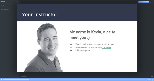
Lesson 2: Setting things up - HTML
In part two, I’m going to show you around in the Scrimba environment and we’ll also set up the project.
All the images are supplied, so you won’t need to worry about looking for the perfect photo just yet. We can focus on building the portfolio!
Don’t forget that you can access everything you need from text and colors to fonts and much more at our dedicated design page.
Lesson 3: The header area - HTML
It’s finally time to start building out the portfolio. In this lecture, we will create the header section. We will brush up on the BEM methodology for setting class names in CSS, and I think you’ll find that this makes the navigation simple and straightforward to create.
Lesson 4: Intro section
Next up is the Intro section of the portfolio. This is where we will introduce ourselves and put a picture of ourselves.
In the end, we add a section about the main skills/services we can do. For the moment we can just fill it all in with “Lorem ipsum” text as a placeholder, until you're ready to fill it in with your own text.
In this chapter, we’re finishing off the rest of our HTML with the last 3 sections: About me, where we’re going to introduce ourselves in greater detail; Work, where we’re going to add some of our portfolio examples, and our footer.
Footers are ideal for linking to email addresses and I will show you how to do that with an <a> tag. We can also add our social media links there too.
For now, it all looks a bit raw and all the CSS fun is ahead of us.
Lesson 6: Setting up the custom properties and general styles
Alright, time to get make that page look amazing!
In this part, we’re going to learn how to add custom properties.
While setting up CSS variables can take some time, it really pays off as the site comes together. They're also perfect for allowing you to customize the site's colors and fonts in just a few seconds, which I take a look at how to do once we wrap up the site.
Lesson 7: Styling the titles and subtitles
Having set all the needed typography, I will walk you through the subtitles of designing and styling the titles and subtitles in our sections.
Lesson 8: Setting up the intro section
Over the next few chapters it’s going to be quite hands-on, so no worries if you feel like rewatching the screencasts a couple of times.
We're keeping everything responsive, using CSS Grid and taking a little dive into using em units as well.
This is the perfect example where CSS Grid shines through and we’re going to learn how to use properties like grid-column-gap, grid-template-areas and grid-template-columns.

Lesson 9: Styling the services section
To add a little bit of interest, I look at how we can add a background-image to this section of the site. It's a nice way to break up the second and avoid just having solid color backgrounds everywhere, and I also look at how you could use background-blend-mode to change the color of the image to help keep the look of your site consistent.
As a bonus, we’re also going to learn how to style out buttons when they are hovered over or selected when we tab through the page.
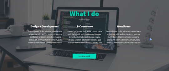
Lesson 10: The About me section
Great progress! So this is the all-important About me section. This one is pretty similar to the Intro because we’re going to use CSS Grid, but move the picture to the right side and find a useful example for CSS fr unit.
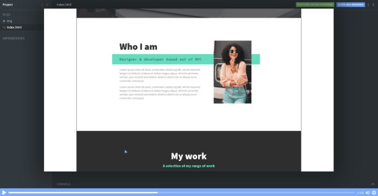
Lesson 11: The portfolio

In this screencast, I will show how to build our portfolio section to display some of our great work. And we’re even going to learn how to use cubic-bezier() to a great and impressive effect with some hover styling!
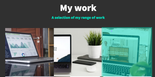
Lesson 12: Adding the social icons with Font Awesome
This cast will be sweet and short, so you can rest a bit and learn some quick tips and tricks.
Adding social media links with Font Awesome icons is a breeze. We can do it with an <i> tag and then adding a class name of an icon you wish to add.
As an example, here’s how to add an icon for GitHub once you have Font Awesome linked in your markup.
<i class="fab fa-github"></i>

While the icons are in place, we do need at add more styling here to get them to be set up the way we need them to be.
With a little use of flexbox and removing the styling from the list with list-style: none it's relatively straight forward.
Lesson 14: Setting up the navigation styles
We have left the navigation to the last because very often it’s one of those simple things that can take the longest to set up and do correctly.
Once completed, the navigation will be off-screen, but slide in when a user clicks on the hamburger icon. The first step though, is to get it styled the way we want it to look, then we can worry about actually making it work!

Lesson 14: Creating the hamburger
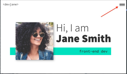
In this screencast, you’ll learn how to add a hamburger menu to transition to the navigation view. It’s not an icon or an svg, but pure CSS.
We’re going to have a chance practice ::before and ::after pseudo-selectors, transition, and, since it's not a link but a button, we also need to define the different cursor when we hover over the hamburger icon to indicate that it can be clicked with cursor: pointer.
Lesson 15: Adding the JS
With a little bit of JavaScript, I will walk you through the implementation of a really nice and smooth transition from our main screen to the navigation window on click of the hamburger menu.

I also take a look at how we can add in smooth-scrolling with CSS only by using scroll-behavior: smooth. Yes, it really is that simple! It also makes a great tweet for Today I Learned (TIL). Feel free to send you TILs to @scrimba and I’m sure they will be really happy to retweet them!
Lesson 16: Creating the portfolio item page
With the homepage wrapped up, it's time to work on a template portfolio page that can be used to give more details on each of the projects that you are putting in your portfolio.
We're also going to learn how to link it seamlessly with our main page for a nice user experience.
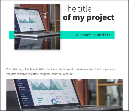
Lesson 17: Customizing your page
This is where the magic of CSS custom properties comes in!
In this video I look at how we can customize the custom properties that we set up to change the color scheme of your site within seconds, and how we can update the fonts quickly and easily as well in order to make the site your own!
Lesson 18: DigitalOcean Droplets - What they are and how to set one up
In this screencast, we're going to explore DigitalOcean droplets. They are Linux-based virtual machines and that each droplet is a new server you can use.
It can seem daunting, but they are super easy to set up, very customizable and come with a lot of useful features, like a firewall automatically.
I'll talk you through every single step of the way so that you know exactly how to set a droplet up.
Lesson 19: DigitalOcean Droplets - Uploading files via FTP
To finish the whole process off, let me show you how we can upload our portfolio to the droplet we've created in the previous chapter and now it's online for others to see!
Lesson 20: Wrap up
And that's it! Your next step can be to make this page all about you, add all the relevant examples, tell us about you and make it live in a DigitalOcean droplet.
Once you've put yours together and got it online, please share your portfolio with Me and the team at Scrimba! You can find us at @KevinJPowell and @scrimba on Twitter, and we would be really happy to share what you're up to!
Check out the full course
Remember, this course is completely free. Head on over to Scrimba now and you can follow along with it and build out a fantastic looking site!
via freeCodeCamp.org https://ift.tt/2QwcP6z
0 notes
Text
Wordpress 4.8: Expanded Maximum Width of the Customizer Sidebar to 600 Pixels
For all the users, who were letting down their faces with customized narrow sidebar, happy news for you. WordPress has expanded the width of the Customizer sidebar to 600 Pixels. Any WordPress Development company would have been delighted to hear that.
As the announcement was made by the Customize Component Maintainer, “Weston Ruter”.
It was revealed that the sidebar of the customizer in WordPress 4.8 has a variable width.

After a lot of ups and downs, the scope was decreased to user-resizable ratio. Despite addressing a more fundamental problem, the sidebar is extremely and unnecessarily limited on a high-resolution display. So, the Customizer sidebar has the minimum breadth range of 300px and the maximum range is 600px. But, what users will see will be depending upon their screen’s width. This was a fact noticed by all major WordPress Development companies.
Without being affecting a small change, the extra width is visible. The developers of WordPress from different WordPress development companies, who develop themes and WordPress development companies and plugins are encouraged to test the custom controls of the customizer of WordPress 4.8 to make sure that it display properly on large screen.
Using a percentile-based width or flexbox will be helpful to ensure that the controls are appearing properly on the larger screens, while making future-compatible controls the width of a sidebar could be user-friendly.

Improvements In Accessibility
Moreover, the screen of the admin in WordPress 4.8 are more approachable. In WordPress 4.3, the team of accessibility restored H1 headings to the admin screens. This made the team to change the headings ranks in WordPress 4.4. Now, credit goes to organizing the header text on pages, in WordPress 4.8 admin screens are more accessible.
At present, the header on admin screens usually contains more than text. For support, the Add New button on the Posts and Pages admin screens is included within the Posts and Pages header text. So, assistive technologies have difficulty to help users navigate different sections of a page.
Although, changes in WordPress 4.8 turn the headings on admin screens into their own elements.
#Wordpress development#Wordpress development company#Wordpress development services#WordPress 4.8 update
1 note
·
View note
Text
A Guide To New And Experimental CSS DevTools In Firefox
A Guide To New And Experimental CSS DevTools In Firefox
Victoria Wang
2019-10-10T14:30:59+02:002019-10-10T14:36:30+00:00
Over the last few years, our team at Firefox has been working on new CSS tools that address both cutting-edge techniques and age-old frustrations. We’re the Layout Tools team, a subset of Firefox Developer Tools, and our quest is to improve the modern web design workflow.
The web has seen an incredible evolution in the last decade: new HTML/CSS features, browser improvements, and design techniques. Our team is devoted to building tools that match that innovation so that designers and developers can harness more of the efficiency and creativity that’s now possible.
In this guide, we’ll share an overview of our seven new tools, with stories from the design process and practical steps for trying out each tool.
Editorial Design Patterns
By naming lines when setting up our CSS Grid layouts, we can tap into some interesting and useful features of Grid — features that become even more powerful when we introduce subgrids. Read related article →
1. Grid Inspector
It all started three years ago when our CSS layout expert and dev advocate, Jen Simmons, worked with members of Firefox DevTools to build a tool that would aid users in examining CSS Grid layouts.
As one of the most powerful new features of the modern web, CSS Grid had quickly gained decent browser adoption, but it still had low website adoption. There’s a steep learning curve, and you still need fallbacks for certain browsers. Thus, part of our goal was to help popularize Grid by giving developers a more hands-on way to learn it.

Grid Inspector (Large preview)
The core of the tool is a grid outline, overlaid on the page, which helps devs visualize how the grid is positioning their elements, and how the layout changes when they tweak their styles. We added numbered labels to identify each grid line, the ability to view up to three grids at once, and color customization for the overlays. Recently, we also added support for subgrid, a brand new CSS specification implemented in Firefox and hopefully in more browsers soon.
Grid Inspector was an inspiration for all the tools that followed. It was even an inspiration for a new team: Layout Tools! Formed in late 2017, we’re spread across four time zones and collaborate with many others in Mozilla, like our rendering engine developers and the good folks at MDN.
Try Out The Grid Inspector
In Firefox, visit our Grid example site.
Open the Inspector with Cmd + Shift + C.
Turn on Grid overlay via one of three ways:
Layout Panel: In the Grid section, check the checkbox next to .content.grid-content;
Markup View: Toggle the “grid” badge next to <div class="content grid-content">;
Rules View: Click the

button next to display:grid; inside #page-intro .grid-content;
Experiment with the Grid Inspector:
Change the purple overlay color to red;
Toggle “Line numbers” or “Extend lines infinitely”;
Turn on more grid overlays;
See what happens when you disable grid-gap: 15px in Rules.
Since Grid, we’ve been seeking to expand on the possibilities of what a browser CSS tool can be.
“
2. Shape Path Editor
The next project we worked on was the Shape Path Editor: our first visual editing tool.
CSS Shapes allows you to define shapes for text to flow around: a circle, a triangle, or a many-sided polygon. It can be used with the clip-path property which allows you to trim elements to any of those same shapes. These two techniques together open the possibility for some very unique graphic design-inspired layouts.
However, creating these sometimes complex shapes can be difficult. Typing all of the coordinates manually and using the right CSS units is error-prone and far removed from the creative mindset that Shapes allows. Therefore, we made a tool that allows you to edit your code by directly clicking and dragging shapes on the page.
This type of feature—visual editing—was new for us and browser tools in general. It’s an example of how we can go beyond inspecting and debugging and into the realm of design.
Try Out The Shape Path Editor
In Firefox, visit this page on the An Event Apart website.
Open the Inspector with Cmd + Shift + C and select the first circular image.
In Rules, click on the

icon next to the shape-outside property.
On the page, click on the points of the shape and see what happens when you drag to make the shape huge or tiny. Change it to a size that looks good to you.
Visual editing is an example of how we can go beyond inspecting and debugging and into the realm of design.
“
3. Fonts Editor
For years, we’ve had a Fonts panel in Firefox that shows an informative list of all the fonts used in a website. In continuing our theme of designing in the browser, we decided to turn this into a Font Editor for fine-tuning a font’s properties.

Fonts Editor (Large preview)
A driving force behind this project was our goal to support Variable Fonts at the same time that the Firefox rendering engine team was adding support for it. Variable Fonts gives font designers a way to offer fine-grained variations along axes, like weight, within one font file. It also supports custom axes, which give both font creators and web designers an amazing amount of flexibility. Our tool automatically detects these custom axes and gives you a way to adjust and visualize them. This would otherwise require specialized websites like Axis-Praxis.
Additionally, we added a feature that provides the ability to hover over a font name to highlight where that particular font is being used on the page. This is helpful because the way browsers select the font used to render a piece of text can be complex and depend on one’s computer. Some characters may be unexpectedly swapped out for a different font due to font subsetting.
Try Out The Fonts Editor
In Firefox, visit this variable fonts demo site.
Open the Inspector with Cmd + Shift + C and select the word “variable” in the title (the element’s selector is .title__variable-web__variable).
In the third pane of the Inspector, navigate to the Fonts panel:
Hover over the font name Output Sans Regular to see what gets highlighted;
Try out the weight and slant sliders;
Take a look at the preset font variations in the Instances dropdown menu.
4. Flexbox Inspector
Our Grid, Shapes, and Variable Fonts tools can together power some very advanced graphic design on the web, but they’re still somewhat cutting-edge based on browser support. (They’re almost there, but still require fallbacks.) We didn’t want to work only on new features—we were drawn to the problems that most web developers face on a daily basis.
So we started work on the Flexbox Inspector. Design-wise, this has been our most ambitious project, and it sprouted some new user research strategies for our team.
Like Grid, CSS Flexbox has a fairly steep learning curve when you first get started. It takes time to really understand it, and many of us resort to trial and error to achieve the layouts we want. At the beginning of the project, our team wasn’t even sure if we understood Flexbox ourselves, and we didn’t know what the main challenges were. So we leveled up our understanding, and we ran a survey to discover what people needed the most when it came to Flexbox.
The results had a big effect on our plans, making the case for complicated visualizations like grow/shrink and min/max. We continued working with the community throughout the project by incorporating feedback into evolving visual prototypes and Nightly builds.
The tool includes two major parts: a highlighter that works much like the Grid Inspector’s, and a detailed Flexbox tool inside the Inspector. The core of the tool is a flex item diagram with sizing info.

Flex item diagram and sizing (Large preview)
With help from Gecko layout engineers, we were able to show the step-by-step size decisions of the rendering engine to give users a full picture of why and how a flex item ended up with a certain size.
Note: Learn the full story of our design process in “Designing the Flexbox Inspector”.
Try Out The Flexbox Inspector
In Firefox, visit Mozilla’s Bugzilla.
Open the Inspector with Cmd + Shift + C and select the element div.inner (just inside the header bar).
Turn on the Flexbox overlay via one of three ways:
Layout Panel: In the Flex Container section, turn on the switch;
Markup View: Toggle the “flex” badge next to <div class="inner">;
Rules View: Click the

button next to display:flex.
Use the Flex Container panel to navigate to a Flex Item called nav#header-nav.
Note the sizes shown in the diagram and size chart;
Increase and decrease your browser’s width and see how the diagram changes.
Interlude: Doubling Down on Research
As a small team with no formal user research support, we’ve often resorted to design-by-dogfooding: basing our opinions on our own experiences in using the tools. But after our success with the Flexbox survey, we knew we wanted to be better at collecting data to guide us. We ran a new survey to help inform our next steps.
We crowdsourced a list of the 20 biggest challenges faced by web devs and asked our community to rank them using a max-diff format.
When we found that the big winner of the challenges was CSS Layout Debugging, we ran a follow-up survey on specific CSS bugs to discover the biggest pain points. We supplemented these surveys with user interviews and user testing.
We also asked folks to rank their frustrations with browser developer tools. The clear top issue was moving CSS changes back to the editor. This became our next project.
5. Changes Panel
The difficulty in transferring one’s work from a browser developer tool to the editor is one of those age-old issues that we all just got used to. We were excited to make a simple and immediately usable solution.

Changes Panel (Large preview)
Edge and Chrome DevTools came out with variants of this tool first. Ours is focused on assisting a wide range of CSS workflows: Launch DevTools, change any styles you want, and then export your changes by either copying the full set of changes (for collaboration) or just one changed rule (for pasting into code).
This improves the robustness of the entire workflow, including our other layout tools. And this is just a start: We know accidental refreshing and navigation from the page is a big source of data loss, so a way to bring persistence to the tool will be an important next step.
Try Out The Changes Panel
In Firefox, navigate to any website.
Open the Inspector with Cmd + Shift + C and select an element.
Make some changes to the CSS:
Modify styles in the Rules pane;
Adjust fonts in the Fonts pane.
In the right pane of the Inspector, navigate to the Changes tab and do the following:
Click Copy All Changes, then paste it in a text editor to view the output;
Hover over the selector name and click Copy Rule, then paste it to view the output.
6. Inactive CSS
Our Inactive CSS feature solves one of the top issues from our layout debugging survey on specific CSS bugs:
“Why is this CSS property not doing anything?”
Design-wise, this feature is very simple—it grays out CSS that doesn’t affect the page, and shows a tooltip to explain why the property doesn’t have an effect. But we know this can boost efficiency and cut down on frustration. We were bolstered by research from Sarah Lim and her colleagues who built a similar tool. In their studies, they found that novice developers were 50% faster at building with CSS when they used a tool that allowed them to ignore irrelevant code.

Inactive CSS tooltip (Large preview)
In a way, this is our favorite kind of feature: A low-hanging UX fruit that barely registers as a feature, but improves the whole workflow without really needing to be discovered or learned.
Inactive CSS launches in Firefox 70 but can be used now in prerelease versions of Firefox, including Developer Edition, Beta, and Nightly.
Try Out Inactive CSS
Download Firefox Developer Edition;
Open Firefox and navigate to wikipedia.org;
Open the Inspector with Cmd + Shift + C and select the center content area, called central-featured;
Note the grayed out vertical-align declaration;
Hover over the info icon, and click “Learn more” if you’re interested.
7. Accessibility Panel
Along the way we’ve had accessibility features developed by a separate team that’s mostly one person — Yura Zenevich, this year with his intern Maliha Islam.
Together they’ve turned the new Accessibility panel in Firefox into a powerful inspection and auditing tool. Besides displaying the accessibility tree and properties, you can now run different types of checks on a page. So far the checks include color contrast, text labels, and keyboard focus styling.

Auditing in the Accessibility Panel (Large preview)
Now in Nightly, you can try the new color blindness simulator which harnesses our upcoming WebRender tech.
Try Out The Accessibility Panel
Download Firefox Developer Edition;
Navigate to meetup.com;
In the developer tools, navigate to the Accessibility tab, and click the “Turn on Accessibility Features” button;
Click the drop-down menu next to “Check for issues” and select “All Issues”;
Take a look at the various contrast, keyboard, and text label issues, and click the “Learn more” links if you’re interested.
Next Up
We’re currently hard at work on a browser compatibility tool that uses information from MDN to show browser-specific issues for a selected element. You can follow along on GitHub to learn more.
The Future
We’re committed to supporting the modern web, and that means continuously changing and growing.
New specifications get implemented by browser vendors all the time. Guidelines and best practices around progressive enhancement, responsiveness, and accessibility evolve constantly. Us tool makers need to keep evolving too.
And what of the long-lived, ever-present problems in creating the web? What everyday user interfaces need to be rethought? These are some of the questions that keep us going!
What about a better way to navigate the DOM tree of a page? That part of DevTools has gone essentially unchanged since the Firebug days.
We’ve been experimenting with features like back and forward buttons that would ease navigation between recently visited elements.
A more dramatic change we’re discussing is adding a compact DOM view that uses a syntax similar to HTML templating engines. The focus would be on the most common use case—navigating to CSS—rather than viewing/editing the source.

HTML Outline View (Large preview)
We’ve also been thinking about a better element selector. We know how it can be more productive to work inside the page, with less jumping back and forth into DevTools. We could make the element selector more powerful and more persistent. Perhaps it could select whitespace on a page and tell you what causes that space, or it could shed light on the relationships between different elements.

Visual Element Selector (Large preview)
These are just two of the many ideas we hope to explore further with the help of the community.
We Need Your Input!
We want to keep making awesome tools that make your life easier as a developer or designer.
Here’s an easy way to help: Download Firefox Developer Edition and try using it for some of your work next week.
Then, tell us what you think by taking our 1-page survey.
We’re always interested in hearing ideas for improvements, particularly any low-hanging fruit that could save us all from some regular frustration. We do our work in the open, so you can follow along and chime in. We’ll keep you updated at @FirefoxDevTools.
Thanks to Patrick Brosset for his contributions to this article.

(dm, il)
0 notes
Text
A Guide In Firefox to New And Creative CSS DevTools
Over the last few years, our team at
Firefox
has been operating on new CSS gear that address both cutting-edge strategies and age-old frustrations. We’re the Layout Tools team, a subset of Firefox Developer Tools, and our quest is to improve the modern-day internet layout workflow.
The internet has seen an first-rate evolution inside the final decade: new HTML/CSS functions, browser improvements, and design strategies. Our crew is dedicated to constructing gear that fit that innovation so that designers and developers can harness extra of the performance and creativity that’s now possible.
In this guide, we’ll proportion a top level view of our seven new equipment, with memories from the design system and realistic steps for trying out each tool.
1. Grid Inspector
It all started out three years in the past while our CSS format expert and dev advocate, Jen Simmons, labored with members of Firefox
DevTools
to construct a device that would aid customers in examining CSS Grid layouts.
As one of the most powerful new functions of the cutting-edge internet, CSS Grid had quick gained decent browser adoption, but it still had low internet site adoption. There’s a steep studying curve, and you nevertheless need fallbacks for sure browsers. Thus, part of our purpose turned into to help popularize Grid by way of giving developers a more hands-on manner to research it.
The middle of the device is a grid outline, overlaid at the page, which facilitates devs visualize how the grid is positioning their elements, and the way the layout modifications once they tweak their styles. We introduced numbered labels to identify each grid line, the capability to view up to 3 grids at once, and colour customization for the overlays. Recently, we also introduced support for subgrid, a modern day CSS specification implemented in Firefox and hopefully in extra browsers soon.
Grid Inspector changed into an idea for all of the tools that followed. It was even an notion for a brand new team: Layout Tools! Formed in late 2017, we’re unfold across 4 time zones and collaborate with many others in Mozilla, like our rendering engine builders and the best parents at MDN.
TRY OUT THE GRID INSPECTOR
In Firefox, go to our Grid example site.
Open the Inspector with Cmd + Shift + C.
Turn on Grid overlay through one of 3 ways:
Layout Panel:
In the Grid section, check the checkbox subsequent to .Content.Grid-content;
Markup View:
Toggle the “grid” badge next to ;
Rules View:
Click the button next to display:grid; inside
#page
-intro .Grid-content;
Experiment with the Grid Inspector:
Change the crimson overlay coloration to red;
Toggle “Line numbers” or “Extend strains infinitely”;
Turn on greater grid overlays;
See what takes place while you disable grid-gap: 15px in Rules.
2. The Editor of Form Path
The next project we have been working on has been the Shape Path Editor: our first visual editing tool.
CSS Shapes permits you to define shapes for textual content to drift around: a circle, a triangle, or a many-sided polygon. It can be used with the clip-path assets which permits you to trim elements to any of those equal shapes. These two techniques collectively open the opportunity for a few very specific graphic design-stimulated layouts.
However, creating these sometimes complicated shapes can be difficult. Typing all the coordinates manually and the use of the right CSS units is error-inclined and some distance eliminated from the creative mind-set that Shapes allows. Therefore, we made a device that allows you to edit your code through at once clicking and dragging shapes on the web page.
This kind of feature—visible editing—became new for us and browser tools in general. It’s an instance of how we will go beyond inspecting and debugging and into the world of design.
TRY OUT THE SHAPE PATH EDITOR
In Firefox, go to this web page at the An Event Apart website.
Open the Inspector with Cmd + Shift + C and pick out the first circular image.
In Rules, click on the icon subsequent to the shape-outside property.
On the web page, click on the factors of the shape and notice what happens while you drag to make the shape massive or tiny. Change it to a size that appears exact to you.
3. Text Reader
We have had a Fonts panel in Firefox for years which displays an informative list of all the fonts used in a website. We decided to convert this into a Font Editor to fine-tune the properties of a font by continuing our trend of designing in the browser.
A driving force behind this assignment become our purpose to support Variable Fonts at the same time that the Firefox rendering engine team changed into adding support for it. Variable Fonts gives font designers a way to offer fine-grained variations alongside axes, like weight, within one font file. It also supports custom axes, which offer each font creators and web designers an exceptional amount of flexibility. Our device routinely detects these custom axes and offers you a manner to alter and visualize them. This would otherwise require specialized websites like Axis-Praxis. Additionally, we added a characteristic that gives the ability to hover over a font name to spotlight in which that particular font is being used at the page. This is helpful because the manner browsers select the font used to render a bit of text can be complex and depend upon one’s computer. Some characters may be abruptly swapped out for a special font due to font subsetting. TRY OUT THE FONTS EDITOR
In Firefox, go to this variable fonts demo site.
Open the Inspector with Cmd + Shift + C and pick out the word “variable” within the title (the element’s selector is .Title__variable-web__variable).
In the 1/3 pane of the Inspector, navigate to the Fonts panel:
Hover over the font name Output Sans Regular to look what receives highlighted;
Try out the load and slant sliders;
Take a take a look at the preset font versions within the Instances dropdown menu.
4. Flexbox Inspector
Our Grid, Shapes, and Variable Fonts equipment can together electricity some very advanced graphic layout at the internet, but they’re still somewhat present day based on browser support. (They’re nearly there, however still require fallbacks.) We didn’t need to work most effective on new features—we were drawn to the problems that maximum web builders face on a every day basis.
So we started work at the Flexbox Inspector. Design-wise, this has been our most ambitious assignment, and it sprouted some new consumer research strategies for our team.
Like Grid, CSS Flexbox has a fairly steep learning curve while you first get started. It takes time to truely recognize it, and a lot of us hotel to trial and error to gain the layouts we need. At the beginning of the assignment, our team wasn’t even sure if we understood Flexbox ourselves, and we didn’t recognize what the main challenges have been. So we leveled up our understanding, and we ran a survey to discover what human beings wanted the most when it got here to Flexbox.
The outcomes had a big effect on our plans, making the case for complicated visualizations like grow/decrease and min/max. We continued operating with the community at some point of the task by means of incorporating remarks into evolving visual prototypes and Nightly builds.
The tool consists of two main parts: a highlighter that works just like the Grid Inspector’s, and a detailed Flexbox device inside the Inspector. The middle of the tool is a flex item diagram with sizing info.
With help from Gecko format engineers, we have been able to show the step-by-step size choices of the rendering engine to offer users a full image of why and the way a flex object ended up with a positive size.
Note: Learn the full tale of our design manner in “Designing the Flexbox Inspector”.
TRY OUT THE FLEXBOX INSPECTOR
In Firefox, visit Mozilla’s Bugzilla.
Open the Inspector with Cmd + Shift + C and pick out the element div.Inner (simply inside the header bar).
Turn on the Flexbox overlay through one of 3 ways:
Layout Panel:
In the Flex Container section, turn on the switch;
Markup View:
Toggle the “flex” badge next to ;
Rules View:
Click the button next to display:flex.
Use the Flex Container panel to navigate to a Flex Item known as nav#header-nav.
Note the sizes shown within the diagram and length chart;
Increase and reduce your browser’s width and see how the diagram modifications.
Interlude: Doubling Down On Research
As a small team and not using a formal person research support, we’ve regularly resorted to design-by-dogfooding: basing our critiques on our personal stories in using the tools. But after our achievement with the Flexbox survey, we knew we wanted to be better at collecting statistics to guide us. We ran a new survey to assist tell our subsequent steps. We crowdsourced a list of the 20 largest demanding situations faced by internet devs and asked our community to rank them using a max-diff format. When we discovered that the huge winner of the demanding situations was CSS Layout Debugging, we ran a follow-up survey on unique CSS insects to discover the largest pain points. We supplemented these surveys with user interviews and user testing. We also asked folks to rank their frustrations with browser developer tools. The clear pinnacle difficulty became moving CSS modifications returned to the editor. This became our subsequent project.
5. Changes Panel
The difficulty in shifting one’s work from a browser developer device to the editor is one of those age-old issues that we all just got used to. We were excited to make a easy and straight away usable solution.
Edge and Chrome DevTools got here out with versions of this device first. Ours is centered on assisting a wide range of CSS workflows: Launch DevTools, trade any patterns you want, and then export your modifications by means of either copying the overall set of changes (for collaboration) or simply one changed rule (for pasting into code). This improves the robustness of the whole workflow, such as our other format tools. And this is just a start: We recognize accidental refreshing and navigation from the web page is a huge source of facts loss, so a manner to bring persistence to the tool may be an essential next step. TRY OUT THE CHANGES PANEL
In Firefox, navigate to any website.
Open the Inspector with Cmd + Shift + C and pick an element.
Make some adjustments to the CSS:
Modify patterns inside the Rules pane;
Adjust fonts within the Fonts pane.
In the right pane of the Inspector, navigate to the Changes tab and do the following:
Click Copy All Changes, then paste it in a text editor to view the output;
Hover over the selector name and click Copy Rule, then paste it to view the output.
6. Inactive CSS
Our Inactive CSS feature solves one of the top troubles from our layout debugging survey on precise CSS bugs: “Why is this CSS assets now not doing anything?”
Design-wise, this feature is very simple—it grays out CSS that doesn’t affect the page, and shows a tooltip to give an explanation for why the property doesn’t have an effect. But we understand this can enhance efficiency and cut down on frustration. We have been bolstered by research from Sarah Lim and her colleagues who constructed a similar device. In their studies, they observed that novice builders had been 50�ster at building with CSS when they used a device that allowed them to ignore beside the point code.
In a way, that is our favorite sort of feature: A low-placing UX fruit that barely registers as a feature, however improves the complete workflow without actually wanting to be determined or learned. Inactive CSS launches in Firefox 70 but may be used now in prerelease variations of Firefox, consisting of Developer Edition, Beta, and Nightly. TRY OUT INACTIVE CSS
Download Firefox Developer Edition;
Open Firefox and navigate to
wikipedia.Org;
Open the Inspector with Cmd + Shift + C and choose the center content material area, called central-featured;
Note the grayed out vertical-align declaration;
Hover over the data icon, and click on “Learn extra” if you’re interested.
7. Accessibility Panel
Along the way we’ve had accessibility functions developed by means of a separate group that’s typically one person — Yura Zenevich, this year together with his intern Maliha Islam.Together they’ve turned the brand new Accessibility panel in Firefox into a powerful inspection and auditing tool. Besides displaying the accessibility tree and properties, you could now run different varieties of checks on a page. So far the checks include shade contrast, textual content labels, and keyboard attention styling.
Now in Nightly, you can strive the new shade blindness simulator which harnesses our upcoming WebRender tech.
TRY OUT THE ACCESSIBILITY PANEL
Download Firefox Developer Edition;
Navigate to
meetup.Com;
In the developer tools, navigate to the Accessibility tab, and click the “Turn on Accessibility Features” button;
Click the drop-down menu subsequent to “Check for problems” and pick out “All Issues”;
Take a have a look at the diverse contrast, keyboard, and text label troubles, and click the “Learn greater” links if you’re interested.
Next Up
We’re currently hard at paintings on a browser compatibility tool that uses facts from MDN to expose browser-specific problems for a particular element. You can follow along on GitHub to learn extra. The Future
We’re committed to helping the modern-day web, and that means continuously converting and growing. New specs get implemented via browser vendors all of the time. Guidelines and nice practices around progressive enhancement, responsiveness, and accessibility evolve constantly. Us device makers need to hold evolving too.
And what of the long-lived, ever-present troubles in creating the web? What ordinary user interfaces need to be rethought? These are a number of the questions that preserve us going!
What approximately a better manner to navigate the DOM tree of a page? That a part of DevTools has gone essentially unchanged since the Firebug days.
We’ve been experimenting with functions like again and forward buttons that might ease navigation between lately visited elements. A extra dramatic trade we’re discussing is including a compact DOM view that makes use of a syntax much like HTML templating engines. The attention could be on the most common use case—navigating to CSS—as opposed to viewing/enhancing the source.
We’ve additionally been thinking about a higher element selector. We realize how it can be more effective to work inside the web page, with much less jumping backward and forward into DevTools. We should make the detail selector extra effective and greater persistent. Perhaps it could choose whitespace on a page and tell you what causes that space, or it can shed mild at the relationships between extraordinary elements.
As a reputed Software Solutions Developer we have expertise in providing dedicated remote and outsourced technical resources for software services at very nominal cost. Besides experts in full stacks We also build web solutions, mobile apps and work on system integration, performance enhancement, cloud migrations and big data analytics. Don’t hesitate to
get in touch with us!
Source:
whizzystack.co
#b2b ecommerce
#b2b content marketing
#b2b seo
#b2b marketing blog – toprank®
#Ecommerce
0 notes