#flexbox snippets
Explore tagged Tumblr posts
Visit Tumblr Blog
Explore Tumblr blogs with no restrictions, modern design and the best experience.
Last Seen Tumblr Blogs


Fun Fact
The most popular pages on Tumblr are about Minecraft, GIFs, and David J. Peterson.
Text
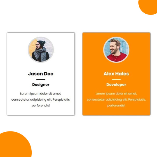
Team Section UI Design
#team section html css#team section flexbox#codenewbies#html css#frontenddevelopment#html5 css3#css#webdesign#css flexbox layout#flexbox snippets
3 notes
·
View notes
Text
8 CSS Snippets for Creating Bento Grid Layouts
New Post has been published on https://thedigitalinsider.com/8-css-snippets-for-creating-bento-grid-layouts/
8 CSS Snippets for Creating Bento Grid Layouts
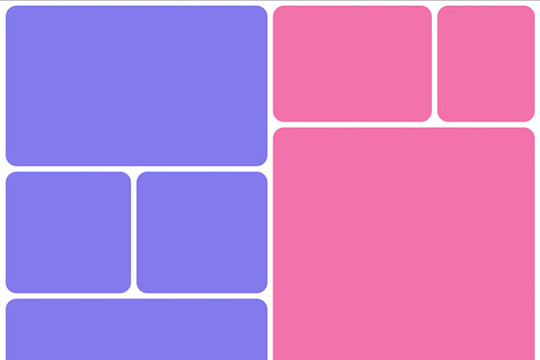
Another day, another design trend! Bento grid layouts are the subject this time around. They’re bold and beautiful. Plus, they satisfy those with a need for symmetry.
So, what exactly is a Bento layout? Think of it as a puzzle. Different-sized containers fit together to create a seamless look. Inspired by Japanese culture, it’s popping up all over the web.
There’s good reason for Bento’s growing popularity. You can use these layouts in a multitude of ways. Everything from listing blog posts to product features is possible. They’re also perfect for dashboard screens.
We should also mention the role that the evolution of CSS has played. Both CSS Grid and Flexbox make these layouts easier to build. No hacks or workarounds are necessary!
With that, here’s a look at 8 beautiful Bento grid layouts.
Complex Bento CSS Grid Layout
CSS Grid packs a lot of power into a tiny bit of code. For example, this complex grid layout requires only 43 lines of CSS. The layout is both efficient and naturally responsive. Therefore, you won’t have to play around with media queries.
See the Pen Complex Bento Layout
Bento-Style Responsive Dashboard
Here’s a gorgeous dashboard layout that benefits from Bento. The layout offers a great way to display relevant content. Everything is neatly organized and easy to follow. The use of photography and color makes this example stand out.
See the Pen Responsive Dashboard | Bento Style by Ecem Gokdogan
Bento Design Concept Layout
This page layout is a different take on the Bento aesthetic. There’s a sidebar featuring in-page navigation. Clicking a button expands it. Meanwhile, the content container maintains a consistent height.
See the Pen bento design concept by Abhishek Bhardwaj
Bento-Box-V1.0.1
Bento layouts also benefit from minimalism. This layout features fewer bells and whistles. Notice the use of white space and legible typography. The animated charts catch your eye without being overwhelming.
See the Pen Bento-Box-V1.0.1 by Gwenaël Guiraud
Sticky Bento on Scroll
This “sticky” presentation adds special effects to the mix. Watch how certain elements stick as you scroll. The idea is that you can go beyond static grids. Bento can be fun, too!
See the Pen Sticky Bento on Scroll ✨ by Jhey
Bento Grid Using CSS Flexbox
Let’s check out another fun example using Flexbox. This grid has a neon look and includes cool hover effects. Bonus points here for maintaining legibility and responsiveness.
See the Pen bento grid – challenge (Chrome +111) by EaterUsr
Card-Based Layout with Gradient Borders
Here’s an example for those wanting to stand out from the crowd. This card-based layout features animated borders, “wipe” effects, and beautiful hover styling. The layout remains clean – even with all those goodies.
See the Pen Cards (gradient border) by Dan
CSS Grid & :has() Grid Layouts
We can achieve a lot with the CSS :has() pseudo-class. This example uses it to adjust the layout as boxes are added and subtracted. Watch as the layout maintains perfect symmetry throughout.
See the Pen Always great grid – CSS grid + :has() + view transitions by Adam Argyle
Use Bento Grids to Keep Your Layout Nice and Tidy
The idea of using Bento aesthetics in web design isn’t new. However, older CSS layout techniques made them difficult to build. That’s no longer the case.
Perhaps the best part is that modern CSS does all the dirty work. We don’t need to compute complex calculations. CSS Grid and Flexbox can do this for us.
That leaves us free to experiment. The examples above demonstrate what is possible. And you can get as creative as you like.
Want to see more Bento grid examples? Check out our CodePen collection!
Related Topics
Top
#amp#Blog#box#challenge#charts#chrome#code#Color#container#Containers#content#CSS#CSS Flexbox#CSS Grid#CSS Layout Snippets#CSS Layouts#CSS Snippets#dashboard#Design#display#easy#effects#Evolution#eye#Features#grid#grids#hover#how#it
1 note
·
View note
Note
how did you learn coding?
I am pretty much entirely self taught as far as front end goes!
I started messing around with HTML and CSS with tumblr themes back in 2016-ish.
For javascript I looked at https://developer.mozilla.org/en-US/ for a lot of documentation + examples. And also used codepen a lot to kinda reverse engineer existing snippets of code.
I also read a lot of https://css-tricks.com/
And for flexbox + css grid there's these:
After I got a good foundation of vanilla JS, I learned Vue for a little while and then moved on to React. The new react documentation is really good in my opinion so I definitely recommend reading that if you're interested in learning.
Most of my learning came from trial and error and working on projects that I was really excited about. I used to be so proud of findtags (the original version) which was in jquery...
The react version is miles ahead of it. And even then, the theme builder is also way ahead of findtags. I learned way more between those two projects than reading documentation alone!
191 notes
·
View notes
Text
I look up "make the page footer stick to the bottom of the page without fucking up the main content display" once every six months and come up with a different solution every goddamn time. Let's end this once and for all: vertical flexbox.
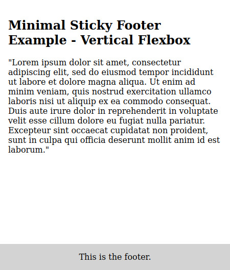

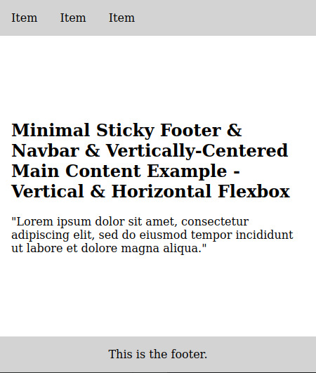
EDIT: Also vertically-centered main content. With the vertical flexbox.
30 notes
·
View notes
Text
Tried Every Major AI Model for Frontend Coding Only One Truly Delivered.
Let’s face it. As web developers, we’re all chasing the dream of faster, smarter, and more efficient coding. After all, the clock’s ticking, and there’s always more to build. Enter AI. You’ve probably heard all the buzz—AI tools that promise to help us write code faster, debug smarter, and even suggest better practices.
So, I did what any curious developer would do: I tested every major AI model for frontend coding. The verdict? Only one truly delivered. Spoiler alert: it wasn’t the one you might expect.

Let’s break it down.
The AI Hustle: The Tools I Tested GitHub Copilot – The AI-powered sidekick that lives inside Visual Studio Code, claiming to write code for you based on context.
ChatGPT – The famous conversational AI that answers all your questions and generates code snippets on demand.
Tabnine – The autocomplete tool that promises to help you code faster by suggesting relevant code as you type.
Kite – More of a Python fan favorite, but I thought I’d give it a shot for frontend tasks.
IntelliCode (Visual Studio) – Microsoft’s answer to AI code suggestions, integrated right into Visual Studio.
GitHub Copilot: Feels Like Magic—Until It’s Not At first, GitHub Copilot felt like something straight out of a developer’s dreams. You start typing, and bam—there it is: a perfectly crafted function, just like you wanted. For straightforward tasks like creating forms, loops, or boilerplate code? Copilot is on fire.
But… here’s the kicker:
The Caveat: When things got more complex—like building dynamic React components, handling state, or trying to integrate with APIs—Copilot just couldn’t keep up. It would suggest solutions that didn’t align with my project’s unique needs.
Code Quality: While the code worked, I often found myself rewriting it. It wasn’t exactly best practice material.
Don’t get me wrong—if you're cranking out basic pages or static HTML, Copilot is your friend. But for anything more nuanced? Not so much.
ChatGPT: Close, But Missing the Magic Touch I was honestly pretty pumped to try ChatGPT for frontend coding. It could explain things, generate code snippets, and even walk me through complex concepts. Plus, it was fast. But… as much as I loved it for learning and brainstorming, there were some glaring problems:
The “Old-School” Problem: Sometimes, ChatGPT would suggest outdated methods or libraries that were no longer considered best practice. So while it was fast, it wasn’t always on the cutting edge.
Context? What’s That?: ChatGPT is fantastic at answering questions, but it’s like that friend who has one really good idea and sticks to it. If you’re trying to build something specific, like a responsive navbar with flexbox and media queries, it often needed a bit of extra clarification from me.
Here’s the thing: ChatGPT can absolutely help with quick fixes or answering questions about web development. But when I needed it to generate more complex, customized code? It wasn’t perfect.
Tabnine: Fast, But Feels Like Auto-Pilot Tabnine was the next tool I dove into. It’s designed to speed up your workflow by predicting what you want to write and giving you the perfect code snippet. When it worked, it was like a breath of fresh air.
The Speed Factor: For simple functions or repetitive CSS rules, Tabnine sped up my workflow dramatically.
The Problem: But the minute I started getting into custom JavaScript components or more involved frontend logic, Tabnine became… well, a bit too generic. It felt like I was getting the same suggestions over and over. The more unique or specific the task, the more irrelevant the suggestions became.
So yeah, Tabnine is great when you’re doing basic stuff. But when you need it to adapt to your project’s unique context? Not so much.
Kite: More Python, Less Frontend Now, Kite is a popular AI assistant for Python developers. But hey, why not try it for frontend, right?
Turns out, that was a bad idea.
Wrong Fit for the Job: Kite’s suggestions were often off-track when it came to JavaScript, React, or even CSS. It’s not that it was a bad tool; it’s just not built for the frontend world.
Learning Curve: The lack of deep web development intelligence meant that Kite often gave me Python-flavored suggestions that weren’t very helpful.
If you're coding in Python, Kite’s your jam. But for frontend tasks? It felt like I was trying to put a square peg in a round hole.
IntelliCode (Visual Studio): A Little Too C#-Centric IntelliCode is another tool that’s integrated into Visual Studio. It’s solid—if you’re a C# developer. But I was working with JavaScript and React. Here’s how it went down:
Solid, But Static: IntelliCode tried to help, but it mostly focused on C# coding patterns. When it did suggest something for JavaScript, it felt like it was trying to adapt to a framework it didn’t really understand.
Not Frontend-Friendly: The AI behind IntelliCode just didn’t seem to “get” the way frontend development works, especially with React or complex HTML/CSS layouts.
If you’re in the Microsoft ecosystem, IntelliCode will help, but it won’t make you a frontend wizard.
And the Winner Is… ChatGPT (With a Twist) Here’s the plot twist: ChatGPT came out on top.
But before you roll your eyes, let me explain.
Here’s Why ChatGPT Works:
It’s Flexible: ChatGPT adapts to your needs. Whether I needed help with React state management, CSS animations, or even troubleshooting a weird bug, ChatGPT could jump in and help.
It Explains, Don’t Just Autocomplete: The real beauty of ChatGPT is that it doesn’t just give you code—it explains it. I could ask it to explain the difference between useEffect and useLayoutEffect, and it would break it down for me.
Context-Aware: While it still has room to improve, ChatGPT is surprisingly good at understanding your project’s flow, especially if you’re clear about what you need.
Pro Tip: Don’t rely on ChatGPT to write your code from start to finish. Treat it like a coding assistant—ask for help when you’re stuck or need a quick answer, then tweak the code to make it your own.
Final Thoughts: AI Isn’t Here to Replace Developers (Yet) It’s clear that AI tools aren’t perfect—yet. GitHub Copilot speeds up basic coding, Tabnine is great for fast suggestions, and IntelliCode can help if you’re in the Microsoft world. But for frontend development, ChatGPT emerged as the true game-changer.
The secret? ChatGPT is not just a code generator—it’s a powerful assistant that can teach you, help you troubleshoot, and give you contextual advice. It can’t replace your creativity or problem-solving skills, but it can certainly amplify them.
So, what’s the takeaway here? If you’re serious about AI tools for frontend development, ChatGPT is your best bet. Embrace it, and let it be the sidekick you always wished for.
0 notes
Text
Price: [price_with_discount] (as of [price_update_date] - Details) [ad_1] Master HTML & CSS Faster with the Power of AITired of struggling with confusing coding tutorials? Discover how artificial intelligence can make learning web development more efficient, engaging, and accessible. Master HTML & CSS Coding with AI offers a practical, hands-on guide for beginners who want to build websites while using cutting-edge AI tools to supercharge their progress.Why This Book?AI as Your Mentor: Get personalized feedback and AI-generated solutions to coding problems in seconds.Practical Learning Approach: Complete real-world projects while mastering HTML and CSS fundamentals.Modern Web Development Focus: Understand responsive design, CSS animations, and more, with AI tools to guide your progress.By the End of This Book, You Will:Build responsive and dynamic websites using HTML and CSS.Use AI tools like ChatGPT for coding assistance and project optimization.Implement advanced CSS techniques, including Flexbox, Grid, and animations.What’s Inside:Chapter 1: Mastering HTML and CSS Basics with AIChapter 2: Improve Code Accuracy and EfficiencyChapter 3: Create Engaging and Interactive Web ContentChapter 4: Advanced CSS for Complex LayoutsChapter 5: Responsive Web Design TechniquesChapter 6: Dynamic Website Enhancements with AnimationsChapter 7: CSS Optimization for Scalable ProjectsYou’ll also gain access to exclusive resources, including ready-to-use code snippets, AI prompt lists, and video demonstrations to enhance your learning experience.Unlock the future of coding and create amazing websites effortlessly! ASIN : B0DTFJYJB8 Language : English File size : 23502 KB Simultaneous device usage : Unlimited Text-to-Speech : Enabled Screen Reader : Supported Enhanced typesetting : Enabled X-Ray : Not Enabled Word Wise : Not Enabled Print length : 733 pages [ad_2]
0 notes
Text
CSS Diner
The bézier game
Flexfrog Froggy
Grid Garden
Hex Invaders
Guess CSS! HTML & CSS Puzzler Game
Guess which code snippet of 3 produced the displayed layout!
Super Markup World
Pixel and Pixella live in the Super Markup World which was created by the great architect Markup Polo. On a beautiful sunny day when Pixel and Pixella visited the mountainous region of Divland the evil architect Mosiac has collapsed all the mountains! Pixella somehow evaded the disaster using a hyperlink tag. But now Pixel and Pixella are separated! It is up to you, Pixel, to find Pixella and save Divland.
Juego de Adobe Color
Observa la rueda de colores. Recuerda la secuencia. Repítela en tu turno.
Helvetica vs Arial
¿Serás capaz de diferenciar la Helvética, la tipografía por excelencia, de su hermana Arial? A veces parece fácil, en otros casos, no lo es tanto…
Color
He aquí un juego en el que debes poner en práctica tu agudeza visual en un círculo cromático. Se trata de encontrar el tono exacto que proponen, aunque la cosa se va complicando a medida que avanza el juego.
Shape Type
Un juego para demostrar tus conocimientos en tipografía. Simplemente hay que completar las diferentes letras para que se parezcan al máximo posible al original.
The Logo Quiz
A todos en el mundo de la publicidad nos gustan las marcas pero… ¿serías capaz de reconocer sus logos viendo sólo un fragmento? Es hora de comprobarlo.
¿Qué color ves?
Otro juego de colores y rapidez visual. En este caso se trata de encontrar el recuadro pintado de un color diferente al resto. Al principio la cosa parece fácil, pero pronto se complica.
KernType
He aquí un juego en el que hay que alinear correctamente los diferentes caracteres de una palabra para adivinar el kerning (espacio entre letras) de la tipografía en cuestión.
Guess the logo
¿Sabrías decir a qué marcas pertenecen todos los logos que se muestran en este juego? Lo complicado es que se muestran marcas de todo el mundo y no todas son conocidas en nuestras fronteras…
0 notes
Text
Keeping Nested DIVs Neat: Solutions to Prevent Overflow Woes

Dealing with nested DIVs and overflow challenges is a common hurdle in web development. When containers within containers lead to unexpected overflow, it can disrupt the layout and aesthetics of your webpage. In this guide, we'll explore various solutions to keep nested DIVs in check and prevent those pesky overflow issues.
CSS Overflow Property
The CSS Overflow property is a handy tool for managing overflow within a parent container. By default, it's set to 'visible,' allowing content to overflow its container. However, adjusting this property can help maintain a clean layout. Here's a simple example of using the CSS Overflow property: CSS.parent-container { width: 300px; height: 200px; overflow: auto; /* or hidden, scroll, or overlay */ } .child-content { width: 400px; height: 250px; } In this scenario, the parent container has a fixed size, and the overflow is set to 'auto.' This ensures that if the child content exceeds the container dimensions, a scrollbar will appear, allowing users to navigate through the content. Experiment with different values of the Overflow property to find the best fit for your specific layout requirements.
Flexbox Magic
Flexbox is a powerful tool for crafting flexible and responsive layouts. It simplifies the structure of complex designs, making it an excellent choice for managing nested DIVs efficiently. Let's dive into a basic example of using Flexbox to control nested DIVs: CSS.parent-container { display: flex; justify-content: space-between; align-items: center; } .child-div { flex: 1; /* additional styling as needed */ } In this case, the parent container uses 'display: flex;' to enable Flexbox. The child DIVs then automatically adjust their size, filling the available space with 'flex: 1.' Adjust the Flexbox properties to achieve the desired layout for your nested elements. Flexbox simplifies the complexities of nested structures, providing a dynamic and responsive solution for your layout challenges.
Grid Layouts for Precision
CSS Grid is a robust system that excels at handling intricate layouts with precision. Its two-dimensional nature makes it particularly useful for managing nested DIVs and achieving complex designs effortlessly. Let's explore a simple example showcasing the power of CSS Grid: CSS.parent-container { display: grid; grid-template-columns: repeat(3, 1fr); grid-gap: 10px; } .child-div { /* styling for child elements */ } In this snippet, the parent container is set to a three-column grid with equal fractional units. The 'grid-gap' property adds spacing between the columns, providing a clean and organized structure. Adjust the grid properties based on your layout requirements. CSS Grid empowers developers to create sophisticated layouts, making it an excellent choice for managing nested DIVs with precision and ease.
JavaScript as a Solution
JavaScript offers dynamic solutions for handling overflow issues, allowing for real-time adjustments based on user interactions or specific conditions. Let's delve into a basic example using JavaScript: JavaScriptfunction adjustOverflow() { var parentContainer = document.getElementById('parent-container'); var childContent = document.getElementById('child-content'); if (childContent.offsetHeight > parentContainer.offsetHeight) { parentContainer.style.overflowY = 'scroll'; } else { parentContainer.style.overflowY = 'visible'; } } // Call the function as needed, for example, on window resize or content change. window.addEventListener('resize', adjustOverflow); In this script, the 'adjustOverflow' function dynamically checks if the child content overflows the parent container vertically. If so, it sets the overflow to 'scroll,' allowing users to navigate through the content. Adjust the conditions and actions within the function to suit your specific requirements. JavaScript provides the flexibility to handle overflow dynamically, making it a valuable tool for addressing nested DIVs' overflow challenges.
Frequently Asked Questions
Addressing common queries related to nested DIVs and overflow issues: Q1: Why do nested DIVs often cause overflow problems? A1: Nested DIVs can lead to overflow when their combined dimensions exceed the boundaries of the parent container. This can disrupt the layout and cause unexpected scrolling or cropping. Q2: How can I prevent overflow in nested DIVs using CSS? A2: Utilize the CSS Overflow property. Set it to 'hidden,' 'auto,' 'scroll,' or 'overlay' on the parent container, depending on your design needs. Experiment with these values to find the most suitable solution. Q3: What advantages does Flexbox offer in managing nested DIVs? A3: Flexbox provides a flexible and responsive layout model, automatically adjusting the size of child elements. It simplifies the structure of nested DIVs, making it easier to create and maintain complex designs. Q4: When should I choose CSS Grid for managing nested DIVs? A4: CSS Grid is ideal for intricate layouts that require precise control over both columns and rows. It excels in scenarios where a two-dimensional grid structure is beneficial, offering a high level of customization. Q5: How can JavaScript be used to dynamically handle overflow in nested DIVs? A5: JavaScript can dynamically adjust overflow by checking the dimensions of the child content in relation to the parent container. Modify the script to meet specific conditions and interactions, providing a dynamic solution to overflow issues. Explore these solutions to address common concerns and enhance your ability to manage nested DIVs effectively.
Conclusion
In conclusion, managing nested DIVs and preventing overflow issues requires a thoughtful approach. Each solution discussed—CSS Overflow property, Flexbox, CSS Grid, and JavaScript—offers unique advantages depending on your specific requirements. Key Takeaways: - CSS Overflow Property: Ideal for basic cases, providing simple control over overflow with properties like 'auto,' 'hidden,' 'scroll,' or 'overlay.' - Flexbox: Perfect for flexible and responsive layouts, automatically adjusting the size of child elements. Use when simplicity and adaptability are priorities. - CSS Grid: Offers precision in managing both columns and rows, making it suitable for intricate layouts. Choose this solution when a two-dimensional grid structure is needed. - JavaScript: Dynamically handles overflow based on conditions or user interactions. Use when real-time adjustments are necessary, providing a dynamic and responsive solution. Consider the nature of your project, the complexity of your layout, and the desired user experience when choosing the most appropriate solution. Combining these techniques judiciously can lead to a well-managed and visually appealing web layout. Presenting the demonstration code. See the Pen Nested DIVs and Overflow Solutions by CSS Monster (@CSS-Monster) on CodePen. Read the full article
0 notes
Text
Stay Ahead of the Game with These 6 Must-Know CSS Snippets for Front-End Developers in 2023
As we gear up for 2023, it’s impossible to ignore the ever-evolving world of front-end development. With new frameworks, tools and techniques emerging every day, it can be tough for front-end developers to stay on top of the latest trends.

But amidst all of this rapid change, there are a few tried-and-true CSS snippets that remain essential for any developer’s toolkit. Whether you’re a seasoned pro or just starting out, incorporating these six code snippets into your workflow can help you create cleaner, more efficient and visually stunning websites.
So let’s dive in and take a look at what every front-end developer should know in 2023.
Are you ready for the future of CSS? In 2023, everyone will be vying for the latest and greatest web design. But how do you stay ahead of the game? Simple.
Hire the best Web designers. Or better yet, become one yourself.
CSS snippets are the backbone of any great front-end coder. If you want to get noticed in the world of web design, you need to know these six must-know CSS snippets.
Trust us, your future self will thank you. From animation effects to hover transitions, these snippets will elevate your web design game to new heights.
Don’t worry if you’re new to CSS, we’ve got you covered. With a little bit of practice and determination, you’ll be creating beautiful websites that will knock your client’s socks off.
So, what are you waiting for? Start learning these CSS snippets today and secure your spot at the top of the web design food chain.
Stay Ahead of the Curve with Tech Striker’s CSS Training and Consultation Services.
1. Introduction and Overview
Technology advances rapidly, making it crucial for businesses to keep up with web design trends. To stay ahead, every front-end developer should know six essential CSS snippets in 2023, from responsive typography to dynamic gradients.
These snippets boost website aesthetics and engagement. Whether experienced or new, learning these CSS snippets ensures competitiveness in the evolving industry. To hire web designers who are up-to-date, ask about their knowledge of these CSS snippets.
2. CSS Box Sizing and Flexbox
Front-end developers wanting to stay ahead in 2023 should learn CSS box sizing and flexbox. These tools are essential in creating responsive layouts and managing website content.
Box sizing controls the element dimensions while flexbox offers options for arranging and aligning content. Although it may seem daunting, practicing with trial and error will make you a master in no time.
The result is faster loading, cleaner-looking, and user-friendly websites. Start learning CSS today!
3. Custom Cursor and Gradient
Front-end development is always evolving, and it’s crucial to stay ahead. Mastering the right CSS snippets is key to creating great websites.
But with trends and technologies constantly changing, how can developers keep up? In 2023, custom cursors and gradients are two must-know CSS snippets for any front-end developer. These snippets offer more than just looks – custom cursors enrich the user experience and convey important information, while gradients add dimension to a website’s design.
Learning these snippets not only gives developers an edge, but also helps them craft engaging web experiences. Don’t wait, get ahead of the curve and explore these innovative CSS snippets today.
4. Scroll Snap and Sticky
As front-end developers, our goal is to create captivating web pages that retain users. Keeping up with the ever-changing technology landscape can be daunting.
Scroll Snap and Sticky
However, mastering CSS snippets like scroll snap and sticky elements can give you an edge. Scroll snap allows for seamless scrolling between page sections, providing a smooth experience for users.
Sticky elements keep important information like navigation and headers in place as you scroll. Implementing these techniques requires experience, attention to detail, and consideration of the user experience.
Master these CSS snippets to provide your users with a cutting-edge, intuitive browsing experience. Front-end development is an exciting field, and with these tricks up your sleeve, you’ll remain at the forefront of innovation.
5. Animated Icons and Variables
To stay ahead in web development, front-end developers need to master CSS. Animated icons and variables can add interactivity and consistency to your site’s design.
Using variables in CSS makes it easier to efficiently make changes to your design system without replacing values throughout your code. Learn these CSS snippets for an edge in the competitive world of web development.
Start incorporating them into your workflow today for optimal benefits.
6. Conclusion and Next Steps
Mastering CSS snippets is essential for front-end developers who want to stay ahead in 2023. Implementing these six crucial snippets gives you an edge in this constantly shifting field.
Don’t stop there – experiment with new techniques and follow emerging trends to stay cutting-edge. Embrace the art of uncertainty and the beauty of progression in your coding journey.
Never stop learning, tinkering, and pushing boundaries. Dive into CSS snippets with gusto and enjoy bursts of creativity that lead to greatness.
The best things in life are wild, erratic, and full of surprises.
Stay Ahead of the Curve with Tech Striker’s CSS Training and Consultation Services.
In an industry as fast-paced and ever-changing as web development, it’s essential for front-end developers to stay up to date with the latest trends and technologies. One area that is constantly evolving is CSS, the language used to style web pages.
If you’re a front-end developer looking to stay ahead of the curve, it’s crucial to have a strong understanding of CSS and how to use it effectively. Tech Striker, the leading web development company in India, can help you achieve this with their expert knowledge and experience.
They offer a range of services, including CSS training and consultation, to ensure that you have all the tools and knowledge you need to succeed in this field. With Tech Striker’s help, you can learn the six CSS snippets every front-end developer should know in 2023 and stay ahead of the competition.
The Bottom Line
In conclusion, CSS is one of the most important languages for web design and front-end development. Knowing the right CSS snippets can help you create stunning websites that look professional and are easy to navigate.
As newer technologies and trends emerge, it’s important to stay up-to-date with the latest CSS techniques in order to keep your skill-set relevant and competitive in the ever-evolving tech industry. Whether you’re a seasoned professional or an up-and-coming developer just starting out, mastering these 6 CSS snippets is a must for anyone looking to break into the front-end development space.
Don’t hesitate to dive in and start exploring the endless possibilities of CSS in the years to come.
Happy coding
Article Resource Link-: https://www.techstriker.com/6-must-know-css-snippets-for-front-end-developers-in-2023/
0 notes
Text
62/100 Days of Code
Finished reading about the different ways you can combine FlexBox & Grid today! I am very excited to work on the Admin Dashboard after I watch the video Odin recommends, first.
This will be a challenge for sure, but I think I can get it done! Probably going to have to post snippets (whether I share them here or not) so that I can incrementally create my poor Repo and commit some changes rather than 1 & Done-ing it afk from my main machine...
Wish me luck!
#[ work is still killer but i am trying to b grateful for it!! ]#the odin project#kris codes#100 days of code#mine
0 notes
Text
Responsive Design and Mobile Optimization in WordPress Plugin Development
Hey there, developers and web wizards! Whether you're a seasoned developer or just starting your coding journey, understanding the magic of responsive design and mobile optimization is crucial to creating websites that wow users across all devices. Get ready to level up your WordPress plugin development game with these tips!

Understanding the Mobile Revolution
Picture this, you're scrolling through a website on your phone, and the text is so tiny that you need a magnifying glass to read it. Not a pleasant experience, right? That's where responsive design swoops in to save the day! It's all about creating websites that adapt beautifully to any screen size, from massive desktops to pocket-sized smartphones.
Embracing Responsive Design in WordPress
It's time to dive into the nitty-gritty of responsive design in WordPress. With CSS media queries, you can craft CSS rules that respond differently based on the device's screen width. Take a peek at this code snippet to see how it's done:
@media only screen and (max-width: 600px) {
/* Your responsive CSS rules here */
}
Making Mobile Optimization Your Superpower
Speed is the superhero of mobile browsing, and your website needs to be a lightning bolt! Optimize images and videos to reduce load times and use browser caching to store static files for quick access. Let's empower your site with these optimizations:
<!-- Adding viewport meta tag for mobile optimization -->
<meta name="viewport" content="width=device-width, initial-scale=1.0">
Crafting User-Friendly Interfaces for Mobile
Imagine you're navigating a website on your phone, and the menu covers the entire screen – not a smooth experience! Design adaptive navigation menus that gracefully collapse into a hamburger icon on smaller screens. Here's how:
<!-- HTML for responsive navigation -->
<nav class="main-menu">
<ul>
<li><a href="#">Home</a></li>
<li><a href="#">About</a></li>
<li><a href="#">Services</a></li>
<li><a href="#">Contact</a></li>
</ul>
</nav>
Developing Marvelous Responsive Layouts
Flexible and fluid layouts are like elastic heroes – they stretch and shrink to fit any device. Embrace the power of Flexbox and CSS Grid to achieve responsive layouts that adapt seamlessly:
/* CSS for flexible and responsive grid layout */
.container {
display: grid;
grid-template-columns: repeat(auto-fit, minmax(250px, 1fr));
gap: 20px;
}
Testing and Debugging like a Pro
To unleash the full potential of your mobile-friendly website, you need to test it on various devices. Browser developer tools come to the rescue! Use them to simulate different screen sizes and spot any layout glitches. Be a coding hero and fix issues like a pro!
SEO and Mobile Optimization
Psst! Want to skyrocket your website's search rankings? Google loves mobile-friendly websites! Optimize your meta tags, descriptions, and image alt attributes for mobile devices. Your site will be riding high on the search engine results pages!
The Heroic Mobile-Optimized WordPress Plugin
Let's dive into a real-life case study to see how a WordPress plugin can be your mobile website's true superhero! From crafting mobile-friendly forms to optimizing images, you'll witness the step-by-step process of creating a mobile-optimized plugin.
Congratulations! You've unlocked the secret to responsive design and mobile optimization in WordPress plugin development. Embrace these techniques, and your websites will dazzle users on any device. So, gear up, put on your coding cape, and rock the web with your mobile-friendly creations! Happy coding! To know more visit us at https://magnigeeks.com/
0 notes
Text
Update: Resources that helped me
So, I'll add to this post with the handy things that I found (and thank you for those that recommended things too!! Every little resource helps!) I'm not normally one for 'quick how-to' YouTubes, but this one really helped me visually:
youtube
For those of us that like posters and handy lil one-page helpers....
The graphic below came from this website: https://css-tricks.com/snippets/css/a-guide-to-flexbox/

Feel free to reblog and add any other CSS handy tips that have either helped you in the past or that you think will help others!
CSS Positioning...
Today is the day I try my absolute best to focus on CSS flexbox.
Positioning in CSS is a complete guessing game to me currently, so today I'm going to specifically take the time to deep delve and try to fully understand what does what.
If you have any handy tips, I'd be grateful to hear them! Otherwise, I'll end up trying to make something that will hopefully make it easier to others too.
Wish me luck!
#learning to code#css#learning css#front-end#front end development#learning web development#flexbox#web design#coding#codeblr#studybrl#study blog#learning#career change#career switch#lets help each other#Youtube
17 notes
·
View notes
Photo

Responsive CSS Flexbox Timeline Design Check out Divinector YouTube Channel for more
#css flexbox examples#CSS FLexbox Tutorial#css timeline#timeline html css#css snippets#webdesign#frontend#html css#html5#css3#responsive web design#learn to code#code#divinector
3 notes
·
View notes
Link
https://fribly.com/2019/02/17/pure-css-3d-cards/
#web development#web design#3D#Code#CSS#CSS3#Flexbox#Hover#HTML#HTML5#Responsive#Snippets#Transition
0 notes
Text
web development
Creating a successful web development blog involves a combination of technical expertise, engaging content, and a well-structured approach. Here's a comprehensive guide to get you started:
1. Define Your Niche and Audience
Identify Your Niche: Decide whether you want to focus on front-end development, back-end development, full-stack development, specific frameworks (like React, Angular, Django), or other topics such as web design, performance optimization, or web security.
Know Your Audience: Determine if your content is for beginners, intermediate developers, or advanced professionals. Tailor your content to their needs and skill levels.
2. Set Up Your Blog
Choose a Platform: Popular choices include WordPress, Ghost, or static site generators like Jekyll or Hugo.
Select a Domain Name: Pick a domain name that reflects your brand and is easy to remember.
Hosting: Choose a reliable hosting provider. For static sites, consider Netlify or GitHub Pages.
3. Design and User Experience
Responsive Design: Ensure your blog is mobile-friendly.
User-Friendly Navigation: Make it easy for users to find content with a clear menu and search functionality.
Performance Optimization: Optimize your blog for speed. Use tools like Google Lighthouse to check performance.
4. Content Strategy
Regular Updates: Post consistently. Create a content calendar to plan your posts.
Engaging Titles: Craft compelling headlines to attract readers.
Quality Content: Focus on creating high-quality, informative, and well-researched posts. Use code snippets, images, and videos to enhance your content.
SEO Best Practices: Use keywords effectively, optimize meta tags, and create descriptive alt text for images.
5. Types of Content
Tutorials and How-To Guides: Step-by-step guides are very popular in web development.
Case Studies: Share detailed analysis of projects you've worked on.
Opinion Pieces: Write about trends, best practices, and industry news.
Interviews and Guest Posts: Collaborate with other developers to bring new perspectives.
Project Showcases: Share your projects and the development process.
6. Promote Your Blog
Social Media: Share your posts on platforms like Twitter, LinkedIn, and relevant Facebook groups.
Developer Communities: Engage with communities on Reddit, Stack Overflow, and GitHub.
Networking: Connect with other bloggers and developers to cross-promote content.
7. Monetization Strategies
Affiliate Marketing: Promote tools and services you trust and earn a commission.
Sponsored Posts: Partner with companies for sponsored content.
Ads: Use Google AdSense or other ad networks.
Sell Products or Services: Offer e-books, courses, or freelance services.
8. Analytics and Feedback
Track Performance: Use Google Analytics to monitor traffic, user behavior, and popular content.
User Feedback: Encourage comments and feedback to understand what your readers value.
9. Continuous Learning and Improvement
Stay Updated: Keep up with the latest in web development by following industry news and trends.
Improve Your Skills: Continuously learn new technologies and improve your writing and technical skills.
Example Blog Post Outline
Title: Building a Responsive Navigation Bar with Flexbox
Introduction
Brief overview of the importance of a responsive navigation bar
What will be covered in the tutorial
Prerequisites
List of tools and knowledge required
Setting Up the Project
Creating the HTML structure
Adding basic CSS
Using Flexbox for Layout
Explanation of Flexbox properties
Applying Flexbox to the navigation bar
Making it Responsive
Media queries for different screen sizes
Ensuring usability on mobile devices
Final Touches
Adding animations and hover effects
Testing across browsers
Conclusion
Summary of what was learned
Encouragement to experiment further
Call to action (e.g., share the post, try a related tutorial)
Resources for Learning and Inspiration
Websites: MDN Web Docs, CSS-Tricks, Smashing Magazine
Books: "Eloquent JavaScript" by Marijn Haverbeke, "You Don’t Know JS" by Kyle Simpson
Podcasts: Syntax, ShopTalk Show
Final Tips
Be Patient: Building an audience takes time.
Be Authentic: Share your unique perspective and experiences.
Engage with Your Readers: Respond to comments and build a community around your blog.
Starting a web development blog can be highly rewarding, both personally and professionally. By following these steps, you’ll be well on your way to creating valuable content for the web development community.
1 note
·
View note
Text
Keeping Nested DIVs Neat: Solutions to Prevent Overflow Woes

Dealing with nested DIVs and overflow challenges is a common hurdle in web development. When containers within containers lead to unexpected overflow, it can disrupt the layout and aesthetics of your webpage. In this guide, we'll explore various solutions to keep nested DIVs in check and prevent those pesky overflow issues.
CSS Overflow Property
The CSS Overflow property is a handy tool for managing overflow within a parent container. By default, it's set to 'visible,' allowing content to overflow its container. However, adjusting this property can help maintain a clean layout. Here's a simple example of using the CSS Overflow property: CSS.parent-container { width: 300px; height: 200px; overflow: auto; /* or hidden, scroll, or overlay */ } .child-content { width: 400px; height: 250px; } In this scenario, the parent container has a fixed size, and the overflow is set to 'auto.' This ensures that if the child content exceeds the container dimensions, a scrollbar will appear, allowing users to navigate through the content. Experiment with different values of the Overflow property to find the best fit for your specific layout requirements.
Flexbox Magic
Flexbox is a powerful tool for crafting flexible and responsive layouts. It simplifies the structure of complex designs, making it an excellent choice for managing nested DIVs efficiently. Let's dive into a basic example of using Flexbox to control nested DIVs: CSS.parent-container { display: flex; justify-content: space-between; align-items: center; } .child-div { flex: 1; /* additional styling as needed */ } In this case, the parent container uses 'display: flex;' to enable Flexbox. The child DIVs then automatically adjust their size, filling the available space with 'flex: 1.' Adjust the Flexbox properties to achieve the desired layout for your nested elements. Flexbox simplifies the complexities of nested structures, providing a dynamic and responsive solution for your layout challenges.
Grid Layouts for Precision
CSS Grid is a robust system that excels at handling intricate layouts with precision. Its two-dimensional nature makes it particularly useful for managing nested DIVs and achieving complex designs effortlessly. Let's explore a simple example showcasing the power of CSS Grid: CSS.parent-container { display: grid; grid-template-columns: repeat(3, 1fr); grid-gap: 10px; } .child-div { /* styling for child elements */ } In this snippet, the parent container is set to a three-column grid with equal fractional units. The 'grid-gap' property adds spacing between the columns, providing a clean and organized structure. Adjust the grid properties based on your layout requirements. CSS Grid empowers developers to create sophisticated layouts, making it an excellent choice for managing nested DIVs with precision and ease.
JavaScript as a Solution
JavaScript offers dynamic solutions for handling overflow issues, allowing for real-time adjustments based on user interactions or specific conditions. Let's delve into a basic example using JavaScript: JavaScriptfunction adjustOverflow() { var parentContainer = document.getElementById('parent-container'); var childContent = document.getElementById('child-content'); if (childContent.offsetHeight > parentContainer.offsetHeight) { parentContainer.style.overflowY = 'scroll'; } else { parentContainer.style.overflowY = 'visible'; } } // Call the function as needed, for example, on window resize or content change. window.addEventListener('resize', adjustOverflow); In this script, the 'adjustOverflow' function dynamically checks if the child content overflows the parent container vertically. If so, it sets the overflow to 'scroll,' allowing users to navigate through the content. Adjust the conditions and actions within the function to suit your specific requirements. JavaScript provides the flexibility to handle overflow dynamically, making it a valuable tool for addressing nested DIVs' overflow challenges.
Frequently Asked Questions
Addressing common queries related to nested DIVs and overflow issues: Q1: Why do nested DIVs often cause overflow problems? A1: Nested DIVs can lead to overflow when their combined dimensions exceed the boundaries of the parent container. This can disrupt the layout and cause unexpected scrolling or cropping. Q2: How can I prevent overflow in nested DIVs using CSS? A2: Utilize the CSS Overflow property. Set it to 'hidden,' 'auto,' 'scroll,' or 'overlay' on the parent container, depending on your design needs. Experiment with these values to find the most suitable solution. Q3: What advantages does Flexbox offer in managing nested DIVs? A3: Flexbox provides a flexible and responsive layout model, automatically adjusting the size of child elements. It simplifies the structure of nested DIVs, making it easier to create and maintain complex designs. Q4: When should I choose CSS Grid for managing nested DIVs? A4: CSS Grid is ideal for intricate layouts that require precise control over both columns and rows. It excels in scenarios where a two-dimensional grid structure is beneficial, offering a high level of customization. Q5: How can JavaScript be used to dynamically handle overflow in nested DIVs? A5: JavaScript can dynamically adjust overflow by checking the dimensions of the child content in relation to the parent container. Modify the script to meet specific conditions and interactions, providing a dynamic solution to overflow issues. Explore these solutions to address common concerns and enhance your ability to manage nested DIVs effectively.
Conclusion
In conclusion, managing nested DIVs and preventing overflow issues requires a thoughtful approach. Each solution discussed—CSS Overflow property, Flexbox, CSS Grid, and JavaScript—offers unique advantages depending on your specific requirements. Key Takeaways: - CSS Overflow Property: Ideal for basic cases, providing simple control over overflow with properties like 'auto,' 'hidden,' 'scroll,' or 'overlay.' - Flexbox: Perfect for flexible and responsive layouts, automatically adjusting the size of child elements. Use when simplicity and adaptability are priorities. - CSS Grid: Offers precision in managing both columns and rows, making it suitable for intricate layouts. Choose this solution when a two-dimensional grid structure is needed. - JavaScript: Dynamically handles overflow based on conditions or user interactions. Use when real-time adjustments are necessary, providing a dynamic and responsive solution. Consider the nature of your project, the complexity of your layout, and the desired user experience when choosing the most appropriate solution. Combining these techniques judiciously can lead to a well-managed and visually appealing web layout. Presenting the demonstration code. See the Pen Nested DIVs and Overflow Solutions by CSS Monster (@CSS-Monster) on CodePen. Read the full article
0 notes