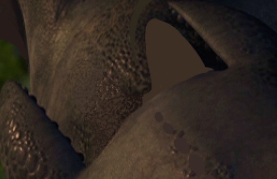
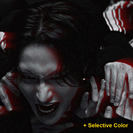
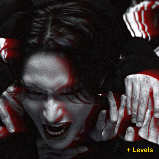
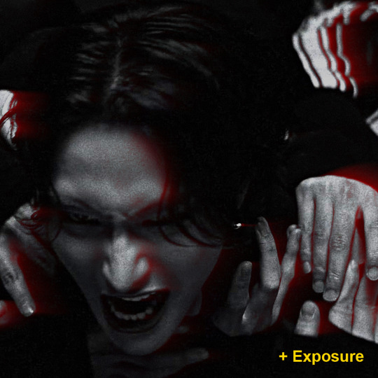
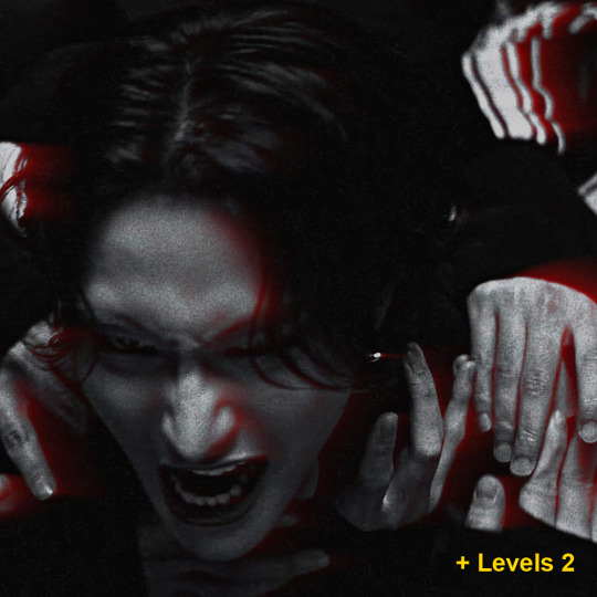
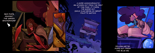
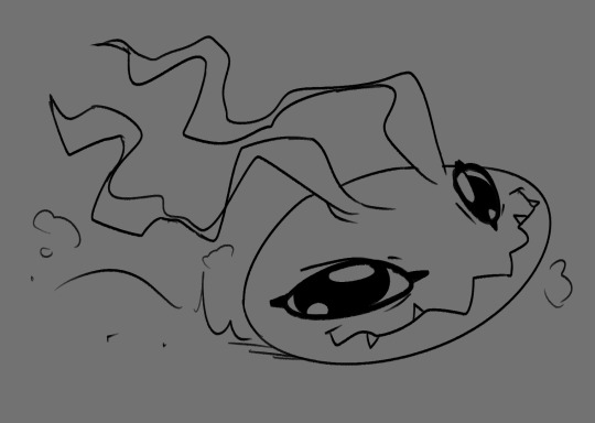
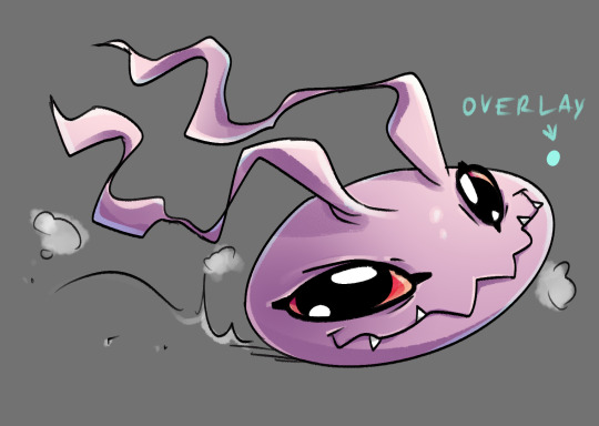
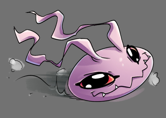
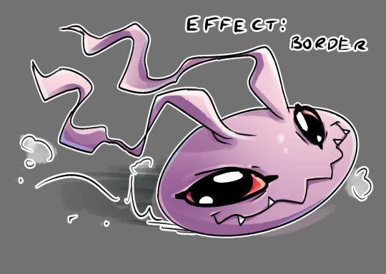
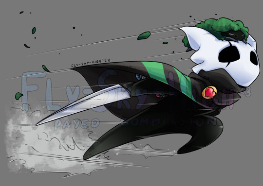
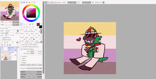
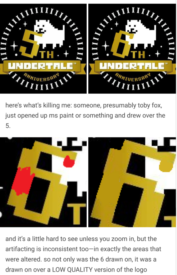
#the 1% is color adjustments and the texture overlay
Text

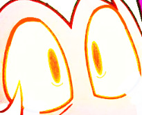
(insert caption here about how i love the Vs. Yinu bossfight)
#no straight roads#my art#nsr fanart#yinu's mom#nsr mama#i wish she had a name😭 do you guys have a headcanoned name for her#because i usually just call her Ms. Natura#procreate is my usual program but 99% of this was made on ibis paint#the 1% is color adjustments and the texture overlay
226 notes
·
View notes
Note
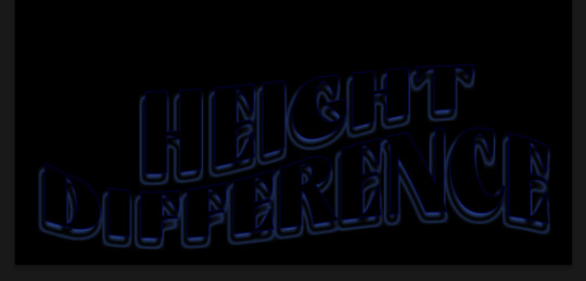
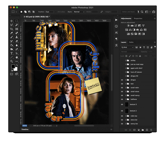
hello! I love your edits and I wanted to know, for the "Steve Robin and Nancy" Gif you posted.. How would I go about doing something like that? More specificly, the bottom two where it says "Height Difference" and where it labels them as "Princess, Jock and Loser"
Thank you! Sorry this took a while to answer. I finally had time to sit down and write this. Link to original post.
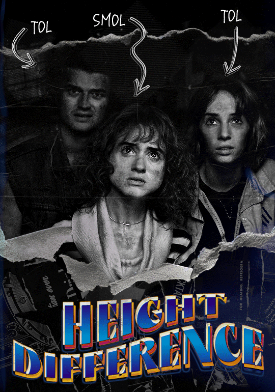

Quick notes:
I'm using Photoshop 2021 on Mac and working in video timeline. Must have basic gifmaking skills and know how to use layer masks. This is primarily a gif layout and text tutorial.
Fonts used in first gif:
Pea Wolfe Tracks — link here
King & Queen — link here
Fonts used in second gif:
Kiera — link here
Post — link here
Ellianarelle's Path — link here
Heina's hurry — link here
I used a light leaks/film texture, ripped paper textures, folded paper textures, and transparent pngs (arrows + post-it notes + smiley face).
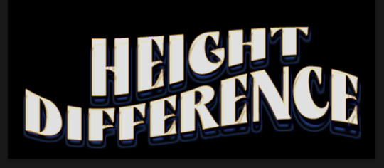
We'll start with this gif.
Make your gif! The gif here is 540x600px. I color and sharpen it to my liking. Go to image > canvas size > change height from 600 to 770px. I left the anchor in the middle, though it doesn't really matter.
I drag and drop my folded paper texture and change the layer order so it's under my gif. Then I change the blending mode on my gif to Screen so the texture shows through the gif, but I keep the texture at 100% Opacity and Fill.
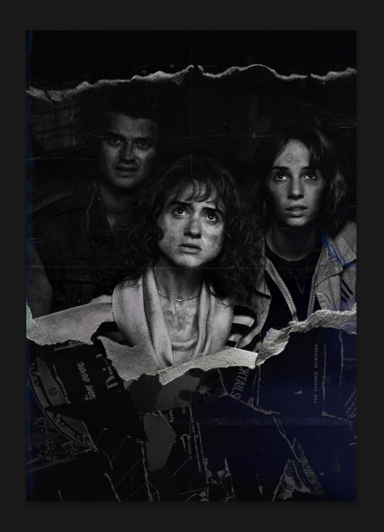
Now I move my gif around and add my ripped paper textures. I wanted to give it a sort of poster-like feel to it, so I made more room on the bottom for my main text and ended up with something like this. Blending mode is set to Lighten for the ripped paper textures.
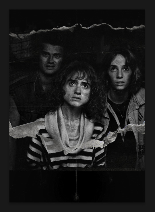
I then use layer masks to hide what I don't want shown and add my light leaks/film texture. Blending mode on light leaks/film texture set to Pin Light, Opacity: 50%, Fill: 70%.
I use Levels and Brightness/Contrast adjustment layers to darken the gif up a bit more, then I add a patterned paper texture. Blending mode for patterned paper texture set to Lighten, Opacity: 100%, Fill: 75%. Result:
Now on to the text!
I'm going to be honest here, a lot of this was clicking around until I settled on something I liked. There's three layers to create this text effect. The font used here is King & Queen.
For the first text layer, the font color is set to black (#000000), font size: 87 pt, leading: 80 pt, tracking: 25.
Layer styles used here are stroke and drop shadow.
Text Layer 1
Stroke settings:
Size: 1px
Position: Outside
Blend Mode: Hard Light
Opacity: 40%
Overprint: unchecked
Fill Type: Color
Color: #5911ed
Drop Shadow settings:
Blend Mode: Difference
Color: #2d5ba8
Opacity: 85%
Angle: 70°
Use Global Light: checked
Distance: 7px
Spread: 0%
Size: 6px
Contour: Cone - Inverted
Anti-aliased: unchecked
Noise: 0%
Layer Knocks Out Drop Shadow: checked
Blending mode for text layer set to Overlay, Opacity: 100%, Fill: 85%.
Warp text settings:
Style: Wave
Horizontal: checked
Bend: +60%
Horizontal Distortion: +10%
Vertical Distortion: 0%
With all those settings applied, the first text layer looks like this:
Duplicate the layer, clear all layer styles, and change the color for the second text layer to white (#ffffff). All other text settings (including warp settings) should stay the same. The only layer style then applied to this text layer is stroke.
Text Layer 2
Stroke settings:
Size: 1px
Position: Outside
Blend Mode: Difference
Opacity: 100%
Overprint: unchecked
Fill Type: Color
Color: #d48f16

Blending mode for the second text layer is set to Difference, Opacity: 90%, Fill: 100%. Nudge the second text layer a bit so the first text layer is a little more visible or move to your liking.
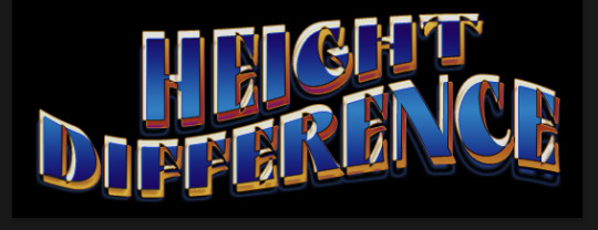
With both those layers active, it looks like this:
Duplicate the second text layer, clear layer styles, and change the color of this third text layer to a dark grey (#1a1919). Again, all other text (and warp) settings should stay the same.
Layer styles applied to this layer are stroke and gradient overlay.
Text Layer 3
Stroke settings:
Size: 1px
Position: Outside
Blend Mode: Difference
Opacity: 100%
Overprint: unchecked
Fill Type: Color
Color: #d48f16
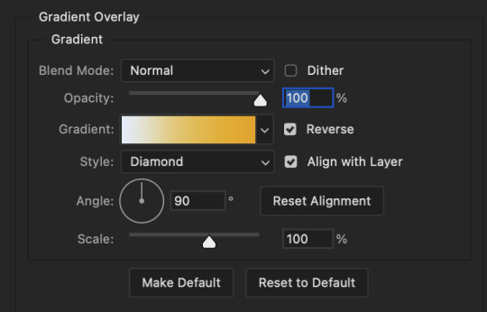
Gradient Overlay settings:
Blend Mode: Difference
Dither: unchecked
Opacity: 100%
Gradient: #cd3f00 > #ffdb5d
Reverse: unchecked
Style: Reflected
Align with Layer: checked
Angle: 90°
Scale: 100%

Blending mode for the third text layer set to Exclusion, Opacity: 100%, Fill: 100%. I also moved the third text layer around, down and to the right a few pixels to give it that 3-D Word Art effect.
With all three text layers active:
Next are the arrows.
Take your transparent pngs and place them to your liking. Blending mode for these is set to Difference, Opacity: 100%, Fill: 100%.
Command + click on an arrow thumbnail to select all the pixels in that layer. This is why the image must be transparent!
With that selection made and on a new blank layer, right click the selection and click on stroke. Settings for that are width: 2px, color: white, location: center. Move that a couple of pixels over.
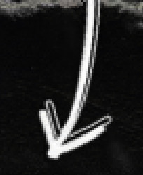
Do this for all arrows for a total of 6 layers for arrows. I group them together to keep my workspace clean, then I duplicate my arrows group with no further changes made to the second group to get what you see in the final gif.
Next is the smaller text. It's three separate text layers for each word, so I can move each of them around to my liking.
Font used is Pea Wolfe Tracks, font color: white (#ffffff), font size: 24 pt, leading: 6 pt, tracking: 25. Bold and italic options checked. I set the blending mode to Difference, Opacity: 100%, Fill: 100%.
And that's it! That concludes the tutorial for this gif!
Now on to this gif.
We'll start with the background gif. There are three separate gifs. You could make them one gif, but I wanted the option to order them differently if I needed to.
All gifs in the background are the size of the canvas: 540x770px. Color and sharpen to your liking, but keep them all black and white. To get the blurry effect go to filter > blur > guassian blur. Set radius to 7.0 pixels. Add this to all three gifs.
Then I add two folded paper textures. Blending mode for one set to Lighten, Opacity: 60%, Fill: 100%. The other set to Screen, Opacity: 70%, Fill: 90%.
I found this tutorial a while back for a halftone effect. They include links to the halftone pattern used here as well as textures and gradient maps not used here.
I'm only using the halftone pattern here.
Pattern fill settings:
Angle: 66°
Scale: 8%
Link with Layer: checked
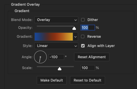
I also added a gradient overlay layer style to the halftone pattern which gives the gifs the color you see above.
Gradient Overlay settings:
Blend Mode: Overlay
Dither: unchecked
Opacity: 100%
Gradient: #0059ac > #a33600 > #e6b801
Reverse: unchecked
Style: Linear
Align with Layer: checked
Angle: -100°
Scale: 100%
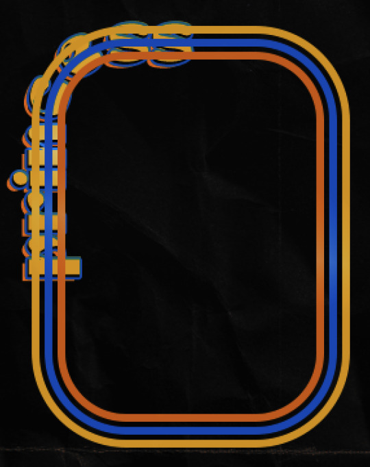
Now on to the square shapes with rounded corners. In the interest of keeping this tutorial short(er), I found this tutorial on youtube that explains how to make squares with rounded corners.
I set my stroke size to 6px, stroke color to white (#ffffff), and fill to no color. I don't use the stroke layer style to make the borders of the shape like in the video! I'm only linking the video to show how to curve corners with square shapes.
Note: Be sure you know how big or small you want these to be and how they're going to fit on your canvas in order to make all the shapes and edit them. It can be tedious to change the settings.
Duplicate and resize to your liking.
In this instance, I wanted to make three squares total, so I had to duplicate twice and resize until I had something I liked.
Settings for the shapes used here are:
Innermost shape: W: 200px, H: 280px, corners: 50px
Middle shape: W: 220px, H: 300px, corners: 60px
Outer shape: W: 240px, H: 320px, corners: 70px
Once I have the size I want for all three shapes, I group them together to make a set and duplicate that group twice, then adjust each set on the canvas for my layout.
What the sets look like all together:
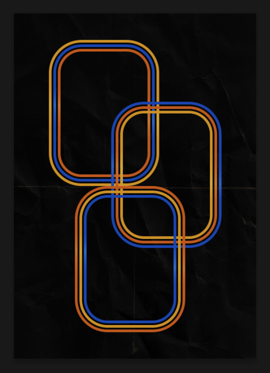
Colors used: orange #e47100, blue #0062d1, yellow #ecac00
To add color to the shapes, either change the color of the shape itself or use layer styles. I used layer styles.
Note: I didn't add the colors until the end after I knew what gifs went where and what color scheme I wanted, but I don't want to add more images than I need to here.
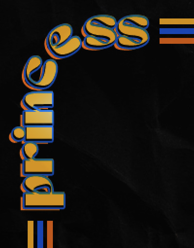
To keep this short, I found this tutorial on youtube that explains how to wrap text around a shape. However, I wanted the text to align on the outside where the white line is and not the green line (left image):
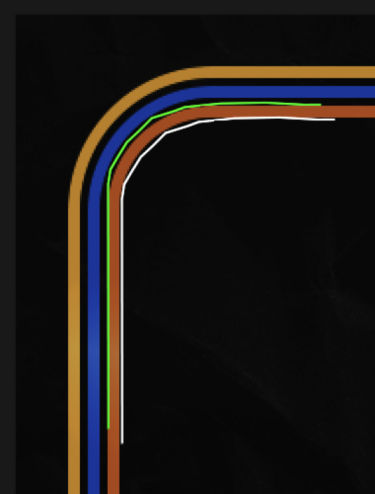
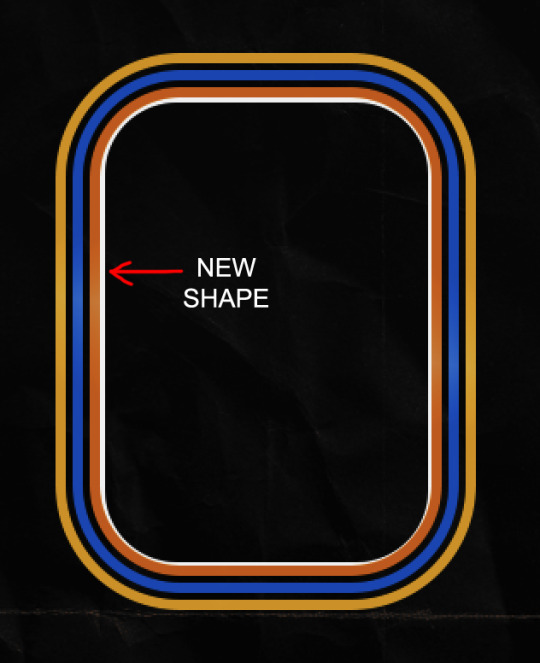
So I created another shape just inside the innermost square and used that as a path for my text (right image). Adjust the text to your liking until you have your text where you want it. Refer to the video tutorial if you need help moving the text along the path!
You don't need the shape path once you have your text where you want it, so use the layer visibility tool to hide it. You can hide your other shapes too so you can work with your text.
Do not delete your shape path!
I duplicate it once I start working with my "jock" text since all the sets are the same size. The "loser" text has to be worked a little differently, but we'll get to that later.
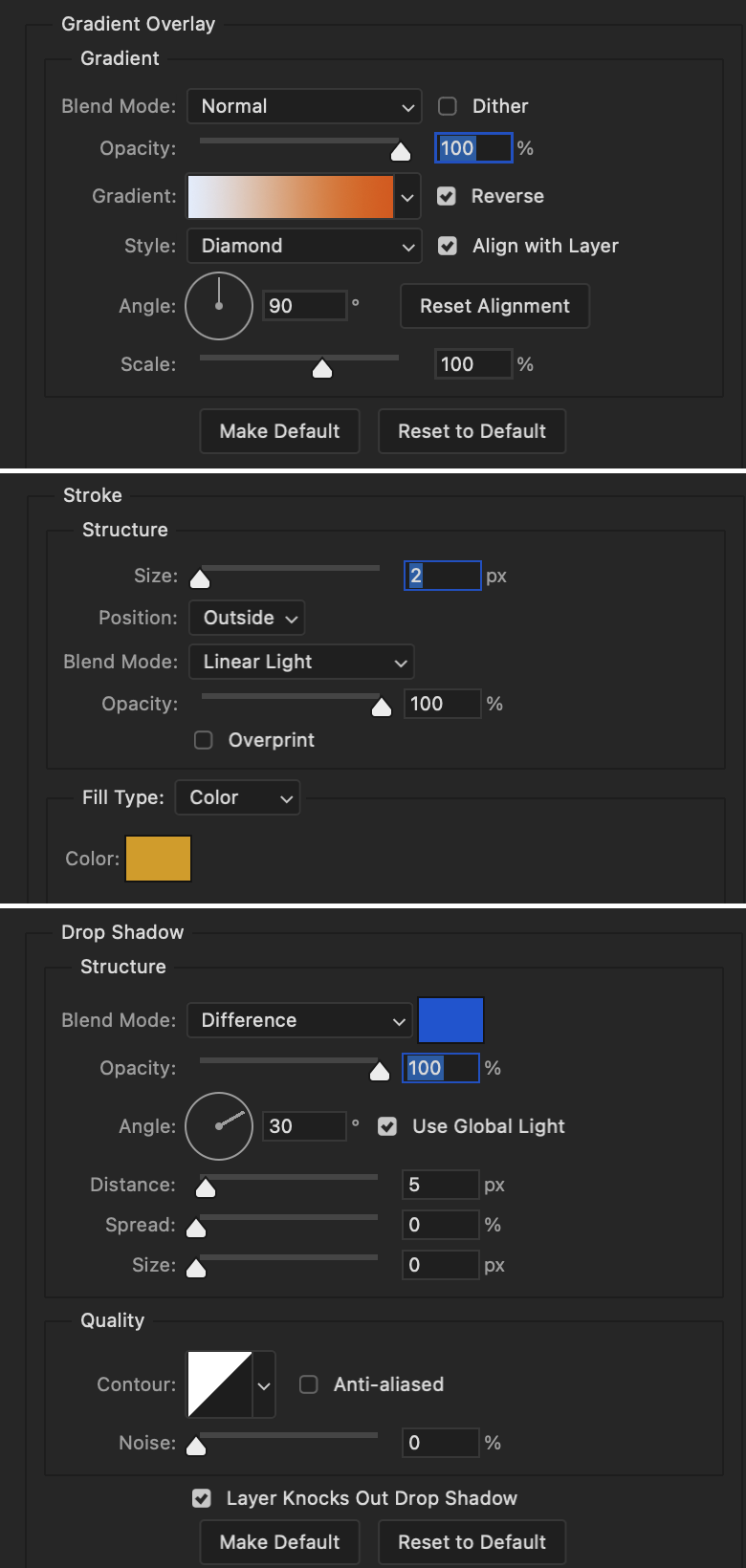
For the princess, jock, and loser text, there are two text layers to create the overall effect. For both layers, font used is Kiera, font color set to white (#ffffff), font size: 60 pt, blending mode set to Normal.
I added a gradient overlay layer style to the first text layer which I'll call the base layer. Opacity for this layer is 100%, Fill: 100%.
Base Layer
Gradient Overlay settings:
Blend Mode: Normal
Dither: unchecked
Opacity: 100%
Gradient: #f0b002 > #e7f0fd
Reverse: checked
Style: Diamond
Align with Layer: checked
Angle: 90°
Scale: 100%
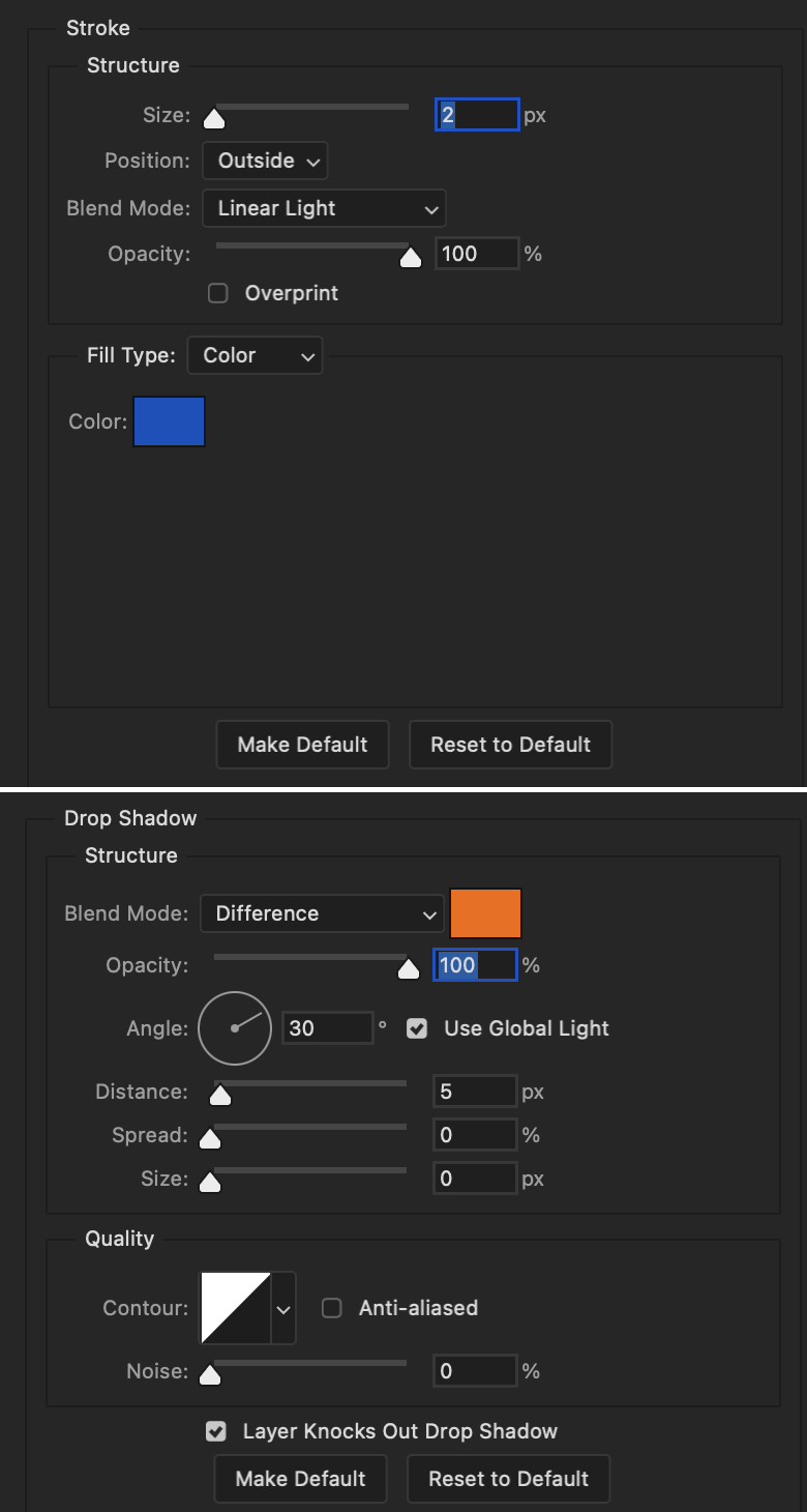
The second text layer is your stroke and drop shadow layer. For this layer, opacity is set to 100%, Fill: 0%.
Stroke and Drop Shadow Layer
Stroke settings:
Size: 2px
Position: Outside
Blend Mode: Linear Light
Opacity: 100%
Overprint: unchecked
Fill Type: Color
Color: #0064cb
Drop Shadow settings:
Blend Mode: Difference
Color: #fb7c00
Opacity: 100%
Angle: 30°
Use Global Light: checked
Distance: 5px
Spread: 0%
Size: 0px
Contour: Linear
Anti-aliased: unchecked
Noise: 0%
Layer Knocks Out Drop Shadow: checked
End result looks like this:

When I make my shapes visible again (minus the one I used as a path), I get this:
The shapes are clearly in the way of the text, whether they're above my shapes layer or under it. I use layer masks to hide what I want, so the text is legible. It looks cleaner this way and I wanted the text to be a part of the shape itself. I do that for each rounded square.
Now on to my smaller gifs. I like to crop, resize, sharpen, and color separately because my laptop and Photoshop would kill me if I tried to do it all on one canvas. I use the size of the middle shape for my gifs (220x300px), so I can have a little wiggle room when adjusting. I then use a layer mask to hide the parts of the gif that are outside of the shape.
A quick way to do this is to command + click on the thumbnail of the innermost square. With that selection made, I got to my gif layer and add a layer mask. Sometimes you need to invert it. Use command + i with the layer mask selected (not the gif) to invert the layer mask.
I repeat this process with my Steve and Robin gifs. I have to go back and forth with all the layer masks to hide parts of the gif/shapes I don't want for each set. It's kind of a long process, but not all that difficult. I label and group my layers together as I work to keep things clean and it helps me keep track of what I edited and what needs to be edited when it comes to things like this.
The picture below shows where I hid the bottom right corner of Nancy as well as the shapes that make up her set using layer masks. I also did this with the Steve and Robin sets, hiding the bottom left corner of Steve.
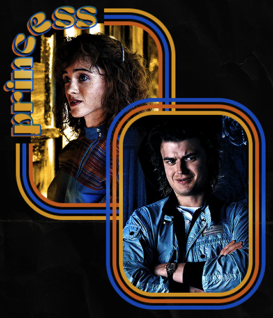

Similar text settings used for jock. The gradient overlay layer style for this base layer is different than that of princess because of the positioning of the text. Again, same as princess, two text layers are used here. Blending mode, opacity, and fill for both are the same as the princess text layers as mentioned before.
Base Layer
Gradient Overlay settings:
Blend Mode: Normal
Dither: unchecked
Opacity: 100%
Gradient: #007aec > move bottom middle dot to 80% > #e7f0fd
Reverse: checked
Style: Diamond
Align with Layer: checked
Angle: -140°
Scale: 100%
Stroke and Drop Shadow Layer
Stroke settings:
Size: 2px
Position: Outside
Blend Mode: Linear Light
Opacity: 100%
Overprint: unchecked
Fill Type: Color
Color: #a05700
Drop Shadow settings:
Blend Mode: Difference
Color: #ffba00
Opacity: 100%
Angle: 30°
Use Global Light: checked
Distance: 5px
Spread: 0%
Size: 0px
Contour: Linear
Anti-aliased: unchecked
Noise: 0%
Layer Knocks Out Drop Shadow: checked
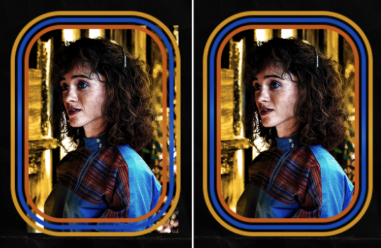
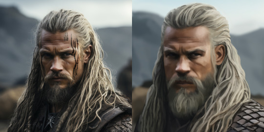
Image 1: We start with Robin.
Image 2: To make the loser text, I had to create a new path.
Image 3: I make it so the text is on the inside of the path instead of the outside. (Hint: Refer to video tutorial if you don't know how to do that.) I then adjusted the tracking between the letters in the word "loser" so they didn't look so squished together.
Image 4: Then I use layer masks to hide the parts of the shape I don't want shown.
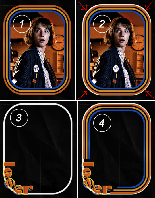
You can then hide the path or delete it. You only need it if you want to adjust the placement of the text. I keep it (hidden) just in case.
Text settings for loser are just like those for princess. Blending mode, opacity, and fill are also the same.
Base Layer
Gradient Overlay settings:
Blend Mode: Normal
Dither: unchecked
Opacity: 100%
Gradient: #eb6400 > #e7f0fd
Reverse: checked
Style: Diamond
Align with Layer: checked
Angle: 90°
Scale: 100%
Stroke and Drop Shadow Layer
Stroke settings:
Size: 2px
Position: Outside
Blend Mode: Linear Light
Opacity: 100%
Overprint: unchecked
Fill Type: Color
Color: #e1a900
Drop Shadow settings:
Blend Mode: Difference
Color: #0068de
Opacity: 100%
Angle: 30°
Use Global Light: checked
Distance: 5px
Spread: 0%
Size: 0px
Contour: Linear
Anti-aliased: unchecked
Noise: 0%
Layer Knocks Out Drop Shadow: checked
Next are the post-it notes! This is probably the easiest part of making this gif. You just have to repeat this process for however many post-it notes you're making.
Image 1: To start, place your transparent post-it note where you want it. You can also rotate it if you'd like.
Image 2: Then create a text layer and write what you want. Font used here is Post. I wanted this text underlined to give emphasis, so I click on the underline option. I also adjusted the leading because I wanted more space between the word and the line. Rotate the text so it looks like it's written on the post-it note.
Note: It looks better if you choose a font that looks handwritten.
Image 3: I wanted another line to give emphasis to the "Dingus!!" text and make it seem more handwritten. I use the line tool to create another line.
Image 4: Then I adjust that line to my liking.

Fonts used for notes: Post, Ellianarelle's Path, and Heina's hurry
Repeat this process for all post-it notes!
That finishes the tutorial! (And I hit the 30 image limit lol.) I hope this helps. If you have any further questions, feel free to send an ask or IM and I'll try to answer to the best of my ability.
Happy photoshopping!
#ask#pcocana#photoshop#photoshop tutorial#tutorials#*tutorials#userchibi#userbunneis#uservivaldi#userriel#userabs#usertiny#useralien#useraljoscha#userfanni#userraffa#tusermona#userbess#userrobin#userroza#quicklings#janielook#usernaureen#userrlorelei#tsusermels#tusermimi#userelio#usertj#userbarrow#usernolan
166 notes
·
View notes
Note
Could you give some advice on editing? I really like your httyd edits
Like what kind of layer you use to change the colors of the characters (overlay? Multiply? Stuff like that)
And how to you put black on a lightfury or white on a nightfury so well
Again I really like your edits
I actually wasn't aware if anyone was into my edits since I don't do them much, haha~
But screenshot edits are fun! Here's how I do them using Roughwave!
Here's what I'm starting with:
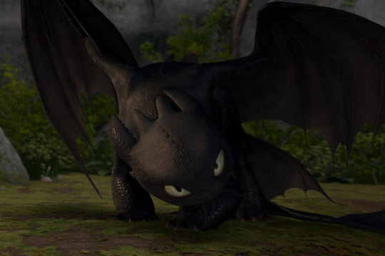
(I always felt like HTTYD 1 Toothless worked better for edits of her~)
So with this, I start by adjusting the lighting and contrast and slightly altering the saturation of the screenshot:
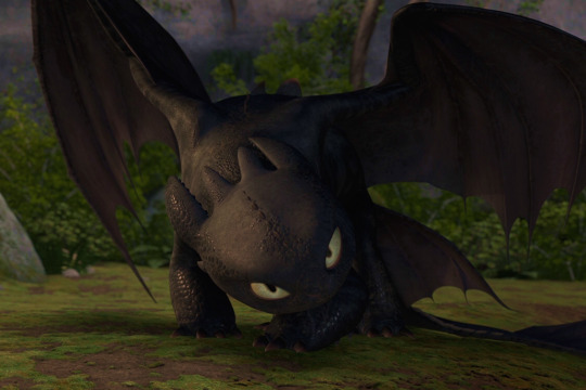
It's not a crazy difference, but it's enough of a difference to me. Now that I have that, I need to adjust the body. Roughwave is a night light with both night fury and light fury traits, more than just coloration. She has the night fury build, but light fury wing-shapes, no head spines, a fin going down her back instead of the night fury spikes, and only three ear sets instead of four (does not have the top middle set). So before I bother to alter the colors, I need to have my "base".

On a different layer, I blocked in what I was changing and covered what I was removing. I used the colors closest to the surrounding areas of what I was changing. Needless to say, It looks kinda funny rn, but trust the process. This next step is where your eyedrop tool is going to be your best friend. What you'll be doing now is, on the same layer or a different, whatever you prefer, you are going to mimic the shading and texturing over the blotches until they blend.
Comparison of one side that I've done to the other side I haven't gotten to, yet~ I generally start with the darker parts and work my way up to the lighter. It's just all about getting the closest color, dotting and scribbling, and getting the next color until it blends near seamlessly. This process is what takes me the longest in my edits, so be patient.

And here's my new base~ Now I can color!

I make a new layer on "Add Glow" ('Add' will do, too), and I go over my base with a white and erase her markings (since they're the same color as the base I'm using). Once done, it'll look like this. I blur the white layer slightly and touch up the edges a bit so they're not too blurred or too solid for better blending. Once that's done, I lower the layer opacity to 20% and-
Since the scene takes place with lower lighting, I wanted to keep her white darker to match the scene better. I could technically leave it at this since her eye color is the same as the base's, but I usually like going in and adding a few extra details to really make my edit a bit more of "my style".

So the extra detail is pretty much this:
-Add a new layer 'Add Glow' with a green color to Roughwave's eyes to make them pop more.
-Add a new 'Multiply' layer and go over the shading already on it to give it depth.
-Add a new 'Overlay' and do highlights~
-Play with some extra lighting details to make things pretty~
And basically, that's it! As a bonus, for putting black on a light fury, use a grey on a 'multiply' layer and play with the shade of grey and the opacity of the layer until you get the kind of black you're looking for! Hope this helps! ;v;
31 notes
·
View notes
Text
here's some tips to copy my cross hatching style on procreate, sorry no pics bc I don't know how to screenshot on an ipad
1. get a really textured brush: the chalk brush is what I use, but I also bought chromagraph brush sets from True grit texture supply, and they can mimic traditional brushes super well.
2. this style really works well with linearted stuff, so. fill in your lines with the base color a shade lighter than your intended color. Don't use a textured brush for the base. use a really smooth one, or even the fill tool.
3. when you're done with the base, make a new layer on top, and set it to multiply, but make the opacity low. Mine is usually set to like 30%, but adjust as needed- Start coloring in with the textured brush.
4. layer in your colors like youre actually working on traditional art. lightest to darkest, this will really work well if you avoid using any blur tools. When you're done with the first layer of colors with the textured pencil, merge it down, start a new layer, set it to low multiply, and add the next layer of colors, just like how you would color pencils irl.
5. if you can comfortably eyeball the colors, try to add in more colors to the piece *without* using the layer tools like multiply or overlay, and just try to guess which color harmony would work. Don't be afraid to use more grays rather than the really vivid colors.
6. once you're done with the drawing, you can use the sharpen option to make the textures more prominent!!
7. try to add just One filter above it, just to make the drawing feel more natural !
183 notes
·
View notes
Text
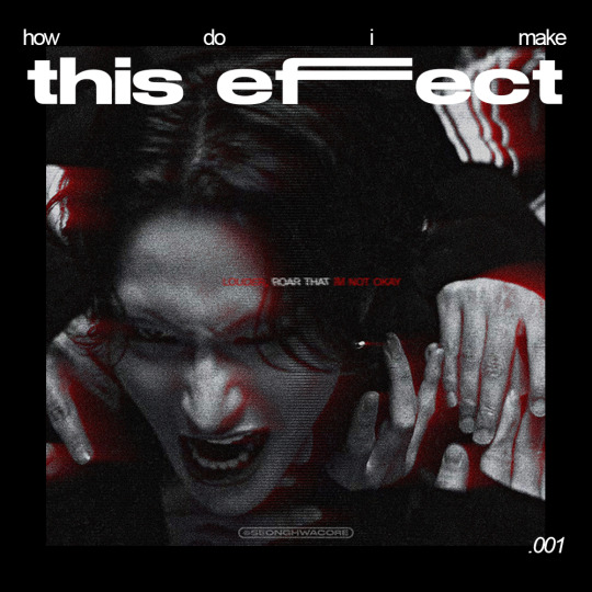
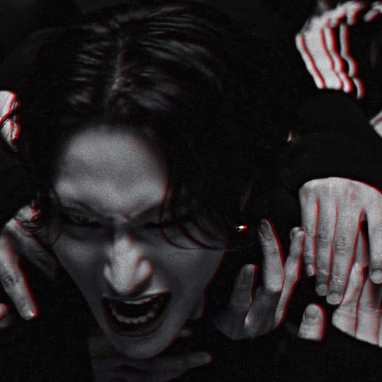
🏍 AKIRA-ISH MOTION BLURRED LIGHT EFFECT (or the cooler name, ✨Rear Sync Flash effect✨)
as requested for my carrot kid @renjunniez (and everyone) <3
⁕ Tool: Photoshop 2021 (PS)
⁕ GUIDE:
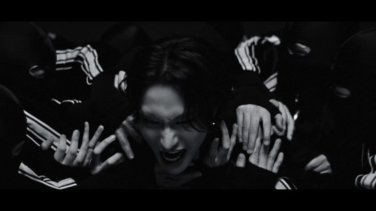
1. Open/place your picture of your choice on PS. For this set, I took a screenshot from the MV using VLC. Didn't bother to take it from VS.
You need a black & white picture with dense shadow/black shade and focused highlight to achieve this effect. If your base is as colorful and bright as a 4 year old's imagination about the world of unicorns, you gotta need some adjustments. The effect still appears but give a totally different vibe. I put an example at the end of the tutorial.
2. Then, do the basic sharpening and resizing for the base layer. I crop them to 540x540px.
3. Copy the base layer and delete the sharpening smart filters. Double click the layer to open Layer Style panel.
On General Blending, change the Blend Mode to Lighten. On Advanced Blending, uncheck the Green (G) and Blue (B) channels, so you'll be left with Red (R) channel. And then, move the picture to the right because you want the red shadow to "trail" Seonghwa (your subject)'s movement.
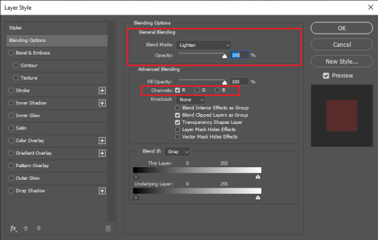
Your pic will look somehow like this:
4. Go to Filter > Blur Gallery > Path Blur. The default option is usually Basic Blur. Change the option to Rear Sync Flash.
Now, you have to decide the direction of the "red trail". This is quite tricky because it's better if you apply the blur with the subject's real movement in mind. In this example, I imagined Hwa was swaying to the left in slow motion as he restrained from being dragged away. So, my path's starting point is from the left.
Once you've decided, click on a random point to pin a starting point and stretch the arrow to your desirable distance. You can also curve the arrow to give a more, well, fancy direction.
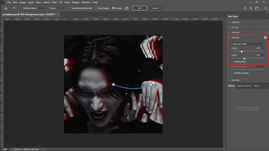
I set the Speed to 146% and the Taper to 17%. Uncheck everything else.
*Hover over the word "Speed" and "Taper" to know what it'll do to your pic
**If you wanna know more about Rear Sync or Rear Curtain Flash in photography [x]
5. After this part, basically you're free to do whatever with your gfx. These steps below are OPTIONAL.
5-a. First, I adjusted the lighting and contrast.
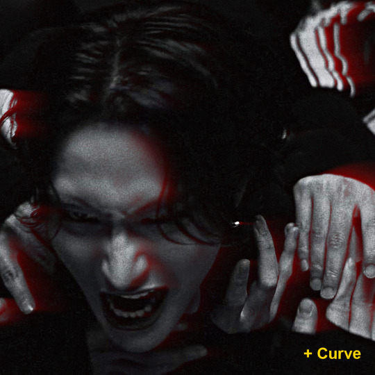
5-b. Then, I added text.
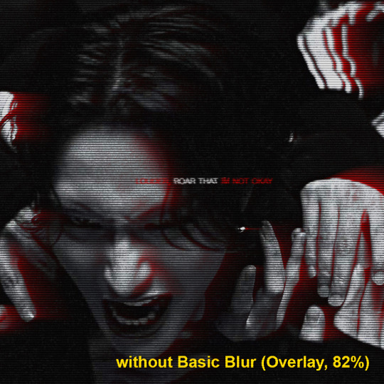
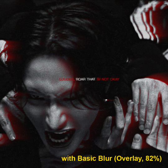
5-c. After that, I placed a lined texture. I set the blending to Overlay with 82% Opacity and gave it a Basic Blur effect from Path Blur. I definitely just fuckin around with this step and found out that it changed the opacity of the lines depending on where it's applied on: shadow, midtone, or highlight parts.
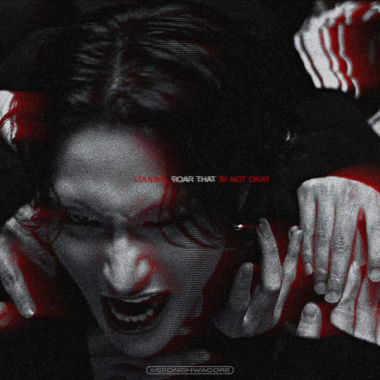
5-d. Lastly, add grains texture
Et voila! You'll get this effect 🤩
Now, if you have a bright, colorful pic as the base. For example, I use this The Real Hwa dontevenaskmehowmanypicsofhwaihaveinmyputer. The "highlight" part (the sky) is surrounding the "shadow" (Hwa in hanbok). Then, I applied the same effect.

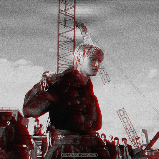
Still slay but definitely not as "dramatic" and intense as the dark mode version. Kinda lose the purpose of the trail to me. HOWEVER. I encourage you to fuck around and improvise 👍
Hope this helps!
#ann.txt#gfx tutorial#rear sync flash effect#if theres something i need to revise or if you want to discuss about this just lmk
23 notes
·
View notes
Note
What is your process in making your comic? :o I'm trying to make one myself and would like some tips!
Sure thing! I'm assuming you're talking about this one
Hope you're okay with a long answer
I'd say first, you figure out what is the most important goal for you, and base the process around it. Is it trying a new style? Focusing on backgrounds?
For me, there was two main technical things.
1. I wanted to make absolute sure that I WILL finish it.
2. I realized how much I missed having physical pieces of art.
(I also wanted to use the story to get a feel for writing these characters... but. that doesn't affect the process. not for me at least)
First, I have the story mostly mapped out in my head. It's not super long, it's more of an introduction to the world. So my "scripts" are really just dialogue and a thumbnail scribbled beside it. I'll plan maybe 5 pages and then immediately start drawing it. It's fast, and keeps me on my toes.

I sketch and ink everything on Bristol paper, except for the very first page. It took hours to do the inks for that one, which is when I realized that it was taking way too long and ultimately switched to paper. Infinite use of Ctrl+Z is not always a good thing.
I'm not clean whatsoever with my inking. Most people would be more careful, but I just use it as a way to ignore my mistakes and keep pushing forward.
(I do have a white paint marker for the big messes though.)
I scan the pages, and adjust the levels so it's purely black and white. I might also fix obvious mistakes here and there, but I'm not picky about it.
Then I color! I'm still figuring out what looks good. Though I really like having either monochromatic panels, or two complimentary colors directly opposing each other. I also overlay it with a grainy texture.
I use CSP for everything, and they have really good text tools, especially for comics. I like to color the text bubbles to match the color palette of the panels they're in. Just a personal preference.
I think that's it? But feel free to ask other questions if you're interested!
23 notes
·
View notes
Text
BUGGIN-0UT CAS CRASH COURSE!
I have zero video editing/ recording knowledge so i had to settle for this, hopefully its still helpful.
REFERENCES
@ iamkimey, blkkstar, dravenonline
When I use references, I rarely aim to make the Sim look exactly like the actual person. Instead I tend to select my favorite parts or features from each picture. Sometimes I don't use references at all, and people's features just pop into my head. Either way, my Sims are inspired by real people 95% of the time.

------------------------------------------------------------------------------
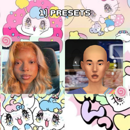
PRESETS
I loosely picked presets that were Similar to the reference I was using. I specifically liked the shape of her features and the fullness of her face, so that's what I focused on. Btw, I never aim to make it look exactly like the reference. I learned years ago that trying to make a perfect match is impossible unless you're using a face mask and As a perfectionist, it only sets you up for disappointment.
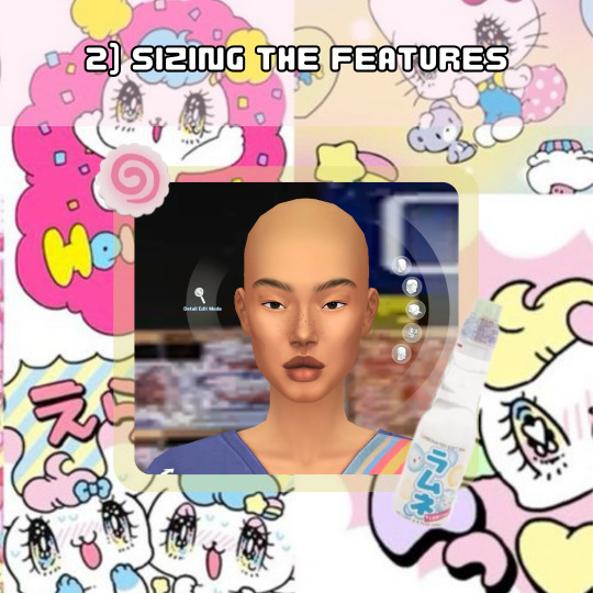
SIZING THE FEATURES
I think we all notice how cartoonish vanilla sims are so to make my sims look more "realistic" I do not make the features any bigger than the default size and I usually size the eyes down 1-3 bits, average being around 2. For the rest of the features I try to balance it out so that they're all cohesive.
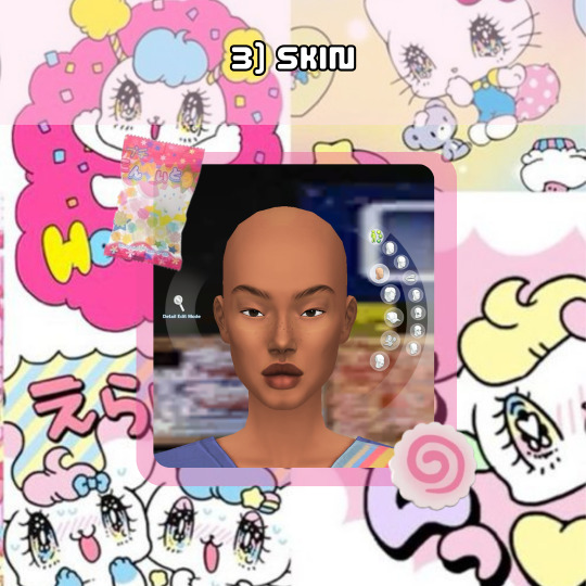
SKIN
When selecting a skin tone, I usually click around randomly or aim for something similar to the reference. In this case, I chose a tone randomly and adjusted it using the color slider.
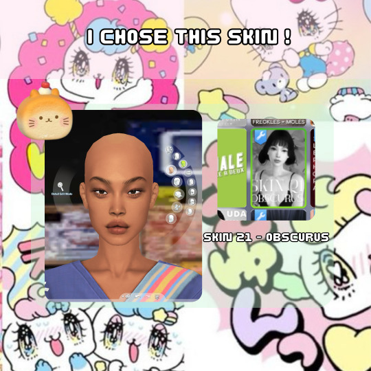
For this Sim, I desired a fuller, more plump face, so I searched for a skin that went with that look. Now, here are my most important tips! As you can see, this skin is an "Asian skin” but I'm not aiming to make this Sim Asian, I just chose it because it lacks cheek shadows. Skin details are important to my Sim making process and I cannot stress this enough! I plan to show the difference it makes by creating two different Sims using the same base at the end.
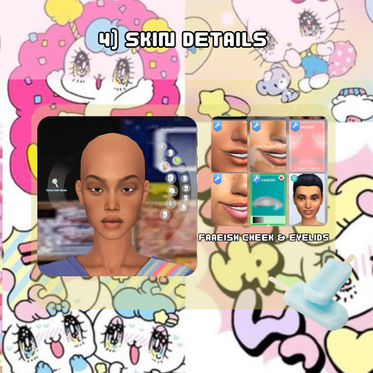
SKIN DETAILS
When it comes to skin details, I always use the Faaeish cheek and eye details. I've been using them for years and they significantly enhance my Sim creations. I use a variety of skin detail overlays, especially those that include skintones, because they offer more texture and definition. However, many overlays don't align well with the base game skin tones and I generally prefer non-overlay skins because overlay skins often have grey undertones for black skins. For this reason, I recommend using the color slider mod.

MINI COLOR SLIDER TUTORIAL
Here's an example of how I use color sliders to match my skin details. It helps if you're already familiar with color, hue, tone, etc., but it's not difficult if you're not. The swatch here is the closest match I could get in terms of color, so I'll use saturation, opacity, and brightness to achieve a closer match.
1) If it appears too orange, adjust the brightness and/or opacity.
2) Darkening the brightness helped, but it still looks too orange.
3 & 4) I reduced the opacity to slightly less than halfway, and it worked.
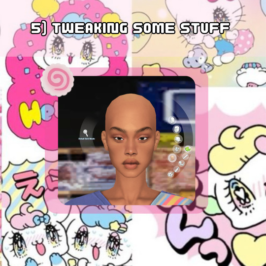
TWEAKING SOME STUFF
I adjusted the nose and lips to align with the fullness of the face. Remember when I mentioned cohesiveness earlier? Well, I'm going to dive into that a bit more right now. I chose a softer nose overlay to appear less defined and more rounded because a sharply defined nose on a full face wouldn't be as harmonious (although it can still work and look beautiful for sure). I added a lip overlay for fullness for the same reason. I then tweaked the face to ensure all features were facing neutrally (straight across, not up or down turned) to maintain consistency, because what???? cohesiveness blah blah blah!
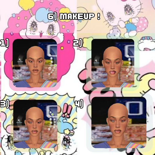
MAKEUP
Time for the fun part! I also use makeup skin details, which are superr helpful with giving my Sims distinct looks. This is how I can use the same base skin for almost all my Sims and still make them look unique. For eyeshadow, I use eyelid overlays and adjust the color using the color sliders, following the same method as before :). In the images, you can see the difference between using no makeup skin details and using them. You can also see the difference in lipstick before and after using the color slider. OH! I also included heterochromia, inspired by one of the references!

EYES
I always reduce the size of the eyes and go for ones with less shine to achieve a more "realistic" look. Since these were the only Heterochromia eyes I had, and they leaned towards the cartoonish side, I made them very small and raised them a little to appear less round and more oval-shaped. I also adjusted the brightness to darken the eyes, creating more shadow for the sclera, which I feel like enhances the realism…Then ofc I make them a lil cockeyed, cause whats a buggin-0ut sim if the eyes dont look like they tryna see each other.

SKIN BLENDING
This is a new method I've been using to add texture to my Sims. I utilize the color slider mod to blend skin overlays, non-overlays, and facemasks. For this Sim, I chose the Tems skin by ClaikSims, mainly because she fine BUT !, it was a good choice because the spacious eyelids matched up perfectly. When doing this step, I recommend not setting the opacity too low, it can make the skin see through, which makes double nipples, eyebrows, belly buttons, etc. If this does happen, I honestly just use the body and cleavage masks by Sims4Melancholic.
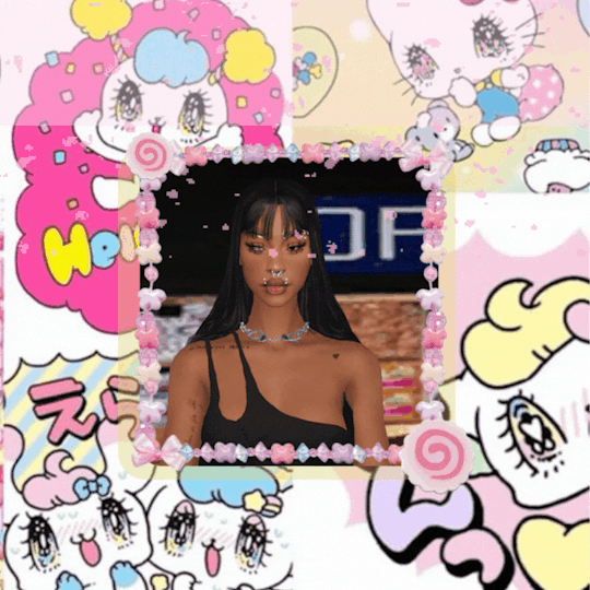
DO WHATEVER YOU WANT!
The final step! I revisit my references and see what else I can include, such as their hair, makeup style, aesthetic, and so on.
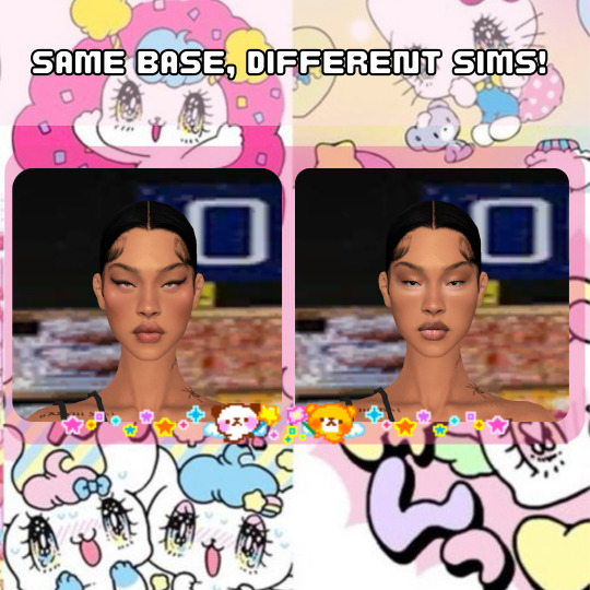
I didn't change anything except the makeup. I just wanted to show an example of how much it can change a Sim, regardless of the skin used.
….
And that's my CAS process! Nothing too crazy…i think???. I've been doing the same routine since 2018, minus the sliders ig.
If you have any more questions, feel free to ask. I dont say much, but I do not bite, またね!
#b0:tutorials#forgot to mention i also use HELLA sliders and use them at every angle#Didnt realize i did all this until i had to break it down step by step#AND DONT ASK ME FOR SHIT ELSE!#nah im jp#i am a proud gatekeeper tho so you probably wouldn’t want to frfr
21 notes
·
View notes
Text
My portrait painting process (ft. Erak from Ranger's Apprentice)
I've wanted to do something like this for a while, but I would always forget! This isn't really a tutorial, but more just to show my process. I did rush this one, but it still took about 5 hours lol.
How much the result looks like the reference depends on how close the reference is to what I want. In this case it was really close.
To start I pulled in my reference to the side of the painting area.
1: Blocking out the background
2: Blocking the subject (I'm zoomed way out during this stage)
3: Gradual refining (painting, smudging and blending)
4: Hair:
A) Paint scribbly hair
B) Paint larger hair
C) Smudge
5: Repeat the steps above over and over until you hate yourself
6: More refining, painted in some leather on his shoulders, resized the subject and adjusted the background
7: Applied a lens blur to the background, painted more hair using step 4, and added a smart sharpen filter to the subject
8: Painted wispy hairs

9: Added a subtle noise texture on overlay mode on the skin

10: Final touches and color adjustments
Behold:
54 notes
·
View notes
Note
HII I’m not sure if this is the right blog but I’m so curious about how you color artwork, like what brushes you use, I really love your style and have thought about taking some inspiration from it
Hi! :D This is fine, I'll reblog it to my art blog so it can be easier to find, no worries.
I'm not the type that uses too many different brushes! I ended up comfortable with just a single brush for most of my work unless the style calls for something else (like soft look of Rain World, which I did a little step by step for here~)
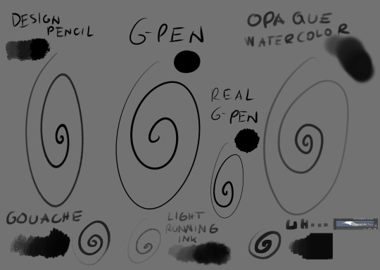
The main brush I use for just about everything is Design Brush. I use it for sketching, I use it for lineart and I use it to add shadows and highlights! I also like to mess with the backgrounds with it
I got hooked to Real G-pen recently for fun lines and texture! Opaque watercolor is what I use for soft rendering like slugcats~ Gouche is very fun to paint with also because of the texture! I haven't used in awhile tho. Light running ink is what I use for smokey effects, clouds, stuff like that! I love the brush! And uh... the last brush is called *checks the source* Nouchika Square Brush. It's free! It's square! It's new to me! very fun to use!
Details about the steps with Design pencil:
After sketching, I basically just lineart with the same brush in a different layer (or multiple of them, if needed!). Once done, I also duplicate the lineart layer to make the previous a little sharper, since depending on the pressure the brush can be faint or very strong, which will come in handy with colors later!
Single layer VS doubled:

Next, for easy color in, I select the areas outside of lineart, invert selection and even shrink it by 1 pixel. Then, I color the new layer bellow lineart flat with one base (in this case, Koromon's pinkish color)
Above it, I hand fill other colors and yes, there are probably easier ways to do that but I am way to used to the hard way XD Note that I rely on this: Hold CTRL and click on base color layer to select everything in that layer, then make a layer and color within that, so I don't cross the border/lines.

I usually lock layers for the next part but you can also just make a new layer above.
Use gradient tool (with which ever options) and select colors that are slightly shifted in hue and saturation from the base color picked one and toss in a bit of gradient shadow and highlight in each locked color!

Remember, color picker is your best friend ever to befriend in any art program! it will help you find hues in this gradient you can work with to add to the shape while doing the simple render!
Now, I use the same brush still but I change sizes depending on which area I'm going to go across. Nice part about it is the aforementioned pressure that can apply less or more color depending on how much you press down. I go with the light strokes over first and then stronger ones above! you can get softer shading this way! Same with highlight~ If something feels off somewhere, color pick the nearest hue and stroke the mistake away~ You can do the same if you want to use any present hue in another part of the figure

after that's done, I then tend to put another layer and select Overlay option on it to add at least a little bit more shadow or highlight (I chose highlight in this case). There is no background for this drawing so I figured it would be nice to add a little bit of cold colors to the warm ones Koromon is made of.
You can play with other layer options or even edit and color adjustments like tone curve, color balance and brightness/contrast, with any color layer! I do it a lot actually~
You add some extras if you want and you're done~
There is not much to it, so I use this for a simple style commission!
#ask#my art#sorry if something sounds odd it's a little later here as I toss this together dfgjgh#I dunno how good is to use the brush I use I'm just a bit too used to it with how I handle my pen pressure#I noticed it has a different(?) texture on my older tablet somehow?#might be the dps difference between tablets#but anyway#that's how I roll~
14 notes
·
View notes
Note
Genuinely, how do you work with the lc 3d models n render them so cool!? Especially the customizations, I see a ton of lc skins but I don't know what ppl work with or how they do it so well!!
SHEER WILL POWER.
But for actual answers, the short answer is a lot of fuckery.
And the long answer is
Firstly all the shit I do is in Blender, and it involves a lot with the camera and the posing of whoever I'm playing around with. My rule is that if it's not gonna be seen by the camera angle in the final render, then I really don't have to give a shit about how it looks. It only has to look good for the camera. A small example of this is with Fencer, because his tailcoat is just a little jank, I have to move it around a bunch for it to look good, which results in it clipping through his ass. Yet, you're not gonna see that ever in a render now, will ya ?
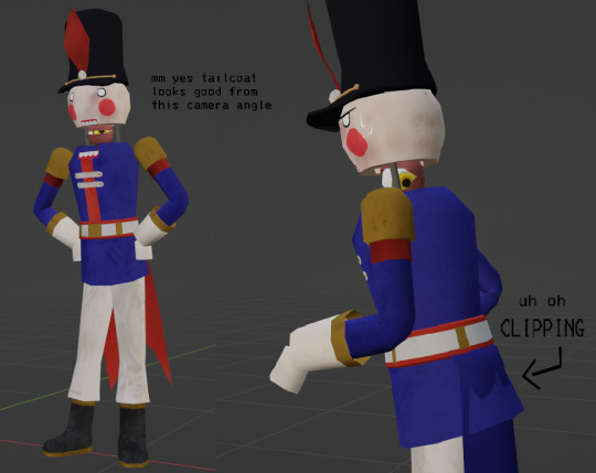
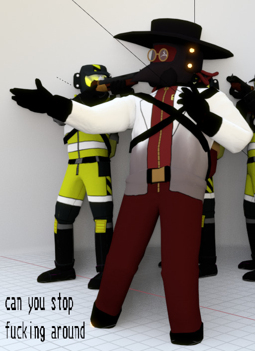
Another example is something in my most recent render, in which Doc is slightly clipping through the floor just so I could get him in the right position for the camera, but I didn't have to care about this because it's only his upper half showing ! (Also from here out, I'll probs be using the render as prime example so yay)
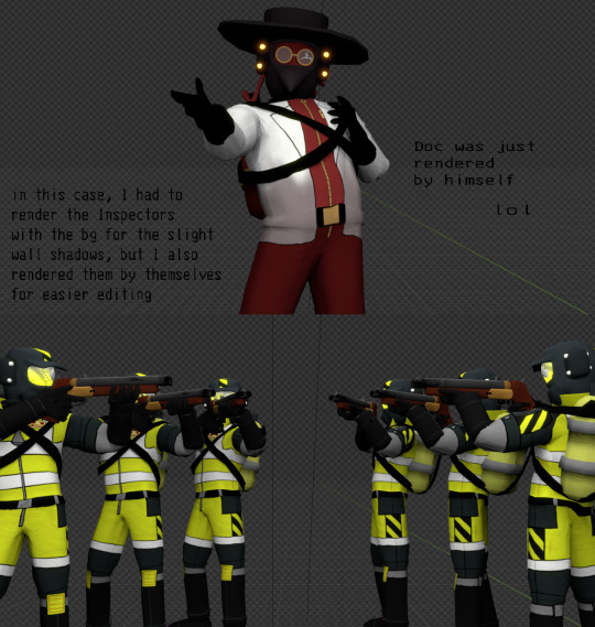
Another thing I do (sometimes) is if there's more than 1 element in the piece, I will render them out into separate PNGs with transparency. This will include the characters, the background, foreground, etc or whatever I need.
NOW WE MOVE ONTO PAINTING OVER IT ! This is where I take everything into my main program, FireAlpaca, and touch everything up to look nice. One of the main things I do is fix up shading / texture / clipping mistakes. Here are some examples of that
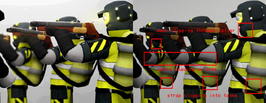
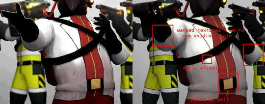
Painting over everything also allows me to add small, fun details to the render ! Such as the small rim lights, glow, shine, blur- fun things that would otherwise make me want to rip my hair out doing in Blender ! I also adjust the contrast / colors to how I want them, and paint on some of the lighting if I feel like it's needed.

And then after applying overlay textures (if any) and a bunch of other small things, the render's done yayyyy !

There's probably a couple things I could do in Blender to ease up this process, but this is just how I personally enjoy doing my renders. If you look around, there's most likely tutorials or smth to get cool effects in the program itself and waste less time, it's just that I'm a little pea-brained and don't wanna bother with that LOL
Moving onto custom suits, I just use a cruddy scavenger model from sketchfab to easily texture paint on for the suits. Cosmetics (hats, visors, items, etc) are completely modeled by hand and not pre-made assets, either by friends or me. Texture painting and modeling is an even LONGER thing to explain, at least from my perspective, but there are a bunch of tutorials out there for that kind of stuff, and also tutorials on how to create your own custom LC stuff !
anyways ok this answer was LONG as FUCK um. oops !
17 notes
·
View notes
Note
how do you do the “cut out of a piece of cardstock or paper or something” effect
i'm gonna do an image guide, if that's okay!
i use these texture overlays - i've been planning to make a post that credits all these sorts of assets i use that i can link in my pinned post, but i keep forgetting...
so, well, i'll credit them now! and you can get them yourself, too! they're quite handy. it's a name your price thing, so you can download it for free, or be kind and donate to the creator!
-> Natural Materials Vol. 1 by TOMB of NULL
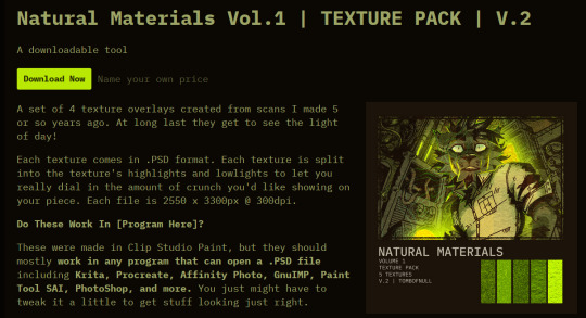
guzma art guide underneath all this, it does get a little long, but it should cover my whole process for getting this effect!
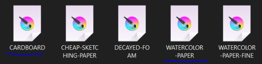
you download the thing above and unzip it, and get some handy files to open in basically any art program that can handle PSD files. there's other material packs, but i only use this one! and out of these, i really only ever use the ones i lined with blue. (CARDBOARD and WATERCOLOR-PAPER)
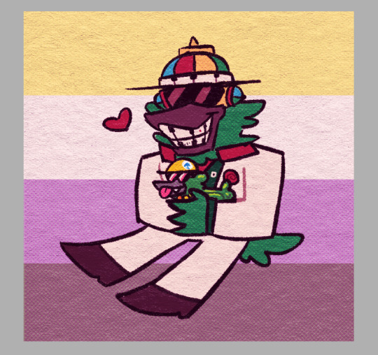
the idea is, that you draw a drawing and paste it within these folders. however, i don't do it this way, as you can see! it's a very different result. as an example, i'm gonna use the non-textured version of my old icon .
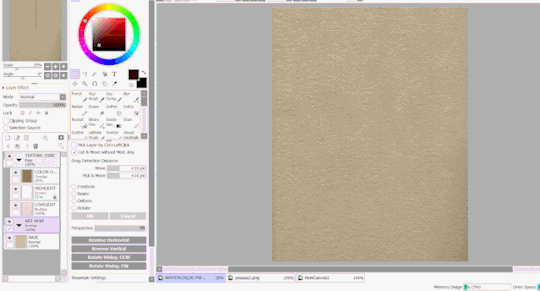
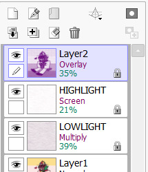
you can do this and get a nice effect, especially if you use more fitting colors for this sort of style, but again, this isn't what i do! i actually copy specific layers and paste THOSE into my actual pieces. (specifically "LOWLIGHT" and "HIGHLIGHT" from "WATERCOLOR-PAPER")
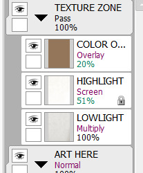
i paste LOWLIGHT first, and set it to MULTIPLY. then, i paste HIGHLIGHT on top of it, and i set it to SCREEN.
then, i lock the layers for both and either paint over or bucket-tool fill them with a different color that fits my piece more. i adjust the opacity of each layer. i don't get the color first try always, i spend some time to play around with it - but for demonstration i stuck with what i picked at the moment.
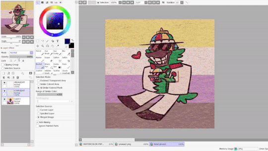
but that isn't all! i sometimes use "LOWLIGHT" from "CARDBOARD" as well, set on top of both of these layers, but instead set to OVERLAY. due to some scratches in the texture i don't like, i may move the position slightly. unless you draw really big, the texture will cover up your whole pieces and allow for some movement. if not, re-sizing is okay!
but i don't use that one always - what i use MOST of the time, and what i've done before i began using any paper overlays - were dot/halftone overlays! i either use these ones below, that are a specific, same size. (i resize for canvases all the time, that doesn't matter.)
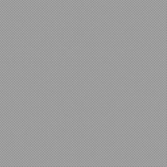

...or i also use another method! it requires krita.
you open up krita, and paste your whole piece into it. (what i do, is flatten my current piece, copy it, then undo to get all my layers back. then i paste the image into krita)
once i'm there, i go to FILTERS -> ARTISTIC -> HALFTONE. i adjust as i think it looks good, and then copy that.

then, i paste that back into sai. however! it may be off by a few pixels! zoom in and move it slightly left or right - turn the opacity down slightly to help you figure it out. once you do that, set that layer to OVERLAY. you can play with the opacity - or even do fun things! it makes it look better, so hang on a minute!
the "fun things" i mentioned is going over to LAYER and selecting "CONVERT LUMINACE TO TRANSPARENCY". in this case, it makes the white transparent and removes it, while it keeps the halftone! then i can change it's colors to be more fitting to my piece. (like we did with the texture layers!)
i used a purple overlay - so it makes the picture feel more purple and it ties the colors together a little bit more, without the use of an layer on top that's just one color set to OVERLAY or MULTIPLY to give it a different color hint. i usually do that, but set to super low opacity. but not always!
a lot of these are just done by "feeling it" and trial-and-error! just messing around and seeing what looks nice, after all, these are usually my final details i add to a piece once it's done to give it a more finished, uniform look. plus, the texture looks nice, and it's great to make more flat colored pieces just POP OUT !!
and of course, i use either the image half-tone overlay or the krita method depending on just what i think looks good. i don't really have a specific method!
and sometimes, i add different overlays on top and mix and match - sometimes from actual scanned paper textures! i've downloaded some from this google drive i'm going to link below. i use them rarely, but it's worth the credit, too.
-> PAPER TEXTURES GOOGLE DRIVE (not mines!) (unfortunately, i lost the tumblr post i got these from.)
------------------------------------------------------------------------
few other things i tend to do, also: i tend to add extra saturation once a piece is done. i like bright colors.
i also tend to copy the original drawing underneath all these effect layers, and paste it over all these other layers. i set it to OVERLAY and set it to low opacity. (or rarely, without the layer effect!) it helps gets a bit of the "original" feel out, while brightening/saturating the colors out a bit... i always play with the opacity here a bit.
and so, here's the layers again + the final piece!

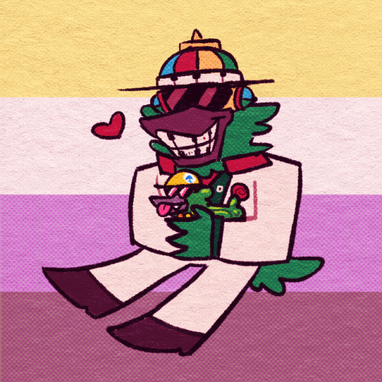
admittedly, this was supposed to be a softer looking piece from the get-go, so saturating it may make it look a bit goofy when the flag in the background has been made brighter previously... but it makes the characters stand out! still looks nice! i'd definitely tweak this a bit, but it's definitely the kind of result you may be looking for!
i did use sai as an example, but if you use krita, medibang paint, fire alpaca, csp or photoshop... this all should work there as well! i've done this in ibis paint as well - using textures from the app itself! using what you learned here could help you figure that out for your own.
------------------------------------------------------------------------
well, i hope this was helpful and somewhat comprehensive! if anything's a bit messy here, i can admit i made this while in a call, so that may be why. feel free to ask follow-up questions! thanks for reading!!!
7 notes
·
View notes
Text
How to draw in my art style:
1. Put on kikuo
2. Stare at colors you think work well together and try to replicate them
Also 2. Color as close to the colors you want, and if you're in procreate, use curves and color balance stuff to adjust the colors more to your liking
3.lose your mind as you slowly realize that someday you might have to work a 9-5 if your art doesn't take off
4. Take a shower and cry underneath the water as you sing sad songs under your breath that you forgot the words to so you end up going "umm blahalasbak sob sob oh yay chorus time"
5. Go back to your art and then transfer that slight feeling of insanity and sadness into if
6. Use an overlay layer as shadows :D put blues and purples in those shadows, then on the lighter side use yellows and pinks
7. Find random texture brushes and experiment with those
8. Realize holy shit I have to pee
9. Get distracted for 3 hours straight
10. Try to draw again but your cat is now sitting in your chair so I guess you can't draw anymore
11. Throw your cat to assert dominance
12. Use some kind of hard light or vivid light layer or something and then take saturated colors and SCRIBBLE EVERYWHERE
13. Have fun, take a couple drinks of water and make sure that Kikuo music is still playing so the drawing is the most amount of crazy
14. Get curious about what the Kikuo lyrics are about, look it up, and then have to sit in your chair thinking "why the hell was I dancing to that holy shit."
15. Think about those lyrics and, I quote, "what the hell" while scribbling more (make sure youre having fun"
16. Make sure the lineart is still visible. If not, just redo it with a dark saturated purple on multiply
17. Realize you forgot to flip the canvas. flip it, and have a mental breakdown
18. Reconsider why you even are trying to do art in the first place
19. Fix it up. Oh wow that looks better good for you
20. Post it online and then get positive feedback and go >:D
21. Realize holy shit I forgot to fix that and then spin in circles in a spinny chair until you start to feel sick
22. Get distracted for the rest of the day
AND THATS MY SECRET GUYS!!! I HOPE THIS HELPS YOU GUYS MAKE SILLIER ART!! MAKE SURE TO PUT YOUR EMOTIONS INTO THE DRAWING AND GO CRAZY!!!
9 notes
·
View notes
Photo
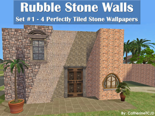
Rubble Stone Walls - Set 1
Four Perfectly Tiled Stone Walls
("Set 2" has 4 more colors!)
These stone textures are from the Coronado Stone catalog. I have adjusted them so they tile perfectly every which way; so they work seamlessly on multi-story buildings!
I have included pictures of each wall showing the multi-story tiling and a close up detail of the stonework.
I hope you like them! Images under the cut...
DOWNLOAD @ SFS
or MTS
All are appropriately named, and a swatch is included in the DL file.
The walls tile perfectly all 'round - so they work well on multi-story buildings.
These walls are found in the "Masonry" category; and are priced at $12 each.
All my walls are Mac friendly.
PSST: Add your own moulding with my Wallpaper Overlays - These overlays let you add whatever moulding you want to your walls.
Enjoy!
31 notes
·
View notes
Note
9, 24 and 27 for the creator asks!
9: Would you say your style has changed a lot since you first started creating?
oh for SURE. regardless of what i consider my start bc i used to gif from like 2015-2017 and then i didn't start up again until april of 2023. this time around, i have learned SO much, and i'm sure part of that is just bc of how much gif styles have changed in the last 6-8 years, but also bc i joined a couple gifmaking networks and have gotten so much help through them, found so many resources, and learned tons!
to compare, here's one of the sets i was proudest of from Back In The Day. now, it's definitely not horrible, but the coloring and the slow framerate make me borderline homicidal. this one is marginally better, and i remember thinking i was really Doing Something with that typography 😂
here are some of the sets i made early on in my Return to Gifmaking this past April/May. this was one of the first times i'd ever combined multiple gifs into one and girl. what the fuck happened. why are the framerates Like That? what is this typography? i had no business making early l&o gifs 540px wide bc the quality is bad enough at 268px 💀and i think this one is a good example of i got the spirit! the execution just wasn't quite there. i like the main gif with the overlay of the sky, but i'd do the typography very differently and idk if i'd do it in b&w? i could try and remake it tbh, it's been 9 months since i made and posted it.
24: What’s your step by step? How do you organise your editing process?
buckle up 😂
make clips of the scene(s) i want to use if i don't already have them
import video frames to layers
action 1: grouping and timing (groups all layers and sets frame rate to 0.05)
delete any extra frames
crop to whatever dimensions i'm using
action 2: sharpening (two smart sharpen layers) + vivid sharpening (i used this tutorial and i usually keep that folder at 30% but sometimes drop it down to 10-15%)
coloring! it depends on what i'm giffing, but i color everything from scratch at least the first time. i save a LOT of my psds, like there's one psd that i use for almost all my tfothou gifs, a couple for hill house depending on the tint of the scene i'm giffing, one for law & order that sometimes needs to be adjusted just a little, one for the good wife, one or two for satc, etc. but they're all psds that i created myself.
typography (if applicable) which almost always involves scrolling through the entire list of fonts just to use one of my go-tos
action 3: this save action from anyataylorjoy
export > save for web!
upload to hellsite (derogatory) and gifsets always immediately go to my drafts, even if i want to post them right away, just so i can make sure i'm happy with everything and try to catch any last-minute mistakes
as for general organization, i'm organized on my computer to a near-ridiculous standard, but it works for me lmao. my psds, templates, and project psds (where i save an entire finished gif if it's for a larger, complex set and then never get rid of them lmao), and all overlays, textures, icons, graphics, transitions, etc. are meticulously organized. my finished gifs are also organized into their own folders.
27: What’s your favourite font to use?
in general, monsterrat. i use it for everything in google docs, and it's my fave sans serif to go with serif or script fonts. when i'm using it for giffing, i usually use semibold.
1 note
·
View note
Text
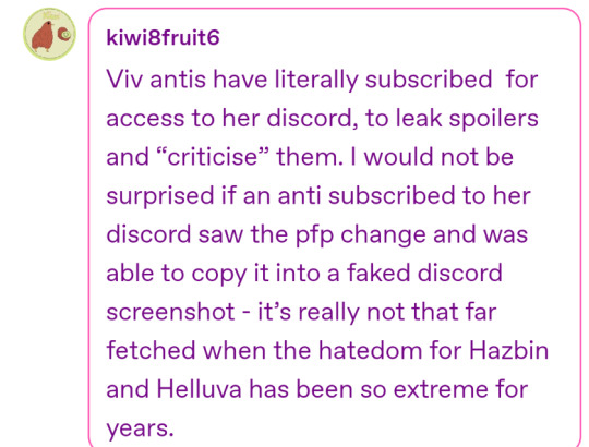
@kiwi8fruit6 forgive me if it sounds as though I am insinuating you only read the last part of my post but when I upped the contrast and brightness there was no texture or pixel differences differences indicating overlaying images to fake a screenshot or text. These are also exported discord messages so that would make it a lot harder to hide because its not just a screenshot
Your idea how they could get her pfp doesn't quite explain the perfect alignment, lack of pixels indicating an overlay that would show up when upping the image adjustment. If you wanna suggest someone colored over them with a brush tool in an app it would stick out with upper contrast and brightness. So itd be really hard to hide.
Let me show you what i mean, here's a edit I made (with contrast and brightness upped to see) vs the OG image
Now when i made this edit i used an eyedropper tool to open the eyes and give moxxie teeth. We can tell these are edits because despite me grabbing the black from the outline of moxxies mouth for consistency under a brightness and contrast layer

The outline gains a red hue and grainy texture to it. My line work stays black. Looking at Moxxies eyes I opened them and again color picked from the outline
Its thicker, solid color with no grain, and no yellow inside the line to accompany my line work. You can also see this post where it can be noticed
I dont like using fancy terms to have this misunderstood but just so we're on the same page
Artifact is a term that describes a degraded picture (digital image) where small areas of the picture have obvious localised islands of distortion or blocky spots of off-colour pixels. A similar phenomenon occurs as a halo around some objects in the picture where there are sharp edges. <- This is the grainy texture im talking about.
Theres also her icon would be blurrier because presumably theyd have to get a separate screenshot of it and resize it to fit over the other one and match her typing quirks. If that makes sense? Generally the steps would be
1. Export the original messages
2. Screenshot either vivs name or icon or both
3. Resize it exactly and consistently over the original
4. Somehow hide the overlay but also any compression from resizing images in a way that doesnt show up upping contrast and brightness
That idea doesn't fully check out but thats part of the importance of the discussion! And I appreciate your effort in trying to make sense of it.
5 notes
·
View notes
Note
approaches bravely and asks you what brushes you used for the bald airy piece artwork you made which was so yummy 😋
hi anon, i assume you meant the anniversary piece. if you didn’t send me another ask and i’ll help you.
for starters, i use medibang on my phone. the more fancy softwares are too overwhelming for me (as much as i wish i could use procreate or csp for the texture tools lolol)
for the base colors, i use a custom brush i got from a friend. any brush can work here depending on what texture you’re going for
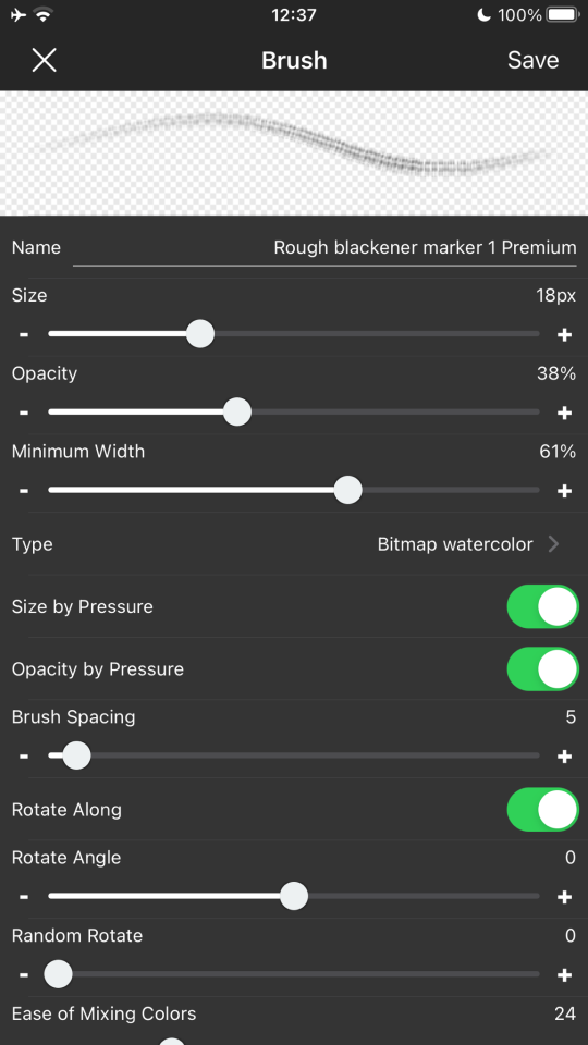
for the lighting i use a mix of the acrylic brush and the ‘rough blackener marker 1’. acrylic is for blending and the blackener is for texture as well as blending. blackener gives the colors a choppy effect that i find nice to look at.
(adjust the settings as you please, i like to do that as i go along. the settings of the brush will never be the same after i finish a piece)
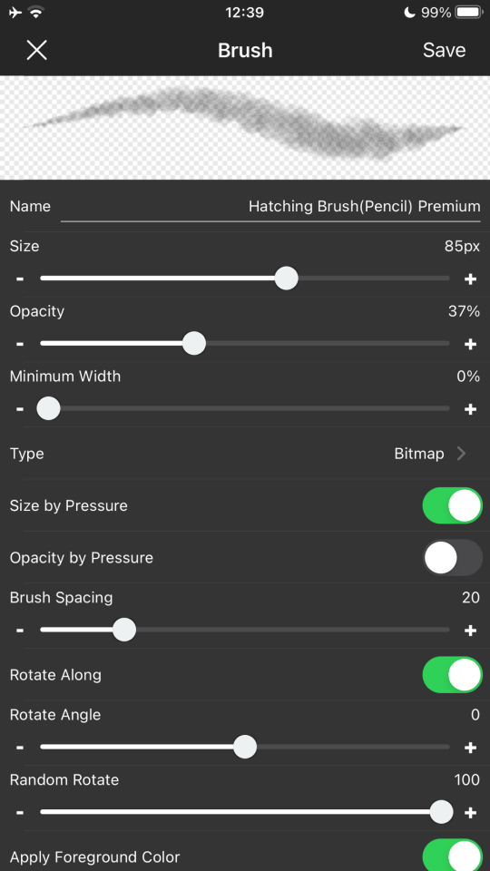
i also used hatching brush (pencil) to add more texture as well as the glare lighting. it looks scratchy which makes the strokes more natural
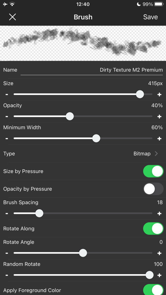
dirty texture m2 for details
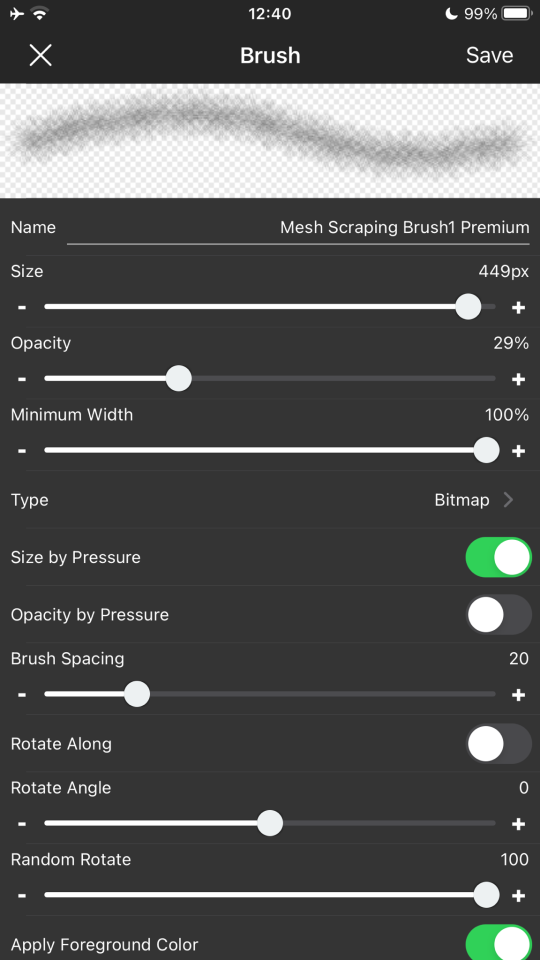
mesh scraping 1 for details too
for the background and the effects like noise and halftone, i just used my custom brush as well as the medibang materials menu. USE THE MATERIALS MENU it has so many textures
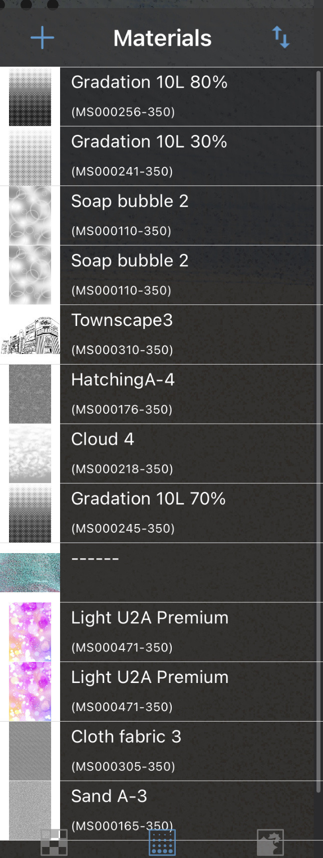
(these are the ones i have downloaded)
what i like to do is add a halftone filter (there are a lot so just choose the one you like best) and then erase it with a textured brush like the hatching pencil i mentioned earlier. this makes it look almost like a comic book (but not quite, duh)
sand in the background uses the sand filter but also erased with same brush
medibang also has a filter setting with custom noise, which i use to add overlays. it lets you add noise (sand) which i like to put on almost all of my drawings. it also has a sketch filter which i used for the purple airy drawing.
i hope this helps. if you have anymore questions about my art feel free to ask
3 notes
·
View notes
Last Seen Blogs

saludabless
Sin título
summerxchaser
Lost in Paradise
pahleis
Charles Baudelaire
rrageblue
rageblue
dri-ello
Sem título