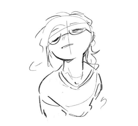
#the animal is not recognizable
Note
HELLOOOO I hope you've had a good day :D I was just wondering how you end up with the colours for ur compositions :O? Are you the type to use a lot of colour adjustment layers (multiply, overlay, etc) to get at a satisfying hue, or do you just eyeball directly from the colour wheel? I remember you saying for one of ur pieces that u eyedropped directly from like,,, a dead corpse of some animal XD but i assume that isnt ur process for everything hahaha. Do you use a lot of references for the specific vibe you wanna convey?
ANYWAYS keep up the amazing work!!!
YOOO!!! I didn't recognize u at first omg (p.s. ty!)
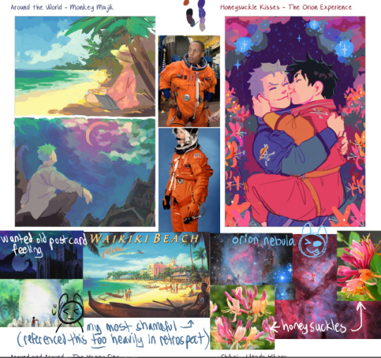
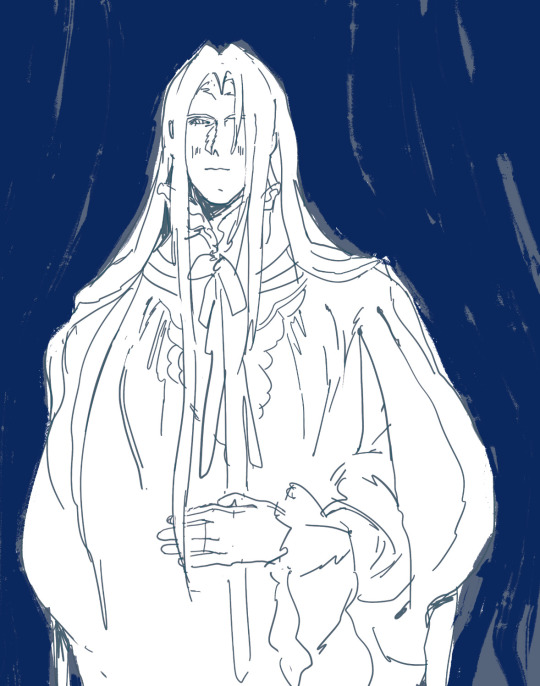
The way I made the zolu playlist drawings isn't my Usual drawing / coloring process but I formed some sort of Strategy for it
Actually I think sharing the literal refs I used for each image would be fun and maybe demystify the art process
Pics below cut! 😊

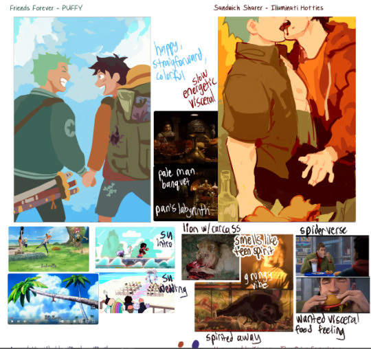
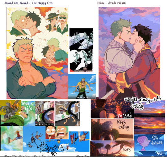

I mostly eyeballed from the colorwheel. I think I only used color adjustment layers on Chikai and Around the World to get a soft glowy effect in the clouds. BUT!! I'll frequently play around with adjusting the colors through the hue/saturation/luminosity sliders, or I'll go in to Tone Curve and play around with the levels until things are looking how I want. Especially for backgrounds
I also colorpicked from ref photos (like you mentioned w the lion eating a carcass). I GENERALLY tried to avoid overly referencing any one pic, but Simple song and Around the World were the two worst offenders 😓
---Color Choice---
I went by pure gut feeling at first while listening to the song, how the instruments sounded and what color they were
And then after that, I'd try and refine it a little more by Overall Vibes (making it feel more Glowy) (adjusting how colors interact w eachother like toning down a too-saturated color or making skin tones warmer or cooler to contrast w the background)
And then i gathered references n either colorpicked from them or I used them as vibe inspiration as i was painting
---More General Color Stuff...?---
This section is riddled with over-explanation.
-> To make a color stand out as Really Saturated, I surround it w neutral colors, esp contrasting ones (e.g. if I want a red to pop, I put it next to a cool gray)
-> if the overall painting is really warm (like, everything seems cast in a warm light) and i need to have a specific cool-tone color (like green), I take one of the warm colors and drag it a ways Towards the cool color I need (so , colorpick a red, and drag the slider until it's on yellow) and then desaturate it a lot. I then test that color on the piece and see if it Looks green. Same goes in reverse (cool-tone paintings that need a warm color)
So, Like...for example: Zoro's hair is some really weird colors.
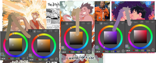
-> I try to limit eyebuzz (places where two colors meet, where the hue [tone] is different, but the brightness [value] of the color is almost exactly the same. Basically, if you made everything grayscale, you dont want two grays of the same color right next to eachother [or, you want to do it intentionally?]) (called eyebuzz bc at really high saturation, two colors of the same value almost vibrate next to eachother)
(Sidenote: I think "eyebuzz" mustve just been a term my high school art teacher used bc i don't see any relevant results for it on google... there's probably a more professional term for this lol)
Examples:


I esp try to limit eyebuzz between foreground and background objects
I know some artists are intense enough about contrast that they toggle grayscale on n off as they're painting. I just kinda eyeball it.
-------
This ended up really long again oh my goddd
I think those are the main things on my mind when choosing colors...?
Hope this is helpful 😅
#not art#kinda#animal death#as one of the reference photos#the animal is not recognizable#just looks like meat#also the image is very small and low quality#eyestrain#when im talking about hue and value#long post#i cannot stop myself from overexplaining#my apologies#oh my god tumblr did something really strange w the tag order again#tried to fix it#oh my god adn then the cut went crazy okay now ive fixed that
12 notes
·
View notes
Text
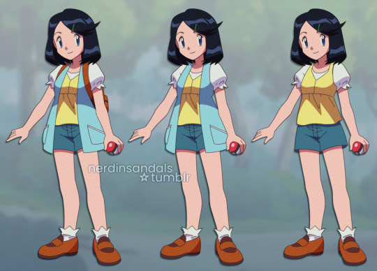
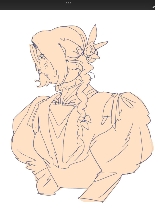
I wanted to see if I could draw Liko as a Gen 1 character! 💙
Instead of just changing the art style, I tried following the trends of the era to create a whole new design that looked believable for the time. For example, her outfit is based on Squirtle instead of Oshawott in this concept. :>
[Update: She has friends now!]
#Pokemon Anime#Pokemon Horizons#Anipoke#Pokeani#pkmnart#Liko#my art#Anipoke art style swap#// since Liko is a Gen 9 character it was so much more difficult to 'devamp' (do people still say that? lol) her design compared to Conway#who is technically a Gen 4 character but his design is basically a Super Nerd. a Gen 1-2 trainer class#I feel like I could simplify her even further to look more authentic but I wanted her to still be recognizable!
776 notes
·
View notes
Text
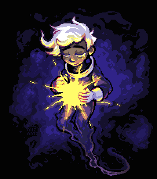
little star
#danny phantom#pixel art#animation#danny fenton#space#space core danny?? space obsession danny???? no idea#but i did wanna give his suit a lil redesign to look more like an astronauts#most of it got hidden by the star tho#shoutout for danny for being so easy to draw completely divorced from canon while also being mostly recognizable. very good for my muse ty
2K notes
·
View notes
Text
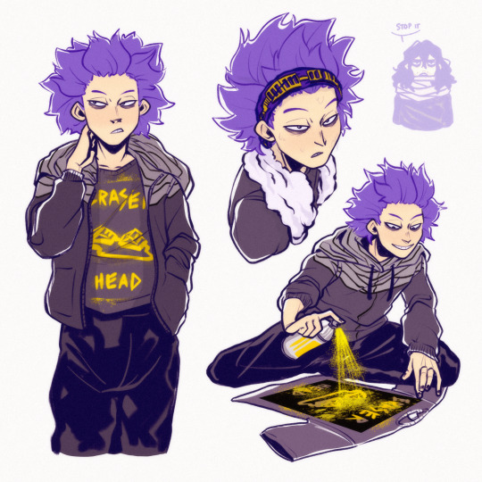
so i might be a shinsou enjoyer. maybe.
#mha#shinsou hitoshi#uhhhhh#aizawa shouta#monoma neito#so incredibly embarrassing bc ppl used to tag some of my sunas as shinsou and i developed a distaste for the guy based on that#fast forward to now and im just so sorry for ever insulting u buddy… its not YOUR FAULT i cant draw suna recognizably different from u#anyway this is me stalling to avoid adding the tag for…#monoshin#in my heart…#also im only current on the anime so im dodging manga spoilers#bnha
2K notes
·
View notes
Note
MY BELOVED—cough cough I mean uh...
Crack, sweetest boi, I would like to know what kind of food is absolutely your favorite 🫶

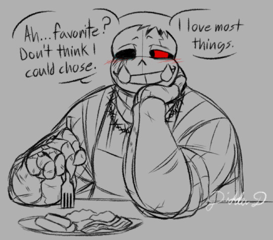
Crack: Heh.. Hey Lex.
Ah... favorite? Don't think I could chose.
I love most things.
..... If it's meat.. 's long as 't's not bloody... or real obviously an animal... 'n' sometimes I jus' avoid it completely...
Found some vegan places I really like in some AUs over time.
Love a good vegan burger.
#he's got trauma your honor#usually goes for boneless meats if it's real meat#seeing very recognizable bones when he gets down to it could send him into a panic attack#and he'd probably lose everything he just ate#(forgor to mention#he'll also avoid anything that was a baby animal)#tam ask event#crack sans#horror tourette's sans#undertale#utmv#didderd art#didderd asks#caycanteven#he jus sitting down to eat after that foob he was making in that first ask
145 notes
·
View notes
Note
raises you sephiroth in victorian goth attire (from that ask with the juri robe)
Not quite goth and not completely victorian but this sparked some sort of animalistic desire to draw seph in house of worth coats in me. + bonus aerith
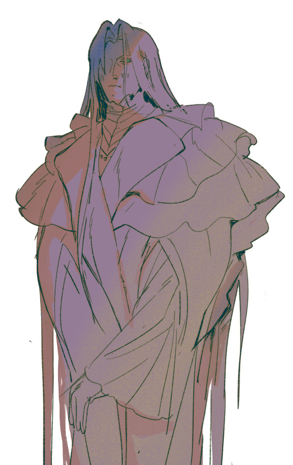
Love how i’ve been clocked as a fashion history liker lol 😭 i love rgu and anyone who mentions rgu to me gets +500 points in my mind. Also to me seph is a bit juri coded. Pathetic futch lesbian. So cool and good with a sword but secretly soooo sooo lonely and patehtic……
THANK YU FOR ASKING…!1!111!!!!
#sorry no menswear i dont particularly like vict menswear + I CANT DRAW IT i dont know why it slides off of my brain#btw one day. i will draw seph as joan of arc…#also aerith is very like. cleo de merode type long hair french ballet starlet glam 2 me……#well! somewhat.#ALSO IM SORRY FURIOUSLY APOLOGIZING TO THE FASHION HIST ENJOYERS IN THE AUDIENCE FOR THE HAIR IN THESE. THEYRE JUST NOT RECOGNIZABLE W/OUT-#-THEIR ANIME HAIR……….#gomaff#ff7#fanart#mine#doodles#sephiroth#aerith gainsborough#cave mail#chanting. HOUSE OF WORTH HOUSE OF WORTH HOUSE OF WORTH HOUSE OF WORTH
125 notes
·
View notes
Photo

collection of some doodles :’) plus redraws of their faces in various scenes for personal reference purposes
DISCLAIMER: Before you decide to watch Re-Animator, make sure to check for content warnings, there is a scene that a lot of people choose to skip!
#reanimator#danbert#herbert west#dan cain#Daniel Cain#herbert x dan#dan x herbert#Re-Animator#i am working...on another comic#these are the doodles i do in between on the same canvas ;;;#and the refs help when i draw them and realize that they are missing some key feature but am unsure which one#the refs are already stylized to highlight their most recognizable features hkshdfdhsf#ALSO I AM ADDING DISCLAIMERS NOW BC IVE BEEN SEEING PPL SAY THEY WANNA WATCH THE MOVIE BC OF ME i need you all to know beforehand#bc the scene i am referring to is fucked up and i want you all to make sure you can watch it first okay okay love you
2K notes
·
View notes
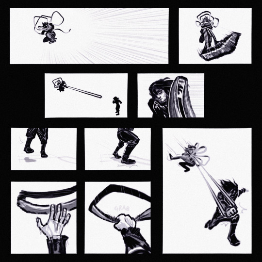
Text
it’s always nice drawing the sticks when i’m blocked
#alan becker#animator vs animation#ava red#ava yellow#i feel like she’s recognizable from the glasses#soul scribbles
177 notes
·
View notes
Text
Uhhj animation for @sootslash 's. Funny little clangen comic. Thumbs up
Also the. Comic account. In case you wanna check it out . I don't know how to do this @fog-and-the-frost
217 notes
·
View notes
Text
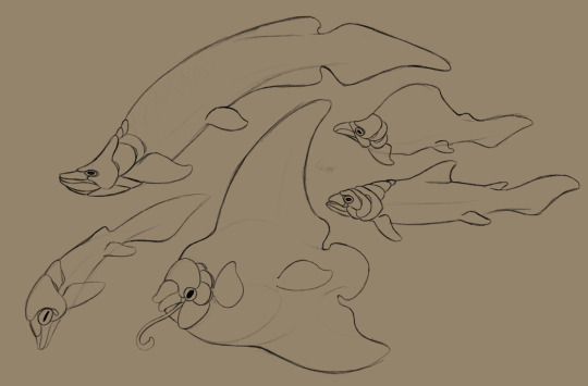
some alien fish concepts for my headworld. well. one of them. the dragon one! well. one of them-
tiny note that these are not to scale compared to each other <3
#im trying to balance the speculative evolution with THIS IS A MAGIC FANTASY WORLD WEEEEEEEE RANDOM BULLSHIT GO#i like cuttlefish faces but i like fish bodies & i like dunkleosteus fossils/tails#so like... fish with cuttlefish faces!!!! and dunkle-esque face plates!#its not toooo big of a stretch to imagine a world where fish evolved to have face arms#i imagine they're hiding a horrifying exposed jaw in place of a beak <3#with all the animals ive been making for this world#its.. tough to find a balance between 'these are aliens' and 'i want them to be somewhat similar to earth animals'#recognizable but not carbon copies yk?#vera crafting#worldbuilding#drawing this made me hungry ngl...#its weird i dont like the flavor of most fish. and yet they look so delicious#maybe its my love of salmon... am i part bear...#anyway fish used as heavy inspiration were: arapaima / sunfish / sockeye salmon / trout#the last one (technically first) was just me fuckin around trying to get a feel for it <3#i gotta draw fish more its so soothing#ohhhh i should add these guys to the size chart for funsies
155 notes
·
View notes
Text

founders
#warrior cats#warrior cats fanart#wc art#wc fanart#riverstar#thunderstar#windstar#shadowstar#dotc#dawn of the clans#Erin hunter#wc designs#furry art#animal art#wc chibi project#hopefully they r all recognizable…..I never finished dotc lol#climbdraws
679 notes
·
View notes
Text

People asked me to do Roy so I thought, why not try Dot too? 💙💖💜
Their designs were definitely more difficult to adapt to the OS style since they're almost 100% modern elements, but I did what I could while trying to keep them recognizable! Hope you like the result. :>
[Original Liko post]
#Pokemon Anime#Anipoke#Pokeani#Pokemon Horizons#Liko#Roy#Pokemon Roy#Dot#Pokemon Dot#pkmnart#my art#Anipoke art style swap#// I did a first pass for both of them that looked more authentic to OS but they were basically different people so I had to compromise#just to keep them recognizable haha#especially in terms of overall silhouette#Roy is the one who looks the most different but the reddish pink hair looked so out of place... ;; so I added it to the hat instead!
512 notes
·
View notes
Text

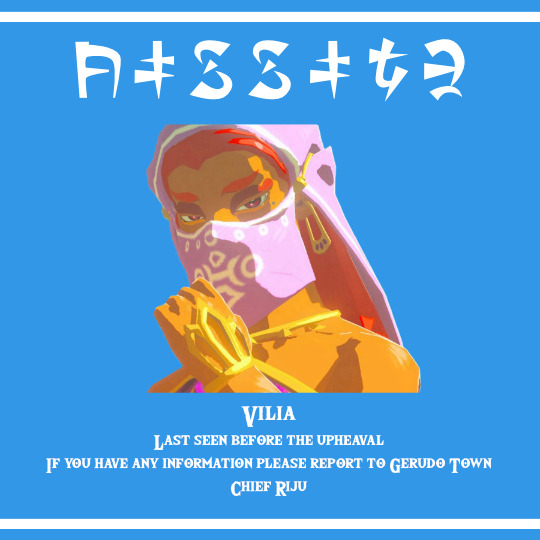

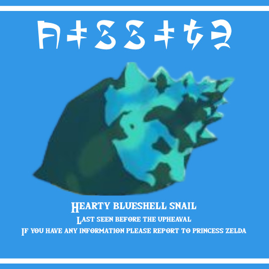
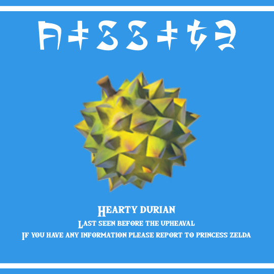
I had an idea. So I made some Lon Lon milk label missing notices for what I remember to be missing in Tears of the Kingdom from Breath of the Wild.
#loz#botw#totk#okay the hearty food sure i still hate it but okay#but the rhino???#why is the rhino missing???#i will never forgive nintendo for removing kass from the game and replacing him with the highly obnoxious stable trotters#they are inferior!!!#there are many issues surrounding Vilia in nintendo's treatment of her to the orientalisation of the Gerudo fully#however why is Bozai allowed to exist and she disappeared#i KNOW they wouldn't make labels for animals and plants#but i felt like it#also i chose the Lon Lon label cause Hateno's label is clear and less recognizable
61 notes
·
View notes
Text
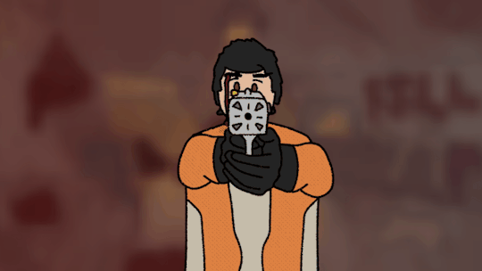
"It's what I was taught... I don't know if it was right..."
Remake of this
#i had SO MANY PROBLEMS with this#tumblr hates me and hates cutler and WOULDNT LET ME MAKE CUTLER A GIF#so hes an mp4 now. ugh.#anyway idk if i improved!!!#i think my animation is better but i might prefer the 'old design' of cutler#i also accidentally made him face the wrong way which kinda messes with the whole 'recognizable burn scars' thing :/#but you get the idea. danse sad cutler dead sad :(#fallout 4#paladin danse#cutler#gif#my art#my animation#cw gif
80 notes
·
View notes
Text
i want to make a guide to drawing gen 1 style sprites but my vocabulary is so limited that its hard to think of something coherent past "well dont make it look bad but dont worry about it looking good either"
#bababababa gen 1 sprites arent “poorly drawn” on purpose or even noticeably low effort#theyre weird varying sprite styles that are still decently “clean” pixel art#but not only are the art styles theyre drawn in stemmed from working within limitations#to still make a coherent monster design#theyre also technically the original designs and not the sugimori/anime ones we're most familiar with#theyre still recognizable! but theyre very strange early versions like developing newborns#theyre off-model in the sense that the model was refined later#so when you think gen 1 dont think like oh its sillt and drawn in paint in like a minute#but more oh its some kind of familiar thing thats just slightly off and compressed#insane insane. insane
181 notes
·
View notes
Text
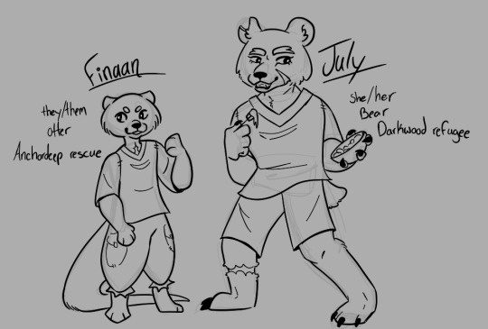
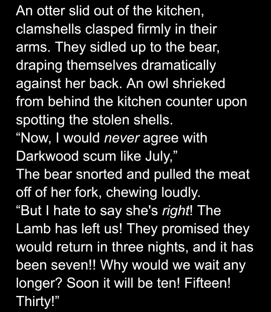
For that mutual I promised I'd make some drawings for 🙏
Here we have 2 of the important reoccuring characters in my fic, who will make their first appearance in chapter 1!!
Finaan is an Anchordeep rescue, found chained to an altar by the lamb and saved.
July is a Darkwood refugee, a 'reformed' cultist of the old faith, who joined the Lambs' cult after losing to them in battle.
(Some wips under the cut for fun)
Oh hey since you're down here you also get a writing wip!! I'm on my phone so it's formatted Bad but. Deal with it <3

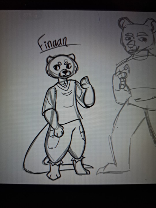
#cult of the lamb#cult of the lamb fanart#cotl fanart#cotl au#tcolc au#i hope they are recognizable#i tried rlly hard to get them to look like the animals they are
20 notes
·
View notes
Last Seen Blogs

sighss
🫧

hypertechnica
odo

emiton
Moth
visionthefox
VisionTheFox

fallen-in-love-suggestion
I think I've fallen in love