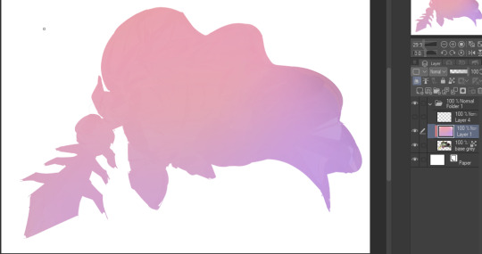
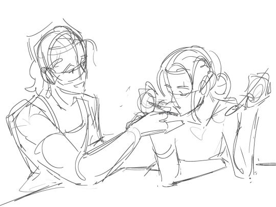
#the lineart is just the sketch but duplicated
Text
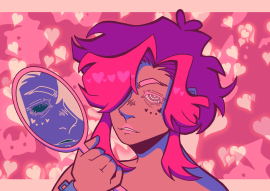
The mirror knows the real you
#digital art#my art#i just needed to get something out of my head :)#this art is about someone#but ough#it came out so fucking good#i want to eat it#i feel like it would taste like strawberry and sour blue raspberry#surprisingly...this is not a fully rendered piece#the lineart is just the sketch but duplicated#and i didnt do any fancy shading
25 notes
·
View notes
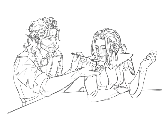
Text
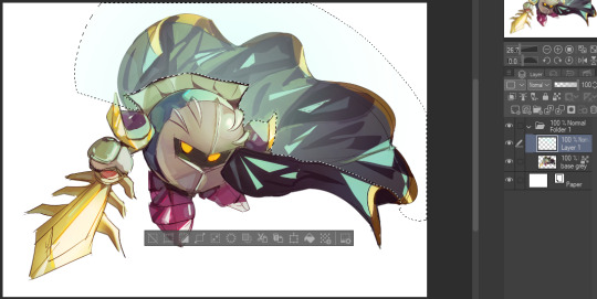
inspired by tina drawing foolish with boobs on her stream the other day, heres some (kinda messy but i'm ignoring it) sketches of genderbent foolish (+ a little tina and karl). her name is noelle :]

#also karl is karla obviously but i have No Idea what boy tina's name would be. like best i can think of is tim but thats just not her vibe#his vibe? whatever#i wouldnt normally post smthn this unfinished but i dont think im gonna finish any of these and i still wanna put the idea out there so#woe sketches with kind of wonky anatomy be upon ye#foolish gamers#im not gonna bother with any other tags for this lmao#my art#ok im just yappin in the tags now but right before i went to post this i remembered a thing tina did on stream where she duplicated her#lineart and then gaussian blurred it and did some lighter airbrushing behind it and goddamn that looks so much nicer than just the lines#by themselves. thank u tina for doing that im stealing that technique now if i ever wanna post sketches like this again lmao
20 notes
·
View notes
Text
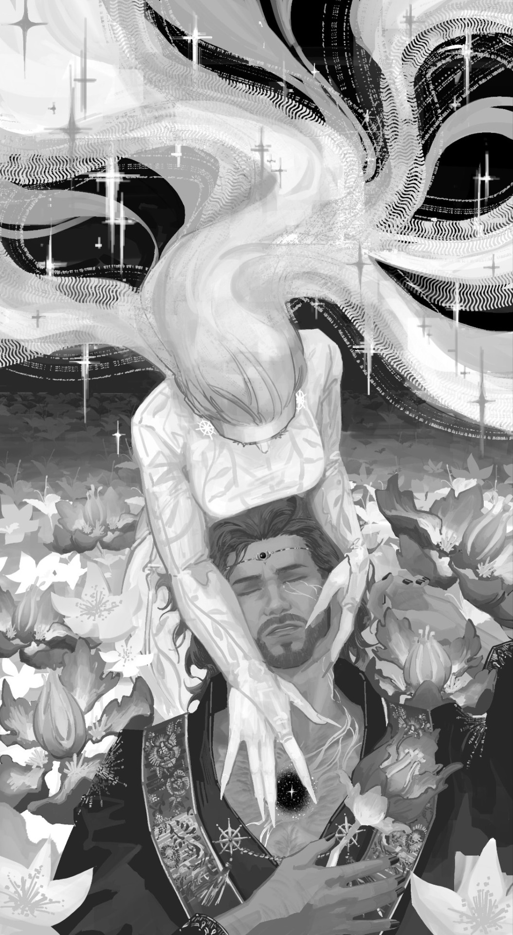
Today is Dungeons & Daddies’s 5th Anniversary!

I haven’t been listening for nearly that long but the podcast and all its characters means a lot to me. Happy Anniversary!!!
Throwing the cropped sections under the cut because there’s a lot of stuff going on and I know Tumblr likes to throw half the pixel quality out the window. And also so I can ramble a bit about this piece!!!
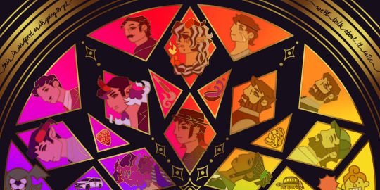
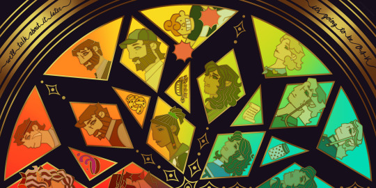
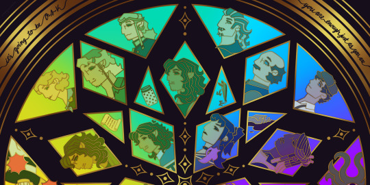
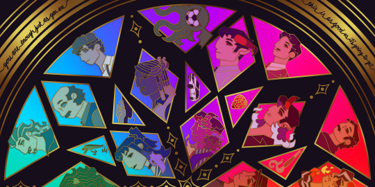
This piece has been months in the making, possibly an entire year. And by that I mean I’ve had a sketch of the comp scribbled on my whiteboard for ages because I wanted to save this specifically for 5th anni art. Now onto design stuff!
(First off a random thought: I really love how the garlic knot came out, I kind of want it as an enamel pin.)
I knew I wanted to make this a stained glass piece since the beginning, but I was also going to add flowers at one point but quickly dropped the idea. It felt like too much and I also didn’t want to fuss over flower language assignments for everyone. I was also going to add Doodler tentacles, but also dropped that idea pretty early. Kind of on accident, right at the end, I figured out how to make it even more stained glass-like but taking a duplicated lineart underneath the regular layer and turning the brightness all the way down, then setting it to overlay and adding a guassian blur. It’s very subtle but it adds that tiny bit of depth that makes it look more real. As for shading on the lineart/gold, I tried adding more highlight on the characters who died but once I evened everything out it wasn’t as noticeable anymore so I’m throwing that thought here so the attempt at least known lol.
The order of characters only changed a little bit from my original comp, I flipped the Wilsons and the Oaks so the rainbow could work. As for the anchors, specifically in season 2, I lined them up to the teens since the season 1 anchors lined up with each dad:
Tony —> Scary: his death was the beginning of Scary’s betrayal arc and also Willy killed him.
Guitar Pick —> Taylor: it’s not really aligned with Taylor at all, but the anchor was with Glenn so I put it next to his blunt.
Scroll —> Normal: was only because it was the last left to give him, but there’s the whole scene of him and Hermie in the Green Room so it still works!
Garlic Knot —> Link: one of two that he broke, but the more significant of the two with him telling Grant he never wants to see him again.
Small notes on the season 1 anchors: I put the layer of mold in the overnight oats but you can’t really tell with the overlay. And to make the supper bowl more interesting I added the fantasy sodas mix they dumped into it. The lure of actually drawn before so I just traced my own art lol.
As for the other smaller triangles, it took me a bit to figure out what I wanted to put there. I didn’t even think of adding the vehicles until two days ago but I’m so glad I did. I don’t really have my own take on the mascot version of the Doodler (yet?) so I borrowed the design from one of the stickers in their merch shop. Teeny was terrifying as just a front facing head so I made him cute again.
In the outer circles, I put what I felt was the most significant quotes for each family. I really wanted to use “It’s okay to be angry, it’s not okay to be cruel” but it was just a little too long.
That’s all I can think of! If you read all the way through, thank you for indulging me in my excitement to gush over this piece.
#dndads#dungeons and daddies#dndads fanart#dndads s1#dndads s2#dndads glenn close#darryl wilson#henry oak#ron stampler#jodie foster dndads#nick close#nicholas foster#nicky swift#grant wilson#sparrow oak#lark oak#terry jr#taylor swift dndads#lincoln li wilson#normal oak#scary marlowe#hermie unworthy#bill close#paeden bennetts#barry oak#willy stampler#meryl streep dndads#robert wilson#hildy russet#stud stampler
2K notes
·
View notes
Note
your rendering is so good how do you do it
Thanks, I love your rendering too!! Gonna try and make a tutorial ^^
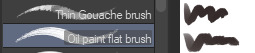
To start off, I'm on Clip Studio Paint and these are the brushes I use! First two for rendering characters (round brushes) and the other two for mostly backgrounds (square brushes)

I used to do lineart, but it takes too long >:( now I just make a sketch and sorta clean it up!

Next I fill it in with a gray color. For simpler pieces I just put in the flat colors, but for more paint-y pieces I do grayscale -> color! I'll be doing that here :)
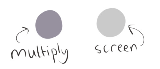
Also, I make 3 clipped layers on top of the gray - two are multiply, and the top one is screen. On the first multiply, I do a soft gradient using an airbrush
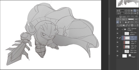
On the next multiply layer, I fill everything in with either a cool-ish or warm-ish gray, depending on the mood ^^
I also determine a light source, and use the lasso tool on the screen layer to block out where (I think) the light hits! Tbh I just do wherever feels right lmao, but I recommend having a reference! I like doing it in triangle patterns
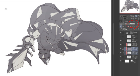
Then adjust the opacity of each layer to whatever feels right, and merge everything (I don't merge the sketch/lineart yet, I do it before adding colors in!)
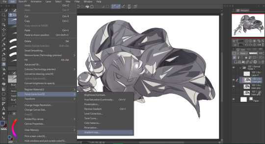
Now... rendering. Some tips I have are color pick (greys) off of the canvas and use them to paint! Clean up the sketch more, erase edges, but I save details (like Galaxia's red gem, his eyes, etc.) for the end, or during coloring.
After I'm sorta happy with it, I merge the sketch layer, then duplicate it, and add a gradient map! I did this sunset-y one but changed the hue to yellow-ish, then lowered the layer's opacity ^^
Play around with the hue-saturation-luminosity setting!
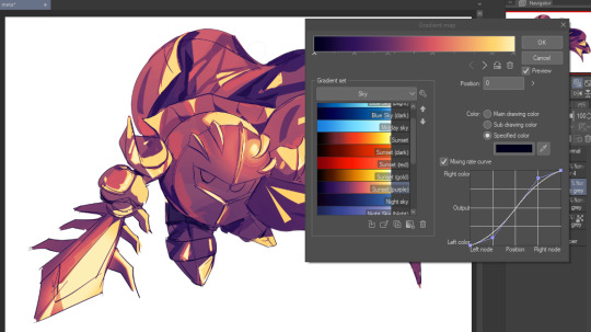

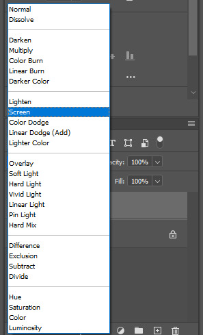
Now go crazy with blending modes! Multiply, overlay, color, glow/color dodge, etc. Feel free to layer them up on top of each other too, and this is to add the character/piece's actual colors in. For example, I used a white-blueish overlay layer for his mask and glove, blue for his cape, blah blah
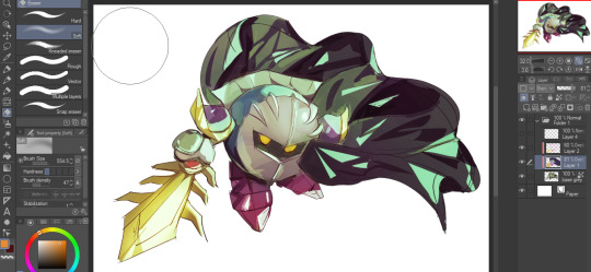
Now I clean the sketch up/refine it more. Also, to "harmonize" the color palette, you can add a colored gradient on top. Then set it to multiply, and add overlay/glow dodge layers with any colors you see fit! I like using teal and light/warm orange!
Here is an example of a colored gradient:
Another tip is to add saturated colors on the edges of both lighting and darker shadows, before blending it:

Also I usually add in a light blue/grey in shadowy areas, and lower the opacity for reflective light:

Also! You can lasso + use an airbush with a light blue to block out parts of the background (his cape here, for example). It helps with more depth!
Finally, I like adding sparkles on low opacity :3 And gaussian blur to certain areas! I'm using radial blur on this piece though ^^

For the background, I like doing blocky shapes!! I use my square brush on 90% ish opacity, to color pick different hues from the piece. For lighting I use a glow dodge layer, here's a mini timelapse as well as the finished art!
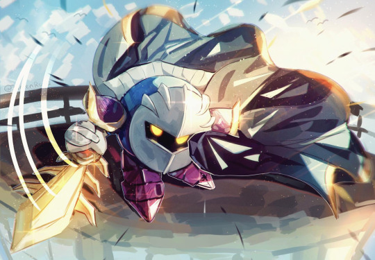
At the very end, play around with the hue/saturation and contrast tools to change the colors :)
#iiii hope this helped??#first time making a tutorial sorry!!#art tutorial#kirby meta knight#meta knight fanart#meta knight#nintendo kirby#kirby nintendo#kirby fanart#kirby series
537 notes
·
View notes
Text
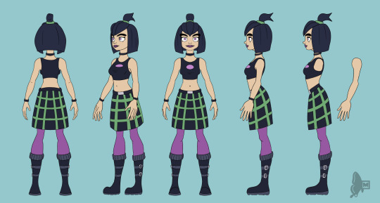
Road to 3D- Sam Manson (Part 2):
Character Modeling


Part 1: Model Sheet
Welcome to the second and final part of this project. Since people have asked how I do my models, I decided to make a write-up on how I approach these things using the example of a model of Sam Manson. The first part focused on how I make a model sheet fo a 3d model the second part focus just on the modeling. There are many more things about how to create a fully realized 3d character that I could make whole other chapters for, like UV unwrapping, texturing, shading and rigging, but I don't have enough knowledge past the fundamentals on these topics that could warrant their own seperate posts.
Additional stuff before I continue:
I use Blender for all my model
This not a beginners guide or something similar, it would be helpful to already know the general workflow of a modeling, how to use Blender and know different terminology like edgeflow, retopology etc.
If you are a beginner and want to learn more about character modeling I recommend the videoseries "Modeling for Animation" by Dikko on Youtube
Maybe I make some reference some tricks from this videoseries
That's it, let's go!


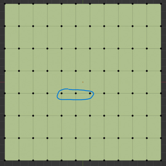
My first step is always the block-out phase. The block-out phase is what the construction lines and the first sketch in a drawing are. I align the frontview and sideview from the model sheet I made in part 1 with the z-axis (the blue line in the images above) and roughly shape out the forms with primitive forms. For this I mostly use a cube with a subdivide modifier.
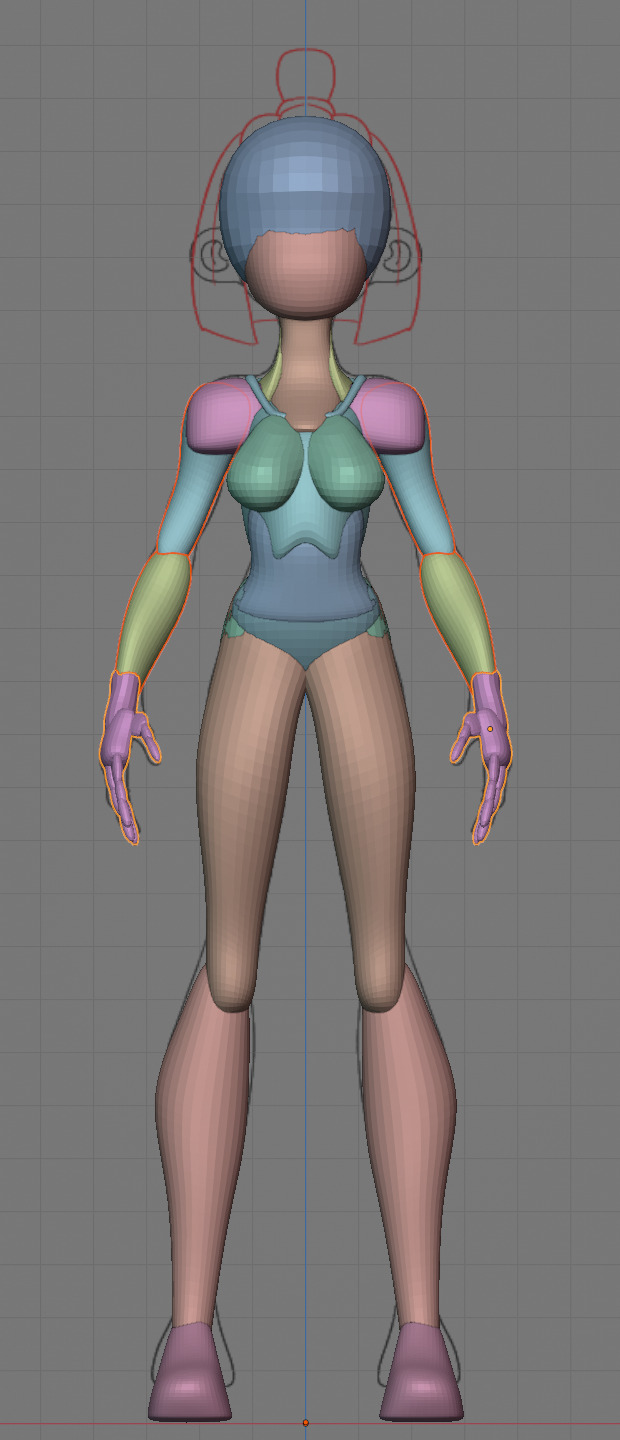


Having a modelsheet without the clothes obscuring the body makes it much easier the get the form right. The block-out phase is one of the most important steps, if it looks good than I have practically half the work done. This is also a good opportunity to practice anatomy.
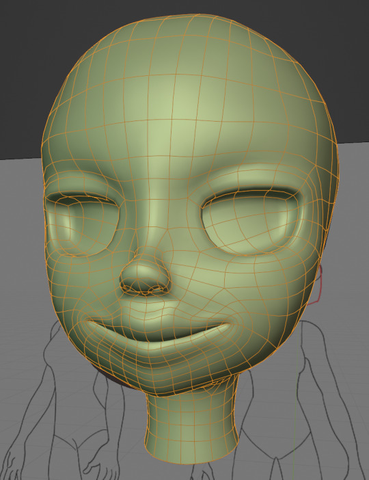

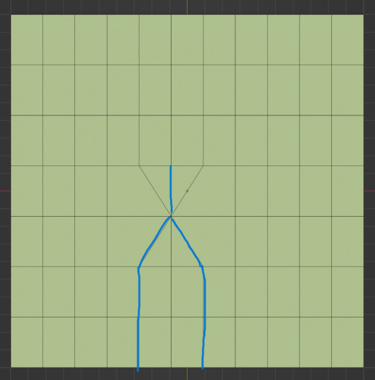
After this stage I continue with the head. First of all, don't forget to add the mirror modifier so I just need to model half of the model. There are different methods to approach modeling the head, like sculpt the head first, retopologize and than bake all the deatails onto the retopologized head. I actually prefer to polymodel the head especially when I have a good model sheet. I practially trace the lineart from the model sheet by extruding vertices, once from the frontview and once from the sideview. The most important points are the form of the eyes, the mouth, the form of the face and the jawline. The head block-out is used as an anchor point for the shrinkwrap modifier so that the traced forms actually look like they belong to a 3d form and not 2d lines floating space. From this point on it's just connecting everything, pull and push vertices so it looks like a 3d head and make sure the edgeflow is good. (It's also helpful to know how the planes of the head look like) After that I add the eyelashes, eyebrow, eyes and the ears, now it looks like something!
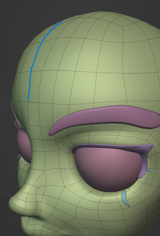
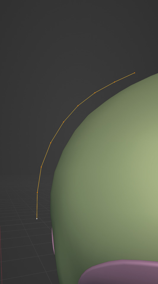
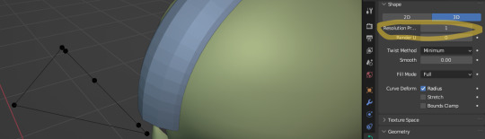
Now comes the hair. For the hair I used the "curve trick" like mentioned in the video series I recommended. Here is a tip to save time: I choose some edges from the head, duplicate and seperate it from the mesh. I convert this seperated line into a curve and choose a beziercircle as a bevel geometry. This is now the perfect foundation to model the hair further. One thing I needed a long time to notice: To get the beziercircle to a perfect square or in this case a triangle lower the Resolution U to 1 in the shape options. Now I just convert the curves into a mesh and add details and the head is done!
With the head finished I continue with the body. Remember how I wrote with a good block-out half of the work ist finished? Well, for this step I practically just use the smooth brush in sculpt mode and smooth everything out so everything looks connected. Then I retopologize the body and that's it. Well, ok there is a little bit more to it: Before smoothing things out I join the block-out part to a single mesh and remesh it with the remash modifier expept for the hands. I prefer to polymodel the hands seperatly without worrying about the rest of the body because they are difficult to model. I reattach them later. Speaking of reattaching, I make sure that the connection points have the same number of vertices while I retopologize/polymodel. To ensure that, I often use the following trick visualized with a simple example ( which is also described in the video series):

I want to reduce the amount of edges at the bottom of this plane, for this I merge 3 vertices from the middle into 1 vertice seen in the left image. After that I can select the blue marked edges from the center image and dissolve them. The result, which you can see on the right, is a nice clean edgeflow with a reduction in the number of edges.

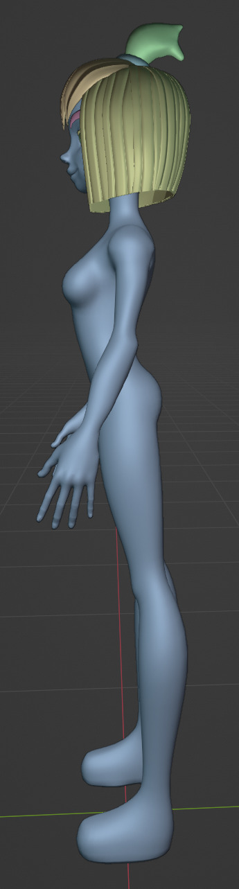
After modeling every part I attach them together and I have a finished bodymesh the work with.

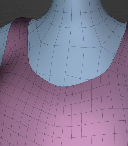
Now onto the clothes, for this I use the model sheet with clothes as reference. Having a retopologized body makes it easier to model simple stuff like e.g. Sam's shirt. On the left image the marked faces of the the bodymesh already looks like a shirt. I just need to duplicate and seperate this area, clean it up a little and the shirt is basically finished. The more complex stuff like the boots I need to polymodel around the bodymesh.
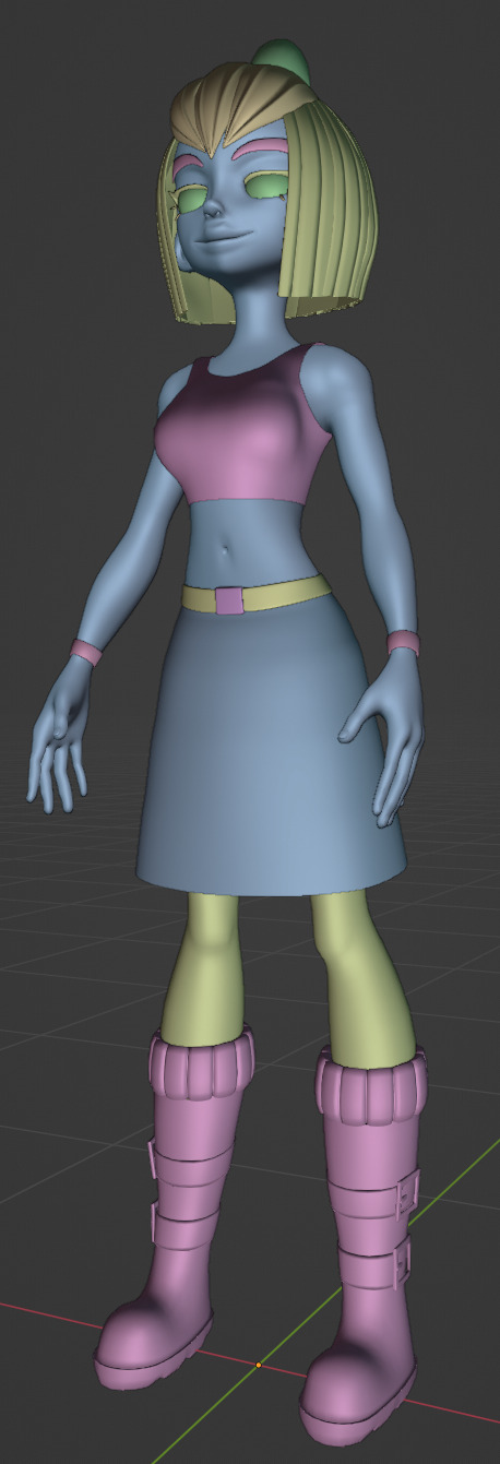

With that the modeling part is done! Now comes the things I said above: uv unwrapping, texture painting, rigging and shading. These are whole other topics I cannot go deeper because I'm still learning how to do these things but I hope my little write-up about how I appoach character modeling was enough to learn one thing or two.
Thank you for your time and thank for reading!
#3d modeling process#3d model#blender#danny phantom#sam manson#long post#my animation#my art#art resources
236 notes
·
View notes
Note
ok sorry if this sent twice i got a weird error on the askbox ANYWAY i was gonna ask if you could make some sort of lasso tutorial? how do u use it to replace lineart... please teach me i cant do this shit anymore </3

sketch something!

make a new layer (or layers) on top of the sketch layer with the border effect (in black). use the lasso fill tool (with white) and trace the sketch. think of it like a paper doll almost! (sometimes ill duplicate the sketch and put it on top for more complicated pieces)

combine the lasso layers into one layer. then, edit > convert brightness to opacity.

now you got lineart 👍🏽

this is what i do for these super rendered drawings. i use the lasso fill tool to render the drawings too! the only time i 'hand draw' something is usually the nose/mouth :]

i also use lasso fill when i just need to hurry up and design something but dont wanna draw an entire body for it. i did not sketch any of these beforehand, just used the lasso fill 🫡
happy drawing!
101 notes
·
View notes
Note
I LOVEEEE THE WAY YOU COLOR!!!!
Do you have any tips on coloring....
I HAVE YES YES!! anon let me teach u how to achieve this simple sketch result here

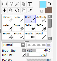
First, if you have absolutely no idea how to pick a color to shade your drawing, I'd highly recommend creating a new layer, setting the blend mode to Multiply and then test out some fun colors and see which one you like the most! I usually choose very dark colors and then change the layer's opacity to get a lighter color. That's basically what I do with most of my sketches
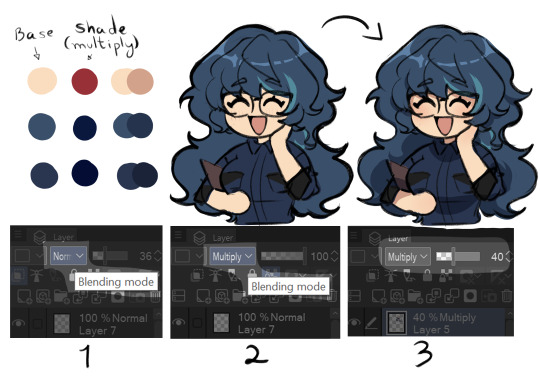
1- go to your art program (im using CSP) and find the blending mode option
2- change the blending mode option to Multiply
3- decrease the opacity for a lighter color result and voila!!

Then, color the lineart to make it look cuter!! I'd also highly recommend adding a black outline around the character bc. idk. i think it looks nice JHGJKDHDG
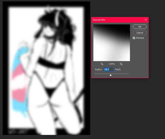
You could absolutely stop here if you want to, but I always like to give my lineart a ✨glowy effect✨, so to do that you'll have to:
1- Duplicate the lineart layer
2- Select the layer you just duplicated
3- Go to Filter > Blur > Gaussian Blur and select it
4- Set the strength around 50 (really depends on how much glowy you want it to be)
5- Select the duplicated layer again and change its opacity to your liking!! AND YOU'RE DONE!! YIPPIEEE
You can also achieve a similar result by just duplicating your already finished drawing (make sure that this layer is above the original one), adding the blur effect to it and just changing the opacity again!! BOOM now your drawing is glowing ✨
#ask#lmk if you have any questions!!#will probably take a while to respond btw#but you already know this#anyways extra cute little mugi sketch for u anon
174 notes
·
View notes
Note
idk if this has been asked before but what is your art process usually? or at least what brushes do u use? ive been trying to replicate what you do on your stuff but i really cant achieve it
i use the basic binary brush in paint tool sai for my lines,
my lineart is just cleaned up sketch (i erase a lot of lines) tho i leave some mess because i think it gives a lot of character to my drawings and i like how your brain fills up the lacks in my lines.
this is my shading brush if you want to copy it, tho i tweak it allllllll the time it is not set in stone
when i'm done i will go to photoshop with the finished picture and duplicate the layer like this

add a little bit of screen or lighten layer mode
and then

do a bit of gaussian blur
and then at the end lower the opacity to whatever i like it varies so try out some things
after that i save the image, and put it back to photoshop and i add a bit of random noise to give it some texture

i think the bloom and slight soft shine around the colors looks really nice, a little dreamy which is fun.
Also real quick some secret sauce i like to use for fun text
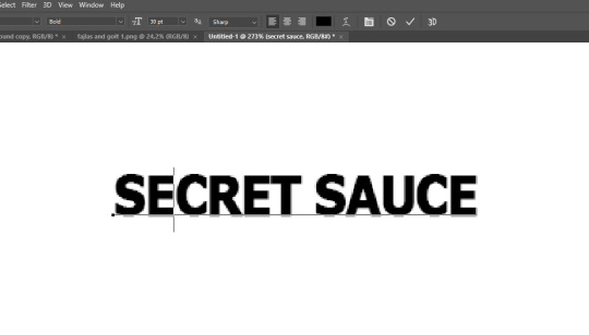

i like to rasterize it first so it is a png that i can manipulate much easier
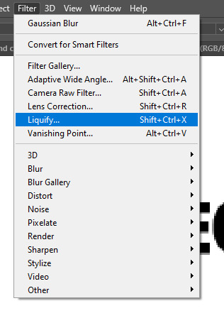
do a bit of liquify on the text

and just have a bit of fun in this window that opens, pull on the text make it have some fun shapes
it can do some fun stuff like this
163 notes
·
View notes
Note
Hello hope you're doing good! Your style is so unique to me, I think it's your use of colour? Just wanted to ask, do you do any speed paints or progress shots? I'd love to know what's going on in your head while you work

I know it's not the most comprehensive thing in the world, but in all fairness, I don't think I've ever been asked for my process before. I don't do speedpaints or process videos, but if there's interest, I'll see about maybe figuring out CSP's timelapse feature and ocassionally posting some of those? I dunno, I'd genuinely need to know if there's like, demand for it or anything. Also thank you, things are going pretty well right now! That said!
Steps:
Sketch
Lineart
Base
Rough Shading/Lighting
Refine Shading/Lighting
Colours
Duplicate the Colours Layer and make it black and white, then play with the layer-settings (this image it was put on Hard Light but sometimes I use Soft Light or Overlay)
Play with the settings on the duplicated layer and adjust colours as needed (this image it was set to Soft Light; most images I go between Soft Light and Overlay)
Finally, I'll play with some gradients as overlays, then put in my watermark and a noise filter and it comes out as:

#ask#fullmetal alchemist#fullmetal alchemist edward#fma#fma edward#edward elric#fmab#fma brotherhood#fullmetal alchemist brotherhood#art process#should I post the final image separately or does anyone actually care about that???#Ed's arm was a mess and a half to draw I will have you know#It feels so awkward showing off how horrible my actual sketches look haha
79 notes
·
View notes
Note
hi….! any chance we can see your art process ? it’s fine if not! i was wondering if u do a sketch before your lines or you just skip directly to lineart? your art is very beautiful!
HI!!! AUGGHHHJHH THANK YOU SOOOO MUCH T__T my art style is kinda simple imo so my process is pretty bare-bones ^^;; there's not rly much too it!! it also kinda changes depending on how uhhhh lazy im feeling in the moment HAHA
probably around half of my drawings are straight to line art bc they're rly just doodles or things i decide to draw without any planning (but also im kinda impatient so i try to skip the sketching step if i can LOL...). but if i DO have a specific pose in mind for a drawing, i'll start with a sort of mannequin sketch or loose pass, then depending on how messy it is, ill either do the lineart pass on the layer on top or duplicate the sketch and then clean it up.
and then my coloring process is not sophisticated at all i just create a new layer and then paint bucket tool away LMAOOOO
here's an example of a drawing where i did sketch first ^_^

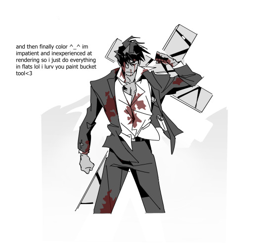
#clarification on the second image: usually when i make changes to the sketch i just go straight to lineart rather than doing a second pass#which i what i did for this drawing. i just like to minimize how many sketch passes i do (again bc i am impatient and lazy lol)#but also bc personally i get frustrated when my lineart doesnt turn out like my sketch so the solution my brain came up with is to..#...skip sketching i guess LMAO;;#idk if this was helpful or not AHGHAAH my process is rly nothing fancy and there's not much to show T_T;#ALSO OMFG IM SOOOOOO SORRY THIS TOOK ME SO LONG TO RESPOND TO GKJFHDJG THIS WAS SENT LIKE A MONTH AGO I THINK T_____T#i saw this when i got off the plane coming home from a trip and then i remembered it a few days later#but then in the middle of writing my answer i left to eat dinner and forgot to save so when i came back the page refreshed#and deleted everything i wrote T____T AND THEN IFORGOT ABT IT AGAIN
145 notes
·
View notes
Note
hey, how are you? i love your art! i am just learning how to use procreate, and i was wondering what brushes or canvas do you use to get the paper effect when you’re drawing? sorry, i hope you don’t mind me asking. thank you. ☺️
hehe well i’m gonna do a basic comprehensive tutorial on my drawing process and general guidelines i follow when doing art (hope you dont mind im using ur ask), i’ll start with my process first
brushes i use:
lineart: “ink bleed” brush that comes preprogrammed in procreate
coloring/texture: maxpacks watercolor set (while in the pricy range, ive been using it for years and i think its a worthy investment, he also has sales occasionally)
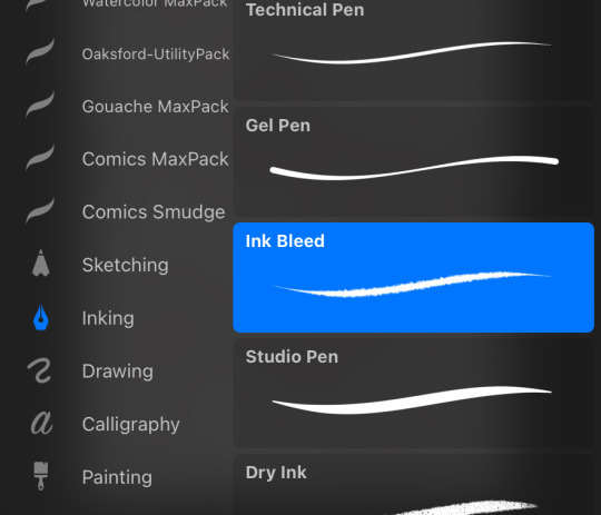
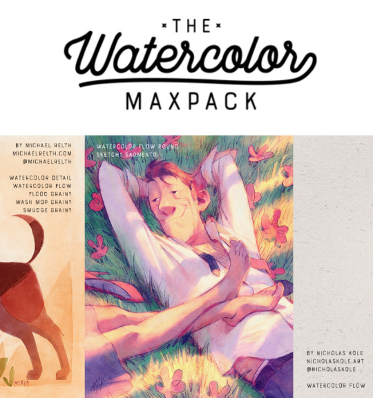
for sketching: HB pencil that comes with procreate but you can use whatever
so my lineart, i typically duplicate my original layer, “color fill” the new layer with a dark red (or any dark color of ur choice), gaussian blur it @ 3% and set it to multiply and that just gives it some depth (for this piece i actually copied my dark red lineart and adjusted the opacity to make it a little darker so there’s 3 layers in total here)
now on to COLORING, i start off with a solid bright color (usually one that goes with the general palette you’d like to use, i wanted something warm so i went with a pink base)
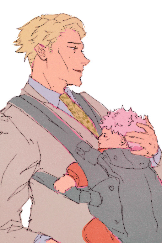
create a new layer and thats where the colors come in, i typically do a rough estimate of the colors i want to use at this point, cause they can be adjusted later in the “color balance” setting under “adjustments” once you have your coloring done (this is all on one layer)
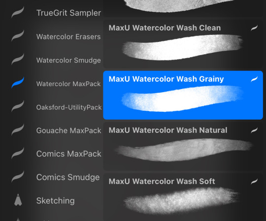
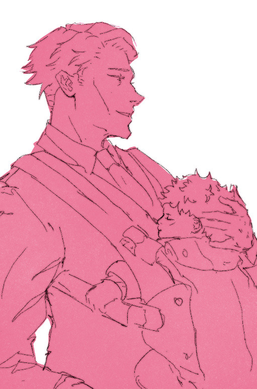
now my SECRET is i use the WASH GRAINY brush as an ERASER and lightly go over my color layer so the pink base comes through a little and unifies the colors and gives it that yummy texture. sometimes i erase the base color too for a little more texture but thats not necessary for every single drawing. once i erase enough, i go to “color balance” adjustment tool and mess with the hues till i get the result i want.
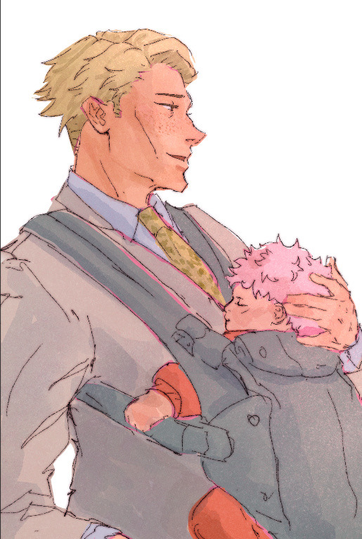
after that i create a multiply layer and with my WASH GRAINY brush i do shadows/face rendering. and with this piece specifically i did an add layer to simulate sunlight on them (i do extra layers at my own discretion, so have fun with it :)
as a final cherry on top i create another multiply layer, fill it with white and then set a noise filter on it @ 17% (dont ask why that number it just works for me lmao) and thats it!
if i need to clarify anything dont hesitate to ask! like i said we dont gatekeep here
and some general tips: dont over-articulate your drawing, cause i find the more i fuss with details the more stiff my drawings look, so i suggest being a little more loose with lineart/sketching and dont sweat the small stuff
same goes for coloring, the more simplistic your shapes are the more cohesive ur drawing will look
another coloring tip: if you’re having trouble with ur drawings looking “muddy” i recommend starting off with a black and white render so you can get a handle on your values before you worry about hue (i do this with my more rendered portraits but i find it helps you focus on the depth of your drawing)
38 notes
·
View notes
Note
HII!!!!! I really love that art you posted recently with homura and madoka!! Do you have any favorite details?
I also love seeing process so it'd be super cool to see the sketch or how you sort your layers or anything like that !! :O
hi!!! i'm glad you enjoy the piece! i'd be more than happy to share progress pics :) under the cut!


i start off with a sketch to nail down the composition! once i'm happy with it, i'll roughly block in base colors and lighting just to see how everything works together.

then i move onto lineart, cleaning up shapes, and rendering! and after some final polish, i call the piece done.
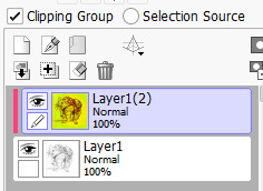
as for my layers, they looked something like this for this piece. the way i usually do my lighting is painting the piece with base colors. then i use some mix of hard light/multiply/darken/soft light/overlay layers to fill in the color of the light. i then duplicate the base image and create a new folder with a layer mask and a multiply layer for the shadows. with the layer mask, i can erase out the parts that i want to be in the light -- which will reveal the color from the light layers!
the effects folder has a bunch of stuff like overlay, multiply, color dodge, hard light, and color balance layers for some nice post processing effects

hope you enjoyed seeing the process of this piece :)
40 notes
·
View notes
Text

@doodled-chai asked how I went from pencil -> digital for that last illustration. It's very simple really.
Scanned it in the library:


If you don't have a scanner you can also play around with brightness/contrast/levels and dodge/burn until the white looks as white as you can get it and the dark as dark as you can get it.
Convert luminance to opacity (note I use Paint Tool SAI but you can do this in pretty much any drawing program):
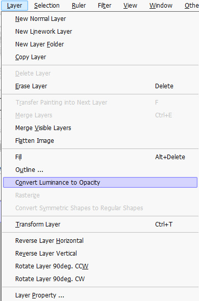

Now the lines have a clear background, so you can just go from here.
I duplicated the layer and merged it to give it more opacity.
Then to get the red in the sketch lines back, I added the original scan on top as a clipping layer and messed with the brightness and contrast until it looked good.

Here's my color sketch, using the lineart as an overlay layer:

Finished piece:

55 notes
·
View notes
Text

I haven't done one of these in forever! I think the last one I did was... four years ago? I thought it would be fun to make one again with my improved art skills and show the work that was put into this piece.
The final piece was one of three idea prompts I submitted for the zine. I was already sketching out thumbnails while I was waiting for approval, but I did draw for one of the rejected prompts as well. (Unfortunately I don't have access to them at this time but I'll add at a later date).
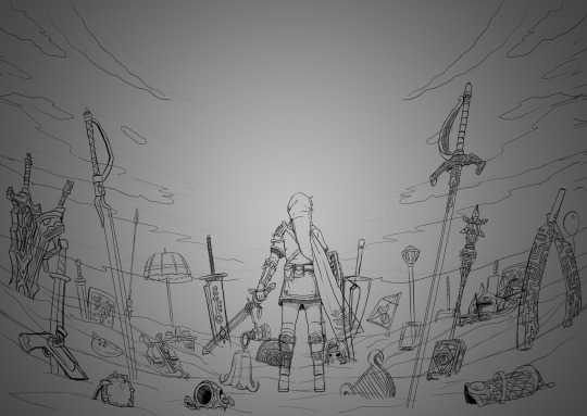
Once the weapon prompt was approved, I got started on a rough sketch. (The sketches were drawn cleaner than what I would normally do to make sure it was readable haha). The toughest part of the piece was its composition. Scattering the weapons was hard because I needed to make sure everything looked balanced and focus was placed on the master sword.
What ended up working for me was I managed to grab as many weapon models from the game as I could find, threw them into Blender, and arranged them until it looked good. A bonus of doing this was having good references for both the piece and the individual weapons themselves (which came in handy when I had to draw some of the detailing). The models were also size accurate so that helped a ton too. I did have to upscale the smaller weapons so they'd be more visible on the cover.
Some of the weapon placement was deliberate, others were put there to fill in space or for another reason. The majority of the characters wielded some variation of a sword so I sprinkled in different weapons and other things to break up the repetition. That includes stuff like the Fierce Deity Mask and Toon Zelda's helmet. The more sillier weapons like Tingle's balloon and King Daphnes' sail were placed in the back so they wouldn't clash too much with the other weapons.
I'll talk about some of the more of the symbolic stuff further down the post.

I also drew an alternative version of this piece with Link being in the center instead of the master sword.
Fun fact: at one point I did consider including Ganon since he's technically playable, but realized he doesn't have a weapon. This would have meant I would also had to include the big Cucco from the cucco mode so neither were ever conceptualized.
I intentionally left the art's tone ambiguous just in case the mod team had something in mind. I did picture it having a dawn color scheme though, and the mods wanted the cover to have a peaceful/hopeful vibe so that worked out. I did however add some sunset choices in my color concepts for more options. The four I made also had sepia versions to fit with the aesthetics of the game.
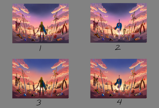

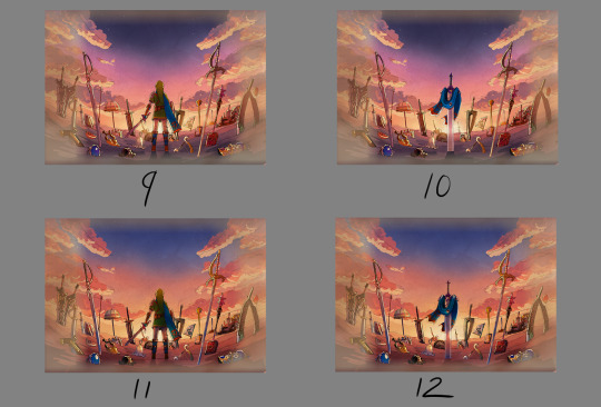

8 was the one the mods chose. However, I did end up slightly adding 6's colors into it to make the sky pop. This ended up being the finalized color concept.
(It looks a little fuzzy because I ended up layering 8 and 6 on top of each other and I didn't position them correctly fghj).
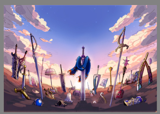
When I do illustrations I start with the background first so I can use its colors for the foreground and midground. I normally don't draw clouds this big and up close so I had to be pretty delicate with how I rendered it. I'm glad I only had to do one side and just duplicate it to the other. Also I made the oranges in the sky and clouds subdued.
After the background was done, I tried rendering the ground and it was a disaster. This was early on in the rendering phase, but what was meant to be dirt started to look like sand. I tried to see if adding textures would help but it made the problem worse. I ended up taking a break from the ground and moved on to the weapons.
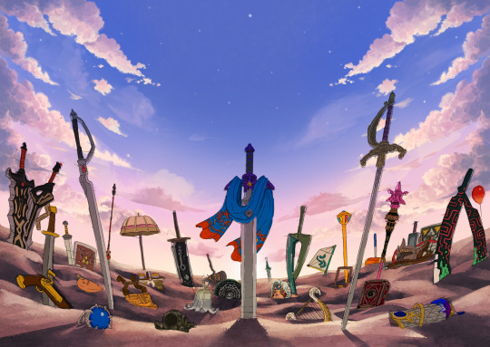
Next was the most grueling part of the piece: linearting. I am not kidding when I say doing the lineart took three whole days. I was also juggling with my other illustration I was working on for the zine so the timeline ended up stretching to a week. I'm a detail-oriented person and stuff like this isn't usually that bad for me but this one was pretty rough. The sweat and tears paid off, I think!
After lineart was done, I went back to render the ground again. It was becoming more polished and included more small rock formations, but the dirt-looking-like-sand bit wasn't improved. I opted to add grass instead since that would be easier to render. That was probably the right call because I think that helped with the desired tone for the cover.
I flipped-flopped between working on the grass and the weapons. This screenshot was when I had added the shading, textures, and some highlights. Oh, and I slightly tweaked the sky a bit.

With the grass and rendering done comes my favorite part: color editing. Started throwing overlays, soft lights, what have you on everything and used color balance to level out the colors. Also added light reflection on the ground for some of the weapons.
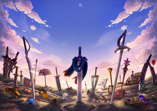
Something was missing from the illustration and I had no idea what it was. A friend had suggested particle effects and that did the trick! Everything was set and done and I submitted my illustration. When I saw the cover with the title for the first time, I noticed that the illustration was made a bit brighter than what I originally had (likely so the title stuck out better). I actually really liked that change and edited my own copy of my illustration accordingly.

With that said, now I want to talk about some of the more subtle details in this piece. You guys probably noticed these already, but I want to talk about them anyway! I mentioned deliberate weapon placements some ways up so let me go over that first.
Ghirahim's sword, Zelda's rapier, and the master sword are placed in sort of a triangular way meant to represent the triforce (although I think I messed up on the distance between them). I originally wanted Ganondorf's swords being in Ghirahim's spot but I was worried about contrast issues with the swords' darker color scheme and battling attention away from the master sword. I think the idea still works considering Ghirahim is Demise's sword (and Demise is like the Ganondorf of that game). Though Ganondorf's current placement can be viewed as him being a looming threat, for Hyrule Warriors and other Zelda titles.
I have Lana's tome and Cia's scepter close together to symbolize them being two sides of the same coin. Toon Link and Toon Zelda's were placed on opposite sides of the piece but slightly facing each other. Toon Link's and Tetra's are also diagonal from each other, both also representing a type of connection to each other. It's a similar deal with both forms of Midna's weapons as well as Yuga and Ravio. Speaking of Ravio, his weapon is the only one partially buried, sort of peaking over at the master sword to reflect his cowardice natureand being Link's Lorule opposite (at least the Link from a Linked Between Worlds). A similar idea with Fi is that she is somewhat of a silhouette behind the master sword to reflect her growth in Skyward Sword. (I know technically Fi is represented twice here, but her "weapon" in Hyrule Warriors is a different blade so that's why).
Like I said before not all weapons have symbolic placements like this, but a number of them do.
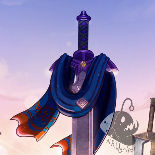
One more weapon detail I wanted to point out is on the master sword. I had this planned from the very beginning but I intentionally draped Link's scarf over the master sword so that the triforce of courage on the blade is the only one visible. I also intentionally highlighted the engraving to make it more prominent.
In the background, the sky is shaped in a way to resemble the Hyrulean royal crest. With the gap in between the clouds looking like the wings, the Master sword acting as the body, and the three visible stars as the triforce (but I messed that up slightly). Only thing I didn't include was the feet of the crest. It's not an exact 1-to-1, but here's an outline for a better visual:

On the topic of stars, there are 29 in total to represent all 29 characters. The brightest star above the master sword is meant to represent Link, but the other 28 are scattered around. Some are more visible than others so it may be hard to spot them all, but they're there.
Saving this last detail because it doesn't really have anything to do with Zelda and more to do with my art. I have always wanted to do this with my work for a while but haven't implemented it until now so I wanted to bring it attention.
From now on, all of my illustrations will have a hidden little angler fish blended into the scenery. I got the inspiration from Adventure Time's snail that appears in almost every episode incorporated somewhere and thought I could do something similar with my art. I'll show you guys where I placed this one, but you'll have to find the next ones on your own.
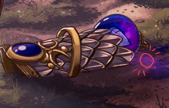
Not the clearest, but I promise in the future it'll be better drawn (and in case you're wondering, yes there are also little anglerfish in the other zine illustration too!). I just thought this would be a fun way people can interact with my art (and also act as an additional signature).
And that's it! If you have read all of my rambles, thank you!
30 notes
·
View notes
Note
I am so fascinated by your artworks its just crazy!!! Could you make some kind of tutorial on how to make lineart? It doesn’t seem like regular lineart, seems like its almost sketchy or sm like that… love you very much!!🤯
Hmmm. Well thats because it is sketch. I dont really do lineart... though i know some people call those sketchy lines of mine lineart too. Dont think theres much to tutorial about. The brush i use for sketching (link in my pinned post i believe) is made to be very pencil like, and its very soft, so sometimes i duplicate the sketch layer with small opacity to make it more visible. I also never make it black, its usually brown or green set on multiply (+ red on hands, ears and face features sometimes, as well as full black on the eyes), so that the sketch is always visible no matter how dark the coloring is


140 notes
·
View notes
Note
Whats your art process and what would you reccomend for someone who would like to achieve a style similar to yours? i love this mix of cartoonism and realism. your work is such an inspiration >.<
oh gosh! thank you?! 💞 i'll do my best to explain it, but even I have a difficult time trying to understand my own art process/style because of how inconsistent it is;; (i still have a lot to learn!) this is gonna be a long reply so i'll place it under the cut
process:

I start loose with a more gesture type rough sketch. I mainly just do lineart in the same layer as my sketch and erase away parts I don't like. Sometimes I'll lower the sketch's opacity and on a new layer do my lineart (which is what i did for the drawing above). But regardless doing that loose gesture sketch helps keep my drawing dynamic even as I refine over top of it!
- I duplicate layers A LOT for safekeeping my previous progress, especially if I'm thinking of making a big change (ex. changing limb position)
If I wanna put colors down underneath it I set my lineart to Multiply. For coloring I'm very inconsistent with the process, but recently I've been using a more subjective coloring style, where I pick my own shadows and highlights to try relying less on blending modes (which is gonna be too long to get into here;;) Finally if I feel like it, I make a layer on top of my lineart layer where I render everything
Oh this is something that helps me a lot for colors! I have 2 layers that are a mid-gray tone placed above all my other layers. One I set to the Color mode (to make the drawing black and white), and the other I set to the Luminosity blending mode (to make the drawing's brightness the same..?not sure)
The Color layer helps me check if I have enough contrast in values, and the Luminosity layer helps me check if I have enough contrast in color hue and saturation!
style:
This is really difficult to answer because style encompasses so many different aspects of art, but I'll try to focus my answer on the mix of cartoonism and realism that you mentioned!
I struggled trying to explain what my style is like so I just broke down one of my drawings that exemplifies a lot of my stylizations! Hopefully these can give you some pointers about what I tend to think about when I draw (click for higher quality)
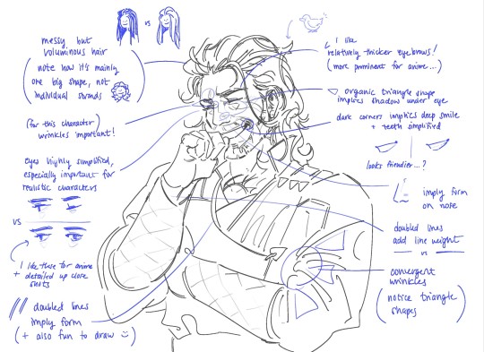
(+to add to this i use a brush with no size pressure, only opacity pressure)
What I recommend for stylizing a realistic character: The way I learned to stylize a more realistic character like this one was to import a reference of his face, then trace over it very deliberately, making sure to stick to big shapes and characterizing details I thought were important to achieve his likeness! Then I'd turn the reference layer off and freehand it over and over, comparing and redrawing until I managed to get the mix of accuracy and stylization I liked!
What I recommend to find a style: I basically ended up with my style subconsciously as an intersection between the things I like to see in art + the things I like to draw! Most of my inspiration comes from anime (😔) and artists online. I'll see a very specific stylization I like in others' art, and try replicating it to see if I like how it fits with my style + if I enjoy drawing it in that way. I did this a lot over the years, accumulating into a big mosaic of inspiration from all the artists whose work I personally enjoy and learn from! I know this isn't exactly answering how to get a style like mine, but I think knowing this general process may help you out in the long run!
ahh i think that's it! i tried to be as comprehensive as i could without being too verbose (my bane). i hope this is the answer you were looking for and that it can help you! 💞 and thank u for the ask! it was a good exercise for myself to analyze my own art
#my asks#anonymous#tutorial#...? art info? not sure what to tag this#i spent a very intense day mulling over this ask#hopefully i answered this correctly...!#art resources
44 notes
·
View notes
Last Seen Blogs

queer-rose
🌹I'm Gay :)🌹

luvsickfairy
𝓈𝒽𝒶𝒹𝑒𝓈 𝑜𝒻 𝒸𝑜𝑜𝓁

fancyluminarystranger2
Untitled

quickmoviereviews4you
QuickMovieReviews4you
afuror
Afuror