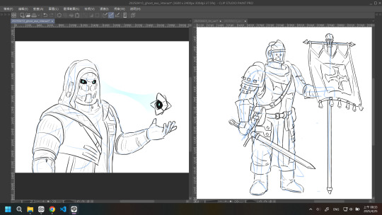
#the next tutorial might be about the rendering
Explore tagged Tumblr posts
Visit Tumblr Blog
Explore Tumblr blogs with no restrictions, modern design and the best experience.
Last Seen Tumblr Blogs


Fun Fact
The total number of visits Tumblr.com received during January 2021 is 327 million.
Text
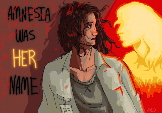
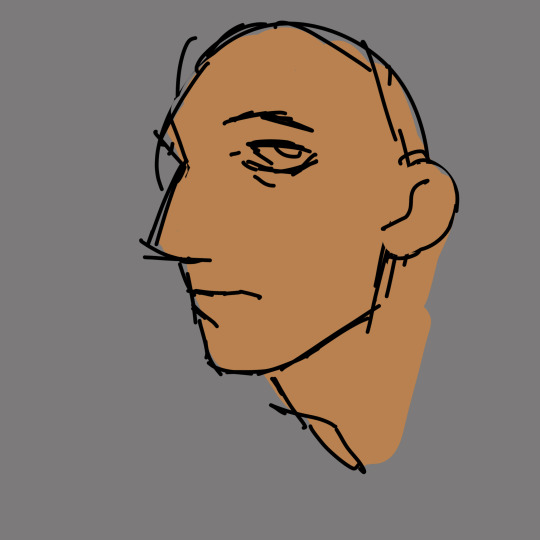
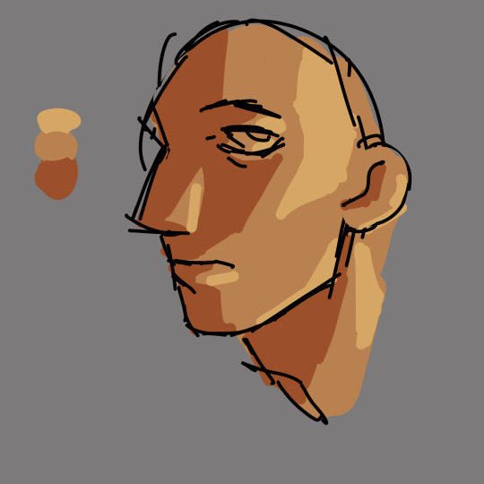
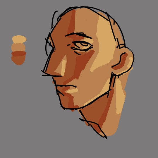
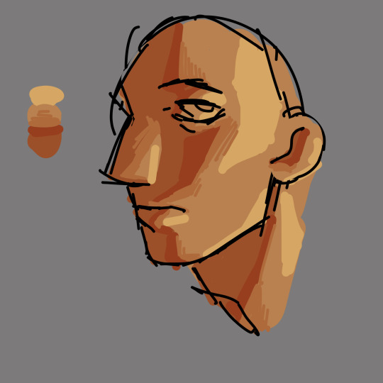
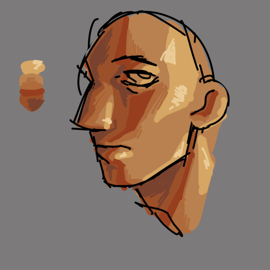
How to draw Manga/Anime heads in the rev1999 style!


it's not a rendering tutorial and just the construction of the female head for rev1999(and other anime art style really)
the images have alt text!
I highly recommend practicing by trying to replicate the heads in the wallpapers they provide with this method:
1. draw in the guidelines on the image itself(yes,basically tracing,bare with me)
2. hide the construction and draw the same guidelines beside the image
3. compare to the first construction lines
4. now,with the mistakes in mind,hide both the constructions and the image and try to replicate the constructions from memory
repeat 3-4 until satisfied
you should be able to remember how to draw the heads even without reference after doing this a bunch of times! ヽ(o^▽^o)ノ
#the next tutorial might be about the rendering#or the male heads#really depends on my mood ngl#also this is kinda a sequel to the eye tutorial :D#reverse 1999#rev1999#r1999#art#art tutorial#tutorial#anime#manga#anime head#manga head#head construction#step by step#art guide#guide#step by step guide#art style#art style analysis#digital art#illustration#kaalaa baunaa#tooth fairy#jessica#godofart
153 notes
·
View notes
Text

Month 7, day 23
No digitally painting tonight, I was eating dinner at my desk and since I was already right there and my computer was on so I could watch the YouTubes and chat with @silentspaces on Discord I opted to make a new material today :)
I don't think I did this one before the Great Kablooie. And there's two because the settings in the tutorial looked way too saturated to me, so I dropped the saturation down and I definitely like the second render better :D
#the great artscapade of 2024#art#my art#blender#blender render#blender 3d#cycles render#I think something in the file of my project tutorial got corrupted because if I save it twice it crashes my computer#but every other blender file is fine?#so idk#I might have to start all over again#oh no the horror :| whatever will I do :|#one part of my brain: but we have to move on to the next part!#the other part of my brain: NEED. MORE. PRACTICE.#the inside out emotions panel that pilots my meat mech is having a heated debate about this lol
3 notes
·
View notes
Text
Ok! I've finally decided to put together a (somewhat) comprehensive tutorial on my latest art~
Please enjoy this little step-by-step 💁♀️
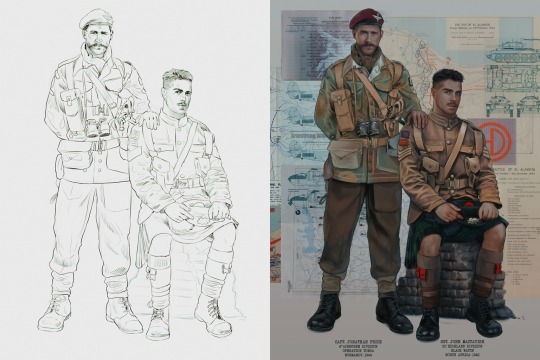
First things first--references!
Now I'm not saying you have to go overboard, but I always find that this is a crucial starting point in any art piece I intend on making. Especially if you're a detail freak like me and want to make it as realistic as possible 🙃
As such, your web browser should look like this at any given point:

Since this is a historical piece, it means hours upon hours of meaningless research just to see what color the socks are, but...again. that isn't, strictly, necessary 😅
Once I've compiled all my lovely ref pics, I usually dump them into a big-ass collage ⬇️
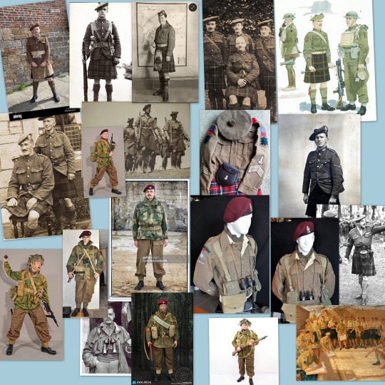
(I will end up not using half of these, alas :'D)
Another reference search for background material, and getting to showcase our models of choice for this occasion~
When picking a reference for an actor or model, the main thing I keep in mind (besides prettiness 🤭) is lighting and orientation. Because I already kinda know what pose I'm gonna go with for this piece, I can look for specific angles that might fit the criteria. I should mention that I am a reference hound, and my current COD actor ref folder looks like this:

Also keep in mind, if you're using a ref that you need to flip, make sure you adjust accordingly. This especially applies to clothing, as certain things like pants zippers and belt buckles can be quite specific ☝️
Now that we've spent countless hours googling, it's time to start with a rough sketch:
It doesn't have to be pretty, folks, just a basic guideline of where you want the figures to be.
The next step is to define it more, and I know this looks like that 'how to draw an owl' meme, but I promise--getting from the loose sketch above to below is not that difficult.
Things to keep in mind are--don't go too in-depth with the details, because things are still subject to change at this point. In terms of making a suitable anatomically-correct sketch, I would suggest lots of studying. This doesn't even have to be things like figure drawing, I genuinely look at people around me for inspiration all the time. Familiarize yourself with the human form, and things like weight, proportions, posing will seem a little more feasible.
It's also important at this stage to consider your composition. Remember to flip the canvas frequently to make sure you're not leaning to one side too often. I'm sure something can be said for the spiral fibonacci stuff, which I don't really try to do on purpose, but I think keeping things like symmetry and balance in mind is a good start ✌️
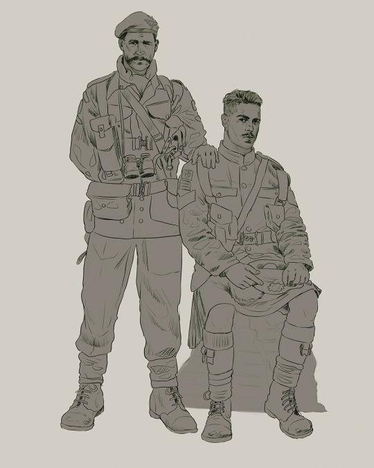
Next step is just blocking in the figures. Standard. No fuss 👍
Now onto the background!
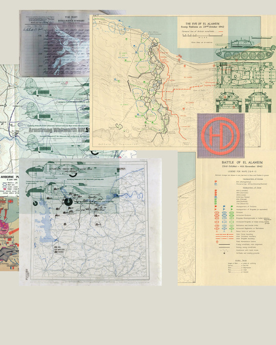
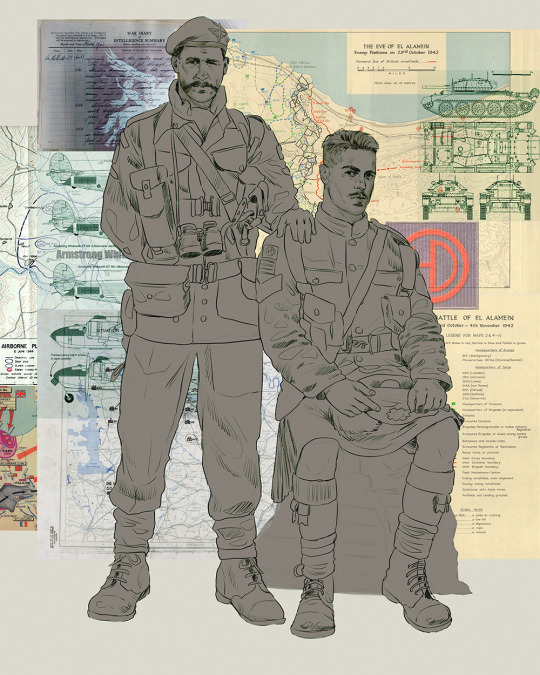
It's frankly hilarious how many people thought I was *hand-drawing* these maps and stuff 😂😂 I cannot even begin to comprehend how insanely difficult that would be. So yeah, we're just taking the lazy copy and paste way out 🤙
I almost always prepare my backgrounds first, and this is mostly to get a general color scheme off the bat. For collage work, it's really just a matter of trial and error, sticking this here, slapping this there, etc. I like to futz around with different overlay options until I've found a nice arrangement. Advice for this is just--go nuts 🤷♀️
Next, I add a few color adjustments. I tend to make at least 2 colors pop in an art piece, and low and behold, they usually tend to be red and blue ❤️💙There's something about warm/cool vibes, idk man..
Now we move on to coloring the figures. This is just a basic block and fill, not really defining any of the details yet.
Next, we add some cursory values. Sloppy airbrush works fine, it'll look better soon I promise 🙏
And now--rendering!
I know a lot of beginner artists are intimidated by rendering, and I can totally understand why. It's just one of those things you have to commit to 💪
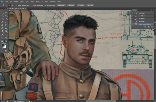
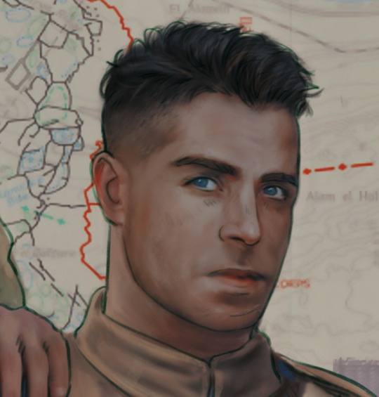
I've decided to show a brief process of rendering our dear Johnny's face here:
Starting off, I usually rely on the trusty airbrush just to get some color values going. Note--I've kept my sketch layer on top, but feel free to turn it on and off as you work, so as to not be too bound to the sketch. For now, it's just a guideline.
This next stage may look like a huge jump, but it's really just adding more to the foundation. I try to think of it like putting on make-up in a way~ Adding contours, accentuating highlights. This is also where I start adding in more saturation, especially around areas such as ears, nose and lips. Still a bit fuzzy at this point, but that's why we keep adding to it 💪
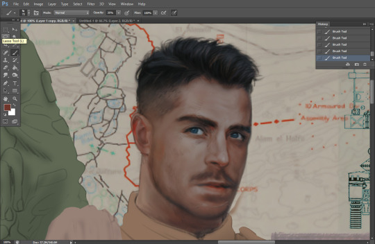
A boy has appeared! See--now I've removed most of the line layer, and it holds up on its own. I'll admit that in order to achieve this realistic style, you'll need lots and lots of practice and skill, which shouldn't be discouraging! Just motivate yourself with the prospect of getting to look at pretty men for countless hours 🙆♀️
I'll probably do a more in-depth explanation about rendering at some point, but let's keep this rolling~
Moving forward is just a process of adding to the figures bit by bit. I do lean towards filling in each section from top to bottom, but you can feel free to pop around to certain parts that appeal to you more. I almost always do the faces first though, because if they end up sucking, I feel less guilty about scrapping it 😂 But no--I think he's pretty enough to proceed 😚
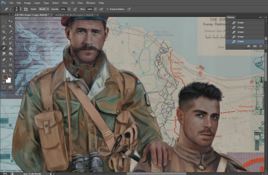
They're coming together now 🙆♀️ Another helpful tip--make sure you reuse color. By that, I mean--try to incorporate various colors throughout your piece, using the eyedropper tool to keep a consistent palette. I try to put in bits of red and blue where I can
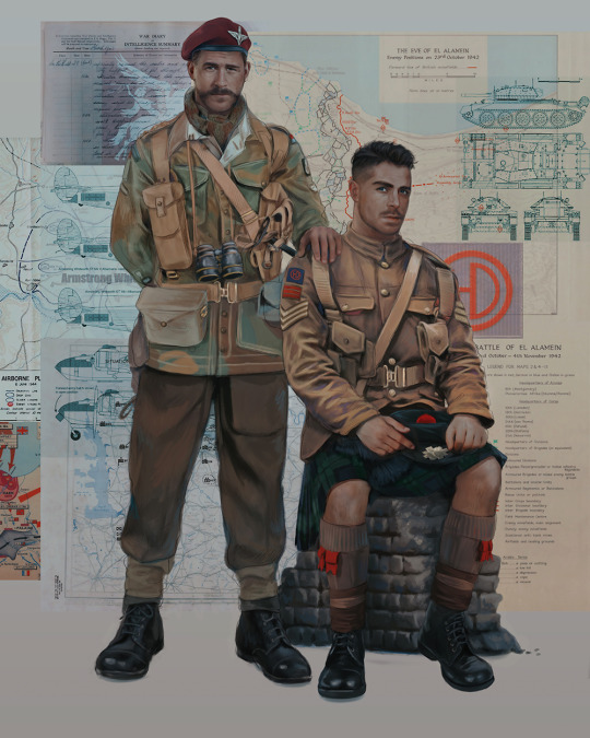
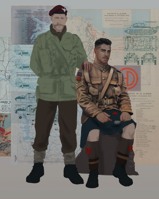
Here they are fully rendered! Notice I've made a few subtle changes from the sketch, like adjusting the belt buckles because I made a mistake 😬 Hence why you shouldn't put too much stock in your initial sketch~
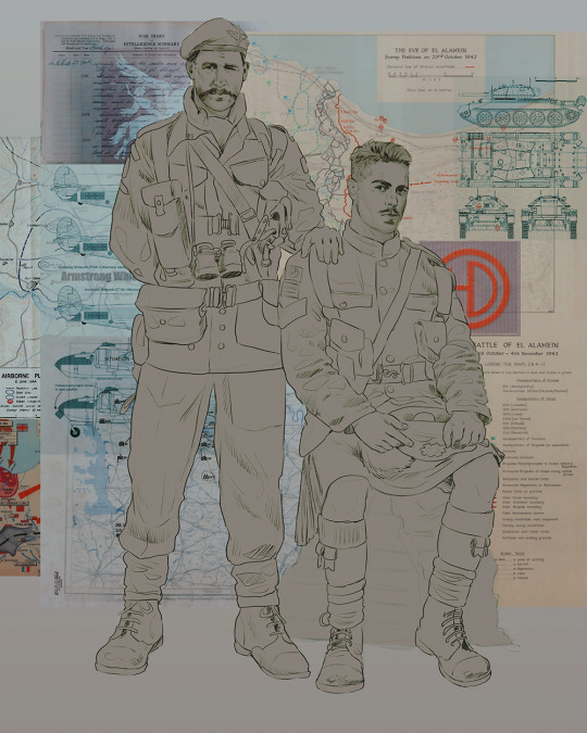
The next step is more of a stylistic choice, but I usually go over everything with an outline, typically in a bright color like green. Occasionally, I can just use my initial line layer, but for this, I've made a brand new, cleaner line 👍
And the final step is adjusting the color and adding some text:
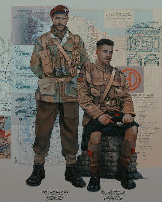
Tada!! It's done!
All in all, this took me the better part of a week, but I have a lot of free time, so yeah ✌️
I hope you appreciated that little walkthrough~ I know people have been asking me how I do my art, but the truth is--I usually have no clue how to explain myself 😅 So have this half-assed tutorial~
As a bonus, here is a cute (cursed) image of Johnny without his mustache:
A baby, a literal infant child !!! who put this wee bairn on the front lines ??! 😭
Anyway! peace out ✌️
#tutorial#my art#art tutorial#since people have been asking#I remembered to save my process from this latest work~#enjoy 🙆♀️
1K notes
·
View notes
Note
do you have tips for drawing armor? (specifically guardian armor but armor in general works too)
Wow this is the first time i got asked about art related question. Life achievement get. Also please allow my rambling.
Tbh, there's... not that much real advice i can give? I mean, the best thing about drawing armor is that there's almost no organic stuff (e.g., facial / eye expression, muscle, etc) and you can just copy the reference. I'll try, but idk if this is what you're looking for
Basic / General Section
Because drawing armor is basically just "slapping a skin on a figure by copying the reference mindlessly", you need quite a few basic "things" to actually do that well enough:
A base figure (to slap the armor on. If you're good you could probably just freehand the armor directly but i cant. Draw the figure now so you can mindlessly copy-paste the armor on it later)
Reference (if you're drawing that armor set for the first time definitely don't use your memory. Just get a set of reference and stare at it and copy each piece you see. I would use destiny 2 model archive, open in blender, render enough reference i need and post them in PureRef. You'd probably need: 8 angles for the body, 8 angles for the head (zoomed in), the inside part of the arm and leg, and maybe more variated angles for the head. By 8 angles i mean front back left right and the 4 in the middle)
Perspective skill (this is generally important in drawing, but for armors (which is mostly about inorganic stuff) this probably matters a little bit more. For example, the shoulderplate might be in weird angles when the character move their arm and you should make sure you can draw that in these weird angles. The general advice would be to just go to drawabox.com and learn as much as you can, at least part 1 lesson 1 and draw (a bit of) 250 boxes challenge?)
Btw, by "copying reference" i don't mean "pose the character in game or in blender and copy / trace the pose and things exactly what you see", i mean "you shouldn't just imagine the armor pieces and clothe design of the character, you should know what the design looks like by seeing a reference and copying its design"
And that's it. Go slap some armor on some figures... Okay maybe I should give some examples.
Let's use these 2 as examples
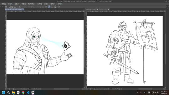
So first of all, who are these people anyways? They are the Limitless Subversion hunter set (& exo chassis & ghost) and Reynauld from darkest dungeon, so you should probably go and prepare your reference now.
Now the least fun part imo. Drawing the figure.
"Least fun" because all the proportion, motion, perspective information, and just basically anything should be dealt with at this stage and i'll be more and more unconfident in my figure drawing and perspective skill as time goes on. The rest of armor is just detail that you can mindlessly slap on the figure later.
probably should make things more block-y to see what i mean by perspective
not perfect but you get the point. you should know which direction the arm / leg / torso is facing so you can slap the armor at the correct position and angle.
...tbh that's just part of the figure drawing skillset. you also need that when you slap muscles on a figure
(just a random example for my practice note don't actually try to figure that out it's probably wrong anyways)
As for how exactly to do the figure drawing... there's tutorials literally anywhere and each person has their own way to do that. can't really help you with that, go google some videos or just crunch the andrew loomis figure drawing book. free online btw. Also anatomy helps a huge ton even if youre not actually drawing muscles.
And the next step is just stare at the reference and copy the armor pieces on the figure
that seems like a big jump but tbh we've dealt with the most difficult part in the figure drawing section so this is just mindlessly drawing now. the general advice i can give is to get a dual monitor (to not clutter the screen with reference too much), try to understand what each piece looks like in 3D, make sure the armor pieces is in the right orientation, and (do your best to) figure out if what you're drawing would violate the perspective rules you learned before (which should also be dealt with in the figure drawing part)
Detail / Niche Advice Section
we are talking about armor and clothes and outfit stuff so there should be a lot of niche detail stuff that would be beneficial to do or learn
the things i can think of now are these
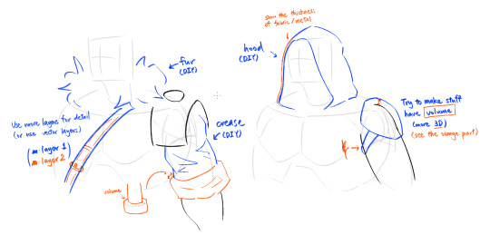
DIY (do it yourself) means this is a common topic and there should be some tutorials online or in books (e.g., fur, crease), or just do it a bunch of times and you would somehow get the gist of it (e.g., hood). (i kinda hate learning that way because it's just pure coincidence whether you "get it" or not and that makes me uneasy because there's a chance that i'll never get it. but yeah sometimes this is what you need. Go and stare at / try to copy other people's artwork as practice and you MAY get what they're doing. Don't just mindlessly trace them btw it won't help if you're not actively using your brain to understand what's going on)
And that's it. It's probably too much for an AMA but let's just say i'm doing this as a record of my process
31 notes
·
View notes
Text
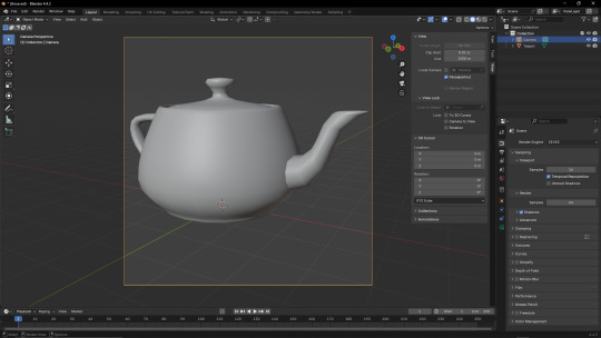
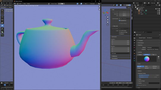
Some kinda lady with a ring for a head!
You might notice that her head is kinda. Pixelly. That's because it's actually a 2D prerendered sprite, enhanced with the magic of normal, specular and emission maps to fake directional lighting and shading!
Head textures below, along with a tutorial explaining how to make normal-mapped images.


(clockwise from top-left; colour/alpha, normal, roughness, emission)
Ok so basically. Here's how you make a normal map from a render:
Step 1 - use shift+a to make an object.

In this case, it's the good old Utah Teapot, a version of which is included in the Extra Mesh Objects extension (which you can download from Blender's Preferences -> Get Extensions menu).
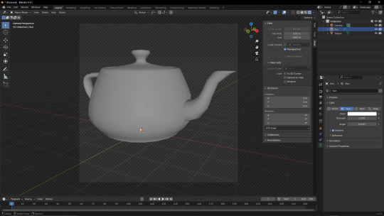
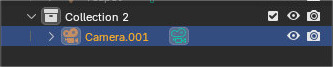
Step 2 - add a camera and set it to your chosen viewpoint
Protip: go to View -> Align View and select Active Camera to View.
Then, while in the camera view (numpad 0, if you have one), press N and, on the right-side panel, navigate to View, and under "View Lock", click "camera to view". This allows you to move the camera using Blender's normal camera controls. Be sure to turn it off if you want to leave the camera view, otherwise you can mess up your intended viewpoint.
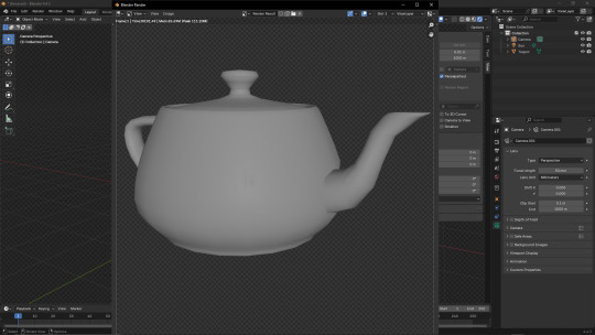
Step 3 - mess around with the camera and image-size settings
Ok so what you want to do first is change your image's resolution. For this I'm setting it to 1024x1024, but you can make it whatever size you want.
If you want to, you can also fiddle with the camera settings, but I'm keeping them standard because it's easier than explaining what everything does.
If you've been following this properly up to this point, your window should look something like this, and you're ready for the next step;
Step 4 - rendering your image, but also there's some stuff to do before that before that
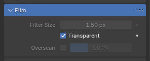
Ok so go to the search-bar on the right and type "transp", then click the "Transparent" box under "Film" on the Render tab. This will make the render's background transparent; remember this, it will come up again later.
Next, add a Sun (shift+a -> Light -> Sun) and point it away from the camera's position (this is easier if you switch to wireframe); the position of the Sun doesn't matter, just its rotation (since it's a sun, and just kinda. Projects directional light at everything that isn't covered by an object. Kinda like the actual sun does). I also recommend fiddling with the Sun's Angle parameter. Just make sure the light is, like, "even"(?) on the object (since having too many prominent shadows or highlights will look weird once you get the Normal Map set up).
Press F12 to render your base image. I'm using the Eevee renderer because I don't want this post to take longer to make than it probably already will. Save the image somewhere memorable, preferrably a folder dedicated to this project. Save the model there too, while you're at it.
Step 5 - the easy bit
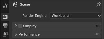
Go to the Render tab and change the Render Engine option to "Workbench".
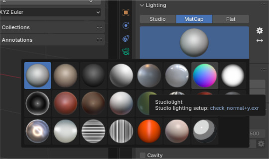
Change the "Lighting" option to MatCap, and select the second-to-last option on the top row.
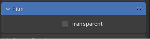
Remember the Film -> Transparent thing from earlier? Told you it'd come back. Uncheck it, the next thing requires it.
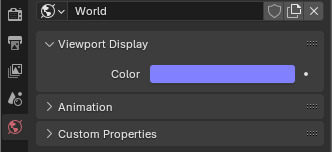
Go to the World tab, go to Viewport Display, and change the Colour thing to the hexcode 8181FF (or, if you're a nerd who manually puts in their RGB values, 129 129 255).
If you try rendering now, you'll notice it looks kinda off; it's all washed out, and maybe even the wrong hue.. That's because there's one more step before you can start messing around with normal maps!
Step 6 - I had to figure this out myself and good gravy do I wish I knew about it before

Fun fact; Blender has colour-correction! And to turn it off. All you have to do is go to the Render tab, scroll all the way down, and under the Colour Management tab, change View Transform from "AgX" to "Standard".
Step 7 - ok back to rendering

Press F12 again, and you should get a beautiful normal map! Save this to the same place as the base image.
Step 8 - hope you like material nodes!!!!
Switch back to Eevee, and hide the Collection all your stuff is in, and make a new one. Hold Alt and rotate your view so that the little angle gizmo on the top-right shows "-Y". Create a camera, right click it and click "set active camera", and then do the "align active camera to view" thing.
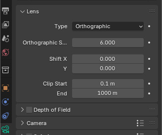
Set the camera to Orthographic. Note that scrolling with Lock -> Camera to View doesn't actually zoom; zooming is instead done via the thing below the Type dropdown.
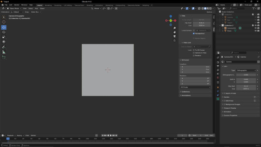
Add a Plane, rotated 90° so it's facing towards the camera, and mess around with the camera controls until it fits into the camera's view.
On the top tabs, switch to "Shading".
Click "New" on the panel below the viewport to create a new texture (or, if you haven't modified the default texture, use the dropdown next to the "New" button to select that instead). Then, recreate the setup shown in the image.
Add another Sun, and play around with the angle. If you did it properly, the image should appear to have proper shading that changes with the light's position (if it looks weird, play around with the Strength parameter and the dropdown on the Normal Map node).
And you're done! This can be used for a lot of stuff, like I learned about this technique from a YouTube video about Super Mario Bros. Wonder modding.
Anyway I need to sleep. It's nearly 6am in my timezone and I haven't slept. If there are any errors in this post, it's because I was writing this instead of going to bed. Uhhhh good night I guess
Also please ignore that the textures in the bits with the plane don't match the renders I showed earlier; I accidentally messed up the camera's position and forgot to save the normal map, so I had to redo both of them :(
7 notes
·
View notes
Text
A friend asked about how I did the hatching and rendering on this work, so I made a little tutorial! I figured it might help some other people, so I’m posting it here.
Starting off with a sketch of some guy, and a base color!! Doesn’t usually matter what base you’re doing. I try to do a neutral tone - not too saturated, but not too dull either. Depends on the mood and colors of the drawing you’re working on
-
next, I usually add my highlights and lowlights. For this style I used a big, plain round brush- make sure it’s opaque!! I color shifted the darker tone to be more red, and shifted the highlight to be more yellow. They really help tie the whole thing together. You wanna do real blocky, basic shapes for these, it’s used as a template for how you use your colors later
-
Next, I add a Saturated Tone between the shadows and the mid tone (skin). Also color shifted towards red! I went with a deeper, brighter red, to stand out with the orange! This helps give the piece dimension and visual interest.
-
From here, I start the hatching. I use a slightly smaller brush of the same kind, and use a darker color than the skin tone. It can be slightly color shifted in any direction, really, it just depends how you want it to look. I go in with rough, small lines to try and create dimension in space
-
Finally, I repeat that last step with other colors, in other areas!! At this point you can just have fun with it. Using hatching strategically in places where the light is changing (ie- where a gradient would be on a face) can help give you dimension in your work. Color shifting to cooler or warmer colors will also help give the piece dimension and interest! Trust your gut, do what feels right and looks good to You. Here, I made the Deeper shadows more desaturated, and also cooler.
And that’s basically it!! You can keep hatching and adding more colors + detail to your hearts content
Hope this was helpful!
#art tutorial#art#art ref#refrence#color theory#tutorial#oc art#artists on tumblr#my art#void speaks
5 notes
·
View notes
Text

Quick test render of the gal with Wishender in VRM Posing Desktop
I'm almost done- Mini rant about it below
Figuring out the baking stuff was a bit annoying but now, I can do that fast. Redid bakes multiple times until I realized I'm limited with the VRM shader (Wanted to add metalness but I can't do a mask for specific parts, and using a matcap looks weird)
Also merging the two armature turned out to be quite easy? Didn't even need a tutorial to snap two bones together- Idk if due to sheer luck of finding where to click or if because I'm actually understanding what I'm doing lmfao
Need to polish the weight painting, remake the OG blendshapes cuz they got wiped and the collision
Been wanting to do this for the past few months, so to see this come to fruition, it makes me happy. Next, maybe I can do the bat with the armor... Since I can use Poiyomi shaders with it, it might look p smooth but I'm a lazy bitch rn
4 notes
·
View notes
Text
Otis IGCS DoF Tutorial for BG3
Today we're going to go over how to utilize Otis_Inf's IGCS DoF generator for BG3, available over on his Patreon along with his excellent camera tools suite (and many other suites for many other games, it's worth the sub imo.) While the camera tools themselves are pretty self explanatory if you look through the hotkeys, the DoF generator might be a little more confusing if you're not already familiar with how these types of filters work.
In case you find configuring the settings for this DoF generator a bit daunting, I put together this little toot to show you the options and what exactly they do. We're going to take a base frame and then show the steps for configuring and the differences between some of the settings. Let's start with our base shot:
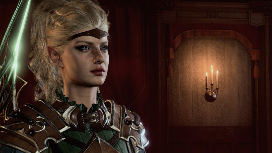
Pardon the coloring/contrast, I had the Reshade set up for different lighting so it's a bit stark here, but that's not the focus of this tutorial.
Now let's take a look at the DoF session options and what they do:
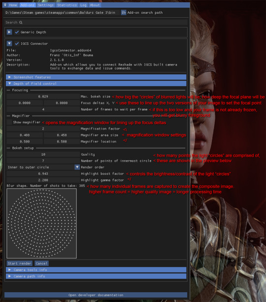
Detailed breakdown of the options & process below the cut:
So the first thing you're going to do is set your bokeh size, as how far the deltas are from each other will change based on this size. When I say, "light circles", I'm referring to this effect:
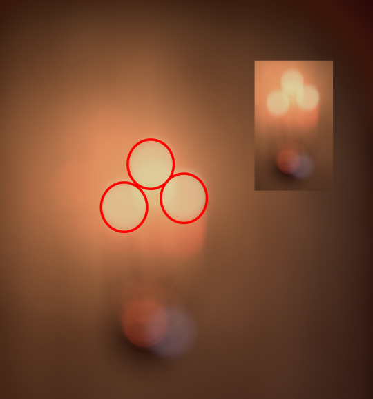
Changing bokeh size will change how big these circles get, basically making the image appear more or less blurry in the distance. It also in effect changes how wide or narrow your focal depth is. I usually go for somewhere between .2-.4, but you can play around with it to find the setting you like. Just be aware that if you change it you will have to realign the focus deltas so try to do this first in your process so you don't have to realign over and over.
Next, on to focus deltas. WTF am I even talking about? Well, the way this generator works is it captures frames between multiple different angles and combines them to generate the field depth. When you first start the DoF session, you are going to see two versions of your image overlapped and offset from each other, each one from the opposite "end" of the angles the generator will be using, like this:
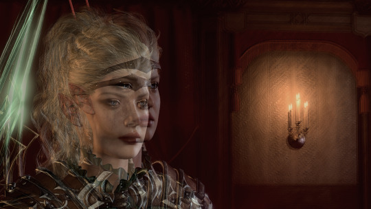
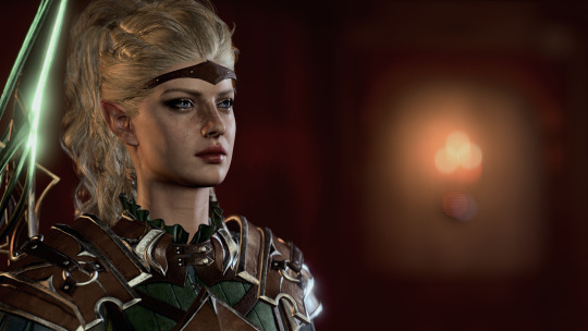
Aligning the focus deltas to match up with each other is how you pick where your image is focused. In most cases you will be using a character's eyes as your focal point, but you can make it anywhere, whatever spot you align the focus deltas on is what will be in focus. Here's the generated image with the focus on the character:
And here with the focus on the candle holder in the background:
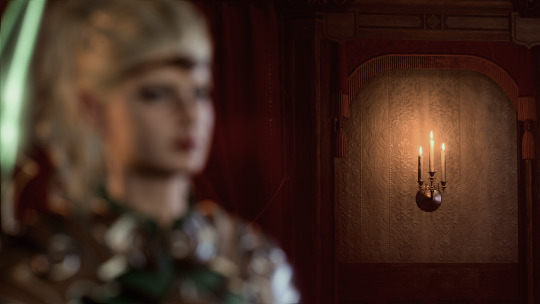
As you can see, wherever you align the focal deltas is where the camera will be focused.
Now let's take a look at the magnifier tool:
This is basically just a zoom-in window so you can align the focus deltas more precisely. You can change its size and position to get it to where you're trying to adjust the focus. Move and resize it however you need so the point you want to focus on is in the window. Then move the focus delta values around until both versions of your focal point are aligned with each other. Now your image will focus on what you've chosen as the focal point.
Now, one thing with focus deltas is that if your focal "point" is spread across more than a single focal depth, you may need to "split the difference". For instance, due to the 3/4ths angle, the eyes here are at slightly different depths, so if you look at the edge of the face in the magnifier window you will see some slight pixel overlapping instead of it being lined up perfectly. Usually in the generated image this isn't noticeable, but you can exaggerate it using large bokeh size and focusing on a single point instead of splitting the difference if you want to get a super narrow DoF, where, for instance, only one side of the face is fully in focus.
So you've aligned your deltas. Now what does the rest of this stuff do? The rest of the settings affect the "light circles" created by the bokeh effect. This generator creates them by rendering tiny points of light in a circular formation. The first two settings affect how many points are in each circle. Let's take a look at how they compare when using lower quality settings vs higher:
Low quality:
vs high quality:
As you can see, in the lower quality image the "points" are clearly visible. However, higher quality settings take significantly longer to process as they utilize many more individual frames than lower quality. You can mess with these to find a balance of speed vs. quality that you prefer. Render order just changes the order the points are generated in, but I haven't found changing this to make too much of a difference.
Last two settings affect the brightness/contrast of the "light circles". Here are some examples of the same lights with different settings:

Not a huge difference, but I find that a sharper, more pronounced bokeh will give the image more of a "cinematic" feel since it's such a distinct effect caused by the way real cameras work.
Finally, let's go back to the setting I skipped over- the "Frames per frame" setting. If you are freezing the image with the camera tools beforehand, you will probably not need to mess with this setting. If you are taking screenshots without freezing the game, however, you may need to increase this setting slightly, otherwise the generator may not compensate for, say, your character shifting slightly during their idle animation, and the foreground will come out just as blurry as the background.
That's pretty much it. Hopefully this helps!
52 notes
·
View notes
Note
hi tamelee!
I'm here to ask for a little bit of advice if that's okay (: about a month ago I bought a Wacom drawing pad so I could start experimenting with digital art. artists like you here on tumblr have really inspired me to start making art. but I feel kinda.. lost. I've been mostly drawing naruto manga caps and I'm getting better but I guess I don't know where to go from here. coloring and shading scares me lol. I'm using clip studio paint and it's just a little.. intimidating. I feel discouraged, like I won't be able to do it. how did you do it tamelee? did you watch a lot of tutorials, or did you experiment until you figured things out? any advice you'd have for a beginner artist I'd really appreciate.
thank you veryvery much for your time ^^
Hi Nonee! 🧡 Sure!
Oh I think that’s a very good place to start. As well as drawing subjects you like ^^! Hmm, tbh I’ve just experimented a lot, but I don’t think my way of having done things was the most efficient. You might want to follow tutorials step by step? You can try coloring only with flat colors until you feel a bit more confident with that as well as cell-shading (toon-shading/non-realistic, like in anime) instead of rendering further as that can all be confusing at first. I personally never truly understood shading until I studied cell-shading and made my art a lot more readable. A lot of Anime uses this;
You see how there is a base color, a darker color for shadows and highlights? (Sometimes not even highlights.)
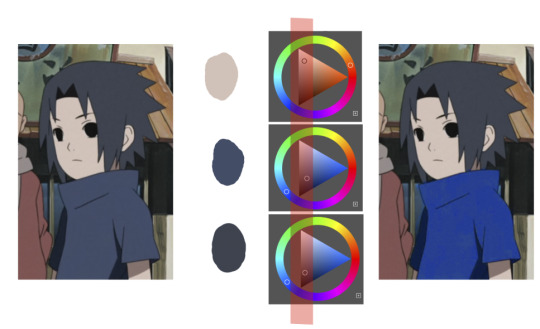
When you start to study it from existing work you’ll start to notice things like color always being in the same area of saturation and when you suddenly have a color that is way more saturated than the other it can look off. (See example.) But this is a guideline, not a rule. In your own art you can especially use saturation and brightness to help aid you to direct a viewer's focus and even tell a story.
I LOVE ‘How to train you dragon’ and ‘Kung Fu Panda’ for this because their coloring is so inspiring and if you truly want to learn from professionals... well those are the type of media to look for of course! I have an entire folder to inspire me just based on those.
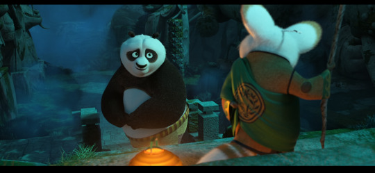
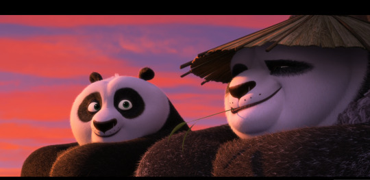
Do you see how calculated those color combo’s are?!?! Here you see both analogous and complementary schemes and it is actually through looking at the things I like that I learned it >< The orangey colors stand out and are bright which helps you to focus on that area whereas the complimentary scheme is used to bring characters together.
If drawing Manga-caps is something you love to do, then maybe for coloring you can study screen-caps from Anime or even other animated films. I’d recommend to take it step by step, though I haven’t really applied it myself, from the video’s I’ve seen and artists I’ve followed it is always advised to have an art-goal that you can work toward. Maybe you first want to focus on lineart and then laying down a base color where the colors are harmonious and next would be cell-shading maybe and then you can start adding another light-source etc- eventually you can decide to create more depth or practice with monochromatic coloring, maybe even greyscale to learn values. But right away that can all sound a bit intimidating doesn't it? Find things that you like and then maybe you can open them in your program and just study. Find a brush you like, put on some music or a show on the background and for a moment play around with it without needing to create a finished piece. This is also how I learned how things like adjustment layers work or what all the different kinds of tools do. I have to agree with you, CSP is intimidating for me as well >< so this is kinda how I approach it as there are so many add-ons and additions within it but I try to only learn what I need for that moment so I don't overwhelm myself. I definitely try to find video’s that can help me with creating Manga though! ^^ There are plenty! It'll get easier eventually, you'll learn the program and you start to recognize placements for shadows and you will get a feel for the coloring- no worries 💪 Learning something new will always stay intimidating, every time I open up a new document I feel it too. It's not easy at all, but you kinda have to allow yourself to experiment and even make mistakes because practice is never perfect. I have some beginner tips written here- I hope any of this is somewhat helpful 🌷��
15 notes
·
View notes
Text
How I draw my short fancomic
A/N: This is not a tutorial or anything like that, just a little post where I look back my own process, celebrate my small success and be hopeful about the future. The comic in question, of course, is that House of the Dragon fan comic.
Forgive my spelling, English is not my first language.
I started drawing HOTD fan comic in July due to my hyperfixation as the show came out. We humans are all natural borned storyteller, but it's quite hard when it comes to telling a story with pictures. I have seen many examples of disconnected comic pages, that's what I fear the most. To learn everything I need about making comic, I searched educational videos on Youtube and listen to them while increase my drawing skills by sketching everyday. One of my favourites is Tim Mcburnie's channel.
I actually had a lot of ideas for this one comic, most of them are depressed. It's because in the show, I don't feel like Aegon, Helaena and Aemond have good relationships. But in the end, I chose the most fluffy idea to draw. I soon realized it's very easy for me to hurt a character's feeling, but I struggled to pull them out of despair or give that angsty story a meaning.
I finished the first storyboard in two days or so. In that time, I just focused on the flow and tried to find the best way to adapt my script, which I had written before. This might be the best part for me to work on, just pure creative work.


After that, I drew another storyboard that was more detailed and easier to understand on Ibis Paint. I added two pages so it wouldn't feel rushed. When I was sure that everything is okay, I started sketching properly, lining and then shading. That is the most time consuming part of this process. Sketching every panel alone took one month. I spent fifteen days lining, and fifteen days rendering. But now thinking back, I could have done it more quickly if I had study art fundamentals carefully, especially the background parts.
Minh Nhat, a friend of mine, had to sketch out gridlines for me to draw buildings and trees in. Without them, I would have messed everything up. And I was so lucky that when I asked everyone out on an Aegond group chat, Sylva agreed to help me translating my script.
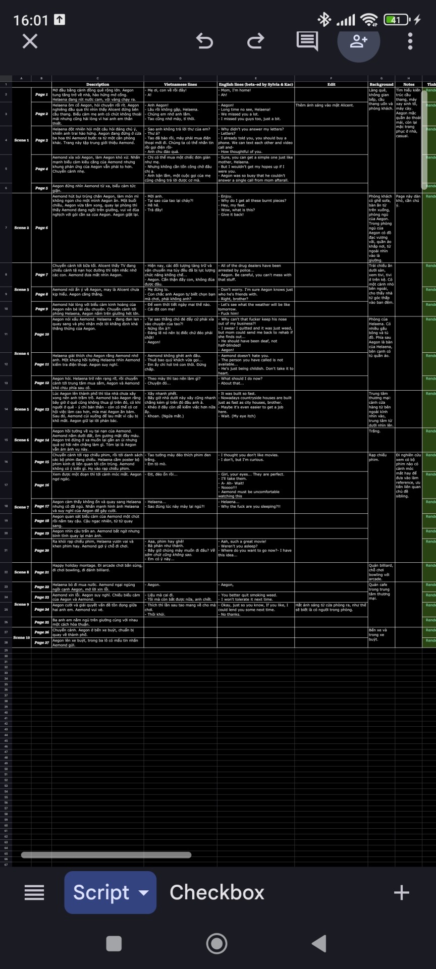
This is the private script that I used to track my drawing speed. It has overall page description, characters lines and my notes.
While drawing, I have doubt myself multiple times. Drawing and studying in the same time is very stressful to me. When I don't study, I have to draw, otherwise I won't be able to make it. Somehow I lost a lot of followers online and I thought that people wouldn't like my comic because it was too personal, not to mention my art is not that good. There are so many artists younger than me that are doing way better than me. I know drawing is essentially for yourself, but it's hard to deny that I would feel encouraged when people read my comic more than they don't. Luckily, I have received so many heartwarming comments from people I admire in the end. I was very happy and even feel more confident about my skills, although I knew I still have to practice a lot.
After finishing, I feel like it was kind of funny that I can't print this comic out because of my poor layout, but neither did it really suitable to read online. I have discovered comic layout in Medibang so I guess I wouldn't make that mistake again.
Now that I have to study for semester exams, I currently can't invest that much time in drawing anymore. But I still have plans to draw comic in the future and next year, if possible, I would like to join a convention. If you have any idea of merchandise or comic, just tell me right here, I might draw them if I can.
5 notes
·
View notes
Text
I'm happy to say that my objective experience playing a Pokémon game for the very first time has rendered this opinion of my very own: I prefer Pokémon Blue to Pokémon Moon!
Context: Though I grew up in a house with two Gameboys (OG and Pocket to stop us arguing about who's go it is, and actually being able to see anything with the Pocket's screen) we never had and Pokémon games... I knew of only the show and stopped after Brock left (ffs he was the best one next to Meowth #sorrythetruthishard plus painting on the cell vs digital colouring will have it's own appeal to me) So come 2016 and I took my friend Aly to our local Video Game retailer for a Midnight launch (actually I think it was get your game at 10pm, go out the back into another shop so we can play the game before midnight and therefore technically not break street date) once everyone else had collected their pre-orders, I bought a new 2DS "Wedge" console and really didn't bother with it (as I was still quite happy with my DS Lite from 08) So still I didn't play Pokémon (Might have started, but for what I will say shortly about Pokémon Moon, this will make so much sense)
Come a few weeks ago and I had borrowed a friend's copy of Pokémon Blue, and finally decided to give my first proper shake at Pokémon! and yeah, it's a fun game! for something that takes up less than half a Megabyte on a cartridge, they used smart game design to guide my experience though the game, and 25 hours in of bumbling around for the first time, I'm enjoying what must have been amazing back in the day! I've still allot to do in Pokémon Blue, but I'm having fun!
Pokémon Moon being arguably 20 years worth of experience in making the game, oh my fucking god! for context, I'm not trying to rush this one either, there's nice graphics! good designs, but when you get to a gate and you press A to go through it, rather than the gate animating, the screen fades, and you teleport to the other side... DID THEY SERIOUSLY AVOID ANIMATING A GATE OPENING ? I don't know if that changes later in the game, but WOW! Also I have how chatty everyone is, it's a huge detriment to the players to be told where to go as what feels like an extended tutorial...
Note: these are my early feeling about playing Pokémon Moon, dear god is it nice to game a game machine that doesn't need a light source over my shoulder! but I'm going to keep with bother Blue and Moon, but I know where my real time is going to be spent
...Hooking up my SNES and using the Super Gameboy to have a decent backlight screen!
5 notes
·
View notes
Note
Have you ever wanted to draw something but you fought due to your skill level at the time you decide not to do it
Honestly I don't think there's been a time in my life where I haven't experienced this. There's a file on my ipad I've had on the backburner for like probably over 4 years now; there's a really clear image in my head of a poster showing the detailed anatomy of an astronaut from the perspective of aliens who believe the spacesuit to be part of its body, and every time I come back to it, I keep saying I'll do it later because I just can't pull it off yet :') so yeah the struggle is real
That being said, I've personally found that apart from just 'don't draw it and let it haunt you for years until your confidence improves', there's two solutions that work for me
1: Just draw it the best you're able now, with the knowledge that it might suck (in your eyes) but there's no rule that says you can't come back and re-draw it a few months or years down the line once you've learned more, if you still want to. It can be super frustrating if you have a really concrete awesome image in your head that you know you can't execute the way you'd like, but treating it more like a rough draft than something that has to be perfect the first time around can help get around this. Genuinely I think about this post all the time now, I think it rewired my brain chemistry as an artist. Just accept it'll look bad, who give a shit!!!! If you draw the rough draft now, it'll either turn out better than you expected, or you'll figure out what you struggled with for next time. Either way you'll at least temporarily get The Image out of your head and satiate the Art Beast.
Which leads into...
2: Figure out if there's a specific aspect of the Thing that intimidates you the most and put some time into low-stakes practice with the skill that's blocking you. Usually it's gonna be something like perspective, anatomy, rendering/painting, struggling with dynamic poses, etc.
Starting a completely new skill from scratch sounds intimidating, but you're not starting from scratch, and if you sit yourself down and give it some dedicated practice, you WILL see improvement within the same day. Keep it up for a week or a month and you'll have learned a lot. If it's dynamic perspective, tell yourself "ok I am GOING to learn how to draw with perspective" and mess around with references, look up tutorials, draw other art pieces with perspective until you feel like you have a somewhat decent grasp of it. If it's anatomy or dynamic poses: (once again, cannot stress enough) use references. Trace and then copy references until you get a feel for the shapes (AdorkaStock is really good), practice figure drawing (Quickposes, Line of Action), watch Proko because they have really good videos on these things (1) (2) (3).
'Practice makes perfect' is simultaneously very correct and very unhelpful advice, but if you've got a good grasp of the fundamentals of art, picking up specific, individual skills to a 'good enough' level is not nearly as time-consuming and frustrating as trying to just get better at 'art' as a whole. It can be really good motivation tbh (at least for me), to have an image of something I want to create and telling myself "I am going to intentionally practice [indoor environments]/[perspective]/[faces]/[painting with unrealistic colors]/[insert specific skill] for a few weeks until I feel confident enough to draw this thing".
anyway sorry that was so long. idk if this is any help, just my personal experience
6 notes
·
View notes
Text
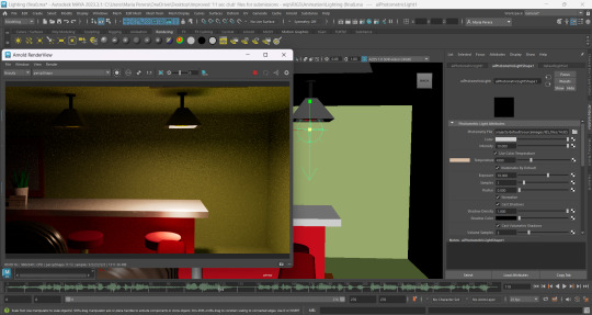
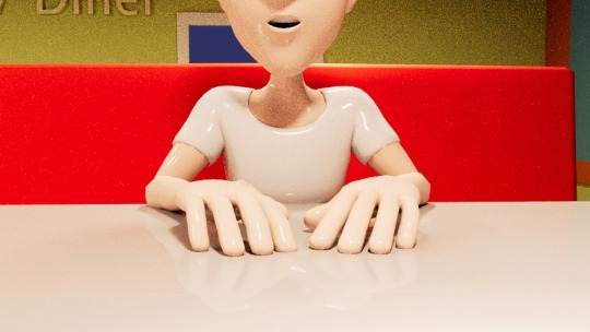
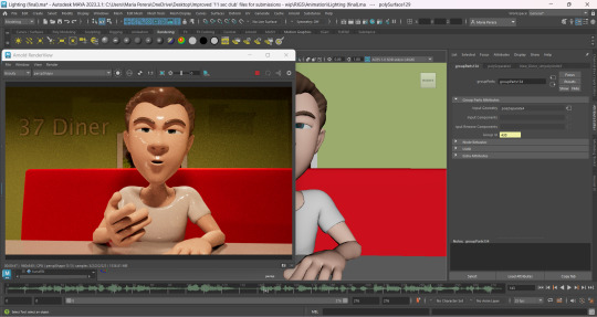
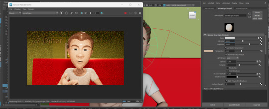
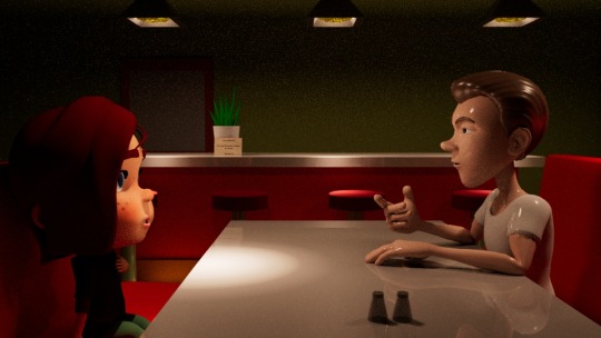
Light setup for the 11 second club animation (part 1)
19/04/2025
I just finished watching a video by 'Academic Phoenix Plus' on how to use photometric lighting in Maya and I want to give it a try for the 11 second club animation.
According to her, the photometric lighting can be done by using IES lighting. I downloaded the folder that she recommended to give this a try for the diner lights.
youtube
Work in progress:-
So, I just realized that this isn't necessarily a light source to fix to your bulb. This is used to cast realistic lighting onto a surface. But honestly, the set up looks pretty cool here! I'm planning to add some area lights (or mesh lights) to the bulbs so the lighting looks more realistic!
ufy7e8fefgeugfudgf
[OMG the lighting looks so much better lol]

So, I've used both the Photometric lights and mesh lights with the same color!
This is what all 5 scenes look like with this new lighting! I think the mesh light intensity is a bit much. I'm planning to add a nighttime hdri light to see if it'll make the setup look more interesting.


Tutorial I followed for the Hdri lighting :-
youtube
I downloaded the Satara night sky light from 'Hdri Haven' just to see if it'll add any interesting background light. But there wasn't much contribution from it..
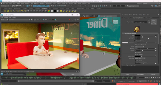
I think it might be best for me to reduce the intensity and exposure of the mesh light and then see if the lighting looks better!
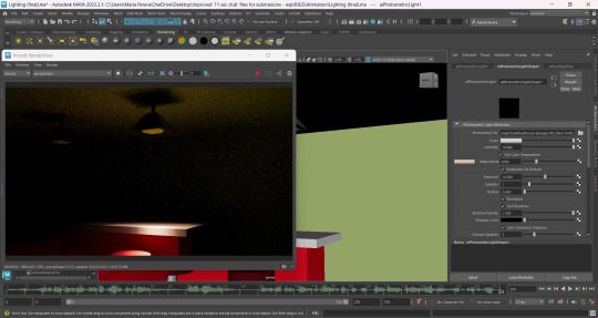
This time I changed the mesh light intensity and exposure to 5! Now the setup looks much better!
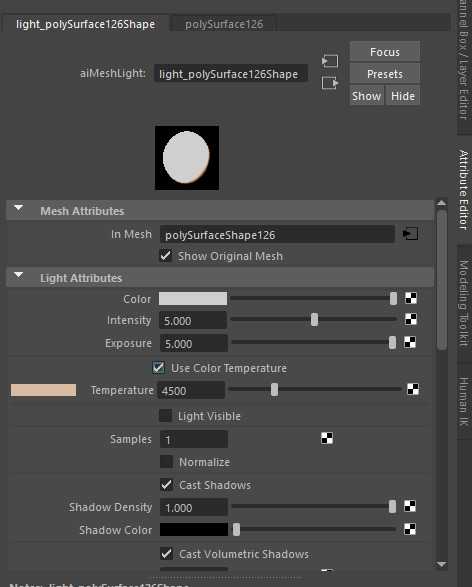

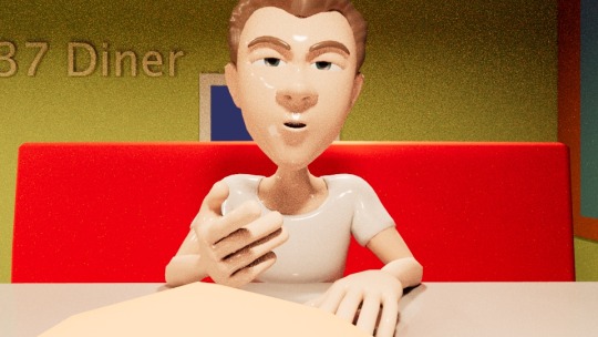
But...there's an issue with Clairee's eyes. She currently looks a bit scary, so I'll have to add in an eye light to give her eyes some glow!
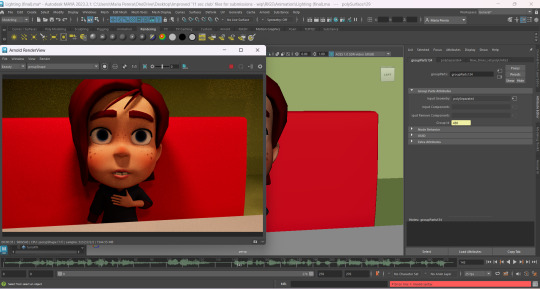
[My bad everyone. I forgot to turn on the Photometric lights back on. I did turn them on and the lighting looks better! But I still need to add in the eye light for Clairee]
Tutorial :-
youtube
Work in progress -
Alright, so I did make an attempt to add in the eye light for Clairee, but it wasn't working no matter how many times I scaled the lighting or moved it closer to her.
So, I decided to add in a face light! This was actually the best way to go about this since the shadows from the diner light cover Clairee's eyes. I added a face light for Tuna as well with different settings for intensity and exposure!
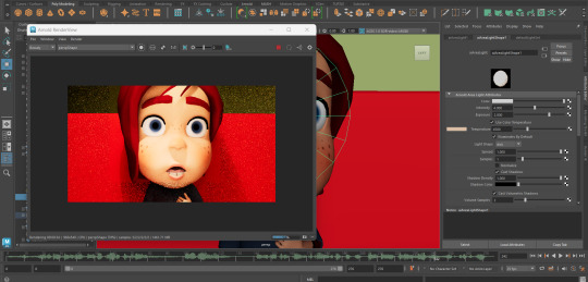
I toned down on the intensity for both the face lights after unhiding the photometric light!
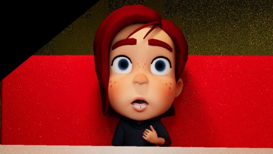

Below are some renders I've saved of the light setup in the diner! I'm so happy with the way they've turned out! ToT [Specially after my first attempt with the yellow mesh lights lol]
Shout out to Academic Phoenix Plus because her videos helped me figure out how to get the lighting right for this diner setup!

Before concluding this post, I would like to mention that I got rid of the hdri light since it didn't have any impact in elevating the diner scene. If I were to keep it unnecessarily, I would waste so much of render time. So, I decided to settle with a Dark-Greyish Blue for the night light!

That's all for this post! On my next post I will be recreating the story board with updated descriptions and camera shots, and I'll then get started on the animatic for the Hitchcockian animation!
0 notes
Text
Practicing Maya rendering
youtube
While searching for tutorials on how to create gemstones, I stumbled upon an incredible video about rendering. The video was a revelation it reminded me of the power of rendering in Maya, which I had completely overlooked, and how transformative it can be for my projects.
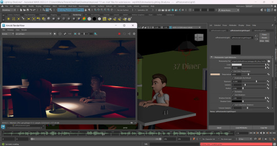
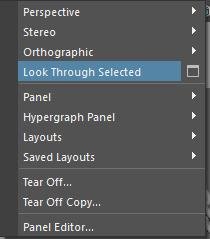
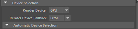
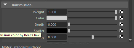
Following the tutorial, I began by placing a camera and using the "Look Through Selected" option. This feature allowed me to render the scene from any perspective within the camera's view. Then, in the camera settings located at the top of Maya's menu, I adjusted the preset to "1K_square," just as shown in the video. I also switched the render device to GPU to speed up the rendering process a valuable optimization that saves time and boosts efficiency in the long run.

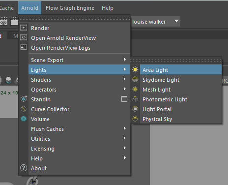
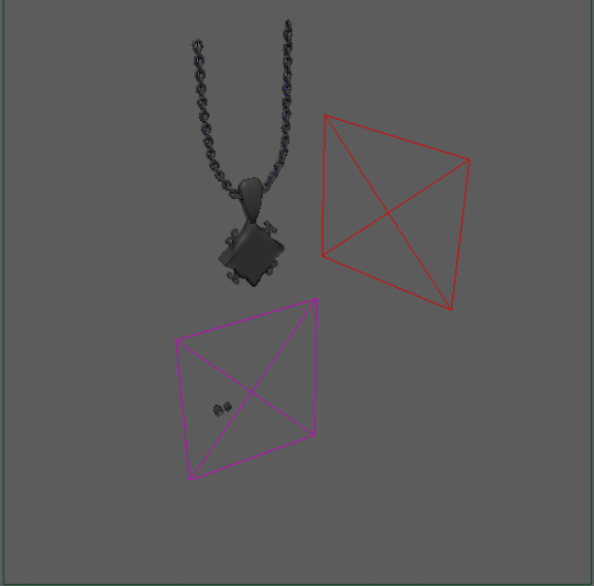
After setting up the camera I placed a light to ensure the scene was visible during rendering without it the render would appear entirely pitch black. I opted for an area light which provided flexibility in positioning. This allowed me to freely adjust the light's placement to achieve the desired illumination for my scene.
Before rendering the image I discovered the option to adjust the "metalness" of materials, which added a metallic and more realistic effect to the scene something I found particularly appealing. Inspired by the tutorial I also experimented with making the gem at the centre resemble glass. To achieve this I applied a standard material and modified the "weight" setting under transformation. However, the rendered result wasn't quite as I envisioned possibly due to the smooth nature of the object. I plan to address this by UV mapping the gem which might help achieve the desired effect in future renders.
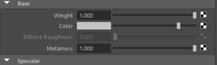
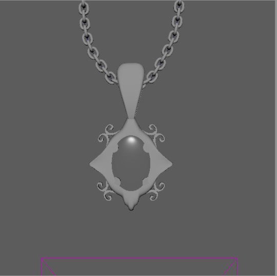
(before I applied metalness)
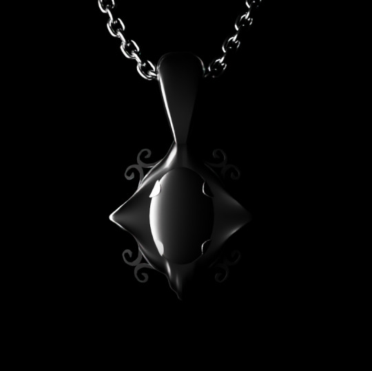
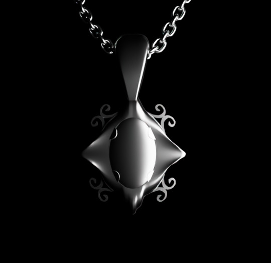
After clicking the render icon, I experimented with various lighting angles to enhance the scene's visual impact for my poster. This process allowed me to fine tune the illumination and achieve the perfect balance for presenting my work.
left-
right-
under-
above-
I plan to explore even more ideas for improving my render. The video later suggested using two lights for contrast which can be particularly effective as well as adding a background as light is reflected and bounces back onto the object. I'll definitely experiment with these techniques to take my project to the next level.
0 notes
Text
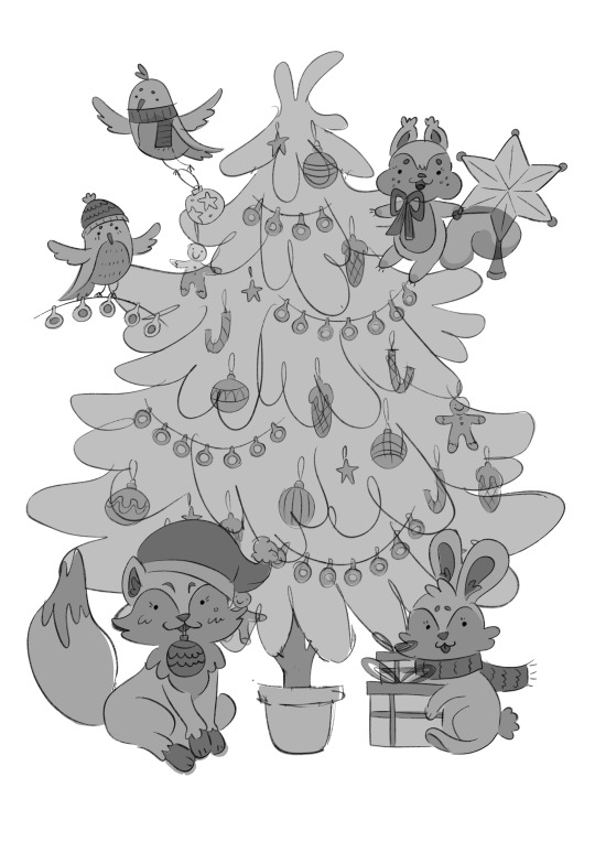
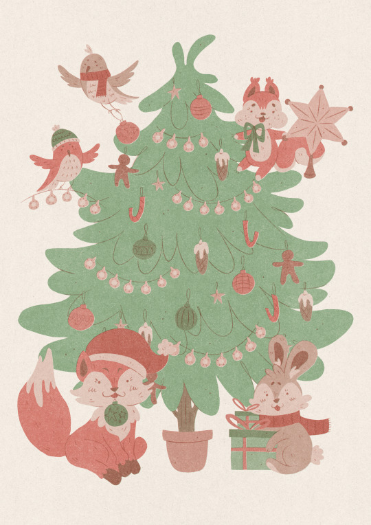
Monthly Summary - December
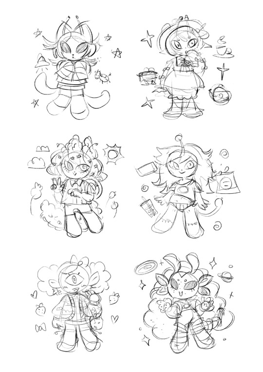
I started December working on my final piece. Initially, I planned to create character references using Gummy’s brushes, which I had previously practiced rendering my Jelly Cat with. However, my experience showed that rendering a more detailed character would take even longer than expected. I couldn’t afford to spend that much time on it, so I decided to scrap the idea and leave my character as a coloured sketch. I also experimented with creating more simplistic characters. My initial plan was to make a full illustration with a background, but I realized that the designs I had chosen might be too overwhelming in a backgrounded composition. I sketched several pages using various Sylvanian Family toys as references, but none of the results satisfied me, so I returned to my original idea.
At this point, I decided to start watching the course Exploring Landscapes: Travel-Inspired Gouache Paintings in Procreate by Yifat Fishman. The first few lessons focused on collecting references and making thumbnails for future illustrations. This helped me a lot in creating an interesting composition and selecting the best one to develop further. I refined two selected sketches, adding colour to them, and I was proud of the results.
The following week, we had to create cards for the pop-up shop. Although it wasn’t required, I chose a holiday theme. I was simply in the holiday spirit and thought it would be both more fun and more marketable. I spent a lot of time brainstorming ideas, but in the end, I was inspired by a card design featuring a Christmas tree in the center with a different character in each corner. The card was divided into four sections, creating four different cards. I found this idea compelling and decided to create something similar. My design featured forest animals—two birds, a squirrel, a fox, and a rabbit. Each contributing in their own way to bringing the tree to life. Since this was intended as a risograph print, I limited the design to only two colours to reduce the number of layers per print and streamline the process. However, when I attempted to print it, I ran into issues. The scanner, which reads black-and-white images, failed to pick up any opacity below 40-50%, while anything over 60% became over-saturated. It wasn’t until I asked the tutors that I learned some students were allowed to use USBs for printing, which made the process much easier and resulted in better colour accuracy. I’ve been here for years and had never been told about this. It’s frustrating to think of all the stress I could have avoided. In the end, I simply created a digital version of the print, and I’m quite happy with it.
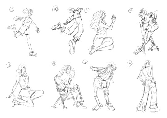
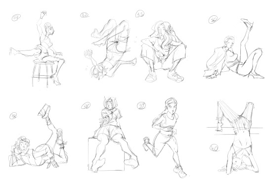
During the third week, I didn’t feel like continuing my final piece because I liked how my sketches looked and was a bit afraid of ruining them. Instead, I focused on creating 5-10 sketches of dynamic poses each day. By the end of the week, I could see my sketching ability improving. I also was watching tutorials on YouTube and experimented with background drawing using the selection/lasso tool, but I wasn’t entirely satisfied with the results.
Later that week, I sketched out some sticker ideas I was considering selling on Etsy. However, I lacked the motivation to finish them at the time, so I set them aside as a potential future project.
That’s how this month ended. With the holidays approaching, I didn’t want to work through the little time I had off. While this month may not have been as productive as others, I still laid the groundwork for my final pieces, which I will continue working on next month.
0 notes
Text
Why Choose React Framework for Your Next Web Development Project?
Are you looking for a modern, efficient, and powerful framework to build your next web application? React, a popular JavaScript library developed by Facebook, might be the perfect choice for your project.
React is celebrated among developers and stands out in web development.
1. What is React?
React is a JavaScript library for building user interfaces, particularly single-page applications. It allows developers to create reusable components, making the development process faster, more efficient, and easier to maintain.
2. Key Features of React Framework
Component-Based Architecture: React applications are built using small, reusable pieces of code called components. This modular approach simplifies development and enhances reusability.
Virtual DOM: React uses a Virtual DOM, which improves app performance by updating only the components that have changed instead of re-rendering the entire page.
Unidirectional Data Flow: This feature ensures that data flows in a single direction, making debugging and state management more predictable.
Rich Ecosystem: React has a vast ecosystem of libraries and tools, allowing developers to build robust and feature-rich applications.
3. Advantages of Using React
Fast Rendering: Thanks to the Virtual DOM, React offers blazing-fast rendering speeds.
Scalability: React is suitable for projects of all sizes, from small websites to large-scale applications.
Community Support: With an active and large developer community, you’ll find solutions, libraries, and tutorials for almost any challenge.
SEO-Friendly: React allows developers to build applications that are optimized for search engines, enhancing visibility.
4. Why React is a Developer's Favorite
React’s simplicity and flexibility make it an ideal choice for both beginners and experienced developers.
Its syntax is easy to learn, especially if you have a basic understanding of JavaScript.
Furthermore, its ability to integrate seamlessly with other libraries and frameworks offers endless possibilities for creating dynamic, interactive web applications.
5. Use Cases of React
React is perfect for:
Single-page applications
E-commerce platforms
Social media applications
Interactive dashboards
Progressive Web Apps (PWAs)
Start Your React Journey Today!
React is more than just a framework; it's a revolution in web development.
Whether you’re building a simple app or a complex interface, React can help you achieve your goals efficiently and effectively.
If you’re eager to learn React, now is the time! Enroll in a React course or explore its extensive documentation to start building amazing web applications.
👉 Ready to dive into React? Let’s build something extraordinary!
Feel free to share your thoughts or questions about React in the comments below. Let’s keep the conversation going! 🚀
#ReactJS #WebDevelopment #JavaScript #ReactFramework #CodingLife
#react js online training#react course#reactnative#placement service#reactnativecourse#job support#web design#reactjscourse#web development#reactjs#reactframework#reactjsframework
0 notes