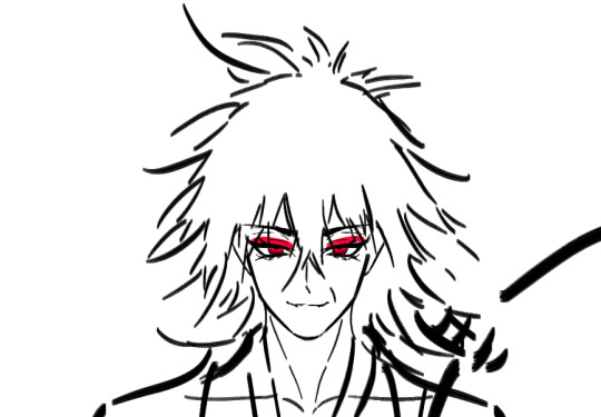
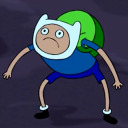
#the scene looked sooo good i needed to redraw it!
Text
Epic Fight-Scene 💥✨️
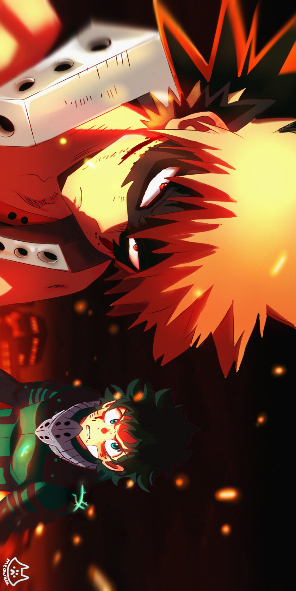
#fanart#my fanart#bnha bakugou#boko no hero academia#my hero academia#bakugou katsuki#mha izuku#izuku mydoria#the scene looked sooo good i needed to redraw it!#badass#slightly changed
36 notes
·
View notes
Text
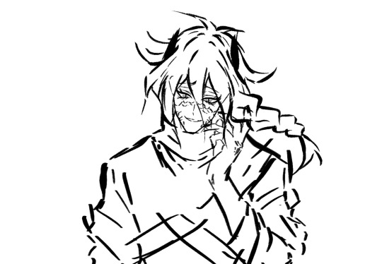
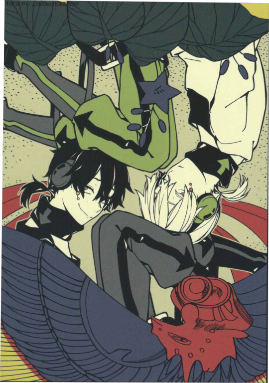
【KagePro】 Kuroha's Manga Route 2 Design 🖤❤️🐍
New (Version 2.0)


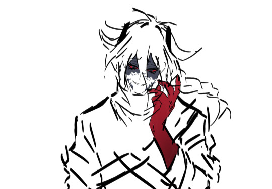
Old vs. New (Version 1.0)


Judar Doodles (Close Ups)


Intro Rambles
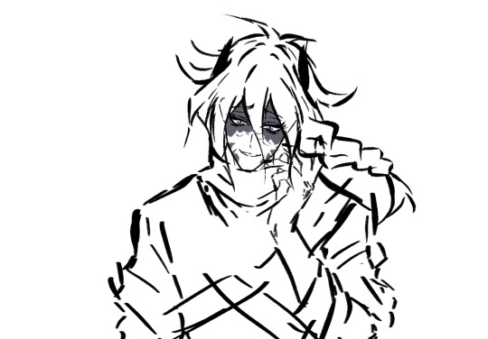
Judar doodles (close ups) 🖤 ❤️ 🐈⬛
1st pic: OG (Oil Paint Flat brush)
2nd pic: Change brush type to Aalmaluar's weighted lines brush
3rd pic: Filling in the 2nd pic manually with black strokes
Difference is so subtle but interesting… They all look good so it's up to me to decide which one I want
Since CSP makes it easy to change the brush type and size of your lines
Intro Rambles
My first time drawing Kuroha's Manga Route 2 Design 🖤 ❤️ 🐍
I drew the old ones yesterday!
Did a redraw of Kuroha's face cuz I wasn't fully satisfied
New version: Changed the old one's eyes to the new brush type
Yippee!!!
I've been playing around with a new brush. I usually use CSP's old Oil paint flat brush (Version 1.10) but I've been trying out Aalmaluar (@/aalmaluar.t)'s brush set.
It's harder for me to control right now since I'm not used to it, but I love the weighted strokes… It's clearer and sharper than my old brush, which has a blunt softer edge. Both are nice
My style has really prominent thick eyelashes so it just doesn't look good when they can't be seen. I think the compromise for the black snake skin scales on his face is to lower the opacity to a dark gray, use a dark screentone, or use pitch black but outline the lines with white.
I bought from Aalmaluar's brush pack and figure drawing/gesture drawing challenge set, so I wanted to test out the brushes. I wanna level up my art game (over time) 🙏
That brush has a really crisp look… And can draw finer details easier
The oil paint flat brush I'd been using since 2022 ~ 2023 has a blunt edge and softer look
I think using a dark gray or dark screentone looks the best in this case. Both of Kuroha/Saeru's designs are really good (tfw a Konoha recolour is still peak)
I love the Manga design's cute hair tufts, black horns, black snake skin scales on his face, black/red darkened gradient limbs, and braids in the back that resembles a scorpion's tail like Judar's braids 🖤 ❤️ 🤭


Feila's Rambles


Kuroha teasing Ene is so cute 🥰
“Because let’s be for real here, SHAFT would nerf his hotness”
BHBHHBHB I AGREE WITH THIS
MCA ALREADY NERFED HIS HOTNESS
JUST LOOK AT SIDU'S ARTS COMPARED TO MCA

Like both the Black Konoha (Konoha recolour) and the Manga Route 2 design are so good…
The braids and snake scales in this design are so peak
Like the art style SHAFT chose for MCA is sooo… ugly. Doesn't capture my faves' beauty at all
Ene is SO pretty in Sidu's art style and MCA just doesn't capture my wife's cuteness at all (aside from some chibi Ene scenes)
Though content of my faves is still content of my faves, I'll take what I can get
...
I really want to see Sidu's concept art sketches for Kuroha/Saeru's Manga Route 2 design cuz I wanna see what the canon colours are
I assume it's either like… gray and black, or red and black for the top and bottom clothes? Cuz the colours used in the Children Record Re:boot MV don't actually correspond 1:1 to the canon colours, so I wonder…
A: His hair looks like a scorpion tail, which is really cool
Me: YEAHH Kuroha/Saeru's Manga Route 2 design has black snake scales on his face, a braid in the back and horns/tufts of hair on the sides
Reminds me Ohtaka (Magi mangaka) said she designed Magi charas' shape language on animals
Judar's hair braids' shape language is based on a scorpion's tail
I need to draw KuroEne with Kuroha in his Manga Route 2 Design omg
...
KuroEne AU: Dialogue Scripts (WIP)
Reminds me I had this KuroEne AU idea before:
Ngl it would be really fun if Ene in her tsundere denial tries to tell Kuroha/Saeru that she would not be doing this with him (being intimate with him) if it weren’t for the fact that he’s possessing Konoha’s body. Kuroha gets amused by the seeming challenging nature of her insinuation.
So then, Kuroha/Saeru uses Konoha’s Eye Ability, Awakening Eyes, and changes his body, appearance, and clothes, turning into his alternate form (Manga Route 2 Design) in front of Ene.
Ene counters him with how, even if he’s changed his appearance, he’s still using Konoha’s body.


...


F: Also wanna point out the fact that these hair parts looks like hamster ears (specifically the non-perked up ones)
It looks like sad animal ears in general 😭
He looks horrifyingly stupid-ly cute
Me: WHDSHHHDSH I NEVER REALIZED THAT'S SO CUTE 😭 Snek (hamster) bf + bunny gf 🐍🐇
Ene: Can I flick your hair? Stuff your cheeks like a hamster's? You think I could put you in my pocket? (:D)
Ene: You don't look too threatening anymore! You look like the sad hamster meme-
Kuroha: (.) 🧍
F: LMAO 😭😭😭
She said that so casually towards someone that's a whole ruler taller than her, the confidence👏
Note:
Takane/Ene: 157 cm (5'1")
Haruka/Konoha/Kuroha: 182 cm (6'0")
Height Difference: 25 cm
#Mainly KagePro rambles but a bit of Magi in here too#Since I like drawing similarities between my faves#And am constantly reminded of them#kagepro#kagerou project#kuroha#ene#enomoto takane#takane enomoto#dark konoha#black konoha#saeru#me ga saeru hebi#saeru hebi#snake of clearing eyes#kuroha x ene#kuroene#saeene#saeru x ene#dark konoha x ene#black konoha x ene#sen's rambles#sen's ideas
2 notes
·
View notes
Text
putting the g*LO*w back in LO (pt 5)
doing some KRONOS today, sorry if I seem extra salty, I'm running on 2 hours of sleep and have just found out I have to replace my phone ( :
S2.2 Kronos is, frankly, a huge joke. He's reduced from this psychotic tyrant to a goofy, stupid airhead of a "villain". To me the best comparison I can make is Ultron from The Avengers - when Age of Ultron came out, one of the biggest disappointments was the mischaracterization and mishandling of Ultron, who was teased to be this terrifying, merciless entity, but ultimately reduced to a gag in the final film. The S2 finale fight scene really seals the deal, operating as pure MCU bait content that doesn't serve the story in any way and feels more like an obligatory "make Persephone look good" fight scene than a real conflict.
So these new glow edits are meant to fix some of those issues in Kronos. Yeah, this goes WAY further than the glow but idgaf because the whole point of this project isn't JUST for the glow, but to achieve that S1 look, including but not limited to the glow. And sometimes that means I'm gonna have to tweak stuff beyond the glow.
So yeah, let's get this going!
Old and busted: New hotness:

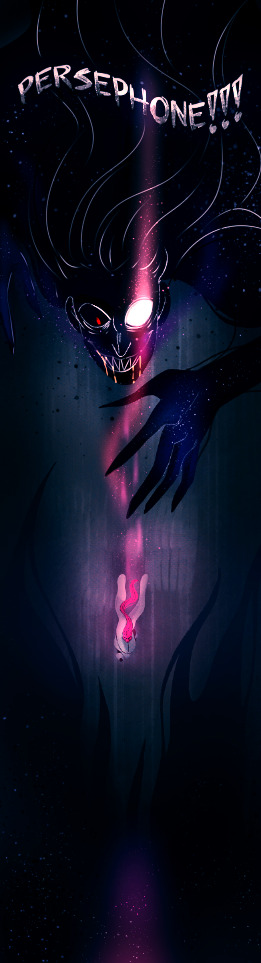
I just needed to remove those caterpillar eyebrows and fix that goofy ass tooth mouth. Also, have some ichor dripping out of his mouth! He did just consume Zeus after all and he IS the guy who typically eats people o-o
"Don't touch him ;-;" : "DON'T TOUCH HIM" :
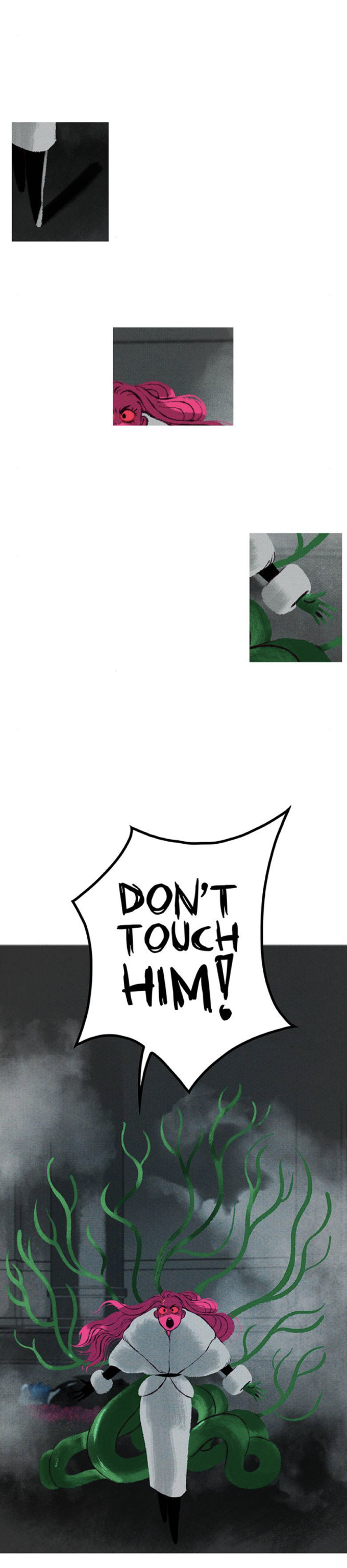
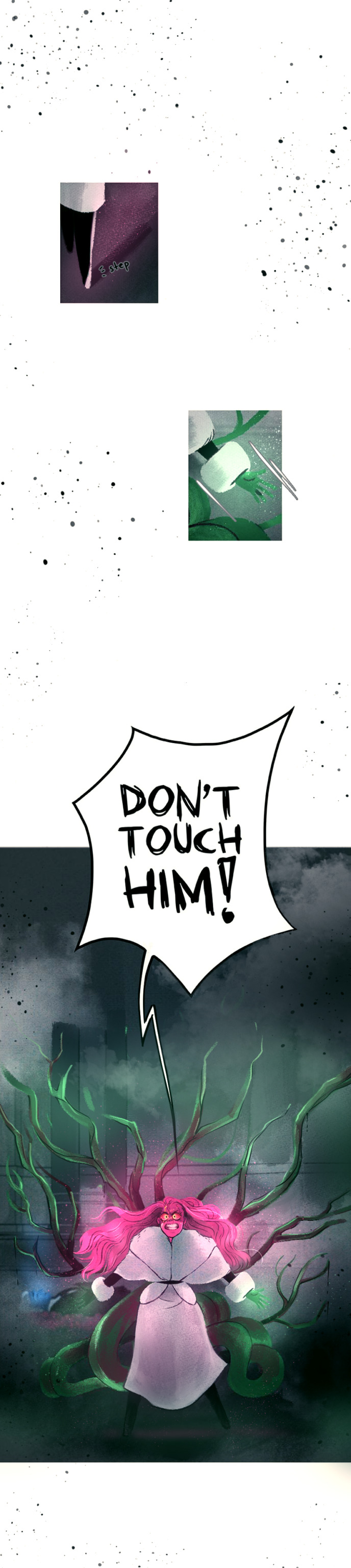
(and yeah i had to fix her legs and the walrus coat here, girl looks like she's being eaten by a croissant and she's not doing a defensive pose in the slightest in the original panel. I also removed the middle panel of her eye/hair because it just seems like a pointless step in the build-up process here and it's way more obviously copy+pasted than the others)
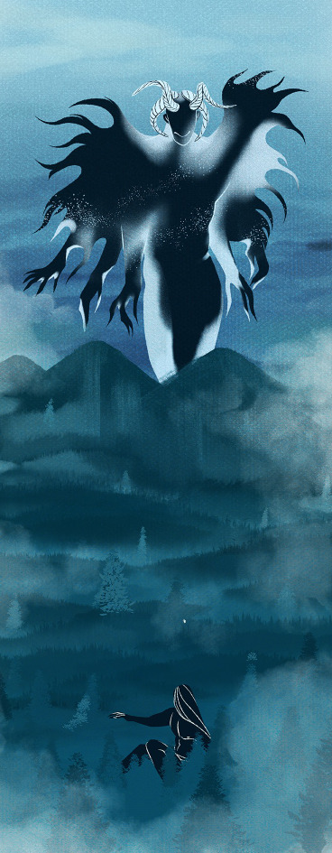
As for the actual season finale, ima be honest, a lot of the panels from the Kronos fight scene just aren't good on a composition level, let alone when it comes to the final rendering, and I'm not about to go redrawing entire panels. But this one sorta felt doable for me sooo here ya go:

By the way, if y'all have any requests for specific panels you want me to glow up in the style of S1, feel free to send 'em my way! This has been a fun lil' side project so far and it really pushes me out of my usual comfort zone (as it's a style I don't typically work in).
175 notes
·
View notes
Note
Tell us about “is that allowed”
LOL okay... so there's this scene from BIRDMEN where they're in this cafe and this painting of Bernini's Ecstasy of Saint Teresa sculpture is just?? casually hanging on the wall????

And I wrote an essay on its symbolic significance but I still couldn't get over the idea that in-universe someone looked at st teresa having a time and was like "yeah that's perfect for my cafe". At one point the sentence "What if we kissed under the Ecstasy of Saint Teresa at the local Pizza Hut" spawned and it was all downhill from there. I need you to understand that I started painting this for the bit.

Originally the painting in the bg was actually just going to be a study of the Bernini sculpture but then on a different day I was stricken with a different madness (normal about Karasuma and Umino hours) and I started doing a redraw with them and Shiba as st teresa and I was like. wow. you know where this would go perfectly. in that one unfinished painting of eishi and rei kissing in the cafe.
obviously the document title is from the vine where the guy filming points at this girl having a pda moment with her [hotly debated whether it's a real guy or a sex doll] in public and yells "What the fuck? Is this allowed? What the fuck— is that allowed?"
I wasn't good at painting skin back then (and I still don't think I'm good at it now) but probably everything will have to be redone LOL. But I'm sooo determined to finish this this is so fucking funny. I think if I finish it and it looks really good it truly will be one of the most baffling pieces of fanart anyone could come across (although I do think it's more confusing if it actually was a painting study of the original sculpture. because then people would recognize that and go, "What the hell is THAT doing here") It's always for the bit. the Kaishin communism comic? for the bit. even when I'm serious it's to be funny. I hope you can understand.
12 notes
·
View notes
Photo

Process and wip images for A House That Holds Long Limbs (Part 2)
See Part 1 process and wip documentation
Read the pages for part 2 here (full complete version will be linked from YYH North Bound master post)
As a story progresses, I tend to become more comfortable with jumping ahead and around in my so-called process. This is mainly because the idea of getting deeper into the action is exciting and I want to get to drawing the pages as quickly as possible. The downside is that it usually results in a lot of “oops” and rework on what was supposed to be a final page.
Here you’ll see that script/pagination/thumbnailing and final pages are all starting to drift even more than in Part 1.
The (last version of the) script
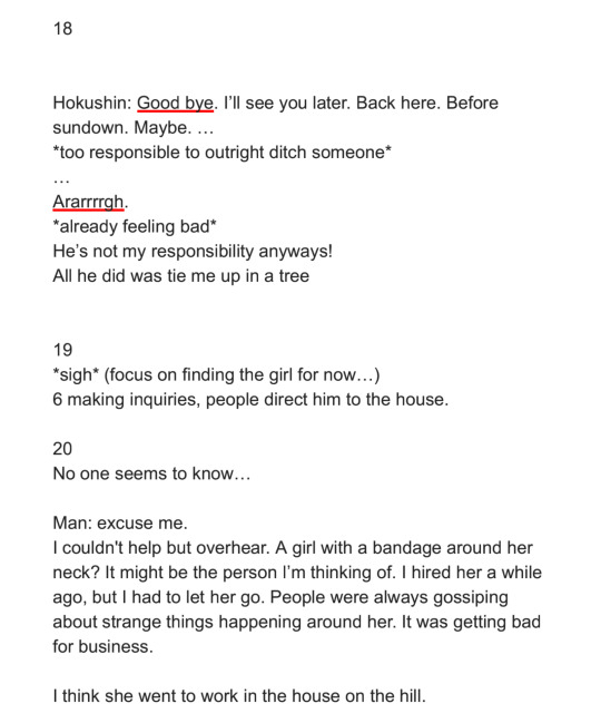
Earlier versions were even more point form and incoherent with typos. But, it only needs to capture enough that I can recognize key actions, points of dialogue, the mood, things to draw in the panels, etc. A few specific items to point out:
“[new part 2]”: The script originally had no exposition on rokurokubi - it went straight to Hokushin telling Raizen he was leaving. It occurred to me later, after I’d started thumbnailing, that inserting a few pages of storytelling narrative right here would help to further solidify the kaidan (traditional Japanese ghost story) effect and mood. More importantly, it creates a baseline reference for what the reader will know about rokurokubi for the purposes of this story. I was lucky that Part 1 and Part 2 were cut neatly enough that this wouldn’t be jarring.
I’m still not entirely happy with the text for this section, mainly the “features of note” about rokurokubi. Not just the fact that it’s oversimplification and slight adaptation of actual Japanese folklore - which can’t be avoided unless I want to write a historical essay here. I’m mainly not super keen on how each of the three items has been phrased. It’d be nice to make the three points more parallel in terms of length, but I couldn’t seem to edit, increase the number of points (by splitting them up), or reorder it effectively without negatively impacting other aspects of pacing and information reveal. More points would draw out the pages longer than I wanted, and some points were clearly sub to other points. The final here is the “good enough” version. JUST GET IT DONE ALREADY SO THAT IT CAN GO OUT INTO THE WORLD.
Sooo many word choice changes. The biggest one, done at the last second, was “They are almost always female” to “They are rarely male”. Other phrasings I debated - “They are very rarely male”, “They are almost never male”, etc. Lemme tell ya, it’s easy to get lost in the weeds… Anyways, the main reason for this was because after I drew it and ran the text through my head, the originally-intended juxtaposition of Hokushin on this page with the word “female” felt too subtle. I felt it would create a brief moment of cognitive dissonance that didn’t serve the flow of the story, so I changed it to create emphasis on the same gender instead with the rationale that it will flow more smoothly and allow the reader to focus their attention on the fact “males are very rare” more than the mental hiccup of processing the juxtaposition. DOES THAT MAKE ANY SENSE?? It made sense in my head.
Anyhow, I’m sure there are people who will disagree with many of the decisions I’ve made, but at least you can see what I was trying to do.
Thumbnails
As mentioned, these thumbnails were done BEFORE I decided to insert the exposition at the beginning.
The first two rows on the left hand page are actually the same set of pages - you can see little arrows pointing down or to the right whenever I’m dissatisfied with a thumbnail and attempt to redraw it.
WIPs
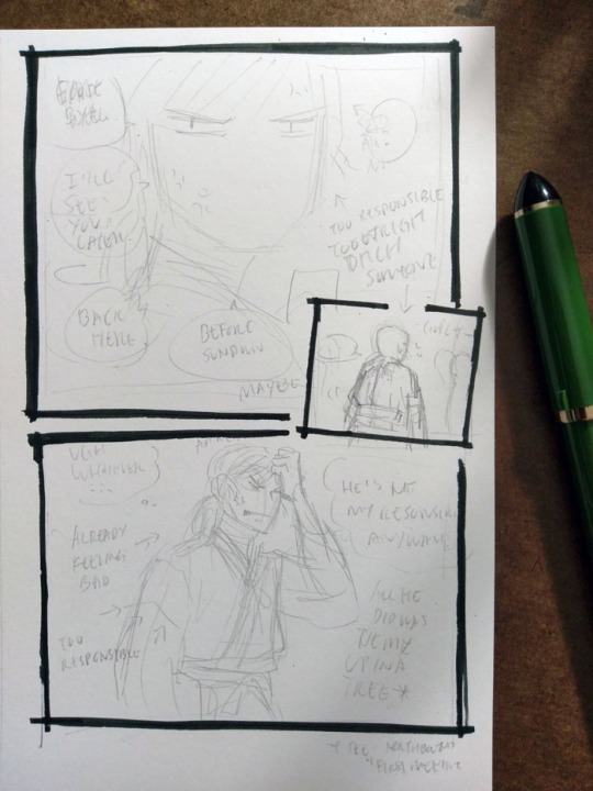
I really like how Hokushin turned out in the last panel here; I like the pencils more than the final inked version. It’s also another example of changing text up to the last second. In case it’s hard to make out, it says (along with what happened to them in the final):
First thought bubble: Ugh, whatever… (moved to the next page, seemed to work better as the end exclamation for this sequence of thoughts before he turns his attention to something else)
Over Hokushin’s head: Aaaargh (moved into the thought bubble)
Second thought bubble: He’s not my responsibility anyways! (no change)
First arrow: *already feeling bad* (no change)
Second arrow: *too responsible* (dropped, since a previous panel already said “too responsible”. Too redundant)
Next to Hokushin: All he did was tie me up in a tree (no change)
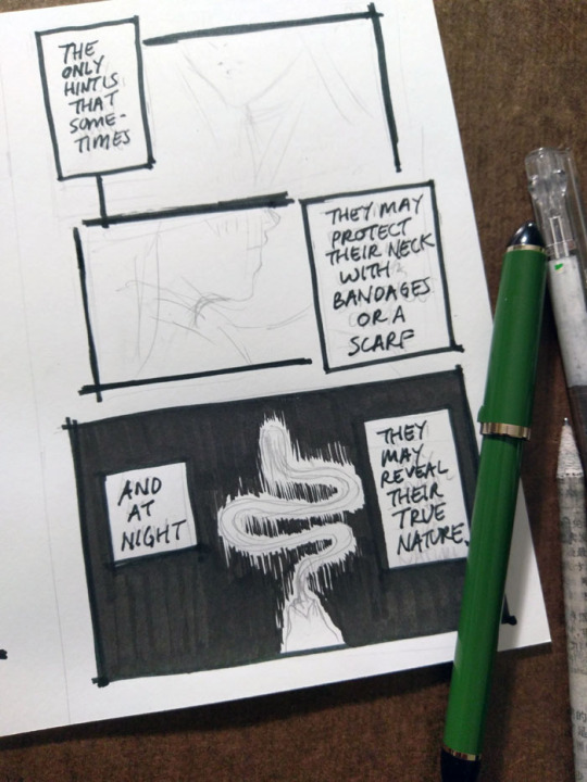
The above panel “And at night...” was a thrilling and scary thing for me lmao. I don’t usually tackle large patches/fills of black, since many of my comics are scribbly in style (pencils, hatching) or colour. I’m too lazy for screentones, traditional or digital. It’ll be interesting as parts of the story coming up will involve poorly lit/dim/dark spaces. I’ve been reviewing how other artists handle it, particularly those with styles driven by pure-ink or minimalist type approaches. Two immediate examples from Yu Yu Hakusho that I’ve been going back to are the dark room fights during Genkai’s successor trials (I’ve taken a similar approach here), and the haunted bedroom case in volume 19. Hardcore cross-hatching seems like a likely route, but that freaks me out when I have to do it over faces. I’d like to minimize or avoid screentoning out of principle, but I still want to create a clear mood, so we’ll see how it goes...

This was my view while inking this page - holding the book in one hand while inking Hokushin with the other. Using the more freehand, sketchy inking style for this comic was so helpful in terms of reducing my inking anxiety and allowing me to work faster.
It’s always great when you can find a reference for period armor (because I find armor very difficult) that is so close to the pose you’re already drawing. There are some small differences - for example, Hokushin’s head is turned more to the right; his left arm is turned and raised more as he’s pulling the sword upwards. But it’s close enough.
Also, spotlight on a few of the books I’ve referenced over the course of working on North Bound in general and this part specifically.
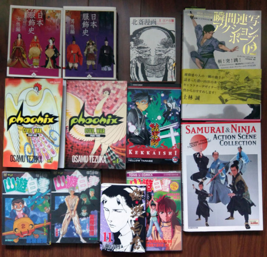
Clockwise from top left:
日本服飾史 女性編 and 男性編 (History of clothing/costume in Japan female and male editions). This marvelous set of books highlights Japanese fashion throughout history. I’ve actually been referencing these photos for a long time before I ever picked up these books - you can see them at the Costume Museum’s website here, alongside helpful line drawings and translations of some of the details. But the books allow me to see a lot more detail.
Hokusai manga vol 1 (this book is published as part of a set of 3). Sketches by Hokusai. This one focuses on “The life and manners of the day” and includes drawings of youkai, including rokurokubi, as well. You can check out the drawings online at places like The Pulverer Collection Online Catalogue.
Action references!! Real Action Pose Collection 02 (focuses on sword fights) and my favourite Samurai & Ninja Action Scene Collection. Not used as much in Long Limbs, but was helpful in some of the other chapters. The time frame is really much later than what I need for ideal clothing references, but it’s helpful for things like movement.
Kekkaishi volume 32. SPOILER a key flashback takes place about 500 years ago, which is actually a few centuries off give or take from but at least it’s closer than the Edo period. I’ve been looking at it for houses, some clothing.
Osamu Tezuka’s Phoenix - Civil War parts 1 and 2. I reference this so much while working on North Bound in general. It has scenes with peasants and commoners and some appropriate street and interior environments, not just stuff focused on the aristocracy or warrior classes. Just have to remember that they flipped all the artwork in the English version lol
Bunch of Yu Yu Hakusho manga and anime references from the end of the series, mostly for Raizen, the kudakusushi and just to check against things he or Hokushin said. The actual clothing and environments are not helpful at all lol
Last minute edits
After I posted, I discovered a few mistakes (of course). I used to freak out a lot and drop everything to fix it. Now I just sigh and laugh (and still freak out a little bit, depending on the mistake) and then decide what’s important enough to fix and what is like, “Oh well, whatever, move on with my life”.
I feel that seeing other artists share their frustrations and mistakes helps a lot of people feel better about it when they realize IT HAPPENS ALL THE TIME TO EVERYONE (including professionals. There are errors like this in professionally published series, like Yu Yu Hakusho, too). YOU’RE NOT ALONE.
So, these ones bugged me enough that I quickly redrew them on the computer.

#yu yu hakusho#comics#fanart#hokushin#process#wip#art supplies#sketches#art by Maiji/Mary Huang#yyh north bound#raizen
6 notes
·
View notes
Last Seen Blogs

sir-maximillian-goof
WHAT THE BLOG SAYS MAX... WE WILL FOLLOW

independent-fangirl
Just some stuff
adventurade
★☆★☆★
leonaluv
Leonaluv

nuttykryptonitex
Untitled