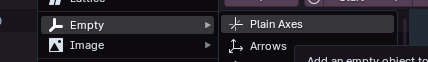
#this is a simple two keyframe interpolation but
Explore tagged Tumblr posts
Visit Tumblr Blog
Explore Tumblr blogs with no restrictions, modern design and the best experience.
Last Seen Tumblr Blogs


Fun Fact
In 2020, 44% of users from Denmark used Tumblr daily.
Text

lazing around on the blender default cube
#kingdom hearts#antisora#kh sora#getting better with blender#this is a simple two keyframe interpolation but#my next quest is trying to offset the animations so its not just everything synced up
364 notes
·
View notes
Text
Bridging the ‘Space Between’ in Generative Video
New Post has been published on https://thedigitalinsider.com/bridging-the-space-between-in-generative-video/
Bridging the ‘Space Between’ in Generative Video
New research from China is offering an improved method of interpolating the gap between two temporally-distanced video frames – one of the most crucial challenges in the current race towards realism for generative AI video, as well as for video codec compression.
In the example video below, we see in the leftmost column a ‘start’ (above left) and ‘end’ (lower left) frame. The task that the competing systems must undertake is to guess how the subject in the two pictures would get from frame A to frame B. In animation, this process is called tweening, and harks back to the silent era of movie-making.
Click to play. In the first, left-most column, we see the proposed start and end frame. In the middle column, and at the top of the third (rightmost) column, we see three prior approaches to this challenge. Lower right, we see that the new method obtains a far more convincing result in providing the interstitial frames. Source: https://fcvg-inbetween.github.io/
The new method proposed by the Chinese researchers is called Frame-wise Conditions-driven Video Generation (FCVG), and its results can be seen in the lower-right of the video above, providing a smooth and logical transition from one still frame to the next.
By contrast, we can see that one of the most celebrated frameworks for video interpolation, Google’s Frame Interpolation for Large Motion (FILM) project, struggles, as many similar outings struggle, with interpreting large and bold motion.
The other two rival frameworks visualized in the video, Time Reversal Fusion (TRF) and Generative Inbetweening (GI), provide a less skewed interpretation, but have created frenetic and even comic dance moves, neither of which respects the implicit logic of the two supplied frames.
Click to play. Two imperfect solutions to the tweening problem. Left, FILM treats the two frames as simple morph targets. Right, TRF knows that some form of dancing needs to be inserted, but comes up with an impracticable solution that demonstrates anatomical anomalies.
Above-left, we can take a closer look at how FILM is approaching the problem. Though FILM was designed to be able to handle large motion, in contrast to prior approaches based on optical flow, it still lacks a semantic understanding of what should be happening between the two supplied keyframes, and simply performs a 1980/90s-style morph between the frames. FILM has no semantic architecture, such as a Latent Diffusion Model like Stable Diffusion, to aid in creating an appropriate bridge between the frames.
To the right, in the video above, we see TRF’s effort, where Stable Video Diffusion (SVD) is used to more intelligently ‘guess’ how a dancing motion apposite to the two user-supplied frames might be – but it has made a bold and implausible approximation.
FCVG, seen below, makes a more credible job of guessing the movement and content between the two frames:
Click to play. FCVG improves upon former approaches, but is far from perfect.
There are still artefacts, such as unwanted morphing of hands and facial identity, but this version is superficially the most plausible – and any improvement on the state of the art needs to be considered against the enormous difficulty that the task proposes; and the great obstacle that the challenge presents to the future of AI-generated video.
Why Interpolation Matters
As we have pointed out before, the ability to plausibly fill in video content between two user-supplied frames is one of the best ways to maintain temporal consistency in generative video, since two real and consecutive photos of the same person will naturally contain consistent elements such as clothing, hair and environment.
When only a single starting frame is used, the limited attention window of a generative system, which often only takes nearby frames into account, will tend to gradually ‘evolve’ facets of the subject matter, until (for instance) a man becomes another man (or a woman), or proves to have ‘morphing’ clothing – among many other distractions that are commonly generated in open source T2V systems, and in most of the paid solutions, such as Kling:
Click to play. Feeding the new paper’s two (real) source frames into Kling, with the prompt ‘A man dancing on a roof’, did not result in an ideal solution. Though Kling 1.6 was available at the time of creation, V1.5 is the latest to support user-input start and end frames. Source: https://klingai.com/
Is the Problem Already Solved?
By contrast, some commercial, closed-source and proprietary systems seem to be doing better with the problem – notably RunwayML, which was able to create very plausible inbetweening of the two source frames:
Click to play. RunwayML’s diffusion-based interpolation is very effective. Source: https://app.runwayml.com/
Repeating the exercise, RunwayML produced a second, equally credible result:
Click to play. The second run of the RunwayML sequence.
One problem here is that we can learn nothing about the challenges involved, nor advance the open-source state of the art, from a proprietary system. We cannot know whether this superior rendering has been achieved by unique architectural approaches, by data (or data curation methods such as filtering and annotation), or any combination of these and other possible research innovations.
Secondly, smaller outfits, such as visual effects companies, cannot in the long term depend on B2B API-driven services that could potentially undermine their logistical planning with a single price hike – particularly if one service should come to dominate the market, and therefore be more disposed to increase prices.
When the Rights Are Wrong
Far more importantly, if a well-performing commercial model is trained on unlicensed data, as appears to be the case with RunwayML, any company using such services could risk downstream legal exposure.
Since laws (and some lawsuits) last longer than presidents, and since the crucial US market is among the most litigious in the world, the current trend towards greater legislative oversight for AI training data seems likely to survive the ‘light touch’ of Donald Trump’s next presidential term.
Therefore the computer vision research sector will have to tackle this problem the hard way, in order that any emerging solutions might endure over the long term.
FCVG
The new method from China is presented in a paper titled Generative Inbetweening through Frame-wise Conditions-Driven Video Generation, and comes from five researchers across the Harbin Institute of Technology and Tianjin University.
FCVG solves the problem of ambiguity in the interpolation task by utilizing frame-wise conditions, together with a framework that delineates edges in the user-supplied start and end frames, which helps the process to keep a more consistent track of the transitions between individual frames, and also the overall effect.
Frame-wise conditioning involves breaking down the creation of interstitial frames into sub-tasks, instead of trying to fill in a very large semantic vacuum between two frames (and the longer the requested video output, the larger that semantic distance is).
In the graphic below, from the paper, the authors compare the aforementioned time-reversal (TRF) method to theirs. TRF creates two video generation paths using a pre-trained image-to-video model (SVD). One is a ‘forward’ path conditioned on the start frame, and the other a ‘backward’ path conditioned on the end frame. Both paths start from the same random noise. This is illustrated to the left of the image below:
Comparison of prior approaches to FCVG. Source: https://arxiv.org/pdf/2412.11755
The authors assert that FCVG is an improvement over time-reversal methods because it reduces ambiguity in video generation, by giving each frame its own explicit condition, leading to more stable and consistent output.
Time-reversal methods such as TRF, the paper asserts, can lead to ambiguity, because the forward and backward generation paths can diverge, causing misalignment or inconsistencies. FCVG addresses this by using frame-wise conditions derived from matched lines between the start and end frames (lower-right in image above), which guide the generation process.
Click to play. Another comparison from the FCVG project page.
Time reversal enables the use of pre-trained video generation models for inbetweening but has some drawbacks. The motion generated by I2V models is diverse rather than stable. While this is useful for pure image-to-video (I2V) tasks, it creates ambiguity, and leads to misaligned or inconsistent video paths.
Time reversal also requires laborious tuning of hyper-parameters, such as the frame rate for each generated video. Additionally, some of the techniques entailed in time reversal to reduce ambiguity significantly slow down inference, increasing processing times.
Method
The authors observe that if the first of these problems (diversity vs. stability) can be resolved, all other subsequent problems are likely to resolve themselves. This has been attempted in previous offerings such as the aforementioned GI, and also ViBiDSampler.
The paper states:
‘Nevertheless [there] still exists considerable stochasticity between these paths, thereby constraining the effectiveness of these methods in handling scenarios involving large motions such as rapid changes in human poses. The ambiguity in the interpolation path primarily arises from insufficient conditions for intermediate frames, since two input images only provide conditions for start and end frames.
‘Therefore [we] suggest offering an explicit condition for each frame, which significantly alleviates the ambiguity of the interpolation path.’
We can see the core concepts of FCVG at work in the schema below. FCVG generates a sequence of video frames that start and end consistently with two input frames. This ensures that frames are temporally stable by providing frame-specific conditions for the video generation process.
Schema for inference of FCVG.
In this rethinking of the time reversal approach, the method combines information from both forward and backward directions, blending them to create smooth transitions. Through an iterative process, the model gradually refines noisy inputs until the final set of inbetweening frames is produced.
The next stage involves the use of the pretrained GlueStick line-matching model, which creates correspondences between the two calculated start and end frames, with the optional use of skeletal poses to guide the model, via the Stable Video Diffusion model.
GlueStick derives lines from interpreted shapes. These lines provide matching anchors between start and end frames in FCVG*.
The authors note:
‘We empirically found that linear interpolation is sufficient for most cases to guarantee temporal stability in inbetweening videos, and our method allows users to specify non-linear interpolation paths for generating desired [videos].’
The workflow for establishing forward and backward frame-wise conditions. We can see the matched colors that are keeping the content consistent as the animation develops.
To inject the obtained frame-wise conditions into SVD, FCVG uses the method developed for the 2024 ControlNeXt initiative. In this process, the control conditions are initially encoded by multiple ResNet blocks, before cross-normalization between the condition and SVD branches of the workflow.
A small set of videos are used for fine-tuning the SVD model, with most of the model’s parameters frozen.
‘The [aforementioned limitations] have been largely resolved in FCVG: (i) By explicitly specifying the condition for each frame, the ambiguity between forward and backward paths is significantly alleviated; (ii) Only one tunable [parameter is introduced], while keeping hyperparameters in SVD as default, yields favorable results in most scenarios; (iii) A simple average fusion, without noise re-injection, is adequate in FCVG, and the inference steps can be substantially reduced by 50% compared to [GI].’
Broad schema for injecting frame-wise conditions into Stable Video Diffusion for FCVG.
Data and Tests
To test the system, the researchers curated a dataset featuring diverse scenes including outdoor environments, human poses, and interior locations, including motions such as camera movement, dance actions, and facial expressions, among others. The 524 clips chosen were taken from the DAVIS and RealEstate10k datasets. This collection was supplemented with high frame-rate videos obtained from Pexels. The curated set was split 4:1 between fine-tuning and testing.
Metrics used were Learned Perceptual Similarity Metrics (LPIPS); Fréchet Inception Distance (FID); Fréchet Video Distance (FVD); VBench; and Fréchet Video Motion Distance.
The authors note that none of these metrics is well-adapted to estimate temporal stability, and refer us to the videos on FCVG’s project page.
In addition to the use of GlueStick for line-matching, DWPose was used for estimating human poses.
Fine-tuning tool place for 70,000 iterations under the AdamW optimizer on a NVIDIA A800 GPU, at a learning rate of 1×10⁻⁶, with frames cropped to 512×320 patches.
Rival prior frameworks tested were FILM, GI, TRF, and DynamiCrafter.
For quantitative evaluation, frame gaps tackled ranged between 12 and 23.
Quantitative results against prior frameworks.
Regarding these results, the paper observes:
‘[Our] method achieves the best performance among four generative approaches across all the metrics. Regarding the LPIPS comparison with FILM, our FCVG is marginally inferior, while demonstrating superior performance in other metrics. Considering the absence of temporal information in LPIPS, it may be more appropriate to prioritize other metrics and visual observation.
‘Moreover, by comparing the results under different frame gaps, FILM may work well when the gap is small, while generative methods are more suitable for large gap. Among these generative methods, our FCVG exhibits significant superiority owing to its explicit frame-wise conditions.’
For qualitative testing, the authors produced the videos seen at the project page (some embedded in this article), and static and animated† results in the PDF paper,
Sample static results from the paper. Please refer to source PDF for better resolution, and be aware that the PDF contains animations which can be played in applications that support this feature.
The authors comment:
‘While FILM produces smooth interpolation results for small motion scenarios, it struggles with large scale motion due to inherent limitations of optical flow, resulting in noticeable artifacts such as background and hand movement (in the first case).
‘Generative models like TRF and GI suffer from ambiguities in fusion paths leading to unstable intermediate motion, particularly evident in complex scenes involving human and object motion.
‘In contrast, our method consistently delivers satisfactory results across various scenarios.’Even when significant occlusion is present (in the second case and sixth case), our method can still capture reasonable motion. Furthermore, our approach exhibits robustness for complex human actions (in the last case).’
The authors also found that FCVG generalizes unusually well to animation-style videos:
Click to play. FCVG produces very convincing results for cartoon-style animation.
Conclusion
FCVG represents at least an incremental improvement for the state-of-the-art in frame interpolation in a non-proprietary context. The authors have made the code for the work available on GitHub, though the associated dataset has not been released at the time of writing.
If proprietary commercial solutions are exceeding open-source efforts through the use of web-scraped, unlicensed data, there seems to be limited or no future in such an approach, at least for commercial use; the risks are simply too great.
Therefore, even if the open-source scene lags behind the impressive showcase of the current market leaders, it is, arguably, the tortoise that may beat the hare to the finish line.
* Source: https://openaccess.thecvf.com/content/ICCV2023/papers/Pautrat_GlueStick_Robust_Image_Matching_by_Sticking_Points_and_Lines_Together_ICCV_2023_paper.pdf
† Requires Acrobat Reader, Okular, or any other PDF reader that can reproduce embedded PDF animations.
First published Friday, December 20, 2024
#000#2024#ai#ai training#AI video#AI video creation#animation#animations#anomalies#API#app#applications#approach#architecture#Art#Article#Artificial Intelligence#attention#B2B#background#bridge#Capture#challenge#China#clothing#code#colors#Companies#comparison#compression
0 notes
Text
Turntable Animation
Now that I have some models to showcase, as well as set up lighting for them, I needed to create a simple animation to show the angles of my models.
The best way to do this was to make a simple looping turntable animation, where the model will rotate on a fixed axis, showing a full 360.
I did this in blender, by creating an Empty, and parenting it to the joined model.
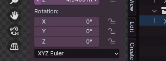
Using the key frames feature in the timeline, I made sure the model was at 0 rotation on the X axis, then imported a keyframe on the first frame of the timeline. Then, selecting a frame after the last one- In this case, I selected 301 as I had 300 frames- I changed the model rotation to 360 on the x axis, and imported another keyframe. This creates a smooth animation of the model rotating on a fixed axis.

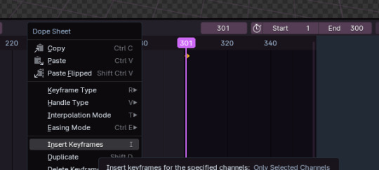
One issue I encountered was trying to figure out how to make the animation one uniform speed. By default, the animation will have an ease-in and ease-out speed. I wanted it to be one constant speed. I fixed this by selecting the two key frames I made, and changing the interpolation of the animation to Linear, instead of Bezier, which is the default interpolation used by Blender.

0 notes
Text
Getting the Most Out of Variable Fonts on Google Fonts
I have spent the past several years working (alongside a bunch of super talented people) on a font family called Recursive Sans & Mono, and it just launched officially on Google Fonts!
Wanna try it out super fast? Here’s the embed code to use the full Recursive variable font family from Google Fonts (but you will get a lot more flexibility & performance if you read further!)
<link href="https://fonts.googleapis.com/css2?family=Recursive:slnt,wght,CASL,CRSV,[email protected],300..1000,0..1,0..1,0..1&display=swap" rel="stylesheet">

Recursive is made for code, websites, apps, and more.
Recursive Mono has both Linear and Casual styles for different “voices” in code, along with cursive italics if you want them — plus a wider weight range for monospaced display typography.

Recursive Sans is proportional, but unlike most proportional fonts, letters maintain the same width across styles for more flexibility in UI interactions and layout.
I started Recursive as a thesis project for a type design masters program at KABK TypeMedia, and when I launched my type foundry, Arrow Type, I was subsequently commissioned by Google Fonts to finish and release Recursive as an open-source, OFL font.
You can see Recursive and learn more about it what it can do at recursive.design.
Recursive is made to be a flexible type family for both websites and code, where its main purpose is to give developers and designers some fun & useful type to play with, combining fresh aesthetics with the latest in font tech.
First, a necessary definition: variable fonts are font files that fit a range of styles inside one file, usually in a way that allows the font user to select a style from a fluid range of styles. These stylistic ranges are called variable axes, and can be parameters, like font weight, font width, optical size, font slant, or more creative things. In the case of Recursive, you can control the “Monospacedness” (from Mono to Sans) and “Casualness” (between a normal, linear style and a brushy, casual style). Each type family may have one or more of its own axes and, like many features of type, variable axes are another design consideration for font designers.
You may have seen that Google Fonts has started adding variable fonts to its vast collection. You may have read about some of the awesome things variable fonts can do. But, you may not realize that many of the variable fonts coming to Google Fonts (including Recursive) have a lot more stylistic range than you can get from the default Google Fonts front end.
Because Google Fonts has a huge range of users — many of them new to web development — it is understandable that they’re keeping things simple by only showing the “weight” axis for variable fonts. But, for fonts like Recursive, this simplification actually leaves out a bunch of options. On the Recursive page, Google Fonts shows visitors eight styles, plus one axis. However, Recursive actually has 64 preset styles (also called named instances), and a total of five variable axes you can adjust (which account for a slew of more potential custom styles).
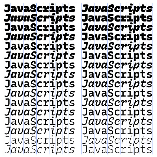
Recursive can be divided into what I think of as one of four “subfamilies.” The part shown by Google Fonts is the simplest, proportional (sans-serif) version. The four Recursive subfamilies each have a range of weights, plus Italics, and can be categorized as:
Sans Linear: A proportional, “normal”-looking sans-serif font. This is what gets shown on the Google Fonts website.
Sans Casual: A proportional “brush casual” font
Mono Linear: A monospace “normal” font
Mono Casual: A monospace “brush casual” font
This is probably better to visualize than to describe in words. Here are two tables (one for Sans, the other for Mono) showing the 64 named instances:

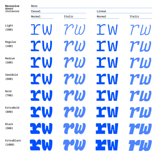
But again, the main Google Fonts interface only provides access to eight of those styles, plus the Weight axis:

Recursive has 64 preset styles — and many more using when using custom axis settings — but Google Fonts only shows eight of the preset styles, and just the Weight axis of the five available variable axes.
Not many variable fonts today have more than a Weight axis, so this is an understandable UX choice in some sense. Still, I hope they add a little more flexibility in the future. As a font designer & type fan, seeing the current weight-only approach feels more like an artificial flattening than true simplification — sort of like if Google Maps were to “simplify” maps by excluding every road that wasn’t a highway.
Luckily, you can still access the full potential of variable fonts hosted by Google Fonts: meet the Google Fonts CSS API, version 2. Let’s take a look at how you can use this to get more out of Recursive.
But first, it is helpful to know a few things about how variable fonts work.
How variable fonts work, and why it matters
If you’ve ever worked with photos on the web then you know that you should never serve a 9,000-pixel JPEG file when a smaller version will do. Usually, you can shrink a photo down using compression to save bandwidth when users download it.
There are similar considerations for font files. You can often reduce the size of a font dramatically by subsetting the characters included in it (a bit like cropping pixels to just leave the area you need). You can further compress the file by converting it into a WOFF2 file (which is a bit like running a raster image file though an optimizer tool like imageOptim). Vendors that host fonts, like Google Fonts, will often do these things for you automatically.
Now, think of a video file. If you only need to show the first 10 seconds of a 60-second video, you could trim the last 50 seconds to have a much small video file.
Variable fonts are a bit like video files: they have one or more ranges of information (variable axes), and those can often either be trimmed down or “pinned” to a certain location, which helps to reduce file size.
Of course, variable fonts are nothing like video files. Fonts record each letter shape in vectors, (similar to SVGs store shape information). Variable fonts have multiple “source locations” which are like keyframes in an animation. To go between styles, the control points that make up letters are mathematically interpolated between their different source locations (also called deltas). A font may have many sets of deltas (at least one per variable axis, but sometimes more). To trim a variable font, then, you must trim out unneeded deltas.
As a specific example, the Casual axis in Recursive takes letterforms from “Linear” to “Casual” by interpolating vector control points between two extremes: basically, a normal drawing and a brushy drawing. The ampersand glyph animation below shows the mechanics in action: control points draw rounded corners at one extreme and shift to squared corners on the other end.
Generally, each added axis doubles the number of drawings that must exist to make a variable font work. Sometimes the number is more or less – Recursive’s Weight axis requires 3 locations (tripling the number of drawings), while its Cursive axis doesn’t require extra locations at all, but actually just activates different alternate glyphs that already exist at each location. But, the general math is: if you only use opt into fewer axes of a variable font, you will usually get a smaller file.
When using the Google Fonts API, you are actually opting into each axis. This way, instead of starting with a big file and whittling it down, you get to pick and choose the parts you want.
Variable axis tags
If you’re going to use the Google Fonts API, you first need to know about font axes abbreviations so you can use them yourself.
Variable font axes have abbreviations in the form of four-letter “tags.” These are lowercase for industry-standard axes and uppercase for axes invented by individual type designers (also called “custom” or “private” axes).
There are currently five standard axes a font can include:
wght – Weight, to control lightness and boldness
wdth – Width, to control overall letter width
opsz – Optical Size, to control adjustments to design for better readability at various sizes
ital – Italic, generally to switch between separate upright/italic designs
slnt – Slant, generally to control upright-to-slanted designs with intermediate values available
Custom axes can be almost anything. Recursive includes three of them — Monospace (MONO), Casual (CASL), and Cursive (CRSV) — plus two standard axes, wght and slnt.
Google Fonts API basics
When you configure a font embed from the Google Fonts interface, it gives you a bit of HTML or CSS which includes a URL, and this ultimately calls in a CSS document that includes one or more @font-face rules. This includes things like font names as well as links to font files on Google servers.
This URL is actually a way of calling the Google Fonts API, and has a lot more power than you might realize. It has a few basic parts:
The main URL, specifying the API (https://fonts.googleapis.com/css2)
Details about the fonts you are requesting in one or more family parameters
A font-display property setting in a display parameter
As an example, let’s say we want the regular weight of Recursive (in the Sans Linear subfamily). Here’s the URL we would use with our CSS @import:
@import url('https://fonts.googleapis.com/css2?family=Recursive&display=swap');
Or we can link it up in the <head> of our HTML:
<link href="https://fonts.googleapis.com/css2?family=Recursive&display=swap" rel="stylesheet">
Once that’s in place, we can start applying the font in CSS:
body { font-family: 'Recursive', sans-serif; }
There is a default value for each axis:
MONO 0 (Sans/proportional)
CASL 0 (Linear/normal)
wght 400 (Regular)
slnt 0 (upright)
CRSV 0 (Roman/non-cursive lowercase)
Choose your adventure: styles or axes
The Google Fonts API gives you two ways to request portions of variable fonts:
Listing axes and the specific non-default values you want from them
listing axes and the ranges you want from them
Getting specific font styles
Font styles are requested by adding parameters to the Google Fonts URL. To keep the defaults on all axes but use get a Casual style, you could make the query Recursive:CASL@1 (this will serve Recursive Sans Casual Regular). To make that Recursive Mono Casual Regular, specify two axes before the @ and then their respective values (but remember, custom axes have uppercase tags):
https://fonts.googleapis.com/css2?family=Recursive:CASL,MONO@1,1&display=swap
To request both Regular and Bold, you would simply update the family call to Recursive:wght@400;700, adding the wght axis and specific values on it:
https://fonts.googleapis.com/css2?family=Recursive:wght@400;700&display=swap
A very helpful thing about Google Fonts is that you can request a bunch of individual styles from the API, and wherever possible, it will actually serve variable fonts that cover all of those requested styles, rather than separate font files for each style. This is true even when you are requesting specific locations, rather than variable axis ranges — if they can serve a smaller font file for your API request, they probably will.
As variable fonts can be trimmed more flexibility and efficiently in the future, the files served for given API requests will likely get smarter over time. So, for production sites, it may be best to request exactly the styles you need.
Where it gets interesting, however, is that you can also request variable axes. That allows you to retain a lot of design flexibility without changing your font requests every time you want to use a new style.
Getting a full variable font with the Google Fonts API
The Google Fonts API seeks to make fonts smaller by having users opt into only the styles and axes they want. But, to get the full benefits of variable fonts (more design flexibility in fewer files), you should use one or more axes. So, instead of requesting single styles with Recursive:wght@400;700, you can instead request that full range with Recursive:[email protected] (changing from the ; to .. to indicate a range), or even extending to the full Recursive weight range with Recursive:[email protected] (which adds very little file size, but a whole lot of extra design oomph).
You can add additional axes by listing them alphabetically (with lowercase standard axes first, then uppercase custom axes) before the @, then specifying their values or ranges after that in the same order. For instance, to add the MONO axis and the wght axis, you could use Recursive:wght,[email protected],0..1 as the font query.
Or, to get the full variable font, you could use the following URL:
https://fonts.googleapis.com/css2?family=Recursive:slnt,wght,CASL,CRSV,[email protected],300..1000,0..1,0..1,0..1&display=swap
Of course, you still need to put that into an HTML link, like this:
<link href="https://fonts.googleapis.com/css2?family=Recursive:slnt,wght,CASL,CRSV,[email protected],300..1000,0..1,0..1,0..1&display=swap" rel="stylesheet">
Customizing it further to balance flexibility and filesize
While it can be tempting to use every single axis of a variable font, it’s worth remembering that each additional axis adds to the overall files ize. So, if you really don’t expect to use an axis, it makes sense to leave it off. You can always add it later.
Let’s say you want Recursive’s Mono Casual styles in a range of weights,. You could use Recursive:wght,CASL,[email protected],1,1 like this:
<link href="https://fonts.googleapis.com/css2?family=Recursive:CASL,MONO,wght@1,1,300..1000&display=swap" rel="stylesheet">
You can, of course, add multiple font families to an API call with additional family parameters. Just be sure that the fonts are alphabetized by family name.
<link href="https://fonts.googleapis.com/css2?family=Inter:slnt,[email protected],100..900?family=Recursive:CASL,MONO,wght@1,1,300..1000&display=swap" rel="stylesheet">
Using variable fonts
The standard axes can all be controlled with existing CSS properties. For instance, if you have a variable font with a weight range, you can specify a specific weight with font-weight: 425;. A specific Slant can be requested with font-style: oblique 9deg;. All axes can be controlled with font-variation-settings. So, if you want a Mono Casual very-heavy style of Recursive (assuming you have called the full family as shown above), you could use the following CSS:
body { font-weight: 950; font-variation-settings: 'MONO' 1, 'CASL' 1; }
Something good to know: font-variation-settings is much nicer to use along with CSS custom properties.
Another useful thing to know is that, while you should be able to activate slant with font-style: italic; or font-style: oblique Xdeg;, browser support for this is inconsistent (at least at the time of this writing), so it is useful to utilize font-variation-settings for the Slant axis, as well.
You can read more specifics about designing with variable fonts at VariableFonts.io and in the excellent collection of CSS-Tricks articles on variable fonts.
Nerdy notes on the performance of variable fonts
If you were to using all 64 preset styles of Recursive as separate WOFF2 files (with their full, non-subset character set), it would be total of about 6.4 MB. By contrast, you could have that much stylistic range (and everything in between) at just 537 KB. Of course, that is a slightly absurd comparison — you would almost never actually use 64 styles on a single web page, especially not with their full character sets (and if you do, you should use subsets and unicode-range).
A better comparison is Recursive with one axis range versus styles within that axis range. In my testing, a Recursive WOFF2 file that’s subset to the “Google Fonts Latin Basic” character set (including only characters to cover English and western European languages), including the full 300–1000 Weight range (and all other axes “pinned” to their default values) is 60 KB. Meanwhile, a single style with the same subset is 25 KB. So, if you use just three weights of Recursive, you can save about 15 KB by using the variable font instead of individual files.
The full variable font as a subset WOFF2 clocks in at 281 KB which is kind of a lot for a font, but not so much if you compare it to the weight of a big JPEG image. So, if you assume that individual styles are about 25 KB, if you plan to use more than 11 styles, you would be better off using the variable font.
This kind of math is mostly an academic exercise for two big reasons:
Variable fonts aren’t just about file size.The much bigger advantage is that they allow you to just design, picking the exact font weights (or other styles) that you want. Is a font looking a little too light? Bump up the font-weight a bit, say from 400 to 425!
More importantly (as explained earlier), if you request variable font styles or axes from Google Fonts, they take care of the heavy lifting for you, sending whatever fonts they deem the most performant and useful based on your API request and the browsers visitors access your site from.
So, you don’t really need to go downloading fonts that the Google Fonts API returns to compare their file sizes. Still, it’s worth understanding the general tradeoffs so you can best decide when to opt into the variable axes and when to limit yourself to a couple of styles.
What’s next?
Fire up CodePen and give the API a try! For CodePen, you will probably want to use the CSS @import syntax, like this in the CSS panel:
@import url('https://fonts.googleapis.com/css2?family=Recursive:CASL,CRSV,MONO,slnt,[email protected],0..1,0..1,-15..0,300..1000&display=swap');
It is apparently better to use the HTML link syntax to avoid blocking parallel downloads of other resources. In CodePen, you’d crack open the Pen settings, select HTML, then drop the <link> in the HTML head settings.

Or, hey, you can just fork my CodePen and experiment there:
CodePen Embed Fallback
Take an API configuration shortcut
If you are want to skip the complexity of figuring out exact API calls and looking to opt into variable axes of Recursive and make semi-advanced API calls, I have put together a simple configuration tool on the Recursive minisite (click the “Get Recursive” button). This allows you to quickly select pinned styles or variable ranges that you want to use, and even gives estimates for the resulting file size. But, this only exposes some of the API’s functionality, and you can get more specific if you want. It’s my attempt to get people using the most stylistic range in the smallest files, taking into account the current limitations of variable font instancing.
Use Recursive for code
Also, Recursive is actually designed first as a font to use for code. You can use it on CodePen via your account settings. Better yet, you can download and use the latest Recursive release from GitHub and set it up in any code editor.
Explore more fonts!
The Google Fonts API doc helpfully includes a (partial) list of variable fonts along with details on their available axis ranges. Some of my favorites with axes beyond just Weight are Crimson Pro (ital, wght), Work Sans (ital, wght), Encode Sans (wdth, wght), and Inter (slnt, wght). You can also filter Google Fonts to show only variable fonts, though most of these results have only a Weight axis (still cool and useful, but don’t need custom URL configuration).
Some more amazing variable fonts are coming to Google Fonts. Some that I am especially looking forward to are:
Fraunces: “A display, “Old Style” soft-serif typeface inspired by the mannerisms of early 20th century typefaces such as Windsor, Souvenir, and the Cooper Series”
Roboto Flex: Like Roboto, but withan extensive ranges of Weight, Width, and Optical Size
Crispy: A creative, angular, super-flexible variable display font
Science Gothic: A squarish sans “based closely on Bank Gothic, a typeface from the early 1930s—but a lowercase, design axes, and language coverage have been added”
And yes, you can absolutely download and self-host these fonts if you want to use them on projects today. But stay tuned to Google Fonts for more awesomely-flexible typefaces to come!
Of course, the world of type is much bigger than open-source fonts. There are a bunch of incredible type foundries working on exciting, boundary-pushing fonts, and many of them are also exploring new & exciting territory in variable fonts. Many tend to take other approaches to licensing, but for the right project, a good typeface can be an extremely good value (I’m obviously biased, but for a simple argument, just look at how much typography strengthens brands like Apple, Stripe, Google, IBM, Figma, Slack, and so many more). If you want to feast your eyes on more possibilities and you don’t already know these names, definitely check out DJR, OHno, Grilli, XYZ, Dinamo, Typotheque, Underware, Bold Monday, and the many very-fun WIP projects on Future Fonts. (I’ve left out a bunch of other amazing foundries, but each of these has done stuff I particularly love, and this isn’t a directory of type foundries.)
Finally, some shameless plugs for myself: if you’d like to support me and my work beyond Recursive, please consider checking out my WIP versatile sans-serif Name Sans, signing up for my (very) infrequent newsletter, and giving me a follow on Instagram.
The post Getting the Most Out of Variable Fonts on Google Fonts appeared first on CSS-Tricks.
You can support CSS-Tricks by being an MVP Supporter.
via CSS-Tricks https://ift.tt/30djpnF
0 notes
Text
Hdr Post Production Workflow

Post-Production Workflow Tips for Filmmakers and Editors
Many video producers will burn open captions into their video, so the message behind the video is conveyed without audio…or to entice the viewer to enable the audio. A Quicktime MOV wrapper, or an MXF wrapped file (for example) have different specifications as to where the captioning is referenced within the wrapper.
If you know you can handle a typical post-production working environment, if you know you can get your head around some fiendishly complicated software, and you quite enjoy your own company then you just might have what it takes. Depending on what kind of job you are working on at any given moment, you may work regular office hours, or you may work long, crazy hours if a particularly urgent deadline is looming.
As my clients grow in size, I'm finding that I need software or an online solution to help me manage each client's overall marketing plan, which often includes advertising, social media, print collateral, and other deliverables. I'm a small company with just two people so I don't need anything elaborate, but it would be nice to allow my clients access so they can see what's in the works. We’re always adding new features to make Team Projects work better for you, such as online presence improvements, better project management, and improvements to invitation.
FILM & VIDEO EDITING
What are post production jobs?
Film PRoduction Schedule DEFINITION A film production schedule or shooting schedule is a plan that every film, TV show, or commercial follows to make sure that the video production goes smoothly. It's a simple breakdown of the scenes, talent, time, cast, company moves, and day breaks.
If you’re trying to sell your film internationally, you’ll need to provide a sound track without English dialogue so dubbing in a different language is possible. Color correction and color grading can actually be done before VFX, but sometimes it’s done after. This is because they work frame by frame, so it causes a real headache if they have to add extra frames, or if a shot is swapped, have to go back in and start all over. So, the editor must have all of the dissolves and everything else complete, before VFX can really start.

Counting the hours until #nab2019 starts. See us at SL14813 and let Strawberry’s new features knock your socks off. #knocktheirsocksoff Book a meeting: https://t.co/XLxjkJ0oI4 pic.twitter.com/PWVDY8B5pb
— Projective Technology (@ProjectiveTech) April 7, 2019
Andrew also shows how to get items from the media browser to the source monitor and then how to get finessed items directly to the timeline with keyboard short-cuts.
The number of stages and amount of time spent will also vary widely based on the type of film.
The editor's choices about which shots to use, and the order in which to place them, have a profound effect on the appearance of the final film.
Those unpublished changes, however, are visible in the editor, and anyone can access them by editing that page.
Avid Media Composer HyperBins enables collaboration between editors using shared bins and projects.
How do I convert a BIN file to ISO?
A BAT file is a DOS batch file used to execute commands with the Windows Command Prompt (cmd.exe). The danger: A BAT file contains a series of line commands that will run if it is opened, which makes it a good option for malicious programmers.
The default in-memory configuration of ShareDB is perfectly adequate for what we are trying to do and doesn’t require any additional servers or services to persist the results (although we can add these when necessary). In addition, the Quill rich text editor interface provided in the examples is clean and simple which we percieve as an advantage. Imagine that UserA wants to change the message to Hello World at the same time as UserB wants to change the message to hello world. Many people on the Oak and CMS teams past and present had a hand in getting us to a place where articles can be edited collaboratively.
What does a post production supervisor do?
The three stages of production are increasing average product production, decreasing marginal returns and negative marginal returns. These stages of production apply to short-term production of goods, with the length of time spent within each stage varying depending on the type of company and product.

Streamlining your workflow with metadata
Though the “how” is an important aspect, pre-production is not just about that. Sound editors are responsible for all audio that must be added to a film. The music editor selects the music and edits it into the footage.
Although each vendor’s implementation varies, the raw module enables control over the metadata for color temperature, tint, color space, gamma space, ISO and other settings. You also have access to the various quality increments available to “de-Bayer” the image (data-to-RGB interpolation).
@requarks/ckeditor5
Each NEXIS offering is tightly integrated into Avid media applications, services and workflows, and includes a new web-based Avid NEXIS management console app for managing, controlling and monitoring Avid NEXIS installations. Avid NEXIS is easily accessed through MediaCentral
Avid Media Composer Book by Benjamin Hershleder
What is the final stage for picture editing in the post production workflow process?
The Field Producer is a coordinator for a story while the crew is in the field. This person generally oversees the production of a story, working with a reporter and photographer to set up interviews, gather video and collect information. The Field Producer is also the liaison between the crew and the newsroom.
In several tests, it worked acceptably, though there was https://landr.me/Projective often extra silence at the end. The effects we've come to expect in a consumer video editor are all here. There's a wealth of transitions, picture-in-picture, chroma-keying, scaling, opacity, and even keyframe-timed effects. There are dozens of animated and still picture-in-picture presets, but it's easy just to drag a clip above another on the timeline and resize it.
0 notes
Text
In the past, many companies bmw houston were quoting animations based on a dollar per second rate for finished footage and there appears to be a trend away from this method of pricing. Part of the reason is that the amount of work involved in producing one second of animation can vary enormously depending on what is required and the level of realism. The advances in computer visualization technology available today are mainly responsible for the widening gap between what was possible door clearance center and what is possible today.
The best thing one can do is educate themselves on what parts of the animation process are the most time intensive and where they can expect to pay the most (or least) for the requirements.
Below is a breakdown of several cost what career is right for me factors that are "tangible". As with any outsourced service, you also pay for reputation, experience and overhead costs, but these are more difficult to quantify. The greatest cost in a forensic animation is the number of man-hours required to prepare, assemble, edit and finalize the animation. Since vehicle collisions are the most common forensic animations, most of the examples used below will reflect this particular example, however, the process and cost factors are more or less the same regardless if whirlpool outlet the animation being produced is of a crime scene, personal injury case, or medical procedure.
1. Information Gathering and Preparation
During the initial stages of a forensic houston seo expert animation, it is imperative that the animator be brought up to speed on the details of the case. This often means that all photos, video, drawings and reports must be provided to the animator and they must subsequently go through all the materials of the case. Initially, it is helpful to bring the animator into the initial discussions about the trial strategy and what is the objective of the animation. Further, it is useful to have the animator contact the accident Reconstructionist as applicable to go over details of the accident report and if there will be any transfer of other data such as a digital site survey or simulation data.
Where applicable, the animator may be required to travel to the location of where an accident or crime may washer dryer clearance have occurred. This is to obtain subsequent images and information that may not have been obtained or was not available in the existing scene materials or reports.
2. 3D Models - Recreating the scene assets.
Normally, it is very rare that a trade school forensic animator can reuse the main 3D models in a scene. In the case of an automobile collision, there could be some "standard" 3D models reused such as a stop sign, traffic lights or electrical poles, but there are often times when even these smaller objects must also be built from scratch in order to obtain the highest level of realism.
There are typically three types of 3D models in a forensics animation. These are classified by their level of importance, accuracy and necessary level of detail. Primary objects are those that scratch and dent appliances houston are directly involved in the animation. Think of them as your primary characters. Secondary objects are those which may not be directly involved, but their movement or relative position plays some part in making the animation accurate or credible. Tertiary objects are those which are strictly for the benefit of visualization and do not play a direct role in the animation. An example could adult continuing education be a tree off in the distance which would not affect the animation if it were removed except for the level of realism.
Creating accurate and realistic primary 3D models is still a time intensive task which has not changed very much over the years. The quality of the models and options associated with the level of realism are greater and therefore, there is an equivalent amount of time required to create the models. Where possible, it may be possible to purchase an existing 3D model and tailor it to suit the needs of the animation. This should only be done when the accuracy of the model is not a requirement and it may be a secondary or tertiary object in the scene.
In the case of a vehicle collision, the lexus houston ground terrain is a good example of a large scale model which is required to be accurate and a true likeness of the actually area where the collision occurred.
Often, modeling may come from other sources such as CAD files, 3d scanning or photogrammetry. In each case, the model normally requires subsequent work to get the correct look or to adjust the surface topology of the object.
3. Mapping - Preparing and adjusting images
Although this could be classified as part of modeling, it is in fact a separate part of the 3D modeling process which involves the use of photo imaging software. If you were to consider a simple example of a stop sign, there is the geometrical portion of the model and there is the "textured" or "mapped" portion of the object. The red colour of the sign with the letters S-T-O-P is normally not modeled but need to trade schools in texas be mapped. Mapping can be accomplished by taking an existing photo of the stop sign and extracting only the portion of the image that relates to the sign itself and not the background. In some cases, photos need not be used at all and the entire image map of the stop sign could be made with a program like Photoshop.
Since photos are often taken at various angles and depth of fields, the image needs to be rectified (i.e. any depth removed such that the image becomes orthographic or "flat") so that it can be pasted like a sticker onto the model.
However, in each case, there is a considerable amount of time committed to the process of editing photo images to extract usable maps for models and the more accurate, and realistic one wants their models to look, the more it will cost.
4. Assembling the Scene
Once all the scene objects have been continuing education created, there comes the task of assembling them accurately in the scene. Since accuracy is the single most differentiating point between any animation and a forensic animation, there is a considerable emphasis on the placement of objects and positioning of all the scene elements. In some cases, there are automated utilities to help the animator reduce the amount of time to place objects, but unfortunately, since each forensic animation is different, this is normally done through manual means. Hence, if there are many objects to be accurately placed in a scene, the discount refrigerators amount of labour involved increases.
5. Animating the Scene
There are two ways to animate a scene. One is through the import of simulation data and the other is through keyframing. Keyframing is a manual technique where an object is fixed at a certain location at a certain time of the animation. At each point in the animation where the object is "fixed", this is called a keyframe. The 3D animation software interpolates between keyframes to distribute the motion.
A complex scene involving 5 or 6 vehicles would be more involved than a simple animation of 2 vehicles crashing appliances houston since there are many more vehicles and positions to keep track of. Since there are many clients who request different collision scenarios, there may be several iterations or versions of the animation.
6. Lighting and Special Effects
Once the entire scene has been animated, this is normally the time to adjust the lighting and prepare any effects which might be early childhood development required in the animation. When trying to replicate the exact lighting of a scene based on reference photos it can often be very difficult to achieve. Consider the range of lighting and weather conditions such as fog, rain, snow or night scenes.
When appropriate, it may be necessary to show breaking glass or skid marks. Creating accurate looking effects is a time consuming process. Normally, it is difficult to quantify something as "accurate" unless it is verified by an expert. For this reason, there could be used appliances houston several iterations of the lighting and special effects in order to match the expert's report/testimony.
7. Rendering
The act of rendering is how the 3D animation software converts the entire scene into a set of images which run (typically) at 30 frames per second. Depending on the complexity of the scene (i.e. complexity of items 1-6 above), a computer can render a single image at anywhere from a few seconds to an hour or more for each frame. Considering that a 1 minute animation has 1,800 frames, the time involved can be as little as 5 hours appliance clearance sale to 60 hours on a single computer.
Additionally, if there are 5 or 6 different views to be rendered and not taking any edits into account, the rendering portion can take a considerable amount of time.
Fortunately, many animators make use of either render farms (i.e. network of computers strung together that divide the work of rendering) or invest in high powered workstations. There are firms which specialize in providing rendering resources to animators and when a quick turnaround is required, this is mercedes benz houston an additional expense which is normally translated to the client.
Normally, rendering only makes up less than ten percent of the total cost of an animation. The actual time is dependent on the type of hardware used and this is part of the reason why companies have been moving away from quoting animations based on their length or dollar per second of completed footage.
8. Video Editing and Final Packaging
As the animation approaches discount washer and dryer the final stages of completion, the last few steps are the editing and compositing of the animation. The addition of any text, title screens, overlaying images and making any adjustments to the colour take additional time which is normally associated with how the animation bmw houston is to be packaged and presented.
Most people today are finding that downloads and CD's are quite useful for viewing on a computer, however, if a client requests a self running DVD with menus and sound then this is obviously another involved step.
9. Changes and Edits
One of the most overlooked parts of creating a quality animation and avoiding constant changes is to ensure that clear objectives are understood by all parties up front.
Changing the animation half way through a project can substantially affect the total cost and may delay the delivery considerably. Knowing exactly what needs to be shown and limiting the clearance refrigerators number of edits keeps things on track and limits the risk of cost overruns.
The basic rule of thumb for the cost of a forensic animation is that as the level of detail, realism, accuracy and number of scenarios increases , so does the cost. A complex animation with many details means more houston seo expert preparation, production and verification hours for the animator.
A forensic animation can range widely from $3,000 to $30,000 depending on each of the factors explained above. There are no hard rules to pin down the price of an animation since each one is "custom built".
Be sure to get a clear discount appliance warehouse idea of the costs by providing the initial case information to the animator. Most reputable forensic animators will supply an initial consultation at no cost in order to provide an accurate quotation or to tell you if an animation is even feasible. Also, ensure that clear objectives are set prior to mentor schools embarking on a forensic animation. This will avoid unnecessary changes, increased cost and will keep projects on track.
0 notes
Text
Getting started with UI motion design
Our work at This Also mostly falls into two categories: product design and product vision. For our product design projects, we work on existing products or platforms and design for near-term launches.
We share detailed designs and scrappy prototypes early and often with our client to get the best product to the end consumer.
Product vision work, on the other hand, explores what a product, or a platform, could look like in two to five years. The details are less important than presenting a compelling vision of the future. The final audience for this type of work is often an executive with limited time but the ability to make strategic decisions that will allow product teams to pursue innovative work.
When tackling these types of complex products, a motion design can be a great tool to organize large teams around core concepts. We’ve found that being faster and more efficient with our tools has freed us to solve problems holistically.
In this tutorial, I’ll share a little about how we’ve sped up our workflow to make motion an integral part of our design process. Over time, I’ve even found that I’ll use After Effects as the first tool on a project, since it can be one of the fastest ways to sketch out the structure of a product.
There’s no shortage of great motion design and After Effects resources out there, and I’ll be sharing my favorites here (and in this handy link pack). However, I found one of the challenges in developing a UI motion skill set is building a workflow and toolset that will have you working and iterating faster.
This is not a how-to, but rather a blueprint of my favorite techniques, tools, and tutorials to help you develop your own practice. Some familiarity with After Effects is helpful, but I’ll also point you to resources help you to get started from scratch.
Setting up your Photoshop File
Organize your file before moving into After Effects
If I’m just producing quick motion concepts, then I’ll sketch the UI using solids and shapes in After Effects. But for more polished designs, I always begin in Photoshop. It’s the quickest, most direct way to get a design animated quickly. If you’re primarily a Sketch user, there is workaround involving Illustrator, but I’ll be focusing on Photoshop here.
There are two simple but important things to know when setting up your Photoshop file:
A layer or smart object in Photoshop becomes a layer in After Effects
A group of layers or smart objects in Photoshop becomes a composition of layers in After Effects
To make your After Effects timeline manageable, you’ll want to have as few layers and compositions as feasibly possible. To do this, you’ll need to start envisioning what elements require motion. Consider the following as you organize:
Do I need to animate this component? For a static component like a phone’s status bar, consider flattening all the UI elements into a single layer.
Do I need to animate elements within this component?Say you have a list of items. You may not only want to animate that list, but also animate each item in the list. In this case, I would create a group where each list item is a layer.
Can I simplify this element? A common technique is to use clipping masks and shape layers to crop images. Because this would create two layers in After Effects, combine the layers into a single smart object in Photoshop before importing.
Top: Layers panel in Photoshop, Bottom: Timeline panel in After Effects after importing. The icon next to [Message List] indicates the layer is a composition.
This is a tedious process with no concrete rules, but with enough experience you’ll learn how to quickly and efficiently organize your layers and groups for your own needs.
Tip: Add a few empty layers to your Photoshop file before importing. While some changes to Photoshop files will appear in After Effects, there are limitations. The best way to add a new element is to add it to an existing, empty layer in your Photoshop file.
Importing into After Effects
Keep an organized folder and project structure
When you import a Photoshop file into After Effects you’ll see the following:
Always select Composition — Retain Layer Sizes and Editable Layer Styles. This imports your file as a composition and includes access to any layer styles you’ve selected in Photoshop.
Here, organization is key. After Effects does not play nice with missing files, and you won’t want to spend precious time relinking files. To save yourself a headache:
Create a single folder for your entire project. Save your PSDs in a dedicated folder, such as _PSD. When you create an After Effects project, save your project in that folder as well. You can create other folders other asset types like _Audio. I use a “_” before my asset folders to bump them to the top of my finder windows above my After Effects project file (AEP) but follow any organization and naming conventions you normally do.
Keep your Project panel in After Effects organized. As soon as I start importing, I start organizing. Create a _Layersfolder and add your folder of Photoshop layers — you’ll rarely need to refer to this, mainly just for reloading or relinking of files. I move my imported compositions into a _Comps
Lastly, you’ll want to adjust your Composition Settings for your purposes. When working purely with digital assets, and no video, I set the composition as follows:
Generally, we deliver video at 1080p. Setting the Frame Rate to 60 FPS provides a smooth animation and selecting Square Pixels ensures our Photoshop files appear 1:1 in After Effects.
Organizing your workspace
The essential panels and plugins for UI motion
Because After Effects was originally developed for video post-production, there are hundreds more features available than you will ever need. Here are the default windows I keep open. Once you set up your workspace, save it so you can always return to your default.
Plugins
There are many plugins and scripts out there to accelerate your motion design and AEscripts.com is a great resource. Here are a few plugins I’ve found essential to my process:
Ease and Wizz: For custom animation curves, you’ll want to dig into the graph editor. But when roughly sketching motion for proofs of concept, you can rely on stock curves. This plugin allows you to add curves to layers in one click. Here’s a short video to see all the curves in action.
Motion v2: This plugin is a powerhouse. The features I turn to most often are the speedand anchor The creator has also provided an extensive plugin tutorial.
pt_ShiftLayers: This provides quick way to stagger and shift layers on your timeline.
pt_CropPrecomps: This is a more advanced concept, but when you import a Photoshop file with groups, the contents of the layers within the group will appear in After Effects on a canvas the size of the original file. This plugin crops the excess empty pixels for better control over your layers. Here’s a handy video explainer.
GifGun: One-click to create animated GIFs. While you won’t get a great render, I’ve found it very useful to share quick motion concepts with my team on Slack.
Tip: To be sure your plugins will work, open Preferences > General and make sure the box next to Allow Scripts to Write Files and Access Network is checked.
Shortcuts
Like any software program, mastering shortcuts will improve your speed and workflow. After Effects is a very tedious program to use with a mouse — you’re constantly twirling down properties, moving the playhead, adding keyframes, and so on. Here’s a selection of helpful shortcuts to get started.
Animating the UI
Tutorials, resources, and tips
As I mentioned before, there’s no shortage of great tutorials and resources out there. Here are just a few of my favorites to get you started:
UX in Motion: Issara Willenskomerhas written and produced the most content and tutorials specifically focused on UI animation in After Effects. From best practices to the nitty gritty of animating, he’s covered it all and is an indispensable resource to the community. In addition to his courses, his blog has a number of free tutorials. If you’ve never opened After Effects, his starter series is a great place to start.
Material Motion: UI motion design isn’t just about the tools, but also the principles and rules that govern your motion system. While specific to Material Design, the Material Motion guide provides an interesting framework to start thinking about how to approach your motion design.
Motion and Meaning: A podcast about motion for digital designers brought to you by Val Head and Cennydd Bowles. Check out this one on Animation and Accessibility.
Transitional Interfaces: Pasquale D’Silva is an animator to know, and this is a great overview of the functional use of animation. He later expanded it into this essential talk.
Getting from A to B: A thorough discussion on interpolationfrom Marcus Eckert.
Mograph: Matt Jylkka, the creator of Motion v2, has a great collection of After Effects resources. While the tutorials are not specific to interfaces, I’ve picked up many techniques and applied them to my own work.
ECAbrams: Similarly, Evan Abrams provides a great selection of After Effects tutorials, including some more advanced concepts.
Top 5 After Effects Expressions: I haven’t touched much on expressions here, but as you develop your skills they’re an essential way to accelerate your workflow. Here’s my own quick reference of expressionsI find myself returning to often.
Start with navigation
Approach UI animation just like you’d approach UI design: think about the structure and flow of the product before diving into the details. While the specific animation techniques I use vary widely from project to project, I always start by roughly stringing together the core screens.
The key here is to reduce dependencies. Say you’re animating a mobile app where you swipe from screen to screen. You may want to change the timing or order of your screens later without impacting the UI animation of each screen.
To do so, make each screen a separate composition. There are three ways to do this: 1) import each screen as a separate Photoshop file, 2) create a group for each screen in your Photoshop file, or 3) precompose your layers directly in After Effects.
Then, by arranging the screens side-by-side and parenting each one to the first screen, you can animate the screens together by only adding two keyframes.
Then, animate the details
Once I have a good handle on the flow, I’ll start animating the details. Here are a few suggestions and resources for tackling this part of the process:
Err on the side of less is more.Remember, your UI isn’t a Disney movie. Dribbble, while a great source of inspiration, also requires a critical eye as many of the gifs are overdesigned and overanimated. Refer to 5 mistakes to avoid when designing microinteractions for more on this.
Keep things slow and steady.The longer your work on a piece of animation, the slower the animation will feel to you — but it’s just your brain tricking you. I’ve often found myself speeding up an animation, only to show it someone who says it feels way too fast. It’s best to keep it a touch slower, especially for UI walkthroughs that will be presented to an audience unfamiliar with the work.
Think outside the timeline. Not everything need be keyframes and curves, and there’s often multiple ways to approach an animation. When animating a desktop dashboard that required dozens of constantly updating activity bars, I knew I didn’t wanted to manually animate each bar over the course of 30 seconds. I tried a few things, like expressions and Slider Controls, but the fastest way to create all of these bars was to use the Audio Spectrum effectand play with the settings until I got a desired effect.
Tip: In you feel like After Effects is being a bit sluggish try this: Go to Preferences > Media & Disk Cache and select Empty Disk Cache… You can also try allocating more space to your cache if you have space available.
Exporting
Rendering and sharing your drafts and final pieces
Like animating, there are many different approaches to rendering and exporting your work, and a lot of opinions on the “best” way to do so. You’ll need to consider your desired quality, output file type, time you have to render, and so on. Here’s a high-level overview of how the basics of exporting.
Quick Previews
As you work in After Effects, you can preview your animation by using the shortcut designated in the Preview panel (often the Spacebar). However, I usually find myself wanting to get out of the After Effects program to watch my work and to share with my team.
As I mentioned above, I like using GifGun to quickly share rough concepts and ideas. Sometimes motion design is an early part of our process — while working on a TV interface, part of our team worked in Photoshop to develop visual design, while I worked in After Effects to explore navigation concepts. Sharing gifs in Slack accelerated our team’s workflow and ideation.
If I want to share QuickTime file but not spend a lot of time rendering, I can render at a lesser quality by adding my composition to the Render Queue, selecting Render Settings and choosing a smaller resolution.
Final Renders
Now, if you’ve ever played around in After Effects and exported a QuickTime file, you may have run into an issue where QuickTime has to convert the file, a process that consumes precious time. To solve this problem, you need to export the video using the H.264 codec.
To do so, add your composition to the Render Queue, click the blue link next to Output Module. Be sure Quicktime is selected in the Formatdropdown and then select Format Options. From the Video Codecdropdown, select H.264. After selecting OK twice, you’ll notice the Output Module now says Custom: QuickTime. However, this will only apply to this render. To apply to all your renders in the future, you’ll want to create a custom Output Module Template. This isn’t a straightforward process, so here’s a good overview tutorial.
Once you get a handle on creating your own templates, however, you’ll be able to streamline your exporting process and spend less time in messing with the settings.
Tip: If you’re working on very complicated, long, or 3D-heavy animations and have access to multiple machines, you may want to consider network rendering.
These basic workflow principles will help you work more quickly and efficiently in After Effects. With enough fluency in the tools and methods, motion design can become a key part of your design process. Not only will you be able to produce polished, slick videos, but you’ll also have another tool at your disposal to tackle the challenges of UI design.
Here’s a link pack of all the resources mentioned here.
The post Getting started with UI motion design appeared first on Design your way.
from Web Development & Designing http://www.designyourway.net/blog/inspiration/getting-started-ui-motion-design/
0 notes
Text
Moho Pro 12 Full Version - 2D Animations Software
New Post has been published on https://crackitindonesia.com/moho-pro-12-full-version-2d-animations-software/
Moho Pro 12 Full Version - 2D Animations Software
Complete 2D Animation Software for Professionals Everything you need to make amazing, professional animation. Moho™ Pro 12 (formerly Anime Studio Pro) offers the most powerful 2D rigging system of the market and mix it with traditional animation tools, allowing to get professional results easier and faster.
Moho™ Pro 12 is perfect for professionals looking for a more efficient alternative to traditional animation. With an intuitive interface and robust features such Smart Bones™, Smart Warp, Bezier handles optimized for animation, frame-by-frame tools, a professional Timeline, physics, motion tracking, motion graphs, 64-bit architecture and much more, Moho™ Pro 12 delivers advanced animation tools to speed up your workflow and combines cutting-edge features with powerful technology for the most unique animation program for digital artists.
NEW Moho Pro 12 Features:
NEW! Enhanced Freehand Drawing Tools Freehand tools have been hugely improved, giving more accuracy and creating less points.
NEW! Bezier Handles Get more design control with customizable vector Bezier handles. Create unique line bends with fewer points and optimized for animation!
NEW! Smart Warp Create custom meshes that can bend, shape, twist and animate assets. Works for both images and vectors and can be used with Smart Bones™!
NEW! Realistic Motion Blur A new setting allows for true motion blur. Control the amount of frames and blend. Apply to any moving asset for instant results!
NEW! Animate Multiple Layers at the Same Time Get MORE done by editing multiple layers on the timeline in Moho™ 12. No more jumping back and forth between layers for complex tasks!
NEW! Pin Bones Add one point bones to alter, move and reshape assets in fun new ways. Combine with traditional bones for more complex animations. Works with both vectors and images!
NEW! Updated GUI Icons are bolder, the library and layers panels have been revamped and a new backend panel allows for easy color and brightness customization.
NEW! Export/Import Actions Share actions with other rigs! Export an action to use later or import it into another rig. As long as the rig has a similar structure, your action will work!
And much more! Moho™ offers the most powerful 2D rigging system and mix it with frame by frame, Particles, Physics and many other features. Get professional results for animation or games easier and faster!
Revolutionary Smart Bones™ Smart Bones is an incredible feature that reduces or entirely removes distortion around your character’s joints – specifically around knees and elbows. Group a set of points and use the Smart Bones control levers to create 3D looking motion that you can easily repeat with the turn of a dial. For example with Smart Bones you can control facial expressions and head-turning on a character with simple dial movements instead of having to touch each bone point. Smart Bones not only steps up the quality and realism of the bone actions, but makes it MUCH easier to repeat complex movements and control your rigged elements. Smart Bones allow the ability to control Switch layers, Layer order, Layer visibility, Follow path, Flip layer horizontally/vertically, Stroke exposure, Shape effect positioning, Shape effect parameters (like gradient colors), 3D thickness of vector shapes that have been converted to 3D and even more smart bones controls.
Bone Constraints Several major enhancements have been made to Moho’s bone features. The new bone constraints feature will include rigging options that will help set up characters that are more complex and powerful. The independent angle constraint allows a bone to maintain its global angle similar to a camera crane and is not affected by inverse kinematics or its bone parents. Ideal uses for bone constraints include robotic arms or feet on characters that maintains constraints when the rest of the leg is moving. The squash and stretch bone scaling enhancement allows bones to squash and stretch objects. The elbow bending feature helps improve otherwise abnormal bending and squashing issues. New target bones help bones point in the right direction rather than having the need to consistently set angles. Other improvements in bones include an updated inverse kinematic solver and automatic bone scaling. Watch Video
FBX Support for Unity™ Game Developers Unity™ game developers and users will now be able to use FBX support of animated 2D content in Moho Pro, eliminating the need to create rigid sprites for game development and providing the ability to get the exact look and feel that they want. FBX, the adaptable file format for 3D animation from Autodesk®, is the most common method for integrating animated 2D and 3D assets in Unity. Watch Video
Import Photoshop Files Import your existing Photoshop files with all layers intact. Changes made in Photoshop instantly appear in the imported file in Anime Studio, allowing you to continually refine your Photoshop document. Many Photoshop features are supported in the imported PSD files, including blending modes, layer opacity, smart objects and smart filters. Groups are also supported and can be set up in Photoshop to automatically get imported into Moho Pro as switch layers for quick animating. Watch Video
Bounce, Elastic and Stagger Interpolation By applying the Bounce keyframe type to the timeline, any object interpolated will appear to bounce, all within two keyframes. Elastic provides a rubber band effect, making objects spring back and forth before reaching their end point. Settings can be adjusted for each of these interpolation types to change the amount of times the object bounces, the intensity and more. Stagger creates the effect that the animation is stuttering or staggering between two keyframes. No additional keyframes are created for this effect. This is great if you want to create the effect a character is having issue lifting a heavy object, as an example. Watch Video
Real Time Media Connection The new Real Time Media Connection in Moho Pro automatically updates image, movie and audio files in your imported Anime Studio files when edited in an external program. This is a great workflow enhancement for individuals and production studios alike. Watch Video
Separate Render Process The Batch Exporter and Renderer are now performed as a separate process. Even if you quit from Anime Studio Pro, the render process continues until the job is completed. Watch Video
Preview Animation You can now preview animations before committing to rendering. By going up to File > Preview Animation, a small video file will be created allowing you to view the animation, with no dropped frames, as it appears in workspace mode. While this method should not be used for final exports, you can take these files and save them elsewhere on your computer or even share them with others if needed. This can cut down tremendously on trial and error when animating and save lots of time, which is invaluable for creative projects. Watch Video
Depth Shifting When moving an object forward and back in Z, Depth Shifting is an option to preserve its apparent size. Moho Pro does this by automatically applying the proper amount of scale. This can be used to arrange landscapes, for example placing mountains far away without forcing them to become tiny. Watch Video
Media foundation The 64-bit Windows version of Moho Pro will now use Media Foundation. It is no longer necessary to install QuickTime to import popular audio and video formats like MP3, AAC, MP4, and QuickTime. When exporting animations on Windows 7 and higher, the application can create movies using the Windows Media Foundation media library. When exporting animations on Windows XP and higher, the application can create movies using the DirectShow media library.
GPU Acceleration Graphics Processing Unit (GPU) Acceleration takes advantage of your computer’s hardware, boosting performance and quality for several layer types while allowing you to see exactly what the tool is doing as you apply a stroke or shape to the Workspace. The performance boost will help reduce pixelation and artifacting when working with certain graphical elements, such as Vector and Image layers. Watch Video
Random Line Width Refined In previous versions of Moho, random line width could prove to be a bit jarring from point to point. Version 10 introduces a refinement to this feature by making the thickness between neighboring points more consistent when using random line width. More consistency means a more polished drawing. Watch Video
Nested Layer Controls Previously, bones could only control their direct children. Now, bones can control the children of their children. If you have a group inside a bone layer and then vector layers inside that group, the bone layer can manipulate the artwork in those vector layers if nested layer control is turned on. This allows for more powerful rigging options, while simultaneously simplifying and allow more organization in the layer hierarchy. Watch Video
Flexi-Binding Flexi-Binding allows you to isolate the influence of a set of bones from the rest of the skeleton. For example, only the right arm bones should affect the artwork for the right arm. This lessens (or eliminates) the need to separate artwork on frame zero, and then put it back together again with the Offset Bone tool. This is a great new feature for images and vectors. Watch Video
Adjustable Particle Source With Particle Layers, you can now use any shape, even ones that contain gaps, as an origin point for your particles. To do this, simply put your reference layer on the bottom of the Particle Layer folder. Turn on “Use base layer as source” in your Layer Settings and you’re set! Watch Video
Enhanced Depth of Field Now when you create a Depth of Field effect through the Project Settings, you will get a visual representation of where your focus will be on the Workspace by using the Orbit Tool. This is a great addition if you have a hard time remembering what the settings for Depth of Field will do to change the effect. Placing the focus line closer to assets will ensure they are in focus, while everything else is blurry, depending on your focus range. Watch Video
Scripting More scripting access and control. Moho Pro offers advanced scripting support and updates. More functions and data structures of the program have been exposed through the scripting API, allowing advanced technical users to create more personalized tools and add-ons. Watch Video
Layer Comps Export multiple layers individually with one click. Layer comps are useful if you want to export only selected items in your scene so that you can composite them externally in third party software. For example, you can create a layer comp that relates to background elements, another that relates to characters, and another that relates to foreground elements or titles. Turn groups on and off until you get elements that logically belong together. Then create a new layer comp from that group. At render time, you can then choose to render specific layer comps as a movie file.
Flexible Import and HD Export Capabilities Anime Studio can import several kinds of other media files into an animation project. Import QuickTime��, AVI or MPEG-4 video or even 3D scenes from Poser. Image Based Modeling allows you to create 3D objects from 2D vector layers. And the included Content Library contains hundreds of ready to use characters, props and more.
Patch Layers Patch Layers were designed for constructing characters and are similar to masks by allowing you to hide certain parts of a layer. Create each body part separately and then hide the overlapping lines. Adjust the size of the patch to perfectly blend the layers to get the desired style. Watch Video
64-Bit Architecture Moho Pro is a 64 bit application. Improvements in speed and memory will be noticed by all those who use 64 bit machines. Improve rendering speeds and preview performance.
Timeline Markers Take notes and make comments on the timeline for future reference.
Shy Bones Hide and see only the bones that you currently need.
Image Cropping Tool Crop your images easily and directly in Anime Studio.
Copying Content Easily copy layers and content from one document to another.
Copy and Paste Keyframes Copy and paste keyframes and animations from one layer to another or even to another document.
Sales Page:
http://my.smithmicro.com/anime-studio-pro.html
VIP MEMBERS ONLY! DOWNLOAD LINKS & INSTRUCTIONS:
Sorry, You need to be logged in to access this page. GET FULL ACCESS all the contents on this site for onetime payment ONLY $75. This includes FREE access to our new updated contents everyday. Access into our private groups WhatsApp support & share is given also. Please Login or Register to access.
0 notes
Text
Getting the Most Out of Variable Fonts on Google Fonts
I have spent the past several years working (alongside a bunch of super talented people) on a font family called Recursive Sans & Mono, and it just launched officially on Google Fonts!
Wanna try it out super fast? Here’s the embed code to use the full Recursive variable font family from Google Fonts (but you will get a lot more flexibility & performance if you read further!)
<link href="https://fonts.googleapis.com/css2?family=Recursive:slnt,wght,CASL,CRSV,[email protected],300..1000,0..1,0..1,0..1&display=swap" rel="stylesheet">
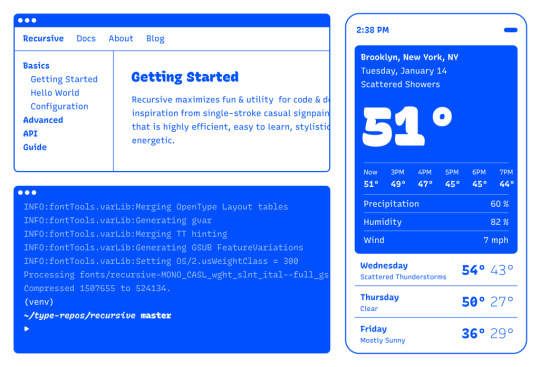
Recursive is made for code, websites, apps, and more.

Recursive Mono has both Linear and Casual styles for different “voices” in code, along with cursive italics if you want them — plus a wider weight range for monospaced display typography.
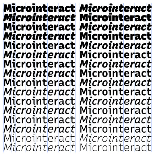
Recursive Sans is proportional, but unlike most proportional fonts, letters maintain the same width across styles for more flexibility in UI interactions and layout.
I started Recursive as a thesis project for a type design masters program at KABK TypeMedia, and when I launched my type foundry, Arrow Type, I was subsequently commissioned by Google Fonts to finish and release Recursive as an open-source, OFL font.
You can see Recursive and learn more about it what it can do at recursive.design.
Recursive is made to be a flexible type family for both websites and code, where its main purpose is to give developers and designers some fun & useful type to play with, combining fresh aesthetics with the latest in font tech.
First, a necessary definition: variable fonts are font files that fit a range of styles inside one file, usually in a way that allows the font user to select a style from a fluid range of styles. These stylistic ranges are called variable axes, and can be parameters, like font weight, font width, optical size, font slant, or more creative things. In the case of Recursive, you can control the “Monospacedness” (from Mono to Sans) and “Casualness” (between a normal, linear style and a brushy, casual style). Each type family may have one or more of its own axes and, like many features of type, variable axes are another design consideration for font designers.
You may have seen that Google Fonts has started adding variable fonts to its vast collection. You may have read about some of the awesome things variable fonts can do. But, you may not realize that many of the variable fonts coming to Google Fonts (including Recursive) have a lot more stylistic range than you can get from the default Google Fonts front end.
Because Google Fonts has a huge range of users — many of them new to web development — it is understandable that they’re keeping things simple by only showing the “weight” axis for variable fonts. But, for fonts like Recursive, this simplification actually leaves out a bunch of options. On the Recursive page, Google Fonts shows visitors eight styles, plus one axis. However, Recursive actually has 64 preset styles (also called named instances), and a total of five variable axes you can adjust (which account for a slew of more potential custom styles).
Recursive can be divided into what I think of as one of four “subfamilies.” The part shown by Google Fonts is the simplest, proportional (sans-serif) version. The four Recursive subfamilies each have a range of weights, plus Italics, and can be categorized as:
Sans Linear: A proportional, “normal”-looking sans-serif font. This is what gets shown on the Google Fonts website.
Sans Casual: A proportional “brush casual” font
Mono Linear: A monospace “normal” font
Mono Casual: A monospace “brush casual” font
This is probably better to visualize than to describe in words. Here are two tables (one for Sans, the other for Mono) showing the 64 named instances:
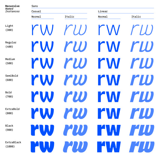

But again, the main Google Fonts interface only provides access to eight of those styles, plus the Weight axis:
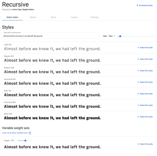
Recursive has 64 preset styles — and many more using when using custom axis settings — but Google Fonts only shows eight of the preset styles, and just the Weight axis of the five available variable axes.
Not many variable fonts today have more than a Weight axis, so this is an understandable UX choice in some sense. Still, I hope they add a little more flexibility in the future. As a font designer & type fan, seeing the current weight-only approach feels more like an artificial flattening than true simplification — sort of like if Google Maps were to “simplify” maps by excluding every road that wasn’t a highway.
Luckily, you can still access the full potential of variable fonts hosted by Google Fonts: meet the Google Fonts CSS API, version 2. Let’s take a look at how you can use this to get more out of Recursive.
But first, it is helpful to know a few things about how variable fonts work.
How variable fonts work, and why it matters
If you’ve ever worked with photos on the web then you know that you should never serve a 9,000-pixel JPEG file when a smaller version will do. Usually, you can shrink a photo down using compression to save bandwidth when users download it.
There are similar considerations for font files. You can often reduce the size of a font dramatically by subsetting the characters included in it (a bit like cropping pixels to just leave the area you need). You can further compress the file by converting it into a WOFF2 file (which is a bit like running a raster image file though an optimizer tool like imageOptim). Vendors that host fonts, like Google Fonts, will often do these things for you automatically.
Now, think of a video file. If you only need to show the first 10 seconds of a 60-second video, you could trim the last 50 seconds to have a much small video file.
Variable fonts are a bit like video files: they have one or more ranges of information (variable axes), and those can often either be trimmed down or “pinned” to a certain location, which helps to reduce file size.
Of course, variable fonts are nothing like video files. Fonts record each letter shape in vectors, (similar to SVGs store shape information). Variable fonts have multiple “source locations” which are like keyframes in an animation. To go between styles, the control points that make up letters are mathematically interpolated between their different source locations (also called deltas). A font may have many sets of deltas (at least one per variable axis, but sometimes more). To trim a variable font, then, you must trim out unneeded deltas.
As a specific example, the Casual axis in Recursive takes letterforms from “Linear” to “Casual” by interpolating vector control points between two extremes: basically, a normal drawing and a brushy drawing. The ampersand glyph animation below shows the mechanics in action: control points draw rounded corners at one extreme and shift to squared corners on the other end.
Generally, each added axis doubles the number of drawings that must exist to make a variable font work. Sometimes the number is more or less – Recursive’s Weight axis requires 3 locations (tripling the number of drawings), while its Cursive axis doesn’t require extra locations at all, but actually just activates different alternate glyphs that already exist at each location. But, the general math is: if you only use opt into fewer axes of a variable font, you will usually get a smaller file.
When using the Google Fonts API, you are actually opting into each axis. This way, instead of starting with a big file and whittling it down, you get to pick and choose the parts you want.
Variable axis tags
If you’re going to use the Google Fonts API, you first need to know about font axes abbreviations so you can use them yourself.
Variable font axes have abbreviations in the form of four-letter “tags.” These are lowercase for industry-standard axes and uppercase for axes invented by individual type designers (also called “custom” or “private” axes).
There are currently five standard axes a font can include:
wght – Weight, to control lightness and boldness
wdth – Width, to control overall letter width
opsz – Optical Size, to control adjustments to design for better readability at various sizes
ital – Italic, generally to switch between separate upright/italic designs
slnt – Slant, generally to control upright-to-slanted designs with intermediate values available
Custom axes can be almost anything. Recursive includes three of them — Monospace (MONO), Casual (CASL), and Cursive (CRSV) — plus two standard axes, wght and slnt.
Google Fonts API basics
When you configure a font embed from the Google Fonts interface, it gives you a bit of HTML or CSS which includes a URL, and this ultimately calls in a CSS document that includes one or more @font-face rules. This includes things like font names as well as links to font files on Google servers.
This URL is actually a way of calling the Google Fonts API, and has a lot more power than you might realize. It has a few basic parts:
The main URL, specifying the API (https://fonts.googleapis.com/css2)
Details about the fonts you are requesting in one or more family parameters
A font-display property setting in a display parameter
As an example, let’s say we want the regular weight of Recursive (in the Sans Linear subfamily). Here’s the URL we would use with our CSS @import:
@import url('https://fonts.googleapis.com/css2?family=Recursive&display=swap');
Or we can link it up in the <head> of our HTML:
<link href="https://fonts.googleapis.com/css2?family=Recursive&display=swap" rel="stylesheet">
Once that’s in place, we can start applying the font in CSS:
body { font-family: 'Recursive', sans-serif; }
There is a default value for each axis:
MONO 0 (Sans/proportional)
CASL 0 (Linear/normal)
wght 400 (Regular)
slnt 0 (upright)
CRSV 0 (Roman/non-cursive lowercase)
Choose your adventure: styles or axes
The Google Fonts API gives you two ways to request portions of variable fonts:
Listing axes and the specific non-default values you want from them
Listing axes and the ranges you want from them
Getting specific font styles
Font styles are requested by adding parameters to the Google Fonts URL. To keep the defaults on all axes but use get a Casual style, you could make the query Recursive:CASL@1 (this will serve Recursive Sans Casual Regular). To make that Recursive Mono Casual Regular, specify two axes before the @ and then their respective values (but remember, custom axes have uppercase tags):
https://fonts.googleapis.com/css2?family=Recursive:CASL,MONO@1,1&display=swap
To request both Regular and Bold, you would simply update the family call to Recursive:wght@400;700, adding the wght axis and specific values on it:
https://fonts.googleapis.com/css2?family=Recursive:wght@400;700&display=swap
A very helpful thing about Google Fonts is that you can request a bunch of individual styles from the API, and wherever possible, it will actually serve variable fonts that cover all of those requested styles, rather than separate font files for each style. This is true even when you are requesting specific locations, rather than variable axis ranges — if they can serve a smaller font file for your API request, they probably will.
As variable fonts can be trimmed more flexibility and efficiently in the future, the files served for given API requests will likely get smarter over time. So, for production sites, it may be best to request exactly the styles you need.
Where it gets interesting, however, is that you can also request variable axes. That allows you to retain a lot of design flexibility without changing your font requests every time you want to use a new style.
Getting a full variable font with the Google Fonts API
The Google Fonts API seeks to make fonts smaller by having users opt into only the styles and axes they want. But, to get the full benefits of variable fonts (more design flexibility in fewer files), you should use one or more axes. So, instead of requesting single styles with Recursive:wght@400;700, you can instead request that full range with Recursive:[email protected] (changing from the ; to .. to indicate a range), or even extending to the full Recursive weight range with Recursive:[email protected] (which adds very little file size, but a whole lot of extra design oomph).
You can add additional axes by listing them alphabetically (with lowercase standard axes first, then uppercase custom axes) before the @, then specifying their values or ranges after that in the same order. For instance, to add the MONO axis and the wght axis, you could use Recursive:wght,[email protected],0..1 as the font query.
Or, to get the full variable font, you could use the following URL:
https://fonts.googleapis.com/css2?family=Recursive:slnt,wght,CASL,CRSV,[email protected],300..1000,0..1,0..1,0..1&display=swap
Of course, you still need to put that into an HTML link, like this:
<link href="https://fonts.googleapis.com/css2?family=Recursive:slnt,wght,CASL,CRSV,[email protected],300..1000,0..1,0..1,0..1&display=swap" rel="stylesheet">
Customizing it further to balance flexibility and filesize
While it can be tempting to use every single axis of a variable font, it’s worth remembering that each additional axis adds to the overall files ize. So, if you really don’t expect to use an axis, it makes sense to leave it off. You can always add it later.
Let’s say you want Recursive’s Mono Casual styles in a range of weights,. You could use Recursive:wght,CASL,[email protected],1,1 like this:
<link href="https://fonts.googleapis.com/css2?family=Recursive:CASL,MONO,wght@1,1,300..1000&display=swap" rel="stylesheet">
You can, of course, add multiple font families to an API call with additional family parameters. Just be sure that the fonts are alphabetized by family name.
<link href="https://fonts.googleapis.com/css2?family=Inter:slnt,[email protected],100..900?family=Recursive:CASL,MONO,wght@1,1,300..1000&display=swap" rel="stylesheet">
Using variable fonts
The standard axes can all be controlled with existing CSS properties. For instance, if you have a variable font with a weight range, you can specify a specific weight with font-weight: 425;. A specific Slant can be requested with font-style: oblique 9deg;. All axes can be controlled with font-variation-settings. So, if you want a Mono Casual very-heavy style of Recursive (assuming you have called the full family as shown above), you could use the following CSS:
body { font-weight: 950; font-variation-settings: 'MONO' 1, 'CASL' 1; }
Something good to know: font-variation-settings is much nicer to use along with CSS custom properties.
Another useful thing to know is that, while you should be able to activate slant with font-style: italic; or font-style: oblique Xdeg;, browser support for this is inconsistent (at least at the time of this writing), so it is useful to utilize font-variation-settings for the Slant axis, as well.
You can read more specifics about designing with variable fonts at VariableFonts.io and in the excellent collection of CSS-Tricks articles on variable fonts.
Nerdy notes on the performance of variable fonts
If you were to using all 64 preset styles of Recursive as separate WOFF2 files (with their full, non-subset character set), it would be total of about 6.4 MB. By contrast, you could have that much stylistic range (and everything in between) at just 537 KB. Of course, that is a slightly absurd comparison — you would almost never actually use 64 styles on a single web page, especially not with their full character sets (and if you do, you should use subsets and unicode-range).
A better comparison is Recursive with one axis range versus styles within that axis range. In my testing, a Recursive WOFF2 file that’s subset to the “Google Fonts Latin Basic” character set (including only characters to cover English and western European languages), including the full 300–1000 Weight range (and all other axes “pinned” to their default values) is 60 KB. Meanwhile, a single style with the same subset is 25 KB. So, if you use just three weights of Recursive, you can save about 15 KB by using the variable font instead of individual files.
The full variable font as a subset WOFF2 clocks in at 281 KB which is kind of a lot for a font, but not so much if you compare it to the weight of a big JPEG image. So, if you assume that individual styles are about 25 KB, if you plan to use more than 11 styles, you would be better off using the variable font.
This kind of math is mostly an academic exercise for two big reasons:
Variable fonts aren’t just about file size.The much bigger advantage is that they allow you to just design, picking the exact font weights (or other styles) that you want. Is a font looking a little too light? Bump up the font-weight a bit, say from 400 to 425!
More importantly (as explained earlier), if you request variable font styles or axes from Google Fonts, they take care of the heavy lifting for you, sending whatever fonts they deem the most performant and useful based on your API request and the browsers visitors access your site from.
So, you don’t really need to go downloading fonts that the Google Fonts API returns to compare their file sizes. Still, it’s worth understanding the general tradeoffs so you can best decide when to opt into the variable axes and when to limit yourself to a couple of styles.
What’s next?
Fire up CodePen and give the API a try! For CodePen, you will probably want to use the CSS @import syntax, like this in the CSS panel:
@import url('https://fonts.googleapis.com/css2?family=Recursive:CASL,CRSV,MONO,slnt,[email protected],0..1,0..1,-15..0,300..1000&display=swap');
It is apparently better to use the HTML link syntax to avoid blocking parallel downloads of other resources. In CodePen, you’d crack open the Pen settings, select HTML, then drop the <link> in the HTML head settings.
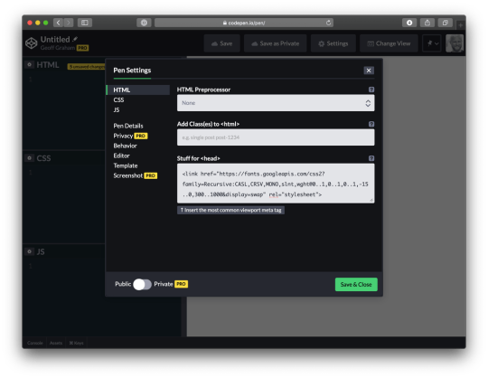
Or, hey, you can just fork my CodePen and experiment there:
CodePen Embed Fallback
Take an API configuration shortcut
If you are want to skip the complexity of figuring out exact API calls and looking to opt into variable axes of Recursive and make semi-advanced API calls, I have put together a simple configuration tool on the Recursive minisite (click the “Get Recursive” button). This allows you to quickly select pinned styles or variable ranges that you want to use, and even gives estimates for the resulting file size. But, this only exposes some of the API’s functionality, and you can get more specific if you want. It’s my attempt to get people using the most stylistic range in the smallest files, taking into account the current limitations of variable font instancing.
Use Recursive for code
Also, Recursive is actually designed first as a font to use for code. You can use it on CodePen via your account settings. Better yet, you can download and use the latest Recursive release from GitHub and set it up in any code editor.
Explore more fonts!
The Google Fonts API doc helpfully includes a (partial) list of variable fonts along with details on their available axis ranges. Some of my favorites with axes beyond just Weight are Crimson Pro (ital, wght), Work Sans (ital, wght), Encode Sans (wdth, wght), and Inter (slnt, wght). You can also filter Google Fonts to show only variable fonts, though most of these results have only a Weight axis (still cool and useful, but don’t need custom URL configuration).
Some more amazing variable fonts are coming to Google Fonts. Some that I am especially looking forward to are:
Fraunces: “A display, “Old Style” soft-serif typeface inspired by the mannerisms of early 20th century typefaces such as Windsor, Souvenir, and the Cooper Series”
Roboto Flex: Like Roboto, but withan extensive ranges of Weight, Width, and Optical Size
Crispy: A creative, angular, super-flexible variable display font
Science Gothic: A squarish sans “based closely on Bank Gothic, a typeface from the early 1930s—but a lowercase, design axes, and language coverage have been added”
And yes, you can absolutely download and self-host these fonts if you want to use them on projects today. But stay tuned to Google Fonts for more awesomely-flexible typefaces to come!
Of course, the world of type is much bigger than open-source fonts. There are a bunch of incredible type foundries working on exciting, boundary-pushing fonts, and many of them are also exploring new & exciting territory in variable fonts. Many tend to take other approaches to licensing, but for the right project, a good typeface can be an extremely good value (I’m obviously biased, but for a simple argument, just look at how much typography strengthens brands like Apple, Stripe, Google, IBM, Figma, Slack, and so many more). If you want to feast your eyes on more possibilities and you don’t already know these names, definitely check out DJR, OHno, Grilli, XYZ, Dinamo, Typotheque, Underware, Bold Monday, and the many very-fun WIP projects on Future Fonts. (I’ve left out a bunch of other amazing foundries, but each of these has done stuff I particularly love, and this isn’t a directory of type foundries.)
Finally, some shameless plugs for myself: if you’d like to support me and my work beyond Recursive, please consider checking out my WIP versatile sans-serif Name Sans, signing up for my (very) infrequent newsletter, and giving me a follow on Instagram.
The post Getting the Most Out of Variable Fonts on Google Fonts appeared first on CSS-Tricks.
You can support CSS-Tricks by being an MVP Supporter.
Getting the Most Out of Variable Fonts on Google Fonts published first on https://deskbysnafu.tumblr.com/
0 notes
Text
Simple Server Side Rendering, Routing, and Page Transitions with Nuxt.js
A bit of a wordy title, huh? What is server side rendering? What does it have to do with routing and page transitions? What the heck is Nuxt.js? Funnily enough, even though it sounds complex, working with Nuxt.js and exploring the benefits of isn't too difficult. Let's get started!
Server side rendering
You might have heard people talking about server side rendering as of late. We looked at one method to do that with React recently. One particularly compelling aspect is the performance benefits. When we render our HTML, CSS, and JavaScript on the server, we often have less JavaScript to parse both initially and on subsequent updates. This article does really well going into more depth on the subject. My favorite takeaway is:
By rendering on the server, you can cache the final shape of your data.
Instead of grabbing JSON or other information from the server, parsing it, then using JavaScript to create layouts of that information, we're doing a lot of those calculations upfront, and only sending down the actual HTML, CSS, and JavaScript that we need. This can reap a lot of benefits with caching, SEO, and speed up our apps and sites.
What is Nuxt.js?
Server side rendering sounds pretty nice, but you're probably wondering if it's difficult to set up. I've been using Nuxt.js for my Vue applications lately and found it surprisingly simple to work with. To be clear: you don't need to use Nuxt.js in particular to do server side rendering. I'm just a fan of this tool for many reasons. I ran some tests last month and found that Nuxt.js had even higher lighthouse scores out of the gate than Vue's PWA template, which I thought was impressive.
Nuxt.js is a higher-level framework that you can use with a CLI command that you can use to create universal Vue applications. Here are some, not all, of the benefits:
Server-Side Rendering
Automatic Code Splitting
Powerful Routing System
Great lighthouse scores out of the gate 🐎
Static File Serving
ES6/ES7 Transpilation
Hot reloading in Development
Pre-processors: SASS, LESS, Stylus, etc
Write Vue Files to create your pages and layouts!
My personal favorite: easily add transitions to your pages
Let's set up a basic application with some routing to see the benefits for ourselves.
Getting Set up
The first thing we need to do if you haven't already is download Vue's CLI. You can do so globally with this command:
npm install -g vue-cli # ... or ... yarn add global vue-cli
You will only need to do this once, not every time you use it.
Next, we'll use the CLI to scaffold a new project, but we'll use Nuxt.js as the template:
vue init nuxt/starter my-project cd my-project yarn # or... npm install npm run dev
You'll see the progress of the app being built and it will give you a dedicated development server to check out: http://127.0.0.1:3000/. This is what you'll see right away (with a pretty cool little animation):
Let's take a look at what's creating this initial view of our application at this point. We can go to the `pages` directory, and inside see that we have an `index.vue` page. If we open that up, we'll see all of the markup that it took to create that page. We'll also see that it's a `.vue` file, using single file components just like any ordinary `vue` file, with a template tag for the HTML, a script tag for our scripts, where we're importing a component, and some styles in a style tag. (If you aren't familiar with these, there's more info on what those are here.) The coolest part of this whole thing is that this .vue file doesn't require any special setup. It's placed in the `pages` directory, and Nuxt.js will automatically make this server-side rendered page!
Let's create a new page and set up some routing between them. In pages/index.vue, dump the content that's already there, and replace it with:
<template> <div class="container"> <h1>Welcome!</h1> <p><nuxt-link to="/product">Product page</nuxt-link></p> </div> </template> <style> .container { font-family: "Quicksand", "Source Sans Pro", -apple-system, BlinkMacSystemFont, "Segoe UI", Roboto, "Helvetica Neue", Arial, sans-serif; /* 1 */ padding: 60px; } </style>
Then let's create another page in the pages directory, we'll call it `product.vue` and put this content inside of it:
<template> <div class="container"> <h1>This is the product page</h1> <p><nuxt-link to="/">Home page</nuxt-link></p> </div> </template>
Right away, you'll see this:
youtube
Ta-da! 🏆 Right away, we have server side rendering, routing between pages (if you check out the URL you can see it's going between the index page and product page), and we even have a sweet little green loader that zips across the top. We didn't have to do much at all to get that going.
You might have noticed in here, there's a special little element: <nuxt-link to="/">. This tag can be used like an a tag, where it wraps around a bit of content, and it will set up an internal routing link between our pages. We'll use to="/page-title-here" instead of an href.
Now, let's add some transitions. We’ll do this in a few stages: simple to complex.
Creating Page Transitions
We already have a really cool progress bar that runs across the top of the screen as we’re routing and makes the whole thing feel very zippy. (That’s a technical term). While I like it very much, it won’t really fit the direction we’re headed in, so let’s get rid of it for now.
We're going to go into our `nuxt.config.js` file and change the lines:
/* ** Customize the progress-bar color */ loading: { color: '#3B8070' },
to
loading: false,
You'll also notice a few other things in this nuxt.config.js file. You'll see our meta and head tags as well as the content that will be rendered inside of them. That's because we won't have a traditional `index.html` file as we do in our normal CLI build, Nuxt.js is going to parse and build our `index.vue` file together with these tags and then render the content for us, on the server. If you need to add CSS files, fonts, or the like, we would use this Nuxt.js config file to do so.
Now that we have all that down, let's understand what's available to us to create page transitions. In order to understand what’s happening on the page that we’re plugging into, we need to review how the transition component in Vue works. I've written an article all about this here, so if you'd like deeper knowledge on the subject, you can check that out. But what you really need to know is this: under the hood, Nuxt.js will plug into the functionality of Vue's transition component, and gives us some defaults and hooks to work with:
You can see here that we have a hook for what we want to happen right before the animation starts enter, during the animation/transition enter-active, and when it finishes. We have these same hooks for when something is leaving, prepended with leave instead. We can make simple transitions that just interpolate between states, or we could plug a full CSS or JavaScript animation into them.
Usually in a Vue application, we would wrap a component or element in <transition> in order to use this slick little functionality, but Nuxt.js will provide this for us at the get-go. Our hook for the page will begin with, thankfully- page. All we have to do to create an animation between pages is add a bit of CSS that plugs into the hooks:
.page-enter-active, .page-leave-active { transition: all .25s ease-out; } .page-enter, .page-leave-active { opacity: 0; transform-origin: 50% 50%; }
I'm also going to add an extra bit of styling here so that you can see the page transitions a little easier:
html, body { font-family: "Quicksand", "Source Sans Pro", -apple-system, BlinkMacSystemFont, "Segoe UI", Roboto, "Helvetica Neue", Arial, sans-serif; /* 1 */ background: #222; color: white; width: 100vw; height: 100vh; } a, a:visited { color: #3edada; text-decoration: none; } .container { padding: 60px; width: 100vw; height: 100vh; background: #444; }
youtube
Right now we're using a CSS Transition. This only gives us the ability to designate what to do in the middle of two states. We could do something a little more interesting by having an animation adjust in a way that suggests where something is coming from and going to. For that to happen, we could separate out transitions for page-enter and page-leave-active classes, but it's a little more DRY to use a CSS animation and specify where things are coming from and going to, and plug into each for .page-enter-active, and .page-leave-active:
.page-enter-active { animation: acrossIn .45s ease-out both; } .page-leave-active { animation: acrossOut .65s ease-in both; } @keyframes acrossIn { 0% { transform: translate3d(-100%, 0, 0); } 100% { transform: translate3d(0, 0, 0); } } @keyframes acrossOut { 0% { transform: translate3d(0, 0, 0); } 100% { transform: translate3d(100%, 0, 0); } }
Let's also add a little bit of special styling to the product page so we can see the difference between these two pages:
<style scoped> .container { background: #222; } </style>
This scoped tag is pretty cool because it will apply the styles for this page/vue file only. If you have heard of CSS Modules, you'll be familiar with this concept.
We would see this (this page is for demo purposes only, that's probably too much movement for a typical page transition):
youtube
Now, let's say we have a page with a totally different interaction. For this page, the movement up and down was too much, we just want a simple fade. For this case, we'd need to rename our transition hook to separate it out.
Let’s create another page, we’ll call it the contact page and create it in the pages directory.
<template> <div class="container"> <h1>This is the contact page</h1> <p><nuxt-link to="/">Home page</nuxt-link></p> </div> </template> <script> export default { transition: 'fadeOpacity' } </script> <style> .fadeOpacity-enter-active, .fadeOpacity-leave-active { transition: opacity .35s ease-out; } .fadeOpacity-enter, .fadeOpacity-leave-active { opacity: 0; } </style>
Now we can have two-page transitions:
youtube
You can see how we could build on these further and create more and more streamlined CSS animations per page. But from here let's dive into my favorite, JavaScript animations, and create page transitions with a bit more horsepower.
Javascript Hooks
Vue's <transition> component offers some hooks to use JavaScript animation in place of CSS as well. They are as follows, and each hook is optional. The :css="false" binding lets Vue know we're going to use JS for this animation:
<transition @before-enter="beforeEnter" @enter="enter" @after-enter="afterEnter" @enter-cancelled="enterCancelled" @before-Leave="beforeLeave" @leave="leave" @after-leave="afterLeave" @leave-cancelled="leaveCancelled" :css="false"> </transition>
The other thing we have available to us are transition modes. I'm a big fan of these, as you can state that one animation will wait for the other animation to finish transitioning out before transitioning in. The transition mode we will work with will be called out-in.
We can do something really wild with JavaScript and the transition mode, again, we're going a little nuts here for the purposes of demo, we would usually do something much more subtle:
youtube
In order to do something like this, I've run yarn add gsap because I'm using GreenSock for this animation. In my index.vue page, I can remove the existing CSS animation and add this into the <script> tags:
import { TweenMax, Back } from 'gsap' export default { transition: { mode: 'out-in', css: false, beforeEnter (el) { TweenMax.set(el, { transformPerspective: 600, perspective: 300, transformStyle: 'preserve-3d' }) }, enter (el, done) { TweenMax.to(el, 1, { rotationY: 360, transformOrigin: '50% 50%', ease: Back.easeOut }) done() }, leave (el, done) { TweenMax.to(el, 1, { rotationY: 0, transformOrigin: '50% 50%', ease: Back.easeIn }) done() } } }
All of the code for these demos exist in my Intro to Vue repo for starter materials if you're getting ramped up learning Vue.
One thing I want to call out here is that currently there is a bug for transition modes in Nuxt.js. This bug is fixed, but the release hasn't come out yet. It should be all fixed and up to date in the upcoming 1.0 release, but in the meantime, here is a working simple sample demo, and the issue to track.
With this working code and those JavaScript hooks we can start to get much fancier and create unique effects, with different transitions on every page:
youtube
Here's the site that the demo was deployed to if you'd like to see it live: http://ift.tt/2tGAjZd as well as the repo that houses the code for it: http://ift.tt/2twFpHw
Navigation
In that last demo you might have noticed we had a common navigation across all of the pages what we routed. In order to create this, we can go into the `layouts` directory, and we'll see a file called `default.vue`. This directory will house the base layouts for all of our pages, "default" being the, uhm, default :)
Right away you'll see this:
<template> <div> <nuxt/> </div> </template>
That special <nuxt/> tag will be where our `.vue` pages files will be inserted, so in order to create a navigation, we could insert a navigation component like this:
<template> <div> <img class="moon" src="~assets/FullMoon2010.png" /> <Navigation /> <nuxt/> </div> </template> <script> import Navigation from '~components/Navigation.vue' export default { components: { Navigation } } </script>
I love this because everything is kept nice and organized between our global and local needs.
I then have a component called Navigation in a directory I've called `components` (this is pretty standard fare for a Vue app). In this file, you'll see a bunch of links to the different pages:
<nav> <div class="title"> <nuxt-link to="/rufina">Rufina</nuxt-link> <nuxt-link to="/prata">Prata</nuxt-link> <nuxt-link exact to="/">Playfair</nuxt-link> </div> </nav>
You'll notice I'm using that <nuxt-link> tag again even though it's in another directory, and the routing will still work. But that last page has one extra attribute, the exact attribute: <nuxt-link exact to="/">Playfair</nuxt-link> This is because there are many routes that match just the / directory, all of them do, in fact. So if we specify exact, Nuxt will know that we only mean the index page in particular.
Further Resources
If you'd like more information about Nuxt, their documentation is pretty sweet and has a lot of examples to get you going. If you'd like to learn more about Vue, I've just made a course on Frontend Masters and all of the materials are open source here, or you can check out our Guide to Vue, or you can go to the docs which are extremely well-written. Happy coding!
Simple Server Side Rendering, Routing, and Page Transitions with Nuxt.js is a post from CSS-Tricks
via CSS-Tricks http://ift.tt/2vSp2FI
0 notes