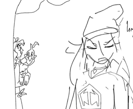
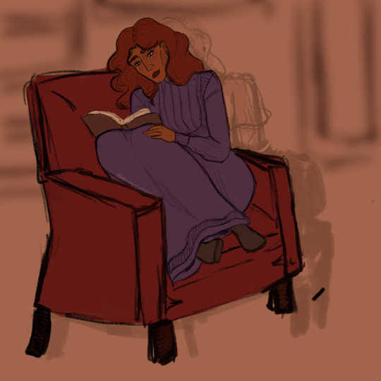
#this is just a cleaned up and coloured sketch bc I wanted to draw an
Text
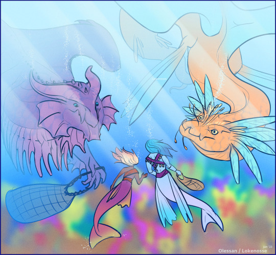
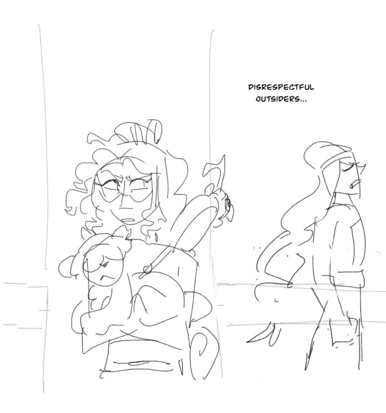
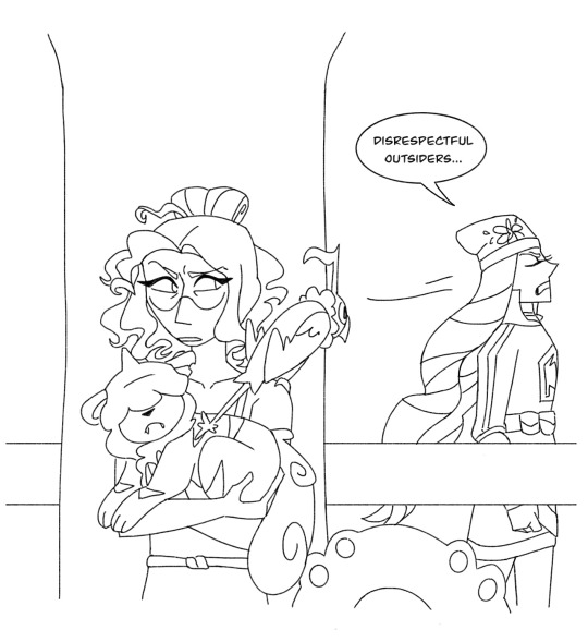
Each year the annual meeting of the ambassadors brings a new face or two 🐍
#flight rising#flight rising art#fr art#frfanart#flightrising#lokenosse art#this was going to be more polished but I liked it loose and kind of messy so here it is lol#it's been ages since I've been able to finish a FR thing I have been pretty stressed through 2022#so here is a lighthearted one lol#this is just a cleaned up and coloured sketch bc I wanted to draw an#undertide
249 notes
·
View notes
Text

hey hey hey!!!
#artists on tumblr#across the spiderverse#spiderverse#atsv#hobie brown#spider punk#hello im love him#came out of the theatre possessed#hand guided by the radioactive spider that makes you draw good#had SO much fun with this one#i hate hate HATE doing lineart bc i always baby my lines#clean them up at x10 zoom#and then wonder why the sketch looked so good and the lines are so shit#this one i just went wild#and the lines are GORGEOUS#also got to use all the bright colours#and pile up textures bc that's what hobie would've wanted#ALSO all the non-drawn elements are my own photos from around town#even the letters are from the magazines i have#was working on this for a week straight#so fucking happy with it and hope you like it too#alexskyline
335 notes
·
View notes
Note
Hi! Not sure if you’re still doing this but I wanted to know if you have art tips on drawing faces and bodies for poses? Like step by step way of doing things if you do that.
P.s. love your art!
i will try to help!
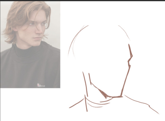
I almost always use a reference photo to start. if i cant find the pose i want then i frankenstein several images together. for simplicity's sake im using a random portrait that kind of looks like my oc jamie (from an editorial called MONO #ChuckII STORY by Fucking Young!) im crediting it bc im going to show it unedited but typically i dont bc beyond using it for planes of faces, its not recognizably linked. so...transformative work.
from there i block in the edges of the face and broad shapes w a light colour. i usually "dim" or sometimes blur my refs bc it helps me see the broader shapes? idk if that makes sense at all.
and then i usually go right into the nose bc to me its like... the foundation of a face. IF I AM DRAWING A REAL ACTOR/person. i pull up a ref of their face at the same angle. i sometimes have to scour for these. and from here i draw in black bc it means i cant pussyfoot and my lines have to be decisive.
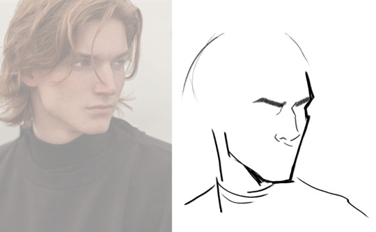
tbh tho, it is very unnatural for me to stop or to do stuff in too specific of an order so this all looks very odd to me..anyway then ill putter around to other features and hair. by the time ive got eyes/mouth/nose and hair if its the same as whoever im drawing, the ref is put to the side until i have to shade, (if i use it at all again)

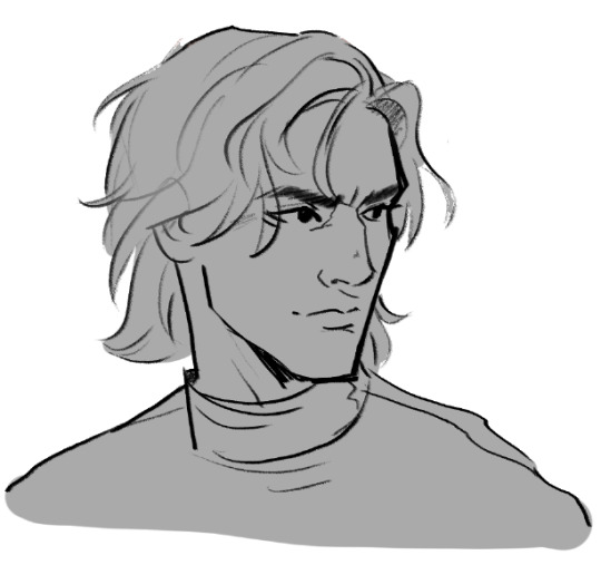
and then i just clean up my sketch till im happy, flipping the canvas with a hotkey OFTEN. i simplify shapes in hair a lot for flow. then he gets filled in with grey (these are usually when i post wips) and then i jump into colouring!
and since you haven't asked for that, ill leave you with that!
81 notes
·
View notes
Text


hiii!! it’s me, elaine/lainie
i know this one is not as detailed as my other drawings, but that’s just bc i had artblock and just wanted to try and get a simple sketch done which i just cleaned up and did some basic colours and very little shading. i don’t know how to feel about how i draw erik mainly bc it’s never consistent
ty for the reception on my last drawing !! <333 you all make me feel so appreciated on this website and i love and adore every single one of you
#art#fanart#erik poto#erik the phantom#phantom#phantom of the opera#the phantom of the opera#erik destler#phandom#phan art
79 notes
·
View notes
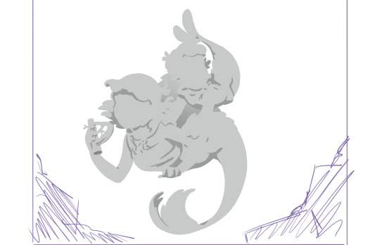
Text

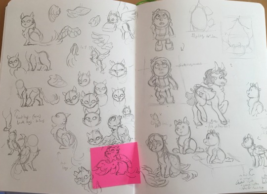

gonna just d r o p some extremely rough sketches here bc my sketchbook I’ve had on the go since 2020 is almost filled up and once it is I probably won’t go revisiting any of the sketches in it, so I may as well share some of them here
I’m incapable of shutting up abt my art so ramblings under the cut
1-3 - mattie sketches :) the last ones are recent and the 1st is one of the first drawings I did of her, back in 2021. idk I just think it’s important y’all know she’s been on her tide mouse shenanigans since the beginning
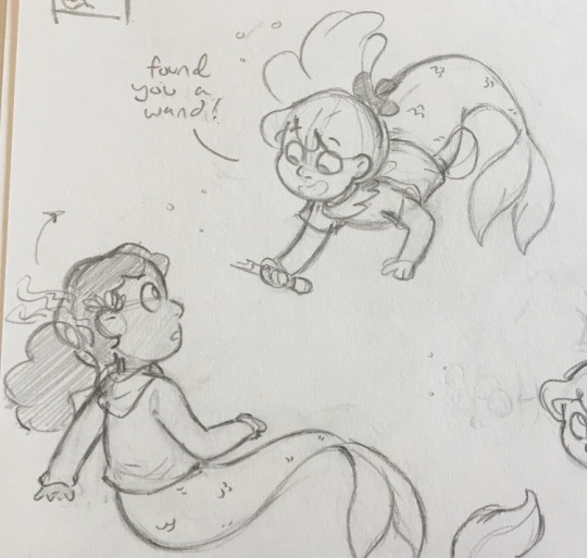
4 - I think I drew this back in last march and meant to move it to digital and clean it up there but things got busy and I never did :( they’re based on @randomwords247’s wonderful mermaid designs bc I love them
5 - unrelated to the last one, but while I was working on one of my little mermaid au drawings I tried to think how I’d approach the sequel if I got that far & ended up w. this. something something mermaids having human familiars being frowned upon
6 - I think. this is a drawing of @blaithnne’s pony!lauren that I never finished oops
7 - forgot I had this!! year before last me and @bubblekidaesthetics were planning to cosplay these two at comic con, and I got super hyped and doodled this. we did do this cosplay and it was awesome <3
8 - slightly more recent design stuff for freyja, still based on hilda-fanblog/rhombus’ design ofc but figuring out if I wanted my take on her to change anything like how many legs she has lol. also some pony!mountain king doodles on the next page
9-10- something something centaur au. somewhere in my notes app is a whole list of hilda chars and horse types/colours bc I started researching them and got so carried away. johanna’s supposed to be a bay and hilda was gonna be a shetland I think…? (the hilda one is a lot more recent and I think it shows lol). rip to dee who had to watch me talk abt this au so much and barely actually draw it
anyway tumblr won’t let me add any more pics which is probably a good thing 🤷♀️ I hope literally everyone feels better as an artist for seeing what an absolute mess my drawings start out as 😌 now I gotta buy a new sketchbook
#yeets out this thing that has been hanging out in my drafts since like january#sorry to the ppl I tagged who had to scroll down to find out why#i love drawing other ppl’s designs but they rarely get finished 🥲#hilda the series#Hilda netflix#mattie#art tag#sketches#also fun fact! These are like. the sketches I spent a lil extra time on and turned out Good#there are many MANY that are rough as hell and I moved em to digital to fix em#just saying#this is not indicative of what I always draw like lol#hilda ocs tag
80 notes
·
View notes
Text
I'm a little late to the #webcomicday party but I still thought it'd be fun to break down my process a little bit using the latest Way Out chapter as an example!
So I have a rough outline for the whole comic but I don't go into too much detail planning each story arc until I'm about to get stuck into it. The rough outline is for jotting down ideas as they come along, acting as a skeleton for what will eventually happen, while the more detailed arc outlines are for plotting and pacing the story beats.
Planning each chapter out like this means that each one feels like its own mini-story, and more importantly, stays on track and achieves something to further the story or character progression. You'll notice that the chapter notes are still pretty barebones, which leaves me room to fine tune the smaller beats within the script.


Then, it's scripting time! I'll only have a script for the chapter I'm working on and a script for the next chapter, so as I'm currently working on Chapter 66 I have a script for chapter 66 & 67 but not 68. This is ideal for me in keeping the story flexible, allowing me to take a chapter in a bit of a different direction without feeling tied to a whole arc's worth of scripts that I'll need to rework otherwise.
Around 20 panels is the sweet spot for a chapter of Way Out; there are some with fewer and some with more, but shooting for that number makes me think about whether a scene ought to be extended or cut down in order to meet that goal. If I only plan out 18 panels then I can probably squeeze something extra in, while if I plan out 23 panels, I have a look and see if there isn't anything that can't be condensed.
The scripts themselves are pretty sparse, mostly just dialogue with basic action notes that I highlight as I finish. I'm usually pretty good with visualising things in my mind so the notes are more of a reminder to self about angles & expressions more than anything- if this were a collaborative project I'd probably put more effort into making it descriptive, but it's not.

I've never been one for thumbnailing, which is bad comic practice, I know. But once I have my script I just want to get stuck straight into drawing and don't like slowing down to jot down what is already pretty vivid in my head when I can just. draw the thing.
(a large part of why I started my first webcomic in the vertical format is because you don't need to consider variety in panelling and page flow, which is something thumbnails are very important for).
And so the sketching begins! My sketches are rarely pretty with little focus on anatomy and shape and more focus on blocking and size. I use Procreate to draw the panels and its resizing tool has a tendency to obliterate the quality, which I can sharpen in small amounts but it saves a lot of pain if I plan it all out in the ugly stage.
In some ways I often prefer the sketches to the clean lineart, but that's mostly the stylistic scratchy-ness of it that I have to do away with in favour of clean lines. I'm not always super proud of the art in the end but not every panel needs to be a masterpiece and it's all practice. I think a quantity over quality approach is kind of necessary if you want to make a comic and not lose your mind.
I sharpen up and clean any spots up as I go, but once they're all done I glue all the panels together on my desktop so that I can adjust the spacing between them, then I cut them back up again into smaller slices for posting! And that's the whole chapter process!
I also have a quick (and by quick I mean 4 minute) rough timelapse of chapter 65's coloured panel I can post, if anyone would be interested in seeing that, but it'll probably need to be its own post bc it'll crash this one.
10 notes
·
View notes
Note
Sunny, is there anywhere we can watch your drawing process? Lines and colours are sooooo cool
just my really old speedpaints on YT! I kinda stopped trying to record my process bc whenever I do it ends up either being a pic I never finish or I get tired of opening the recorder every time I work on the pic across multiple days/weeks/whenever 💀
but basically 1. I choose a bg color I want depending on what the picture is gonna be, if there's no specific setting/lighting I choose neutral colors r de-saturated pink/yellow blue etc depending from what would suit the scene more, otherwise I choose something based on what I'm gonna put in the bg if anything (unless I'm referencing a specific palette, all my colors are just chosen based on what I think would look nice and then I tweak them with the hue and saturation tool if needed)
2. I do the sketch, most of the time it's also going to be my lines once I clean it up a bit, if it's a complicated pose it's possible I will do a separate very messy sketch just to get the poses down and then I sketch again over it
3. coloring: if it's an illustration it's possible I will be coloring random parts of the sketch before I'm even done with it just to see what's it going to look like moving forward since usually the coloring is part of the main focus, if it's a simpler pic or a comic panel where I use flatter colors anyway, I usually make sure my lines are fully done first so that I can use the wand selection tool and fill in each part faster
4. fixing/painting over parts of the pic on a separate layer if I need to (it makes it faster to edit something rather than tweaking the individual layers)
5. sometimes there will be an overlay layer on top or I use the curve tool in PS to tweak the contrast and some hues (also the gradient map tool in clip studio is interesting for tweaking colors a little, I use that sometimes)
hope this helps! :>
100 notes
·
View notes
Text

2024 Human Art VS 2019 Human Art !!!!!
AS PROMISED, HERE'S A POST WITH SOME NEW ART!!!
And also an art comparison, just to see, how much I improved in drawing the 2 bois <3
I'm MEGA tired despite having slept after work, but I WON'T let that deter me from writing a description!! YAPNADO AHEAD;
FINN AND MARCOOO. FINNANMARCO. BEEN A WHILE SINCE I'VE ACOUSTICALLY AND FERALLY YELLED ABOUT MY 2 FICTIONAL MEN WHOM ARE CLOSE TO MY HEART.
I'm SO glad, that in the new drawing, Marco finally looks like the twink he always was, but still enough meat on the bones to look NORMAL lmao, can't say that about the 4 other sketches of me trying to redraw this ref for years. xD (why yes, his wings took forever, why do you ask? /lh)
I'M MEGA SUPER DUPER GLAD, that Finn FINALLY looks like a chubby, wild bastard TOO, OH TOOTHPASTE MAN, HOW MANY HEARTACHES YOU GAVE ME OVER STRUGGLING TO DRAW AN ENDOMORPHIC BODY TYPE. BUT I CAN NOWWWWWWWwwww!!!!!
God this habit of loudly reading out my posts as I type them made me realise what a bad Schwarzenegger impression I do on accident bc I'm overly excited to post something after a month of silence SDKFSKLDG
ONE THING I ALWAYS WANTED TO DO. IS PUT EVERY DETAIL I NEEDED ON A BIG REF. SO I DID! I've drawn closeups of the boys's eyes, I've drawn Finn's tongue so that I don't need to constantly remind myself what his blush and flesh colours were sdfkldsgkl, I FINALLY denoted their heights, so people know that they're tall TALL dudes (and that Finn obviously will struggle w/ his lanky mfing legs, we LOVE giving a middle-aged man heart attacks once he reaches his 40's!!!)
ANNDDD ALSO SOME SIDE VIEWS OF THEM. The last side-view I had of F & M, looked REAL bad. Like, Marco's face looked WAY too stereotypically European (to my fault bc surprise surprise not many African people live in Europe so I had poor frame of reference but I've been fixing it via looking up images online instead, at least it helps but yeah, I have a hard time so far unfortunately💀), Finn's was just... B u c k e t. NOT LIKE HANDSOME BUCKET. BUT JUST BUCKET. IT NEEDED FIXING (fun fact I accidentally made Finn have the most attractive jaw shape for men according to beauty standards and I DIDN'T EVEN KNOW I JUST WANTED THIS MAN TO LOOK S Q U A R E AND THAT'S IT, MINECRAFT STEVE HAS MORE RIZZ THAN MOST MEN OFFICIALLY).
OH YEAH ALSO A CLAW REF AGAIN FOR FINN!!! His old ref looks too cool for me to give up on it tbh even as dated as it is sfjklsdglk, BUT I felt like I needed to redraw them properly.
FUNNILY ENOUGH A PERSON I COMMISSIONED SAID I HAVE SOME REALLY CLEAN AND NICE LINEART. I wish I heard that 5 years ago when I was really insecure about my bad lineart skills xD, I don't use lineart anymore nowadays outside of reference-drawings like these I don't plan to redraw in the next years unless necessary soooo yeah! They're gonna appear much rarer unless I go off and about making more ref sheets of all of my Sonc OC's sfklsdgsdfksdg
This drawing took 5 days to make btw. Not the hours spent on this LOL. 5 days of my life I'll never get back tho bc I care too much about my babies and I feel they deserve proper refs sdfklsdglk
WHAT ELSE SHOULD I MENTION.....HOPEFULLY I PLAN TO DRAW MORE HUMAN REFS IN THE FUTURE INSTEAD OF STAY IN MY COMFORT ZONE OF SONIC OCS ONLY. I for years wasn't confident in my ability to draw humans, but I can do so NOW at least!!!!!!!!!! Even if I'm like...3 years too late to how I wish my art looked back then already dsklfdsg, I have some high standards I need to continue to knock down as my 2024 resolution sdfklsdg
^IT'S BEEN WORKING THOUGH AS YOU CAN TELL BC I'VE BEEN UPLOADING SOME BAD DOODLES AND SKETCHES, BEEN DRAWING MORE GARBAGE AND BECAME MORE INVOLVED IN MY BELOVED FANDOMS. I wanna continue doing so! It was the most fun I've had with art ever. I hope to properly meet more fandoms I left in the past bc I thought it'd be embarrassing to share my passion for a franchise back then. I EMBRACE THE CRINGE NOW AS AN ADULT AT LEAST EVEN IF 7 YEARS TOO LATE ON THAT FRONT TOO. We all age and mature ig but I just become more silly year by year,,, c:
Oh yeah if you also see this btw lemme know, whether the new watermark tiles are subtle enough to not be noticed!!!! I know, watermarks are annoying and nobody likes them, but ever since AI invasions, I REFUSE to put my work online without ANY form of proof that somebody took it from my page. I just want people to stop lying on the internet for cloud and pick up a pencil. It's not that hard smfh. The only time I could excuse AI art is w/ amputees man. That's the only time I could empathise with someone, who wants to be an artist but LITERALLY can't bc they got dealt a bad hand in life. I digress my AI hate can be rambled about some other day, I know I love yapping and writing essays about THAT topic for sure sfklsdklg
I chose to post this ref to my Tumblr first tho, bc I still wanna work on my drawing of Abbacchio,,,, he is quite dear to me and I'd love to put effort into a doodle of him that won't take too long. Like 4 hours or 5 hours tops. I still have yet to figure out, if his cute star shape on his head is a hat or part of his hair. Bc I CAN'T TELL TBH AND I'VE BEEN DRAWING IT AS PART OF HIS HAIR PATTERN BUT I THINK IT'S A HAT NOW EVER SINCE I LOOKED AT MORE ASBR CAPS OF HIM I TOOK FOR REFERENCES. xD
Also another side-note, but I've ofc reduced down the lankiness of the dudes I draw™, but I in result wanted to sliiightly make larger feet/hands bc my Sonic phase will continue to possess me 'til the end of time /hj, if you also wanna lemme know what you think on that, bls do! I am messing about with stylization still. I am finding my footing with stylizing humans sOOO yeah!!!! I hope to some day be satisfied with my artstyle change of '24! So far it's been really rewarding and eye-opening to me and my journey as an artist for my 7 years of existing on the 'net w/ my silly goobers I like to scream about to in the void <3
Once again, tagnado also incoming below bc I dunno how to properly tag my art so lemme throw in things I THINK are relevant to this post sdkldsgkl
See you hopefully tomorrow w/ a lil doodle dump if I get around to it!!!! : D
#digital art#artists on tumblr#my art#artwork#art#character art#original art#semi realistic#fainthed#fainthed cherry#fainthed-cherry#o0CherryPie0o#o0fainthedcherry0o#human artwork#human artist#anime artstyle#art improvement#progress#old art vs new art#digitalart#oc#ocs#my ocs <3#original charater art#my oc art#oc art#my ocs
4 notes
·
View notes
Note
Hi. I love your Thomastair art and your artstyle and was wondering if you could tell me a little more about your process (I assume you draw digitally)
I've only been drawing digitally myself for a couple of weeks so I'm curious how other people do it.
this is so FUCKING OLD but i told myself id answer it even if this info is useless to you now bc NO ASK GETS LEFT BEHIND IM SO SORRY IVE THOUGHT ABOUT TTHIS EVERY SINGLE DAY IM SO SERIOUS i was in an art block for so long 😭
i will cry tysm you’re so nice i really need to get back into it
YES DIGITAL ART IS SO FUN what program are you using? i use procreate on the ipad
my process is an absolute fucking nightmare im the person those art accounts warn you about it’s really bad
i start out w a really messy sketch, usually a colour blob to draw lines over and establish guides. i go over the sketch 2-3 cleaning it up until i end up w something like the right, just usually a little messier, i clean it up and edit and change colour as needed along the way. i kinda hate line art, i never do it, clean sketches work so much better for me.

for colouring, i block out the biggest areas w one colour, then use clipping mask on that section i block out smaller sections on different layers, like the skin is a different layer from the dress, this makes colouring a lot easier if youre not doing a more traditional paint style at least imo

then it comes down to individually colouring everything. im a HUGE fan of lighting so i start off w a warm overlay, ESPECIALLY for this one since its firelight but you can tell by anything else ive done that’s its usually the case. it looks really weird rn but trust the process. then i usually go in w a dark purple on multiply for shadows. i do it on multiple different layers, smudging some, some have darker opacities to have darker effects in certain areas etc etc and editing the line work where its needed and adding more lines for detail.

this is also when i sort a background out if needed to make sure the lighting works. then to continue the nightmare on even MORE layers, i do the lighting. some blurred and some lines, in places where the light would hit as well as some face details like blush now that the lighting colours are done.
this isn’t the best i kinda fucked up her face w the colouring i like the sketch sm more but also that’s part of improving and ive been out of it for a while its a new years resolution to stay on top of art, but this has been my general process for a while. its a literal fucking nightmare i use close to or over 100 layers on anything more than a sketch but its really helpful if you’re a bit anxious and want to be able to go back and switch things out. its kinda hard to maneuver with but its worth it for me. once again this is so old you probably dont even care anymore but i needed to answer it at the very least for my conscience im SO SORRY
1 note
·
View note
Note
ADVICE FOR ADVICE. If you have any cake/tube watercolours. Always make sure that you make swatch guides and tests before using them for the first time. Gradient from least to most water, medium water amount cross colour grid to see how they layer when dry, and some attempts at gradienting.
Have two water glasses, one for brush clean up another for water to add to the colours. I dint have two water glasses, but i do have an aquabrush that has its own water tank.
Most tube watercolours you can let dry on your pallete and they will re-wet easily. But do read the labels to make sure the watercolours arent secret liars.
I have tube colours but never use them because im a cake colours supermacist. You can generally leave water colours on your paletes to reuse them, if it's plastic it may stain a smidge, if its ceramic it will stay unstained. Staining is only a problem if you're mixing the colours on your pallete.
But always go, brush into water, then colour, then pallete, to make sure what sort of consistency you have, then on the paper. If you mix water colours on the pallete, its big brain to have a scrap paper to test what colour you just mixed.
Natural brushes are way better at absorbing water than synthetic. If you accidentally put too much water on the paper you can just, pick it up by gently touch it with a dry natural brush.
Another water thing. Get masking tape, put it all around your paper before adding water. Then add water. Should dry mostly straight depending on paper. In sketchbooks its less of a problem because the sketchbooks have hard surfaces and so they, kinda flatten the papers over time if you pile them up.
Whitenights has good quality watercolours at a cheaper price than some other good quality watercolour suppliers.
Now, how to use them on paper? No idea. I usually use them to add quick light colour to my sketches. (Somewhat consistent use of water and colour, just colour in the shapes like i would with pencil but way faster. Add layers as needed depending on how strong/multicoloured i desire the figure/surroundings to be) I also know how to draw landscapes with lots of water. (Do the paper prep with masking tape, just cover the paper with a layer of just water, then with a higher consistency of colour on a brush colour in nature shapes. When drier you can add in details that require sharp non fuzzy lines.)
You can put water colours on ink, or do ink over water colours. But before puting it on ink, make sure it dries, and that you before hand do a test to see if water makes it smudge or not. Most water colours i used so far, if you use them over a pencil sketch, its a smidge hard to, erase the sketch after wards.
You are the best anon
Anyway thank you so much for all the advice!! The two water cups especially is an excellent idea (I have a couple of brushes with water containers too but I use a regular brush for the wash backgrounds)
I've been doing most of my watercolor work in multimedia sketchbooks but I also appreciate the masking tape advice bc I'm sure once I get good enough at it I'll want to move onto things I can gift to people <3
6 notes
·
View notes
Note
2, 9, 21 and 23 for the art ask game!
2. what's your favorite thing about your style
maybe the way i draw faces? idk, it's a relatively minor thing, but i find it cool to see how my faces have changed and improved over the past year or two as i've gotten more familiar with how faces work and figured out what i want my art to look like!
9. show us a finished piece right alongside the original sketch
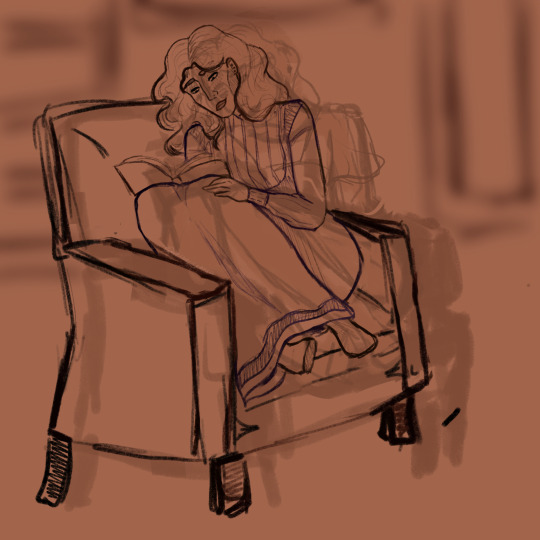
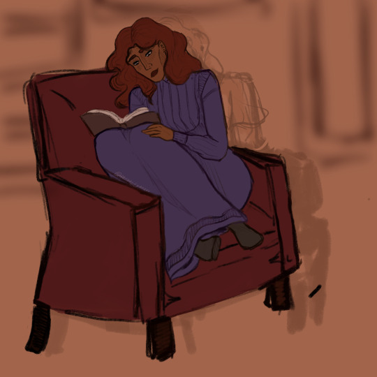
i had to really go looking for something for this one because if i'm doing a thing digitally i usually just. clean up the sketch on the same layer. but here is a teeny initial thumbnail for this! (just linking bc otherwise it'd be quite a few photos)

21. something you would like to improve on
my use of colours i think? there are so many artists i admire that do incredible things with colours and i'd love to be able to work that into my own art
23. what's something you hope people notice when looking at your art
okay i had a really hard time thinking of an answer for this one, but i'll go with - little things i add in terms of clothing/accessories for characters, if that makes sense? idk, a lot of the time i add piercings or teeny details to clothes that i know only i will know are there, just because it makes me happy! but it is very cool when other folks notice those too.
3 notes
·
View notes
Note
Hi, This isnt about the butterfly au but i was wondering do you use any apps to draw your art on and if so which ones due you use? also do you have any tips?
Hey there! No worries I'm happy to talk about art in general as well!
I use Procreate (I think currently V5) on a first gen iPadPro to do most of the art and photosh*p cs2 for any edits, or compiling files when my layers overflow. (I'm not gonna lie, that is the major bummer with Procreate, but the app is well priced and I got no complaints about it otherwise.)
As far as art tips, go I wanted to acknowledge that these are tips I would and also do give myself, so it I am not an expert in any of these, but they are cool things to strive for.
1. Find the workflow for what makes sense for you. Not everyone has to do 2 sketches a lineart, flats and render in that order in every single piece. Experiment around, find what works for you, which parts of the process you enjoy, most importantly. I do very clean sketches on top of loose pose puppets and hate lineart. So I usually don't do that, but I get away with it bc I like doing the detailed sketch phase and "line sculpting" so I just go straight to colouring most often. Maybe you don't either, but for you a lineless style would work better. This is also how you can build style very easily!
2. Experiment with programs and find the one that supports your workflow best. I started off with a pen-tablet and PS/Corel painter and that didn't work for me for the longest time - I guess I never had the necessary hand-eye coordination for laptop and pen-tablet setups. Drawing ON the screen however, whoo boy my improvement skyrocketed. So I would urge everyone to look at what they struggle with while making art bc it might not be you, it might be the setup you use. Sure I could have spent a million hours fine tuning my lines to be straight, but I cold have also switched to a program that supports stroke stabilisation, you know? Also look into available shortcuts and pre-sets: the better you know your program the faster you are, the less likely you are to burn yourself out on a piece.
3. Build skills, but let your interests dictate what skills to focus on. Sure practice is key and you need to draw a thing a 1000 times to understand it, but I'm saying you are only going to draw something that many times if you like it. When I was into series that featured many male characters I beefed up on male anatomy; when I was crazy about a live action show I practiced copying the features of real actors; now I am neck deep in fashion refs and drawing different types of fabric. Find your passion and let it drive you! It does make sense to identify shortcomings and get comfortable with art basics like shape, light and colour, but if you don't find a way to apply it it a way that sparks joy, you risk your hobby turning into a chore (so this advice is mainly for hobbyist), so try not to do that and instead focus on eating your "veggies" and "dessert" as well if you can. Do sketches all day if you want, but you will need to face drawing the other eye or that hand on the hip if you want to see eventual improvement.
4. Collect inspiration with a goal in mind. It's fair and well to have endless lists of inspiring art and photography saved in your likes, pinterest or wherever, but it is good to sit down sometimes and examine why you saved a pic. (This is not for direct references btw). Ask yourself what you like about the individual piece and whether what you like about is something that just appeals to you as a beholder or whether that is something you would like to reproduce in your own art? It's actually a huge difference. I am drawn to stylised shapes and bold colours in art, but I like to paint like that? No. On the other hand I like looking at guache paintings and really taking apart how they were painted, bc that is the rendering style i like to push for in my art. It's a good idea to go cross-media in your inspiration: from traditional art to photography to industrial object design, you can find a lot of things to learn from outside your native art medium. If you found something you really like, you can do a master study of it (absolutely fair to share with public domain, classical pieces, if you copy a contemporary artist, do it for the sake of study and don't post it).
5. Don't compare yourself to others. Yes, I know this is the hardest. If you find yourself unhappy with the reception of your art online, it impacting your joy in creating art in the first place, it might be worth taking a step back. That's what I did. I was doing winx doodles for almost a year for myself only before I made this blog, (and this is far from being my first art blog on the internet btw). This may not be the right decision for everyone, but I wanted to say something other than "just don't give up", bc when you are in that spot it feels like utter bulsh*t. Social media has us comparing our skills and success to a million other people every day, and as harsh as it sounds, it's just not worth breaking yourself up over it. There is also no need to monetise every hobby you have and become the absolute best in it, especially when you are young.
So, to sum it up:

#art tips#art suggestions#art tipp: draw a fuckton make it make you happy#wow I even used that tag before see I really do mean it#locally sourced art#adjacent#procreate
3 notes
·
View notes
Note
I'm very new to digital art and was wondering what sort of process/brushes you use for your Hilda art? I absolutely love your trolls and centaur designs ❤️
aw that’s very kind, thank you!! tbh my art approach is kind of all over the place but I’ll do my best to answer!
first off, I draw in photoshop and use mainly these two brushes -
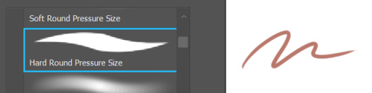
the 1st is pretty much the standard PS brush and the HB one is what I used for most of the trolls/centaur stuff! generally I pick one of these brushes and use it for both lineart and putting in colour/shadows. (to be honest photoshop somehow got the settings on the HB brush messed up a lil while ago which is why I use it for lineart less now, but it’s still nice for doing shadows bc it has a really pretty soft edge :) )
as for art process, I’ll try to explain with the hilda little mermaid drawing I did recently - explanation thingy under the cut!
.
.
so with most of my art I usually start out sketching it on paper first and then move the sketch to my computer - since you’re new to digital you might find it easier to start that way, it helps make things less complicated bc you already have something to start from
so for the drawing in question I started with this which is. A Mess
everything is all over the place and yasha from crit role is hanging out in the middle of it but this is the type of thing I start with! first with the lil thumbnail sketch up in the corner, and then doing the characters in more detail separately (if I know I’m gonna end up moving something to digital I’ll just draw the characters anywhere I can fit them on the page, bc I can worry about fitting them together properly later)
u can honestly skip the thumbnail sketch if u want, but for bigger drawings I find it useful to have something rough to refer back to, so I don’t forget what I’m aiming for overall when I start getting into the details
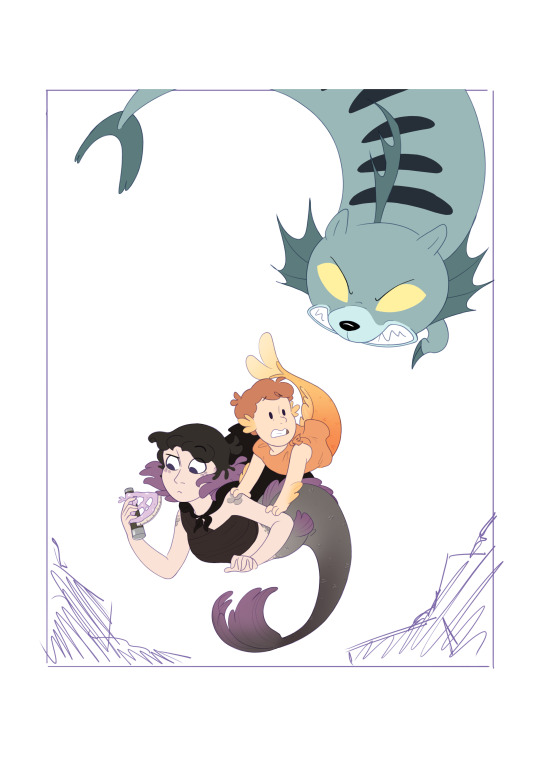
anyway then I move the paper sketch to digital and arrange things properly and add anything I’ve missed, and depending on how messy it is I do another slightly cleaner sketch overtop -

I’ve learned the hard way that fixing things at the lineart stage is a lot more hassle so I try to make sure everything’s looking as it should in the cleaner sketch - david’s initial sketch looked mostly fine to me so I only redid a couple things and added some details, while I changed a lot of kaisa til I was happier with the pose. I knew the salt lion was gonna end up being mostly hidden so I didn’t worry about refining it
SO next I make a new layer and start drawing the clean lineart over the sketch. I like using coloured lineart these days, so I pick a colour to sketch and do lineart in - literally any colour except black, since photoshop lets you change the hue later (you can go to Image -> Adjustments -> Hue/Saturation and change things as much as you like). I did all the lineart for the characters here in purple, like the sketch, and I made sure to keep all the lineart for different characters separate so I could mess with it individually later. I’ve got a bit of what kaisa’s lineart folder looks like below, and you definitely don’t have to put Everything on a new layer like I did, but I usually keep the eyes, brows and little details like the fin lines and scales separate bc they’re the things I’ll most likely want to adjust later
once I’ve got the lineart done in that one colour, I’ll use the Adjustments-> Hue/Saturation slider to change some parts of it (this is where having things on different layers comes in) to blend in or stand out more, so by the end it looks like it does below. I made some swatches so you can see which parts I changed from the main outline colour:

so I kept the original purple for most of it, but I changed the salt lion’s lines to blue, and kaisa’s scales to a light grey so they’d blend in more, and made her eyebrows much darker so they’d stand out from her hair. (I usually do this step after I’ve started colouring them in, bc it’s easier to see what’s working then and what isn’t, I’m just showing it here so you can see it in isolation). also, I’ll usually set the whole lineart folder to ‘multiply’ so it blends in with the colour layer even more
(tbh you don’t have to do it as complicated as this, everyone has their own approach depending on what they’re going for and it might take some trial/error before you find what works best for you. I just do this bc I’m used to it and don’t mind the extra hassle. pretty colours go brrr :) )
for colouring in, I use the lasso tool to trace over areas of the drawing and the paint bucket to fill them in. I usually put every different coloured area on a new layer so it’s easier to go back and change something if I decide I don’t like the colour. so everything is built up over a number of layers, and I can use the airbrush tool to soften the edges of some areas (like david’s arm fins). for the parts with gradients like their tails, I put down a flat colour layer (like the orange for david), select that area and then make a new layer and put the gradient on with a big airbrush tool. also for stuff from hilda I usually colour-pick straight from a screenshot of the show with the eye-dropper tool, it’s much faster than guessing them
so then we have the flat colours done, and I can show you why I like doing coloured lineart even though it takes longer bc

here’s the lineart all in black vs the final result with the colours. like…it’s fine, there’s nothing wrong with the all black one, but having the colours really helps soften things imo!
I didn’t really do much by shading for this one but to go over it real quick -
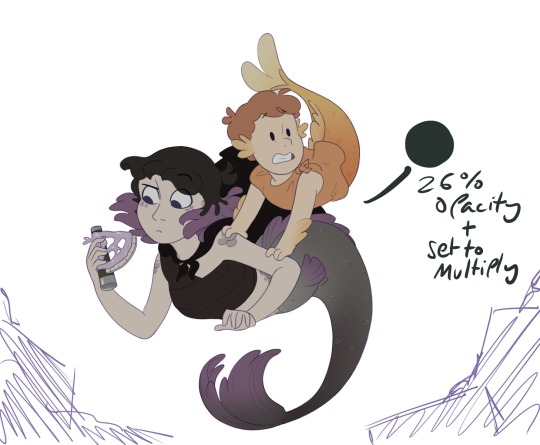
if I was just drawing a character on a white background I wouldn’t bother with this step, but here I know this scene is taking place in the dark & underwater, so I selected the characters, made a new layer and filled in a dark green colour overtop on a low opacity & set to Multiply, so the characters get this slight green tinge and look more like they’re in the setting (I did the same with the salt lion but I’m gonna just focus on these two for now)
for the actual shadows I got the same green colour, and on another multiply layer blocked it in, and just played around with the opacity til it looked about right
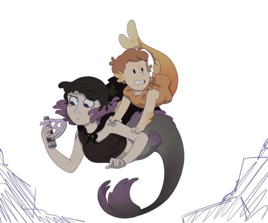
honestly not my best job at shading lol but it helps give it some depth and put them in the scene! if I hide the colours and lines for a sec you can see that literally all I’ve added over the original colours is this:
and if I add the basic colours of the background in, you can see how much it helps compared to the flat colours I started with -

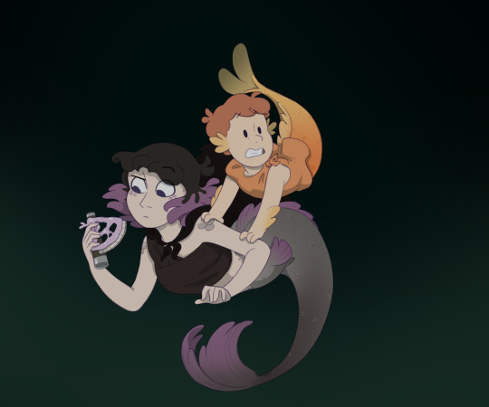
they look so much more like they’re in the scene!
anddd after doing the same thing to the salt lion (which is just the same shading process but more layers and darker) and adding the rest of the background that’s it!!

don’t worry they’ll be fine lol
anyway sorry this got so long, I hope it helps!! I’m not the best at explaining myself so if anything I said here doesn’t make sense then feel free to ask :)
9 notes
·
View notes
Photo

Okay so like I wanted to draw the obey me demons in some of my clothes but I also wanted an mc so I just smushed the two desires together and boom this piece happened. I found out that jacket I put mammon in, which used to be my dads, is ripped and im so upset oof
But anyhow, she has no name (just like all the people I ever draw rip), but she gets along pretty well with everyone, particularly Levi, Beel and Mammon (who she has a soft spot for bc she know what bullying is like and she don’t want him to be alone).
Please be gentle I legit just cleaned up the sketch I drew a little and then splattered some colours on haha
#obey me oc#obey me mc#obey me shall we date#mammon#om! mammon#obey me mammon#that jacket mammon is wearing???#used to be my dads but i fucking LOVE IT#its way too big for me but does that stop me wearing it out???#nope#also that robe I love I have lots of robes lmao
16 notes
·
View notes
Text

oh heeeeeeeeeeellloooo everybody 😈 it’s your resident little shit, bc everyone is always yelling at me for something. idky bc i don’t do anything. SDJFKHDSJKFHDS
hennyways, it me adding another ball of a mess to this rp, next to ky, ouuufffff, but thank you to @dcniros and @alanncs for letting me bring a deniro. I’m very excited. so keep reading, like this, or hmu on discord or something! <3
new york’s very own Adriano Deniro was spotted on broadway street in Gucci Ace GG high-top sneakers. your resemblance to Lorenzo zurzolo is unreal . according to tmz , you just had your twenty first birthday bash . while living in nyc , you’ve been labeled as being manipulative , but also versatile. i guess being a virgo explains that . 3 things that would paint a better picture of you would be speed driving along empty streets, cigarettes at 3am and drinking limoncello by the beach . ( cis-male & he/him )
Basic Information
Full Name: adriano marco deniro
Nickname(s): baby deniro, addy, adri, adrian
Age: 22
Height: 6′2 ft
Date of Birth: september 13th 1997
Zodiac sign: virgo
Hogwarts house: slytherin
Ethnicity: italian
Nationality: italian-americian
Gender: cis male
Pronouns: he/him
Orientation: heterosexual
Religion: agnostic-catholic
Language(s) Spoken: italian + portuguese + french + german + english + spanish
Accent: has an italian accent that blends well with english
Favourites
Weather: summer
Colour: red
Music: ultimo, logic, travis scott
Movies: fast and furious franchise
Sport: what is that? LOLOL
Beverage: negroni, limoncello, rum
Food: florentine steak and potatoes
Animal: lions, eagles, bears.
Family
Father: arnaldo deniro
Mother: vittoria deniro
Sibling(s): an older brother, and 2 sisters in between. adriano’s the youngest !
Cousins: alanna deniro + atlas deniro + ? deniro
BIOGRAPHY
adriano was born in Florence, Italy, the youngest child of four from arnaldo and vittoria deniro. the last name itself gives away what his family is all about. they’re prestigious, boujee, and automatically adriano was given a rep before he could even breathe.
arnaldo is oldest of the second generation after arnaldo sr and corina, therefore he was actually offered the family company but instead decided to venture off into doing his own thing, wanting to make another stamp for the deniro family. he invested in buying out Ferrari instead. buying out ferrari was a smart move for arnaldo because he got a dip into buying out other italian sports car companies - currently in works of buying out alfa romeo and maserati.
even if adriano was born in italy, he has dual citizenship with america due to his family being in both countries and he often visited New York City growing up.
needless to say, adriano grew up around cars. ever since he was little he loved them, the way they looked. when he was 8, he drove a 1957 Ferrari 250 GT California and crashed it into a tree. no one will ever let him live that down bc he’s an idiot for it, but he rlly wanted to, and it wasn’t a hard crash anyway.
adriano’s always lived on the edge of life, you tell him to do something, and he’ll do it. he’s a very independent kid, he likes being on his own, doing things his own way. he thinks his way is better than everyone else’s. this kid is super self critical and strives to be the best, especially since his family has such a prestigious rep, it makes sense, and he just wants to earn up to the name, even though he doesn’t say it, or portray it. it’s just something within him he always feels he needs to do. he’s young and stupid though, right now he’s really into partying, drugs, and doing reckless things. he doesn’t listen to anyone but himself.
growing up in italy, he got away with literally everything, and a lot of that was street racing. it gives him such a rush to pull apart beautiful cars and adding parts to them to make them better, faster, stronger. he loves to hear the strong sound of the muffler. he’s one of those idiots on the streets, and not surprisingly he’s VERY good at racing. when he’s behind the wheel it’s like everything shifts and his brain goes into some analytical mode. there is a system to racing that adriano can’t explain into words, he just knows it. he’s good, but it doesn’t mean he hasn’t been caught, because he has, a lot of times.
adriano has been arrested for street racing, being plagued on multiple tabloids often that his dad is overly frustrated with his youngest son being the troubled kid. it’s not like he had a hard childhood - besides having to live up to the deniro name and being told he had to make a name for himself. it’s just that, even if he wants to amount to something, he’s also sick of it and wants to rebel, so he turned to streetracing, and he doesn’t care about consequences.
one thing for sure though, is that adriano is a VERY skilled artist. in order to get his mind off of cars, his mom hired a personal teacher that would teach him everything about art, whether it was sketching, sculpture - anything of the sort. he’s really good at it, and the only place besides racing where he can let out his frustrations. leonardo da vinci is his icon, which is weird, but that’s him. he’ll often fall asleep on top of sketchbooks filled with charcoal drawings and have little sculptures around that he’s built. he’s just never opened up about his art with anyone, though people know he’s good and always encourage him to do more with it. if he wanted to be a creative director, he would be really good at it that he often gets asked opinions on things for fashion shows, events, and everything. but again, not something he thinks he wants to pursue.
because he’s gotten into so much trouble, his parents have sent him off from Florence to Rome thinking it would help sort him out, it didn’t, so his dad is ultimately sending him off to New York City, thinking maybe a new change of country will be even better for him, but adriano isn’t so sure. nothing he can do about it though.
SO, Adriano is pretty new to new york, arriving on Christmas Day 2019 to fuck shit up leggo
SKILLS + PERSONALITY + CAREER
besides racing, cars, and art; adriano is versed in a large set of languages and skills. he was always learning due to his parents not wanting him to left out in anything.
he’s pretty laid back, but highkey very judgemental, sometimes he doesn’t know when to shut up. he’s those kids that you know mean well but you just want to punch because they’re so annoying.
he hates being called a baby even though it’s what he is. he’s a perfectionist, very much a clean freak, but he’s very reliable.
even if he hates being a deniro sometimes, he loves his family, highkey looks up to those older than him - but again, will never say it bc he’s a little shit.
Right now, he’s just moved to new york, but he’s been working with fashion brands, thinking up new ways to present their lines during the upcoming fashion weeks. (that fenty fashion show? adriano’s creative directing work right tHERE)
it’s ineveitable that he’s attractive, so sometimes when he feels like it, he’ll model for brands and magazines, but that’s pretty much it.
adriano’s not rlly one for relationships unless you want to get hurt. he will always tell you he’s a piece of shit and you’re about to get into a mess. if you’re okay with it so is he.
he doesn’t really have feelings for other people, often gets into trouble bc of it too.
he just arrived to new york, so he’s not rlly looking for work right away.
HMU FOR PLOTS COS YOU KNOW I GOT PLENTY~
#is this long or#dkjghdfjkhgksfjd#wealthyhq:intro#this is all for now#but i might add more later#fgjhdfjghsd
15 notes
·
View notes
Note
hey viria! I was wondering if you had any tips on improving lineart? bc when I sketch the drawing looks good and all, but when I do lineart it turns stiff and doesn't look natural ;-; plus, I can't make a long, continuous line (when I do it just doesn't fit with the sketch) I end up having to make many small lines one next to another. This makes the drawing look unclean and the process is really long and frustating... do you have any tips on how to fix these issues? thank youuu!!
Hi! I feel like this transition from sketch to lineart is such a common problem! I have it too, to a certain extent, though not as bad as it was before, but it’s still there.
To avoid stiffness and to leave the natural flow of the sketch, I think it’s very very important to determine what lines do make it dynamic and expressive. What you like the most about it. Let’s take expressions for example! You drew someone happy, and on the sketch it looks great, and you can FEEL this happiness radiating and you love the way the sketch turned out. But once you start transitioning to the lineart, it loses the certain something. I guess it happens mostly because when it comes to lineart, people feel the need to make it as clean as possible, which excludes some of the motion of the sketch. As to say, when you drew a sketch it has all those crincles of the smiling eyes, and the lines looked a bit messy and expressive, the smile was a bit lopsided and some lines are harsher than the others. Once you lineart it the line variety your sketch had often disappears, and that’s one of the resons it gets more stiff. When I lineart, I always make sure to actually lineart the lines of the eyes the way they are, I zoom in heavily and follow the width of the line my sketch had! So instead of new perfect lines I make new but still a tad messy, if only a bit cleaner and more readable.
When you draw the body, don’t be afraid to either lineart or simply leave some of the lines that made it expressive. If you sketched the leg and it wasn’t really perfect but it was expressive, don’t be afraid to leave those lines that formed it. You will still put colour underneath and all those lines won’t be as noticeable, but they will be there and the lineart won’t be as stiff! That’s one of the reasons why I always leave some bits of the sketch left under my lineart in my final work. I erase the sketch, but not fully. I often leave a lot of lines on the face, and on the hands and legs.
Basically, whenever you make a lineart (on the layer above your sketch), there’s a simple way to figure out what you need for it to still have a certain something. Click the sketch layer underneath on and off. Whatever places irk your eye and feel WORSE with the clean lineart - leave at least some bits of the sketch underneath.
So, if in short, follow the width of the sketch lines in your lineart, and leave some bits of sketch underneath. You can also then merge the layers of sketch and lineart together and play with the depth of the lines. You can simply (very lightly) erase some of those that are further away from viewer, and overline the lines that are closer. That’s optional, but I feel like erasing some very lightly help to make your lineart a bit more interesting!
Now, as for the lines problem. I am also someone who actually mostly uses a lot of small strokes instead of the long fluid strokes, but I feel like for me it works? It doesn’t look too streaky. You can fake the lines by being very precise with your continuous strokes just so it looks quite clean, or just… train your wrist to make long fluid lines.
I use those on the hair, and often on the clothing, whenever I can’t get away with using my strokes. If you do digital, and you do this fluid line but it isn’t in the place you want - undo it and do again, and again if it’s necessary. One of those lines will be good enough for you to be content to leave it there. I can undo so many of the lines over and over again until I am satisfied;;But really - there is only practising to get better with it. The wrist should be trained and there’s no other way to it unfortunately. Keep practising and you’ll keep getting more and more content with your linework!
Also the trick for drawing long lines (especially if you need them quite straight), don’t move your wrist alone, sometimes it’s necessary to move your arm. And you can put a pen to the paper, and then look at the point you need your line to end. And move your pen without looking at it, only at the point you want your line to add! I feel like it works so well so often, it was a trick one of our uni teachers mentioned and i was like WHOOAA
Pheh, I feel like that’s all i have in mind! I hope it helps
626 notes
·
View notes
Last Seen Blogs

itudemokimihe
Hey aoto

rema-writes
a place to rest my poor heart

mohamedsayed4-blog
Untitled

morioh-cho-radios
will you be the rerarera to my rerorero

morenodebarrio
Para echar de comer a parte