#ttrpg layout
Explore tagged Tumblr posts
Visit Tumblr Blog
Explore Tumblr blogs with no restrictions, modern design and the best experience.
Last Seen Tumblr Blogs


Fun Fact
130K people were victims of a chain letter scam that affected Tumblr in May 2011.
Text

I'm happy to announce that the Masks: A New Generation Indesign template is up on itch! For making game books, 3rd-party content, and homebrew in the house style of Masks
103 notes
·
View notes
Text
THEY DO NOT STOP. YOU MUST NOT FAIL.

THEY DO NOT STOP. YOU MUST NOT FAIL. is a solo survival horror role-playing game about escaping a mysterious, unstoppable and unrelenting foe in an impossible maze.
Inspired by Resident Evil, Dead Space and Silent Hill, learn to manage your resources, navigate strange places and survive the horror intact.
Create stories about a relentless monster constantly stalking and constantly breathing down your neck. Make bad combat decisions and get punished or outsmart your pursuer and live by the skin of your teeth.

You can get the game at $4.44 OR grab one of the free community copies now on my Itch.io! Link below:
#ttrpg#indie ttrpg#ttrpg layout#ttrpg art#indiedev#game design#indie games#ttrpgs#horror#indie horror game#indie horror roleplay#horror games#survival horror#indie game#resident evil#silent hill
1K notes
·
View notes
Text
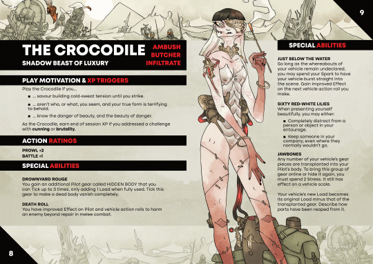
Runefarer Character Mock-Up
Mocked up a starting character for Runefarer, a Mark of the Odd game I'm noodling on.

#ttrpg#ttrpgs#rpgs#rpg#tabletop rpg#tabletop rpgs#tabletop design#tabletop roleplay#tabletop roleplaying#tabletop roleplaying games#ttrpg character#ttrpg layout#elfgames#taterpigs#runefarer#into the odd#mark of the odd#mausritter#mythic bastionland
1 note
·
View note
Text

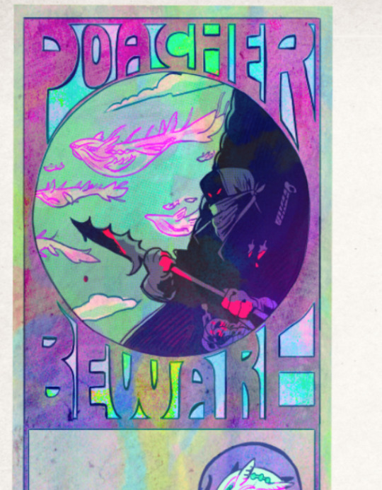

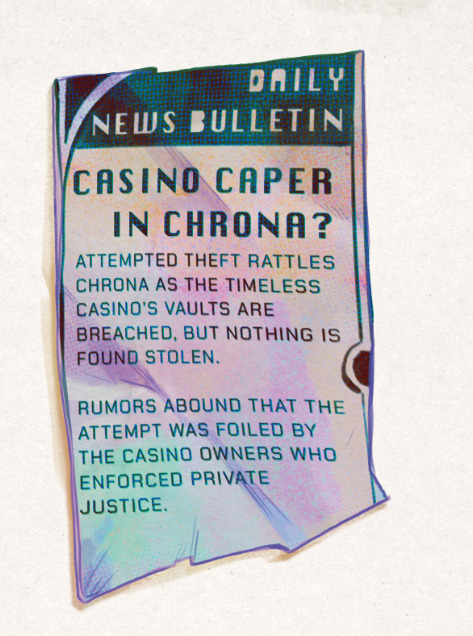

Some of the many bits and bobs and odd and ends that will be filling just one of the Confluence Atlases, this time focusing on the Motley Coast, a region full of pirates, floating islands, science and fallen gods! What's Chrona, or Tensomancy? And What's that little pin and why won't they wear it? Cure your intrigue on our Twitter, where you can keep up to date with the Confluence TTRPG! I'm so proud of the work we're doing! All the above work is mine and the test background by Crislv on twitter!
#anonbeadraws#digital art#ttrpg#confluence#confluence ttrpg#vis dev#ttrpg design#ttrpg art#original art#the motley coast#ephemera#layout design
2K notes
·
View notes
Text
We’re so close to finishing Little Wolves, so we wanted to start sharing some spreads! This is the introduction to The Troll Court, featuring INCREDIBLE art by @grendel-menz

Read more about Little Wolves here:
Sign up for our newsletter to know when Little Wolves is available~
#ttrpg#indie ttrpg#ttrpg design#tabletop#game#indie#roleplaying#tabletop rpg#trpg#werewolves#werewolf#lycanthropy#book#layout#fantasy#troll#trolls#queen#unicorn
81 notes
·
View notes
Text
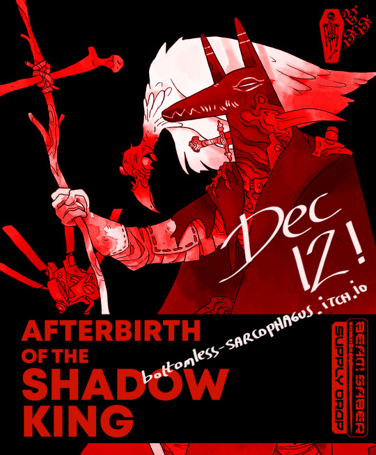


AFTERBIRTH OF THE SHADOW KING (2023) Sci-Fi/Post-Apocalyptic Horror Expansion by Rowan A. for Austin Ramsay's FitD mecha game Beam Saber.
WRITING, LAYOUT, ILLUSTRATION
#tabletop rpg#ttrpg#beam saber#forged in the dark#mecha rpg#post apocalyptic#indie ttrpg#ttrpg art#zine#zine layout#itch.io
475 notes
·
View notes
Text
🐀 Game design never sleeps...

...and neither do the creatures that go bump in the night! 🦇

(just some character sheet doodles from today)
#indie ttrpg#ttrpg#ttrpg design#character sheets#lasers and feelings i guess?#and a breakdown of the etwrnal caverns of urk tunnel goons sheet layout so i can think about how information is conveyed in nasty bastards
81 notes
·
View notes
Text
HIRE A DISABLED TRANS GIRL AND HELP HER PAY RENT!
I've got new commission sheets, and am now offering more services, such as layout and web design!
Hire me! I'm still struggling out here!
You can fill out the form on my website, or DM me here!


#artists on tumblr#commissions open#digital art#ttrpg design#graphic design#layout design#web design#artist for hire#incaseofgrace#illustration#logo design
112 notes
·
View notes
Text

made a mouse guard character sheet bc i couldn't find an official 2e one anywhere on the internet (did find a couple fanmade ones tho)
this one is largely based on the official sheet but just has a more clean and minimalist presentation with handwritten text. i might make a more decorative one in the future with a somewhat different structure but here i just wanted it to be mostly like the official.
idk if anyone plays this game but if you do, feel free to print it out and use it for your home games!
#character sheet#mouseguard#mouse guard#ttrpg#mouse guard ttrpg#mouse guard rpg#honestly i like the horizontal layout it gives a really unique feel#i kinda wanna try a horizontal dnd character sheet sometime too?#would be bit of a layout challenge when i'm so used to the vertical one#forgive me if you notice anything misaligned i dont have indesign at home#so i had to just put in guidelines to align everything#for next one i wanna make the template in indesign for sure
19 notes
·
View notes
Text
no you know what im making a post about it now

SO per Rvb wiki, A'rynasea's model is a Halo Phaeton. Per halopedia, a Phaeton is 10.3 meters long, so more or less this scale right? not super big but hey, our boy Locus is on the run and needs something small and fast so fair enough right?
except

long story short: Locus breaking the scale of things is making me mad, has been making me mad for a WHILE now and the only thing i can feasibly assume is A'rynasea is bigger?? than a normal phaeton but as soon as you start scaling her up, Locus' claim that there int enough room for a third passenger doesnt make sense like, it'd be tight but as it gets bigger than a normal phaeton and you CAN squeeze three people in there
i know i know its rvb, logic doesnt apply here, but look i like to know the schematics when im in this deep and this shit is ridiculous
I reserve my right to bully locus for living in a fucking space prius
3D Model credits: Phaeton model here | My Locus model is a mismash of two models from this guy that i franksteined in blender to be slightly more show accurate
#rvb#red vs blue#rvb locus#rvb a'rynasea#technically#I CALLED IT AND SUV/SUBARU BUT NO ITS NOT EVEN THAT BIG#im shaking him#yes i color coded my notes w red team colors what about it#im just#face downon the ground#trying to design an interior for a'rynasea for art reasons and its like this#there is no interior its just fuckin walls#the bright ass walls we see in the shots w grif in the pock pit w locus isnt the cockpit its the entire goddamn ship#also the entry is on top so take from that what you will#this is in the same file folder as my technically-rvb-but-basically-halo-oc's similarly stupid ship layout so like its just a Thing i guess#my star wars fixation brain got too used to being able to find layouts from swtor and ttrpg shit that now im improvising#for smaller craft and covenant craft from halo and im just#banging my head on the wall for no dang reason#i hope the red rage in this fuels other people to laugh at this please
28 notes
·
View notes
Text
Over the past few days, I've been working on a new layout for my solo TTRPG Ice, Snow, and the Quest for Salvation. I thought I'd share the layout of a page I am particularly proud of.

#indie ttrpg#ttrpg#tabletop games#ttrpg community#tabletop#ttrpg dev#tabletop rpg#tabletop roleplaying#art#indie rpg#ttrpg layouts
10 notes
·
View notes
Text
If you want to make homebrew playbooks for Masks, I have a template available on itch! It uses all free or adobe fonts so it's great for designers just getting started. Have fun, make some playbooks!
4 notes
·
View notes
Text


Previews from Dreadnaut, my tactical survival horror TRPG where you play an Engineer stuck on a derelict starship haunted with mutant flesh. :) Inspired by Signalis and a lot of classics.
Dreadnaut is 50+ pages now. I'm very proud of the large spreads.
Hope to finish this in 2025.
#ttrpg#indie ttrpg#ttrpg design#ttrpgs#ttrpg layout#ttrpg art#indiedev#game design#indie games#indie horror game#survival horror#trpg#horror games#horror ttrpg
136 notes
·
View notes
Text
Whenever I get new fonts or tools, or discover a new source of public domain images, I like to delve into my expanded toolbox and do a bit of practice with layout/graphic design.
Here's a cover mock-up featuring fonts from the Chequered Ink font sale, a paper texture from Unsplash, and an image from Old Book Illustrations. This is not a real game, but it might be some day.

13 notes
·
View notes
Text
talking about a lot of teeny weeny details in the layout design of Interstitial!
12 notes
·
View notes
Text
Ostrichmonkey Hack: Layout Behind the Scenes
Been procrastinating on this enough! So here is a look at some of the process and decisions that went into doing the layout for the Ostrichmonkey Hack.
Let's start with the goals I had in mind:
Keep it simple.
Keep it easy to make.
With those goals set, next step is gathering materials and resources (not all of this was done as cleanly as I'm making it out to be, but this is the gist).
Materials used:
Classic Explorer Template
Affinity Publisher and Photo
Fonts
Art
The text itself
The Classic Explorer Template was critical in getting this layout done efficiently, since it does a lot of the work for you. It's not a replacement for having a rough idea on how to do layout, but it can serve as a nice tutorial/explainer on different elements of layout and typesetting, and honestly, is worth its (digital) weight in gold. There's a free version available if you want to check out what it offers.
I use the Affinity Suite for my layout work. It's a nice set of programs with a manageable learning curve, but there are plenty of other alternatives so go with whatever works for you (one of my favorite elements of using multiple Affinity programs is that within Publisher, you can access both Designer (vector illustration) and Photo (photo editing, illustration etc) functions, which is just a nice workflow).
Here's what my setup looks like, with all the guidelines/base grid stuff turned on;

Normally I start with some style tests and “sketches” to get a feel for what I want the layout to look like, but the Classic Explorer’s does a lot of that heavy lifting for me already so I get to skip this step for this project. Speed and efficiency is one of the main reasons I wanted to use the template - this was envisioned as a “I just need to get something done” kind of project.
So next up on getting it done, fonts!
There are lots of great places to get fonts from, just make sure you're getting them from legitimate sources. Do your homework and make sure that "free" font is actually free to use in commercial projects.
I pulled three fonts from the depths of my collection.
One for the title and main headers (Wallau Deutsch)
One for the second header (Rakkas)
One for the body text (PT Serif)
Technically a secret fourth font for some "bullet points" (1651 Alchemy)

I picked these fonts out because they work together well and are readable. The title/main header fonts are comparatively less readable, but you can get away with that since headers are Big and used less frequently. The second header (Rakkas) is a nice middle ground between a full on blackletter font like the main header, and the classic-y serif of the body text. It creates a transition between the two fonts.
I used PT Serif since it was already in the template, but it also had the bold/italics versions I knew I would need, is readable at a variety of sizes, and had all the special glyphs I would need (it actually did not, but whoops, we'll get to that later).
Normally when I start layout, I do a quick "sketch page" where I try out different fonts and style tests that can look something like this;

But that wasn't necessary for this project (another advantage of the using the template).
Now, let's get to some choices in formatting the text itself.

Each time a key term came up, it was highlighted by bolding and italicizing it. Any time after that, it was just normal text. I went back and forth on highlighting it every single time, but the current format just looked cleaner so it won out.
Additionally, in several places in the text, rather than introducing a third header (which just broke up the page too much, disrupting the flow and clean look), I instead put what would have been the new third header (HP or WOUNDS in the above example) in all caps and behind a colon. This ended up not disrupting the text too much, and was only necessary a handful of times. But when it was necessary, I made sure to stay consistent. Consistent and organized formatting is one of the key ways to make your layout look nice and clean.
Aside from changing some font choices, one of the other ways I tweaked the template was with some spacing (between "sections", like in the above text, introducing an extra line break between the Attributes and Staying Alive sections) and the "bullet points".
The large bullet points that accompany the second headers are actually a glyph pulled from a different font. I picked that one out specifically because its just a little irregular and handwritten looking (1651 Alchemy is a handwritten styled font), and it also helped pull you to the start of new sections, further enhancing the second header. It helps make each section discrete and more "modular".
Back to extra spacing for a second now. So each "chapter" of the text uses the main header to designate it as a full "chapter".

"Characters" up top there is one of those chapter headers. It's nice and big and special, and also takes up a good chunk of space. One a full spread, this also means that the second page of text begins higher up than the text on the first page (compare where Attributes starts vs where Dying starts).
I played around with the format of spreads that did not have a main chapter header on them, starting the first page text up toward the top to have it line up with the second page. Which, probably would have been totally fine, but I preferred the look when each spread had the same kind of spacing. But repeating the main header on each spread was too clunky. So the solution;

Bam! A line!
Blank empty space looked too empty, but slapping a quick line there took up just enough visual space for it to work. Then, I carried that line-design-language to other places (to separate footnotes from the body text, within the tables, and sort of on the cover). This then made the line choice feel even more cohesive and purposeful.
And speaking of footnotes, that was another extra tweak/flourish I added not present in the template (the sidebars are part of the template, but sidebars rule so they would have happened regardless). The footnotes served as a way to share specific references as an informal "works cited". A lot of NSR/OSR design is super iterative, so I thought it would be cool to shout out some of the more direct inspirations and references I used when making my game.
But the footnotes were also kind of not really my downfall. Turns out PT Serif didn't seem to have all the necessary footnote glyphs, nor did it want to make proper superscripts of integers past 3. So, rather than trying to find a new body font (or deal with the headache of using a font solely for superscript notation), I just fudged the formatting some and stuck to asterisks, and restarting "numbering" on each spread. Oh well.
Let's now briefly touch on laying out tables.
It sucks.
My advice is find an example of a really nice looking table and then try and figure out what makes it look nice, and then doing that forever. Luckily, the template saves me again by including multiple examples of tables, ripe for tweaking. Which ended up looking like this;

Nice and clean! Hooray!
Okay, there's a lot of small decisions that goes into making text properly formatted and look nice, but I skipped some of those decisions and didn't go ham on typesetting, but whatever. That all about covers the important parts regarding the text. Now let's talk about art.
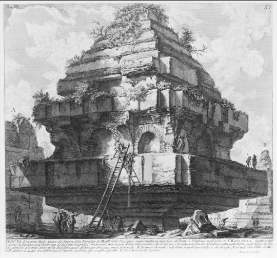
Public domain art is your best friend.
I went and trawled through a bunch of art I've saved from the Met's Open Access collection (there's plenty of great open access collections out there, just happened to have some from the Met handy), and settled on this piece;
Which I then dropped into Affinity Photo and played around until I ended up with this;
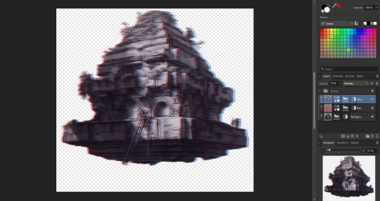
Nothing too wild, but it Felt Right, so it's done.
I then immediately dropped that onto the cover page, slapped the title on, added a quick border (and also spent some time trying to fix some weird issues that ended up being solved by just rasterizing it, whoops) and bam;

And that's the only art piece used throughout the zine! But I made the most out of it. Between each chapter, I had a single splash page and dropped in different zoomed/cropped versions of the art. Like so (and even on the back cover!);


The original image was high resolution, so zooming in worked, plus the effects/distortions I created hid any imperfections.
So that's the art sorted and the zine finished!
Now, this is getting pretty long, so if there's anything anyone reading this is interested that I didn't touch on, shout in the notes!
38 notes
·
View notes