#tutorial? kinda???
Explore tagged Tumblr posts
Visit Tumblr Blog
Explore Tumblr blogs with no restrictions, modern design and the best experience.
Last Seen Tumblr Blogs


Fun Fact
Average visit duration of Tumblr.com is 10 mins and 25 secs.
Text
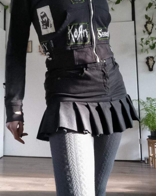
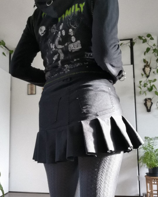
jeans to y2k/tripp inspired skirt ݁ ˖ִ ࣪✩₊ ⊹˚
I thrifted some jeans recently, not knowing if they would fit me, but buying it anyway bc 1) it was €1 and 2) if it didn't fit I could surely make something with it.
turns out it was wayyy too small 😂 so I decided it would be perfect to make one of those tripp/y2k skirts with!
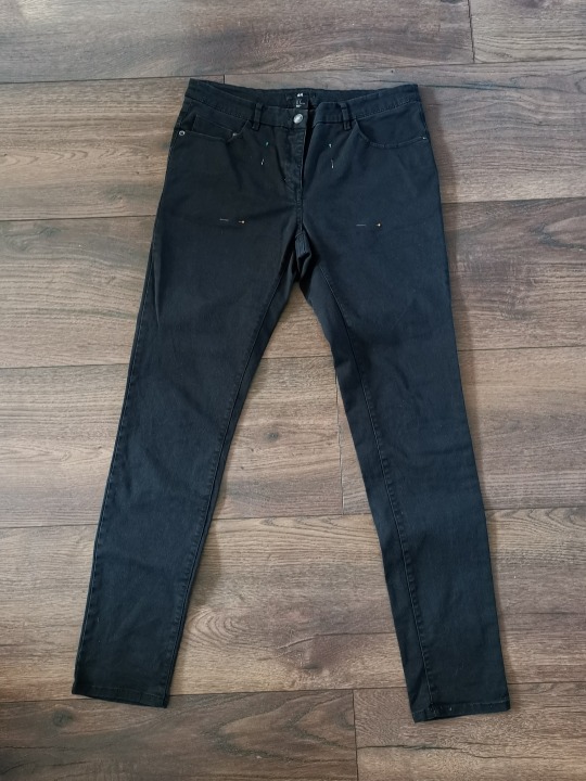
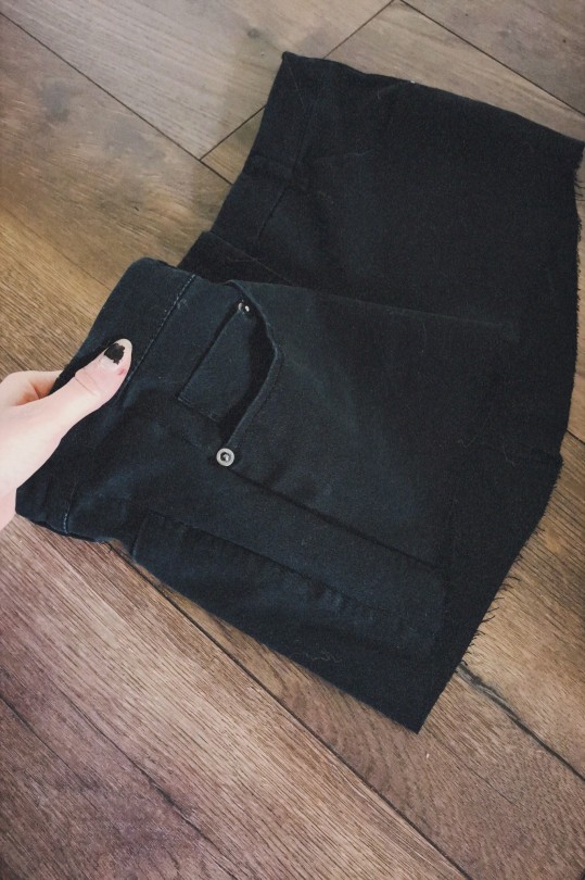
firstly I cut off the legs just above the crotch. I then tried it on, found it was too tight still, and added two strips of leftover fabric on either side. it fits perfectly now!
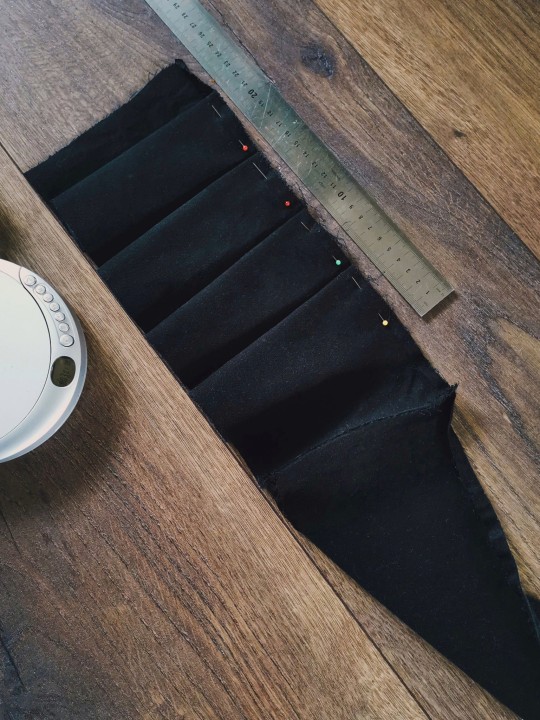
then I cut the remaining pant legs in even strips and connected them all to make one long strip. I folded ruffles of 5cm along the length, and sewed it in place before I sewed it onto the bottom of the skirt!
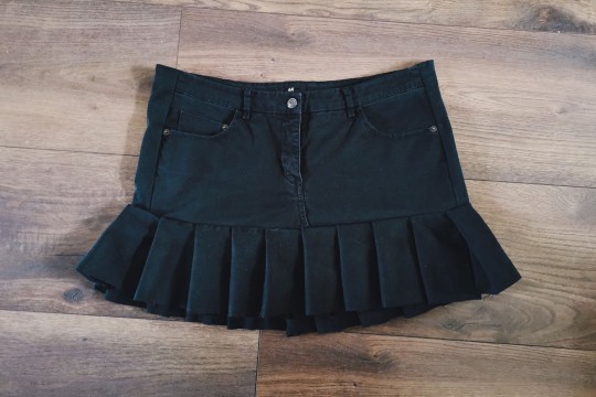
and just like that, I have a new skirt 𓆩♡𓆪 I might add some strips with d rings on it once I figure out the placement ^_^ but for now it's done
#mine#i showed it to my partner who immediately was like YOU HAVE SO MUCH TALENT#which was rly cool to hear actually#goth#alternative#diy#crafts#handmade#tripp#skirt#y2k#selfmade#tutorial? kinda???
333 notes
·
View notes
Note
spec. spec. spec youve changed the game. i never realized your pointer finger and your wrist artery are the same. holy shit. im going to draw hands thank you


aasdjsd its not really an artery but its a useful landmark to facilitate the Flow of a pose imo
#nd then the thumb meat is just kinda tacked on there#u will notice also that i like to use the wrist as a tension point so the hand and forearm kind of drape off it#that has nothing to do with anatomy i am just gay#ask#doodle#tutorial#i gueass.
13K notes
·
View notes
Note
Question! How do you draw ur characters 👀 like tips tricks
hihi i hope i didn't misunderstand you meant this like, in generally and not specifically about each of my chara's!! sorry this is so messy LOL n please take everything i say with a grain of salt ive never learnt art professionally_(´ཀ`」 ��)_


2K notes
·
View notes
Note
Your art is extremely inspiring. Do you by chance have any tips for creating reflective highlights and their placement? It’s something I’ve been trying to figure out for so long and it’s just not computing in my brain. 🫠
First of all, thank you! Ahh I'm not as descriptive with words, so let me give you a quick rundown.
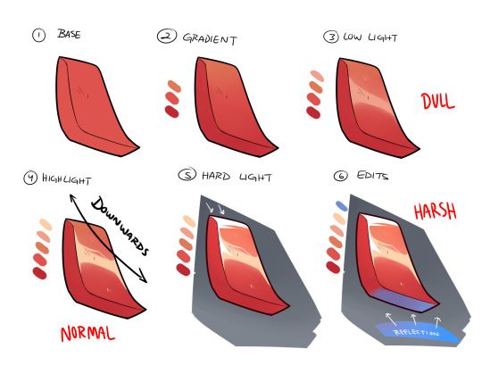
Once you have your base and all is good to go, you create the gradient in the direction of where your light source is (up -> down in the image). The direction will always depend on angle or 'curve' of the metal/material you're trying to work with. Up top, I did a downwards reflection since my shape is more diagonal, rather than uniform and straight. There are times you'll have a round shape, in where this time you'll go ahead and create the highlight at the apex of it. Next, you have to decide what KIND of highlight you'll be using. I usually work with multiple lighting layers, but for this example I'll only show 3. The DULL lighting is just regular low lights that show the texture as reflective, but is most likely AWAY from a light source and/or is reflecting off something that doesn't have much shine. The NORMAL is your regular highlights that is usually just a lighter shade than your base. Since most if the time it just follows your low light(think of it as the intensity of the reflective light source), you can just place it on top of the DULL lighting. The HARSH lights are only portion that are directly in front of the light source OR are the most intense parts of it. Think of it as extreme sunlight etc, and it goes apart from your regular highlights. Lastly, you can add more color to you material by taking in other reflective surfaces, specially those with different color. I added the blue as an example and just color the panel that directly faces it.
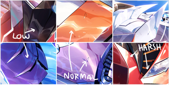
I added a few example of lighting from my works so you can kinda see what I'm talking about. They might not seem as different at first, but the placement really makes a difference once you start finishing your rendering. I'm not great at explaining sorry, but I'll try to do another stream and walk people step by step? Would that be ok? Hope this helps a little!
3K notes
·
View notes
Text
about time i redid my website
#sq*respace's new editor kinda owns ngl......#i also have a tutorial section. lemme know if you need any of my tutorials permanently engraved on my website just in case
171 notes
·
View notes
Note
Velnna. Please. You make such amazing art. I adore all of it, and as a fellow artist I gotta ask.
How do I make more art faster. How do I speed up the process.
There's so much I wanna draw and show but it takes me forever. Help?
Thank youu 🖤
I'll just put here something I shared on IG about not getting stuck on details because they're basically the main things speeding up my process, too:

258 notes
·
View notes
Text
How to draw Manga/Anime heads in the rev1999 style!


it's not a rendering tutorial and just the construction of the female head for rev1999(and other anime art style really)
the images have alt text!
I highly recommend practicing by trying to replicate the heads in the wallpapers they provide with this method:
1. draw in the guidelines on the image itself(yes,basically tracing,bare with me)
2. hide the construction and draw the same guidelines beside the image
3. compare to the first construction lines
4. now,with the mistakes in mind,hide both the constructions and the image and try to replicate the constructions from memory
repeat 3-4 until satisfied
you should be able to remember how to draw the heads even without reference after doing this a bunch of times! ヽ(o^▽^o)ノ
#the next tutorial might be about the rendering#or the male heads#really depends on my mood ngl#also this is kinda a sequel to the eye tutorial :D#reverse 1999#rev1999#r1999#art#art tutorial#tutorial#anime#manga#anime head#manga head#head construction#step by step#art guide#guide#step by step guide#art style#art style analysis#digital art#illustration#kaalaa baunaa#tooth fairy#jessica#godofart
157 notes
·
View notes
Note
Hello so I really like your art style and the way you draw the transformers. And I was wondering if I could ask how did you learn how to draw them?
And do you have any tips for beginners?
Also read the fic btw and it’s genuinely one of the best things I’ve read. So keep up the good work and take breaks when you need too.
There're definitely ppl who can explain it better than me, like @bloominglegumes in this post here , but I here's a bit about how I approach it!


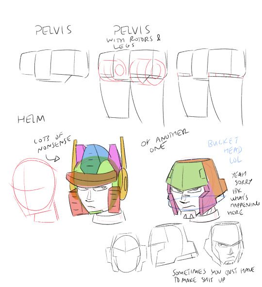


That's basically how I visualize it. It also helps to have reference when you're first starting out. Transformers are wacky to draw cause u need knowledge of organic and inorganic shapes and how they mesh. Personally I try not to let my guys look too stiff. I try to keep lines curved, even if they look straight on first inspection. Technically not realistic since they're made of metal, but it just looks better.
#Hope that helps!#Maybe not the most comprehensive but that's just how I do it#There are definitely also more resources out there#best advice tho is practice and have fun lol#transformers#drawing#tutorial#kinda
230 notes
·
View notes
Note
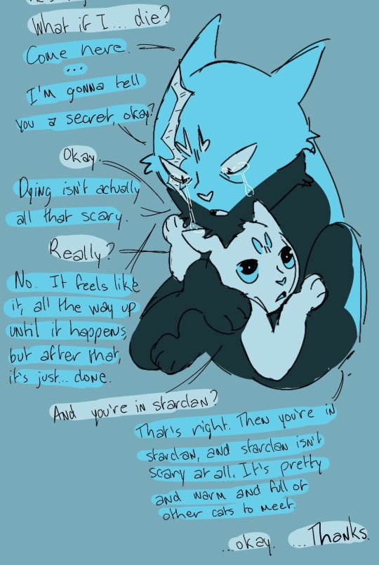
Thinking abt how the kits would have absolutely zero grasp on the concept of mortality and death and how they'd be really confused on why their parents are upset and where Mothtree wen't :^)
Hi friend, I don’t want to be like a major downer but… Rosehipkit is VERY sick. She and Dogwood, more than any other kits, absolutely understand the concept of mortality and death in a way that they should not have to.
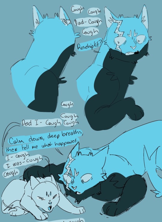
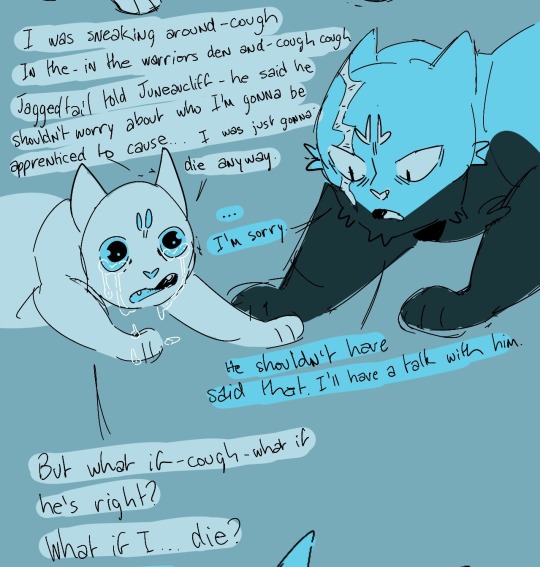
#loudclan#loudclanasks#cw discussion of death#cw death#cw death mention#cw afterlife#cw discussion of afterlife#cw sad#kinda a downer sorry#I know this one is messy but I am terribly tired and I have so many asks in my inbox#I promise the next moon is in process.#sketch done#just trying to balance drawing asks and drawing the moon#also anon who asked about a drawing tutorial I’m working on it!#will probably be a while but I haven’t forgotten
323 notes
·
View notes
Text
🙄
So.. Here's this...
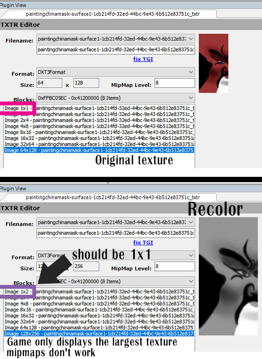
Basically, the smallest mipmap has to be 1x1 pixels.
If it's something else, like 1x2 px, 2x2 px - you end up with a texture that's ~30% larger and with no performance benefits, because TS2 game won't use those mipmaps.
If you're a mipmap enthusiast, pay attention to that top mipmap.
Tip: when building DXT with mipmaps in SimPe, set mipmap level to 12. It will be lowered to required level.
I've already tested a few decor items and clothing recolors and it's always the same. 512x512 texture requires mipmap level 10, 1024x1024 texture requires mipmap level 11.
I stopped building mipmaps for TS2 cc a while ago. I also remove those from various bits of cc I download. Worth noting: mipmaps increase texture size by 33%.
But I still have loads of cc that contains mipmaps.
I've been wondering why only some textures suffer from sharp quality drop on slight zoom-out when mipmaps are present. And now I know. Some of those don't even work. It's just additional, useless data.
To clarify: yes, mipmaps can make textures more blurry on zoom-out. Because of wrong SimPe/Nvidia DDS builder settings almost everybody (including myself) has been using. Now I wonder why the hell I never checked what 'smoothen' option does to mipmaps...


For certain textures with alpha-test transparency, smooth mipmaps help reduce scaling artifacts and might improve visuals.
"Smoothen" option makes tiny, thin details a little more chunky on zoom-out and that might help reduce textures disappearing:
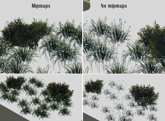

In case of flat stuff with detailed textures - artworks, posters - there are no visual benefits of using mipmaps in TS2, removing blurry mipmaps will improve texture quality at slight zoom-out.
Building crisp mipmaps can also improve visuals.
Here are my test DXT textures. These have multicolor mipmaps (each imported manually) - so you can clearly see if those are functional or not. It should work as shown above, but one texture is always grey because mipmap level is too low.
114 notes
·
View notes
Note
I don’t have the money right now to buy them, but I want you to know that one of your cat magnets, Kiwi, looks SO much like my sweet childhood Tabico that passed last year. Her name was Keke, which is pronounced very similarly to Kiwi (alternative spelling of the name is also Kiki, just one letter off!). She would have turned 20 this April.
I hope the ramble is okay. It just brought me a lot of joy to see one so close to her!
If you ever want ideas for new colors/patterns for designs, I’d recommend looking into ‘Salmiak’ aka ‘The Finnish Mutation’! It’s only been found in one population of very inbred cats in Finland, but it makes an interesting gingham-esque crosshatched pattern.‘Salmiak’ actually comes from Finland’s signature salty licorice candy, Salmiakki! It’s a very acquired taste and when I’ve had it, it tastes a lot like how cat pee smells. I still wouldn’t say that it’s wholly bad.
I would make a salmiak if someone promised to order one! I do love those weirdos, and all weirdos.

I'm glad kiwi brings you joy. I worked in a cat shelter for 2 years, and my favorite duties (which I usually donated) was taking profile photos and writing descriptions of them. So most of the beans are based on shelter cats I knew, named, and adopted to their forever homes.
Because I have experience with several hundred cats, I know what colors are common and how to make something generic enough to fit a bunch of cats within that color scheme. Kiwi is a dilute tortie with white, aka a dilute calico, but i leaned more toward tortie with the color mixing.
As for cost, they aren't all that expensive. A sticker is only a dollar! And shipping is 1-3 dollars even for international.
While I like making money, I'm poor myself, so I always add low-cost options so everyone can benefit.
By the way, did you know you can turn any sticker into a magnet? You can get a bendable magnet at a craft store, or repurpose one from the thrift store. They're really easy to cut with scissors and then you have it!

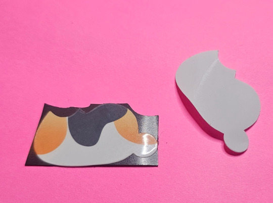
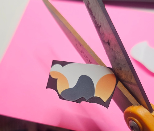

You can do this with any sticker from anywhere!
And flexible magnets are easy to come across. You can go to a craft store or even a hardware store. Some are printable, some are glueable, some come with their own adhesive for double the stick.
And some aren't meant to be used for crafts, but for vents!


I cut mine out with my cutting machine, but if you're just doing a few you can cut them with scissors.
Be a bit wary when buying magnets online or in packages where you can't feel them. Magnet thickness is measured in mils (thousandths of an inch) and anything below 20 mil sucks. The paper thin stuff can't even hold up its own weight, much less a shopping list. Most craft magnets don't have the mils listed, but they're usually 12 mil and suck.
A ramble gets a ramble in return! Now you know how to make your own magnets and can order stickers from me or anyone else in the world and get fridgable items. Magnet hack!
73 notes
·
View notes
Note
HOW DO TOU DRAW. LIEK. UM. UTS HUST SO YUMMY LOOKING?? HOW DO TOU DO BODIES?? ABD FACES??? HELP ITS SO HARD FOR ME
HEHEHWJSJD THANK YOUUU 🌷🌷
Well my artstyle it's simple really, heavily inspired by cartoons, especially this guys

They helped me to capture the most important features on faces (nose, face structure and hair, don't care a lot about eyes in this style, i usually just do dots. They do carry lots of expression, same with the mouth). It's the thing that makes the character recognizable, so it's just doing it over and over again, till you can see the escense ¿¿ of the character (my school books are filled with faces)
I use lots of references for dynamic poses, some examples of how they turn out


sketches (i don't have a lot 😿)


idk if you can see it, but i usually use boxes for the torso and like, smooth lines for the limbs, if i want to do realistics arms and legs i just look for references bc anatomy?? Never heard of it
Ps: LOTSSS of circles, round lines, it usually depends on the character (ex. For foreman i use squares) but for bodies i use CIRCLES
Now hands


i think this explains how i do it. Heavily inspired in TAWOG, SU, and other cartoons since that's all i watch
I also use my hands as reference, since i have really thin fingers and wrists, and check if it's possible and anatomically correct
Conclusion: cartoons...
#ask box#art tutorial#?????#kinda shitty#could make a better one but this is what i got#I got exams don't pressure me....
56 notes
·
View notes
Text
I’m trying out Genshin again.
Ugh.
#I keep trying to play it. but after I finish the tutorial it’s just kinda bland to me?#just open world games in general. explorin’ n’ shit.#I know the main aspect is the characters and the gambling thing.#but I don’t get joy from gambling. Even less joy when it’s characters I don’t really care about.#I can tell they share more or less the same model. and they’re just not appealing to me in general.#Please. have skintones other than white Genshin.#give more of the girls pants. please.#Then why do I keep trying to play it when I don’t like it?#Because I keep seeing other people play#it and enjoying it. so I just keep thinking ‘maybe this time will be better’#kos speaks
56 notes
·
View notes
Text
WELL HELLO THERE FELLOW [Gays]!!!!!

HAVE A LOOK AT OUR TOP OF THE WAREZ!!!
WE HAVE IN-STORES NOW:
- G. POTION
TURN GAY!!! ALREADY GAY!?! TURN GAYER!!! TURN YOUR [ERROR_Friend_Req_Not_Found] GAY!!!! TURN YOUR [[Famliy]] GAY!!! TURN YOUR ENEM1ES GAY!!!!!! THE G STANDS FOR G. SPAMTON
(Smells vaguely like rotten fruit)
- VINTAGE 1997 HRT?!?!
INSTANTLY SWITCH YOUR [[Gander]] WITH THIS SIMPLE TRICK!!!!!!
(These bottles are clearly expired)
- LIMITED EDITION SPAMTON CRAFTED PRIDE FLAGS
SHOW YOUR TRUE
YOUR TRUE
YOUR TRUE
YOUR TRUE
C O L O R S WITH ONE OF OUR MANY HAND-CRAFTED HAND-PAINTED HAND-PICKED FLAGS!!!! WHAT’S THE MOST [[tubular]] WAY TO SHOW YOURSELF OFF?? [Product]
(It’s just old painted over newspapers)
- THE BOYS
[Homophones] BOTHERING YOU??? SEND THEM TO F[*&*@#$] HELL WITH THESE [Shrapnel-inducing] [Microwave Safe] TOYS!!!!! NOW WITH EXTRA [Horse power]
(Pipis)
- SPAMTON SURGERY
TIRED OF YOUR [Redacted] SWINGIN AROUND CAUSING YOU [Internal organ failure, External organ failure, Varination, among other things]???? LET YOUR OLD PAL SPAMTON GIVE YOU A !!!!! GET RID OF THEM NOW FOR THE LOW LOW PRICE OF
(He can’t even disinfect any tools he might have, is thAT A SAW-)
- KISS THE SPAMTON
YOU’VE BEEN WAITING FOR IT [Freaks]!!!!! FOR A LIMITED TIME ONLY, SPAMTON HIMSELF WILL BE OFFERING THE DEAL OF A !!!!! FOR ONLY THE PRICE OF ALL YOUR SWEET SWEET KROMER, YOUR [Hopes] AND [Hopes] WILL FINALLY COME TRUE!!!!!!!! [Queer] GET A [2%] DISCOUNT!!! UNBELIEVABLE!!!!!! EVERYONE ALLOWED!!!!! [No clowns allowed]
#deltarune#spamton#bush art#pride#It took some delays but I finally did it#my spamton speech is kinda rusty but I dont wanna look up how he talks cause it’ll make me sad-#praise alonzoarts for my favorite spamton face tutorial ever <3#also I realized pipislover1997 did exactly this before me……. welp#Anyways happy pride month to all you darlings out there! Love you to bits <333#Don’t let him scam you…
317 notes
·
View notes
Text

simple painting breakdown for an art server I'm in; another user was asking how to replicate this kind of style, and I Love Helping
sketch, block in colors, flat shading / lighting, lighting glow; repeat from any point as many times as needed
+ a more painted one in procreate instead of on my phone Holy shit seeing these on my phone girl why is the iPad so fucking saturated . Anyway


168 notes
·
View notes
Note
Can I ask how you mixed the dark colours for your lovely blue-black goat charm?? It’s so vivid and velvety - my watercolour darks keep coming out very flat.
Hello! sorry it took so long to reply! let me think. It might be because I use more than just watercolours! My base is normally watercolours mixed with a bit of light gouache and then, once dry, I use dark colored pencils to add details and Unify some of the areas where the paint might have been too blotchy. Or you can use light colored pencils over dark areas!
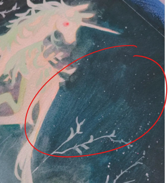
for example you can tell I used an almost dry paint brush with some paler gouache on a still damp dark color here.
Then Later on, once dry I went it with darker colored pencils and "carved" the trees and plant shape with them.:)

Its a lot of playing around with media until you find what gives you the effect you want! As for pencils I use Caran d'ache or Faber castel, but back in the days I would use any prismacolor or dollar store colored pencils for that and it still worked pretty well! (You dont want to push on the paper. rather gently go back on the area over and over so that it has that smooth gradient effect to it.)
#the ghosts are asking#my art#tutorial#kinda#most of the stuff I do is mostly because I was curious and wanted to see how those mediums would mix.#colored pencils work great to add definition to your copic marker pieces!
203 notes
·
View notes