#typeface design
Explore tagged Tumblr posts
Visit Tumblr Blog
Explore Tumblr blogs with no restrictions, modern design and the best experience.
Last Seen Tumblr Blogs


Fun Fact
28.6 is the average number of monthly visits per US mobile user.
Text

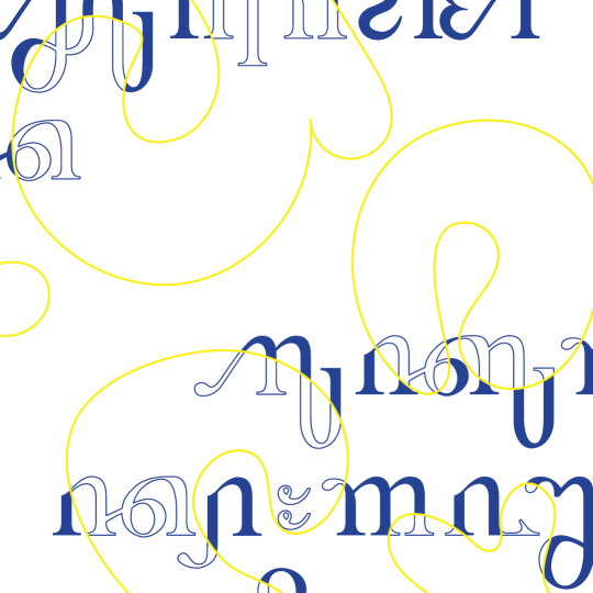
Modular concept typography ioD©MMXXV
56 notes
·
View notes
Text
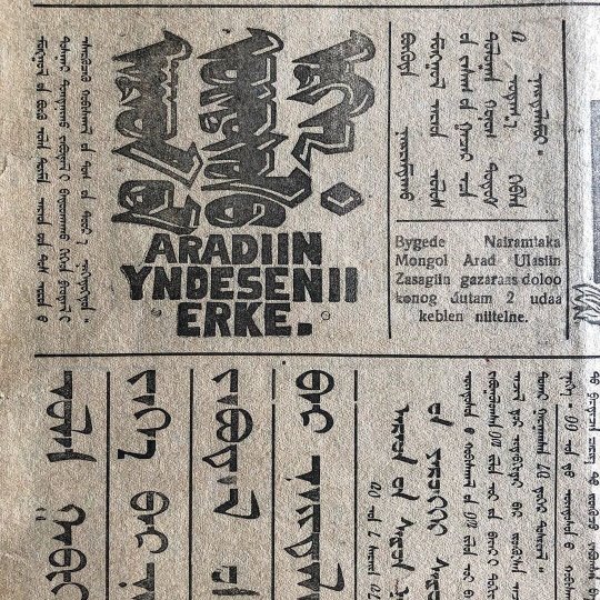

Mongolian newspapers: their typefaces and typographic design
#Mongolia#Mongolian newspaper#newspaper design#type#typography#Mongolian#graphic design#typeface#typeface design
61 notes
·
View notes
Text
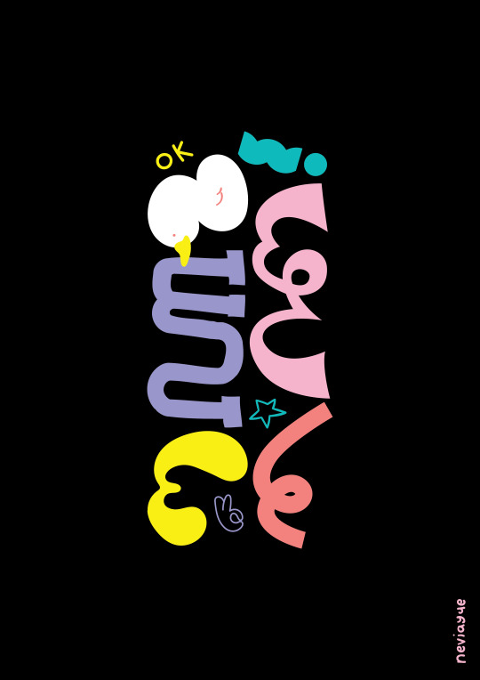
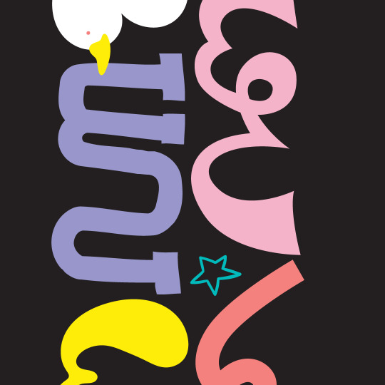
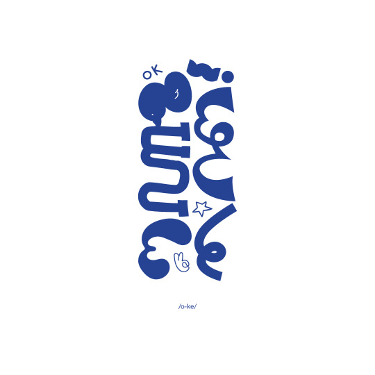
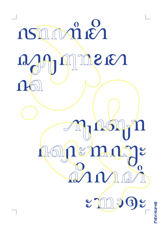
ok | By Nevi Ayu E.
The fourth of my monthly Aksara Jawa Typography Poster project! I wrote o-ke (okay) but put it sidewards, so you need to tilt your head to the left to read it... or not lol. I've seen a lot of designers use this typography technique of having different styles for each letters and reaaaally wanted to try it too, so here it is! The left column reads 'o' and the right one reads 'ke' and ends with an '!'.
#poster design#poster art#posters#typography poster#typography design#typeface design#aksara jawa#javanese script#ok#okay
4 notes
·
View notes
Text

2 notes
·
View notes
Text
Redacted script my beloved! I love using this while writing first drafts! You can’t hyper focus on editing with it and that means you can actually focus on the 1st draft! I actually integrated mine into my freeware of Zenwriter awhile back and it really helped with my blank page anxiety.
I just found the funniest font ever
Like. What is this. Why is this. Who is the target audience of this?
#it’s so neat#especially for writing and for making meaningless copy text in designs for texture.#or if you’re feeling frisky writing out important dialogue and throwing it into an image like nasturtiums on a salad#it adds visual flavor and texture!#and it’s one of those typefaces people ignore. because it’s primary purpose isn’t instant readability!#so it’s great for hiding secrets#typeface design#graphic design#writing
109K notes
·
View notes
Text
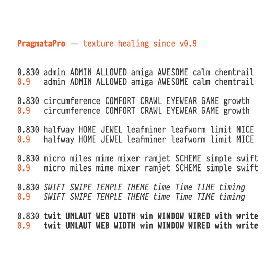
PragmataPro 0.9 - Texture healing of text From this version m M and w W are more expanded in width when meets some letters too extended by design like f i j l r t E F I L with the goal to improve clarity. https://fsd.it/shop/fonts/pragmatapro/ https://fsd.it/shop/fonts/pragmatapro-variable/
0 notes
Text
Cyrillic Serbian
0 notes
Text


NEW TYPEFACE BRIMSTONE FREE DEMO AND FULL VERSION AVAILABLE NOW
INSPIRED BY BRUTALISM, STONE FORCED IN FIRE CUT STRAIGHT FROM THE DEEP DEEP QUARRY. ECHOES OF SCREAMS FILLING THE DUST FILLED AIR, A SELF FEEDING FIRE SURROUNDS BRIMMING WITH SUFFOCATING HEAT. PILLARS OF STONE BEING HACKED AWAY, CARRIED ON THE BACKS OF A BILLION SOULS TRAILING TOWARD WHAT COULD RESEMBLE THAT OF AN UNDERWORLD EMPIRE. BRIMSTONE.
3K notes
·
View notes
Text
These Two Weeks In “Time & Again” #15: IT'S FINALLY DONE 😱 And The Logo, And The Font
I almost kinda can't believe this, but just a couple days ago, it finally happened:
I FINISHED CHAPTER 5 and shipped it to my editor-in-chef.
Wooooo-Whoooooooooo!!!!!! 🥳🥳🥳 I am so happy! It's really hard to emotionally understand that the work is finally done. That was quite an undertaking.
... Overdue by approximately 3 months. But that was just a silly time limit I set to myself before I even started working on it. Different life situations got in the way of me finishing it up faster, but, all in all, since I am fairly satisfied with the result, I don't think any complaints are justified. I am indeed happy. Now I am in the state of mental emptiness. Joking. Not really. I suppose, until my editor gets back to me with a handful of suggestions, I will simply keep drawing and I will try to finish up all the last preparations before I could justify the public release. Gotta make everything look nice and sparkly clean after all 😁
I also slowly, little by little, write materials for a bonus book that currently has a vague title "Time & Again: Collector's Edition". I believe I never revealed that plan just yet, but that's been something I've been working on on and off since the last year, I think. Or maybe even since 2022. Hopefully it's gonna be interesting to all the "Time & Again" obsessed fans in the future someday, because it will contain more WIPs and sketches. As for myself, it's just fun to use it as a sophisticated diary for how the work went.
Speaking of different editions... Earlier in this post I've mentioned my plan to release the updated versions of the previously released Chapters 1 to 4. So, the prospects of that updated release are also getting brighter and brighter; from ghostly, ephemeral concept it is actually gradually fleshing into something real, almost day by day now. And this is very good. And here's the grand reveal for you: this is what the refreshed logo for of the updated edition gonna look like:
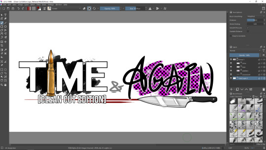
In fact, Chapter 5 will already have this very logo, for it's gonna be the first Chapter to be ever released that came with "Notes & Commentary" section right away. And the presence/necessity of that very section is the main reason why I am updating everything in the first place.
So, when will "Time & Again: Clean Cut Edition" of the previous chapters be released?
- unfortunately, that I have yet to decide on. Cannot tell right now, but one thing that stands for certain is that it will be released only after Chapter 5 goes public. My current priority right now is the release of Chapter 5, proper and nice.
Since today's blog post already contains a fairly big and happy announcement, this might be enough of the news for now. What could possibly be as important as the fact that I finally finished up the supermassive amount of work, literally a new chapter in Lothar's story?! Probably not much!.. Well, almost.
For the last topic to cover today, I wanted to tell something else important and interesting that most people will probably not understand due to excess amount of specific terms 😅 But it matters a lot to me, so here goes.
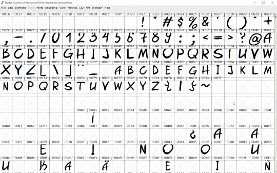
Not long before all the work on Chapter 5 was 100% done, I finally got to look at the main font that I use in my graphic novel (Frosty's Comic Font), for it needed some perfection: I remembered that it was not displaying correctly in some cases, or rather, selected set of the symbols didn't look right, depending. ... I must admit, I am a huge fan of typefaces. I used to collect fonts for personal use back in the day, for I loved to experiment with different designs, and usually I needed them for my custom "one of a kind" greeting cards I used to make for my friends' birthdays. Good memories.
A few years back I started to learn how to make my own True Type fonts - and I bet you have already seen at least a couple of those fonts on my artworks, logos, signatures and, of course, in "Time & Again". Some of those fonts are still partially incomplete and/or unpolished and, thus, currently unused by me - until the moment in the future when I will finally have more time to fiddle with 'em, for working on fonts is not too difficult, but not particularly easy either. In this case, I mean "it's time consuming", for the process of actually drawing a font, designing letters and symbols to me is easy-peasy-lemon-squeezy. But vectorizing, perfecting the kerning in between certain pairs of letters, making sure that nothing is sticking out too much comparing to the rest... That is a bit tedious. In the end of the day however, it pays off tenfold, for you have a pretty, absolutely nice font that can be used virtually anywhere, in any software, for any purpose. I've never designed any monospace font yet... But aye, I'm being a little too nerdy again. Back on track, Frosty.
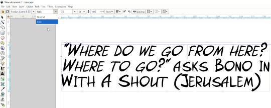
I never post my fonts anywhere to download, paid of free; I use my font solely by myself for now. And "Time & Again" was the reason why I urgently needed a new nice font with a fair touch of "me" in it... I wanted to make "Time & Again" my own as much as possible. So it was only obvious that I needed to design my own typeface for this crazy project. In 2021, I made the first relatively complete version of Frosty's Comic Font to use in "Time & Again" as the main font for the characters' speech. It contained all the basic English language glyphs and extra symbols for German language. Alas, not everything was smooth, and in Inkscape, when I used to copy-paste the lines of text on the speech bubbles, the formatting of little symbols such as apostrophe and quotation marks went down the drain, and was exchanged with the default system font (or whatever Inkscape uses when a glyph is missing). Unfortunately, that error stretched out in time (and space) up until a few days ago. I only was able to figure it out last week. By the time I managed to figure it out, the version of the font reached 1.3, and the last update also contained glyphs for Spanish language. It turned out, I did not include glyphs for all the possible variations of apostrophes and quotation marks. So I got that fixed. And now everything works like a charm. I am very proud 🙃 But the actual reason why I needed to return to designing fonts was different: I was tired of not being able to force italicize my font in Inkscape. While Krita allows for a default italic offset for a font that does not come with a premade italic version of itself, Inkscape does not do that. My manner of work is such, that I work with fonts on the pages of my graphic novel in Inkscape, for it's easier to me. But I like to sometimes accentuate certain words in the speech of the characters with italics, usually to make the readers pay extra attention to those particular words. I did not want to fiddle with workarounds (and in fact I know of no such things for my particular issue) in Inkscape, trying to combine multiple text boxes with different manual skew on the same line or whatnot, so I finally decided to make Frosty's Comic Font Italic. I generate all my fonts in FontForge. Here's what the window looks like:
I couldn't even imagine that generating an italic version out of a regular font could be done in just a couple of clicks in FontForge! 😱 So simple!
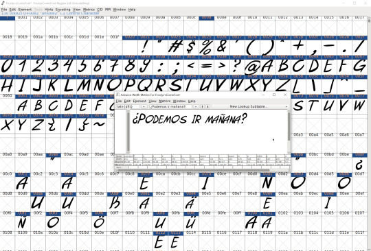
Once it was skewed, I tried to input an example text just to test it out and see what it looks like. When I'm test driving my fonts, I like to write something that uses extra symbols, such as something in German or in Spanish, because all those extra fancy letters make me happy. And once I was satisfied with it, I saved the final version (v1.4) and started using it! Here's the clear side by side comparison of what the regular version looked like versus the new italicized one:
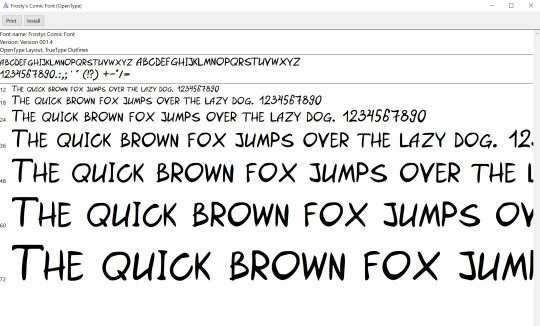
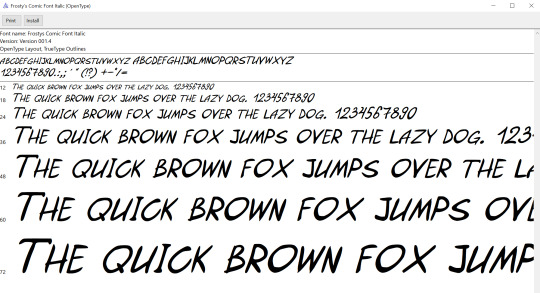
I think it turned out rather nicely.
And now in Inkscape I can finally use different formatting of my own very font within one text box, as illustrated through a quotation from a song by U2 (these guys are my current obsession - just as in ol' good times when I was 11 🤣) on the screenshot below:
Magic!!!!!)))))
That's probably all for now.
... Okay, okay! You probably want more teasers/spoilers from the finished product, right? Here's a little funny snippet for you:
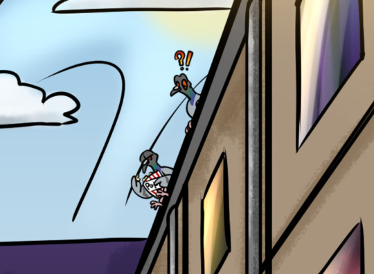
Because any urban landscape always requires fat rock pigeons staring at stuff. Some of them might even watch something while munching on popmeat popcorn.
That's all for today's great news! See you soon! 👋😎 There's more to come.
0 notes
Text

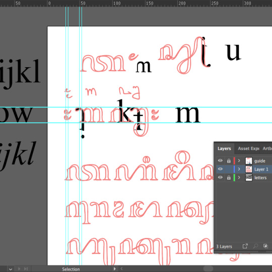
Hard Court ioD©MMXXV
41 notes
·
View notes
Text
You, typeface designer!
How are you making a capital i and a lowercase L visually distinct?
1 note
·
View note
Text
times new roman | By Nevi Ayu E.
Another Aksara Jawa (Javanese Script) typographic poster from me! This time, I designed the typeface by tracing the shapes of the ever-so-iconic Times New Roman. The text reads Times New Roman ukuran 12 spasi 1,5, which translates to Times New Roman size 12 space 1,5, a very typical instruction given by teachers here for typed assignments, lol.

#poster design#posters#poster art#typography poster#typography design#typeface design#aksara jawa#javanese script#tipografia#aksara jawa typography
5 notes
·
View notes
Text
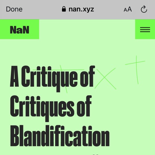
✎ Ⓐ ✄ NaNtxt008
« A Critique of Critiques of Blandification »
by Marcus Leis Allion
↳ https://www.nan.xyz/txt/a-critique-of-critiques-of-blandification/
#branding#typography#typeface design#bland#marcus leis allion#blandification#rebrand#computational capitalism#design writing#graphic design
0 notes
Text
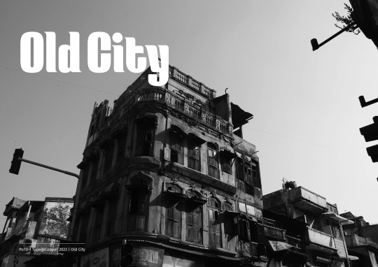

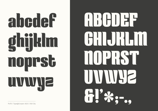
My first ever typeface, inspired by and a tribute to the Old City in Ahmedabad - one of my favourite places. This was the outcome of the Principles of Typeface Design course by the brilliant Troy Leinster (Type@Cooper). The typeface is called Old city and is a bold, condensed display face with visible contrast; expansion model. I honestly have so much to say about this, but I'm going to save that for another post - for now I'm exhausted and can hardly keep my eyes open. This is just a glimpse, because I'm super excited to have come this far! It's been intense, a lot of hard work, so many revisions, but so rewarding. I have a VERY long way to go, but happy to take the small wins for now :) More soon. ------------- Big thanks to Troy, Yusuke and Stephanie for all the feedback, time and patience.
1 note
·
View note