
Don't wanna be here? Send us removal request.
Statistics
We looked inside some of the posts by fsd and here's what we found interesting.
Average Info
Notes Per Post
42
Likes Per Post
39
Reblog Per Post
3
Reply Per Post
0
Time Between Posts
2 months
Number of Posts By Type
Text
16
Photo
1
Last Seen Tumblr Blogs


Fun Fact
130K people were victims of a chain letter scam that affected Tumblr in May 2011.
Text
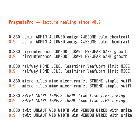
PragmataPro 0.9 - Texture healing of text From this version m M and w W are more expanded in width when meets some letters too extended by design like f i j l r t E F I L with the goal to improve clarity. https://fsd.it/shop/fonts/pragmatapro/ https://fsd.it/shop/fonts/pragmatapro-variable/
0 notes
Text
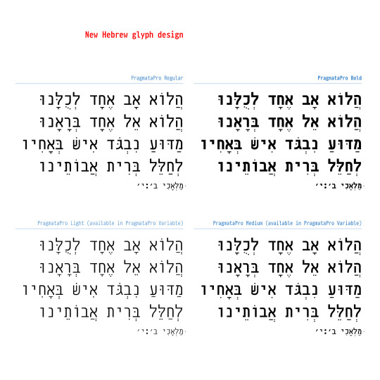
PragmataPro 0.9 New Hebrew alphabet design! https://fsd.it/shop/fonts/pragmatapro/ https://fsd.it/shop/fonts/pragmatapro-variable/
1 note
·
View note
Text
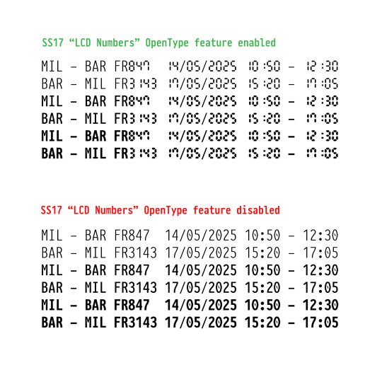
PragmataPro 0.9 LCD Numbers Feature The ss17 Stylistic Set 17 feature replaces numbers and colon with LCD-style numerals and colon that maintain consistent weight with the essential glyphs. https://fsd.it/shop/fonts/pragmatapro/ https://fsd.it/shop/fonts/pragmatapro-variable/
0 notes
Text

More than 7000 Nerd icons edited in PragmataPro Mono 0.9
0 notes
Text
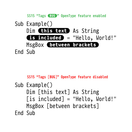
PragmataPro 0.9 out now!
New! OpenType feature ss15 - Tags between brakets
1 note
·
View note
Text
Black Friday 2024!

Save 40% of regular price on all the products available. An exceptional special discount, one time at year. This Friday only. Only at fsd.it Don’t miss this offer!
#blackfriday#typography#fonts#pragmatapro#sys font#siruca#abitare sans#nure variable font#seitu variable font#oook variable font#pragmatapro fraktur#nove nike#sirucanorm#virna mtv
0 notes
Text
Nure 1.3 out now!

Nure™ variable font was improved and released today. Some improvements:
Extreme Condensed Variation
To maximize the font’s versatility, an extreme condensed variation has been added to the Nure™ font family. This new addition opens up a world of design possibilities, allowing for efficient space utilization without compromising legibility. It serves as an ideal solution when limited horizontal space is a factor, without sacrificing the elegance and distinctiveness the Nure™ font is known for. From digital interfaces to headlines, this extreme condensed variation elevates the font’s adaptability while offering a unique visual impact.
Improved Readability
One of the primary objectives of the enhancements made to the Nure™ variable font was to ensure enhanced readability, especially when used at small sizes or for longer texts. Careful attention has been given to refining the proportions of each glyph, making it easier on the eyes and ensuring a comfortable reading experience. The refined letter shapes and improved character spacing further enhance legibility, allowing the font to shine in a wide range of applications, from print to digital media.
Display versions with reduced spacing
In addition to the existing variations, a set of display versions has been specifically designed to cater to more visually striking applications. These versions feature reduced spacing, creating a condensed and tight-knit aesthetic that instantly captivates the eye. Despite the spacing adjustments, readability and clarity remain uncompromised. From eye-catching headlines to impactful signage, these display versions of the Nure™ font are sure to make a lasting impression while effectively conveying the intended message.
With the recent improvements, Nure™ variable font has become even more appealing and functional. Try it to believe!
#variablefonts#typography#sans#helvetica#din#univers#franklingothic#futura#uidesign#font#textfont#displayfont#fabrizio schiavi#typedesign
0 notes
Text
PragmataPro Semiotics
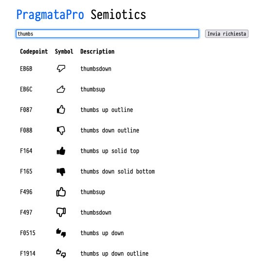
PragmataPro Semiotics project web page is live Thanks to Aaron Madlon-Kay Type a keyword to find one of the 12,000 symbols included in PragmataPro
#pragmatapro#coding font#cheat sheet#unicode#semiotics#codepoints#devicons#nerd fonts#font awesome#vim powerline#vim
0 notes
Text
PragmataPro 0.830 released!
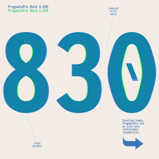
Starting today, PragmataPro has an even more comfortable readability!
Other changes:
— all weights: added and updated the Nerd font icons for the first time was added to Mono versions
— all weights: added notabene ligature available at codepoint 100010
— all weights: added Battery symbols at the codepoints EE00-EE05
— all weights: all the ligatures and Nesteruk glyphs for diagrams are moved to Unicode set 100000-10FFF0
— all weights: fixed the ⟜⊸○∘--- alignment
— Regular: fixed ≤ (U+2264) and ⪇ (U+2A87) alignment
— all weights: improved some APL symbols design
— all weights: disabled ^^ -> ∀ ligature and Git Tree glyphs as default Git Tree glyphs are activable using OpenType Feature ss13
Feel free to contact me directly or notify an issue via Github to improve PragmataPro again and again.Thank you!
#fabrizio schiavi#pragmatapro#typography#typedesign#update#coding font#monospaced font#programming font#functional programming#creative coding
1 note
·
View note
Text
Black Friday at fsd.it
fonts icons emoji playing cards stencils all 40% off!! Only this friday at http://fsd.it
0 notes
Text


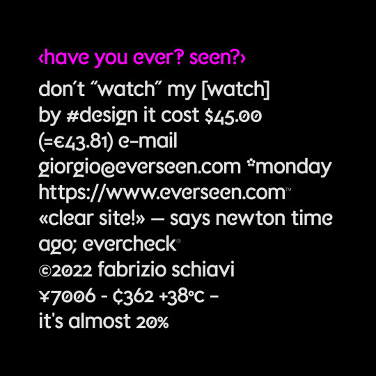


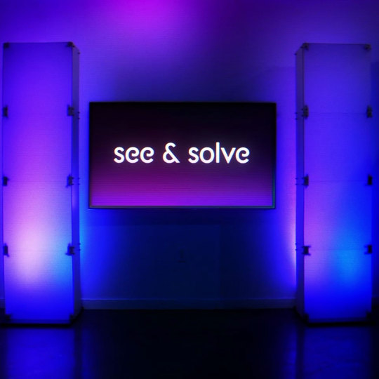
Everseen is an Irish company that developes visual AI for business. I’ve been contacted by Ideosuite in 2022 to improve their custom font used to create logotypes and headlines.
See a selection of all FSD custom brand fonts.
#fabrizio schiavi#fonts in use#custom fonts#brand development#typography#corporate identity#branding#typedesign
4 notes
·
View notes
Photo
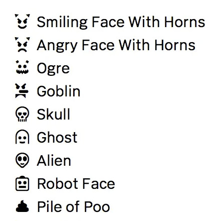
FSD Emoji Fabrizio Schiavi
Source
24 notes
·
View notes
Text

Nure poster designed by Fuss photographed in Monte Santo, Nure valley. Picture by @alecasagrande. Typeface Nure variable font designed by Fabrizio Schiavi
1 note
·
View note
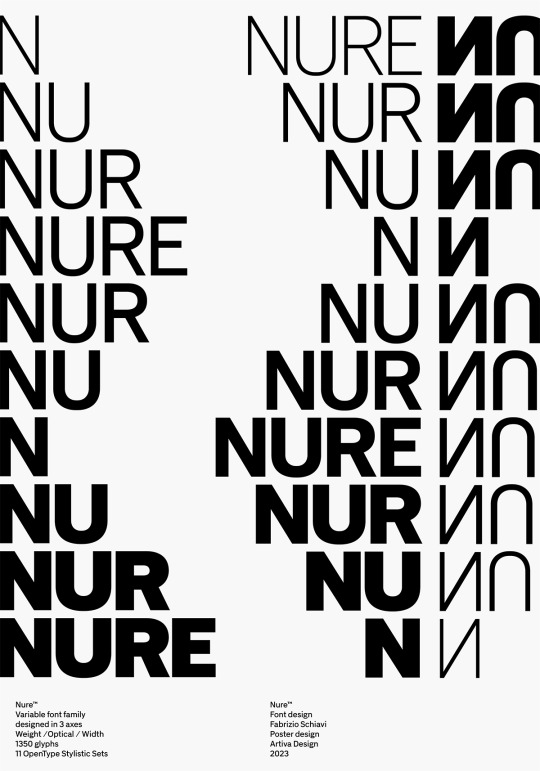
Text
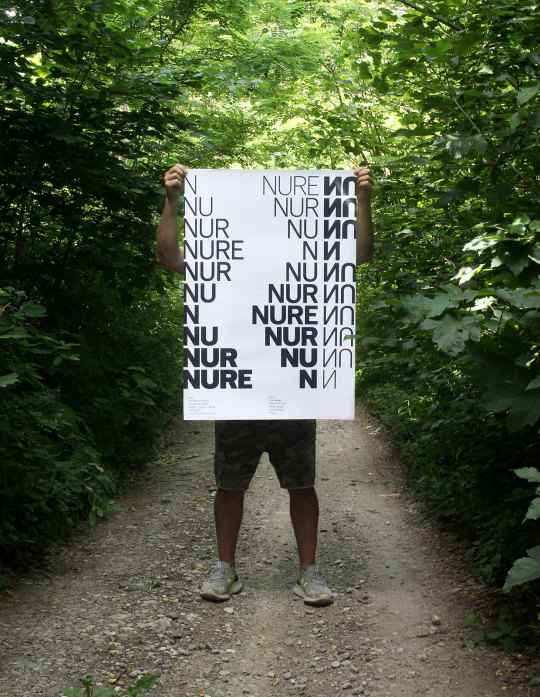
Nure poster designed by Artiva Design photographed on Monte Santo, Nure valley. Picture by Alessandro Casagrande. Typeface Nure variable font designed by Fabrizio Schiavi
#fabrizio schiavi#nure variable font#poster#artiva design#alessandro casagrande#fonts in use#val nure
3 notes
·
View notes
Text

Nure poster by Fuss
1 note
·
View note
Text
1 note
·
View note
Text
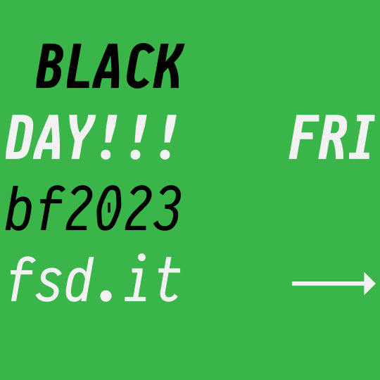
Black friday!

Fonts, icons and products at 40% off with promo code `bf2022` Only at fsd.it/shop/ Only this friday!
5 notes
·
View notes