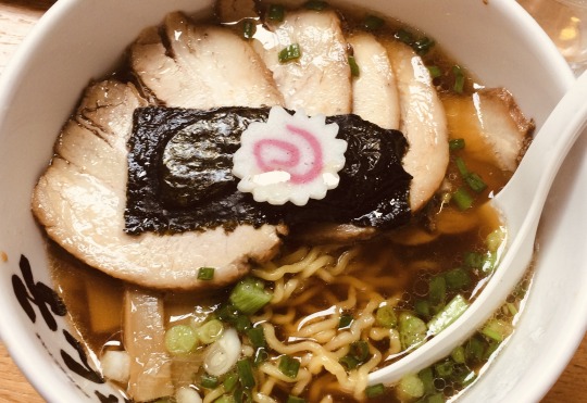
#typographic noodling
Text


Typography Tuesday
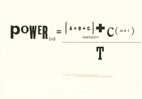
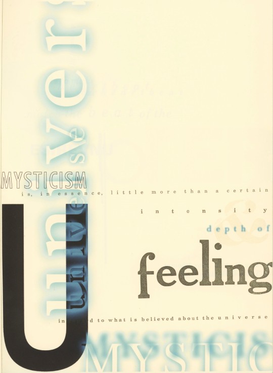
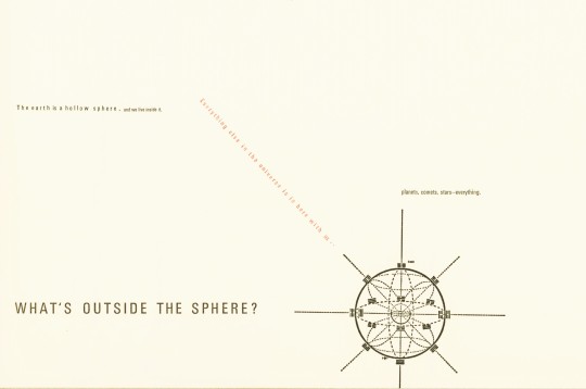
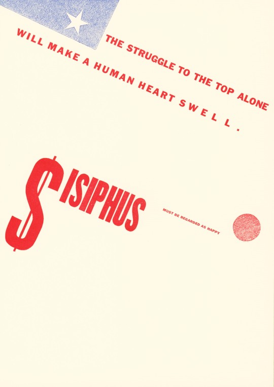
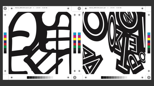
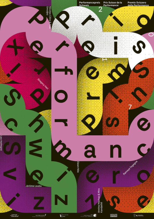
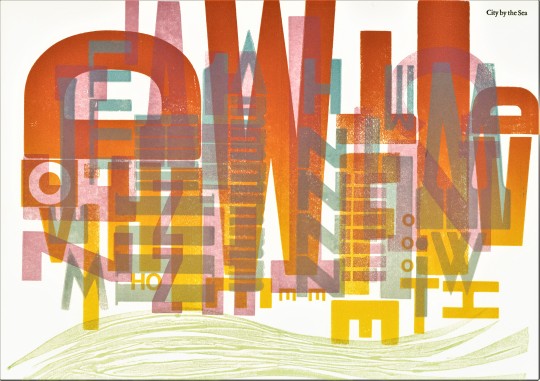
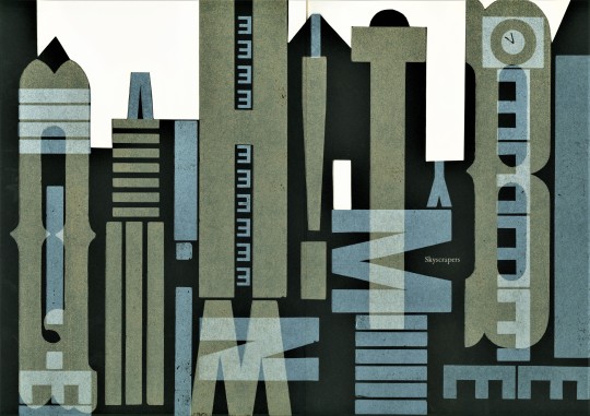
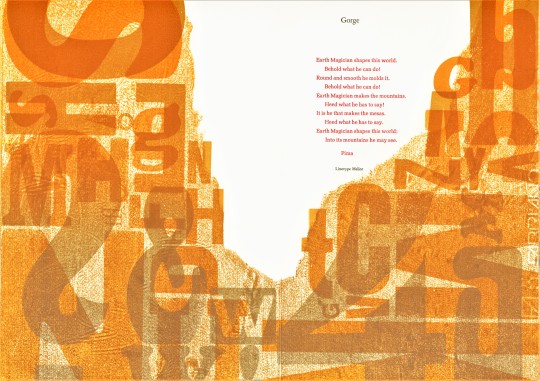
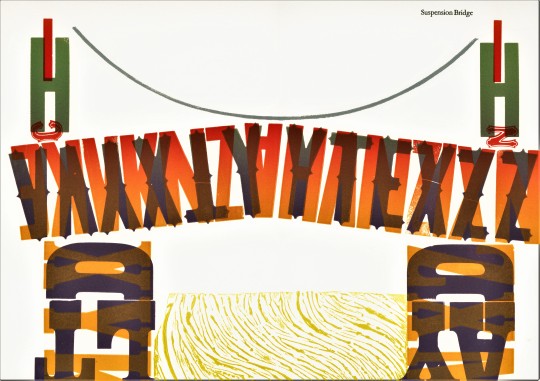
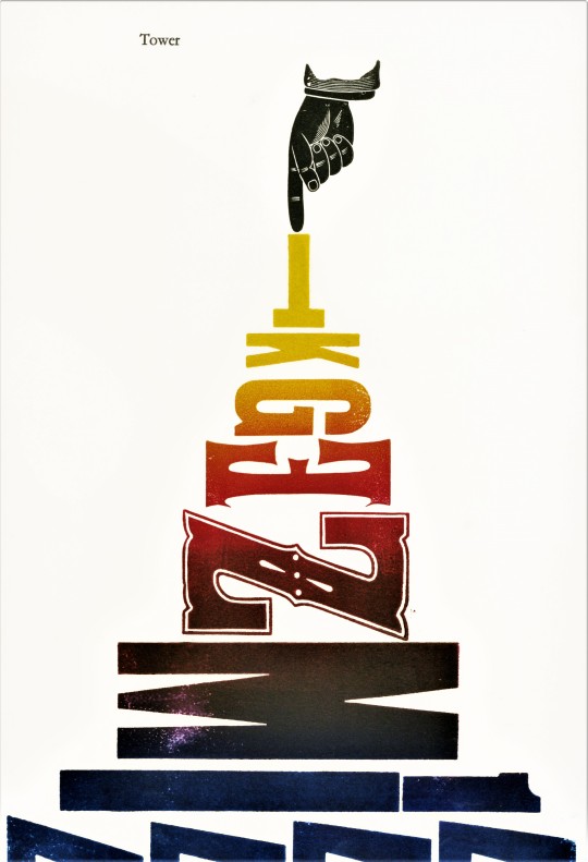
In spring 1999, printer and designer Vance Studley, director of the Archetype Press at the Art Center College of Design in Pasadena, California, led a workshop of 27 designers on a typographic experiment. The result was this collection of typographic prints, Mythologies, A Typographic Journey, published by the Archetype Press in an edition of 52 copies. Of the process, Studley writes:
The subject of this book contains a daring premise; one in which typographic forms are used in graphic arrangements of mark and space to enhance the receptivity of the reader. Each designer selected a myth embedded in culture and then extracted a portion of the myth to arrange in purely typographic form. Pictographs, or pictures could not be employed to lead the reader into making his or her own sense of the excerpt. One had to arrive at imaginary or real connections based on language and its visual structure on the page to embellish the story by means of signifier and signified.
The completed work was printed using metal foundry type, wood type, and polymer digital fonts, with over sixty custom-mixed inks. Our copy is yet another donation from the estate of our late friend Dennis Bayuzick.
View other books from the collection of Dennis Bayuzick.
View more Typography Tuesday posts.
#Typography Tuesday#typetuesday#typographic noodling#Mythologies A Typographic Journey#Vance Studley#Archetype Press#Art Center College of Design#type display#type display book#Dennis Bayuzick
56 notes
·
View notes
Text
Presentation Feedback
need to tidy up my copy and improve some of the wording
is everything actually raw?
"made only with these ingredients" - have this message higher up as well, the brand name doesn't have to be the first thing you see, although it is important
make the wheat smaller - do I want the illustrations to be proportionate or not?
experiment with more type
Brandon Nickerson studio
Hoodzpah
Beasts
find more type studios to get inspiration from
What does the back of my packaging look like?
do research into how other brands handle other sides of the packaging (pot noodle)
consider my target audience - why would they pick up this product? What's the price range? Who would buy it? Is it for customers that go for Walkers or for something more fancy?
Know your customer
the project is heading in the right direction, I just need to stay flexible and keep pushing my designs
Today's tutorial was highly valuable, especially after such a long break. The feedback I received confirmed my concerns and pointed me toward solutions to enhance the overall appearance of my brand. In the coming days, I'll be focusing on refining typographic choices and exploring ways to add complexity to the design.
0 notes
Text

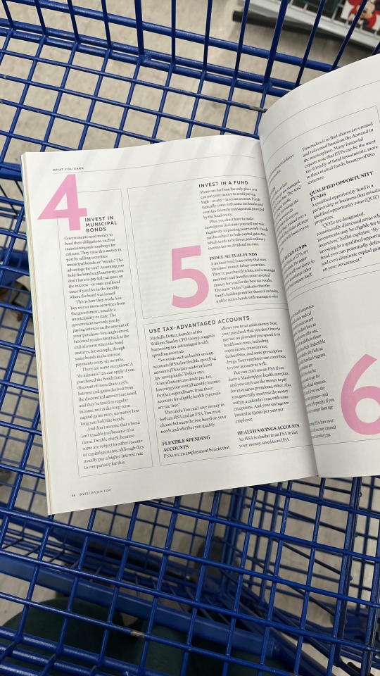
1.) Rhythm in a Magazine (Bauhaus Style) (Image displaying pink numbers 5 and 6): I've always thought of rhythm as one word repeating across a page, but watching the Bauhaus Book video has changed my mind and opened my eyes to how versatile it can really be. I took this picture of a magazine page specifically due to the rhythmic elements I saw in it that aligned with the rhythmic elements in the Bauhaus video. What caught my eye were the bold pink numbers and the way the typography is structured in a rhythmic pattern, easily guiding my eyes throughout the page.
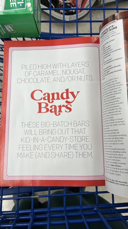
2.) "Candy Bars" Typographic Hierarchy: Flipping through a different magazine, or the same one I can't recall, my eyes were drawn to this specific page that shows how powerful typographic hierarchy can just be. Although the largest, bolded, "main" text is placed in the middle, and you'd expect a person to read the page from top to bottom, I couldn't help but read that middle section first, due to the typographic hierarchy it carries.
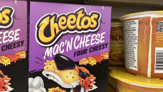
3.) A letter with an ascender: Upon taking this photo, I don't think that I would've noticed the obvious extension of the "t" if it weren't for the way I trained my eyes to look throughout this semester. I'm honestly surprised by the choice of design where the "C" and "h" at the beginning of the word "Cheetos" are curved down. I think this also brings attention to the ascender letter "t" and makes it look more dramatic.
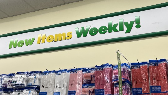
4.) A letter with a descender (Image of "New Items Weekly"): I took this photo in a dollar tree and the main letter that obviously falls beyond the invisible baseline is definitely the letter "y". I think the letter y is common to be categorized as a letter with a descender due to the extension of its tail or the way it's typically written.
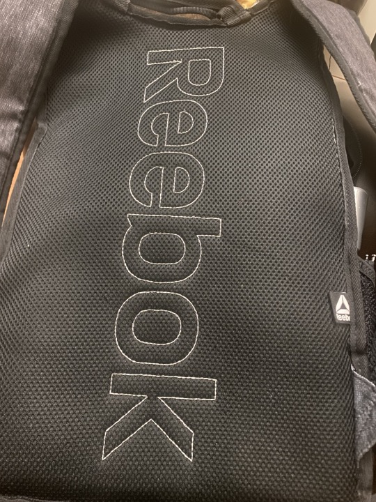
5.) Reebok Letter with a Counter: After coming home from a long day of taking photos, most of which included a letter with a counter, I realized that my backpack, which I carried with me the whole day, had the perfect example of letters with a counter. Every single letter in the design of "Reebook", except the letter "k", is enclosed or partially enclosed in a way that displays how it's a counter letter.
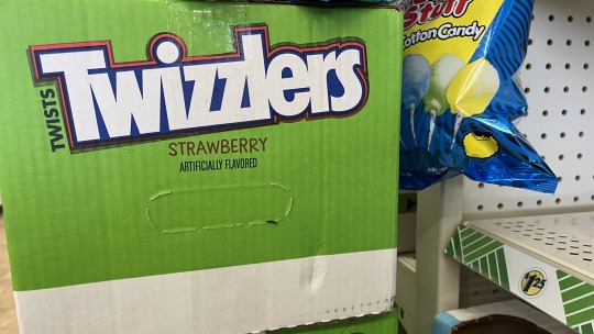
6.) "T" Letter with a Crossbar seen in Twizzlers: It's no surprise that the basic design of the letter "T" displays a letter with a crossbar and that's no different with the word Twizzlers. I like how the T is capital and its basic design is enough to display that.
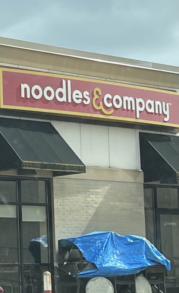
7.) Large X-height Font: I never thought that an all-lowercase typographic design could display the concept of a large X-height font. However, I think that the design of Noodles & Company is the perfect example. Even without being able to directly compare all the lowercase letters to capital ones, I'm able to tell that the proportion of the lowercase letters "d" and "l", seems quite tall in comparison to the other letters.
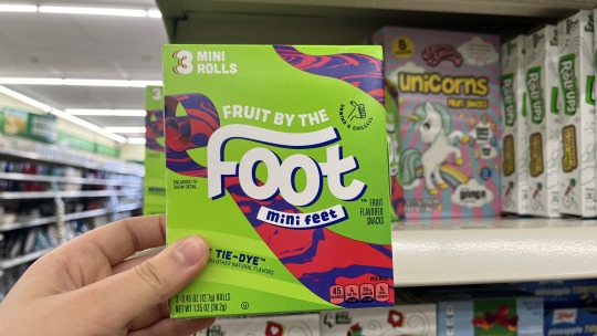
8.) Small X-height Font: The design seen in the "Foot" typography makes the "F", the capital letter, appear way taller as compared to the lowercase "t". The x-height font of a lowercase "t" is usually seen as taller so I think the choice of design gives it a small X-height.
9.) Modernist design ("Grandson" Birthday Card): The design of this card is the closest thing that I could find to a modernist piece. Although the use of gold may not be as modernist as one could get, I think the simplicity of the text takes over. The clean strokes of what looks like sans-serif text display modernist characteristics that I see aligning with the Helvetica video I watched.
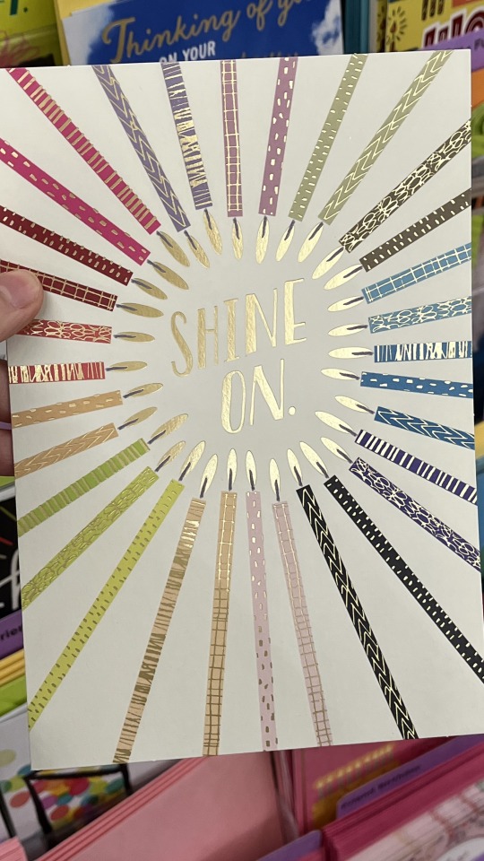
10.) Font Connotes something more than just text ("Shine On" image): Not every typographic piece can connote something more than just the text but I think this birthday card proves the opposite. The way the text shines, regardless of the candles surrounding it, proves how text can be more than the words!
0 notes
Text
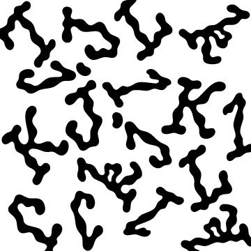
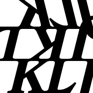
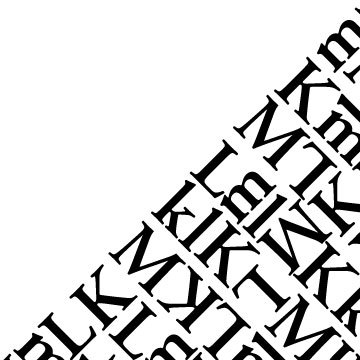
Week 3 and 4 of ARTS102 and every day has been such a great learning experience! In week 3, we were tasked with making three 5inx5in Typographic Abstraction pieces in Adobe illustrator. The words needed to be solid black and each piece had to have a different font. I noodled around for a bit and tossed around a bunch of different ideas, but I’m proud of the end results!
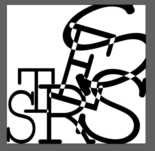
My first major inspiration was a word I experienced quite a lot last semester, ‘stress’.I wanted to pick a font that was very straight and slightly formal looking, maybe even a little unapproachable. Then, I wanted to create a picture that had meaning. The left starts off smaller and orderly and as it goes to the right the letters become larger and more chaotic. I also asked how to make the areas where the letters intersect disappear (I saw this in past projects and thought it was interesting). So that was the process for the ‘stress’ image you can see below. I liked the look of this image. You could read the word ‘stress’ very clearly and it has a deeper meaning behind it, but unfortunately, I had to eventually scrap the idea. My professor mentioned something like ‘how do we know where the line for abstraction is’ when I made the intersecting parts disappear. This made me re-think my whole approach as the image is very clear and too easy to read. I left it for a while because sometimes the best medicine is to sleep on an idea.
My next piece and one I kept till the end was my ‘cheese’ picture, I absolutely love cheese! Choosing the font for this happened fairly quick, it’s curved, thick and if the font did have color it looks orange (physically it’s black but in my head the font looks orange) just like cheese. I didn’t want to do anything special with this piece either, I just wanted a simple, generic looking piece since I was re-evaluating my whole thinking process towards abstraction. But, for all the pieces, I still really wanted the viewer to be able to read the words, so that was a constant lingering thought for my process from here on out. In summary, this piece was just an experiment to see what abstraction is like to make.
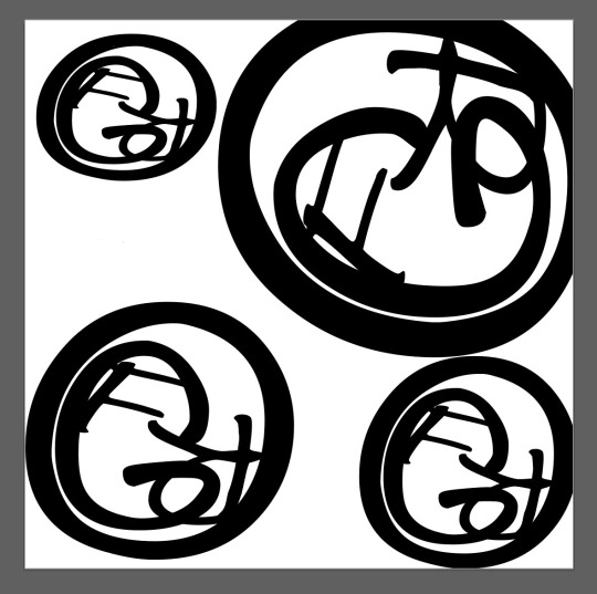
In my next piece, I used the word ‘frog’. They are one of my favorite animals! So, when choosing a font, I wanted it to look like hand writing or messy. There wasn’t anything too messy but I found a font that was round and scrappy enough. Then, I wanted to play around with the ‘O’ and ‘G’ because they are both round and I tried to fit everything in the ‘O’. After playing around with different options, trying to do a kaleidoscope effect, I just didn’t think it was abstract enough. The circles were too formal and I didn’t like how “put together” it looked. Just like the ‘stress’ piece, I decided to sleep on it.
…
The ‘stress’ piece was giving me such a hard time, I kept trying things but I didn’t want a piece anything like the others. So, ‘onomatopoeia’ popped into my head. Lots of letters and lots of ‘O’s to play around with. I chose the font just because it looked fun, and I wanted the text to take up space without taking up space. I think the lines in the letters do that quite well. I tried a lot of different things; making the letters touch, separating them, etc. Eventually, I found a corner and tried to bunch everything up, like the letters were blooming out of one corner. I arranged some things and found a good pattern, then I rotated the whole image unti I liked the orientation. For some reason… this picture reminds me of tacos, haha. Anyways, I liked this one the most.
My final piece ‘frog’, I really wanted to use the word frog, but I needed more letters, so I added a ‘S’ to make ‘frogs. I then had S,O and G to use, all round, I fit them inside each other and just randomly but G and F in the mix. At first the whole thing was sideways (corner to corner) but rotating and experimenting, I liked the blank space on the sides. It looked unique from many of the other previous examples I’ve seen that take up most of the space.
So then, I liked all my pieces and I was ready for the next step.
On the final day we had our 3 pieces printed and we cut them out with Exacto knives and as a class, made a whole composition together. At first, we put up our own pieces individually, but on the 3rd piece, everyone put their work up and we all talked together about where the pieces should go. This was a lot of fun! We ended up with a composition that has the denser pieces in the middle and the less-clustered pieces on the outside. We even explored moving some pieces out of the normal grid (see on the left of the final composition picture).
Overall, I really enjoyed this project and it really got me to use my brain differently! I had to stop thinking about what I wanted and start thinking what the project wanted (just like a client I guess) but still include creativity. I really enjoy this class!
We started our next project this past week, but I'll save all the details for next time!
Pictures:
1. STRESS composition (didn’t end up in final)
2. CHEESE composition
3. FROG composition (Later added S)
4. Cheese/onomatopoeia
5. Exacto knife
6. End result of class composition


0 notes
Text
My last project was a typographic extraction,
In the first one, I wanted to create a sort of "chicken noodle soup" floaty effect. I started with the plan to make something floaty and airy-looking, and when I saw this squiggly font (picnic), I thought it was the perfect font. It has this sort of squiggly, noodle-y effect.
The last two were inspired by the idea of alignment, and I wanted to create lines with the preexisting lines of the characters. With the second, i made lines with the characters, while creating variation by flipping the fonts horizontally and vertically. The last one was inspired by origami, and the different ways a square can be folded in half.
1 note
·
View note
Photo
#berger + stadel + walsh#b+s+w#switzerland#graphic design#rainbow#print#poster#noodle#typographic#typography#bergerstadelwalsh#berger stadel walsh
80 notes
·
View notes
Text
❦ LAWLESS: TWO
content warning: noncon, cursing, violence, manipulation, possessiveness, jealousy, humiliation, overstimulation, explicit sexual contents, gangbang, mentions of killing, traumatic events, sensitive topics, drugs, self-harm, blood, detailed smut, dark content.
english is not my first language, expect typographical and grammatical error.
all chapters on masterlist.
minors dni.
Y/N
A lunatic woman suddenly hold my arms. "Y/N?"
I only look at her and pulled my arms away.
"My daughter..." she caress my head. "Why were you inside the juvie?"
I scoffed and slapped her hand away. "Mom, you were there in my trial. What are you saying?"
"I am sorry, I couldn't come." She said.
She's definitely crazy, I can clearly remember how she cried in the court.
Looking at her in disbelief I said. "Come to your senses Mom! This is why I don't want to go home."
"What are you saying? Let's just go home." She pulled me.
I pushed her away causing her to stumble and flyers from her opened shoulder bag scattered. Flyers for finding my dad.
Suddenly, my eyes get blurry. "You are still finding him?" I asked as she picked the flyers on the floor. "Mom, how many times do I have to tell you? Dad is dead!" I told her and a tear fell from my eye.
She's plainly annoying. They should've let me stay more in the juvie than to see this woman.
"Don't say that... you're dad is alive somewhere, we still didn't find his body." She said.
I wipe my tear and ride my skateboard away from her. She called me many times but I didn't looked back. I won't go home, I don't wanna live with a Mom who's out of her mind.
Riding the skateboard until night, I stayed at a park. I am resting sitting on my skateboard while staring blankly at the streets light.
"Where should I sleep tonight?" I asked myself and sighed.
I at least should eat something, so I went to a convenience store.
"I'll take this and a pack of cigarettes." I told the cashier putting the cup of instant ramen on the counter.
"But we don't sell cigarettes with minor." She told me.
She seems like my age doing part-time job here. I look at her almost glaring at her. "I am not a minor though."
"Let me see your ID please." She asked.
I rolled my eyes and showed my ID. "Happy?"
"But... your birthday is tomorrow so you are still 17, I can't sell cigarettes for you." She smiled.
I gritted my teeth. "What's the difference between today and tomorrow? Everyday is the same." I told her.
"How is it different? You'll be an adult tomorrow."
"So you want me to come back here tomorrow just to buy a cigarette?" I asked her frustratingly.
She nods. "You are still young why are you ruining-"
"Shut up and just let me pay for this ramen. You are annoying." I told her. "You're not even the owner of the store why are you so strict?" I whispered rolling my eyes at her.
She shut her mouth and did her work. I ate the cup noodles outside when I saw a man I think he's unemployed in his 30s. He is smoking.
I walk to him and smiled when he looks at me. "Excuse me, I just ate and I also want to smoke. Can I ask for one stick?" I act coy to win him over.
He shyly nod and took his pack of cigarettes on his pocket. He opened it and groaned. "I am sorry, it seems like this is my last." He said.
I pout. "What a shame... I couldn't buy to the convenience store since I left my ID." I looked at him and tucked my hair on my ear. "I always get mistaken as a minor but I am 20." I sighed. "I blame my looks for this."
He shake his head. "No, don't say that. You look pretty." He said holding the back of his nape shyly. "Want me to buy you cigarettes?"
Bingo.
"Can you? I would be really thankful." I said smiling at him and pretend to take money from my pocket.
"No, it's my treat. Wait for me here." He said and run to the convenience store.
I already expected that he will pay for it.
He came back holding a three pack of cigarettes and gave it to me. "Is this enough?" He asked.
Enough for an obviously jobless person.
I nod. "Why did you bought three? I only asked for one stick." I said pretending to be shy.
He laughed. "It's okay... umm... I just wonder... can I get your number?"
I acted surprised. How brazen for someone who looks so ugly and smelled so bad?
"You don't have to, if you don't want." He added.
Yeah, I don't want to.
"My memory is not good so I don't know my number plus I don't have my phone with me..." I reasoned.
He bob his head. "I'll just give you my number." He said and went back to the convenience store.
Why is he so restless? Whatever, I'll just entertain him until he leaves, it's boring anyway.
I rolled my eyes and lit a cigarette. "How I miss sucking a cigarette's butt?" I uttered and blow a smoke.
After a while he came back with a pen. He wrote his number on his empty pack of cigarettes and gave it to me. "Here, you can contact me with that." He told me.
I only nod and put it inside my hoodie's pocket.
"Make sure to contact me, you can tell me anything you want." He told me.
I smiled and nod.
He fix himself and wave goodbye. "I have to prepare for my job interviews so..."
"Ohh okay... thank you." I told him smililing and also waved goodbye.
My smile faded when he's gone. I went back to the table outside the convenience store where I put my bags and skateboard. I throw the empty pack with his number written on it in a trash can and left.
I rode my skateboard again and roam around the streets of Roponggi. There's a lot of rich people here and I'll try to pick pocket some money.
Riding my skateboard I stopped when I saw a nice car parked outside a club. I scanned it with my eyes in awe and touch it a little. I am curious how it looks inside so I leaned down my face to the tinted window.
"Woah!" I gasped when I saw a fat wallet inside.
I looked around and saw a stone. I threw it to the window and the alarm goes off. I took the wallet, didn't mind the broken glass grazing my skin.
Men from the club went out and saw me. They look like bouncers with huge body. I run away using my skateboard and went to a crowded place.
I hide in a dark alley and took off my hoodie, throw it in a trash can, now I am only wearing my under tshirt.
I saw the bouncers pass by so I enter the nearest bar I saw to hide.
"We don't let minors in. Show your ID first." The guard asked.
This again?
I showed it to him. "Just let me in, I'll be turning 18 in three hours." I told him.
"What happen to your arm? You are bleeding." He said.
Oh, I am.
"Please sir... a group of men are chasing me, just let me hide." I begged desperately.
If they are police I will let them caught me, but I think they are gangsters so... they will surely beat me up.
"Whatever, just get in. If you cause trouble here you will pay for it."
I nod and hurriedly went inside. It's a prostitution bar. I shrugged and roam around to find the restroom, cleaned the blood on my arm.
A lady in her 40s also entered and looked at me through the mirror. "How old are you?" She asked and sip the cigarette on her mouth.
"I am 20." I told her.
She laughed blowing smoke in her mouth and nose. "I can totally smell a teenager runaway from you." She kicked my bags that I put on the floor earlier. "How did you get in?"
I face her. "I use the door, of course." I rolled my eyes.
"What a brat." She inhaled a smoke again and blow it on my face. "Wanna work here?"

do not repost.
#fanfic#tokyo revengers#tokyorev x reader#tokyorev smut#tokyorev x you#tokyorev x yn#mikey x y/n#mikey smut#mikey x you#bonten mikey#mikey bonten#manjiro x you#manjiro x y/n#manjirou x reader#sano manjiro
65 notes
·
View notes
Text
Found Objects Final
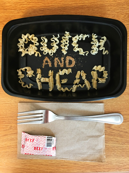
Here is the final image for the Found Objects project. Written reflection is under the cut.
The process of constructing words with ramen noodles for material was a lot more delicate than I was expecting it to be. The first word I worked on was “CHEAP”, which consisted of breaking up half a block of uncooked noodles. To really get the forms I wanted, I had to search for pieces that were broken in a certain way (For example, I was really happy to have found a curved piece for the ‘C’). To put the pieces in place within a small container, I quickly realized my fingers were too big to rely on without disrupting other parts, so I moved pieces around with a pencil. Next was “QUICK” with cooked noodles, and since they were flexible, it was a lot easier to form. I also had to use a pencil to move them into place because they’d stick to my fingers. Lastly, I used the flavoring packet powder for “and”. This consisted of pouring a small amount into the container and moving it into shape with a dry paintbrush. A wet paintbrush was used to remove excess powder.
It was a conscious decision to have “QUICK” be cooked noodles, because that word has more round letter forms that would be easier to shape with a more malleable material. Another reason is to symbolize that “quick” refers to the conveniently short time it takes for noodles to cook. The reason why I didn’t use cooked noodles for the entire project was to show the different textures and colors between cooked, uncooked, and flavor powder, and to exhibit all the components of ramen. The fact I used a black tupperware container to frame the words was to play into my idea of convenience. I also thought having something dark to contrast the light-in-color noodles would help them stand out. However, I did go into Photoshop to adjust the brightness and saturation a bit to give it more contrast. I thought it appropriate to photograph my project with a fork, the flavor packet, and a napkin, to again reinforce this idea that ramen noodles are usually a staple for many people like me, a busy college kid making do with what I have available.
In terms of typographic treatment, I had everything be in all caps because capital letters offer a bigger, usually less complicated form to work with. I feel like if I had used lowercase letters, it would have changed the mood of my work. The capital letters give a sense of urgency or busyness, which adds to my theme of a convenient meal in a busy world. Overall, this was a really enjoyable project. It offered a chance to think creatively and problem solve by using a material one probably wouldn’t use in any other situation.
1 note
·
View note
Text
The best recipe
In his essay " Thirteen ways of looking at a typeface " published in 2007 in Design Observer, Michael Bierut gives thirteen reasons how or why to choose a particular typeface after what he humouristically refers to as his binge of typefaces.
In fact, after ten years, of only using a limited number of typefaces projects (at Massimo Vignelli’s) he went nuts and " became typographically promiscious ". Through his article, Michael Bierut explains that we can use any typeface we want and helps us to make our choice without regrets. So, he details thirteen reasons why we could legitimately use a typeface.
We could use many kind of typefaces, explains M. Bierut in his introduction, but we have to know when it’s too much before becoming a " slut " and make something illegible. I think this statement is also at the core of cooking : I like to know which ingredients I am going to eat and understand their combination. For example, ramen (a Japenese recipe that I am crazy about) is composed of a lot of simple ingredients. But the difficulty lies in the perfect marriage between them such as the art of using typeface : it is a question of homogeneity.
In the reason nine " because it’s ugly ", M. Bierut says that sometimes we use an ugly typeface because it is great. This reason nine is almost similar with the one " because it works ". Consequently, we have to admit that, even if we don’t really like the choice of a typeface, it is the solution. Likewise, I am always surprised by the Chinese cabbage in my ramen, but it is undeniably essential to the balance of flavours. In the same way, we maybe have the right to employ a typeface only " because it’s beautiful " like the reason eight. It is an essential point in cooking, and I am not sure I would enjoy ramen as much as I do if it wasn’t beautiful. Because it is a fact, the visual marriage between noodles and sliced pork is perfect : the slice of pork bring order to the disorder of noodles, each one depends on the other and, the broth makes the connection with everything. Moreover, I am so crazy about ramen that if ramen restaurant is among a multitude of other restaurants in the same street, it will always be the solution. That is makes the connection with the fifth reason of M. Bierut " because it was there ".
All in all, M. Bierut seems to says that we have to choose a typeface for reasons we believe in. It is the solution to the counterproductive multiplicity of fonts. That is why my heart chooses ramen. I could eat many other recipes like sushis or pizzas but this one " made me "(6). It will always be a ramen choice " because it works "(1), " because it’s beautiful "(8), because I like the name(3) and because – let me add a forteenth reason to Bierut’s list – I love it !
---------------------------------------------------------
Michael Bierut’s essay : https://designobserver.com/feature/thirteen-ways-of-looking-at-a-typeface/5497
0 notes
Text
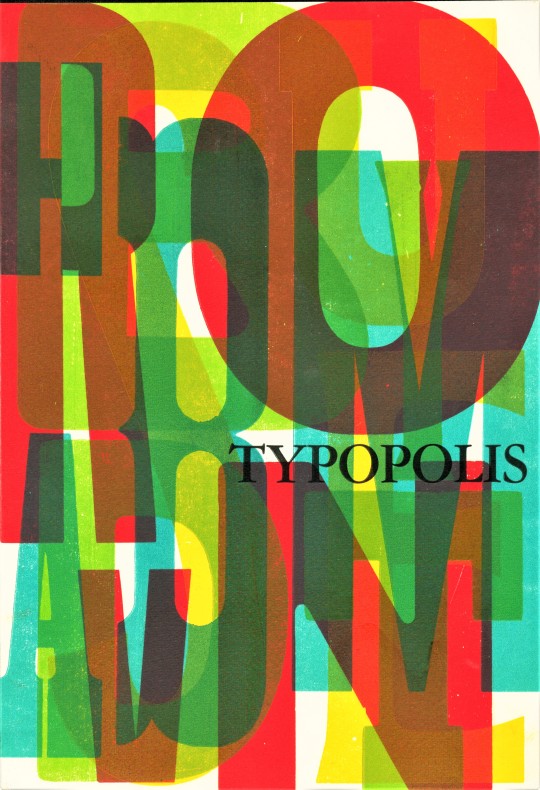
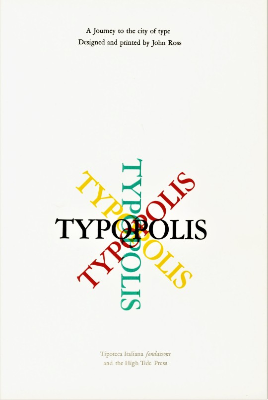
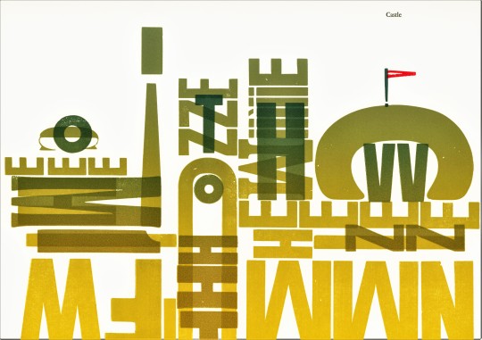
Typography Tuesday
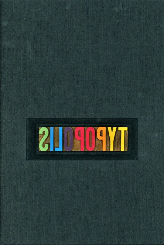
We recently received a donation of numerous fine press, deluxe, and artists books from the estate of our late friend, art professor, painter, collector, letterpress printer, and book artist Dennis Bayuzick. Among the many beautiful books from his collection is this deluxe book of letterpress wood type imagery, Typopolis, "A Journey to the city of type," designed and printed in 2002 by American artist, educator, and printer John Ross (1921-2017) at his East Hampton, New York High Tide Press in an edition of 25 copies. The bound accordion book was produced in association with the Tipoteca Italiana Fondazione in Cornuda, Treviso, Italy. Ross had suggested to the newly-established type and printing preservation foundation that:
a working printshop could be used to produce artists books, posters or prints to keep the letterpress tradition alive by artists and designers using the equipment collected in the Tipoteca. [They] agreed and this book is one of the first efforts to produce new work using old technology.
The book is a lovely visual meandering through a typographical landscape.
View more Typography Tuesday posts.
#Typography Tuesday#typetuesday#Typopolis#John Ross#High Tide Press#Tipoteca Italiana Fondazione#typographic prints#typographic noodling#artists books#fine press printing#wood type#Dennis Bayuzick
30 notes
·
View notes
Video
youtube
KENDRICK LAMAR - HUMBLE.
[5.29]
FULL STOP.
Maxwell Cavaseno: Another year, another Kendrick Lamar single that receives undue praise for me to neg. Let's be frank, "HUMBLE.," beginning with its hyper distortion yodeling from Mars (and not even the good kind you get from Young Thug or Peewee Longway, but the histrionic sounds of a hamster getting squashed as channeled by a child) is doomed from the start, because the record's main goal is telling us the supposed superiority of Kendrick Lamar. Based on what? Half of "HUMBLE." is a jumble of half-assed analogies that don't even make sense and Lamar couldn't even bother to structure as a simile. Yet still, he manages to insist that his record is "Grey Poupon, Evian, TED Talk" like those three are actually essential, classy, or worth your time. Coincidentally, he turns to the ever overrated Mike WiLL, who is no Daz Dillinger or Sam Bostic, and whose attempt at Mobb Music-style keys sounds more like a parody of rap music made for an episode in some comedy show where "gangsters" come to intimidate your overexposed improv icon of the year. The hook itself is unfunky as anything, not to mention his flows throughout the verses. He demonstrates that, even a relatively straightforward Kendrick Lamar record is -- in which he tries to rap without lavish choirs, evocative jazz noodling, or some other form of grandstanding to glory he'll always inevitably assume -- still so far up his own ass.
[1]
Thomas Inskeep: Am I allowed to admit that I don't really like the tone nor tenor of Lamar's voice? Also, this is Mike WiLL Made-It's most uninteresting beat in eons. "HUMBLE." is clearly a record made for the radio, and that's to its detriment.
[3]
Will Adams: The set-up for what could have been a simple, effective car-blaster of a single gets bogged down in Kendrick hopscotching topics and an annoying synth screech.
[5]
Jonathan Bradley: Kendrick hops on Mike WiLL Made-It's broke-up jock jam of a beat, popping his own off-kilter shrapnel syllables perpendicular to the industrial whirs and zombie-funk piano jabs. "HUMBLE." is "King Kunta" in negative: a banger that pounds against our urge to ride along with it. It's both disorienting and intuitively pop because Kendrick knows how a voice can lick like a flame around a listener's synapses: "my left stroke just went viral" is a smarter hook than the do-as-I-say-not-as-I-do peacocking that forms the actual chorus. What makes him such an arresting presence in hip-hop is not that he rhymes better or flows better than anyone else -- though he has a reasonable claim at both titles -- or that he is more innovative, but that he imagines spaces in the American consciousness larger than anyone else and sets about filling them. So, sure: be humble.
[8]
Joshua Copperman: The video is a [10], and even the hook is a [10], but the rest is a bit more complicated for me. About that beat; I got justifiably called out last time I said something was tinny when that's just a genre trademark (and it's definitely an intentional homage here, considering that Derek Ali is one of the best engineers of any genre), but I'm pretty sure I should be able to hear more of the piano than just the overtones! Meanwhile, the controversial part about stretch marks and natural women is well-intentioned but feels surprisingly sloppy, especially next to someone like Vince Staples claiming that we "need Tamikas and Shaniquas in that Oval Office." As a result, "HUMBLE." sometimes seems stuck between two modes; if it's a pure banger, then why have those lines about being "sick and tired of all the Photoshop," and if there really are deeper messages, why don't those lines tie in better to the theme of the song, and why make the chorus entirely consist of multi-tracked Kendricks pointing and laughing at Big Sean? Kendrick Lamar's lack of focus is often thrilling on DAMN., especially with the beat switches and flow experimentation on songs like "DNA." and "XXX.", but it almost ends up hindering him here.
[6]
Cédric Le Merrer: That piano beat is so hard going all CAPSLOCKS. ONE. WORD. DOT. is the one typographic choice that makes sense. The perfect backing for Kendrick Lamar in one of his "let's remind everyone I can rule the world if I want to" moments. I'm not going to talk about the authenticity of this, because like removing stretch marks from an ass on Photoshop, it probably took a lot for work to make this sound raw as fuck. But IT. IS. the rawest sounding shit and I've been playing it right before job interviews lately and can only recommend it as a secret of successful professionals.
[10]
Alfred Soto: The rhymes sound second-tier to me and his flow awkward; he and Mike WiLL Made-It fell too hard for that piano line. Moreover, Kendrick Lamar just sounds tired.
[4]
[Read, comment and vote on The Singles Jukebox ]
2 notes
·
View notes
Text
—Week 11, 12
Proposal draft
What:
Central Proposition
Communication design can facilitate the representation of Chinese culture with visible plurality.
Context
What is this project about?
- The relation of type and culture
- Ethnic types that are stereotypical and can be racist in certain contexts
- Its used commercially there’s two sides of it: restaurant owners who don’t see the problem and use it to signify authenticity and designers to want to scream ethnic! And design products based on stereotypes and racial digs
- Designing a new typeface, an alternative that is true to the culture rather than based of stereotypes
What are you investigating/addressing/revealing/challenging?
- How type has been stereotype and created
- Who designed racist type
- The origin of the wonton font
- How it paved its way to Chinese restraunts
- How its kept going and still used today
- How type is designed
- The process of how type is received
- Social science and understanding of peoples minds and how they construct a stereotype
- What authenticity means, what makes something authentic
- cultural commodity as these typefaces have been used to sell the culture there by using signifiers to show the culture
- signifiers, an easy visual short cut to show and signal a ‘thing’
- semiotics behind the type such as its racial history and coming to be referencing the yellow peril, gold rush, Chinese immigration, housing, chinse ban, movies where westers mock Asians, the power over the other, micro-aggression, yellow face, orientalism, terms such as chink, chong ect
what practical, technical, theoretical or design approach is your research using/advancing/following?
- Paul shaw
- His key points
- Ethnic Typefaces are a visual shorthand for an entire group
- People connect to typefaces with their own accord and reinforcing the fonts’ ethnic associations inviewers’ minds.
- Its welcomed by commercial purposes that serve the ‘person’ to an advantage such as restaurant owners
So What:
what is the significance of the problem/topic/issue; why is it
worth doing? Why should we care about it?
- It’s a product of the past but people continue to use it
- Seeing it used reminds me of growing up with a heritage of the racism, and can’t shake those associations whenever I see the font
- Racism is quite present in NZ as The Human Rights Commission report hints that this might be the case, with ‘one in two New Zealanders [who] feel the recent arrival of Asian migrants is changing the country in undesirable ways‘. One in two.
- 1 in 3 complaints to the Human Rights Commission are about racial discrimination
- micro-aggression the unseen, but the heard is still strongly present
- there is no ‘alternative’ to it in the market that isn’t racists??
- There is no such thing as nz typeface kinda thing
- Pointing the problem
Why:
State your concept
What ideas have you brought to the problem/issue/topic?
- A new typeface
- A visual thing/exhibition/manifesto
- Campaign?
- A book, ethnographic, biographic study of it
What is your angle or approach?
-
What does it add to what we already know?
- It confines it and gives awareness to it, as its been pushed under the rug
- Its old news but still prevails in modern society, examples of racism or lack of authenticity to sell as a commodity such has the noodle night market lol
What does design add to the problem/issue/topic?
- Design takes on the role as a visual communication for everything, its our role as visual communicators to be educated and do design right not wrong
- We undertake the responsibility behind how things are perceived, viewed, looked, felt and understood.
- Design controls it
- Design confines what outside viewers understand
- Its role is to design good not bad
- Make good design choices
what do you add to the integrated fields of the problem/issue/topic and design?
- A background of experience and knowledge of both receiving ends of the spectrum
- From behind the counter and experiencing what that undertakes and what it also comes with
- An insight into a visual understanding of it and questioning it
- Growing up in nz
- As a takeaway kid
- Moving on from that and reflecting the choices/no choices that we had or say in the branding
- Cheap designers who were most likely of that decent making back design choices and they don’t know better, uneducated in that sense
- sinister association in my head because I have it abruptly thrown at me by strangers who clearly do not speak Mandarin.
-
How:
State your intention
What did you do to get to this point?
- Research into what exists
- A fair conclusion that people think the same way
- On the same wave length and want to never see that font used
- Interviews with a few groups of people
- 1) restaurant owners; which concluded that design choices were made by the designer on hand their input was colour and context, but and input of what they wanted; common answers were fortune, brings people in, draws attention from other competition surrounding, ‘Chinese’
- 2) a group of people of Chinese decent on their thoughts and feelings confronting them – the chopstick font and racial stereotypes in the media. They all knew about it were aware of it and reminding them of it, sparked a sense of ugh this again. And questioning why, how was that even allowed, how did it go through all those production stages and end up on the market?
What have you learnt/invented/created that can be a departure point for further work in semester two?
- A collection of found signage and ethnographic study
- A complied journal of biographies from first hand experiences, conversations with friends and blog posts of racial remarks/stereotypes/micro-aggressions
- A collection of ugly fonts (up to 25 at this point)
How can what you have done already suggest what you do next?
- Its given me resources to unpack and uncover
- It has started the conversation and an ever growing list of what exists
-
What specifically do you intend to do?
- I intend to offer a new typeface as an alternative to your ethnic font your using or about to use, this font serves as a new outlook on what is means to be Chinese and not what it is seen for from stereotypes and racial aggressions.
- I intend to also help victims, like me of this to stand up and speak out against it. But also or people to understand and build empathy towards the wrong and learn and reflect on their behavior and create social change.
Objective
Precedents:
- There’s no such thing as a New Zealand typeface, klim
- Ada chen who confronts racism through jewelry https://i-d.vice.com/en_us/article/9k8jd7/ada-chen-jewelry-made-in-chinese-america
- Banana mag https://i-d.vice.com/en_us/article/9k8jd7/ada-chen-jewelry-made-in-chinese-america
- He points out: the history of ethnic typefaces and shows that there are many different paths taken by a typeface from its creation to its status as a visual shorthand for an entire group.
- Many fonts, however, are seen as exotic because of context
rather than innate characteristics.
- Thesefonts’ ethnic connotations have developed gradually, through
recurrent appearances on book covers and posters, by people who
connected the typefaces with their own cultural biases and perceptions,slowly reinforcing the fonts’ ethnic associations in
viewers’ minds.
- Ethnic type—not just chop suey but all of the varieties—survives for the simple reason that stereotypes, thoughcrude, serve a commercial purpose. They are shortcuts, visual mnemonicdevices. There is no room for cultural nuance or academic accuracy in ashop’s fascia. Restaurant owners want passersby (often in carsrather than on foot) to know immediately that they serve Chinese (orGreek, or Jewish) food, and a lettering style that achieves this iswelcome.
-
-
Typographic shapes and letterforms are a way to represent a culture.
People have been seduced by the cultural connotations in typographic letter forms to assimilate a culture. Type is used as a visual short hand to represent a culture through visual mnemonics. (wachendorff 228)
These visual devices — often seen in ethnic fonts, can lead to racist designs or used for ethnic stereotypes which prevents a culture having proper representation.Ethnic fonts are usually served for a commercial purpose, to perpetuate authenticity and signify a culture. This project focuses on ethnic type, specifically of Chinese influence and the ways around cultural authenticity and challenges the use of these existing fonts by peoplewho have chosen to use these typefaces and kept their popularity alive.
Wachendorff theorises that a culture is perceived through rhetoric notions of how something looks and feels, in which the viewer encompasses the culture. (210)
that are often crude and mimic the style of Chinese calligraphy serve for s commercial purpose.
These visual devices are
typefaces taking on ethnic identities after
years of playing other aesthetic roles.
People hab
Type is a visual short hand
Unpacking the definition of culture
UNESCO: "[Culture] is that complex whole which includes knowledge, beliefs, arts,
morals, laws, customs, and any other capabilities and habits acquired by [a human] as a member of society."
Theories:
In response to the theory of:
Authenticity
Cultural commodity
Semiotics, signs, symbol, signifiers
0 notes
Text
The Minutes of Our Last Meeting - The Ottawa County Senior Community Center Forth of July Celebration
by Joe Janes
The Ottawa County Senior Community Center
Forth of July Celebration
Wednesday July 4, 2018 8:30am
In attendance: Center Director Margaret Niehauser, Glenn Davis, Dr. Neil Loughlin, Janet Webster, Mark Krause, Paul Custodio, Greg Wendling, Rebecca Levine, Nat “Nat” Topping, Susan Gutowski, Chip Chinery, Millie Milburn, Milt Milburn, Deanna Baker, and Lori Letterhos.
Chris Othic was heavily sedated and his wife said his prescription medicine hasn’t been mixing well with his Crown Royal, so I don’t know if that counts as in attendance. Chris does love his Crown Royal. He drinks it right out of the cloth bag. Like a gentleman.
The last time anyone did notes was when Glenn Davis took over for his wife Phyllis one time last September when she was incapacitated. He has not done it since because he did not like doing it at all and no one else would do it.
Note taking this morning by Glenn Davis in honor of his wife who passed away two months ago on Cinco de Mayo. I blame the Mexicans in town who kept driving down our street honking their horns disturbing her rest. This isn’t a racist thing. It’s just a fact. She loved the Mexicans and celebrated Cinco de Mayo from her living room hospital bed by wearing a colorful sombrero and fake mustache while eating pureed Taco Bell. People think we’re rich because we had a hospital bed in our home. We rented. I do miss it though. We still had three weeks paid for when she passed. I enjoyed watching ESPN while reclining and eating Doritos. See? Doritos. We aren’t racist.
Independence Day was one of Phyllis's favorite holidays. Right up there with Christmas, Thanksgiving, Easter, and Columbus Day. I am taking these notes for her.
During our traditional meeting opener singing the national anthem aka pella NOBODY took a knee! No, Sir or Madam! Although Nat “Nat” Topping toppled over as he was standing a bit wobbly while on his Rascal Mobility Scooter. Went right over the handlebars. We’re waiting for word on his condition. He’ll be back. He’s a tough nut. He crawled back on to his Rascal and scooted himself to the Magruder Hospital emergency room where he got hit by an ambulance. Good folks over there at Magruder. According to Dr. Neil, they said they’d pay for his scooter.
Today is our annual big 4th of July celebration. Everybody has a job to do.
Center Director Margaret Niehauser has brought out all the flags from storage. Her and Lori Letterhos were in charge of getting the dust mites and moths off them. They used some battery-operated handheld fans to do that this morning. Made a lot of noise, but it got the job done.
Janet Webster mopped up the floor when they were done.
Dr. Neil paid for and picked up a patriotic sheet cake from the Kroger’s. It was on sale because of a typographical error. It says “Make America Great Again! Happy July Forth!” Nobody even noticed. Paul Custodio pointed it out. There should be a comma after “Great”.
Mark Krause and Greg Wendling are in charge of games. They brought in some red, white, and blue balloons for us to bat around with pool noodles while sitting in a circle. Not sure what the end game is supposed to be on that. Right now, they are trying to rig up Rebecca Levine’s oxygen tank to fill them up. Nobody has the lungs or lips for that sort of thing anymore.
Susan Gutowski brought in some games just for the grand kids. Some board games from her attic. Monopoly and Scrabble. She says there are pieces missing from both, but kids won’t care. They can still spell words and play with the cannon and thimble.
Chip Chinery said he’ll oversee music and bring his vinyl. I do not know what one has to do with the other, but I look forward to seeing this chair he thinks everyone will “groove’ to.
Millie and Milt Milburn brought the fireworks. These are going to be those little plastic champagne poppers. They said they bought a dozen for New Year's and had eleven left over. Can’t wait.
Deanna Baker said she would oversee clean up. Key word there is “oversee”. That means she’s just going to stand around and tell other people what to do. Boy howdy.
Well, we’re about to open the doors and let people in. I’m in charge of checking IDs and making sure everyone is from Ottawa County AND a US citizen. If you ain’t from here, you are not welcome. At The Ottawa County Senior Community Center, we’re all about the red, white and blue flag. This is America. Not Russia.
#Make America Great Again#Cinco de Mayo#Fourth of July#4th of July#comedy#Port Clinton#Russia#MAGA#Trump#Joe Janes#satire#senior citizens#illegal immigration
0 notes
Link
Surprisingly, Vancouver – not Shanghai, Hong Kong or Las Vegas – was once the neon capital of the planet.
By Mike MacEacheran
4 May 2018
Wide shot: a city’s majestic backdrop of sea and sky, skirted by folds of Douglas fir, and deep, zigzagging fjords. Zoom in: a downtown core on the rise, a mixture of newly built condominiums, theatres and red-brick saloons. Close-up: in the middle, a hodgepodge of advertising signs and overhead utility lines rearing out of the darkness. And the big picture: the sky electrified in a glow of red, yellow and green as 19,000 neon lights switch on.
Step back in time to 1950s Vancouver, and this is what would have greeted you after sailing across the Georgia Strait to the city’s historical district of Gastown. From here to the suburbs, the streets hummed with transporters and Frankenstein-like glass insulators. Logging agencies, lumberjack recruiters – even churches – advertised with neon lettering, while residents amped up their houses with neon door numbers. Harder to believe still, the city produced more strip neon than anywhere else on the planet, with one sign for every 18 residents, and 12 factories, including the world’s largest.
View image of Vancouver, Canada, was one of the first capitals of neon, with one sign for every 18 residents (Credit: Credit: Michael robertharding/Alamy)
Stories like this aren’t supposed to happen in the middle of the Pacific Northwest’s beautiful temperate rainforests. Maybe in Hong Kong, Las Vegas or Shanghai, cities where streets besieged with neon are part of downtown lore. But Vancouver, Canada’s great-outdoors capital? The sheer volume of neon colour juxtaposed with its beautiful natural setting seems alien. Yet the truth that it was one of the world’s first capitals of neon is unlike anything stereotypes of the city might lead you to expect.
To learn more, I contacted John Atkin, a Vancouver-born civic historian, heritage consultant and neon expert. “Neon and rain are made for each other – it makes the colour diffuse and come alive – and that really helps explain why there was such a boom here,” he said as we toured the Museum of Vancouver’s permanent neon gallery on an overcast afternoon. “Vancouver has more grey days than anywhere else in North America, but it was also a streetcar city, which advertising neon is perfect for. Add the weather to the transport system, then factor in the low cost of leasing the signs as manufacturers began competing with each other, and neon boomed. It worked here.”
The museum’s rich collection of aged and weathered signage comes from the groundwork of Atkin, who first curated an exhibition on the city’s neon history back in 2000. Two stand-outs are a gigantic pink-striped ‘R’ from Regent Tailors, first hung on West Hastings Street in 1960; and a buzzing red and green headstone designed for S Bowell & Sons Ltd Funeral Directors from the previous decade.
View image of Even Vancouver’s churches advertised with neon signs (Credit: Credit: Mike MacEacheran)
According to Atkin, the key thing that set Vancouver apart was the majority of sign makers here were art-school graduates. That meant there was a real consideration for design, and streets became canvases of typography, colour and action. The definition between where the building finished and art began started to blur.
“The artists had fun with it,” said Atkin, as we looked upon one-sided mounts advertising a beauty salon, a dry cleaner, a garage, a dairy and a pool hall. “In the 1940s and 1950s, Vancouver wasn’t just lit by neon – it was illuminated with stories.”
Vancouver wasn’t just lit by neon – it was illuminated with stories
Atkin clearly remembers the tales that illuminated his childhood. When he was a boy, he used to cycle through the inner city on his way to swimming practice. He was an early riser, and somehow felt drawn to the rainbow-coloured signs on downtown Granville Street in the pre-dawn light, particularly vibrant around 05:00.
Share such stories with Vancouverites today and many will be puzzled. Tell them trees were covertly planted beneath well-known signs to blot out the visual noise and they’ll scarcely believe you. But there’s a good reason: the signs have all but gone, with most consigned to the scrapheap.
For history hasn’t been kind to Vancouver’s neon. Did it signal glamour and big-city living – or was it a vulgar display that vandalised a city? From the 1950s to 1970s, this was the question that divided the city, with neon becoming a symbol of a deep civic controversy and a lightning rod for critics.
By the 1960s, a growing suburbia meant neon had become demonised and associated with urban blight. “You can have civilisation, or you can have neon,” said one detractor, the criticism ironically lit up as a display at the museum. “It is vital to Vancouver’s reputation as a beautiful city… that these proposed sign controls be implemented before any more visual squalor is added to our most attractive streets,” said another at the height of the backlash.
To the city’s lawmakers, the signage frustrated people’s expectations of what Vancouver – surrounded by a northern cape of mountains and forests – should be. The throbbing glow was seen as an ugly, seedy distraction. So by 1974, the city adopted its first comprehensive sign control bylaw, restricting new neon signage beyond measure.
As Atkin sees it, the distaste came from a misguided realisation of just how corrosive to society neon was. “The bylaws made it damn difficult to do anything,” he said. “Everything that made neon cool – you couldn’t do it anymore. And with it the craft started to disappear.”
View image of By the 1960s, Vancouver’s neon became a symbol of deep civic controversy
Today, examples of vintage neon still dot Vancouver, although you need to know where to look. For maximum impact, a walk through the city should take in The Orpheum and Vogue Theatre, two typographic verticals on Granville Street trimmed with bulbs. On nearby Hastings Street, a quick succession of marvels then spreads farther east, including signs such as those at Save On Meats, The Balmoral and The Pennsylvania (hotels turned social housing projects) and Ovaltine Cafe, a city fixture dating to the early 1940s.
We’re bringing the neon back
However, thanks to newly tempered bylaws keen to curtail downtown’s commercial decline, change is gathering pace, particularly in Chinatown, an area intrinsically tied to neon’s rise and fall because of the propensity of restaurants to embrace the advertising. Walk along East Pender Street and you’ll come to Sai Woo, a nearly 100-year-old restaurant, restored and reopened in 2015 as part of the area’s ongoing gentrification. Here, the unmissable 3x2m neon cockerel advertising chop suey – paid for by a community-supported C$19,000 Kickstarter campaign – is just the start of a welcome revival.
“We’re bringing the neon back,” owner Salli Pateman told me, while staring out at the two-sided gold-and-green cockerel sign. “It’s happening again, and a year from now there’ll be five or so more places with signs like this. We’re salvaging the heritage of this neighbourhood.”
The message is clear: there’s a new generation willing to embrace the visual noise.
View image of Owner Salli Pateman raised nearly C$20,000 to locate and restore the Sai Woo restaurant’s original neon sign (Credit: Credit: Mike MacEacheran)
Next for Chinatown is the return of Foo’s Ho Ho, Vancouver’s oldest Chinese restaurant and a place famous for a once-notorious neon artwork. It was the address for an incredibly complex four-storey sign depicting a two-sided bowl of steaming noodles with flashing, alternating English and Cantonese words. The campaign to restore it has been masterminded by restaurant owner Carol Lee. Designed from scratch by Atkin using a more streamlined design, and paid for through heritage grants and donations, the C$80,000 signboard will be unveiled later next year.
It creates a sense of nostalgia, but also community
But while such visual ambition forms part of a wider lighting strategy to revitalise downtown Vancouver, it’s about more than just adding drama to the cityscape for locals. “It creates a sense of nostalgia, but also community,” said Pateman, looking up and down the street with a look of marked confidence. “When these signs are switched on, people will know Chinatown is back.”
The ultimate symbol of Vancouver’s transition from west coast logging town to vibrant metropolis, neon was once the city’s hallmark. Tomorrow’s Vancouver – shining bright – will be as much a reaction to its past as it is a celebration of the future.
Join more than three million BBC Travel fans by liking us on Facebook, or follow us on Twitter and Instagram.
If you liked this story, sign up for the weekly bbc.com features newsletter called "If You Only Read 6 Things This Week". A handpicked selection of stories from BBC Travel, Capital, Culture, Earth and Future, delivered to your inbox every Friday.
from bbc.com/travel/columns/adventure-experience
The post The dark story of Canada’s neon jungle appeared first on Travel World Network.
0 notes
Photo
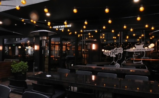
The menu itself is a highlight. Rather than a boring bit of paper, you get a mini magazine full of descriptions, pictures and typographic galore. Read it cover to cover and you'll find photo essays on small plates, soups and salads, meat dishes and one-hit wonders. From the starters, the Weeping Wolf would be worth ordering for the name alone, but luckily this grilled lamb on a bed of cucumber with a zingy green sauce will have you howling for more. You should also try the spicy Edamame Som-Tum and the Complicated Noodles (assemble yourself rice noodle sheets with lettuce, minced pork and a kick-ass lime sauce). Of the main courses, the Hot Oil Pork Knuckle has dangerously addictive amounts of crackling and juicy fat, that is indecently good. Crab Meat Wok Rice is lighter, delicate and delicious. This is absolutely one of my favorite tops three restaurant in London. I’ve been there twice and will definitely come back for those juicy Hot Oil Pork Knuckle!
0 notes
Text
https://frieze.com/article/helen-marten-my-influences
3. SOUP & SALAD
In all its engineered shapes, colours, flats and corrugations, pasta is one of the most fabulously playful dishes. To sit consuming a bowlful of spaghetti is to be brought face-on with material floppiness, with squiggle, softness and swelling. Pasta is architectural, monumental but also absurd. The idea of alphabet noodles in soup is amazingly provocative: think of little un-tethered limbs of vowels, bridged hs and swooping cs forming unscripted and glutinous sentences as they swim down the colon towards the bowels and further excretory punctuations.
The outlines of food are important; it’s spectacular to photograph. Soup is an undulating blobby weight, a foamy liquid volume that happily caresses the sides of any container it might encounter. But it is also prone to splashed dribbles and to pierce it with a fork is impossibile. Where soup becomes spooky is in imagining its hidden layers – what information has been dimensionally compromised, flat-packed, blended into uniform beige. Vegetables with upright responsibilities, with discernible, touchable outlines, are ushered into a state where image staggers to a near full stop. Any chopping, decorating, storing, edifying impulses are stripped out, clouded over by matter only to be guessed at. The colour spectrum flits, at most lurid, to a milky orange or dirty red but hovers mostly around a safely indiscriminate band of mud greens and beiges. In liquid form there is mystery! Like the illusionist’s puff of smoke or the compression of a zipped file, the information is hidden away, made discrete and repackaged.
Where soup is clouded and molecules band together, salad is described as ‘strong’ because it is raw. It has a visual nakedness, so promises an event. Crudités are also raw: the beginnings of a larger meal – they are tasters, appetite whetters, place holders. A young salad – that modestly glistening baby plate – is the opening chime in a much longer staggering rhythm of dishes. And linguistically, there is crudeness in there too: overtly sexy matter. What is bared is nude, un-blanched, not cooked. So maybe salad is sexy, too! Where soup implies unknown depths, salad speaks multidimensional eroticisms, a curling, flicking sexiness! Lacquered in dressing, or eaten unadorned, placing salad on a plate can be a deliberately stylized ritual, an action of overwrought composition – it is a wonderfully formalized manicuring of nature: an impromptu hairdo! As a mix, salad can be self-possessed, authoritative and unabashed with equal conviction. It comes in a bag, in a box, from the earth! These greens are leafy, crisp and defined; they have complex shadows, typographic curlicues, hairs, veins, definition.
But the outlines of an object frustrate too; in soup there is liberation and with amorphous looseness, all usual written limits are overridden. The envelope – that packaging of ‘image’ – meets geometric impossibility in the form of soupy sludge. Soup is the formalness of salad denatured, quiet (but not at a loss) and condensed. From soup, there is the marvelous idea that we could recombine, re-texture … conjure a Frankenstein resurrection of something with more shape and shadows! To blend is to physically destroy all pictures, all geometric certainties and thus to start anew with possibility, with a sexy kind of ambiguousness. As with liquid, with snot or goo – ambiguous mashes – shapes are destroyed, but given freedom to pan out, to ebb and to gel. Density is re-plotted and skin defiantly overridden but invited into new constellations.
0 notes
Last Seen Blogs
glaube-an-jesus
Verlass dich auf den Herrn von ganzem Herzen, und
soneunjung36
일상사진
islebeescene
I remember the nightmare so you don't have to
tinyperson00
Akira

mg170691
everything and nothing