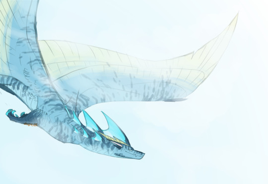
#until i remember how to draw
Text
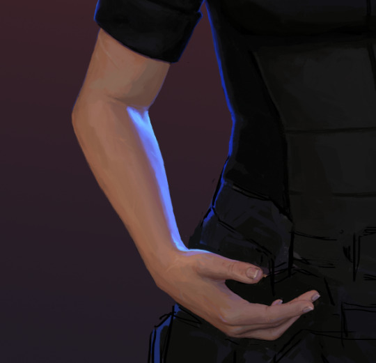
HAND
#this is very old and im just fucking around#until i remember how to draw#i cant sketch rn to save my life lol#but painting is okay?? for some reason#dont @ me im struggling to remember my most crucial skill#wip#helilart
22 notes
·
View notes
Text
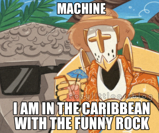
redraw of a meme my brother sent me. hello ultrakill fandom
"the armor comes off-" yeah but that's not Nearly as funny
#ultrakill#maurice#gabriel#ultrakill gabriel#art#doodles#shitpost#he is a kind of robot to me. i dont know if im drawing more ultrakill but the armor aint never comin off okay#fanart#it is amazing how hard this stupid gayass angel was wiping the fucking floor with me until i remembered to Slide#reminds me. ''i dont know if im drawing more ultrakill'' no that's a lie i have at least one more doodle. and THEN i dont know#his fight pissed me off before that. but not nearly as much as the secret Crash Bandicoot mission. fuck that level <3 fuck that LEVEL#NEVER PLAYED CB AND NOW I NEVER WILL OUT OF NOTHING BUT SPITE THANKS
500 notes
·
View notes
Text

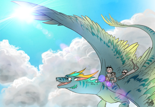
it's now midnight my time so!! happy birthday siffrin!!! here's him and loop relaxing with each other :3 a bonus twohats spoilers pic in the readmore <3

im so normal about them i swear. waaah
#in stars and time#in stars and time spoilers#isat siffrin#isat loop#twohats spoilers#act 6 spoilers#isat spoilers#minhmy art#i wanna draw a proper drawing but with how i've been working every day i literally did not remember sif's bday was today until yesterday lol#and im writing this 12 hours before posting and im at work and i have no idea what i can properly draw#but they deserve everything#everything. the world even
189 notes
·
View notes
Note
Happy 10th birthday to Cercerion!
OUGHHH UR RIGHT CERCIE IS 10 YEARS OLD NOW !!!!!!
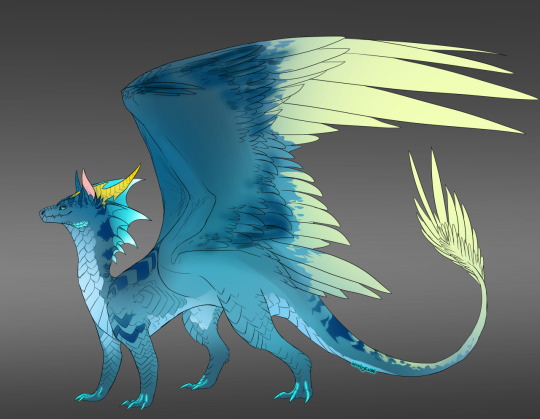

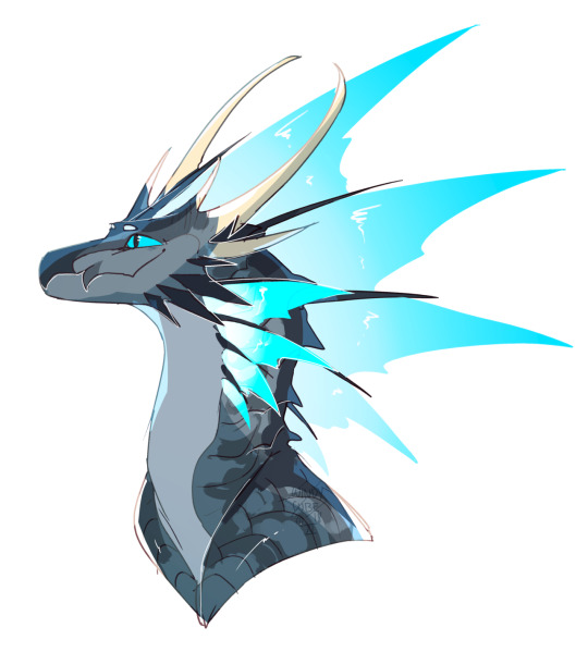

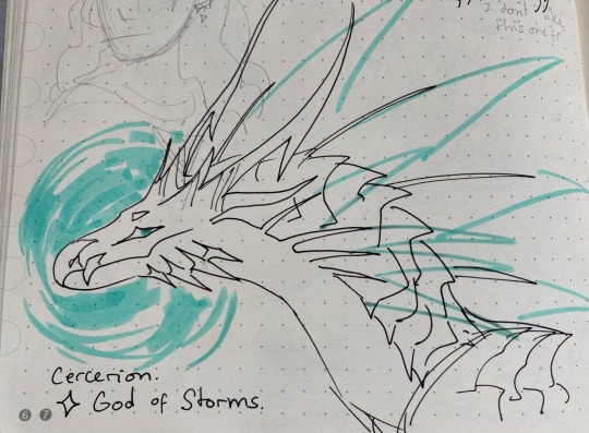
HAPPY BIRTHDAY BABY BOY BELOVEDEST DID NOTHING WRONG EVER IN HIS WHOLE LIFE !!!!!!!!!!!!!!!!!!!!!!!!!!!!!!!!!
#ALSO IM RLY HAPPY HIS OLD DESIGN IS NOW MUCH OLDER THAN HIS FIRST DESIGN WOAH!!!!!!#since i drew the old one SO MUCH back in 2014 i remembered it as being so super prevalent. that when i changed his head shape a couple year#it took a while to get used to the not boxy head but god it was so much more fun to draw the beak. and now its the standard#and it makes me rly happy fr fr. i actually thought i changed his design like only 2 years ago but it was SIX YEARS WHAT!! HOW TIME FLIES..#ask#cercerion#SORRY I JJST WANTED TO REPOST ALL OF THESE#omg dude this also means u and i have known each other for 10 years thats CRAZY#this photoset is so funny its like he went from being :D to being >:U over the years but i assure you now hes more chill than before#HIS COLORS HAVE NOT CHANGED FOR EIGHT YEARS ALSO WHATTTTT i just chose the perfect hues forever#sobbing and crying i love this guy so much#i dont show him online a lot or at least i didnt as muhc until recently but hes always in my brain#cercerion may as well be a part of my soul at this point#HAPPYU TENTH BIRTHDAY CERCIE I LOVE YOU SOOOO MUCH!!!!!!!!!!!!!!!!! BLOWING KISSES INTO A HURRICANE FOR U#windyart#sure ill put it in my tag. this is literally my art
193 notes
·
View notes
Text

would u accept
#obey me#obey me barbatos#I debated drawing a giant macaron until I remembered I don’t know how to draw macarons#MY ENEMY BTW SIDENOTE RAMBLE IVE BEEN TRYING TO DRAW MACARONS BC IM REDRAWINF THAT ONE CARD AND IVE BEEN STRUGGLING SO BAD#drawing stupid stuff pt2 electric boogaloo#drawing the little gold lapel at the bottom reminds me of a giant C: face
221 notes
·
View notes
Text
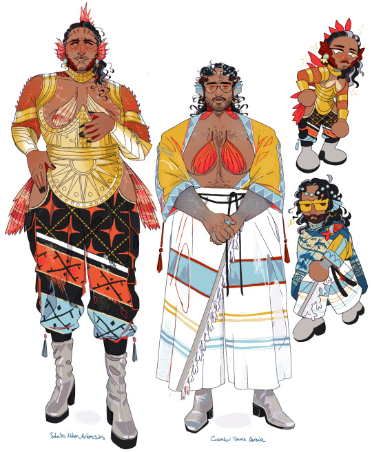
bad news folks. got into another sci-fi podcast
[Image ID: Digital reference sheet of Sokrates and Cassander from Friends at the Table: COUNTER/Weight. Sokrates and Cass are both fish-people, Sokrates taking design inspiration from the red scorpionfish and Cassander the Mediterranean parrotfish. They are adorned in a modified version of Minoan fashion, featuring flowing garments with vibrant primary color patterns. They both have long, black hair greying at the sides. Cass is several inches shorter than Sokrates, excluding headspines. End ID.]
#friends at the table#f@tt#counter/weight#cassander timaeus berenice#sokrates nikon artemisios#its so funny looking back and being like oh yeah all of my wolf buddies were also super into this show#like hm i wonder why. could be any reason.#anyway im currently on a project to not look at c/w art until i post my designs for them#like as a fun challenge to test my design skills#so no i do not know how other people draw cass or sokrates besides my one friend that i somehow remembered art they drew of them years ago
680 notes
·
View notes
Text


we need that plush but not that much
#you don't know how much that plush absolutely break me#i even wanted to make a plush for everyone#until i remember i don't have design skill and i basically abandoned that portrait for every warframe stuff so im not even gonna consider i#warframe#warframe excalibur umbra#warframe operator#(ok maybe it was the drifter i kinda wanted them to wear the default cosmetic in my au but meh loneryder is easy to draw)#my art
84 notes
·
View notes
Text

hangin out!!! <3
#sodart#animation vs minecraft#ava the second coming#ava green#avm purple#avm ships#secgreen#ava firefly#grapeduo#avm second x green x purple#how the hell do you tag them#also i finally drew these guys on my usual art program!!!! yahooooo!#drawing sec sleeping was soo fun until i remembered the whole hollow head thing.. then i had to improvise LOL#added an img description i hope its alright!!
458 notes
·
View notes
Text

Yet another gala.
#dramione#dramione fanart#dramione art#draco/hermione#draco and hermione#dhr art#hermione/draco#traditional art#copic markers#copic art#marker#pen and ink#How long until they sneak away?#a touch of photoshop#3 hr drawing#i saw a pic and had to draw it#tiny q#I remembered to put their rings on!#Happy because I got to use my sparkle pens#the only reason to do traditional art lol#Not sure how I feel about this sketchbook#it seems to cast a bit of a yellow hue#also using my new (dumb) scanner because my old (awesome) scanner died
283 notes
·
View notes
Text

woe mundane monopoly headcanons be upon ye
follow for more of modern au hua cheng’s outfits
#mostly completed this a month ago and then procrastinated the final touches until now lmao#its. so low quality. i also switched to a new brush for lineart and now this is kinda 🥴#i wanted to draw my modern au designs :3#fun facts:#hua cheng has a glass eye but he still covers it with his bangs#modern HC shops at prada btw#MQ is described as looking more like a civil god than a martial one so he has a goth academia type thing going on#FX wears sports team shirts everywhere sorry#mu qing’s mug has 3 different level markers#“fuck off” “i can hear you i just dont care” and “ok what were you saying?”#i think mu qing would hate that sort of mug but feng xin and xie lian keep giving them to him#apologies to anyone who doesnt know the rules of monopoly this is incomprehensible without previous knowledge#so: do i believe these four would actually voluntarily hang out post canon#yes actually. fxmq and hua cheng mutually tolerate each other for xie lians sake#imo after like a LONG time hc could actually be friendly towards fx (in book 2 fx admits how courageous hong hong’er is) or mq (bitch2bitch#but i dont think thatll happen there is way too much resentment that goes both ways#remember that theyve canonically fought multiple times ‼️#tgcf#art#tian guan ci fu#天官赐福#heaven official’s blessing#hualian#hua cheng#xie lian#fengqing#feng xin#mu qing#xianle trio#my art
671 notes
·
View notes
Text

The Stellaron Hunters
#the cat is an integral part of the team and i really hope they explain it at some point (prob elio's spy cat or smth)#wanted to put them in the jepella rebellion outfits bc they look nice#to bad sam is like 50% shoulder armour and wouldnt be able to fit into anything#welcome to my arc of refusing to draw the mecha properly until i absolutely must (which will prob be soon)#honkai star rail#hsr#hsr kafka#hsr silver wolf#hsr blade#hsr sam#stellaron hunters#flambo art#great news! i remembered how i like to shade things
223 notes
·
View notes
Text

are you prepared to open doors that can never be closed?
#until dawn#ashley brown#midnight draws#with implied chris i guess...#also known as ashley open the door please ashley open the door#or dont open it.#remembering that there even more thematically relevent Ashley Doors as i post this. the one she runs in after josh in the kitchen#AND the butterfly effect to follow chris immediately or let that door close and find joshs workshop#love how often the game is yelling noooo ashley dont open that door until its yelling OH GOD OH PLEASE ASH OPEN THE DOOR
59 notes
·
View notes
Text


daily affirmations: im the shit
#homestuck#hom3stuck#home24uck#home2t4ck#dirk strider#jake english#dirkjake#admin draws#fanart#can someone power wash my brain ive gotten addicted to the shoe commercial song again#and 2nd one is not related. well now it is. but it was supposed to be its own thing#i ended up not liking the sketch enough for how much trouble it gave me so its going up like this#sweep ur bf off ur feet (flying edition)#anywayz. 1st one done in an hour while listening to something on repeat. no prize for guessing what#im at my vacation now so its gonna be backlog for a little while until i get my bearings#its a tradition by now to draw fullbody walkies while listening to hip hop so who knows. i might do more of that#now i sleep for tomorrow i go shopping#today i packed spent 4 hrs in a cramped car. had a swim a pint some real good canned tuna for dinner. truly life is good#and i cant wait to sleep on this mood so i can wake up feeling different tomorrow#it hasnt quite been dread latwly except when it has. but idk#i remember id used to wake up and not feel like im in a pressure cooker set on medium to low#its been a year. id like to know that feeling again
95 notes
·
View notes
Text
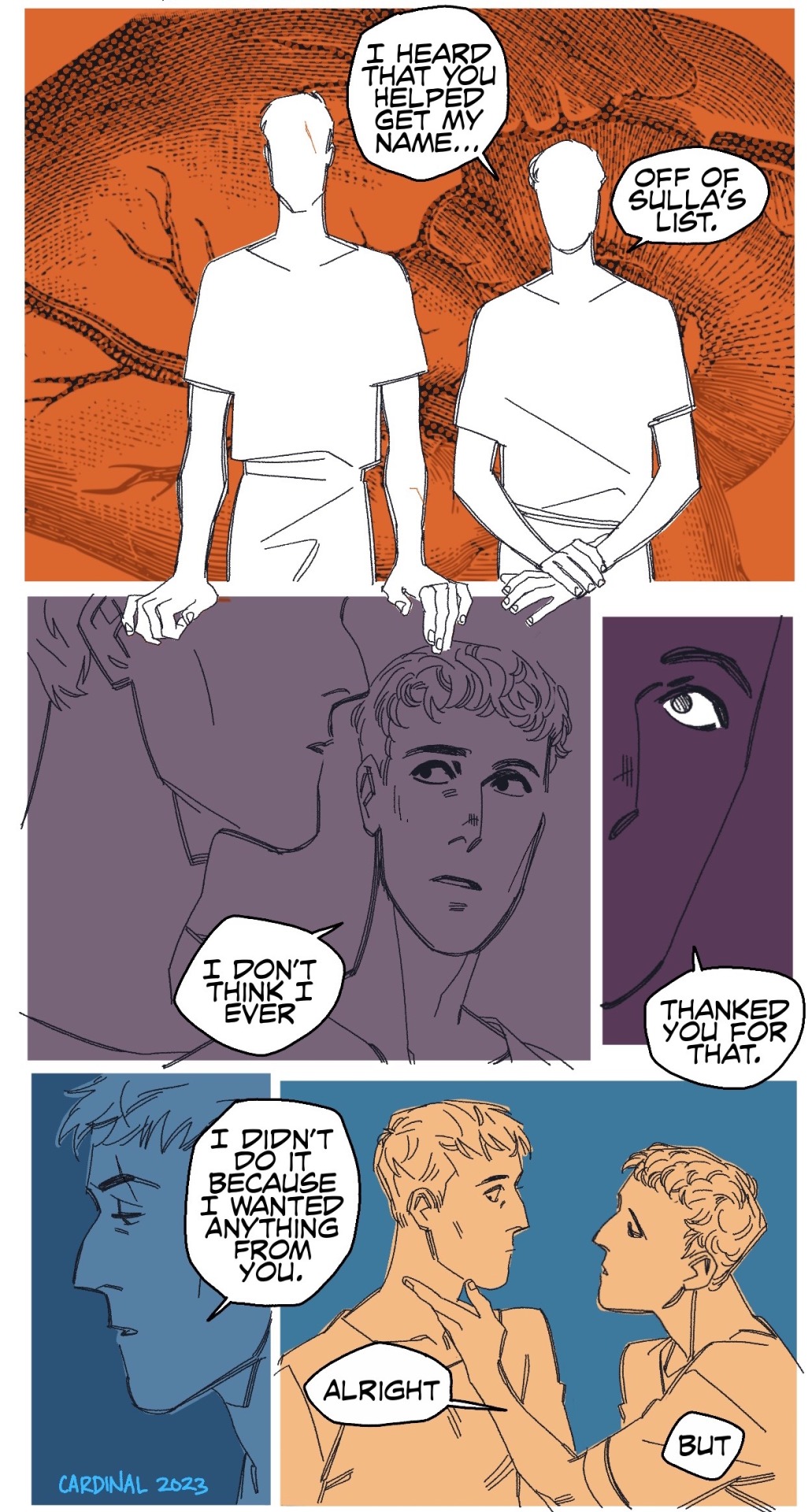

so it’s. it’s like. man this is so hard without my laptop.
alright so Crassus is a weird guy, existentially. There’s a tendency to speculate, assign, and insert him into whatever places are conspiratorial and shadowy because he fits into those narrative places with ease. My personal favorite (aside from all of it) is the idea that he may have pulled strings wrt to Sulla and Caesar’s conflict to help get Caesar out of it.
The Defeat of Rome: Crassus, Carrhae and the Invasion of the East, Gareth C. Sampson
In the universe that exists in my head, he definitely had a hand in it, but he didn’t really intend for Caesar to figure out he played a part in it, but Caesar’s good at puzzles, and noticing someone goes both ways. Binding someone to yourself goes both ways.
Crassus: The First Tycoon, Peter Stothard
This scene takes place sometime relatively soon after Sulla’s death. Crassus has complicated feelings about it, Caesar less so. Veni, vidi, vici, baby!
Here’s a bonus thing that I keep thinking about with them.
The Roman Revolution, Ronald Syme
like, utang na loob. and it is DEEP between them.
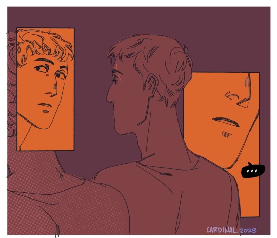
#this is actually an old first draft script from a much longer Caesar/Crassus arc I’ve been writing#To go along with the Pompey/Crassus one#Accidentally it’s turned into a whole arc bc why not do the Caesar/Pompey civil war break up while I’m at it#anyway formatting all of this on my iPad was a nightmare no more comics that I have to split up for posting until I get a laptop#tris homines#roman republic tag#komiks tag#drawing tag#there’s a modern gangster AU version of this scene where Crassus and Caesar fuck on the floor in front of Sulla’s funeral portrait#Pompey is there too bc I finally remembered how I was tagging my tris homines live blog and found#The quote comparing the three to some kind of transgressive incestuous relationship. Thank u at my past self for live-blogging that#anyway this was relegated to first draft pits bc Crassus needs to have more bite about it but I wanted to draw them kissing. So.#(Waving a flag) get it caesar#(Bite as in sharp teeth and edges you could cut yourself on if you aren’t careful. Which is why Caesar is Always Very Careful#Pompey’s the opposite about it but I’ll get to those comics. Soon…….hopefully……………..)#gaius julius caesar#marcus licinius crassus
308 notes
·
View notes
Text

omg guys... these two r actually really cute together...
#i was scared i wouldnt be able to come wit a ship idea for this prompt but then i remembered pinkcho's frog costume#n went oki well i cant use cottoncamdy wit her this time (she's goin wit someone else this week) n went well who then#then i saw hydrangea n remebevred her pet is a frog n how she looks a little rained on... omg this pair was waiting for me#anyways i didnt ship them until i drew this so if u start shipping them too- yw 🙏#cand posts#cand arts#cookie run#cookie run ovenbreak#pink choco cookie#hydrangea cookie#cr wlw week#cand fav art#this might actually be my favorite drawing this week (we will have to see) but omg this is so cute
303 notes
·
View notes
Note
I was wondering how achieve such a wonderful textured finish on your pieces? They are wonderful and I love their resemblance to aged photographs and the speckles of colors in the backgrounds. Your art is mesmerizing :)
you can see some of the texture brush sets i use in my #info_asks tag but i have some more (procreate) tips aside from just brushes
also hi i made this whole thing and then stupidly hit ctrl z to erase ONE word and i lost the entire bottom half of the post and all my image descriptions so fuck you tumblr i had to make this twice
to get a faded photo or old digital screen look, consider duplicating the canvas (once all the layers are merged) and using a gaussian blur tool on the new duplicated layer. then set that to low opacity to add a misty sort of look. looks nice in combination with some chromatic abberation and a small bloom effect. then a subtle noise filter on top:
for faded print effects, it's really worthwhile to learn how to use layer masks. you can use a layer mask to non-destructively 'weather' blocks of colour or lineart, without erasing the layer itself. the weathered ink/block print effect here was made using layer masks which means that if i just hide the mask, the lineart becomes solid black again and easy to alter or colour in:

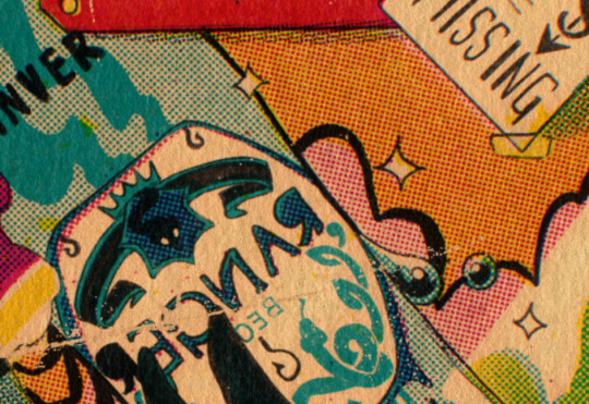
for old paper effects you can just set a paper texture on multiply over the art sure, but you can also combine it with the blur & bloom thing, a really subtle drop shadow and canvas tilt, and highlights to make it look like an aged photograph of a card. this originally had a transparent bg but i'll post it here with a white bg so that the drop shadow is more obvious. the scuffed edges of the card (left) were hand drawn, simple white stucco brush. the bigger patch of scuffed ink (top right) was a texture stamp.

for block print looks you can move the colour layer out of alignment by a few pixels - but only after you're absolutely sure you're done with it, otherwise you'll get something like this -

i forgot to erase out her eye before i moved the red layer so now her eye defeats the 'look' of a misaligned print. the black lineart and red layer were also given the same layer mask treatment as described above to make them look faded or like the ink didn't stick down right to the paper
you can do this with multiple colour layers too. if the colour layers are separated and set to multiply (as in this cmyk example), it'll leave halos and edges around each shape which mimic old comic book print
just to show what you can do WITHOUT any special brushes, here's a piece of one of my mez tarot cards from before i got any extra brushsets at all. for this one, i added a green tint over everything to mimic a sun-bleached or faded print (my actual goal wasn't 'medieval illustration' but actually 'trading card from the 60s that got left on someone's windowsill for decades'). the background texture is the procreate noise brush. the texture under the green lion drawing is the procreate concrete brush (to make it look painted onto a wall). the lettering and lineart is procreate's 6B pencil. but to properly aim for The Look of it being a printed physical object, i also used a perspective blur so that the edges are out of focus, and metallic gold highlights which don't match the lighting of the actual illustration and appear to be catching some other external light. that texture was made from the procreate noise brush
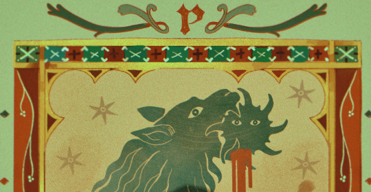
it's pretty simple compared to my later stuff but i still really like the effect
in terms of colours, you need to keep them unified so that they all appear to be acting under the same external light source, like if someone is holding up a torch to a painting then the painting colours will be glazed with firelight even if there's no painted fire. a really easy way to do this is to slap a multiply layer over everything in one shade - grey-yellow for a weathered paper look, or greenish blue for sunbleached photos. this unifies all the colours of the drawing. or you can apply a gradient map at a low opacity so that there's only a subtle change. or just do it by hand - if you want everything to be slightly tinted yellow, just pick the colours you normally would, but move the colour wheel towards yellow to get a yellowfied version of the base colour. easy
it's really important to consider how fading and weathering can affect printed colour. white paper yellows, black fades. you will rarely see pure black or pure white. which means you can use pure black or pure white to add external effects like the white scuff marks on the hierophant card. if the whole drawing is yellowed from age but there's some white somewhere, it's an easy shorthand to show that the scuff mark or whatever was not originally part of the drawing (great way to add some nasty stains lol)
#info asks#i don't have like a specific set of steps i follow i kind of freestyle it every time#obviously i have favourites i like to use but like that sphinx drawing? don't ask me how i did it because i don't remember#i just played with it until it looked nice. the blue dots are ... some sort of effect layer i don't remember which
647 notes
·
View notes
Last Seen Blogs
miirabel
house of memories

allodoxoph0bia
The Fear of Opinions
beachnutface
Beautiful, ordinary things

beachnutface
Beautiful, ordinary things