#vue pass data to component onclick
Explore tagged Tumblr posts
Visit Tumblr Blog
Explore Tumblr blogs with no restrictions, modern design and the best experience.
Last Seen Tumblr Blogs


Fun Fact
Tumblr has a low social media market share in South America.
Text
How to pass value to child component in Vue.js
How to pass value to child component in Vue.js
Hello buddy, in this blog we will see how we can pass value to the child component in vue.js and we will also learn the use of props. Sharing data across components is one of the core functionalities of VueJS. It allows you to design a more modular project, control data scopes, and create a natural flow of data across your app. Think you are using the Vue tab component where you have put 5oo…

View On WordPress
#pass data to component vue#vue dynamic component#vue emit#vue get data from child component#vue pass data between sibling components#vue pass data from one component to another#vue pass data from parent to child#vue pass data to component onclick
0 notes
Text
SVG Web Page Components For IoT And Makers (Part 2)
SVG Web Page Components For IoT And Makers (Part 2)
Richard Leddy
2019-05-15T13:30:16+02:002019-05-15T15:35:00+00:00
So, we already have ways of dynamically loading a menu of SVG icons made to react by loading panels if we so desire, but the icons were not actual components. We were able to use a simple trick of bringing in the SVG for each icon and passing it into the Vue application. It was simple enough to generate a list of icons, and each icon reacted in a similar way except for small data differences. The data difference made it possible to bind the name of a panel to each icon in such a way that the handler for the icon’s button click could pass it on.
When a panel is loaded in the form of Vue component, everything about the panel and its components has to be loaded, templates, JavaScript, and more. So, the job of just managing loading the panel is bigger than what we have encountered so far in this discussion.
Let’s look at Vue’s way of providing a hook for async loading. The following snippet is from the Vue guide.
Vue.component('async-example', function (resolve, reject) { setTimeout(function () { // Pass the component definition to the resolve callback resolve({ template: '<div>I am async!</div>' }) }, 1000) })
The guide tells us that the setTimeout function is an example of how to use the synchronicity with Vue components. Notice that where before there had been an object as the second parameter to Vue.component, there is now a function, which is referred to as a factory function. Within the resolve callback is a component definition, that would have been the second parameter to Vue.component before.
So, I had to stare at this example a while before it made sense to me. Here is another example, which suits me better:
Vue.component('async-example', function (resolve, reject) { // Vue will call this function and promise itself to handle // it when it gets back with data. // this function can then call a promising object loader // here the 'loader' function is some abstract function. // Most likely the application will use 'fetch' // but it could be something else. loader('/my/resource/on/server.json'). then(function (JSON_data) { var object = transformJSONToJSObject(JSON_data); resolve(object) }).catch( (error) => { handle it } );
It seems like the right thing to do to make a more general function to go around this form.
function componentLoader(c_name,resource_url) { Vue.component(c_name, function (resolve, reject) { loader(resource_url). then(function (JSON_data) { var object = transformJSONToJSObject(JSON_data); resolve(object) }).catch( (error) => { handle it } ); }
So, in general, to load a component, we would just need a line like the following:
componentLoader('ThermoPanel','./JSON/thermo-panel.json');
So now, just what is the JSON that is being loaded? It can include everything about the component. In this case, as a panel component, it can include thermometers, machine switches, sliders, gauges, and more. While it seemed nicer to keep the components parts on the web page, it may actually work better to use the subcomponent field that is in the longer example for ‘thermo-panel’ that we made before and also for the other similarly constructed panels. The JSON will contain a complete panel structure.
However, if the reader will notice the inclusion of the function call to transformJSONToJSObject, he will understand that JSON might be coded in some way to make transport easier and to make it easier for a server to handle the definition. After all, the definition will include complete SVG templates, function definitions, and other JavaScript expressions. Also, the JSON object may contain more than just the panel definition because some information may simply aid in bookkeeping or validation. So, one can expect that there will be some treatment of the object upon receipt.
As for the encoding, the data coming in from the server may be encoded in a number of ways. Perhaps it will be simply URL encoded. Or more securely, it might be enciphered. For this discussion, we can just use URL encoding.
Some of the tools that are available for creating Vue applications no doubt take care of the JSON transformation. But, this discussion has so far avoided the use of command line tools. This omission is not that bad as we have also used Vue with the minimum of resources, using only one script tag for the referring to the CDN. However, I certainly do recommend looking into the command line tools especially for organizing projects.
When the JSON arrives at the page, given the component is completely assembled with subcomponents, no more work has to be done to fetch the parts. We can make the assumption that all components will come in fully defined for the rest of this discussion. But, assembling complete component hierarchies will require command line tools at some point.
The SVG editing process will also require some work. The SVG editing processes allow a designer to draw a panel and all the components on it. But, each subcomponent has to be identified, called out in a group, or given a place holder. Any approach to using the drawing requires some treatment of the SVG so that Vue component tags can replace the groups or graphic elements. In this way, any artist rendering can become a template. And, the drawn subcomponents will have to be disassembled into templates for Vue subcomponents.
This sort of parsimony is contrary to the workflow of most of the JavaScript frameworks. The frameworks are about assembling pages. But, editing or drawing, results in something already assembled by an artist. In practice, the result of editing does not provide a text file that corresponds directly to a framework component definition.
More about the editing process may be considered in some other discussion. There is a lot to it. But, for now, we have the tools we need in order to load hierarchal components and make them come alive.
The Lazy Application
For our IoT panel construction, we already have a selection bar that responds to searches. And, we have a way of loading components when we need them. We just need to connect up these parts. And, at last, we have to make sure that the panels appear and that they start working when they do.
The lazy loading of panels done by the async code above provides a sketch of an idea. But, thankfully, some people have experimented to find ways of making sure that all kinds of components can be loaded. There is one codepen entry that shows how to update Vue apps with new components of varying types. That is the mechanism that is needed for updating a designated part of the page with different types of panel.
With the ability to add in different kinds of panels and with a simple mechanism to load their definitions, we can, at last, have our panel searching page.
Here is the HTML that we need in our page so that the Vue app can place components in dynamically:
<template v-for="(panel, index) in panelList"> <component :is="panel" :key="panel.name"></component> </template>
The component tag is a Vue meta tag. See the reference for dynamic components. The properties, special attributes, used for the component tag in this case are is and key. The is attribute exists for dynamic components. And, the key ensures that the new children will have different identities from each other and helps Vue to decide what to draw.
“Children of the same common parent must have unique keys. Duplicate keys will cause rendering errors.”
The template tag will loop through components that are provided in the panelList data field of the application.
So, starting with the application level Vue definition for the icon app, we can make changes to include the panelList in the data elements. (Let’s now call it the panelApp).
var panelApp = new Vue({ el: '#PanelApp', data: { iconList: [ // Where is the data? Still on the server. ], panelList: [ ], queryToken : "Thermo Batches" // picked a name for demo }, methods : { goGetPanel: function (pname) { // var url = panelURL(pname); // this is custom to the site. fetch(url).then((response) => { // this is now browser native response.text().then((text) => { var newData = decodeURIComponent(text); eval(pHat); // widgdef = object def, must be assignment pHat = widgdef; var pnameHat = pname + pcount++; pHat.name = pnameHat; // this is needed for the key this.panelList.push(pHat); // now it’s there. }).catch( error => { /* handle it */ }); } } });
Besides adding in the panel, goGetPanel is now in a form required for getting a component definition from a database or other store. The server side must be careful about delivering JavaScript code in the correct format. As for what the object looks like coming from the server, we have already seen it. It is the kind of object used as a parameter to Vue.component.
Here is the complete body of the Vue app that provides a menu as a search result and a place to put panels fetched from the server when the user clicks an icon.
<div id="PanelApp"> <!-- Recognize the name from the Vue doc --> <div> <h2 itemprop="name">Request MCU Groups</h2> <p itemprop="description">These are groups satistfying this query: .</p> <button onclick="GetIcons(11)">Find All</button> <button onclick="GetIcons(5)">Find 5 Point</button> <button onclick="GetIcons(6)">Find 6 Point</button> </div> <!-- Here is a Vue loop for generating a lit --> <div class="entryart" style="padding:4px"> <button v-for="iconEntry in iconList" @click="goGetPanel(iconEntry.name)" > <div v-html="iconEntry.icon"> </div> </button> </div> <div class="entryart" style="padding:4px" > <template v-for="(panel, index) in panelList"> <component :is="panel" :key="panel.name" :ref="panel.name" ></component> </template> </div> </div>
In the last div, the component tag now has a ref parameter bound to the panel name. The ref parameter allows Vue app to identify which component to update with data and keeps components separate. The ref parameters also allow our application access to the new dynamically loaded components.
In one test version of the panel app, I have the following interval handler:
setInterval(() => { var refall = panelApp.$refs; // all named children that panels for ( var pname in refall ) { // in an object var pdata = refall[pname][0]; // off Vue translation, but it’s there. pdata.temp1 = Math.round(Math.random()*100); // make thermos jump around. pdata.temp2 = Math.round(Math.random()*100); } },2000)
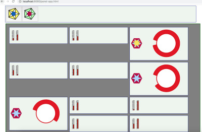
The code provides a little animation, changing thermometers randomly. Each panel has two thermometers, and the app allows the user to keep adding panels. (In the final version, some panels must be thrown away.) The refs are being accessed using panelApp.$refs, a field that Vue creates given the refs information in the component tag.
So, this is what the randomly jumping thermometers look like in one snapshot:

A collection of animated panels for one type of panel (or component). (Large preview)
Connecting The Panel To The IoT Device
So, the last piece of code is a setInterval test updating thermometers with random values every two seconds. But, what we want to do is read in real data from real machines. In order to do that, we will need some form of communication.
There are a variety of ways. But, let’s use MQTT which is a pub/sub message system. Our SPWA can subscribe to messages from devices at any time. When it gets those messages the SPWA can direct each message to the appropriate data handler for the panel mapped to the device identified in the message.
So, basically what we need to do is replace the setInterval with a response handler. And, that will be for one panel. We probably want to map panels to handlers as they are loaded. And, it is up to the web server to see that the correct mapping is delivered.
Once the web server and the SPWA have the page ready for operation, the web server no longer needs to take care of messaging between the page and the device. the MQTT protocol specifies a routing server to handle pub/sub. A number of MQTT servers have been made. Some of them are open source. One very popular one is Mosquito, and there are a few developed on top of Node.js.
The process for the page is simple. The SPWA subscribes to a topic. One good version of a topic is an identifier for an MCU such as a MAC address or a serial number. Or, the SPWA could subscribe to all temperature readings. But, then the page would have to do the work of filtering the messages from all devices. Publication in MQTT is essentially a broadcast or multicast.
Let’s take a look at how the SPWA will interface with MQTT.
Initializing MQTT On The SPWA
There are several client libraries to choose from. One, for instance, is a MQTT.js. Another is eclipse paho. There are more of course. Let’s use Eclipse Paho since it has a CDN stored version. We just need to add the following line to our page:
<script src="https://cdnjs.cloudflare.com/ajax/libs/paho-mqtt/1.0.1/mqttws31.min.js" type="text/javascript"></script>
The MQTT client has to connect to a server before it can send and receive messages. So, lines setting up the connection also need to be included in the JavaScript. We can add in a function MQTTinitialize which sets up the client and the responses for connection management and message receipt.
var messagesReady = false; var mqttClient = null; function MQTTinitialize() { mqttClient = new Paho.MQTT.Client(MQTTHostname, Number(MQTTPort), "clientId"); mqttClient.onMessageArrived = onMessageArrived; // connect the client mqttClient.connect({ onSuccess: () => { messagesReady = true; } }); // set callback handlers mqttClient.onConnectionLost = (response) => { // messagesReady = false; // if (response.errorCode !== 0) { console.log("onConnectionLost:"+response.errorMessage); } setTimeout(() => { MQTTinitialize() },1000); // try again in a second }; }
Setting up Subscription
With the connection ready, the client can subscribe to message channels, send messages on them, etc. Just a few routines can do most of the work necessary to connect panels with the MQTT pathways.
For the panel SPWA, the moment of subscription can be used to establish the association between the panel and the topic, the MCU identifier.
function panelSubcription(topic,panel) { gTopicToPanel[topic] = panel; gPanelToTopic[panel] = topic; mqttClient.subscribe(topic); }
Given that an MCU is publishing on its topic, the SPWA will receive a message. Here, the Paho message is unpacked. And, then the message is passed on into the application mechanics.
function onMessageArrived(pmessage) { // var topic = pmessage.destinationName; var message = pmessage.payloadString; // var panel = gTopicToPanel[topic]; deliverToPanel(panel,message); }
So, now all we need to do is create deliverToPanel which should be somewhat like the interval handler that we had before. However, the panel is clearly identified, and only the keyed data sent in the particular message may be updated.
function deliverToPanel(panel,message) { var refall = panelApp.$refs; // all named children that panels var pdata = refall[panel][0]; // off Vue translation, but it’s there. var MCU_updates = JSON.parse(message); for ( var ky in MCU_updates ) { pdata[ky] = MCU_updates[ky] } }
This deliverToPanel function is abstract enough to allow any panel definition with any number of data points for animation.
Sending Messages
To complete the application loop between the MCU and the SPWA, we define a function to send a message.
function sendPanelMessage(panel,message) { var topic = gPanelToTopic[panel]; var pmessage = new Paho.MQTT.Message(message); pmessage.destinationName = topic; mqttClient.send(pmessage); }
The sendPanelMessage function does no more than sending the message out on the same topic pathway that the SPWA subscribes to.
As we plan to make the icon buttons responsible for bringing in some number of panels for a single cluster of MCU’s, there will be more than one panel to take care of. But, we keep in mind that each panel corresponds to a single MCU, so we have a one-one mapping, for which we may use two JavaScript maps for the map and the inverse.
So, when do we send messages? Usually, the panel application will send a message when it wants to change the state of the MCU.
Keeping The View (Vue) State In Sync With Devices
One of the great things about Vue is that it is very easy to keep the data model synchronized with the activity of the user, who may edit fields, click on buttons, use sliders, etc. One can be sure that button and field changes will be reflected immediately in the components’ data fields.
But, we want changes to fire off messages to the MCU as soon as the changes occur. So, we seek to make use of the interface events that Vue may govern. We seek to respond to such an event, but only after the Vue data model is ready with the current value.
I created another kind of panel, this one with a fairly artistic looking button (perhaps inspired by Jackson Pollock). And, I went about turning it into something whose click reports the state back to the panel that contains it. That was not so simple a process.
One thing that threw me off is that I had forgotten some of the oddities in managing SVG. I first tried to change the style string so that the display field of the CSS style would either be “None” or “something”. But, the browser never rewrote the styles string. But, as that was cumbersome, I tried changing the CSS class. That also had no effect. But, there the visibility attribute, which most of us recall from old HTML (version 1.0 perhaps), but that is very up to date in SVG. And, that works well. All, I had to do was to get the button click event to propagate.
Vue has designed properties to propagate in one direction, parent to child. So, to change data in the application, or in the panel, you have to send a change event to the parent. Then, you can change the data. The change of the data element controlling the button causes Vue to update the property affecting the visibility of the SVG element we have chosen to indicate state. Here is an example:
Finally, a collection of different types of panels each with instances assigned to separate MCU’s. (Large preview)
Each instance of the squiggly button panel is independent. So, some are ON and some are OFF.
This snippet of SVG contains the odd-looking yellow indicator:
<path :visibility="stateView" style="opacity:0.98000004;fill:#faea4a;fill-opacity:1;stroke:#eecd5c;stroke-width:1;stroke-miterlimit:4;stroke-dasharray:none;stroke-opacity:1" id="sunthing" d="m -36.544616,12.266886 c 19.953088,17.062165 5.07961,-19.8251069 5.317463,8.531597 0.237853,28.356704 13.440044,-8.847959 -3.230451,10.779678 -16.670496,19.627638 14.254699,-2.017715 -11.652451,3.586456 -25.90715,5.60417 10.847826,19.889979 -8.095928,-1.546575 -18.943754,-21.436555 -1.177383,14.210702 -4.176821,-12.416207 -2.999438,-26.6269084 -17.110198,8.030902 2.14399,-8.927709 19.254188,-16.9586105 -19.075538,-8.0837048 9.448721,-5.4384245 28.52426,2.6452804 -9.707612,-11.6309807 10.245477,5.4311845 z" transform="translate(78.340803,6.1372042)" />
The visibility is populated by stateView, a computed variable that maps the state boolean to a string for SVG.
Here is the panel component definition template:
<script type="text/x-template" id="mcu-control-panel-template"> <div> <control-switch :state="bstate" v-on:changed="saveChanges" ></control-switch> <gauge :level="fluidLevel" ></gauge> </div> </script>
And, this is the JavaScript definition of the Vue panel with its children as subcomponents:
var widgdef = { data: function () { var currentPanel = { // at the top level, values controlling children bstate : true, fluidLevel : Math.round(Math.random()*100) } // return currentPanel }, template: '#mcu-control-panel-template', methods: { saveChanges: function() { // in real life, there is more specificity this.bstate = !this.bstate relayToMCU(this.name,"button",this.bstate) // to be defined } }, components: { 'control-switch' : { // the odd looking button props: [’state'], template: '#control-switch-template', // for demo it is in the page. computed: { // you saw this in the SVG above. stateView : function() { return ( this.state ) ? "visible" : "hidden" } }, methods : { // the button handler is in the SVG template at the top. stateChange : function () { // can send this.$emit('changed'); // tell the parent. See on the template instance } } }, 'gauge' : { // some other nice bit of SVG props: ['level'], template: '#gauge-template' } } }
So, now the mechanism for a single button embedded in a panel has been laid out. And, there has to be a hook for telling the MCU that something has taken place. It must be called immediately after the data state of the panel component has been updated. Let’s define it here:
function relayToMCU(panel,switchName,bstate) { var message = switchName + ':' + bstate // a on element parameter string. sendPanelMessage(panel,message) }
There is the state change on it’s way to hardware in just two lines of code.
But, this is a fairly simple case. Any switch can be viewed as a function call to a piece of hardware out in the world. So, the string might contain the switch name and several other data elements. So, the component method that registers change will have to have some custom handling in it in order that it might gather together all the pieces of data set on the panel and send them along in one command string. Even the command string is a little simple. If the MCU is quite small, the command string might have to be translated into a code. If the MCU has a great deal of capability, the command string might actually be a JSON structure or perhaps all the data that the panel hosts.
In this discussion, the buttons on the icon panel contain the name of the panel to fetch. That may also be fairly simplified as well. It seems to make sense that that parameter can stand for any panel that might be stored in an enterprises databases. But, perhaps it is some formula. Perhaps, information about the panel should be wrapped around the panel definition that we receive from the server. In any case, the basics can be easily expanded upon once certain headaches are out of the way, like making the SVG respond to clicks properly.
Conclusion
This discussion has laid out some basic steps and decisions that lead to the realization of a Single Page Web App (SPWA) that can interface with IoT devices. We now know how to get panels from a web server and turn them into MCU interface.
There is much more to this discussion with quite a few other discussions that may follow. Starting with Vue is one thing to think about. But, then there is the whole MCU story, which we have only briefly touched upon.
In particular, by selecting MQTT as a communication substrate, we assume that IoT devices on the other end can somehow be ruled by MQTT. But, that may not always be the case. Sometimes gateways are needed if MQTT is to gain access to a device with serial links or Bluetooth. Or, perhaps all one ever needs from on the web page is WebSockets. Nevertheless, we used MQTT as an example to show how Vue could both receive and send data while keeping its data state in sync with devices.
Once again we only have part of the story. This time it is for synchronization because the page should be able to deal with alerts and bother the user if something critical is happening. Sometimes messages can get lost. So, we have to have a mechanism for acknowledgments.
Finally, it is my opinion that Vue makes updating data upon receipt quite elegant. But, sending the state changes is not so straight forward. It does not seem to make the job much simpler than can be done with vanilla JavaScript. But, there is a way and it makes sense.
Perhaps a clean library can be built to make a universal set of components for all panels. The elements for making such libraries and having them stored in a database have been briefly mentioned. Tools that go beyond just making SVG pictures may have to be developed. In any case, there are likely many things that can be done for the next steps.

(dm, yk, il)
0 notes
Link
What are those names?
In case you are wondering what is Snowpack and/or Svelte, let me give you some context...
Snowpack is a build tool that allows you to create your application and see the ongoing changes faster in the development process while also providing all the excellent features you may be used to with bundling applications for the deployment process.
The already known bundlers like Webpack and Parcel have to rebundle & rebuild parts of your application every time you make a change in a file and save it.
This rebundling process takes some time depending on the framework of your choice (takes more time for Angular than it does for Vue, for instance).
The difference with Snowpack is that it serves your whole application unbundled during development. As in, every file gets built just once, and then it's cached after that.
So now that you are making changes and putting features, Snowpack rebuilds only the file that has changed and serves it instantly in the browser plus, you can also use Hot-Module Replacement (HMR) to go with it.
Once you're done making the app and want to create a production build, you can plugin your preferred bundler via a plugin (lol) and have an optimized production build ready to be deployed to the hosting service of your choice.
Here's a beautiful little image that shows what this 'Unbundled Development' thing is, taken directly from the Snowpack docs.

Unbundled vs Bundled development
So now you might be thinking, "Okay, that sounds cool and all, but how am I supposed to use this for my web apps, and if it's a bundler, does it support my existing ones?."
Well, yes, and yes. It supports many of the things we've used working with other frameworks. It comes with support out of the box for things like Typescript, JSX, CSS Modules, and you can pick a template to have support for React or Vue or Svelte, and so on.
You can use the 'Create Snowpack App' to get started with your framework of choice, and you can also take an existing app and migrate it to Snowpack easily.
Refer to the Get started section in the official docs (which are very well-written by the way).
Now for Svelte's case, it's a library much like React that cares mainly about providing the UI layer of an application without paying attention to the rest of the application's stack.
Since it goes about the visual aspect of an app, you can start using it in any project you have already created by incrementally adding some Svelte components to it and have it work like before.
But I'm not going to go too much on why choosing Svelte or how to get started building cool things with it. There's already a great post on that matter written by @nimrodkra that you can read all about here
What are we going to build?
We'll be making a sample app to demonstrate how easy it is to get started building something from scratch.
It is a relatively simple one, but it will help illustrate some of the features we can use to make something more interesting than a usual 'to-do list.'
Here's what it will look like:

Screenshot of the end result
Starting out
To begin, open your terminal and run this command.
npx create-snowpack-app snowpack-svelte --template @snowpack/app-template-svelte
You can also pass in the --use-yarn flag if you prefer.
It will create the directory and install all the dependencies in it and then give you a message that it initialized a git repo and will show all the available commands currently in package.json.
Now you can use cd inside the folder and start the dev server either with npm start or yarn start
Once you do that, you'll already be with your new site open in your default browser, and a dev server with hot reloading enabled. Boom, that was fast.
Open the folder in VSCode and start making some changes in the App.svelte file, save it and see the changes instantly reflected there.
Now it is time to do some coding...
Fetching the data
Now go ahead and remove all the code from the template except for the first div, and we'll be putting everything that we do inside it.
We'll change the default message string to 'Random Users' and then display it inside the template within an h1 tag.
Now here comes the fun part. We'll be fetching data from an external API and render it on our page. In Angular, we use the HttpClient, and in React, we can use the Axios library.
In this case, we're going to be using the Fetch API to call the jsonplaceholder endpoint.
So we'll create a getUsers function and fetch the data there like this:
function getUsers() { fetch("http://jsonplaceholder.typicode.com/users") .then(res => res.json()) .then(data => console.log(data)); }
And to use this function, we'll put a button on the template to call it once it's clicked.
<button on:click={getUsers}>Fetch Users</button>
Here we are using the svelte syntax for the onclick event and passing it the name of the function that we created.
Now, if we open the browser console tab, we can see the array of users that gets returned once we click the 'Fetch Users' button.
Rendering the data
Let's display the data on our page. For that, remember to remove the console.log and instead assign the data to our users variable. With that done, we can now display the data on the page instead of the console.
One way we could go about doing that is to put the users variable directly into the template, and that will just spit out our array of objects.
But, it would display undefined until we click the button to fetch the data from the API.
To take care of that, we're going to use the {#if} construct in Svelte to validate if we have the data available or not to be displayed. We'll do it like this.
{#if users} {JSON.stringify(users, null, 1)} {/if}
Now you can see the array printed all over the screen. We'll want a better way to display this data separately for each of the users returned.
How are we going to go about that? Well iterating over the 'users' array. In React, we could use the map function and render all the users in a list.
Here we're going to use another Svelte construct called {#each}, and we'll render a list item for every user like this.
{#if users} <ul class="user-list"> {#each users as user} <li> <div class="user"> <h3>{user.name}</h3> <p>Username: {user.username} </p> <p>Phone: {user.phone} </p> <p>Website: https://{user.website} </p> </div> </li> {/each} </ul> {/if}
If you look into the response, we get from the API. You'll notice that each user object has several properties. Here I just chose the ones shown for the sake of simplicity. You can add additional ones if you like.
Applying basic styling
Ok, that works, now let's give it some styling so that they look nicer. You can write all the CSS rules inside the <style> tags like this.
<style> .App { text-align: center; font-family: Verdana, Geneva, Tahoma, sans-serif; } .user-list { display: flex; flex-flow: row wrap; justify-content: center; list-style: none; padding: 1rem; } .user-list li { width: 45%; padding: 0.5rem } .user { padding: 4px; border: 1px solid #ccc; border-radius: 6px; text-align: center; } </style>
Now that looks much better. Feel free to play around with the styles and give it some more color if you like.
We're almost done. There's something else I'd like to do just that it doesn't look like an empty page at the beginning.
What if we don't have to use the button to fetch data, but instead, we fetch it once the component is created.
In that case, we're going to use one of Svelte's lifecycle methods that are called onMount, and we use it like this.
import { onMount } from 'svelte'; onMount(() => { getUsers(); })
With it, we can now remove the button, and the data will be displayed on the page once it is loaded.
And that's it! We now have a fully functioning app that fetches data from an API and displays it on a page.
We could take the div with the user class and turn it into a component and then call it from App.svelte but that, as they say, is an exercise left to the reader 😛.
Also, bonus points if you take the div with the App class an turn it into a main tag.
There you have it folks, the entire application, minus the CSS styles, is very short. (About 35 lines or so)
And it didn't take too much time to get it done 'cuz we can see the result in realtime every time we save the file.
0 notes
Text
Getting Started with React Hooks
React Hooks are a great new feature coming in React 16.7. React 16.6 brought some awesome new things like React.memo() and React.lazy and Suspense. The React team isn't stopping there.
Hooks are a feature that you'll end up using every single day of your React development. You can give them a try in React 16.7.0-alpha right now and are being discussed in an open RFC. Hooks are great because we get more tools as React developers.
If you want to use state or lifecycle methods you would normally have to change to using React.Component and classes. Hooks let us use these features in functional components!
React Hooks are a way to add React.Component features to functional components. Features like:
Hooks let you use React's features without classes.
Don't worry though, classes aren't being removed or discouraged. We're being given more ways to code!
Let's say we have a component like this:
import React, { Component } from 'react'; class JustAnotherCounter extends Component { state = { count: 0 }; setCount = () => { this.setState({ count: this.state.count + 1 }); }; render() { return ( <div> <h1>{this.state.count}</h1> <button onClick={this.setCount}>Count Up To The Moon</button> </div> ); } }
With React Hooks, we are a able to condense that class into this functional component:
import React, { useState } from 'react'; function JustAnotherCounter() { const [count, setCount] = useState(0); return ( <div> <h1>{count}</h1> <button onClick={() => setCount(count + 1)}>Count Up To The Moon</button> </div> ); }
Here's a CodeSandbox for the above example:
Notice how much easier the functional component would be for beginners just learning React.
You may be unfamiliar with the line with the useState() syntax. This uses destructuring assignment for arrays. This is similar to how we would pull props out an object with object destructuring.
Let's compare object destructuring vs array destructuring to see why the array way is helpful. Object destructuring requires more writing to grab a variable and rename it.
// object destructuring. lots of writing! const users = { admin: 'chris', user: 'nick' }; // grab the admin and user but rename them to SuperAdmin and SuperUser const { admin: SuperAdmin, user: SuperUser } = users;
That bottom line can be a bit difficult to read. With array destructuring we just name variables as we get them out of the array. First variable is the first item in the array.
// array destructuring const users = ['chris', 'nick']; // grab in order and rename at the same time const [SuperAdmin, SuperUser] = users;
useState gives us two variables and we can name our two variables whatever we want. Just know that:
The first variable is the value. Similar to this.state
The second variable is a function to update that value. Similar to this.setState
The final part to useState is the argument that we pass to it. The useState argument is the initial state value. In the case of our counter, we started at 0.
The React Hooks intro gives a good section on this: Classes confuse both people and machines. The gist is classes can sometimes be confusing and can be written any number of ways. Dive into somebody else's project and you could be in for a world of different syntax and style choices.
By allowing classes to be converted into smaller functional components, we can even further break out parts of our application into smaller and more focused components.
We can even use useState() multiple times in the same function.
import React, { useState } from 'react'; function AllTheThings() { const [count, setCount] = useState(0); const [products, setProducts] = setState([{ name: 'Surfboard', price: 100 }]); const [coupon, setCoupon] = useState(null); return <div>{/_ use all those things here _/}</div>; }
The State Hook allows us to use state in React functional components. This gets us a step closer to using functional components over class components. The next part of moving to functional components is lifecycle methods.
Effects are similar to componentDidMount, componentDidUpdate, and componentWillUnmount
This is what the Effect Hook is for. Side-effects are things you want your application to make like:
Fetching data
Manually changing the DOM (document title)
Setting up a subscription
Effects will run after every render, including the first render.
Let's compare a class to a functional component:
import React, { Component } from 'react'; class DoSomethingCrazy extends Component { componentDidMount() { console.log('i have arrived at the party!'); document.title = 'preesent'; } render() { return <div>stuff goes here</div>; } }
When using the the Effect Hook, we use useEffect():
function DoSomethingCrazy() { useEffect(() => { console.log('i have arrived at the party!'); document.title = 'preesent'; }); return <div>stuff goes here</div>; }
And the CodeSandbox for this example:
https://codesandbox.io/s/43mv317k
useEffect() is... effectively 😏... similar to componentDidMount and componentDidUpdate
The Effect Hook can take a second argument, an array. It will look through the array and only run the effect if one of those values has changed.
// only run on mount. pass an empty array useEffect(() => { // only runs once }, []); // only run if count changes useEffect( () => { // run here }, [count] );
To run something before a component unmounts, we just have to return a function from useEffect()
useEffect(() => { UsersAPI.subscribeToUserLikes(); // unsubscribe return () => { UsersAPI.unsubscribeFromUserLikes(); }; });
There's no problem using them together! Together they can create functional components that work the same as your class components!
Here's a more real-world example of a component that fetches a list of users from GitHub API with useEffect() and keeps them using useState(). We'll start by using useState() for users:
import React, { useState } from 'react'; function GitHubUsers() { const [users, setUsers] = useState([]); }
We are setting users as an empty array to start in useState([]). Next, we will bring in the useEffect() hook and use fetch to grab data from the GitHub API:
import React, { useState } from 'react'; function GitHubUsers() { const [users, setUsers] = useState([]); useEffect(() => { fetch('https://api.github.com/users') .then(response => response.json()) .then(data => { setUsers(data); // set users in state }); }, []); // empty array because we only run once }
Notice we are setting the second argument for useEffect as an empty array so it only runs once. Finally, we will show the list!
import React, { useState, useEffect } from 'react'; import ReactDOM from 'react-dom'; function GitHubUsers() { // ...other stuff here... return ( <div className="section"> {users.map(user => ( <div key={user.id} className="card"> <h5>{user.login}</h5> </div> ))} </div> ); }
Not the prettiest but it gets the job done! I've also added Bulma so it's somewhat better looking than default. That's what the section and card classes are for:
Here's the CodeSandbox:
React State and Effect Hooks are wonderful additions to the library and will be tools to make it easier to learn React for new developers. A lot of Vue's success is in its simplicity in creating components. It's just an object. Now with React, you don't have to differentiate between "is it a class?" or "should I use a functional component?"
via Scotch https://ift.tt/2D8IjdB
0 notes
Photo

Getting Started with React: A Beginner’s Guide
In this guide, I'll show you the fundamental concepts of React by taking you through a practical, step-by-step tutorial on how to create a simple Message App using React. I'll assume you have no previous knowledge of React. However, you'll need at least to be familiar with modern JavaScript and NodeJS.
React is a remarkable JavaScript library that's taken the development community by storm. In a nutshell, it's made it easier for developers to build interactive user interfaces for web, mobile and desktop platforms. One of its best features is its freedom from the problematic bugs inherent in MVC frameworks, where inconsistent views is a recurring problem for big projects. Today, thousands of companies worldwide are using React, including big names such as Netflix and AirBnB. React has become immensely popular, such that a number of apps have been ported to React --- including WhatsApp, Instagram and Dropbox.
Prerequisites
As mentioned, you need some experience in the following areas:
functional JavaScript
object-oriented JavaScript
ES6 JavaScript Syntax
On your machine, you'll need:
a NodeJS environment
a Yarn setup (optional)
If you'd like to take a look first at the completed project that's been used in this guide, you can access it via GitHub.
[affiliate-section title="Recommended Courses"][affiliate-card title="The Best Way to Learn React for Beginners" affiliatename="Wes Bos" text="A step-by-step training course to get you building real world React.js + Firebase apps and website components in a couple of afternoons. Use coupon code 'SITEPOINT' at checkout to get 25% off." url="http://ift.tt/2tF1ast" imageurl="http://ift.tt/2y2HI7v"][/affiliate-section]
What is React?
React is a JavaScript library for building UI components. Unlike more complete frameworks such as Angular or Vue, React deals only with the view layer. Hence, you'll need additional libraries to handle things such as data flow, routing, authentication etc. In this guide, we'll focus on what React can do.
Building a React project involves creating one or more React components that can interact with each other. A React component is simply a JavaScript class that requires the render function to be declared. The render function simply outputs HTML code, which is implemented using either JSX or JavaScript code. A React component may also require additional functions for handling data, actions and lifecyle events.
React components can further be categorized into containers/stateful components and stateless components. A stateless component's work is simply to display data that it receives from its parent React component. It can also receive events and inputs, which it passes up to its parent to handle. A React container or stateful component does the work of rendering one or more child components. It fetches data from external sources and feeds it to its child components. It also receives inputs and events from them in order to initiate actions.
Understanding the React DOM
Before we get to coding, you need to be aware that React uses a Virtual DOM to handle page rendering. If you're familiar with jQuery, you know that it can directly manipulate a web page via the HTML DOM. In a lot of use cases, this direct interaction poses little to no problems. However, for certain cases, such as the running of a highly interactive, real-time web application, performance often takes a huge hit.
To counter this, the concept of the Virtual DOM was invented, and is currently being applied by many modern UI frameworks including React. Unlike the HTML DOM, the Virtual DOM is much easier to manipulate, and is capable of handling numerous operations in milliseconds without affecting page performance. React periodically compares the Virtual DOM and the HTML DOM. It then computes a diff, which it applies to the HTML DOM to make it match the Virtual DOM. This way, React does its best to ensure your application is rendered at a consistent 60 frames per second, meaning that users experience little or no lag.
Enough chitchat! Let's get our hands dirty …
Start a Blank React Project
As per the prerequisites, I assume you already have a NodeJS environment setup. Let's first install or update npm to the latest version.
$ npm i -g npm
Next, we're going to install a tool, Create React App, that will allow us to create our first React project:
$ npm i -g create-react-app
Navigate to your project's root directory and create a new React project using the tool we just installed:
$ create-react-app message-app … Success! Created message-app at /home/mike/Projects/github/message-app Inside that directory, you can run several commands: yarn start Starts the development server. yarn build Bundles the app into static files for production. yarn test Starts the test runner. yarn eject Removes this tool and copies build dependencies, configuration files and scripts into the app directory. If you do this, you can’t go back! We suggest that you begin by typing: cd message-app yarn start Happy hacking!
Depending on the speed of your internet connection, this might take a while to complete if this is your first time running the create-react-app command. A bunch of packages gets installed along the way, which are needed to set up a convenient development environment --- including a web server, compiler and testing tools.
Navigate to the newly created message-app folder and open the package.json file.
{ "name": "message-app", "version": "0.1.0", "private": true, "dependencies": { "react": "^15.6.1", "react-dom": "^15.6.1", "react-scripts": "1.0.12" }, "scripts": { "start": "react-scripts start", "build": "react-scripts build", "test": "react-scripts test --env=jsdom", "eject": "react-scripts eject" } }
Surprise! You expected to see a list of all those packages listed as dependencies, didn't you? Create React App is an amazing tool that works behind the scenes. It creates a clear separation between your actual code and the development environment. You don't need to manually install Webpack to configure your project. Create React App has already done it for you, using the most common options.
Let's do a quick test run to ensure our new project has no errors:
$ yarn start Starting development server… Compiled successfully! You can now view message-app in the browser. Local: http://localhost:3000/ On Your Network: http://10.0.2.15:3000/ Note that the development build is not optimized. To create a production build, use yarn build.
If you don't have Yarn, just substitute with npm like this: npm start. For the rest of the article, use npm in place of yarn if you haven't installed it.
Your default browser should launch automatically, and you should get a screen like this:
One thing to note is that Create React App supports hot reloading. This means any changes we make on the code will cause the browser to automatically refresh. For now, let's first stop the development server by pressing Ctrl + C. This step isn't necessary, I'm just showing you how to kill the development server. Once the server has stopped, delete everything in the src folder. We'll create all the code from scratch so that you can understand everything inside the src folder.
Introducing JSX Syntax
Inside the src folder, create an index.js file and place the following code in it:
import React from 'react'; import ReactDOM from 'react-dom'; ReactDOM.render(<h1>Hello World</h1>, document.getElementById('root'));
Start the development server again using yarn start or npm start. Your browser should display the following content:
This is the most basic "Hello World" React example. The index.js file is the root of your project where React components will be rendered. Let me explain how the code works:
Line 1: React package is imported to handle JSX processing
Line 2: ReactDOM package is imported to render React components.
Line 4: Call to render function
<h1>Hello World</h1>: a JSX element
document.getElementById('root'): HTML container
The HTML container is located in public/index.html file. On line 28, you should see <div id="root"></div>. This is known as the root DOM because everything inside it will be managed by the React DOM.
JSX (JavaScript XML) is a syntax expression that allows JavaScript to use tags such as <div>, <h1>, <p>, <form>, and <a>. It does look a lot like HTML, but there are some key differences. For example, you can't use a class attribute, since it's a JavaScript keyword. Instead, className is used in its place. Also, events such as onclick are spelled onClick in JSX. Let's now modify our Hello World code:
const element = <div>Hello World</div>; ReactDOM.render(element, document.getElementById('root'));
I've moved out the JSX code into a variable named element. I've also replaced the h1 tags with div. For JSX to work, you need to wrap your elements inside a single parent tag. This is necessary for JSX to work. Take a look at the following example:
const element = <span>Hello,</span> <span>Jane</span;
The above code won't work. You'll get a syntax error telling you must enclose adjacent JSX elements in an enclosing tag. Basically, this is how you should enclose your elements:
const element = <div> <span>Hello, </span> <span>Jane</span> </div>;
How about evaluating JavaScript expressions in JSX? Simple, just use curly braces like this:
const name = "Jane"; const element = <p>Hello, {name}</p>
… or like this:
const user = { firstName: "Jane", lastName: "Doe" } const element = <p>Hello, {user.firstName} {user.lastName}</p>
Update your code and confirm that the browser is displaying "Hello, Jane Doe". Try out other examples such as { 5 + 2 }. Now that you've got the basics of working with JSX, let's go ahead and create a React component.
Continue reading %Getting Started with React: A Beginner’s Guide%
by Michael Wanyoike via SitePoint http://ift.tt/2f3OnKa
0 notes
Text
An Introduction To Storybook: Organize How You Build JS Components
What is Storybook?
Storybook is an open source tool for developing UI components in isolation and it integrates pretty well with most front end frameworks including React, Vue, and Angular and a host of other frameworks. It makes building stunning UIs organized and efficient that means developers don’t get distracted with flaky data, unfinished API or business logic.
Storybook runs outside of the main app so users can create UI components in a different environment without worrying about app-specific dependencies and requirements and this makes it easy to keep track of edge cases and as a result, you ship components with confidence.
Use Cases for Storybook
Storybook is currently being used by a lot of teams and engineers as a UI component library because of the way it helps you build components in isolation. Several teams rely on storybook to do the heavy lifting of composing a component library and also as a building block for their design systems. Companies like Algolia, Salesforce, Artsy ,Gov.uk, and GitHub use Storybook to build and distribute UI components that impact millions of people.
Here's a couple of use cases for Storybook.
Component Library: With the way Storybook works, we can maintain a component library by utilizing this process of having all components in our application in one location with the ability to test each state of the component.
Design Systems:A design system is a series of components that can be reused in different combinations. Design systems allow you to manage design at scale. With storybook, this becomes easy to achieve you get a design system out of the box.
Visual Testing: With Storybook addons, we can integrate visual regression testing in order to test and keep your component library consistent no matter how big it is.
Share across teams:Storybook can be shared across teams because of the way it can be deployed as a static site functioning solely on its own. It can be shared amongst designers, project managers in a team to give feedback or comments on the current design of the components which improves collaboration within teams.
Writing Stories with Storybook
From the name Storybook what comes to mind when you hear stories is that a combination of stories forms a Storybook right? My thoughts exactly! A Storybook is a combination of different stories for different components. Stories are functions that return something that can be rendered to screen. A story can contain a single state of one component or can be seen as a visual representation of a component.
Building UI components with Storybook is a good choice what this means is you have all components in your application isolated whereby they function regardless of the connection between them and it becomes easy to test out UI components.
When building with Storybook there are several ways to structure and organize stories within your application.
Stories inside a component directory
. └── src/ └── components/ └── button └── button.js └── button.stories.js
Stories outside the src directory
. └── src └── components └── button.js └── stories └── button.stories.js
Stories sub-folder in a component directory
. └── src/ └── components/ └── button └── button.js └── stories └── button.stories.js
Following any of these methods is a matter of choice. It’s up to you to pick what works best for you or/and your team.
Integrating Addons
Addons are extra features that can be added to a storybook to make them more interactive and useful. With addons we have two ways of implementing them, One way is by using Decorators and another is by using Native Addons. A list of all addons curated by Storybook team can be found on this page.
Decorators: Decorators are wrapper components that wrap a story. An instance where decorators can be handy is when you need to center a story on the displayed screen. We can create a wrapper component and then use it within the story.
const styles = { textAlign: 'center', }; const Center = ({ children }) => <div style={styles}>{children}</div>;
import { storiesOf } from '@storybook/react'; import { action } from '@storybook/addon-actions'; import Center from './center'; import Button from './button'; storiesOf('Button', module).add('with text', () => ( <Center> <Button onClick={action('clicked')}>Hello Button</Button> </Center> ));
Native Addons: Native addons use Storybook as a platform and interact with it. Native addons can add extra features beyond wrapping stories. An example is the storybook-action addon, this helps with logging the data received by event handlers in Storybook.
Deploying Storybook as a Static App
Storybook can be used alongside with the project we are developing because it gives a great developer experience with features, like hot reloading via Webpack HMR. But also we can extend this further by deploying the Storybook as a static site on its own. This will enable us to showcase our components to everyone and can even pass as a style guide for our application. To do this all you need to do is to configure your storybook using this script.
{ "scripts": { "build-storybook": "build-storybook -c .storybook -o .out" } }
When you run yarn build-storybook this will build the storybook configured in the Storybook directory into a static web app and place it inside the directory called out and then you can proceed to deploy that directory using one of any of these services GitHub Pages, Netlify or Now, etc.
Integrating with Other Frameworks
Storybook supports almost all the frontend frameworks available and in order for you to integrate with either of these frameworks a guide has been written by the storybook team that you can follow to setup storybook for individual frameworks and they include:
React
React Native
Vue
Angular
Mithril
Marko
HTML
Svelte
Ember
Riot
Preact
Wrapping Up
Storybook works for a lot of use cases as we have seen and integrating it into our workflow will enable us to build comprehensive UI components for our applications in isolation. In this article, I’ve covered what Storybook is all about and when it is useful to take advantage of when building web applications. The next part of this article will entail how we can start building interactive UI components using React and Storybook.
An Introduction To Storybook: Organize How You Build JS Components published first on https://deskbysnafu.tumblr.com/
0 notes