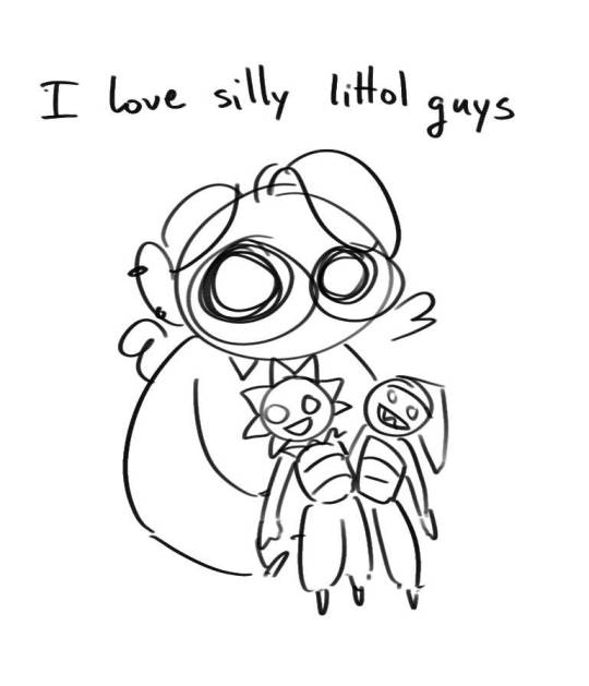
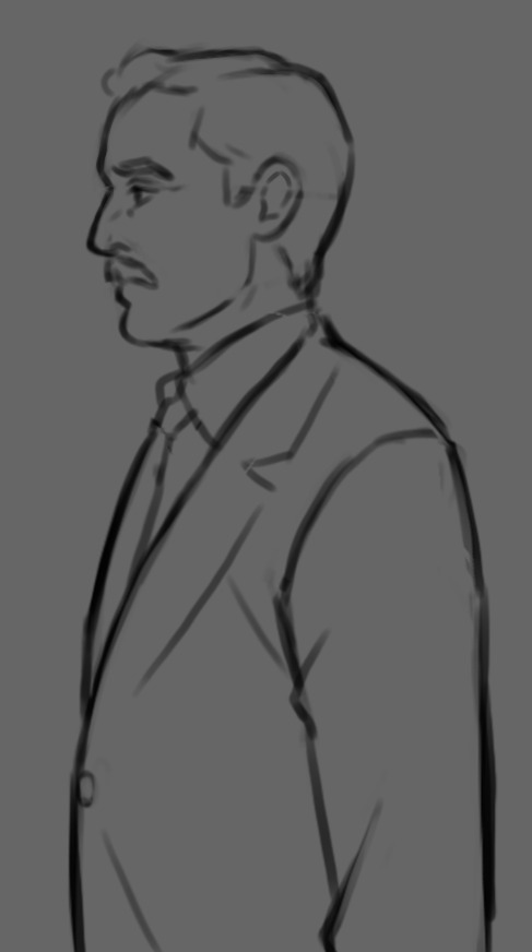
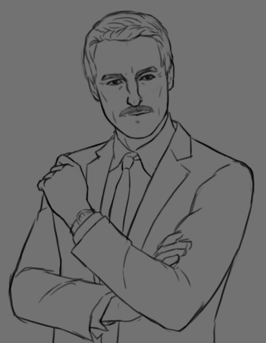
#wanted to try out some new drawing/rendering techniques
Explore tagged Tumblr posts
Visit Tumblr Blog
Explore Tumblr blogs with no restrictions, modern design and the best experience.
Last Seen Tumblr Blogs

Fun Fact
There were a total of 171.5 billion posts on Tumblr in 2019.
Text

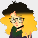
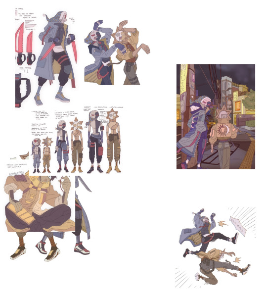
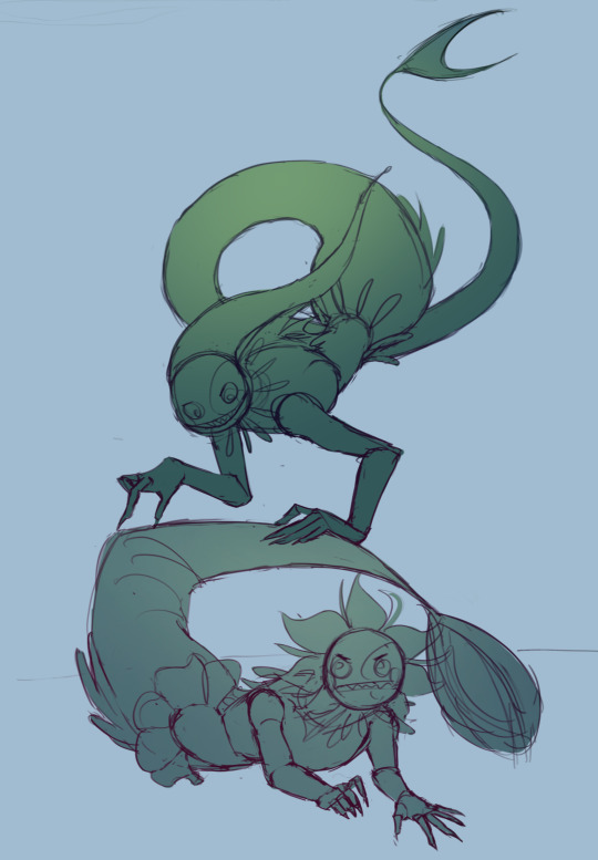
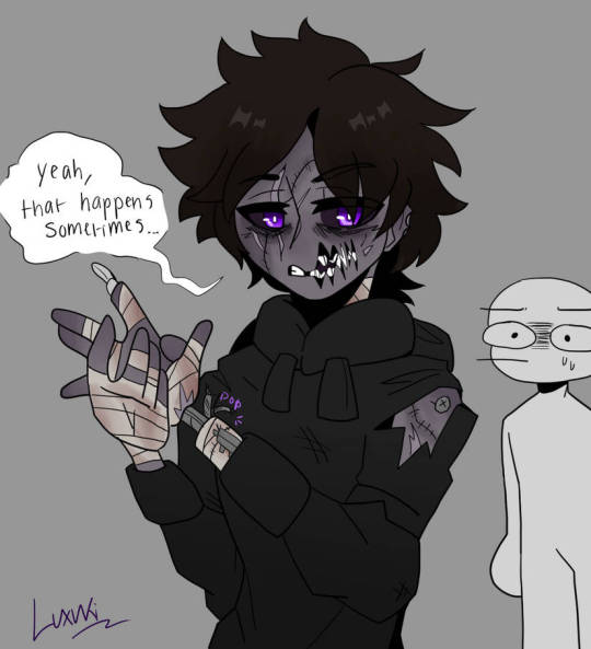
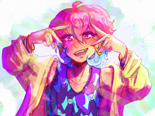
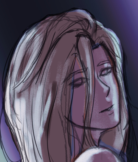
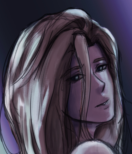
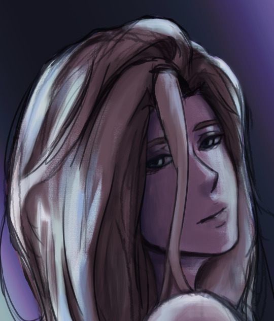
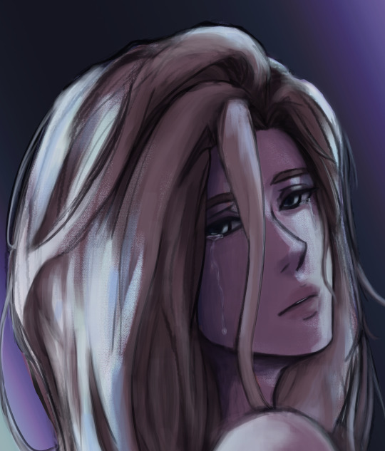
portrait practice with my warden Tabris
#wanted to try out some new drawing/rendering techniques#I’ve been feeling bored and unsatisfied with how I draw heads and faces and shade them 🤷🏼♂️#sometimes I need to mix it up#anyway his name is Ayen and he is eight years old this summer ☺️ one of my older OCs#my art#dragon age#(barely lol)#dragon age origins#warden tabris#ayen tabris#dao#da:o#dragon age art#dragon age fanart#grey warden#oc art#art#artists on tumblr#digital art
21 notes
·
View notes
Text

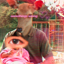
Well since I'm alive again I might as well post some of the art I did during my hiatus, and since I was talking about Keiki in my last post I might as well start with this piece here that I did of her. (click for better resolution)
Artist's Notes;
Ok so I remember having the idea for this a while back and wanted to try going for a very monochromatic palette. I also wanted to generally keep the background very minimal, mainly so the lighting and Keiki herself can stand out.
As for Keiki herself, I mainly stayed on-model with her design... minue the glowing hair, which, I'll get to that in a moment, but yeah I mainly just wanted to focus on making the pose readable. As for the flame hair, I mainly did this because I thought the potential lighting scenario it could make would be fun to play around with. I also wanted to try out rendering flame again and I think the lighting around Keiki's face is my favourite part of the piece.

I applied this technique with flame rendering to the human spirits near the bottom of the piece. I used the lighter parts of the flames to represent some vague skeletal structures, and their faces are inspired by a Salvador Dali piece (it was called something like "Flaming Giraffe" idk) but that's where the surrealism inspiration ends.
Don't worry though, I do have some art of Keiki that I did a little after this piece where I make her look weird. This piece was before I made some changes in my stylization, so I consider this the last of an era of my style. This is also before I found a new way to render hair, which you'll see soon, don't worry, I plan on just dumping all of my art I did up until this point and then going into hibernation again.
Speaking of, I might as well set some expectations for my posting schedule right now. Due to life keeping me busy, as well as my mental health and enjoyment of art, I won't be posting every time I finish a new piece. I started to enjoy drawing so much more again during my impromptu hiatus, and I want to keep enjoying that feeling for as long as I can. If I post stuff any sooner or later, it'll probably just be dependent on my mood that day, so expect me to kinda just spawn in out of nowhere every now and then.
Now then, I will once again pray to whoever is up there that Keiki will do something in Touhou 20 because I am still holding out hope she will appear again. Like, she was made as an allegory for AI and robots and considering today's world she would be perfect to bring back for this. Please, Zun, just bring her back and develop her character more, us Keiki fans only have Touhou 17 and that's it, she never appeared again, and you set her up like she may come back so please just let her return or do something at the very least please-
90 notes
·
View notes
Note
Oh uh forgot to ask in the previous ask (the one with the digital piece of candy and scurrying and stuff)
How do you draw art so good
Like
Is there a method you use or is that just the style you've gotten over time?
you've activated my trap card
I'm just gonna preface that this tutorial is from someone who was not professionally trained and didn't have a lot of free time for art, so a lot of the tips I have is short cuts I use to get the best results quickly
If you genuinely want to get better at art then please look at references and practice that is always the best
However if you are like me and only really do art for fun but want to go faster then these are for you pfppt
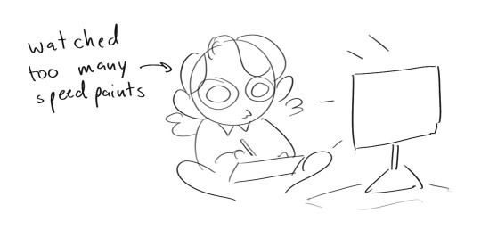
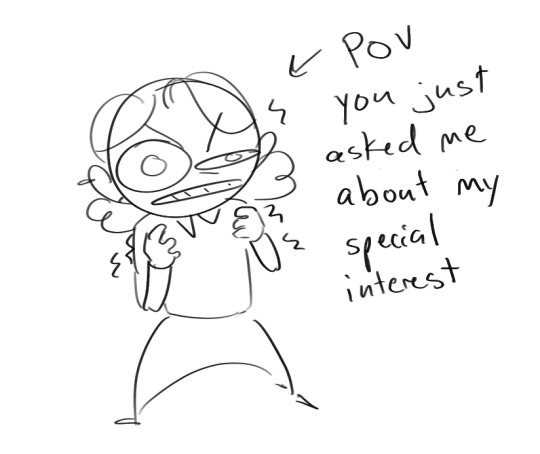
Overall I'd say my style is influenced by speedpaints I would watch when I was younger, I like analyzing how people do things and what makes something look "good" to me
I always recommend watching them because they will often have techniques you've never seen before or do things a certain way that you can try out yourself
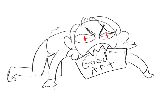
I consume good art, it feeds me
but seriously it can be super helpful when developing your own methodology, or just generally trying something new
Usually it starts with me pulling some references from artists I really admire and sort of sketching out how they do the things I like
For example 8um8le has like super good anatomy and poses so I focused on trying to replicate how they do that
venemous-qwille is super good at color and pulling focus so that's what I focused on in my study of them
In general I'd say my process is sketch -> silhouette -> color -> shading -> render
I really don't like doing lineart lol

I'd say for the sketch the most important part is using references and just kind of fudging it until it looks correct anatomically/physically
General rule of thumb is spend time on areas of interest, and keep non important areas light (like the stitching on his pants)
I don't do lineart because I think its unnecessary for most paintings I do
I naturally tend to put more time and focus on areas of interest (like hands and feet) and if you use a brush with opacity for the sketch, those areas are naturally going to be darker in the final sketch
Of course this is gonna be different for everyone but it's what works for me
Sometimes I do a really really sketchy layer underneath my sketch/lineart, just so I know where everything is going
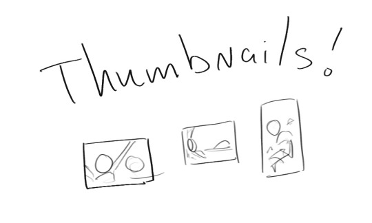
Use thumbnails! They are great to help figure out the general layout of things and what pose I wanna do
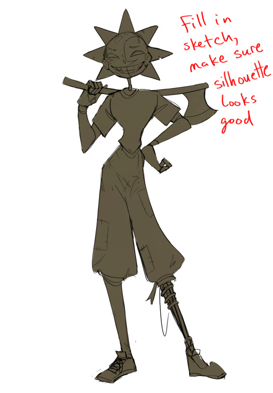
Next is what I call the "silhouette" layer
This is super important for me cause it helps me refine the figure and make sure the pose/anatomy looks correct, also depending on what color I choose for the silhouette helps guide what colors I'm going to use on top
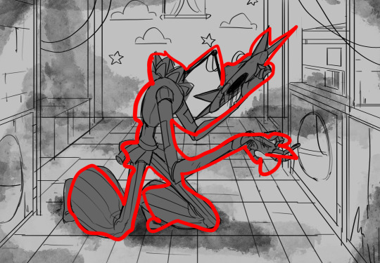
This piece is a good example of how it works. The silhouette shows me how the figure interacts with the background, how the pose looks and if its any good
The silhouette layer doesn't have to be super clean, as long as it follows the sketch decently well and shows where the figure is then its fine
I also sometimes make the silhouette layer multiple colors to help guide shading and vibe
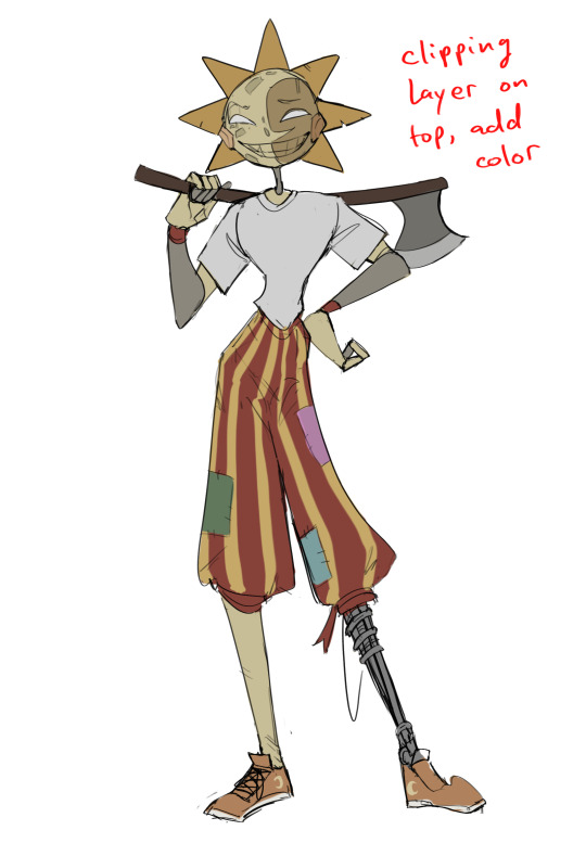
Next is the coloring layer. I usually make this a clipping layer on top of the silhouette layer, or I change the silhouette layer to alpha lock, either way it saves me time on coloring everything in

Sometimes I am super rough with the coloring too, using like an airbrush or my fav watercolor brush just to generically block in color where I want it
Works out cause most objects have like a bounce light to them from surrounding objects, so this is sort of a cheat I use to get that effect without all the work lol
Also don't be afraid to have the lower silhouette layer shining through, having multiple colors sort of subtly shining through the piece helps lots
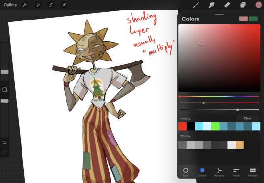
Next is the shading layer, this is usually another clipping layer, usually set to "multiply"
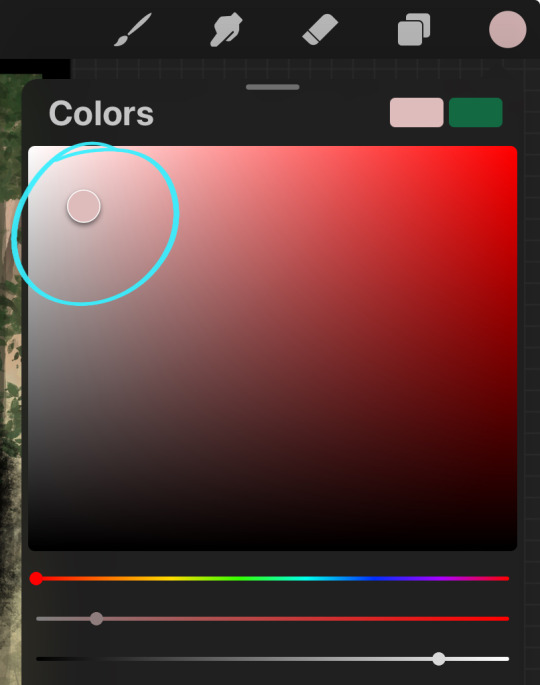
The colors I pick here is usually within this range, any color works, just depends on the piece and vibes.
Since this piece is set in a sunset forest I choose a more desaturated orange for the shading layer
I know there's a whole thing about multiply layer being a crutch (and it kind of it) but it is a useful tool when you just want some darker values across the piece but don't want to go through the process of color picking every single darker shade
Also in my opinion it looks better than picking a darker color and setting it to a lower opacity, idk I just think the color has more "depth"
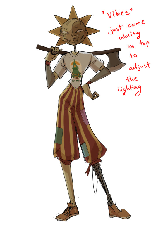
Next is the hardest to explain, sort of the vibes layer
Usually its just a layer of more concentrated color on top of the normal color and I fudge with the settings and values until I get a result I like
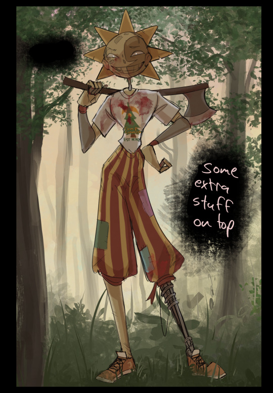
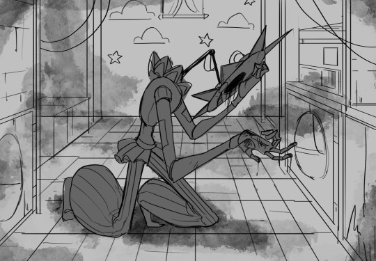
Next is the longest step, is the "extra" or the render stage.
Usually I add a background before this step so that if I need to merge the figure better with the background I can
If I render with a white background but he's supposed to be in a dark forest, its going to mess with the lighting severely
Also this is when I add more "vibe" layers on top to get the figure to match the background better
Backgrounds in general I recommend checking out @/derekdomnicdsouza on instagram he's got lots of great tutorials for breaking down backgrounds simply

I'd say general rule for the rendering layer is to focus on the areas of interest and spend less time on areas you don't care about
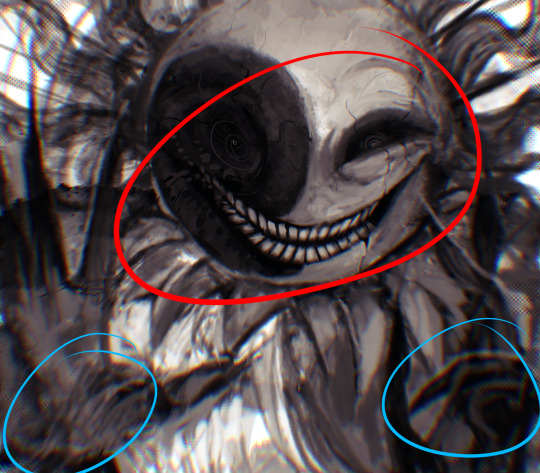
I even blur stuff out on the edges I don't want people to see, partially to save time on fixing mistakes in areas I dont care about (oop), but mainly to help draw the eye to the areas I do want people to focus on

Theoretically parts of the background should like mesh with the characters, parrallel lines are a no no unless they are directing a viewer to look somewhere, things that are perpendicular help bring things together
tbh I'm still not the best at layout and probably need more practice, but overall this is what I like doing
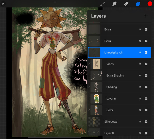
Overall this is what my layer set up ends up being
Sort of a sandwich with the lineart/sketch as the "meat" lol
Color and basic shading below the sketch, clean-up and rendering on top
I like this method cause it's super flexible if I ever want to try something different or try to replicate someone's style
I can make each step less or more messy depending on the end result and can add a lineart layer if need be. Also if there's a part that is straight up not working or needs to be removed its super easy to do cause I can just paint over it on the "extras" layer, color picking from the surrounding area to get the same vibe
Generally rule of thumb for my style is: get the initial layout of colors, form and shading to look good, then the rendering should be smooth sailing
Really the best advice I can give to get better at art is to enjoy what you're doing and become very very obsessed with drawing a silly little guy
You'll eventually get very good at drawing them pfptpf
#sundrop#moondrop#long post#art tutorial#fnaf sun#fnaf moon#I draw them way too much holy guac#ask#this is for you asker#idk if anyone else is interested in this kind of stuff#i apologize for ranting lol#also me struggling to spell silhouette like 15 times
120 notes
·
View notes
Note
What art program do you use? sorry if you already answered something like this but im so mesmerized by the techniques you use in your art.
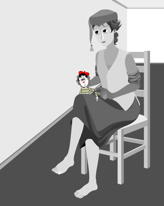
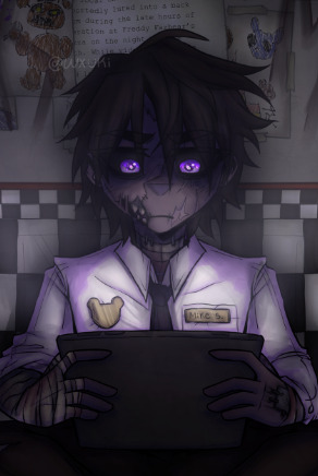
Thank you. No need to apologise; I don't mind answering this question because it's an excuse to walk through my latest image!
The concept for this piece is based on being perceived online through interpretations of posts and artwork, yet how artificial this can be. The relationship the viewer forms is more with the narrative of the work, and any insight into the artist through this feels highly awkward to me, which is precisely what I want to explore with this piece.
In this example, I wanted an attractive sitter to look like someone out of a new romantics music video or like an Enya video, because this genre and era of media is very aesthetically pleasing and nostalgic for me. I hold it as an unobtainable ideal— a hauntology. So, as wonderful as it is, it equally feels shameful and perverse because it's an aesthetic object of desire that I am contriving.
The sitter is holding one of my cartoon characters, Lauren Ipson, the protagonist of my Ersatz world project. A trope in writing is when a character acts as a self-insert of the author, and I'm conscious to try and avoid that with Lauren. I try to write Lauren as dry and sardonic yet also fun, dramatic, and friendly. I don't think of these as personal qualities of my own, but I imagine personal qualities bleeding into fictional characters is inevitable.
Yet Lauren Ipson feels much more alive a character to me compared to any attempt at self-portraiture or self-expression that I've done, which is very little because I'm not interested in constructing a perceivable identity. (I'm aware this text itself can be interpreted as self-expression; however, to me this is just another construct.)
So Is the sitter meant to be me, controlling Lauren? I'm definitely baiting the viewer to think this, and you can interpret it that way if you want, but really I don't think of the sitter as me at all. My intention is to show how it's all a facarde. The sitter is basically just as much a doll, a puppet, a mannequin as Lauren Ipson is, if anything more so.
There's a deliberate irony between Lauren's cartoon rendering and the sitter, who I wanted to render with more detail and evoke a modernist style. I'm inspired by Hans Bellmer and Dorothea Tanning with their work with dolls. However, despite that implied visual hierarchy, the more detailed sitter shares a similar, stilted vector construct to Lauren. They're both born from vector drawing after all. And it's further undermined with the way Lauren the doll looks directly at the viewer, as if she's alive, while the sitter looks to the side with a blank, almost dead-in-the-eyes expression.
Anyway, with that in mind, almost all of my work starts as a thumbnail sketch. Although I often draft digitally and am fine with doing that, I feel more confident doing it freehand on paper. Digital rendering feels more like a refinement process to me. Funnily enough, although I often prefer to sketch with physical materials, I'm anxious of refining or rendering with them.
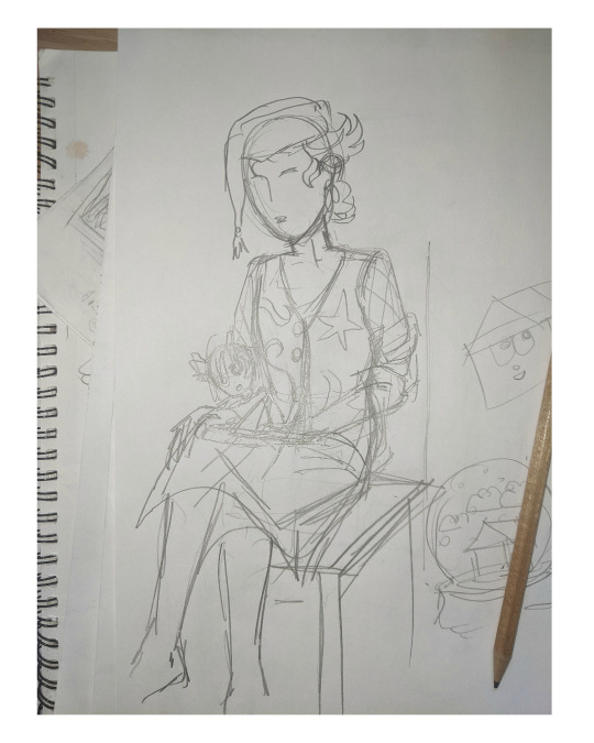
I like my designs to be very direct and conceivable, so a solid silhouette, pose, negative space etc. I often create a quick digital sketch with this in mind, either by tracing or referencing the thumbnail, although sometimes I skip this step and go straight to the rendered drawing. The aim is to establish a visual guide, dividing the drawing into various shapes for digital airbrush rendering later on.

With this composition, I made a second draft with more attention to details such as the face, hands and feet. Sometimes I'll use photo references if I'm struggling with posing or anatomy. These drafts are often blue because it's easier to render the black linework over a transparent blue sketch.

The chair took some time but was relatively simple to render. It uses the line tool set to magnetic anchor point, following two-point perspective vanishing points. I like two-point perspective because it feels sort of digitally native to me to have these impossibly perfect vertical lines. I also know the horizon line should be at eye level or something, but I just like the idea of the top of the chair to be perfectly horizontal.

Here I'm drawing the final rendered form. I use the stroke tool with it set as smooth as possible. Often I'll redraw lines over and over if it means getting certain curves to look right. Once the lines are drawn, I'll fill them in and remove the stroke, leaving just the solid vector shape. The shade of grey I use is done to simply denote the shape. It does not represent any kind of shading or anything; in fact, when I bring it into Photoshop, all these shapes are set to the same shade, but if I had that here in Animate as I'm drawing, it would be impossible to see what I'm doing. The red background is just for clarity.
Once it's all drawn, I'll make sure every shape is clean, overlapping nicely, and divided into its own layer. A composition can often be comprised of hundreds of separate shapes.
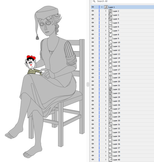
Each shape will be its own layer in Photoshop, which will operate as a clipping mask. The clipping masks act like masking tape or shielded off areas for soft brush opacity rendering, similar to the soft atomised rendering from an airbrush, just done digitally.
I follow very rudimentary painting techniques of simple shading, lighting, and bounce-back highlights. I follow a simplified Grisaille technique, focusing on strong values in greyscale before adding a wash of colour with a color gradient map set to layer style color. Sometimes my values can be a little off, but as long as the values are all consistently acting together, I can correct them with transparent washes or color curves. If the greyscale looks harmonious with all the forms clear, colour will likely work.
Proper digital painters will say this is an amateur process, with results that look mechanical and stiff, as colours in the real world all bounce together off different surfaces, resulting in colour harmonies. However, I don't mind the inharmonious nature of the colours, as I find the values give the composition enough harmony. I'm working digitally, so why go to all the effort to make it not look digital? It's interesting to me to have the red chair look blindingly red, the green skirt look blindingly green.
Colours can look boring without some form of harmony though, so I will add in blue-greens with the darker areas, more turquoise greens towards the highlights.
Skin tones are far more complex, however, as it's something that's more informed by realism. This is why kigurumi dolls with their plastic flesh look so artificial to the eye, because we're familiar with how light passes through flesh and skin and all the subtleties of colour that it picks up. This piece is the first time I've explored flesh tones, as typically I avoid all this by rendering skin as grey porcelain.
I needed to really up the contrast, with shaded areas becoming purples and highlights verging on washed out. Areas with more blood, like feet and cheeks, appear more orange and red. Areas closer to bone and cartilage, like the bridge of the nose, can look almost blue and green. Exploring these colour values and tints in the aim of natural tones was fun to do, and ironic given how blank the face is.

Although in the moment I feel very much like I'm rendering a realistic reality, when I step back, I'm reminded how stylised and unrealistic the painting actually is. It looks kind of insane, like everything is so uniform and overtly saturated. It doesn't feel present in a real space, despite the shadow and form implies one. But I'm not consciously thinking of these things, of style, as I'm working. To me, it's a process of world-building and problem-solving.
129 notes
·
View notes
Text
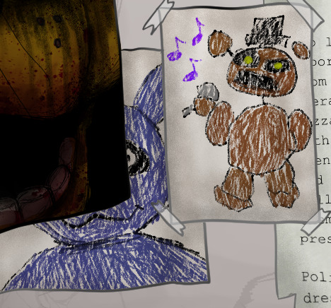
Like I said I would, I'm going to go through the details I hid in my recent FNAF painting. Not because anyone asked, but because I want to and I'm proud of everything put in
1. Michael's design is my own! I've pretty much had the same concept for the design since SB came out. I just really liked the idea of having part of his jaw missing for no particular reason other than it looks cool. But, I have since moved the jaw gap to the other side, as well as defining scars and wrinkles.
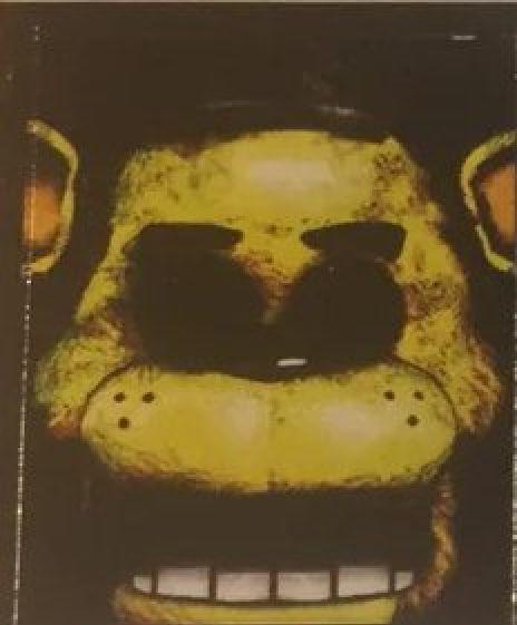
2. I've already posted Golden Freddy but here he is again. I redrew the original poster since I really didn't feel like I just should just slap the original on there. Since I had that freedom now, I decided to make references in the design to later games since it is appearing as a hallucination(?) to Michael. Obviously there are blood stains around the mouth to reference The Bite of '83 and I also added tear stains to reference Evan/CC, said victim of the bite.

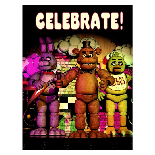
3. The classic "Celebrate!" poster. The same thing with Golden Freddy, I didn't feel like I should copy and paste the original so I drew it myself, but this time I only drew the bottom half of the crew since you'd only see that part anyway. Maybe one day I'll fully recreate the poster but for now, this is it lol (You may also notice that I gave each of them different leg shapes, to make them more distinguished from each other other than just colour)
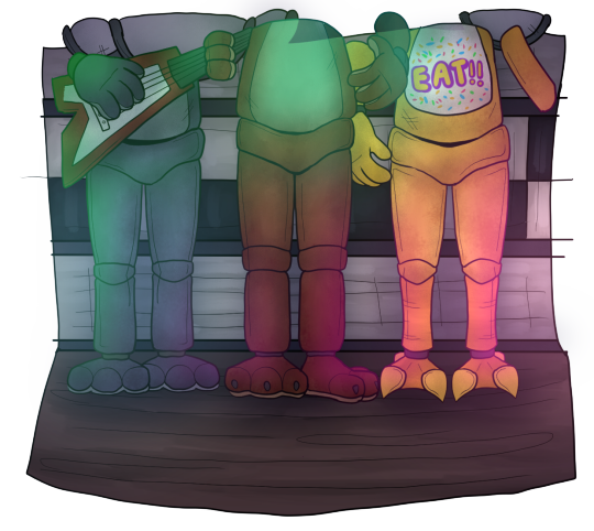
4. And again, didn't want to just copy and paste, so I re-typed all of the newspaper clippings myself in Canva. They say pretty much the same thing as the originals, but I'll still put them here anyway in case anyone wants to take a look:

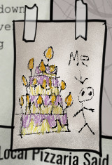
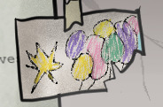
5. I also recreated the children's drawings myself. Fun fact: I actually used my NON-dominant hand to draw most the basic shapes. I figured that if I drew with my dominant hand, the lines might look too clean, showing my obvious years experience. It's silly but I really wanted it to look and feel like a child drew it
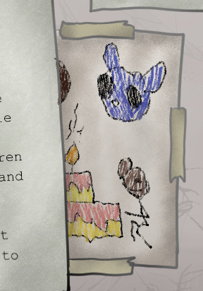
6. It ends up being pretty much invisible in the final painting, but on the floor you can see old confetti and blood stains on the tiles

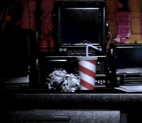
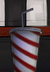
7. If it wasn't obvious; cup from the Security office is here too
8. Now it should it obvious by now that I chose to not draw the security office. Why you ask? I'm still new to drawing more detailed backgrounds, and I really didn't feel like drawing the office in the moment lol so I opted for the hallway, and I think it still looks pretty good with what I was going for
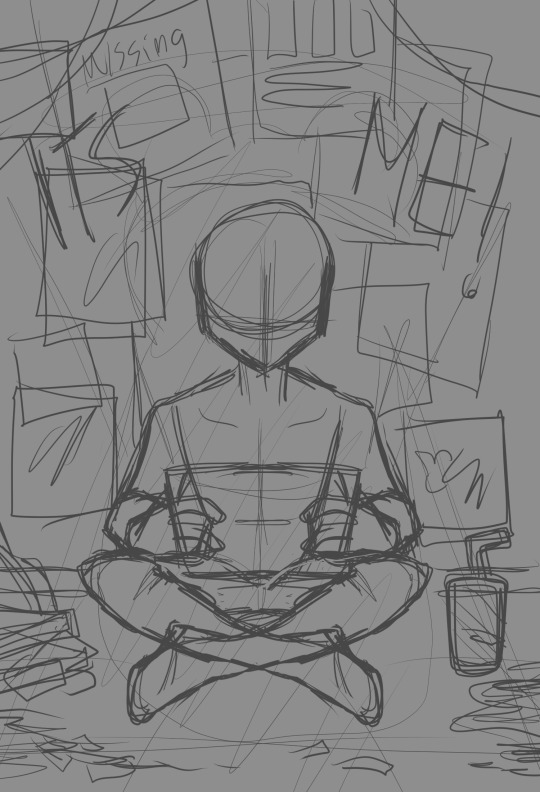
9. As a bonus, here's the original sketch I planned out. As you can see, I was originally planning to have more posters, some featuring the missing children. But in the end, I decided to scrap it and leave room for the wall to be more detailed since I thought it looked bare. Also, if you look closely, you can see a faint plan for a shadow over Mike. I was originally planning to put a shadow of Freddy there, but when I really started finishing up the shading, I realised that the extra shadow would be too much for an already dimly lit scene
And that's pretty much everything! I had so much fun doing all the little details and references, even though it did end up being more time consuming lol. I also tried out a bunch of different rendering techniques and I think they really helped pulled everything together. I'm definitely going to try my hand and making more paintings like this in the future ^^
If interested in seeing the full process, here's a link to the speed-paint:
youtube
#art#digital art#fanart#artists on tumblr#fnaf 10th anniversary#fnaf#fnaf fanart#drawing process#Youtube
71 notes
·
View notes
Text

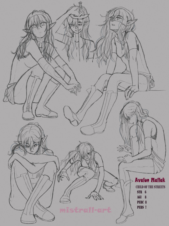
Avalon sketchpage!! ☆*: .。. o(≧▽≦)o .。.:*☆
I'm so proud of this one! It started out as a character study and pose practise for my Wayfarer Avalon Mallak. Then I also wanted to try some new rendering techniques and it really turned out great! Honestly had a lot of fun with the poses, even if I was scared of drawing so many hands :')
More below along with the - mostly - cleaned up sketches (you can see exactly where I ended up on the wrong layer ( ̄┰ ̄*) most poses are referenced from pinterest; the feral looking one and the top left one are from AdorkaStock!
I recently did a playthrough with Avalon and it was so much fun! It's been awhile since I last played and even longer with Ava :') but she still cartwheels up that mountain in Rona, doesn't get robbed and can't lie to save her life X'D
Personality wise, Ava is cautious, which often leads to her missing opportunities, but she'll never pass up on making a funny remark (avalon is the character that I always pick the funny options with). She's also very perceptive and knows when it's saver to keep quiet. Ava tends to talk a lot with her hands and often sits all bunched up when not sitting some place high. Also, much like Alua, to Avalon chairs are but a suggestion :')
Her fighting style is quick and precise, and she favours dodging instead of blocking while making use of the terrain. Really took Sero's training to heart. Will scratch and/or bite when necessary.
That's all I have for now! ( ノ ゚ー゚)ノ
Edit:: completely forgot, but her sword is the King Killer and is named Daybreaker!
#my art#wayfarer if#wayfarer!avalon#art#digital sketch#digital art#sketch page#coloured sketch#oc: avalon mallak#original character#oc#mistocs: avalon#this took about three days total to finish :'D#each day spending about 3-4 hours on it @A@);; which was a lot longer than planned
55 notes
·
View notes
Text

An OC being the prince of Hyrule (don’t worry, there’s a princess too!) in an LoZ AU a friend and I have been working on. It’s been turning in my head like a rotisserie chicken for over a year now.
More explanation and close up pictures below the cut:
I said that if I could finish the Sheikah Tower I’d go ahead and post this. It’s technically still a WIP because there are parts that are very obviously not finished but I was using this to learn some new digital art techniques that I got a really good hang of and my main focus was always on the character and he’s been done for almost a year now, so I’m ready to call this good enough a move on. I couldn’t move on until the Sheikah tower was more than just a blue rectangle in the distance, though. 😂 I can let the foliage be low detail and sketchy, but that blue rectangle was really jarring so close to the character, which was meant to be the main focus but got lost in the background quite a bit. When I was planning this drawing I only had the character and had actually completely finished it before I even considered what I wanted the background to look like. As a result I drew both a bit independently and meshed them together and unfortunately it sort of shows. I do like parts of it tho. The character and the coloring process I used for him were the main things I was focused on in this, and as a learning exercise it turned out great! I still use a lot of what I learned from this today.


I spent an absolute TON of time on the clothes — partially because I was designing what his outfit would look like, and partially because I was learning how to paint on top of a rough sketch. All the shading, highlights, color gradients — all of it was painstakingly done like I was using a colored pencil on paper. I could have used digital art tricks, but I was trying to find a middle ground between digital art and the traditional art I’m more accustomed to.
One of my favorite details is the running horses along one side of the waist band. I used the early animation stills of the running horse as reference, so there are about 4-5 unique designs that repeat along the border.
I used “Creating a Champion” to get ideas for the design on the tunic.
Another random favorite detail is the added gusset on the inside upper part of the pants for reinforcement. Because I drew that detail in, I got to play a lot with how the lighting would look there and I like how that turned out (I also like the idea of reinforced crotches and thighs on pants — why do these not exist???)

As I was working on this tonight, I realized how much I really liked the shading and light bounce on the arm wraps — this one specifically. Past me was on some good ish when she did that. We’re gonna ignore the sword for now. I did put thought into the design, but I definitely also want to redesign it.


Face close ups because that’s another part I spent a ton of time on. This character has a super distinctive canon hair style that I always have to get creative to maintain the silhouette of whenever I put him in a fantasy setting. This is one of the only times I’ve been satisfied with the results — partially because I just kept his “duck butt” hair in the front (that’s the canon hair style) and partially because I felt like I really killed the braids. (He’s also got some freckles that I am contractually obligated to draw attention to at every opportunity.)


Finally we have some parts of the background I like. The left-hand side of it was always more complete than the right hand side. I could spend another 20 hours rendering those trees, but I just decided I had had enough for now. Maybe when I’m bored in the future I’ll dip back in and play. And ofc the Sheikah tower. I finished that tonight and wound up pretty proud of how it came out. Ofc I was aided by the fact that the tower is in the distance and dimmed by the lightning, so it didn’t have to be super detailed or accurate. But still. After looking at a blue rectangle for the past year, that tower looks pretty good completed.


More sketches of my OC as Prince of Hyrule!
Keep reading if you’d like a little explanation of the LoZ AU this comes from.
Usually when my friend and I start an AU, we leave everything how it is in the universe and just plop our characters in and make them the focus. Easy. But since the plot of LoZ is always so intrinsically tied to the hero, princess, Ganon, and other major characters with major roles, there’s not a lot of room to carve out a spot for our OCs. I suppose we could have done a slice of life type thing in the vein of “Rosencranz and Guildenstern Are Dead” but with such a large cast of characters already in the LoZverse and the fact that she and I have a pretty large cast of OCs, there wasn’t a lot of room for that. So, we did things a little backwards. Instead of just using the universe, we also hijacked the plot and the character roles and stuck our OCs in the already established roles. One of my OCs is princess Zelda, one of hers is Link and another of hers is Ganondorf. We decided to play in the BotW/TotK LoZverse, so we also replaced the former champions and future sages with our characters. When we got done, I had a leftover character that didn’t seem to really fit anywhere. I’ve always been intrigued by the idea of a prince of Hyrule — not to take the role from Zelda, but as an addition in the narrative. And we know of at least one prince in the canon. I decided to add the role of prince and stick my leftover OC there. It now means he’s the brother of his canon wife, but eh, they’re really cute as siblings.
I’ve got heaps of lore about what the addition of a prince does to the BotW/TotK narrative, but the only detail you need to understand this art is the fact that Cooper (OC I’ve drawn here and been yapping about) is very proficient with magic and his magic aligns with the elemental dragons Farosh, Dinraal, and Naydra. He can use Lightning, Fire, and water/ice magic in a few different ways. Here he’s just using lightning magic for a nice AoE type of attack in Farosh’s domain of Faron. Not sure what he’s attacking. Didn’t think that far ahead. 😂
I might yap more about this AU in the future. It’s one of several Zelda related things that are currently rotting my brain, so there’s plenty to yap about. 😅
#legend of zelda#loz#loz au#my ocs#oc stuff#AU stuff#my art#loz fanart#sorta#faron woods#BotW AU#totk au#the fact that I can show you the exact spot in Faron Woods that this is qualifies it for LoZ fanart me thinks#the background is the LoZ fanart#😂😂😂
8 notes
·
View notes
Note
OMG U DRAW ABSOLUTELY DELICIOUS!!! I love to draw too but I am not very good at it , so I was wondering if you have any art advices!!
I love your art so much it's so pretty 💗💗💗✨✨
WAIT WHAT DO YOU MEAN YOU’RE NOT VERY GOOD AT IT??? I’ve just seen your blog and your art is so cool??? I AM IN LOVE WITH YOUR WAY IF COLOURING ITS SO LIVELY AND VIBRANT ❤️❤️❤️
If I really have advice to give in art, from someone who had a huge artblock for months, it would be to not be shy to go out of your comfort zone/experiment with techniques! I know for me it’s what helped me?
For example, try to do some art study ( like trying to replicate from pictures ), or sometimes just try to use new techniques! ( I used to draw anime-only things; and I try to render sometimes which really helped me to improve to try something different )
Also don’t try to be shy to retouch your old art if you feel like you improved your skills to correct some stuff too? Or even just add things for fun?

For example, I wanted to finish that sketch just to practice my full-body anatomy and do some backgrounds, and even if it’s not perfect, it was pretty interesting to practice too.
Also DON’T BE SHY TO USE REFERENCES! IT SAVES LIVES 😔🙏 I think my main analogy would be to be an engineer who uses his calculator; we know he can count without it, but he is in a deeper level of his discipline that it does help and saves time.
But keep in mind I am a beginner artist and self-taught, so my advice might be not that professional 😭😭 (take them with a grain of salt) I know it will always be the best to follow more theory-based techniques/knowledge.
Have a nice dayyyyy
19 notes
·
View notes
Text
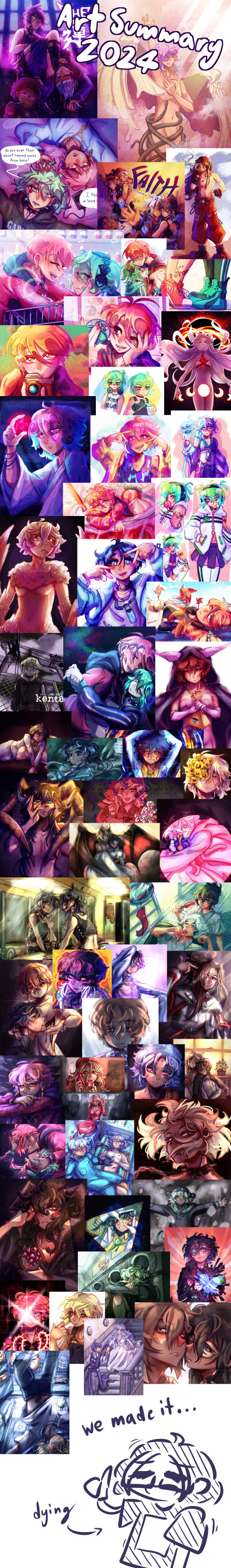
that's a wrap on art posts for 2024!
like what you see? all the art I posted this year is visible on my art tag!
wanted to try something different after last year's formatting disaster, so this is less of a summary and more of an everything-I-made-and-liked collage. as in that's what it is that's what you're looking at
this was a big year for me (I started university and lived away from my parents for the first time, yayyy) and I think you can see that in how my art style evolved in the past 12 months. I'm really happy with where it is now!
last year I picked one piece from each month to talk about, so I'll be doing that again for this year below the cut
january

this is the still version of an after effects animation I did for a design class in my last year of high school. I initially wanted to post this as a gif, but I knew nothing about how gifs worked at the time and it came out both massive and heavily artifacted. I can't even post the gif on tumblr, but the animated version is up in an mp4 format (that does have more colour correction and generally looks better)
february
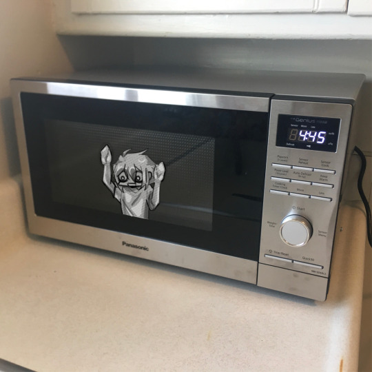
this is a weird pick to represent february (it wasn't even on the collage image) but this... thing does represent that month to me lol. this doodle took me all of 20 minutes and represents the most important battle of 2024... shaman king flowers stream vs frost's microwave
march
kentareo happened (in earnest, they've been here since the end of january)
april
I don't like anything I drew in april enough to put here
may
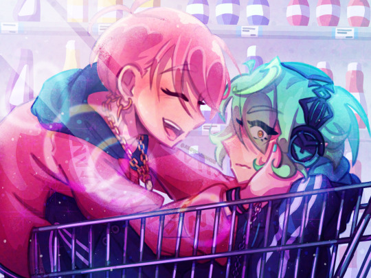
march-may was my flop era this year and I blame these two. at the start of the year I was using a LOT of heavy colour overlays to hide my inability to colour good and those really showed their weaknesses when it comes to pieces with strong complementary colour palettes. this one's nice though, I hated drawing kenta's shoes
june
big month for tss news! I really love the colours I got with my tss art from june, you can tell the overlay technique can work when you're not shackled by the kentareo colour palette
july
(wow this is really the same pose again. I promise I drew more things in between)
my first month out of high school! had a lot of fun going into the outfit details with this one
august
the most important change as far as this list goes- I switched programs to clip studio paint! I'd used adobe fresco for almost all of my digital art career, but I got a pc in august and finally made the switch. it took a while to adjust, mostly because my fresco process had emerged basically via natural selection under the program (and hardware) limitations I was working under. a lot of things (like the heavy texture) I had to relearn in csp with more intention (the august piece is a bit smooth, isn't it?)
september
I moved into uni and spent most of the month adjusting to the major life change. I spent most of my drawing time on this piece, trying to figure out techniques and download brushes to get the kind of texture I wanted. this one took absolutely ages
october
clip studio finally clicked for me. I figured out how to speed up the parts of my workflow that sucked (flat colours) and embraced a more paint-heavy, brushstrokey rendering style. the speed increases also meant I suddenly had the energy for backgrounds!
november
I drew the most this month out of any in the year. I also stopped needing the overlays to make my colours look nice, and so the palettes in my art got more diverse. this piece I remember drawing in about an hour at midnight when I had to wake up at 6:45 the next morning for work, and being so happy I finally captured this specific glowing hair effect
december
I drew so many full background pieces this month, but I want to shout out this non-background one for the shattering effect I got with the selection tool
and that's the end! many more things coming in the new year (some I've already drawn, actually)
#goose draws#artists on tumblr#digital art#one year later and I still can't tag these#this is my once annual art yapping post okay
8 notes
·
View notes
Note
I know art is all about practice and trying out new things and not being afraid of using references, but do you have any advice for newer artists about areas to focus time on? Especially for learning digital art/colouring? I've always loved your art style so any advice you have would be valuable.
hi anon!!! Thank you for the kind words :)
There's no one good answer to this because art is about a lot of things. So rather than give you clear-cut actionable items to do, like a checklist, I'll just write down my own philosophies about art exploration. I've also been thinking a lot about this in terms of my own improvement.
(Also for everyone reading this I am by NO MEANS a teacher so take everything I say with a grain of salt. I'm simply someone that just enjoys thinking about art)
I think art is a lot about the combination of technical skill + visual language + concept.
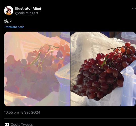
Practicing technical skill, as you said, involves using reference and doing studies. I think an important thing to remember is you need to know what you're trying to learn. Here's a good example the former is a traditional still life of grapes, the artist probably intended to make a piece with a good composition and an impressive rendering technique. While the latter is definitely more of a value/color study. I'm certain this artist could have gone into detail rendering those grapes but being realistic isn't their intention/style. So when you're doing your studies I think simply asking "what do I want to work on?/what am I trying to communicate" can be helpful.
If your goal is working on color specifically I think it would be important to practice values, hues, and temperature control. Those things are the basis of color and after that you can play with more stylistic color. In the end my advice is to do a lot of studies, and look at a lot of art! Doing these studies digitally is just a matter or practicing and familiarizing yourself with the art programs (it takes time). If you have an artist you like you can probably look at their work and breakdown what you like about it. For example the narumitsu art I was working on here is kind of a study of @/rei_17's art (from twitter). I love her use of non-local colors and colors that are very close in value but the depth comes from the hue/temperature shifts in color. It's so masterful to me!!! So, now that I know what I'm looking at it becomes easier to break down and put it into practice for my own art.
Visual language usually refers to "style". To me, it can mean a lot of different things but for the sake of this long ass text post let's say it's just about "art style". My tip is to...copy! Copy what you like and figure out what it is you like about it. I feel like your hand will guide you towards your own art style in the end. I don't view myself as someone with a particularly interesting or unique art style but I can breakdown my influences a little. I'm someone who grew up with anime/shoujo influence but also copied a lot of popular tumblr styles back in the day lmao. I want my anatomy to "feel" correct even though it's rarely realistic and I don't really exaggerate form too much because I don't have a preference for it. I'm someone who values drawing speed and clarity of form over details. And all those things added up are the reasons I draw like I do. You can totally make a style by more intentionally riffing off others, and you can also develop a style just by doing your own thing. Your art will always have an identity of its own even if you don't know it at the time!!!


Concept is just your idea/intentions/narrative etc. I really think concept can be anything you want. Some people can go really in-depth with their concept with studying and research and etc, and other people can make something visually interesting simply by going "I want to draw a cute girl". Everyone is different! I wouldn't take concept advice from me personally because I don't make original illustrations. Fanart is easier to work with because usually you're interpreting someone's existing narrative and you can churn out something cool from that. Maybe my advice is draw more fanart???
9 notes
·
View notes
Text
New year, new art! (I should be posting more this year. 2023 was a hell year for me...) Trying some new rendering techniques and FORCING myself to draw backgrounds. Hopefully a year of practice will make me good at it...
I'm starting Out of the Abyss, and my DM let me play a Mindflayer (or, Gnome Ceremorph) OC that I've been excited about for YEARS now.
His name is Azzox. He's a Ceremorph born from a Mindflayer Colony run by a Ulitharid that likes to experiment with eugenics and "designer babies" so to speak. By sheer luck, he broke away, but the psionic backlash broke his mind and personality. He was forced to scramble together a new identity based on the ghosts of all the people he's eaten over the years, but has a base of a Gnomish Xenobiologist.
Morinq, the Flumph, is his best friend and life partner. He saved Azzox's life, and helped him learn to stave off eating brains by teaching him how to eat dreams and grow fungus with physical nutrients, but it has diminishing returns... Here's hoping the hunger doesn't become a problem in the campaign (it probably will.)
The two want to make an "Aberrant Zoo" where they can safely study aberration biology and help them to peacefully coexist with other forms of life. I think they'll fit right in with the Soeciety of Brilliance!
I love my squiddy and jellyfish boys. And I'd like to personally thank Larian Studies for making the Best Game Ever (tm) to inspire my DM to let me, and making Illithids cool again. :3
#dnd#art#RasarakArt#digitalart#character design#illithid#Mind Flayer#Flumph#dungeonsanddragons#out of the abyss#oc#oc art#not ai generated#not ai art
26 notes
·
View notes
Note
Hi yes sorry to bother really quick question though uhm when you draw a human head do you draw put the the uh the circle thing that displays the top the head and then draw a chin oooor no?
If not what do you start with when you draw someone? And also how do you draw hair? I love the way you draw it and I am literally struggling sm w/ my art style(?? Idk Ik i don like it much tho) atp and wanna know what you do when you draw...and you seem like yk what ur doing so... yaaaaa thank youu! :3
Haii don't worry you're not bothering at all ^_^
To answer your question well i don't really draw the full circle usually i just draw circle heads but when I'm not doing that i like to try n get the chin shape as I'm drawing the head
Like this

After that i like to finish Woking on the head before moving on to the body
It can sometimes be a problem when you start drawing the body n you realise that maybe you need to resize or move the guy so you'll have to erase the head you already finished but if you're drawing digitally you don't have to worry about it 👍
I usually finish the face then draw the hair n neck but the order doesn't matter do whatever you want


There's a lot of different ways to draw the body n you can use whatever technique is easier for u but for me i like to start w the shoulders n do some chest n back lines
They don't have to be accurate just a general shape to indicate the body type/pose you're doing

Once i add the arms i start doing some fixes to the body
The arms make it more coherent all together so you start to see what issues can be fixed in the general shape of the body or maybe even the position of the shoulders or the pose
Once the guy looks right you can hide all your hard work w some clothes


Then yea i just add some last details like clothes folds n stuff n also go back to fix some lines that don't look right just erase as much as u want till the guy looks decent enough

As for the hair i just do general shapes i can never figure out how to do the detailed hair with all the individual strands rendered so this is the best i can do
I have some general strand shapes i like to use every style gotta have one of these

I like to start w the bangs then draw the rest of the hair sometimes if the drawing is too tiny i won't draw the bangs at all just do whatever till u get a shape you like 👍

Also for the artstyle thing if you're not happy w how your art looks i advice trying new styles
For me i have my little lap rat blorbo who i draw every time i wanna try a new style or technique
Look at other artists n pick out certain aspects you like about their style n try to replicate it if you're vibing w the style or technique then good for u king(gender neutral) draw that all the time 👍
Don't worry about changing ur style either even after u found a style you like it's always fun to experiment w new stuff n who knows you might even develop a new style that u like even more
Just have fun bestie do whatever brings u joy

Anyways i talked too much be gay do spinjitzu or whatever ✌️
11 notes
·
View notes
Text
ai analogies
with photography, the 'inputs' or 'creative choices' include the subject, the framing, and technical qualities like exposure, focus, aperture and iso. the output, the thing that's judged, is then the qualities of the image - composition and colour and narrative. since photography is very quick, a photographer will typically take many shots of a subject, and then pick out the ones they like best to share with the wider world, so there is also a curative element.
with collage (and also photobashing, and even the limited space of a dollmaker game), the 'inputs' are the choices of existing images, and the composition created by arranging them. so there's a curative element in selecting what to collage, and then new meaning is created by juxtaposing two previously unrelated images, the spatial relationships between them, and so on. (see also graphic design!) the visual qualities of the original image are relevant insofar as they affect the composition, but you don't judge a collage containing a painting or photo on how well-painted the painting or well-shot the photo is, rather on how well it uses that painting or photo.
with 'readymades' and similar genres of conceptual art, it's kind of similar, right? you put the existing objects in a new context and create meaning through how they're arranged. people respond to whether the idea it communicates is interesting. (often these days they come with some text which gives a key to inform you how to interpret the artwork.)
anyway. with drawing and painting, which are comparatively laborious to create, you are constantly making thousands of creative choices, from the broad scale - composition, value structure, how you construct a figure - to the tiny, like line weight, rendering, shape design. to navigate this vast space of possibility, you will be informed by your memory of other pictures you've seen (your personal 'visual library') and techniques you've practiced, reference images you've gathered, and so on. the physical qualities of your body and the medium will also affect your picture - how you move your arm, how watercolor moves across the paper, etc etc.
broadly the same is true for other very involved media like sculpture or computer graphics or music (of all kinds!). more fine-grained control implies both more work and more scope for creative choices.
when someone sees an image created by whatever means, they take all of this in at once, for a gestalt impression - and if they feel like it, they can look closer and appreciate the particular details. many artists will think about trying to create a composition that 'leads the eye' to take in particular points of interest and convey the narrative of the picture.
so then, 'AI'. your inputs are the design of the neural net, the selection of training data, the text/image used as a prompt and then finally the selection of an image produced by the program. (you can modify that image of course but let's not get into that for now). chances are you don't have a lot of control over the first two since the computation involved is too unwieldy, though some image generators can be 'finetuned' with additional training data.
'AI art' is like photography in that you typically generate a lot of images and select the ones that 'come out well'. like a photographer looking for a subject, you might search around for an interesting prompt. it's unlike photography in that you have very limited control over all those other parameters (at best you can try to verbally describe what you want and hope the AI understands, or ask it to generate similar pictures and hope one has the qualities you want).
'AI art' is like collage in that you are taking existing images and creating new meaning of of them, by generating a latent space and transformation algorithm that approximates them. it's unlike collage in that you have no real knowledge of what specific images may be 'most' informing the corner of latent space you're probing. you can look at an AI generated image and say 'this looks kinda like a Nihei manga' but it's not using a specific image of Nihei. still, there is something similar to the relationship between images in collage when you do things like 'style transfer'.
'AI art' can be like conceptual art or for that matter political cartoons in that often it's just providing illustration to a concept or joke that can be expressed in words. 'Shrek in the style of The Dark Crystal' or 'cats that spell "gay sex"' is what you're getting across. but 'AI art' as a subculture places very high concern on the specific aesthetic qualities, so it's not that simple.
briefly, sampling in music often tends to foreground that it's a sample, either one the audience may recognise - the Amen break for example - or just by being noticeably different from the texture of the rest of the piece. even when the sample isn't easily recognised, though, the art of sampling is to place it in a new context which brings out different sonic qualities, e.g. by playing it rapidly in succession, or heavily filtering and distorting it, overlaying it with other sounds, or playing it right before the drop. it's similar to collage and photobashing.
paintings then. AI art rather obsessively tries to imitate paintings, drawings, 3D graphics etc. some of its proponents even try to position it as obsoleting these art forms, rather than a new derivative art form. a lot of the fear from artists who work in those media is that, even if the AI generated images are a poor substitute for what we make, it will be 'good enough' to satisfy the people with the money, or discourage people from learning how to paint with all its nuances.
so, 'AI' may make results that look like a painting, but the process of making it is hugely different. rather than gradually constructing a picture and making decisions at each turn, you try out successive prompts to get a page full of finished pictures, and generate variations on those pictures, until you find one you like. it's most similar to the client who describes an image they want and then makes requests to tweak it. there is still creativity in this, because it's kind of replicating the back-and-forth between an artist and client/art director/critique-giver/etc. however, in this analogy, it's hampered by the limited communication between you and the 'artist'. and it's a different sort of input, so we respond to it differently.
generating and posting AI art could also be compared to the kind of thing we do on this website, where we curate images we like and share them. you're all looking at the outputs of the same image generator and pointing and saying 'ooh, that one's cool'. what's kinda troublesome in this analogy is that AI obfuscates all that stuff about credit and inspiration, collapsing it all into one mass. unless their name was used in the prompt, you can't tell if the 'AI' image is 'drawing heavily' on any particular artist. this isn't a new problem - firstly websites full of uncredited images abound, secondly any creative process is inspired by loads of things that we can't enumerate or hope to divulge, so the idea of tracing the paths of inspiration is perhaps a mirage anyway. still, for me (sakuga fan type of person!), knowing what i can about the specific people involved in creating artwork and how they went about it is important, and that's heavily blackboxed by 'AI'.
none of this would be helped by harsher copyright laws. it's great that people can create derivative works and respond to existing art. that is the scaffold that launches us somewhere new and hopefully interesting. simply putting someone's work into an image generator to create similar pictures is not a very interesting statement in its own right, and a lot of AI illustration produced at the moment has a weirdly glossy, overproduced feeling that is offputting and leaves nowhere for the eye to settle (when it isn't just mush), but that's not to say AI is never going to be able to be used to say anything interesting or become a meaningful art form in its own right.
'AI' is kinda like a bunch of things but not exactly like any of them. (this isn't to get into the economic questions at all, that would be a much longer post!). but since there are people very sincerely devoted to this being an art form... I want to know how to 'read' these works - what I'm looking for in there, what a meaningful comment would be. bc right now when I see an illustration and realise it's AI generated image it's like... a sense of disappointment because whatever I was picking up on isn't actually part of the 'statement' in the way i thought. so it's like oh... that's nice. the machine picked a cool perspective huh? all the things i would normally appreciate in an illustration are outside the artist's control, so responding to them feels irrelevant! so what is the right mode here? there's more to it than just the choice of subject. but I feel like I have more to say about even a picrew.
45 notes
·
View notes
Note
have you ever shared speedpaints / progress videos anywhere?
I absolutely love the way you use color and don't understand how you pull it off at all lmao
I always wanted to make speed paint videos, but I'll be honest when I want to make one, creativity never sparks me like ever. I have tried to in the past so many times, and my brain usually goes, "Man, I would really rather play some video games," or "I'd rather watch some deep-dive iceberg videos" 😭 It's a never-ending cycle, so I have kinda given up trying. I hope when the stars align with my creativity and making a speed painting vids, I can just do it. I'm a very fickle person when my creativity sparks, and I just like to go go go go and not stop to do anything else. Tbh when it comes to coloring digitally, I simply color as if I would traditionally. It's a very simple technique. While I use my layers to set up everything, I always smash into one layer to work. I do have different styles of coloring. Because not all pieces need a painterly style.... Some need the idea to just be out there like my flat renders. I also take every drawing piece as something new to learn, so no two drawings are ever the same in coloring styles. What stays the same is I take a traditional coloring head space to each one.
#asks#also my colors might be the way they are because I'm color blind to certain colors too LOL ;u;#also when it comes to me making speed painting#I may have to check on my ADHD with my dr cause man one lil thing can tank my head space and#make me not want to be creative no more for the day when it comes to that <.<
6 notes
·
View notes
Text
Weekend WIP Game
Thanks @cha-melodius for the tag! This was super fun!
WIP List: I've got 3 and they're all Mobius lol. First one is just a screenshot painting, it's actually further along but I wanted to show an earlier stage of my process. Second is a frame for an animatic that's a crossover of Loki with Jujutsu Kaisen. Super random crossover choice but I just really love the new opening theme for that show. Last one I posted a while ago, it's the watch ad illustration which I haven't made any progress on since last time.
Which WIP is your most complex? Definitely the animatic, I'm trying to do 16 frames and some have multiple characters and complicated backgrounds.
Do any of your WIPs involve you using a technique/style that you haven't used before? What inspired you to try it? Nothing that different, though the animatic will have some frames of characters from really high and low angles, which will be tough for me.
Which WIP do you expect will take you the longest? Again the animatic lol
Which WIP are you finding the most enjoyable to create? Maybe number 1 because it's the most relaxing, with screenshot paintings I don't need to think as much.
Do you have a favourite character to draw/stitch/paint/depict? Are they in many of your WIP projects? I think that's evident from these WIPs hahah
Which WIP do you experience the most self-doubt about. Why? Number 3 because I want to do it in a painted style, but I don't have an exact lighting reference for what I want to do. Lighting is always hard for me when I don't have exact references.
Have any of your WIPs been struck by the curse of creator's block? Not often, once I've started a WIP it's because I have an idea for how I want it to look and can keep chipping away at it. If I get artblock it's when I can't think of anything to start next.
Do any of your WIPs contain characters outside the main ship? How are you finding creating those? For the animatic I'm planning to include some other characters: B-15, O.B., Casey, and Brad! It'll be my first time drawing most of them and I'm looking forward to it.
What emotions are you hoping to convey through your WIPs? Haven't thought about this too much, for 2 and 3 I'm just hoping they'll look cool hahah. And 1 is sadness (hopefully this is evident if you recognize the screenshot it's from)
Are there any features/details you are finding challenging in your WIPs? Mobius' hair in number 1 is hard since I'm trying to render it realistically.
Which WIP has the most complex shading/colouring? It'll be 3 but I haven't started that yet.
Which WIP has the most complex background? Definitely 2.
Which WIP do you have the highest expectations for? 2 I'm hoping will be really neat, but I think it also has the highest chance to not work out.
Do you dream about any of your WIPs? I haven't, but I wish I did!
Do any of your WIPs have particular complexities that your other art doesn't? Not that I can think of
Are any of your WIPs commissions? No, I don't do commissions because they stress me out, I want to draw whatever I'm most interested in the moment and not have any obligations.
Do you have a character that is more difficult to draw/stitch/paint/depict? Are they in many of your WIP projects? Female characters are harder for me to draw, because I don't do it very often. B-15 will be in WIP number 2!
Tell us one thing we don't know about one or more of your WIPs. Can't think of anything interesting for a specific WIP, but I've got a list of potential future ideas for Lokius drawings and it's currently 23 items long. 😂
Not going to tag anyone specific, but if any creators want to do this I'd love to hear about your WIPs! The writer version of these questions is in @cha-melodius's post here.
18 notes
·
View notes
Note
Hiii can u pls do a face tut pls I’m begging you
heya! sorry this took some time, i just moved and it's been really hectic @@
and thank you for the question! i'll use stuff for bela and shadowheart as an example for ya for the two styles i usually do
warning, i am not a teacher and i'm still experimenting and learning so uhh some of this might be scuffed but is how i do it :>
also noting that i use csp or photoshop depending on my mood and what brushes i want to use but the same technique works for either and i use 2 brushes for the main bits and additional brushes if i want to add texture
--
1 - so after i have the sketch roughed, i usually put it on a multiply layer and add a background layer under it (i leave it white or almost white if i'm just doing a doodle or sketch) and i start to figure out the lighting and shading under the outline layer
the lighting is usually pretty rough and i'll start to understand what i'm going for as it starts to shape up but i try not to reduce the brush size too much so i don't get too muddled
(at this point i'm going thru my mantra of "trust the process" and breathing into a paper bag and kicking and screaming about how i want to quit)
--
2 - once i have the lighting somewhat how i want it, i start tweaking the color and i do it by using adjustment layers and manually painting. this part is kinda like cooking and tasting as you go, if i feel i want the image to feel colder/warmer i'll adjust accordingly but i will tell you how i did it for both examples below:
for bela, i actually painting above the shading/lighting layer and used "soft light" and "hard light" blending modes for the hair and skin to fit more with how i wanted it to look. i used color balance and curves for the background to get it to more of a purple/blue and darker
for shadowheart, i actually put the color below the shading/lighting layer and left the color as is and swapped the blending mode for the shading/lighting layer to "multiply" and then did adjustments using curves and gradient maps using "hard light" and "soft light" too and i think i had a "color burn" just for fun
this is my fav part of the process bc i just experiment and mess around with different layers. i usually have a vision for how i want the color and lighting to look but there's always room for new ideas! so i just mess around for a while here till i'm happy!
--
3 - rendering time! um i don't really have much advice here except i just start going in and rendering in closer detail. and remember references are your friend!!!
bela render progression:
shadowheart render progression:


i sometimes end up changing the drawing quite a bit during rendering but that's okay bc as you go into detail, you will notice discrepancies from the pre-render stages
for the style i used with shadowheart i just paint over the outline pretty much with some bits of it left it and i blend more to smooth it out more. for the style i used with bela, i add back in any outlines i painted over that i wanted to keep
--
and at the end of the day it's your art and how you express it is what's always gonna be the best so trust your gut (and references) but also it's okay to take creative liberties and go with the "cool rule" :3
and keep practicing!!!! i def feel i've gotten better with drawing faces compared to a year ago
i hope this helps and if it didn't ":3 i hope you had fun reading
#i hope this makes sense#i had to go back into my files and disable layers to get these screenshots Dx and i have a LOT of layers but for you anon i did it#i didn't know if u just wanted a broad tut of how i draw the face or if you wanted smth specific but i hope this helps anyways#i didn't promise this would help#pretty long post#asks#anonymous#my art
5 notes
·
View notes