#we like robots and overcomplicating designs
Explore tagged Tumblr posts
Visit Tumblr Blog
Explore Tumblr blogs with no restrictions, modern design and the best experience.
Last Seen Tumblr Blogs


Fun Fact
Celebrities use Tumblr as well.
Text
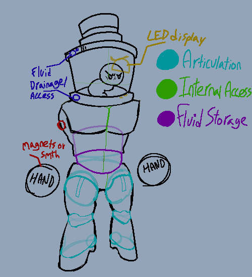

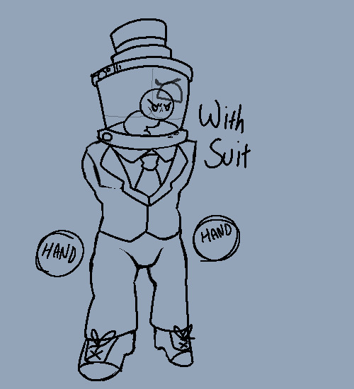
dr fetus robot study
#not putting this on our main blog but. waves#we like robots and overcomplicating designs#super meat boy#smbf#dr fetus
6 notes
·
View notes
Text
I just wanna know if it'll work!
The Monolith!
A massive perpendicular structure - 1 meter deep, 4 meters wide, 9 meters tall - with a perfect 81 centimeter diameter circle cut, with its center 64 centimeters from the top.
Naomi Glasnikova was grinning like mad. She couldn't figure out where to put squares of 4, 5, 6, or 7 in the design without overcomplicating things, so decided to just forego them. It'll be fine, she's sure everything will work out just as planned.
What is the plan, her fellow scientists from the Coalition species ask? To see if placing ominous black metal alloy structures around a planet with primitive lifeforms will make their brains go "Oh, this is different, I should... *think* about it. Yes. Thinking is a thing I can do now. Thus, with the power of thoughts I can look at other things and go "Oh, what if I did this!" and make myself evolve into a civilization (once I figure out how to come up with prerequisite concepts)."
Is the inner dialogue Naomi was having. Her colleagues, both Human and Alien alike, had long abandoned the idea of trying to talk to her about her projects. She would just get into this deep staredown with you while simultaneously not paying any attention to your existence. Her mind begins to race with the possibilities, the what ifs, who dunnits, why nots, etc., and after a few minutes of complete stillness she would suddenly rush out, writing furiously on her digi-pad, often bumping into chairs, tables, walls, other people, one time she almost vented herself from the station. They put a micro-tag on her pad that would wirelessly turn off nearby lights at any intersections that didn't lead to her office. She subconsciously veers toward bright lights.
This latest monolith project came about after one of her equally eccentric interns (nobody knows where they come from, she just seems to naturally attract ones with similar brainwaves or something) showed her an ancient fictional documentary about possible technological developments in the early 21st century. The image of this simpler monolith instantly embedded itself into her mind.
WAIT! I've got it! Four groups of monoliths arranged in different patterns. The group of 16 will make a perfect square. 25 a star. 36 a hexagon, and 49 a... hmm heptagon would be too similar, and it doesn't look right no matter how you shape it.... hrrnnn No wait, a seven layer circle! One in the center, fourteen in the outermost and the rest... I'll do the math later. The areas will need to be perfectly cleared and flat too. Oh! Line patterns on the ground itself. Ones that show core scientific truths! One of the primitives will surely one day follow the lines and map them out either in its brain or on a simple data recording apparatus and see Science! They'll be so stunned! Gotta write that down, get one of the helpful people (her interns, whose names or faces she doesn't even know, yet they don't care either. Look, it's weird, but their kind of non-relationship works out somehow) to begin production. They will need to be made of non-corrosive alloys, of course. Each with a different core metal though. But then the color might change. No paint, that is an unnecessary element. Hmm... Evolution will take millennia, hopefully a few less with my help.
Last month her focus was on making a fully transparent species of frogs to see whether they would go extinct due to being unable to see their partners, or overrun the ecosystem. Nobody has seen the results of that yet.
We also don't know what she's actually a PhD of. Her diploma just says applied robotics, and it is a legit diploma from the Henderson University of Greater Estonia. But her published thesis is on viral infection vectors in sub-tropical moths. We thought she might be a fraud, but the science checks out in whatever she has put out so far. Whatever she is, she is allowed to do whatever she wants. Like most scientists out on these stations now that I think about it.
What are we even doing here, other than... Science?
Mmmm, fuck it, unlimited funding. Let's go!
#humans are space orcs#humans are space australians#humans are space oddities#humans are deathworlders#humanity fuck yeah#carionto#FOR SCIENCE
76 notes
·
View notes
Note
I want to preface this by saying this is not a request disguised as a question. Have you ever designed Mavericks? If so are they online somewhere? Or do you not like the X series?
...I like the series' gameplay and the music, in particular I am fond of Maverick Hunter X (barring everything involving Vile) and MegaMan X4...! I like X5's music! ...Uh... RiCO is cute?
Imma level with you, the thing is that while I appreciate the gameplay and music of the X series, I do generally find the actual story and characters to be such a chore that I do not really want to bother with it.
I like Robot Master design given that by all indications, you can equate making a Robot Master to making a comic book super hero such as Spider-Man or Batman.
Pick a theme, play around with it, figure out their personalities, what they're good at, what they suck at, what are their quirky bits, what powers do they have, how much can you stretch that theme?
So classic Robot Masters tend to go
Wouldn't it be cool to make a robot out of a transforming car?
Wouldn't it be cool to make a robot based off the phrase "do androids dream of electric sheep"?
How about we make something based off Tengus?
Ooh! Ooh! This one is made to be a cool Pharaoh dude with plenty of egyptian motifs!
I like this one, he's got scissors stuck on his head. c:
And I follow that line of logic with my designs (and using ideas made by friends):
Okay how about I make a physical representation of the ILOVEYOU Virus?
Has there ever been one to play around with Cavemen, dinosaurs and paleonthology?
Oooh, there's this whole thing I can do about a metalhead trying to act like a cute idol!
Okay I'm told to make something based around slime, how about I make a fish that can segment into different body parts?
A super secret spy hacker with firefly motifs sounds hella cool.
I made this tiny gremlin of a clown with a lot of lightbulbs and an electrical cord she can swing from.
To quote a few.
Maverick design however goes for the logic of "we must represent the animal first", so we have a bunch of:
This is an elephant BUT HE'S ON FIRE
This is a crocodile BUT HE'S VERY POINTY
This is a beetle but HE CAN DO GRAVITY FOR SOME REASON
This is a warlus AND HE REALLY BIG AND COLD
This is a Pegasus! ...he do... windy thing.
This is a Clam and he has big clam shields!
This is a Hyena AND HE'S ALSO ON FIRE
This is a Panda AND HE'S GOT MISSILES.
By all accounts there is not a lot of breathing room with the Maverick design since its a lot of just... pick an animal, give it a power and that's basically your lot, I wouldn't have the fun of coming up with something fun.
Not to mention... line economy, Maverick designs are overcomplicated as hell (and generally, that goes for X era type designs), if a robot master is a comic book super hero, then the X series designs are the equivalent (to me) of making a 90s overdesigned, edgy "hero"...

...or a throwaway villain for an episode of a TMNT-wannabe.

Soooo I would have no fun with making a design.
But how about a personality then?
That's ALSO a no-go because the mavericks have the maverick virus to deal with.
Sure they're brash and have varied motivations, but we never really learn anything about them as individuals BEFORE they go maverick because the entire point is shooting them down since we are a super cop.

We know GutsMan likes to do Karaoke for instance, that's a personality trait that makes him fun.
You could do the same with Mavericks, but since they're all outlaws or infected with a virus that overrides their entire personality, there's not much room for experimentation there.
So nothing I could do would be fun to me, the most I could do would be "...this is an electric coyote, I guess?" and call it a day.
The only time I ever made anything of the sort is "Exploding Moskito", and that was a throwaway joke at Zero's expense since he dies to an exploding moskito mechanoloid in... x2? x3? I forget.
I have drawn X-related art before though, just... not entirely original maverick creations since that's never interested me.

Though this one was technically a commission.
So... yeah, I'd probably try to make something for Zero, ZX, Starforce and BN before I even considered making something for X, there's nothing fun there for me to play around with.
At least Zero has a more broad Mythology theme and sick-ass art style.
4 notes
·
View notes
Text
I will stand by that story wise, the main fnaf story should've ended after 3, but would be lying if I said I didn't enjoy some of the robot designs and characters that came after
But fnaf lore is like, death by overcomplication. The mystery was part of the fun but now everything has to be overly explained to the point of stupidity or contradicting previous lore
The more I learn the more I'm like, wow that's dumb did we need that. It's like when star wars introduced midochlorians. Did we need this explanation. No. I feel like this is a good example for writers on why less can be more
#fnaf#its hardly a hot take i know but the fnaf books especially are bad for this#i wanna enjoy the later games more than i do but its bogged down with a lot of nonsense
13 notes
·
View notes
Text
Yeah gonna be honest the safe room dillema thing is such a weird thing to have resurfaced
Because there is a very easy explanation that doesnt mess the timeline. And im pretty sure it was something widely agreed on until recently, so its extra weird that it went back into debate
The safe rooms were closed some time before the Phone Guy died, probably not much after the FNAF 2 location closed, since theres the whole "We had a spare one in the back, someone used it. A yellow one. Now none of them are acting right". And they disguise that choice as budget restrictions
Its a false wall. Its probably not that hard to tear it down when he had the means to dismantle the animatronics, and it would be a smart move for William to make since the robots cant reach it there. So, a safe spot for him to hide in.
"Uh, some guy who helped design one of the buildings says there was like an extra room that got boarded up, or uh, something like that. So, we're gonna take a peek and see what we can find."
Its said that it was boarded up and doing a very quick research, it doesnt look like false walls would be too hard to tear down. Especially with whatever William had to destroy the animatronics. (Plus, no one probably went there in the time between William dying and the Fazbear Frights team went there to see if it was still boarded up.)
And all that Phone Dude says about finding Springtrap is this:
"But I have an even better surprise for you, and you're not gonna believe this! We found one. A real one."
Nothing mentioning that he was sealed up or anything. He could very well just be there lying around, but not sealed. Just unable to move. (Now as for why then he is able to move in fnaf 3, ehhh details details. But also in those 30 years there probably wasn't much sound so the suit didn't have anywhere to go, really)
So yeah. Doesnt make sense why people are overcomplicating this small detail that has had a really easy clear answer since 2015
14 notes
·
View notes
Text

Dust Watched: FLCL: Grunge
Genres: Action, Sci-Fi, Comedy // 3 episodes // S01/02 (x) S03 (x)
Ok, but why?
✧ story & characters ✧
For the basic set-up, let me just copy-paste this part from an older review:
"As usual, we get to witness a coming-of-age story with a lot of weird space shit and mechas thrown in. Mechanical Mechanica is trying to flatten Earth(?), Haru is doing her thing, seducing people and beating up robots while our main character has shit growing out of his head. As I said, the usual."
The 3 episodes follow Shinpachi, Shonari, and Orinoko individually and every episode is tied together by the events that take place on the final night and of course, Haruko's involvement.
Haruko and MM are doing the same thing they've been doing for the every past entry so let's look at the characters and they're... not very good? Or should I say, they don't have enough time for their stories' ending to feel like they really paid off.
Shinpachi is just chilling. He is the son of a sushi chef and that's literally it. Shonari has the most chaotic 23 minutes of character buildng I've ever seen; from the fact that he is an alien which isn't even explained properly, to his brother being an alcoholic Yakuza member, to his bullying, crush on Orinoko, and I could keep going but won't for spoiler reasons. The pacing in his episode was horrid too and I legitimately had no idea what was going on multiple times (not in a FLCL way, but in a "bad writing" way). Orinoko has a pretty interesting backstory but I didn't like the way they wrapped up her story. Despite the emphasis being on "finding your OWN future", she pretty much gets her final decision made for her by the other two. She doesn't oppose it... but she didn't have agency in it either.
✧ art ✧
Hooooo boy. The fact that it's CGI will already turn a lot of people off but as someone who's watched a few this show is UGLY. I cracked up at the first close up shot of Haruko. She looks so bad, oh my word.
The animation is all over the place quality wise too. It does have a few nice enviromental shots. Some of the character designs were quite creative (and more importantly, worked as 3D models), and I enjoyed the randomly inserted 2D animation shots... although they just looked so much better that I was then disappointed when it went back to the CGI.
Listen, the goofiness, the craziness, the cookiness of FLCL IS here. But the CGI is just hands down not pleasant to look at. Is there worse? Definitely. But geez.
✧ sound ✧
The Pillows is back, and while nostalgia and straight up bangers really carry this whole thing, it carries it *so hard* it almost felt like I was watching an overcomplicated 1.5 hour long music video.
✧ overview ✧
Overall, I didn't hate my (short) time with this but in the end my question is: why? This entire thing felt like an AU for the original. It's references upon references. Which would be fine but it doesn't do anything with it? WHY? We already have the original! Why was this made? Why did it have to be FLCL? A longer runtime wouldn't even have helped here (besides fixing some of the pacing) because I really don't think they had much to say or show that hasn't been done (better) before by the original or even the movie sequels.
Late addition: my score was actually higher as I started writing this coming off the hectic experience of watching... well, any FLCL media, but the aftertaste of this show is worse than I thought it'd be. I had some fun watching it but now the only things I remember are the bad parts.
My Rating: 3.2/10
2 notes
·
View notes
Text
Revolutionize Your Home Security: The Ultimate Guide to Access Control Systems.
Let’s face it—home security is no longer just about locking the front door and hiding the spare key under the mat. Life has moved on. Technology has evolved. And if you live in a fast-moving city like New York or Brooklyn, you know how unpredictable things can get.
Imagine this: You’re at work, stuck in a meeting, and your younger brother calls. He reached your apartment early and forgot his key. Classic, right? Now what? With a smart Access Control System for your home, you can just tap your phone and unlock the door for him. That’s it—problem solved, no stress.
At Jacob Intercom, we help turn this kind of everyday drama into simple, secure solutions. Our goal is to make your life smoother and safer.

What Is an Access Control System for Your Home?
If you’re new to the concept, don’t worry. It’s not as complicated as it sounds. Think of an access control system as your new-age house key, but smarter. Instead of carrying physical keys, you control entry to your home using passcodes, fingerprint scanners, key cards, or even your smartphone.
These systems let you decide who enters your home, when, and how. Lost your key? No problem—just change the digital code. Expecting a friend to water your plants while you’re out of town? Send them a temporary access link. No need for copies or physical keys at all.
Why NYC Homeowners Are Switching to Access Control?
Living in a city that never sleeps also means keeping your home safe 24/7. More and more Brooklyn families are upgrading their old locks for digital access systems—and for good reason:
You’re in control: Give access to family members or revoke it from that one friend who never returns your things.
It’s safer: If someone loses their code or card, just delete it from the system.
It’s smarter: Use your phone to check who came in and when—even if you’re on vacation in another country.
It grows with you: Whether you add new family members or get a pet-sitter, your access system adjusts accordingly.
Jacob Intercom specializes in helping homeowners like you design and install these systems without overcomplicating things. You get modern security without tech headaches.

Features You’ll Actually Use
We don’t believe in giving you flashy gadgets you’ll never touch. Here’s what our systems typically include:
Keyless entry (because no one wants a bulky keychain)
Fingerprint and facial recognition (for VIP-level security)
Smartphone control (for remote access from anywhere)
Real-time alerts (know who entered and when)
Smart lock compatibility (link it with Alexa or Google Home)
It’s not just about locking doors. It’s about peace of mind.
How Do We Make It Affordable?
Let’s be honest—when people hear “smart home” or “digital lock,” they imagine dollar signs. But it doesn’t have to be that way. At Jacob Intercom, we work with all kinds of budgets. Whether you live in a cozy Brooklyn apartment or a larger townhouse, we’ll help you find something that fits your needs without burning a hole in your wallet.
Why Trust Jacob Intercom?
We’re not some big, faceless tech company. We’re locals. Our team has spent years helping NYC residents secure their homes. We’ve seen all types of homes, all types of families, and all types of concerns. And every time, we come up with a system that makes sense for you and visit our Access Control System for Home page and book.
Here’s what makes us different:
✔ Real people, not robots. We actually listen. ✔ Solutions, not sales pitches. ✔ Local experience. We know what NYC homes need. ✔ Full support. From setup to maintenance, we’re just a call away.
Call Us Today
If you’re ready to take control of your home security—not just lock your door, but actually know who’s coming in and out—call us today.
📞 Dial +1 718-252-2730 or +1 212-837-2147 for a free consultation.
Trust us—once you go keyless, there’s no going back.
0 notes
Note
I have Thoughts but they're too long for tumblr cuz it hates me apparently (pt1). Masumi ruffles tsuzuru's hair and unlocks his inner child (tsuzuru stop sitting in the chair upside down PLEASE). I feel like since banri is smart he'd realize that to get to juza he needs to make an advance directly eventually but it's still a good 5 plays at *least* of mii channel music before it clicks -🌺 (okay but seriously how can 🌸 anon write such long asks teach me your ways)
I have Thoughts but they're too long for tumblr cuz it hates me apparently (pt2). Passive aggressive chikage and hisoka but neither seem concerned when talked to about it and everyone's like are we missing context????? And the two are like why are yall worried this is just another tuesday. This has been nagging at me for a while but WHATS UP WITH HOMARE NOW. HE LITTOL. ONLY 15 WHAT HE DOIN. ALSO PLS IMAGINE YUKIS WARDROBE NOW THAT HE HAS MORE EXPERIENCE WITH DESIGN -🌺
--
idk why tumblr hates you for speaking the truth anon but i'm so glad you share your messages anyway. if anybody knows why tumblr does this please share!!
for context on the mAnkAi swAp AU (age swap au and yes i am always going to write it out like that #ArtisticVision #Girlboss), here's the tag! this one got a lil long so under the cut it goes!
UEUEUEUE this is so true!!! tsuzuru and masumi is severely underrated. partially because um. canon masumi writing is so bad so i can't actually blame people but. it's a good dynamic and it's fun to play with in both aus and in canon.
banri is smart but he's also very dumb, so i think he'd like. 5d chess himself. he'd try and overcomplicate things before realizing after like, a full year, that he really really does need to be direct. i think it'd be funny if it only gets into motion after azami moves in so like. imagine your 32 year old yakuza boss telling you that you're being indecently flirtatious with the director and youre like??? damn i am???
HELP YEAH UM. it's really funny because i think they're so used to keeping secrets that they just. forget to tell people their relation. and then oz has its opening night and august is there to gush and hisoka runs out and is like omg august ^_^ and everybody is like ??
HOMARE IN THIS AU IS THE GUY OF ALL TIME BC LIKE. we canonically know what he looks like in this era

AssIts The Same.
Muku and Yuki came to speak at St Flora for an alumni event and talked about Mankai, which is what inspired Homare to join. He's still the same poetic boy we all know and love - although currently, he's still just an aspiring poet.
The big difference is that he's never met his ex in this AU, which leads to two things: him being more emotionally available and him being even more insensitive at times. Of course, whenever the latter happens, he has Mankai around to tell him that he's hurt their feelings in a normal way, and not just call him a robot.
Also, he ends up reconciling with his grandmother earlier, which is a win! Honestly, everything is coming up Homare!
AND YES EXACTLY... yukis power in this AU is not to be underestimated.
3 notes
·
View notes
Text
ParaMountZ Review 2021 - ⚠️Launch Discount & Huge Bonus⚠️
WHAT IS PARAMOUNTZ?
These days a quality instant funnel builder is… The only tool that anyone needs to build beautiful highly-profitable websites. And as a marketer that should be music to your ears for 2 reasons…
You can have complete control over the look and feel of your websites without having to learn any of the boring time-consuming codings…
The days of spending thousands of dollars on freelancer designers, developers, and website hosting companies are a thing of the past…
In 2021, a funnel builder is your one-stop-shop for creating beautiful sales pages, sales funnels, landing pages, and much more in seconds…
Even if you have zero web dev experience or knowledge. But there’s one big problem with all of the “corporate” funnel builders… They All Charge You A Monthly Subscription For Their Service
==> Special Discount: Order Today With Best Price And Special Offers
I wanted my own funnel builder that I could use to create a sizzling-hot website in seconds without the need to bust our photoshop or my HTML editor…
A that provided a “Wix like” builder without denting my wallet every month…
A builder that we could market to our internet friends and peers like you…
A builder that would enable you to stop paying out monthly to the corporate giants (who are clearly all in cahoots to suck every last penny they can out of us marketers)…
A builder that would enable you to fulfill all of your funnel builder needs for years to come without spending another dime on design, development, or hosting…
After 2 years of working closely with a team of world-class developers, ParaMountZ was born.
ParaMountZ is a world class Funnel/Page builder that gives you all of the functionality that you would expect from an expensive subscription service, for a tiny fraction of the price… I had the privilege to receive Beta access to this great cloud software ParaMountZ, and all I can say is GET THIS NOW!
>> Visit The Official Website Here to Place Your Order!
There’s just so much packed inside this one members’ area that I don’t even know where to begin. ParaMountZ helps you find hot offers from JVZoo, Clickbank and W+, and build high converting affiliate pages.
You can share these pages across 100 social media sites. Create visually appealing email marketing templates, high converting SMS marketing messages, build traffic-pulling eCommerce sites, and so very much more.
Almost everything you need to build and operate a thriving online business is available in the members’ area of ParaMountZ. I’m serious… You can operate a six figure online business from this one site.
I buy a lot of automation type products, and for the most part, they’re good products to have, but this membership eliminates the need to invest money in so many different products and sites.
(LIMITED SUPPLIES) Click Here To Order From Its Official Website
ParaMountZ Elite is setting a NEW standard for effortless online traffic, leads & sales. Marketers of ALL backgrounds are loving the results from this 100% legal, breakthrough app that AUTOMATES traffic, list building and conversions. But all good things come to an end.
It would definitely seem that this new all-in-one beginner-friendly programme from the well-known and respected software developer Mosh Bari can be the ultimate affiliate tool.
It finds successful higher-commission offers on the 3 major affiliate product platforms and then enable you to build irresistible high converting affiliate pages, create appealing campaigns and share it across 100 social media sites – an affiliates dream come true… It even build you traffic-pulling eCommerce sites, and so very much more
Get ready to drive unlimited traffic, capture unlimited leads and engage unlimitedly like never seen before. It’s a cloud-based software that automates social media marketing across Facebook, Messenger & Twitter for viral traffic, lead generation & sales.
HURRY UP GET EXCLUSIVE 50% DISCOUNT OFFER ON OFFICIAL WEBSITE.
ParaMountZ is the world’s biggest and most powerful social media marketing tool that allows customers to create highly Converting Ads Like Posts, Campaigns, Optin Pages, Interest Groups, Messenger Shops fast and easy in less than 2 minutes without paying a dime.
ParaMountZ is created with proven to convert ads like posts, CTA Powered Campaigns, Messenger Online Selling, Chatbots, Lead Generators comprising top platforms like Facebook, Instagram, Messenger and Twitter.
In the next parts of this ParaMountZ Review you’ll see full details, including a demo and proof of results from multiple marketers … including COMPLETE beginners making their FIRST online profits with this software.
HONEST PARAMOUNTZ REVIEW – MY OPINION: IS IT WORTH USING?
If you’re already using social media to promote your business, awesome. If you’re not – I totally get it. There are so many platforms and potential solutions, it gets pretty confusing. For best results, whether you’re new or experienced … it helps to SIMPLIFY.
What’s the biggest social network online? Facebook.
Which one has the most authority? Twitter.
How are MOST people connecting with brands & businesses? Messenger.
So instead of overcomplicating things, just focus on those three. ParaMountZ Elite is a unique software that brings you the best results from Facebook, Twitter & Messenger inside ONE dashboard. Instead of running different campaigns to drive traffic, create leads or sell … Now you can do ALL THREE with every post!
Innovative, platform-approved tech means your posts maximize traffic. Turn as many clicks into leads as possible … And do the selling FOR you with cutting edge automations.
Get For a Special Discounted Price Today (In Stock)
As powerful as the software is, it’s 3 step simple to use – and you can start seeing results within HOURS. Imagine leveraging MULTIPLE social media platforms for targeted traffic … And turning more CLICKS into LEADS than EVER before possible!
This groundbreaking tech gets you VERIFIED email subscribers from both Facebook & Twitter. Lets you create retargeting audiences on the fly … Build messenger lists at the same time. AND redirect new subscribers to ANY URL for impulse sales.
The World’s First 300-in-1 Traffic App lets you:
Send High-Quality Buyer Traffic to ANY Link or Offer
Make Consistent Sales Every Day with FREE Traffic
Build a Massive List in ANY Market (To Sell To the Same People Over and Over Again)
Grow an Influencer-Level YouTube Channel and Social Media Following
Hit Affiliate Leaderboards Overnight (Cash Prizes and Clout!)
Never Pay For Traffic Again
So for every campaign, you’re creating 3 lists in one WHILE making sales!
Grow your email list to skyrocket conversions on your promos
Build retargeting audiences you can market to with dirt-cheap FB ads
And create unique Messenger lists that get EVERY one of your messages with a 100% delivery rate!
Best part? This software works whether you’re posting organically OR running paid ads – so you get the best results from BOTH free and paid traffic.
What Makes It Different? 3 things, really.
1st – the posts this software creates are really amazing. They stand out and get maximum attention – job #1 for social marketing.
2nd – the lead generation technology is INCREDIBLY slick. Every click on an image or carousel post gets you an email subscriber with VERIFIED contact info. Every COMMENT on a post gets you a Messenger lead, that you can market to and get 100% delivery rates.
3rd – this software is BUILT for conversions. You can filter new messenger leads into ‘interest groups’ based on their replies. Add new email leads to ANY list you want … Use the INCLUDED chatbot to run fully-automated messenger promo campaigns to turn new leads into buyers.
And create retargeting audiences from EVERY click on EVERY post … meaning this software maximizes your conversions from EVERY possible channel.
Ask yourself, can you afford to miss this ‘no brainer’ opportunity? At a tiny one time payment to access ParaMountZ, investing in software is a complete no brainer. I don’t need to “sell” it to you. The demo above does all of the talking…
Most web hosts cost more than that for a month and they don’t even give you any ability to instantly create wonderful high-performing websites like ParaMountZ does…
If you’re a marketer who invests in either web hosting, a Funnel builder, or a designer or a developer then you’re going to save a huge amount of money this year alone by investing today…
(ACT NOW AND SAVE) Click Here To Get at a Discounted Price!
Over several years, you’re going to be saving multiple-thousands of dollars.
Even if you’re yet to build your first website and simply have “plans” to start making it online in the future, you should grab this exclusive offer today. If you do, it means you never have to spend another penny on web development costs…
ParaMountZ enables you to build a beautiful website in seconds… Prior to creating ParaMountZ; Mosh and I spent thousands of dollars per month on web development. We were forever spending money on designers and coders for our landing pages, offers, and funnels…
That’s not to mention the hosting costs. But with ParaMountZ we can instantly create beautiful sales pages and landing pages in super-fast time, despite the fact we don’t have design or development expertise…
PARAMOUNTZ OTOS AND PRICE
For a limited time, you can grab ParaMountZ with early bird discount price in these options below. Let’s pick the best suited options for you before this special offer gone!
Front-end: ParaMountZ ($17)
OTO 1: Limitless Edition ($19)
OTO 2: The Lazy Rich ($67)
OTO 3: Autonomous Luxury Edition ($29)
OTO 4: Robot Upgrade ($77)
OTO 5: DFY Store ($67)
OTO 6: Jericho Super Blaster ($39)
OTO 7: Click & Go ($29)
OTO 8: 1K Every Day ($19)
OTO 9: Reseller License ($29)
PARAMOUNTZ REVIEW CONCLUSION AND ULTIMATE HUGE BONUSES
Thank you so much for reading my ParaMountZ Review. I really hope it did help you with your buying decision. This system is coming out with many bonuses for the early bird. Take your action ASAP for the best deal.
==> Read More Here: Don’t Miss Out Today’s Special Offer <==
1 note
·
View note
Text
The Ikea Test
Pairing: Sebastian x Reader
Warnings: Pregnant Reader, a playful dig at Swedish people (I’m danish it’s what we do. Nothing is meant by it)
Word Count: 1500ish
A/N: This is thought part of my LLL universe but as always it can also be read as a stand-alone.
Betaed by: @blacktithe7 thank you, sweetie!
***My fics are not to be saved nor posted on any other sites without my express written permission.***

It had been a long day and you were absolutely exhausted as you sat in the new armchair in your daughter’s nursery. It was your own fault really. Sebastian had been willing to pay to get designer products if that had been what you wanted. It just wasn’t.
You weren’t poor by any means but you also weren’t Beyonce or whatever Hollywood actor brought in the big bucks that the moment. You didn’t mind. New York was an expensive city to live in, but it was home to Sebastian. Truth be told you were really starting to love it too. Every street corner was starting to bring with it memories. Happy memories of a life with the sweetest, kindest man you had ever met; a man who, luckily enough, adored you as much as you did him.
So since you weren’t looking to leave New York anytime soon you just had to think a little about how you spent your money. You still lived way above average, but you knew a baby was pretty expensive. This was why you had insisted that baby clothes didn’t need to be designer brands to be comfortable and cute. You also didn’t need a room you would only use in that form for a year or two to cost an arm and a leg. Which was why you had dragged Sebastian with you to Ikea, jokingly telling him that if your relationship could sustain a trip like that, there wasn’t anything you wouldn’t be able to weather.
Sebastian had just rolled his eyes at you, but as you had entered the maze that was the department store, he had started to see the reality of your joke. Luckily, Sebastian loved shopping with you, no matter if it was clothes for one of you or things for the house, but especially when it was for your daughter.
Sebastian had been so excited ever since the first scan, but it had taken new heights after he learned you were having a baby girl. He brought home little outfits or toys she wouldn’t be able to play with for months or years all the time. You rolled your eyes at him, but the truth was, you found it endearing. You were so happy to see how excited he was to meet her, and you loved how tactile he was with you. He always was, but the further along you got in your pregnancy, the more handsy he got. Not in a sexual way necessarily, more protective and loving.
He was actually enjoying Ikea with you, so it wasn’t really much of a test in the typical sense. It was more a test of his sense of direction, or lack there off. Which did put your patience to a test in return. All in all, it had been an amazing day, and you had returned home with a mobile, the armchair you were currently sitting in breezing through the book of baby names, a dresser that had yet to be collected, and the crib Sebastian was sitting on the floor trying to assemble.
“How about Lea?” you asked only looking up from the book when Sebastian answered shortly.
“No.”
You frowned, a little annoyed with his quick dismissal of the name, but you also had a hard time holding onto that anger as you looked at him. His hair was still long from playing Bucky. He was keeping it that way in case they called him back for reshoots unless he got another role that would force him to cut it. He had currently pulled it back into a small ponytail but loose strands had escaped the rubber band prison and were framing his concentrated face as he struggled with the frame of the crib.
“You can’t just say no,” you scolded without any anger in your voice, as you extended your leg poking his side with your fuzzy socked foot. “Give me a reason why?”
“Because,” Sebastian looked up at you, blowing the hair away from his face which only helped for about five seconds. “You said you wanted her last name to be Stan.”
“Lea Stan,” you chewed the inside of your cheek, before nodding. “Yeah, that’s not gonna work. Next.”
“Honey. I’m kinda busy here,” Sebastian sighed, making you smile wider.
“I could help you?” you offered, making Sebastian shake his head.
“No. You’ll get cold on the floor. Stay up there,” he ordered, making you roll your eyes at him.
“Yes. Sir.”
“Sorry,” Sebastian sent you a sheepish smile, knowing how much you hated him ordering you around. It didn’t happen often. He wasn’t that kind of guy, but a few poorly chosen words at the wrong time had definitely taught him his lesson. Luckily you appeared to be in a great mood. You waved him off returning your attention to the book.
“How about Georgeta?” Sebastian offered absentmindedly as he returned his attention to the puzzle of furniture pieces in front of him.
“No.”
Sebastian smirked, fully expecting that answer, but he still couldn’t help but poke fun at you.
“You can’t just say no. Give me a reason?” Sebastian mocked your voice, making you laugh and gently poke his side with your foot again. That earned a hearty laugh from Sebastian as he looked up at you with sparkling eyes.
“Because sweetheart. As much as I love your mother and I do love her,” you assured him, making his smile widen. “I do not want our kid to get picked on all the way through high school.”
“Fair enough,” Sebastian chuckled, groaning to himself as he seemed to have lost some piece of the eventual crib in front of him.
“What about Victoria?” you suggested, wiggling your nose in thought, not completely sold on that one yourself.
“It’s a little posh isn’t it?” Sebastian muttered, halfway paying attention. “It there a logic to the names you are picking?”
“Yeah. I was trying to find something that could work in danish, Romanian and English. And that works with Stan, and it cute,” you listed making Sebastian laugh.
“That’s not gonna be easy, darling,” he teased before groaning in frustration again.
“Seb, just let me help.” You closed the book, pushing yourself toward the edge of the chair, ready to get on the floor.
“No, stay up there. I got this,” Sebastian let go of the crib, turning to face you, putting his hands on your thighs to prevent you from moving. Just as he did, the frame of the crib fell apart in almost slow motion, landing in four different places.
“Clearly,” you laughed as Sebastian looked over his shoulder, but stopped as soon as you realized Sebastian wasn’t even close to as amused with the whole thing as you were.
“Goddammit,” he yelled grabbing one of the pieces and flinging it across the floor. It startled you a little since you weren’t used seeing him lose his temper like that. You flinched but quickly regained composure, wrapping your arms around his head, and he, to your relief, leaned into your embrace straight away.
“I should be able to do this,” Sebastian mumbled, burying his face deeper into your lap, making you smile. He was frustrated, but he didn’t take it out on you. He never did. Instead, he sought comfort in you, and you suddenly realized this was another side of him you loved dearly.
“It’s okay. Ikea is Swedish. They overcomplicate things. That’s what Swedes do,” you reassured him, running your fingers through his hair, losing the hairband.
Sebastian looked up at you, smiling cheekily as he spoke. “Did you just insult yourself there Y/N/N?”
“I’m Danish you idiot,” you tugged his hair, making him groan a little, “not Swedish.”
The little punishment clearly hadn’t relieved Sebastian of his sudden teasing mood as his eyes kept flickering with mischief.
“Close enough,” he smirked, causing your eyes to widen. You quickly grabbed the baby book, gently whacking him over the head with it.
Sebastian jumped back a little, still laughing. “Hey! What was that for?”
“I don’t call you Russian do I?” you pouted, causing Sebastian to laugh even harder as he pushed himself onto his knees, moving between your legs.
“I. Am. So. Sorry.” Sebastian spoke, punctuating each word with a small peek to your pouty lips.
“It will never happen again,” he promised as you started to giggle at his shenanigans.
“You’re such an ass sometimes,” you sighed, wrapping your arms around his neck, and Sebastian grinned widely, knowing he was forgiven.
“You love my ass,” he wiggled his eyebrows, causing you to laugh and shake your head at him as he leaned in to kiss you deeply and tenderly.
He might not be the best carpenter in the world or even remotely close to being one at all, but he made you laugh, feel happy and loved. That was all you needed, and you would just have to make sure the crib wasn’t gonna break down with your daughter in it when Sebastian wasn’t home so his feeling wouldn’t get hurt either. You didn’t need him to be able to build you anything, but if it made him happy to try, you’d gladly let him.
Please reblog; help me spread my work - Leave a comment. Feedback is fuel
Sebastian Stan Tag Team
@feelmyroarrrr @sleepretreat @roxyspearing @jewels2876 @hellaqueerangelofthelord @danijimenezv @rumoured-whispers @becs-bunker @smoothdogsgirl @blacktithe7 @grace-for-sale @averyrogers83 @sebs-potato @sorenmarie87 @docharleythegeekqueen @erosbellarke @the-wayward-robot @super100012 @myfanficlibrarium @winchesters-favorite-girl @awkwardfangirl2014 @igotkatiepowers @dottirose @deathofmissjackson
#Sebastian Stan#sebastian stan x reader#sebastian x reader#sebastian stan imagine#sebastian imagine#mcu rpf#marvel rpf#lll
404 notes
·
View notes
Text
Things I would like to see in future sets of MTG:
- “Huatli and Saheeli’s Wild Honeymoon”: Huatli and Saheeli exploring Ikoria, with Huatli going hog-wild and bonding with 124 different dinosaurs of increasing size and peligrosity while Saheeli laughs and sketches new designs based in the elementals and nightmares of the plane. Lands would depict the happy couple having picnics in the different triomes.
- “Water-Plane: Beach Vacation Special”, an endless ocean without continents or islands where red shamans need to find creative ways of working their magic underwater. Chandra learns a lot of new tricks. Kiora has a blast. Karn discovers he can’t swim at all. Teferi forgets his bathing suit and swims naked the whole time. He appears in every island. We neet a new planeswalker: a whale with telepathic powers that wants to fly and eventualy succeeds.
- Library Plane. Saga heavy set. Tamiyo, Narset and Karn explore the multiverse largest library (a whole plane of books, half Borges Library of Babel, half M.C. Escher madness) searching for a fabled grimoire. They get lost, they fall into traps, and eventually discover the library is actually the mind of a certain god.
- Forge World Grand Artificer’s Fair - Artifact heavy set. Tezzeret, Saheeli, Angrath, Nahiri and Koth take part in a week long, plane wide, weapon forging competition. The goal is to make the best weapon, and the winner becomes Supreme Artificer of the Forge Plane, the de facto ruler of the plane.
- Oko wreaks havoc at a very queer scandinavian inspired world. Ajani, Garruk and Elspeth try to stop the chaos but Oko fools them with a series of overcomplicated practical jokes that involve constant gender changing and seduction shenanigans. They eventually go home embarrased.
- Vraska and Chandra create“Interplanar Revolutions Inc”, with the sole purpose of overtrhowing dictators and tyrants around the multiverse. The whole set centers around them (and a reluctant Nissa) freeing oppressed planes. The main enemy is Jace, the new phyrexian overlord.
Things we’ll probably have instead:
- Phyrexia invades Tarkir and creates some (*sigh*) zombie mechanical dragons or some silly stuff like that. So much hype...! The white straight american balding male demographic is VERY happy. Finally something violent and disgusting! War! Blood! Viscera! Horrific amputations! What’s not to love??? Also Ajani becomes a robot and everybody thinks is SO cool now. So edgy! Also everything is Kaya’s fault because she’s been smuggling people between planes, so she dies. Outscreen. Of a cold.
- Manly, masculine viking world with racist undertones. Very manly! Beasts and axes. Blood. Grrr.
- Vryn!, where we discover that Jace is even MORE amazing and MORE intelligent than we thought. He is also VERY sexy and SO interesting even if he is a dorky doofus (just like you, balding player!), and he is a womanizer too! Wow! He has like three lovers in this set, all of them more interesting than him by a landslide. Two of them die, sadly, so he can built character (again) and get confidence (even more, if you can believe it).
- Oh no, Bolas is back. Oh no, how unexpected. Careful, he has a gun now! But fear not, the New Improved Gatewatch is here to save the day. They are:
Heterosexual Chandra
Heterosexual Nissa
Ghost Gideon
God-Pharaoh-Living-Guildpact-Supreme-Overlord Jace
Pollyanna Vess
Well you know the usual.
12 notes
·
View notes
Text

So Imma open commissions! Yay :D
These are some basic things about my commissions that you need to read about payment and all the process anf how I'll send the WIPs PLEASE READ THE FOLLOWING THINGS.
Extra charges:
-Semi elaborated background: +5 USD
Elaborated background: +15 USD
Overcomplicated designs: To be discussed with commissioner (minimum. +5 USD)
(such as general structures, outdoors general landscape, etc.)
(such as more intricate and detailed structures, detailed specific landscape, etc.)
PROCESS and PAYMENT:
If you are interested in a commission, you can either comment on this journal or send me a note.
Once every detail about your commission has been discussed and cleared out between us, I'll send you an invoice so you can pay. Do let me know if you wish to do full payment or half payment ^^
I'll start drawing ONLY when I receive AT LEAST half of the payment
I will keep you updated on the progress
I will send you a stash low-resolution watermarked link to the sketch so you can tell me if you want anything changed. If not, I will continue with the coloring.
Once I finish the coloring, there won't be any changes regarding pose, expression, etc.
If an elaborated or semi-elaborated background is requested, you can tell me if you want any changes once I send you the sketch.
Once I finish the background, there won't be any changes regarding layout.
For simple backgrounds, you can ask me to change the background hue at any time.
Once finished, I will send you a low-resolution sta.sh link with watermark to the piece so you can make sure I finished it.
Once I receive the full payment, I'll send you a note with a link to the full resolution, unwatermarked image, or if you prefer it, I can send you the PNG file through e-mail.
I can and most likely WILL upload the finished image to my social media. Those will be watermarked, of course.
You may NOT re-upload the commission as a post nor here or outside dA WITHOUT PROPER PERMISSION, you MUST ask me before hand. It's most likely I'll say yes as long as you credit me and place a little link back to my profile and the original image ^^
You MAY share the image through direct messages on any social media, as long as you don't claim it as your own.
I currently don't ship any of my commissions unless it's a customized doll I am selling, I'll need to make a doll comission post sepparately in the future.
PAYMENT
I will only start a commission after at least half of the payment has been received.
Various commission types might have various payment options. Normally I accept both Points and Paypal, unless specified on the commission journal.
When the payment is with points, please do not send them until I tell you where to send them to! You can send the points on the donation pool or on the "gift" option. Just make sure to include a small message specifying it's for the commission.
When the payment is with PayPal, I'll send you an invoice through notes. Please, do communicate me in advance if you would like the payment to be done in one go or in two payments, so I know what quantity to place in the invoice.
You can also pay me by sending the money directly to my bank account. If you wish to pay this way, do say so in the note.
Deadlines and waiting times
I do not have a specific waiting time for any of my commissions, but I always give them top priority. You should expect me to finish them in around a month.
If anything gets in the way of me finishing the commission within a month, I'll make sure to tell you.
Refunds
If I see myself unable to finish the commission, I will offer you a refund.
For all commissions, if you really need a refund because, for example, something difficult has come up and you desperately need the money, send me a note and we'll discuss it!
Works In Progress (WIPs)
I will send you a sta.sh low-resolution link with watermark to the sketch so you can tell me if you want anything changed. If not, I will continue with the coloring.
Once I finish the coloring, there won't be any changes regarding pose, expression, etc.
If an elaborated/semi-elaborated background is requested, you can tell me if you want any changes once I send you the sketch.
Once I finish the background, there won't be any changes regarding layout (though I can add some simple foreground objects if requested).
You can ask me to change the color hue of the background at any time (except if it's elaborated or semi-elaborated).
Once finished, I will send you a low-resolution sta.sh link to the piece so you can make sure I finished it.
Do's and don'ts for me
-I will draw humans, anime characters, animals (maybe), horror and light Gore, creatures/monsters (ask what kind) and couples (ask), landscapes, fantastic animals, OCs, fluff for couples.
-I won't draw ref sheets, fetishes or NSFW, Furry, complex Mecha robots, hard Gore.
-If you're not sure about an idea or design, feel free to ask, I never bite!
-I'm allowed to stream/speedpaint the commission, however, I won't if you ask me not to in advance.
I'm allowed to use the finished artwork in my portfolio and to upload it to my own page.
Do's and don'ts for you
-Do communicate with me, and give me details in your note! I don't mind receiving lots of references for a character. I also love reading about a character's background and personality, it helps me in getting ideas when you don't ask for a specific pose or expression.
-When a commission is finished, you will receive a full HD unwatermarked version of it.
You may NOT re-upload the commission nor here or outside dA WITHOUT PROPER PERMISSION, you MUST ask me beforehand. It's most likely I'll say yes as long as you credit me and place a little link back to my profile and the original image ^^
You are NOT allowed to use the commission for commercial purposes. If you want to do so, you must ask me beforehand and we will discuss the terms and prices (since, of course, the price would rise).
9 notes
·
View notes
Text
Winter Anime 2019 Part 4: That’s all, folks.
Over already? This is a pretty thin season with not a lot of shows, so it’s not that surprising that there’s not many good ones either. Still, a weak showing. Oh well, let’s get it over with. There were a few decent ones in the last batch.
Circlet Princess
What: Dimwitted schoolgirl is good at some vaguely defined virtual fighting sport, changes school based on it, finds out relevant club has been abolished. Forecast says: 5 member plot incoming.
❌ I think it’s already clear this show isn’t very ambitious, and not very well written either. A game adaptation at its laziest.
❌❌ Man, this girl is STUPID. What the hell.
❌ The rest of the cast are less stupid (which isn’t hard), but that just means they’re so forgettable they might as well not exist.
❌❌ It looks cheap, and by that I mean really really cheap. The character design is ISO standard anime and it’s mostly on model, but that’s as good as it gets. The animation just sucks. That’s a death sentence for an action/sports show with terrible characters.
Bermuda Triangle - Colorful Pastrale

What: Japanese Spongebob, as in cute mermaids. Doing things optional.
❌ To make this quick, this is almost exactly Pastel Memories, only every problem is just a little less extreme. It has fewer characters, it’s looking slightly better, there’s a tiny bit more going on, the setting is mildly more interesting. That still means it is:
❌❌ 1. A boring mess in which a handful of samey girls do nothing of much interest in a location that should be unique, but isn’t.
❌❌ 2. Conspicuously cheap. It even has the same sightline problems.
❌❌ 3. Featuring a character model sheet that is “off” even under the best circumstances. This time due to the very offputting decision to give everyone blobby triangular irises.
❌❌ Unlike Pastel Memories (which was an ad for a mobile game) this is an anime original, so it really has no excuse being this lame.
♎ I find it amusing that Pastel Palettes are providing the OP for an anime, and it’s not the one currently airing that they’re actually characters in.
Endro~!
What: Kiraralike comedy thing in a generic JRPG setting.
♎ Namori character designs, so it’s like Spyce in that it just seems like the Yuru Yuri cast cosplaying a genre. But hey, Namori character designs do look good.
❌ I’m not as done with generic JRPG settings as with generic isekai settings, but it’s still a real problem since the former is now a subset of the latter. Mildly making fun of it does not improve things much either.
✅ The tone is cutesy and pleasant. I find this much preferable to something like Mahoujin Guru Guru, which is pretty much the same thing but with abrasive, high-intensity slapstick instead.
✅ It’s backing that up with generally high-quality, agreeable pastel looks.
❌ Not being annoying is a start, but beyond that this seems very middle of the road and predictable. I don’t get much out of the genre “parody” and simply being cute is still not an unique selling point in anime.
Grimms Notes The Animation
What: Did someone say JRPG? This is a mobile one, vaguely based on fairy tales as the title implies.
✅ This universe runs on the idea that every NPC’s fate is controlled by a preset story they’re aware of. You could make a good story about that if you took it seriously. It even does that somewhat, but only to the degree that you’d expect from a throwaway sidequest in a moderately well-written JRPG.
❌ And the reason for that is that it has to make room for being a JRPG, of course. Read: It’s irritatingly mechanics- and combat-focused. Stuff like the characters changing form when in fights just seems overly complicated and adds nothing.
❌ Said combat looks competent, but not good enough to make up for detracting from what could have been an interesting setting. Merc Storia did this aspect far better (by usually not doing it at all).
❌ So it ends up being better than expected, but then that only amounts to a disappointment.
Kaguya-sama wa Kokurasetai / Kaguya-sama: Love Is War

What: Kaguya and Miyuki are in the student council of a prestigious school and HATE HATE HATE each other. Specifically, they hate the part where the other one won’t just finally admit their love.
✅ The joke here is that it’s operating on full intensity at all times, over the most simple matters. It’s pretty much Kaiji, only about dating - complete with hammy narrator. This is another one of those shows where I can’t say with certainty that it’s solid, but I had a blast during the first episode.
✅ Regarding Quintuplets, I made it clear that I love me some sparks in my romantic comedies. It doesn’t get much more explosive than this.
✅ The characters are comparable to Quints too: Smart scheming upstart vs. rich scheming ojou, with a simpleminded girl in the middle that ends up winning more often than not simply by not overdoing it.
✅ The visuals are just as over the top as the proceedings depicted. Occasionally a filter massacre, but mostly cool.
♎ The long-term viability of this show depend entirely on whether they can consistently come up with scenarios that work, which isn’t a given. Also, this is so intense it might become tiresome - I already felt some fatigue towards the end of the first episode. We’ll see, I guess.
Kakegurui ××

What: Some weirdos think they can crash the party at Hyakkaou with an intent to scare the daylights out of Yumeko and Midari, of all people. Let’s just say they were not as prepared as they thought.
✅ As you might have guessed by me watching the sequel, I liked Kakegurui. It has its problems, but if you’re down for some crazypants madness, this show delivers.
✅ This is one of the better episodes of it too, because it gets right into it and the game they play is dead simple. Kakegurui was never about smart moves or strong characters, so not having anything detract from our girls deriving the entirely wrong sort of pleasure from danger is a plus.
♎ Sadly, the OP is a step down (though still great) and the ED is simply an inferior, overcomplicated version of the magnificent original one. They seem to know this too, because they play the OP cut of Deal with the Devil in its entirety for a montage. The rest of the production is on par with the original though, so it’s fiiiine. Oh well.
❌ It got Netflix’d again and the subs situation is dire. Since this is one I actually like, I might have to wait for the official release.
Kouya no Kotobuki Hikoutai / The Magnificent Kotobuki

What: Piston-engined fighter plane pornography.
✅ This delivers where Girly Air Force failed: Close to zero exposition, the majority of the episode is just planes dogfighting with barely any talking either. And that part is executed really well. I think the plane startup sequence alone is as long as the total of Girly’s airtime.
✅ Guess what, it’s Tsutomu Mizushima, previously known for unbridled panzer (und girls) pornography, and boy can you tell. However, this cuts out a lot of GuP’s bullshit: A plane doesn’t have the cast of K-ON in it, it’s not over-the-top zany, and whatever this universe is, it can’t be as insipid as GuP’s. The classy milwank exists you guys, we found it.
✅✅ The music really helps here, sky pirates vs zeppelins just wouldn’t work without some classic swashbuckling orchestra background. Fat sound mixing on the dakka too. It’s great.
♎ Can’t really say much about the narrative because we kinda skipped that in this episode aside from the obvious, but Mizushima’s Shirobako collaborator Michiko Yokote is writing it, and that’s a good sign.
❌ Now we’re getting to the elephant in the room though: There’s no way the planes wouldn’t be CG in 2019, but the characters are CG too, and their animation is mediocre. Also, they did the KADO thing where they 2D-animated the side characters that aren’t important enough to model. This has the funny side effect that you can tell who’s going to die real soon by them looking better. It’s far from great, but probably a worthy tradeoff if the mechanical side is this extensive and also delivers.
✅ This is definitely not for everyone, since you have to have more than a casual appreciation for those magnificent girls in their flying machines. I do, though.
revisions

What: A chunk of Shibuya gets teleported to the dystopian future, local doomsday prepper gets handed a large robot because he’s special.
❌ A Goro Taniguchi joint being a poorly conceived scifi mess? Say it ain’t so! I especially dig the tryhard English jargon (mecha: “String Puppet”, monsters faction: “Revisions”, particular monster, I think?: “Civilian”, tacticool operetah: “Balancer”).
❌ Works very hard to characterize the main character, to the detriment of everyone else. A for effort, but you made an unlikeable asshole though.
❌ This is another full CG show, with the quality of the animation being curiously variable. Sometimes it’s well above average and sometimes it’s painful. There doesn’t seem to be much method to it.
✅ Tries to establish stakes by being mondo edgy and graphically murderizing some poor bystanders. It’s adorable.
❌ If you’re really jonesing for some mecha, you can watch all of this on Netflix right now. It’s not like you have any alte- wait, Egao no Daika has mecha too. Well there you go then. That’s a better show.
#anime#impressions#winter2019#Bermuda Triangle#endro#grimms notes#kaguya-sama#circlet princess#kakegurui#koya no kotobuku hikoutai#revisions#The Magnificent Kotobuki
25 notes
·
View notes
Text
INTRODUCTION TO CREATIVE PLAY: CORE PRINCIPLES OF A GOOD STORY.

For my first lesson of the module Introduction to Creative Play, I and my fellow students were taught and discussed some of the core principles of a good story. Those being:
Drama
Situations and predicaments that the characters are placed in to heighten intrigue in a story, such as;
conflict and resolution
tension and release
mystery and revelation
losses and gains
setbacks and comebacks
peaks and troughs
Familiarity
Stories we've heard before can be more powerful, with good, unique execution. Stories with seemingly different events, characters, settings, and tones may tell the same basic story at their core or share a setting but still be creative and unique in their own ways.
Relatability
The more people identify with the main character of a story, the more likely they are to feel transported by the narrative and believe its core message.
Trust
If a story goes away from what the fans wanted or breaks the established rules of its own world or characters, then the story loses immersion and the story or brand gets tarnished.
Immersion
The more we immerse ourselves in a story, the more likely we are able to relate to the beliefs that are contained within it
Simplicity
Overcomplicating a story with too many details, twists, and turns can turn the reader off and confuse them. Meaning they won't be invested in anything in your story, only distracted by unnecessary elements.
After going through and discussing each of these principles, we were placed into groups to create and pitch an idea for an animated short film as part of an exercise.
As we were trying to think of ideas, one member asked what genre our short could be, and someone suggested science fiction, which many agreed could be interesting and fun to do. we just now needed to think of what to do with this genre for a story. I referenced the notes I took during the discussion of each story principle to help come up with a plotline.
I first suggested that we perhaps base a plotline on the drama of Tension and Release, thinking of a scenario similar to the 1979 film Alien, where a character could be hunted down by a monster of some kind. With this, we started sketching out Ideas for the characters. As this pitch was for a short film, we in the group knew that we needed to get the audience invested in the main character quickly without too much exposition and be able to relate to them in some way. We also didn't want our protagonist to be generic, like a human space commando, and wanted them to stand out. It was then I came up with the idea to make the protagonist some sort of animal. Not only would animals, such as the ones we keep as pets, for example, be familiar and relatable elements the audience could latch onto, but putting an animal in a precarious situation such as being hunted by a monster would get the audience emotionally invested right away. With this, one of us began to sketch concepts for the characters: two protagonists, a dog and cat, wearing space suits. the antagonist would be a monster inspired by the character No Face from the 2001 anime film, Spirited Away.


With one person doing this concept art for the protagonists, I decided I would expand upon the design of the antagonist in my own sketchbook.

In the first sketch I did, I drew on the influence of the No Face character; an amorphous, vaguely humanoid figure with a white mask face. the first design, I felt, seemed too human and identifiable, so I tried going for something more inhuman. the second face I drew was more insectoid, with a vertical mouth and a single black, camera-like eye.


For the body and the overall biology of the creature, I imagined it to be a foil to the cat and dog duo; not only towering in size and imposingly humanoid in its base form, but being mechanical in nature. A robotic alien made up of a single crome head with a body made up of interweaving wire-like arms. Perhaps the reason for its pursuit of the two animals being that they, in its eye, are organic life invading the all-machine space station it lived on. Like a white blood cell killing foreign bacteria invading the body.


One of my group suggested the creature may be visually impaired in some way, causing it to try and sense its surroundings via its many arms. I explored the idea through the creature's two forms; its neutral form, where it would look vaguely humanoid and glide across the ground similar to a Romba. And its hunting form, where, upon sensing organic lifeforms, it would extend its far-reaching, wire-like arms to grab at whatever it sensed.


My final contribution artistically was drawing the storyboard scene above where the cat and dog are confronted with the creature for the first time in the short. I and the group finally presented the pitch for the short to the rest of the class and our idea was received positively.
I was proud of my work here overall. Not only for my artistic contributions to story and character concepts but also for my ability to bounce off and work with a team. A skill that I hope to practice and improve on in the future.
0 notes
Text
Screen printing workshop
Today we made our own screen prints based on our articles and inspired by some screen print artists. I researched Rob Coradetti and Zoltron and before making my own prints. They were very successful and I had a lot of fun making them, the block colours are very appealing to me.
Rob Coradetti
Rob Coradetti is an artist who specialises in screen printing, comic book art and creating psychedelic imagery who is widely known for his project “Killer Acid”. In this project he creates highly detailed technicolour pieces of art inspired by head shops and other psychedelic imagery that has become wildly successful in the last 10 years.
I personally actually really enjoy the outcomes of his black and white pieces which contain highly intricate areas of white on black. The shapes he creates with his prints aren’t usually similar to the typical way which things are represented which is why I find it so captivating. A good example of this is how he displays the smoke in the piece below as a shape similar to that of a curly fry coming from the cigarette.

From noticing this in Coradetti’s work I began to consider how I could do this in my own work and I ended up using a similar technique when displaying a brain as I didn’t make it the typical shape of a brain and instead made it rather abstract. I also do love the amount of continuous shapes in his work as the simple shapes make each element of it have a very clear texture that they are representing, something which I didn’t achieve in my own work very well, as I made everything a block shape.
In the piece below he includes many colours which is something I wish I did more of in my own work as my pieces are all one colour and I did little to no layering and when I did layer it was more of an overlapping technique than using different prints to add new colours and depth and creating a cohesive piece solely with screen prints.

The many elements really appeal to me and the way he has used many objects to create another is very interesting to me and something I should consider testing in my own work in the future. Despite enjoying the abundance of different things being visually communicated, I also enjoy how the colour palette is limited to only four or five colours as it makes the composition as a whole make sense and the elements work well together due to all fitting into this colour palette.
Zoltron
Zoltron is a screen print artist most famous for his poster art and street art. He works mainly with singers and bands to create eyecatching and vibrant screen print posters relating to their theme and music. Unlike the many colours used in Killer Acid’s work, Zoltron opts for more simple colour schemes using 2 or 3 colours in different tones but extremely bright.
The borders of the work usually match the darkest lines, which makes for a very cohesive piece which draws audience’s attention to the centre, most important image. Just because his colours are more simple does certainly not mean that his designs follow in suit, as they are far from simple, containing linework and shadow which I believe are similar to that of Charles Burns, the hatching and lines used give Zoltron’s work a real flow and intricacy to them.
I really love how the colours are used in the piece above as they are used to show different shadows and lighter areas instead of creating gradients or using darkened versions of the colours in question. I also really like the way the composition looks with the big spiral in the background as it draws focus to the middle of the poster due to it spiralling to the middle. His creation of texture also intrigues me greatly as he uses such simple things to display each texture, such as wood being illustrated with lines going straight down the guitar.
In the piece below the colour is the accent to the predominantly black and white art. I really like the grey and the red together and it makes me consider using these two colours together in the future. I also think the way the background is decorated is very interesting as it adds extra context and information about Iggy Pop into the piece. through small images that pay homage to the success and situations that Iggy Pop has found himself in during his career.

The grey eyes on Iggy makes the background tie into the foreground and avoids adding a new colour which may not work with the other two. The red is used subtly in the bottom left hand corner of the collage which actually overlaps the foreground for a moment there to connect the two further. A very faint screen print of grey patterns can be seen over the body, possibly to resemble tattoos, although I am unaware as to whether he has tattoos or not.
There is a large amount of type within the background in varying fonts and sizes which could be to further emphasise the information being portrayed in the collage and also to relate to phases or words commonly associated with Iggy Pop. It is very clear that very much thought has gone into the contents of the background, possibly even more than the composition of the foreground.
My screen prints
In my own prints I wanted to create simple designs which would relate to my articles and work very well when scanned in to use in compositions on photoshop. For my first piece I based it off someone getting botox to fit with my theme of botox curing depression. I made a stencil of a person with 2 needles going into their face and for the first print I just did one single print with brown paint to see how the stencil turned out. Unfortunately I moved the stencil before I lifted up so it turn out with a slightly offset lighter element to it, but luckily I really like the effect this had and I believe it made the piece have a new part to it that made it look almost 3D.
I chose the colour brown to begin with as it made sense as both a hair colour and a skin tone and since this is a print of a person I wanted the colour to also make sense. I am very happy with the outcome I created although I did ruin it slightly as I accidentally got it stuck to another piece of paper when it wasn’t completely dry and when I separated them some paper still remained on the print.
When I was designing this stencil I wanted to stick to a very geometric theme so I made the hair out of mainly triangles and quadrilaterals and the mouth and ears out of shapes completely made of straight lines. The triangles as a nose is something I did since it reminded me of the way a nose looks on a human skull but extremely simplified. I made the eyes spirals as I thought that it was a more interesting shape for eyes than just making them circles or ellipses.
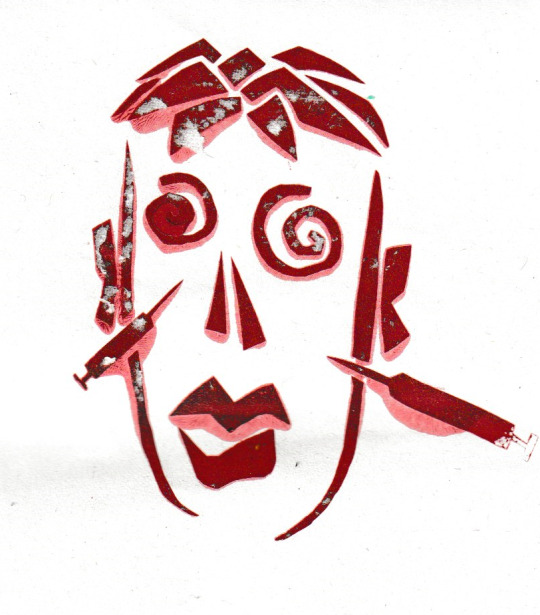
I also used this stencil to create a repetitive page covered in faces. I chose to use the colours red and brown as the red relates to the subject matter of surgery and biology due to it being the colour of blood, but also it works very harmoniously with brown. By repeating this stencil across the page I emphasise how many people are severely effected by depression and want a cure desperately to improve their quality of life.
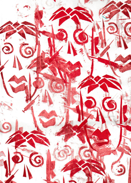
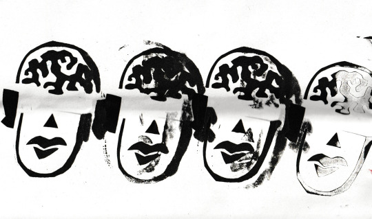
I then went on to make a stencil related to blindness. For this I took inspiration from Killer Acid and made the brain a very abstract shape. I also completely left out the eyes as blind people can’t see and I thought this was an effective yet simple way to demonstrate this. When actually printing these stencils I laid them all out in a row to show that blindness is a disability that affects many people and therefore a cure could be very important.
I made the brain exposed to show that the cure to blindness would be related to the brain as they are experimenting with implants in the brain to treat it. I also made the prints black to display the darkness which plagues people affected by blindness’ lives.
If I was to further develop onto this I would’ve possibly added something into the brain even if it was as simple as a colourful rectangle to portray the implant which could cure the blindness, or I could give eyes to one of the figures and make only the correlating brain contain the implant to display that it works. I really like the outcome of this piece overall and I think the layout really worked in my favour to emphasise the narrative I was communicating.
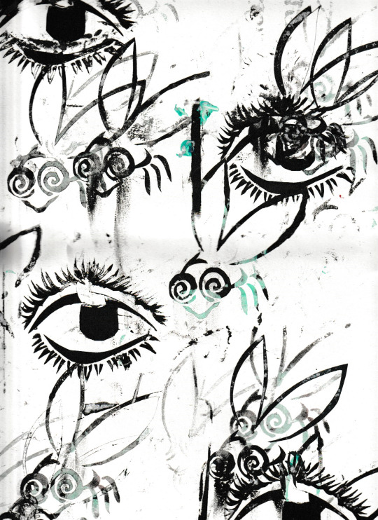
I created a page based on the CIA robot fly spies using two different stencils. The first stencil I created was of a fly. I used the very basic shapes of a fly so as to not overcomplicate it and make it unclear what the stencil is of. The eyes and wings of a fly are what really define them as a bug so I made the eyes 2 very large swirls and the wings decently noticeable so that people can easily distinguish that it is a fly.
When printing I decided to use a black and green colour scheme to fit with the theme of spying as they are colours commonly associated with spy media. I really like the way these colours look when blended together and I believe they had the effect I desired, as the switching of the colours part way through the print appear in a way which could visually represent a glitchy type of technology that would’ve been around in the 70′s when the robot fly was created.
For the second element of this piece I made a stencil of an eye to represent the spying half of the article. I printed the eye in just black so as to not overwhelm the entire piece with too much green. I messed up when I made the stencil as I made it on too small of a piece of paper to cover the whole silkscreen and therefore some of the ink got down the side of the screen which left lines on this composition which weren’t intended. I don’t really like the layout of this piece and I wish I put more thought into how I put it together as a whole, filling some of the empty spaces with eyes instead of overlapping them with the flies in multiple places.
This stencil design was informed by my article concerning robots showing human emotions. I thought the best way to display this would be to make a robot with multiple faces all displaying different emotions. I design this using basic shapes, squares of the head and round shapes for the hands body and feet. I made the choice to make the head square as it is an unnatural shape and therefore the stencil is clearly not a human or living thing as living things aren’t shaped like this.
When designing the faces I wanted to illustrate different feelings that we as humans feel. To do this I made one face happy, one face angry and one face sad. The happy and angry faces were successful, as the eyebrows on the angry face really show the rage of the robot, but the sad face was unsuccessful as I believe the tears look as though they are the eyes and the eyes look like the eyebrows. As a solution to this problem I could’ve made the tears their own stencil and printed them in blue to display that it is water. I could’ve also extended them past the face as though there are teardrops flooding from the robot.
I chose to make the robot black to get a clear print that is easily distinguishable, but in hindsight I should’ve used a grey colour to display metal and further imply that this is a robot and not a human or monster. I also could've used multiple shades of grey on one print to possibly display a shininess and show the texture of metal.
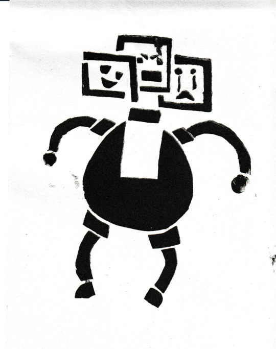
For my final print I made a mammoth which is half complete and half just skeleton. This is to link the mammoth to the scientific element of the news article I am using which is about reviving them. I made the stencil with the basic silhouette of a mammoth and I designed a skeleton for it which I thought looked as though it made sense even if it isn't necessarily anatomically correct.
When I placed the stencil on the page I wanted to place them in a similar way to how elephants walk in movies as I presume a wooly mammoth would do a similar thing. To achieve this I placed the prints in a row at the bottom of the page to possibly make it look as though they are following each other in a line. I really like this composition and I believe it looks how I walked it to.
The colour choice made for these prints is to represent the cold climate that mammoths typically used to live in. I wish this blue was maybe slightly less green and more pale to look more similar to ice as it isn't a very icy blue and instead a vibrant teal. Another thing I would change about these prints if I could is how I used colours and the configuration of the print. If I had design the print in a way which made the bones the white area of the print and the colour was in the background I could’ve printed in brown and made the mammoth the colour it is supposed to be, but overall I really enjoyed these processes and believe on the whole that the prints were a success.
0 notes
Text
04/11/19 - Week 6
This week was spent trying to improve upon previous models and working on new ones like the pipes, which I will talk more about later on. For this post, I will be showing my very rough new concept art, as the game has changed again and the group want the NPC characters to be robots that are in the simulation so they look like the different characters.
These are some of the older characters that I tried to turn into robots but honestly, I really don’t like how these turned out and I think the original concept art of the characters are much better. I’m hoping everyone will change their minds again and the characters will look more like their original concepts then the newly designed concepts, as I had way more time I put into the original concepts, whereas these I couldn’t put as much time into the as it was past halfway through with the time we had for the project, and we had more important things to do, like model more of the environment and model the enemies, so that we can at least have most of the assets in the first level made.
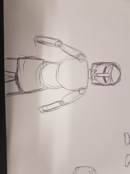
Here is a robotic version of a knight, I tried to redesign these to make them look more robotic, however knights are already pretty robotic looking, if they’re completely covered in armour and that is how we planned them to be. This would be a new possible concept of how the knights would look, but compared to the original, I’m not sure if I like this version as much.

Here I sketched a different kind of dinosaur, just as a rough sketch because I still don’t know if we’re having a range of dinosaurs in the game or just the T-Rex. I hope that maybe we could add in more, but I have doubts as the time constraints don’t allow for overcomplicating the game, which we had already done with the original concepts, hence why it has changed so dramatically in a short space of time.
I also concepted a new mummy enemy design, I made it look more robotic, by trying to make it up using simple shapes, I even used some of the pieces from the mood boards that we made for the industrial and futuristic levels, that were originally part of the game.
I like how the concept turned out, I made it pretty rough-looking, trying to add in details that would make the robot look old like a mummy would, so I added pieces that were broken on the robot, so the internal mechanisms inside the robot were on show through gaps in the bandages that covered the rest of the body. I surprisingly, prefer this version of the mummy over the original version that I made, as it just works better with the aesthetic that we are planning for in the game.

Here’s an attempt at making the caveman design into a robot, I’m not a big fan of this version compared to the original, however I feel it is much better than the other robot versions of the caveman that I worked on, despite this design being the complete opposite of what my original caveman design was and yet the next two designs are similar in that they’re big and bulky, opposed to being small and skinny.
We also have another knight design, that I concepted and which I much prefer compared to the other robotic knight design and maybe even more so than the original concept.

A couple of bulkier caveman designs, that have been transformed into a robots and for these, I really tried to make both the original concept and the robotic idea merge together, but it really didn’t work all that effectively so I’m not a big fan of these designs and I hope that if we are sticking with wanting robotic characters, that I will have time to do another redesign where I can hopefully improve upon the concepts so that they combine a lot more effectively than this.

0 notes