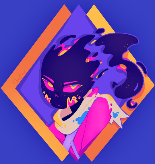
#well its like... a traditional sketch colored digitally
Text
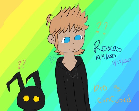
Forgoooooot to post these, so I'll do it now
First is my blog pic digitalized (10/4 is the sketch date, 11/18 is the digital date)
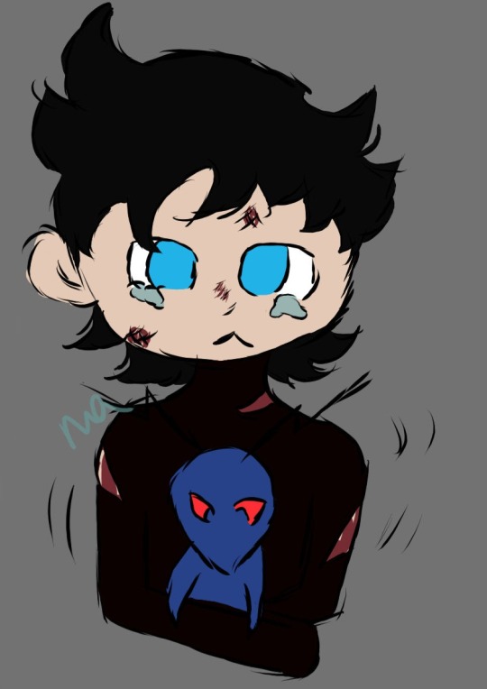
Second two pictures are all Vanitas and Mocha from @letoasai 's series Secrets, specially Secrets Kept
I just really love them, and this series is one I've read at least twice now (in the last month don't @ me)
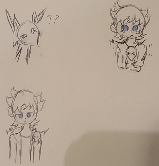
Miiiiight digitalize the other two, but I'll just add them to a reblog of this lol
Mocha protecc, Mocha atack, but most importantly he got Vani's back
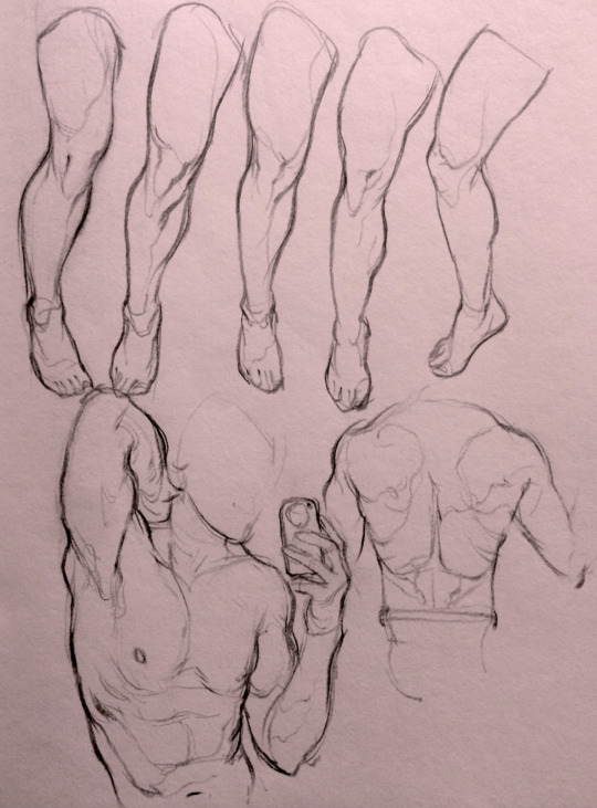
#kingdom hearts#kh roxas#my art#digital art#kh vanitas#Secrets by Letoasai#shadow kh#Mocha the flood#kh flood#minor gore#like Vanitas was beaten to hell so thats where the blood came from#hc that cures dont remove the blood that was already lost and is on skin#the digital is from a scene in chapter 1 so i dont think its a spoiler??#also i used final mix coloring for Mocha because thats most well known im pretty sure#Mocha in the corner be like *tilts head*#colors so dark you cant tell the difference between the body suit and the lineart#eventually ill sketch more lol#mason art#traditional art
12 notes
·
View notes
Text
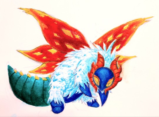
i got some watercolor brush markers for christmas !! did some other coloring to get used to it then pumped this out. anyways now all i can think about is drawing slither wing
[reblogs appreciated !!]
#honestly this looks a LOT better than anything i colored with my copic markers like holy shit?#i might actually start doing traditional art fr again.... ive been doing nothing but doodles for a while now LOLE#hopefully ill be able to draw more often!! i really want to but i just. Havent. for the past year and a half. what happened man...#i used to crank out so many drawings and drawpiles like in one week alone. 15 year old me was different#but ANYWAYS i got my first ever screen tablet (its a kamvas 13 and its really nice. im loving the hotkey buttons)#so im excited to do more digital stuff as well!!#also. new sketchbook. it works with my mechanical pencils much better than my last few holy shit#like if i was struggling on a sketch in my old ones i could only erase so much otherwise itd start rubbing the surface of the paper off 💀#this one does not do that at all! and it doesn't bleed easy either#hm. maybe i could draw some scrimblos in here ......#pokemon#slither wing#my art#pkmn art
56 notes
·
View notes
Note
hi, i ireally love your work and i don't know if you've answered this before but, what kinds of studies do you do or how did you learn color theory? i wanna get better at rendering and anatomy but im having trouble TT TT
Hi! Long answer alert. Once a chatterbox, always a chatterbox.
When I started actively learning how to draw about 10 1/2 years ago, I exclusively did graphite studies in sketchbooks. Here's a few examples—I mostly stuck to doing line drawings to drill basic shapes/contours and proportions into my brain. The more rendered sketches helped me practice edge control & basic values, and they were REALLY good for learning the actual 3D structure behind what I was drawing.


I'd use reference images that I grabbed from fitness forums, Instagram, Tumblr, Pinterest, and some NSFW places, but you could find adequate ref material from figure drawing sites like Line of Action. LoA has refs for people (you can filter by clothed/unclothed, age, & gender), animals, expressions, hands/feet, and a few other useful things as well. Love them.
Learning how to render digitally was a similar story; it helped a lot that I had a pretty strong foundation for value/anatomy going in. I basically didn't touch color at all for ~2 years (except for a few attempts at bad digital or acrylic paint studies), which may not have been the best idea. I learned color from a lot of trial and error, honestly, and I'm pretty sure this process involved a lot of imitation—there were a number of digital/traditional painters whose styles I really wanted to emulate (notably their edge control, color choices, value distributions, and shape design), so I kiiind of did a mixture of that + my own experimentation.
For example, I really found Benjamin Björklund's style appealing, especially his softened/lost edges & vibrant pops of saturated color, so here's a study I did from some photograph that I'm *pretty* sure was painted with him in mind.
Learning how to detail was definitely a slow process, and like all the aforementioned things (anatomy/color/edge control/values/etc.) I'm still figuring it out. Focusing on edge control first (that is, deciding on where to place hard/soft edges for emphasizing/de-emphasizing certain areas of the image) is super useful, because you can honestly fool a viewer into thinking there's more detail in a piece than there actually is if you're very economical about where you place your hard edges.
The most important part, to me, is probably just doing this stuff over and over again. You're likely not going to see improvement in a few weeks or even a few months, so don't fret about not getting the exact results you want and just keep studying + making art. I like to think about learning art as a process where you *need* to fail and make crappy art/studies—there's literally no way around it—so you might as well fail right now. See, by making bad art you're actually moving forward—isn't that a fun prospect!!
It's useful to have a folder with art you admire, especially if you can dissect the pieces and understand why you like them so much. You can study those aspects (like, you can redraw or repaint that person's work) and break down whether this is art that you just like to look at, or if it's the kind of art that you want to *make.* There's a LOT of art out there that I love looking at, probably tens of thousands of styles/mediums, but there's a very narrow range that I want to make myself.
I've mentioned it in some ask reply in the past, but I really do think looking at other artist's work is such a cheat code for improving your own skills—the other artist does the work to filter reality/ideas for you, and this sort of allows you to contact the subject matter more directly. I can think of so many examples where an artist I admired exaggerated, like, the way sunlight rested on a face and created that orange fringe around its edge, or the greys/dull blues in a wheat field, or the bright indigo in a cast shadow, or the red along the outside of a person's eye, and it just clicked for me that this was a very available & observable aspect of reality, which had up until that point gone completely unnoticed! If you're really perceptive about the art you look at, it's shocking how much it can teach you about how to see the world (in this particular case I mean this literally, in that the art I looked at fully changed the way I visually processed the world, but of course it has had a strong effect on my worldviews/relationships/beliefs).
Thanks so much for sending in a question (& for reading, if you got this far)! I read every single ask I receive, including the kind words & compliments, which I genuinely always appreciate. Best of luck with learning, my friend :)
3K notes
·
View notes
Text
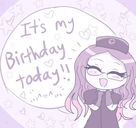
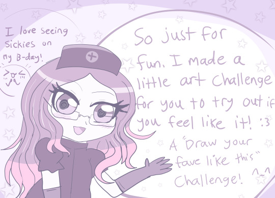
Hello everyone!! Today I grow a year older :3 (and I hate it lmao) FEEL FREE TO REPLY BIRTHDAY WISHES IF YOU WANT :3
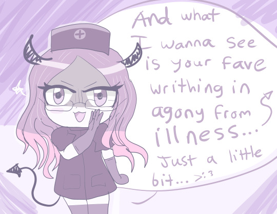
So, over the time I've come back here, I've become pretty confident and proud of my once hidden passion about sick characters, sickfics and sick comfort/whump... 🌡️
And you all have been so supportive and sweet despite my weirdness so I thank you for that. You helped me feel more confident in my otherwise weird fixation <3 So, for my birthday I thought I'd try and make up a little drawing challenge for anyone who wants to give it a try... There are soo many talented artists on this site (and in this fandom)
So... It's your turn to target your faves now. You will see how fun it is and hopefully understand why I love doing it so much. 😈🌡️
(plus it's my birthday and I require some sustenance LMAO JKJK)
But yeah anyone can join in. This is just for fun though! You don't have to if you don't want to! I think its okay to ask for some food on my birthday though...right?? X'D So if you wanna do sth for my birthday...then... 👉👈 💦
CHALLENGE BELOW~
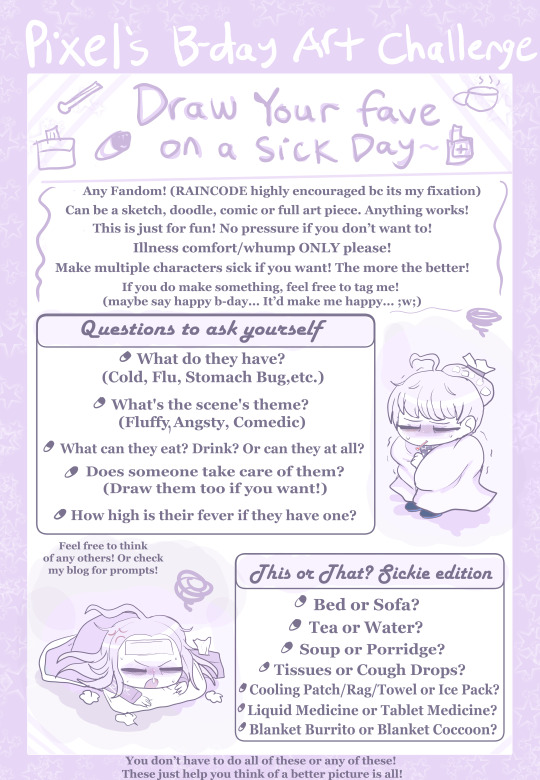
DRAW YOUR FAVE ON A SICK DAY CHALLENGE🌡️😷🥵🤧
~~~~
(Mmmmkay, I am lying to myself when I say this isn't mostly aimed at the RainCode community... X'D Can't help myself. But anyone can join regardless of the fandom!!)
So here's the challenge and the rules!! (featuring my two main lil targets ofc :3)
Regardless of who it is, put your fave through some sickness hell >:3c I'd love to see it! Make em' as miserable as you want!
destroy them 😈 jkjk XD
If you're in the RainCode community you can target anyone, but as you know, my main targets are Yuma and Makoto. If they're also your faves and who you decide to use, that will make me extra happy!
Some tips for anyone new to drawing a sick day scenario art. A few things that make it look convincing are the following:
Pajamas or Loungewear
Messy Bed Hair
Fever flushed face w sweat or at least a red nose
Tired Eye bags
Shivery body
Ice Pack or a Compress on the head
Thermometer sticking from their mouth
LOTS OF BLANKETS
Tissues or medicine surrounding them
Tea or Soup (or both)
Those are just to name some from the top of my head. If you'd like some pointers on how to make a character look ill, check out my Fever Coloring Guide. This is for digital artists but traditional artists can try it too!
You can add injury or angst to the scene but I'd like illness to be the main focus of it.
The scene can be anything you want to, it can be fluffy and wholesome (with a caretaker) it can be angsty, or it can be silly. Its all up to you! Do it for the sake of fluff! Caretaking scenes are the best for any kind of relationship >w<
Either way, have fun with it!! I look forward to see what people make if they decide to give it a try! It doesn't even have to be a full on picture! Doodles and sketches are fine too! Just show me something >w<
(feel free to tag me and say happy b-day and mention my challenge, I am proud to be known for this and would love for many to participate :3) I wanna see you take a go at it :3 Show me your style! :D
~

~~~
(wow look at me misspelling the word writing on text when I did it fine with my own hands lol)
Now, I know not everyone can draw...
Well never fear! I accept writing as well! ✍️✍️✍️
(hi vivia lol sorry for giving you a cold, at least you have an excuse to read and do nothing now haha x3)
Sickfics are one of the biggest things I live for! Any little drabbles or full fics with more than one chapter are welcome! Again target who you want any fandom you want, but I'll def be super happy if you make a RainCode fic. And even happier if you target my faves as well, but again, anything will do! Just make a cute story about your fave being miserable and being tended to! Trust me, it's super fun!
You can add injury or angst to the scene but I'd like illness to be the main focus of it.
Feel free to post your writing here and tag me or mention my AO3!
If you need a start to your fic, look on my blog for illness prompts! Maybe it can help give you a good start or give some inspiration! (thats why I share 'em :3)
I look forward to anything you try to write!
~

That's about all!! I hope you decide to participate! ✨
Good luck, have fun, and godspeed you future whumpers! 😈
(nah jk XD)
AGAIN THIS IS FOR FUN! NO PRRSSURE IF YOU DON'T WANT TO!
#pixeldoodles#my art#art challenge#pixelsona#illness whump#sick whump#whump community#rain code#whumpcode#artists on tumblr#digital artist#fever whump#cold whump#whumpblr#whump ideas#whump scenario#sick art#sickfic#sick day challenge#yuma kokohead#makoto kagutsuchi#vivia twilight#shinigami rain code#IM A LITTLE NERVOUS ABOUT TRYING THIS#but idk it sounded like a fun idea... >w<;#plus it was fun to design the challenge pages#pretty much used the color replacement tool on photoshop to make it all purple LMOA#but yeah if you wanna give it a try I would love to see what you come up with!!#especially from the raincode community... XD#be sure to show me!! >w<
50 notes
·
View notes
Text
150+ Followers DTIYS Contest!
Hello! This is going to be a quick OOC post!
This took a smidge longer then I'd have liked but...This blog has gained more then 100 followers, in fact its gained 163 very quickly! (Been planning this since it hit 100 I just am only finally posting this now, oops? >_<)
And that is...honestly a bit boggling, I made this little blog just for the fun of it and to join in on tumblr Slendlr shenanigans, I never expected so many people to actually follow it and like Pink so much! So a quick thank you to all of you, I appreciate you all! ^-^
@dustsansm1 had been the one to suggest a DTIYS so that's what I'm doing!
The contest will be held from now until....let's say April 12th 2024! That's almost three weeks to submit! And there will be a prize for 1st, 2nd and 3rd place!
1st place will receive a full color, shaded half body drawing of a character of their choosing! (as long as its SFW)
2nd place will receive a full color, non shaded half body OR a shaded bust drawing of a character of their choosing.
And 3rd place will receive a colored non shaded icon of a character of their choosing!
RULES:
-NO NSFW
-You can change the pose if you wish
-Keep the outfit the same please
-You must be the one who made the drawing to submit
-can not be AI generated art
-It doesn't have to be colored, can be just a sketch if you want
-can be traditional or digital!
-Must be tagged #pinkslendydtiys (You can also @ this blog as well if you'd like!)
-Must be done before April 12th 2024!
-Have fun!

And a ref below for Pink's color palette.
23 notes
·
View notes
Text
IT'S THAT TIME AGAIN!


...Where I start trying to get comms going!
Hello! I'm currently working towards going on a trip to Japan with my buddies and I thought I'd offer comms again (and yes its the same advertising images as last time because I've been working on full body refs and not headshots lately. :')).
Pricing is going to be 30 USD for a headshot sketch and 40 USD if you want a flowercrown symbolism traditional sketch (I can choose the flowers or you can! I have an extensive list). Adding on 20 USD for either if you want digital colors.
I AM open to full or half body drawings! Please DM to discuss price on those. Backgrounds will be the basic ones here and are free with a colored image of any kind! I generally pick that out based on "the vibes" but you're welcome to tell me an idea of what you'd like there.
I can be contacted either on this blog or via discord (darth_shimo_the_smol)
My only rules are no mecha and anthros. Vague animals features are fine though! All characters MUST have visual references. I will not draw based on descriptions, though I may ask for personality or story information as well just to get a feel for things! (And because I adore hearing about people's characters!) :)
Feel free to reblog this if not comming as well, or make a donation through my ko-fi page as well on the sideline!
Thank you! And may you have a great day!
12 notes
·
View notes
Note
i love ur art sm!! ur such an inspiration 💌💌how do you choose your palettes? the colors you use have always catched my eye
thank you so much!!!
For the colours, I don't know what to suggest if you do traditional art as I'm not very skilled in that but if you're a fellow digital artist I can try!!
pretty long post coming up, btw I do need to preface I'm just a student and not a professional, so take this all with a grain of salt especially if i get technical at all
TL;DR (too long didnt read): i use a green and or orange multiply layer, i try to give everything a dark green-orange undertone, focus on how certain colours look when next to each other and how they can appear completely different
also also its late and im tired so i apologise for any mistakes
i usually start by doing colours that generally match the character im drawing, then i just kinda go wild with altering them, ive learnt to pick them on my own through practice but a lot of the time and starting out i simply mess around with "blending modes". It'd be difficult to explain all of them and they may differ from software to software but my favourite one is "Multiply" (which should be on most softwares, hopefully!)
now, what you do with these depends on what sort of vibe youre going for, I like warm colours, I don't really know how to describe my art, but I like it to be saturated yet dark.. if that makes any sense lmao
gonna use this random doodle of emma to explain what i mean. on my phone rn so its not,, very good but itll do haha

so, i started by getting roughly similar colours to what she has. colourpicking from official art is always an option too, if youre drawing an oc then just figure out the general "local colour" (flat colours unaffected by lighting) you want the character to have and put them down, my art switches from being desaturated and saturated a lot depending on the vibe im goung for, for the more saturated art I'm gonna add a clipping layer of this solid bright yellowy green olivey colour in this example (the colour you use changes the atmosphere of it a lot, i usually use green or orange because i really like the look it gives, i love dark and warm tones)

clipping is a feature a lot of art softwares should have, for this im using ibis paint x, i usually use clip studio paint, others will have it and blending modes too, it lets you create a new layer and "clip" it to the one below, anything you draw on the clipped layer will only show up on space that has been drawn on the layer below (but you can hide/delete anything on this layer and it won't effect the original layer!)
next im gonna use the multiply feature,
"keeps only the darker colors of the blend layer and makes light colors less opaque. The resulting color is always darker, except for where it's pure white" (taken from a website called sketch) dunno how much the specifics of its affects change between different softwares, but the way I view it is always "makes base colours darker, and adds a tint of whatever colour you selected"

the result from doing that is this! this gives a sorta green tone, you can play with the opacity to change the intensity. this is a really simple trick to get cool looking colours, and the more I've used it and paid attention to what specific colours i get from doing it. for these saturated pieces ive noticed that depending on how much I tinted the piece any colours that would for example be white (like the hair frederick has in this drawing) is actually straight up yellow/orange


i have some art thats a little less saturated/a bit darker than this though, but its a pretty similar process! you can see the white of their shirts are actually again a dark desaturated yellow/orange, now you may notice it looks a little green at first, that is another thing to keep in mind


colours can trick your eyes a lot! and you can use this to your advantage very well, I'm not well versed enough in colour theory to explain the exact specifics on how this happens, but basically depending on the colours surrounding it, certain colours can appear completely different
another example is normans waistcoat in this drawing, you probably see that and think "thats blue" but nope, somehow, its actually a very very desaturated yellow! grey can appear as blue a lot ive noticed

if we isolated that grey/yellow colour you can see it is in fact grey, but it looks blue in the whole drawing!
whilst obviously theres nothing wrong with making a drawing of a character where things like blue actually are blue or a white/grey is actually white/grey, in the style of art I do i personally enjoy limiting the amount of colours used and using certain tricks to make it look like theres more variation in hues than there actually is, i like how cohesive it makes the artwork look :)
heres another example of what multiply can do with a few different colours, its best to learn to colour without it, i see multiply (and other blending modes! theres a lot of them) like training wheels, its not cheating to use them, its just a little boost to help you start out, and you can go a lot further in developing your understanding of colour if you try and learn to colour without it :D

#thank you for asking!#ive wanted to write smth like this for a while#art#art tips#color theory#kinda#tbh im bs'ing a lot of this#digital art
7 notes
·
View notes
Note
do u have any tips for character poses... 🥺i rlly like the poses u draw in ur art, do u just come up with them or do u use references? because i want to draw better poses but it always feels boring when i use a reference 😭😭 🙏
I'M SOSORRY I DIDN'T ANSWER YOUR ASK EARLIER but i do mostly come up with poses in my imagination or use the 7,000 screenshots i've saved for references so either way you would need some references at one point or another,,, though i do have something that really helped me make my (somewhat more dynamic??) poses look better!!
That being "Make a small silhouette of the pose" which is what i used to draw the pose in my Roseate Desire E.G.O. Adam sketch! its really helpful
Basically you open a canvas size that you usually use and zoom in (not too much!!) into one of the corners and use the Pen Fade brush ( if you use ibis paint) with a gray color to start making the silhouette. This helps me because I can see the proportions and how the pose looks like right now before I make the sketch, and because when I flip the canvas and see some flaws in the silhouette, its easier to fix!! Although if it's hard for you to sketch certain body parts because they overlap in the silhouette, you can use different shades to make the certain parts of the silhouette stand out, thus making it easier to sketch them later on :3

A bit of a visual representation with Adam. Though I do have to say - Don't draw hair or the clothes of the character in the silhouette!! It will only make it more confusing, so just draw the body itself, because (in my opinion) it will be better if you sketch the hair and the clothes on top of the body, thus having some guide with where everything lays on ("Where is the coat gonna be on the torso", "Where will the hair start" and etc etc). Plus whenever I draw the silhouette, the sketch looks much more clean than just sketching from the start
Also this is just a general tip but FLIP THAT CANVAS it could help you identify flaws in the silhouette or the sketch so you could fix them before doing your lineart. And also do note that this tip works best for digital art, as I don't think that this will work well for traditional,,,
#this is what i do when i draw my poses to help myself make it easier and better :D#i dont think i have anything else that i could give as advice but this is how i do it usually !! hope this helps :3#yomoasks#projmoon#txt#also hope that this is explained well enough as i am sleepy and. still not over the things that happened today
9 notes
·
View notes
Note
hello! if its not too much, do you have any tutorials on how to do lighting coming from an electronic like a phone or laptop?
Hi there! Great question!
To recreate lighting coming from an electronic device like a phone or laptop in a 2D artwork, treat it like a baby sun / light source. This means it will add to whatever other lights you have in the scene.
Here is a general workflow to try :)
Study reference: Look at reference images of electronic devices to get a sense of how the light they emit behaves.
images from unsplash


When there is a lot of other light, the rim glow that the computer screen adds is a lot more subtle.
The computer screens give a nice big glow in lower light settings.
Highly suggest taking your own pics w a friend/selfie camera of what you are envisioning, as I feel this reference would be easy to make and can match what you are going for.
Now for the actual rendering process. This workflow kind of involves some knowledge of form/lighting, so definitely read up on that before.
Create a base: Draw the device and any surrounding objects using base colors. (Works for traditional paint/digital, but for colored pencil probably work dark to light, which can take a bit more planning...)
Define the light source(s): Sketch in the light source(s), making sure it appears to come from the device. The tricky part is to take in account the global lighting, so other light sources you want might make the screen glow more subtle or more pronounced. I like to paint shadows before light, so at this stage just kind of mark out what you want to do later.
Add shadows: Use shading to indicate shadows cast by objects in the scene, taking into account the light sources you've defined. I use multiply layers. I also try to think about each light source separately in my head and paint in layers to make the process a bit less complicated.
Add highlights: Use lighter tones to indicate areas that are lit by the light source, creating contrast with the shadows. Computer screens usually add a soft glow to planes that are close to the computer, and also a rim light. I'd zoom in on the reference more. If working digitally, try using overlay or soft light layers and build up the effect. If traditional, try glazing/using less opaque mediums/slowly adding in your values.
Remember, the device screen is like a rectangular lamp, and since the brightness can be adjusted, I feel like you can make it believable with a variety of different value choices.
Gaussian blur can help you with the glow effect as well.
Adjust as necessary: Make any final adjustments to the lighting, such as increasing or decreasing the brightness of the highlights or shadows, until you're satisfied with the result. Reference is key to this I think. You can make your own references pretty easily, if you have a camera and a friend!
Hope this helps!
<3,
Ali
Thank you for reading and all the support!
If you are interested in helping fund the website/keeping this going, I have a pattern at https://www.patreon.com/astrikos and http://buymeacoffee.com/aky.
58 notes
·
View notes
Text
The Specifics
schedule:
Signups Close: December 28th
Assignments Given: January 1st & 2nd
Check in: January 20th
Deadline to submit your gift: January 30th
Posting: January 31st
signups will be closing on December 28th, and you should also get a confirmation dm that day (if not a few days before!) to make sure you are still interested and able to participate
there will be a check-in on January 20th to make sure everyone is still working on their gift, and to see if anyone needs to drop out for any reason
Where do I submit my art when its finished?
you should submit your art here, to this tumblr blog (@kirbyoc-secretsanta!)
how and when will my art be posted?
you should submit your finished work to the blog, and posts will be queued for January 31st, each submission being posted 5 minutes apart!
Rules:
Your gift must follow your recipient's wishlist, and respect their blacklist
no drawing NSFW/suggestive content, nor can you request it
your gift should be finished! this means clean lineart and coloring, and can also include rendering and shading as well.
don't post about who you're you have or what you're drawing!! remember, this is a secret Santa!
if you feel as though you may need to drop out for whatever reason, please contact the blog as soon as possible!!
have fun! ;)
OC references:
references can be any clear, colored image(s) of your oc! obviously, a finished, clean reference sheet is preferred, but colored sketches will also do just fine!
you MUST provide a reference!! if you are unable to provide a visual reference, you may not join. written descriptions/references do not count.
How will Secret Santa info be shared?
once you fill out the signup sheet, a Profile will be created with your tumblr username, a link to your tumblr, a link to the oc references provided, your wishlist, your blacklist (the "I do not want to receive" part of the form), and any additional information you wanted your secret santa to know. that doc will be shared with your partner, so they know what to draw!
information will be shared through tumblr dms!
additional stuff:
you may make as many pieces of art for your Santa as you'd like! though the minimum is one finished artwork!
artworks can be digital or traditional
if you draw traditionally, make sure your artwork is photographed in good lighting and the photo isn't blurry!
artists of similar art skills will be paired together
this is a KIRBY OC event, so please don't submit ocs from other fandoms!
have a question that isn't answered here? send your question to the askbox!
SIGNUPS
MASTERPOST
12 notes
·
View notes
Text
Junior Thesis


some stuff I worked on for my junior thesis project earlier this year. Ill share the full finished comic later on but for now enjoy these character designs and such 🫶
the watercolor version of the cover looked too much like bradley james when that was like, not the point of the assignment, which is why the finished digital version looks so much different. I still prefer the original watercolor version but i tend to always favour my watercolor versions of things
In depth explanation below cut
the junior thesis assignment was the adapt a book into a six page comic and we could have creative freedom with certain things and the book only ever mentioned the color of guenever's hair and eyes, NOT her skin color or features and so I had my fun with her design. the ONLY description they give lancelot in the entire book is that hes ugly and beauty is subjective so i gave him "non traditional" features. In one of my original sketches for him, he was going to have crooked teeth, but unfortunately i do not draw teeth well LMAO. I wanted Arthur and Lancelot's designs to contrast each other as well. Arthur is shorter and stockier where Lance is taller and thinner, Arthur keeps his feelings quiet while Lance wears them on his chest, and then i wanted there to be the stark color difference too between them.
Morgause and Mordred were fun, but they both had a lot more descriptive descriptions in the book, so I didn't get as much creative control outside of their outfits. I assigned the Lot family the color blue and the Camelot cotizens red to try and contrast better throughout the story and it was kinda fun cause it made mordred look like an ice prince or something.
also despite gwen lance and arthur being around the same age at the point of my comic, i wanted to try and make arthur look the oldest, sort of visually show how much being king and his decisions has weighed on him, especially since the scene I adapted was pretty heavy.
also i did have a reference page for gwen but at some point it got deleted? so in this its just a fun drawing I did of her holding excalibur instead. I do also have a full reference drawing for exacalibur in my files that was useless because i never ended up drawing it in the comic LMAO
the last photo is the cornwall sisters, Elaine, Morgan and Morgause. With their designs i had fun trying to make them look related to each other, to Arthur and their parents but also try to not make them all have the same face. Elaine looks like her mother, Morgan looks like her father, Morgause looks like a mix of both (Uthers hair color but Ygraine's hair style, Uther's face but Ygraine's eye color) and Arthur looks like a perfect blend of both too. I sort of did the same with Mordred where I took features from both morgause and arthur to make him look related but like his own person. Ygraine and Uther are only in one panel so there's no proper ref for either of them.
This project was a five month process, six if you count writing the script to fit within a six page comic without losing any details from the book and creating my pitch for my professor (all of which was done over winter break)
The project took FOREVER and I definitely am not happy with the final result but its due to the fact i had frequent doctor visits and hospitalisations and wasnt able to work on it as much as I had wanted, PLUS i had an eight page comic for another class i worked on also over the same five months (and i was more focused on that one as it was my own original characters)4
regardless though, i do still like it, just wish it cane out better in the end lmao
will prolly post the full comic in a day or two :3
#comic#thesis comic#thesis project#sva thesis#sva#svanyc#school of visual arts#junior thesis#the once and future king#oafk#the once and future king th white#merlin#arthur pendragon#morgause#morgan le fay#lancelot#guienevere#guenever#queen guinevere#guinevere#gwen pendragon#mordred pendragon#morgause of lot#king lot#arthurian legend
3 notes
·
View notes
Note
hi! i love the way you vary line weight and pen pressure! it's so expressive and conveys so much extra information, like it's stunning - and I'm so ???? that you achieve this digitally!
if you don't mind a question, are your finished drawings done on top of a more loose sketch that you then delete, where you plan out where to bring in that variance and how, or do you go in all deliberate and purposeful from the start? is your process entirely digital?
(I'm sorry pls ignore if this message annoys you. I'm learning to draw with some online courses rn and the most interesting thing that's happening with that is I'm starting to see different things than before and I got real excited about it)
woahh tysm!! i've actually never been asked about my art style/process before so bear with me here!!!
so i hate to admit, but i'm still very much new to digital art HAHA. i'm originally a traditional artist that still cant break much of the habits of when i used to draw in my sketchbooks. i just work (read: fight) the sketch until its the way i want it to be, so essentially, the sketch IS my lineart! and majority of the time its just multiple layers of different segments of the sketch that i just end up cleaning up and then merge later on. i sketch the silhouettes first and then i sort of fill in the blanks. i'm that kinda chaotic artist where i barely use guidelines at all,,,
also sometimes my process isn't entirely digital! there are days i'm having a hard time with a pose, and somehow, sketching it in my sketchbook makes the world of difference. i end up tracing those sketches over and rework them digitally. but these days its mostly just working straight from digital once i have a pose already in my head.
btw - i draw on my ipad using procreate and i use this colored pencil brushpack! changed the game for me as i prefer pencil brushes to simulate the traditional feel hehe. it even has palettes u can play around with! especially helpful to me as i'm not really that confident yet with coloring and color picking. also tinkering with the pen pressure settings helps + a really thick pencil grip (especially with my wrist pain- do your stretches!!!).
i wish you well on your art journey!! its so exciting to notice new things you've never seen until now! :3
#sorry to yap... hope this makes sense...#this is the first anyone has asked about my art in general LMAO#thanks sm for the ask!!#i hope this was helpful in a way?? LOL#keep em coming!! i'll answer as best as i can!! :3#bressyntax#bressymposium
4 notes
·
View notes
Text
I’m as busy as a spider spinning daydreams,
I’m as giddy as a baby on a swing.
I haven’t seen a crocus or a rosebud
Or a robin on the wing,
But I feel so gay—in a melancholy way—
That it might as well be spring…
It might as well be spring.
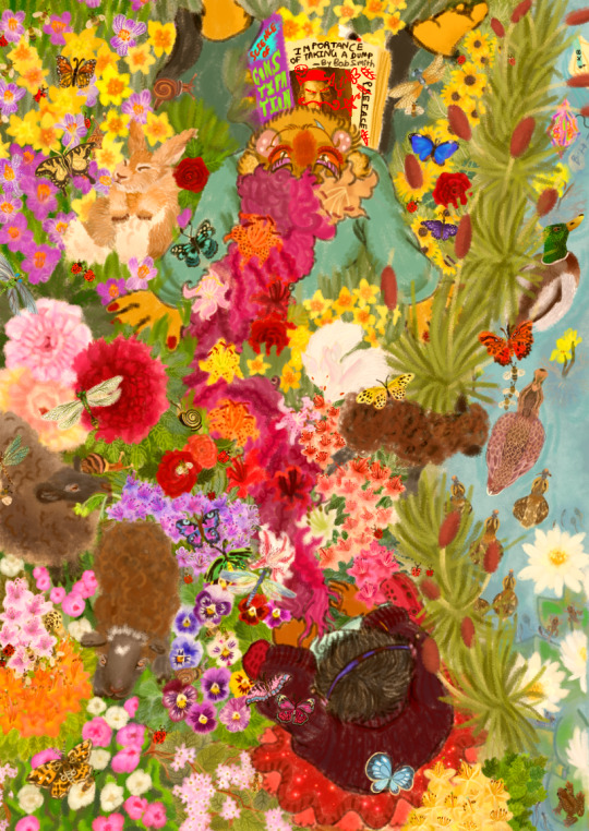
[ ID: Traditional art that has been colored and edited digitally, featuring Kamal Bora and Dr.Habit from Smile For Me the game.
In the artists interpretation Kamal as a kid is much shorter than Habit. He has short straight hair. He wears a oversized dark purple sweater. Then he has a frilly red skirt which sparkles. Ending with light blue socks and pink crocs. Blue-magneta headphones are worn.
Here Habit is a really tall kid. He has a muppet-like appearance with yellow-greenish fur, very long rose-pink curly hair, pink blushing cheek patches with three freckles, ears stuffed with cotton fluff , deep red nails. His eyes are orange, circled below by red ruffles and have some pale purple eyeshadow. He wears a teal buttoned shirt with wavy darker pants that have yet darker stripes on them. Basically it's Kamal’s outfit from the game. His feet are bare.
We are viewing them from above. Kamal is braiding lillies of various colors and shapes- multicolored, freckled, painted- into Habit's huge hair, now he's at the end of it. He sits with folded legs. Besides Habit's ear lies a Tooth Lily. Habit lays his head back, supported by hands on the ground, and looks at the viewer with a devilish smile-a glint in his eye, one blue snaggletooth showing. His feet are thrown about casually. Between them lies a half-open book titled 'Science Of Constipation' in loud colors and fonts. It shows a page titled 'Importance of taking a dump by Bob Smith' that has been absolutely vandalized by Habit. Bob Smith's photo now sports a hat, devil horns and a mustache. ' Preface' has been struck out and replaced with 'Peeface'. Skull, flowers, star, eyes, and a silly emote with its tongue out have been doodled with a red sketch which lies nearby.
Nature surrounds them. Most of it is springtime flowers that can be found in Boston, USA. Daffodils, crocuses, peonies, roses, azaleas, pansies, tulips, black-eyed susans, trailing arbutus. Among this lush greenery- snails, ladybugs can be seen underneath while dragonflies, butterflies, bees fly above. Some young black sheep graze. One looks ahead, with a white heart-marking on its head. Beside Habit's left leg is a large light orange-brown rabbit, curled up and sleeping. Somewhere among the flowers are two small white red-eyed rabbits nuzzling.
To the far right swaying bushes of cattail grow. Beside them is a clear stream running, host to a male and female mallard duck leading their ducklings, bladderworts, white waterlilies with their pads. Among these waterlilies, a brown frog and tadpoles in various stages of life can be spotted. One duckling catches a tadpole in its beak. To the very front are Habit and Kamal's paper boats engaged in a race-- Kamal appears to be winning. One is pink and crumply, heavily decorated, a submerged tag attached to it reads ' B.H'. The other is neat and streamlined with a little teal flagpole announcing it as 'KB'.
The first version of the drawing is overlaid with a very warm orange filter, the second is unedited. End ID]
Talk below the cut!
PLEASE LOOK AT THIS I WORKED ON IT FOR MONTHS NO JOKE THIS IS MY CHILD WHOM I WAS PREGNANT WITH AND NOW I HAVE PAINSTAKINGLY BIRTHED AND CLEANED HIM FOR ALL OF TUMBLR TO SEE
[ Plain text: Please look at this I worked on it for months no joke this is my child whom I was pregnant with and now I have painstakingly birthed and cleaned him for all of tumblr to see]
🥸[ Glasses-and-moustache silly disguise emoji ]
aNYWAY this is part of a series of drawings where Habit and Kamal are just playing as kids really LOL
I listened to Vashti Bunyan's 'Just Another Diamond Day' album a LOT while coloring and drawing this HAHA also some vintage springtime songs! They were so lovely!!!
This also taught me a lesson to plan out my drawings more I guess but also WITNESS THIS BEAUTIFUL CHAOS AND MAY YOUR HEART BE OPENED TO ALL THE JOYOUS POSSIBILITIES MY FRIEND
[ Plain text: Witness this beautiful chaos and may your heart be opened to all the joyous possibilities my friend]
----
A stranger would not have noticed the change, but Molly could see that the withered earth was brightening with a greenness as shy as smoke. Squat, snaggly trees that had never yet bloomed were putting forth flowers in the wary way an army sends out scouts; long-dry streams were beginning to rustle in their beds, and small creatures were calling to one another. Smells slipped by in ribbons: pale grass and black mud, honey and walnuts, mint and hay and rotting applewood; and even the afternoon sunlight had a tender, sneezy scent that Molly would have known anywhere. She rode beside Schmendrick, watching the gentle advent of the spring and thinking of how it had come to her, late but lasting.
"Unicorns have passed here," she whispered to the magician. "Is that the cause, or is it Haggard's fall and the Red Bull's going? What is it, what is happening?"
"Everything," he answered her, "everything, all at once. It is not one springtime, but fifty; and not one or two great terrors flown away, but a thousand small shadows lifted from the land.
Wait and see."
-- From The Last Unicorn by Peter Beagle
:-) [ smile emote ]
#my art#YQKAJSMMS#fanart#dr habit#kamal bora#roseverse#AU#s4m#smile for me game#How I toil for thee; Smile For Me!
24 notes
·
View notes
Note
Your original illustrations are really fantastic. I dig the colors and the anime girls.
I feel like I resonate with them well, so I am curious about what creatively influences you. Like... Why do you color as you do? Why are your illustrations of anime girls? What do you think of when illustrating? Are there artists, pieces of media, or events in your life that inspire your stylings?
Sorry if that seems like a lot or if I'm being intrusive! I just really want to know why your art is the way it is, but I feel that if I ask that so simply, I may not receive an answer with nuance, which is what I'm hoping for.
no worries about being intrusive, if anything, i appreciate the ask!
there's no clear-cut answer for a lot of these, but i'll try to articulate as much as much as possible. i started drawing from a very young age (~5 or so), and my preference was always cartoons/games/anime. i always enjoyed heavy stylization - not that i disliked realism, it just felt as if i had already seen so much of it before? and this isn't to discredit such works, just that they werent something i personally gravitated towards.
as i got older, i realized i wanted to pursue my goal of becoming an artist. things started to change when i entered college, though. it's a choice i dont regret, but i often felt a bit lost in comparison to my peers - because i didnt really draw [or study/learn] the way they did. i still struggle with insecurities regarding technical skill or talent because of this - and i actually stopped drawing for a year or so after i graduated. i kept thinking "its just another anime style anyways." (which is discrediting in and of itself, as all art has value regardless of how subjective it may be).
basically, i did a lot of soul searching - and the reasons i wanted to draw started to resurface. i loved drawing incredibly cute, yet somewhat outlandish looking characters. of course there's a sense of nostalgia with this, but i always preferred the art used for older anime (90s and early-mid 2000s specifically). i'm also really into hobbyani, which is basically hobby/kids media (precure, duel masters, beyblade, etc). i love the sense of experimentation that comes from designers who intentionally market stuff to a broader audience within restrictions, if that makes sense? it just seems to resonate with me.
i'm also heavily into old tech/computer graphics. a big example of this is the old (and still running!) chat program known as worldsplayer. i discovered it about a decade ago, and while a lot of people found it ominous or strange, it felt... comfortable to me. reminded me a lot of the stuff i used to play as a kid, but beyond that, a sense of style/texture i wanted to replicate in my artwork.
(as a sidenote: i actually run a sideblog dedicated to old chatroom media called digitalspacetraveler!)
as for specific inspirations/artists? i love the traditional sketchiness of van gogh, rembrandt, etc. a lot of classical painters during the renaissance era + beyond come to mind. for more modern artists, id say yoshitoshi abe, shigenobu matsumoto (duel masters mangaka), yoshihiko umakoshi (doremi, heartcatch precure, casshern sins), hajime ueda, and a plethora of artists on tumblr/pixiv/twitter.
basically, i love the idea of combining ridiculous amounts of texture with otherwise cutesy and/or 'smooth' styles, such as those found in anime/manga. the end goal is pretty different from the initial sketch, but that's what makes it fun to me. mimicking traditional mediums while also incorporating digital processing, overlays, and filters!
29 notes
·
View notes
Note
1 - 23 :3
cracks knuckles
okay
1. how would you describe your art style?
uhhhhhhhh, maybe "safe" is the word rn. whenever I think of my art style, what comes to mind is just how little I've been pushing things with it. I wanna change that ;D
2. what's your favorite thing about your style?
I realize I like to use semi-realistic proportions, its cool how comfortable I've gotten with drawing faces and bodies
3. what's your least favorite thing about your style?
It's so static man. same thing I said for the first question, I don't think anything really looks bad, but it just is lacking in creativity in comparison to the older art that should be looking worse than what I do now. I prefer my older stuff ;D (looking at you inktobertale2021.. where did it all go wrong)
4. favorite thing to draw?
regular ol people. human characters are def more in my comfort zone, which explains why I keep hitting skeletons with the humanization ray (also I prefer to draw feminine characters)
5. least favorite thing to draw?
I can't even say I rlly dislike it cuz of how rarely I even do it, but I am procrastinating so hard on learning backgrounds..
6. warm colors or cool colors?
cool colors are my fav, but i find it easier to work with warm ones (I used to put a cool overlay over all my warm toned drawings hgdhfg)
7. show us a WIP
behold, the wip ever. this drawing... was supposed to be posted on august 2022. and then, it was supposed to be posted on dec 21st, dream and nightmares birthday. (atp if I do end up wanting to finish this idea again, I'll probably just scrap it and start over)
8. what's the most fun and least fun parts about your process?
most fun is flat color and rendering. (though I rarely do the latter anymore) and for least fun, tbh a lot of the sketching part tends to be difficult for me, sometimes its cool tho
9. show us a finished piece alongside the original sketch
example from when sketching was fun

10. how many different sketches do you usually have until your piece is finished?
I think I do need to make more of at least thumbnail sketches tbh.. I usually just make one and keep editing it, trusting the process. (and that fails like 70% of the time. woww wonder why sketching isnt fun for me-)
11. show us the last thing you drew, be it a finished piece or a small doodle
can this count,,
12. show us an old drawing
first deltarune drawing. here's the redraw I later made of this :3 (also old hsgdhgf)

13. how long do you usually take one a piece?
depends. I'll have like 276478923 wips started, and then I get a random idea that I just have to do right at that moment, and I'll get it done in like 1-4 hours. meanwhile old sketches start to rot and maybe if its lucky I'll revisit it before my motivation dies and my style is too different to wanna continue from where I left off
14. digital or traditional?
digital all the way, i've gotten too dependent on the transform tool + liquefy ;D (and many other things tbh but I'd be here all day if I tried comparing them more jhdjdf)
15. if digital, what program do you use?
procreate, the layouts on other drawing programs scare me
16. favorite media to work with when drawing traditionally
pen on paper (am I understanding this right wdym media-)
17. what do you love getting compliments about?
I like when people enjoy the humanizations I come up with, and also original designs in general
18. are you satisfied with the attention your art usually gets?
hmmm yeah
19. how often do you draw?
very often, I just don't have finished things to share most days
20. a piece from this year that you're really proud of
:3
21. something you would like to improve on
the dynamicness (well, the lack of it) of everything, as said before
22. what inspires you?
Ink sans and a ton of creators in this fandom (also animated shows and movies, I love animation)
23. what's something you hope people notice when looking at your art?
idk tbh, just notice it at all and I'm happy :>
#shy rambles#ask game#long post#twinribbonz#yaayyyyyyyyyyyyyyyyyyyyyyyyyyyyyyyyyyyyyyyyyy#another sign to look for more references#my problem may be going from imagination too often
8 notes
·
View notes
Note
Hey, I’m someone newer to digital painting. I’ve drawn for years, and I started looking around here for artists who paint really well. I want to ask about your process. I think your semi-realism stuff is really cool and well done! I love the way you block out color and make scenes that look so real and charming. What’s your process for painting like that?
i'm glad you like my work!!
its honestly not far too different from traditional. i usually tone the canvas, do a line sketch, color and block in the shadows under the lines, and then paint ontop of everything. something that helped me get a hang of and learn to paint digitally was finding brushes that feel natural and unobtrusive. i don't spend much time actually blending the colors bc the brush has a good amount of drop off without me having to go back over a color (the brush is DG_main by dave greco if you wanna give it a try!)
hope that helps!! and gl!
#i can make a little post with my main brushes and where to get them actually if ppl want#but i think everyone has diff preferences for this kinda stuff so#just a matter of finding ones that feel comfortable
28 notes
·
View notes
Last Seen Blogs

severepalacelampalien-blog
Untitled

bulgaal
Little Things

sugarsickzzz
phantom

peachesnpinky
pinky
mxnicdriver
Barry Harris