#why do people not use embedded alt text
Text
sorry for not knowing how tumblr works ive never used it before and im just guessing as i go
#like how tf do you put images next to each other#why do people not use embedded alt text#tumblr is so confusing#milk 💌 ;🕥
1 note
·
View note
Note
hey, out of curiosity, why do you add image IDs under the image instead of in the embedded image ALT?
Fair question! I made a poll a lil' while ago while I was planning out how I was gonna work alt text onto the blog about whether the embedded image alt or the under-image text alt strategy was better, and the feedback I got was that, while the difference was pretty slim, a majority of people prefer image IDs being under the image. (This is, apparently, largely because embedded-in-image alt text has a nasty habit of throwing your formatting all out of wack if you use tumblr mobile.)
13 notes
·
View notes
Note
hi ! sorry if this is dumb im kinda new to tumblr but what is the ID thingy u do under ur posts? i’ve never seen it before
No worries! It's an image description, basically describing what my drawing looks like lol. It's also in the 'alt text' which is embedded in the actual image. It's so people who are vision impaired and use screen readers can get a load of my art :D screen readers really only need the alt text, but I put the ID under a cut (or right in the post if it's short) because I know some people still like to read it to help them understand the joke or have details they missed pointed out. Plus it's easier for me to draft the ID in the body of the post bc the alt text box is so teeny, so since it's already there why not leave it haha
You can read the ID by clicking the 'keep reading' at the bottom of the post!
15 notes
·
View notes
Text
So You Want to... Try StableDiffusion?
Okay. So three big pieces of advice to start with:
Forget about LAION's default datasets. They're absolute fucking dogshit and only getting worse.
Imagine an automated web-scraping system that copies images off the web, pairs them with their alt-texts and/or adjacent text, then chucks them into the mathemagical fairy dust grinder with no human inspection, much less interference. This means a lot of junk data the generator draws from, and junk images you'll get from that.
Don't even try copying prompts from the web. Actual monkeys would do them better than the throngs of idiots who get one good picture out of a hundred by sheer dumb luck.
Half the words in positive prompts and 3/4 of the words in negative prompts don't mean shit to the generators. Why? See the previous point. Even if someone curates the input data for dataset building, they most probably won't spam it with bullshit like "trending on artstation", and the frequency of terms like "beautiful" and "masterpiece" will be absurdly low. That and, most datasets are built on images that weren't made by AI and don't contain the typical AI fuckups people try to pray out of in negative prompts. No matter how much you want to avoid fucked up hands and faces, if the dataset is shit, you'll get them whether you include that in the negative prompt or not.
RUN. YOUR. OWN. Local setups like Automatic1111, NMKD's Stable Diffusion GUI and ComfyUI are free and customizable - even if they can't handle extra bits like LORAs, embeddings and plugins, they can and will run any checkpoint dataset you can get off HuggingFace or CivitAI. Meanwhile, you have websites demanding $10 a month for a selection of fifteen datasets, if that, without any extra bits, or, even worse, $30 for something even more nonsensical and still achievable with a local setup (and maybe some extra third-party software). A local setup requires particular hardware, namely a Nvidia graphics card, but any Nvidia graphics card made in the last five years will do.
With that behind us, some basic technical pointers:
Samplers and schedulers matter. They turn the mathemagical fairy dust into images in different ways, and some of them work better than others.

In the picture above, you can see how some of them absolutely go off the fucking rails while a lot more do the job at as few as ten passes. The names at the top row, however, are scheduler-sampler pairs, as they're usually offered. Compare how the LMS sampler running on a Karras scheduler (center-right of the image) gives better results at as low as 10 passes while LMS sampler on a Normal scheduler (third from left) wipes out.
Don't overcook your image. Each dataset has an optimal number of passes - go too low and it'll go off the rails, go too high and it will ruin the details. And potentially go off the rails.
If you used the default LAION datasets, and had to run more than fifty passes in one rendering to get something serviceable, it's one of the things you need to unlearn.


Image on the left has been rendered in 35 passes, then upscaled and smoothed out in 15 passes. The one on the right has been rendered in staggering 80 passes and upscaled in 20. Both images ran off the same seeds. Notice how the right one has much more blur in the background, overly smooth foreground and the glitchy line in the corner of the mouth. That's what "overcooked" means.
Another way of overcooking images comes from going too high with the Classifier Free Guidance, or CFG, or guidance for short, which is the degree to which the generator sticks to the description. While looking for the definition, I found an article that stated: "it has been previously observed that extremely high guidance weights damage fidelity by yielding saturated and unnatural images." Which kinda explains why the image on the right has noticeably more saturated colors and exaggerated details (notice the pink spot in the character's ear) - the base image was rendered at 10 guidance (on a scale from 1 to 30!), while the base image on the left was rendered at 5.5 guidance. Both were upscaled at 8 guidance, but that means that upscaling kinda straightened and tightened the left one and did the opposite on the right one, trying to mellow out the overly complex image. Since the default datasets by LAION only start resembling something kinda sorta real at 9 guidance or so and make sense around 12 to 15, while curated ones already look fine at 8, this is another thing you need to unlearn.
LAION?! Not even once!
Asking for a specific artist's style can only provide an approximation. "Painting by Greg Rutkowski" will not give you a painting by Greg Rutkowski, mostly because of the things you want being also pictured in the dataset by other artists and the generator running out of Rutkowski's works, then trying to meld whatever it got from them with the non-Rutkowski imagery.
The two pictures below both have "painting by Greg Rutkowski and Jakub Rozalski" (they have similar painterly style, with Rozalski relying on broader strokes) and... well...

The city street in the picture on the left kinda, sorta, generally looks like stuff from Greg Rutkowski's ArtStation page. But that one's easy. The soldier in the picture on the right? Well, that's a solid nope. It's that generic, pseudo-realistic, overly refined slightly 3D kind of imagery that is so ridiculously far from Greg Rutkowski as you can throw it, hell, even fire it from a cannon. But, that's nothing compared to our next candidate...
You do know the distinctive inkbrush and watercolor style of Yoji Shinkawa and his Metal Gear Solid concept art, right? I asked Stable Diffusion for that exact style when rendering the concepts of my Pyrkon 2023 cosplay. That's way off the mark, and none of the datasets I tried, including the overloaded LAION dogshit, ever came close. Even worse, if you ask for pretty much any Japanese artist, a lot of datasets will give you anime, and very generic anime at that, no ifs or buts. If I say it's culturally insensitive, it fucking is culturally insensitive. This here anime guy? It's the exact same goddamn prompt used for the cosplay concept art. Hell, even asking for an imitation of Hajime Sorayama gave me anime, and sure as shit Sorayama's work is nowhere near anime. What it didn't give me was the most distinctive part of his work, and that is shiny chrome. I mean, seriously: I'm asking you to draw me something looking like the work of the guy who mostly draws chrome gynoid butts and you're showing me generic flat anime?
Get ready to clean up. I mean, those image generators are far from perfect and sometimes you'll get something almost serviceable but with an extra finger or some noise where you don't want it. In that case, you'll need to roll up your sleeves and do some old-school Photoshop work. See that overcooked image of a goth girl in the park up there? That's the raw version. I got around to erasing that black line in the corner of her mouth and even put a vertical labret piercing on her. Not to mention the entire process behind Tiny Dancer (okay, I was showing off there).
Really, don't expect that everything will be done for you on the first attempt.
0 notes
Text
ok so im curious, and i genuinely want to know in good faith: why do people type out IDs as text after the image in a post as opposed to put it in the alt text embedded with the image?
from my knowledge i've learned from my web design and development classes that that's what the alt parameter is for as for if an image doesn't load or if someone is using a screen reader, it'll use the alt text. is there added benefits putting it in the post instead of using alt text?
#it's been like a new trend for the last year or so#and ive just been curious#googling this has not given me anything other than#this is how you add alt text to your image tags in html#.txt
10 notes
·
View notes
Text
Editing tips, I guess?
Hey uhhhhh, so I've gotten lots of new followers over the past few weeks and wanted to do some kind of thank you?? Also, I have seen a fair share of "omg HOW" in the tags on my edits (which??? always make my day?? my week??? my life????)
Anyway, I thought I'd share some of my ~techniques with y'all? So here goes:
(lmao this got really fuckin long so cuuuuuut)
1. Make EVERYTHING a Smart Object
Okay, maybe not EVERYTHING, but seriously. Do it. It will save ur editing life. You ever shrink something down and then an hour later change your mind and decide you want it bigger? If you're not using a smart object, it’ll get blurry when you scale it back up and you’ll be fuCKED!
To make a layer/group a smart object, just right click on it in the layers panel and select "convert to smart object". This makes Photoshop store the layer's original data in a separate space for safe keeping (an embedded .psb file, to be exact) -- so you can shrink it and enlarge it as many times as you want without any lossiness.
As soon as I paste/place a screencap, texture, or whatever into my document, the first thing I always, ALWAYS do is convert it to a smart object!!
Why, you might ask?? Continue to item No.2 :)))
2. Harness the POWER of Smart Objects!!
The reason I am obsessed with Smart Objects is because I am obsessed with making any edits as non-destructive as possible. If you use “Image > Adjustments > Levels/Selective Color/etc” on a regular layer, that’s a destructive edit. Same goes for any Filters (such as blur/sharpen) and transforms (Warp, distort, perspective). You lose the original data that was there and the only way it can be undone is with ctrl+z. Might not seem like a huge deal at first, but if you keep chugging along for an hour and decide, “hmm, maybe i went too hard on that levels adjustment after all...” your only options are deleting the layer and starting over, or uh... hoping it’s still in your history panel.
However, it's really easy to avoid destructive edits when you use smart objects!! Because all those adjustments, filters, and transforms become “Smart Filters”. Smart Filters have all the non-destructive advantages of performing these adjustments via adjustment layers, but have the added bonus of ONLY effecting the layer they’ve been applied to, instead of cascading down and effecting all the layers beneath. (Which can be a good thing sometimes, but that’s a whole other topic)
Smart filters are attached to their ‘parent layers’, and can be hidden, deleted, or modified (by double-clicking their names) at any time:

Can I hear a wahoo???
Other cool things about Smart Objects:
You can copy a Smart Filter with all its settings to another layer by alt+click+dragging it over
You can change the order in which Smart Filters are applied by clicking and dragging them around
You can edit a smart object independently/in a sort of 'isolated' mode by double-clicking on its thumbnail!! I like to use this for edits that are specific to a given screencap-- like cutting out the background and any initial adjustments, like levels and selective coloring. Once you’re done editing the contents of the smart object, hit ctrl+s and it will automatically update in the main document!
But really, the biggest thing for me here is psychological. I know I’m much more willing to try things and experiment when I know that I can easily go back and tweaks things at any time. Otherwise, I’d stick with adjustments I don’t really like all that much simply because it would take too much time/effort to redo them.
3. Don't even THINK ABOUT using the eraser tool or I will STOMP YOU to death with my hooves!!
Use a layer mask instead. Please I am begging you. It all comes back to making your edits as non-destructive as possible. If you erase something, it's gone forever. When you mask something, you can make changes to which parts are visible/not visible as often as you want.
For the newbies or the otherwise unacquainted, a mask is a greyscale ‘map’ attached to a layer (or layer group) that controls its opacity. Black areas give the layer 0% opacity, white areas will give it 100% opacity, and you can use shades of grey to achieve partial transparency. You ‘draw’ on these layers with the your trusty brush and paint bucket tools.
You can create a mask by selecting a layer and then clicking the little mask icon at the bottom of the layers panel (it’s the one with the little circle inside the box). Draw black on the parts you want to hide, and if you erase too much on accident? Just paint back over it with white!
I love masks, and sometimes i will throw an already masked layer inside a layer group and apply a second mask to said group. This way I have two masks that can be edited independently from each other. Like layer mask-ception.
So anyway, yes. Eraser tool? Don’t know her.
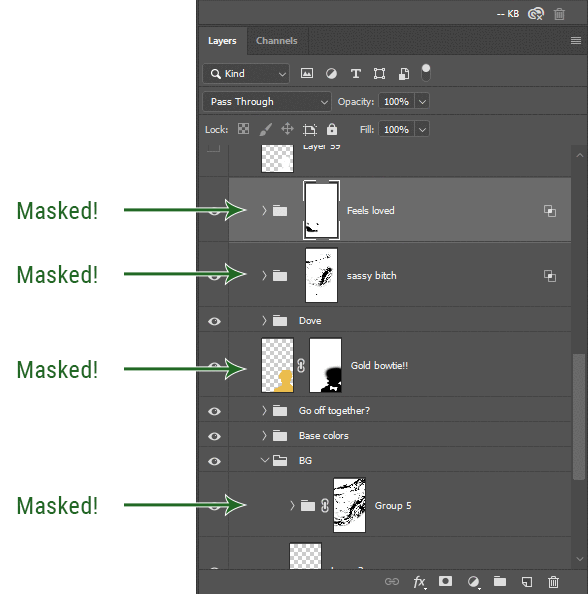
4. Try using channels to create masks!
This is a technique that works REALLY well for cutting out complex shapes, such as wispy hair (or feathers!) -- provided there's strong contrast between the subject and the background, and the background isn't too busy.
This is also a fantastic method for capturing alpha transparency. For example: If you have a neato paint stroke/splatter/watercolor texture you want to use as a mask, but has a solid background that’s getting in the way of things. This method will capture all the semi-opaque areas flawlessly!!
While editing your image (which you had better have made into a Smart Object!!!) do the following:
Switch from the "layers" panel to the "Channels" panel.
Toggle through the R, G, and B channels, and decide which one has the most contrast for the areas you are trying to mask.
Ctrl+Click that channel's thumbnail. This will create a selection marquee.
Switch back to the layers panel
Click on the target layer/group (the one you are trying to mask)
Click the mask icon at the bottom of the panel (the one with the circle inside a box)
Release the selection and invert the mask if necessary
If you're using this method to cut out a subject from its background, you probably won't want alpha transparency. In this case, select the mask thumbnail and use a levels adjustment on the mask itself to bump the contrast until you have more of a cutout effect!
It sounds like a lot of steps, but it’s really simple! So I made this handy GIF: (click to view from beginning)
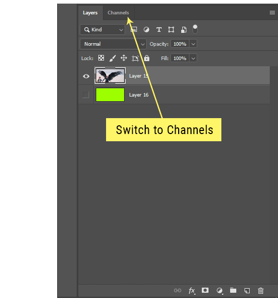
Sometimes you won’t want to use this method for the entire image, but just a specific part. For example, if you’ve cut out a character with some other method (magic wand, manual brushwork), but are having a hard time with their hair in particular. Use this method to create the selection, but instead of converting the whole selection into a mask, use the brush tool to apply the mask only where you need it! You can invert the selection itself with shift+ctrl+i.
5. Outlining text
The font I used here is Salomé, which is actually a solid typeface with no outlined version. But you can make virtually any font into an outlined version if you so desire!
There's two possible methods here, actually:
The Easy Way:
Add a stroke layer effect to the text layer (by selecting the layer, clicking the little “fx” button at the bottom of the layers panel, and choosing “Stroke...”)
As far as settings go, aligning the stroke to the inside usually yields the best result/maintains the integrity of the letterforms.
Make the color of the text itself match the background.
If necessary, use the lighten/darken blend modes to create the illusion of transparency.
If you need true transparency (which I didn't until I decided I wanted to apply a gradient over the text), you'll have to try something else-- The Also Easy But Less Than Ideal Way:
Right click the text layer in the layers panel and select "convert to shape".
Now you can edit the fill/stroke the same way you would any other vector shape.
Again, you’ll want to set the stroke alignment to ‘inside’. For vector shapes, those settings are a little hidden. You’ll wanna open up that little dropdown in the toolbar with the line in it, and click “More Options”.
This is semi-destructive, so if you're working with a lot of text you might have to edit later, consider duplicating and hiding those text layers first so you'll have a 'backup' of it.
And while I’m on the topic of text...
6. Try breaking up your text layers!
I know a lot of people like to draw a neat little text box to put their text in, and then they center it all nice and neat and probably use a small font size to make it subtle and stuff... and that’s cool. Everyone’s got their different styles and things they like to emphasize in their edits and there’s absolutely merit to that sort of thing (case and point: the bulk of my dear @herzdieb’s work), but. Listen.
I love typography. I love a good typeface. The stroke widths, the letterforms, the ligatures, the serifs... I get like, horny on main for a good typeface. I like to make the text on my edits BIG, so that those details can shine. I also like doing interesting things with the text. Jumbling words/letters around, distorting them, deconstructing them and just... letting the text really ~interact with the rest of the composition instead of just kinda politely floating on top of it.
I’m not saying you have to do that kinda stuff. Or that I think neat little floaty text boxes are boring, or lazy, or whatever. It’s just... personally, I get really inspired by type. Fun type treatments are one of those things I LIVE FOR, something of a ~signature of mine, and I encourage everyone to just... try it? To use text as more of an integral Design Element and less of a... idk. A caption?
So if you have a quote, or even just a word... put each word (or letter) on its own text layer. And then: make ‘em different sizes. Make the words so big they don’t fit on the canvas. Rotate each one at a fun angle. Scatter them around. Go nuts. Use masks to chop parts of the letterforms off. Make ‘em overlap. Just have at it. Or, as the kids these days are saying: go absolutely fuckin feral.
If that really just isn’t your style, or doesn’t work/make sense for the edit you’re doing, fine. Delete all the layers and just do a text box or whatever. But. I’m tellin u.
Give it a try.
At least once.
Just... a lil taste.
7. Understand the difference between lighten/darken vs screen/multiply
For a while in my photoshoppin' youth, my understanding of these blend modes basically amounted to "darken makes things darker, and multiply makes things really darker", and vice versa for lighten/screen. But there's an important difference between how these blend modes work, and if you understand them, you can use them more... strategically? I guess?
Darken and Lighten are kinda misnomers tbh, because they technically don't really darken or lighten anything. What they actually do is make it so that only the areas of the layer that are darker or lighter than the content of the layers beneath them are visible. This produces some pretty nifty layering effects that you can't achieve with screen and multiply.
Here’s an example: (if you’re reading this on a phone with the brightness dimmed down you probably won’t be able to see the differences)
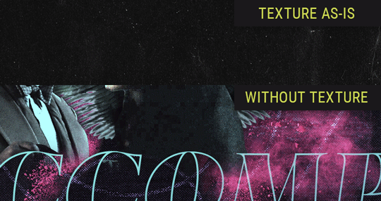
Without any the texture applied, you can really see the noise/graininess of Crowley’s jacket in the screencap. You can also see the ‘seam’ where Crowley fades into the background-- the jacket is a green-ish black, while the background it’s fading into is more of a purple-black.
With the texture set to ‘Screen’, the whole image becomes lighter across the board. Crowley’s jacket gets lighter, and so does Aziraphale’s jacket and the pink cloud thing. This does little to nothing to obscure the poor image quality and disguise that ‘seam’.
But with the ‘Lighten’ blend mode, ONLY the dark parts of the image appear lightened, and not only do they appear lightened, but they get kinda equalized. Notice how the patchy jpeg artifacts on Crowley’s jacket disappear, how that color seam smooths out, and how the brightness of Aziraphale’s jacket and the pink cloud doesn’t change at all.
This isn’t to say that lighten/darken are better and that you shouldn’t use screen/multiply. They each have their uses. But most often, I find myself using lighten/darken because the way they work is honestly really helpful? And just cool af?
8. Masking individual frames on gifs
If you ever feel like torturing yourself by making a gif that has frame-by-frame masking, my advice is don't try to mask each frame from scratch. You'll get patchy/wobbly results from the masks being slightly different on each frame.
Instead, mask the first frame, then alt+click and drag that mask onto the next frame. Make any minor adjustments to the new mask as needed, and repeat for each frame. This saves time and more importantly, keeps the masking consistent on areas with little to no movement, which makes a HUGE difference in how smooth the final product will be.

If you look at the edges of the animation, they’re nice and steady and consistent. It’s only the parts that have a lot of movement (like the back of his neck) where you can see any ‘ghosting’/wobbly-ness happening.
Sometimes the mask will move when I copy it to the next frame. Like, for the whole document. It gets nudged 20 pixels down or to the left or s/t every time. I have yet to figure out why, but I’m betting it has something to do with shooting myself in the foot with the frame 1 propagation settings at some point during editing?? ANYWAY, when this happens, just unlock the mask from its layer (click the little chain icon between their thumbnails) and move it back into place.
In these cases, I also like to pick a spot with a hard edge (such as the shoulder in the above gif) as a reference point of where it needs to be moved to. It kinda sucks having to do this for every frame, but you already signed up for some suckage when u decided to mask every frame of a gif, so I mean... 👀
9. Don't be afraid/too intimidated to do manips as needed!
Manips can be tricky if you're really striving for realism. There's light sources and color grading and perspectives to reconcile!! But when you're doing an artsy Edit with a capital E, odds are those kinds of discrepancies will be thoroughly camouflaged by all the levels, black and white, etc adjustments you're doing!
Something I run into often is, "I like this screencap, but the top of their head/hair is chopped off :(" But if I go back through all the screencaps from the scene, there's usually another frame where the camera is planned/zoomed out enough that I can steal the rest of their head/limb from it! And since it's from the same scene/shot, the lighting and color grading should already be a perfect match!
A super simple example:
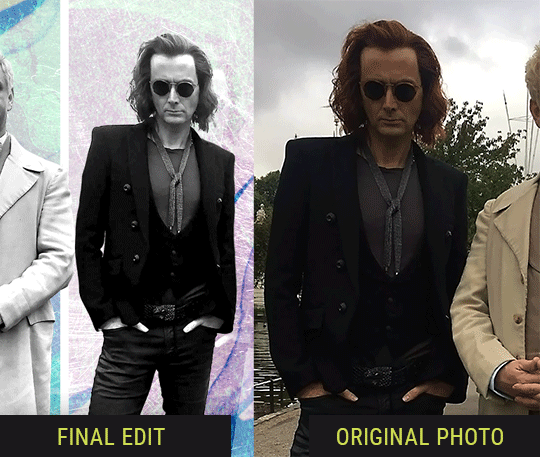
So I wanted to use this picture of David and Michael for this edit, but 1) They’re standing on the wrong sides for their characters, and 2) part of David’s arm is covered up by Michael’s.
Of course, the easiest course of action would be to just mirror the photo so they’re on the correct sides, but 1) mirroring faces tends to yield wonky results, and 2) that still wouldn’t give me a perfect, free-standing cutout of Crowley to place wherever I want in my composition (as opposed to being forced to awkwardly position him off the edge of the canvas to hide the fact that the other arm is missing)
Fortunately, it only took all of like, two (2) minutes to draw a crude selection around his good arm, copy and paste it into a new layer, flip it around, and add any necessary masking to get the shape right.
My point here isn’t to teach y’all how to do manips, or to pass this off as an impressive example of one. Because it’s really, REALLY not. My point here is to demonstrate that even something as tiny and simple as this can really open up your options for what you can actually do with an edit/composition.
So next time you’re feeling limited/inconvenienced by the crop of a screencap, just... you know. Consider whether or not it’s worth attempting a quick and dirty manip to fix it.
Another Example:

Sometimes you’re torn between two screencaps. You like one element from Screencap A but also want some other element from Screencap B. What to do? Just frankenstein ‘em together. Layer one on top of the other, get them lined up, and mask out the necessary parts.
It’s easy to get hung up on stuff like “Uh... should Crowley’s shoulder be doing that?” but let me assure you that like... the people looking at the final product are none the wiser to your butcherwork and will not notice. Especially if you’re going to add a bunch of contrast and color adjustments later on. (in fact, sometimes I’ll apply those adjustments first so I’m not distracted by any discrepancies that are going to come out in the wash anyway)
“I dunno... 🤔🤔 doesn’t seem anatomically correct... 🤔🤔🤔🤔” thought no one.
Point is... point is... dolphins you can get away with a LOT more than you think you can. Don’t let the desire to make these kinds of manips perfect get in the way of just... making them good enough. The bar isn’t that high, I promise.
10. Know what inspires you
What types of edits get you EXCITED? What kind of work do you see on your dash and go, "oh, I'm reblobbin' THAT!!1!"
I know for herzdieb, she's all about emotional pieces. She likes matching words/lyrics/poetry to on-screen moments and punching you in the feels with both. She hears a song, or reads a poem, and the lightbulbs go off for her, and she does her thing.
As for myself, I just live for the aesthetics of an edit. The colors, the fonts, the composition. I almost never know what text/screencaps I'm going to use when I start an edit. I just see a font I like, or a color palette, or a texture, and think, "I wanna use that!"
And once you know what inspires you, collect that inspo! I hoard textures and fonts. I have them organized into neat lil folders. When I wanna make an edit, that’s where I start. I just browse through them all until one or two start calling my name. Herzdieb collects songs and quotes and poems. Maybe your thing is color palettes, or aesthetic-y photos. Or whatever.
The point here is make the kinda stuff you like/want to see. Not the kinda stuff everyone else is making or the kinda stuff you notice gets the most notes.
11. Be able to let go of things that aren't working
I often begin an edit with a rough idea of the style, colors, or layout I'm going for. And I almost always end up doing... something totally different.
So don't get too fixated on what your initial ideas are. Be open to experimenting and just let the edit be what it wants to be. If something looks nice, do it. If it doesn't, don't try to force it just because, "well, I was inspired by this piece that did xyz and I wanna try it too".
When you see a certain effect that inspires you, just keep it in mind as a possible solution for the next time you make something-- don't make it into a benchmark, or some imaginary 'goal' you have to meet for This Edit You Are Working On Right This Moment. In fact, sometimes the elements I end up ditching are the very ones I started with, that initially sparked my inspiration. And that's okay. Inspiration can be a moving target, and if your vision for something changes, let it.
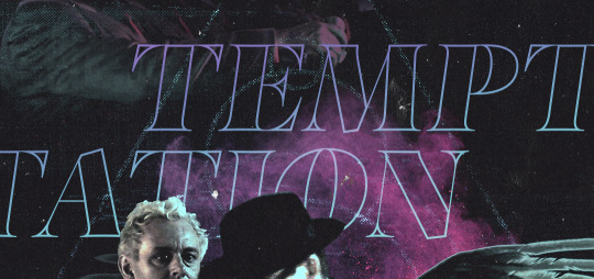
You wanna know what inspo reference I was looking at when I started that “Temptation Accomplished” edit?
Fucking this: https://search.muz.li/YTdiNjkwN2Rh
You might be thinking, “how the fUCK was that the inspiration??!! Your edit looks nothing like that at all!” ...and you would be 100% correct, and that is 100% my point. I spent a good hour or two trying to incorporate that cutout text layering effect before finally accepting the fact that it just wasn’t working for the edit I was making. And it wasn’t until then that it actually started to come together.
12. Be patient, and take the time to explore all your options!
I’m not gonna lie, y’all. I spend hours on my edits. I usually complete them over the course of 2-3 days/sittings. I rarely have a plan. 99% of the time I'm just throwing things at the wall and seeing what sticks. When I get stuck (when, not if), it helps to step away from it and come back later with a fresh perspective/set of eyes.
Every single edit I've posted, I have at some point felt like giving up on because I thought it looked like garbage (and not just because I was being self-deprecating/doubting myself, but because at those points, they simply weren't finished/something about the composition just wasn't working for me)
Work through those moments, and if necessary, take a break/sleep on it. It's always after I've exhausted my early ideas that the really good ones start to come to mind!
Here’s how the character poster edits I did progressed:

In Classic Me™ Fashion, I literally started off with just... textures I liked, and a font that I liked. Now, there were obviously a lot more ‘steps’ involved in both designs, but hopefully at the very least this gives a sense of how things get from point A to point B.
So uh... thanks 4 comin 2 my TED talk. I hope u learned at least one (1) cool new thing or maybe just feel vaguely inspired by this rambling mess?
158 notes
·
View notes
Note
The epilogues look terrible and I don’t want to spend my time reading them... but I love + trust your judgement and your takes on things. Could you summarize them? (No pressure if you don’t want to)
OK, it’s been a few weeks since i read it, but I will do my best.NOTE: This is probably not comprehensive and definitely not objective. As a supplement, I did some poking around, and the MSPA wiki has some bullet points. I also eventually found another summary on tumblr, albeit by someone who also didn’t like it, so it is probably biased as well.
ANOTHER NOTE: Those content warnings weren’t a joke. Below are references to sexual content, assault, suicide, sexism, transphobia, character death, and probably some other stuff.
WHAT HAPPENED:
In the prologue, Rose summons John to inform him that he needs to defeat Lord English right now, or they will all experience terrible consequences. These are mostly meta consequences you can interpret as ‘if we don’t produce new Homestuck content on its 10th anniversary, everyone will give up on this franchise for real, and also canon doesn’t seem stable when the big bad never got beaten’. John goes to visit Roxy and Calliope before he leaves and is given the option to eat either meet or candy. This represents a choice he is supposed to make, and that choice creates two timelines.
In MEAT, John travels back in time and gathers three 16 year old versions of his friends. They confront Caliborn in the battle he represented in his Masterpiece and are sucked into the house juju. Vriska activates it, but not before being pulled into the black hole. Rose and Jade die immediately, with Rose’s body being destroyed and Jade’s falling into the black hole, because why should women get to fight the story’s biggest misogynist. Dave lands a solid hit on English before having his head bitten off Mami from PMMM style. John gets chomped on as well and a gold tooth ends up embedded in his chest. Davepeta appears and drags the wounded LE into the black hole. John finds his father’s wallet, retrieves his car, and slumps inside. Terezi appears, in bad shape after a long time wandering the ring. She seems confused at his state (explained because in CANDY she has been texting that version of him for years). She removes the tooth from his chest and they have sex.
Meanwhile, on Earth, Dave and Karkat have avoided talking about being a relationship for seven years, while Jade harasses them about becoming a threesome. This is explicitly tied to her abandonment issues but also she is referred to as a slut so like. Don’t love that. Jane is running for president, and Dave thinks this is terrible because she’s a woman fascist and doesn’t understand the economy and Karkat should run instead. Other shit is happening but I lost track. Rose is ill because she’s becoming her ‘Ultimate Self’ and seeing all timelines. Dirk claims he’s overcome the same problem and offers to help her but ends up controlling her and revealing he is the one actually writing this narrative. There is a bit where the narration starts addressing the reader directly and then turns orange which I admit is genuinely cool and might have been interesting if done with characters I didn’t actually care about.
Dirk amps up controlling the narrative, directly forcing people to do and think certain things. (For example, he sequesters Rose away in his workshop and tells Kanaya via narration she believes Rose is better off with him, and she uncomfortably agrees without understanding why she thinks that.) He supports Jane’s bid for the presidency, even though she wants to crack down on trolls because they are naturally violent and reproduce too fast. Everyone tries to get Jake’s endorsement because he’s popular, which includes Jane attempting to seduce him in a very uncomfortable scene.Then Jade slips into a nice coma, because it’s not Homestuck without Jade losing her agency, and alt!Calliope starts using her as an avatar to take control of the narrative away from Dirk. They have some back and forth arguments before he is pushed out which, again, is genuinely clever but would be more enjoyable without all the edgy bullshit. Dirk eventually tricks alt!Callie and sedates Jade, taking back control of the story. Jane wins the presidency. Also at some point Meat!Roxy and Callie ID as nonbinary and start using they/them, and narrator!Dirk freaks out about it and misgenders them a lot, which is character assassination bc everyone knows Dirk is a trans icon. Anyway. Dave and Karkat have an awkward talk about their relationship where they keep dancing around things and Dirk tries to force Dave to kiss him. Dave gets frustrated because he’s aware someone is trying to make him do something (like with the Aimless Renegade), and eventually yells at Dirk to get out of his head before kissing Karkat. Terezi brings John back to Earth, and he begins to fade, since apparently LE’s tooth was poisoned with something more powerful than god tier that makes you irrelevant. Possibly a meta commentary on the hero or story not being needed once the big bad is gone. Terezi is sad about this and listens to him bleed while she smells him die. Then Dirk contacts her via narration and implies he can help her. She gets a text (later revealed to be Vriska). Dirk gets a spaceship from Jake after forcing him via narration to grovel about how much he loves him and then rejecting him and flying away with Rose and Terezi in tow. Jade wakes up long enough to tell everyone Dirk’s gone bad before she gets repossessed and starts pointing in his direction, prompting everyone to give chase.
There is a final scene that will make more sense later, so I’ll add it later.
CANDY
John decides not to go fight LE. Roxy is delighted, and they began dating. Calliope tells John it is time to let Gamzee out of the fridge. Gamzee pops out and claims he is redeemed in a long speech making fun of sloppy redemption arcs. He then proceeds to be terrible for the rest of the story.Candy essentially satirizes Harry Potter epilogue style fics. Jane marries Jake (it’s implied she essentially roofies him with the trickster lollipop) and has Gamzee on the side. They have a son named Tavros. John and Roxy have a son named Harry. Rose and Kanaya adopt a troll clone of Vriska and name her Vriska. Jade, Karkat, and Dave are all dating, but Dave and Karkat are miserable. Dirk kills himself when he realizes the timeline went off kilter. Jade’s corpse from the Meat timeline crashes to earth, and in the middle of the funeral (which was genuinely a good scene) she sits up, possessed by alt!Calliope. Alt!Callie sequesters herself on the old meteor, now landed, and explains to Aradia and Sollux that this timeline is a dead end and she is protecting it from the influence of the prince. She also, in a parallel to Dirk’s reveal in Meat, talks about how every narrator has an agenda even if the text is formatted to make you not realize that.Jane becomes a fascist dictator and begins oppressing trolls. Karkat eventually get sick of being in a trio and runs off to be a resistance leader, including getting a sick eye patch (reference to Summer Teen Romance). Meenah stole the Ring of Life from Meat John and lands in the session; she and Karkat begin dating. Other ghosts begin falling from the sky as well, and Gamzee converts them to his redemption religion.John feels like something is really off. His only solace is texting Terezi a lot, and he seems closer to her than he is to his wife. He and Roxy break up for a while and then (non-romantically) reconcile. Jake eventually leaves Jane and takes Tavros with him. Jade and Dave become rebels as well, then Dave meets a hologram of Obama, who helps him attain his ultimate self, putting his soul in a new robot body.
Oh, also Vriska falls out of the sky, has hatesex with Gamzee, kills him, and then talks with Rose and Kanaya’s Vriska about how she loves Terezi. Then she texts her, as seen in the Meat timeline. Isn’t Vriska 13 and Gamzee an adult at this point? Probably. There’s a lot of questionable age stuff in this.
I’m sure I missed some details. Can you tell I’m losing steam.
Anyway, the two last chapters of each section reference the other storyline. At the end of Meat, Lord English’s body falls out of the sky, and alt!Callie (still in Jade’s body) devours it, becoming powerful enough to battle Dirk. Candy!Davebot arrives and he and Aradia jump into the black hole in pursuit.At the end of Candy, Dirk’s ship nears a new planet where he intends a new game of SBURB to be played. Rose is in a robot body serving as his handmaid essentially, and Terezi’s also on board.
TAKEAWAYS:
There are a lot of different interpretations of the epilogue. A mockery of the two extremes of fanfic. Andrew Hussie continuing the theme of ‘all authors are tyrants by nature’ and using his self-insert to display how he hates his own story but also can’t stop telling it. Dirk trying to create conflict by making himself a villain because otherwise they’ll lose relevance and disappear. Musing on how being arbitrarily labeled 'grown up’ when you’re not ready (aka handed godhood by a game that doesn’t understand people) can fuck you up, and there is no single winning screen in life. Just a big old meta experiment on unreliable narrators. I can see where some of this is coming from, but frankly, I found it disturbingly sexist (even if it is intended to be so for effect). A lot of the sex and violence felt over the top and graphic just to be #ow the edge rather than serving any narrative purpose. Also, authors can do what they want with their texts, and they’re allowed to write tragedies, but after Hussie’s self-insert informs Caliborn that the most important stories are about friendship and teamwork and the fandom (that I’ve seen anyway) really responding to the bonds between characters, it felt cruel. That’s my feeling. Not everyone shares it. But hey, I’ve got my solution.
60 notes
·
View notes
Text
7 Crucial Factors For Optimising Your Web Design For Search Engines
Every website owner wants to have a high ranking on Google. To achieve that, having a well-designed website is essential. With more than 73% of internet users reporting how important web design is, it couldn't be more apparent how crucial an effective web design is. In this blog post, we’ll share 6 important factors that can help you optimise your website for a higher ranking on search engines, but before we get into that, let’s understand why SEO web design inSydney is so important!

Why is SEO Web Design Important?
You might think that once you've got your website designed, you're done with it. After all, the site has been built and launched. And you can now sit back and wait for the traffic to roll in with off-page links here and there. But there's more to it than that.
Bad Web design can waste all your SEO efforts. For example, a potential customer may find your web link, but once they click on it, they might encounter the error ‘404’. It will waste all your efforts of bringing the user to the website and losing their trust in you as well as in search engines.
Another problem is that users may not like your web design, and they'll leave the page immediately. Many factors affect this decision, such as; poor layout, bad colour combinations, lack of content on the homepage, slow loading time etc.
You need a professional web designer who can help you optimise your web design in Melbourne for search engines and make it more user-friendly so that visitors are more likely to stick around longer on your site.
How to make your Web Design SEO-Friendly for a Higher ranking
Create an Effective Site Structure
A well-structured website can significantly improve your SEO efforts and make it easier for search engines to find relevant content. A good site structure includes internal links (links to other pages within your site), external links (links to other sites), and image links (links embedded within images). You should also utilise meta tags such as title tags and meta descriptions which can help attract visitors by providing relevant information about the page's content.
Mobile Friendliness is the key
According to Google, over half of all searches now take place on mobile devices. If you do not optimise your site for mobile devices, you will miss out on a huge fraction of customers that would have been a part of your customer base, given the conditions were conducive.Make sure all pages load quickly, look good on different screens and don’t take too long to load.
Images and Videos for better Visuals
Images and videos can help improve user engagement on your site, which can help boost rankings in search engines. If you use images or videos on your site, make sure they're optimised for web design and SEO purposes! The images used must be high-quality and relevant; include captions when necessary, and use alt tags that accurately describe each image so that search engines know what they're looking at.
Focus on Fonts
Fonts are important for readability and user experience and affect how your site appears in search results. Use font sizes that are readable but don't go overboard with small types. You want people to be able to read your page without having to zoom in or squint at their screens. The best fonts for readability are sans-serif fonts such as Arial, Verdana, Trebuchet MS and Tahoma. The body text size should be at least 12px for desktops and 16px for mobile devices.
Have a Sitemap
Sitemaps are an essential part of any website's architecture. They allow search engines to easily find the content that they need to determine the site's ranking on their results pages. You can include a sitemap with your HTML code, or you may choose to use a third-party service that will automatically generate one for you.
Get rid of Broken Links
Broken links are links that don't lead anywhere when clicked on. These are bad for SEO because search engines like Google will penalise sites with broken links by lowering their rankings on search results pages. You can check for broken links on your own by running a quick text search through all of the pages on your site, looking for anything that reads "404," which means "page not found." If you find any broken links, contact the web designer to fix them as soon as possible so that there is no negative impact on your rankings.
Load Time
The longer it takes for your page to load, the more likely users will leave before they even see what you have to offer them. If your site is slow, it’s not just annoying for visitors but also hurts your search engine rankings! Google wants websites with fast load times so that users will keep coming back and stay engaged with their content.
Final Words
As a final remark, Web design is what matters in SEO. If you want to be ranked high in Google search results, then you should have a website that is easy to navigate and has great content. If you’re looking for an expert who can help you with professional web design in Brisbane, the team at Make My Website can help! They have years of experience in all facets of web designing and SEO ranking. Get in touch with them today!
0 notes
Text
Slack and the Future of Work Platforms
Dom Nicastro asked me (and some other market watchers) about the recent acquisition of Atlassian's HipChat and Stride by Slack, and that's been published at CMSWire. Nicastro picked some of the things I said, but I thought I'd share my full comments, and add a new topic at the end, regarding Slack's unique opportunity as a work platform, more than as a work chat product.

Nicastro asked for my thoughts on July 31:
Nicastro: Obviously there was the big shakeup with Atlassian bowing to Slack and selling their collaboration tools.
Did this move surprise you? Why? Why not?
Boyd: I was surprised that Atlassian had approached Slack in the way they did, but not surprised that HipChat and Stride were losing in the head-to-head competition with Slack.
Nicastro: Do you expect Atlassian users to just make the move to Slack or is it an opportunity for Teams to swoop in and steal some of them?
Boyd: My bet is that users of the Atlassian tools who had not already defected to alternative solutions will use the time before the tools are shut down to evaluate all the options. Slack has the opportunity to build some export/import bridgework, or to offer Atlassian users some discounts. But ultimately I bet the users will move to Slack, Microsoft Teams, Facebook Workplace, and other alternatives in about the same proportions as others in the marketplace do, with perhaps a slight lean in the direction of Slack. But remember, they could have defected to Slack a month ago if they liked Slack so much.
Nicastro: What does this mean for practitioners as they entertain a central hub for collaboration in their enterprises? Is it a Slack vs. Teams world? Or is that something manufactured by people like me who like big headlines?
Boyd: Yes, Atlassian surrendering to Slack is the final battle of one war, but the bigger war is still going: Slack versus Microsoft Teams. And Microsoft has 150 million business users for Office 365, and it has the inside track on converting those to Teams users.
My prediction is that Slack needs to line up with an internet giant to out-market Microsoft, so an acquisition by Google or Amazon is predictable. However, Slack is an unusual case: it has grown very quickly, and is the market-defining product for work chat. So the company is likely to go it alone until its growth slows. Honestly, though, the fit with Google's G-Suite is compelling, and would be a good use of $10 billion.
Nicastro: What do large organizations need out of enterprise collaboration tools today? What's most important?
Boyd: Work chat is the hot, high growth element of the larger domain of work technologies. That's used best for small teams that communicate frequently to coordinate work. There are well known issues with scaling work chat to effectively support the communications and coordination at scale larger than teams, however, a great proportion of work is the work of small teams.
Other tools are also critical. Email is still the default mechanism to communicate with those we do not work with as teammates. Task, work, and project management tools -- like Asana, Trello (acquired by Atlassian), Basecamp, Smartsheet, and many others -- are also in broad use in the enterprise. And of course, companies stil rely on documents, even if they don't get printed out as much anymore, so tools like Google Drive (with Docs, Sheets, and Slides), Dropbox and Dropbox Paper, and Microsoft Office 365 (Word, Powerpoint, and Excel) -- which used to be called 'productivity' tools -- are still essential. Note that Google and Microsoft are big players in this last category, 'productivity tools', and Slack has no horse in that race, as yet. Also, Microsoft and Google both have task management offerings, which Slack has opted to simply integrate with all comers.
Nicastro: Who right now has the most compelling story out there to offer these things?
Boyd: Slack has the best pure play work chat story, Microsoft (trailed by Google pretty aggressively) have the best work technology suites, ranging from email to 'productivity'.
Nicastro: What advice would you give practitioners/orgs in the digital workplace looking at this news and wondering what's best for them in their enterprises -- in other words, what should we be using to collaborate -- what are some good steps they can take to help themselves figure out what's best?
Boyd: That's a huge question. I don't think there is a one-size-fits-all answer. A 20,000 person law firm with offices in three countries has very different needs from a 300 person design firm in one city, and again different from a 50 person software company with a largely remote workforce.
I'd suggest any company start with a simple assessment: what is the center of gravity in the company's work activities? Is it project coordination with many external clients, like the design firm might be? Start by getting a good work/project management platfom established, and accept the inevitability of email-based communications. Is it internal communication by small teams? Start with work chat, and then decide what secondary considers matter to help pick the right work chat solution. I bet the law firm is document-centric, and relies on a solution like Sharepoint of Google Drive, so the obvious option is to pick one of those first, and adopt the other tools in the suite.
Nicastro: Anything else I didn't ask you'd like to add, feel free!
Boyd: One last observation: There is an interesting trend that is gaining steam, which I call 'work processing'. A new generation of document-centered tools -- like Quip, Notion.io, Slite, Nuclino, and others -- support shared documents with styled text, embedded objects (tables, videos, images), tasks and checklists, and social affordances: threaded comments, internal notifications, and messaging. In this approach documents are not just dumb files with styled text, sitting in a cloud file system. Instead of relying on work chat communications, which are only structured by channels and search, work processing relies on a system of documents to structure company information and discourse. This can also be integrated with work chat, or may include work chat internally. A trend to keep an eye on!
We covered a lot of ground, but the heart of our discussion was largely inward-looking, focused on the conventional idea of internal ‘collaboration’: a company's employees communicating, coordinating, and cooperating among themselves, principally.
However, companies are being rapidly remade, as hierarchies are being eroded by the tectonic changes in the economy, and as companies move toward increasingly autonomous teams operating horizontally, and increasingly working with ‘outsiders’ on company operations. The adaptations to an accelerating marketplace require companies to become more agile and flexible, to work more closely with customers, partners, and suppliers, and to pull diverse, distributed task forces together to innovate and deliver greater value to customers.
This has major ramifications across the enterprise -- on leadership, operating principles, decision-making, and, well, everything. But pertaining to Slack and the role of work technologies this means a new set of requirements.
Instead of simply supporting communications with the company, work chat and related tools will have to support increasingly critical multiorganizational use. When all involved are using the same technologies -- say Slack -- the cross-company integration is relatively straightforward, and might involve a cross-authentication between the two companies’ Slack accounts.
However, when company A wants to coordinate work with company B, and they are using different tools -- say Slack and Teams, for example -- things become more complex. There would have to be a common protocol between vendors of work chat solutions for that to work, or at least a one-to-one agreement between Slack and Microsoft. (Or not: we could have a standoff like we did with instant messaging services back in the day, but that’s a different history lesson.)
Slack has become the market leader for a number of reasons, but it has clearly staked its claim to being the most oriented toward easy integration with other tools, such as help desk, document systems, task management solutions, and so on. I am wagering that they will be the first to move aggressively toward full distributed platform support, just as businesses realize that their futures rely on reorienting their operations toward the horizontal, and move to convert themselves into business platforms. For companies to become full-on business platforms they will need to rest upon foundational work platforms -- technology that will include work chat and other work management tools, as well as close integration with other necessary enterprise software.
This realignment of business operations toward the horizontal is the most obvious motivation for my claim that Slack will ultimately align itself with an internet giant, like Google or Amazon, because we can expect that these horizontal work platforms for business will naturally emerge on top of the cloud computing platforms that the giants will command.
Maybe we will be writing about platform-as-a-service, soon, with Slack as one important element in that stack.
#writings#work chat#work platfroms#slack#atlassian#google#microsoft#hipchat#stride#microsoft teams#amazon#horizontal business#platform-as-a-service
4 notes
·
View notes
Text
Must Do's To Improve Your Seo Rankings

Gigantic heaps of data is created on the World Wide Web ordinary. To guarantee whether people are showing up at it you need to know whether your blog/site is being recorded properly through web crawlers and are showing up in a decent circumstance there. This is where Search Engine Optimization comes in.
Here is an overview of Citiesagenciess you can execute to construct the SEO score of your site:
1. Watchwords as Links
Embeddings watchwords in your page URLs, page titles, heading names ( <h1> to <h6>, with <h1> being the most huge ) and picture alt text is a remarkable idea to help your digital marketing company Mumbai. Additionally, if you haven't started it now, it's a glad opportunity to start now. That being said, one thing that web crawler enhancers don't pay a ton of focus on is making joins out of expressions. This is a critical piece of SEO and can on a very basic level further foster your SEO rankings at whatever point acted in the right manner.
The above picture is a piece on an article from Searchengineland.com about Google App Indexing. Here 'Application Indexing and Deep Links' is made as an association (with a do-follow quality), and as it ought to be because it's a solidly related watchword for the article which spotlights to another article on App Indexing and Deep Links. This way when web search devices creep the page they'll pass significant association juice to the associated with page, which accordingly will determinedly impact your SEO score and will essentially chip away at internal interfacing of your webpage.
2. Page Load Speed
Other than making huge and quality substance for your perusers, a nice site speed is fundamental to gain traffic. Site speed clearly impacts your customer responsibility, bounce rate, gatherings per visit and your overall SEO score. 2 – 2.5 seconds. Without a doubt, that is the best time your site should stack in. Advance the going with on your site to chip away at its speed:
a. HTTP Requests – Minimize the amount of sales your program makes to convey the site by clubbing all of the styles in a solitary external layout. This will decrease the size of your code, make it look smooth and in a general sense further foster site execution.
b. Pack Images – Images address the most bytes downloaded when a page loads in a program. Ceaselessly consolidate 'stature' and the 'width' quality. This way the program won't need to reload your page numerous events to choose the right sizes and overlap text over them. Use JPEG plans as bigger piece of the projects support them. Yield your photos to right gauge according to your page.
c. Program Caching – Browsers need to download a couple of substance, layouts and various parts when you visit a page strangely. Enabling project putting away will save all of them, due to which your program won't need to set a couple of HTTP expectations in resulting visits.
Here's Google's actual statement of using site speed as a factor in search situating. While Matt Cutts has clearly communicated that further creating site speed impacts under 1% of the pursuit requests, it's not absolutely unessential. Let us not neglect to recall that any business exists since people need its organizations, and that is what your consideration should be on – further creating customer experience at every movement. In like manner, when SEO experts like us are endeavoring to break every single situating variable, why leave out site speed then? Who knows Google's next computation update gives site speed significantly higher weightage. You'll express profound gratitude to us then!
In case you need to make a dive further with Page Speed assessment, read encounters from this Moz blog on page speed.
3. Astonishing Your Title and Meta Description
More than 70% of a webpage's traffic is made from the web search apparatuses. This makes it principal to propel your page titles and meta depictions as new as could really be expected. The Title length should preferably be of 45 – 55 characters and should consolidate the most customary and most examined expressions for your business. Concentrated investigation ought to be coordinated preceding choosing this. The most key expressions ought to be put first, followed by various watchwords and should be detached by vertical lines. Do whatever it takes not to use more than 2-3 expressions in it. Then, at that point, there should be a good sync between the page content and the page title. For eg., If your article examines obtaining mass anyway proteins then don't make the title as "best food hotspots for working out" or relative. Hold it frank.
Likewise, the best length of meta depictions should be around 140 – 150 characters and should decisively portray your page content pretty much. Endeavor to utilize somewhere near 2 – 4 watchwords in it. You should get this right as it's the primary asset among customers and your site. It's where a sharp customer closes if to visit your site. So guarantee you kickass!
4. Adding to a blog, YES!
Talking about your business is a nice practice for customer responsibility and SEO, both. Incredible publicists reliably share musings and articles with their group which are appropriate and affluent in information. Doesn't have any effect if there 100 destinations adequately on a comparative point out there, customers have come your site which is as it ought to be. They appreciate your picture.
Keep expression densities two or three long-tail watchwords up to 1.5 – 3 % and guarantee you use reciprocals and close varieties of those watchwords as well. This extends the significance of your article as indicated by the web crawlers. Some splendid sources to discover most close varieties of your expressions are from the Google's Keyword Planner device, examining social occasions on your industry strength and by looking out for Subreddits on Reddit regarding your subject. Not a lot of people significantly research on these focal points for watchwords.
Click for more: - What is the function of domain name in SEO?
The sum of this clearly doesn't mean you stray from the certified objective of creating your blog – which is to connect with your customers and offer important substance with them.
5. Zeroing in on Local Keywords
Region express zeroing in on has become a fundamental piece of SEO in the past couple of years. According to SE Leads, "43% of web glance through performed today use a close by expression and 86% of those endeavors convert to a call or visit to the genuine region". This example is basically going to increase later on.
For example, a Google search for "wellbeing rec focuses" shows multiple million rundown things, while a watchword search for 'health rec focuses in Bangalore' shows simply 723K site pages. This proposes that there is fundamentally less challenge for neighborhood watchwords and consequently, it's much less complex to rank for them in normal results. Hence your point should be to target long-tail watchwords having region assurance. This will through and through influence your SEO rankings.
6. Backlinks through Social Sharing
Social channels are gold mines for each modernized publicist out there making a pass at brand care in the current time frame. Regions like Facebook, Google, Quora, Twitter, LinkedIn, etc among others own a nice bit of the web's group. Facebook itself has over 1.55 billion customers reliably with people from all parts of the world endorsed in. Tap into the power of electronic media by making profiles on these associations and attracting with your customers. See what they need to say about your picture/thing and gain from them. The more you attract with them, answer their inquiries and get them to examine your picture, the more respect you secure in the automated circle. Lively customers will therefore confer their experience to your picture, which will make significant backlinks for your site. These customer reviews and social proposals as thought to be as significantly critical and dependable by the web crawlers, which subsequently will assemble your SEO score. Guarantee you impact all of the social channels open.
7. Flexible Responsive Design
Mashable's bits of knowledge on adaptable chase designs show that over portion of Google's traffic is made through mobile phones. This is a BIG number considering the world's most extensively used web crawler on the web today. Similarly, all through the drawn out the amount of flexible customers has beated the amount of workspace customers and they rely upon their PDAs currently more than ever. Customers are searching for information on associations and organizations on their mobile phones continually. Google's Mobile Friendly Update conveyed in April last year undeniably displayed to combine flexible responsiveness in your site to hold and further foster your digital marketing agency Pune.
Making a flexible updated site should be a central arrangement for additional fostering your SEO score. I've found this intriguing gadget that helps you with study and manage your compact responsiveness. It gives an undeniable and new idea viewpoint on how your site is displayed on standard PDAs like iPhone, Google Nexus and that is only the start, and where you need to carry out appropriate enhancements.
0 notes
Link
Why do some things we remember but forget most others? It’s the emotion that makes things special to us and brings up the memories associated with them even after a long time.
Humour and laughter generate positive emotions on social platforms. You made a mischievous joke and people burst into laughter — this picture will be imprinted in their memory and bring a smile to their faces ever after.
Social media platforms are particularly known for expressive posts on trending topics that manifest all types of emotions. But unless the topic is sensitive, mostly it is the humorous, satiric, and engaged posts that become viral.
Social media is flooded with various formats or types of humorous posts — text, infographics, short videos, etc. The latest addition to this list is Internet Memes which have become so popular that some companies are creating NFTs of Internet memes to launch their brands with a bang and also ensure future traction. Today, our topic is this only, memes for marketing. Let’s start with the very basic
What is a Meme?
A meme is an encrypted message wrapped in fun. Formally known as Internet memes, these are usually made of images or videos punched with short texts that triggers fun or laughter to bring home an idea or a message. These cute little crackers spread via social media platforms, e-mails, forums, instant messaging apps, and even news websites.
The best aspects of Internet memes are its two central attributes — creative reproduction of materials and intertextuality.
Creative reproduction refers to remixes, parodies, or mashups that explain how memes cause ideas to move between people and cultures in the current events.
Intertextuality is when one text in a work is linked to other texts in the social and textual matrix in some way.
What is Meme Marketing?
Real time marketing has always done experiments with humour in the ad campaigns to make a favourable impression in the minds of the consumers. So why not memes? It’s so powerful yet so inexpensive!
Actually, the Meme marketing trend caught on in a big way because memes are the fastest growing digital assets spreading across all platforms and channels. Sharp wit, emotions, bizzare images and texts (sometimes non-grammatical) pieces of content help memes go viral in no time.
Smart marketers are using memes cleverly in their marketing campaign which will help them viraling their brand messages embedded in humour. Memes don’t say anything directly, one has to be witty to enjoy them in their daily lives. The mix of creativity and refined humour is the usp of meme marketing, which helps a brand get practically promoted by the people when its meme becomes viral.
How is Meme Marketing doing in India?
Companies who have established a good marketing plan by speaking the language of millennials have been the first to recognise the potential of memes on social media.
The prevalence of lively pop culture in India is fueling the growing appeal of meme marketing. Many popular memes are based on popular films and television shows. Characters from popular culture have become well-known among India’s many demographics. Several media firms, such as Amazon Prime, Hotstar, ALT Balaji are effectively exploiting the popularity and cross-cultural appeal of such fictitious characters.
Following are a few leading brands across various fields that adopted meme form of marketing to run some of the spectacular digital marketing campaigns in recent times.
Zomato
Zomato definitely deserves the first place on the list due to the great amount of interest and engagement it has created with its “Harmonium Chacha” meme.
Zomato’s target audience loves spending time on social media and the concept of meme marketing gave the company a great opportunity to connect with them through this funny meme.
The campaign became an instant hit; it not only received huge likes and shares but also prompted people’s response with humorous comments and return memes.
0 notes
Text
Email Design: Your Handy Guide to Create Winning Emails
Despite the emergence of a plethora of marketing channels, email still continues to enjoy maximum popularity and effectiveness among all businesses. Statista has revealed that 306.4 billion emails were sent and received every day in 2020. This number is set to rise to 361.6 billion in 2024. That’s a huge number.
At the first glimpse, this looks pretty impressive, but if we give a second thought, it reflects a big challenge for email marketers. Since the subscribers are so inundated with emails each day, it is obvious that they are simply scanning through your emails.
That’s why you must focus on creating unique email designs that are aligned with the industry best practices.
Keeping this flowchart in mind, let’s get into the nitty gritty of email design best practices that help to create a winning campaign.
Have an instantly recognizable From name
The From name is the first thing that your subscriber will notice whenever you send an email. Have your brand name as the from name as it will be easily identifiable and most subscribers will be familiar with it.
Craft a captivating subject line
Your subject line should be short, personalized, and pique the subscriber’s curiosity. It must convey the purpose of your email and entice the user to open it. Keep it up to 65 characters so that the email clients does not truncate it.
You can even try out different emojis in the subject lines to add a personal touch to your emails.
Elaborate the subject line through the preheader text
30-55 characters are perfect for the preheader text. It must work as an extension of your subject line and tell the readers more about what they can expect in the email.
Maintain a clean email layout
The number one rule of creating impactful email designs is to get rid of unnecessary clutter and distractions for the subscriber. Place the copy, images, and CTA in such a way that the information is easy to consume and navigate through. Keep plenty of white space and follow the inverted pyramid design pattern.
Place the logo at the top followed by the hero image and header text.
Use grid-based layers to create a simplistic design.
Maintain the text to image ratio at 80:20.
Have enough white space around the CTA and design it with a contrasting color so that it immediately draws the reader’s attention.
You can divide the content into smaller chunks with the help of bullet points or separators.
Make use of appropriate fonts and typography that matches your business type and industry.
Add suitable visual elements and interactivity
According to human psychology, visuals appeal more to us when compared to text. Therefore, you must have relevant imagery to go with the copy, whenever possible. This is a good idea when you have too much information to share. For example: If you want to let your subscribers know the usage of your product, you can have an explainer video or GIF rather than a wall of text.
Furthermore, you can also use interactive elements such as accordions if you want to convey more in the limited space of emails.
Just make sure that you do not miss out on Alt-text and proper fallback while using rich media and interactivity in emails.
Design a responsive email
39% emails were opened on mobile devices in 2020. Therefore, you must design responsive emails that render well across all devices and email clients.
Here are the points to help you create a responsive email:
Use a single column layout.
Maintain the title font size at 22px and copy line width of 6 words.
Line spacing should be 1.5 times the size of the font.
According to Apple, the CTA button should be 44×44 pixels and the font size should be 16px or more. This will help to create easily tappable buttons for mobile devices.
Do not ignore the email footer
Most marketers tend to overlook the email footer. That is a big mistake. You must pay attention to visual hierarchy even in the footer. Links to the social media platforms go a long way in boosting your brand visibility and getting organic followers. Separate the footer from the rest of the email by using a different background color. Your footer must always have important contact information along with your physical address. This is also crucial according to the anti-spam guidelines.Besides, you must also add an unsubscribe link in the email footer.
The fine print must include a disclaimer that lets the recipients know why they are receiving the email. Doing so can reduce the spam complaints and enhance your brand reputation.
Make your emails accessible
It is unfortunate that 2.2 billion people all over the world are suffering from visual impairment. To make things easier for them, it is critical to abide by the email accessibility guidelines.
Here’s how:
Arrange the email content in such a way that it reflects a logical reading order.
Semantic tags and headers must be used for the subscribers using screen readers. This will help them in comprehending the hierarchy.
Center-aligned copy is a strict no-no because reading it will be tough for dyslexic patients.
To make sure that the color blind population can access your emails, you must maintain a sufficient color contrast in all the email elements.
9. Build a Dark Mode compatible email
Most of your subscribers have switched to Dark Mode on their devices. Therefore, it is imperative to build Dark Mode compatible emails that render well irrespective of the settings.
If you miss out on creating a Dark Mode compatible email, it will spoil the subscribers and turn them off. Take a look at this broken Dark Mode email.
10. Your emails must load without any unnecessary delay
In case you have added animations or embedded videos in the email, you must double check its loading speed. The visuals should not add to the loading time, otherwise it might annoy your subscribers.
Wrapping Up
Most businesses are using drag-and-drop builders to send out their emails. However, you must try to create impressive email designs to boost the subscriber engagement and yield a higher conversion rate. Serve freshness in the subscriber’s inbox by sending out professional and classy emails that are aligned with the email design best practices and technological advancements.
The post Email Design: Your Handy Guide to Create Winning Emails appeared first on Scoop.it Blog.
Email Design: Your Handy Guide to Create Winning Emails published first on https://improfitninja.weebly.com/
0 notes
Text
7 Stunning Ways to Use Product Images & Content to Attract New Customers
People often spend a few seconds looking at a marketing campaign as they scroll through their social media feeds and search results. How do you get their attention in such a short period? When you add product images to your content, you give potential customers a better idea of what your brand has to offer.
This guide will look at how you can use product images to attract new customers and increase your sales. From increasing social media visibility to helping your site improve its search ranking, images can help take your online presence to the next level.
Let’s get started!
Why should you use product images and content?
Images are powerful marketing tools as they don’t just take less time to understand but also leave a lasting impact on viewers. There is truth to the saying that a picture is worth a thousand words. While you can list all of your product’s specifications, nothing can match a high-quality image when it comes to convincing a potential customer to give your brand a try.
Aside from being easier to perceive and understand, images are also easier to share, especially through social media. For example, Instagram ads have become the Holy Grail of visual storytelling. When you’re using image-centric platforms like Instagram and Pinterest for marketing, a good image can make or break your success.
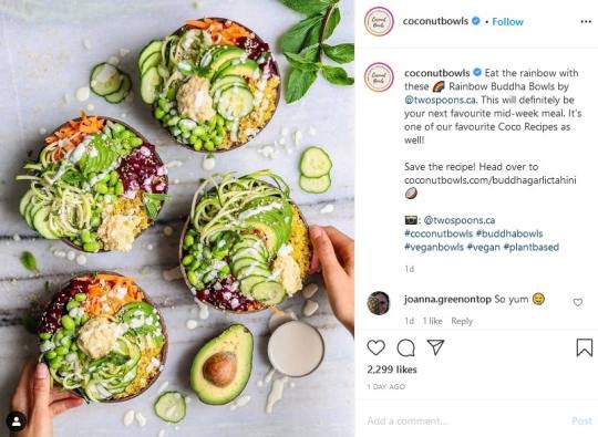
Here’s an example from Coconut Bowls, an online retailer known for its beautiful and eye-catching product imagery:
If you’re still not making use of Instagram Stories for your business, then you aren’t maximizing your brand awareness. An Instagram story maker lets you use ready-made templates and doesn’t need design skills to master them.
One study suggests that when subjects heard a piece of information, there was a 10% likelihood they would remember it three days later. In contrast, after they viewed an image, they were 65% more likely to remember it after the same span of time. Using product images can help your audience recall your products and boost your conversion rate.
In the next section, we will look at different ways to use images and content to your brand’s advantage.
7 ways you can use product images and content to attract customers
To maximize the impact of high-quality images, you need to make them the centerpiece of your social media strategy. You also need to incorporate them into your website design, Google business page account, and email marketing. Great product images allow you to highlight your offers across formats without creating additional material from scratch.
Here are seven ways you can use images as an integral part of an effective marketing strategy:
Perform SEO on your images
Feature product images on social media
Post user-generated content
Include images in email marketing
Add images to your Google My Business account
Use high-quality product images on product pages
Offer a 360-degree view of your product
1. Perform SEO on your images
Most businesses focus on the text, headline, and HTML tags of their content. However, they don’t realize that images have an impact on their site’s search ranking. By performing SEO on your images, you can help them show up on Google image searches. This is important when you’re running an ecommerce site that depends heavily on product images to attract customers.
How do images influence your site’s search visibility? Google is gradually pivoting towards more visual content in search results. In fact, images now sometimes occupy a more prominent position in Google searches. For example, searching for “snowmobile” will yield the following top results:
The third top result leads to an article called “5 New Snowmobiles That Will Get Your Adrenaline Pumping in Winter” on a review site called Robb Report. The image itself doesn’t appear on the top of the page but appears after a few paragraphs:
Why does the photo of the Yamaha Sidewinder occupy a higher search position than the article’s banner image? A quick look at the site’s HTML code gives us an idea:
The code above appears on Line 132 of the article page. On the other hand, the top image doesn’t have any alt tags:

While Google Images uses several factors to rank image results, it’s clear that high-quality images alone aren’t enough to increase page visibility. You need to tinker around a bit with image SEO to make them rank higher in search results.
The example above shows the importance of alt tags in product images. Alt tags are often used to act as placeholders in case an image fails to load. Google also uses them to determine what the image file is supposed to contain.
When you add proper alt tags to your image, Google recognizes and indexes them immediately. This leads to the image getting featured in Google Images results. In turn, this results in higher traffic and more conversions.
Back to top
2. Feature product images on social media
Product images on social media can attract attention to your offers and help you create content that is both informative and easy to share. A study found that about 74% of the respondents used visuals heavily in their social marketing campaigns. If close to three-fourths of marketers use product images, there’s no reason you shouldn’t be doing the same for your brand.
The Instagram post above, from beauty brand Summer Fridays, is simple and focuses on the product itself. Even if the image is accompanied by only a short description of its features, it drives engagement and shares. It also works because while the post itself is information-heavy, it also aligns with the brand’s story.
There’s a qualifier for posting product images on social media, though. Facebook often shows the image that appears first on the page that you’re linking to. This means you need to ensure that the page has great product images too.
On the other hand, Instagram does not allow links in post captions, limiting its usefulness as a source of website traffic. If your business isn’t based in a location where Instagram Shop is available, you need to be creative with your approach. For example, you may use external links or swipe-ups in Instagram Stories to link back to your product page.
Back to top
3. Post user-generated content
While you can always use professional product images on your website, user-generated content (UGC) is a lot more engaging. UGC consists of visual content featuring your brand created by your followers and shared on social media.
People tend to believe that a product has merit if a customer shares their experience with it. Studies estimate that posts featuring UGC get 4 times more click-throughs than branded content. It also increases audience engagement up by 28%. These posts don’t just increase sales; they also help you create a community around your brand.
The example above from Tieks uses a user-generated image to promote its line of shoes. Unlike typical product images, which place the product front and center, user-generated content features your brand in an everyday setting. In the example above, we don’t see the shoes themselves that much. Instead, our attention goes to the mother-and-child duo, which is an even more powerful visual cue.
How do you encourage users to generate content that’s good enough to serve as product images? You could run a contest where users can share photos of themselves using your product and allow them to tag your social media page. You can then offer prizes for the posts that have the most likes and comments.
You can also use hashtags to help spread the word about your brand. These are particularly effective on Instagram and Twitter. One of the most successful hashtag campaigns, Red Bull’s #PutACanOnIt, began as a single piece of user-generated content that most users would find ridiculous (seriously, who holds Red Bull cans over Mini Coopers anyway?).
But because Red Bull takes fun seriously, it took the idea, gave it a hashtag, and ran away with it. The result? Over 10,000 photos with the hashtag #PutACanOnIt on Instagram and Twitter. It became so successful that other brands wanted to join in the fun:
Source: Shorty Awards
User-generated content is free, authentic, and relatable - all desirable traits in a promotional campaign. It also attracts new customers who want to see what the fuss is all about. When your followers post on social media and tag you or use your hashtags, it gives your brand exposure to new audiences.
Back to top
4. Include images in email marketing
Organic ranking and search engines are not the only ways to drive traffic to your site. Email marketing helps you turn your subscribers’ inboxes into your personal marketing solution. While SEO software helps attract potential leads through Google searches, email marketing helps you convert the lead into a customer.
According to Campaign Monitor, the ideal email copy length is between 50 to 125 words. If you feel you cannot keep your word count to a minimum, you may add images to your email campaign and let the images speak for themselves.
Adding product images to your marketing emails also helps you create a brand identity and reinforce your brand's story. For example, Apple's clean and monochromatic aesthetics are consistent through different channels. On the other hand, National Geographic makes heavy use of images, videos, and colors to reinforce its brand identity:
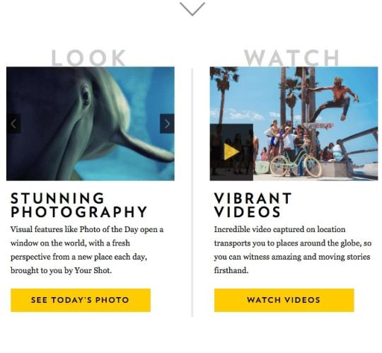
Source: Campaign Monitor
Take a look at National Geographic's email newsletter above, which pulls the reader in with embedded videos of wildlife exotic locations. The entire newsletter convinces the reader to explore the NatGeo site further.
Back to top
5. Add images to your Google My Business account
A Google My Business account is a vital marketing channel for small businesses that want to boost their local SEO. It helps drive consumers who enter local searches for businesses close to them. If they like what they see and feel safe about paying you a visit, they may come and check out your business.
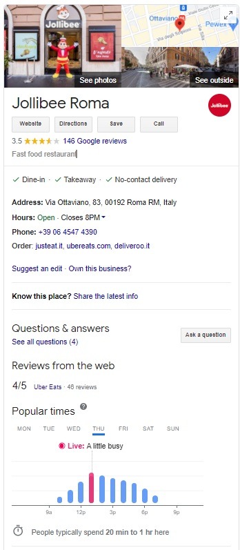
The Google My Business page for the Jollibee restaurant allows customers to take a tour of the business in photos. It also contains contact details and address, business hours, and star ratings. These are all vital pieces of information a customer needs to make a dining decision.
Adding product images to your Google Business profile can encourage customers to give your business a try. If you already have a verified profile, you can open to Google Maps, go to your business profile, tap “Promote,” and choose the photos you’d like to upload. It’s a simple and easy way to increase visibility and give your business a visual presence.
Back to top
6. Use high-quality product images on product pages
While social media is an excellent channel for showcasing your brand, your website also needs great product images. Using high-resolution images on your product pages allows the customer to see the item as if they were holding it in their hands.
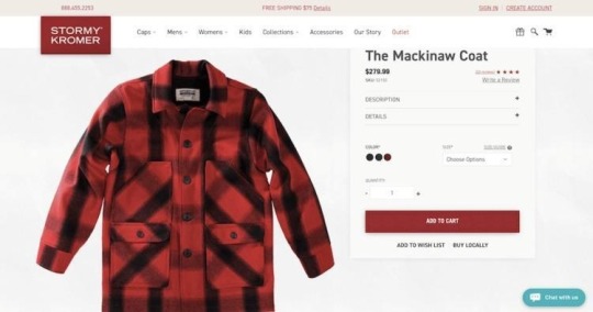
Source:Bigcommerce
The Stormy Kromer page above includes a short description of the item and offers different color options. It helps the customer look at different options and gives them an experience similar to being inside a physical store.
Aside from appearing on your website, product images also appear whenever you post a link to your blog on your Facebook page.
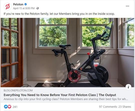
The fitness brand Peloton, for example, doesn’t just sell exercise bikes or treadmills. It also offers classes for all levels of fitness. In fact, it earns more from the classes than from the hardware it sells. However, because their bikes and treadmills are very attractive, they also make great subjects for product images.
Even if you sell non-physical solutions, such as software or services, you can always attach a screenshot of the product in action. These screenshots will help the customer imagine themselves using it. This is quite important as many customers consider the user experience before deciding to purchase a tool or solution.
Back to top
7. Offer a 360-degree view of your product
Another way to make the product's details evident is to show how it looks from each angle. There are three ways to do this. First, you can click high-resolution photographs of the product from multiple angles. Second, you can go the interactive way and include consumer touchpoints on the screen that enable them to take a complete look at the item. Third, you can insert a short video that gives you a 360-degree view of the item:
These product images are a great way to help users learn more about what they are buying. It gives them the feel of an in-store experience but with the convenience of online shopping.
Visuals are a great way to showcase your brand as they help you build a connection with your customer and showcase your brand’s story. They also help you create shareable and attractive content that attracts and engages your audience.
Use product images as a way to showcase your brand, highlight how it fits in with their lives, and tell your brand’s story. Using an SEO tool to add suitable tags to high-quality images will increase your search volumes.
Back to top
Related Content
8 Product Photography Ideas to Help You Sell More Online
6 High-Quality Product Landing Page Designs & Tools to Use
6 Facebook Ad Image Best Practices that will Send your Click-Through-Rate to the Moon
How To Build Your Online Brand With Images
200 Instagram Photos: Examples, Ideas & Resources for Your Business
Bottom line
Product images are a powerful tool for promoting your brand. A good product image has the following benefits:
Informs your customers and helps convince them to try out your product.
Allows you to market your brand to different audiences and across different channels.
Boosts your brand’s search engine rankings and makes your product visible on Google Images through SEO.
Offers your customers a closer look at your product. This is especially true when you include 360-degree photos and simple, zoomable images.
Attracts more engagement through presenting well-defined use cases for your business.
The bottom line? Using creative, high-quality, and high-resolution images shows your brand in a better light and improves the user experience. This leads to new customers, stronger customer loyalty, and more revenue.
Written by our guest writer Nick Chernets, the founder of DataForSEO
A leading provider of SEO data for the marketing technology industry. With an API-led approach to data delivery, DataForSEO is enabling hundreds of software businesses to enhance their products with reliable, accurate, and fresh data.
.flex-container { align-items: center; display: flex; flex-direction: column; justify-content: center; } @media(min-width: 768px) { .flex-container { flex-direction: row; } }
from RSSMix.com Mix ID 8230801 https://ift.tt/3wdNNLR
via IFTTT
0 notes
Text
On-Page SEO: 10 Techniques That Will Boost Your Site Traffic
Master On-Page SEO and change your bottom line!
If nobody knows you exist, how will you ever get customers through the door? Sure there’s advertising, but that comes at a significant cost and doesn’t guarantee you the traffic you’re after.
That’s why search engine optimization (SEO) is so important to your business. It is the frontline to spreading the word and getting you found. So, you want to maximize your on-page SEO as much as possible to get more people to visit your site.
This article helps you to do just that by giving you the lowdown on SEO. Here you’ll find ten of the most effective techniques you can implement and rank up today.
What is On-Page SEO?
While off-page SEO encompasses background processes, such as link building and domain authority, what you really want to focus on first is boosting on-page SEO. This involves optimizing your website and its content to allow search engines to identify what you’re about and rank you accordingly.
This is essential, because the more data that falls in line with your business niche, the more authority you get in search engines. So when they see you providing valuable and relevant content that people like, they start increasing your rank so more people see you.
1. Audit Your SEO
The first step to improving your on-page SEO is to identify what’s currently working and what needs improving. This is a great way to find out what you’re missing and what you can do to fix it.
On-page SEO tools like Ahrefs and SEMRush are excellent for this. They basically scan your whole site and locate errors such as lack of keywords, alt tags, broken links, page speed, and so on. Once you know where you’re at, you can start implementing the next tips.
2. Create Quality Content
If your content is bad, as in providing little value, or is irrelevant to your service, your search ranking is going to suffer. When you create great high-quality content that people want to see, the search engines take notice. More time on your site, more clicks, and shares – all help prove your authority.
Make your content original, well-researched, and exclusive to your website alone. Include descriptive text for videos and images to show what they’re about. Also, include as many keywords as you can to satisfy user intent. So, if they search for something, you’ll pop up at the top.
3. Optimize Your Content For SEO
Before you create any content, you’ve got to do the research. But, even before that, you’ve got to do keyword research. This not only shows you what people are searching for within your niche, but it gives you an idea of what content to create in the first place.
Once you know what your keywords are, build a list, and find longtail keywords and related phrases people are searching for. Then it’s simply a case of adding them to your content, titles, headings, and descriptions to boost SEO.
4. Fruitful Formatting
For pages to do their thing properly, correct formatting is key. Each must have an h1 tag for the title which is displayed in the search results. Make them interesting and easy to read. Then include the other subheadings (h2, h3, h4) for the rest of your content with additional keywords.
All text should be presented so it’s as easy as possible to read. Use a font size of at least 12-14 and use underlines, bold, and italics to highlight important points. Break up large chunks of text into paragraphs of 3-4 lines only to help readers too.
5. Top Titles and Magic Meta
Each page on your site needs a title and meta description. This gives search engines a good idea of what your site is all about and ranks it accordingly. So it’s incredibly important, and a good way to include more keywords.
Keep your titles relatively short and descriptive (less than 60 characters) with the keywords preferably at the start. Meta descriptions (200 characters) add more details to what the site is. And just like the title, you want to make it informative and interesting to get those clicks and rank.
6. Perfect Your Permalinks
A permalink is the URL unique to each page and it also affects your SEO. They’re the part that follows your main website URL after a “/”. They should follow the same rules as your titles to include keywords, as well as being short and descriptive.
Each URL should follow the same structure as your website too. This means categorizing your content so that it’s easier to follow its trail. So if you have a blog that is categorized, the URL should read something like this: https://www.mywebsite.com/blog/topic1.?utm_source=rss&utm_medium=rss
7. Internal and External Links
When search engines read a page, they also look for any links to follow other pages. This gives them a better idea of what your site is about and indicates pages they may not have been aware of. Also, by linking within your site, it keeps visitors there for longer.
When you link externally to other sites, it helps increase authority and value on a topic further, as well as build relationships with others in your niche. Don’t go overboard with internal and external links, and make sure they’re relevant and useful.
8. Multimedia SEO
Breaking up text with images and videos not only add information to content, and makes it easier to digest, but it also helps with SEO. Use small images and include an alt tag description to let search engines know what it is.
Anything interactive like an embedded video is another great way to add more information with less text to read. People generally prefer to watch and listen than read, so it’s another great way to increase time on your site and provide value.
9. The Need For Speed
People’s attention spans are rapidly decreasing. They like to scan more, read less, and don’t like waiting around for pages to load. Search engines see this too as bounce rates affect your rankings considerably.
Make sure your site is up to speed so everything loads quickly and people can get to your content fast. If not, they’ll leave which doesn’t look good for you. Things like reducing image sizes and background processes that slow things down. Aim for max load speeds of 3-5 seconds.
10. Get Phone Friendly
About half of web users access websites through their mobile phones. So if you’re not mobile-friendly, you could be losing out on a huge chunk of traffic. Be sure to include a responsive design so that your site looks great on mobile as well as desktop. Test everything and make sure images load, the text is easy to read, and all links are visible and clickable.
Maximize Your SEO
By implementing just a few of these on-page SEO tips will do wonders for your website and maximize the amount of potential traffic. Include all ten and you’ll be well on your way to the front page in search results.
If you’re struggling, you can always find some on-page SEO services to help. Once everything’s in place, you’ll start to see your numbers go up more than you ever thought possible!
The post On-Page SEO: 10 Techniques That Will Boost Your Site Traffic appeared first on 316 Strategy Group.
from
https://316strategygroup.com/on-page-seo/#utm_source=rss&utm_medium=rss
source https://316strategygroup.weebly.com/blog/on-page-seo-10-techniques-that-will-boost-your-site-traffic
0 notes
Text
5 Email Marketing Metrics You Need To Know
5 Email Marketing Metrics You Need To Know
These days, so many musicians focus all their marketing attention on social media platforms, and while it’s absolutely a good idea to spend time, money, and effort on being where people actually are, the old school methods are still very important.
Email newsletters may seem outdated to some, but they can be incredibly valuable when it comes to not only reaching those who have identified themselves as the biggest fans of your work, but also those who are willing to do the most to support you financially.
If you’re not already sending email newsletters, you need to start now… and if you’re just getting started, make sure you do it right.
Open Rate
Perhaps the most important of all the figures you’ll be examining when you dive into email marketing on a professional level is the open rate. Thankfully, it’s pretty straightforward. Of all the people you sent your latest newsletter to, how many of them actually opened it? That’s the open rate.
Now, I should warn you in advance that even if your list is filled with people who signed up willingly and who have identified themselves as big fans of your band, that doesn’t mean your open rate is going to be anywhere near 100%. In fact, if you get even one-fifth of that, you’re already doing great.
In time, you can watch your open rate to gauge what works with your audience when it comes to the best time of day to send emails, the frequency with which you put them out into the world, and the subject lines that pull them in and get you more subscribers.
There are best practices and suggestions out there, but at the end of the day, you need to play around with everything for a while to learn what your fans want.
Click-Through Rate
If the open rate is the single most important metric you need to pay attention to, the click-through rate deserves to come in second. Getting someone to open your message is a huge win, but what do they do after they’ve quickly glanced through the images and text? Do they simply move on to the next email, or do they actually do something related to the message you sent?
The main goal when it comes to the vast majority of email communication is to get people to click through to a website, but what comes after that depends on the organization doing the sending.
Brands may want a reader to click through and buy something from a newly-announced sale.
A politician may want a potential voter to click through to read about their specific positions on issues.
A band could be looking for a fan to click through to see a new tour date, listen to a new song, or potentially even purchase some new merch.
Monitoring the click-through rate will give you an idea of how effective your messaging is. You may see the number rise or fall depending on what images you use, the headlines you write, and so on, and you should use these suggestions to help you create better emails in the future.
Conversion Rate
Conversion rate and click-through rate go hand-in-hand, and you can’t examine just one.
The click-through rate will show you how many people read your message and actually clicked whatever link was embedded in the message. That’s a big win, but it’s only one of the first steps. Once someone has landed on whatever web page you indicated, do they actually do the thing you wanted them to?
Here’s an example that might clear things up:
The click-through rate may tell you how many fans visited your website to see your new merchandise.
The conversion rate will tell you how many actually purchased something.
If your click-through rate is very high but your conversion rate is surprisingly low, there’s probably something wrong with your actual webpage.
Maybe they didn’t care for the new t-shirts, or perhaps a link was broken and thus they couldn’t enter their credit card number.
The rate itself won’t tell you what’s wrong, but it will help point you in the right direction…then it’s up to you to figure it out and fix it!
ROI
ROI stands for return on investment, and it’s something that everyone spending any money to make any money looks at. When it comes to email newsletters, you’ll want to think about your ROI in two different ways.
You need to consider your ROI monetarily. If you’re working with a company that helps you compose newsletters, keep a database of subscribers, and analyze important figures like your click-through and open rates, you need to think about how much you’re paying them versus how much you’re making from that activity. You might not immediately earn much money from a newsletter, but after a while, it should turn a profit. If you go more than a year or so without actually bringing cash in from your newsletter, something’s not right, and it might not financially be worth it.
You have to look at how much time you’re spending on your newsletter. You should take the time to think about every word and image used, and you want to make sure you’re sending a quality product out into the world, but you also can’t spend too long on every message. Time is money, and if the creation of your weekly or monthly newsletters are eating up hours upon hours, you need to find a way to cut that down dramatically…otherwise, you won’t have any time to actually make the music you’re trying to sell!
Unsubscribe Rate
As someone with a newsletter, you’re always going to be sad to see someone decide they no longer want to receive messages from you, but it’s inevitable. Even if you have the best email newsletter in the world, at some point someone will simply opt out, and you need to be prepared for that.
If you have a small number of people leaving the party, you’re okay…but you want to watch this rate carefully to see if you’re doing something wrong, or perhaps if you’ve got it all right. If you see a large number of people jump ship after a specific email, you need to think long and hard about why. If you notice that a lot of fans opt out after just one message, you’re really doing something wrong.
You want to hold onto as many hard-earned subscribers as possible, so take note whenever someone tells you they no longer want your alerts, but don’t take it personal!
5 Email Marketing Metrics You Need To Know
Music Marketing Blogs
5 Email Marketing Metrics You Need To Know
from WordPress https://ift.tt/32DF891
via IFTTT
0 notes
Last Seen Blogs

studiooctava
Studio Octava

lisa20011999
massage in dubai

thebioticbasilisk
TheBioticBasilisk

transparentanchorgardener-blog
yesilcamtube

boy-kim
Hello