
Statistics
We looked inside some of the posts by thecoloroute and here's what we found interesting.
Average Info
Notes Per Post
9K
Likes Per Post
7K
Reblog Per Post
2K
Reply Per Post
12
Time Between Posts
1 day
Number of Posts By Type
Text
12
Note
1
Last Seen Tumblr Blogs


Fun Fact
The average Tumblr user visits about 67 pages every month.

Text
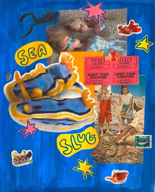
amazing work!
The sun is starting to set earlier and earlier, which means I get to see some beautiful views on my commute home ☀️
9K notes
·
View notes
Note
do you usually post your art or is it everyone elses
:-) my first question !!
yes i do my last post is actually ones i made but i do like to write about other artists mostly, its easier for me to mix the two and keep up with a blog that way cause sometimes my creativity doesnt wanna perform lol
thanks for the question!!! lmk if u have any art or artists you'd like to see on here
1 note
·
View note
Text


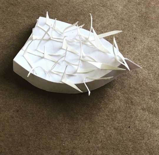
RISD bird sculptures. paper. 2019
3 notes
·
View notes
Text
Creative Things To Make When You're Bored
bookmarks. can be out of paper, cardboard, crochet, tape, etc. sky's the limit
bracelets (cool thing to keep in mind is almost anything can be a bead?????)
dreamcatchers. dont get overwhelmed about materials. i use twigs from outside, fabric or string or ribbon the cover up the twig when i want to, and string to make the knots, then add beads and some feathers if u have, if not, pinecones acorns shells and dried berries or oranges would also be super cute
crochet hand warmers. literally so easy its a long rectangle that u never connect at the thumb area. quick simple and super useful
a terrarium. i went outside and found a snail so i made him a natural enclosure with some other buddies. dont have him anymore lol but any kind of terrarium is cute and easy and it lasted me a long time so would def recommend
mini paper crafts: idk how u guys feel but anything mini is so cute to me sooo u know those rings that u use to count down holidays and you rip them off cause theyre paper? i made a colorful mini string of those to use as decor on my wall (its so cute ill probably update this w a pic of it lol)
mini origami!!!! simple and cute. i used to hand mini colorful cranes from my ceiling and now that i type this, i may do it again in my new place
tic tac toe sets with rocks
im getting sleepy so thats it for now but dont u worry theres always more to come. sleep well everybody <3
3 notes
·
View notes
Text
Art Deep Dive: Ines J.
Words cannot truly express how I feel about this artist! but i will try.
I discovered Ines J. on instagram where they go by the handle @a.creature (ive linked her direct instagram to this @ so it will not take you to a tumblr account of theirs, not sure if they have one but i will check and edit this after typing everything up if so!).
From what i've gathered, Ines is a very multifaceted artist that incorporates their work into a variety of mediums and trinkets. Im going to highlight some of the recent works of theirs that I'm absolutely obsessed with. to be honest, they're all fantastic though so i would definitely recommend checking their page out and getting lost in a surrealist paradise of wonky doodles.
my thoughts on the pieces are going to be in bullet form so bear with me.
bodies, demons, faces, morphed creatures, morphed selves
stickers, commercial, industrialized, contrasting organic lines
organic shapes resembling body parts, intestines
bright color unnatural to regular body tones, for emphasis? (or personal taste which is what id do for color choice)
the beautiful inclusions of black imagery, woman on top left is my favorite she looks so haunted and her hair reminds me of myself on a rough morning
"on & on" speaks to works theme of chaos and continuing on despite it, like me during those said mornings
unraveling in a sense

god! beautiful color choices just IMMACULATE
THE FACE ON THE LEFT? THE CONTRAST OF THE BLUE WITH THE ORange??? Ines!!!!!!!!!!!!!! great job
different features, organic material
text adds to juxtaposition of natural vs. unnatural which is a common theme
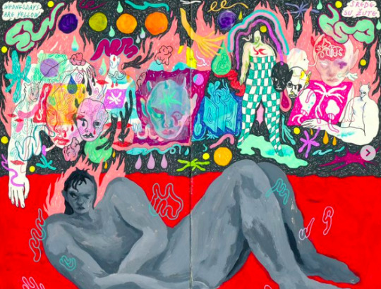
Wednesdays do feel yellow. sometimes being human is about being alive to hear/see observations like this
i am guilty of throwing checker patterns in lots of spots on my art, love the teal checker pantsuit here it fuels my soul
red, anger, angst, sex, sexuality
large dominant figure is not happy, and contrasts to the abundance of color around, could signify a void or lack of emotion, creativity, maybe even happiness
this drawing reminds me of how it feels to scroll through instagram on a bad mental health day while it seems like everyone else is living their best lives while i occasionally rot

reminds me of something similar i said to the man i currently am infatuated with, minus the airplane part
"oh what can you do!" this is how i feel about him lol. the black and lime green image of the two people also reminds me of him
i wonder if this piece is based on a lover... probably
tears, unfinished boxes, distance that is most likely unwanted, lack of memory
when those things fade we will do our best to capture things creatively like this in art as a shrine for the emotions we feel and have felt but ultimately have to let go of
drawings like this break my mf heart (cause they remind me of when i was mf heartbroken lol)
and ykno what yes to the green head on top right corner, everyone has their own interpretation but that makes me think ya love can actually make you lovesick and that is how id mentally draw myself with the green worm sliming out and all bc sometimes thats how it feels out here
more tears i see:(

one of my favorites that i've seen so far honestly?
this image reminds me of myself and im sure a lot of women feel the same
colorful blobs at the top, bubbles of experiences, memories that have passed, things that make you who you are, and the shapes get more specific and thought out in terms of painted construction as you near the woman (red star, blue circle, black teardrop, etc).
delicate nature of the wispy but sharp surroundings behind her, like a girly, cosmic barbed wire (luv it)
pink and overall colors mentioned before contrasts with the deep blue and black used to illustrate her, somber colors and face expression, head down
the vibrant red flower seems to be the focal point, most vivid spot in terms of color
to me symbolizes a feminine rage because it is so big, red and bright that it is something which naturally demands to be seen
her demeanor is the exact opposite, like a woman in society trying not to seem out of line even though she has every right to be upset
cultivating the flower, knowing when to let certain emotions bloom?
possibly being tired from not being able to let certain emotions bloom
okay thats all for tonight everybody. i know ive been saying that i'd do this for a while but adult life can get so hectic. Also i wanted to wait till i found someone i really enjoyed so i wouldnt get writers block halfway through this blog post. here's to ines j. for being a super dope artist!
#ines j.#art#modern art#deep thoughts#deep dive#art analysis#art education#artwork#art and design#illustration#abstract#surreal#surrealism#instagram#inspiration#interpretation#thecoloroute#a.creature#highlighting artists#artist support#artisticexpression
1 note
·
View note
Text
Back To School Shopping List for A College Freshman Art Student
Hi guys I went to RISD a few years back but I do remember looking up this question. if you're not going to college just yet but are interested in art, it could be super useful to get comfortable using the tools/mediums below. even though i know most teachers give a materials list the first day, i needed to be prepared way ahead of time because of my anxiety. in my case, i was told id get a list in person, but walking in with an empty bag just felt wrong to me lol??? i ended up bringing a couple things, but missed a few vital essentials so here's a list of everything that i can think of. read to the end for my wagon epiphany that i think all art students should adopt (if they havent already)
-a notebook or planner (lined). some professors will hit you with extremely important info right away and wont always tell you to write down what they're saying but 90% of the time its important stuff you dont wanna miss
-a sketchbook. this can help if they throw a quick exercise at you and you have to write/draw something quickly. i blanked and didnt bring a sketchbook from home (because i was told id need to get certain types according to the teacher's specifications) but looking back idk why i didnt?? first days are hectic. actually the first week lol. anyways there were single sheets offered but honestly having your own right off the bat helps for organizational purposes, saves time, and IF YOU'RE LIKE ME, prevents the need to get up in front of everyone
-writing utensils. I'd recommend a nice pen and a set of drawing pencils (doesn't have to be anything crazy cause your teacher will most likely request that you buy more advanced/specific tools later on)
-headphones. every teacher is different, but usually art students will be given little tasks to work on during their first day in class at college. I was not clever enough to remember to pack my headphones, and the silence in a room full of focused art students can be especially unnerving when you're nervous. Hearing a student's questionable music taste can be equally unnerving, so make sure to pack those.
-snacks/drinks. this is kind of a branch off of the last one, cause again it can get sooooo quiet in these classrooms/studios. Pack snacks to prevent belly grumbles. I have heard it happen to many people in my classes and i am a victim as well. stay ready
-sunglasses. seems trivial but super important because you'll probably be walking around outside a lot your first day. this is the typical college commute, up down and around the streets.
-MONEY. I AM GOING TO PUT THIS IN ALL CAPS BECAUSE THIS WAS BY FAR MY BIGGEST MISTAKE LOL. UNFORTUNATELY, STAY STRAPPED WITH CASH OR CARD BCUZ! SOME OF THOSE ART SCHOOL PROFESSORS ARE A LIL BOUJEE AND WILL SEND U RIGHT TO THE CAMPUS ART STORE DAY ONE. It was very overwhelming for me, and some might think its common sense but idk my entire school career you always get some time after school to buy that stuff. they really sent us shopping ten minutes into class so be aware or look broke like i did.
Other than that, all the stuff you'll have to potentially purchase that day will be specified by the teacher. If you're worried about getting the wrong thing, don't be. The students get to go together and the teacher gives very specific details about the products to buy, which the campus store workers are well aware of. Off the top of my head, i remember being sent to get materials for a few different classes throughout the day. I'll list them here without the brand specifics (1. cause i dont know and 2. cause it may not match what your teacher will want anyway) just to give you a general idea.
-large ruler, metal, 1 yard (3 ft)
-clear plastic t-shaped ruler for drawing
-sketchbooks, drawing pads (of all sizes)
-a large portfolio (looks like a gigantic black totebag for big art papers)
-sewing kit
-string
-muslin fabric
-ink pens
-drawing pencils, different sizes
-drawing charcoal
-white paper drawing blender, a good eraser
-a toolbox for the drawing materials
-gouache paint
-brushes, pallets
-oil paint crayons
-a tool box
-ink pens like harry potter
That's pretty much it. If you'd like to grab some of these things before hand it should be fine, but for the most part id stick to waiting just to be safe.
Also a side note: I was a commuter so i could run home and grab my materials collected over my entire life but not every student is this lucky and some of their homes are thousands of miles away. if ur a traveling bird like them, it could be very VERY useful to pack some cool materials and tools like idk holographic paper or a jar of crystals because CAMPUS ART STORES ARE VERY EXPENSIVE!!!!
Also....... i know it sounds a little ridiculous but there were many many times i wished i had bought a wagon to transport things around campus. imagine me with a like 4ft portfolio bag the size of my body, a pencil toolbox, another toolbox for actual tools, my backpack, any projects i may have brought, a coffee if i am holding one??? and god forbid its a rainy day and i needed my umbrella lol.. it looks & feels difficult anyway trying to lug all the stuff art school requires.. so thats just some food for thought. Imagine a cute pink wagon?!??
anyways thats a wrap, have a lovely school year artists!
#art#art school#art education#art university#college#materials#back to school#back to school supplies#art student back to school list#art student back to school materials#materials list#risd#college life#artist support#art tips#school#commuter#out of state#campus#whats in your bag#what should be in your bag
14 notes
·
View notes
Text
Another Wednesday
Hi everyone, I hope your day is going better than mine. Work was very slow today but its the nature of my job to be a bit up and down financially so I'm not too hurt about it.
Im going to take a dive into social media and find some artists I wanna talk about so stay tuned for that later on while I keep myself occupied from a lack of work clients lol.
Also, feel free to submit your own work through the link on my page if you'd like me to write about you or an artist you like.
Friendly kisses and happy wishes,
The Coloroute
0 notes
Text
#15 Collaboration Piece With Walter Brown

I’ll be examining the artwork titled “#15 collaboration piece with Walter Brown” by artists Bonny Leibowitz and Walter Brown. This piece was created in the fall, specifically on September 28, 2022 and was on display at the Art Gallery exhibit (room A-175) at Collin Campus this September 28-October 26, 2022 for Leibowitz’s show (Leibowitz, 2022).
Bonny Leibowitz is an artist from Philadelphia who serves as an active member in the Dallas art community (Brown, 2022). She’s particularly fond of applying different textiles and miscellaneous objects or mediums into her works, stating that she enjoys “the unexpected mix; old and new, handmade and manufactured” (Burns, 2021). Her bright, abstract way of creating sculptures combines well with Walter Brown’s artist style in this collaboration between the two. He is also known for vibrant use of color, but typically applies this to 2D works instead of 3D like Leibowitz.
The piece is made out of branches foam and plastic which is listed in the work’s description. It appears to be sticking to the wall, attached in some type of way where the securing object between the wall and the artwork is seemingly invisible. Reaching out with numerous mangled tendrils, the organic 3-D structure offers a variety of textures for viewers to get lost in. Different surfaces of the piece have been transformed in different ways, with certain areas appearing to look like coral, skin, or tangled hair. Most of the outer artwork consists of electric blue branches of different sizes, bending and twisting in different directions as they protrude into space. Parts of the blue branches appear to have a hairlike material that is present throughout the piece. This could be from stray glue, melting strings of paint or trimmings from the bark. The thinness of this element in comparison to the branches add a fine, detailed aspect to the sculpture. In the middle section of the sculpture, it looks like white, melted, deformed plastic has been placed and sculpted into the center of the branches. Tools of some kind were most likely used to manipulate the melting plastic into holes and swirls in between the branches. Underneath the white plastic is some sort of gray material that also appears to have melted, but is barely noticeable because of how muted the tone of gray is. Throughout most of the bottom of the piece, a hint of yellow paint is used in different objects which contrasts well against the blue and white that are prominent in the piece. The yellow paint is applied in a messy manner, with only partial coverage wherever it is used, unlike the complete paint job of the blue branches. Due to the lighting in the gallery and the artwork’s silhouette, the shadow on the wall appears to be a mass of different sized branches and crevices, letting pockets of light seep through. The overall mood and adjectives associated with the peace is intriguing but rather grotesque because of the jagged and brutal marks and ships created in the peace.
A constant method evident in both Walter Brown and Bonny Leibowitz’s work is their use of abstract forms and bright color. Leibowitz in particular, experiments frequently with the cohesion of different elements in her art which give off the overarching theme of different worlds colliding. The work is most likely intended to highlight the contrast mainly between two different subjects, because of the two most identifiable elements in the piece, in this case being the branches and the white plastic. This could be a message to viewers about the relationship between nature and man-made items, as well as the destruction human manufacturing has caused towards the environment. The rough, mangled quality of the piece signifies this damaged relationship between the two subjects or elements, but their proximity and state of intersecting suggests the two are negatively intertwined. In various different ways, this could represent relationships of all kinds. A viewer could interpret the meaning of this piece as the branches overwhelming the plastic, in the sense that one force of good is overcoming another force of evil.
Though the piece is rather uncomfortable to look at, the loss of comfort is replaced by a sense of intrigue. This makes the piece enjoyable to me and viewers like me, because not all art is meant to be aesthetically perfect and pleasing. The unusual approach of destruction present, the vibrant color of most of the piece, and the contrast between the natural and artificial materials used makes for a thought-invoking experience for viewers. Behind this artwork, the message could be telling viewers to pay more attention to the drastic changes occurring around us, especially in environments where nature is still preserved. Human behavior is contributing to the destruction of the planet in detrimental ways, and this piece effectively carries the essence of this idea through the chosen elements.
Sources
Brown, Walter. “Walter Brown.” Saatchi Art, 2022, https://www.saatchiart.com/walterbrown.
Burns, Emily. “Bonny Leibowitz.” Maake Magazine, 2021, https://www.maakemagazine.com/bonny-leibowitz.
Leibowitz, Bonny. “#15 Collaboration Piece with Walter Brown.” DigitalCommons@Collin, 2022, https://digitalcommons.collin.edu/seen2022/15/.
#art#collaboration#walter brown#bonny leibowitz#installations#installation art#sculpture#art gallery#environment#enviroment art#foam#plastic#global warming#self expression#artisticexpression
2 notes
·
View notes
Text
Moving Forward: Collaborative Project by Outdoor
A teacher once assigned my class to a collaborative art project. The instructions were to pick a partner and together, pick an artwork and re-create half of it in any manner we see fit. Then, we would eventually come together to combine both halves. Once combined, the work as a whole helped reflect both artists through the contrast of our chosen expression of the piece. Collaborative art offers artists and viewers the chance to consider multiple perspectives, expanding the way people think by offering other ideas simultaneously.
Moving Forward is a collaborative project started by the group Outdoor, which aims to encourage communication amongst artists in the surrounding community (Barbieri, 2014). Located in San Lorenzo, Rome, the exhibit is contained inside of a building that was reused with the purpose of enabling collaborative works for artists in the area. The goal is to promote a space that allows emotional and intellectual discussions to take place through art. Taking a closer look, we will be examining only one of the rooms in depth for further analysis. Artist JB Rock contributed to this project by displaying his art all over the walls of his designated room. Formally titled “Self Portrait”, the work was completed in 2014.

Upon entering the room, viewers are immediately immersed in a world of movement and color. Rock’s art completely embraces the viewer, as opposed to some of the other rooms in the building with only a few elements painted on the walls. In this particular room, the artist has chosen to cover the full interior with his work. Viewers are captivated by the unknown but seemingly familiar symbols, which some may find overwhelming due to it being literally everywhere. I personally find it to be refreshing, in the same way that some people find excitement in the chaos of the city or the energy of a crowded concert.
Looking around, there are black symbols that cover every inch of every surface. They look like letters from another language at first, but are soon understood to be unrecognizable. On the walls, the negative spaces created from these symbols are filled with colors of all sorts.
JB Rock’s work could be best categorized as street art and abstract art. The overall project aims to highlight street artists and muralists, and promotes the immersive building as an outdoor/indoor part of the community. His work is abstract because it does not depict any real object.
The location of this artwork provides a unique emphasis on JB Rock’s work when viewers experience it because it is unique in its own way. Each room in the building is purposely designed to be different and reflect different artists. The contrast of Rock’s work results in a very interactive and overwhelming sensation from the piece because it is everywhere inside this enclosed space.
For the project as a whole, the historical context relates to the current conversations going on in the community at the time of its creation. The building was reused to allow artists in the community to express themselves and their ideas. Outdoor intended to avoid labels or big brand names, “so that the general is narrowed down to the individual” (Barbieri, 2014). It is a local project intended for local artists and viewers. With JB Rock being native to the relative area, his work contributes to the community’s ongoing conversations and emotions. Overall, the building and project reflect the neighboring community’s shared perspective because nearby artists are encouraged to create works there as a form of local artistic discussion.
Upon further examination of JB Rock’s “Self Portrait”, the composition of the piece includes symbols that are reflected on every surface throughout the room. They’re placed together very closely, appearing crammed with no spaces in between. The main components seen in the piece are the black unknown symbols and the colors placed around them. At first, they appear familiar as if the symbols were letters that created a message, but after taking a closer look viewers eventually realize it’s just random symbols. Rock doesn’t utilize the rule of thurs or distancing with optical perspectives. Instead, he focuses on what is best explained as two dimensional patterns that echoed throughout the space repeatedly.
JB Rock utilizes a variety of formal elements in his artwork. Lines are used to create different symbols that represent letters. On the walls, the shapes created in between the symbols are emphasized through use of color. He uses black for the symbols and a variety of colors used in between the spaces.The repeating symbols crammed together create a random pattern of lines throughout the room. A lack of space is presented in the work because the symbols are jam packed all over every surface. A skylight in the middle of the ceiling as well as ceiling lamps throughout the room provide lighting for his piece. The skylight could be considered the focal point of the piece because it is where the most light comes through, and it stands out in the room.
Organizing principles are used to create a sense of chaos in the peace. Elements are combined in an equal but crowded way. The symbols themselves are not symmetrical but the entirety of the space is covered which gives the room balance in terms of space. Emphasis is used through color in the negative spaces that the symbols create, which is only done on the walls and causes them to stand out. The same proportion is applied to the symbols throughout the work, contributing to it appearing almost like a pattern. The constant rhythm throughout the piece is achieved by the placement of symbols. As a whole, the work gives off the energy of fast paced chaos, like the jotting down of an idea before it’s gone. Rock achieved this by first painting the symbols all over, then going in with color to emphasize different areas.
The use of indistinguishable symbols could represent a language only the artist knows through expression, representing his possible feelings of having been misunderstood. The symbols could also represent wanting to share a message in a way that caused chaos and confusion in the viewers, because they can never be understood. Psychologically, black is known to represent mystery, power, elegance, and sophistication (Ferreira, 2022). This contributes to the idea of mystery behind the meaning of the symbols. Multicolor or rainbow can represent “positivity, creativity, and joy” (Roberts, 2022). It’s reasonable to assume that the theme of the work is personal expression through abstract art. JB Rock aims to achieve “impulse that comes forwards before any words, ideas, or reflection on the artistic work” (Project Outdoor, 2014). His goal is to bring on an immersive reaction from viewers rather than an intellectual response.
Sources
Barbieri, Francesco. “Outdoor - Moving Forward - Ex Dogana - Google Arts & Culture.” Google, Google, 2014, https://artsandculture.google.com/story/outdoor-moving-forward-ex-dogana-street-art-rome/IwVhBvQiTgAA8A?hl=en.
Ferreira, Nicole Martins. “Color Psychology: How Color Meanings Affect You & Your Brand.” Oberlo, Oberlo, 8 July 2022, https://www.oberlo.com/blog/color-psychology-color-meanings#black-color-psychology.
Liselle, Rhiannon. “Understanding the Rainbow: The Psychology of Colour.” Daily Life, 2 Apr. 2019, https://dailylife.com/article/understanding-the-rainbow-the-psychology-of-colour.
Project, Outdoor. “Self Portrait - JBROCK - Google Arts & Culture.” Google, Google, 2014, https://artsandculture.google.com/asset/self-portrait-jbrock/MQHWXIixD5eUAQ?hl=en.
Project, Outdoor. “Virtual Tour of Moving Forward.” Google Arts & Culture, Google, 2014, https://artsandculture.google.com/.Roberts, Martha. “The Psychology of Colour: Multicolour.” Psychologies, 18 Feb. 2022, https://www.psychologies.co.uk/the-psychology-of-colour-multicolour/.
#art#collaboration#outdoor#publicsector#public art#art education#descriptive analysis#grafitti#wall art#spraypaint#urban art
1 note
·
View note
Text
Gulliver in Wonderland Analysis

This artwork is a mural painted on a house in 1900 W. Cullerton Street in Chicago. The title is Gulliver en el País de las Maravillas (Gulliver in Wonderland). It was started in 1999 and finished in 2004, created by Hector Duarte.
There is a mural painted on a brick building. A man with a mustache can be seen extending one of his arms up with his palm open, in front of a red and orange background covered in what looks like black clouds on fire. The man is wearing a blue baseball cap and a white mask that's covering only his eyes, which appear very dark, giving him the appearance of a half-skull, half-face appearance. The jagged red, yellow, and orange brush strokes used on his body make his skin appear to look like the flesh underneath, and barbed wire is wrapped around his body and fingers. A little house is painted on the side to mimic the brick pattern of the real building and there are plants along the bottom of the mural.
It is representational art. It could not be considered abstract or non-representational. This is because it portrays an image of something that is easy to identify. In this work, viewers can easily recognize the depiction of a man.
Personal expression is one of the themes of art that describes the contact of this artwork well. The emotion that is brought by the gory image could easily be described as emotional and expressive, which comes from a personal place in the artist. Even the artist’s quick, jagged brushstrokes match the chaos depicted in the scene. It could also be conflict/adversity because there is an obvious struggle in the artwork, which is the man struggling against barbed wire.
Through critical analysis of the artwork’s themes, it can be assumed that the man is enduring pain physically as well as emotionally because of how emotionally charged the artwork appears. He stands in a surrender position, with an unmoving face, while maintaining eye contact with the viewer. In contrast to his chaotic and dangerous surroundings, his apparent calmness makes him appear physically and emotionally resilient in the face of turmoil.
The principles of design support my ideas because they help make up different components of the artwork, which as a whole come off as both chaotic and resilient. Mainly, the large scale of the calm faced man, the emphasis of bold color through fiery reds and oranges, and the sporadic rhythm of the brush strokes contribute to the chaos and resilience.
Scale and proportion in the visual arts refers to how big an object is in relation to the entire work as a whole. The scale of the man is presented very largely to easily portray him as the main subject of the work. His scale also allows for viewer’s to better see his facial expression, which largely contributes to the work’s message overall about resilience through pain.
Balance in visual arts refers to how the objects in a work are placed. In this artwork, the main subject and background are painted asymmetrically. Because it is painted on a house, the man’s asymmetrical body position stretches around the building's exterior, reaching different sides. Clouds are also painted haphazardly and asymmetrically in the sky.
Contrast in visual arts refers to the difference of objects. The man’s dark eyes contrast with the bright white of the mask. His bright blue cap contrasts with the overall warm tones used in the rest of the work. The warm tones consist of reds, oranges, and yellows.
Repetition in visual arts is when something occurs over and over. In this artwork, the usage of barbed wire and what appears to be black clouds on fire is constant throughout the piece.
0 notes
Text
Good Morning
it's 1am and i've had the spontaneous idea to finally start my blog because it'd be something nice and wholesome to do. anyways my name is kiara, nice to non-formally meet anyone who comes across this. i may have to repeat this but if i do post about anyone i find online and they're not okay with it, no worries just let me know and i'll take it down. my page is going to mostly be my art and other peoples art, maybe the occasional sappy thank u and well wishes lol.
here is an old and dramatic photo i created when i was extremely sad (and heartbroken). i think i have always seen myself in millions of colors. im currently feeling lavender

1 note
·
View note