
Statistics
We looked inside some of the posts by acsvisualplay and here's what we found interesting.
Average Info
Notes Per Post
55
Likes Per Post
42
Reblog Per Post
13
Reply Per Post
0
Time Between Posts
1 month
Number of Posts By Type
Video
4
Photo
13
Last Seen Tumblr Blogs


Fun Fact
Users from the US are the majority of Tumblr visitors.
Video
vimeo
SNASK X ADIDAS ORIGINALS
Helping Sneakersnstuff and adidas Originals to find the perfect guy to introduce and test the new exclusive Stockholm Pack release with GORE-TEX® technology. This is Thomas, one of Stockholm’s most respected puddle jumpers. The adidas Originals Stockholm Pack is exclusive to Sneakersnstuff.
#adidas#design#graphiv design#graphic design#video#creative#funny#puddle jumper#sweden#stockholm#snask#design agency
2 notes
·
View notes
Photo


VAULT 49 X DUNKIN DONUTS
So 3D inspiration from bombshell design studio as they team with dunkin donuts for some tasty work
2 notes
·
View notes
Photo


OK CUPID X TOILET PAPER
DTF – a modern acronym meaning ‘down to f*ck’ – is a ubiquitous term used in contemporary dating to refer to a person who, as it states, is willing to have sex. Now, digital dating app OKCupid is attempting to reclaim DTF by presenting a host of new interpretations of the word behind the letter F, in a new range of ads.
‘It became clear that the way this came to life visually would have to be bold and provocative,’ says Melissa Hobley, CMO of OKCupid. The creative minds at advertising powerhouse Wieden + Kennedy stepped in, proposing artist Maurizio Cattelan and photographer Pierpaolo Ferrari – the duo behind visual bible ToiletPaper and who have also conceptualised ads for Kenzo, collaborated with MGSM and designed home accessories for Seletti – for the job. Hobley and her team thought their vibrant, cheeky images were the right fit.
The ads they designed range from the conventional – ‘DTFarmer’s Market’, illustrated with a woman pushing a man in a wheelbarrow full of vegetables, and ‘DTFoot The Bill’, accompanied by two feet, one holding money, the other one clutching a wallet – to the outspoken: ‘DTFight About The President’ sees a blue hand thumb wrestling a red hand in a ring, while ‘DTFilter Out The Far Right’ is accompanied by a hand throwing a gun down a toilet.
Some are outright silly, such as ‘DTFour Twenty’, illustrated with a couple sitting on a flying loveseat. There’s also an ad depicting a same-sex couple holding each other with the phrase ‘DTFall Head Over Heels’. At the bottom of each is OKCupid’s logo with the tagline ‘Dating Deserves Better’. The advertisements will run across OKCupid’s Twitter, Instagram and Facebook accounts, as well as on billboards and subways in New York. They will also be up in Austin and Portland.
#DTF#okcupid#toiletpaper magazine#design#art#advertising#photography#graphic design#ACS#Apple custard studios#ACS Visual play#bold#bright colours
1 note
·
View note
Photo

ACS X NEW WORKS
We got some new works up on our instagram page, which can be seen here.
So do you like skulls? or hostile takeovers or even some type design...why not have a cheeky peek ;-). If you like animation we even have something pretty cool animating over there ;-)
#acs#apple custard studios#design#graphic design#photography#retouching#digital art#composition#photomanipulation#skulls#new work#death#acs takeover#animation#instagram#typed#suicide squad
0 notes
Photo


READ TO ULOCK X CHILDREN
An increasing number of children in Sweden have trouble with their reading and writing skills. The amount of distractions from smartphones, games and computers make children read less and less. To prevent this negative development and to help parents and children use the technology in a productive way, Ministry of Tales – a non-profit foundation that runs writing centres for children – has developed Read to Unlock. Read to Unlock is an app that locks the tablet it’s installed on. Children who would like to use the tablet can unlock it by reading a chapter from a book that suits the child’s age/reading skills and then answering fun questions and writing exercises. Thus making a habit into a reading session every day.
#APP DESIGN#design#interacive design#children#books#tablets#graphic design#change#learning#skills#mobile design#acs visual play#apple custard studios
0 notes
Video
youtube
MIRAJ BY SOSOLIMITED x APPLE TV
What if you could make art by talking to your TV? Miraj is an Apple TV app that lets you paint with your voice. Say something into your remote – ‘hamburger’ for example and of Miraj will create a collage of imagery based on that word.
#apple#apple tv#miraj#sosolimited#soso#design#Interaction Design#interactive#collage#imagery#relax#graphic design#animation#acs visual play#apple custard studios
0 notes
Photo

NIGHT TIME BASKETBALL
We are geting ready for some night time basketball here at ACS HQ. We’re playing to the stars and back!
follows us on instagram: @applecustardstudios
#apple custard studios#acs visual play#gif#animated gif#design#illustration#photoshop#digital compositing#space#NBA#spalding#basketball#nike basketball#adobe
15 notes
·
View notes
Photo


HEINZ X NEW AD CAMPAIGN
If you were one of those Mad Men fans that felt that some of the fictional ad campaigns created in the show were better than any we’ve seen in real life, then you’ll be pleased to hear that one of them has this week crossed out of the world of TV drama and onto the billboards of New York.
The campaign in question is a set of print and poster ads for Heinz ketchup that Jon Hamm as Don Draper pitched during a 2013 episode of the series. The ads, as the client points out in the programme, are bold: the product is not featured at all and instead close-up photographs of foodstuffs such as fries, steak and a hamburger are centre-stage, topped with the simple line ‘Pass The Heinz’.
#HEINZ#ADVERTISING#DESIGN#iconic#acs visual play#apple custard studios#graphic design#mad men#fiction mad real#pitch#photography
2 notes
·
View notes
Video
youtube
KENZO WORLD X THE NEW FRAGRANCE
Kenzo pulls out all the stops to bring you a different type of fashion film for their new fragrance... we must say it is a bit special
#kenzo#kenzo world#fashion#fashion film#film#photography#beauty#reggae#design#acs visual play#apple custard studios
1 note
·
View note
Photo


MOZILLA REBRAND X JOHNSON BANKS
Internet advocacy and software group Mozilla has revealed its new logo and brand assets – including a bespoke typeface, colour palette and proposed approach to imagery – following a seven-month “open design” process documented on its blog
The Mozilla logo is based on one of seven options put forward last year. The design reflects the brand’s connection to the world wide web, with a colon and two forward slashes replacing the ‘i’ and two ‘l’s in Mozilla.
Peter Bil’ak of Dutch type foundry Typotheque has created a bespoke font, Zilla, for the wordmark and accompanying copy. The font is reminiscent of Courier – the default font used for coding – and was selected for its “journalistic feel”, reflecting Mozilla’s internet advocacy work. It is open-source and will be available to download for free.
Mozilla creative director Tim Murray says the company chose to work with Typotheque because of the foundry’s expertise in “localisation” and creating fonts in various languages. As Murray points out, the design bucks the current trend for sans serif fonts in favour of something rooted in the visual language of the internet.
#acs visual play#apple custard studios#mozilla#rebrand#design#graphic design#johnson banks#internet#visual identity#visual#colour#minimal
0 notes
Photo


DEMI MESURE X FACTICE
we are really taken back by the clarity within the skin and makeup
CREDIT:
Photographer, Christina Kapl Makeup, Melanie Hoppe using MAC Cosmetics Model, Romy B. at Munich Models.
#acs visual play#apple custard studios#christina kapl#mac cosmetics#munich models#facticemagazine#beauty#beauty retouch
1 note
·
View note
Photo

CREATIVE BLOCK???
A few ways to open back up your minds!
#creative block#design#graphic design#art#infographic#arts#acs visual play#apple custard studios#help#happens to all#illustration#ai
15 notes
·
View notes
Photo

POP MAGE X ANYA HINDMARCH
The Vere Barrel, a new bag release for men and women...LOOKS SEXAYYYYY!
Mixed with some nice set design, its got it all going on!
#anya hindmarch#fashion#bag#accessory#style#chic#photography#smiley face#wink#design#textiles#acs visual play#apple custard studios
1 note
·
View note
Photo

POP IMAGE X COS
You know when you see a simple but relaxed image....well we had to post this from from COS aka Collection of style
#fashion#fashion photography#COS#Collection of style#green#nature#relaxed#design#photography#simplicity#acs visual play#apple custard studios
11 notes
·
View notes
Photo
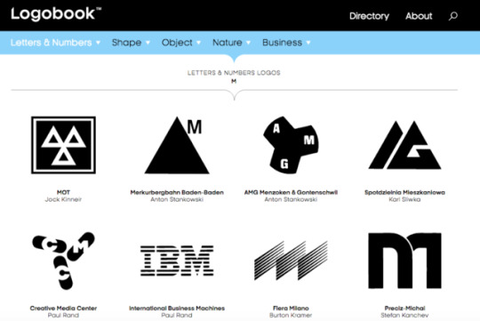
LOGOBOOK X LOGO DESIGN
If you enjoy looking at logo designs, prepare to lose a few hours with a new website, Logobook, which collates identities going back to the 1950s.
Created by a group of Swiss designers, who are now located around the world,Logobook aims to serve as both a resource and an inspiration to design fans. Currently in beta phase, its creators are adding to it all the time.
#logobook#design#logos#logo design#branding#visual identity#logo mark#graphic design#reference#creative#acs visual play#apple custard studios
2 notes
·
View notes
Photo


NEW LSO IDENTITY TRANSLATES SIR SIMON RATTLE’S CONDUCTING INTO GRAPHIC FORM
Using motion capture, The Partners have interpreted the conductor’s movements in a series of animations
These are exciting times for the London Symphony Orchestra. After losing a £5m Government contribution toward the development of its proposed new concert hall late last year, the City of London has now stepped forward with an offer to plug the gap and the project is back on track.
Added to that, LSO’s new Music Director, Sir Simon Rattle, has announced exciting plans for his first season in charge this autumn, with a concert in Tate’s Turbine Hall a highlight.
Video Player00:2100:41
To coincide with the launch of the autumn season, The Partners have created a new visual identity for the LSO that renders Rattle’s distinctive conducting style into 3D motion graphics.
The project is a result of an extensive audit carried out by The Partners into the brand communications of orchestras across Europe. Perhaps unsurprisingly, it found that most were very traditional in their approach, with little to distinguish one from another inbranding terms.
Branding Agency: The Partners
Creative Director: Stuart Radford Senior Designer: Marc Spicer Account Director: Suzanne Neal Digital Artist: Tobias Gremmler Motion capture: University of Portsmouth and Vicon Motion Systems Musician photography: Ranald Mackechnie LSO: Edward Appleyard (Project Lead), Karen Cardy
#the artners#tobias gremmier#3d#design#art#cgi#motion graphics#animation#branding#graphic design#acs viisual play#apple custard studios
2 notes
·
View notes
Video
vimeo
NEW LSO IDENTITY TRANSLATES SIR SIMON RATTLE’S CONDUCTING INTO GRAPHIC FORM
Using motion capture, The Partners have interpreted the conductor’s movements in a series of animations
These are exciting times for the London Symphony Orchestra. After losing a £5m Government contribution toward the development of its proposed new concert hall late last year, the City of London has now stepped forward with an offer to plug the gap and the project is back on track.
Added to that, LSO’s new Music Director, Sir Simon Rattle, has announced exciting plans for his first season in charge this autumn, with a concert in Tate’s Turbine Hall a highlight.
Video Player00:2100:41
To coincide with the launch of the autumn season, The Partners have created a new visual identity for the LSO that renders Rattle’s distinctive conducting style into 3D motion graphics.
The project is a result of an extensive audit carried out by The Partners into the brand communications of orchestras across Europe. Perhaps unsurprisingly, it found that most were very traditional in their approach, with little to distinguish one from another inbranding terms.
Branding Agency: The Partners
Creative Director: Stuart Radford Senior Designer: Marc Spicer Account Director: Suzanne Neal Digital Artist: Tobias Gremmler Motion capture: University of Portsmouth and Vicon Motion Systems Musician photography: Ranald Mackechnie LSO: Edward Appleyard (Project Lead), Karen Cardy
#the partners#tobias gremmier#design#art#branding#motion graphics#3d#graphic design#cgi#composite#london symphony orchestra#lso#acs visual play#apple custardstudios
0 notes