
biloba-creative-portfolio
Portfolio
Your friendly neighborhood graphic designer! Located in Long Beach, CA. Selected works, 2013-2018.
51 posts
Don't wanna be here? Send us removal request.
Last Seen Blogs
jinn-martin
Jinn Martin

checkmate-the-queen
Welcome to my Wonderland

mindbangla
Untitled

helixengineeringworks
Helix Engineering

trust-stay-strong
Sex Is Art
Photo
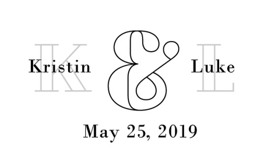
Wedding branding explorations. Top image was used in our photo booth photos. Bottom image was an alternate unused invitation concept.
#bilobacreative#biloba#bilobacreativedesign#graphicdesign#illustration#procreate#ipadpro#handdrawn#drawing#adobeillustrator#adobeindesign#typography#wedding#weddinginvitation#itwasmeantdubois
1 note
·
View note
Photo


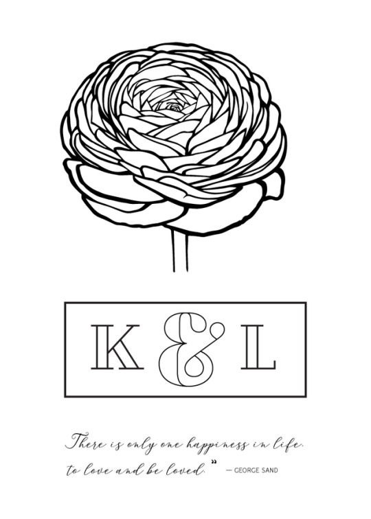
Quick mood board for my wedding branding / feel / planning.
#bilobacreative#biloba#bilobacreativedesign#moodboard#graphicdesign#collage#composition#mood#feeling#blush#pink#itwasmeantdubois#duboiswedding#lagunawedding#lagunabeach#sunset#sunsetwedding#ocean#oceanwedding
2 notes
·
View notes
Photo


Various social media promotional post content for DJ Monk Earl, 2018-2019. Art direction, production and copywriting all by yours truly.
#bilobacreative#bilobacreativedesign#graphicdesign#layoutdesign#layout#typography#collage#composition#promotions#promo#flyer#socialmedia#deejay#DJ#djmonkearl
0 notes
Photo


Shine Cosmetics branding mockup exercise. This fictional cosmetics company specializes in rejuvenating personal care products and a glamorous makeup line. A fun little project to explore branding a product line.
#bilobacreative#bilobacreativedesign#packagingdesign#packaging#beauty#beautyproductdesign#labelling#privatelabelling#mockup#PSDmockup#graphicdesign#layoutdesign#artdirection#creativedirection
0 notes
Photo


The first ebook I created for Juggernaut Strength Training, back in 2014/2015. I had just moved to California from Maine, didn’t know anyone, and was hustling graphic design jobs, primarily on Craigslist at the time.
I made contact with a guy and he asked me to work on this ebook for him. He provided me the art direction and the content, my job was to lay it out and make it look respectable. It was a great project, and at the time I completed it, one of my longest documents I’d worked on.
I would go on to make two other ebooks for them before my computer died for a few months. But that’s another story.
#bilobacreative#bilobacreativedesign#layout#layoutdesign#manual#fitness#modern#graphicdesign#typography#hustling#freelance
0 notes
Photo


Various social media marketing collateral for Complete Athlete, some (top two) merely concept work, the rest all was used on the Complete Athlete Instagram account.
One of the more difficult aspects of working with Complete Athlete, for me, was that I was given no creative leeway. I was told what to do and how to make it look; (even though to my mind the branding was not very well developed.) I asked if I could create a style guide at least. They said no.
But I digress. I look back upon my time working with them and realize now that I should have worked harder to sell my ideas to them; and attempted more to get them to see where I was coming from.
Nevertheless, I do maintain pride in the work I completed for them; but the looks and marketing fell short of what they could have been. Had there been better communication and trust developed throughout the team, I am certain that the brand would have made a bigger impact, and that the various pieces put out for their marketing strategy would have been more effective.
Sometimes we learn lessons from successes, sometimes the lessons come through failures. Either way, I’m always glad to have learned something, and will apply that knowledge to my decisions in the future.
1 note
·
View note
Photo


Digital billboard layouts for Complete Athlete. This was a quick promotional project for the sales team. There was a soccer game and they had managed to get some screen time devoted to the app. One of many marketing collateral ads created for the Complete Athlete brand. Created with Adobe Indesign and Illustrator, during the summer of 2018.
Top image is a mockup ( I never got to see these in action, sadly. ) Bottom three slides are alternate layouts.
#bilobacreative#bilobacreativedesign#graphicdesign#digitalmarketing#marketing#marketingcollateral#billboards
0 notes
Photo


Working for a mid-size company like Mobilitie gave me many opportunities for fun side projects, like this 2018 Father’s Day gift mug.
The brief: create a layout for a mug that kept the company’s branding, and create an accompanying e-card to celebrate the Friday prior to the Father’s Day Weekend and hint at the fact that there would be a gift giveaway happening. This was what I came up with. Top slide: final chosen layout for the mug. Middle slide: the promotional e-card layout. Bottom slides: alternate mug shots.
#bilobacreative#bilobacreativedesign#graphicdesign#layoutdesign#layout#branding#logo#corporate#sports#soccer#fathersday#mug#product#designprocess
1 note
·
View note
Photo


Once upon a time, I used to rap. I performed with a band in Santa Cruz, called the Serendipity Project. And then another band in Portland, Maine, called The Beat Horizon. And I did a solo act for a few years as well. (That’s all in the past, now, but sometimes I wax nostalgic...)
After I left for the west coast, one of my old bandmates hit me up to help make him some posters and assist with the art / layout for the debut album for his new project, Zeme Libre. This was the result of that project.
Top slides are the finished artwork. Middle slides are the photographs we used—fantastic microscope-photography by the talented John Kashuba. This photo in particular was taken from a meteorite called NWA 998. (No relation to the Rap group, that we know of!)
This is a photo of a thin section of meteorite on a glass microscope slide. The remainder of the rock on the glass is ground and polished to 0.03mm (~0.001 inch) thick. When viewed through a microscope, light from the bottom, polarized in one direction, passes through the sample and then passes through another polarizing filter oriented in a different direction, i.e. crossed, and continues up through the eyepiece to be viewed and photographed. That makes for these ‘interference’ colors. If you are interested, you can look at more rad photos here.
Bottom slides are unused alternate options.
0 notes
Photo


Fake magazines from the Eighties! What a fun project. Client was a director of a short movie project titled Doll. Top slide was intended to be an old magazine for a prop. The bottom slides were meant to be poster size props for certain scenes in the film. July 2016.
#bilobacreative#bilobacreativedesign#graphicdesign#layoutdesign#layout#magazinecover#magazine#eighties#retro#typography#shortfilm#movie#movieprops
0 notes
Photo


4 panel Brochure for ASD 2017 Trade Show. My role: creative direction, layout, typography, product photography / photo editing. BXpression is a wholesale consumer electronics and trends company based in Long Beach, CA.
#bilobacreative#bilobacreativedesign#creativedirection#artdirection#graphicdesign#layout#layoutdesign#corporate#marketing#tradeshow#collateral#adobeCC#creativecloud#madewithadobeillustrator#madewithindesign#madewithphotoshop
0 notes
Photo


Here we have a fun little branding project for photographer looking to establish and grow her business. Created in 2016. Top slide is the final branding. Bottom is concept iterations for the client to choose a direction from.
At the time this was a great step forward for me as far as loosening up. I would normally never create something like this on my own, but the client provided the art direction, and I just went with it. I enjoy working with others like that to really help achieve their vision.
#bilobacreative#bilobacreativedesign#graphicdesign#branding#identity#entrepreneur#photographer#photography#logodesign#concepts#options#script#typography#camera#lens#logo#vision
2 notes
·
View notes
Photo


Throwback! This was the first concept I came up with when messing around with a logo for the Portland, Maine-based producer and musician/magician Charles Brodeur; aka Moonrocks. Whew, I love me a long-winded introduction.
So yeah, he didn’t really like this one, but I still like this little mockup. The fill was from the watercolor work done by B. Dunigan for the Kosmopronk album interior. I took the liberty of repurposing it, cause it’s so pretty!
All this happened late 2012-2013. Ah, those were the days.
#bilobacreative#bilobacreativedesign#graphicdesign#logodesign#branding#typography#funky#8bit#eighties
0 notes
Photo


I worked for OC Weekly from April 2015 to Nov 2016. It was my first real design job! I was a production artist, basically responsible for either processing or altering or designing ads for the weekly print edition. It was a great job and I look back fondly on my time there.
One of the last branding projects I took on was for the 2016 Monday Night Football promotion they were running. (It’s trickier than you might imagine at first, coming up with artwork for something like the NFL but steering clear of their own brand. For instance, you can’t use the term NFL, or Superbowl, and a good amount of others without becoming subject to a lawsuit.)
I eventually came up with this templated look. It ran for the first half of the 2016 season. The campaign was a great success that year with the local sports bars that sponsored the events. It was a personal moment of growth to build a format out from scratch, in a day’s worth of time.
After the branding and templates were established, it was time to fill the details in correctly for each event. What teams, how many games, which bar. One bar only had a logo with a white background, so I built a white version for that week. Gotta go with the flow sometimes and get creative with the solutions. That’s what I’m all about. Oh, and “Go Pats!”
#bilobacreative#bilobacreativedesign#graphicdesign#branding#promotions#print#paper#digital#socialmedia#template#ocweekly
0 notes
Photo


Selected spreads from a whitepaper project created for Mobilitie, a telecommunications industry client in Newport Beach, CA. (And the parent company of Complete Athlete.)
Before I got started with this client, I was given their marketing guide and brand style guide. I worked off of those to keep the fonts all the same, sizing and kerning included. This was another great chance for me to push their brand a bit and I opted to give the presentation a clean, minimal and tech inspired design that broke new visual ground for the company’s image.
Working in collaboration with the copywriter and their senior designer, we put together an elegant, refined and on-brand piece of in-depth sales collateral. I was responsible for the layout design, images and infographics. I also photographed the cover image as well.
View or download the whole paper here if you like.
#bilobacreative#bilobacreativedesign#graphicdesign#layoutdesign#telecommunications#corporate#whitepaper#5G#tech#infographics#spectrum#wireless#typography#styleguide
0 notes
Photo


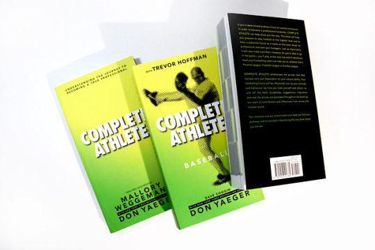

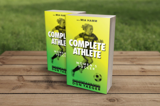
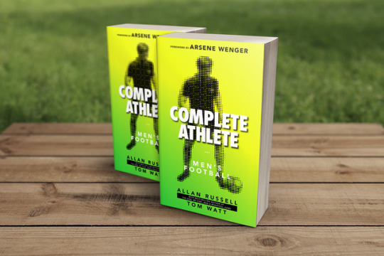


Complete Athlete is an app for athletes, parents and coaches. The program is meant to be a self-help guide and social media platform of sorts, for members to connect upon. When I joined the team the app was about to launch, at the end of 2017. I successfully laid out the four different books over the next three months, and they went to print shortly afterwards.
The app itself has ebooks users can purchase in-app. However the team wanted to create printed versions as well. So I was brought in to take the content and apply their pre-established styling and branding to the raw manuscripts. I did this process for the four books seen displayed above.
The project was a fantastic success and you can find these books for sale on Amazon, and of course the app is available for download for both android and iphone models. Check it out if you’re a parent or coach of an athlete, it’s packed with great advice from big names in the industry.
#bilobacreative#bilobacreativedesign#layoutdesign#styleguide#branding#sports#typography#spreads#bookdesign#ebookdesign#ebooks#books#print#digital#appdesign#madewithadobe#madewithillustrator#madewithAi#madewithphotoshop#mockups
0 notes
Photo


Various marketing collateral (and product photography!) for K-Beauty SOS, a Long Beach-based cosmetics distributor. All circa February/March 2017.
#bilobacreative#bilobacreativedesign#marketing#marketingcollateral#productphotography#layoutdesign#layout#graphicdesign#typography#tradeshow#business#kbeauty#longbeach#businesscard#businesscarddesign#flyer#gif#koreanbeauty#cosmetics
0 notes