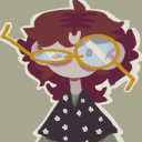
Neurodivergent teen artist, musician, and aspiring animator • Any Pronouns
Last active 2 hours ago
Don't wanna be here? Send us removal request.
Statistics
We looked inside some of the posts by clarafyer and here's what we found interesting.
Average Info
Notes Per Post
136
Likes Per Post
100
Reblog Per Post
29
Reply Per Post
7
Time Between Posts
2 days
Number of Posts By Type
Text
17
Last Seen Tumblr Blogs


Fun Fact
In 2020, 44% of users from Denmark used Tumblr daily.
Text
EEEEEEE I LOVE THEM SM THANK YOU SO MUCH <3
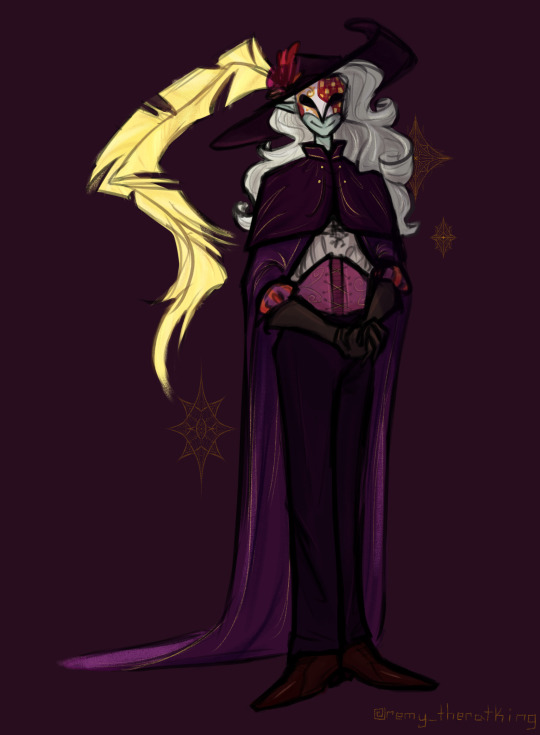
Remy

[Image ID: The character remy by @clarafyer looking at the viewer. There are multiple distortion effects in a broken glass pattern. /. End ID]
I did this in like 5 hours immediately after an exam because it's Friday today so i had a break
5 notes
·
View notes
Text
Yeah Imma go back to being Clarafyer yall
What do you do when your online persona design becomes much more than just how you draw yourself + a little lore to go with the theme? And also when your chosen name just turned out to be directly associated with said persona and, sure, it's a nice name, but the only reason you were using it was in reality just because you wanted to be the character?
Because uhm yeah my persona has a lot of lore now and is now the one thing that I didn't want it to be—involved with the rest of my OCs in their story. The story that I want to turn into a comic/game/show. And I don't want to share the name identity as what will be a major character in that.
.
.
.
Can I just like
Start over 😭
4 notes
·
View notes
Text
Why cant i be consistent in how I draw my persona like every drawing of them, the hair is somehow a different type, the jacket doesn't have nearly as many designs as I envision it having bc I'm lazy (it's supposed to be Mollymauk level intricate) yeah it is THAT bad of a difference.
I haaatteee my artttt let's gooooo ✨🎶
1 note
·
View note
Text

New lore goes hard
#ah the pain of being your worst critic#drawing#my art#ocs#artists on tumblr#artwork#art#my ocs#oc art#drawings#oc artwork#oc artist#oc digital art#oc drawing#digital artist#digital drawing#digital art#original character#my persona#remy theratking
21 notes
·
View notes
Text
I UPDATED MY ART FIGHT PROFILE
#do note that im the kind of artist who spits out a finished piece of art only at least every like 3 weeks#i am demotivated as hell#so sorry if my ratio is low (it probably will be)#art fight#artfight prep#artfight 2025#artists on tumblr#art community#remy theratking
2 notes
·
View notes
Text


AAAAAAA I love them so much I want to publish them to the world but I can't yet because it's unfinished as hell and I don't know how to make a show
#art#artwork#drawing#my art#ocs#artists on tumblr#my ocs#oc art#drawings#oc artist#oc artwork#oc drawing#oc doodles#original character#doodle#doodle dump#sketch dump#drawing sketch#sketches#sketchbook#sketch#remy theratking
2 notes
·
View notes
Text
Streaming REPO with my friend Nakuitsi!
3 notes
·
View notes
Text

Thing that I'm procrastinating working on digitizing currently
#art#artwork#drawing#my art#ocs#artists on tumblr#my ocs#oc art#drawings#drawing sketch#sketches#sketch#oc artist#oc artwork#oc doodles#oc drawing#remy theratking
4 notes
·
View notes
Text
Live reaction of the whiplash I had between I Remember You and The Lich

Oh yeah so for the past 5 days I've been binging Adventure Time because I saw ONE man who I'm hyperfixating on so hard (Simon)
I just finished I Remember You
I just bawled my eyes out
10 notes
·
View notes
Text
Oh yeah so for the past 5 days I've been binging Adventure Time because I saw ONE man who I'm hyperfixating on so hard (Simon)
I just finished I Remember You
I just bawled my eyes out
#by binging I mean BINGING#i'm at a rate of about 1 season per day#he's taking over my life help me#adventure time#simon petrikov#ice king#adventure time ice king#adventure time simon#i need him carnally
10 notes
·
View notes
Text
Friendly reminder to be unapologetically yourself, to let yourself enjoy what you want to enjoy, and to not be afraid of judgment. I know judgment is scary, embarassing, and anxiety-inducing. But it's okay. Everyone has embarassing moments, phases, or even are just seen as cringe their whole life. And it's hard, feeling like being yourself leads to endless hostility. But that's why you just need to surround yourself with people who actually support you, people who won't gossip about you behind your back, people who will instead back you up when you're being knocked down.
Cringe culture isn't dead, but it can be fought. You've got this :)
#saying this bc i had a moment today#got really embarassed#thing is some people just don't appreciate the good things#the greatest gift of all is the ability to experience joy#even in the littlest of things#cringe culture is stupid#remy theratking
4 notes
·
View notes
Text
STREAMING DELTARUNE TODAY!!!
#deltarune#small streamer#twitch streamer#streaming#streamer#twitch#live stream#deltarune chapter 3#deltarune chapter 4#remy theratking
1 note
·
View note
Text
I MADE ACADEMIC HONORS EVERYONE!!!1!111!1!1
4 notes
·
View notes
Text

WIP for my painting final (it's not really a final in that sense but just busywork while we beg for the year to be over)
#ONE MORE WEEK#gonna crash out at my school for being this insane#watercolor#watercolourpainting#watercolour art#watercolour illustration#watercolour sketch#art wip#my wips#current wip#wip#art#artwork#drawing#my art#ocs#artists on tumblr#my ocs#oc art#drawings#oc painting#painting#art project#oc artist#oc artwork#oc drawing#remy theratking
9 notes
·
View notes
Text
Update on my health since I haven't talked about it much! I have an appointment scheduled to get started with my diagnosis journey! My mom put in some of my symptoms and that I heavily suspect that it's hEDS (I've been researching for months and wrote shit down, I am NOT getting gaslighted for ts.)
I may also have POTS, suggested by my POTSie friend, but I have less of the major symptoms for that and so my main focus is hEDS.
I'm so happy to finally start making progress though! Thanks to everyone who's supported me so far :)
#i also may have stolen my dad's cane from when he was injured a long time ago#i was using it while alone and it felt so freeing and good#if they never notice it's gone then i'm gonna sticker it up and maybe paint it#possible heds#probably heds#heds#hypermobile eds#undiagnosed chronic pain#chronic illness#chronic pain#chronically ill#pots syndrome#pots#possible pots#hypermobile ehlers danlos#ehlers danlos syndrome#remy theratking
9 notes
·
View notes
Text
IT IS HE
#art#artwork#drawing#my art#ocs#artists on tumblr#my ocs#oc art#drawings#original character#digital art#oc#oc artist#oc artwork#oc drawing#oc digital art#oc design#digital artist#digital drawing#dungeons and dragons#dungeons & dragons#dnd art#dnd character#dnd oc#dnd5e#d&d art#d&d character#d&d oc#d&d#remy theratking
43 notes
·
View notes