nocturnus33
Avid fanfiction reader.
Reading Harry Potter Fanfiction since 2003. Non native English speaker. Pomegranate bookbinding workshop.
1650 posts
Don't wanna be here? Send us removal request.
Last Seen Blogs
yoursonlucifer
welcome to shrug city, P
writingincense
writingincense

luciddreamingstuff
Call Me LD

teriyakiweasel
teriyakiWeasel

elegantcatstudent
Untitled
Text

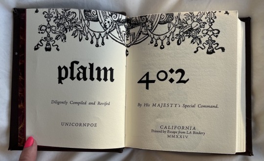
psalm 40:2 by unicornpoe
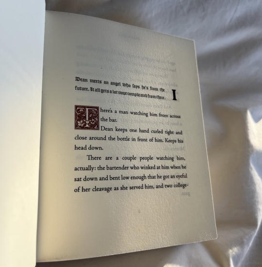
Dean meets an angel who says he's from the future. It all gets a lot more complicated from there.
Supernatural, Castiel
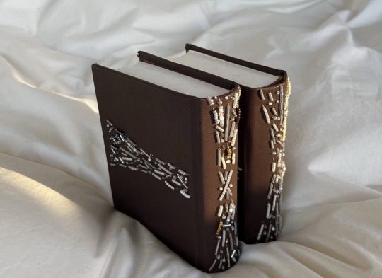
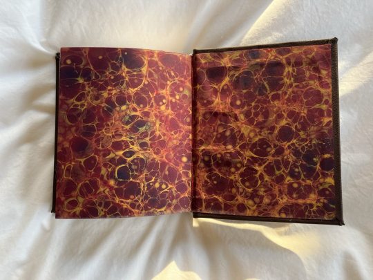
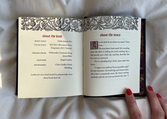
Here is my bind for @no-name-publishing in a Renegade Mini-Exchange! This is such a wistful and tender story about learning to accept and love yourself, even when you feel unlovable, and I was absolutely ecstatic when I peeped it on his wishlist.
Lots of firsts for me this bind: first time working with leather, first time CHISEL-TRIMMING (:elmo fire emoji: insert here please), only second time power sanding (which I love tbh), first time BEADING a cover. I absolutely loved working with leather and the effect of beading, and wish I could take a video to show how sparkly the beads are in the sunlight! I also used ~ * f a n c y * ~ endpapers by Claire Guillot that I just knew I had to have for this bind the second I saw them, and will absolutely be returning to her for future binds.

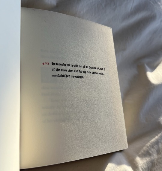
All the typesetting choices are inspired by the 1611 King James Bible, as well as the beading which forms a cross when the book is fully opened. It's my first Supernatural bind—what's a girl to do besides make Biblical references? (jk, @clovenhoofbindery made a totally non-Biblical bind of the same fic and I have been LOSING MY MIND at how perfect and gorgeous it is)
Materials:
Leather: Siegel leather pre-pared leather in espresso
Title font: KJV1611
Body font: Adobe Jenson Pro
Dropcap: Goudy Initialen
Decorative images: King James Bible 1611 (Wikimedia Commons)
Some more details, just for fun :)


#fantastic ficbinders and where to find them#renegade bindery#fan art#fanbook#fanbinding#fanbound#fanbind#ficbind#ficbook#fan bound#fan binders#fan binding#fic binders#fic books#fic book#fic binding
23 notes
·
View notes
Text

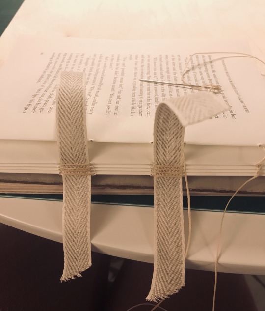

First ficbinding attempt, will update with the finished thing when I case it in tomorrow.
#fantastic ficbinders and where to find them#ficbinding#ficbind#ficbook#fanbook#fanbind#fanbinding#fanbound#fan bingbing#fan bound#fan binders#fan binding#fic binders#fic binding#fic book#fic books#renegade bindery#first binds
48 notes
·
View notes
Text
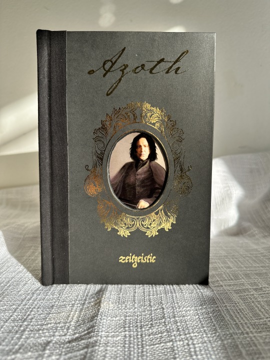
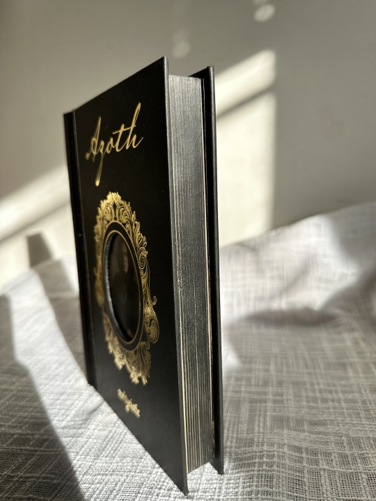

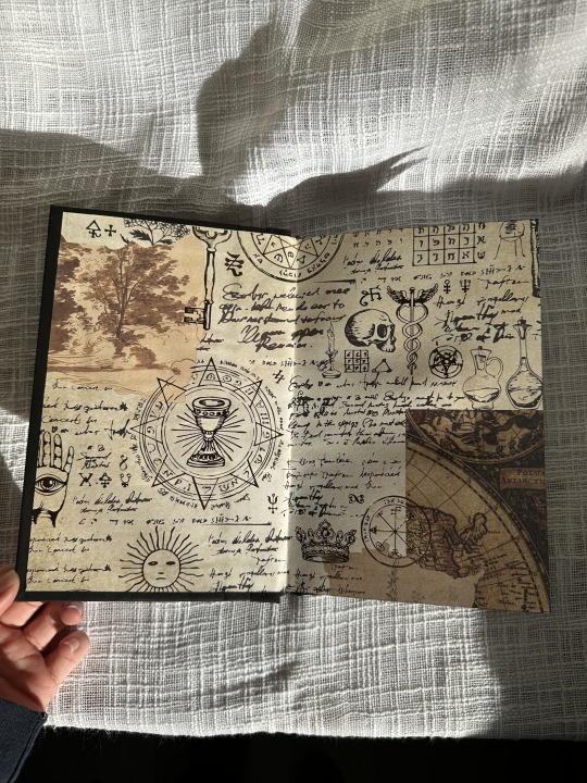
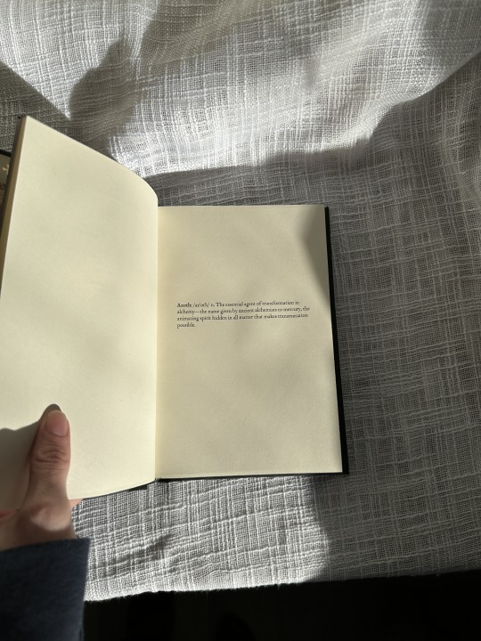
Azoth by Zeitgeistic
Very excited and nervous to start sharing my binds online but here is my first post! I've known I wanted to bind Azoth since I first read it ages ago so I'm glad I've finally gotten here. To be clear, this is NOT my first bind, it's actually my tenth.
This bind had a lot of firsts for me.
First cardstock cover
First foiled cover
First edge coloring
First sewn endbands with metallic thread
First cloth spine
There are of course mistakes but overall I'm quite proud of this one!
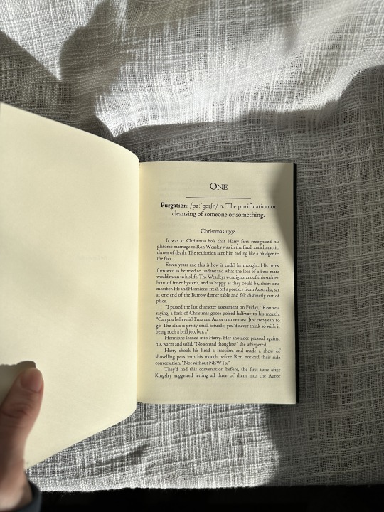
I did the typeset myself which took the longest as it's one of the more detailed typesets I've done and wanted to make sure it was done well.
The cover was done with toner reactive foil and turned out far better then I could have hoped. The cut out I did by hand and then glued the portrait of Snape on the back side.
Endpapers are from a paper pack from Michaels but I think they fit the theme very well.
#fantastic ficbinders and where to find them#grimmauldplacepublishing#renegade bindery#fanbinding#fanbook#fanbound#fanbind#ficbook#ficbind#ficbinding#fanfic#bookbinding#drarry#fic binders#fic books#fic book#fic binding#fan binders#fan bound#fan binding#azoth
51 notes
·
View notes
Text
Girl just wanna have fun
[Insert sad violins]
Me: Since I'll be alone at home, I'll devote my evenings to ficbinding.
The universe: Taking advantage of the fact that Nocturnus33 is home alone, I will launch a storm, cut off the city's power supply and leave her in darkness.
So there she is, poor old Nocturnus33, watching her days alone at home waste away in the dark. Pity me.
3 notes
·
View notes
Text
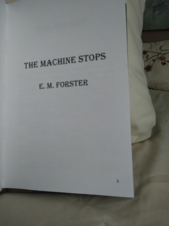
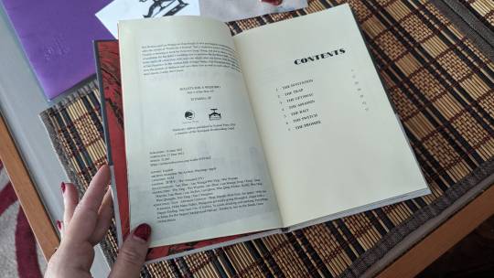
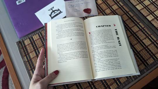
Got a bit of a different bookbinding post today. @renegadeguild got an ask from a new binder saying they were intimidated by everyone's gorgeous binds (me too, actually, some of you guys are scary good), and so they've asked people to share their first binds. And I realized I'd never even taken photos of my first one, so here it is, warts and all:
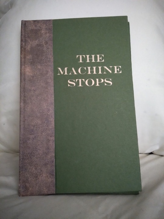
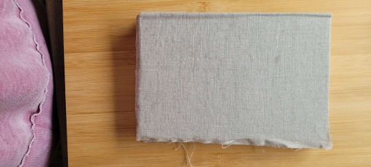
This is E.M. Forster's The Machine Stops, a public domain scifi short story that you can read for free at the link. The first reason I chose it was that it's an interesting story, and I'd bought a print-on-demand copy a few years previously that was just terrible. Baffling cover choices, basic errors in the typeset (like quotes that face the wrong way), weird size that didn't fit on my shelf; just not a good product. I couldn't do it with more indifference than the PoD people. The second reason was that I was too intimidated by the thought of asking a fic writer if I could bind their story and then producing something with a thousand sloppy beginner mistakes, and then they'd want to see photos and I'd have to show them this and it would have been mortifying, but Forster has been dead since 1970 so I could not disappoint him. It was very freeing. I bound it in 2021 as an experiment, to see if I liked this hobby enough to stick to it. The cover is green cardstock and faux leather scrapbook paper that I bought at... probably Hobby Lobby. I added the title later, as a practice project when I first got my Cricut; for the first two years of its existence it had a blank cover.
There are more photos under the cut!

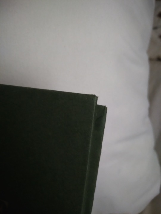
In this photo we can see:
--Too much glue when attaching the leather-print paper, so it oozed out onto the cover.
--Cricut font too thin and too much heat/too long of a press, so the letters have gaps and the glue also oozed out here. It's a continuing theme with this bind.
--I tried to use a bone folder to give it a sharper hinge crease and accidentally pressed too hard and tore a hole in the paper; you can see this in the little white vertical line near the top of the hinge
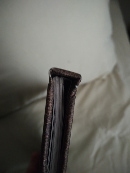
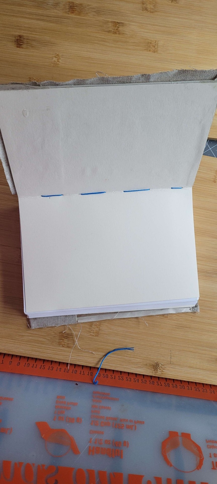
The fore edge is not square. I actually don't remember why this happened. I may have eyeballed the board position when I made the case, or the paper may have slipped while the glue was wet, or I cut it crooked and didn't notice till later. Either way it's bad enough that the book doesn't stand on its own. There was a crooked man/who walked a crooked mile/and found a crooked sixpence/against a crooked stile./He bought a crooked cat/which caught a crooked mouse/and they all loved together in a little crooked house, and I bet they read this little crooked book from their little crooked library.

Top view, you can see that the case is too big and the text block doesn't sit straight in it. It has no endbands or bookmark, and it's hard to see in this photo but there's glue on the top of it, at the spine. This still happens to me but I know how to trim books now so this bit gets cut off. You can also see that the scrapbook paper has some cracks where its white core is visible. This is why I do cloth or actual faux leather on the spines now. Endpaper shows uneven trim (did I not use a ruler for this??), too much glue causing major seepage, and it doesn't sit evenly in the case. I'm not sure if this is because of the case itself being crooked, a badly-trimmed endpaper, or if the text block is also crooked. Or it may be a combination of all these factors. Unclear.
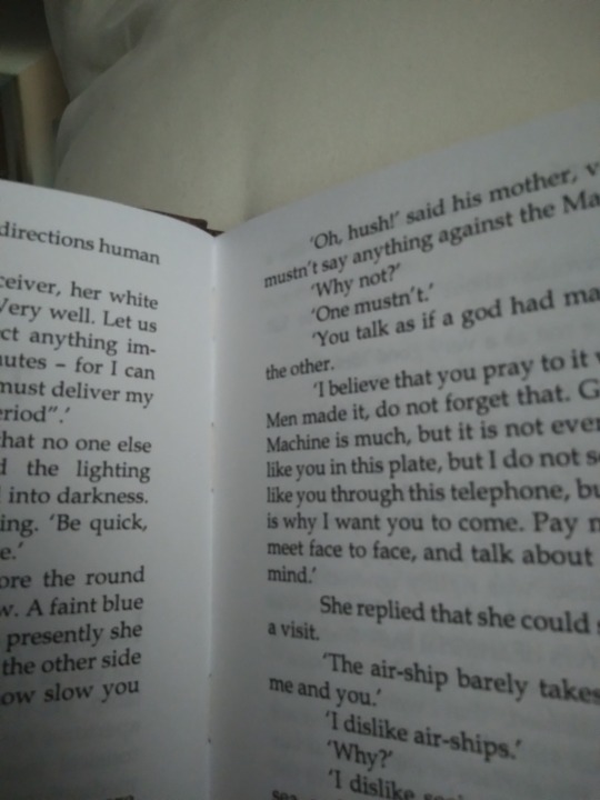
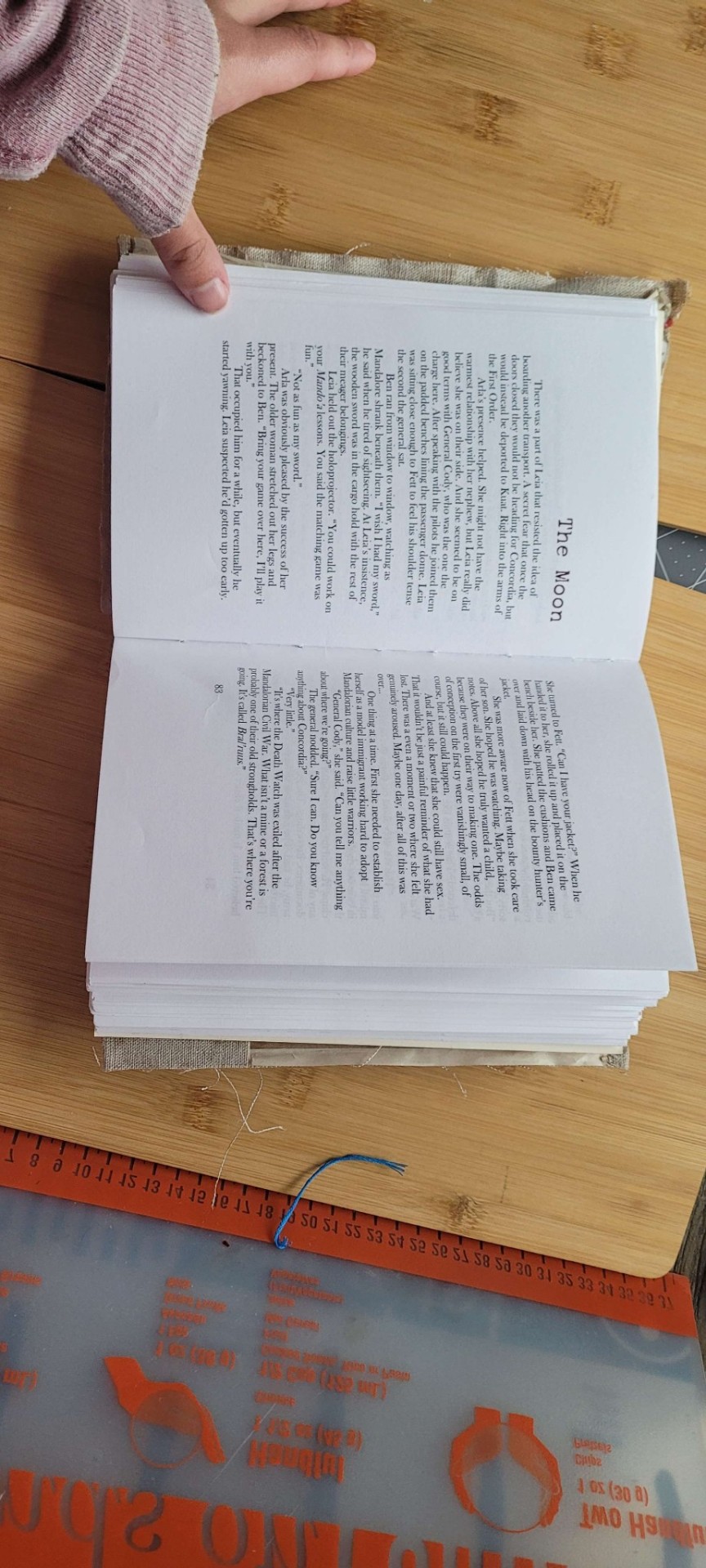
Typeset photos! Here we see:
--Title page has a page number on it. This is a pet peeve of mine and I fixed it after this book.
--There is no half title, summary, or metadata. All my later binds have these things.
--It's typeset in Times New Roman. Unlike many I don't actually hate this font but reading it reminds me of being in high school so this is the only book I used it for. Baskerville is my beloved now. The font is also much bigger than it should be. It's not huge but it's like a large print book so it feels weird for me to read it.
--Lol what are margins
--Lol what are page headers
--Actually I think I left the headers out so it wouldn't have a header on the first page of each chapter, because I knew about page breaks but not section breaks at this time.
--It's on regular-ass lightweight printer paper. There's nothing wrong with this but I switched to heavier weight paper shortly after to help with bleed-through and the light stuff feels so flimsy now.
--I didn't understand how Word's book fold worked at this time, so when I had to set the sheets per booklet and it had an option for 4, I chose that thinking it would give me 4 sheets of paper (16 numbered pages) per sig. It did not do this. It gave me 4 numbered pages per sig. So every signature is 1 sheet of paper. Every page is its own signature. I am still mad about this but it sure drove home how the setting works and also how to make kettle stitches since you make one after every sig. A book of 48 pages has 12 signatures which is just ludicrous.
--There's no photo of this but it has a piece of printer paper on the spine because I didn't have mull. I did use PVA though. Lots and lots of PVA.
--It's stitched with regular sewing thread, which means it doesn't have much swell for a book with that many sigs, but it's less sturdy and more likely to tear the paper.
And that's that! It probably sounds a bit like I was tearing it to shreds but I actually love this book quite a lot. I learned so many things that I applied to my next binds, it was an invaluable experience. It let me fall in love with the hobby so I could make the awesome things I make now. I've got those all posted on my main blog under the tag #snek makes books, or you can see them all on my side blog @papersnakepress. For a first book it's functional and readable, and still better than the PoD copy I had before. I've been thinking of doing a rebind as a sort of progress gauge, actually. Maybe next year.
#fantastic ficbinders and where to find them#first binds#renegade bindery#bookbinding#fanbind#fanbook#fanbinding#fanbound#fan binders#fan bound#fan binding#fic binders#fic books#fic book#fic binding#fan art
18 notes
·
View notes
Text
Hi I have something to share! :)
For the last two years I've been working on this fantasy novel adaption of our D&D campaign's first season (it's also a bound book now because I can't seem to let it go?), and I am finally posting it! The entire project is absolutely a collaboration of everyone in the group, with art and music and backstories and world building from different people going into it. It's been incredible to see how much enthusiasm and love everyone has poured into this campaign.
I know AO3 isn't the best place for original fiction, but if you're into fantasy and you like the way I write, give it a try!
Some more pictures of the binding process - I improvised a lot and I'm pretty happy with how it turned out! The book block is a bit crooked but I think that's what happens if you don't have a proper book press, and I didn't even try to cut the pages, just folded them in half and let them be.


42 notes
·
View notes
Text
Strap in Folks: #firstbind.
My first bind was that of Solus by FettsOnTop(GTFF)
There was so so many things I've messed up with this.
From the covers bending. The spine board too wide. The cloth not being fully glued down. The thread not staying glued. To no mull and shifting signatures.
BUT and here's the big one for me- IT WAS A BOOK!
Just like how Tolkien mentioned that Bilbo couldn't begin his adventure without stepping out his door, I couldn't call myself a binder WITHOUT doing these mistakes and creating my first book. It's not fancy. But it is MY FIRST BOOK
#fantastic ficbinders and where to find them#fan art#renegade bindery#bookbinding#fanbinding#ficbinding#fanbook#fanbind#fanbound#fan binders#fan bound#fan binding#fic binders#fic books#fic book#fic binding
58 notes
·
View notes
Text


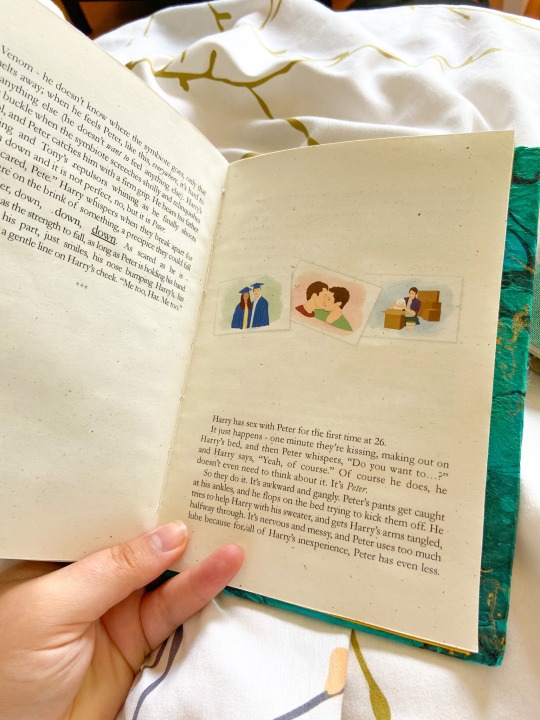

chosen family by Trickster88
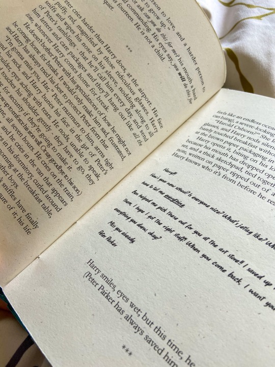
Harry meets Peter at four and a half (four and three-quarters, Harry insists, because adults always tell him he’ll understand things when he’s older, but he’s old enough for it to be annoying). Harry's playing in the sandbox at Oscorp’s daycare (kinetic sand, actually, because what’s the point in being a cutting-edge, fortune 500 company if you don’t have the newest stuff) and Gregory Haskins stomps on his sand castle. Harry’s eyes fill with tears of frustration as Gregory laughs and steals the Tonka truck out of the sand, but before he gets the chance to wail, Peter is there.
Peter has a mop of soft, chestnut curls, and kind, brown eyes. He has dimples in his cheeks when he smiles, every so gently, like Harry is a baby deer he’s afraid of spooking, and Harry blinks at him, surprised.
***
Or, Harry and Peter, over the years. MCU with Harry Osborn
art by @heyboydraws, fic by @thwip--thwip
92 pages / 25,534 words
Title Font: Brightness Inverted
Body Fonts: Garamond, Arbery, Absender, October Crow
Read more on the process below the cut!
Now, onto the how!
I typeset in Microsoft Word; I realize now that my margins were set wrong (and the second book I've printed, which is still in the binding process) - but this taught me a lot! It's honestly probably better to have the fic at this reduced size; it feels like a nice, short novella.
The cover paper is Thai Marbled paper from Paper Source, and the end papers are Nepalese handmade papers I purchased from McManus & Morgan, a paper shop local to LA that's been here since 1923! I wanted an emeraldy-gold look, since those are Harry's colors - and the duo book cloth from Colophon Bookarts seemed like a good pair. The black streaks on the marbling spoke to me as the darkness that permeates Harry's life, as well as a not-so-subtle nod to the Venom plot at the end of the book. Still, the gold in his life shines through. I chose two different endpapers for the same reason - Harry's life starts out grey and somewhat bleak, and ends happily ever after, in a warm gold. All in all, the color coordination worked out better than I could have imagined!
I used a bunch of different fonts in this fic to help the story jump off the page, and it was really fun! I also played around with different effects, like so, to help emphasize emotional moments:

I think it adds something!
I printed on Speckletone Madero Beach from the French Paper Company, 70lb text weight. It has a nice feel to it, a cool recycled look, and is a good combination between cream and white. Not sure if I'll stick with it forever, but it makes it feel like a real book!
Last but not least, my edges. Ho boy. I tried to hand trim and totally failed...I won't make the same mistake again! I ended up sanding down the edges to mitigate the error and it's still serviceable. Overall though, I'm very pleased! Ha, do I get to say I'm self-published now?
#fantastic ficbinders and where to find them#bookbinding#fanbinding#fanficbinding#fanfic binding#renegade bindery#fanbook#fanbind#fanbound#ficbook#ficbind#fan binders#fan bound#fan binding#fic binders#fic books#fic binding#fic book
72 notes
·
View notes
Text
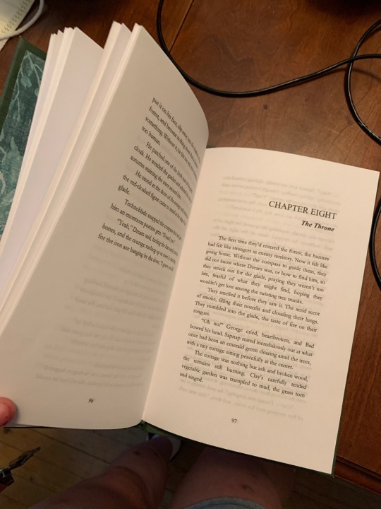
Behold, my first ever bookbinding! The fic is and as he fell (you walked away), by the amazing and wonderful @tea-with-veth
This project was done at the start of June 2022, and was made to be a gift for Tea, since she was visiting me and I wanted to do something cool for her.

Since it was my first project, and because I only did it in a week, I had to make up a bunch of stuff. For example, I ended up just using a family members printer. Which, while much cheaper, also meant I only had pure white paper. Still very proud of how it turned out though!
You can read the original work here:
#fantastic ficbinders and where to find them#renegade bindery#fanbinding#bookbinding#fanbook#fanbound#fanbind#ficbind#ficbook#fan binders#fan bound#fan binding#firebound press#fic binders#fic books#fic book#fic binding
161 notes
·
View notes
Text
We, the older lot.
5K notes
·
View notes
Text
ohmygodohmygodohmygodohmygod
This amazing person has offered to bind one of my GO fics and give me a copy as a gift! I am freaking out. Help.
With the artist's permission, I'd love to reblog updates on the progress, because bookbinding is fascinating and also eeeeeeeeeeeeeeeeeee!!!!
#fantastic ficbinders and where to find them#author's reaction#fandom gift economy#ficbind#ficbinding#ficbook#fanbinding
40 notes
·
View notes
Text
Free Frankenstein Typeset
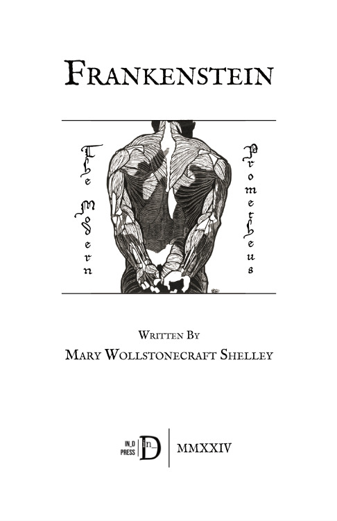
So I did a typeset for Frankenstein by Mary Shelley. Well, typeset(s). I went through about three different versions trying to figure out a style or a theme, before I finally, finally settled on anatomical asses 😆.
Anyway, this half letter (letter folio) typeset is FREE for your personal use! Bookbind it, print it out and burn it, what have you. Just please leave credit and consider dropping a like/reblog if you can!
Link:

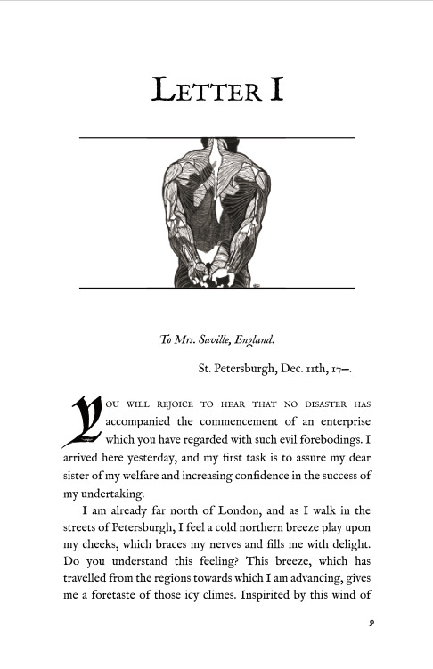
IM FELL English used for the body font. IM FELL series is definitely one of my favorites for almost everything. And for the "body" bodies, I used some wonderful public domain illustrations by Reijer Stolk I found on rawpixel.com.
(Also if you downloaded any of my other typesets, I updated them in the google drive cause I forgot some minor stuff.)
50 notes
·
View notes
Text

My cartoon for this weekend’s @guardian books
9K notes
·
View notes
Text
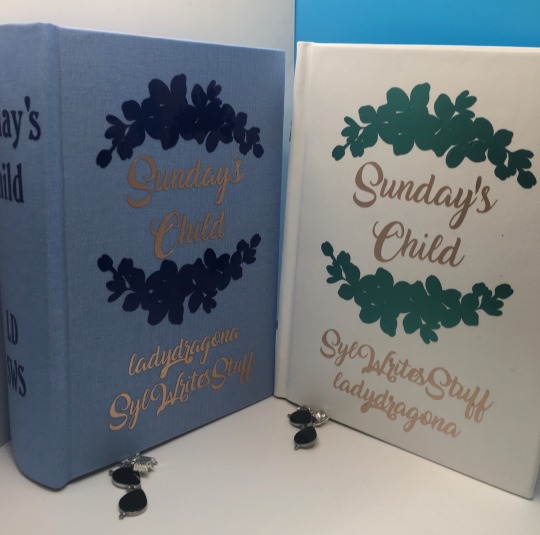
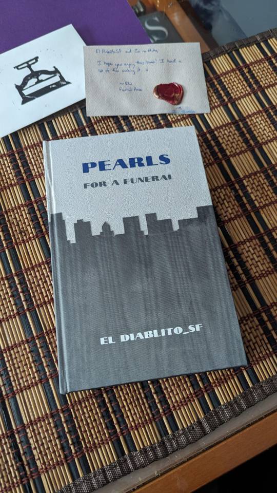
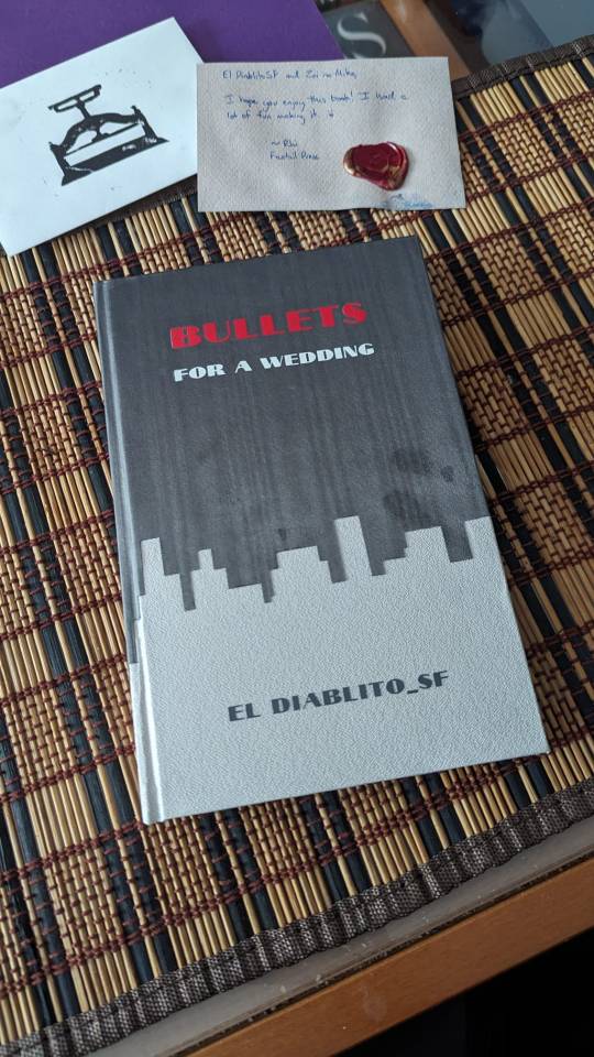
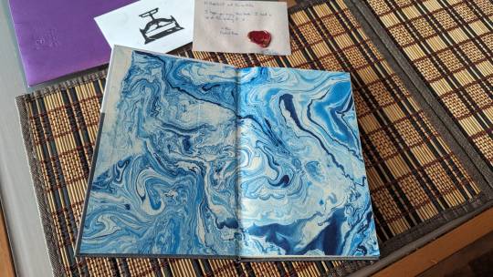
For @theladydrgn and @sylwritesstuff, editions of their wonderful Heyer inspired Sunday’s Child. I had trouble deciding on colors, and was originally going to go with blue and pink for ladydragona’s, but I liked the dark blue on blue much better. Hope you like it.


#fantastic ficbinders and where to find them#renegade bindery#fan art#fanbook#fanbinding#good omens fic#fanbound#fanbind#bookbinding#renegade guild#ficbind#ficbook#fan bound#fan binders#fan binding#ficbinding#fic books#fic binders#fic book#fic binding
24 notes
·
View notes
Text
Free Jekyll & Hyde Typeset
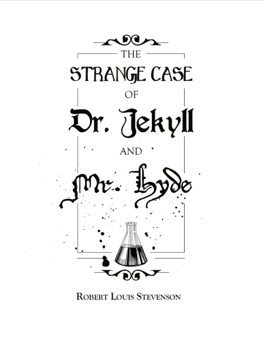
This is a typeset I did for The Strange Case of Dr. Jekyll and Mr. Hyde by Robert Louis Stevenson with a transcript from Project Gutenburg. It's set for letter quatro, and I used like eight different fonts for the entirety of this novella 😆.
Anyway, here is the link to the typeset if anyone would like to use it for bookbinding! It's free to use for personal use only, just please leave credit and consider dropping a like/reblog if you can!
Link to the typeset:

#The Strange Case of Dr. Jekyll and Mr. Hyde by Robert Louis Stevenson#jekyll and hyde#typesets#typesetting#book design#bookbinding#free to use
90 notes
·
View notes
Text
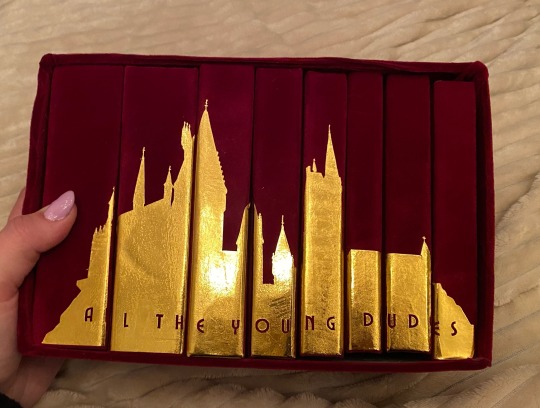
this is the one. the most popular fic in the harry potter fandom. the fic that got me into fanfiction. the fic that i sobbed to for months after reading it.
i tried to bind this three separate times over the last two years and bro the first two sucked ASS. it was legit the very first fic i tried to typeset which is like, not the greatest thing to start off with LMAO. it looked funky, i hadn’t fixed any of the spacing, my footers didn’t match the text font or size. it was very much a baby binding.
the second one was my first time using a cricut and there is a very steep learning curve w the cricut, especially in creating designs that aren’t too complex or too plain. i tried to copy one of the popular printable book jackets and omg i spent weeks modifying my designs and printing and reprinting on my cricut and it looked like trash when i was done.
so finally, we have come to this.
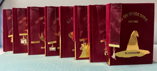
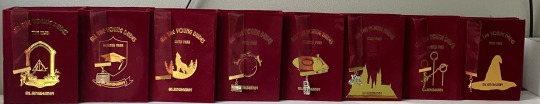
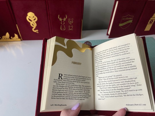
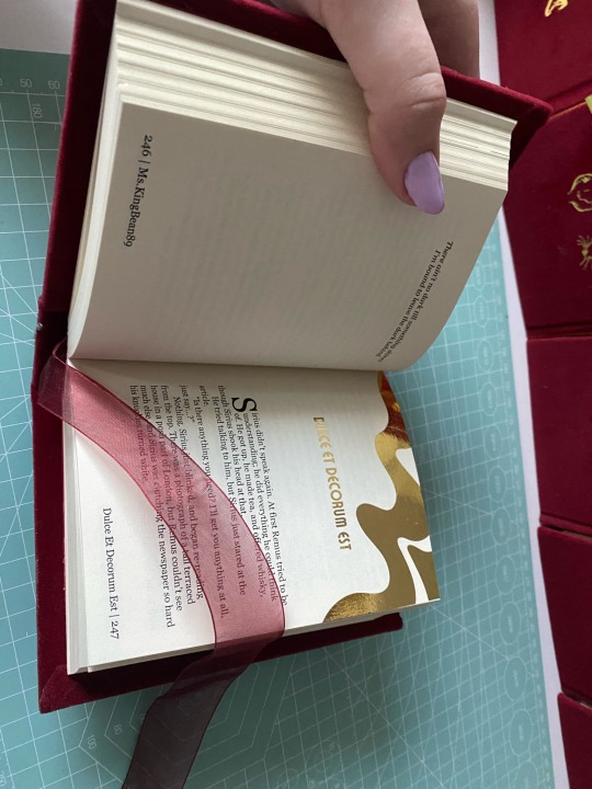
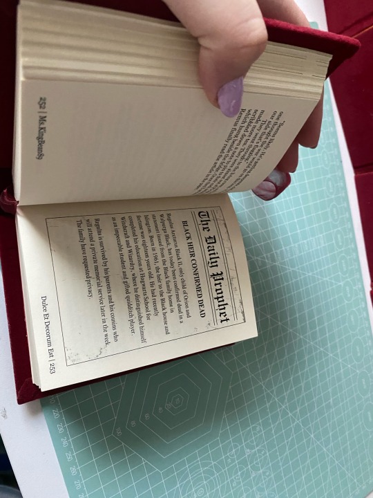
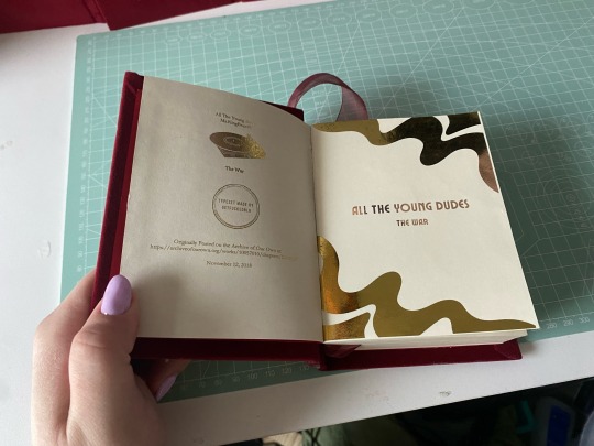
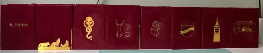
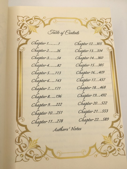
i got really into quartos during the winter and was like omg the editing process for this would be so much more manageable if i broke it down into years! so then i did lol. it allowed me to customize each chapter into sections so i could add the chapter title to the footers, and break down graphics into separate years so i didn’t have 100 pages in one canva file. it was just a lot easier to feel accomplished having broken it down bc this fic is a MONSTER.
every chapter heading is the same - just the swirl. i gilded all the chapter titles using toner reactive foil and my laminator (she broke in the middle of this project. i ended up having to buy another laminator, and about 3 packs of foil from icraft. this is my most expensive fic binding to date🫠). i included the songs ms.kingbean put at the top of every chapter, and the bootleg tapes and christmas special.
i am seriously so proud of how this turned out, and can’t believe it’s actually done. sorry this is super long, but this really was a labor of love. they’re not perfect, i’m still really bad at measuring and cutting straight lines, but i’m satisfied. really satisfied.
#fantastic ficbinders and where to find them#atydbookbind#atyd fandom#atyd marauders#fan art#fanbook#fanbinding#fanbound#harry potter#fanbind#fan binders#fan bound#fan binding#ficbind#ficbook#ficbinding#wolfstar#bookbinding#atyd#atyd fanart
97 notes
·
View notes
Text


My hot wife has arranged for us to have my Noir AU (both installments) bound by the awesomely talented @fantailpress and it's SO BEAUTIFUL!!! 😭😭😭😍🥰🤩 This type of binding is called "tête-bêche" or "head to foot" and I love it so much!
#fantastic ficbinders and where to find them#renegade bindery#fan art#fanbook#fanbound#fanbinding#fanbind#fan binders#fan bound#fan binding#ficbind#ficbook#ficbinding#fic binders#fic books#fic book#fic binding
85 notes
·
View notes