
This is the official Tumblr page account for the Denver-based graphic design moniker, Shout! Graphics. Shout! Graphics is run, and founded by Austin Lovelace.
Don't wanna be here? Send us removal request.
Statistics
We looked inside some of the posts by shoutgraphics and here's what we found interesting.
Average Info
Notes Per Post
8
Likes Per Post
7
Reblog Per Post
0
Reply Per Post
1
Time Between Posts
12 days
Number of Posts By Type
Text
17
Last Seen Tumblr Blogs


Fun Fact
Tumblr Inc. has $15.1M in annual revenue.
Text


Back in 2019, The RedHeaded Zombie Show threw a concert at Bar-K in Colorado Springs. The show took place on 4/20. The lineup featured Rough Age, Timmy Vilgiate, Menagerie, and Dear Rabbit. Naturally, a 4/20 show called for a psychedelic poster, and that’s exactly what we delivered.
Liv Heavilon provided the illustration for this month's flier.
_ 🔗 learn more: shoutgraphics.design/projects/branding/rhz-04-20-19/
#shout#graphic design#shout graphics#shout! graphics#shout!#print design#poster#concert poster#branding#redheaded zombie show#rhz#dear rabbit#menagerie#rough age#nathan archer#live music#bar-k#bar k#zombie#4/20#psychadelic#april 20th#timmy viligiate#timmie vilgiate#timmothy and the vigilantes
0 notes
Text


Sparkle n' Splash Designs Art Studio was the subject of a fake job posting and scam that I, unfortunately, became entangled in. While the business and brand were not real, the work I created for the brand is strong. The work is worth showing.
Sparkle n' Splash was presented as a concept for an art gallery and physical show space featuring the work of skilled traditional artists. When developing the logo, I focused on the use of “ n’ ” in place of “and.” This offered a unique design opportunity: to create a custom lettermark that could stand alone or be integrated into the wordmark. The "n" was designed to be the primary brand symbol, subtly accented by flame and water icons to visually reflect the gallery’s name. The flame icon cleverly serves as the apostrophe above the lowercase " n ." I felt this detail was particularly clever.
To showcase work in the gallery space, I masked artwork into the " n " itself. -
🔗 learn more: shoutgraphics.design/projects/branding/sparkle-n-splash/
#graphic design#shout graphics#shout#shout!#shout! graphics#print design#branding#logo design#book design#loose lief#sparkle n' splash#sparkle n splash#sparkle#splash#art gallery#designs art studio#art studio#business proposal#scam warning#online scams#scammers#fake check scam#scam alert
1 note
·
View note
Text

I Got Scammed
and Here's How They Did It
There’s a common misconception that freelancers don’t bother applying for jobs on LinkedIn. After all, if we’re self-employed, why spend time on job boards, right? The truth is, many of us are looking. Some are looking for in-house roles, others for solid contract gigs. I’m one of them. If you’ve spent any time scrolling through LinkedIn’s listings, you know that freelance and contract positions (I-9s) are posted right alongside W-2 opportunities.
Recently, I accepted one of those contract roles. If the title of this post hasn’t tipped you off yet, it didn’t go well.
The Setup
To start, the person who posted the job was impersonating someone else. I won’t refer to them by name, since the name I was given turned out to be false. As for the individual they were impersonating, I won’t name them either—they don’t deserve to be dragged into this.
The job was listed as a 10-month contract for a new gallery called Sparkle n’ Splash Studios. The business was a new gallery space. After years of making a living selling oil paintings, I would be working with an artist who was opening a permanent gallery space. I’d be responsible for the branding. The role came with a weekly retainer for up to 40 hours of work. I was told the first paycheck would arrive via email, then I'd move to direct deposit.
Everything seemed legitimate on the surface. The work came in steadily for two weeks. I created a logo, customer acquisition offers, customer retention offers, and a full business proposal. I delivered low-res versions of each until I was paid. I got feedback, made edits, and stayed in close contact. I even ran the job offer and payment paperwork past a friend in HR. Everything checked out on paper.
I put in 45 hours building a solid design system. At the end of week two, I let my client know I had room to take on more. He asked if I could help out with some clerical tasks while he finished hiring. I agreed, within reason.
The Red Flags
The clerical work started small: picking up prints and dropping off mail. My first payment arrived, via email, as promised. The payment included a bit more than my retainer to help with the extra tasks. So far, so good. These errands didn’t have inherent monetary value to my client, and I was happy to help.
Then came the first major red flag. One of the design assets I created was a customer acquisition offer. New customers who bought a painting would get a $100 Target gift card. At a price point of $1,000–$2,000 per painting, the offer made sense. My client told me he wanted to send out seven offers and claimed Target would only allow him to purchase $500 in gift cards. This does happen. Gift card purchases are often capped by large retailers as a way to prevent money laundering. He asked if I could buy the remaining $200 in cards.
I refused.
This is a Fake Check Scam
These scams usually unfold in one of two ways, but both begin the same: you're sent a check (via email or mail). What many don’t realize is that standard paper checks—unlike cashier’s checks—take at least two business days to fully clear. In the meantime, your bank will make funds available and remove any “pending” label, giving you a false sense of security.
Scammers use this window and this poor communication to their advantage.
In one version, they ask you to buy office supplies from specific vendors. In reality, the vendors are fake or affiliated with the scammer, and the money goes right back to them. No legitimate company sends you money up front for supplies. They will either buy them for you or reimburse expenses you've documented.
In my case, I was asked to convert funds into gift cards. Gift cards are untraceable, non-refundable, and once sent, the money is gone. The check bounces, the scammer pockets the gift card codes, and you’re left holding the bag.
I knew better. I only knew better because I fell for the first version of the scam two years ago. I lost $500. I wasn’t about to repeat the mistake. Sure enough, the check bounced. I hadn't spent a dime of it, but my loss was 45 hours of my time.
It's More Than Me
Unfortunately, I believe scams like these are becoming a standard risk in freelance work. They’re getting more sophisticated and harder to detect. This scammer kept up the illusion for three full weeks. He faked hiring documents, faked onboarding, faked real assignments, and provided frequent communication. All this before the first red flags reared their ugly heads.
Three weeks of effort for $200 in Target gift cards? That’s only worth it if this is happening on a larger scale, with more victims than just me. Freelancers, keep your guard up. Vet your clients. Trust your instincts. And when something feels off, speak out.
Let’s look out for each other.
#scam alert#scam warning#scammers#online scams#shout graphics#shout!#shout! graphics#shout#fake check scam#freelance#update#linkedin#job posting
0 notes
Text


A Bad Night For A Hero is the project of frontman and singer-songwriter CJ Hackett. Though he’s released music under the name since 2010, On the Balcony is self-described as the project’s debut—and only—full-length record. In 2015, the project expanded into a full band, with bassist Brandon Arnold playing a key role in shaping the sound and contributing to the writing.
I was commissioned to design the album cover, packaging, lyric book, and release assets for the album.
📸 : Brandon Arnold
- 🔗 learn more: shoutgraphics.design/blog/updates/social-media-policy/
#on the balcony#a bad night for a hero#abnfah#graphic design#cd case#album art#lyric book#cd packaging#social media campaign#branding#poster design#album release#facebook cover photo#facebook cover#facebook cover image#poster#concert poster#live music#branding suite#alternative rock#alt rock#rock#indie rock#indie
2 notes
·
View notes
Text


Located in Beaumont, CA, the Beaumont Library District is a bedrock of the community. They have been a cornerstone of the community since 1914. They have offered educational resources, local classes, and media to generations of residents. In late 2017, I was commissioned to design a logo and a small set of branding assets for the Library.
This is the PSA portion: get yourself a library card.
- 🔗 learn more: shoutgraphics.design/projects/branding/beaumont-library-district/
#graphic design#shout#shout! graphics#shout!#shout graphics#branding#print design#logo#logo design#parchment#letterhead#envelope#stationary#beaumont#CA#california#beaumont CA#beaumont library#beaumont library district#library
0 notes
Text

The RTD is struggling with a lack of funding and income paired with a lack of modern UX/UI systems both off-site and on-site. What changes can be made to the ticket purchasing systems and transportation maps to streamline the process and bring in more revenue?
A NEW WEBSITE
This project focuses on improving the ticket purchasing interfaces on-site, as well as the important pages of the app and website.
The website home page did not need a lot of work. This version eliminates redundancies and puts more emphasis on important CTAs. The tools menu did not offer anything that the nav menu already did not. It was removed. Trip Planner and Next Ride did not offer separate products; both were merged into Trip Planner. A clear Buy Tickets CTA was added in the hero as well as the nav. This CTA will go to the same link as Trip Planner.

A NEW TRIP PLANNER
The original Trip Planner was too lightweight. It did not offer the necessary information to the tourist demographic. While the current version offers directions for one trip, this version offers a sequence of stops or even an itinerary for a multi-day trip. After the user finishes entering their trip information, the website will offer them a product that fits their needs. The tool may even offer an upgrade if it makes sense. This is focused on increasing revenue.


A NEW MOBILE APP
This new app is modeled off of modern transportation apps like rideshare and navigation apps. This app acts as a complete tool for the user. Once logged in the first screen is a map where the user can look at bus routes, train routes, service interruptions, or any combination of the three. The user can also search for their destination and be given directions as well as a ticket to get there.
The account page is given a personalized set of information for a wallet, upcoming trips, schedules, and service interruptions. The QR code can be scanned as a ticket or multiple tickets. The rest is moved to the nav. Alltogeather this app combines RTD Flex Ride and RTD Mobile Tickets.
How it works:
Search for your destination
Confirm your location
Select a route
Buy your ticket
Get your QR code and directions

A NEW ON-SITE SYSTEM
The ticket purchasing system has been replaced by a system that mimics the mobile app. The difference is simply removing the account log-in and the miscellaneous menu options.
The information booth is replaced by a live updated system. The lefthand side is a digital map that shows interruptions and incoming trains/buses. The right-hand side is replaced by a system that shows a list of routes that are on their way to that location, their arrival time, and if they are running late.
_
🔗 learn more: shoutgraphics.design/projects/web/rtd/
#RTD#denver#public transportation#ux/ui#ux#ui#app design#web design#wayfinding#rideshare#directions#solution#app development#production design#mockups#wireframing#wireframe#buses#trains#shout#shout! graphics#shout graphics#graphic design#transportation#travel
0 notes
Text


Loved working with Ted Dougherty on updating his personal website. Ted is a creative, a writer, an author, and an educator who specializes in Halloween entertainment. Check out his website for more information, and follow him on social to see what he's working on. 🌕 Busy season is coming. _
🔗 More web design: shoutgraphics.design/web/
#halloween#october#haunted house#haunted houses#experiential#education#ted dougherty#knotts berry farm#knotts scary farm#web design#ux/ui#ux#ui#shout graphics#shout! graphics#shout!#shout#experiential entertainment#entertainment industry#entertainment
1 note
·
View note
Text


Here are some merch concepts for Lizzie's Axe Throwing. The first design is based on the famous poem written about Lizzy Bordon's murder case in 1892. The second is for a T-shirt designed for Glizzies at Lizzie’s, the hot dog stand located just outside The Brighton location. The design reflects the playful, tongue-in-cheek aesthetic of the new brand, using bold colors and a bright, cartoony illustration.
- 🎃 Learn more about pumpkin popping: shoutgraphics.design/projects/print/pumpkin-popping/
🪓 Learn more about Lizzie: shoutgraphics.design/projects/print/lizzie-bordon/ 🌭 Learn more about Glizzies: shoutgraphics.design/projects/print/glizzies/
#axe throwing#axe#throwing#lizzies#lizzie borden#lizzie#borden#lizzie borden took an axe#glizzy#glizzies#hot dog#brat#glizzies at lizzies#t shirt#t shirt design#graphic design#merch design#print design#merchendise#merch#branding#shout#shout graphics#graphics#floral design#bratwurst#hoodie#sweatshirt#halloween#pumpkin
0 notes
Text

Tariff(ied)
Navigating the Unwarented: The Trade War in Design
Shout! Graphics is a graphic and web design provider, and I aim to keep my public statements aligned with the professional services I offer. That’s exactly what I’ll be doing here. What I won’t be doing is wasting digital breath ranting about the man behind these actions or laying out the reasons why these tariffs are a bad idea—there are plenty of political voices far more qualified for that. That said (and perhaps overstated), there’s a reason this post has had to be written and rewritten so many times. Regardless of the “never admit defeat, even when you’ve lost” mentality we’ve grown accustomed to, these people are still vulnerable to public pressure. Every delay in implementing these tariffs has been the direct result of widespread backlash. If I’m going to make one political point, it’s this: we still have power.
_
🔗 Read more here: shoutgraphics.design/blog/industry/tariffied/
#shout graphics#shout!#shout#tarrifs#graphic design#web design#blog#blog post#trump#snip snap#the office#steve carell#design#politics#political blog#political#trade#trade war#opinion piece#opinion
0 notes
Text


I developed this logo concept for FolliGro, a hair growth serum emphasizing hair health through eco-friendly ingredients. This is the second of two designs. The logo is designed to work in green, white, and black.
-
💼 More work from PLC: shoutgraphics.design/industry/plc/
#logo#logo design#skincare#graphic design#skin care#hair growth#cosmetics#eco#eco friendly#nature#shout!#branding#earth#private label campiagns#shout#shout graphics#shout! graphics#white label
0 notes
Text
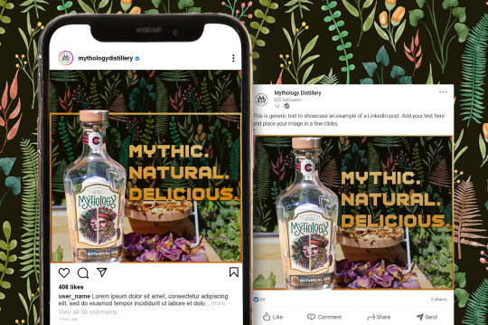
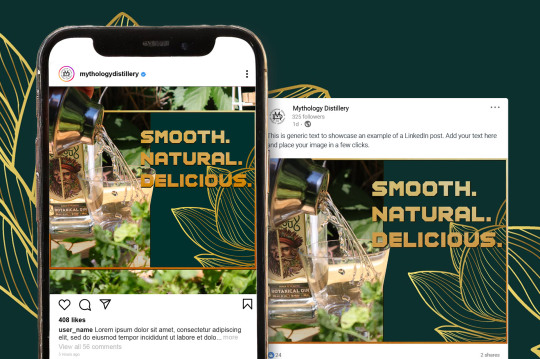
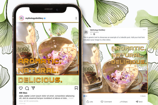
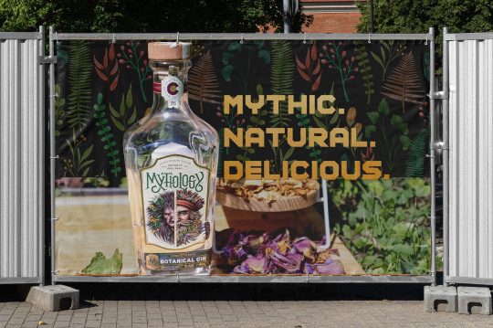
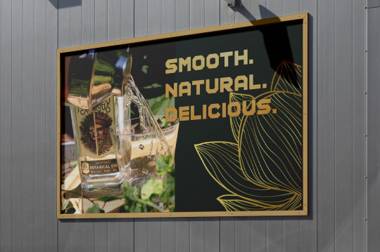
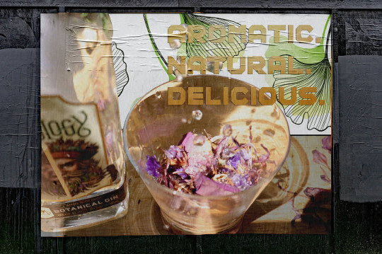
This branding was created at Rocky Mountain College of Art and Design for a class called Photography for Graphic Design. The project was to take product design photos for a product of our choosing. I chose Mythology Distillery and its botanical gin product. The photos used were taken by me and a small-scale design system was created around them, around a slogan, and around the product.
These are not official advertising materials for Mythology Distillery.
- Learn more: shoutgraphics.design/projects/digital/aromatic-natural-delicous/
#shout#graphic design#shout graphics#shout! graphics#shout!#print design#branding#social media#social meda graphics#advertising#gin#mythology#distillery#mythology distillery#mockups#liquor#billboard#instagram#linkedin
1 note
·
View note
Text


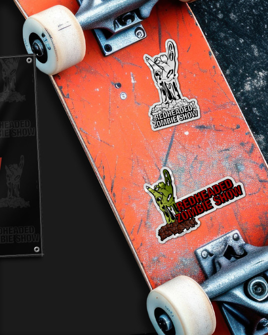

When the RedHeaded Zombie Show returned from a two-year hiatus in 2019, I took on the title of Art Director. The team had grown significantly during our time with the event, and our return needed to reflect that. This meant new branding—most importantly, a new logo.
This remains one of my best digital illustrations, and I’m still proud of the work I did with RHZ to this day.
_
🔗 Learn more: shoutgraphics.design/projects/branding/redheaded-zombie-show/
#shout#graphic design#shout! graphics#shout!#shout graphics#print design#branding#stickers#sticker#logo#logo design#digital illustration#rhz#the redheaded zombie show#banner#mockups#zombie hand#zombie#rock hand#local art#local music#listen local#listenlocal
2 notes
·
View notes
Text


During his time as a student at UCCS, Timmy Vilgiate became a cornerstone of UCCS Radio. In 2014, he launched The RedHeaded Zombie Radio Show, an interview program spotlighting local artists and musicians. Following each broadcast, Vilgiate aired a radio drama. The first, Grease Fire, was written and performed entirely by Vilgiate. Its sequel, Sunrise, expanded on the story of Grease Fire and featured a broader cast of voice actors, many from the local arts scene.
This poster was created as promotional material for Sunrise during its 2015 run. Unfortunately, Sunrise has yet to find a permanent streaming home. Maybe one day we’ll get the RHZ crew back together and give it a proper release. Never say never!
_
🔗 Learn more: shoutgraphics.design/projects/print/sunrise/
#shout#graphic design#shout graphics#shout! graphics#shout!#poster#print design#animated poster#sunrise#radio drama#radio#uccs radio#college radio#timmy vilgiate#grease fire
0 notes
Text


⛷️ Throwback to a design exercise from a few years ago: creating a branding package for a hypothetical Winter Olympics in Vail, CO. From logo design to a full color scheme and branding package, it was a big project—and yes, in case you’re wondering, I did pass the class that made me do this.
The logo design draws inspiration from Vail's history as a mining town, once reliant on locomotive transportation—a remarkable feat of engineering. Naturally, Colorado’s mountains and sun are key elements, capturing the state’s 300 days of sunshine, even in winter. The color scheme reflects the beauty of a sunrise and sunset in a Rocky Mountain town.
‘Reach the Mountain Top’ quickly became the slogan for this event, inspiring a poster template that led to a set of five advertisements. This provided an opportunity to use the core design elements to create both generic and stylish merchandise. Attendees would want a keepsake featuring the full event logo, while the logo’s versatility also allows for creative abstractions on unique clothing items.
All of these branding elements came together in the design of the event tickets. The logo appears in four different variations, with the slogan placed behind it, customized for each specific Olympic event. Gold leaf is included in the print, transforming what would typically be a simple admission formality into a collectible item.
_
🔗 Learn more: shoutgraphics.design/projects/branding/olympic-logo/
#winter olympics#branding#olypics#color scheme#color story#logo#concepting#logo concept#vail#co#colorado#vail colorado#merch#tickets#print design#poster#flyer#graphic design#digital design#hoodie#beanie#shout!#shout! graphics#shout graphics#shout#apparel
0 notes
Text


This poster was designed in 2015 for my good friends and partners at the RHZ, Timmy Vilgiate and Colin Bovberg. At the time, Timmy Vigilate was performing under the moniker Timothy and the Vigilantes. Colin Bovberg had founded Weathervein to perform his solo work with a full band, The Epic Weatherman—a project that eventually evolved into his current full-band project, Ozonic. The venue, The Exchange, remains one of my favorite places in Colorado Springs.
_
🔗 Learn more: short graphics.design/projects/print/timmothy-and-the-vigilantes/
#the epic weatherman#epic weatherman#weathervein#timmy vilgiate#timmothy and the vigilantes#timmy and the vigiliantes#the coffee exchange#the exchange#ozonic#indie#electronic#electro pop#singer songwriter#live music#poster design#poster#flyer#print design#graphic design#shout#shout graphics#mockup
0 notes
Text


As the design lead for The RedHeaded Zombie Show, I had the privilege of collaborating with many incredible visual artists. Lauren Brown wasn’t just an addition to that list—she was also a member of the RHZ team for some of our most memorable shows. Brown is a traditional artist whose work often explores the space between the linear and the painterly. Adapting her illustration into a digital format and designing around it was an exciting challenge.
As for the show, it featured 45 Revolutions, The Band Henry David, Foul Play, We Woke Up Like This, and Foxen. Just how we like it: a big energy, small venue, rock show. Perfect.
_
🔗 Learn more: shoutgraphics.design/projects/print/rhz-04-25-15/
#shout#shout graphics#graphic design#shout!#shout! graphics#print design#branding#poster#concert poster#theRedHeadedZombieShow#redHeadedZombieShow#zombie#RHZ#musicPromotion#laurenBrown#45Revolutions#theBandHenryDavid#foulPlay#weWokeUpLikeThis#foxen#rock#altRock#listenLocal#localMusic#liveMusic#mockup#theFluxCapacitor
0 notes
Text

Instagram Has Gone 4:5
That’s not really the point here, is it?
Earlier this week, social media managers woke up to a decision that would fundamentally alter how they approach their work. Let’s not sugarcoat what it means to be a social media manager in 2025—these professionals are graphic designers, photographers, account managers, and digital marketers all at once. This week, Instagram decided the grid would go 4:5.
This change lands in a fractured social media landscape. It has been years since the men, seated in the front row at January 20th’s inauguration, prioritized genuine connection over profit. We log on not because we want to, but because we feel compelled to—and our moods deteriorate as a result. We’ve collectively voiced a desire to leave platforms like Instagram, but the alternatives still feel inadequate. Now, amid this disillusionment, Instagram has quietly discarded over a decade of design work by users with one sweeping change.
Most blogs addressing this update will stick to the practicalities. I’ll save you the time: make your images at 1080 x 1350 or 1536 x 1920. The process, however, is far from intuitive. After selecting your images, click "Next," find the dashed square icon at the bottom left of the image preview, and set your post to "Portrait." If you make a mistake, don’t worry—Instagram has also made deleting a post far less accessible. But let’s not kid ourselves—that’s not really the point here, is it?
Creatives have had to accept that our portfolios cannot exist solely on our websites. This is why Shout! Graphics has an official social media policy. Platforms like Instagram, Facebook, and Twitter/X aren’t just social spaces—they’re search engines. They dictate visibility, and if your work is seen, your next contract might depend on the immediate look of your grid. With one unilateral change, a carefully curated portfolio no longer reflects the creator’s intent. Sure, I can adapt future assets, but the time, effort, and resources I’ve already poured into optimizing for 1:1? Gone. The effectiveness of the grid I’ve built has been significantly diminished.
Instagram’s move from 1:1 to 4:5 is an abrasive reminder of how little control we have in these spaces. We don’t set the rules; we’re forced to play by them. They can change the rules at any moment. There is nothing we can do about it. The only place where we maintain true creative control is our own websites.
This isn’t just an inconvenience—it’s a message. Instagram’s decision underscores a lack of respect for its users’ labor and investment. As creatives, we must recognize this for what it is: a move that reinforces the need for independence. Social platforms can serve as tools, but they should never dictate how we define or present our work. The shift to 4:5 isn’t just about aspect ratios; it’s about power dynamics. This is yet another decision made on our behalf, but not for us.
_
🔗 Read more here: shoutgraphics.design/blog/industry/instagram-aspect-ratio/
#instagram#aspect ratio#post size#meta#content moderation#moderation#fact checking#facebook#mark zuckerberg#blog#shout#graphic design#shout graphics#shout! graphics#shout!#branding
1 note
·
View note