
Nabil Qureshi, Graphic Design Student @BCU Birmingham City University
Don't wanna be here? Send us removal request.
Statistics
We looked inside some of the posts by snabshot99 and here's what we found interesting.
Average Info
Notes Per Post
31
Likes Per Post
27
Reblog Per Post
3
Reply Per Post
1
Time Between Posts
3 days
Number of Posts By Type
Photo
17
Last Seen Tumblr Blogs


Fun Fact
Tumblr.com rank in the US is 25.
Photo

#Magazine#Editorial#Magazine Anatomy#Sketch#Adobe#Adobe Creative Cloud#Adobe Illustrator#Graphics#Graphic Design
2 notes
·
View notes
Photo
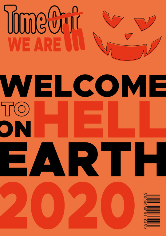
This was a mini task on creating a magazine cover. We where given options of magazines that we wanted to create a halloween themed cover for, as you can see I chose to go with Timeout Magazine.
Instead of making the main concept being an image or illustration, I wanted it to be purely text that attracts the viewers attention. I used a big and heavy font to fill the space with text, the font I used here is Metropolis Black.
This has been laid out with a lot of thought as this cover has many different interpretations depending on how you might read it. Let me pick them out for you.
If you read the whole thing properly then its says ‘welcome to hell on earth 2020′
Read only the black fill text it says ‘welcome on earth’. This can be like welcoming aliens or ghosts to earth.
Now just read the orange text it says ‘we are in hell 2020′. Covid-19 has destroyed many peoples lives and made it hell for us.
#Timeout#Timeout Magazine#Halloween#Cover#Magazine Cover#Orange#Text#Multiple Meanings#Editorial#Pumpkin#Covid-19#Corona#Coronavirus#Adobe#Adobe Creative Cloud#Adobe Illustrator
0 notes


Photo


This is Flare Magazine. The limited use of colour really works in their favour, along with use of large condensed type that is loud and catches the eye of the reader. Photography and fashion has been done in a smart way keeping in line with the colour scheme of the magazine, so wearing yellow for the yellow section and red for the red section of the magazine. Flare Magazine doesn’t really have a grid structure, it more like brakes the rule of using a grid and not in a bad way. A grid can definitely be used with this structure however.
The typography is really striking and makes the reader want to look at the images and what is being said in the article, large condensed type is big in the industry right now. Putting photography over the type is also unique and visa versa, as well as the use of the outline of the text which gives its own impact and is less heavy on the eyes which is great in this urban design language.
Large type on the top and sides of the composition creates a brilliant visual hierarchy. The title or the article and the page numbers on top of the page are large and quite unusual to have the page numbers on top of the page as well as at this size. This once again makes this design unique as it is unusual and breaks the grid in a visually stunning way.
#Research#Editorial#Magazine#Typography#Photography#Condensed Type#Flare Magazine#Yellow#Red#Black&White
4 notes
·
View notes
Photo

2nd Module for L5 Graphics at BCU University, Context of Graphic Communication. This module will be looking at editorial designs which in normal talk is magazine designs.
2 notes
·
View notes
Photo


Final Outcomes from the Live Turner Duckworth Sink or Swim brief. I am really proud of my final logo and web designs they turned out better than I initially thought, this was a great experience working in a professional environment and putting myself to the limit getting this task done in a short amount of time. The main thing I will take away from this task is that it has made me a much more confident speaker when talking or pitching ideas. This has lead me to have confidence in my ability to be a class rep for this year which is amazing.
#Turner Duckworth#Live#Live Brief#Final#Final Design#Final Outcome#New#New Identity#Re-brand#Skills#Graphic Design#Design Communication#Logo#Web Design#Adobe#Adobe Illustrator#Motion Graphics#Adobe After Effects
6 notes
·
View notes
Photo

My strapline is Make It A BlockBuster. I want to have all our members to have a BlockBuster time on the platform. And the only way members will be able to have a BlockBuster time is if we have a wide variety of movies, TV shows and games on BlockBuster library. BlockBuster is to have the biggest library of content out there with BlockBuster exclusives and originals thanks to the new storage capabilities.
Three words to describe the new BlockBuster would have to be Integrated, Community and Technology. Integrated it will be with all gaming platforms to be merged into one place, to have the biggest media community in the world, and made possible with new technology. The BlockBuster platform will be available on all gadgets, PC, Consoles, Portable Consoles, Smartphone’s, Smart TV’s. and on WiFi enabled TV Boxes.
#BlockBuster#Integrated#Community#Technology#tech#library#exclusive#original#original content#merged#one#yellow#blue#yellow and blue#re-brand#storage#all gadgets
1 note
·
View note
Photo

My Big Idea is to have BlockBuster be the first online platform to have both video streaming and games all in one place. BlockBuster Video is going to get a new look, along with BB Games, another name for the games platform was BB Game House, as we are connecting all gaming platforms and moving them into one community. This would be possible with partnerships with Playstation, Windows. and Apple. The reason we have Apple as a partner is because a lot of games are not available for Apple Mac, BlockBuster with its new games platform would change this and put the powerful Apple SSD’s to use.
The biggest aspect of this new platform is the community hub. Here members will be able to chat with other members on the platform about their favourite games, movies and tv series. This will also be made simple with each member to have their own profile and can showcase their favourites list of movies, tv and games. It will also feature a ‘Watching Now’ feature. This can be changed in the privacy settings to either allow the public to see, just friends or keep to yourself. The community hub will also be able to allow friends to create group chats and have a separate chatting area.
The community hub will also include the biggest feature to come onto any online platform which is the VIP HUB. This is where VIP members will be able to have close contact with real game developers and be able to pitch their ideas on what they are looking for in a video game. Developers can then see the feedback and create catered games exclusively on the BlockBuster platform.
#thebigidea#thebigone#blockbuster#redesign#newplatform#community#together#alltogether#playstation#windows#microsoft#xbox#apple#appletv#applearcade#games#movies#tv series
1 note
·
View note
Photo

To visualise the road I wanted to take for the BlockBuster branding, I put together this mood board to get a better sense of what direction I want to take my big idea. As the platform will be an online streaming service it was obvious to me that I wanted to focus on the tech side of the program.
In the end I decided not to change the colour scheme drastically, as I wanted the brand to be recognisable with the blue and yellow colours. I did however change the shade of both colours made them more vibrant and electric which is more modern and makes assets cleaner when put together. The cleaner design and new technology will propel this platform to the top.
#blockbuster#redesign#graphics#graphicdesign#tech#technology#colour#colours#recolour#new#vibrant#electric#power#yellow#blue#pantone#online#moodboard#mood#community#cross#crossplay
1 note
·
View note
Photo

This is just a quick collection of BlockBuster’s old branding and brand design. I personally do like the blue and yellow, really striking to the eye and hard to miss or mistaken for any other brand in its field. I will be taking the blue and yellow into consideration possibly with other colours added to it, giving a fresh, new, modern look.
2 notes
·
View notes
Photo


The following week we had an Ideation Workshop. There was a presentation on the different techniques to come up with ideas, I made notes on them as you can see in the above screenshot. Before this workshop I had no idea that there was this many ways to come up with ideas, I knew about mind mapping or straight up write down ideas in a list as they come so this was interesting to know and apply to my ideas. We where then asked to use these techniques for our idea generation. I chose to do a mind map and the 5 W’s. I never really know you could make a creative brief form using the 5 W’s technique as the last time I used this technique was for English during my GCSE’s.
3 notes
·
View notes
Photo

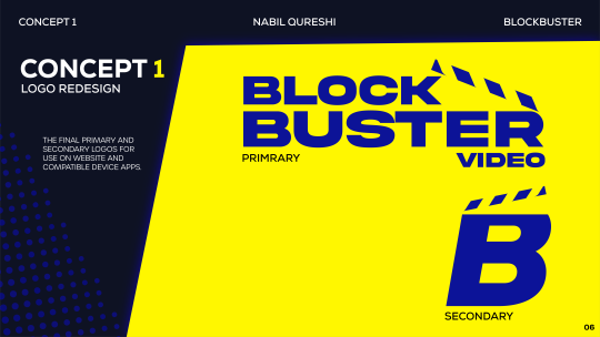
The next thing to do was to create a few initial ideas for the logo of BlockBuster. It was said that you didn’t have to change the logo at all, however I felt as if so this current BlockBuster logo was not going to fit with the theme I have in mind. Accordingly I decided to redesign the logo. During this time I thought about having one alpha logo with sub-logos that will be used accordingly to its designated pages on the platform. For instance BlockBuster Video will be for the movies page, BlockBuster TV will be for the TV shows page, and BB Games will also need its own logo. The circled logo was the one most chosen as a favourite in my class, however with the brand in mind I feel as if the one below it suits it much better.
#graphic design#graphics#redesign#brand#branddesign#logo#logodesign#logo redesign#adobe#adobecloud#adobecreativecloud#adobeillustrator#adobephotoshop
1 note
·
View note
Photo


BlockBuster was a movie rental service which started in 1985, and in the mid 90′s established itself as the number one leading video rental service in the world. BlockBuster would buy movies and rent them out to customers and would make their money back by renting the movies out a couple of times, which at that time was an amazing idea. But what got their revenue rising was their ‘late fees’ rule, if you rented out a movie for a specific amount of time and did not return it at the date agreed upon then you would be fined a late fees... which was pretty hefty the longer you left it.
Then the year 2000 came along and a new competition for BlockBuster, Netflix. Now Netflix was not like what it is today with online streaming services, it was more like order your DVD through the mail service. Netflix even proposed a deal with BlockBuster, however BlockBuster was having none of it, they wanted to be the number one video service. And the thing that drove most people to rent from Netflix was ‘NO LATE FEES’, Netflix did not charge for a late fees which did bring in more customers. Later down the road even BlockBuster decided to drop the late fees rule, but not entirely. The new rule was that you would be able to have 7 days over the initial due date to return your rental. BlockBuster did try the DVD by mail on demand service, but the problem was that they tried it too late and Netflix had already mastered this type of service, if they had acquired Netflix then there still might of been a chance that BlockBuster would still be here today or even overtaken Netflix as they where massive with 9000 locations by 2004.
BlockBuster then makes a deal with Enron to make an online video ordering service like Netflix, Enron was fully committed but on the other hand BlockBuster was only dipping their toes in the water to test it out. While on the other side Netflix is jumping in on this market with two feet, which eventually lead to Enron going bankrupt and the whole service to fail. BlockBuster however still believed in the physical stores and opened up more of them. They did also eventually start their own on demand online video service but it was a terrible service compared to Netflix’s services.
2004 was the last year BlockBuster saw a profit since then the company was on a deep dive of loss losing billions per year. In 2010 BlockBuster finally declares bankruptcy, and stores vanish rapidly. BlockBuster failed due to failure to understand how fast the market was changing and to take on the deals that they where offered.
#BlockBuster#history#historyofblockbuster#Netflix#Enron#DVD#DVDrental#movies#games#online#onlinerental#number1#streaming#bankrupt#bankruptcy#re-design#brandguidline#brandidentity#storytime
3 notes
·
View notes
Photo


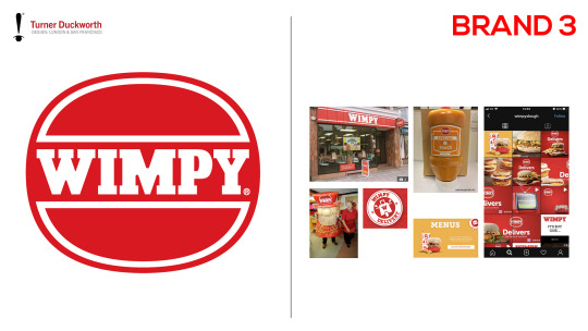
These 3 brands where big in the past but have sank due to other brands exceeding them. Our job is to re-brand and make a striking brand identity for one of these brands. My eye is on BlockBuster, I remember when BlockBuster used to be the go to shop for cheap or newly released movies and computer games. That was over taken by CEX which is now the largest second hand games and DVD shop. I hope to bring back the glory days with re-branding BlockBuster’s brand identity.
#re-brand#brands#brand identity#post office#BlockBuster#wimpy#Turner Duckworth#graphics#graphic design#graphic communication#BCU#bcu visual communication
3 notes
·
View notes
Photo

The brief that I am leaning to is the Turner Duckworth brief. I really want to challenge myself and refine my design style, by choosing a big company like Turner Duckworth and their Sink or Swim brief will help me learn new skills that I might not have at this moment and hopefully learn to communicate in a more professional level
1 note
·
View note
Photo

These are the 6 companies that where pitched to us on Monday the 21st September, we are to pick one of the briefs provided by them and work on what they would like us to do. It is a 4 week project so not as long as other modules but I believe this is a more valuable project.
#Live#Livebrief#Level5#Turner Duckworth#Baxter & Bailey#100 Club#Hetty's Frozen Cakes#Who Sampled#Mimosa Grove
1 note
·
View note