#;RP Icon Tutorial
Explore tagged Tumblr posts
Visit Tumblr Blog
Explore Tumblr blogs with no restrictions, modern design and the best experience.
Last Seen Tumblr Blogs


Fun Fact
Tumblr.com is the 103rd most visited website in the world.
Note
¿oodrías hacer un tutorial de cómo difuminar el marco de las fotos tipo así, por favor?

holii, ahí te grabe uno. no se si me explique bien, pero de esa manera es muy fácil para mi. solo le pones filtros a una foto de color, los que le puse son para difuminarlos (depende del gusto de cada uno de como ajustarlos) luego le pones la foto arriba y con la flechita de al lado del candado la superpones y ya esta.
(ignoren lo de capcut 💔💔)
si no quieres que la foto quede tan visible, por así decirlo, le bajas la opacidad (lo marcado en rojo)

espero que te sea de ayuda. cualquier duda que tengas, puedes escribirme por aquí o por mi ig 👊🏻!!
#fakeland#rp moodboard#tropical moodboard#kpop moodboard#tropical#kpop#moodboard#random moodboard#argentina#brasil#my edit#photo edit#editblr#edit#short bios#kpop bios#messy bios#messy icons#messy layouts#messy moodboard#instagram#tutorial
297 notes
·
View notes
Text
PHOTOPEA TUTORIAL / PHOTO FILTER FOR SKIN TONES:
a tutorial on HOW TO BRING OUT SKIN TONES if an image is 'too gray' (faded) or has too much of one (likely over saturated) color! this technique can easily be applied to icons that already have a border ! just put your focus on the base image / icon ! this works on relatively anything, including poc and non-poc. WHAT YOU WILL NEED: photopea...and your desired your base image(for example, i'll be showcasing inconsistent or otherwise dark/faded scene lighting, like twilight and saw). DISCLAIMER: not all lighting/images are the same, nor are psd colorings. while some colorings may be designed to bring out reds/yellows(which is the filters we'll be using in this specific example), others may mute them and you may have to improvise with whatever color the psd you're using is designed to focus on. this is just a general idea, you will have to explore as you see fit. it's all going to depend on your personal taste !
by the end of this, you should be able to manage results like this !

cool, huh?....anyway, on with the mechanics !
EXAMPLES:

[ BEFORE PSD ] [ SYNOPSIS ]
#01 / LEFT IMAGE ABOVE: too much green, becomes muted with psd and doesn't show variety. #02 / RIGHT IMAGE ABOVE: the colors are very faded in this scene, and the pink focused psd in question made the image seem gray. we will start with EXAMPLE #01. i will be using the same PSD on both, a custom psd i made and focuses on reds/pinks.

as you'll see above the PSD has now been applied...but now it's kinda boring :// (there's nothing wrong if you don't mind how it is above, everyone's got their aesthetic choice—HOWEVER, we're aiming to add skin tone...)
once you have your image open, you'll want to go to image>adjustments>photo filter; i went ahead highlighted it in yellow for easy finding !

since this psd DOESN'T mute reds/yellows, (and those are usually the base of most/general skin tone combinations) i applied both a yellow and red filter. now, these colors i'll be using in this example, because they're in my default colors on the photo filter option—you can totally choose lighter or darker variants of these colors, or like i said, a different color altogether based on how the PSD you're using works. the toggle setting doesn't have to be exact to this example either—this is just what worked best on this image combined with the chosen PSD ! // RIGHT IMAGE IS THE FINAL RESULT AFTER APPLYING THE RED FILTER AFTER THE YELLOW.


repetition on a different example . . .


this scene in particular is very faded, and the red feels a little blotchy/over saturated here...so i'll show you an EXTRA STEP you can use ! in saying this, you don't have to do exactly this; you can even choose to go ahead with selective color to fix your image, without doing the filters, if you find that suitable. but i'll be showing you the magic of selective color to balance out the red toned overlay.

same concept as before, just a different selection: image>adjustments>selective color. think of selective colors as "balancing" the colors. it does have a toggle selection for each color, which is super helpful, including diminishing or adding white highlights. given the PSD colors, naturally, i'll be focusing on yellow and red.


it's now got a general skin tone and red is not as blotchy !
[ FINAL RESULTS / CONSISTENCY WITH PSD APPLIED ]

this is a great hack i use quite a bit, it's great for maintaining consistency in your icons when the lighting is working against you...hope this was comprehensible and helpful, happy editing !
#* RE - RELEASE#* MY TUTORIALS.#sorry i didnt realize i forgot to reupload this one!#long post /#FREE TO REBLOG !#rp community#icon tutorial#rp icon tutorial#psd tutorial#roleplay coloring#roleplay help#roleplay resources#roleplay community#roleplay graphics#coloring psd#psds#icon psd#psd#roleplay psd#rp graphics#rp psd#rp resources#tutorial#editing tutorial#rpc tutorial#editing resources#psd coloring
254 notes
·
View notes
Text
*✶ please please please
a template by cozysip.
by clicking in the source link you’ll find 02 different dash icon templates made by me from scratch. credit is not needed , but do not claim as your own ! if you enjoy this or you use it, please reblog or like this post . thank you !
#01. PSD TEMPLATES : mine.#template#free template#rp template#psd template#free psd#dash icon#dash icons#dash icons template#icon template#icon psd#psd#rpc#rph#graphic tutorial#free graphics
279 notes
·
View notes
Text
Quick-N'-Easy Icon Editing Set-up with Krita!
I'm sure there are already a few tutorials like this one out there, but hey, what can one more hurt?
What's this do?: Krita has features you can use so you can make quick edits to your icons all at once, and save them all out individually with the press of a button. It's a great time-saver, and gives you a lot of flexibility in your edits!
What you'll need:
Krita, a free and open-source painting / image editing program!
Icons!
Part 1: How to export your icons all at once.
( warning: long and image-heavy! Written with beginners in mind. )
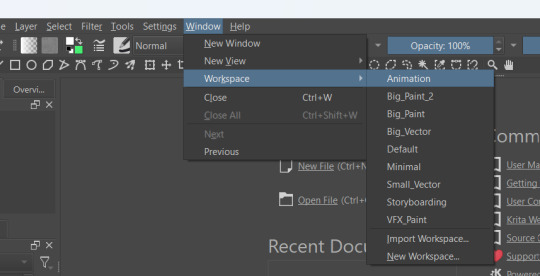
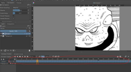
Once you open Krita, you'll want to go to Window > Workspace > Animation on the uppermost bar to change the layout for what we'll need, here.
We're going to be using Krita's animation features to make iconing / icon-editing a little easier.

( as an extra note, hitting '1' on your keyboard will set Krita's zoom to the image's actual size, while '2' will have it fill the available space. Helpful for seeing how your icons will appear on the dash. )
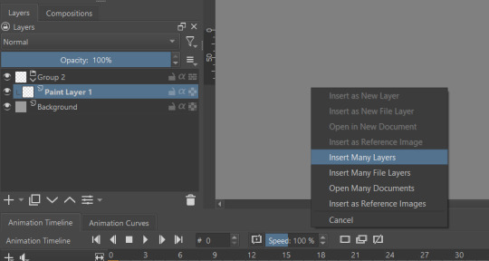
Okay, let's get started! Make a new image ( File > New or press Ctrl + N ), set it to whatever dimensions you want ( I default to 100x100px ). Make a new layer ( Click the plus icon in the layers tab, or press ins ), and then put that layer in a group ( Right-click the layer and click group > quick group, or press Ctrl+G while its selected. )
With that grouped layer selected, Grab your icons, and click & drag them into Krita, onto the canvas ( the big empty grey space in the center ). When Krita prompts you, select 'insert many layers.' This will load in each image as its own layer. If you don't have the grouped layer selected, you'll have to select them all and put them back in the group. ( No big deal, just shift + click the first and last layers, and drag them where you need them. )
You can now delete your initial paint layer in the group, if you want. Otherwise it will make an 'empty' icon when we export.
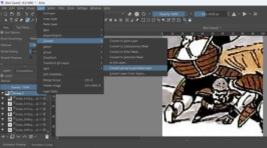
Select that group, then go to Layer > Convert > Convert Group to Animated Layer on the top bar. ( This is only accessible through the top bar, not the menu that appears when you right-click on a group. I don't know why. )
Congrats! Now all your icons are frames in an animation. Each cell on the timeline is a single icon. If you have a scroll wheel, you can scroll to quickly look through them all.
If you can't see all of your icons on the timeline, click the three bars here and set 'clip end' to whatever number of icons you have ( or a little more, for extra wiggle room. )
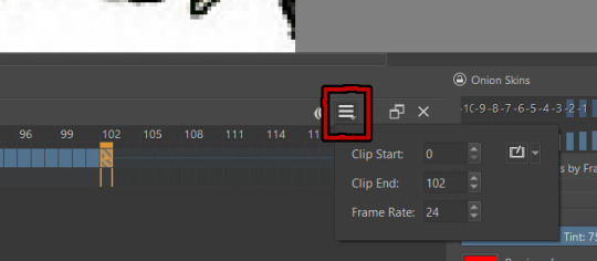
Find the last filled cell, right-click it and select 'set end time.'
When you're ready, hit File > Render animation.
You'll want to make sure you set it to export as an image sequence, and select where you want your icons to go on your computer. Give them a naming scheme. Make sure you save before you export your icons, as I've had Krita crash while exporting a large number of icons all at once. ( If it does this to you, just try again. Worst comes to worst, you can export by setting the first frames and last frames to smaller chunks instead of all at once. )
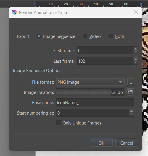
Hit OK and voila! No more saving icons out one-by-one!
Of course, we haven't done any editing yet, so this is all redundant unless you're saving out your own freshly-cropped icons. Let's move onto the fun part:
Part 2: Editing
Right-click your new group layer and hit add > filter mask. Choose any you want- for demonstration purposes, I'll be using my favorite: gradient map.
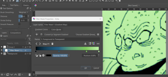
This will put that filter over all frames in that animation layer, meaning you won't have to repeat your edits per icon.
If you want to edit your filter mask after you click off, just right-click it in the layer tab and select 'properties.' It will bring the initial prompt up again for you to adjust.
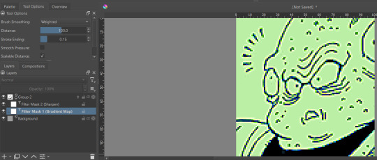
You can add as many filter masks as you want! The order the layers are in does matter, though, so keep that in mind.
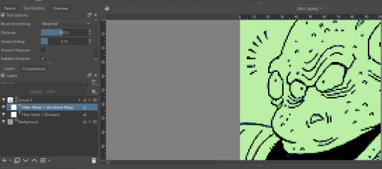
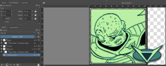
If you want to add frames, banners, name tags, symbols etc, you can do that on layers over or under that animation layer! They'll stay consistent across the 'animation' unless you add new frames to them on the timeline.
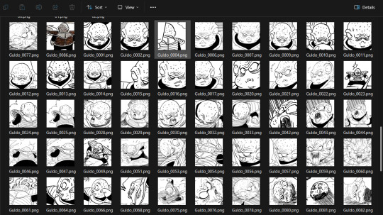
If you want to edit your icons again, just do so, and re-export! If the naming scheme and numbers are the same, Krita will automatically overwrite the old files. But watch out; if you're trying to save new icons, make sure you start numbering at a higher number than your last icon, or change the base name.
Happy iconing!
#rp icons#rp icon tutorial#rp resource#rp tutorial#icon editing#icon edits#not icons#no clue what to tag this as...
51 notes
·
View notes
Note
Thanks to you, I learned and created my very first icon! Your Tumblr has it all — technique, great taste, and generosity. Thank you so much, truly.
show meeeeee! i have an icon tutorial for you:
2 notes
·
View notes
Text
tag setup.
#base icons#screencaps#paid resources#psd#carrd template#discord resources#discord tutorial#coloring psd#rp icon template#template#photopea#promo template#photoshop template#graphic template#social media template#social media graphic#google docs template
2 notes
·
View notes
Text
Comic Version of Maggie

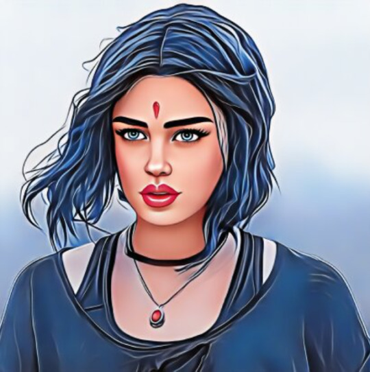
Original:
Used this sites: (x) (x) for the first two pictures. They're free to use and you don't have to sign up. At least I didn't had to and I made a few pics there And also this site (x) for the third one. This is also really good and you can use it for free too (kind of). Only thing is you have to sign up if you want to download the picture and with the free account you can only download one pic per day (Or you just make a screenshot works too and you don't have to sign up...). Beside that some things are only accessible with premium for which you have to pay. Also depending on what filter you use you maybe have to edit it a little. Edit: I made a little mistake on this site (x) you also need to sign up to download the picture. It's been a while since I used them so I remembered it wrong. I also checked the other site (x) and this one works with out signing up.
#ooc:mun#maggie's comic verse#maggie mccoy#maggie moon#phantasma#tried to use photoshop to turn real pictures into comic pictures but totally failed and it took way too long#tbh it's not worth the stress just for rp icons if i can use these pages instead#photoshop is just too much of a struggle and it's getting really annoying and frustrating to use#especially when you follow every step of the tutorial and nothing works#don't have the patience and time for this#if anyone knows other sites or apps etc. or other ways to make real pictures into comic version i'll be happy to hear it#if possible something that's free to use or not that expensive
1 note
·
View note
Text

…make reply icons?
reply icons (or as i call em, replycons) are a weird kind of edit. they’re in the same genre as rentry or carrd graphics—i.e., that you can do whatever you want with no real rules. that said, these are some guidelines i follow
i. make your canvas much wider than it is tall
there’s no exact measurement for this. my reply icons for this blog are 600x150, but they’re fairly uniquely small. the general consensus at least amongst my peers is about a 4:1 or 3:1 ratio will work best.
the reason why your replycons should be wider than longer is because it keeps them from taking up a lot of space. here’s mine as an example:

enough space to be visible, but not so much as to be obnoxious. that should generally be your goal.
ii. collect a wide variety of expressions
this’ll be limited depending on your characters, but it’s best to have a good variety of expressions. i also save my files with whatever the expression is to me for easier searching but you don’t have to do that LOL
also, i feel obligated to mention it, but you don’t have to stick with just one character. you can use a whole group, either an in-game group (i.e. leo/need) or a visual group (i.e. blonde characters.) they don’t even really need to match, though it’ll look better if they do. with this blog and my old ones, i used a variety of characters with the same color palette so i could get the expressions i wanted.
iii. just make the damn thing
ah, the worst part of all editing—actually editing. god fucking damn it. now that you’ve got your canvas and your character(s) it’s time to grit your teeth and make some replycons
first thing i usually do is narrow down a theme. this can be as simple as a color or as complex as something like “cybercore” or whatever -core scratches your brain. for these replycons, my theme is just attempting to match the rest of my blog layout. god fucking speed.
it can sometimes help to make a thumbnail like this ^ but that’s 100% optional. i like to do it for tutorial purposes and it helps me to get my thoughts from my brain and into photopea. your thumbnail need not make sense nor be cohesive. it’s just for you to know
a good way to start is to make a shape and make it interesting—i usually make a shape and give it a border and some fun lines, rp style, but you don’t have to do that. all of those things can be done with just the shape tool. you can also find existing icon masks on tumblr or resource rentries (make sure you credit properly!!) and you can find some templates, like mine!
once you’ve got a theme and a base, start adding shit.

^ pretty easy base. i pixelated the lines around her eyes and added eyes, and added a stroke and drop shadow to the shape to make it easier to see! if you’d like, you can stop there. but i think it needs a background and some details so i’m going to keep going
background complete! for this i just used a color fill and went rasterize > filter > noise > add noise but you can add whatever you like—patterns, wallpapers, solid colors, etc. it’s up to you! i also added a small stroke around my character png so as to distinguish her from the background a little further :)
this one is a little blank on the left side so i’m gonna add some text and details!!

there we are. i added the cd png to break up the monotony of my base, added text because it’s my personal preference, and added a chibi so the text is distinguished! if you do add text, make sure it’ll be readable in any modes—light and dark. i typically add both a black and white stroke for this, and a drop shadow can help a lot, too!
an important thing to note here is any extraneous images of the character you add can’t be too distracting to the main image. if i had, for example, done this:
the new png is obviously too distracting, right? it takes up too much space and completely draws the eye away. this is even more true when the base and the png have conflicting expressions, like so:
because now i can’t tell what emotion you’re conveying—is the replycon happy or sad? what part do i focus on??
so it’s best to keep any extraneous decals pretty simple, for the sake of clarity. it’s also best to remember that english-speakers read from left to right, and native speakers are conditioned to interpret most things that way. you’ll want to draw the eye in that direction as you work, and not the other way around. hope that makes sense lmfao
iv. save as a psd
once you’ve got all your layers and details situated, make sure that you save your replycon as a psd. this is imperative, because it enables you to make new reply icons as the occasion arises, or you can recycle the basic components for a new theme!
if you’re unsure on how to save as a psd, click file in the upper left-hand corner and then ‘save as a psd.’ i recommend labeling it so you can file it more easily; i’m naming this file cobaltpegasi replycons, which is an easy template—just stick your url in instead.
once you’ve done that, keep adding expressions until you have a suitable amount of replycons! i usually made about five to ten to start with and then add new expressions as i see fit, but you can do whatever works best for you.
also, when saving your replycons, it helps to sort them by what emotion you think they convey. for example, my canarysage replycons are sorted by character and then by emotion—so this one is labeled “len smug” because that’s how it seems to me

you don’t have to do that, but i find it helps a lot when trying to find specific ones, especially if you have a lot.
v. go forth and use them
now that you’ve got your replycons done, you can use them! go forth and clear out those week old requests in your inbox (🤨) or whatever it is you want to do with them. that is all. canarysage signing off <3
…so that’s how you do it.
93 notes
·
View notes
Text

— COMO BUSCAR TEMPLATES?
Onde e como encontrar templates.

Recebi uma ask pedindo por um tutorial de como encontrar templates, e mesmo que seja um trabalho que não tem como eu facilitar, sei que muita gente chega aqui no tumblr e não sabe onde procurar e por onde começar.
Por isso, nesse guia, vamos discutir onde procurar templates para usar aqui no tumblr, seja em um blog pessoal, 1x1, blogs de personagens ou, até mesmo, em uma central.
Antes de tudo, como eu disse ali em cima, não tem muito como cortar caminho. Se você quer encontrar templates que gosta, vai ter que passar um tempo fuçando nas tags até encontrar o que você está procurando. Aqui você não vai encontrar uma fórmula mágica, e é importante saber que demanda tempo além do que você vai dispor para editar seu template. Dito, isso, vamos começar.
Adendo: o casal do @twilightalks postou um super post com vários blogs e sites pra vocês encontrarem conteúdo pra edições e que vai facilitar muito a sua vida. Clique aqui pra ser direcionado para o post!
RPHs
Primeiro, a maioria (se não todos) os tumblrs de rph reblogam templates. Você pode abrir um rph da rp br ou da tag gringa e vai encontrar resources, isso é fato. Mas se você não sabe o que procurar, abrir um blog não vai te ajudar tanto assim, já que é impossível ir olhando página por página.
Para facilitar a sua vida, eu vou colocar aqui algumas tags de helpers brasileiros onde você encontra templates:
jackhelps
#char psd; templates específicos para introdução de personagens. #ps template; templates em geral. #icon borders; templates para banners & ícones. #psd; psd para aplicar em imagens. #dividers; divisores para posts.
sakurajjam
#( templates ) #( psd ) # ♡ · ❄️ : photoshop
neozhelps
#⊰ 🍄:photoshop resources ˎˊ˗
desireeh
#templates
yeagrist
#* ⠀𓈒 ׄ ✮ ﹕ 𝐫𝐞𝐬𝐨𝐮𝐫𝐜𝐞𝐬 ⸝⸝ template . # * ⠀𓈒 ׄ ✮ ﹕ 𝐫𝐞𝐬𝐨𝐮𝐫𝐜𝐞𝐬 ⸝⸝ psd .
gwldcnz
#m: templates. #m: dash icons. #m: graphics. #m: colorings. #m: ps resources. #r: templates. #r: colorings. #templates. #colorings.
yixinc
#template
twilightalks
Mega post de help com vários links úteis, incluindo perfis de criadores de conteúdo.
Tags
Certo, mas onde esses rphs procuram esse tipo de coisa pra reblogar? E se não encontrar nada ali, como procurar?
Pra ir direto na fonte, você vai precisar usar as tags do tumblr. Se você notou ali pelos links, temos termos específicos mas em geral usamos template em rph. É assim com todo conteúdo? Não, você vai precisar pesquisar tags específicas pra encontrar algo que você procura.
#rph
Essa é a tag geral de helpers do tumblr, então você pode encontrar conteúdos em geral, como templates, gif packs, pngs, etc. Não é frequentemente que vejo templates por ali, a maior parte dos posts é de gif packs, mas pode ser que você encontre algo se der uma olhada pela tag.
#rp resources
Resources variadas, desde pngs, templates, ícones, etc. Aqui você vai encontrar tudo mais misturado, e com outros tipos de resources como starters e etc. Se você está procurando algo mais específico, pode dar um trabalhinho. Se não, vai encontrar bastante coisa bacana.
#rp template #psd template #rp psd template #graphic template #photoshop template
Nessas tags você encontra templates gerais. Acontece de ter alguns posts irrelevantes, mas, em geral, são só templates que você pode usar, só precisa filtrar conteúdo gratuito.
#character graphic #character template #character psd #char psd
Character psd/graphic/template são aqueles templates que se encaixam em fichas. São especificamente feitos para mostrar personagens, e podem ser usados como fixado também. Alguns têm espaço para nome e outras informações, outros são focados só em imagens. Quando você estiver buscando esse tipo de template, as tags acima são ideais para essa busca.
#rp psd #psds #free psd #psd
Quando você quer encontrar ajustes de cor para colocar nas suas imagens, e não templates, as tags que usamos são as de psd. Nelas você encontra psds gratuitos e pagos, alguns que só alteram coloring e outros que alteram as cores de forma mais extrema.
Outras tags úteis:
#faceless gif pack para packs de gifs de cenários, pessoas que não mostrem os rostos, objetos, etc.
#aesthetic pngs #transparent png #png icons #transparent icons para ícones em png. Podem ser usados em templates e como ícones.
#dividers #tumblr dividers #aesthetic dividers #post dividers são os divisores de posts em png.
#icon border #free rp icon border #icon borders sendo bem sincero eu só me deparei com esses templates recentemente, vejo eles sendo usados (e já usei) como banners.
#dash icons template são os templates pra fazer ícones transparentes pra dashboard.
Deviantart
Se você pretende usar templates com frequência, vai ter que se acostumar a usar o Deviantart. É um site onde criadores postam arte, mas também armazenam templates, psds, e etc, e disponibilizam para baixar. Alguns criadores aqui do tumblr armazenam lá, e você recebe um link para baixar pelo deviantart, e outros você só encontra por lá.
Para baixar, você vai precisar criar uma conta, o que é bem simples de se fazer, e depois ir até o link do que pretende baixar. Embaixo da imagem do template, você vai encontrar esses botões:

Você clica na seta de download, e o conteúdo vai ser baixado. Algumas vezes vem direto como psd, outras em uma pasta com arquivos, ou até mesmo um arquivo zipado. Depende do criador.
Mas atenção, se você entrar em um conteúdo em que no lugar da seta, apareça o valor, assim:

Significa que esse conteúdo �� pago, infelizmente.
Mas, além de ser direcionado para o Deviantart apenas para download, você também pode pesquisar templates diretamente por lá. Eu considero até um pouco mais fácil, pois você consegue especificar exatamente o que está buscando.
Exemplos:


É claro que vai surgir algum conteúdo que não interessa, mas você consegue fazer uma busca mais direcionada ao que você está buscando.
Aconselho sempre adicionar o termo template no final da busca para garantir que você filtre por templates mesmo, e buscar usando termos em inglês pra ter mais resultados. Depois é só ir selecionando os que você gostar e conferir se não são pagos. Não se esqueçam, é claro, de dar uma olhada na descrição do conteúdo para saber como o criador gostaria de ser creditado.
No post do twilightalks também tem uma lista ótima de usuários que postam templates, o que facilita essa busca.
Buscar templates é um trabalho um pouco cansativo, não tem muito como correr disso, infelizmente. Mas sabendo onde buscar facilita bastante e poupa um pouco do seu tempo. Então espero que esse guia ajude, e qualquer dúvida, só chegar na ask!
23 notes
·
View notes
Text
Photopea: How to batch resize square icons (101)

I personally use photoshop for most of my graphics need, but I know that this is not an option for a lot of folks, and I've decided to make a couple of RP specific tutorials using Photopea (free, web based, no software to install) and Krita (free, install required).
This first post is for Photopea.
You can grab your screenshots of comic books (for instance) with picpick or another software that allows you to screengrab specific shapes / pixel sizes. I use picpick (I purchased pro for my use, but if you don't intend to do sell your icons you may use the free version. It is as complete as the paying version) to screen grab at 150x150px. Tutorial from RPCheapos here. (For live action/animated, I recommend using "free video to jpg converter" for better results)
Now on to the resizing (Very Easy To Do imo) with a bunch of screen shots to show you the steps.
First step is to open www.photopea.com. You can create an account if you'd like. As it is a free site that lives thanks to ads, I would recommend turning off adblocker for this specific site.
Click File > Automate > resize image:

It will open a little pop up called "Resize". Click on Source Images. They're your screen grabs that you want to resize to a smaller size:

Caveat: I never tried more than a hundred screenshots at once. So do with that what you will. I've read posts of folks who have issues if they put too many pictures into photopea at once, but I never experienced that type of issues.
Once your images are loaded:
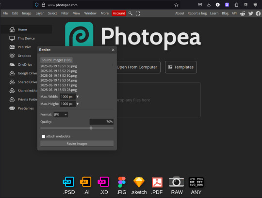
Change the parameters to your desired width/height. Note: it does NOT crop. If your screen grabs aren't square now, they won't be square after! Also select your favored format (I favor PNG over JPG: higher quality & supports transparency if needed)
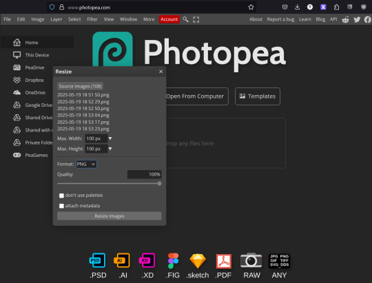
After you click resize, it will open a popup in order to save your newly resized icons into a zip folder. Save it wherever you'd like with a name that talks to you, unzip the file, and now you have your resized icons!

This is pretty powerful but also! pretty limited. No cropping, no coloring, no sharpening, etc. But it is a good jumping point imo when you get started and just want all your icons to be the same size.
Take care, and sprinkle sparkles in your life!
~Emma
9 notes
·
View notes
Text
PHOTOPEA TUTORIAL: RP ICONS/ICON BORDERS !
HOW I USE CLIPPING MASKS && RECTANGLE SELECT TO CREATE MY ICON BORDERS. this post will include framing the rp icon itself, the border around the icon && adding on optional block quotes—also, a bonus how-to for applying patterns to your block quotes and/or icon border; in case you're after some zesty editing !
pictured below is a simple, PRE-MADE icon that we will be attempting to recreate in this tutorial. all you need is a screencap && photopea ! as for the blockquote pattern, it is an optional design / example that i will provide later on in the tutorial ! this tutorial will involve rectangle select & clipping masks and i will cover how to do them both.

start a New Project, make sure the background is transparent. pick what size you'd like the overall border to be, not the icon itself.

you should start out with a transparent rectangle, as seen above. for this particular recreation, i've listed the width & height of my standard icon border sizes below. if you don't know, these sizes are determined by pixels.
W: 640 H: 107 i.e., W: 640 pixels H: 107 pixels.
next step: select Layer>New>Layer as seen highlighted below. this new layer is where your icon base will be/your clipping mask will go.

now that we've added a new layer for the icon base/mask to go, we're going to use rectangle select to set the size of our icon. right click where the yellow highlight(left bar) is pointing in the example below && drag your cursor to expand the "rectangle select" to whatever size icon you want. for this example(as seen below) i've chosen the size 80x80.

after you've set your desired icon size, you can now drag the selection(you should see a dotted border outlining your selection) to where you'd like your icon to be placed. i personally chose to place mine in the center—i did accidentally forget this step in the tutorial, so don't mind it if you see it move in the next two examples. though not an incredibly important detail, you can always move it after you fill it in !
once you have placed your base, select your brush tool && choose a color(highlighted in yellow, located on the left bar in the example below). you can use whatever color you'd like here, as long as it stands out to you—i usually choose red or green so that it can stand out from the background. once you've picked your color, you're going to color inside of the selection that you've made. don't be afraid to color outside of the lines...the brush will not exceed past what you've selected in advance with your rectangle tool !

once your base is colored in, you may now de-select your rectangle select tool(right click>deselect).
pictured below is an example of our current progress. as you can see i finally moved my icon to the center.

this colored shape will be your 'x marks the spot'—it is where your screencap(as a clipping mask) will be going once we finish the border of the icon.
speaking of which, now it's time to create our border ! add a new layer with the same process as before. Layer>New>Layer. name it whatever you'd like. i've simply labeled the new layer as "icon border" because it will be the layer the border goes on. make sure it is on a layer that is separate from the icon base.

in the "icon border" layer, repeat the rectangle select process outside of each side of your square/icon base. selecting one side at a time, be sure to fill it with the color of your desired border. i will be using a white border, which will be 3 pixels wide on each side. (example is of me expanding the select tool to the preferred pixel height/width outside of the base)

once you've finished creating a selection && filling each section, you can deselect && should be left with something like this:

this is optional, of course, but if you'd like you can also make an outer border/border edge. you can do this in a new layer or simply place it on the same layer as the white border. in the example icon at the top of the post, you can see that the icon i made has a gray outline outside of the white border. to do that, simply repeat the rectangle select option; and this time, only select 1 px width of space(or more, depending on how thick you want it/if your border is wider) on the outer edges of the white border. with you're new color(mine being gray as depicted) you can fill each of these edges. here's what we got going on so far !

now, to add your icon inside of the border! (it doesn't really matter if you do it before or after, just as long as you got your layers right!)

as you can see, i already added my icon to the base; you can do this before or after you've created your border && border edge. in the image above, the rectangle select you're seeing is an example of where the outer border/edge was filled in with gray. of course, to add your icon, file>open and place>choose your screencap. once your screencap is opened, right click it && once you're met with the drop down, left click the option that says "clipping mask." doing this will give you free reign to zoom in or out and move your icon around(to move it, edit>free transform && drag) all within the confines of the icon base you've created with your selection tool && brush.
our current result:

now... for optional blockquotes. make sure to start a new layer for your blockquote/s. once again, you're going to use the rectangle select tool; choose the width && height of your blockquote by dragging/expanding the tool with your cursor. i've made my blockquote 2 pixels wide because i prefer them thin—if you would choose wider blockquotes, just expand the selection.

once selected, fill that selection with the preferred color of your desired blockquotes. most people choose gray or colors relevant to their characters—i will be using red because i will be treating this as a clipping mask, so i can show you how to put a pattern into the blockquotes if you want something that stands out.

you can see ive put two blockquotes in place. you can choose to move them however you want them, or include both the blockquotes in one layer or seperate layers. i've personally separated mine for this example. (layers bq 1 + bq 2 on the side)
ADDING A PATTERN: do the same thing you did with your screencap...file>open and place>choose image. i will be using this abhorrent little pattern(free to use!) i created for the sake of this tutorial. and just like you did with placing your screencap, right click and select "clipping mask" on the dropdown. again, you can move it, zoom in and out however you please. just make sure the image is lined up with the blockquotes!

and here's what you should end up with, or something similar !

EXTRA / ADDING A PATTERN TO YOUR BORDER:
once you've gotten the hang of rectangle select/clipping masks, this part is self explanatory. basically, if you'd like to put a pattern inside your border (this will be the white border you created) you can repeat steps you took to add a pattern to your blockquote, this time placing your clipping mask over the layer with your border.

and that's pretty much the formula of all formulas for me personally—these tools come in hand for a lot of my editing !
#* MY TUTORIALS.#long post /#rp community#icon tutorial#rp icon tutorial#psd tutorial#roleplay help#roleplay resources#roleplay community#roleplay graphics#coloring psd#psds#icon psd#psd#roleplay psd#rp graphics#rp psd#rp resources#tutorial#editing tutorial#rpc tutorial#editing resources#psd coloring#icon border#icon border tutorial
286 notes
·
View notes
Text
Hey, this is my personal RP Resource blog. I reblog anything I personally find to be useful here, and sometimes make memes. Please do not remove credit, or the blank template links from my memes. Thanks!

MINE carrds && rp meme
GRAPHICS color palettes, fonts, graphics pack, icon templates, pngs, psds, templates, textures
CHARACTER THINGS aesthetics, fashion, muse study, ships
ORANIZATION & APPEARANCE gdoc templates, tags, themes
MISC psd tutorials, rp help, tumblr help, writing help
writing / rp memes
7 notes
·
View notes
Note
Hi there! I was wondering if you have any tips or advice for aspiring graphic designers (in the rp sense)? Or even tutorials, sites for resources that you might be willing to reccomend?

Hello Anon!
Thank you so much for the kind message and question, didn't think i would become a 'reference' or 'guideline' for anyone in rp graphic or graphic design in general! however ever since you asked about tips - advice & free sources, i will extend you the courtesy of such!!
TIPS &. ADVICES FOR ROLEPLAY GRAPHICS!!
ALWAYS KNOW YOUR STYLE &. BE INSPIRED BY OTHER WORKS!! i know it may sound bullshit or something, but trust me: you need to know THE STYLE YOU RECOGNISE AS YOURSELF,
the style you want to try to recreate / homage / inspired of &. the style you see that's circulating around the community!! my initial experience when i first got into 'editing' was almost 10 years ago, like when i was in highschool, i was in twitter rp &. was fascinated by tumblr rp & the usage of image around!! from there i started to see the trends on editing that were circulating around &. try to recreate it!! i was just a kid per se, and honestly, to be creative is to see thus i believe it is fine to be inspired because from there you buILD YOUR OWN STYLE!! Because you learn, and you keep having ideas, it's like a principle i believe to be graphic designer or even an artist, there's always a glimpse of something/someone in your artwork but in the end it is yours to have it.
ALWAYS UNDERSTAND THE PLATFORM. when i was in twitter roleplay, there's a phenomenon where writers want to have such an aesthetically pleasing account and follows the trends that were happening in tumblr &. applies it to twitter. like the colouring, the graphic style or even the layout; but unfortunately this created a perception that tumblr rp was 'superior' in terms of graphic editing for characters &. they keep trying to 'recreate' &. 'recreate' to fulfill such aesthetic pleasing that can only be reached if you're in tumblr. for example, i find it bizarre if you're writing in twitter but has a blockquote icon or apply PSD/filter to a meme just to have this aesthetic pleasing desire. YES IT IS NECESSARY TO HAVE GRAPHICS FOR YOUR ' ROLEPLAY IDENTITY ' FOR CHARACTERS YOU PLAY, but that doesn't necessarily force you to be do everything for aestheticism. understand your platform, understand its benefits / capabilities & inabilities so you can utilize it for your roleplay - writing THAN your imagery.
UNDERSTAND YOUR CHARACTER, LIKE REALLY; i find it so so necessarily that you need to understand your character through imagery. it doesn't necessarily about how they look, but rather the vibe - the images that remind you of your character. sometimes people are obsessed to have a faceclaim / bodyclaim etc that fits into the character thus they can have it in the graphics, but i believe the vibe - the images that remind you of the character is the one that should be used in roleplay graphics. it's like an abstract of a research, and your roleplay writing is the content of the research; if you don't give tidbits of the whole thing, you can't deliver the whole thing. this goes to the colour you associate to the character as well because colour can help you to give concrete base of your character instead of having paralysis on options that are being presented. same goes to the fonts; yes it can look good but does it really represent your character?
HAVE FUN EXPERIMENTING. hey. this is serious advice. i wouldnt be here if i didnt try and try experimenting with styles / fonts / colouring etcs. but in the end you will always have one particular thing that will stuck with you and you will eventually know, the experimenting works!! textures - overlays - different fonts - insipred by movies / book covers / milk covers etc; it can be source of experiment to apply to your graphics in roleplay and everyone will think: this is neat!!
lil side note, but it's my personal bias tbfh: don't make your graphics too dark / desaturated. people can't see it. accessibility should be main priority when it comes to writing. how do i feel about people that use small icons or too saturated colour? point two again: understand your platform. if it can be applied fabulously i agree but it shouldn't be like hindering your writing.
FREE RESOURCES :
ive been using these websites as my resources heh
PHOTOPEA : if you dont have photoshop, use photopea; the basic principle from photoshop applies to photopea. however one downside about photopea is that psd from photoshop can be different when it is applied to photopea, same goes to the other way around so it has benefits - disadvantage but hey, use it when you dont have photoshop fr
HERITAGE LIBRARY : free vintage illustrations, like really, png - vectors, very hopeful
PUBLIC WORK : same like heritage library however it's like pinterest but public domain which you can absolutely use!!
COSMOS : an alternative for pinterest. pinterest has everything to be honest but AI starts to appear and it makes me :/ sometimes which i found about this alternative FOR CREATIVE ONLY so yup it's pure inspiration all around.
FREE FACES : modern fonts are stored here, but then again i still use google fonts...
i'll try to remember where did i get my photoshop brushes but brushes can really help you fr. trust me. you dont need to overlay and such what matters is you can use brushes..
i'll keep this list update for further references honestly!!
SO ANON!! ONCE AGAIN THANK YOU FOR THE QUESTION &. HOPEFULLY THIS ANSWER IT even though it's almost gibberish / tmi / oversharing but yes i was in mindset where aestheticism should be everything, whilst it is, but don't make aestheticism become sole purpose of your roleplay whilst roleplay is about writing, playing the characters <3
17 notes
·
View notes
Text

Big Canva Tutorial Document
Hi guys! Canva's been my hyperfixation for a while now, so why not try to compile everything I've learned into one place? This Google Doc is intended to introduce you to this browser-based editor and help guide you through using it for RP graphics. It contains a couple tutorials, and some questions along the way to help inspire you to create your own awesome stuff.
Tutorials already present:
— How to use a Canva template to make icons — Making a pride icon in just a few seconds — Adding freckles/moles/etc features to your faceclaims — "Fancier" pride icons/regular icons once you've got the basics
This Doc will be continually updated with more tutorials, templates, and tips. So once you have access to the Doc, you'll get to see those as I add them!
★Link★ ✰Alt link✰
30 notes
·
View notes
Note
your blog is makimg me want to get into RP but idk where to start 😔
Rp blogs are great! Its the easiest way to get involved writing fanfiction and headcanons with a community
I dont roleplay that much any more on here obvs bc a bitch is off his/her meds however
Here's how to start a tumblr rp blog!
First. Make a new account. Not a sideblog. Sideblogs are fine but it can be confusing and messy and it's just not the ideal experience for ur first blog
Pick out a url that relates to your character and their themes/motifs or the themes you want to write
Pick out a container or minimalist theme on @theme-hunter a simple one! Doesnt have to be too fancy!
Make, commission, or draw some graphics. Some people will make incredibly detailed icons. I got lazy on this blog honestly and I hate all my graphics so we're going thru it, struggle bus on limpfisted dot tumblr dot com, but a lot of people have a nice aesthetic header, a nice aesthetic icon, and a nice aesthetic pinned post. Plus promos
You don't honestly have to do that, but its fun, and you get to learn photoshop editing, which is a great skill that impresses my parents. U also don't have to use photos hope, i use clip studio paint on my tablet, and tbh i like it better bc its not so fucking SLOW. I always used to make my own .psds anyway so it's whatever. There a lots of tutorials, Google it, but have fun with it!
Go to the tumblr search and look for a Google doc template or carrd template. This is for your rules/about page. Its mobile friendly for suckers like me without laptops. Write basic rules (ie no minors shit of that nature), then write your characters backstory and important information.
Then head over to ur brand new tumblr and click the new post button. Make a pinned post. Put ur little graphic. Put a little poem. Put a link to your carrd/Google doc. Put ur online name pronouns and age range and ur characters name and pronouns. PIN that shit.
Then go and hit the new post button again and put the little graphics you made for your promo. Write a little poem. Tag it "bg3 rp" and "dnd rp" and "oc rp"
Then bobs ur goddamn uncle. You're a roleplayer. You did it!
Start following blogs and let the mutuals come rolling in
Come join us, wyll warrior! We're waiting for u!!!!!
19 notes
·
View notes
Text
out of curiosity. does anyone have like... tutorials for making like. tumblr graphics for rp and stuff? like. making your own icon templates/banners/dividers/etc etc. i have many ideas but it's kinda hard to execute them when i don't know where to start you know?
5 notes
·
View notes