#ADVANCED ADOBE PHOTOSHOP
Explore tagged Tumblr posts
Visit Tumblr Blog
Explore Tumblr blogs with no restrictions, modern design and the best experience.
Last Seen Tumblr Blogs


Fun Fact
Post activity is at the highest at 4:00 pm EDT; notes peak at 10:00 pm EDT.
Text
Look past the lens and hear past the beat.
Want to turn your talent into a job? Check out our huge range of classes that are designed to help you succeed:
ADVANCED ADOBE PHOTOSHOP
CERTIFICATE COURSE IN SEO
DIPLOMA IN DIGITAL MARKETING
DIPLOMA IN SOCIAL MEDIA MARKETING
DIPLOMA IN VIDEO EDITING
DIPLOMA IN GRAPHIC DESIGNING
DIPLOMA IN WEB DESIGNING
CERTIFICATE COURSE IN ILLUSTRATOR
Why go with G-TEC Education?
• Industry-aligned curriculum for practical skills
• Flexible learning for beginners and upskillers • State-of-the-art labs and tools for immersive coding practice
• Networking opportunities with fellow enthusiasts and experts Earn a living from your programming love by joining our community!
#ADVANCED ADOBE PHOTOSHOP#CERTIFICATE COURSE IN SEO#DIPLOMA IN DIGITAL MARKETING#DIPLOMA IN SOCIAL MEDIA MARKETING#DIPLOMA IN VIDEO EDITING#DIPLOMA IN GRAPHIC DESIGNING#DIPLOMA IN WEB DESIGNING#CERTIFICATE COURSE IN ILLUSTRATOR
0 notes
Text

SALLY BOWLES???
#silly#i dunno#some rattish nonsense#art#artists on tumblr#cabaret#cabaret musical#sally bowles#cabaret 1972#digital aritst#digital painting#digital drawing#digital art#illustration art#illustrator#my art#fanart#the stupid cabaret musical#has absorbed my life entirely#for the past few days#i had feared this would happen#ANYHOW i hope this phase will pass#and i hope i wont be dragged back into it#kicking and screaming#in a few months time#also i dont know how i feel about using photoshop#it feels like im cheating on medibang#but im not enjoying it 😭😭#this is what i get for trying to get ahead of the class and get used to the monstrous adobe nonsense in advance smh...
250 notes
·
View notes
Text
hi. i'm pasting this image here and then i'm going to download it so i can pull it up as a reference for this stage in the advance wars 2 remake. in my old age (mid-20s) i simply can't handle being zoomed all the way out
#i fully recognize i could open MS Paint or Adobe Photoshop and do this more easily#but tumblr was already open so y'know#advance wars
6 notes
·
View notes
Text
#PHP Classes in Rohini#Web Designing Institute Rohini.#Advanced JavaScript Training Institute in Delhi#Adobe Photoshop Course in Rohini.
0 notes
Text
Adobe Photoshop VS Others
When someone once said, "Photoshop to the rescue, " one of my favourite dialogues from Gabblin's web series Office Politics, I hoped that there would have been some other equivalent alternatives to this software.
But to date, there has been none.
I last used it in September 2019, and since then, I have been struggling to get a chance to use it again.
Simply as I do not own a license.
But Photoshop is what it is. And Adobe should be super proud of it.
Be it 🖊️ Image Editing 🖊️ Image Manipulation 🖊️ Visual Effects 🖊️ GIF Creation 🖊️ Generative AI 🖊️ Graphic Design 🖊️ Digital Painting 🖊️ 3D
You name it and most probably they have it.
No alternative in my knowledge has been able to deliver close to what Photoshop can do.
Credits: Video and Sound: Movie Taqdeerwala | Hansi Mazaak and Gaming Sound FX (YouTube) Images: Adobe, CDNLogo, and PNGEgg
Enjoy the video and do let me know your thoughts in the comments section 😊.
#graphic design#graphic designer#photoshop#adobe#image editing#image manipulation#digital painting#photoshop actions#generative ai#visual effects#funny#designers humor#designer#designer hub#design community#gif creation#matte painting#video editing#bollywood#youtube#png#advanced features#dechnsign#theharssharora
0 notes
Text
Tough Education is the no.1 Educational Institute in Butwal, Nepal. We provide the best computer courses, language courses & Tuition classes.
#Computer course#graphic design#best graphic institute#korean language#advance excel#photoshop#adobe illustrator#InDesign#Accounting Package#best graphic design course
0 notes
Text
Photoshop with Online Courses and Earn Your Certificate: The Ultimate Guide
Introduction
Adobe Photoshop is the premier software for photo editing and graphic design. Whether you are a novice looking to learn the basics or a seasoned professional aiming to refine your skills, a Photoshop online course with a certificate can provide the structured learning and credentials you need. This guide explores the benefits of taking a certified Photoshop online course, key features to look for, and the top courses available to elevate your design skills and enhance your career prospects.
Why Enroll in a Photoshop Online Course with a Certificate?
Photoshop is an intricate tool with a vast array of features. A structured online course can help you navigate its complexities efficiently, providing comprehensive knowledge and practical skills. Here are some reasons to enroll in a Photoshop online course with a certificate:
Comprehensive Learning:
Courses cover a wide range of topics from basic functions to advanced techniques.
Structured lessons ensure a thorough understanding of Photoshop’s capabilities.
Expert Instruction:
Learn from Adobe-certified instructors and industry professionals.
Gain insights, tips, and techniques not easily found in free tutorials.
Hands-On Practice:
Engage in practical projects and real-world scenarios.
Build a robust portfolio showcasing your Photoshop skills.
Flexibility:
Online courses allow you to learn at your own pace.
Suitable for working professionals, students, and hobbyists.
Certification:
Many courses offer certification upon completion.
Adobe certification can enhance your resume and career prospects.
Career Advancement:
Certifications demonstrate your commitment to professional development.
Can lead to higher earning potential and job opportunities.
Key Features of Top Photoshop Online Courses with Certificate
Beginner to Advanced Modules:
Courses should cater to all skill levels, starting with basics and progressing to advanced techniques.
Modules on specific topics like photo retouching, digital painting, and graphic design.
Practical Projects:
Hands-on projects that allow you to apply what you've learned.
Real-world scenarios to help you develop practical skills.
Access to Resources:
Downloadable resources such as project files, templates, and brushes.
Access to recorded sessions and future updates.
Interactive Learning:
Live sessions, Q&A with instructors, and interactive assignments.
Community forums and peer reviews to enhance learning.
Certification:
Many courses offer certificates of completion.
Certifications from reputable institutions can enhance your resume and career prospects.
Top Photoshop Online Courses with Certificate
Adobe Photoshop CC – Essentials Training Course (Udemy):
Comprehensive course covering Photoshop basics and advanced features.
Includes hands-on projects and exercises to reinforce learning.
Certificate of completion available.
Photoshop for Beginners (LinkedIn Learning):
Ideal for beginners, this course covers the fundamental tools and techniques.
Taught by experienced instructors with practical examples.
Certificate upon completion.
Advanced Photoshop Techniques (CreativeLive):
Focuses on advanced photo editing and graphic design techniques.
Suitable for intermediate to advanced users looking to enhance their skills.
Certificate available.
Photoshop CC Bootcamp (CreativeLive):
Intensive bootcamp offering in-depth training on all aspects of Photoshop.
Combines lectures, hands-on projects, and live feedback sessions.
Certificate upon completion.
Photoshop Mastery (KelbyOne):
Series of courses covering everything from basics to specialized techniques.
Includes access to a community of Photoshop enthusiasts and experts.
Certificate of completion available.
Domestika – Advanced Photoshop for Photographers:
Specialized course for photographers looking to enhance their editing skills.
Taught by professional photographers with real-world examples.
Certificate upon completion.
Choosing the Right Photoshop Online Course with Certificate
Identify Your Goals:
Determine what you want to achieve from the course.
Choose a course that aligns with your career aspirations and skill level.
Course Content and Structure:
Review the syllabus and course modules.
Ensure the course covers essential topics and tools relevant to your needs.
Instructor Credentials:
Check the qualifications and experience of the instructors.
Look for courses taught by Adobe-certified professionals and industry experts.
Student Reviews and Testimonials:
Read reviews and feedback from previous students.
Consider the course’s reputation and overall rating.
Support and Resources:
Ensure the course offers adequate support, such as mentorship, forums, and Q&A sessions.
Access to additional resources like project files, templates, and reading materials.
Success Stories from Photoshop Online Course Graduates
Jane Doe - Graphic Designer at CreativeAgency:
Completed a Photoshop online course with a certificate on Udemy.
Created a portfolio that helped her land a job at a top design agency.
John Smith - Freelance Photographer:
Took an advanced Photoshop course with a certificate on CreativeLive.
Improved his photo editing skills, attracting high-profile clients and increasing his income.
Emily Johnson - Digital Artist:
Graduated from a Photoshop mastery program on KelbyOne with a certificate.
Gained the confidence and skills to launch her own successful digital art business.
Future Trends in Photoshop and Digital Design
AI-Powered Tools:
Adobe Sensei and other AI-powered tools are revolutionizing Photoshop.
Automated features for photo editing, object removal, and content-aware fill.
3D Design and Augmented Reality:
Growing integration of 3D design tools within Photoshop.
Use of augmented reality for more immersive and interactive designs.
Mobile Editing:
Increasing capabilities of Photoshop on mobile devices.
Enhanced synchronization between desktop and mobile versions.
Collaborative Design:
Tools for real-time collaboration with team members.
Integration with Adobe Creative Cloud for seamless sharing and feedback.
Conclusion
A Photoshop online course with a certificate provides a comprehensive and structured pathway to mastering Adobe Photoshop. By covering essential skills, tools, and principles, these courses prepare aspiring designers, photographers, and digital artists for successful careers in the creative industry. With the right training, a strong portfolio, and a commitment to staying updated with the latest trends, you can unlock your potential and create stunning digital designs. Start your journey today and earn your certificate to take your Photoshop skills to the next level.
#photshop course#photoshop course online#photoshop adobe course#photoshop course online free#photoshop course in chennai#photoshop computer course#photoshop editing course#photoshop online course with certificate#photoshop course certificate#photoshop course bangalore#photoshop editing classes#photoshop advanced course#photoshop design course#photoshop lightroom course#photoshop classes mumbai#photoshop course in mumbai#photoshop manipulation course
0 notes
Text
So y'all have seen the Williams F1 Logo before, yeah?
well get ready, becaues I am about to ruin your day!
where does one even begin with this. i am sorry in advance. -just a poor learning graphic design student, who simply tried to enjoy their saturday evening
The Logo
For anyone that doesn't know, here's the Williams F1 Logo. Entirely unedited, copied straight from Wikipedia:

Now like many fans, I actually quite enjoy this logo. I like the modern, sharp edges of it and it's simple yet intriguiging design. It's memorable, while also easily recognizable as a W. I also really enjoy the colour choice (this, however, is entirely a personal preference.)
(entire rant under the cut. please keep reading this took years off my life span.)
How did we even get here?
Let's start at the beginning. How did we even get here? Well I, a poor poor learning graphic designer, was watching this lovely video from Mr. V's Garage about bad F1 Logo's over the past 35 or so seasons. Very interesting, I can only recommend it (but you don't need to watch the video to understand this post)!
Now, to cleanse the palette at the end of the video, Mr. V included a top 10 GOOD logos from this time span, it was very kind of him.
On P4 of this "Good List," Mr. V placed the current Williams F1 Logo, as pictured above. At first I vaguely agreed with this, believing that he probably simply hadn't noticed one of the things that's been bothering me about that Logo since the first time I saw it up close.
The first sign of Trouble
So, what is this mystery issue, you might ask?
It's simple really. You don't necessarily notice it at a first glance, but something about that logo seems off. Taking a second longer, you may notice it yourself.
No, I mean it, take a minute and go look at the logo. It looks wonky as hell, doesn't it?
Well I can tell you the first thing that I personally noticed. The arms of the W aren't in line with the bottom half, see:

(Graphic by @girlrussell who was so kind to let me use it, as it is way prettier than the one I made)
It's a crooked W. There is no good explanation for this. The rest of the font is perfectly fine, geometrical shapes.

Anyway, the good person that I am I went to point this out to my partner ( @leftneb ) who proceeded to inform me that he, infact, was not aware about this and was, quote, "never going to unsee that."
Now, the good FRIEND that I am, I, of course, proceeded to rush into our broader F1 friendgroup to make them suffer for eternity.
What's the logical next step to take? Of course, fix the logo in Adobe Photoshop, you know, as a joke.
(Disclaimer at this point, I am not necessarily the biggest fan of Williams Management Team. I enjoy ALL their drivers this season. I do NOT enjoy James Vowels. Be warned.)(Also I am aware that he probably did not have an influence on the logo)
Trying to fix it. Oh god, I was so innocent back then
Trying to fix the logo in Photoshop is the worst mistake I could've made. THE worst path to take. I could've just giggled about making my friends suffer (which I succeeded in, by the way) and moved on. Instead I ruined a perfectly good Saturday evening, and for what? I don't know anymore.
Anyway, how was I gonna go about fixing the logo in the simplest way possible? Simplest way I could come up with: slap the thing in Photoshop and put two, mirrored boxes at each side to make the sides line up. Small issue, how do I make the thing actually even? Fix: line them up at the intersecting point with the bottom tips of the W.
Here's the result:

Hey, anyone care to explain to me why in THE LORDS NAME the arms are different sized? I mean, surely they weren't before. Surely, certainly, I must've messed up.
I double, I tripple checked. I made sure everything was lined up and made sense. But no.
It just couldn't be. Something was uneven in this logo, something even deeper. Something I could not have predicted when first taking a closer look. It was at this point I realized I had messed up. What rabbit hole had I stumbled across? Certainly, it couldn't get much worse.
And that's when I noticed.

(pictured above; my genuine reaction)
There's MORE? (oh god, the top isn't lined up)

I couldn't believe my eyes. This is the PINNACLE of the sport, and THIS was the logo of one of the competing teams? I mean, yeah, we have a Visa Cash App RB or a Kick Sauber or even a MoneyGram Haas which are all terrible logos, but at least they're CLEAN. (this has not been checked. If anyone wishes to ruin a nice Saturday evening, feel free to check them and tell me how wrong I was in the previous statement!)
But you can see that there is no end in sight for this post. I'm sure you're as scared as I was at this point. By now we were sitting in VC, discussing the horribleness of this logo. I had long informed my irl's about this, who take said design classes with me. And it was one of them who pointed out the next thing that had been bothering me, but I had not been able to put a finger on up to this point.
thE DISTANCE, HOW DID THEY FUCK IT?

I'm afraid I have to confirm your fears.
Yes, those lines are the same length. According to Photoshop, they're on the same level as well, so no flunking with angles.
The gaps of the arms to the main W are not the same. They're differently sized gaps.
It was clear to us, this logo is inherintely flawed. They're subtle issues, but once you pay attention you start to notice things. It all looks slightly wonky and off centre. And eventually, you get paranoid, and start comparing other angles and sizes. And you will keep finding things. This has ruined my life.
HOOOOOW

Honestly, I don't even know what to say. Yes, yes sadly those lines, too, are the same length. Just copied over from one side to the other and layed over on the same height. I admit, they're not layed over perfectly. I was honestly holding back tears at this point. But the point still stands, you can clearly see a difference in width.
Honestly, the only way I can explain it is that at some point there was a mess up of distance or proportions and whoever was designing the logo couldn't pin it down and tried to restore the visual balance by making manual adjustments. And in all honesty? They kinda did a good job, if that's what's happened. I mean, you notice the crookedness of the arms, and then maybe the difference in height, but the rest you probably will not notice if you don't spend too much time staring at it. (like some of us) And even those issues clearly aren't noticeable to the vast majority, considering I had to go point it out to a group chat for my friends at least to notice.
what the fuck is THAT?
Now, the thing about doing this investigative work of prooving a team you dislike is worse in more aspects than you previously thought, is that you do a lot of zooming in. And zooming in means you might notice bits that yours eyes simply overlooked before, because they were too small.

Here you can witness the top of the middle point, that, for whatever reason, really wants to touch the top border of the Logo. I'm relatively certain that's the highest few pixel in the entire graphic, considering earlier chapter "There's MORE?" I have no idea why it looks like that or why they thought it was necessary for it to not end in a clean point.

I just actually have no idea how to even describe what is going on on the top of the left arm. That left hand side, again, touches the side and is therefore the most-left-pixel in the graphic. I, once again, have no idea the purpose of this. However the RIGHT hand side also makes no sense, as it is the most prominent corner in the whole logo. There's pointed corners, and rounded OF corners, but nothing that is trying to form it's own colony in a distant land that hopefully isn't this god awful logo. I hope that blob gets away. I really do. You go king.
i'm loosing my mind
Anyway, the only reason I could come UP with those weird "reachy-outy-bits" was to establish the dimensions of the logo? But if that was the case, I don't understand why they managed to keep all the other potentially border touching corners clean?


Like, look. Those are clean, sharp corners with some clearance off the borders. I have no clue why they managed it here but not with the others.
guys. please.
Backtrackig a little bit, going back to the positioning of the arms.

Do I need to mention that those lines are both the same length and the same (mirrored) angle? I really hope I don't, because I don't think I could be making this shit up. Like, once you roughly know what you need to look for it just kinda becomes easy to find.
As said before, I genuinely do think that most of these issues happened in a chain-reaction. For example, the distances between the main part and the W wouldn't be as noticeable (and they do get noticeable once you start looking at it) if the angle wasn't fucked. And guess what, there's more fucked angles here! Which ALSO influence this specific area of the logo!
this is just embarrasing for you.

something something same line copied over and mirrored etc etc
It's not as visible but the angles defintely don't line up here as well. As mentioned before, these issues for the most part all influence each other. It doesn't really excuse the issues, in my opinion as a designer, because a big company like this shouldn't have these sort of issues in their logo.
So let's review;
to sum it up,

i cannot even BEGIN to explain to you how big of a fucking JOKE this FUCKING logo is. because, i thought to myself, to round the post out, hey, why not show ALL the issues i pointed out in one picture? that would round it out quite nicely, wouldn't it?
Yeah well, this logo sent STRAIGHT FROM HELL just could NOT let me rest. I had only done the lines visualizing the crooked arms in PAINT up until this point, i.e. I had only pulled both up individually. To make a nice "rounding out" picture I still had to add them into PHOTOSHOP. so i did. i pulled up the line. i mirrored the line.
THE ANGLE IS FUCKING DIFFERENT
none. and i mean NONE of my friends had noticed this before. i need you to understand that we looked at this thing with FIVE pair of eyes, and NONE of us noticed that until i thought to myself "Oh I still need to add these specific lines to have ALL the issues I pointed out in my SILLY TUMBLR POST in ONE image" and i get THAT FUCKING SURPRISE
I was PLANNING to round the post out with a statement on how obviously this isn't a serious post. Here, I even had it all written out already because I accidentally started writing it in the last paragraph:
Of course, this is nitpicking, and it's not that serious. I'm aware of that. AS MENTIONED most of these would not be noticeable if we hadn't gone specifically looking for them.
yeah, well, fuck that. i just spent two hours seething about this logo. i'm ending the post on this instead.

#i am ENRAGED#i managed to actually calm down about it#yk. just typing away#and then i just try to ROUND OUT THE POST#for fucks sake#anyway i know i'm posting this at an hourrendous hour#if you read all the way. reblog? maybe#pretty please#williams f1#williams formula 1#williams racing#formula 1#f1#also apologies for any spelling mistakes i do NOT have the nerve to go back and proofread this
952 notes
·
View notes
Text

MASTER POST
The Experimental Monster Laboratory, or Monster Labs, is a TADC AU where the cast is in the physical world! Sorta..
C&A Research Facilities is one of the cornerstones of the science and medical worlds! They do everything; funding research, manufacturing equipment, and research into the known and unknown in an effort to understand everything. To the public, that is.
They experiment heavily in everything, from hiring literal Gods on earth to manage the more ..sensitive divisions; mixing machine and magic, technology and the supernatural, genetic experimentation, you name it, they’ve probably done it! The world outside may not know anything of the advancements they’re researching but there is little C&A Labs won’t allow in the name of progress in understanding and cataloging everything in their universe. Our story takes place in one of the more private residencies deep in C&A, belonging to Caine; a minor God with mysterious origins, unknown limitations, and boundless enthusiasm for learning everything he can about his little science friends.

╰┈➤ Content
╚═ Unnamed fic (Coming soon...) ╚═ Bubble can cook?? .
╰┈➤ Asks
╚═ Does Pomni act like a zombie? ╚═ Is Zooble's Demon Snake Leg happy? ╚═ Gangle is in a Situation.png ╚═ Gangle's temperament ╚═ Has Ragatha ever shocked anyone? ╚═ Gangle love RAAAH ╚═ Do Caine and Ragatha fight over Pomni? ╚═ Why did Gangle summon a demon? ╚═ Why does Pomni wear a bell collar? ╚═ Kinger's eye ╚═ What if there was a baby crying? ╚═ Death trauma [Gangle and Pomni] ╚═ Kinger has ONE hobby outside of Bugs ╚═ Is Zooble protective of Gangle? ╚═ What happens when you touch Pomni's brain? ╚═ JAX DATED SOMEONE?? ╚═ What does Jax do? .
╰┈➤ References
╚═ Intro Cards ╚═ Height Chart Lineup ╚═ Zooble Demon Snake Leg Intro Card /j ╚═ Queenie ╚═ Gummigoo ╚═ The Sun Room ╚═ Logo .
╰┈➤ Arts
╚═ First ML AU Post ╚═ Second, exploring outfits ╚═ Design sketches part 2 ╚═ Pomni + flower language ╚═ Showtime + Ragapom doodles ╚═ Jax not practicing lab safety ╚═ Abstragedy cuddles ╚═ Raga doodle ╚═ Ragapom doodle ╚═ Jax and Meadowsweet ╚═ Pomni staring out a fake window.png ╚═ [Gives pomni flowers] ╚═ more doodles ig
.
╰┈➤ Misc.
╚═ Caine Lemon Rant [Animatic] ╚═ Zodiac signs?? ╚═ Caine gets called a Tumblr Sexyman and cries ╚═ Bubble Looksmaxxing ╚═ Jax wants to take ketamine with you (Romantically) ╚═ Caine eats a lemon [Animatic] ╚═ BUNNYSUITSSS ╚═ Magma doodles ╚═ Magma doodles part 2
.
╰┈➤ Pomniverse
╚═ Wonderland and Zombni are friends :D
.
╰┈➤ Boundaries / Q&A
╚═ Any story plans? I'm not sure yet, currently writing a fic and several comics on the way.
╚═ Any boundaries? None, so go crazy! I am OK with gore, NSFW, angst, violence, etc, just be sure it is tagged/TW'd appropriately as not everyone is OK with that content. I'd also like to see please LOL
╚═ Can we create fanart/fics/content? Can we dub or fancam? Yes of course!! Please tag me, I'd love to see all of it! I'm tracking the tag #TADC Monster Labs AU for other's content
╚═ Is NSFW allowed? Yes, both art and fic, so long as it's marked appropriately I'd very much love to see!
╚═ Can I ship the characters, self-ships, or OC x Canon? Yes, ship away! Just be aware the only au-canon ships are Caine/Pomni, Ragatha/Pomni, Gangle/Zooble, and PAST Ragatha/Jax.
╚═ Can we make OCs? Go on ahead! Here is a PSD file for the blank template and the PNG can be found here.
╚═ Who are you?
✦✧ Hi I'm Audi! 26, she/they. Full-time office worker, I do art in my free time. ✦ My current interests are TADC, RWBY, Looney Tunes, and Trolls. ✧ I draw using a custom PC, a Huion Kamvas 16 (2.5K), and Adobe Photoshop. Currently learning to use Procreate. ✦ I do not RP and this isn't an ask blog, asks interacting directly with characters will probably not be answered. ✧ Asks are not guaranteed to be answered, sorry if yours isn't but please don't spam/send multiple times! ✦ Commissions and requests are not open at this time, thank you. ✧ My main tumblr is Audi-art. My Twitter is Hammerspaced.
509 notes
·
View notes
Note
Ozz! I'm trying to get into drawing, but I'm absolutely horrid at it and have no idea where to begin. Do you have any tips for beginners? Also, what program do you use? I've heard Krita is good, have you heard of it?
Also, also, remember to hydrate properly and get a good amount of sleep and do lots of self-care! <33 we love you and your content; you make the world a brighter place ^^
~ 🐇
If you want to start from the very bottom, there's a website where the first lesson is drawing a line, quite literally. It builds your confidence with basic shapes, then moves on to more complex topics like textures, shapes in space, construction of real life objects and so on.
I've had it in my bookmarks for...gosh, years now. I should definitely pick it up again, haha.
I also follow Alphonso Dunn on YouTube, he has hundreds of art tutorials and exercises.
As for software, I briefly used Krita years ago and it was nice! It had a very easy interface and the brushes worked well if you wanted to reproduce traditional art. The only reason I didn't stick to it was because I already had PaintTool SAI and Photoshop at the time. When I got my first graphic tablet, I started with Paint.NET, though it was very simplistic.
The general consensus online seems to be Krita for painting or MediBang if you're into drawing anime. In terms of paid software, I think Clip Studio Paint is very popular and has a lot of resources, from brushes to 3D models. Photoshop is classic, but it can be overwhelming if you're new to digital art.
I personally use Procreate because it came with my iPad and it has a very simple menu. Some professional illustrators say it lacks the advanced options you'd find in other programs, and I do agree it may not be enough if you want to go beyond merely drawing. To add text and make small edits, I'll put the doodle through Photoshop, for example.
Free software: Krita, MediBang, Gimp, KRESKA.art (no installation required)
Paid software: PaintTool SAI, Adobe Photoshop, Procreate, Clip Studio Paint
If anyone has more suggestions or tips, feel free to drop them in the comments!
88 notes
·
View notes
Note
I'm realizing that there's a part of me that never really internalized the. Um. Principle of art? Idk what to call it–Why art doesn't have to be skillful, or maybe, more specifically, why a person should not just give up if their work is not perfect, why a person's work should be worth anything if it's not "good" especially if they aren't willing to break their backs to improve. Whenever I see people who talk about art like that what I've always done is keep it in mind,bit inside I've always just wished I understood how what their saying is true. If it's true.
So when someone says "AI Art has no soul" for a fraction of a second I think "this sounds like baloney, what does that mean?" Before I remember myself and think "oh huh, yeah, I've seen people talk about how AI really just isn't as advanced or capable of the profit that all the company's and investors think it is, and there are doubtlessly things a veteran artist can do that these programs can't pull off, even if I'm not skilled enough to know what those are yet." And therefore when I come across people online talking about, say, the glaring limitations of LLMs that are now a headache because of how many people blindingly trust them to do their writing for them, that always makes more sense to me than people who talk about "AI art having no soul" and such. And I suspect a big part of it is some sort of insecurity of mine
Because I didn't realize that this is how I felt (I thought I was just mostly, in every part of me, Anti AI, like ‘fuck that noise’ y'know?) Until it came to bite me in the ass. A woman who's like my sister though we aren't related, is letting me live in her house as I try to get my bearings and handle on life after deciding to push my last year of college back a year, and she's like, a capable adult with experience in the job market and some industries so I trust her when she says "you know you're going to have to focus on developing your painting and traditional art skills, since with the Advent of AI Art, no one wants to pay for that service anymore." Because that makes sense. Artists in my country, as far as my college goes anyway, are embracing and trying to figure out how to integrate AI into their workflow so as not to be taken over by it. So the market has definitely changed, I've not really met another artist here who has any profoundly negative views of AI art, definitely customers are for the most part the same. For some job security, I better get a handle on the form of art that can't be replicated well by AI.
And yet I feel horrible. Because now I fear it's going to be a thing where any digital.art I may end up doing in this house will be looked upon disapprovingly. Because I'm not as good in traditional painting and I should be focusing on that, there's no need to be putting so much of my energy into digital art like this because it's no longer going to bring me money. All the personal projects I'm doing, my animatics, my oc character sheets are as they have always been, a waste of time or the thing I tend to focus on rather than my school work art. It doesn't matter that I've realized I kind of hate painting, I still prefer it to every other section of art I could have chosen to specialize in (digital art is under graphic design and I hate graphic design and Photoshop/Adobe/coreldraw etc.) And all of that is bumming me out because my main drive for art seems to be in my personal art despite it getting in the way of school work. And I can't stand the thought that it's not worth anything, that I should take a break from it, that AI art is better at it than me therefore there's no point to it. But what else am I supposed to do when I'm not entirely sure how much of all.that is false? And it's become apparent my entire philosophy of art is on shaky ground.
I just want to know and understand the truth so I can stop feeling this way. I'm sorry for the long ask I'm just really conflicted
--
I'm honestly confused about what your philosophy of art even is.
The vibes I'm getting off of this ask are 1. depression/anxiety and 2. extremely black-and-white thinking.
There is no single Truth™ in art, though there are strong tendencies. AI art sucks for some ethical reasons, regardless of whether the art is pleasing to the eye. AI art also sucks because the way it is programmed leads it to default to one style of human face unless explicitly told not to. "AI has no souuuuul" is silly nonsense. Plenty of boring art by humans also feels soulless.
The actual issue is that "Draw a hot girl" elicits lots of different responses from human artists. AI goes straight for AI Face. There has been drama and much hilarity about shitty book covers where what was supposed to be this individual character has ended up with AI Face in a really visible way. AI also suuuuucks at drawing hands or having little details correct. (Like... even more than human artists already suck at hands, which lbr, is a lot.) AI is objectively bad at art in a bunch of formal ways. It may get better over time, and the least discerning type of customer does not notice, but it does, in fact, suck at its job.
AI art is preferred because it is cheap.
This is the same principle as moving factory jobs from country to country looking for the lowest paid labor.
If you want to make money on art, you have to find something that cannot be done elsewhere and for less. For many people, this means building a cult of personality around themselves so that they are the product and are not replaceable.
You do not sound like someone who wants to be a commercial artist.
I get that you feel you have no obvious path to supporting yourself, but that doesn't mean you actually want to be an artist. Hobby art has plenty of value emotionally and for enriching your life. It does not need to make money to have value.
However, if you want to make a living at art, basic digital arts skills already wouldn't have paid the bills before AI took over, at least not in any market I'm familiar with. The people who pay rent this way generally have a strong interest in multiple types of art, and they are far more interested in fulfilling a brief from a client.
--
Honestly, nonnie, if you can't already tell how bad AI is at digital photorealistic paintings or whatever, I think you do need to go focus on painting classes.
It's not that I think you should be a painter, but if your art school is any good, they should have some instruction on formal, traditional art aesthetics. This will include things like anatomy and composition.
It is that da Vinci Michelangelo shit that will set one digital artist apart from another. I see way too many people whose whole education was drawing bishies for DeviantArt. They refine and refine and refine the surface details without ever addressing the underlying issues with proportion and perspective.
91 notes
·
View notes
Text
sorry to say this but y’all are going to have to accept that AI, including gen AI, is going to be integrated progressively into creative digital workflows. it’s not a maybe—it will. the knee-jerk fear reaction to any mention of AI is reactionary and juvenile. you either have to accept this or forever be pissed off at anyone who creates in a digital medium, becaue functions like photoshop’s generative fill or premiere’s enhance audio or algorithmic noise suppression will become and are actively becoming mundane aspects of digital workflows.
there are two important things to keep in mind: first, that companies like adobe are cashing in on the AI buzz and so will label as many minor functions of their apps “AI” as possible; second, everyone wants to use the best and most efficient tools available to them. together this means that as all kinds of AI advance, artists will use it. they will use it to recolor sections of paintings, or generative fill a section of the background after moving where a hand or head was that was blocking it, or balance and clean up audio in video editing. it’s fine if you don’t want to use it, but panicking about anyone who gets even slightly adjacent to AI tools will soon have you alienating the professional artists you claim to be defending.
#cricket chirps#i am a professional video editor and our whole team is expected to experiment with and implement *any* industry advancements#because that’s what you should be doing—you can’t grow and adapt as an artist if you stalwartly stick to outdated tools#*especially* in digital creative media
89 notes
·
View notes
Text
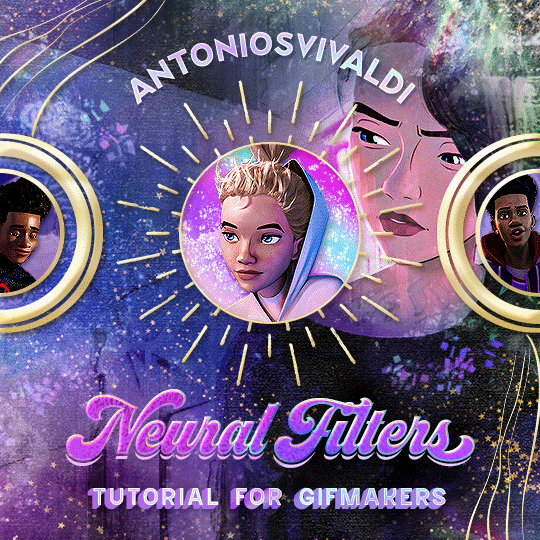


Neural Filters Tutorial for Gifmakers by @antoniosvivaldi
Hi everyone! In light of my blog’s 10th birthday, I’m delighted to reveal my highly anticipated gifmaking tutorial using Neural Filters - a very powerful collection of filters that really broadened my scope in gifmaking over the past 12 months.
Before I get into this tutorial, I want to thank @laurabenanti, @maines , @cobbbvanth, and @cal-kestis for their unconditional support over the course of my journey of investigating the Neural Filters & their valuable inputs on the rendering performance!
In this tutorial, I will outline what the Photoshop Neural Filters do and how I use them in my workflow - multiple examples will be provided for better clarity. Finally, I will talk about some known performance issues with the filters & some feasible workarounds.
Tutorial Structure:
Meet the Neural Filters: What they are and what they do
Why I use Neural Filters? How I use Neural Filters in my giffing workflow
Getting started: The giffing workflow in a nutshell and installing the Neural Filters
Applying Neural Filters onto your gif: Making use of the Neural Filters settings; with multiple examples
Testing your system: recommended if you’re using Neural Filters for the first time
Rendering performance: Common Neural Filters performance issues & workarounds
For quick reference, here are the examples that I will show in this tutorial:
Example 1: Image Enhancement | improving the image quality of gifs prepared from highly compressed video files
Example 2: Facial Enhancement | enhancing an individual's facial features
Example 3: Colour Manipulation | colourising B&W gifs for a colourful gifset
Example 4: Artistic effects | transforming landscapes & adding artistic effects onto your gifs
Example 5: Putting it all together | my usual giffing workflow using Neural Filters
What you need & need to know:
Software: Photoshop 2021 or later (recommended: 2023 or later)*
Hardware: 8GB of RAM; having a supported GPU is highly recommended*
Difficulty: Advanced (requires a lot of patience); knowledge in gifmaking and using video timeline assumed
Key concepts: Smart Layer / Smart Filters
Benchmarking your system: Neural Filters test files**
Supplementary materials: Tutorial Resources / Detailed findings on rendering gifs with Neural Filters + known issues***
*I primarily gif on an M2 Max MacBook Pro that's running Photoshop 2024, but I also have experiences gifmaking on few other Mac models from 2012 ~ 2023.
**Using Neural Filters can be resource intensive, so it’s helpful to run the test files yourself. I’ll outline some known performance issues with Neural Filters and workarounds later in the tutorial.
***This supplementary page contains additional Neural Filters benchmark tests and instructions, as well as more information on the rendering performance (for Apple Silicon-based devices) when subject to heavy Neural Filters gifmaking workflows
Tutorial under the cut. Like / Reblog this post if you find this tutorial helpful. Linking this post as an inspo link will also be greatly appreciated!
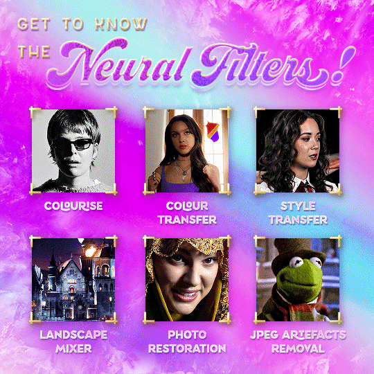
1. Meet the Neural Filters!
Neural Filters are powered by Adobe's machine learning engine known as Adobe Sensei. It is a non-destructive method to help streamline workflows that would've been difficult and/or tedious to do manually.
Here are the Neural Filters available in Photoshop 2024:
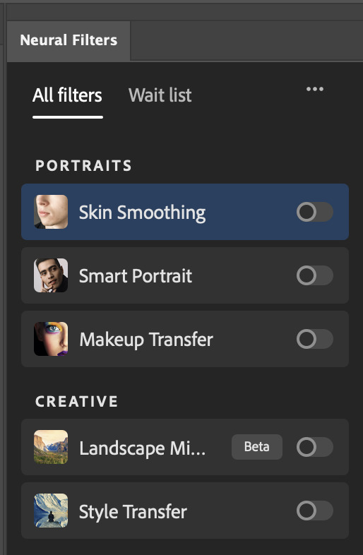

Skin Smoothing: Removes blemishes on the skin
Smart Portrait: This a cloud-based filter that allows you to change the mood, facial age, hair, etc using the sliders+
Makeup Transfer: Applies the makeup (from a reference image) to the eyes & mouth area of your image
Landscape Mixer: Transforms the landscape of your image (e.g. seasons & time of the day, etc), based on the landscape features of a reference image
Style Transfer: Applies artistic styles e.g. texturings (from a reference image) onto your image
Harmonisation: Applies the colour balance of your image based on the lighting of the background image+
Colour Transfer: Applies the colour scheme (of a reference image) onto your image
Colourise: Adds colours onto a B&W image
Super Zoom: Zoom / crop an image without losing resolution+
Depth Blur: Blurs the background of the image
JPEG Artefacts Removal: Removes artefacts caused by JPEG compression
Photo Restoration: Enhances image quality & facial details
+These three filters aren't used in my giffing workflow. The cloud-based nature of Smart Portrait leads to disjointed looking frames. For Harmonisation, applying this on a gif causes Neural Filter timeout error. Finally, Super Zoom does not currently support output as a Smart Filter
If you're running Photoshop 2021 or earlier version of Photoshop 2022, you will see a smaller selection of Neural Filters:

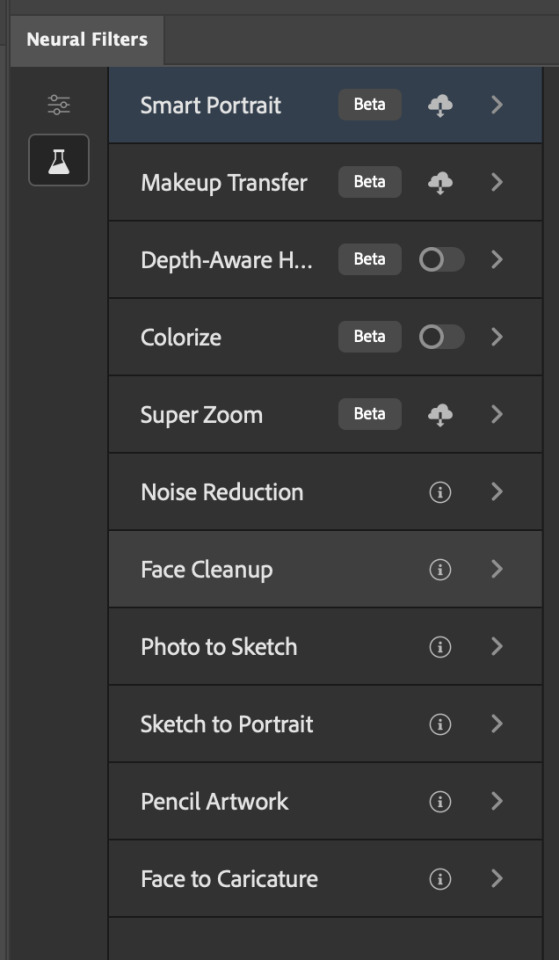
Things to be aware of:
You can apply up to six Neural Filters at the same time
Filters where you can use your own reference images: Makeup Transfer (portraits only), Landscape Mixer, Style Transfer (not available in Photoshop 2021), and Colour Transfer
Later iterations of Photoshop 2023 & newer: The first three default presets for Landscape Mixer and Colour Transfer are currently broken.
2. Why I use Neural Filters?
Here are my four main Neural Filters use cases in my gifmaking process. In each use case I'll list out the filters that I use:
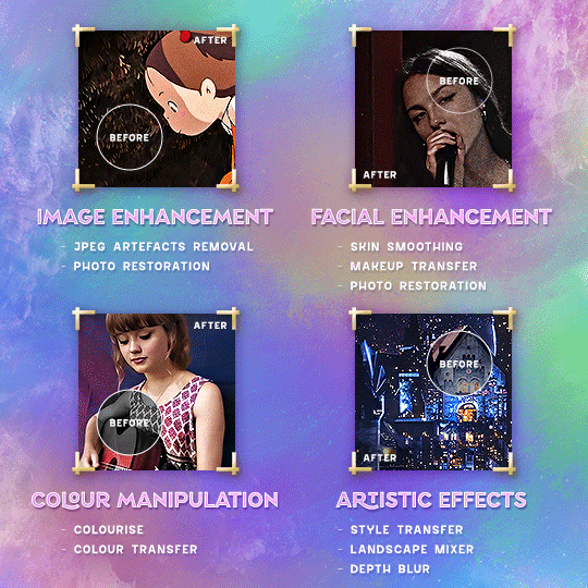
Enhancing Image Quality:
Common wisdom is to find the highest quality video to gif from for a media release & avoid YouTube whenever possible. However for smaller / niche media (e.g. new & upcoming musical artists), prepping gifs from highly compressed YouTube videos is inevitable.
So how do I get around with this? I have found Neural Filters pretty handy when it comes to both correcting issues from video compression & enhancing details in gifs prepared from these highly compressed video files.
Filters used: JPEG Artefacts Removal / Photo Restoration
Facial Enhancement:
When I prepare gifs from highly compressed videos, something I like to do is to enhance the facial features. This is again useful when I make gifsets from compressed videos & want to fill up my final panel with a close-up shot.
Filters used: Skin Smoothing / Makeup Transfer / Photo Restoration (Facial Enhancement slider)
Colour Manipulation:
Neural Filters is a powerful way to do advanced colour manipulation - whether I want to quickly transform the colour scheme of a gif or transform a B&W clip into something colourful.
Filters used: Colourise / Colour Transfer
Artistic Effects:
This is one of my favourite things to do with Neural Filters! I enjoy using the filters to create artistic effects by feeding textures that I've downloaded as reference images. I also enjoy using these filters to transform the overall the atmosphere of my composite gifs. The gifsets where I've leveraged Neural Filters for artistic effects could be found under this tag on usergif.
Filters used: Landscape Mixer / Style Transfer / Depth Blur
How I use Neural Filters over different stages of my gifmaking workflow:
I want to outline how I use different Neural Filters throughout my gifmaking process. This can be roughly divided into two stages:
Stage I: Enhancement and/or Colourising | Takes place early in my gifmaking process. I process a large amount of component gifs by applying Neural Filters for enhancement purposes and adding some base colourings.++
Stage II: Artistic Effects & more Colour Manipulation | Takes place when I'm assembling my component gifs in the big PSD / PSB composition file that will be my final gif panel.
I will walk through this in more detail later in the tutorial.
++I personally like to keep the size of the component gifs in their original resolution (a mixture of 1080p & 4K), to get best possible results from the Neural Filters and have more flexibility later on in my workflow. I resize & sharpen these gifs after they're placed into my final PSD composition files in Tumblr dimensions.
3. Getting started
The essence is to output Neural Filters as a Smart Filter on the smart object when working with the Video Timeline interface. Your workflow will contain the following steps:
Prepare your gif
In the frame animation interface, set the frame delay to 0.03s and convert your gif to the Video Timeline
In the Video Timeline interface, go to Filter > Neural Filters and output to a Smart Filter
Flatten or render your gif (either approach is fine). To flatten your gif, play the "flatten" action from the gif prep action pack. To render your gif as a .mov file, go to File > Export > Render Video & use the following settings.

Setting up:
o.) To get started, prepare your gifs the usual way - whether you screencap or clip videos. You should see your prepared gif in the frame animation interface as follows:

Note: As mentioned earlier, I keep the gifs in their original resolution right now because working with a larger dimension document allows more flexibility later on in my workflow. I have also found that I get higher quality results working with more pixels. I eventually do my final sharpening & resizing when I fit all of my component gifs to a main PSD composition file (that's of Tumblr dimension).
i.) To use Smart Filters, convert your gif to a Smart Video Layer.
As an aside, I like to work with everything in 0.03s until I finish everything (then correct the frame delay to 0.05s when I upload my panels onto Tumblr).
For convenience, I use my own action pack to first set the frame delay to 0.03s (highlighted in yellow) and then convert to timeline (highlighted in red) to access the Video Timeline interface. To play an action, press the play button highlighted in green.

Once you've converted this gif to a Smart Video Layer, you'll see the Video Timeline interface as follows:

ii.) Select your gif (now as a Smart Layer) and go to Filter > Neural Filters
Installing Neural Filters:
Install the individual Neural Filters that you want to use. If the filter isn't installed, it will show a cloud symbol (highlighted in yellow). If the filter is already installed, it will show a toggle button (highlighted in green)
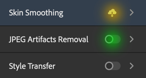
When you toggle this button, the Neural Filters preview window will look like this (where the toggle button next to the filter that you use turns blue)

4. Using Neural Filters
Once you have installed the Neural Filters that you want to use in your gif, you can toggle on a filter and play around with the sliders until you're satisfied. Here I'll walkthrough multiple concrete examples of how I use Neural Filters in my giffing process.
Example 1: Image enhancement | sample gifset
This is my typical Stage I Neural Filters gifmaking workflow. When giffing older or more niche media releases, my main concern is the video compression that leads to a lot of artefacts in the screencapped / video clipped gifs.
To fix the artefacts from compression, I go to Filter > Neural Filters, and toggle JPEG Artefacts Removal filter. Then I choose the strength of the filter (boxed in green), output this as a Smart Filter (boxed in yellow), and press OK (boxed in red).
Note: The filter has to be fully processed before you could press the OK button!
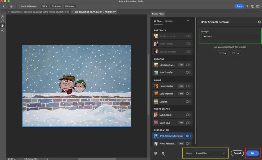
After applying the Neural Filters, you'll see "Neural Filters" under the Smart Filters property of the smart layer

Flatten / render your gif
Example 2: Facial enhancement | sample gifset
This is my routine use case during my Stage I Neural Filters gifmaking workflow. For musical artists (e.g. Maisie Peters), YouTube is often the only place where I'm able to find some videos to prepare gifs from. However even the highest resolution video available on YouTube is highly compressed.
Go to Filter > Neural Filters and toggle on Photo Restoration. If Photoshop recognises faces in the image, there will be a "Facial Enhancement" slider under the filter settings.

Play around with the Photo Enhancement & Facial Enhancement sliders. You can also expand the "Adjustment" menu make additional adjustments e.g. remove noises and reducing different types of artefacts.

Once you're happy with the results, press OK and then flatten / render your gif.
Example 3: Colour Manipulation | sample gifset
Want to make a colourful gifset but the source video is in B&W? This is where Colourise from Neural Filters comes in handy! This same colourising approach is also very helpful for colouring poor-lit scenes as detailed in this tutorial.
Here's a B&W gif that we want to colourise:

Highly recommended: add some adjustment layers onto the B&W gif to improve the contrast & depth. This will give you higher quality results when you colourise your gif.
Go to Filter > Neural Filters and toggle on Colourise.
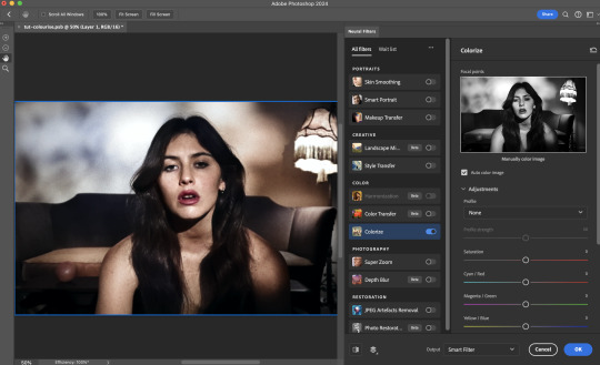
Make sure "Auto colour image" is enabled.
Play around with further adjustments e.g. colour balance, until you're satisfied then press OK.
Important: When you colourise a gif, you need to double check that the resulting skin tone is accurate to real life. I personally go to Google Images and search up photoshoots of the individual / character that I'm giffing for quick reference.
Add additional adjustment layers until you're happy with the colouring of the skin tone.
Once you're happy with the additional adjustments, flatten / render your gif. And voila!

Note: For Colour Manipulation, I use Colourise in my Stage I workflow and Colour Transfer in my Stage II workflow to do other types of colour manipulations (e.g. transforming the colour scheme of the component gifs)
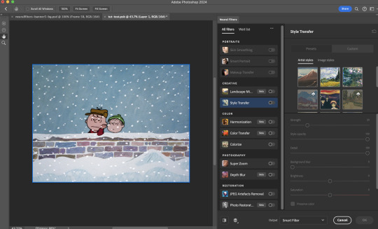
Example 4: Artistic Effects | sample gifset
This is where I use Neural Filters for the bulk of my Stage II workflow: the most enjoyable stage in my editing process!
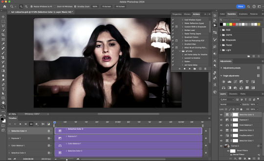
Normally I would be working with my big composition files with multiple component gifs inside it. To begin the fun, drag a component gif (in PSD file) to the main PSD composition file.
Resize this gif in the composition file until you're happy with the placement

Duplicate this gif. Sharpen the bottom layer (highlighted in yellow), and then select the top layer (highlighted in green) & go to Filter > Neural Filters

I like to use Style Transfer and Landscape Mixer to create artistic effects from Neural Filters. In this particular example, I've chosen Landscape Mixer
Select a preset or feed a custom image to the filter (here I chose a texture that I've on my computer)
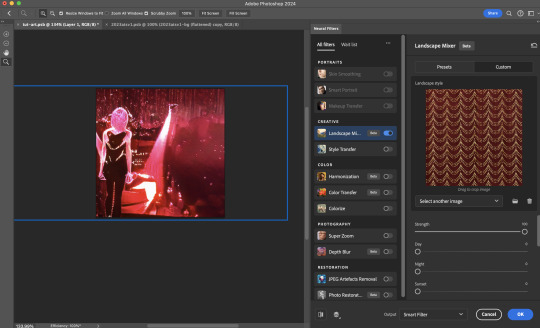
Play around with the different sliders e.g. time of the day / seasons
Important: uncheck "Harmonise Subject" & "Preserve Subject" - these two settings are known to cause performance issues when you render a multiframe smart object (e.g. for a gif)
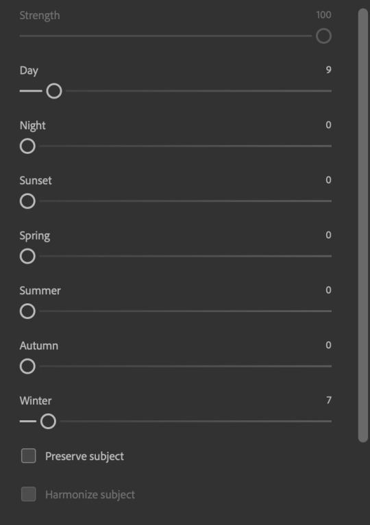
Once you're happy with the artistic effect, press OK
To ensure you preserve the actual subject you want to gif (bc Preserve Subject is unchecked), add a layer mask onto the top layer (with Neural Filters) and mask out the facial region. You might need to play around with the Layer Mask Position keyframes or Rotoscope your subject in the process.
After you're happy with the masking, flatten / render this composition file and voila!

Example 5: Putting it all together | sample gifset
Let's recap on the Neural Filters gifmaking workflow and where Stage I and Stage II fit in my gifmaking process:
i. Preparing & enhancing the component gifs
Prepare all component gifs and convert them to smart layers
Stage I: Add base colourings & apply Photo Restoration / JPEG Artefacts Removal to enhance the gif's image quality
Flatten all of these component gifs and convert them back to Smart Video Layers (this process can take a lot of time)
Some of these enhanced gifs will be Rotoscoped so this is done before adding the gifs to the big PSD composition file
ii. Setting up the big PSD composition file
Make a separate PSD composition file (Ctrl / Cmmd + N) that's of Tumblr dimension (e.g. 540px in width)
Drag all of the component gifs used into this PSD composition file
Enable Video Timeline and trim the work area
In the composition file, resize / move the component gifs until you're happy with the placement & sharpen these gifs if you haven't already done so
Duplicate the layers that you want to use Neural Filters on
iii. Working with Neural Filters in the PSD composition file
Stage II: Neural Filters to create artistic effects / more colour manipulations!
Mask the smart layers with Neural Filters to both preserve the subject and avoid colouring issues from the filters
Flatten / render the PSD composition file: the more component gifs in your composition file, the longer the exporting will take. (I prefer to render the composition file into a .mov clip to prevent overriding a file that I've spent effort putting together.)
Note: In some of my layout gifsets (where I've heavily used Neural Filters in Stage II), the rendering time for the panel took more than 20 minutes. This is one of the rare instances where I was maxing out my computer's memory.
Useful things to take note of:
Important: If you're using Neural Filters for Colour Manipulation or Artistic Effects, you need to take a lot of care ensuring that the skin tone of nonwhite characters / individuals is accurately coloured
Use the Facial Enhancement slider from Photo Restoration in moderation, if you max out the slider value you risk oversharpening your gif later on in your gifmaking workflow
You will get higher quality results from Neural Filters by working with larger image dimensions: This gives Neural Filters more pixels to work with. You also get better quality results by feeding higher resolution reference images to the Neural Filters.
Makeup Transfer is more stable when the person / character has minimal motion in your gif
You might get unexpected results from Landscape Mixer if you feed a reference image that don't feature a distinctive landscape. This is not always a bad thing: for instance, I have used this texture as a reference image for Landscape Mixer, to create the shimmery effects as seen in this gifset
5. Testing your system
If this is the first time you're applying Neural Filters directly onto a gif, it will be helpful to test out your system yourself. This will help:
Gauge the expected rendering time that you'll need to wait for your gif to export, given specific Neural Filters that you've used
Identify potential performance issues when you render the gif: this is important and will determine whether you will need to fully playback your gif before flattening / rendering the file.
Understand how your system's resources are being utilised: Inputs from Windows PC users & Mac users alike are welcome!
About the Neural Filters test files:
Contains six distinct files, each using different Neural Filters
Two sizes of test files: one copy in full HD (1080p) and another copy downsized to 540px
One folder containing the flattened / rendered test files
How to use the Neural Filters test files:
What you need:
Photoshop 2022 or newer (recommended: 2023 or later)
Install the following Neural Filters: Landscape Mixer / Style Transfer / Colour Transfer / Colourise / Photo Restoration / Depth Blur
Recommended for some Apple Silicon-based MacBook Pro models: Enable High Power Mode
How to use the test files:
For optimal performance, close all background apps
Open a test file
Flatten the test file into frames (load this action pack & play the “flatten” action)
Take note of the time it takes until you’re directed to the frame animation interface
Compare the rendered frames to the expected results in this folder: check that all of the frames look the same. If they don't, you will need to fully playback the test file in full before flattening the file.†
Re-run the test file without the Neural Filters and take note of how long it takes before you're directed to the frame animation interface
Recommended: Take note of how your system is utilised during the rendering process (more info here for MacOS users)
†This is a performance issue known as flickering that I will discuss in the next section. If you come across this, you'll have to playback a gif where you've used Neural Filters (on the video timeline) in full, prior to flattening / rendering it.
Factors that could affect the rendering performance / time (more info):
The number of frames, dimension, and colour bit depth of your gif
If you use Neural Filters with facial recognition features, the rendering time will be affected by the number of characters / individuals in your gif
Most resource intensive filters (powered by largest machine learning models): Landscape Mixer / Photo Restoration (with Facial Enhancement) / and JPEG Artefacts Removal
Least resource intensive filters (smallest machine learning models): Colour Transfer / Colourise
The number of Neural Filters that you apply at once / The number of component gifs with Neural Filters in your PSD file
Your system: system memory, the GPU, and the architecture of the system's CPU+++
+++ Rendering a gif with Neural Filters demands a lot of system memory & GPU horsepower. Rendering will be faster & more reliable on newer computers, as these systems have CPU & GPU with more modern instruction sets that are geared towards machine learning-based tasks.
Additionally, the unified memory architecture of Apple Silicon M-series chips are found to be quite efficient at processing Neural Filters.
6. Performance issues & workarounds
Common Performance issues:
I will discuss several common issues related to rendering or exporting a multi-frame smart object (e.g. your composite gif) that uses Neural Filters below. This is commonly caused by insufficient system memory and/or the GPU.
Flickering frames: in the flattened / rendered file, Neural Filters aren't applied to some of the frames+-+
Scrambled frames: the frames in the flattened / rendered file isn't in order
Neural Filters exceeded the timeout limit error: this is normally a software related issue
Long export / rendering time: long rendering time is expected in heavy workflows
Laggy Photoshop / system interface: having to wait quite a long time to preview the next frame on the timeline
Issues with Landscape Mixer: Using the filter gives ill-defined defined results (Common in older systems)--
Workarounds:
Workarounds that could reduce unreliable rendering performance & long rendering time:
Close other apps running in the background
Work with smaller colour bit depth (i.e. 8-bit rather than 16-bit)
Downsize your gif before converting to the video timeline-+-
Try to keep the number of frames as low as possible
Avoid stacking multiple Neural Filters at once. Try applying & rendering the filters that you want one by one
Specific workarounds for specific issues:
How to resolve flickering frames: If you come across flickering, you will need to playback your gif on the video timeline in full to find the frames where the filter isn't applied. You will need to select all of the frames to allow Photoshop to reprocess these, before you render your gif.+-+
What to do if you come across Neural Filters timeout error? This is caused by several incompatible Neural Filters e.g. Harmonisation (both the filter itself and as a setting in Landscape Mixer), Scratch Reduction in Photo Restoration, and trying to stack multiple Neural Filters with facial recognition features.
If the timeout error is caused by stacking multiple filters, a feasible workaround is to apply the Neural Filters that you want to use one by one over multiple rendering sessions, rather all of them in one go.
+-+This is a very common issue for Apple Silicon-based Macs. Flickering happens when a gif with Neural Filters is rendered without being previously played back in the timeline.
This issue is likely related to the memory bandwidth & the GPU cores of the chips, because not all Apple Silicon-based Macs exhibit this behaviour (i.e. devices equipped with Max / Ultra M-series chips are mostly unaffected).
-- As mentioned in the supplementary page, Landscape Mixer requires a lot of GPU horsepower to be fully rendered. For older systems (pre-2017 builds), there are no workarounds other than to avoid using this filter.
-+- For smaller dimensions, the size of the machine learning models powering the filters play an outsized role in the rendering time (i.e. marginal reduction in rendering time when downsizing 1080p file to Tumblr dimensions). If you use filters powered by larger models e.g. Landscape Mixer and Photo Restoration, you will need to be very patient when exporting your gif.
7. More useful resources on using Neural Filters
Creating animations with Neural Filters effects | Max Novak
Using Neural Filters to colour correct by @edteachs
I hope this is helpful! If you have any questions or need any help related to the tutorial, feel free to send me an ask 💖
#photoshop tutorial#gif tutorial#dearindies#usernik#useryoshi#usershreyu#userisaiah#userroza#userrobin#userraffa#usercats#userriel#useralien#userjoeys#usertj#alielook#swearphil#*#my resources#my tutorials
538 notes
·
View notes
Text
#Web Development Training in Delhi#JavaScript Institute in Delhi#Advance WordPress Course#Programming Courses in Delhi#PHP Course in Rohini#Adobe Photoshop Course in Rohini
0 notes
Note
Hi! I download your newest Photoshop 2024 two nights ago, and it's saying there is only a 5 day grace period before it uninstalls itself if I don't license it. I thought this was meant to be free, so did something happen when the file was created or did I misunderstand what is going on with this?
Update, please have a look at this updated fix/post!
Hi there!! My apologies for posting this publicly, instead of answering you privately, but I just want to be able to make sure that if anyone else runs into this issue, that they easily have access to the fix. Now, this hasn't happened to me at present after numerous days of consistent use, nor have I heard of anyone else running into it, but I am aware that it can happen, but the fix is actually quite simple (I had to do this for a previous version). Okay, this involves a little bit of navigating and tinkering in Windows, but I'll run you through it, don't worry.
In essence what happened is that Photoshop was able to connect to the Adobe servers, where it verified itself through an automated process, and realized it wasn't quite activated yet. This is nothing concerning, and is something that us little pirates have had to deal with for years without any issue at the backhand. So the simple, very old, and private solution to this is to not let Photoshop connect to the internet at all (this will not limit it in any way), and accomplishing that is simple enough. Before you go through these steps however, please uninstall Photoshop, and reinstall it (ideally in a slightly different location, even if it's in a subfolder.) After that, here, let me run you through the steps!
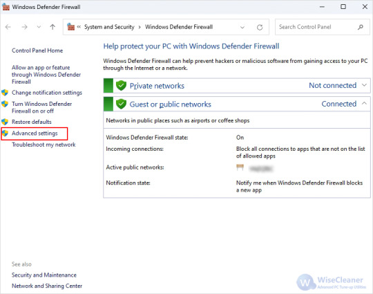
Step 1. Do a search for 'Windows Defender', and click 'Windows Defender Firewall' when it pops up as a search result. When the window pops up, navigate to the left-hand side and select 'Advanced settings', like below:
Step 2. In the new window, click 'Outbound rules' to the left-hand side, and then 'New rule' on the right-hand side immediately after:

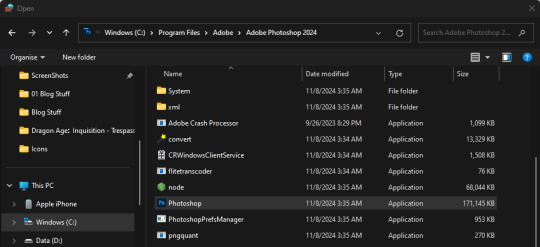
Step 3. Another window will pop up, and in the options given to you, select 'Program', and then, do you remember when you first installed Photoshop? Navigate to that folder, and you'll find the according application file called 'Photoshop' with its usual little icon on the left. To help you, the default path (where I have it installed) is as shown underneath, including the file you should select:
Step 4. Select the file, hit 'Open' in the bottom-right, hit 'Next', and make sure that you then select 'Block this connection'. On the next screen, it'll ask you when the rule should be applied and all options should be checked, if they are not, be sure to check them. You can name this rule however you want on the next screen, it won't matter! Hit 'Finish', and all should be fine from hereon out!
If you run into any problems with any of these steps, let me know, or leave me a little DM and I'll be happy to help!! I'm so sorry for the inconvenience. <3 Have a lovely night!!
#[ i need a little resources tag for asks like this-- but for now this'll work. ]#[ inquiries: out of character. ] they do not know what to make of me. i have kept to myself; for fear of giving them purchase to cling to.
128 notes
·
View notes
Text
The Man 11
Warnings: non/dubcon, and other dark elements. My username actually says you never asked for any of this.
My warnings are not exhaustive but be aware this is a dark fic and may include potentially triggering topics. Please use your common sense when consuming content. I am not responsible for your decisions.
Character: mob!Lloyd Hansen
Summary: a demanding customer complicates more than your work life.
As usual, I would appreciate any and all feedback. I’m happy to once more go on this adventure with all of you! Thank you in advance for your comments and for reblogging ❤️

You half smile and half cringe. Oh boy. He wants you to do that. With him there. Well, you never really did it with an audience. You’re more of a loner when it comes to... cumming.
You let out a brittle chuckle, “sir, that’s... you know, I think I’m pretty good. I got lots of action today--”
“I’m not asking,” his voice is dusky and makes your chest thump. Wow. Okay, you can see for a split second how he might be attractive. If you just photoshop the caterpillar off his lip with your mind Adobe.
“I understand but what if I just focused on you, sir. You seem to enjoy that--”
“Don’t make me repeat myself. It’s getting old. Fast.”
“Sure, that’s fair, I hate a broken record,” you gulp and look down then back up, squinting as you smile with a strain in your cheeks. “So, like down here or... it’s a bit tight...” you sheepishly show your teeth then laugh for real as the joke bubbles in your mind. You can’t help but let it free, “that’s what she said.”
He blinks and looks at the ceiling then down again. He sits back in his chair, legs wide, hands on his thighs.
“Get on the desk,” he orders.
You inhale and steel yourself. This is a lot. You think you’ve been handling things well. One thing in particular but you don’t know how much more you can take. Today has been intense. What time is it?
You move forward, once more face to face with his crotch before you manage to plant a foot and stand. His eyes flick down and he hums. You turn slowly and try to see the corner of his screen. Holy, it’s not even three o’clock.
“What the hell are you looking at?” He snarls.
“Nothing, sir, promise--”
“Turn it off.”
You should say the same thing about his dick. You keep your mouth closed and press the button to black the monitor. You put your hands on the desk and carefully slide his delicate keyboard and mouse aside. They’re so light you nearly toss them. You shake your head.
“What?” He sneers.
“It’s just, sir, Apple products are made to break. This keyboard feels like a wafer.”
“This isn’t what we’re doing right now. Focus.”
“I’m focused,” you whine and consider the desk. This glass better be sturdy.
You lift one knee, then the other. You don’t like this. It's like crossing ice; tenuous and just as cold. He clicks his tongue.
“You know, you don’t got a bad ass considering,” he mutters.
You should thank him. It’s a real compliment. All those squats you do when the shop slows down are paying off. You’re too frazzled to do much more than turn over and sit facing him. As hot as this might seem in his head, the logistics are not easy. Or safe.
You glance around and frown, “sir, what if I break--”
“You keep talking, and I’ll break something on you,” he swivels the chair slightly as his hand crawls up his pantleg.
“Got it, okay, so...” you bend your legs, putting your feet on the glass and wiggles your toes.
You slowly pull your thighs apart. You tremble as the cool air slips between them and grazes your cunt. Your ears are burning and your skull is pounding. You’re dizzy. This desk is really high up. You could fall and crack your head open.
“Take your fucking time,” he growls.
“Sir, I got a bit of stage fright here,” you squeak, “I never really... you know, in front of someone.”
“No use being shy when you had me down your throat twice today,” he reprimands.
“Fair,” you tilts your head, “that’s a good point.” You look down at your body and reach down between your legs. You blow out between your lips, almost whistling as some of the tension seeps out. “That’s helpful advice, actually.”
He sighs and you seal your lips. You nod and close your eyes. You can do this. How many times have you done this? Well, maybe you shouldn’t be proud of that.
You feel down your tummy and along your pelvis. Goosebumps rise and you shiver, leaning back on your other hands as your feet arch against the edge of the desk. You feel along your coily hair and delve between your tender folds. You’re wet but that’s better than the alternative. You’d rather this not last forever.
You press down on your clit and take a deep breath. You let it out slow as you trace the sensitive bud and hum. Alright, gotta get the rhythm. You’re thinking too much. Stop that.
Wait, no. You need to think. You need to picture something. This is too much pressure. Knowing he’s watching you, you have to think of anything else. Of someone. Someone sexy. You gotta get the motor going.
You ease back onto your elbow as the heat begins to flow. You picture this burly guy you saw down at the sandwich shop. You don’t quite have the clear picture of him but he was tall and thick and he had some nice eyes. He also looks pretty grumpy but he could probably channel that energy into some good hip action.
Okay, back to the point. You put together the fantasy; thick arms, hairy chest, throaty grunts, and a big... yeah. That’s it. Your fingers swirl faster, slippery as your excitement builds. You moan and tilt your head back. You’re almost there.
You flick your fingers up and down, your thighs quivering. You gotta give this guy a name. Something sexy. Gene? No, ew, that’s not it. Hm. Oh, yes, Adam? The first man. The epitome of maleness.
You squeak as your breath hitches and your lashes flutter. Your toes curl and you put your head forward as the tension winds tight and all at once, unleashes. You quake and drone out madly, head lolling as you fight to keep your fingers moving. You feel your orgasm flowing from you, wetting your cunt and the creases of your thighs. Fuck...
Suddenly, your land on your back. The glass braces and you wait for a crack. Lloyd pins you by your neck. He swats your hand away from your cunt and frames your entrance with two long fingers. He drags them up, rubbing your buzzing clit as you squirm.
“Oh, Adam,” you burst out and your eyes snap open in horror. You didn’t mean to let that out.
“Adam?” He growls as he stops, squeezing your throat tighter, “who the fuck is Adam?”
You touch his wrist, “I meant... Floyd?”
#lloyd hansen#dark lloyd hansen#dark!lloyd hansen#lloyd hansen x reader#drabble#series#au#mob au#the man#the gray man
165 notes
·
View notes