#Alphabets
Explore tagged Tumblr posts
Visit Tumblr Blog
Explore Tumblr blogs with no restrictions, modern design and the best experience.
Last Seen Tumblr Blogs


Fun Fact
Tumblr was acquired by Yahoo for $1.1B in 2013.
Text
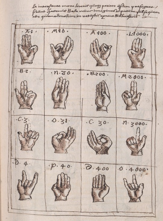
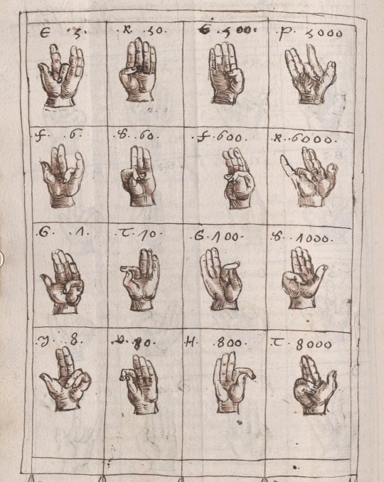

16th c. alphabet for fingerspelling & fingercounting
from a copy of a text attributed to bede the venerable (7-8th c.), included in a miscellany manuscript written and illustrated by wilhelm werner von zimmern, speyer (?), c. 1539-62
source: Stuttgart, Landesbibl., Cod. Donaueschingen 704, fol. 163r-164r
#16th century#bede the velnerable#Beda Venerabilis#fingerspelling#finger counting#Abacus atque vetustissima veterum Latinorum per digitos manusque numerandi consuetudo#wilhelm werner von zimmern#fingers#alphabets
890 notes
·
View notes
Photo

The alphabets of Europe
139 notes
·
View notes
Text


Typography Tuesday
TIPPLER
Tippler, "Dusk to Dawn in the life of a Man-about-town, as shown by twenty-six different scenes, each decorating a letter of this tippler alphabet," was created by an anonymous designer sometime in the late 1930s or early 1940s. The set is reproduced in ABZ, edited by Julian Rothenstein and Mel Gooding, and published in San Francisco by Chronicle Books in 2003 (an earlier edition was published by Shambhala in 1993 as Alphabets & Other Signs).

View other posts from ABZ.
View our other Typography Tuesday posts.
#Typography Tuesday#typetuesday#Tippler#historiated initials#alphabets#inebriation#drunk#ABZ#Julian Rothenstein#Mel Gooding#20th century type
164 notes
·
View notes
Text
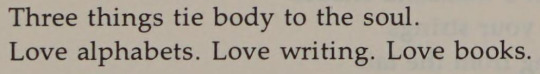
Sayat Nova, from Anthology of Armenian Poetry, ed. & tr. by Diana Der Hovanessian and Marzbed Margossian; "Listen to me"
[Text ID: “Three things tie body to the soul. / Love alphabets. Love writing. Love books.”]
#sayat nova#on writing#on books#on reading#on literature#soul#books#alphabets#excerpts#writings#literature#poetry#fragments#selections#words#quotes#poetry collection#typography#poetry in translation#armenian literature#armenian poetry
200 notes
·
View notes
Text


☆ — maus alphabet
full below :3 these werent rly intended to be used in any way theyre just for getting grasps on the concept but! if u wanna use them for anything then go ahead


#💾 — file received!、、#uhh i didn't make a new tag list for this type of graphic in advance#rentry#rentry resources#carrd#carrd resources#editing resources#alphabets#fonts#??#deltarune#deltarune maus
53 notes
·
View notes
Text


Wim Crouwel - Alphabets
26 notes
·
View notes
Text
#ColoringBook#Alphabet#Alphabets#AlphabetColoringBook#Coloring#ColorWithMe#ColoringForAdults#AdultsColoringBook#ColoringTherapy#CozyColoring#Relaxing#Asmr#ColoringPages#Amazon#Art#Simple#Bold#Letters#Cute#Spotify
77 notes
·
View notes
Text
the Aurebesh isn't very great from a conscripting perspective. not only because it's a fucking cipher (a mere font to write in English, with English nonsensical spelling rules) but also because all letters are blocky squares.
Which us fine because this isn't the focus of Star Wars, it's purpose isn't to work well linguistically or practically, it is to set an atmosphere and pretend it's not English
Chinese, Japanese and other syllabic scripts work that way because each symbol stands for a while syllable, not an individual sound. and English has syllables with massive consonant clusters like scratch
an alphabet needs many tall, thin letters like l i r q r t p d f h j k l b
if all letters are fat and wide like ლ then any text occupies far too much space and is overly long. and larger chunks of text consume exponentially more space, paper, ink, digital pages, stablishment titles, etc, not to mention being annoying to read
the simplest solution is to create thinner versions of each letter, making them thinner and thinner until it's a totally different alphabet
a different solution that preserves the blocky feel is to combine letters together into ligatures, like in Hindi, specially for common words and consonant combinations, so, fusing E and R into a single ER letter, for example.
to illustrate, this is "Republic" in canon Aurebesh:
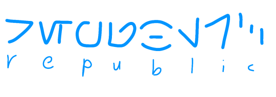
and this is "Republic" after combining some letters:
we could go more aggressive and combine more than two letters, but speakers would have to know all ligatures, but that's fine, Hindi speakers learn hundreds or millions of letter combinations and they're not random, they are intuitive
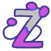
now with Skywalker:
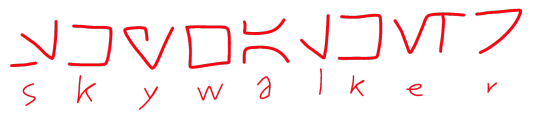

of course, i'd still prefer to make an alphabet which actually makes sense

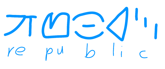
real life example: Korean
if we wrote English with the Hangul, Republic would be 러풉맄
[ㄹ=r][ㅓ=e][ㅍ=p][ㅜ=u][ㅂ=b][ㄹ=l][ㅣ=i][ㅋ=k]
ㄹ+ㅓ=러
ㅍ+ㅜ+ㅂ=풉
ㄹ+ㅣ+ㅋ=맄
canon Aurebesh would spell it ㄹㅓㅍㅜㅂㄹㅣㅋ
Hindi:
र=e रे=re फ=p फु=pu
ब=b ल=l ब्ल=bl ब्लि=bli ख=c
रेफुब्लिख = Republic
canon Aurebesh would spell it रएफउबलइख
#languages#alphabets#alphabet#aurebesh#star wars#ligature#ligatures#clone wars#star wars prequels#sw prequels#conscripting#conscript#worldbuild#worldbuilding#hangul#devanagari#devanāgarī#देवनागरी#한글
137 notes
·
View notes
Text
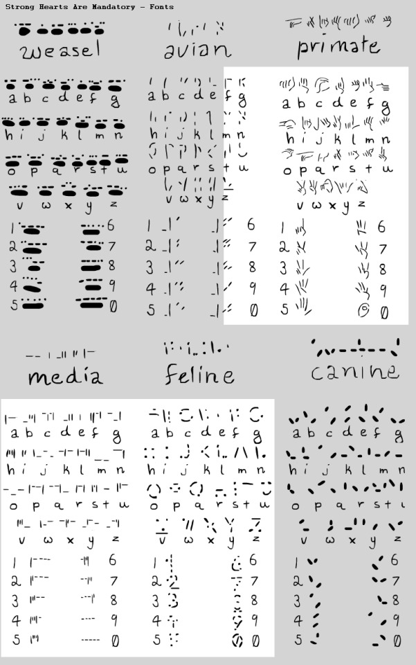
Still working on this but some alphabets for Mandatory!
Feline or Cats Scratch - is indented, so anyone can read it even without sight as long as they can touch since it's the clawmarks in the parchment that makes it readable, text is on textured rollers or haptic screens for monitors so they can read messages from their supervisors or the council. To become a Median you must have some knowledge of Cat Scratch and Cats Tongue to become verified and be given your handle.
Media's Type is directly related to Cats Scratch, but is designed for the computers and haptics, all Medians must learn this.
Avian or Birds Peck - works similarly and is both pecked and clawed, so there's more openness on interpretation of the letters but it's easier to do with a talon.
Primates Sign is written and signed often, it is the least used in Media but was made for ease of having an alphabet in Deviate. They also have a short-hand which is intensely more complicated but shortens sentences significantly. I may make it in the future or have it cameo in the comic!
Weasel's Claw is a new edition and is done with their finger tips and entire paw print for each letter, a much bigger font for some, not so much for ermines.
Canines Dig is the simplest, but can be the hardest to understand.
Each is referenced or inspired by certain alphabets to keep it mildly educational to myself and it's really fun so far! c:
60 notes
·
View notes
Text

A: Sign painters letters. Ames’ Alphabets - 1879.
#vintage illustration#lettering#vintage lettering#typography#vintage typography#hand lettering#hand-drawn letters#calligraphy#penmanship#sign painters#design#graphic design#vintage books#alphabets#the alphabet#ornate letters
8 notes
·
View notes
Text

Subway station at Manhattan's Times Square, New York City.
📸 Luiz C. Ribeiro
7 notes
·
View notes
Text

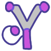
Y - Yak 🐂
#ai#ai art#ai generated#anime#anime art#india#94shasha#animeedit#animeedits#bharat#indiananime#y#yak#english#alphabets#alphabet#abcdef#aiartcommunity#ai artwork#ai artist#ai art gallery#ai edit#ai enhanced#digital drawing#digital art#illustration#illustrator#digital illustration#ai ethics#digial art
14 notes
·
View notes
Text

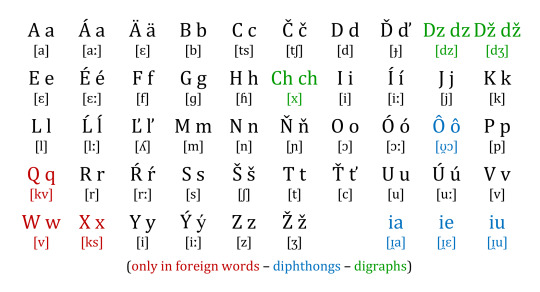
The Slovak Alphabet
8 notes
·
View notes
Text


Typography Tuesday
This week we present a few random alphabet designs as reproduced in ABZ, edited by Julian Rothenstein and Mel Gooding, and published in San Francisco by Chronicle Books in 2003 (an earlier edition was published by Shambhala in 1993 as Alphabets & Other Signs). The alphabets from top to bottom are:
Alphabet by Slovak artist and educator Fridrich Moravcik (1916-1993) from his notable theory book Method of Creating and Arranging Lettering.
Typeface designed in 1965 by English typographer and graphic designer Edward Wright (1912-1988) to be use on buildings. Wright is perhaps most well known for the his design of the New Scotland Yard’s rotating sign (1968).
Typeface based on Standard Light Extended, a san-serif typeface in the Standard family developed in the early 20th century at the Berthold Type Foundry.
1940s German typeface by an unknown designer.
Preliminary drawing for Paul Renner's Futura typeface, 1925.
Gothic wood type by an unknown designer, ca 1837.
Edward Wright's preliminary drawing for a typeface, 1965.
French typeface, date unknown, designer unknown.
Hand-drawn typeface, designer unknown.
Alphabet from an early 20th-century, French signwriter's manual, Modeles de Lettres sur vingt ton de fonds differents.
View other posts from ABZ.
View our other Typography Tuesday posts.
#Typography Tuesday#typetuesday#alphabets#ABZ#Julian Rothenstein#Mel Gooding#Fridrich Moravcik#Edward Wright#Paul Renner#20th century type#19th century type
114 notes
·
View notes
Text
I find it honestly fascinating and astonishing how your brain gets used to learning another alphabet.
Learning Korean was really hard in the beginning. Of all the languages I had challenged myself to learn, Korean was the one where I could really feel my brain working hard. Cogs were turning. At first I was mostly going by sound to figure out what the correct translations were, or occasionally by a word's first letters. I couldn't really read words without going letter by letter.
I guess the same way one learns how to read.
And then, one day, it clicked. For longer words I would still struggle, but shorter ones just sort of pushed themselves into my consciousness. Now even longer words don't really trip me up anymore.
I'm now sort of in between these two stages for Arabic, though I'm definitely still leaning more towards the former. I think learning Korean already helps, though. It's like my brain is already primed to the notion of connecting sounds to completely different symbols than I'm used to. Because otherwise of course the two alphabets couldn't be further apart from each other.
I love that these lines and swirls and swishes which were incomprehensible to me before are now taking on meaning. As a teenager I learned the (ancient) Greek alphabet, and I can still read it to this day, but it has, of course, large similarities to the Latin one. The Korean and Arabic alphabet were a whole different endeavour entirely.
I find myself trying to figure out whether my brain reads a foreign alphabet by transliteration or by sound. I don't have the answer to that.
I also often wonder what it's like to learn the Latin alphabet, that I am so familiar with, if it is foreign to you. Is it hard? Does it make sense? Or are our lines and swirls and swishes bizarre and illogical?
#learning languages#languages#arabic language#korean language#ararbic#korean#alphabets#something that's also interesting is that#I think for me while Korean was obviously incomprehensible it still looked like different symbols#and with arabic I had more trouble seeing differences between the symbols easily (maybe bc they are connected)#it just looked like pretty lines and circles and dots all attached to each other#arabic really looked so mysterious to me when I didn't know it yet#it's really cool that now that's not the case anymore#while I don't know much arabic yet so I can't really read sentences and such#i see arabic now and I can recognise all the different letters#i understand where one ends and another one begins#I love it#a story every day#4 june#june 2025#2025
2 notes
·
View notes