#conscript
Explore tagged Tumblr posts
Visit Tumblr Blog
Explore Tumblr blogs with no restrictions, modern design and the best experience.
Last Seen Tumblr Blogs


Fun Fact
Tumblr has a low social media market share in South America.
Text
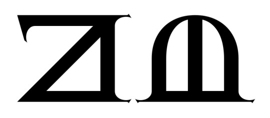
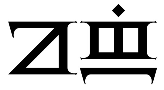
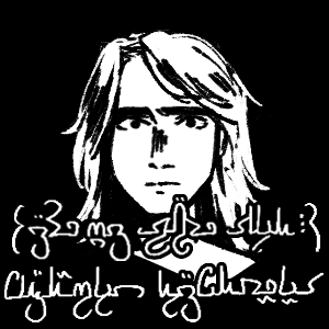
A page from the monster hunters guide on the Sèrejòt

Text in Tsekàn (Lifnevòsa dialect)
Tòs Sèrejòt:
Imjitsòròs fa ngumòs tsàròthòs Sèrejòt, kì tsù ilenfòs dròmalen tè fjadawàr lewurakòs fa dranòs drasanòs. Thundàren salìwòra gonòs lòrìng nanòsa, tè drasanòs tòs. Thuwurenùr nesirásen fja tlìmìren ngè fja skogaìn.
Drènàldòsdàr rìng tòsa sì. Imgansìnòra Sèrejòt, fa imòfjàsaja. Imjìldàròr sìnòs, kì sìnòs tòs. Imganànanòra ledavèrá fja Sèrejòt. Imrìngdàrme sadàròs ninwan hewàtdòsa, kì imhjaladàr tlaisa hjala. Tsù vjiràvjenásdàròs tavèránòs. Ràli tsèli tòsa fa irilirdàr gai. Tsùm sìròsa, ja-sìròsen tlìmìren fa ja-sìròsdàr rànìrùf ilen lòjìlen fa tlè imvurwìrdàr lòshìrsa lònun. Pàkjilif tòsa netsömen, thòlesa tsòr fa tòsa bàk fjàdàr imànkès. Tsùm vanahena skogaìn, tsèl sìròslir tòsa thòlesa tsòr. Ja-shìrdàrùf il fjà, tè imäksadàra fja fasa lònun.
Liridàr skonòr Sèrejòt. Sìsìwanòs fa sìmèntanòs. Lòrìng valorònòrsa, thonfalif fali lòshi ngo newalorò fa valorò, lehjènilòrèfshara lòmil. Translation into English (for those whose Tsekàn is a little rusty hehe)
The Sèrejòt:
The Sèrejòt is not a monster and barely a beast, but still it’s in this book for it can pose a threat occasionally and is very common. This book assumes you are familiar with basic knowledge of this creature, due to its common nature. Suggested weapons for killing are the spear or hunting pick.
Important things to know are its speed. You cannot outrun a Sèrejòt, you are not the exception either. They do not appear that fast, but they can reach incredible speeds. You cannot outclimb a Sèrejòt. If it has minor manipulation of gravity we do not know, evidence does not seem to support this. It is still incredibly good at climbing. Its skin is thick and difficult to pierce. It can be done, spear recommended, but hit it from the angle illustrated, to decrease risk of the strike deflecting. Better to hit it underneath its plates, the back of its head or its underside. When using a pick, strike only at the back of the head. Succeed in your strike in one go, you will likely not have more chances.
Sèrejòt can be difficult to hunt. They are quick to run away and hide. On trapping them, refer to the dedicated section on setting traps, all you’ll need can be found there.
#conlanging#Tsekàn#art#my art#conscript#neography#This took me so long#Probably the longest text I've made in my conlang so far
20 notes
·
View notes
Text
#polls#poll#daily polls#i love polls#polladay#military service#military#the draft#military draft#conscription#conscript
784 notes
·
View notes
Text

860 notes
·
View notes
Note
I was looking at your Valyrian glyphs for animals (I especially love the ones for spider, squid, turtle and frog) and was wondering if you have made a lion glyph? I'm designing some royal seals for Tyrion and Cersei, and wanted to add a lion glyph. I've searched through your wikis and there is a glyph for cat, and one for gold, so perhaps I'll add those together if there's no lion glyph. Thanks, I love your work on this series so much!
A good question! The word for "lion" is built off the word for "cat", so there isn't a separate glyph. Kēli is "cat" and kēlio is "lion", so to spell the latter you use the "cat" glyph with a -io determinative. Generally that's the "gate" glyph, but given the nature of lions, you can also use the "tooth" glyph. Here are both spellings. First, the "gate" version:
Next, the "tooth" version:
But yeah, since it's derived, no individual "lion" glyph. ("Dragon" is also derived, but they're a bit more central to Valyrian culture, so it makes sense they'd have a separate glyph for it.)
#conlang#language#valyrian#hbo#high valyrian#orthography#conscript#game of thrones#got#hotd#house of the dragon#tyrion#cersei#jaime#et al
218 notes
·
View notes
Text

"Anybody remotely interesting is mad in some way or another" - the 7th Doctor
Support/commission me on Ko-fi!
#doctor who#7th doctor#circular gallifreyan#gallifreyan#conscript#sylvester mccoy#classic doctor who
169 notes
·
View notes
Text
Sdefa Sdaturday #21
My first youtube video is now live!
youtube
This is a video all about my musical conlang Sdefa! You’ll hear some music, learn the basics of how the language works, and go through a few examples in detail!
I couldn’t get into too much detail in a short(ish) video, so I didn’t cover Sdefa writing, but I plan to in a future video. The main example in the video is what I showed in last week’s post, but here it is again in both writing systems:

That means “You’re hearing Sdefa, a musical language that I made.” Now you get to actually hear it!
169 notes
·
View notes
Text

112 notes
·
View notes
Text

83 notes
·
View notes
Text
My W.I.P Logography, Amaranscript.

82 notes
·
View notes
Text

and another one thank you
been playing with this design for yeseian clothing for a few days and finally im satisfied with it
#my art#kélas#art#worldbuilding#conlanging#conlang#neography#conscript#constructed language#constructed script#character design
71 notes
·
View notes
Text
Kryptonian Omegaverse

I almost never do fanart, but I wanted to do SOMETHING to thank @suzukiblu for all their wonderful fic. They've been playing with Darren Doyle's Kryptonian conlang, and I thought, "I can do conscript calligraphy! I'll just write some of their omegaverse terminology and some of the characters' names!"
This was supposed to be a few hours work, two Saturdays ago. That isn't what happened. Instead, I have STRUGGLED. Absolutely every aspect of this script has challenged me. It looks so INNOCENT, but lineweight, scaling, stroke style, character positioning ... everything has required pages of notes, trying to figure out how to make it work in my style.
This is my 6th good copy. I also have at least 10 pages of notes and practice. I had to do WORLDBUILDING (in an earlier post also tagged 'kryptonian') to try to justify how I'm drawing the circles. And you'll notice that this isn't even my full original idea!
Here is the Kryptonian for 'Alpha', 'Omega', and 'Beta', along with ideographic glyphs I designed for the three. The ideographs are combinations of the glyphs for 'my', and 's', 't', and 'k', respectively.
Names are still coming. But it's been over a week, and I needed to share something before I got overwhelmed. Now the project is smaller, and I might be able to finish!
(Rin, I decided to include the syllabic nasal at the beginning of ":dho kyn-tul". And write it with an 'n', instead of with the colon. But if you want to ignore it, just erase the three dots at the beginning of the phrase!)
#think I have a SLIGHTLY better method for the next part#which will lead to a cleaner result in less time#we'll see!#kryptonian#superfamily#conlang#conscript#gecko writes pretty
60 notes
·
View notes
Text

Ni guā itișa nia hișati
I hold you in my eyes.
#conlang#constructed language#translation#conscript#constructed script#artlang#conlanging#I am still fiddling#maybe a vowel harmony system?
56 notes
·
View notes
Text

get ready for stupid shitposting in conlangs
#oc: yrsk#sorkish conlang#kélas#conlanging#conlang#conlangs#constructed language#conscript#neography#sorkish script#translation#my art
105 notes
·
View notes
Text

Played through Half-Life 2 again with the excellent Beta Aesthetics mod, it surprised me at how different it felt, it felt much more like a 2004 game, ironically. Here’s some beta conscripts, I do prefer the Civil Protection but I kinda wish they were in the final game somehow.
#art#digital art#fanart#half life#half life 2#hl2#half life 2 fanart#half life 2 mod#half life 2 episode 2#half life 2 episode 1#hl2 fanart#hl2 beta#hl2 beta conscripts#conscript#artwork#concept art#drawing#digital arwork
77 notes
·
View notes
Text
Lexember (December 2nd)


Today's Valyrian glyph is manengi "pelican". This was a fix-it word because I couldn't for the life of me remember how the hell manengagon meant what it was supposed to mean. Same with manaeragon. No clue. At all. I had an idea when I created them, but then I entered the film The Eternal Sunshine of the Spotless Mind and removed all memories associated with the creation of those words. And so I came up with a pelican. The pelican fixed everything. The pelican made everything work somehow. And so now we have pelicans. Delightful pelicans. With their big, fancy beaks fluffy feathers. They look like musical instruments. We all agree, right? Pelicans look more like musical instruments than animals. I want to squeeze them... And have them make a little honk. I love pelicans.
#conlang#language#hbo#game of thrones#valyrian#high valyrian#orthography#hotd#house of the dragon#got#conscript#pelicans#delightful pelicans
268 notes
·
View notes