#Also had to break the design elements a bit to make it still recognizably him. Maybe I'll do a version that had no exceptions..
Explore tagged Tumblr posts
Visit Tumblr Blog
Explore Tumblr blogs with no restrictions, modern design and the best experience.
Last Seen Tumblr Blogs


Fun Fact
Forty percent of Tumblr users are between the ages of 18 to 25.
Text
No new finished art, so here's some doodles... Planning out Minato's angel design for an AU :]
Ryoji's already done if you'd like to see him


I am finally getting somewhere, here's the bust for that.. I have a full body scribbled out but it's too messy and I don't feeling like cleaning it up (✿◡‿◡)

If you try to play the harp on his head you will sustain an injury
#Persona 3#Persona 3 Reload#minato arisato#makoto yuki#persona 3 makoto#Persona 3 AU#I am not done with this AU it'd been rattling around in my brain. I love it#His angel design is a little different than other IV angels since he's either in Purgatory or the human realm#Also had to break the design elements a bit to make it still recognizably him. Maybe I'll do a version that had no exceptions..#Anyway#I love him I love Ryoji I love this AU#It's like the kind and nice versions of Them.#Which is why I made Min look reminiscent of Pandora#Okay done yapping now about my super self indulgent AU hope enjoy him#Indomitable Vows AU
29 notes
·
View notes
Note
...life series ace attorney au?
colour me intrigued.
I've already explained the jist of it here and expanding on some defense/prosecutor duos I enjoy here
I am so excited to talk abt this!! Feel free to ask more questions! I'm using this ask as an excuse to talk abt design ideas regarding the lawyers!
Starting off with Gem, whose design I've already finished!! She has a similar silhouette to Apollo's angsty Dual Destinies design with her (green) jacket over her shoulders because of the shawl(?) In her hc10 skin and witch skin. I gave her a white button up with a yellow tie since a lot of her skins have yellow/gold accents. I also gave her a corset because of the corset for her empires skin (now sure what season, I haven't watched her empires u-u). I've given her a single glove as a reference to her hc10 skin and to Athena's single glove, since I think Athena and her share some fun similarities. Finally she has some grey pants (Capcom give these lawyer women pants!!) And brown dress boots.
Unfortunately, Gem's design was the easiest for me! I'm trying to keep the defense side relatively simple as you'll notice in aa they tend to be (rip Athena). I don't want everyone in a basic suit tho so I am trying to mix things up a bit. Would love some suggestions! As for the others, I have some ideas
Scott's S1 Empires skin is actually perfect! It's that multicolored tunic that could easily be depicted as a suit jacket with a white dress shirt underneath. Could be fun to mess around with what kind of shirt he's in or a neck accessory besides a tie. Other than that I haven't got much for him. Ace attorney lawyers also tend to be strongly color coded, so a multicolored suit may break that aa feel, but uh it's more fun <3. I may end up playing around with the colors anyway.
Mumbo's design is actually the easiest. I had more fun with Gem, hence why she was done first, but Mumbo is already wearing his ace attorney suit design lol. I kinda want to play around with it a bit more, but I may end up settling on his self imposed aa design.
Scar has an extremely unique problem for me where he actually has too many fun lawyer-adjacent skins. Particularly his hc8 and limited life skins. They are both very iconic to me but would be difficult to actually mesh into one deisgn. Additionally I ADORE the color pallette of his secret life skin (og, but red is good too) but I'm not sure if I could include it. Altogether Scar is the hardest!! If I pick one route I feel like I'm losing so many possibilities! And I don't want to just copy one skin of his, like Gem I want their to be numerous references to different skins. May have to study the aa wiki defense attorneys to get some better in-universe outfit ideas.
I've been having some trouble with Grian as I wanted to include his iconic sweater without breaking the prosecutor vibe. The prosecution tends to have more wild or whimsical (see Nahyuta) designs. However, I think Grian may end up on the more simple side of the prosecutor spectrum, Edgeworth is a more simple prosecutor anyway and Grian is Edgeworth-adjacent. Come to think of it tho, his poultry man skin looks stupidly similar to Gregory Edgeworth. Could do smth with that maybe hmmm.
Etho's design is actually pretty straightforward from his skin. And he only has one to work with haha. What I'm picturing looks a lot like Godot's outfit, he even has a mask on lol. I'm probably gonna try to make it pretty unique, but it is hard to resist the urge to just turn those sleeves into a button up and that green into a suit vest.
Joel is one I'm trying to play around with more. I've perused his skins and haven't had any stand out as super lawyer-y. His default is fun enough to work with tho! Gem's comment of his weird vest thing as a corset is making me consider giving him a corset (he and Gem can match!). I'm trying to distinguish him from Shrek as much as possible while still keeping recognizable elements from his default. All in all I think he'll be fun.
CLEO oh BOY am I excited for Cleo. I'm thinking a lot of Franziska's silhouette with Cleo, focussing on extravagant sleeves, particularly relating to that blue dress skin of Cleo's. I'm also thinking of Nahyuta's detailing. Cleo's skins, to me, give the perfect amount of inspo without spelling anything out. I'll probably stick to her usual color pallette, but playing around with her 80s skin colors could be fun! Cleo is very exciting for me!
Finally, Pearl. When it comes to Pearl's design, her top aa influence is Barok van Zieks. I adore his cape and would really like to use it as a reference to scarlet Pearl. I also really like his soldier-esc getup underneath it, and while I wouldn't go as heavy handed with it, I am tempted to take some bits. I also really like Lana Skye for Pearl as a design reference, but mostly for her sprites. Pearl will not be crazy corrupt like her, but I would like to draw some parallels
#on a fun side note I realized after my post the other day when I mentioned Scott being rather calm for a defense#he's like Kristoph#like obvi there are other calmer defense than our main cast#but he is given me very similar vibes to Kristoph#I think the fact he has Jimmy as a co-counsel contributes to this#smooziespeaks#ask#dragonanswers#life series#trafficblr#traffic smp#life smp#Hey if ur just finding this and didn't look at my og posts and are upset I didn't include ur fav in this au#I DID#I only mentioned defense/prosecution in this podt#if ur fav isn't here they are either co-counsel detective or Martyn#Martyn being the judge lmao#ALSO#I know in the body here I mentioned Gem's silhouette was reminiscent of Apollo's in dd#this is because his dd inspired the suit jacket on the shoulders look#but her silhouette is ACTUALLY more like Sebastian Debeste's#I just forgot he had that jacket until now
11 notes
·
View notes
Text
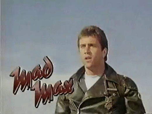
January 29-31, 2021: The Mad Max Franchise
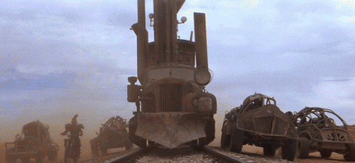
Now that I’ve finished watching all of the Mad Max films, I can confidently say that I am indeed a fan! The journeys of the ex-cop through a post-apocalyptic landscape that just gets increasingly worse and worse. Yeah, I can dig it.
And so, I thought it’d be fitting to talk about all of these movies at once, rather than just talk about them one at a time. And I mean ALL of these movies. After all, I started this month by saying the Fury Road was my favorite action film; might as well end it talking about the movie!
Recap
Mad Max: 78%
Mad Max was a great movie, honestly. It’s also HANDS-DOWN the weakest of the quadrilogy. I think that, since this is Miller’s first film, as well as being the first in this franchise in general, this is Miller carving out this universe on screen for the first time, so it doesn’t feel as fleshed out and as stylistically unique as the succeeding films. So, it’s hard to hold that against this film. Anyway, let’s break it down a little.
Cast and Acting: It’s legitimately nice to see Mel Gibson before he became...well, Mel Gibson, at least from a cinematic standpoint. And yes, Hugh Keays-Byrne is certainly memorable as Toecutter, and is a fitting first villain to the franchise. But, uh...that’s it for standout performances. Yeah, Joanne Samuel is endearing as Jess, and I like Steve Bisley as Goose, of course. But they don’t take the spotlight in my memory as much as our main two players. Which, obviously, is fine, but I like me a good supporting character in there as well. Still, this is getting a good 8/10 from me.
Plot and Writing: Plot’s you’re pretty standard cop story. Cop is awesome, cop wants to quit to spend time with family, cop’s family is killed by the villain, cop destroys villain. Not much outside of that. The biggest thing to praise to story for is the mild universe-building given to us. And even then, there isn’t a whole lot. Not, of course, that there needs to be. Credit goes to George Miller, Byron Kennedy, and James McCausland for this 7/10.
Directing and Action: George Miller’s cutting his teeth on the celluloid for the first time, and it’s awesome...for a first-time director, anyway. As for the action: yes, please. It doesn’t have the same pageant s future entries in this franchise, but it’s certainly great at the same time. Overall, 8/10 here.
Production and Art Design: It’s beginning, even though it’s not there yet. This universe hasn’t become the post-apocalyptic hellscape that it’s going to become, but the beginnings are there. Because of this, leather might be a dominating fashion choice, but...not as much as its gonna be. But, OK, let’s stop comparing this to the rest of the franchise. On its own merits, this film looks good! Doesn’t stand out too harshly from the crowd, but it still looks quite good. So, 8/10 here, too!
Music and Editing: Tony Patterson and, yes, George Miller were the editors for this mad boy, and they sought to make an Australian film with a fast-editing style, and in a way that the film could work without sound, as well as with. They way they incorporated sound and music (by Brian May, but not the one you’re thinking) into the film would actually be incorporated as industry standard practice in general! Wow! So for all that...8/10. It’s good, but this is early in their careers, so it can be a teensy bt choppy at time. And the music’s recognizable, but not particularly memorable after the fact. But still, 8/10.

Mad Max 2 AKA The Road Warrior: 92%
This is where I start to fall in love with the franchise. The Road Warrior is where the franchise really begins for me, and it’s EXTREMELY high up on my favorite action films list for this month. Obviously not the highest, but it’s up there for sure.
Cast and Acting: Gibson’s starting to come into his own and own this character, and I think this film is where he’s at his finest as Max. Definitely the most memorable and noteworthy. Antagonists, both Vernon Wells and Wez, and Kjell Nilsson as Lord Humungus, are fanTAStic, and I love them both. Supporting cast also ain’t no slouch this time! Bruce Spence’s Gyro is a wonderful character, and extremely fun to watch. Even the settlers, like Michael Preston’s noble portrayal of Papagallo, were memorable to me. Great cast all around, and they’re getting a 9/10 from me. Why not a 10? Well, for all of those performances, there’s also Feral Kid and Toadie...so, it’s not perfect
Plot and Writing: Plot’s definitely more interesting this time around! We’ve gone into the deep end of apocalypse, as compared to the first film, and we instead get an enforcer storyline for Max. And, yeah, I love that. This movie would carve out the tone of the rest of the franchise, and there’s a reason for that: it’s great. Terry Hayes, Brian Hannant, and of course, George Miller, you guys get a 9/10 for this one, too!
Directing and Action: Right off the bat 10/10. Action is AMAZING IN THIS MOVIE, and George Miller is doing a great job with directing. Not much to say here, other than the fact that this movie looks fantastic, all the way through.
Production and Art Design: A 9/10. This is where the franchise comes into its own, and it does that with a HELL of a lot of leather and metal studs. And yeah, the villains of this movie have a BDSM vibe about them, but it’s still iconic. Not to mention that the vehicles are now taking their true, metal-modded forms. Again, 9/10.
Music and Editing: Brian May turned it UP this time, and the music here is iconic and great. Editing’s pretty good, too, although I did notice some spotty sound editing areas, like in Mad Max. For this one, 9/10 as well.

Mad Max Beyond Thunderdome: 86%
I honestly wish this was rated higher for me, but there are a few issues that I did have with it. However, I gotta say, this one might be the second-highest in my heart. You know what the number one is. Still, I wanna talk about this one, because it’s what made be fall in love with the universe of this franchise.
Cast and Acting: By the time we get here, Mel Gibson is, well...Mel Gibson. He kind of stops inhabiting the role of Max at this point, and becomes the ‘80s and ‘90s action star that we’re all familiar with. So instead, the focus should be on the villains. Tina Turner! WHOOOOOO, Aunty Entity! Look, I love Lord Humungus, but Tina Turner definitely beats him in terms of character. And I might like Wez, but I love MasterBlaster, and...well, mostly Angelo Rossitto. Paul Larsson’s good too, even though there isn’t much acting in the role. And then, there’s Helen Buday, Tom Jennings, and the rest of the desert kids. And let’s not forget Bruce Spence or Edwin Hodgeman! Yeah, this one earns its 9/10 for some memorable performances. Might not have been Oscar-worthy, but they have a special place in my heart.
Plot and Writing: Intricate plot this time! It does seem like George Miller and Terry Hayes get better and better with each movie. Real talk, the universe-building in this one is INTENSE, and well-done for that matter. And the writing’s good as well. This one gets another 8/10, because it’s not perfect in the writing department, but it’s still damn good!
Directing and Action: Y’know, weirdly, 8/10 on this one. Yeah, the action’s pretty damn light here, as compared to the previous two films. Not that I’m complaining, mind you, I love me some good character development and story. But if I’m judging it for action, it’s a bit less. Still, direction’s fantastic; definitely George Miller’s best effort so far. So, 8/10.
Production and Art Design: No surprise, but it’s a 10/10 here. The style of these films is evolve WAY FURTHER with this one, as we get the sense that the world has gotten worse, just by pure physical comparison. And yet, everything is starting to return to some kind of rudimentary order, with places such as Bartertown. Yeah, this one RULES visually, and I would say it’s arguably the best yet.
Music and Editing: Well, music’s still good, but the tone shift from rock instrumentals is a little jarring. Still, for the score, Maurice Jarre does good. And, yeah, Turner’s power ballad, “We Don’t Need Another Hero”, is more well-remembered than the movie itself by many. Hell, I had NO IDEA that this song came from this movie. But for all of that (and for great editing), an 8/10 is going here.

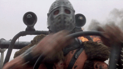
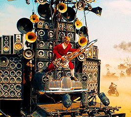
Mad Max Fury Road: 94%
Need I say anything? Let’s get into this one.
Cast and Acting: Well, Tom Hardy’s Max Rocktansky is fine, and definitely takes off of Gibson’s earlier portrayals, but I can’t really say he’s the absolute star. No, that’s the Atomic Blonde herself, Charlize Theron. Furiosa is FAR more memorable than Max here, and that’s pretty obviously on purpose. And hey, Hugh Keays-Byrne is back for a FAR more memorable villain in Immortan Joe. GOD, I love Joe; he’s great. And again, supporting cast aren’t slouching a BIT. Nicholas Hoult, Rose Huntington-Whiteley, and of course...iOTA. You know, the Doof Warrior. Yeah. The dude who plays the blind flamethrower guitarist on the back of a truck is called the Doof Warrior, and is played by a dude who calls himself iOTA. I LOVE THIS GODDAMN MOVIE. 10/10!
Plot and Writing: OK, I’l freely admit that this is the weakest element of an otherwise amazing movie. Because, yeah, it’s basically one long chase with some background plot. Not bad, but not great at the same time. While it’s certainly engaging, and the writing is overly memorable, I’m still giving this one an 8/10.
Directing and Action: I mean...c’mon. 10/10.
Production and Art Design: I mean...COME ON. 10/10!
Music and Editing: MUUUUUUSIC. Junkie XL is the composer this time, and he’s put to excellent usage. Yeah, this is the most memorable music in the franchise, bar none. And the editing is also great, as per usual. While it’s not on my playlist (yet), it deserves to be, just for pump-up music. Although, if I listen to that while driving...eh, maybe not. 9/10!
And the winner is Mad Max Fury Road, at a...94%.
Wait...94%? OH. OH NO.
That means...it’s been dethroned? I, uh...I’m gonna have to figure that out. End-of-month summary?

End-of-month summary. See you later today, people.
#mad max#mad max franchise#mad max 1#mad max 2#the road warrior#mad max 3#mad max beyond thunderdome#beyond thunderdome#george miller#mel gibson#max rockatansky#mad max rockatansky#365 movie challenge#365 movies 365 days#365 Days 365 Movies#365 movies a year#user365#userbreeanna#usertilly#action january
26 notes
·
View notes
Text
Denki Kaminari is the traitor and I can prove this through his character design
I actually wanted to analyze all of the character designs of class 1-A, but this theory has been burning in the back of my head for weeks, so now I’m doing the shortened version with just looking at Denki’s part. Hey-ho let’s go.
1. Lists
First off, we have to create an analytical basis. In my opinion, the students of class 1-A can be separated into 4 different categories in regard to their overall “importance” to the story (I know that sounds rude and I personally hold all the kids very close and dear to my heart, but from a storytelling perspective you got to admit that there are some characters given less screen time or story beats than others and as a result tend to be less important than characters who have lots of flashbacks etc.). The categorization is based on an objective view of the series and I will try to explain why I put certain characters in certain categories along with naming the categories.
1) prime primary characters (100% not the traitor)
Deku, Bakugou, Shouto
These three are the main focus of the series, the protagonists if you will. They get the most screen time, the most flashbacks, and the most backstory information and are untouchable pillars of the story’s groundwork. All two (or three) of them have their own personal character arcs that span longer than just one story arc (see Bakugou slowly learning not to be an absolute gremlin, Deku’s long journey of becoming the hero he wants to be, Shouto learning to deal with his father’s abuse and family situation). Even if you’d say that i.e. Shouto is not important enough to be counted as one of the protagonists, he is still one of the most recognizable characters of the series and definitely on the forefront when it comes to fleshed out characterization.
2) primary characters (70% not the traitor)
Ochako, Tsuyu, Iida, Kirishima
These four characters are the main group surrounding the protagonists and are fundamental as the supporting cast. These include the first two real friends Deku made at UA, Ochako and Iida, as well as Tsuyu and Kirishima. Ochako is here because of her connection with two characters from the prime primary category: she is one of Deku’s closest friends in addition to being clearly framed as his main love interest, as well as being in one of the more important fights from the Sports Festival against Bakugou. Iida is connected to two characters from prime primary as well: like Ochako he’s close friends with Deku, but also shared a lot of spotlight with Shouto during the Stain storyline. Kirishima seems to be only connected to Bakugou at first (being the first one to try to befriend him, reaching out to him during Kamino, being reminded of his strength through Bakugou during his own backstory flashback), but with the recently finished Overhaul arc in the anime he also had his time to shine alongside Deku during that arc. Tsuyu was a bit of a tough case to categorize as she did not have any flashbacks or bigger story arcs for her own (yet), but she is also one of those closest to Deku and did share an emotional moment with him and Shouto after the Bakugou rescue mission. She is also a very recognizable face for the series (so much that my friends who have never touched a piece of BNHA media named her as one of the characters they think are in the series “there’s the protagonist, then this boy with the split hair colours and...That weird frog girl, right?”). Characters in this category have backstory and flashbacks like those from the prime primary category, though these are dealt with and then accepted as a staple in the story, and not ongoing plot structures. Examples for this are the mention of Ochako’s motive for becoming a hero, Iida’s revenge plot and Kirishima’s backstory during the Overhaul arc. These are important story beats that flesh out their characters, but once the arc reaches its end the character growth for the character in question slows down a lot or comes to a halt entirely. Counter example is Bakugou’s ongoing character growth throughout the series, which will remain as an arc throughout the whole thing because of his status as prime primary character. If one of these characters were to be the traitor it would not be a series destroying move, though in my opinion it’s still very unlikely, since these all have proven themselves to be close friends with the prime primary characters, shared emotional moments with them and gave us all a look into their motivations and backstory to a point, where I just think it’d be highly unlikely for one of them to do a 180 and turn out to be ‘evil’. For those already typing that that’s the point, that we should think the traitor is not this close to the protagonists to then be surprised by the reveal, I have to tell you that that is not how story-telling works. If you put a character in a story, make them best or very good friends with the protagonists, make them save and/or help them during tough situations, make them have flashbacks to their own childhood or develop backstory with the prime primary characters by their side, and then reveal them to have betrayed them the entire time without setting it up beforehand, you are not a good writer. Neither Iida nor Ochako nor Kirishima nor Tsuyu have had a situation in which they did or said questionable things or acted in a way that would make one stop for a moment and think about what just happened. They also all have a very high recognisability for the series and turning one of them ‘bad’ would be way too ground breaking for BNHA. (I know that Hori likes to subvert shounen tropes and such, and I admit that he manages to surprise me a lot, but he still largely follows the main story beats, plot structures and character functions other shounen writers before him did, so I assume that he won’t pull the reverse Uno card and make for example Tsuyu the traitor, because that simply goes too much against the current of shounen and other media of the type).
3) secondary/support characters (very likely to be the traitor)
Mina, Kaminari, Aoyama, Tokoyami, Jirou, Momo, Sero
These characters are sort of there to fill the classroom, but are designed and set up in a way to potentially have backstory and character growth. These are characters that have had small arcs mostly connected to the prime primary and primary characters that weren’t really that in depth or emotional, but are a great set up for more growth. One of them is most likely to be the traitor in my opinion because they kind of stand in the middle: they are recognizable for the series (see for example Mina, Tokoyami, Jirou) and have had short touches with backstory (see Aoyama talking with Deku about him not being compatible with his quirk, Mina having a small part in Kirishima’s backstory), or character development (see Momo showcasing her skills during Joint Training, the current small arc in the anime of Jirou learning to save people through music), but are ultimately kept in the background. To sum it up, they are very clearly meant and designed to be secondary to the main cast of prime and primary characters.
4) full-picture characters (too unimportant to be the traitor)
Hagakure, Koda, Shouji, Ojiro, Sato, Mineta
These are characters which are in my opinion very clearly designed to “just” be background characters, or as I call them “full-picture” characters (in the sense of them filling empty spaces in a class picture). This does not mean they will never get any development, though they are very likely to stay in the background and act as very minor supporting characters to prime and secondary characters. These characters are designed to be very simple and often have a constant joke that goes with them (see Mineta being a pervert, Ojiro being plain) and are meant to create a basis for interactions between prime and secondary characters. They are literally too unimportant to be the traitor, meaning if it was suddenly revealed to be one of them, there’d be no screen time, no real dialogue and no backstory to back it up (up to now). Characters can move from this category to the secondary character category, though this is currently still unlikely.
Possible spoilers from here on out!
2. Look at these characters and tell me their personality
Ok, now that I’ve categorized all my precious hero kids into their story-level importance, I think it’s time to point out something that hit me yesterday at 1 AM: I noticed that the more important a character is for the series, the more ‘human’ their character design is. I’ll try to explain: in the world of BNHA it’s very common to have a sort of ‘mutated’ body, most times to accommodate for a quirk, though sometimes the mutation seems a bit random. However, the series is filled with people who have multiple body parts, highly deformed body parts or otherwise bodies that deviate from the to us normal human form. Now let’s look at our kids and their importance levels: all the prime primary characters have completely ‘normal’ human bodies (btw, single-colour colourful hair will not be counted as deviating from the normal human form, this is still an anime we’re talking about). They are all average heights for boys their age, no extra body parts, no deviation from an average anime boy face. Yes, there’s Shouto with his two-coloured hair and two-coloured eyes, but the split only applying to his hair and eyes makes him still look very much like an average human, as opposed to i.e. if his skin was also two-coloured and split in the middle. I think it’s not that surprising for the three main characters of a shounen to look like normal teenage boys, since it’s still a series meant to appeal to a widespread audience and I don’t think that could have been achieved if Deku and his two prime buddies were all heavily mutated. For now, let’s look at the primary characters: Ochako is very humanly designed, no weird mutations or crazy design elements aside from the pads on her finger tips. Iida is also very human, no deviation from the norm in face or body aside from his engine pipes in his calves. Kirishima also looks like the average anime boy, the only time he looks rather ‘inhuman’ is when he fully activates his quirk and goes into Red Riot Unbreakable. Tsuyu is the only one out of the primary characters whose body and face deviate more heavily from the normal human form (though the deviation is also not that crass or remarkable). And what did I say while categorizing her? She is tough to categorize because she hasn’t played that big of a role in the story yet, that she had a few emotional moments with the prime primary and primary here and there, but ultimately she does not have a backstory or major story elements yet. This stands in contrast to Ochako, Iida and Kirishima, who have all had major story beats, flashbacks and important interactions with the prime primary up to now, and are all very much humanly designed, aside from minor deviations that don’t affect their overall picture. Compare Tsuyu constantly standing a bit hunched over, her big feet and hands, her comically large eyes, her large and uniquely drawn mouth and her tongue sticking out to Ochako, who looks like an average anime girl except for the small pink pads on her finger tips.
Hold on. From the 7 characters in the prime primary and primary category, only one deviates a bit more from the human form and coincidentally that one is also the one character out of the 7 who has not have major character growth, backstory, flashbacks and/or the kind of specific interactions with the other characters from the categories yet? Now I’m intrigued. To me it seems the more important a character is for the series, the more human is his character design.
And now, to ask the question we’re all here for: if Hori did not scrap the traitor plotline, wouldn’t it make sense to make the traitor as human as possible? Since the possibility of a traitor was treated very serious during and after the UJ incident, as it posed a threat to the security and well-being of UA, I figured that whoever the traitor is shouldn’t look too, or be connotated with the words ‘joke’, ‘inhuman’ or ‘silly’. Not only would it make the most sense for an average, human looking student to be the least suspected, but it would also make the story-wise hit and drama from a traitor reveal that much more captivating, both for main characters and audience, since then the traitor is not someone they are completely detached from look wise, but someone who looks very close to them or someone they know. If the traitor were to be a student with blue skin, a trunk and six legs, I think it would just take away from the impact of a reveal and make you wonder why nobody noticed the questionable actions of the literal alien.
Since I think we can all agree that the kids in the prime primary category are 100% not the traitor, and the kids from the primary category are also very much not likely to be the traitor because of their major involvement with the protagonists (and the absolute bullshit it would be to make the characters who were established since page 1 to be nice and helpful turn to the bad side without beforehand character development in that direction), that leaves us with the kids from the secondary category and the kids from the full-picture category. The latter I described as being designed for the background; characters who could potentially rise in category once given character development, but who are without backstory or character growth up to now. Let’s look at them: Mineta, Sato, Ojiro, Shouji and Koda all deviate heavily from the standard human form set by the prime primary characters, either by their body size, mutated body parts or facial deviation. As much as it pains me to say this, they are all designed either too far from being ‘normal human’ to be the traitor, and/or have a joke attached to them and their character that would make a possible reveal come off as too comedic or inappropriate. Hagakure is a special case. She has deviations from the human form (having no visible body) but this is a minor deviation compared to the other five in the category. Still she has a joke attached to her (not being visible) and is also kept in the background of the series without having major story beats on her own and, like the other five, acts more as a supporting character to the secondary characters. Overall, the 6 kids in this category all have heavy deviations from the standard human form and a joke attached to their character, which makes them very unlikely traitor material.
Let’s look at the secondary characters in more detail: without revealing too much, the characters in this category are design-wise on the same level as those of the primary characters with very minor bodily deviations from the human form and only some of them have a joke attached to their character. Mina and Tokoyami have the most prominent bodily deviations with having pink skin/horns and a bird head, but let’s take a look at their role in the overall story: Mina is very much a Genki Girl, an enthusiastic bouncy girl, and acts as a support especially to Ochako and Tsuyu. She also played a semi-important role in Kirishima’s backstory, which let us have a look at her childhood/middle school self. That, plus her deviating human form makes it clear: a character like her is very unlikely to be the traitor. Tokoyami has a more severe deviation from the human form, plus he has a semi-joke attached to his character (constantly being serious or dramatic, holding speeches about darkness in archaic language). He also got captured during the Training Camp incident and is friends with Deku since the Sports Festival. Deviating human form, constant joke connotated with character, taken advantage of by the villains: in my opinion, very unlikely to be the traitor. Two characters in this category with very little deviation from the human norm are Jirou and Sero. Jirou has her earphone earlobes as the only deviation, while Sero has his elbows and almost constant big-toothed smile as his bodily and facial deviations. Jirou is one of the counterparts to Mina’s Genki Girl type and also acts as a supporting character for the rest of the girls. While Ochako, Mina and Hagakure can be characterized as enthusiastic, bouncy and happy, Momo and Tsuyu are more of the intellectual and tactical types, with slight tendencies to get bouncy when excited. Jirou is a middle part among the girls, being cool and reserved and not as bouncy as Mina, but also being slightly more brash and offensive than Momo or Tsuyu. She has no real joke attached to her character, but the fact that we have seen her parents and the recent arc in the anime is all about her realizing she can save people through her music (overall being a more light-hearted arc) add to my opinion that she is very unlikely to be the traitor. Sero has his elbows and smile as his deviations from the standard human form and as a member of the unofficial ‘Bakusquad’ he serves as a supporting character to Bakugou, Kirishima and Kaminari. There is no joke attached to his character, but sadly there is also not much more to his character up to now. He’s had minor roles in the Sports Festival and Training Camp Arcs, and often acts with Kaminari as a duo, but compared to him, Sero has had very little overall screen time, very little meaningful dialogue and almost slides off into the full-picture category. The only reason I did not put him in that category is because of his only minor human deviations, but overall he just is not prominent enough in the story to be considered for the role of the traitor. That leaves us with two characters with absolutely no deviations from the human form and one with slight facial deviations, the latter of which is Aoyama who has a very unique facial design among the class. He also has constant jokes attached to his character, one being always looking into the “camera” and breaking the fourth wall, the other being often talking about his fabulous self and acting out in bizarre ways. Another point that paints him very unlikely traitor material is his recent small arc in the anime: starting out with ominous signs towards Deku and acting more weird than usual brought many to the conclusion of Aoyama being the traitor, but as it turns out he was used as bait. The real background for his weird behaviour was him telling Deku about his own quirk, Navel Laser, not being compatible with his body, which is why he needs his support belt. Him and Deku form an emotional bond after this and Deku considers Aoyama his friend from that point forward, and after this incident, Aoyama returns to his usual (though still bizarre) behaviour. If Aoyama would be the traitor character, all the character clues, small flashbacks and emotional development that led up to his scene with Deku would have to be repeated and changed to form the basis for the traitor characteristic. As this is very unlikely to be the case, and Aoyama has had his small brush with character growth, also not forgetting the jokes attached to his character, I think it’s overall given that he will not turn out to be the traitor. That leaves us with Momo and Kaminari.
Momo has no human derivation to herself, as well as no joke attached to her character. She has had small encounters with character growth during all the exam arcs as well as in Kamino, which also sort of is the breaking point for traitor theorists with her: During the attack on the training camp she created a small signal device and got Awase from 1-B to attach it to the villains. This signalling device would later help the Bakugou Rescue Team she was also a part of help to succeed on their mission. There was no need for her to create that device and/or join the rescue team if she was the traitor. I mentioned that there are no jokes attached to her character, though that is not entirely true. There is actually one joke that is sometimes applied to Momo, though it is not constant or particularly deprecating: it is her upbringing as a rich girl, which sometimes makes her detached from the monetary struggles her classmates go through, though this is more treated as a quirky characteristic than a joke. In regard to her being rich, she also invited some of her classmates to her house to study in Season 2, which gave us a look into her home. All the above mentioned facts speak against her having traitorous tendencies, despite being the only complete standard human girl.
3. The Case for Denki Kaminari
That leaves us with Kaminari Denki, the only boy in 1-A other than some of those from the prime primary and primary categories who 1) has absolutely no deviation from the standard human form, 2) has no constant joke to his character (we’ll talk about his whey in a second) and 3) has enough interaction with characters from both prime primary and primary to almost be considered a primary character. He really looks just like the standard human boy looks in BNHA; the only thing making him stand out look-wise is his hair, which is styled slightly spiky and has the black lightning bolt on his bangs (which is btw not dyed but there since his birth). His trait of ‘being flirty’ is as minor as Momo’s rich girl tendencies and also treated more as a characteristic and not as a joke. Now, I know you’re all pointing to his whey right now. Whenever Denki overuses his quirk and releases too much electricity it fries his brain and he goes dumb for about an hour, sticking up his thumbs, making a dunce face and only being able to talk very slurred. But is this really a joke? Is it not more a supposed additional characteristic of his quirk? Because if you think his whey-phase is a joke, then Tsuyu hibernating when it gets cold is also meant to be laughed at and Momo going tired after creating big things as well. Not to mention that, as many have mentioned before, his whey is something very easily fake able. But let’s jump back to his hair for a second. I know, it’s the most minor thing one can talk about, but isn’t it strange that Jirou and Denki are the only ones out of 1-A other than Shouto who have two-coloured hair? And people have been brushing this off, but the two-coloured hair is like, a major character trait for Shouto and not only represents his two sides and his two quirks, but is also symbolic for the split he feels inside of himself and the colours are representative not only of his parents’ hair, but also of the quirk each side can handle. So why can’t it be symbolic for the other two? Putting Jirou aside, what does the black lightning bolt-like strand in Denki’s hair represent? His quirk? Very plausible, since his quirk is based on electricity. But why is it black? You see, Jirou has a small ECG line in her hair, which is also representative of her quirk (and maybe of her hidden emotional and passionate side), but its colour does not deviate much from her original hair colour (her normal hair is dark purple, the line is light purple). Denki could have had a lightning bolt-like shape in any colour in his hair; he could have even had his hair completely black and the shape in yellow to emphasize it, but he doesn’t. He could have had a completely different hair style, with his hair being styled wildly in all directions away from his head to be symbolic of having an electric shock for example, or his hair having multiple small lightning bolts in it, but he doesn’t. Why is his hair completely blonde, except for the small shape symbolic of his powers in pitch black, almost lying like a dark shadow on the bangs slightly obstructing his face?
Moving away from the hair: if he is really meant to be a rather jokey secondary character with no important backstory, character development or role in the series, why is he designed so humanly and close to the protagonists? He could have had the constant whey-look on his face, be very tall and lanky to resemble a lightning rod, have the before mentioned ‘shocked’ hair-style, have lightning shaped markings on his skin, have antennas on his head that act like TV antennas; he could have had a very wild and from the norm deviating design and it would have fit perfectly for a minor full-picture character. But Denki looks the way he looks and I can’t help but point out that there has to be a reason he looks like that, because character designs have meaning in a story. Why did Hori make Denki such a pretty boy, without any bodily or facial oddities, and have it not matter up to this point? Because let’s face it: out of all the boys without any immediately noticeable deviations from the human norm (Bakugou, Deku, Shouto, Kirishima, Aoyama, Iida, Ojiro, Sero, Denki), Denki is the only one that
1) doesn’t turn out to have major deviations and/or several constant jokes attached to his character (leaving Bakugou, Deku, Shouto, Kirishima, Iida, Sero, Denki)
2) wasn’t pushed into complete irrelevancy due to his role in the class (leaving Bakugou, Deku, Shouto, Kirishima, Iida, Denki)
3) isn’t considered the main protagonists (leaving Kirishima, Iida, Denki)
4) hasn’t contributed majorly to the storyline already plus clearly showing his antipathy for anything villainous and/or helping the main characters in a major situation against said villains
If you take all the above mentioned into consideration and add it to the major points of the Denki-Traitor-Theorists, it all comes together. His ‘initial’ character design for example? Too villainous, too obvious, he needed to look more human to take on the role of someone infiltrating a school and leaking its secrets. Why is Denki designed the way he is? Why is he prominently featured in a lot of promotional art despite seemingly being such a minor secondary support character? Because the groundwork for the revelation of his character is already rooted in his design and his actions.
I’m too tired to talk about all the Traitor!Kaminari points, you gotta look those up yourself if you’re interested.
This is my take on it for now, if y’all want I’ll talk about his hero costume and brand of character some more (which only adds to him being the traitor), but now I just want to get this theory out.
#bnha#bnha shitpost#bnha theory#traitor kaminari#bnha traitor theory#shut up amy#character design#i did it#boku no hero academia#i did research for this#now i'm tired#i dare someone to prove me wrong#just kidding#pls tell me if i'm going crazy or not
268 notes
·
View notes
Text
FMP Evaluation Unit 12
To get started on project I needed to identify myself a concept, for me to specifically underline and highlights myself a path that I can propose. Giving myself a steady path and expectations, highlighting exactly where I should be going each week keeping myself on track and my my final major project strong. Identification of the concept put a lot of deep digging into different definitions and ideas that could/spur from many different concepts, ideas and themes. Bringing on different inspirations immediately, as I was looking into imagery and the kind of ideas which other artists have a developed within these themes. In fact it was a bit of a struggle at this stage already because I found a lot of different concepts had ideas that I wanted to further develop, the first one was the theme of urban. Was looking into my different choices I found that there was quite a bit of imagery in urban, finding them visually enjoyable and I wanted to work from and present. I have always been inspired by the natural world surrounding me however recently I have been able to engage with the architectural forms as well which I meant I could maybe pronounce these two contrasting features together in my unit 9 project of breaking boundaries. However after digging I found it that a lot of these things crossed over and therefore I could use more than one in my project all coming back to the ideas of surroundings of myself. This idea made my project very personalized. This is an area in which I have never really taken my work before I have more focused on an audience outside of myself. I chose my concept of interior and exterior along with environment, surface and urban because I was able to make this project unique myself and truly connect with the the outcomes I was producing. I have always had the opportunity to do this however I have not actually taking it so to push myself out of the comfort zone that I have held her out this year I wanted to make my project more personalized and my audience became myself. This meant that I only needed my own approval on my final piece and I wanted to create something big. Symbolizing myself. Imagery I saw was an inspiration that I was able to produce and I wanted to look into the idea of surrounding. More specifically my own surroundings as I wanted to present them along with my own personality. Like it says in my proposal I wanted to trinity exploit this project to express myself. Leading me to the idea of interior and creating a wallpaper then further inspired me to look into different artist who's have installed these elements of my concept into this kind of design. Further more it was Joseph a Frank and that started me off in mind development of my project understanding the concepts and theme of my work I wanted at to pronounce it in a fashion of dedication and chaos. Working similarly to him he raised his colour around but still anointing his work with special factors of nature and environment.

Right at the very beginning the aria plays a massive contribution into the path and true location of where my work was to begin my practical work started immediately was local imagery at my own place of home. Powerfully linking the idea of surroundings and my own environment to my practical work, which is where I decided to go in my. It was simply the view out of my window that started to make my work worthwhile. as I grew a few pieces and it was not feeling particularly inspired by them it was the window design that I finally felt like I was doing work leaning towards my final outcome it's myself and only feeling as it was a familiarity myself. Before this design had drawn a few pieces based around other things than my own primary research and yet it was not sitting comfortably with myself because I did not have that familiarity that created a comfy base for its lay upon. Beings I have made myself the audience, I needed focused primarily on how my work was making myself feel. But I certainly did not want to limit myself and during this project I wished to explore lots of different techniques and I did this by starting off with cyanotype prints and continue to explore into other prints such as lino along with looking into an experience in the darkroom. However the similarities of what I started with an ended with are quite strong as I ended with screen printing and started with cyanotype printing and you can see a clear development and how I ended up almost back where I started.

In my practical work I started off looking into the idea of my own surroundings including architecture and more of a natural element including but not limited to myself too to natural objects such as trees and leaves. You can quite clearly see my development and experimentation surrounding the natural born in my blog as I slowly start from preventing tree like a forms on canvas and then it leave me to a further produce then in oil pastels however onwards from this you can stay as i drop this idea and focus more and architectural differences. On the other hand leaning more towards the end of the project I have introduces the idea of yet another technique, eco printing. Although unfortunately eco printing not very good plan it was it yet to make a contribution into my design as the colours that I found dripped from these natural objects that were quite appealing to my own eye. It is quite unfortunate that I was not able to bring this techniques to life because it would have given me a chance to work directly with my concept. I have found that in my practical work I have discovered a passion for the idea of architecture and the true sharp lines creating a chaotic factor with the in-depth shading and Shadow creating perspective, however this is only me bringing the outside tied into my work so creating a wallpaper with the structure from outside forms I will be in turn bringing the outside in. This idea is a concept that is really quite increasable, I have witnessed installations of artwork ware people have brung natural forms in and overwhelming with them. Of course I am not intending to be as excitable as a wallpaper is meant for a home, I am really trying to express and evidence of the ivy of tranquility My final outcome has been supported by my research of Ian chambers right at the very beginning of my project. His in-depth visualizations of these architectural masterpieces that appear almost sci-fi like seen have also been presented with in my own work with the screen printed buildings I was able to capture in-depth the detail and shading in a true monochrome contrast much like in chamber does within his work. I find in arts work a lot of the beauty actually in fact comes from the contented details and intense way that it performs for the actual piece especially in the idea of monochrome which is what Ian Chambers does with his work. I was following his example with the idea of contrast and intense detail which was produced by the production through photography. Of course it was the building structural form that I was able to capture that made my final piece recognizable to it's potential. During my FMP of course I wanted to capture a lot of ambition

and still have a professional perspective keeping at my work strong and skilled. By using screen printing this technique does in fact keep it professional as a high quality of standard within all of my work, as long as I follow the simple techniques of washing the screen regularly and using tape. I found that I've made a few mistakes in my wallpaper unfortunately because I did not wash the screen regularly. This has put me back however has also taught me to be more careful. Patience has been one of the biggest factors that I have had to concentrate on because of the continuous repeat of the same tedious activity. I have had to keep calm and patient throughout. I admit it has gotten a bit boring and I have started to struggle to continue however for the outcome I needed to say confident to produce an outcome that face the idea of confidence, my wallpaper will be a statement.
Like I said above, my work really started to take off once I began taking and my primary images and photography. This is what was giving me some inspiration because it was familiar and I felt a connection to the property that I was was to display. Although I only was taking images of photographic places that sings to be iconic to me with a lot of power strength and mobility within their structural form this provided me with a lot of detail to work from and became the strength of what I was working at. However I didn't expect myself at to actually use the images straight off in my screen prints, I was trying originally to interpret them as a drawing but I wasn't quite taking off and putting the right skill and talent into my drawings to feel that they were worthy enough to produce and my final outcome. Using the photography I have developed the screen prints had a lot of power from the contrast and masses of shading. Gathering other people's opinions I came to the conclusion of actually using the photos as prince to collect as much detail as possible. Which as you can see through my blog work turned out to be the best decision of of my project because it's as I say and chaos relating back to my own personality. I expected myself to end up with princess more displaying the kind of style of the architectural drawing that I have news on my blog as inspiration with the yellow highlighter however I can see a change in development from this using my photography and it produces more into the idea of Mary Claire Smith and her idea of screen printing and going back to the idea of Ian Chambers. I suppose I really enjoyed the fiddly shades that will be introduced in the yellow highlighter so I was sir that drawn towards doing that myself though I am really happy it did not turn out because of the professional way screen-print have come out to produce my final outcome of the wallpaper.

When I finally got to the stage your actually making my wallpaper I still haven't yet decided on a specific style I would like to take on, I only knew what kind of colours I wanted to present within my work. This still gave me a base of what to work with. For a matter of fact throughout my whole project I did not think about the style of my final piece once, that is until this point in time. I feel this was a mistake because I could have developed my project somewhere else potentially along with explored other areas. The colour I knew, and I wanted a little bit of chaos, repetitive pattern let me to the idea of 70s patterns looking into all kinds of wallpaper that they displayed during this era. This was exactly what I was imagining and what I was after the kind of chaotic patterns and material that will be collided together. ThisThis gave me my biggest inspiration yet, to develop my actual paper in the way that I have. 70s brought in a lot of chaotic patterns and weighs about it especially with the bright vibrant colours which unfortunately I did not choose to use, but the way about it and how they performed as coloured interacting with each other develops a quite a hectic theme within the works, because of the situation that the wallpaper would sit within however I still wanted my personality to be developed into this so by choosing warm tranquil tones of colour and interpreting them into a 70 style I was able to start producing and my wallpaper. Within my entire project I was imagining some honeycomb and brown type shades which are warm and luxurious. Symbolizes a large concur of ambience and comfort, the type of feeling and effects I wish to present in my final outcome along with my own identity. In fact these colours call out me because of my own bodily feelings and sensations, to be more specific, I am constantly cold. Because of this I surround myself with warm sunny colours kind of symptom is also one that can be displayed if you are struggling with the mental disorder of SAD (Seasonal Affective Disorder). It is the resemblance to the sun and warmth that it provides that commits a chemical reaction in my brain and makes these colours significant myself. Being this project is for myself and I am my own audience I have found a connection with these tones and they interact with me perfectly. As for the building, I had several calendar for me to use the one resembling a parcel like form because I felt a lot of our community and historical nature about it presented a strong nature to myself elf and and I believe that was a going to create a string of potential. I really started off with a slightly smaller one, I did not feel it had the puro brutality that I wanted and intended on my work so I swapped it out for a slightly larger one that introduced heaviest shading and fit perfectly in with my wallpaper so it was presented acceptable and you can see the detail clearly when it will be presented on the wall. For a matter of fact my wallpaper had a slight bit of patterns who it was the buildings when making them and designed them so they were follow strict pattern however I will make sure the pattern doesn't correct line up and it is a bumpy and topsy turvy continuing with a chaotic theme. Throughout this project I have been having in and out doubts however I feel the final piece has gone according later plan and has created a beautiful installation especially with the way I have been able to present the wallpaper on the walls.
This project was absolutely massive for myself and yet I was still surprised about the amount of time it took to produce and assemble the actual product but the epic power it contains is prohibited by the time I have processed for this project. It took me only just took under 7 hours to put each piece of paper up on the wall adjusting it structurally to produce a wave like texture as the edges cling to the wall. The hardest technicality of this stage of assembly was the alignment of the paper the keep a structurable flow of repetition in the in patent application in print from to the paper. This was entirely necessary to create a proposal started that chants high quality of a remarkable FMP final outcome. On the other hand I clearly did not budge my work clearly shows that I did not budge my time appropriately as I have not managed to make enough paper to fine the floor as well as the walls similarly to the previous work that I have studied along this area. It is unfortunate because of the way it had the potential to create a whirling hemisphere of beauty and my own chaotic personal environment. What is the catastrophic evidence of the war paving in on the surroundings and creating a crippling effect that engulfs you when you enter. This leads me to my next factorable statement of the easiest contribution in my assembly which I was actually the fact that I didn't have to line up the buildings to create a similar pattern in fact this was the purpose of of the polka dots, to create a large area of Cycloning atmosphere, not to be recognized, meaning that nothing in the room linked up and there was a sense of continuous chaotic atmosphere that surrounds you and is lacking of an end. However to cancel app out this dramatic feeling that I have been explaining in depth is the warm emotional colours that I have introduced layering themselves on top of one another creating themselves a harmonious balance with the chaotic appearance. Without the continuous identification of this pattern the colours would bring a warm spring gentle tone to the piece of work, this allowed the the idea of harmony to take the edge off the hecticness of the wallpaper and in turn the surroundings that are created by my installation. As a layer on top of each other they they become bolder as they are more pronounced creating the ideal strength by them not bleeding into each other but making themselves more of a statement as a pile on top of one another. And then to further emphasize this idea I lay a hard stone building on top which creates the strength and nobility of the actual piece of work and identification of its power and where it draws its personality from. There was a pattern on each strip of wallpaper but I not lining up the patterned buildings I continue with the destructive cluttered way about this piece. And finally I added an additional feature to the room making it more than installation I added a wooden chair to truly highlights the colours and how they have sprung allowing the chair to be ingulfed and you can view this from the doorway. I always planned to have a chair in my installation that I did hope that over the able to bite my time in the right way and create a pillowcase to pronounce the chair as part of my installation however I'm very pleased with the appeal that the chair provide within.
0 notes
Text
Fashion, pastel goth, and glams in Eorzea
When I returned to Balmung about a year and a half ago, I fantasia’d Etienne with a very specific sort of soft grunge / pastel goth look in mind. While the definition of pastel goth (much like ‘goth’ in general) is vague and not very agreed-upon. In the case of Etienne’s design philosophy, it is, at its core, an embracing of elegant, feminine lines and shapes with a heavier Victorian/gothic fashion sense, while embracing a spring and summer color pallet. I classify Etienne as a pastel goth just as much because of their attitude as much as their look. I do not consider pastel goth to be ‘goth lite’, as some might categorize it. Also, I’m more of the philosophy of creating an aesthetic rather than following one, if that makes sense. Since I can’t define what pieces turn up in the game and not everything I’d like Etienne to wear is available to them, it’ll never be exactly what I’d want or imagine. But I find that to be part of the fun and the challenge.
I was very flattered recently to receive a message asking for tips on what items dye well for a pastel goth aesthetic. I’d say the Heavensward gear is best for goth stuff in general, there are a lot of gems in the leveling gear, and people are moving away from that for the time being which will give you a more standout, if possibly quaint, look. I wouldn’t say there’s a particular color or dye that works better. I bought some of the pastel pink dye for my wedding and have used it on a few other items and found it quite satisfying, but you can get a good look out of everything if you follow through with your colors and it happens to be shades that work on your character. Even the ice blue and rose pink dyes you get in the early game could be put to good use in the right context.
Siince I realized I had a ton of things I wanted to say on the subject of glams, pastel goth and fashion, as well as wanting to use visual aids. Here’s some basic ideas and philosophies that help me dress Etienne in all their pastel goth glory. All of these things are purely my opinion, every single one of them, so feel free to disagree. Preferably far away from me. I’m only an amateur when it comes to fashion. I like it a lot but I have not taken a single class or cried over a dress form or anything like that. If I get something wrong, I hope you can at least get my gist.
1. The Character Creator, Hair, Makeup, And Other Considerations
Everyone’s got that POTD haircut these days, right? But I love it!
When it comes to character customization your mileage can vary by races. I won’t begin to tell you what looks good. Aside from retainers, I’ve heardly touched any of the character creators aside from mi’qote and elezen. I’m a little obsessive about trying to make sure that my characters don’t look like everyone else’s, and that’s something that’s only brought about by long-term experience in the game. Remember that shades look different between haircuts, and if you think a skin tone or hair color looks good in the character creator, you probably want it a shade or two darker. The swatches are liars and things IG tend to look more washed out than in the CC. This shade of lavender looks like pink in the swatch, lavender looks gray or silver, etc. You can waste a lot of time, and potentially gil or fantasia on experimenting with this, but I’d say 98% of the time I’ve gone back to redo a character’s look it was mostly rectified by darkening up my color choices. So you may want to simply pick what you like instinctively, and then go a shade or two darker. I happen to like to highlight with a lighter shade of the hair’s original color to give some illusion of depth and texture, but this doesn’t work with every hairdo. Paler eyes give an illusion of life and depth to characters, but wash out very easily in screenshots or may give a lack of distinction. Lip color you can take a bit more risk on. Darker purples, reds, and even greens or blues depending on what you’re going for / your character’s skin color (the latter look great on gray and blue skin tones) look pretty awesome, and again, better to err on the darker side. A brown can be an excellent choice for a ‘neutral’ lip color that still provides a made-up, polished look.
Bright colors look best on warmer and/or darker skin tones, so if that’s part of your character, you’re in luck.
One of the best pieces of advice on creating a customizable character to RP was to simply make it and walk away, and return to it the next day. This requires a lot of patience, but I think the results speak for themselves. You may otherwise wind up playing your character and finding you dislike your choices - or you made some very basic mistake.
2. Building A Silhouette
Shh... I know this isn’t pastel.
Shape of an outfit is, in my opinion, just as important as the colors you choose. This, like many other aspects, has many factors out of your control as we cannot have items custom made and builds have little variation. It’s a video game, and frankly it’s not like most of us are getting our IRL clothes bespoke either. Just as much as you want to think about what colors you should be wearing (and if you’re a RPer like me, why your character might wear it) but if the lines look good. I tend to build an outfit around one specific, notable piece of gear. Usually it’s a coat or something like that, but it may also be a hat or boots. I take a look at the shape of the item and consider the overall silhouette of the outfit. The Thavnarian bolero is lop-sided and worn with pants beneath, as the bloodhempen casting robe. The ‘real’ bottoms for these sets are pants. I’m not fond of the way that breaks up the great line at the waist of these items and makes things look a bit lumpy and uneven. I thought a skirt was a great way to rectify this, plus it adds an interesting motion when you’re moving.
Having a lot of really ornate pieces all together at once, as well as potentially your weapons, can create a busy shape which makes an outfit seem muddled. Your admirers won’t know what to focus on. An outfit should, much like the main character of a Shonen Jump series, have a design that is simple, recognizable, distinct and attractive in silhouette.
3. Colors and Dyeing

If there’s one thing I come to again and again, it’s that you shouldn’t wear all one color.
This warddrobe color guide infographic literally changed my outlook on fashion forever, and thus, my entire glam life, and I keep the rules at the bottom for ‘foolproof combinations’ in mind at all times.
I tend to avoid traditional neutrals, if I must I’ll go with the various shades of gray that are somewhat underutilized IG. Cream yellow and bone white are ones I’ve used a bit on one of my mi’qo alts to great effect, but they are more yellow and ecru than just plain white.
I don’t have a cap that shows it, but I used to have a glam that was mostly grays with salmon pink gloves and shoes that dyed so that just the socks were that color. Using pops of color this way are an opportunity to cheat and use colors that might not look great in large amounts, or are unflattering on your character for the most part.
Remember that the more colors you have, the more bright pops, the more risk you run of looking busy, or that you simply threw together colors you liked without further consideration. That being said, I tend to enjoy using color families. Most of the light colors have darker counterparts.
When you dye an outfit a light color, many of the details get changed slightly to their darker shades. You can then pull out those colors for other pieces of your outfit and match it up. I was delighted to find out, when I got this hat in a drop, that it bore similar colors to the coat I’d already dyed colibri pink. Just because something isn’t dyeable doesn’t mean it’s going to clash with everything you own. If you like a piece, hold onto it. You never know. This is less of a problem in SB, but... just don’t ask to see poor Neondemon, my fashion retainer. Even his beefy Roe arms can’t hold all of my collection.

Plum purple wound up dying half of the boots that actual bright purple, and half of them a deep purple that coordinated with the trim and the other darker elements of the coat. In any case - dark hat, dark gloves, light shoes with a darker trim, and a very bright coat.
I also think it’s important that your earrings, etc., match the other materials you’re wearing, and that the shape compliments the outfit as well. Don’t let your earrings work against an outfit.

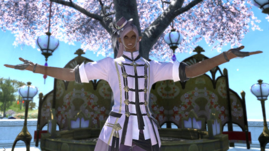
Here we have the combination of light coat, light hat, dark gloves, dark pants and shoes. I loved the line of the Ala Mhigan jacket and its art noveau little hat, so I decided to keep it. Even though this is a set of tomestone gear that basically everyone has, I’ve received a lot of compliments for the choices I made in dyeing this pairing it with the overall look of my character. In spite of it being an ‘ordinary’ outfit with zero alterations, I absolutely loved wearing this and how Etienne looked in these color choices. I don’t think you have to break new ground with every outfit or find the most unique, rare pieces. It may not be realistic to spend your time on that. When you dye things in unusual colors, it brings out qualities others might not have noticed or appreciated about that item. The details on the Ala Mhigan casting set are so much more noticeable in this light color, and it looks very pleasant with the snowy white trim. In spite of doing very little to ‘develop’ this glam aside from deciding on the colors, it’s one of my favorites so far.

Dark jacket, dark pants, light gloves, light shoes + paissa. #aesthetic
4. Take Risks, Get Feedback, Make Friends, And Have Fun

Or just marry someone really cute and stand next to him.
I’ve met so many awesome people because they complimented my look or my glam and I took a few minutes to chat with them about it. Complimenting others has gained me a lot of insight into different ideas, where gear comes from, how it dyes and how to pair it up with things. Allow yourself to be a work-in-progress. The one person you truly have to answer to when it comes to glams is yourself, so there’s no reason to worry to much about getting good.
I dye all my leveling gear.

I just feel like I’m having more fun when I’m pretty.
23 notes
·
View notes
Text
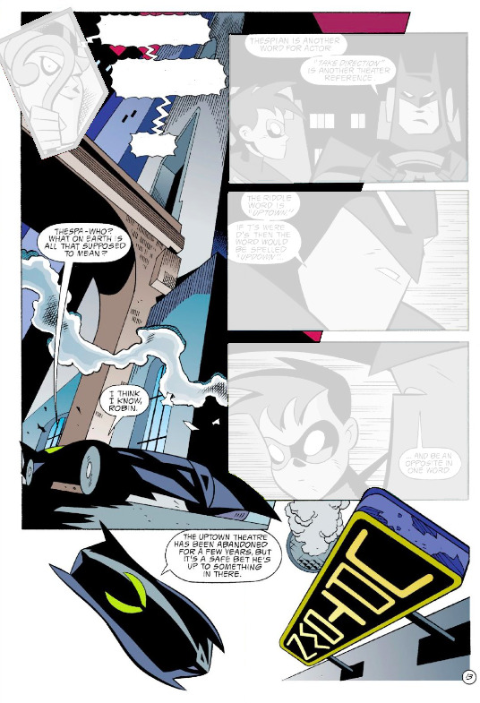
PAGE x PAGE ANALYSIS -- BATMAN: GOTHAM ADVENTURES #1 (PART TWO)
PUBLISHED: DC Comics, June 1998
SCRIPT: TY Templeton
PENCILS: Rick Burchett
INKS: Terry Beatty
COLORS: Lee Loughridge
LETTERS: Tim Harkins
EDITORIAL: Darren Vincenzo
Picking up where we left off last week, we’re gonna dive back into1998′s BATMAN: GOTHAM ADVENTURES #1. You can check out part one here, but for those with time against them, the setup of the issue is: The Joker has killed the only son of industrialist G. Douglas Reid, who has put a fifty million dollar bounty on the killer clown’s head. With all of Gotham gunning for the reward, Batman and his affiliates have taken the Joker into their private custody until they can resolve the situation. With Batgirl guarding the Joker in the Batcave, Batman and Robin head off to answer a Bat Signal from Commissioner Gordon. We’re eleven pages in.
Along with the regular discussion of story flow and scene direction, I’m also gonna get really into some tiny moving parts that particularly interested me as an artist. That might ultimately make this one of the dryer entires in this feature, but hey -- if you wanna skim through the analysis and just enjoy some great pages, friend of mine, it’s okay by me.
BATMAN: GOTHAM ADVENTURES #1 and all characters contained therein are property of DC Comics, reproduced here solely for educational purposes.
***
PAGE TWELVE
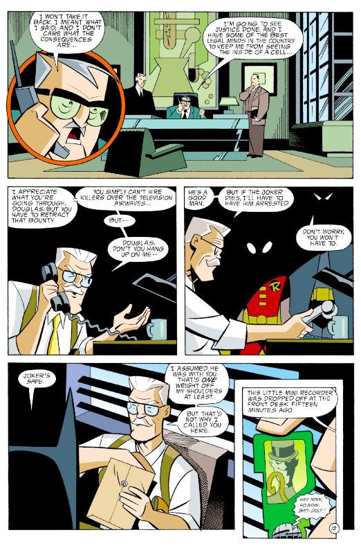
Such a good design on that little Riddler iPod Shuffle (hereafter referred to as a “?Pod”). The question mark motif is clear enough to read, while still subtle enough to keep from being distracting. Loughridge does a good job of keeping the vibrant greens of the ?Pod distinct from the soft greens of Reid’s office in panel two. Burchett choses to include the Riddler’s staff on the ?Pod screen, which makes him immediately recognizable as the classic Batman villain and visually echoes the ?Pod’s design, helping us catch the motif.
Props to Bruce Timm for giving each of the Batfamily distinctive mask eyes, so they can be easily identifiable even in the shadows.
I’d also like to point out something so small it might even be an accident, but something I’ll definitely be using in the future: the different way Reid and Gordon hold their phones.
The angle of Reid’s hand in panel one suggests he’s holding the handset microphone closer to his mouth so he can better make his demands. His posture in panel two emphasizes the anger he feels, the power he’s trying to assert.
Compare with the angle of Gordon’s right hand, turning the handset so that the speaker is closer to his ear. Added to the way he’s gesturing with is other hand, this clearly shows us a man who’s trying hard to reason with somebody who just doesn’t want to hear him.
Try acting this out yourself -- imagining how you’d have to be talking to be holding a phone in each of these two ways. Like I said, it’s small, but it’s some real fine acting.
PAGE THIRTEEN
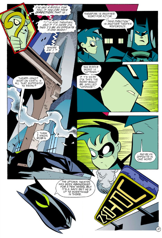
The ?Pod’s great design continues to help us out in the first panel -- it’s distinctive screen becomes an easily identifiable panel shape. Since the rest of the scene takes place in a green/teal environment, Loughridge gives that first panel a red boarder to help break up the scene. See also; the magenta sky.
There’s an interesting relationship between the Batmobiles in panels two and six. Here’s the page again, simplified to just those two panels:
See how the front bumper (gouger?) of the panel two Batmobile asserts itself over panel five? Somehow, this doesn’t interfere with the reading flow. Maybe it’s the simple black shape of the bumper, encouraging you to view it more as graphic element than a pice of diegetic matter. Or maybe it’s because the Batmobile is essentially a location, so we don’t expect it to interact with Batman and Robin inside -- and as a result, it doesn’t throw us when we see it encroach into their space. See also: the Uptown sign in panel seven.
Furthermore! The panel seven Batmobile’s rear fin creeps all the way back into panel two. It’s definitely purposeful -- it’d be easy to avoid with a very minor alteration in the angles of the cars so that they fit entirely within the panel borders. So why this atypical staging? It’s certainly a lively layout, for one thing. For another, liberating the Batmobile from the bounds of panel boarders makes it feel fast and powerful -- driving at liberty all over the page.
PAGE FOURTEEN
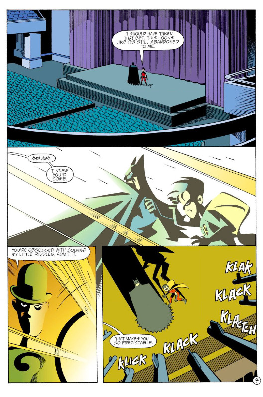
Look at that great smirk in panel three. The New Adventures redesign of the Riddler has nothing on the amazing sport coat and slacks look of the original, but it does have a certain stripped-down charm. It’s clean, distinctive, and devoid of redundancies.
This scene suffers some a little bit of messy geography, as we’ll soon see. For now, just take note of the balcony railing at the bottom of panel one, which is unquestionably where the gunmen are in panel four.
PAGE FIFTEEN
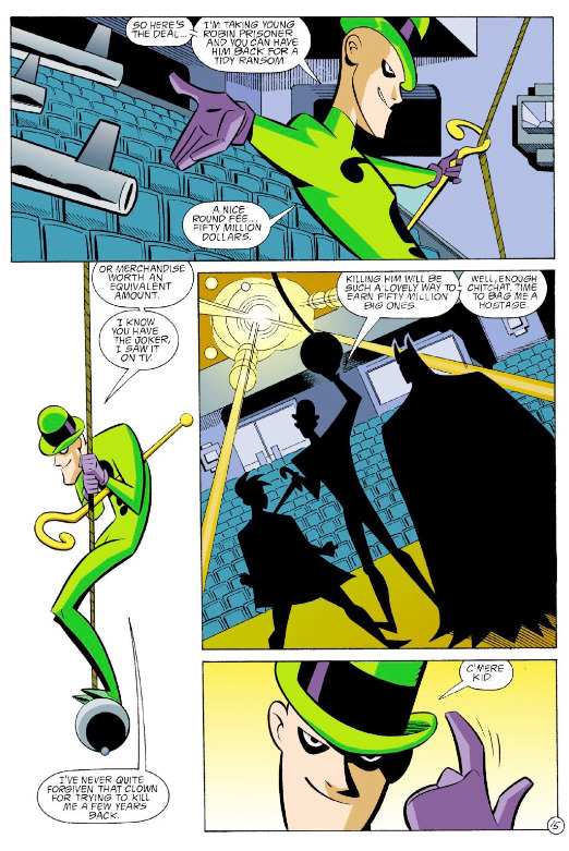
“Or merchandise worth an equivalent amount.” Templeton immediately ties the Riddler subplot to the main Joker narrative. Again, everything in this comic radiates from the clown prince’s murder of Reid’s son. The universe of the comic feels huge, but also connected.
The Riddler’s pose in panel two is his question mark motif writ large. Lowering himself on that ball, the “dot” in the question mark of his body, is a really good visual idea. Unfortunately, it’s at the heart of the geography problem in this scene.
But before we get to that, I want to point out a great example of setting up, execution, and finishing off an action: in panel one, the Riddler uses his cane to pull the rope towards him -- the setup. In panel two, he descends on the rope -- the execution. Then, in panel three, he’s still touching the ball -- finishing off the action.
PAGE SIXTEEN
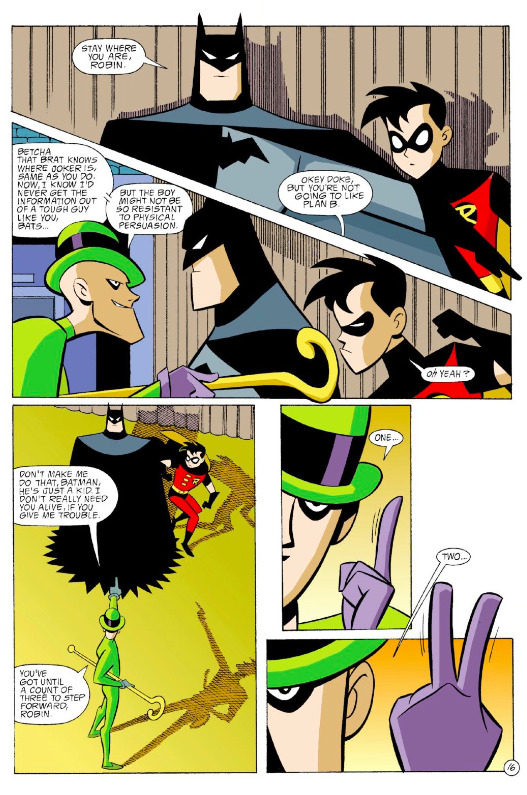
Burchett makes great use of negative space to increase the tension of the Riddler’s countdown in the last two panels.
Sidebar: I’m remembering this bit from a Dan Olson video about -- don’t freak out now -- Triumph of The Will and the Cinematic Language of Propaganda, where he talks about the paradoxical perception strength and weakness of the enemy as viewed by fascism. Check out this segment of his video, and watch until about 10:50. It’s only a minute of video, and it’s interesting food for thought when viewed in the context of how to depict super villains, especially trickster-style villains like the Riddler (see also: Loki, Mysterio, or the Flash rogue who’s actually called ‘The Trickster’). Just try not to overthink the Nazi stuff.
PAGE SEVENTEEN
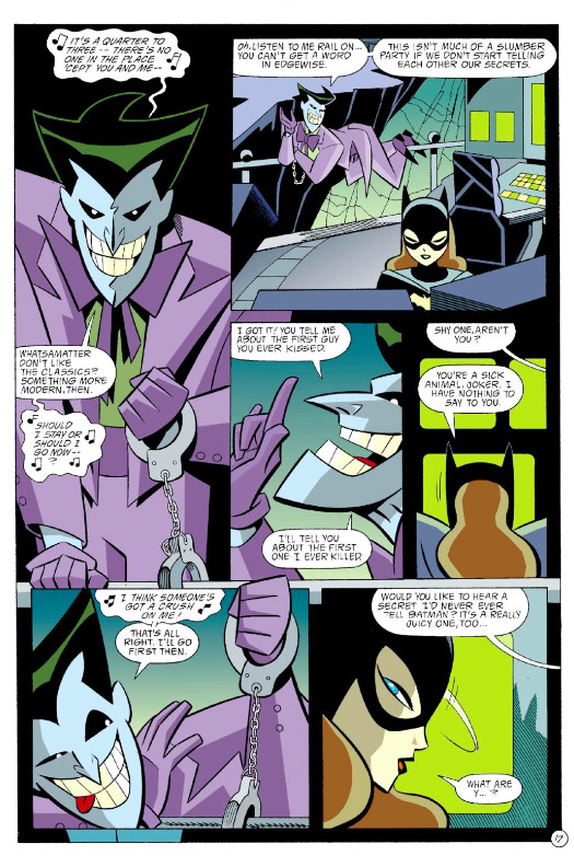
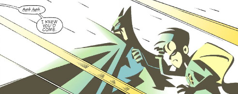
We jump from a panel of the Riddler to a panel of the Joker. Note how both of them are looking straight at us, both gesturing with their left hands -- the Joker’s even echoing Riddler’s countdown with his “Quarter to three” lyric. All of this means that we get to ride the tension of the Riddler scene right into this one, and multiply it by the demonstrably greater potential danger posed by the Joker.
The scene wrings extra tension out of the metatextual history that exists between Barbara Gordon/Batgirl and the Joker in the mainline DC universe. Even without that, we feel the threat he poses to her by the way he’s staged on the page. Look how the Joker dominates the layout: In Fig. 1 below, we have all the Joker panel appearances and dialogue (darkened so as to make the contrast more apparent), and all of Batgirl’s in Fig. 2.
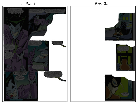
He’s a talker, alright. But this serves another purpose as well: it reminds us that Batgirl is isolated -- trapped in that space with the Joker.
PAGE EIGHTEEN
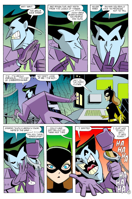
On this page, the creative team and the clown prince have the same objective -- they’re trying to draw us/Batgirl in, commanding our attention, using a repetitive visual/verbal rhythm to hold our/her attention. The rhythm breaks when the Joker reveals his little magic trick in the final panel; on the art level, this is achieved by having the Joker break the panel border, along with the sudden snap to red.
PAGE NINETEEN
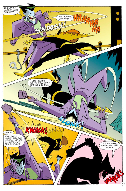
The intensity spikes with this page, both through the warmer colors and the more action-y diagonal gutters. Some clever staging here; Burchett is able to convey Batgirl’s jump in the first panel by showing us the railing behind the Joker, giving us a concrete landmark by which to place her in space.
Check out the motion lines Burchett and Beatty have given us here; see how no two actions take place along the same axis, creating a ton of energy on the page.
That black silhouette in the last panel is as gritty as this comic gets, but Burchett keeps it respectable by only showing the Joker, not the Batgirl he’s clobbering. On the next page, it’s immediately made clear she’s just knocked out, not fully Jason Todded.
Also, props of everybody for never messing up which of the Joker’s hands was cuffed. It’s the easiest thing in the world to accidentally switch it up, especially when a character turns their back to the reader.
PAGE TWENTY
The Joker is now free to move about the Batcave -- Burchett gives us a detailed look at the cave in panel one so that we viscerally feel this dangerous new liberty. He breaks the panel boarder again in panel two, which adds to that great double exposure as he sees the Batcave entrance. Sure, he saw it earlier when Alfred was coming down the steps, but it’s still a great moment. And anyway, it’s the Joker -- maybe he just forgot about it in all the excitement. Who’s to say?
PAGE TWENTY ONE
And we’re back. Here’s the heart of the geography problem -- or at the very least, a continuity problem. Back on pages fourteen and fifteen, we saw the Riddler’s goons are up on the balcony, along with him.
The Riddler then descends to the stage where Batman and Robin are standing. He then begins a one-two-three countdown; we leave the scene when he’s on two. Now he’s about to count three, and suddenly the goons are on the stage as well.
Gunfights are logistically tricky in any medium, especially when your heroes are unarmed. In this instance, the goons had to be down onto the stage so that Batman and Robin could realistically (”realistically”) take them on hand to hand. But since we never saw them descend to the stage, nor would they have had enough time to believably get there via stairs or whatever, their sudden appearance on the stage is very jarring.
A fix; in panel three on page fifteen, pictured below, we just have the goons descending on their own ropes.
If they’re fully rendered, they can be placed behind Robin, The Riddler, and Batman without interfering with their silhouettes.
PAGE TWENTY TWO
This is real solid action blocking. First panel has Batman in the foreground, Robin in the back. Batman’s punch leads organically into panel two, perpendicular to Robin’s kick -- now he’s in the foreground, with Batman in back. In each panel, they have their own fights on their own planes of movement, making the space feel huge. It’s a very short, simple fight scene, but this variety of staging from panel to panel makes it feel much bigger than it actually is.
Burchett also manages to maintain a consistent rightward movement throughout. It totally feels like Batman and Robin are just tearing through these guys, and the uniform direction of movement is a big part of that.
PAGE TWENTY THREE
Back to Wayne Manor with this very cool page. Check out how the action funnels towards the bottom:
By placing the Map to Movie Star Homes where he has, Burchett guides the eye back to the central axis of the page. The action then travel’s straight down the central axis, getting narrower and narrower panel by panel, from the Joker’s wide stance to Alfred’s tactical crouch.
(The vibrating tea tray is a very nice touch.)
PAGE TWENTY FOUR
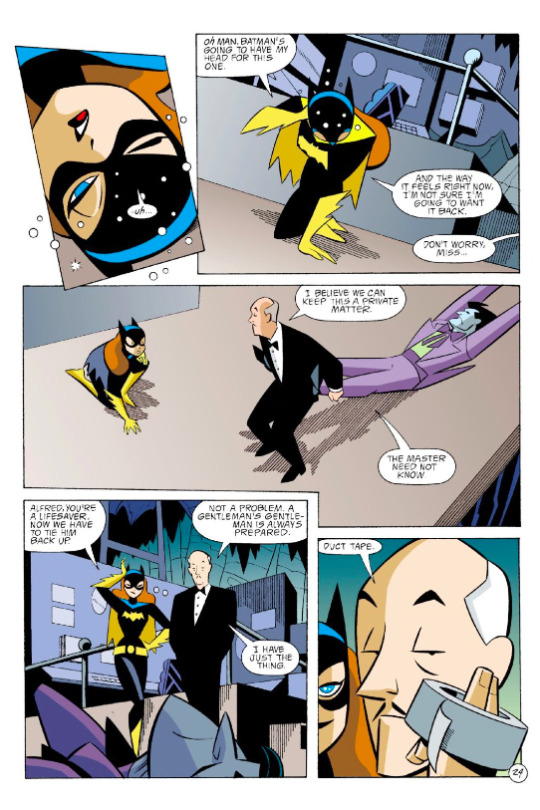
Wobbly panel shape as a shorthand for a woozy character coming back to lucidity is an evergreen technique. I’m also a big fan of the popping bubbles thing, but your milage may vary. When Batgirl comes back to full consciousness in panel three, Burchett cuts to a wide shot, soberly showing us all the characters in relation to each other, which is a great way to indicate a return to reality. We end this subplot, which preyed on themes of isolation and home-invasion danger, with Batgirl and Alfred standing together. An satisfying emotional mini-arc -- and appropriately, Alfred gets a joke in on the Joker.
***
You can get this entire issue -- for free! -- on Comixology, along with every other issue of GOTHAM ADVENTURES for around a buck apiece.
For a couple of my own comic creator bona fides, check out WILL EISNER’S THE SPIRIT RETURNS and SAN HANNIBAL, and pre-order the trade collection for BATTLESTAR GALACTICA: GODS AND MONSTERS.
Additional content can be found on my website, danschkade.com, as well as my twitter!
Be well, talk soon, etc
PREVIOUS PAGE x PAGE ANALYSES:
BATMAN: GOTHAM ADVENTURES #1 (Part One)
GANGBUSTER: SWING ANNA MISS
MINI-ANALYSIS — FIRST SIGHTING: SUPERBOY
ULTIMATE SPIDER-MAN #69 (with Aud Koch)
THE SHADOW STRIKES! #13
PETER PARKER: SPIDER-MAN #13
BATMAN: GOTHAM ADVENTURES #17
#Batman#page x page analysis#dc comics#educational purposes#Ty Templeton#rick burchett#lee loughridge#comics#Dan Schkade
13 notes
·
View notes
Text
OH! HAVE YOU HAD SEX ?
________________________________________________________________
HOW I REED THIS SCENE ... ON THE BASIS OF SYMBOLISM AND ....... MIRRORISM :)

EURUS: Play for me. SHERLOCK: I need to know how you got out of here. EURUS): You know already. Look at me. Look and play. EURUS: No, not Bach; you clearly don’t understand it. Play you. SHERLOCK: Me? EURUS: You. (Hesitating for a long moment, Sherlock then lifts the bow and begins to play Irene’s lament.) EURUS: Oh! Have you had sex? SHERLOCK: Why do you ask? EURUS: The music. I’ve had sex. SHERLOCK: How? EURUS: One of the nurses got careless. I liked it. Messy, though. People are so breakable. SHERLOCK: I take it he didn’t consent. EURUS: He? SHERLOCK: She? EURUS: Afraid I didn’t notice in the heat of the moment and afterwards ... well, you couldn’t really tell. Is that vibrato or is your hand shaking?

________________________________________________________________
((As mentioned in previous posts I think that Sherlock is solving problems and running experiments by creating role plays on a 'Mind-Stage' (x x x). Casting different characters - real and fictional ones - to fill in for known or unknown factors of the cases he is trying to solve. I suspect ....
Mary to serve as an avatar for Sherlock himself ( x x ) - for a process of personal growth over a certain period of time
Irene to be a symbol for his sexuality (x x)
Eurus a symbol for Sherlock's rational mind, pure logic and reason
John seems to be his lead actor where emotions and empathy are involved
Jim covers the part of Sherlock's dark side (x ))
________________________________________________________________

Sherlock begins to play Irene’s lament EURUS: Oh! Have you had sex?
'A Scandal in Belgravia' is the episode where Sherlock is heavily confronted with sexuality. Irene is a very strong mirror of himself, therefore I think she symbolizes not only his own sexuality but also what Sherlock thinks sexuality might be like, how sexuality can be used, the pros and cons ... or where it might lead him to ... in case he allows himself to get involved. Is Sherlock investigating, deducing and probably experimenting on sexuality? Why not? But if Sherlock indeed contemplated or had sex with Irene - his own sexuality - then he simply had sex with .... hmself.

EURUS: The music. I’ve had sex. EURUS: One of the nurses got careless. I liked it. Messy, though.
The sound of Irene's theme reminds Eurus - Sherlock's rational mind - that she once had sex. With a nurse ... a careless one. As mentioned above I believe Mary to be an avatar for Sherlock himself. Mary is a nurse. That's one of the many similarities she shares with Sherlock. Remember this dialog from TSOT:
JOHN: Nurse, press here – hard. SHERLOCK: “Nurse”? JOHN: Yeah, I’m making do.
Did Sherlock become a bit careless because of all the .... damn emotions stirring unintentionally deep inside him since he made the acquaintance of a certain army doctor? Did Sherlock indulge in some messy but overall likable experimenting .... with himself?

EURUS: People are so breakable. SHERLOCK: I take it he didn’t consent. EURUS: He? SHERLOCK: She? EURUS: Afraid I didn’t notice in the heat of the moment and afterwards ... well, you couldn’t really tell.
Even if the practical part was messy but likable ... it seems that the final outcome of Sherlock's experiment has been a negative one after all. Trained since childhood to stay away from everything involving emotions, an unexpected sexual experience might have been a bit overwhelming. Maybe Sherlock hadn't even intended to go through the 'whole thing' but - from a certain point onward - he got carried away by his own body? And afterwards? Started his rational mind (Eurus) dissecting and breaking down what he just experienced? Dividing and splitting and cutting up the whole thing until nothing was left but a simple list of chemical elements. A bunch of neurochamicals and nothing else? Neither sex nor love recognizable anymore? Just the uneasy feeling of vulnerability and disadvantage ... of exposing oneself to unknown dangers? And the question - male or female - might not have been a primary one if Sherlock experimented with his own sexuality .... with his own body.


Remember what Sherlock tells Irene in ASIB:
SHERLOCK: ... Sentiment is a chemical defect found in the losing side.
SHERLOCK: I imagine John Watson thinks love’s a mystery to me but the chemistry is incredibly simple, and very destructive.
SHERLOCK: This is your heart ... and you should never let it rule your head.
SHERLOCK: I’ve always assumed that love is a dangerous disadvantage ... Thank you for the final proof
And Sherlock hands over Irene and her phone into Mycroft's power - meaning - Sherlock returns to the viewpoint of his brother and continues to trust and believe in the lessons he has been taught since childhood. 'All lives end, all hearts are broken. Caring is not an advantage' and 'Don't get involved'. Somehow Irene ends up in the desert and in mortal danger. Mycroft believes her to be dead. Mycroft thinks he had been thorough this time - and that statement can easily go in both directions:
thorough in checking the idintity of a dead body or
thorough in ensuring there is a dead body
BUT IRENE DOESN'T DIE IN THE DESERT
Because when she is bound to be beheaded and killed for good Sherlock appears out of nowhere and rescues her in the very last second. And in the most dramatic and romantic way possible .... wielding a scimitar like a hero out of 'A Thousand and One Arabian Nights'! Ah, he really loves to be dramatic! And that would be one of the things Mycroft doesn't know about - that Sherlock's sexuality is not dead.

How very telling when Irene's text alert starts 'sighing' again just when John is about to leave 221b at the end of 'The Lying Detective'. If this is a scene Sherock designed for his Mind-Stage, then he is the author of John's dialog as well:
JOHN: You bloody moron! She’s out there ... she likes you, and she’s alive. ... and do you have the first idea how lucky you are? JOHN: Just text her back. SHERLOCK: As I think I have explained to you many times before, romantic entanglement, while fulfilling for other people ... JOHN: ... would complete you as a human being. JOHN: Just text her. Phone her. Do something while there’s still a chance, because that chance doesn’t last forever. Trust me, Sherlock: it’s gone before you know it. Before you know it.
In other words - this is Sherlock considering the possibility that John might indeed be interested in having sex with him. That sex could complete him as a human being. That he should act on it before it is too late.
And then in 'The Final Problem' almost the very first topic Eurus - Sherlock's 'rational mind' - contemplates on is sexuality. Again. Sherlock's own sexuality. All the tasks and experiments his own mind (Eurus) sets up for Sherlock, culminate in one important conclusion:
Sherlock needs to land the plane of his isolation. Bring it back to earth without crushing it. Only then he is able to rescue and resurect his abandoned and neglected emotions, his empathy ... buried deep down in a dark well and left to drown a very long time ago.
And then? With Sherlock's old self (Mary) gone, his mind and heart (Eurus & John) playing together in perfect harmony, the budding love (Rosie) steadily growing and lovingly nurtured, Sherlocks not quite murdered sexuality (Irene) drawing attention to herself again .... and probably his dark side (Jim) not entirely gone - it will be a matter of balance to achieve the perfect equilibrium.
Thankfully John Watson - the doctor, the soldier, Sherlock's conductor of light - knows exatly what to do .... or at least, Sherlock thniks so. :)
We’re going to need to coordinate

@callie-ariane thank you so much for your wonderful scripts
@gosherlocked @isitandwonder @loveismyrevolution @tjlcisthenewsexy @longsnowsmoon5 @sarahthecoat @monikakrasnorada @shylockgnomes @justshadethings @yan-yae @marchinaugusta @green-violin-bow
193 notes
·
View notes
Note
provided you're still taking these [and no one's asked it yet] ace attorney for the five things you'd changed meme? [if that's been asked then fire emblem awakening?]
I’m so sorry! I totally didn’t mean to ignore you. I took a break after a huge batch of these when I first posted the meme because my hands ended up hurting from typing so much, and then I got caught up watching the Switch presentation, and then I sort of … forgot that I had these in my inbox/got distracted every time I remembered. I’m sorry! I’ll go ahead and answer this now, though, so I hope it’s not too late.
As a reminder, this is for the “five things I would change” meme. Others I’ve already answered are:
Pokémon XY&Z AnimeDreamworks DragonsPokémon Sun&Moon GamesHarry PotterGravity FallsBlue ExorcistYu-Gi-OhFire Emblem: Awakening
(Yeah, I copy-pasted the apology from another response, but hey: it applies in both cases.)
And as for Ace Attorney . . .
First and foremost, I would completely remove the Khura’in element from the sixth installment. The Kingdom of Khura’in needs to go, entirely and completely. And for that matter? Playing as Phoenix needs to go, entirely and completely. I can understand it in AA5 since they both wanted to give him his badge back (though it’s ridiculous he lost it in the first place, but whatever), and also because there are periods over the course of the plot in which Athena cannot defend because she has been arrested, and Apollo can’t because he suspects her. We need a lawyer at that point, and so it makes sense that Phoenix would step up. However, there’s no reason to do this in AA6, and no reason to keep billing him in the title of the games. His time to shine is over. His part of the plot is done, unless you want to bring back Kristoph Gavin and tell us what those black psyche-locks are hiding (but more on that in a bit). The fact that we wasted so much time on him in AA6 when we have two other lawyers that we need to know more about/have more time with is ridiculous. I’m so beyond tired of Phoenix Wright. I want more Apollo Justice and Athena Cykes, and that means reworking the sixth game completely.So that said? No more Khura’in. This does mean that I lose my darling daughter Rayfa, but in all honesty that’s a sacrifice I’m willing to make. No Khura’in, no Phoenix acting as a lawyer, no Maya coming back just to be a damsel in distress yet again with nothing significant gained from her appearance. Instead, AA5 needs to take place solely in Los Angeles (/Japan/Japanifornia) once again, and the lawyers need to alternate between Apollo and Athena, both of them serving as the other’s co-counsel at different points. And, more to that point, Athena needs to be treated with respect. She’s still new, but she’s a competent lawyer and she has proven this. Treat her like it.But yeah, the Khura’in cases were godawful and a damned chore to get through. None of that. Chuck that in the garbage bin where it belongs. Worst.
Apollo and Trucy need to know that they are siblings yesterday. Ideally this would have come out a long time ago, but at the very least it should have come out in AA6, particularly since it was teased with the second case focusing so heavily on the Gramaryes. And to the end, how much more powerful would it have been if Reus had been the final villain of the game, screaming “GRAMARYEEEEE” after it has already been revealed that Apollo himself is a Gramarye? Because as it stands, Reus and everyone else thought he was simply cursing Trucy and his family, even though Apollo was the one who brought him down. If it was revealed that Apollo was a Gramarye as well, that would have been so much more powerful for all of the characters present. As it stands, it was a waste. A waste and a shame.But yeah, Apollo and Trucy need to know. That plot thread needs to be tied up. The fact that we’re going on ten years---an actual decade---of having this dangling is absolute nonsense. There’s no reason for it, particularly since Capcom felt they had time to retcon chunks of Apollo’s history and introduce a ridiculous new country just so they could push a courtroom gimmick, make an excuse for Maya to appear as a damsel yet again, and act like Phoenix still has any relevance to the ongoing narrative. And speaking of dangling plot threads . . .
KRISTOPH. GAVIN’S. BLACK PSYCHE-LOCKS. This is the only remaining business that Phoenix has left unfinished---the only relevance he has beyond being a father and mentor to the current main cast. We need to know what those black psyche-locks are, we need to finish that up. I am concerned at this point that nothing Capcom reveals will be good enough, that any dark secret that Kristoph has buried is going to be underwhelming given that we’ve had a decade to think of possibilities---but I don’t care. I still want to know. They introduced the black psyche-locks in AA4 and refused to let us break them. They created that dangling plot thread. They then explained what black psyche-locks are in AA5. That is the perfect opportunity, then, to let us go back and break them---and yet it was an opportunity wasted. It could have been explored in AA6, particularly if we went back to the true heritage plot thread that was left dangling from AA4 as well, but again, that didn’t happen. So that said, I would make it happen. I don’t know what it is that Kristoph is repressing (I’d have to replay that part of AA4, because to be honest I don’t even remember what triggered the black psyche-locks), but damn, I really want to know.
I do want to see original trilogy characters again, but I want to see them incorporated in ways that are new and show that they’ve actually grown as people over the past ten (now!) years. This was done well with Ema, in that we see her as a homicide detective and then as a forensics investigator like she always dreamed. We see that she grew up, that she’s doing different things with her life, that she has changed as a person. This was done less well with characters like Pearl and Maya, who act almost the exact same as they did in the original trilogy with very minor design differences, almost as if Capcom was afraid to change them too much. In my opinion, this was done to their detriment. The most glaring example of this was in the DLC case for AA5, in which Pearl---who is a seventeen-year-old junior/senior in high school---saying “for-en-sick-ing” as if she’s still an eight/nine-year-old who doesn’t understand the word. That’s horrible. Pearl was shown to have grown up in some ways, but in others she acted as if she still had the intelligence and mentality of a small child, which is rather insulting to her character (especially since she was always supposed to be quite bright). Maya was a little better, but not by much. Often times she still acted so immature that moments in which she was supposed to be ~mature and wise~ (such as that moment with Rayfa that they flashbacked to 9882348309232 times as if to hammer home, “LOOK SHE’S ALL MATURE AND STUFF NOW!!!!!11!”) felt out of place and out of character. She simply didn’t grow enough to sell it. And if that’s how they’re going to treat OT characters, then I’d rather not see them in the present day games.So that said? While I do want to see them, I want to see growth and change. The next time I see Gumshoe, I want to see that he is actually Chief of Police, happily married to Maggey Byrde with some kids of his own. The next time I see Lana, I want to see that she did her time in prison and is either head detective down at the precinct, or---if her record prevents her from serving on the force again---is acting as a consultant for the police force. The next time I see Kay, I want to see her as a prosecutor, and so on and so forth. I want to see these characters having grown as people, having changed while still being recognizably themselves. This shouldn’t be beyond Capcom. They did it with Ema and Edgeworth, so I don’t see why they can’t do it with the other characters as well.
Lastly, I would make Phoenix and Edgeworth in a committed relationship at the least by the time AA5 rolls around, and probably engaged by the time AA6 does. Not only would it be amazing confirmation that Phoenix is bisexual (and having more bi visibility is always a good thing), and not only would it be a concrete reminder that Edgeworth is canonically not interested in women (and no, it’s not that he’s just ~married to his job~, but that’s a rant for another day), but it would also be a fantastic culmination of all the relationship development we’ve seen between them over the years. It would also be fantastic representation of a relationship that is, and has always been, on equal terms both in terms of dynamic in the workplace and in how they treat one another. I would love for it to actually be canon, particularly since it’s not as if a whole lot would have to change. Trucy calling Edgeworth “Papa” (in contrast to how Phoenix is her daddy), and a couple lines of banter about an upcoming wedding between them is all it would take. (Which is also fantastic representation, because it shows that, hey, they’re people in a relationship just like anyone else! LGBTQA people are just people, how shocking.) So yeah, I would definitely make that a thing, and it would be great.
2 notes
·
View notes
Text
I know a few people that dropped Fire Force in season 1 dues to some of the more controversial aspects and I wonder if I should tell them to give season 2 a try. I mean it still has some raunchy humour and all but it seems to have really done a huge tonal shift in that regard and I think a lot of those people would enjoy it a lot more now.
As for me, you’ll just have to read on… aww who am I kidding. I am picking up all that Fire Force is laying down right now and having a blast while doing it. Let me tell you in a bit more detail.
I had almost forgotten how much I love the visuals in this show. It’s a tremendous production. Way to go David! Of course visuals are a highly personal thing, it’s up to every viewers preference, but you have to admire just how much attention is given to those visuals way beyond the character designs.
Fire Force always plays with hot and cold tones. It uses very oppressive cool palettes like that dark purple wash in Hagues early scene (or Sho’s first scenes last season which were in this super cold blue) to show us scenes without much action happening but that are precursors to something bad. A calm before the storm sort of thing. That’s always when the colours are the coldest. Whereas that silly card between Shinra and Ogun (the yeah yeah screencap) is in a rather warm blue as far as they go, and you can just tell that it’s a much more relaxed and casual colour choice.
Also, I really like Ogun’s eyes. They just pop! One of the best instances of the lately popular golden eyes.
The premise of the episode is simple, and actually very logical. After the events of last season, Shinra is visiting the 4th (a friendly company) to try to get some more information on the Adolla as it seems their captain is also linked. However, during their meeting Shinra and a few members of the 4th seem to get possessed by something deadest of making Shinra use his flames as violently as possible for unknown reasons. A situation that could have turned out quite dramatic if Arthur hadn’t shown up to set everything right. No really…
On it’s face all of this is great shonen action stuff. We got some great fighting animation, Hague acting like a weirdo, a few new charters to pique our curiosity and even the promise of a new pillar which sets up the next few episodes really well. Like I wanna find out who this new pillar is and what their deal is. I’m into it!
But the undertones were much more complex and even a bit delicate. It’s debatable whether it succeeded at everything. There was an undercurrent of rejecting truth or finding one’s own reality going throw the entire episode. And it was present in a way that goes against the established trope. Shinra is possessed but really that is only breaking down his moral restraints. The force whispering in his ears is urging him on but not lying. There is a harsh reality that he just doesn’t want to admit and facing it is making him go wild. Accepting the world as it is, is hurting him right now.
Similarly, Hague likens his own experience with his Adolla link to a spiritual or religious experience that gave him a taste of Truth (capital T). But it’s obviously worn out his sanity. As for my man Arthur well… He was never all there to begin with, and this episode gives us an origin story for his delusion, which although sweet in and of itself, may have weakened the character a bit. Still it’s telling that he is exponentially stronger, better and happier when he is in his own world. Now that’s an unusual lesson…
Fire Force usually likes to put a lot of shadows or simply darken fight scenes. The confrontation between Shinra and Arthur was a departure and it may be because they are both protagonists. I have always really liked Shinra’s deserted Adolla world. Bringing someone else in there felt like an intrusion and it was unnerving. Also kudos for playing with Sister’s design in a way where she is still recognizable but doesn’t look like herself at all.
As I was watching this episode, I was sort of struck by Shinra’s characterization. This Shinra was the devil everyone told us he is and we (well me) had refused to believe. Yes of course there were extenuating circumstances but still. This was the main protagonist on a series for a younger audience, openly attacking his allies and another protagonist the audience has gotten to now and love (well me) and showing little reserve or remorse. In episode 2 of the season! Because Shinra isn’t in fact a hero or a demon. He’s a conflicted kid and sometimes that means he’s not that great. I don’t often see that type of greyness in a protagonist. He’s sweet and likeable and I want to root for him, but the truth is, he could snap and considering his power, that would be devastating.
I think in away, this episode was trying to impart that. And give us a general sense that in a world as ravaged as Fire Force’s, lofty ideas of good and evil might be comforting to some but are ultimately impracticable. When pushed to the brink, the notions sort of loose meaning. Hague himself states it, it doesn’t matter if it’s Heaven or Hell… In the end, it’s kind of the same.
There’s a screencap that I really like so I kept it as my bookend at the bottom of this post. See it’s Arthur waking up on the day he became a Knight King! It’s not that special or anything. I didn’t have to carefully time it because there’s some amazing action happening. But that flower. I just love that flower.
There were many fantastic elements this episode. The shifting art styles, the super deformed angles, the symbolic imagery. I had a lot I wanted tot talk about so I didn’t get to those. But I need to talk about this scene.
It’s part of a flashback that started out all sunny and regular coloured but then shifted into this blue hue as Arthur settled in for the night that would mark the beginning of his new life. This scene happens the next morning and we see the bleak and harsh morning light seeping through. It’s an unpleasant light with a depressing colour palette. The boxes in the foreground further make everything feel claustrophobic and in the context of the scene are a sad reminder of what has just happened. It’s very nicely staged even if it is kind of a downer.
But there’s that flower. It’s the only pop of colour we’ve had for several seconds now. But it’s still clearly in the same filter. The pink petals are purple and the bright yellow heart looks greenish. Still it’s there and completely out of place, almost alien to the rest of the scene. Like maybe it’s not actually there. A clear beacon of hope for a boy who contextualizes his hope in delusion.
It’s a really great bit of visual storytelling and this stuff always impresses me about Fire Force.
Fire Force 2 Episode 2 – The Return of the Knight King I know a few people that dropped Fire Force in season 1 dues to some of the more controversial aspects and I wonder if I should tell them to give season 2 a try.
0 notes
Photo

New Post has been published on https://shovelnews.com/catastrophically-stupid-plot-to-smear-robert-mueller-exposed-by-trail-of-online-evidence/
Catastrophically Stupid Plot to Smear Robert Mueller Exposed by Trail of Online Evidence

Special counsel Robert Mueller.Photo: J. Scott Applewhite (AP)
Conspiracy theories are almost always bullshit, but actual conspiracies are often easy to identify because one of the parties with knowledge of a plot cracks under the pressure or leaks information about it to others. For example, the Watergate plot fell apart largely because of the testimony of Mark “Deep Throat” Felt, an FBI associate director who told investigative journalists details of President Richard Nixon’s coverup of his role in the 1972 break-in at the Democratic National Committee headquarters in DC.
On Tuesday, another much sloppier and stupider conspiracy involving the FBI—an apparent attempt to smear former FBI director and current special counsel Robert Mueller as a rapist—fell apart in record time due to the women the conspirators allegedly intended to bribe and the mind-blowing trail of digital evidence left behind.
Advertisement
On Tuesday, the Atlantic reported that Mueller, who is running an investigation into alleged Russian interference in the 2016 elections and its possible links to Donald Trump’s campaign, had referred a plot to pay off women to make up false claims of sexual misconduct against him to the FBI. Two women, who identified themselves as Lorraine Parsons and Jennifer Taub, told journalists and media figures including Twitter celebrity Ed Krassenstein of the Hill Reporter that they had been offered large sums of cash for accusations against Mueller.
“When we learned last week of allegations that women were offered money to make false claims about the special counsel, we immediately referred the matter to the FBI for investigation,” the special counsel’s spokesperson, Peter Carr, told the Atlantic.
Krassenstein told NBC News that while investigating the women’s claims, he had received threats, including a text message with his home address saying “You’re in over your head…. Drop this”. Yet the plot seems to have continued to proceed regardless, despite the fact the crucial element of secrecy had already faded. NBC News wrote that GOP lobbyist Jack Burkman, a well-known conspiracy theorist, was openly advertising he had supposed proof that Mueller was an abuser on Facebook:
Around the same time reporters began to be contacted about the misconduct allegations, Jack Burkman, a Republican lobbyist and radio host, began promoting, via his Facebook page, that he is investigating sexual misconduct and alcohol-related allegations against Mueller. On Tuesday morning he tweeted that he would hold a press conference two days later to “reveal the first of Special Counsel Robert Mueller’s sex assault victims.”
Over the past two years, Burkman has peddled a separate, evolving conspiracy theory that has blamed several different wild plots for the death of Democratic staffer Seth Rich, who was shot on a Washington street in 2016 during an apparent botched robbery.
Advertisement
Emails obtained by the Atlantic showed that the woman identifying herself as Parsons told reporters she had been offered complete clearance of her credit-card debt, as well as an additional $20,000 payment by a firm called Surefire Intelligence, “to make accusations of sexual misconduct and workplace harassment against Robert Mueller.” Parsons said she was also asked to sign a “sworn affidavit” attesting to the accusations’ accuracy.
Though Parsons said she had worked at a law firm with Mueller in 1974, the firm in question denied any records of that to NBC News, and no one seems to have otherwise tracked this person down. Burkman now insists she’s fictional. But Taub, a Vermont Law School professor who says she has never met Mueller, also told the Atlantic she had received emails from a Surefire account proposing a similar arrangement. (No one has alleged money actually changed hands, if it was ever seriously on the table in the first place.)
Per the Atlantic, Surefire Intelligence advertises itself as “a private intel agency that designs and executes bespoke solutions for businesses and individuals who face complex business and litigation challenges.” Yet it quickly became clear one of the persons behind Surefire was Jacob Wohl, a D-list celebrity Trump supporter mostly known for annoying people on Twitter.
Advertisement
Some context here: Wohl is best known as the number one @realDonaldTrump “reply guy”—i.e., rushing to be the account with the top sycophantic reply to any given Trump tweet. Virtually every day, he’s lining up to post #MAGA tweets flattering the president and touting whatever hot BS will grow his conservative following.
[embedded content]
As the Daily Beast noted, he’s also a conspiracy theorist whose past includes stints as a hedge-fund manager. Years ago, Wohl fell afoul of regulators with the National Futures Association and Arizona Corporation Commission after clients accused him of fraud. (The latter entity barred him from its membership for life, while Wohl attracted additional scrutiny from the Securities and Exchange Commission.) So he is not exactly the most trustworthy character.
Advertisement
Wohl has repeatedly denied having any links to Surefire, which the Daily Beast reported posted advertisements boasting its elite Israeli intelligence credentials on Craigslist. Surefire also seems to have seeded blogging platform Medium with “suspiciously vague” posts touting how good it is at the art of spycraft, the Beast wrote:
Surefire is a bit of a mystery. Since-deleted Craigslist advertisements for the company said it “was founded by two members of Israel’s elite intelligence community.” The ads billed services including “counter intelligence,” “private spies,” and “ethical hackers.”
… Among the little public information available on the company is a pair of suspiciously vague posts on the publishing platform Medium. Both posts were written to appear as journalistic exposes of the company but neither does much beyond extolling its supposed expertise and impressive client list—without naming any of the clients. Both the posts were written by self-described journalists whose Twitter accounts were created in the last three months, and neither has done much beyond promote their Medium posts on Surefire.
Advertisement
According to the Beast, Wohl told them that Burkman had hired Surefire’s “managing partner” Matthew Cohen to assist in his quest to find accusers against Mueller. But the trail of evidence linking Wohl to the firm now includes contact numbers leading to his mom’s phone and a photo of “Matthew Cohen” that appears to be… Wohl, just poorly doctored to black out his face.
Again, this is a face that is instantly recognizable to many of the millions of people who read the president’s tweets.
[embedded content]
Advertisement
[embedded content]
Domain records for Surefire Intelligence’s website also listed Wohl’s email ([email protected]), according to NBC News.
[embedded content]
Advertisement
So either Cohen exists and cleverly set up Wohl as his fall guy, or Wohl was LARPing as an international super-spy using his mom’s phone number and personal email. (It’s not clear whether Burkman was aware of the second possibility.)
OK. Still with us? Because this is already very, very stupid.
It’s about to get stupider.
For one, Surefire’s list of intelligence experts included similarly poorly doctored photos ripped off the web, including models and celebrity actor Christoph Waltz:
[embedded content]
Advertisement
[embedded content]
[embedded content]
As all of this inane scheming began going viral Tuesday following the Atlantic’s report, someone apparently forwarded one of the accusations to the Gateway Pundit, a far-right website known for both its popularity with Trump supporters and wild-eyed credulity. Wohl, who had repeatedly denied any involvement with Surefire, posted news of the resulting story to his Twitter account. Perhaps he was under the impression no one would draw the connection.
Advertisement
[embedded content]
The Gateway Pundit’s story (which Gizmodo has chosen not to link to) cited documents from a firm with an “International Private Intelligence” tagline. Those documents alleged that “on or around” Aug. 2, 2010, Mueller—then the director of the FBI—was reeking of alcohol at Manhattan’s St. Regis Hotel when he identified himself to an unnamed woman as “a cop” attending a conference in the city. When Mueller asked her to join him in his room and she refused, the story went, Mueller told her “I work for the FBI” and “I’m not the guy that you say no to.” The documents then accused Mueller of intimidating her into coming to his hotel room before sexually assaulting her.
[embedded content]
Advertisement
As NBC News’ Brandy Zadrozny noted on Twitter, “International Private Intelligence” is Surefire’s tagline. Hmmm.
The holes in the Gateway Pundit’s story are obvious, and too many to list in full. But here’s one: Gizmodo found that on Aug. 2, 2010, Mueller was reported by the Washington Post to have attended and been dismissed from jury duty in DC Superior Court while in the company of an “ear-pieced security guy.” So for this incident to have occurred on the listed date, the FBI director would have needed to leave jury duty, and instead of finishing his interrupted work day, ditch his security detail to undertake a multi-hour journey to get drunk in New York and sexually assault a stranger. (By the way, a 2009 report noted Mueller was under such constant guard while head of the FBI that four armed guards stood outside a barbershop where he was getting a haircut.)
The Gateway Pundit has since retracted its story, writing “We took the documents down and we are currently investigating these accusations. There are also very serious allegations against Jacob Wohl. We are also looking into this.”
Advertisement
So, to recap, it looks an awful lot like a bunch of conspiracy theorists got together and tried to launch their own conspiracy, showing in the process they were nowhere near competent enough to actually organize a conspiracy. And despite the fact that said plot blew apart faster than a blackout drunk mishandling fireworks at a Fourth of July barbecue, and the key players involved were very likely being monitored and investigated by the FBI as of Tuesday afternoon, they seem to have decided to move forward with it.
It is also entirely possible, as various sites have suggested, this was never about Mueller per se and instead some kind of long-winded attempt to troll the media—or maybe pull a supposed gotcha on the #MeToo movement, which emphasizes believing accounts of sexual violence. Either would stretch the definition of “trolling,” seeing as only the alleged conspirators look stupid here. (For example, the only media outlet to report the Mueller accusation as anything other than a hoax appears to be the Gateway Pundit, which is one of the president’s favorite news sites.)
Wohl, who a lawyer might advise to stop talking, is continuing to tweet about the hoax. Specifically, that he’s not owned.
Advertisement
[embedded content]
To quote the ending of Burn After Reading:
“Jesus fucking Christ. What did we learn, Palmer?”
“I don’t know, sir.”
“I don’t fucking know, either. I guess we learned not to do it again.”
“Yes, sir.”
“I’m fucked if I know what we did.”
“Yes sir, it’s hard to say.”
[embedded content]
Gizmodo has reached out to Wohl for comment, and we’ll update this post if we hear back.
Advertisement
[The Atlantic/NBC News/The Daily Beast]
Source: https://gizmodo.com/catastrophically-stupid-plot-to-smear-robert-mueller-ex-1830115833
0 notes
Text
11 Examples of Experiential Marketing Campaigns That'll Give You Serious Event Envy
Work events are really hit or miss. Let's be honest: How many times have you found yourself anxiously fidgeting with a paper napkin in the corner of a stuffy networking happy hour?
Here's the thing: It's not the event itself that prevents you from coming back the following year. It's the experience you remember having. In this blog post, we'll look at some of the best experiences brands have ever offered their customers.
I have a big problem with generic trade shows and industry conferences. That's why I was not only relieved, but surprised and delighted, when I attended a holiday party that featured a live, interactive version of an arcade game.
An entire room had been curated to look like a video game setting, and people were dressed up as characters from it. There was a giant, real-life scoreboard, boppy electronic music, and best of all, there was no tedious small talk.
It wasn't just another tired work event ... it was an experience. And in our line of work, that sort of thing has a name: experiential marketing.
While a surprising number of people haven't heard of the concept, it's kind of a big deal -- there's an entire three-day summit dedicated to it, and 65% of brands that use it say that it positively correlates with sales.
But what is it, exactly? And how has it been used effectively? We found 11 of the coolest experiential marketing campaigns that really break down how it works, and how you can apply those lessons to grow your business.
Experiential Marketing
Experiential marketing, also called "engagement marketing," is a marketing strategy that invites an audience to interact with a business in a real-world situation. Using participatory, hands-on, and tangible branding material, the business can show its customers not just what the company offers, but what it stands for.
Experiential marketing might sound a bit like event marketing, which makes sense -- experiential campaigns do tend to be event-centric. But there are also times when they have nothing to do with a specific event, as you'll see from the examples we picked.
When an engagement marketing campaign is event-centric, it's dedicated less to the type of event -- like a concert, festival, conference, etc. -- and more to interactions between the brand and the customer. (If you already have an event in the works, check out this guide to adding experiential elements to it.)
These campaigns can take an integrated approach. The primary purpose is to experience a brand in a tangible, offline way, but you'll still want an online dialogue around it. When you consider that 49% of folks create mobile video at branded events -- 39% of which is shared on Twitter -- it makes sense to incorporate a digital element. A branded hashtag, for example, can get people talking about the experience.
11 of the Coolest Experiential Marketing Examples We've Ever Seen
1. Refinery29: 29Rooms
For about three years now, lifestyle brand Refinery29 has hosted the 29Rooms event: What it calls "an interactive funhouse of style, culture, & technology." As the name suggests, it consists of 29 individually branded and curated rooms -- and attendees can experience something different in each one. The rooms are designed and created with brand partners, who range from personalities like artists and musicians, to consumer-facing companies like Dunkin' Donuts, Dyson, and Cadillac.
Each year, 29Rooms has a different theme, with this year's being "Turn It Into Art." Attendees, it seems, are encouraged to enter each room and use the surroundings to create something -- one room, for instance, invites participants to put on punching gloves and hit punching bags that each produce a different sound when contacted to create a symphony of sorts. A truly hands-on experience, indeed.
Takeaways for Marketers
Go nuts, but keep it on-brand. An experience should be memorable, but relevant to the people attending.
Partner with creators like artists and musicians to create experiences, especially if they are recognizable within the region where you're trying to build or augment an audience.
2. Red Bull: Stratos
If you were online October 14, 2012, you probably came across a live stream of the "Stratos" jump.
Red Bull has been at the forefront of extreme sports coverage for almost as long as the brand has existed. But in 2012, the company brought its content marketing to new heights -- a world-record height, actually.
Affectionately named Stratos, Red Bull's superterrestrial marketing campaign featured Felix Baumgartner, a skydiver from Austria who partnered with Red Bull to set the world record for highest skydive.
That record: 128,000 feet, about 24 miles above Earth's surface. Gulp.
To pull off this amazing stunt, Red Bull housed Felix in a small communication capsule and sent him up to the stratosphere using a large helium-filled balloon. And what's truly remarkable is that his ascent and preparation to jump, alone, allowed him to break another record before landing safely back on Earth (spoiler alert): Red Bull streamed the entire event online, and saw the highest viewing traffic of any live stream ever broadcast on YouTube -- at just over 8 million viewers.
Want to see that experience again? Check out Red Bull's recap video below. I won't lie, I indulged in a rewatching as I wrote this article.
youtube
Takeaways for Marketers
Don't underestimate the power of suspense when hosting an event your audience can own a piece of themselves. Being able to witness something new, and maybe a little scary, is such a personal experience. And the better the result, the longer your audience will remember and reminisce over it.
Oh, and if you can put your brand in the record books while you're at it, that's pretty cool too.
3. Lean Cuisine: #WeighThis
It's disconcerting how many commercials today tell women to change something about themselves. Sitting on the couch and watching TV for just two minutes, I had already lost count of the number of times that message came up.
That's why it's so refreshing to see brands like Lean Cuisine, whose marketing used to center solely on weight loss, stray from diet-centric messaging. And its #WeighThis campaign is a great example of just that.
As part of the campaign, Lean Cuisine curated a gallery of "scales" in New York's Grand Central Station, and invited women to "weigh in." But here's the catch: The scales were actually small boards where women could write down how they really wanted to be weighed. And rather than focusing on their weight in pounds -- or anything pertaining to body image -- the women opted to be measured by things like being back in college at 55, caring for 200 homeless children each day, or being the sole provider to four sons.
What's particularly cool about this experience is that none of the participants actually interact with a Lean Cuisine product. No one was interrupted, asked to sample something, or stopped to answer questions. In fact, no one was really asked to do anything -- the display itself was enough to make people stop, observe, and then voluntarily interact.
Lean Cuisine figured out what message it wanted to send: "Sure, we make stuff that fits into a healthy lifestyle. But don't forget about your accomplishments. That matters more than the number on the scale." But instead of blatantly advertising that, it created an interactive experience around the message.
Still, the experience was clearly branded, to make sure people associated it with Lean Cuisine. The company's Twitter handle and a branded hashtag were featured on the display in large text, which made it easy for people to share the experience on social media. And that definitely paid off -- the entire #WeighThis campaign led to over 204 million total impressions.
Takeaways for Marketers
Don't interrupt -- especially if you're trying to grab someone's attention in New York City, like Lean Cuisine was. If you create an experience that provides value to the people who pass by it, they're more likely to participate.
Figure out the message you really want to your brand to send -- that may or may not be directly tied to an actual product, and it might be something that your brand hasn't said before. Then, build an experience around it.
4. Volkwagon: Piano Staircase
Smile, you're on piano camera!
In 2009, Volkswagen caught people at their most musical by turning a subway staircase in Stockholm, Sweden into a giant piano when nobody was looking. The next day, each step produced the sound of a different piano key as people climbed up and down the stairs. The campaign was a part of "The Fun Theory," which suggests people are more likely to do something if it looks fun (I happen to agree).
For Volkswagen, however, the message of fun goes a bit further than just catching people discovering a musical staircase on their way to work.
As the automotive industry started to take big leaps into environmentally friendly products, Volkswagen wanted to help make people's personal habits healthier to go along with it. According to Volkswagen -- and its partner, DDB Stockholm, an ad agency -- "fun is the easiest way to change people's behavior for the better."
According to the video below, 66% more people chose the stairs over the escalator at that particular subway terminal, as a result of Volkswagen's piano staircase.
youtube
Takeaways for Marketers
With every marketing campaign you launch, find the "fun" factor. It's easy to get caught up in how much your brand helps solve your customer's problem. But what about them, as people, would also bring them enjoyment?
Once you find your campaign's "fun" factor, find the "good" factor. Hosting an experience is your chance to make an impact on your community, not just the users of your product.
5. Google: "Building a Better Bay Area"
Corporate philanthropy is definitely on the rise. Between 2012-2014, 56% of companies increased charitable giving, and Google is no exception. But when the search engine giant gave away $5.5 million to Bay Area nonprofits, it let the public decide where that money would go -- in an unconventional, interactive way.
Google allowed people to cast their votes online, but they also wanted to involve the Bay Area community in a tangible way. So they installed large, interactive posters -- in places like bus shelters, food trucks, and restaurants -- that locals could use to vote for a cause.
Source: Google
In the video below, the narrator notes that this experience reaches "people when they had the time to make a difference." That's a big thing about experiential marketing: It allows people to interact with a brand when they have the time. Maybe that's why 72% percent of consumers say they positively view brands that provide great experiences.
And that concept works in this experience because it takes advantage of a "you're-already-there" mentality. In San Francisco, finding people waiting for the bus or going to food trucks is pretty much a given. So while they were "already there," Google set up a few opportunities:
To learn about and vote for local nonprofits
To interact with the brand in a way that doesn't require using its products
To indirectly learn about Google's community outreach
With the help of the online voting integration -- and a branded hashtag: #GoogleImpactChallenge -- the campaign ended up generating 400,000 votes over the course of about three and a half weeks.
Takeaways for Marketers
Create a branded hashtag that participants can use to share the experience on social media. Then, make sure you've integrated an online element that allows people to participate when they learn about it this way.
Keep it local! It's always nice when a large corporation gives some love to its community -- in fact, 72% of folks say they would tell friends and family about a business's efforts like these.
Remember the "you're already there" approach. Find out where your audience is already hanging out and engage them there, instead of trying to get them to take action where they don't usually spend their time.
6. Misereor: Charity Donation Billboard
When was the last time you used cash to pay for something?
Tough to remember, right? We're kind of a species of "mindless swipers" -- globally, an estimated 357 billion non-cash transactions are made each year. And knowing how often we whip out our cards, German relief NGO Misereor decided to put our bad habit to good use with its charitable giving billboard.
It was what they called SocialSwipe. Set up in airports, these digital posters would display images of some problems that Misereor works to resolve -- hunger was depicted with a loaf of bread, for example.
But the screen was equipped with a card reader, and when someone went to swipe a card -- for a small fee of 2€ -- the image moved to make it look like the card was cutting a slice of bread.
Even cooler? On the user's bank statement, there would be a thank-you note from Misereor, with a link to turn their one-time 2€ donation into a monthly one.
Needless to say, this experience required a lot of coordination -- with banks, airports, and a mobile payment platform. Because of that, the experience couldn't just be a one-time occurrence. The people who interacted with it were later reminded of it during a pretty common occurrence: receiving a bank statement.
youtube
Takeaways for Marketers
Visually represent the impact of participating in the experience. People interacting with this display were shown exactly where their money was going -- like slicing bread for a hungry family. (Infographics work nicely here, too -- check out our templates.)
Partner with another brand to create an even better experience. In this instance, Misereor worked with Stripe.com for the payment technology, and with financial institutions to get a branded message on users' bank statements. (And stay tuned -- we'll talk more about the value of co-branding here later.)
Don't be afraid to nurture your leads. Even if you don't use something like a branded hashtag to integrate the experience with an online element, find a way to remind someone that they participated.
7. Guinness: Guinness Class
One of my favorite types of marketing is the "aspirational" kind -- or as the Harvard Business Review defines it, marketing for brands that "fall into the upper-right quadrant." Think: luxury cars, haute couture, and private jets. Things we aspire to own.
It's that last one -- private jets -- that set apart the Guinness Class experience. For a few weeks, ambassadors dressed in Guinness-branded flight attendant uniforms entered bars across the U.K., where they surprised unsuspecting customers with a chance to win all kinds of prizes.
In order to participate, bar-goers had to order a pint of Guinness. After doing that, they would shake a prize-generating mobile tablet that displayed what they won. They could win everything from passport cases to keychains, but one player per night would get the ultimate prize: A free trip to Dublin -- via private jet, of course -- with four mates.
What we like about this experience was its ability to associate Guinness with something aspirational, like traveling by private jet. And according to Nick Britton, marketing manager for Guinness Western Europe, that held the brand up as one that doesn't "settle for the ordinary."
That's important -- and can be tricky -- for a brand that's nearly 257 years old: to maintain its authenticity, while also adapting to a changing landscape and audience. But Guinness didn't have to change anything about its actual products in this case. Instead, it created an experience that addressed changing consumer preferences -- for example, the fact that 78% of millennials would rather spend money on a memorable experience or event than buy desirable things.
youtube
Takeaways for Marketers
Think about the things your target audience might aspire to, and that you'd like to associate with your brand. Then, build an experience around that.
If you do require a product purchase in order to participate in the experience, make it convenient. In this case, people had to buy a pint of Guinness to win a prize, but they were already in a bar that served it.
8. GE: Healthymagination
Think experiential marketing is just for B2C brands? Think again -- 67% of B2B marketers say that events make for one of the most effective strategies they use.
That's why it made sense for GE to invite industry professionals to experience its Healthymagination initiative. The point of the campaign was to promote global healthcare solutions, especially in developing parts of the world.
Source: agencyEA
To help people see the impact of this initiative, GE worked with agencyEA to create "movie sets" that represented different healthcare environments where Healthymagination work took place: a rural African clinic, an urban clinic, and an emergency room. The idea was that doctors would share their stories -- live, in front of 700 attendees -- that illustrated how GE's healthcare technology played a major role in each setting.
When people measure the success of experiential marketing, one thing they measure is how much of a dialogue it prompted. And that makes sense -- 71% of participants share these experiences. In GE's case, the point ofHealthymagination was to get people talking about a pretty important, but uncomfortable issue: Access to healthcare in impoverished parts of the world.
But when you create a way for people to become physically immersed in the issue, it also allows them to acknowledge a topic that isn't always easy to talk about. And that can have quite an impact -- this particular campaign, in fact, won a Business Marketing Association Tower Award.
But fear not: That concept also works for not-so-serious, but equally uncomfortable discussion topics. Just look at how well it worked for Charmin.
Takeaways for Marketers
Experiential marketing does work for B2B brands. Think about who you're selling to, and create an engagement that would not only attract that audience, but also present an opportunity for them to experience your product or service first-hand.
Get uncomfortable. If your business centers around something that's difficult or "taboo" to talk about, creating an experience around it can prompt a conversation. But make sure you keep it respectful -- don't make people so uncomfortable that they have nothing good to say about your brand.
9. Facebook: Facebook IQ Live
Facebook -- who also owns Instagram -- has always understood how much data it has on how people use these platforms. For that reason, it created the Facebook IQ Live experience.
For this experience, that data was used to curate live scenes that depicted the data. Among them was the IQ Mart: A "retail" setting that represented the online shopper's conversion path when using social media for buying decisions. There was also a quintessential Instagram cafe, chock full of millennial-esque photo opportunities and people snapping them -- latte art and all.
The campaign wasn't just memorable. It also proved to be really helpful -- 93% of attendees (and there were over 1500 of them) said that the experience provided them with valuable insights on how to use Facebook for business.
But what makes those insights so valuable? Momentum Worldwide, the agency behind Facebook IQ Live, puts it perfectly: "When we understand what matters to people ... we can be what matters to them." In other words, we can shape our messaging around the things that are important to our target audiences.
And by creating this experience, Facebook was able to accomplish that for its own brand. In creating this experience, it also created a positive brand perception for a few audiences -- including, for example, the people who might have been unsure of how to use the platform for business.
Takeaways for Marketers
Build an experience for people who aren't sure about how they would use your product or service. Find ways for them to interact with your brand in a way that creatively spells out how it can benefit them.
Bring your data to life. We love numbers, but creating a live installment that illustrates them can help people understand exactly what they mean. And since 65% of people think that live events help them understand a product, this setting is a great place to do it.
10. Zappos: "Google Cupcake Ambush"
To help promote its new photo app, Google took to the streets of Austin, Texas, with a cupcake truck in tow. But people didn't pay for the cupcakes with dollars -- instead, the only accepted currency was a photo taken with said app.
And really, what's better than a free-ish cupcake? We'll tell you what: A free-ish watch or pair of shoes.
That was the answer from Zappos, anyway. That's why the brand playfully "ambushed" Google's food truck experience with one of its own: A box-on-feet -- strategically placed right next to Google's setup, of course -- that, when fed a cupcake, would dispense a container with one of the aforementioned goodies.
In order to reap the rewards of the Zappos box, people had to have a cupcake. So while only one brand came away from the experience with an epic sugar high, both got plenty of exposure. And since 74% of consumers say a branded experience makes them more likely to buy the products being promoted, Google and Zappos both stood to gain new customers from this crowd.
But what we really like about this example is how much it shows the value of experiential co-branding. Because Google and Zappos pursue two different lines of business, they weren't sabotaging each other, but rather they were promoting each other (which is what happens when you pick the right co-marketer).
youtube
Takeaways for Marketers
Use experiential marketing as a co-branding opportunity.
Pick a partner with an audience that would be interested in your brand, but might otherwise be difficult to reach.
Make sure your partner would benefit from your audience, too -- you want the experience to be a win-win-win: for you, your co-brand, and the consumer.
When you do pick a marketing partner, build an experience that requires an "exchange" of each brand's product or service. That way, the audience is more likely to interact with both of you.
11. Docker: Docker Dash
Docker is a software platform that allows developers to make and run apps on different operating systems -- a technology known as "containerization." By some standards, it's not the sexiest product you can buy. By an enterprise's standards, it's not even the easiest product to understand. Enter: Docker Dash.
In partnership with Jack Morton, Docker used its developer conference, DockerCon 2017, to nurture its core enterprise market with a unique product demo called Docker Dash. What made it so unique? It wasn't a demo -- it was a game. And conference guests weren't guests -- they were players.
Docker Dash was a live video game-style simulation of Docker's application platform, and it recruited 5,000 of its enterprise attendees to create an app together by solving a series of fun challenges inside the game. Each challenge presented in Docker Dash allowed the "players" to engage a feature of Docker's product and ultimately complete their app. It was a fun, collaborative way to show enterprise software developers why Docker is invested in the containerization market and the value these people can get from Docker's product.
Docker Dash got the attention of more than 3.6 million people -- those who watched and posted about the event from social media, in addition to those who attended DockerCon in person.
vimeo
Takeaways for Marketers
Conference hosts thrive on attendees who network with one another. By creating opportunities for your attendees to collaborate and play together, you allow them to share their ideas -- making for more educated customers as a result.
"Gamify" your brand. Give people the ability to play and compete for something, and you'll instill in them a sense of accomplishment that makes them more passionate about your industry.
Clearly, taking some very calculated risks worked out pretty well for these companies. So when it comes to creating an experience with your brand, don't be afraid to think outside of the box -- and don't be afraid to work together on it with someone else.
Invest some time into thinking about the ways people could interact with you, even if it seems a little nutty. If it's aligned with what you do and executed thoughtfully, people will be talking -- in the best way possible.
0 notes
Text
The best Nintendo 3DS games you can buy
The Insider Picks team writes about stuff we think you'll like. Business Insider has affiliate partnerships, so we get a share of the revenue from your purchase.
The Insider Pick:
The Nintendo 3DS is a great handheld gaming console with many fun games. We've rounded up five of our favorite 3DS games to help you build your collection.
Nintendo wrote the book on portable gaming with the release of the classic Game Boy in 1989 and the company has kept the handheld market all but cornered since then. The original Game Boy, as well as its successors – including the Game Boy Color, Game Boy Advance, and Nintendo DS – all boast great libraries of exclusive first- and third-party titles. And while it got off to a somewhat slow start following its 2011 launch, the 3DS, Nintendo’s latest handheld console, might just be the best portable gaming system yet.
The beloved Japanese game company is nothing if not innovative, and in 2004 Nintendo re-invented the wheel with the unique DS handheld which featured a dual-screen design (hence the name) with a lower touch display. The format proved to be a hit with gamers. The DS sold more than 150 million units worldwide. The 3DS carries on this basic format with one major addition: stereoscopic 3D that lets you view your games in three dimensions without the need for any special eyewear.
Although this 3D feature was greeted with some skepticism by many, there’s no denying that the Nintendo 3DS delivers where it counts: the games. The 3DS has built up an incredible library of awesome exclusives over the past six years, from first-party franchises like Mario and Animal Crossing to third-party hits like Pokémon and Fire Emblem. Don’t turn up your nose at the stereoscopic 3D, however. The redesigned New Nintendo 3DS added a face-tracking feature which greatly improves the stability of the three-dimensional visuals, and this really shines in certain games for a truly unique and visually dazzling experience.
Whether you’re new to the 3DS and are looking to jump on the handheld bandwagon (if you haven’t already, then now is the time), or if you’re already a proud owner of Nintendo’s latest handheld and simply want to know that the must-have games are, our guide has you covered: We’ve pared the 3DS lineup down to what we consider the five best titles that every handheld gamer should have in their collection.
Our favorite Nintendo 3DS games include "Super Mario 3D Land," "The Legend of Zelda: A Link Between Worlds," "Animal Crossing: New Leaf," "Pokémon Sun," "Pokémon Moon," and "Fire Emblem: Awakening." Read on to see why we love these titles and to decide which ones pique your interest.
The best platforming game
Nintendo
Why you'll love it: “Super Mario 3D Land” has all of the coin-collecting, baddie-stomping, platforming action you could possibly want from a Mario game, along with perhaps the best level design seen in the series since “Super Mario 64.”
Our favorite red-clad mustachioed Italian plumber has had a long run, dating all the way back to 1981 when he made his debut in the arcade classic, “Donkey Kong.” Then, a few years later, players were introduced to the game that would come to define a whole genre of platforming games. 1985’s “Super Mario Bros.” became an instant hit worldwide, spawning a franchise that enjoys massive popularity to this day.
Nintendo has continued to experiment with the Mario formula over the years, producing a myriad of sequels and spin-offs that include everything from puzzle games to RPGs. You can’t beat a classic, however, and Mario still shines brightest when Nintendo sticks to the fundamentals of what made him so popular in the first place. “Super Mario 3D Land” is a shining example of this and earns its place as possibly the best core Mario platforming game since “Super Mario 64.”
Visually, “3D Land” features timeless Mario aesthetics that hark back to “Super Mario Bros. 3” and “Super Mario World” with a dash of “Super Mario 64” thrown in for good measure. And while many were initially unimpressed with the Nintendo 3DS’s stereoscopic 3D feature, it shines here.
There are levels where you will absolutely want to turn your system’s 3D all the way up in order to fully experience the world and art design. For example, some stages feature particle effects, and when you activate the stereoscopic 3D, the particles appear to “float” above the 3DS screen as you play. It’s really quite stunning at times and proves that this 3D feature is far from a gimmick.
In terms of gameplay, “Super Mario 3D Land” feels the most like “Super Mario Bros. 3,” complete with flying battleships and the famous Tanooki Suit, along with some new additions. The world design hits a perfect sweet spot between 2D side-scrolling and 3D exploration.
Certain stages are set up like the old-school Mario games, where you run from left to right, although with an added third dimension that lets Mario move around from front to back. This makes for unique multi-layered level designs that put a three-dimensional spin on the old two-dimensional formula. Other areas play more like those found in newer Mario games, where you move and explore in 360-degree open environments, and many of these angles the camera in unique ways to create visual depth that is only amplified by the stereoscopic 3D.
“Super Mario 3D Land” also boasts what is easily some of the best level design and world-building we’ve seen since “Super Mario 64.” The gameplay is extremely addictive and should keep you busy for awhile; even after you beat it, remixed challenge stages await to offer you plenty of replay value.
All of this makes “3D Land” one of the best core games in Nintendo’s long-running flagship series, one of the most fun platforming titles of all time, and an absolute gem for any 3DS owner who still can’t get enough of Mario’s brick-breaking, coin-collecting, princess-rescuing goodness.
Pros: Some of the best level design seen in a Mario game, a fun and catchy soundtrack, great 3D effects, and highly addictive gameplay
Cons: Lacks the interesting overworlds seen in previous Super Mario titles
Buy "Super Mario 3D Land" on Amazon for $31.47
The best action-adventure game
Nintendo
Why you'll love it: With classic old-school gameplay and fantastic dungeons, “The Legend of Zelda: A Link Between Worlds” is a long-awaited sequel that lives up to its legendary SNES predecessor.
Like Super Mario, The Legend of Zelda is another decades-old Nintendo series that remains beloved by millions. It got its start on the NES with “The Legend of Zelda,” the game that laid down the basic formula, but the breakout hit that really put this action-adventure franchise on the map was “A Link to the Past” for the Super Nintendo. “The Legend of Zelda: A Link Between Worlds” is the highly-anticipated sequel to the SNES classic, and Nintendo has once again delivered a stellar game that more than met players’ expectations.
The Zelda series has a long and varied history, and Nintendo continues to out-do itself with each new installment. It first made a jump into 3D on the Nintendo 64 with the hugely popular “Ocarina of Time,” and most of the core Zelda games have followed this new format with great results.
With “A Link Between Worlds,” however, Nintendo returned to the birds-eye-view perspective first seen on the NES and SNES. It’s a fitting choice given that “Between Worlds” is a direct sequel to “A Link to the Past,” and, as good as the newer Zeldas have been, it goes without saying that the traditional formula still works: “A Link Between Worlds” is an absolute joy to play and illustrates that some things simply never get old.
Gamers who enjoyed “A Link to the Past” will be in familiar waters here. “A Link Between Worlds” boasts updated 3D graphics, but the old-school gameplay elements are all there (with some new additions, naturally).
You’ll roam around Hyrule fighting baddies – classic Zelda music playing in the background – when you’re not venturing into wonderfully-designed new dungeons filled with puzzles, rupees, and bosses. At first glance, the game looks and feels a lot like its 16-bit counterpart, and fans of the original will have a lot of fun re-visiting the old instantly-recognizable overworld and seeing what’s changed since Link’s last adventure.
“A Link Between Worlds” adds a whole new spin to Hyrule, however, with some novel mechanics paired with the ability to travel to Lorule, a dark mirrored version of the normal game world. Lorule contains its own unique set of enemies, dungeons, and challenges for you to complete. The familiar Zelda tools and weapons are there for you to play with, but this time around, Link has a few new tricks up his sleeve, such as the ability to transform into a flat 2D image in order to solve certain puzzles.
You can also buy your power-ups at any time, which allows you to complete dungeons in any order. These new elements breathe new life into the old formula and blend seamlessly with the classic gameplay, crafting an experience that is both fresh and nostalgic without getting bogged down in fan-service.
Although the newer 3D Zelda games have been fantastic (many critics, including Peter Brown of GameSpot, have hailed “Breath of the Wild” as the greatest Zelda game ever made), “A Link Between Worlds” is an incredible entry in the series and a serious treat for old-school fans. It’s not only possibly the best 2D Zelda title to date, it’s also one of the best entries in the entire franchise and a must-play for veterans and newcomers alike.
Pros: Classic 2D Zelda gameplay, seamlessly blends the old and new, a great soundtrack, and brilliantly-designed new dungeons
Cons: The old-school formula might appear dated to some
Buy "The Legend of Zelda: A Link Between Worlds" on Amazon for $41.62
The best casual game
Nintendo
Why you'll love it: Handheld games are great for relaxing and it doesn’t get much cozier than “Animal Crossing: New Leaf,” a charming life sim that appeals to all ages and feels right at home on the 3DS.
Animal Crossing is an interesting franchise that is difficult to describe to the uninitiated. Each game follows the same basic blueprint: You move into a new town, buy a house (home loan and all), and then carve out a happy existence as the only human in a village filled with friendly anthropomorphic animals.
You can fish, collect fossils, go shopping, gossip with your neighbors, celebrate holidays, and expand your house as you pay off your mortgage, to name just a few of the many activities that await you. You can even invite your real-life friends to visit your town (and you can visit theirs) through online play.
It doesn’t exactly sound like riveting, edge-of-your-seat gameplay, but Animal Crossing is packed with a unique and addictive charm that makes it difficult to put down. Although it got its start on consoles (it was first released in Japan for the Nintendo 64, then ported to the GameCube for Western audiences), this series really feels at home on handheld systems.
“Animal Crossing: New Leaf” is the latest core entry and, along with easily being the best Animal Crossing title yet, is also one of the most fun and endearing games to be found on the Nintendo 3DS.
“New Leaf” isn’t a major departure from the standard Animal Crossing format, but after three previous games which were all quite similar, fans will be pleased to see some major new additions. The most notable of these is that your character is quickly made mayor of your new town, giving you the power to enhance the village with public works.
You can commission simple things like benches, signs, and lamp posts as well as larger ones like shops, a cafe, and various remodeling projects. This adds a nice new layer to the classic gameplay, letting you customize your town. However, placing new landmarks feels a little clunky at times, and it can take a few tries to get things just how you want them.
One of the highlights of the series has always been expanding and furnishing your home – leave it to Nintendo to actually make paying your mortgage fun – and this system is expanded upon in “New Leaf,” which sees the raccoon merchant, Tom Nook, now running his own real estate agency. There are many ways to earn in-game money, or “bells,” in order to pay your debt and buy things, although the tropical island in the game almost makes this too easy.
Daily trips to collect tropical fruit and rare bugs are a quick way to net a ton of cash, which was likely made easier in order to help you pay for the new town projects. However, it does hamper some of the satisfaction found in previous games where it took a bit longer to fully pay off and expand your house.
All in all, however, “Animal Crossing: New Leaf” is an absolute gem and the new features are a joy to experience. The game, just as much as others in the series, appeals to players of all stripes and ages. And while you can play it on your 3DS pretty much anywhere, the wonderfully relaxing and cozy atmosphere of “New Leaf” is perhaps best enjoyed indoors on those rainy or chilly days when you’re wrapped up in a blanket with your favorite hot drink on-hand.
Pros: A myriad of welcome additions to the Animal Crossing formula, expanded house- and town-building features, a comfy and relaxing atmosphere, and charming characters
Cons: Earning money and buying everything in the game is almost too easy, and the public works feature feels awkward
Buy "Animal Crossing: New Leaf" on Amazon for $27.95
See the rest of the story at Business Insider from Feedburner http://ift.tt/2zihC4h
0 notes
Text
We’re celebrating Wolverine Week over at the Comic Book Illuminati, and it’s 7 days of X-Men, awesome villains, and SNIKT! As usual, Outright Geekery is celebrating right along with this week’s Top o’ the Lot list, but this is certainly a tough one. Where do you go with Wolverine when you can go so many places? Love-interests, villains, teams, team-ups, other characters called Wolverine, and so many others. Well, we’re not ones to take the easy road, or the normal road. This is TotL (pronounced “Total”), and it’s trivially specific while also slanted and biased. So, we reached down deep, and went with fashion.
Wolverine seems to change looks for whatever status quo his particular writer at the time decides he or she wants to have. And I’m perfectly ok with that, because it’s lead to some great fashion choices for Logan. While it’s often times merely a form for utility, and always a little over the top, some of Wolvie’s wardrobe is downright snazzy. So, without further ado, sometime it’s the accessories that really make the outfit, everything goes with adamantium claws,and I have that jacket!, with Outright Geekery’s Top o’ the Lot: Wolverine’s 7 Best Looks.
Honorable Mention: Civilian clothes
Sure, the uniforms are always in style, but Logan’s plain clothes represent a rustic, backwoods style that truly encompasses his overall appearance. Leather jackets, blue jeans, cowboy boots and matching hats, and that ever-ready t-shirt look. Very 50s, Logan.
I couldn’t let this list go without touching on Wolverine’s off-duty wear, and while his choices are unique, he’s old and from the woods. So it fits. Most iconic is probably the Days of Future Past but all of his civilian clothing looks make the grade for at least a mention. But the man’s fashion sense gets better once he gets to work.
#gallery-0-16 { margin: auto; } #gallery-0-16 .gallery-item { float: left; margin-top: 10px; text-align: center; width: 33%; } #gallery-0-16 img { border: 2px solid #cfcfcf; } #gallery-0-16 .gallery-caption { margin-left: 0; } /* see gallery_shortcode() in wp-includes/media.php */
7. Age of Apocalypse
This one makes the cut no so much for what’s there, but what ISN’T there. Brave choices, Logan, but there aren’t many mutant who can pull off a sleeveless ensemble of red on black. But the Pièce De Résistance is the missing hand and claw. Talk about edgy!
Wolvie’s AoA outfit isn’t quite as memorable as that missing hand, it’s a great look. Yes, the metal cap covering that presumably really gross nub really draws the eye, but it’s acts like an odd pocket-square to a quite stylish suit from an apocalyptic future.
6. “Powerless” Wolverine
Wolverine died. Sorry to break it to you, but it happened. Along the way, however, his clothing decisions changed to help him compensate for his increasingly decreasing mutant healing ability. Body armor, bulked up, ribbed for his pleasure, with a lovely homage to the X gene right in the design. We’ve never seen THAT before.
The very last action outfit Logan ever wore, his death is still a black mark on the entire X-Men franchise. This suit, however, was actually a brilliant take on both Wolverine’s character overall and its current place during this final arc. His death came shortly after, but his image lives on.
#gallery-0-17 { margin: auto; } #gallery-0-17 .gallery-item { float: left; margin-top: 10px; text-align: center; width: 33%; } #gallery-0-17 img { border: 2px solid #cfcfcf; } #gallery-0-17 .gallery-caption { margin-left: 0; } /* see gallery_shortcode() in wp-includes/media.php */
5. Playing with Friends (Uncanny X-Men #275)
It’s always important for teams to having matching outfits. It’s the single most important rule for superhero teams. This isn’t hard, people! Nowadays, though, there are too many teams without matching outfits, tossed togethers like a ragtag team of misfits. That’s not how you run a team.
This issue of UXM saw the X-Men team getting back together with Professor X after over 70 issues out on their own, and it was a celebration of a reset. It happens at Marvel Comics all the time, and this is the perfect outfit to represent this aspect of the character and the publisher. Things change, but not really.
4. Weapon X
Again, accessories truly make the outfit, and of all of Wolverine’s this one certainly has the most accessories. Basically, the Weapon X outfit is nothing but accessories, which is a bold choice. Helmet with eye-catching eye goggles, a series of belts and wires, and those blinking metal boxes all come together with a synergy that simply cannot be explained, or should really be seen. Put on some pants, man.
Unmistakable to any Wolverine fan worth his adamantium, the Weapon X outfit just looks cool. Furthermore, it’s a form of torture, mind control, and abuse I’m not sure has ever been matched in comics books. It’s sad as hell, while being the coolest damned thing ever. A perfect reflection of Wolverine as a character. But, yeah, he should really put on some pants.
3. Patch
Sometime a hero needs to get cleaned up, get out on the town, and wine and dine some lucky lady. Wolverines’ Patch persona is not worth explaining, but he’s dapper, full of swagger, and, yet again, it’s the accessories that make the outfit. Give it up for that patch.
This is easily the most fun of Wolverine’s outfits because of the homage story elements related to the character, but it really works. Wolverine is so known for being the animal, he looks so out of place in that tux, and it just works so well. And those pics are great.
#gallery-0-18 { margin: auto; } #gallery-0-18 .gallery-item { float: left; margin-top: 10px; text-align: center; width: 33%; } #gallery-0-18 img { border: 2px solid #cfcfcf; } #gallery-0-18 .gallery-caption { margin-left: 0; } /* see gallery_shortcode() in wp-includes/media.php */
2. X-Force Black and Grays
A lovely, if not stolen, design, and a wonderful blend of darks meant for splendid espionage action. When you have to sneak into an enemy base, kill everyone, and not be seen, yellow is not the color to wear. The dark colors make sense, but keep those Wolverine sensibilities.
Directly stolen from the top pick on this list, and perhaps even a bit better, the X-Force mutant wetworks team has some badass outfits. They looks just like the ones all the members had prior to joining the team, but were done in black and gray, and it just worked. A great look that I’m not sure isn’t the best on this list, but you can’t beat the original.
#gallery-0-19 { margin: auto; } #gallery-0-19 .gallery-item { float: left; margin-top: 10px; text-align: center; width: 50%; } #gallery-0-19 img { border: 2px solid #cfcfcf; } #gallery-0-19 .gallery-caption { margin-left: 0; } /* see gallery_shortcode() in wp-includes/media.php */
1. The Old School Yellow & Blues
The classics are consider so for a reason, and in this case there’s absolutely no doubt. The bright, brilliant, unmistakable yellow that seems to scream like a mad, willing target on the battlefield, couple with the slicing shimmers of blue reminiscent of claw marks is one of the most recognizable uniforms in all of popular culture. An amazing look, and that head wear is simply beautiful.
Okay, maybe the fashion side of me is raving a bit too hard, but this IS a terrific outfit. Everyone know it right away, and it’s really close to the original suit Wolverine wore in his debut, which is very nice. It feels like an organic evolution of the suit, and Wolverine’s wardrobe has continued to grow as the character has.
#gallery-0-20 { margin: auto; } #gallery-0-20 .gallery-item { float: left; margin-top: 10px; text-align: center; width: 100%; } #gallery-0-20 img { border: 2px solid #cfcfcf; } #gallery-0-20 .gallery-caption { margin-left: 0; } /* see gallery_shortcode() in wp-includes/media.php */
While Old Man Logan and the All-New Wolverine have continued Logan’s clothing legacy, we cannot wait for the Best There is At What He Does to get back to doing it. No matter what he’s wearing.
See a mistake? Disagree with the choices? Let us know!
Send emails to [email protected] Find us on Facebook at the Outright Geekery Page Join the discussion at the Comic Book Illuminati Leave us a comment below
TotL – Wolverine’s 7 Best Looks
We’re celebrating Wolverine Week over at the Comic Book Illuminati, and it’s 7 days of X-Men, awesome villains, and SNIKT!
TotL – Wolverine’s 7 Best Looks We're celebrating Wolverine Week over at the Comic Book Illuminati, and it's 7 days of X-Men, awesome villains, and SNIKT!
0 notes
Text
We’re celebrating Wolverine Week over at the Comic Book Illuminati, and it’s 7 days of X-Men, awesome villains, and SNIKT! As usual, Outright Geekery is celebrating right along with this week’s Top o’ the Lot list, but this is certainly a tough one. Where do you go with Wolverine when you can go so many places? Love-interests, villains, teams, team-ups, other characters called Wolverine, and so many others. Well, we’re not ones to take the easy road, or the normal road. This is TotL (pronounced “Total”), and it’s trivially specific while also slanted and biased. So, we reached down deep, and went with fashion.
Wolverine seems to change looks for whatever status quo his particular writer at the time decides he or she wants to have. And I’m perfectly ok with that, because it’s lead to some great fashion choices for Logan. While it’s often times merely a form for utility, and always a little over the top, some of Wolvie’s wardrobe is downright snazzy. So, without further ado, sometime it’s the accessories that really make the outfit, everything goes with adamantium claws,and I have that jacket!, with Outright Geekery’s Top o’ the Lot: Wolverine’s 7 Best Looks.
Honorable Mention: Civilian clothes
Sure, the uniforms are always in style, but Logan’s plain clothes represent a rustic, backwoods style that truly encompasses his overall appearance. Leather jackets, blue jeans, cowboy boots and matching hats, and that ever-ready t-shirt look. Very 50s, Logan.
I couldn’t let this list go without touching on Wolverine’s off-duty wear, and while his choices are unique, he’s old and from the woods. So it fits. Most iconic is probably the Days of Future Past but all of his civilian clothing looks make the grade for at least a mention. But the man’s fashion sense gets better once he gets to work.
#gallery-0-16 { margin: auto; } #gallery-0-16 .gallery-item { float: left; margin-top: 10px; text-align: center; width: 33%; } #gallery-0-16 img { border: 2px solid #cfcfcf; } #gallery-0-16 .gallery-caption { margin-left: 0; } /* see gallery_shortcode() in wp-includes/media.php */
7. Age of Apocalypse
This one makes the cut no so much for what’s there, but what ISN’T there. Brave choices, Logan, but there aren’t many mutant who can pull off a sleeveless ensemble of red on black. But the Pièce De Résistance is the missing hand and claw. Talk about edgy!
Wolvie’s AoA outfit isn’t quite as memorable as that missing hand, it’s a great look. Yes, the metal cap covering that presumably really gross nub really draws the eye, but it’s acts like an odd pocket-square to a quite stylish suit from an apocalyptic future.
6. “Powerless” Wolverine
Wolverine died. Sorry to break it to you, but it happened. Along the way, however, his clothing decisions changed to help him compensate for his increasingly decreasing mutant healing ability. Body armor, bulked up, ribbed for his pleasure, with a lovely homage to the X gene right in the design. We’ve never seen THAT before.
The very last action outfit Logan ever wore, his death is still a black mark on the entire X-Men franchise. This suit, however, was actually a brilliant take on both Wolverine’s character overall and its current place during this final arc. His death came shortly after, but his image lives on.
#gallery-0-17 { margin: auto; } #gallery-0-17 .gallery-item { float: left; margin-top: 10px; text-align: center; width: 33%; } #gallery-0-17 img { border: 2px solid #cfcfcf; } #gallery-0-17 .gallery-caption { margin-left: 0; } /* see gallery_shortcode() in wp-includes/media.php */
5. Playing with Friends (Uncanny X-Men #275)
It’s always important for teams to having matching outfits. It’s the single most important rule for superhero teams. This isn’t hard, people! Nowadays, though, there are too many teams without matching outfits, tossed togethers like a ragtag team of misfits. That’s not how you run a team.
This issue of UXM saw the X-Men team getting back together with Professor X after over 70 issues out on their own, and it was a celebration of a reset. It happens at Marvel Comics all the time, and this is the perfect outfit to represent this aspect of the character and the publisher. Things change, but not really.
4. Weapon X
Again, accessories truly make the outfit, and of all of Wolverine’s this one certainly has the most accessories. Basically, the Weapon X outfit is nothing but accessories, which is a bold choice. Helmet with eye-catching eye goggles, a series of belts and wires, and those blinking metal boxes all come together with a synergy that simply cannot be explained, or should really be seen. Put on some pants, man.
Unmistakable to any Wolverine fan worth his adamantium, the Weapon X outfit just looks cool. Furthermore, it’s a form of torture, mind control, and abuse I’m not sure has ever been matched in comics books. It’s sad as hell, while being the coolest damned thing ever. A perfect reflection of Wolverine as a character. But, yeah, he should really put on some pants.
3. Patch
Sometime a hero needs to get cleaned up, get out on the town, and wine and dine some lucky lady. Wolverines’ Patch persona is not worth explaining, but he’s dapper, full of swagger, and, yet again, it’s the accessories that make the outfit. Give it up for that patch.
This is easily the most fun of Wolverine’s outfits because of the homage story elements related to the character, but it really works. Wolverine is so known for being the animal, he looks so out of place in that tux, and it just works so well. And those pics are great.
#gallery-0-18 { margin: auto; } #gallery-0-18 .gallery-item { float: left; margin-top: 10px; text-align: center; width: 33%; } #gallery-0-18 img { border: 2px solid #cfcfcf; } #gallery-0-18 .gallery-caption { margin-left: 0; } /* see gallery_shortcode() in wp-includes/media.php */
2. X-Force Black and Grays
A lovely, if not stolen, design, and a wonderful blend of darks meant for splendid espionage action. When you have to sneak into an enemy base, kill everyone, and not be seen, yellow is not the color to wear. The dark colors make sense, but keep those Wolverine sensibilities.
Directly stolen from the top pick on this list, and perhaps even a bit better, the X-Force mutant wetworks team has some badass outfits. They looks just like the ones all the members had prior to joining the team, but were done in black and gray, and it just worked. A great look that I’m not sure isn’t the best on this list, but you can’t beat the original.
#gallery-0-19 { margin: auto; } #gallery-0-19 .gallery-item { float: left; margin-top: 10px; text-align: center; width: 50%; } #gallery-0-19 img { border: 2px solid #cfcfcf; } #gallery-0-19 .gallery-caption { margin-left: 0; } /* see gallery_shortcode() in wp-includes/media.php */
1. The Old School Yellow & Blues
The classics are consider so for a reason, and in this case there’s absolutely no doubt. The bright, brilliant, unmistakable yellow that seems to scream like a mad, willing target on the battlefield, couple with the slicing shimmers of blue reminiscent of claw marks is one of the most recognizable uniforms in all of popular culture. An amazing look, and that head wear is simply beautiful.
Okay, maybe the fashion side of me is raving a bit too hard, but this IS a terrific outfit. Everyone know it right away, and it’s really close to the original suit Wolverine wore in his debut, which is very nice. It feels like an organic evolution of the suit, and Wolverine’s wardrobe has continued to grow as the character has.
#gallery-0-20 { margin: auto; } #gallery-0-20 .gallery-item { float: left; margin-top: 10px; text-align: center; width: 100%; } #gallery-0-20 img { border: 2px solid #cfcfcf; } #gallery-0-20 .gallery-caption { margin-left: 0; } /* see gallery_shortcode() in wp-includes/media.php */
While Old Man Logan and the All-New Wolverine have continued Logan’s clothing legacy, we cannot wait for the Best There is At What He Does to get back to doing it. No matter what he’s wearing.
See a mistake? Disagree with the choices? Let us know!
Send emails to [email protected] Find us on Facebook at the Outright Geekery Page Join the discussion at the Comic Book Illuminati Leave us a comment below
TotL – Wolverine’s 7 Best Looks We're celebrating Wolverine Week over at the Comic Book Illuminati, and it's 7 days of X-Men, awesome villains, and SNIKT!
0 notes
Text
Shadow Reviews: Super Mario Bros.

ShadowSect here, and it’s time for the first game review to fill my nostalgia shoes.
Super Mario Bros. for NES
Hit the jump for the spoiler-free review by me, ShadowSect!
Plot Summary: Assuming you’ve been living under a rock, the premise is that Bowser, the “King of the Koopas”, has conquered the Mushroom Kingdom while holding Princess Peach captive. In the meantime, he’s had all of the Toads turned into bricks and… Shrubbery…. Is this Super Mario Bros.? …… It’s not just a damsel in distress story?
Well, it is. The princess is the only one who can revert the black magic that the King Koopa is using, but that’s the main reason why Bowser has Peach captive, among other things. Mario, a brave plumber straight out of 5th Avenue, storms several castles looking for her. Unfortunately for Mario, Bowser has several body doubles and no way to tell who’s the real one (minus using FIRE), so it’s a challenge Mario must take one step at a time… By jumping on enemies and destroying the Toads.
Methodology: 100% completion of the game, which means every level run on Regular, and every level run on New Game+ i.e. Hard Mode. No cheats. Save states were used at the beginnings of levels (and in the middle of levels on Hard Mode). No guide was used.
Estimated Play Time: Main + Extras took me about an hour. 100% completion took me two hours.
Review:
If you know Mario, you probably know that plot isn’t an essential part of the game. It’s mostly the means to an end, and nothing else. That said, it’s nice to know this brief hidden backstory deep in the manuals of the NES, unwilling to share it’s secrets with those on the Virtual Console. The plot itself isn’t entirely original, although it’s a bit macabre to hear those blocks you’re destroying to get precious items used to be people, and you’re basically slaughtering millions, destroying them for the precious coins. To the many people who played this game, you monsters: yes, I am a monster too. I’m critiquing old NES games.
Despite how long it has been since this game’s release, the visuals haven’t aged well, but it looks like Super Mario Bros., if that means anything. Mario is as lively as ever, with the red overalls and cap we recognize today. The background is still crisp, with bushes, clouds, and blocks being instantly recognizable. The Fire Flower and Star stick out, and fireballs pop out in the environment. The sprites and enemies are noticeable and iconic, with the infamous Goomba and Koopa Troopa looking like what they should look like. There are graphical hiccups however. Sprite flickering can be seen in the later levels, mainly castles when there are too many things on screen, but this doesn’t show up often. The pasty, photo-negative background changes you’ll see occasionally for later levels, however, aren’t winning brownie points.
The soundtrack of Super Mario Bros is still as lively as ever. The traditional Level 1 music is still iconic today as the main theme of Super Mario Bros, and it’ll be remembered until the end of time. Koji Kondo’s work is pure art, and it’s so damn catchy too, even after hearing it a thousand times, to the point where every Mario game has made a remix of it to some degree. The underground theme, while minimalist, is also very iconic, and the underwater theme isn’t so bad either. It doesn’t get repetitive, since you don’t hear it nearly often enough for it to do so. The sound effects are also nice, from the breaking of bricks to bopping enemies in midair.

The meat of the game? It’s a basic side-scroller platformer. Mario starts tiny and moves across a linear landscape, using A to jump and holding B to run, and he can jump over blocks and pipes to get to his destination. Mario can also destroy blocks by jumping underneath them, and Question ? blocks leave prizes, which 90% of the time are coins, but it could also be a mushroom to make the tiny Mario bigger, or a Fire Flower to grant him the power of being a pyromaniac, shooting fire from his hands to hurt enemies (except for the dumb Buzzy Beetles). There’s also the lovely Starman, which gives you an invulnerability to enemies for about 10 seconds.
You start the game with three lives, the number of which can be increased with 1-Ups (another item from ? Blocks) or collecting 100 coins, which are spread out through the level. Lose all your lives, and it’s game over, and you have to start from the very beginning! Or, you can hold A and press start to restart in the world you just died in. It only takes one hit to kill you, although the Fire Flower and Mushroom grant you breathing room, granting you an extra hit before you die (though the first hit will make you small Mario again).
At the end of each level is a flagpole, which serves as the end of the level. The journey to get there, however, isn’t easy, since Bowser has spread out his minions all across the map to make your journey that much harder. There are 8 worlds to journey through, and each world has 4 levels. There are, of course, variations to each level. Some levels take place atop sky mushrooms, where everything is tight knit on firm jumping across land masses. A few levels even take place underwater, where you must dodge fish and avoid getting sucked into low vortices. There’s also underground levels, with a claustrophobic level design brought about with a dark background and some machinations like moving platforms or a crapton of bricks. Finally, we have the castle levels, the last levels of each world, where Bowser isn’t pulling any punches. There’s a lot of fire, with fireballs coming from the bottom of the screen, lava to jump over, fire bars around blocks to make your journey short, and of course, Bowser at the end of each.

Level design is the name of the game in Super Mario Bros, and it’s stellar. The first level itself is still a model for many platformers today, introducing the game’s mechanics without having a tutorial, serving to show the player how to handle tougher obstacles by first forcing him to deal with the easy versions. There’s also bonus rooms under the surface in pipes, where you can get a ton of free coins. Added to that are secret warp places which only the most clever of players find. Add all this and you have a great formula for level design, that when combined with creativity, you have tons of high quality levels you can play at your whimsy. Unfortunately, the dev team’s creativity eventually ran out and several levels ended up being reused with harder elements introduced in later worlds. The Castle levels are also guilty of unforgiving design, with no room to breathe in between gauntlets. You’ll occasionally find batshit insane enemy placement as well, which can give you nightmares.
The controls for the NES are pretty smooth, considering how basic the controller is. Using the B button to run and the A button to jump will become natural pretty quickly, and the D-pad has no issues at all in responsiveness, as Mario turns quite quickly. That said, the usage of the A button leaves something to be desired. Sometimes I swear it won’t let you jump, as if you have to press the A button as hard as humanly possible. And this happens often enough that it’s a problem. In addition, when Mario picks up enough speed with B, he gets a lot of momentum, making it hard to slow down, turn around, or even causing problems with jumping, as if that didn’t have enough problems already. This is mitigated in future Mario games, but it’s a problem here. I find myself dying quite often, not because of poor judgment calls, but because I’ll often go way farther than I mean after a jump and I can’t slow down no matter how hard I try. Occasionally it won’t even let you jump as you leave a platform, causing you to fall to your death.
Enemies come in all shapes and sizes, and most of the enemies in this game make their iconic appearance in style. We have the standard mooks, such as the Goomba and Koopa Troopa, but what you’ll really see the most are the Piranha Plants, coming out of the pipes in the ground to snap at your feet. We also have the Goomba replacement Buzzy Beetle (which is stupidly enough, invulnerable to fire), and the winged variant of the Koopa Troopa, the Koopa Paratroopa. Each of the enemies adds more flavor to the game, although there are some rather unfair ones: the Blooper, a squid that pursues Mario underwater, and the Hammer Bro, a helmeted Koopa that throws an endless supply of hammers come to mind. The Blooper can only take damage from the Fire Flower, and the Hammer Bro is almost impossible to jump on because the hammers get in the way all the time. The Hammer Bro right before the last boss is especially unforgiving. There’s also the infernal Lakitus that throw Spinies at you from up above, chasing you until the end of the stage.

The bosses are of short supply, well…. It’s really just one. At the end of each world, there is Bowser, the Koopa King, but the first seven are actually decoys, with the last being the true one. They’re all very similar, but they have small variations. For the first five worlds, each just shoots fire, while for the rest each copy also throws hammers. Each is on a bridge that may or may not have boxes above, and there is always an axe at the back that should you touch, destroys the bridge, throwing Bowser or his copy into lava. Bowser and his copies also occasionally jump, leaving room to run below them in order to touch the axe quickly. Bowser is also vulnerable to his own weapon, so a Fire Flower will make short work of him. It makes for a remarkably repetitive but not altogether boring boss. It’s a cakewalk if you have the Fire Flower, but without it, is an entirely different story. That said, could’ve used some more variety in the boss category.
There isn’t a lot of content in the game. There are of course the earlier mentioned bonus rooms under the surface, but other than that, the only feature besides the regular playthrough is Hard Mode, where all the Goombas are replaced with Buzzy Beetles (to infuriate you even further), some stages are replaced with harder counterparts, and enemies move faster. Other than that, there’s basically nothing else.
The difficulty is Nintendo Hard. One-ups are uncommon unless you exploit a one-up technique, utilizing a Koopa Troopa and stairs to your advantage, but otherwise there are only eight 1-ups in the entire game, and coins are very uncommon, strangely enough. No save feature can also be bad assuming you’re not playing on VC, and then there’s the fact that you start at the beginning of the world you died last in. Add that to problematic momentum, not the most responsive of jump buttons, Hammer Bros that throw hammers at an absurd rate that makes it almost impossible to jump on them, and finally, punishing castle levels, and you have an infuriating Mario adventure. Of course, I could just suck at Mario Bros, but I don’t ever remember dying so often in Super Mario Galaxy, and I never really feel it’s my fault when I die here. The difficulty isn’t a linear curve either, if anything it’s rather schizophrenic. This is especially apparent in World 6 and World 7, where short, easy levels are surrounded by harder ones.

Replayability value is relatively small but rather fun. Hard Mode is an extra feature to add another hour to your playtime, if you feel ballsy enough (or if you can stomach the unfair enemies), and warps do add different playthroughs, as you can go from World 1 to World 4 to World 8, skipping 5 of the worlds completely. It’s not a lot, but it’s something.
Definitely enjoyed a normal run of this game. I died many a time, but this game still had me going. I never thought to rage quit despite my 100+ deaths, although Hard Mode certainly isn’t worth it. The unfair difficulty spikes, the fight with the A button, and the Mario momentum is frustrating, but it’s Super Mario Bros. It’s still a platformer to enjoy today, and it still has a lot of great level design and good gameplay that hasn’t aged as much as it probably could’ve. Not one of the best platformers out there, but it’s not just a piece of history.
That being said, I’d give this game an 8 out of 10.

Recommended Most For:
People who own a NES
Mario fans
People who enjoy platformers
People who want a taste of Mario history
So, what do you think? Too soft? Too harsh? Let me know in the comments.
If there’s anything I missed, or something you’d like to say about the review, let me know.
Also, if you’d like, give your own take on the game. Do you own this game? Have you played/finished it? Any memories you’d like to share?
See you next time!
—–ShadowSect
Credit: ShadowSect wrote first draft. Thanks to SGG for spell-checking, making sure this review didn’t look too much like an essay, fixing many grammatical errors, and for insulting my cliche style of writing.
#Super Mario Bros.#GoT#Guardians of Termina#Super Mario Bros. NES#Nintendo#ShadowSect#Shadow Reviews#Full Review#gotermina#NES#review#game review#Nintendo R&D4#Super Mario#Shigeru Miyamoto#Koji Kondo#Takashi Tezuka
0 notes