#Apply Gradient Color
Explore tagged Tumblr posts
Visit Tumblr Blog
Explore Tumblr blogs with no restrictions, modern design and the best experience.
Last Seen Tumblr Blogs


Fun Fact
Mobile Tumblr US users spend an average of 4.04 minutes per session on the app.
Text
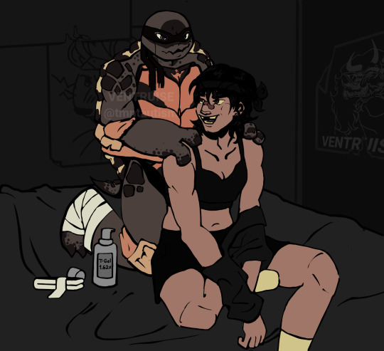
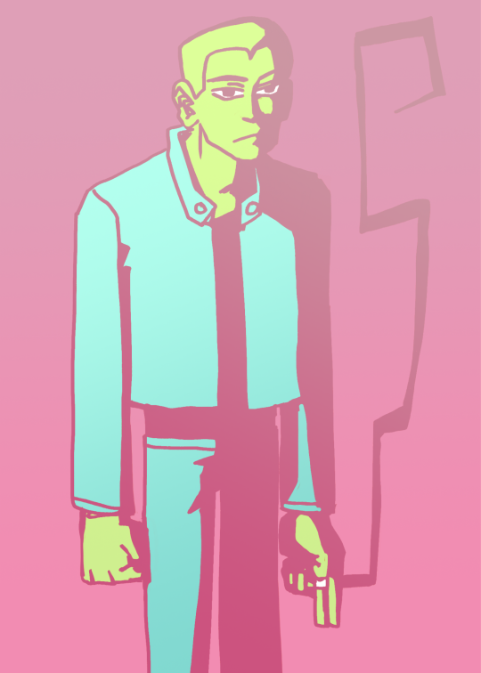
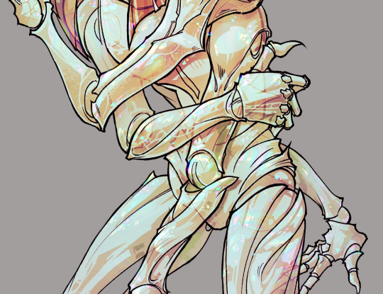
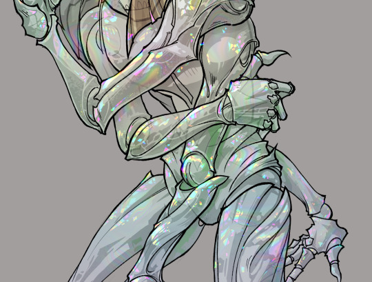
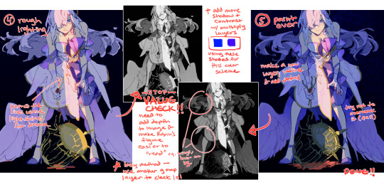
Rafa helping Casey apply his T-Gel 💢 in honor of ME! being two weeks on testosterone as of yesterday ‼️‼️
> ask requests are open :)
#my boyfriend helps me apply my T like this#it's a very special thing to me and an important part of my day#so i wanted to draw my faves doing the same thing ! this drawing means a lot to me <3#this is my raph design; the colors used here are from a gradient map so they arent accurate- but they look cool#my art#casey jones#2012 raph#tmnt 2012#tmnt#2012 casey jones#tmnt fanart
49 notes
·
View notes
Text


Sasakoi anime character designs from the official website! Airs April 13, 2024
#so hard to lay out this post. the important thing is lorelei who have not been shown in color until now!#(well they were shown at animejapan. which i was going to post but i took so long that this showed up lol)#whisper me a love song#whispering you a love song#sasakoi#i'm really happy with what they did for shiho's hair color! i knew the purple-blue gradient wouldn't be doable lol#p.s. first person who sends me a recording* of the live talk at the premiere gets $10 (*conditions apply)
77 notes
·
View notes
Text
for @kiminitodokeu
i decided to make this a post because it would easier to explain. to make text with a gradient color you can go on this site called "text color fader" - link.
you enter your text and then pick any color you want to gradient. then you hit "generate color faded text." once it generates the text, you are going to click select all then just copy the text.
next you are going to go to the this site called "replace text" - link.
you are going to enter the text that you copied into the box. there is going to be two little boxes underneath the big box. you are going to put this symbol -> ; into the "replace this" box. leave the "with this" box empty. then you are going to click replace text. it will remove all the ; in the text.
next you are going to click on the "copy to clipboard" button. it will automatically copy the text.
now all you have to do is go back to your post on tumblr and click on the settings button on the top right corner. you're gonna scroll down to where you see "text editor." change the text to HTML and then just paste your text onto the post, then hit "save as draft" and your text should have a color gradient.
#rambles.𖹭.ᐟ#i hope i explain this well#i'm not that good at explaining things😅#but there are some other posts that explain how to generate text with gradients#all you have to do is search up “how to apply color fade to text on tumblr”#and the first few links should lead you to posts explaining how to do it
9 notes
·
View notes
Text
Finished a lunchbreak draws from Friday
#i was looking at mike mignola art and wanted to try something#finished coloring (applying gradients tbh lol) during a brief roadtrip today and for the first time felt a slightly nauseous xD#aaanyhway#please accept this meager offering#my default guy joseph#joseph from the government#mp100#str8 frm the ol tab
42 notes
·
View notes
Text
on the bright side i’ve figured out how to make auto actions in csp and made one each for a blur/noise filter and chromatic aberration. with the goal of looking like a screenshot of something from cartoon network in the 2000s
it took So Much trial and error to get the chromatic aberration to work well but once i learned that the auto action can only happen to one layer at a time i got it down pat
#it feels a little silly to say but i felt really smart while i was figuring it out#the noise effect was easy. the chromatic aberration wasn’t#auto actions only record making a new layer; changing layer modes; making correction layers; changing a layer’s settings; transforming. etc#you can’t record drawing anything or like making a fill or applying a texture unless it’s perlin noise afaik#normally to do chromatic aberration you make 3 copies of your final drawing; clip pure RGB layers to each. one red. one green. one blue#all of the values at 255 for the given color and 0 for the other 2. set the color layer to multiply. merge each with their drawing#so you have 3 layers of your drawing in R G and B#set the top 2 to screen and then start offsetting them however you like depending on how strong you want the effect to be#bwammm#to get recordable steps for auto action i had to do everything to each color layer at once#copy the drawing. so the action is COPY. new correction layer gradient map; i made 3 gradient maps that were flat R B G#like not actually maps. but that was the easiest way i could think to get a ‘fill’ in an auto action#next clip it and set it to multiply. merge. then i had to offset it w/o being able to see what it’d look like at the end#since auto actions only work on the ‘top’ layer. you can’t hop between layers. you can only work in one direction#so to make sure the aberration looked right i did a test run and counted out the pixels transformed in each direction for each color layer#like when zoomed in 4 times from base R goes up 3 left 1; B down 2 right 4. etc#so id just know how to transform each layer while i was recording the action and id get a reliable aberration with a halo i liked#the auto action doesn’t include merging everything at the end bc that scares me. so i can always just edit the offsets on each color layer#for future uses of the action. but. i like knowing i got a reliable recording of a good offset on each color#i can just make a drawing look like it came from the 2000s in 2 clicks now!#2 clicks!!! i got it!! i’ve tested it on a few drawings and it just works!! two clicks!!!#i’m proud of a lot of parts of this lineup. i might talk about it more on here or insta for funsies#i like breaking down my own art. i think a lot of technical artists do#god there’s a reason my mom thinks i should be an art teacher 😭😭😭#i talk
2 notes
·
View notes
Text
i need to stop looking at my drawing, going "this fucking sucks" and clicking out of the window again
#IT DOESN'T! it's middling at worst but even that isn't true i just hate coloring#... i'm having a little fun with applying gradient maps even though i don't think it's getting me super far progress wise.#rosa talk
3 notes
·
View notes
Text
gonna show u guys a little opalescent highlight hack i threw together today
rainbow gradient above your main figure (i usually have all my main figure folders/layers in one big folder, so i can clip gradient maps + adjustments to it!). liquify tool to push the colors around a bit. STAY WITH ME I KNOW IT LOOKS STUPID RN I'M GOING SOMEWHERE WITH THIS
THEN: set it to add/glow (or the equivalent in ur drawing program), lower the opacity a bit, and apply a layer mask. then u can edit the mask with whatever tools you like to create rainbow highlights!!
in this case i'm mostly using the lasso fill tool to chip out little facets, but i've also done some soft airbrushing to bring in larger rainbow swirls in some areas. it's pretty subtle here, but you can see it better when i remove the gradient map that's above everything, since below i'm working in greyscale:
more granular rambling beneath the cut!
u could also just do this with a brush that has color jitter, but what i like about using layer masks for highlight/shading layers is how simple and reversible it makes everything. i can use whatever brushes i want, and erasing/redoing things is super low stakes, which is great when i often approach this stuff with a super trial-and-error approach.
example: have u ever thrown a gradient w multiple colors over an entire piece, set it to multiply etc, and then tried to erase it away to carve out shadows/highlights? it's super frustrating, bc it looks really good, but if u erase something and then change ur mind later, u basically would have to like. recreate the gradient in the area u want to cover up again. that's how i used to do things before figuring out layer masks!! but masking basically creates a version of this with INFINITE undo bc u can erase/re-place the base layer whenever u want.
anyway, back to rambling about this specific method:
i actually have TWO of these layers on this piece (one with the liquified swirls shown above, and another that's just a normal concentric circle gradient with much broader stripes) so i can vary the highlights easily as needed.
since i've basically hidden the rainbow pattern from myself, the colors in each brushstroke i make will kind of be a surprise, which isn't always great -- but easily fixable! for example, if i carve out a highlight and it turns out the rainbow pattern in that area is way too stripey, i can just switch from editing the mask to editing the main layer and blur that spot a bit.
also, this isn't a full explanation of the overall transparency effect in these screencaps! there's other layer stuff happening below the rainbow highlights, but the short version is i have all this character's body parts in different folders, each with their own lineart and background fill, and then the fill opacity is lowered and there's multiply layers clipped to that -- blah blah it's a whole thing. maybe i'll have a whole rundown on this on patreon later. uhhh i think that's it tho! i hope u get something useful out of this extremely specific thing i did lmao
12K notes
·
View notes
Text
For every type of major collectible seen in 3D Mario games, there has been a different implementation of in-engine coloration in different games.
While regular Power Stars are yellow due to using a yellow texture, Grand Stars in Super Mario Galaxy are black internally, and are colored yellow at runtime. This is implemented this way to allow the "drained" effect seen on the first Grand Star to fade dynamically into its regular coloration.
In Super Mario Odyssey, Power Moons do not actually use differently colored textures, and are white internally while being colored into their various variants at runtime.
In Super Mario Sunshine, Shine Sprites have a white-black gradient texture that is applied at an extremely low intensity to an in-engine yellow color to create a slight gradient that appears like light reflecting off its surface.
Main Blog | Patreon | Twitter | Bluesky | Small Findings | Source: 1, 2, 3
1K notes
·
View notes
Text


before/after some postprocessing!
#on pieces like this i dont really do comprehensible coloring- i just highlight lighter/darker parts and then apply gradient maps/filters#its fun! i love messing around with these things#hovewer it takes a lot of time. like really a lot#because i do many variations and try out different things to see what wokrs best#even if it ends up looking not very much-time-spent-on-it-esque#like this one! there were many variations but i ended up with pretty simple dull/vintage-y coloring#but you know. its about the process. its about exploring and trying out different things
41 notes
·
View notes
Text
I used to teach painting parties, which gives a lot of insight into the artistic skill set of the average, non-artistic person. Let me tell you….most adults struggle to remember which colors make other colors.
I’ll ask “okay, which colors make purple?”
And I’ll get a very long audience pause in response, before someone very cautiously answers.
One of the most frustrating things for a party guest was being able to create, not just the color I instructed them to make initially, but having to make the color again. I’ve seen all manner of professionals furrow their brows, wasting entire plates of paint just trying to replicate a color they were using five minutes ago. (And not succeeding, they sheepishly ask for help)
Mixing paint and knowing how to apply it is a skill. I’ve had guests ask me ‘how are you doing that?’ ‘She makes it look so easy’
I went to school! That’s exactly what I tell them. There are entire units and lesson plans in college just dedicated to critical painting fundamentals. We were made to mix paints into wheels and various gradients. I was taught how to manage different kinds of paints for the desired texture or consistency.
“I could make that!”
My dear, I can paint. I have a degree. I am a professional.
I have no fuckinh idea how he made that canvas that blue,
6K notes
·
View notes
Text
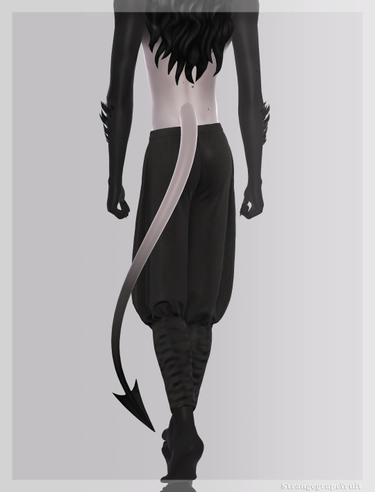
Tiefling Tails
Not a fan of how my previous tiefling tails came out & I never use them, so here we go again.
BGC
Both Frames
4 versions
27 gradients & 1 plain skintone swatch
All LODs
Custom thumbnails
Birthmark (legs)
Separate accessory rings
3 swatches
Ring finger (left)
All the rings can be found within 1 cas item by changing the swatches
You have to apply them manually, they do not come with the tails!


I couldn't get a good screenshot of the difference between v2 & v4, they're the most gameplay friendly though
A few brighter swatches for all your neon demon needs idk I'm tired
The gradients look best on darker/colored skintones
Download (sfs)
Download (mega)
#ts4#s4cc#ts4mm#maxis match#the sims 4#ts4cc#male cc#female cc#alwaysfreecc#ts4 occult#sims 4 custom content#s4 custom content#s4mm#mycc
532 notes
·
View notes
Note
Do you have any tips for painting with gouache? like how do you get it to stay a nice solid color over a large swath of paper? and how do you blend it so seamlessly?
Of course, here's a few pointers off the top of my head:
1. I've used gouache for this in the past so it's possible, but the flat backdrop on my latest WIP is actually acrylic! A nifty thing I've found about putting a layer of acrylic down, is that it creates a barrier once dried and essentially makes the paper waterproof. This means you can work in gouache on top without it mixing with the background, and you can wet a section and completely wipe it clean with a cloth/tissue and it won't disturb the acrylic layer underneath. It also makes the paper more resilient, and you don't get as much pilling/tearing from the moisture
To get an even wash it's mostly getting the right consistency, I add just a little water - enough that the paint is less "tacky" as you drag your brush along paper, but not so much that it's runny or translucent. It takes a couple of attempts sometimes!
2. Also for the current WIP that I posted earlier, like the vast majority of my traditional pieces, keep in mind that it's mixed media. So I assume you're referring to the blue-green gradient on the bird and wondering how I got the gouache to blend like that - it's actually colouring pencils! I'll often switch between dry and wet media, even layer them back and forth, whatever makes the most sense to get the effect I want 😁
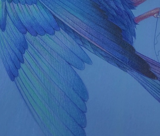
3. On that note, when you're working with paint, or any medium really, I can't recommend enough having a "test" sheet that you do both before and during a traditional piece. It allows you try out different medium combos, see what shade your gouache will dry into, and catch any issues before it ends up on your artwork. I often see artists being encouraged to just Bob Ross their way through a piece, the idea being that you'll just have happy little accidents that you'll naturally work into the piece - maybe, but you'll also possibly irreversibly wreck your hard work and have to start again. I don't know, I'm just a methodical person I guess, but seeing someone just directly apply something to the page when they're not sure what it's going to do makes me wince - no two art supplies are the same! All of those paints and pens have different chemical makeups, there's an unlimited number of ways what you're using could interact, good or bad.
Since it's already there, I usually reuse one of the leftover failsons from the process of making the wash background, then test everything on top of that. That way you can see exactly what shade the paint will dry on top of whatever colour the background is:
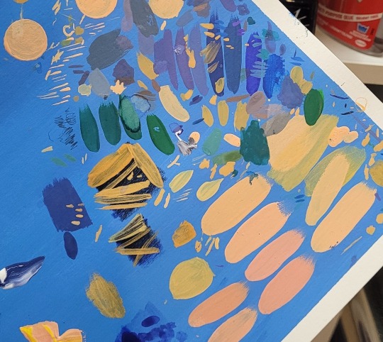
Doesn't need to look good, nobody sees it (usually) and you can also test the thickness of your brushstrokes while you're at it.
Anyway, I hope this helps!
#might have geeked out a little too much about art supplies but hopefully it's helpful :'D#I will be posting a process video of this WIP soon though which I hope will also give people some tips!#art help#art tips#art reference#asks
918 notes
·
View notes
Text
My Favorite Cheap Art Trick: Gradient Maps and Blending Modes
i get questions on occasion regarding my coloring process, so i thought i would do a bit of a write up on my "secret technique." i don't think it really is that much of a secret, but i hope it can be helpful to someone. to that end:

this is one of my favorite tags ive ever gotten on my art. i think of it often. the pieces in question are all monochrome - sort of.

the left version is the final version, the right version is technically the original. in the final version, to me, the blues are pretty stark, while the greens and magentas are less so. there is some color theory thing going on here that i dont have a good cerebral understanding of and i wont pretend otherwise. i think i watched a youtube video on it once but it went in one ear and out the other. i just pick whatever colors look nicest based on whatever vibe im going for.

this one is more subtle, i think. can you tell the difference? there's nothing wrong with 100% greyscale art, but i like the depth that adding just a hint of color can bring.
i'll note that the examples i'll be using in this post all began as purely greyscale, but this is a process i use for just about every piece of art i make, including the full color ones. i'll use the recent mithrun art i made to demonstrate. additionally, i use clip studio paint, but the general concept should be transferable to other art programs.


for fun let's just start with Making The Picture. i've been thinking of making this writeup for a while and had it in mind while drawing this piece. beyond that, i didn't really have much of a plan for this outside of "mithrun looks down and hair goes woosh." i also really like all of the vertical lines in the canary uniform so i wanted to include those too but like. gone a little hog wild. that is the extent of my "concept." i do not remember why i had the thought of integrating a shattered mirror type of theme. i think i wanted to distract a bit from the awkward pose and cover it up some LOL but anyway. this lack of planning or thought will come into play later.
note 1: the textured marker brush i specifically use is the "bordered light marker" from daub. it is one of my favorite brushes in the history of forever and the daub mega brush pack is one of the best purchases ive ever made. highly recommend!!!
note 2: "what do you mean by exclusion and difference?" they are layer blending modes and not important to the overall lesson of this post but for transparency i wanted to say how i got these "effects." anyway!
with the background figured out, this is the point at which i generally merge all of my layers, duplicate said merged layer, and Then i begin experimenting with gradient maps. what are gradient maps?
the basic gist is that gradient maps replace the colors of an image based on their value.

so, with this particular gradient map, black will be replaced with that orangey red tone, white will be replaced with the seafoamy green tone, etc. this particular gradient map i'm using as an example is very bright and saturated, but the colors can be literally anything.

these two sets are the ones i use most. they can be downloaded for free here and here if you have csp. there are many gradient map sets out there. and you can make your own!
you can apply a gradient map directly onto a specific layer in csp by going to edit>tonal correction>gradient map. to apply one indirectly, you can use a correction layer through layer>new correction layer>gradient map. honestly, correction layers are probably the better way to go, because you can adjust your gradient map whenever you want after creating the layer, whereas if you directly apply a gradient map to a layer thats like. it. it's done. if you want to make changes to the applied gradient map, you have to undo it and then reapply it. i don't use correction layers because i am old and stuck in my ways, but it's good to know what your options are.

this is what a correction layer looks like. it sits on top and applies the gradient map to the layers underneath it, so you can also change the layers beneath however and whenever you want. you can adjust the gradient map by double clicking the layer. there are also correction layers for tone curves, brightness/contrast, etc. many such useful things in this program.
let's see how mithrun looks when we apply that first gradient map we looked at.

gadzooks. apologies for eyestrain. we have turned mithrun into a neon hellscape, which might work for some pieces, but not this one. we can fix that by changing the layer blending mode, aka this laundry list of words:

some of them are self explanatory, like darken and lighten, while some of them i genuinely don't understand how they are meant to work and couldn't explain them to you, even if i do use them. i'm sure someone out there has written out an explanation for each and every one of them, but i've learned primarily by clicking on them to see what they do.
for the topic of this post, the blending mode of interest is soft light. so let's take hotline miamithrun and change the layer blending mode to soft light.

here it is at 100% opacity. this is the point at which i'd like to explain why i like using textured brushes so much - it makes it very easy to get subtle color variation when i use this Secret Technique. look at the striation in the upper right background! so tasty. however, to me, these colors are still a bit "much." so let's lower the opacity.

i think thats a lot nicer to look at, personally, but i dont really like these colors together. how about we try some other ones?

i like both of these a lot more. the palettes give the piece different vibes, at which point i have to ask myself: What Are The Vibes, Actually? well, to be honest i didn't really have a great answer because again, i didn't plan this out very much at all. however. i knew in my heart that there was too much color contrast going on and it was detracting from the two other contrasts in here: the light and dark values and the sharp and soft shapes. i wanted mithrun's head to be the main focal point. for a different illustration, colors like this might work great, but this is not that hypothetical illustration, so let's bring the opacity down again.

yippee!! that's getting closer to what my heart wants. for fun, let's see what this looks like if we change the blending mode to color.

i do like how these look but in the end they do not align with my heart. oh well. fun to experiment with though! good to keep in mind for a different piece, maybe! i often change blending modes just to see what happens, and sometimes it works, sometimes it doesn't. i very much cannot stress enough that much of my artistic process is clicking buttons i only sort of understand. for fun.
i ended up choosing the gradient map on the right because i liked that it was close to the actual canary uniform colors (sorta). it's at an even lower opacity though because there was Still too much color for my dear heart.

the actual process for this looks like me setting my merged layer to soft light at around 20% opacity and then clicking every single gradient map in my collection and seeing which one Works. sometimes i will do this multiple times and have multiple soft light and/or color layers combined.
typically at this point i merge everything again and do minor contrast adjustments using tone curves, which is another tool i find very fun to play around with. then for this piece in particular i did some finishing touches and decided that the white border was distracting so i cropped it. and then it's done!!! yay!!!!!
this process is a very simple and "fast" way to add more depth and visual interest to a piece without being overbearing. well, it's fast if you aren't indecisive like me, or if you are better at planning.

let's do another comparison. personally i feel that the hint of color on the left version makes mithrun look just a bit more unwell (this is a positive thing) and it makes the contrast on his arm a lot more pleasing to look at. someone who understands color theory better than i do might have more to say on the specifics, but that's honestly all i got.

just dont look at my layers too hard. ok?
2K notes
·
View notes
Note
hi there!! this is more of an art question but i wanted to know how you go about gradient mapping? and if you find it easier than flat colouring a piece or if you gradient map to colour how you approach that ^^ !!
can't remember if i put together notes on gradient maps before so here's a quick process diagram using a pic from last year! i think gradient maps are super useful for quickly changing the tone of an image or a crutch if you're like me and really struggle with coloring lol
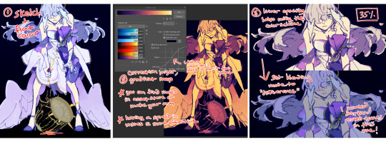
(this is in CSP so you can add a gradient map via correction layer; in procreate iirc you'd have to flatten you image, dupe the layer and then apply the map)
i don't use this method for every draw - sometimes i stop at #3 without changing the blend mode bc i just want the colors to harmonize a bit. or if i'm trying to be more intentional with the color palette i don't bother using a map at all. conversely, you can also create really beautiful effects using maps with more varied tones!!
it's also important to have a variety of values for a gmap to do anything useful, though... i almost always flat color and then map, but i frequently check values the entire time i'm working on a draw, so you could try that ORRRR rough your values in grayscale first before toying with maps
#ASK EVER#if you look through all my xv art its so clear that was the era i relied extremely heavily on gradient maps for just about everything. lol#ever art questions
426 notes
·
View notes
Text
okay i'm back from the movies let's talk about screen and multiply layers

you can read part 1 of this series of tutorial posts where i mostly talk about gradient maps here.
now we're going to talk about the other layer effects. i feel like these ones are already pretty commonly known, but i've also been using them for like 15 years so it's very easy to assume everyone knows everything but actually i'm just old. anyway.
the panel up top is where we're starting from. i've got a nice blue color gradient applied, and everything looks a bit more harmonious. but...... those inks are pretty harsh, especially in contrast to the background, where there's no black inks at all. i'd like everything to come together a little more.
you can do this with a gradient map, if the darkest value is set higher than black. but since we're not using the gradient map at 100% (it's just 30%) the black isn't really affected by it. so it just stays black.
what a screen layer will do--and this is in practice, i don't know what it's actually mathematically doing--is turn your darkest value into whatever color is on the screen layer. so this is what a screen layer set to 100% would do to this panel. (NOTE: all the layers applied in this post are clipped to a folder containing just the characters. they are not affecting the backgrounds, they'll just affect the characters. the gradient map does affect everything)
That's Pretty Blue! the color that neeta's hair currently appears is the color of the layer. everything else is lightened up and also made a little more blue. and this doesn't look terrible, but screen layers will pretty much always make your art a bit lighter, because it's trying to make its color the darkest color. tbh it's great for fog effects and making your blacks light enough that a texture can show up in them. but let's turn it down a bit, to 40%.

hey nice. everything is still a bit lighter, but neeta and emery's hair isn't as sharp against the background. still enough that they stand out as the most important things in the panel, but not so much that they feel pasted overtop. it's a bit like putting some atmospheric perspective between you, the reader, and the characters. there's air in the image. (and why it's good for fog!)
but i want it just a little darker to make up for the lightening up that happened. i don't think i actually need to explain multiply layers, because everyone has definitely used those for shading at one point or another. but here i'm using a very very light blue over the entire characters. i'm not using it for shadows, but to make everything a bit blue.
now it really feels like they're in a room. the only pure white is the speech bubble and gutters. their eyes/teeth/glasses will still read as white, but they are not white. everything is at least a Little blue, so everything is unified.
and that panel above is what the final looks like! let's look at it side by side with just the gradient map.

neat! it would be perfectly acceptable to stop with just the gradient map, if you value high contrast black inks and characters popping off the page. i... don't! i like the air that's generated by going a little bit lighter overall. it has a nice matte effect, which is why i'm very glad my book was printed on matte paper.
and that's why hunger's bite looks so good. you should buy it and read it
342 notes
·
View notes
Text
tutorial — changing the background color in a gif
sofia & remy asked for this tutorial so here it is :)
note: i pay for photoshop and currently own the most recently released version of april 2025 - some things might be different if you're working on earlier versions of photoshop
i've made several gifsets (x, x, x, x) where i've isolated the gif subject so i can change the background into a bright, colorful background or into b&w backgrounds - in this tutorial i'll explain how i do that :)
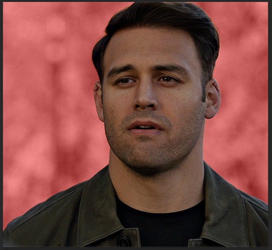
in this tutorial we'll be going from this:
to this:

putting the tutorial under a read more!
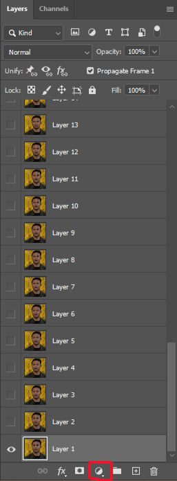
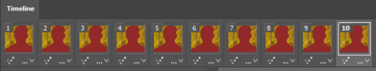
step 1 — open your gif
i usually tend to make my gif beforehand, fully colored and sharpened and everything else, and save it before reopening it (as a gif) in photoshop cause i find it's the easiest way!
you'll have to work in frames mode when isolating the background color (because as said, you'll have to do this frame by frame) and it's important to always have the same frame and layer selected, otherwise you might run into some issues

for the purpose of this tutorial my premade gif (eddie<333) has not been colored, only sharpened
step 2 — selecting your subject
next up we're going to select our subject by going to the select category up top and clicking subject

↓ you'll now have a marching ants line around your subject ↓

sometimes photoshop will be silly and select either too much or too little, and you'll have to manually make sure (for every frame) that your subject is correctly selected - but i'll get back to that later!
step 3 — adding a solid color (/gradient color) layer mask
once you have your subject selected the way you want it, we're going to add a solid color (or gradient color) layer mask by clicking this half filled circle icon in your layers tab - from here on out you can choose whether you want to add a solid color or gradient (for this tutorial - we'll go with a solid color)


photoshop will ask you to pick a color (or gradient) so just go ahead and pick whatever color you wish to make your background! the lighter your color the brighter your background, and the darker your color the duller your background (for b&w backgrounds you can use black or white, it makes no difference) - once you're happy with your color, just press ok :)
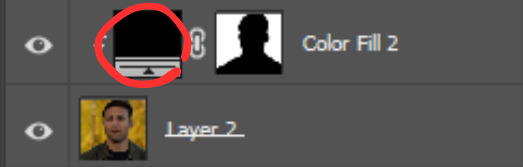
step 4 — create a clipping mask
this might seem like nothing, but is actually an important step in the process! you want to make sure that the color fill layer you just created is clipped to the corresponding frame like so:


you can do this by pressing cmd/ctrl + alt + g or clicking right on your color fill layer and selecting create clipping mask

by clipping your color fill layer to the corresponding gif layer, you avoid this happening:
the color fill layer for the last gif layer has been applied on all gif layers before that, which will make it so that your subject will move in and out of the colored background and makes your gif look silly ↓

obviously this is what we want to avoid so clipping your color fill layer to your gif layer is an essential step!
step 5 — invert the layer mask of your color fill layer
next up we're going to select the layer mask and invert it by pressing cmmd/ctrl + i


this way we go from this

to this

step 6 — changing the blend mode of your color fill layer
the final step (!) is changing the blend mode of your color fill layer - i tend to just use the blend mode color on most of these as this mode tends to give the brightest results but you can definitely mess around and see what you prefer :)

(for this set i actually put the blend mode to soft light to create a duller background, for a gradient background just follow the exact same process but in step 3 choose gradient instead of solid color)
and you're done! now you only have to repeat this process for every. single. gif. frame. :)
and that's all there is to it really, so happy creating <3 see more tips/comments below and if you have questions, my askbox is always open!
tips / comments
1.- record this entire process into an action (tutorial on how to create actions) – this way you'll only have to select the correct frame/layer combo before pressing play and letting photoshop do the work for you! i made two general actions;
bw with subject select: use this action when photoshop can select your subject without issues!
bw without subject select: use this action when you need to manually edit the selection of your subject! (see 2.-)
feel free to download and use these actions! they will turn your background b&w - you can change the background color by clicking this square;
sofia @sadgayeddie made an action to select next frame + layer so you don't have to move your cursor around as often and graciously allowed me to share it <3 you can find it here
2.- (circling back to step 2) make sure photoshop correctly selects your subject – when using the select subject feature, photoshop may fuck up the selection of your subject, as such ↓

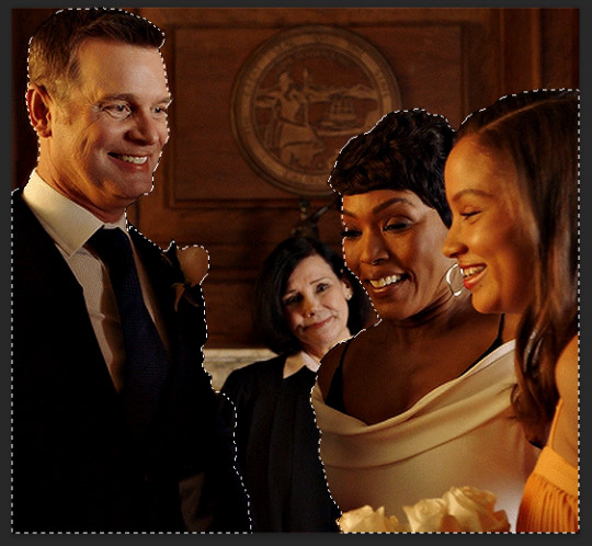
i don't want the lady in the background included in my subject - you'll have to use the quick selection tool to manually unselect whatever you don't want in your subject and/or manually select what you do want in your subject
from personal experience i know photoshop tends to fuck up with;
hair (especially when it moves around a lot)
blurry subject (eg eddie dancing in 8x06
one or more colors in your subject being too close to the background color(s) (such as bobby's suit in this example)
hands (the smaller the hands, the more photoshop makes a mess)
this is what the subject looks like without the lady in the back selected:
it's a bit more work if you have to edit the subject selection for every frame (and you might make small mistakes), but it's worth it! we want the gif looking like this in the end (sneak peek for my bobby set!!)

#resources#tutorial#itsphotoshop#usergif#i say tutorial but it's just me rambling sjkfhskdf#i hope this makes at least a little sense :') otherwise i'm always ready to answer questions!
228 notes
·
View notes