#but there are some other posts that explain how to generate text with gradients
Explore tagged Tumblr posts
Visit Tumblr Blog
Explore Tumblr blogs with no restrictions, modern design and the best experience.
Last Seen Tumblr Blogs


Fun Fact
12.7% of mobile users access Tumblr.
Text
for @kiminitodokeu
i decided to make this a post because it would easier to explain. to make text with a gradient color you can go on this site called "text color fader" - link.
you enter your text and then pick any color you want to gradient. then you hit "generate color faded text." once it generates the text, you are going to click select all then just copy the text.
next you are going to go to the this site called "replace text" - link.
you are going to enter the text that you copied into the box. there is going to be two little boxes underneath the big box. you are going to put this symbol -> ; into the "replace this" box. leave the "with this" box empty. then you are going to click replace text. it will remove all the ; in the text.
next you are going to click on the "copy to clipboard" button. it will automatically copy the text.
now all you have to do is go back to your post on tumblr and click on the settings button on the top right corner. you're gonna scroll down to where you see "text editor." change the text to HTML and then just paste your text onto the post, then hit "save as draft" and your text should have a color gradient.
#rambles.𖹭.ᐟ#i hope i explain this well#i'm not that good at explaining things😅#but there are some other posts that explain how to generate text with gradients#all you have to do is search up “how to apply color fade to text on tumblr”#and the first few links should lead you to posts explaining how to do it
9 notes
·
View notes
Text
Image Descriptions and Accessibility in General on Tumblr for New Users
What are Image Descriptions
Image Descriptions are text following a picture explaining what’s in that picture. They are primarily for blind/visually impaired people with screen readers and visually impaired people who can read text but have issues with pictures.
They also help people who have trouble:
focusing on/understanding a picture
reading text on images (ex low contrast, weird fonts, etc)
getting images to load
Without image descriptions posts are not accessible to many people, so if you can it's best to include a description or alt text every time you post an image.
Alt text vs image descriptions
Image descriptions are written in the body of the post itself, and have some kind of text before and after, to explain that what's coming up. They typically begin short and concise, but can expand to more detail.
Alt text is added to the image itself, and is what is read by screen-readers (which will otherwise just say "image"). There is no need to add any explanation before the description so you can just say "a description of the image". Alt text can only be added by the original poster, by clicking on the three dots in the bottom right corner of the image and clicking 'update image description.' It is typically short and concise.
On tumblr, alt text is currently available on web by clicking on the alt button (or via new xkit - accesskit - move alt text to captions below image). On mobile, alt text is available in some versions of the app through clicking on the alt text button. Image descriptions are visible on all posts, although if you put them under a read-more, that makes them less accessible. (Thanks to @911described for helping with this section)
How to Make Image Descriptions
Awhile ago I made this general guide. I learned from examples, so here are descriptions made by a bunch of different people. I've also made templates for a lot of common images you'll see on Tumblr.
Other Concerns
Gradient or all caps text make most screen readers read out the word one letter at a time. In addition, these plus text that is bold/italicized/underlined, in colors other than black, or in weird/fancy fonts are difficult for many people to read.
How Filtering Works
You can filter out both words/phrases and tags in the filtering section under the general section in the settings. When filtering out words from a post, it will look at both the text of the post/reblog chain and at the url of op and the rebloggers. When filtering out tags it will look at the tags of the specific post on your dash, and at the tags of the original post.
Tagging for Common Triggers
Don't sensor trigger warnings (for example don't tag suic!de) because then people who have them filtered will still see it.
Tagging for Flashing Lights
If you post a gif or video in a post that flashes, you should tag it with something like "flashing lights" and Not "tw epilepsy" because if any of the tags in the original post contains the world epilepsy it will show up in the epilepsy tag, which is dangerous. Check out this post from @photosensitive-despair for more info about tagging photosensitive content.
Tagging for Unreality vs Misinfo
Things that could trigger delusions/psychotic episodes/etc should be tagged with unreality. This includes:
content that has existential themes related to reality/things not existing (example: a philosophy such as solipsism, do not look up the term if unreality stuff is triggering for you)
extremely surreal content(example: sometimes content such as weirdcore/dreamcore aesthetics can fall under this umbrella but again this is very subjective)
content that reinforces or encourages common delusions(example: that one "im living in your walls" meme)
Things like rp blogs and fake/edited tweets should not be tagged with unreality, unless they contain triggering content. Consider tags like "fiction" or "misinfo." See this post for more info.
Edit:
Addition from @mindflamer
You can look through the reblogs of a post to see if someone's already written a description. There is a button to see just comments vs. comments + tags which makes it easier. Scroll through looking for brackets [], ID, or Image Description. This is great to do if you can't write your own IDs for whatever reason, so that you can at least spread the version of the post that's described if there is one.
If you're not able to write IDs consistently, some is better than none. Don't let the perfect be the enemy of the good. You can use the tag #undescribed to make it easy for those who need them to filter out those posts. Similarly, if you primarily tag triggers but can't for certain posts, you can use a separate tag on that to be filtered such as #untagged.
Please, if I forgot something, sound off in the notes and I'll update this post with it
414 notes
·
View notes
Note
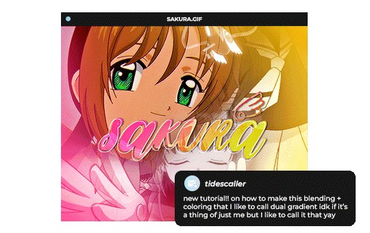
Hello, this gifset for pscentral event 37 is really pretty ✨
https://www.tumblr.com/tidescaller/779330612766081024/pscentral-event-37-trios-the-girl-the-boy-and?source=share
would you please consider posting a tutorial on how you made the blending multi gifs and colouring in the first gif?
Hi anon, so glad you liked it! I'll try my best to explain as detailed as I can. Just a small note that I'm not an expert, I'm still pretty new to blending edits in general so I'm learning as well as everyone ૮(˶˃ᆺ˂˶)
But before that real quick, and if my tutorial isn't enough, I'll leave you a list of amazing tutorials/guides that help me a lot when it comes to everything gifmaking related, so shoutout to them!
basic blending tutorial
coloring tutorial
blend gifs tips
blending, coloring and text effects guide (video)
another one similar to the previous one
gradient text
text outline
HOW TO: Blend multi - gifs / Dual Gradient coloring
You will need any version of Photoshop (I use CC 2019) and basic knowledge on making gifs.
STEP 1: THE BASE
1.1 - Make sure your canvas is 540px width. Mine is 540x450. Choosing which gifs to blend is kinda tricky and no one can tell you what's perfect. Everything depends of the scenary your show, movie, anime whatever you're working on has; but a tip is to use scenes that have dark areas, since it's easier to blend then. 1.2 - Make your individual gifs: crop, color, sharpen, all that, and make sure all of them are the same amount of frames. 1.3 - Before duplicating your gifs into your empty canvas, convert them all into smart objetcs. This will help to simplify stuff, have a much more organized work space and help you load your preview faster.

STEP 2: BRING YOUR GIFS
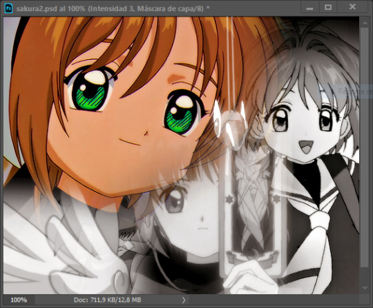
Now all you have to do is right click on every gif you made, go Duplicate layer… and sent it on your empty document. I would suggest doing one by one, so you can work better. Duplicating them all at once can be a little bit intimidating and might have you confuse how to combine your gifs. Try imagining what you want your gif to look like and where you want each element to be. As an example, I wanted the key scene when it kinda drops to be falling from the top of my gif and also as a separation of the one in color and the one Sakura is roller-skating.
STEP 3: BLENDING
3.1 - Okay, now that you more or less know what you want your gif to look like you can start by changing the blend mode of your gifs. Photoshop has mutiple options on this and it applies to all types of layers. For blending, one of the two (or more) gifs you are working is going to be on top, that's the one you're gonna have to change its blend mode in order to start this process. Generally, Screen is the one to go to.
3.2 - Some people group (selecting your layers > ctrl/cmd+g or right click > group) all the gifs so they can then change the group's blend mode into Screen but I personally like to do separately cause if I need a gif to fill some of the background I would keep it as Normal.
STEP 4: LAYER MASK
The key gif works perfect with Screen blend as it has a black background, but of course this won't be the case for most gifs you want to put in the main one. For those unwanted pixels we don't need, we use a Layer Mask. 4.1 - In order to do that, select your gif by clicking on them and next click on the layer mask button.
4.2 - Now you'll see a white square next to your gif layer. This will help by reducing the opacity of those things we don't need of your gif. What is white is 100% opacity and what is black 0%. So all you have to do is click on the layer mask, pick the brush tool and paint over what you want to "delete". Pay attention to use a soft brush, and the size of it should be around 200 and 300px. 4.3 - Repeat the process with all the gifs that need it
STEP 5: EXTRA LAYER
Sometimes a gif will look too bright/transparent/softened over the other ones. In order to fix this, you can create a new layer (the button right next to the trash can)
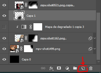
and paint with a black soft brush over the part you need to bring back. I don't know exactly how to explain it properly but I'll try with these before and after images. I'm adjusting the one with Sakura and her card:
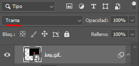
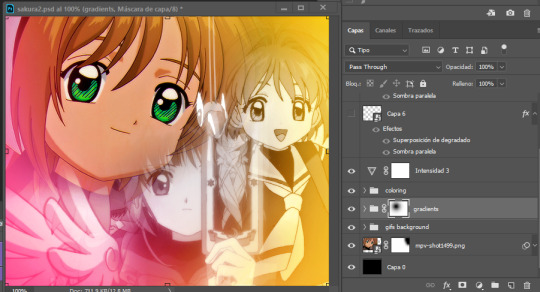
STEP 6: COLORING
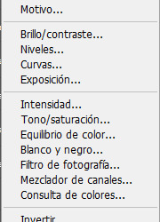
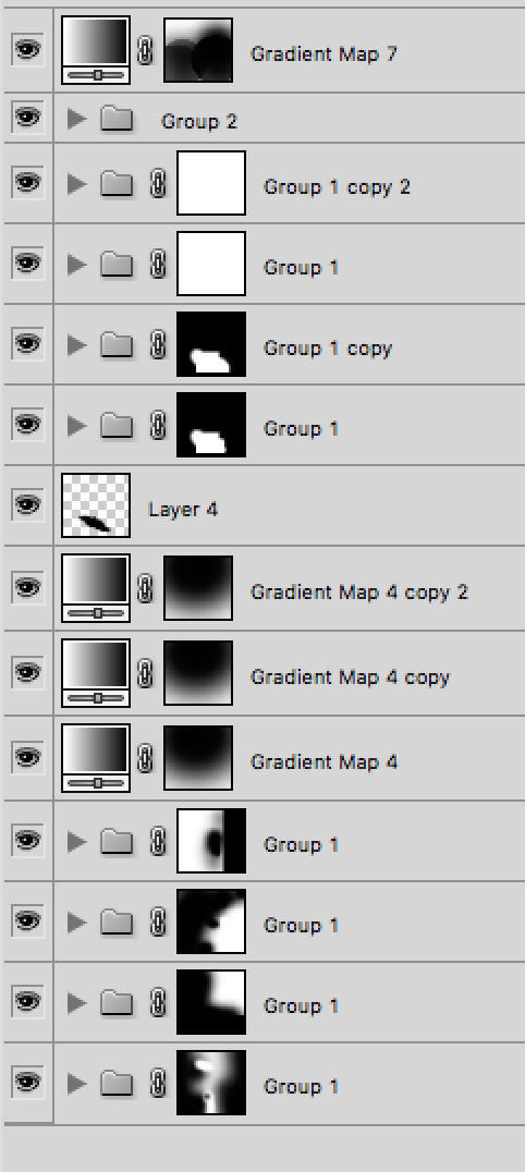
6.1 - OKAY, now that we have all that sort out and the gif has a proper structure is time to add some color. As I'm going to do a dual gradient after and leave only one of these 5 gifs with color, I'll use a black and white gradient map and add it to every individual one as a clipping mask (right click on the gradient map > create a clipping mask). Like this:
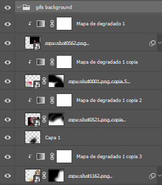
6.2 - Now that we have this I can add my own psd. I started making my own psds for every edit I make and I'm not ready in any way to explain that, but I learn how to do this with this tutorial. With that, my gif now look like this:
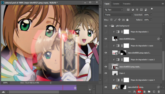
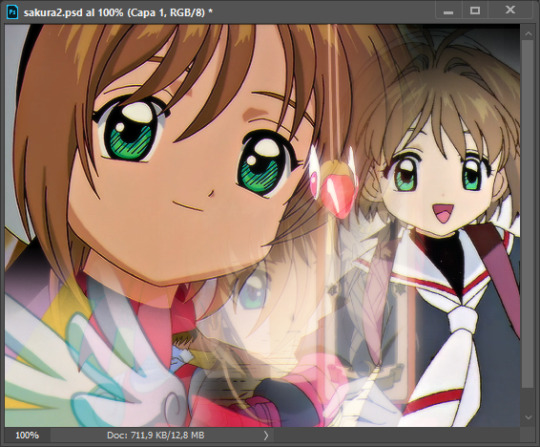
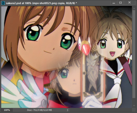
STEP 7: DUAL GRADIENT
Finally for this part I recommend making another group (the folder button next to new layer) and add a new layer for the different colors you add. This is all about painting and playing with the blending modes for these layers. There's no right way to do this, you just have to play around and see what works best for you and the scenes you have. You will end up with something like this:
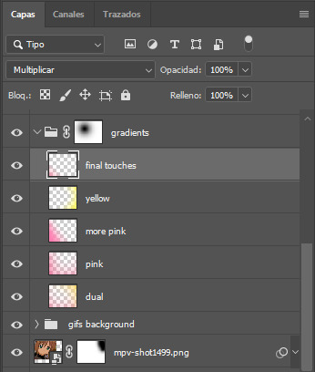
Tips for this step are: 7.1 - Use a soft brush, size it up to 1000px, zoom your gif out and start painting out of the canvas. This will help create that gradient effect we are looking for. 7.2 - Change the layer's opacity/blend mode. This is (again) about playing around with colors. I changed these settings for all my layers that are part of the gradients' group. In order: dual is Screen + 90% opacity, pink Vivid Light + 70%, more pink Lighten + 90%, yellow Hard Light + 70% and final touches Multiply at 100%. I also mixed up the colors, not only staying with certain yellow or pink. 7.3 - The gradient tool works the same way as the brush tool! Just make sure the gradient is any color you're working with + transparent. 7.4 - I also added a layer mask to my gradient's group to erase some of the extra color in Sakura's face. All this will result on this:
And that's pretty much it! For the text part, I was going to add it but the tutorials I linked at the beginning explain it perfectly so shoutout to them. As always, if you have any other doubt, send me an ask and I will answer it as fast as I can! Always happy to help ⸜(。˃ ᵕ ˂ )⸝♡
#answered#anonymous#*tutorial#photoshop help#gif tutorial#blending tutorial#photoshop tutorial#coloring tutorial
23 notes
·
View notes
Text
SHADEDPAW REF

hi again shadedpaw :333
this took a while to finish ONLY BECAUSE i made meadowantler's design on the spot and spent like a hour on him trying to get the markings + color right... THEN I HAD TO USE A GRADIENT MAP TO FIX THE COLORS ANYWAY!!! AFTER I ALREADY COMBINED ALL OF THE LAYYERRRS!!! but whatever... its done now...
LORE/EXPLANATION BELOW!
warning: yapping. a whole lot.
i found out about this feature yesterday and im SORRY to everyone who was subjected to my walls of yap ;____: but also i dont care but i also do care... ive already edited past post to fix this so we good
warning: more yapping... the most yapping i've ever done
~
"Originally found in Shardclan's territory by Willowmoth during her Assessment, Shadedkit was brought back to Tuskclan and was adopted by the medicine cat and his mate."
Before I explain anything in this text, I'll share some important information to keep in mind;
These clans aren't "Dawn of the Clans" new but they aren't as refined as the ones in the current day books either. The story of the original founding of these clans is still being told to young kits with a good amount of accuracy!
The Warrior Code (also may be referred as "the code of the stars") is still very much a thing here but with a handful of changes... notably
Medicine cats ARE allowed to have mates and kits.
Cats are not restricted to one clan.
A cat can move into a different clan, explore another clan's territory, visit another clan's camp, be mates with a cat from some other clan...
BUT! a cat still cannot hunt in another clan's territory and they cannot leave their own clan's territory at night (more-so for safety reasons than anything else... not a strict clan code rule!)
"Why was Willowmoth in Shardclan doing her assessment if she's from Tuskclan? Is that normal here??" NO!!!!!!!!!! 💥💥💥💥💥
The clans can have their own specific customs as along as they don't break the Warrior Code!
One of Tuskclan's customs is that the *deputy* needs to complete an assessment before actually getting their role. In that assessment, they need to go to the Moontree and come back in a few days time.
The Moontree is located in Shardclan's territory!
Shadedpaw specifically... since this is his ref and all...
I don't wanna say TOO much cause he is a important character to the plot/story... so here's some general statements!
Shadedpaw is conceited but also airheaded, preferring to go about things as they come to him rather than prepare and stress. His pride comes entirely from being a medicine cat and his ability to speak directly with his ancestors... but... Starclan doesn't come to his dreams. Even when he visits the Moontree.
He only meets silence.
Any cat can learn how to find and utilize herbs... Just as any cat can learn how to fight and hunt. That connection with Starclan made medicine cats important!
Why was he the outlier?
~
thxxx for reading! here's a bonus art:
hiii dappledpawwww... awww look at herrrrr.... she's making theories about starclaaannn..... awwww.... lil dappledpaaww... i hope there is no horrors related to the clans overall leniency towards conflict within their control behind that door <3333
#melponko wc lore#< organization tag#<< will probably change the name in the future#artists on tumblr#digital art#artwork#original art#my art#warrior cats oc#warriors oc#wc oc#wc oc ref#wc art#wc oc lore#warrior cats#oc lore#only a little bit#oc reference#oc ref#my oc#sfw furry#cat furry
9 notes
·
View notes
Note
hi sel! i was wondering if you had any tips or tricks or advice for making fic banners and dividers? yours are always so cohesive! ❤️🧡💛💚💙💜
hi nonie! omg i'm so flattered you asked me this 🥺 i’m happy you like them!! admittedly, i am a bit particular about the aesthetics of my fics, but don't really expect anyone to notice 😭
i am by no means a designer! but i'll share a few of the things that have worked for me 🥺 under the cut will be what i do for sizing, editing, and inspo!
SIZING (w x h dimensions, 300 dpi)
› banners: 1280 x 320 for my thicker banners. 1280 x 249 for my thinner ones. i've been preferring the thicker ones lately just because i prefer how it looks on the post compared to my thinner ones (more balanced and stuff!)
› dividers: 1280 x any size you want or 500 x 5. i have both jpg (thinner) and png (thicker) versions for my dividers, mainly because my jpg ones stopped working after a while* 😭 i use the png ones more now because the actual image itself is also bigger in height; there are transparent spaces above the bar itself that allow more control over the space your divider will have between text (please let me know if this is confusing! i'm not sure if i'm explaining it well).
*tumblr can be really selective with the media it allows on the feed and tags, and for some reason, some dividers have been causing that problem 😭 i still haven't figured out what characteristics/factors exactly cause it, but i suspect it might be a combination of size + colours. i usually have to do test posts to make sure it appears!
i'm attaching some screenshots below for reference!


EDITING
› software: photoshop, figma. though i know there are others you can use (e.g., photopea, canva, picsart, etc.)! i just use these because i'm more accustomed to them 🥹
› process:
find a manga panel i like and clean it up (background removers can usually do the trick)
find colours i like and use it as the base for the background
*if using photoshop/figma/photopea: set the manga panel layer as 'multiply'
add the text
*for dividers: i usually just grab from the background of the banner (either i crop a portion of it or colour a long, thin rectangle the same colour)
attaching what my editing board looks like on figma! (i could be more organised but i usually do these things in such a rush i could never be bothered 😭)


› things i consider
for general fic banners: i like to keep a consistent format, which is: character panel + name + identifiable colour because they're the details that i'd like to inform people of first when they stumble upon my post! (some people will put fic titles too, which i don't do bc i can't be bothered to mess with the spacing 😭)
*keeping a consistent format also makes it easier to duplicate elements of your banners into other banners you'll be making! ex. if i'm writing 2 different gojo fics and decide to change what manga panel to use, at least i can always duplicate certain elements (i.e., name text) and find colours along a similar saturation/hue! it makes things a lot quicker and easier.
for event fic banners: i usually pattern it after the event banner itself! so for example, the fics under my 'how to be your loverboy' collab share similar elements (i.e., the wavy edge) to the main event banner. sometimes i use the same colours too (i.e., in's and out's event).
*on dividers not showing up on the dash: i notice it a lot more with light-coloured banners (some neutrals) and super thin ones. to find a way around this, i either change the colour and/or the size OR i'll find a photo that shares the colours i want and crop it to the size that i want (for some reason, it works this way 😭)
INSPO
i usually browse through pinterest for inspo on digital design stuff! i learned a bit of UX/UI so there's also a part of me that's influenced by its trends.
lately, i've been really into gradients! because it's a fun and easy way to make things look clean but not boring, and i think it can evoke the ~vibe of the fic based off the colours you end up choosing!
when i can't think of anything and want to come up with the banner quickly, i'll usually choose a photo/aesthetic i associate with the fic and blur the image until all you see are kind of blobs of colours. they're similar to gradients but have more shapes and require less of your brain power 😭 (i.e., by your passenger seat, and there's something...)
... and that's it!
sorry for this really lengthy post, i hope it's helpful nonie 🥹 let me know if you have any other questions/if anything is unclear!
#sorry it took me a while to answer!! i was gathering what to say 🥹#i hope this was helpful!#ask#rep#anon#reference
8 notes
·
View notes
Note
Fun lil' Anon here!! I have an actual question and a nice message!
Message: I love ur art its amazing and its so cool and cute and fun :3
Question: Can you do a step-by-step thingy of drawing a full body plus the side face you did with your Links Meet AU Art (If yk the pieces im referring to...) Im trying to get better at art and I love your style so I wanna try it out!!
If you're ok with all that I would love that, so thanks a lot!!
- Link to the Random (Aka Legends Legacy AU)
Hello hello!! First off, thank you so much!! <33 again, it always mean so much to me that people enjoy my work and my silly little ideas :'']
I can certainly try!! I've been asked to do similar stuff in the past and I'll admit, I'm not much of a teacher because I have a hard time explaining the thought processes in my head, but I will do my best!
Under the cut I will include the timelapse of the sketch and lineart I did in procreate, and then I'll have images going step by step and explaining what I did in each section! (Note: I don't have any color timelapse stuff due to forgetting to record stuff in Clip Studio Paint, that's my bad whoops).
additional note: I actually have sketch + lineart timelapses of all the designs i did, i can potentially post those if anyone is interested in seeing me dick around for 5 minutes as i try to figure out what I'm doing
First off, the timelapse! And I'm using Twilight here as my example because he's just personally my favorite.
It goes pretty quickly, so my apologies if anything is lost there. Thankfully, I save almost all of my works as multi-layered files too so I can go back and edit stuff if need be.
The first two here are the sketches I landed on and liked the most. The first one is much looser and lacking definition, so I went over it in another layer to get more of an idea of what I wanted to do + started to design him more. But you'll see me start to change stuff even in the lineart itself.
The first image here is the lineart as I finished it in procreate, lacking all the text and ideas for now. And the second image is the first pass I took at deciding his colors. I just eyeballed these from his canon design and the LinkedUniverse design because those were two obvious sources of inspiration.


HERE'S THE FUN PART; so I'm very indecisive whenever I color stuff so I'll take forever to find what I'm looking for / what fits the not so clear vision in my head the most. (i have a form of aphantasia, hard to keep images in my head for long)
What i like to do is copy my layers and then edit them with gradient maps, overlays, mess with the saturation, brightness, etc. It's a bit of digital hoarding but comparing the edits I've made to the first version is always nice and helps me keep my options open if need be, I also like to share my progress with friends for opinions so its good for that too. If you have anyone willing to, sharing multiple options and getting as many opinions as you can I think is a good practice! Thankfully some of my friends are big into design as well so it's fun to bounce ideas between each other.


Here are the final four. In the first image here I think I just edited the lines and added some color into some of them so they were all stark black. The next I added in some details on top of everything sorta-rendering style. Completely overhauled some bits in the third and fixed the profile head's proportions as best as I could, and the last one is simply the greyscale version of everything.
While deciding colors I keep a completely white layer on top of everything and set to the blend mode "color", and i switch this on and off just to check how the values are comparing to each other and if anything needs changed. looking at this now, i realize the belt across his chest and the tunic color are very similar, but thankfully the hues are so different that I think they don't blend all that much.
But generally this is how my process breaks down: sketch, second sketch (optional), lineart, color, color adjustment, merging it all together, final rendering adjustments, final product. my newer works have started to lean into this post lineart and color rendering thing more, I used to be really particular about making sure everything had a layer and was organized. nowadays, i just merge shit and start drawing on top of it (maybe i'm getting old, maybe i'm 23, who knows)
but yeah thats pretty much it! if you have any further questions and what not, feel free to ask! i'm a certified yapper myself so I don't mind typing out long shit like this.
4 notes
·
View notes
Note
Hi nobuu!
I was wondering if you knew how to change a word to be another colour other than the ones picked by tumblr already? Like when some people hyperlink things within their posts, some change the colour of the words to be something other than the original 7 colours that are avaliable? Pls tell me if you know how to! 🙏
hi anooonnn!!!
i hope you mean gradient or just different colored texts in general cuz thats the only help i can provide😔 this youtube video actually helped me lots before!!! i think i used the gradient text once on my first dan heng theme??? but ye, this video does a good job of explaining it! tho it is only do-able when youre on a laptop or a computer
youtube
8 notes
·
View notes
Text
Week 4 Blog Post
Who are you to interpret nature through art? How do you interpret “the gift of beauty”? (Your readings – specifically Chapter 5 of the textbook – will be helpful for this!)
As a nature interpreter, interpreting art is just as much part of the job as interpreting a scientific paper to a general audience - there are going to be people who can understand certain topics intuitively while others cannot. Being able to bridge this gap in knowledge as it relates to the environment is one of the key aspects in being a nature interpreter. While interpreting art may not involve explaining mechanisms of how the environment operates, (although it may still make a great gateway for that!) there is still plenty to gain from looking at art through a critical lens.
Art can inspire others to care about nature in a way not many other things can. Everyone here for classes in Guelph should be able to relate to the feeling of seeing the beautiful gradients of crimson to green in the leaves these past few weeks. Being surrounded by something that beautiful is a powerful feeling, what art does is allow others who might not be able to directly experience this sensation to instead get a second hand feeling of it through a painting or photographs. People are often swept away by the beauty of art and when art is related to nature it is a prime time to help those looking at it to take a deeper dive. Even explaining something relatively simple like why leaves change colours in the fall can open up someone unfamiliar with nature to just how complex, deep and important it can be.
The “gift of beauty” as mentioned in the readings this week describes it as the ability to instill that sense of wonder and curiosity that I mentioned earlier. I would interpret in nearly the exact same way as the text just with a slight change. Interpretation should get people interested in the topic which you’re interpreting, that much should be uncontentious. What really gets me is when you could take a painting, have someone be interested and taken by its beauty and then take it further and connect it to ideas that may not be visible in the image. For example, in the painting “1929 Wabajisik Drowned Lake” by Franklin Carmichael we get a scene of a lake with many trees half submerged in water but still standing. One simple question could lead to a multitude of different discussions about how these trees make for important habitats for everything from fish swimming below to insects living within to birds perching atop. Or maybe questions of how these trees even manage to stand after years of being submerged would arise, and that’s not even touching on the topic of anything else like the beautiful rolling hills in the background or the astonishingly fluffy clouds that take up the upper portion of the frame.
Art is just as important for us as interpreters as anything else, it’s another gateway to get others to care about the things we as environmental minded people already hold dear. For some a scientific paper simplified down may draw them in while others will take to art for inspiration instead.

“1929 Wabajisik Drowned Lake” by Franklin Carmichael
0 notes
Note
this feels like a very foolish question, but i've been looking for days and i can't seem to find any other way, so i was hoping you could help me out! for gifs like post/676190237446291456, how do you edit out the background of the original gifs? or do you blend them?
hello! don't worry, no question is foolish anon. to be honest with you anon, this gifset took me like 10 hours a day for 5 days to make so like. i used so many different methods for so many different effects that my brain is fried. there are a lot of people who rotoscope but i didn't do that here. looking at some of them, imma tell you what kind of techniques i used. mind you, this gifset is a beast so if i tried to explain what i did here, it would take me a week in itself so imma tell you some tips.

for this i tried to find light scenes. the lighter the background of a scene, the easier to create a silhouette of the character. so this scene of arthur getting crowned has a white background and with a gradient map, black selective color and heavy levels it became a silhouette. the gif on top, i used this levels adjustment
above my normal coloring, to make the contrast as popping as i could.

i assume this is the one you were asking about? this gif took me 5 hours in itself, like truly anon i went on a journey. these two scenes i used have mostly black backgrounds, so with coloring, a solid black background underneath, blending and some solid color at tiny parts the background was popping out, i did it.

this one was easy enough, that arthur scene is very basic to use for these kinds of gifsets. light background, back shot, easy to do work with gradient maps. i don't usually use exposure, but i used it for this one to tone down his head more. also i used white solid color set to soft light on his left so the text would be more visible so i wanted the gif to look more contrasted.


my dear anon, this is what the layers of this one look like. i'm scared to even look 😂 from what i remember for the boat, i again used big levels layers, solid black color layers set to soft light and normal for corners and basically painted it. you see that it doesn't move a lot so it was possible. oh i also deleted a lot of parts around it, zoomed in a lot to find missing spots, this one was work. its blending mode was screen.
this one was tricky because i had to add the whole gif with 3 gifs inside the colin one. that scene is from the living and the dead and it had a light background. so a mix of gradient maps and levels again. black selective color didn't work well here because it was fucking up the background of the gif, but black selective color in general is very tricky. it can ruin a gif a lot so only use it when it's an emergency.
and that's about it, i didn't show you all the gifs because a. tumblr in asks only lets 10 photos and b. i used the same techniques i talked about already. i hope it was helpful! if you would like help with anything else, my askbox is always open <3
35 notes
·
View notes
Text
Okay, so, this post is a bit more serious than what I usually post, but.
If you can, please at least try to edit images on a PC.
I’m not posting this because of any of our followers, but more of a personal opinion that I think would help a lot of people.
Also the keyphrase: if you can. There’s a lot of factors that can make image-editing impossible for you - lack of a PC, dangers from family-side, your PC being too weak to handle editing comfortably - I get it. I didn’t have an access to a PC for a year at some point in my teens. A lot of things can prevent you from that.
That being said:
You see, there are certain limitations that a mobile app or a webpage have. Sure, basic-level edits *will* be easier - there are tons of easy filters, nice gradients, sometimes you can even get the needed character artwork directly in the app (PicsArt has this option, I believe). And sometimes it will be enough!
But.
A lot of the free apps? They have paywalls. Premium fonts, premium filters, premium (I’ve heard there’s an app that blocks paths for free users!). And it’s not like you can do much - yeah, there are apps that allow you to bypass some paywalls, but they won’t work 100% of the time and can break stuff.
Mobile apps also won’t allow you to use outside stuff, sometimes - you can’t just download a new filter or a new font. You get what the app has.
There’s less control - I tried to post my transparents on PicsArt as stickers, once. I had to continuously fight the resizing going wrong. Stuff like that just didn’t bother me in Gimp.
The shift to the PC editing may be uncomfortable. It may not even work for you, personally - but please, at least try. Gimp, my tool of choice, has many options that can’t be found for free in mobile apps. Paths, color curves, literally any font you can find online, you can also download plugins with even more options (like resynthesizing, smoothing, doing things in batch), you can make your images indexed or export in many more formats.
And, you can still use other apps for some things! Like, PicsArt has a Magic option which just *can’t* be rivaled by any option that GIMP has, to my knowledge! There’s nothing wrong with using multiple tools - I specifically went online to use cheesy text graphics generators or error window generators!
Just - there’s so much more you can do if you go with a PC editor.
This is sorta related, but there’s not many open-source apps for mobile. I don’t really know how to gracefully explain it, but. Even if you aren’t a programmist, I believe that its existence is important - it leaves people able to improve what they’re getting a lot more, and gives some... independence? I’m not the best person, but if you’re interested in this topic, please look it up.
So yeah. Those are my personal opinions (I don’t know how Sepya or Ace feel about them), and I feel like they fit this blog’s theme better - we are an editing resource, after all. And the post itself would be a lot more accessible like this.
I don’t mind if y'all want to tell me another perspective on this! But, I felt like it should be said.
-Mod Firanka
34 notes
·
View notes
Text
#showyourprocess
I was tagged by the wonderful @wangxianbunnydoodles for this gifset. This tag game was started by @lan-xichens (starting post here).
From planning to posting, share your process for making creative content!
To continue supporting content makers, this tag game is meant to show the entire process of making creative content: this can be for any creation.
RULES: When your work is tagged, show the process of its creation from planning to posting, then tag 5 people with a specific link to one of their creative works you’d like to see the process of. Use the tag #showyourprocess so we can find yours!
Process will be underneath the cut!
1. Planning
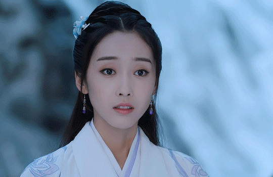
This was the very first post I put a considerable amount of time into, and I’m really proud of it. I wanted to make a set showcasing the Twin Prides, which is my favorite character dynamic of MDZS due to Jiang Cheng. I knew that I wanted to use the scene from CQL episode 14 because that’s where the quote “Yunmeng Jiang will have its Twin Prides” comes from. I also wanted to include the scene from the MDZS donghua episode 10 because it was different visually, and I wanted to incorporate both visual adaptations of MDZS.
I was really happy that the scenes in both the live-action and the donghua are visually captivating. I don’t really know how to explain it very well, but the scenes are just interesting to look at and I’m glad that JC and WWX are in the same frame for every single frame of the gifs.
I took a few notes on paper to organize the layout and decide how I wanted to break up the text.
2. Creation
I choose to gif by using screenshots. I use MPlayer OSX Extended to pull the screenshots and use Adobe Photoshop 2021 to create. I like using screenshots because it allows me to control the exact frames I want to use, so once I open photoshop, I can just load the screenshots and start the actual editing process. I organize the screenshots into folders based on which gif, which makes it easier to load into the stacks.
Step 1: Coloring
I don’t really have a specific process for coloring my gifs. I approach it from the process of “click until it looks good,” but I do like making some colors pop. In the CQL gifs, I wanted to make sure WWX’s red ribbon stood out. I also adjusted the hue/saturation of some of the colors to make the lotus seed pods more green. Here are the hue/saturation levels I used:
Blue: Hue (+24); Saturation (+24)
Red: Hue (+18); Saturation (+18)
Green: Hue (+39); Saturation (+36)
Magenta: Hue (+24); Saturation (+24)
Step 2: Text
Because of the text effect, I knew I needed a blockier type of font. I’m also a fan of simpler fonts, and I didn’t want something that would be too distracting. I tried a couple different fonts until I settled on Forta (downloaded from dafont[dot]com).
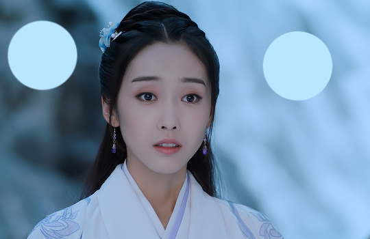
Placing the text was a little tricky. If the background was too light, than the text would be too hard to read. I used the setting “soft light” (you can set it to this using the dropdown menu directly to the left of the opacity setting where the layers listed) for the text and moved it around and adjusted the size until I was happy with the placement and I could read the words.
After I was happy with the placement, I used the following steps:
CTRL + click on the text layer to select
Select --> Inverse (or Shift + CTRL + I)
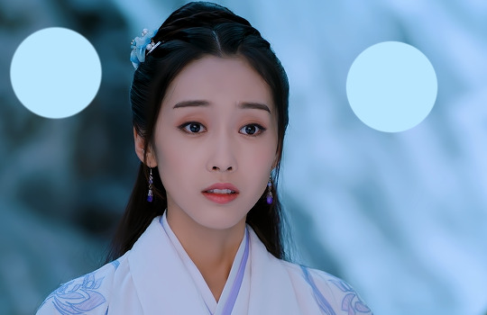
Step 3: Adding more color
This is a continuation of the previous steps, and these steps will get that overall purple/pink color. I chose that color because I thought it matched Yunmeng colors and the color of the scene the most.
Create a new solid fill layer (I chose white first, then adjusted later)
Set opacity to 40%
Play around with the color until you find something you’re happy with! For this set, I used #e67af3.
Done!
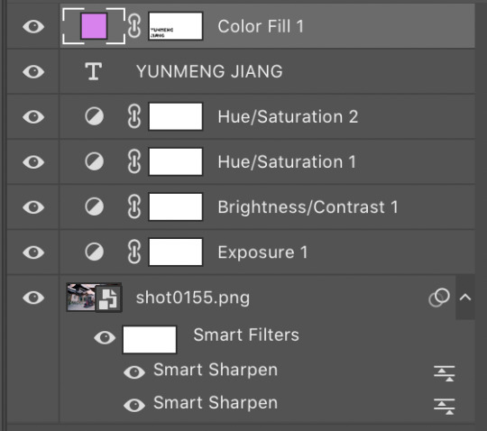
This is what my layers look like. Ignore the second Hue/Saturation layer, I don’t know why its there haha.
I used the same coloring and font for each of the CQL gifs on my set. As for the donghua gifs, I just played around with the hue/saturation as well as the exposure until I liked how it looked.
3. Posting
For the caption, I used a gradient text generator. I went with the purple gradient text because that is Yunmeng Jiang colors. I chose WWX’s quote as the other part of the caption because I believe that is part of what makes the “Twin Prides” promise so important to Jiang Cheng, and it is also very important when understanding the relationship between Wei Wuxian and the Yunmeng Jiang Clan.
I saved the post as a draft first, so I could see how it would look, then I posted it!
Anyway, I hope that makes sense at least a little bit, and I apologize for this being so text-heavy. I had a really fun time making this set and it was my first time playing around with different elements outside of basic editing.
I am tagging:
@mylastbraincql for this beautiful Lan Wangji color palette edit
@marquisguyun for this awesome WangXian video edit
@perkynurples for this lovely WangXian fanfiction
@blinkplnk for this stunning WangXian waterfall fight edit
@wendashanren for this amazing WangXian lyric edit
Please don’t feel pressured to complete this! Or if you wish to talk about something else, feel free to do so! If anyone else sees this and wants to do it, consider yourself tagged!
Thank you for reading so far. <3
#showyourprocess#tag game#thank you for the tag!#i hope this makes sense#the untamed#cql#mdzs#mylastbraincql#mine*#mymdzsthings#if you have any more questions feel free to send me an ask!#(don't mind me sneaking in commentary on my favorite character)
21 notes
·
View notes
Text
#showyourprocess
From planning to posting, share your process for making creative content!
To continue supporting content makers, this tag game is meant to show the entire process of making creative content: this can be for any creation.
RULES — When your work is tagged, show the process of its creation from planning to posting, then tag 5 people with a specific link to one of their creative works you’d like to see the process of. Use the tag #showyourprocess so we can find yours!
Big thank you to @fengqing for tagging me and I’ll do my best to explain how I made this set for Jiang Yanli!
1. Planning
The beginning idea for this set actually stemmed from my Yanli birthday set for the @mdzsnet event, wherein I was working with this palette:

The one thing I had to learn with using palettes, and is my biggest help to others, is SCENE CHOICE. It can make a difference between tearing your hair out and being happy with your final result, though there’s definitely some trial and error to it.
So I knew I wanted to make a gifset using each of the colours, and, for the light blue, immediately my mind went to the Gusu Lectures period of time, due to Cloud Recesses having a much more blue and light palette than many of the other settings in the show. The lightness of the blue made me lean towards outdoor scenes, and I immediately recalled the interaction between Jiang Yanli and Jin Zixuan where she slips and he catches her (episode 6). Thus off hunting I went until I found it. The final set actually came about because I had more footage than the original gif needed and I didn’t want a colouring I was quite proud of to be a one-and-done kind of thing. I also found the scene featuring the second gif, which had a similar palette in the episode, and decided to work it in as well (because I have weird moments of fussiness where two gifs isn't enough lol).
2. Creating
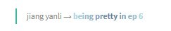
I have all the episodes saved on my hard drive, so it’s a matter of finding the right scenes in the episodes and going from there. With my scenes found, I wrote down the timestamps in order to put it through Vapoursynth, which I use to crop, resize, sharpen, and denoise my gifs before importing them into Photoshop (I use a portable version). I trim them down to a relatively similar length (bc I like those sets to be similar), adjust the timing and, with all that done, we’re left with our base gifs like so!
Now onto the fun part! Colouring! I’m going to pop the rest under a read more because it’s image heavy!
I already had a pretty set colouring since this was overflow from another set, but I’ll break that down a bit as well. My first step is always to plop a couple of spots of the desired colour onto the very top layer of the canvas, because it makes judging if its in the right realm or not much easier, like so:
My go-to’s for base colouring is curves (which does a lot of heavy lifting on colour correcting for me) and a vibrance layer (to see what colours we’re working with).
Then it’s about manipulating those colours into something closer to my desired one. Thankfully here my scene choice made life much easier as it’s already a light setting but it’s also already got a lot of cyan to work with. Threw on a few selective colour layers (focusing on lightening the cyan;
making the blues stand out more by removing the warmer tones;
correcting that green-ish tinge back to blue and making the cyan lighter again;
Now here is a little something I tend to do thats negligible but it makes me feel better about the colouring and thats a gradient map set to soft light, low opacity (20% here) using the pale blue and black. It just helps making the image a little more cool in tone in my opinion, and I put that UNDER my original curves layer;
And this is where we break out the brush! Obviously the darker colour on the left needed to be lightened up, so I went in with the palette colour on soft light at 100%;
and lighten at 50%;
Then I added another selective colour layer to lighten up the cyans and get closer to the palette colour;
Back to our brush! A layer on the right with soft light to give a bit more uniform colour across that expanse;
And lastly, I pulled a gradient of just the blue across the left to smooth out the colour on the edge of the frame, like it is on the opposite side (bc I’m obsessed like that);
Amidst all of this, I was using masks on the brush layers to account for Yanli’s movement and keep it from overlapping her skin, until finally I was happy (you’ll notice above the two circles are barely visible now) and we have this result!
My process was basically the same for the other two gifs in the set, with the second requiring a few more brush layers and gradients until we had all three looking spick and span!

Isn’t she pretty?
3. Posting
This here is where we pray Tumblr doesn’t destroy our hard work.
I mean, ahem. I don’t tend to save stuff to drafts unless I can’t finish it then and there, or I’ll pop it into the queue if it’s for a deadline. The gradient text is one of my favourite ways to caption on sets and I use a palette generator from an image website (google adobe colour palette from image) to pull out colours to use (I fiddle sometimes to get a gradient that looks good), before popping them into Cuvou's text fader (I’d link but Tumblr don’t like that but if you google it should come up). I then switch the text editor here over to HTML to pop in the code generated by the fader, add any other text styles I want (bold, small font or header size font, etc), preview the HTML, preview it on my blog a couple times and then once I’m happy, usually that’s it! It gets posted or queued and out into the aether it goes!
In this case, this was the final result of the gradient text in the caption;
Phew so that was... a lot for what amounted to a colouring and I’m sorry if y’all didn’t want a tutorial but here it basically is xD For the tagging I’m going to go outside the fandom just a bit and tag, but if you’ve already been tagged, don’t stress it!
@offtodef with this set
@sugarbabywenkexing with this set
@gusucloud with this set
@wanyinxichen with this set
@sarawatsaraleo with this set
#showyourprocess#tag game#things i'm tagged in#this is very long#for what amounts to a colouring#i'm so sorry xD#hope you enjoyed!
15 notes
·
View notes
Text
Story Process Tag
by @herpixels
I was tagged by @poetic-falls (thanks Al!)
The challenge: show a certain part of your story process based on you being tagged by other creators!!!
1. Your writing process - show us a part of your script or explain how you write your scenes. Do you write in screenplay format or novel format? Etc, etc.
I have google document where I make a bulleted list of the general flow of the story, and then I go in a make notes on how I want to set to scene, or important things that I want to include (blurred because spoilers :P)

2. Scene building - show us you in the middle of scene building through pictures, gifs, or a video. Explain what is the best thing about scene building and what is the worst!
I suck at building so I usually get something off of the gallery and decorate as I see fit.
3. CC/Pose Making - do you make your own cc/poses for your scene? If so, what is your process like to create? Do you just go off the top of your head? Do you use reference photos?
I will make my own poses on occasion but due to lack of time, I usually do not unless I really need it and can’t find what I’m looking for. When I do make poses, I normally have a vision in my head on how I want it to look.
4. Getting in the zone - What do you do to get in the zone to work on a scene? Examples include: show us your playlist you use when working on a scene, what’s your go-to scene snack/drink, etc.
I have a spotify playlist specifically for songs that have inspired my writing in some way or remind me of certain characters. I’ll put that on when I really want to get in the zone :)
5. Screenshot folder - give us a look into your screenshot folder to show us just how much goes into ONE scene for your story. (Scrapped pictures encouraged!!!)
I take A LOT of photos, then widdle them down to the ones I want to use. Once they’re edited, I save them in numerical order so that they are posted in the correct order when I queue them. The folder below has 124 photos (including the edited versions of the screenshots).
6. Captions - are you a caption on the picture kind of storyteller or captions in text box type of storyteller? Why? Do you do both?
I place the captions on the photos, though I don’t have a problem putting them under the post if that’s what people prefer.
7. Editing!!!!! - explain and show us your process editing a scene through a video, gif, or picture. A Before and after will suffice if you aren’t in the middle of editing a scene as you answer this.
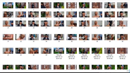
I don’t go too crazy with editing. I normally bring them into Photoshop, run Topaz Clean and Smart Sharpen and add the subtitles. If needed, I’ll adjust the brightness/contrast or levels if a photo is too dark/light. And in the scenes with magic or vampires in their dark form, I’ll use brushes and layer effects/overlays to add magic effects or make the vampire’s eyes glow.
8. Throwback - show us an ANCIENT story scene you done in the past and explain how you would do the scene differently today!
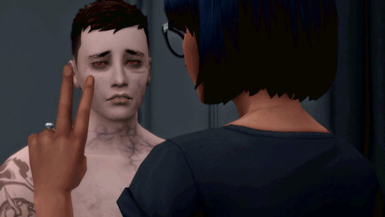
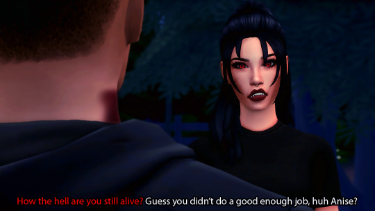
The first scene that comes to mind is the fight between Xander and Anise. I’d definitely do the editing differently if I were to redo the scene. The original photo (top) has a weird color to it, so I would add a gradient map to the photos to make the colors a little more interesting, and probably some other adjustments as well (bottom).
I tag whoever would like to do this!
34 notes
·
View notes
Note
I really wouldn't mind you aiding me with some tutorials love
giffing tutorial/resources
hi anon! sorry it took me so long to answer. i figured this might be helpful for others out there who have asked me similar questions, so i’ve compiled a pretty comprehensive list of tutorials/resources. idk about others but when i was new to giffing, it took me a lot of painful effort to go around and look for resources, so i’m putting it all here to make it a little easier!
i download videos using 4k video downloader. it will download very good quality 1080p videos in .mp4 format. if you’re downloading a 4k video, make sure to change the setting option to .mkv so that you get 4k and not 1080p—for obvious reasons since you want the highest quality.
i rely on kpopexciting to get .ts files — which are basically raw, very high quality video files for live performances. they are much less grainy than .mp4 versions of live performances—which are the ones you’ll see uploaded to youtube. i’ve found that 4k videos (in .mkv) are just as good quality as .ts, but obviously you will rarely see live performances in 4k, so get .ts when you can!! you can also try to find .ts files on twitter, but you may have to do a lot of digging. i wish i could recommend you twitter accounts, but the ones i used to go to have been very inactive/taken down all their drives :( but this website is really nice and updated frequently so i would recommend it!
vapoursynth links + download. the reason you would use vapoursynth is to resize your gif, while maintaining the optimal quality of the gif. if you gif without vapoursynth (.ie only using photoshop), it will still be fine, but the image quality may be grainier. also, you will definitely need vapoursynth to gif .ts files —more will be explained in the tutorial i’ve linked below. i would recommend that you have a high processing/lots of ram/newer desktop or laptop to use vapoursynth so that 1, your computer isn’t fried and 2, your vapoursynth process will go a lot faster. i am using a 2017 macbook pro for all my work, and it runs pretty well, but my laptop still gets pretty hot so just make sure you’re not running a million things in the background while using adobe products and vapoursynth lol. i used a pretty old and beat up 2011 model macbook air back then, and i will say that yes vapoursynth worked and ran on it, but it took much longer, and basically fried the laptop’s battery (aka i had to get the battery changed twice and the laptop would die randomly) but issok it was a school borrowed laptop so i didn’t feel too bad lol. im just saying this as a precaution, to preserve the health of your electronic devices!! but don’t be afraid to use vapoursynth! you should still try it at least once.
thank you to @realstraykids for this super detailed, really nice tutorial! it includes how and where to download videos, how to gif using vapoursynth, using photoshop, comparisons, coloring, and pretty much all you need to know. 10/10 would recommend
thank you to @dreamcolouring for this lifesaver!!! the best and easiest way to blur out unwanted captions/objects in your gifs. i recommend doing this step after converting your frames to video timeline and before you do sharpening and coloring. another tip i’ll add is to feather the selection you’ve made right before you click on “add vector mask” —this will make sense once you’ve read through the tutorial. feathering it will make the blurred spot less noticeable and more subtle.
i use this generator to create gradient colored captions! copy and paste your text, then select the colors you want. generate the code, and copy it. change the settings of the text editor on your post to HTML. paste the code, preview, and voila! add elements <blockquote>,<b>,<i>, etc as needed. see more on colored captions in this tutorial by @kylos --i believe op mentioned a different and better color generator but for some reason it won’t work for me :( hopefully it works for u! basically same idea as the previous generator i mentioned.
my own mini tutorial/workflow process of making gifs. this includes working with a .ts file, vapoursynth, photoshop, coloring, watermarking, etc. and a few of my own tips below:
if you are working with an .mp4, you do not have to make any changes to the preprocessor/denoise filters/sharpening in the resizing part of vapoursynth—it doesn’t make that big of a difference if you do. but if you are working with a .ts file, definitely do make those changes,, that’s the whole reason you have vapoursynth. with an .mp4, i like to use vapoursynth to just resize, but i don’t add any additional settings. i use smart sharpen in photoshop to sharpen it, which is pretty good on it’s own (at least in photoshop 2020!).
my rule of thumb is to do add .02 seconds when i am setting frame delay. so if when you first import the frames, they are at 0.04 seconds, i usually change them to 0.06. of course, this is my personal taste—you can make all your gifs faster or slower depending on how you want em to look.
if you are on a mac, you can screen record by pressing Command+Shift+5 (it’s a shortcut to quicktime screen recording). I only screen record for things like the beyond live concert or other live streamed events. the image quality of the screen recording, in my experience, is actually pretty good. when you gif the screen recording however, you may notice that it adds extra frames that you don’t need. by that i mean duplicate frames. you could keep the duplicate frames but that just means the size of your gif is going to be much bigger (keep in mind the limit is 8mb). in order to remove those duplicates, my only solution has been to remove them manually (by holding Command while selecting), or when you are importing the video to frames, select the option to “limit to every 2 frames”—but this method will be less precise and still not as good as manually removing frames. if you remove the duplicate frames, this means you will need to set the frame delay even slower, to make up for lost frames. in my experience, fps(frames per second) and frame delay work in conjunction. so for example, if i delete every other frame because they are duplicates, but the starting frame delay is 0.02, i am now going to change it to something like 0.05 (so i added 0.03 seconds rather than my usual 0.02). if the duration length and the image dimensions of the gif are short/small, feel free to keep the duplicate frames in—i only delete duplicate frames in order to keep my gif under the 8mb limit. then, if you keep the duplicate frames in, continue with your standard frame delay preferences. now that i’m writing this im realizing this might not make a lot of sense lol.. but don’t worry about it for now and if you run into trouble w screen recorded gifs then you can come back to this for reference. again, this is only my experience recording on a mac—it may be a lot different if you use a screen recording program or are on a pc.
i don’t really use .psd templates because i like to give every gif/gifset it’s own unique coloring—so i remake the coloring every time, but if you get into a rhythm it’s pretty easy. there are a lot of nice coloring tutorials out there, too! my personal coloring adjustments in order: levels, exposure, color balance, selective color (if needed), vibrance, photo filter (if needed), color lookup (i use 2strip most often and i put it on ‘color’ blending mode). don’t forget to adjust the opacities and fills of the ‘color lookup’ adjustment layer in case it’s too strong. go back to correct each adjustment layer as needed. then, when you’re done and satisfied, group all those layers, copy the group (you can do an easy command+c), and paste it onto the next gif you’re working on for easy workflow.
if for some reason you can’t see the frames when you import your layers/video, it’s likely because your ‘timeline’ window isn’t showing up. just go to the window menu on photoshop, go to the bottom and you’ll see ‘timeline.’ make sure it has a check next to it.
i recommend watermarking your gifs because a lot of people like to repost tings these days 😠 - so make sure u got your brand on it! i keep my watermark saved to my ‘libraries’ in photoshop so it’s ready when i need it. i use the blending mode ‘overlay’ and adjust the opacity, but if you don’t want to do that you can also add a stroke/shadow to your watermark/do all sorts.
tag #nctinc for your nct creations and #jenonet for your jeno creations!!
here’s my own mini tutorial (well not much of a tutorial ig more like a work process vid?): took about ten minutes including the time to search and download the video (but i didn’t record that part i trust yall know how to do that), vapoursynth, and exporting. i hope this helps somewhat! feel free to ask more questions whenever :)
youtube
keep in mind that giffing takes a lot of patience, energy, and experience—so don’t worry if it takes you a bit to figure things out or if your gifs don’t turn out the way you want them to the first time around. we all start at the same place and all run into problems. i know giffing can sound intimidating and seem like a lot of work, but i promise, once you get into a routine, giffing is going to happen in minutes—and you’ll get beautiful gifs. have fun! 😊
#anon#answered#tut#tuts#giffing tutorial#should i make a tut/resources post on gfx? not rly sure if gfx can be taught.. it's like a lottt about personal style imo lol#hope this helps!#not just for anon but for anyone
120 notes
·
View notes
Note
How would I go about making wallpapers like you? I have some ideas that I want but I hate asking other people especially because it's so specific.
aaah thanks for your question! first of all, i’m so flattered that i’ve inspired you to make wallpapers of your own! it makes my day when people show me my lockscreens in use or their own wallpapers that they’ve made ^^
second, there are a lot of small or specific details involved in my lockscreen making process? here’s a few things to know about the general process under the read more:
first, you wanna know the dimensions of the device you’re making screens for, and you wanna make sure that you use the right units (i.e. pixels, inches, etc.) for your program. these dimensions are freely available on the internet ^^

you also wanna make sure you’re using big enough background images (if you’re using photos or game screenshots, like i usually do) and if you intend to post them, you gotta check the copyrights. here’s how i usually do that using google images!


you can also use the color tab in the tools if you’re looking for specific colors!
for the background itself, i always have a color gradient at a low opacity to make it look nicer, and i’ve also started using another layer for any additional colors or shading. i’ve made a quick example below:

if you’re using logos or other images for the foreground of your wallpaper, try to find them in transparent .pngs, because that makes life so much easier lol
for font and text, it’s a bit tricky! in the program i use, i have to manually adjust the size and spacing of any text, rasterize it, and then make any last size or spacing adjustments. there are also text and font editors on the internet, where you do everything in a website, and export the final result. the specifics of if and how you do this is up to you!
i hope this has helped! if you want to see more examples of me trying to explain my process, you can check out my tutorial tag ^^
57 notes
·
View notes
Note
Hi! I love your gifs and I was wondering if you could share how you get that gradient text thingy on your posts? For some strange reason whenever I use the code for the gradient text it doesn’t show on mobile, but it does with your posts
Hi anon!
It’s always nice to hear someone likes my work 🙂. I wasn’t aware that my gradient text shows on mobile, although if I’m on mobile, I’m using the app, which, as far as I know, only shows officially Tumblr implemented text colors.
For gradient text, I use two different websites: this JSFiddle page and Text Color Fader. The first page has a very basic interface, only does 2 color gradients, and doesn’t provide previews. The second page is much more fully featured and allows you to create gradients with more than 2 colors.
However, I use the first one because, for some reason I’ve never figured out, the code from the second site does not work for me without some changes. In order to get it to work, I have to make a couple minor changes to the code before pasting it into Tumblr.
I’m going to put my explanation of what I do under a cut, since it’s easier to explain with screenshots.
So, when I use Text Color Fader, I first pick my colors and enter my text.

Then I click the generate button and end up on this page:

You can see how the gradient should look and the code that should let you use that gradient on Tumblr. However, for me, this code never works as is.
So, I open up Notepad (I’m on Windows) and cut/paste the code into it:

Then I use the replace option to make two changes (it doesn’t matter in what order):


As you can hopefully see, I’ve changed this “:#” to this “: #” and this “;”” to this “"”.
Once that is done, I can copy the code again and this time paste it into my post. And, assuming I didn’t mess anything up, it should work. Once it’s in your post, you can add in whatever other HTML elements you want (small text, italics, bold, etc.).
I hope this helps and if you have any other questions, let me know!
42 notes
·
View notes