#Applying text alignment in TextBox
Explore tagged Tumblr posts
Visit Tumblr Blog
Explore Tumblr blogs with no restrictions, modern design and the best experience.
Last Seen Tumblr Blogs


Fun Fact
In 2020, 27% of US Tumblr users had an annual household income of over $100,000.
Note
how did you make the "thief in the night" text on the banner?? :00

ty for askingg! laptop tut below the cut
9 steps with guiding gifs
uses the website pixlr
this is a laptop tutorial, so mobile settings may not be the same
PIXLR
i'm already signed in, but i believe this is what it looks like to new users as well.

(1) click create new and CHOOSE ANY IMAGE SIZE! for a square, press art grid.

(2) now that we're here, we want to go to the left and press the T, which will lead you to a text box, and then CLICK "ADD NEW TEXT", the upmost button on the new pop-out.


reminder: don't use the box labeled "name" to put your text, as that names the layer. use the box labeled "text".


for my example text, i'm going to use "soobfi." from the word i chose, i'm going to take out one letter and replace it with a space.

this is because in the text, you have to leave a space for the cursive letter like shown below. without the cursive "i," it's simply th_ef.
the letter i'll be taking out is B. (3) REPLACE THE LETTER YOU'RE REMOVING WITH TWO SPACES.

(4) now, let's ADD A FONT. the one i'm using below is candu by dora typefoundry. (download is linked)
please ignore how i already sized it up T^T same steps still apply
text sidebar -> scroll until you see font: verdana -> click it and select "+ add local font" -> select an .otf or .ttf file -> press okay (in file explorer) -> font is inputted

don't like the candu font? here's a list of similar fonts to look through! (link)
tip: to adjust your text, click it so the border surrounding it highlights in blue.

use the horizontal knobs on left or right to make your textbox (not your text) shorter or longer.

to make your text bigger or smaller, use the knob on the bottom.
you can also do this by scrolling down on the left side (where you wrote your text) and find size and alter it there.
to move around your text, click and drag.
(my settings: candu, size 200, middle align)
now, let's add the cursive letter. (5) ADD ANOTHER TEXT BOX.
go to the sidebar -> press the "T"
click "add new text"

there are two things that can happen when making a text box (both are shown in the video)
if you make a new text box while having no other text selected, it will add a regular text and you won't have to take any additional steps.
if you make a new text box with the previous text selected, you will have to click *off* of the selected area and unhide the previous layer.
can't see the layers? press the arrow on the right side. how to unhide the bottom layer? press the eye icon with a line through it.
(6) PLACE THE REMOVED LETTER IN THE NEW TEXTBOX. for me, this letter is b, so i'll add b to the new textbox. (i later on changed b -> B)

i'm not sure if it may be me only, but when i tried texting in the new textbox, it wouldn't let me type any letters.
if this is the case- reload. if reloading still doesn't work, copy the letter you're making cursive and paste it into the textbox.
(7) TURN YOUR LETTER CURSIVE. i will show the gif on how to change fonts again if refreshers are needed.
please be aware that you have to click a .ttf or .otf file. if you download a font and it's in a package (.zip), open the folder and extract the .ttf/.otf file.
the font i'm using for the b only is acroterion. (download is linked)

don't like acroterion? here's a list of similar fonts! (link)
my favorites: darleston, optiyork-script, tc wedding3, and beautiful.
"these look too swirly/extravagant for the style i'm going for" -> don't worry, as we're only using one letter from the font. the contrast from the sans-serif to the cursive is supposed to be drastic. still, if you would like a more minimal cursive look, here are some that i reccommend.
hello olivia, south hamburg, and bridget script.
(8) SIZE THE LETTER TO MATCH THE REST OF THE TEXT. you can move text by clicking and dragging, and adjust the size by using the knob on the bottom (pulling it up and down) or scrolling down on the sidebar and adjusting the size from there.
please make the textbox as small as the text.
how? move the tabs on the left or right of the textbox to shorten or lengthen it. this *will* move your text, but it's okay as you can move it back.
adjusting vs adjusted!!


i didn't record it, but i re-centered the text because i moved it downwards. if you want to center the text, click the sans-serif (the print letters) and adjust the cursive letter to match.
(9) save using the blue box in the bottom right corner and you're done!! you did so well ^3^ need any help? my inbox, asks, and replies are always open :D
7 notes
·
View notes
Text
Disable Pivot Table Ribbon & Applying Text Alignment to Partial Text inside TextBox using Java
What’s new in this release?
Aspose team is pleased to announce the new release of Aspose.Cells for Java 18.8. It includes new features, enhancements and bug fixes to supplement the usability of the product and support the developers community. New features are always part of every release to enrich the product. It is very common to apply different alignments to the partial texts in the text box. This feature was having some issues but now it is reviewed and bugs are removed to incorporate proper alignment. This option allows screen reader software to utilize the text within the PDF file for reading. You can disable it by applying a change permissions password and deselecting few options in Adobe Acrobat. Same functionality can be achieved using Aspose.Cells for Java now. Pivot table based reports are useful but prone to error if target users do not have detailed knowledge of Excel to configure these reports. In these circumstances organizations will want to restrict users from being able to change a pivot table based report. Common pivot table features like adding additional filters, slicers, fields, or changing the order of certain things in the report are mostly not recommended for every user. On the other hand, these users shall also be able to refresh the report and use existing filters or slicers. Aspose.Cells has provided this ability to developers for restricting users from changing these reports while creating them. For this purpose Excel provides feature to disable pivot table ribbon and same is provided by Aspose.Cells i.e. developer can disable the ribbon which contain controls to modify these reports. Reliability and efficiency is basic requirement by the users for any software product. If some conversion takes too long, sometimes it is required to interrupt this process to return control to the user. This feature is already present but got some performance issues, however we have further improved it and now can be used without any trouble. While working with Excel, pasting rows and columns is very common and this feature was introduced in the earliest versions of Aspose.Cells. However limited paste option was available in contrast to Excel where variety of options are available when we paste data somewhere in Excel. Now Aspose.Cells has provided this feature and you can paste data with multiple options. There are some other enhancements and exceptions part of this new release, such as Hyperlinks not working when referenced from other sheets, Incorrect alignment issue while rendering to PDF, Wrong placement of table data from HTML to Excel file, Depiction of slicer control while spreadsheet to HTML conversion, Improper gradient color rendering to PDF, Improper chart category title display in PDF and Wrong border style for merged cells. Below are some important new features, enhancement and bug fixes part of this release.
Disable Pivot Table Ribbon
Protect workbook and worksheet in ODS file
Interruption issue with saving XLSX file process
Hyperlink not working when referenced from other sheet
Incorrect alignment while rendering spreadsheet to PDF format
Table data shifted to wrong row and column while converting from HTML to MS Excel file format
Chart's image position is wrong in Chrome & FireFox while converting to HTML
Slicer control is not rendered when converting Excel file to HTML file format
Vertical line at the center of the chart is not drawn properly in the rendered image
Gradient color for negative bubbles is not applying in the PDF output
Chart category title not shown properly in the image
Wrong border style returned for merged cell
Read watermark from Excel file
Property comment contains unnecessary text
Property "revision number" not checked correctly
Macros in the ODS file are not retained in the generated ODS file format
NegativeArraySizeException while converting XLSX to HTML
NumberFormatException raised while loading the HTML file into workbook
NullPointerException exception raised while calling the CalculateFormula
Exception when rendering worksheet to PNG file format
Error in Cell: E22-Invalid formula - exception on opening MS Excel file
Other most recent bug fixes are also included in this release
Newly added documentation pages and articles
Some new tips and articles have now been added into Aspose.Cells for Java documentation that may guide users briefly how to use Aspose.Cells for performing different tasks like the followings.
Applying text alignment to partial text inside the TextBox
Pasting Rows/Columns with Paste Options
Overview: Aspose.Cells for Java
Aspose.Cells is a Java component for spreadsheet reporting without using Microsoft Excel. Other features include creating spreadsheets, opening encrypted excel files, macros, VBA, unicode, formula settings, pivot tables, importing data from JDBC ResultSet and support of CSV, SpreadsheetML, PDF, ODS and all file formats from Excel 97 to Excel 2007. It is compatible with Windows, Linux & Unix and supports all advanced features of data management, formatting, worksheet, charting and graphics.
More about Aspose.Cells for Java
Homepage of Aspose.Cells for Java
Download Aspose.Cells for Java
Online documentation of Aspose.Cells for Java
#Applying text alignment in TextBox#Content Copying for accessibility#Disable Pivot Table Ribbon#process interruption Improvements#Pasting rows with paste option#Java Excel API#Smart Art Image extraction
0 notes
Text
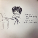
28.01.23
Widows and Orphans
One of the main things mentioned in my feedback was that I need to focus more attention onto details such as widows and orphans. I want to research more into what these are and how to avoid this in my work this term to develop my design and knowledge of vis com.
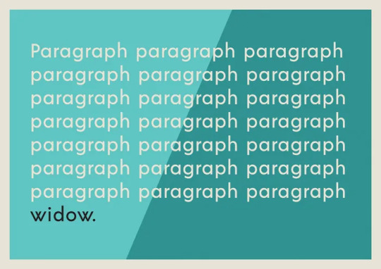
Widows
A widow is a lone word or short group of words that appears at the bottom of a paragraph, column or page. They tend to make long sections of text look unbalanced and messy
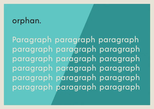
Orphan
An orphan is a similar unwanted straggler, but this describes words that appear at the top of a page. Orphans really belong on the previous page, as not only do they look untidy on the page they appear,
How to get rid of them
1. slightly extending textbox the paragraph is in
2. use an optical margin alignment to your text - select the text frame, check the Optical Margin Alignment box. You’ll notice a subtle shift across some of the text. If your widow or orphan is a short word this can be enough to make them toe the line.
3. apply tracking or kerning - highlight the whole paragraph, the final sentence or the final few words of the paragraph, reduce the Tracking (symbolised by a VA on top of an arrow) to -5 initially. Reduce the Tracking further to -10 etc, until you’re happy with the result.
https://www.indesignskills.com/tutorials/widows-and-orphans/
0 notes
Text
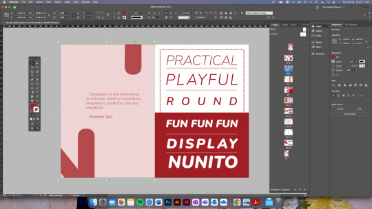
iterations
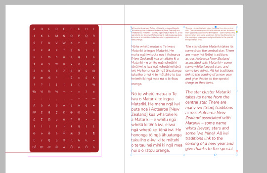
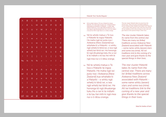
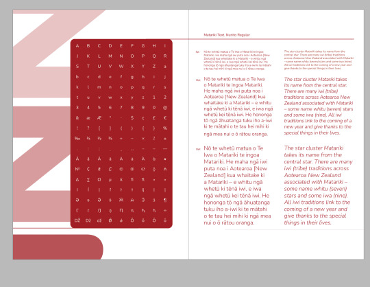
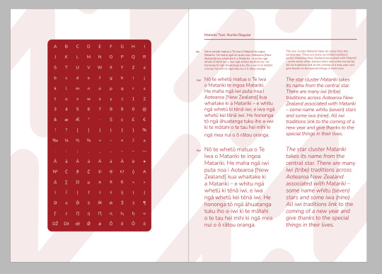
I needed to include a page that focused on larger bodies of text, so I could show off how my typeface would look when it's being used for smaller body text as compared to header text. I decided to split the textbox into columns to show off both the regular and italic version of the font and then put the paragraphs in different sizes as well - I used the Matariki text we have been given in class - alongside it, I added the table of glyphs we made in class and rounded out the edges to match the theme of round edges starting to appear in my work. I then thought I could add a pattern in the back to make the spread more interesting and have a factor that connects the two pages together. I used rulers and my grid to align all my text and also edited each paragraph to make sure they all matched up the best I could and to eliminate any widows.
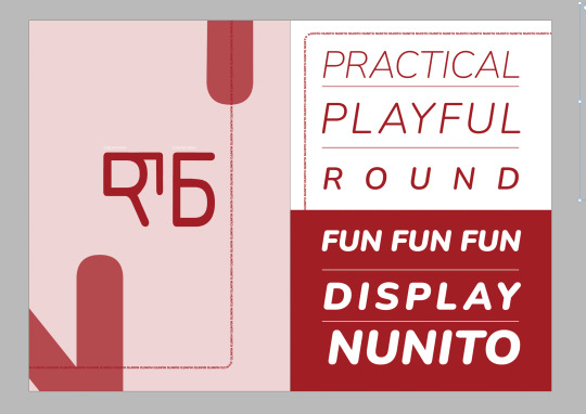
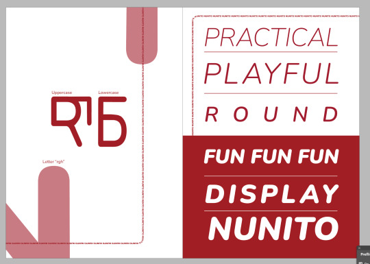
I originally had the 27th letter on the back cover and the quote on the first page, but I decided to put the 27th letter on this page instead. I played around with different opacities and fixed the spacing between the lines and used a grid to do so. I decided to add titles to explain/indicate what letter was what and what the letter is. Since the formative I have changed and applied the feedback I was given about the second page and the words I had used.
0 notes
Text
Class One Notes
Indesign Notes:
- Use typography workspace as base and add links, align, and pathfinder panels. Save this as a new workspace so that you can use it again.
- The bottom left corner shows which page you’re on.
- If you want a ruler in a specific position you can either type it in top left, or double click on that spot on ruler.
- Layout > Create Guides to set up specific rulers.
- Global swatches mean that when you change the swatch colour, it will also change it everywhere it is applied in the document
- You can change the number of columns in a text frame
- Span columns allows you to have one section of text spanning across multiple columns.
- Text frame options allows you to add margins to a textbox, you can also align to the bottom of text box.
Important Keyboard Shortcuts :
x : Switches between stroke and fill
w : Preview Mode
shift+w : Presentation Mode
e : Free transform tool (can use to resize photos)
cmd+0 : Fit to screen
ctrl+alt+cmd+n : Insert page number
shift+enter : soft return, forces text onto next line
0 notes
Video
youtube

powerpoint help
About me
How To Add Audio To A Powerpoint Presentation
How To Add Audio To A Powerpoint Presentation A beautiful easy approach to create some gorgeous typographical results and not using a detailed information of typography. In the Format group you’ll find a collection of instruments that will allow you to save time by making enhancing multiple objects without delay, or copying complicated formatting, super easy. Alt-click on the alignment instruments wherever in PowerPoint for Align to Guides. Repeatedly click on the chosen align option to toggle through the guides. This was a really excessive-stakes meeting that may decide funding levels for a brand new group throughout the firm. A leading healthcare client wanted to rework a knowledge heavy presentation into a convincing sales software. They had robust figures showing enhancements they may ship when it comes to worker wellness and decreased healthcare prices. However the presentation was not well obtained because it was all charts and graphs. A PowerPoint file containing your library will open. Use the Selection Pane and Animation Pane to handle your library. You can add your personal customized sequences, including timings and settings, so your favourite animations are always shut at hand. We’ve pre-stocked your animation library with a number of beautiful sequences to get you began. Convert Table to Text – This is a brilliant useful gizmo if you're turning a desk right into a extra impactful visual. Instead of copying and pasting or typing out each cell individually, merely right-click on on a table and choose Convert Table to Text. You then have the choice to transform the whole desk to a single textbox or convert every cell to a separate text box. Menu Tips – BrightSlide uses contextual Menu Tips to tell you suggestions and tricks in regards to the add-in. Dismiss and reset them right here.Contextual Tools – There if you want them most, our PowerPoint add-in features a host of context-sensitive instruments. Learn where to search out them right here.Table Tools – Right-click on on a desk to access these tools. A movement path ending at the center level of the primary object chosen shall be apply to all other objects selected. You can add animation results to a number of objects by double-clicking the Animation Painter+ or by lassoing a number of shapes after the painter has been clicked. Under Selection & Object you’ll discover a vary of useful instruments designed to make your life simpler. Shift-click on the Table Format Painter to bring up settings, right here you'll be able to choose which design components to copy over. You can even entry Live Paragraph and Character Spacing by deciding on text and right clicking. Typography – We’re super enthusiastic about these instruments! Click the section you wish to be taught extra about or scroll all the way down to see simply what BrightSlide can do. We don’t give push-back, or tell you what can’t be accomplished – we provide you with options for what can. We’re an instant a part of your staff, and centered on providing assistance. You simply inform us what you need, and we discover a approach to get you there – on time and on budget. We’re there if you need us, and whenever you name you speak proper with a manager who can help – no recordings, no receptionists. eSlide introduced a human component to help present the quality of life enhancements our consumer was in a position to ship, which helped their story become engaging and compelling. You can drag and drop photographs out of your laptop into your presentation. Or, click on InsertImage and choose an image from Google Drive, Google Photos, the net, and more. Your presentation saves routinely in Drive as you're employed, so you don’t must click Save. To learn to entry recordsdata offline from your desktop or mobile, see Access stored Drive files with out the web. And thanks to our proprietary project management techniques you’re by no means left waiting for a “devoted rep”. Our massive pharmaceutical consumer wanted to take a text-heavy document and streamline it for an important government presentation to the Board of Directors. Add Shift to toggle by way of guides in the other way. Align to First Selected – When you select two or more objects, this option aligns your choice to the reference object. Align to Selection – This is the default alignment mode for PowerPoint. Objects are aligned to the boundaries of your selection. This page breaks down the sensible performance of our PowerPoint add-in BrightSlide.
0 notes
Video
youtube

power point help
About me
Powerpoint Will Listen To Rehearsals To Help You Stop Swearing And Stuttering
Powerpoint Will Listen To Rehearsals To Help You Stop Swearing And Stuttering Click Inspect to identify hidden content, and click on Remove All to remove the item of your alternative. My PowerPoint presentation on my Mac isn't displaying correctly on the projector. Under the drop-down menu selected to Straighten to Left, Right, Top or Bottom. This page breaks down the good functionality of our PowerPoint add-in BrightSlide. Click the section you need to learn extra about or scroll all the way down to see simply what BrightSlide can do. Noted legal technologists Dennis Kennedy and Tom Mighell bring listeners an in-depth analysis of the most recent advancements in legal technology, in addition to finest practices for utilizing present instruments. Convert Table to Text – This is a super useful gizmo if you are turning a table into a extra impactful visual. Instead of copying and pasting or typing out each cell individually, merely proper-click on on a table and select Convert Table to Text. You then have the option to transform the entire table to a single textbox or convert every cell to a separate textual content box. Menu Tips – BrightSlide uses contextual Menu Tips to let you know ideas and methods about the add-in. While PowerPoint will not take the place of communication abilities, it can be a fantastic device for enhancing and improving your expertise. You can learn to be a fantastic presenter through follow, repetition, exhausting work, research and the proper instruments. Keep in mind, although, that the most effective audio system are the ones who're able to communicate in a means that's most congruent with their own persona. Use the Selection Pane and Animation Pane to manage your library. You can add your own custom sequences, including timings and settings, so your favorite animations are all the time close at hand. We’ve pre-stocked your animation library with a couple of lovely sequences to get you began. Under Selection & Object you’ll find a vary of helpful instruments designed to make your life simpler. Shift-click on the Table Format Painter to bring up settings, here you possibly can choose which design elements to copy over. You can even access Live Paragraph and Character Spacing by choosing textual content and right clicking. A pretty simple method to create some stunning typographical effects and not using a detailed knowledge of typography. In the Format group you’ll find a assortment of tools that may help you save time by making enhancing a number of objects at once, or copying complex formatting, tremendous easy. Alt-click the alignment tools wherever in PowerPoint for Align to Guides. Dismiss and reset them here.Contextual Tools – There if you want them most, our PowerPoint add-in includes a host of context-delicate instruments. Learn the place to find them here.Table Tools – Right-click on on a table to entry these tools. Once you’ve finished, shut this view using the tick button and return to working as before, or shift-click the tick to maximise all visible home windows. A movement path ending at the heart point of the first object chosen might be apply to all other objects chosen. Repeatedly click the selected align option to toggle through the guides. Add Shift to toggle through guides in the wrong way. Align to First Selected – When you choose two or extra objects, this feature aligns your selection to the reference object. Align to Selection – This is the default alignment mode for PowerPoint. Objects are aligned to the boundaries of your choice. You also can watch this video to view aPowerPoint 2013 Basic Tutorial. Select the slide you want to delete, proper-click on, and click on Delete Slide. You can add animation results to a number of objects by double-clicking the Animation Painter+ or by lassoing multiple shapes after the painter has been clicked. A PowerPoint file containing your library will open.
0 notes
Video
youtube

powerpoint help
About me
Powerpoint Forum
Powerpoint Forum In the Format group you’ll find a assortment of instruments that may allow you to save time by making enhancing a number of objects directly, or copying complex formatting, super simple. You can select the precise distance between objects or make them match inside an outlined area. Alt-click the alignment instruments anywhere in PowerPoint for Align to Guides. Repeatedly click on the selected align choice to toggle by way of the guides. Add Shift to toggle through guides in the other way. Align to First Selected – When you choose two or extra objects, this option aligns your selection to the reference object. A brief video demonstrating the way to obtain and use our 3D animations and clipart in PowerPoint. Here is a short video tutorial on tips on how to navigate the new PresenterMedia Clip-Art Customizer. A temporary overview about our add-in and directions how to download and correctly set up this function. Yes, they've a pleasant article explaining tips on how to convert an present Google Slides/PowerPoint theme to Slideas Markdown Presentation template. The reference object is all the time the primary selected. Align to Selection – This is the default alignment mode for PowerPoint. Objects are aligned to the boundaries of your choice. This page breaks down the brilliant functionality of our PowerPoint add-in BrightSlide. Click the section you want to study extra about or scroll all the way down to see simply what BrightSlide can do. We’ve pre-stocked your animation library with a number of beautiful sequences to get you began. Under Selection & Object you’ll discover a vary of helpful instruments designed to make your life easier. A movement path ending at the middle point of the first object selected might be apply to all different objects chosen. You can add animation results to multiple objects by double-clicking the Animation Painter+ or by lassoing a number of shapes after the painter has been clicked. A PowerPoint file containing your library will open. Use the Selection Pane and Animation Pane to handle your library. You can add your own custom sequences, together with timings and settings, so your favourite animations are all the time shut at hand. Also, verify in your latest files in Google Drive to see when you can access from there. Please check that you just made the copy in the Google account the place you’re wanting. If you've multiple Google account (personal vs faculty/firm) possibly your presentation is in certainly one of them. You need to have two situations of Chrome browser opened . One along with your personal account and the other with the corporate/faculty account. Shift-click on the Table Format Painter to deliver up settings, here you'll be able to choose which design elements to repeat over. You can even access Live Paragraph and Character Spacing by choosing textual content and right clicking. Typography – We’re super excited about these instruments! A beautiful simple method to create some gorgeous typographical effects and not using a detailed information of typography. You then have the choice to convert the entire desk to a single textbox or convert every cell to a separate text box. Menu Tips – BrightSlide makes use of contextual Menu Tips to tell you suggestions and methods in regards to the add-in. Dismiss and reset them right here.Contextual Tools – There when you need them most, our PowerPoint add-in features a host of context-sensitive instruments. Learn where to search out them right here.Table Tools – Right-click on on a table to access these instruments. Once you’ve completed, close this view utilizing the tick button and return to working as before, or shift-click on the tick to maximise all seen home windows.
0 notes
Text
Office Insider for Windows Version 1912 release notes

Office Insider for Windows Version 1912 release notes.
Build 12325.20012 (December 6, 2019)
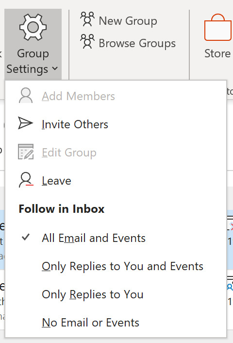
Outlook New feature: Advanced group email settings Are you part of too many groups to count? Customize which emails or events to receive or follow in your inbox. In group settings you can select to receive all mail and events, only replies to you, replies and events sent to you, or to keep them out of your inbox altogether.
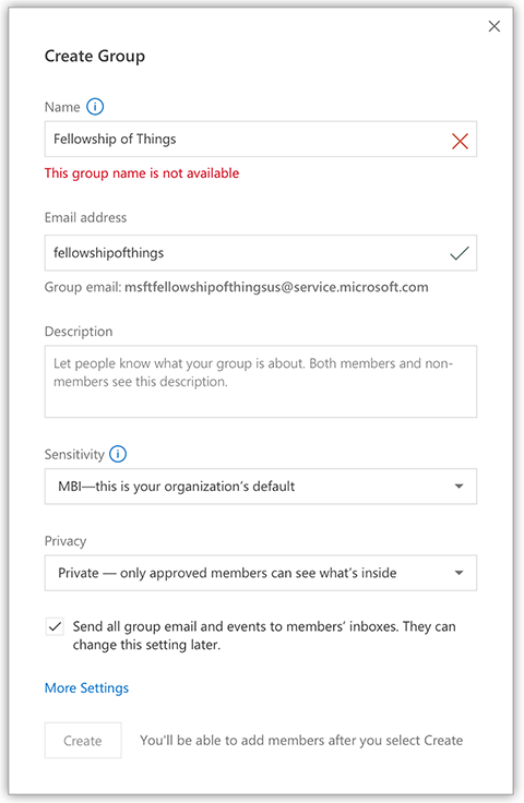
Groups Naming policy A group naming policy enables the IT admin to standardize and manage the names of groups created by users in the organization. The admin can require a specific prefix and suffix be added to the name for a group when it's created, and can block specific words from being used. This helps minimize the use of inappropriate words in group names as well as IT manage the representation of groups in their directory. Naming Policy also helps organizations that deploy team sites to categorize them based on department.
Notable fixes: We resolved an issue where inserting images into emails may have caused them to be resized.We resolved an issue where policy tips may not have worked when you changed the sender.We resolved an issue that may have displayed the retention policy for inboxes alongside the inbox name.We resolved an issue where the Meeting Notes add in for Outlook may not have launched OneNote.We resolved an issue where the name order in a user's account may not have been correct for Japanese names.We resolved an issue where blank spaces may have appeared in Contact cards with Japanese language pack. Word New features: Tabbed panes Now you can switch between multiple panes using a tab UI on the right hand side of the app. The UI will only be visible when you have 2+ panes open.
Notable fixes: We resolved an issue where the comment pane may have reloaded when using copy+paste.We resolved an issue where comments may not have pasted in the correct order.We resolved an issue where safelinks from Word to PowerPoint may not have launched PowerPoint correctly.We resolved an issue where @mentions may not have worked correctly.We resolved an issue where applying a template with multi-level list with custom styles may not have preserved the style.We resolved an issue where the margin dropdown menu may not have rendered correctly.We resolved an issue where the building blocks organizer may have displayed an invalid alert.We resolved an issue where follow-up preview loaded too much text.We resolved an issue where saving after a mail merge may not have worked.We resolved an issue where resizing a split screen border may have introduced an additional split screen.We resolved an issue where the name order in a user's account may not have been correct for Japanese names.We resolved an issue where hovering a mouse pointer over comments may display a textbox outline around the comment. Excel Notable fixes: We resolved an issue where users may have encountered an error when saving changes while using some non-English character sets.We resolved an issue where ribbon customization may not have loaded when opening an embedded workbook.We resolved an issue where clearing a modern array formula with backspace may not have cleared all cells.We resolved an issue where disabling hardware graphics acceleration with 4k resolution may have delayed the rendering of cells.We resolved an issue where ribbon customization may not have loaded correctly.We resolved an issue where users may have encountered an error while attempting to access a hidden named range.We resolved an issue where the margin dropdown menu may not have rendered correctly.We resolved an issue where the name order in a user's account may not have been correct for Japanese names.We resolved an issue where hovering a mouse pointer over comments may display a textbox outline around the comment. PowerPoint Notable fixes: We resolved an issue where safelinks from Word to PowerPoint may not have launched PowerPoint correctly.We resolved an issue that may have prevented scrolling on touch screens.We resolved an issue where the margin dropdown menu may not have rendered correctly.We resolved an issue where closing PowerPoint with the Camtasia add in running may have produced an error.If a user has two (or more) different videos on a slide in a cloud file, the video images are rendered correctly, but when the user clicks on each one to play, the video content is the same.We resolved an issue where the name order in a user's account may not have been correct for Japanese names.We resolved an issue where hovering a mouse pointer over comments may display a textbox outline around the comment. Project Notable fixes: We resolved an issue where the overallocation table may have been hard to read in dark mode.We resolved an issue where comparing projects may have caused the app to crash.We resolved an issue where updates to the effort column may not have been reflected in the day. OneNote Notable fixes: We resolved an issue where the Meeting Notes add in for Outlook may not have launched OneNote.We resolved an issue where the name order in a user's account may not have been correct for Japanese names.
Build 12307.20000 (November 15, 2019)
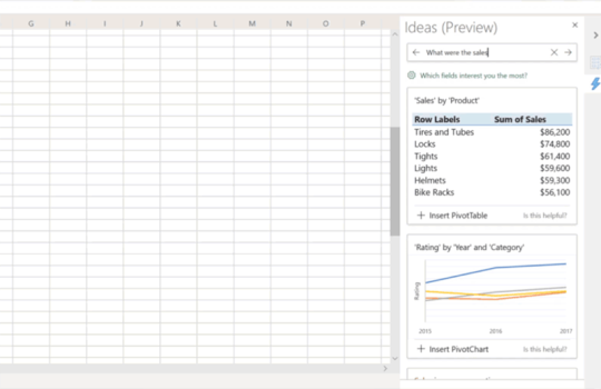
Excel New feature: Natural Language Queries in Ideas in Excel Tired of trying to remember tons of complicated formulas? Now you can simply ask Excel questions to glean insights from your data, all with the power of your voice! Using the intelligence that powers Ideas in Excel, natural language query will quickly answer users’ data questions with formulas, charts, or pivot tables.
Notable fixes: We resolved an issue where editing dynamic array formulas within a cell may have resulted in text being aligned outside of the boundary of the cell.We resolved an issue where Text to Column functionality may have failed for some localizations.We resolved an issue where replying to a comment may have caused the textbox to expand vertically beyond the edge of the pane. Word Notable fixes: We resolved an issue where right-clicking sometimes did not result in selecting the whole word.We resolved an issue where some themes made it difficult to determine which comment is selected.We resolved an issue where selecting a comment hint did not show the modern comments pane when hidden in pane switcher.We resolved an issue where the cursor may have remained active inside an object after converting to a suggested format instead of outside once the conversion has been accepted.We resolved an issue where embedded images may have appeared smaller than expected.We resolved an issue where replying to a comment may have caused the textbox to expand vertically beyond the edge of the pane. Project Notable fixes: We resolved an issue where users may experience an invalid error regarding licensing.We resolved an issue where the Today button in the date picker may have set the incorrect date.We resolved an issue where replying to a comment may have caused the textbox to expand vertically beyond the edge of the pane. Outlook Notable fixes: We resolved an issue where embedded images may appear smaller than expected.We resolved an issue where replying to a comment may have caused the textbox to expand vertically beyond the edge of the pane. PowerPoint Notable fixes: We resolved an issue where the cursor may have disappeared after moving focus from text.We resolved an issue where replying to a comment may have caused the textbox to expand vertically beyond the edge of the pane. OneNote Notable fixes: We resolved an issue where replying to a comment may have caused the textbox to expand vertically beyond the edge of the pane. Publisher Notable fixes: We resolved an issue where replying to a comment may have caused the textbox to expand vertically beyond the edge of the pane. Access Notable fixes: We resolved an issue where replying to a comment may have caused the textbox to expand vertically beyond the edge of the pane. Visio Notable fixes: We resolved an issue where replying to a comment may have caused the textbox to expand vertically beyond the edge of the pane.
Build 12231.20000 (November 8, 2019)
Excel Notable fixes: We resolved an issue where pasting a chart from Excel to PowerPoint could have reduced the size of the chart. Outlook Notable fixes: We resolved an issue that may have caused crashes when working with cross-folder content. PowerPoint Notable fixes: We resolved an issue where pasting a chart from Excel to PowerPoint could have reduced the size of the chart. Read the full article
#MicrosoftAccess#MicrosoftExcel#MicrosoftOffice365#MicrosoftOfficeInsider#MicrosoftOneNote#MicrosoftOutlook#MicrosoftPowerPoint#MicrosoftProject#MicrosoftVisio#MicrosoftWord#OfficeProPlus#publisher
0 notes
Text
Optical Effects in User Interfaces (for True Nerds)
How to make optically balanced icons, correct shapes alignment, and perfect corner rounding. An illustrated guide.
Our eyes are weird organs that often tell lies to us. But if you know the peculiarities of human vision, you can construct more approachable and clean designs. Not only do type designers utilize optical tricks for creating readable and well-balanced fonts, but it’s also helpful for interface designers, who build user-computer interaction.
In the 1920s the Gestalt theory of visual perception was developed. It explains how our eyes process different images and how our brain interprets them. You might have already heard about such things as the principle of proximity or the common fate rule. This article refers to some points of the Gestalt theory and highlights practical aspects rather than scientific research. There is a list of recommended materials on the topic at the bottom.
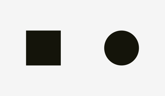
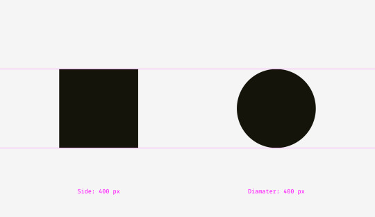
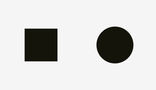
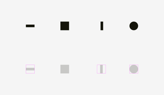
1. Measured and optical size
What is bigger: a 400-pixel square or a 400-pixel circle? Geometrically speaking, their width and height are equal. But look at the picture below. Our eyes immediately detect that the square outweighs the circle.
Here is the version with guides.
Let’s take a look at one more picture with a square and a circle. In terms of visual weight, are they equal to you?
At least it’s hard to tell immediately, which one outweighs the other. Not surprising because I increased the diameter of the circle.
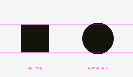
I overlapped the shapes from the first and the second examples. On the left, the 400-pixel square has bigger area than the 400-pixel circle. That’s why we see it visually larger. On the right, the circle and the square are balanced. Basically, they have similar area while their width and height are different.
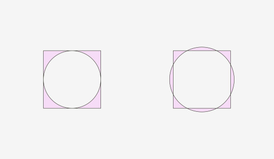
We can witness the same effect with diamonds or triangles. To be balanced visually with squares, they should be wider and higher, so that their areas are similar. Area-based approach works perfect with the simplest shapes.
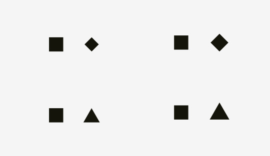
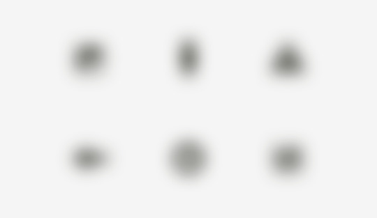
How can one use this feature in interfaces? For instance, when you are creating a set of icons, it’s important to make them all well-balanced, so that no icon stands out too much or looks too tiny. If we directly inscribe icons into square areas, the more square-like icons will look larger.
I recommend compensating the weight of differently shaped icons by allowing visually smaller icons to hang beyond the icon area and by leaving some space between visually heavier icons and the icon area.
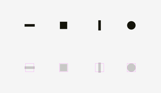
And now some real icons balanced optically.
Now it’s clear why an icon area is always larger than an icon body — just to allow non-square icons fit it and look not smaller than square icons.
The easiest test to check visual balance is blurring the items. If your icons turn into more or less similar blobs, they have the same optical weight.
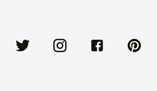
But sometimes we work with already existing graphics, for instance, social network logos used as sharing and liking buttons. Facebook and Instagram icons are square, whereas Twitter is represented by a bird silhouette and Pinterest by an encircled “P”. That’s why Twitter and Pinterest icons are a bit larger, so that they look balanced with Facebook and Instagram icons.
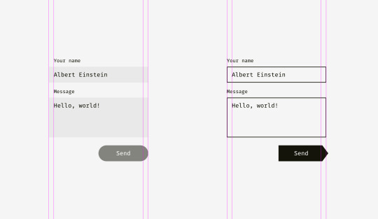
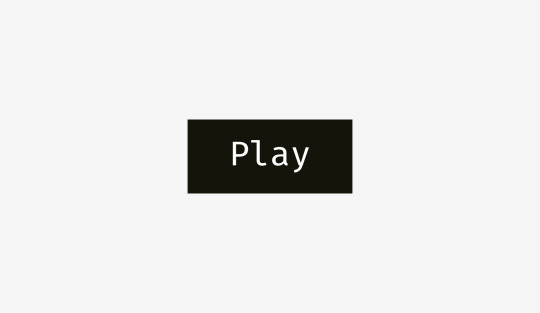
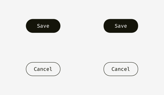
Another example of an optical balance issue is a textbox placed together with a round button. If the button diameter equals the textbox height, the button will seem smaller to our eyes. When you enlarge it a little bit, the whole construction will become better balanced.
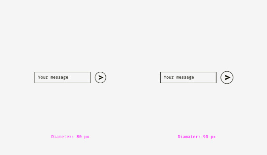
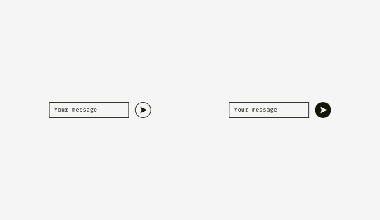
But if you change the style of the button, enlargement won’t be needed. On the picture below, the button and the textbox are 80 pixels high, but the button on the right doesn’t look “lost” owing to the strong black fill.
Things to remember
Optical weight is how human eyes perceive the size and significance of an object, and it doesn’t necessarily equal its pixel size or area.
Circles, diamonds, triangles, and other non-square shapes need to be higher and wider to be optically balanced with squarish shapes.
Areas for icons should have some space reserved for optical balancing. It’s crucial for sets of icons, which should look consistently.
2. Alignment of different shapes
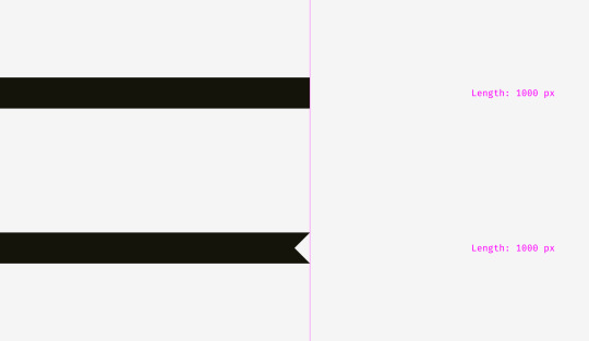
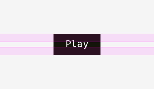
Optical alignment is a logical continuation of the optical balance topic. Take a look at the stripes below. Do they look as if they are of the same length?
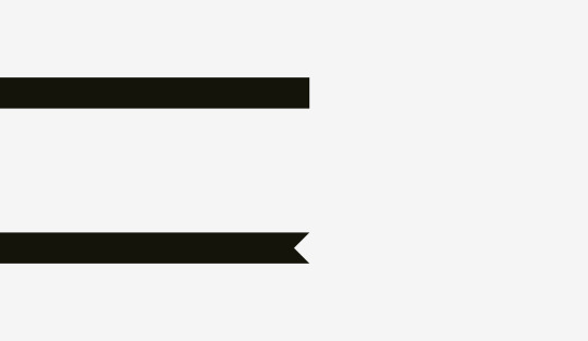
Pixelwise, the answer is a firm “yes”. However, at first sight, the lower stripe looks shorter than the upper one.
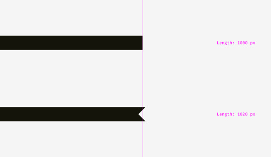
One more picture of the two stripes. Has anything changed?
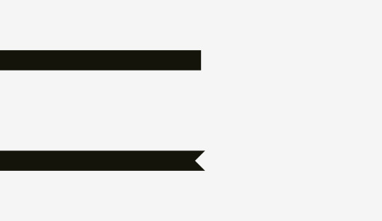
I applied optical compensation for the lower stripe. Allowing the spikes to go 20 pixels beyond the length of the upper stripe is the way to compensate a gap between the spikes and make both shapes optically equal.
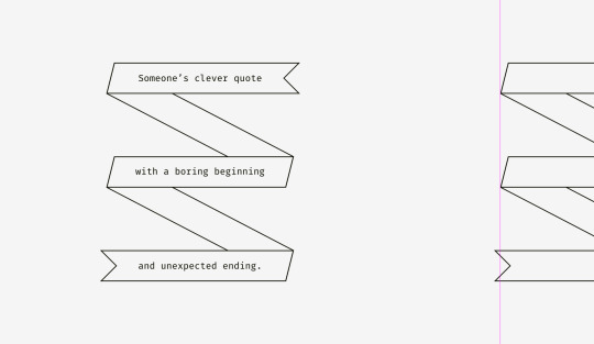
And now some more sophisticated examples of differently shaped stripes.
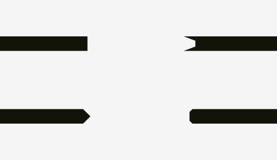
So, if you are creating a poster with folded stripes and text on them or you are putting a bright “discount” stripe on a product card of an online store, mind making them optically balanced. Sharp edges should go a bit beyond the rest of the shape, especially if it’s a rectangle.
And what about aligning plain text and paragraphs that have a background? It depends on the visual density of the background. If it’s light, you can align the highlighted paragraph with the rest of text.
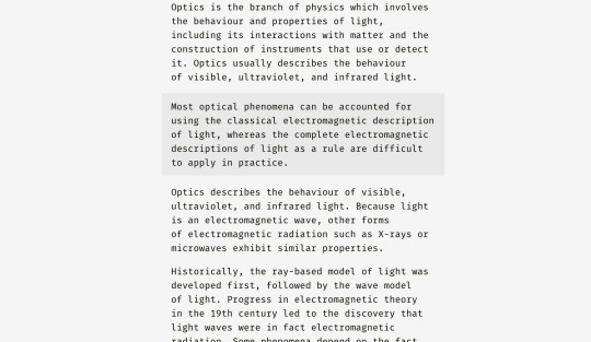
Since the background is light, it doesn’t interrupt the usual text flow.
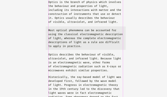
A different approach can be utilized for a dense background. On the picture, the black background is aligned with the rest of text while the white text inside of it is placed with indents.
Unlike the case with the light background, the black one has substantial optical weight, and if the goal is to insert a paragraph seamlessly, it’s better to align it the way shown below.
The same principle will work with buttons and input fields. Of course, it’s not a dogma, just a recommendation based on human visual perception.
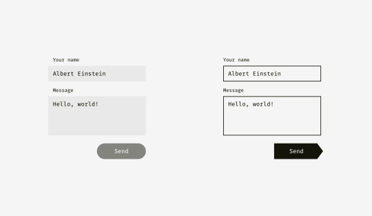
The light background of input fields on the left can go beyond input labels and user’s input. The right edge of “Send” button is not fully aligned with the right edge of input backgrounds since the button is darker and looks heavier from visual perspective.
On the right, inputs have solid borders, and I aligned them with the labels while user’s input has indents inside of the boxes. “Send” button has a triangular side. The button is moved a bit rightwards to look balanced with the rectangular input fields above.
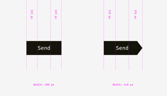
And here we are approaching to one more aspect of alignment — the alignment of text and icon buttons. Look at the buttons below. The text looks centered, doesn’t it?
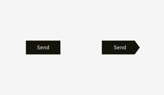
The trick is that on the right button I moved the word a bit to the left, since the right edge is triangular. Moreover, the arrow-like button is 40 pixels wider to look optically equal to the rectangular one.
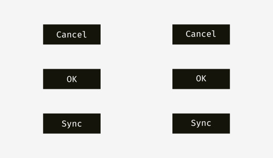
Not only do text buttons have horizontal alignment, but also they have vertical alignment of a word and a background. The first approach I’d like to tell about is used in the interfaces of various operating systems, sites, and applications. It’s the alignment based on the height of an uppercase letter of a font (so-called cap height). It equals the height of either “H” or “I”.
Basically, the space above and below an uppercase letter and the edge of a button is equal. It makes sense because command names usually are written in title case and English letters have more ascenders, upper sticking out parts (l, t, d, b, k, h), than descenders, lower hanging parts (y, j, g, p).
Another approach is to align a name and a background using the height of a lowercase letter of a font (so-called x-height). In sans and sans serif interface fonts, it equals the height of — not surprisingly—the letter “x”.
This approach also makes sense because the main optical weight of a text is concentrated in the area where lowercase letters are placed.
Is there any difference between these approaches? Yep, there is a difference. And it’s not that big.
More examples for comparison below. The cap-height approach represented by the left column is definitely better for “Cancel” and “OK” — so widely used buttons — because “Cancel” has no descenders and “OK” is all capitals. The x-height approach shown in the right column is better only for “Sync” button, the name of which has both an upper and a lower sticking out elements; “Cancel” and “OK” words seem to be placed too high.
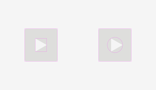
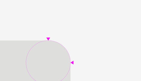
The situation with icon buttons is slightly different from text buttons. Let’s put a popular “Send” icon on a round button background. Which variant looks more visually balanced?

Hope you’ve noticed that something is wrong with the left one. It happens because of different alignment methods. The first option treats the icon if it was a rectangle. To a certain extent that’s right because when you send an SVG or PNG file to a developer it’s a rectangular sheet with a paper plane art on it. The right variant shows the icon placed the way all its sharp edges have equal distance to the circular button background.

If you prepare a file for a developer, you need to reserve some area, so that they can center the icon on the background optically right.
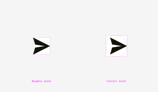
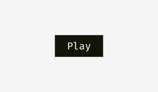
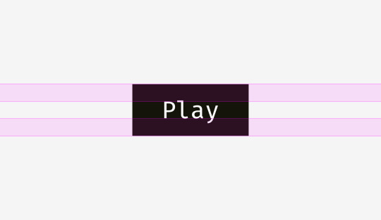
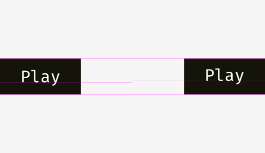
The same story with “Play” buttons. If you directly align these shapes — a rounded rectangle and a triangle — they’ll look odd.

If you want to position the triangle optically better, encircle it and align this circle with the button background.
Things to remember
Shapes with sharp edges should be larger or longer to look balanced with the neighboring rectangular objects.
Cap-height alignment is an effective method of positioning button names on button backgrounds.
One of the effective ways to correctly position a triangular icon on a button is to encircle it and align the circle with the background.
3. Optical corner rounding
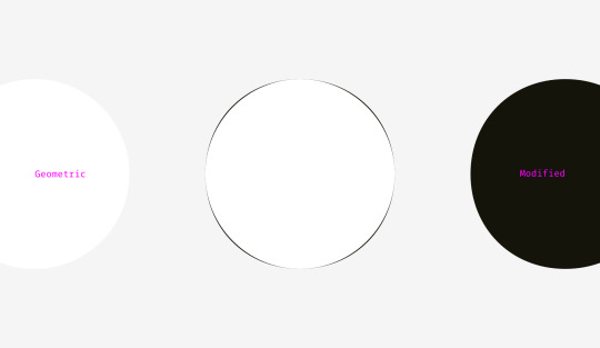
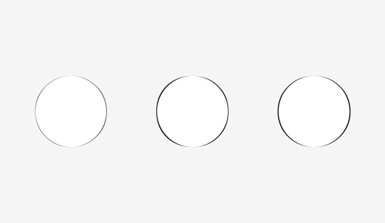
What can be more circular than a circle? I used to think that nothing, but as I said at the beginning of this article, our eyes are weird and sometimes perceive things not as we expect. So, which circle on the picture below looks the most smoothly circular?
People who I asked before were choosing between numbers 3 and 4. Numbers 1 and 2 are definitely too skinny, 5 is too plump. If we overlap the third and the fourth variants — a geometric circle and a modified circle — we’ll find out that the latter is a trifle heavier than the first one and, consequently, more smooth to our eyes.
To show what I mean I took letters “o” from three famous geometric fonts — Futura, Circe, and Geometria. Given that high-quality fonts are built based on human visual perception and use a sophisticated system of optical construction, I suppose their circular shapes look more circular than geometric ones. Aren’t these letters pleasant to your eyes?
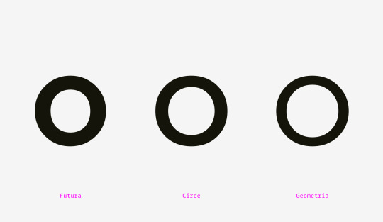
Let’s overlap them with geometric circles. Even the most geometric Futura’s “o” has four sticking out parts. Circe’s and Geometria’s letters are, in addition, wider than circles, but even if they had equal height and width, we could see these four “bellies” as if they were hungry and overate.
So, optically speaking, a modified circle (on the right) can look even more “circular” than a geometric one (on the left).
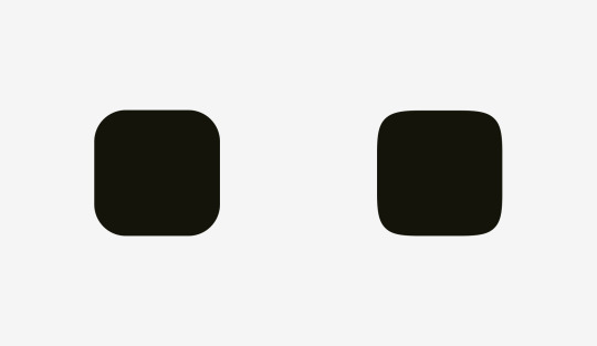
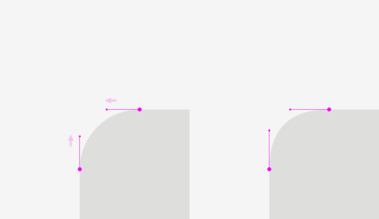
How can we use this phenomenon? For corner rounding, of course! If you utilize the embedded rounding feature in popular graphics editors, the result will be not optically good.
Human eyes immediately detect the point where a straight line suddenly turns into a curve. And this rounding doesn’t look natural.
I fixed this issue taking into account our visual perception.
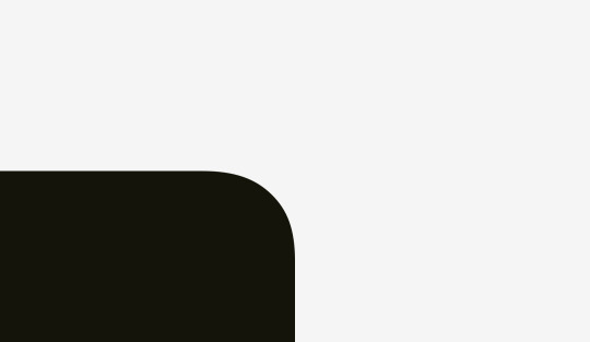
This kind of rounding has an extra area beyond the geometric circle making the point where a line meets a curve unnoticeable.
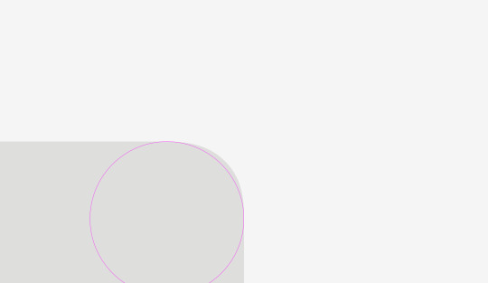
Just try to feel the difference between these rounding methods.
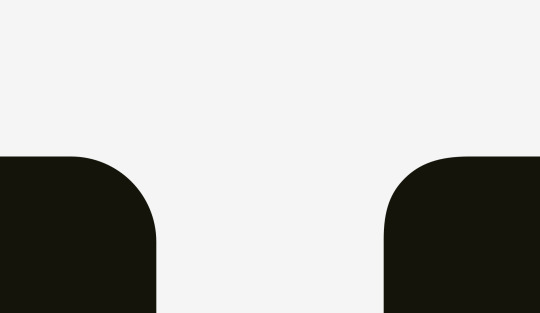
Now we can apply this approach to rounded buttons.
You might have noticed that the buttons on the right have more smooth corner rounding and it is more pleasant to your eyes.
The same story with app icons. One doesn’t simply use standard corner rounding to reach a perfect result. But before we dive into this topic let’s take a look at two differently rounded shapes.
The first one is a rounded rectangle, which I created in Sketch. The second shape is a superellipse, also known as Lamé curve. It was discovered by a French mathematician Gabriel Lamé and depending on the formula can vary from something like a four-pointed star to the shape looking practically as a rounded square.
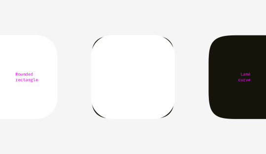
Marc Edwards proposed the formula of Lamé curve that resulted a smooth and optically perfect shape. Icons starting from iOS 7 are based on it.
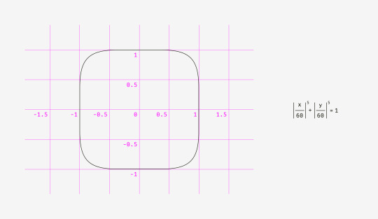
Later this shape was modified by adding golden ratio proportions and a grid for guiding the designers of new icons but that’s a different story.
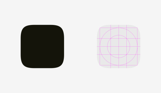
The main benefit of using shapes like superellipse is their smooth appearance. On the other hand, these non-standard shapes are difficult to insert into a real interface. One should either combine multiple SVGs, include special formulas or scripts into the code or use PNG masks like Apple does for its app icons.
As for design process itself, there is a simple fix for rounded corners. You need to convert revertible rounding effects into an outline, enter the shape editing mode and manually move curve handles closer to each other.
The difference is even more vivid with acute angle rounding, which is important for drawing road or metro schemes.

Things to remember
Geometrically rounded corners look artificial because you can easily see the points where a straight line suddenly turns into a curve.
Optically correct corner rounding needs special formulas or manual adjustment of a shape.
Bonus
Sometimes a not ideally geometrical square looks more squarish. You might think, “What a ridiculous nonsense?” So, what do you think about the squares below? Which shape looks more squarish?
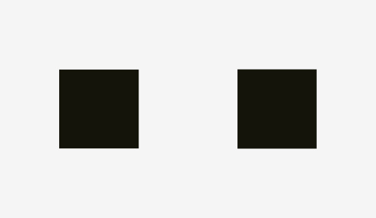
If you’ve chosen the left shape, you’ve managed to hear the voice of your unbiased visual perception.
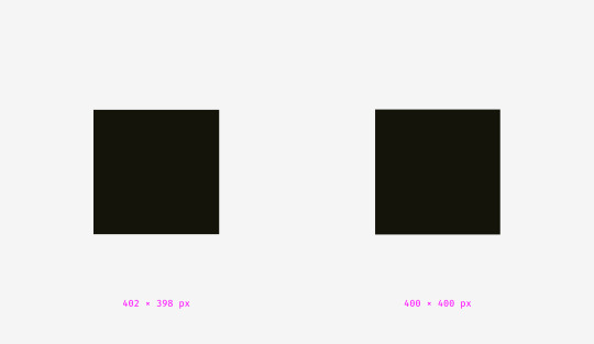
I personally was surprised when learned that our eyes are more sensitive to the height of an object than to its width. It explains why even in geometric fonts, letters “o” are always wider than geometric circles, and the vertical stems of letters “H” are always thicker than the horizontal ones.
Recommended reading
This essay provides a limited understanding of the topic, so I encourage you to keep on exploring it. Here is a list of articles and books about the origins of Gestalt psychology and its initial ideas.
Barry Smith, “Gestalt Theory: an Essay in Philosophy”, 1988. A profound study on the Gestalt theory origin and the philosophical and psychological aspects of human perception.
Steven Lehar, “The World in Your Head: A Gestalt View of the Mechanism of Conscious Experience”, 2002. This book explains how people perceive reality. It turns out that we see not the real world but its reflection in the brain. (Chapter 1 is available online.)
James J. Gibson, “The Perception of the Visual World”, 1950 (a scanned copy, some images are low-quality). The book shows how the physical processes in our brain affect the way we see the world.
James J. Gibson, “The Ecological Approach to Visual Perception”, 1979. (A same-titled article with key ideas is available online.)
George Boeree, “Gestalt Psychology”. A brief history of Gestalt ideas.
Biographies of the founders of Gestalt psychology: Max Wertheimer, Kurt Koffka, and Wolfgang Köhler.
The post Optical Effects in User Interfaces (for True Nerds) appeared first on Design your way.
from Web Development & Designing https://www.designyourway.net/blog/user-interface-design/optical-effects-in-user-interfaces-for-true-nerds/
0 notes
Photo
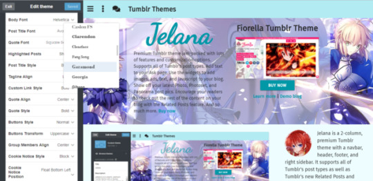
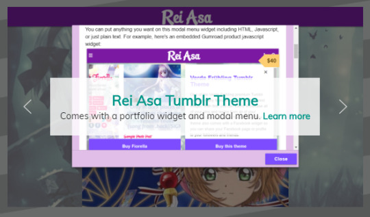
How to Customize the Jelana Tumblr Theme Select Options?
This post will show you how to customize the select options of your blog if you’re using the Jelana Tumblr theme. To get started, go to the theme options page of your blog.
Here are the meanings and explanations for each of these select options:
If you want to use Tumblr’s built-in fonts for your blog, then refer to the following font options:
Body Font - the font family for the body part of your blog such as the contents of your posts.

Post Title Font - the font family for the titles of your blog posts such as Chat and Text posts. This includes caption titles (if you turn on the caption titles feature) for Photo, Panorama, Photoset, Video, Link, and Audio posts.

Quote Font - the font family for quotes in quote posts. This applies only to the quote itself as well as the first line in the body of the quote post (for the author or source of the quote).

The rest of the text in the quote post uses the Body Font.
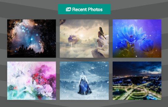
Highlighted Posts - the choices are either Show or Hide.
If you choose to show this, images from your latest Photo, Photoset, and Panorama posts will be displayed on the sidebar. These images will contain a link to the post where they came from.
On the demo blog, the heading for this feature is “Recent Photos”, but you can change this to any text you like.
On bigger screens, the highlighted posts will show up on the sidebar. On smaller screens, it will show up after the posts section of your blog.
Note that even if you choose to show this feature, it will not appear on your blog unless you have at least 6 Photo, Photoset, or Panorama posts.
This is decided by Tumblr; the feature will automatically show up (if you turn or toggle it on) as long as the requirement of 6 pics have been met.
Post Title Style, Custom Link Style, Quote Style, and Buttons Style - the choices are:
Bold
Normal - this is the default style, meaning the text is neither bold, italic, or underline
Italic
Underline

The Custom Link shows up on the navbar part of your blog. You can put any text and link you want here. In the demo blog, the text says Tumblr Themes. See this post for more info.
Tagline Align, Quote Align, and Group Members Align - the choices are:
Left
Right
Center
Tagline refers to the text on the header section of your blog. This shows up right below your blog title.

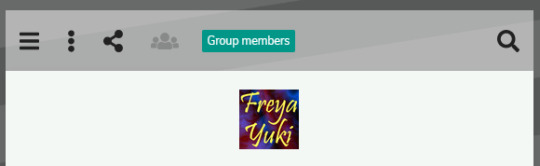
Group Members - this feature shows up on the sidebar part of your blog.

The avatars of the members of your blog will be listed here. Their avatars will contain a link to their Tumblr blog.
If you hover your mouse over each of the avatars, you will see a tooltip with the blog member’s username as well as the title of their blog.

Both Quote Style and Quote Align refer to Quote Posts. This applies only to the quote itself as well as the first line in the body of the quote post (for the author or source of the quote).
Buttons Transform - the choices are:
Uppercase - this means the text will show up in all caps like this: EXAMPLE TEXT
Lowercase - this means the text will show up in all small letters like this: example text
Normal - the text will show up exactly how you type it on the provided textbox. For example, if you type Example Text, then it will show up as Example Text
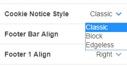
The Cookie Notice Style has the following options:

Classic

Block

Edgeless

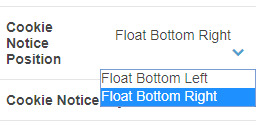
The Cookie Notice Position has the following options:

Float Bottom Left - the cookie consent notice will show up on the bottom left side of your blog

Float Bottom Right - the cookie consent notice will show up on the bottom right side of your blog

If you have any questions about any of this, please feel free to ask me by leaving a message in the comments section below or by contacting me here.
#theme features#tumblr theme#tumblr themes#custom theme#premium theme#theme options#select options#customize blog#premium tumblr theme#theme documentation#premium themes#jelana
0 notes
Photo

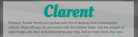
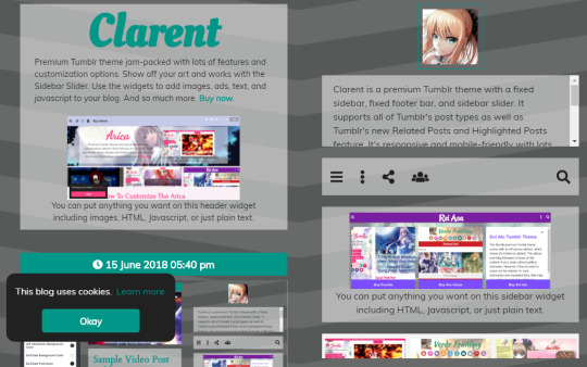
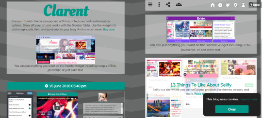
How to Customize the Clarent Tumblr Theme Select Options?
This post will show you how to customize the select options of your blog if you’re using the Clarent Tumblr theme. To get started, go to the theme options page of your blog.
Here are the meanings and explanations for each of these select options:
If you want to use Tumblr’s built-in fonts for your blog, then refer to the following font options:
Body Font - the font family for the body part of your blog such as the contents of your posts.
Post Title Font - the font family for the titles of your blog posts.
This includes caption titles (if you turn on the caption titles feature) and text posts with no title (if you use the tag that will turn the first line of your text post with no title into a title).
Check out this post for more info.
Quote Font - the font family for quotes in quote posts.
This applies only to the quote itself as well as the first line in the body of the quote post (for the author or source of the quote).
The rest of the text in the quote post uses the Body Font.
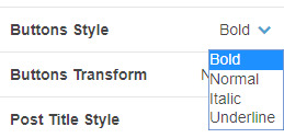
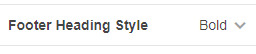
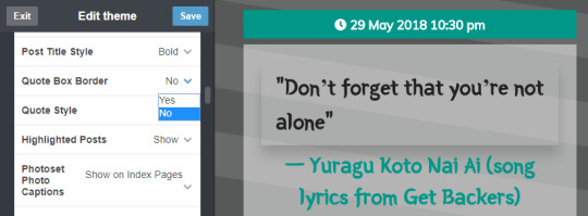
Buttons Style, Post Title Style, Footer Heading Style, and Quote Style - the choices are:
Bold
Normal - this is the default style, meaning the text is neither bold, italic, or underline
Italic
Underline
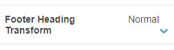
Buttons Transform and Footer Heading Transform- the choices are:
Uppercase - this means the text will show up in all caps like this: EXAMPLE TEXT
Lowercase - this means the text will show up in all small letters like this: example text
Normal - the text will show up exactly how you type it on the provided textbox. For example, if you type Example Text, then it will show up as Example Text
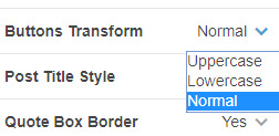
Quote Box Border - the choices are either Yes or No. Picking Yes will add a border box around the quote of quote posts. Choosing No will remove this border box.
Highlighted Posts - the choices are either Show or Hide.
If you choose to show this, images from your latest Photo, Photoset, and Panorama posts will be displayed on the sidebar. These images will contain a link to the post where they came from.
On the demo blog, the heading for this feature is “Recent Photos”, but you can change this to any text you like.
On bigger screens, the highlighted posts will show up on the sidebar. On smaller screens, it will show up after the posts section of your blog.
Note that even if you choose to show this feature, it will not appear on your blog unless you have at least 6 Photo, Photoset, or Panorama posts.
This is decided by Tumblr; the feature will automatically show up (if you turn or toggle it on) as long as the requirement of 6 pics have been met.
Photoset Photo Captions - the choices are Show on Index Pages and Hide on Index Pages.
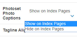
On the Clarent Tumblr theme, pics from Photoset posts are displayed in a single column, 1 image per row.
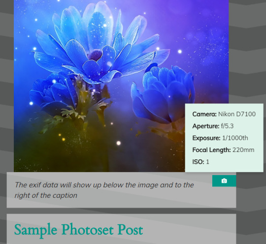
Captions for each photo will show up right below each photo.
You can choose to have these captions show up on index pages or you can have them only show up on post permalink pages.
Tagline Align - the choices are Left, Right, Center, and Justify.
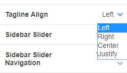
The tagline is located on the header part of your blog, right below your blog title. The Tagline Align will align your text either to the Left, Right, Center, or Justify.
On bigger screens, it will look like this:
On smaller screens, a small circular arrow icon will show up at the end of the tagline text.
If you click on this downward caret arrow, you’ll automatically be scrolled down to the sidebar section of your blog.
Sidebar Slider - the choices are Show or Hide.
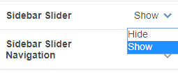
Sidebar Slider Navigation refers to the left and right icons located on either side of the slider. You can use these icons to look through the slider.
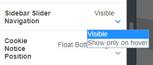
You can choose to make these icons Visible all the time or have them show up only when you hover your mouse over the slider (Show only on hover).
The Cookie Notice Position has the following options:
Float Bottom Left - the cookie consent notice will show up on the bottom left side of your blog
Float Bottom Right - the cookie consent notice will show up on the bottom right side of your blog
The Cookie Notice Style has the following options:
Classic
Block
Edgeless
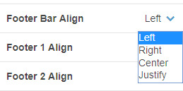
Footer Bar Align - this refers to the alignment of the contents of the fixed footer bar widget. This widget shows up on smaller screens when you scroll down a bit on your blog.
The alignment choices are Left, Right, Center, and Justify.
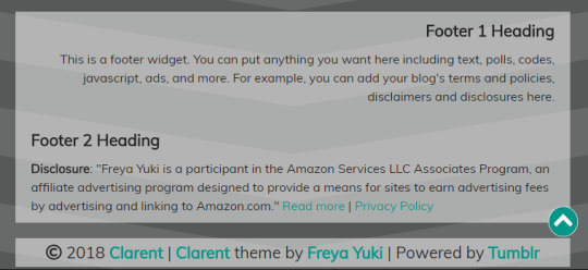
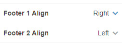
Footer 1 Align and Footer 2 Align - this refers to the alignment of the contents of the footer, which shows up at the bottom of your blog.
The choices are Left, Right, and Center.
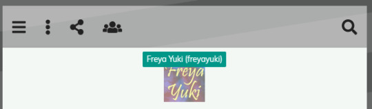
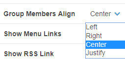
Group Members Align - this feature will show up on the navbar.
Click on the people icon (if you hover your mouse on it, you will see a tooltip which says “Group members”) to open a dropdown box or container.
The avatars of the members of your blog will be listed here. Their avatars will contain a link to their Tumblr blog.
If you hover your mouse over each of the avatars, you will see a tooltip with the blog member’s username as well as the title of their blog.
You can choose to align this group members avatar list to the Left, Right, Center, or Justify.
If you have any questions about any of this, please feel free to ask me by leaving a message in the comments section below or by contacting me here.
#premium themes#tumblr themes#tumblr theme#theme documentation#premium theme#premium tumblr theme#customize blog#custom theme#theme options#theme features#select options#clarent
0 notes
Text
How to center an image in HTML – We Covered It
How to center an image in HTML?
How to align an HTML image to the center of your screen using a grid?
1. Create an HTML image
2. Select the image below and click the Create button.
3. Select your grid
4. Choose the network for the image you just created.
5. You should now see your image at the center of your screen.
6. Select a different grid to align it with
7. Now create a new grid that will align your image as well.
Read More : 18 great HTML APIs – and how to use them
Use the Grid Editor
1. Use the grid editor and Set the grid to the image you just created
2. Right-click an image you’ve placed on your screen to create a new grid.
3. Then click the grid icon to apply a style to the grid
Make a grid using the Grid Editor
1. Set the grid to the image you just created.
2. Right-click an original image you’ve added on your screen and then click the Edit button.
3. Then select the grid from the menu.
4. Click the OK button to save your grid. Now you can place your image anywhere within the image.
5. Place images by using the image preview option, which will create one grid
Read More : 5 hot new CSS features and how to use them
You can move images within the Grid Editor too:
Using a Grid Tool.
1. Right-click an image you have selected in the Grid editor, and then choose Edit > Select Grid to adjust the grid’s shape
2. Right-click an image you have added on your screen and then select Edit > Transform from the Grid Editor
3. Now choose the image you’ve created
4. Right-click the image you’ve selected in the Grid editor to remove it from the image window
5. Then right-click the grid icon to add a new one
You can add an image to your grid using the Grid Tool.
1. Right-click an image you have selected in the Grid editor, and then choose Edit > Grid to add an image.
2. Select an object you want to add to the grid with
3. Right-click on the object and select Insert.
Ways to center an image on your website:
There is a wide variety of ways to center an image on your website. There are a couple of easy ways you can do this.
1.) You can put the image on a page. This is the simplest and fastest way to center an image.
2.) If you’ve created or edited the image, use a text editor to center the image.
3.) You can add a colour gradient between the image and the container so that the colour of the image is more intense.
I hope this article helped you realize how to center an image. It’s not easy to do, but I found some great ways through this article that I’ve been using and would recommend you take for a spin.
Related tags:
css center image in div, bootstrap 4 center image, css center image vertically, html align center text, css thumbnail image\, w3school meet the team, image and text side by side html css, how to align textbox in html, image position css, html image padding, html align text, html how to center a gif, image won t align left html, vertical align image, how to align table in center of page in html5, center image in div vertically, position absolute center, text in middle of div, center image html without css, centrar imagen css, image align not working, html5 align center, align center not working, how to move an image up in html, how can you change the border of a table, how to move a picture to the right in html, html center image on page, how to align multiple images in html horizontally, html image, html image size, center image in div vertically and horizontally, how to center an image in html5, how to put text next to an image in html
The post How to center an image in HTML – We Covered It appeared first on Game Leaks.
0 notes