#Based on the in-game UI with a little more flair
Explore tagged Tumblr posts
Visit Tumblr Blog
Explore Tumblr blogs with no restrictions, modern design and the best experience.
Last Seen Tumblr Blogs


Fun Fact
Tumblr.com rank in the US is 25.
Text
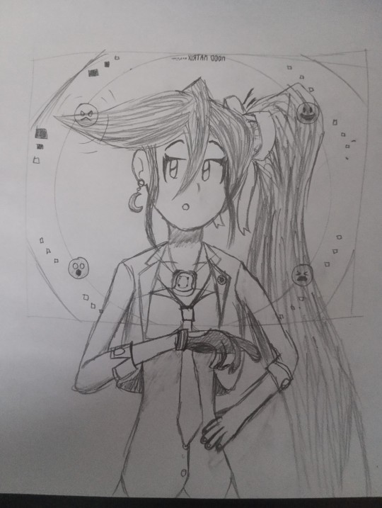
Stage 2 Anger... just for entering the scene?
Man I haven't done art in a while...
I know I also said before that I was playing TGAA2, but I couldn't help myself (Athena is so precious to me)
(The state of the Mood Matrix is actually based on one of SoJ's sequences, by the way!)
#art folder#sketch#ace attorney#athena cykes#mood matrix#turnabout storyteller#<- technically?#I definitely exaggerated on some of the proportions#It's fine though#Also HC Mood Matrix design!#Based on the in-game UI with a little more flair#in the form of the squares to indicate the emotion's intensity#ik the pulsing already does that#but it's nice to be extra clear sometimes#also it has a “window mode” so that she can see through it and look at the witness#the mental image recreation is still there but it's toggleable#.........#[looks at the amount of HC tags]#[SIGH]#I guess a text post is in order at some point#eagerly awaiting the return to the Sky Deck#OR... feel free to drop in some asks!
6 notes
·
View notes
Text
weekly update
Hello everyone, and happy Monday! We've officially arrived in September, the month of crisp mornings, baking, wellies and winter coats 🍂🍁🧥
The updates for this week can be found, as always, under the cut. Happy Simming!
— Database
Following up from last week's update: we've now worked through all backlogged tags and mentions available to us. If you've submitted something and it's still missing from the database, please re-send it — thank you! 🙏🏻
From this week on, we'll be reverting to bi-weekly updates instead of weekly updates due to personal time constraints. Thanks for understanding 🤗
— Base Game
A little UI improvement: the top menu on all base game pages has been updated to include links to its subpages. You can now access Buy Mode, Build Mode, Decorative and Debug from any of the other subpages. Phew! 😮💨
Base Game Decor

Casual Comfort Pillow conversion by @platinumaspiration has been added.
— Expansion Packs
Lovestruck
The filterable page is now available!
A link to the filterable page in the pinned post has been added.

A Flair for Dramatics Back Bar, A Wave of the Palm Plant, Agapanthus, 'Animal in Me' Flooring, Araceli the Breathtaking, Art Divider, Artisanal Harmony Living Chair, Artisanal Harmony Wooden Table, Artsy Porcelain Veggie Bowl, Artsy Urban Number Sign, and more conversions by @tvickiesims and @platinumaspiration have been added.

Cornery Feelings End Table (+ add-on), Herbert Heart, I Chair-ish You, Kiss of the Night Couch, and Love's Little Book Collection conversions by @megamassikalove have been added.

I Chair-ish You and Kiss of the Night Couch conversions by @deatherella have been added.
16 notes
·
View notes
Text
8 CSS & JavaScript Snippets for Awesome Reveal Effects
New Post has been published on https://thedigitalinsider.com/8-css-javascript-snippets-for-awesome-reveal-effects/
8 CSS & JavaScript Snippets for Awesome Reveal Effects

Not everything on a website has to be displayed straightforwardly. Sometimes, it’s prudent to hide an element. We can then reveal it automatically or via user interaction.
That’s what makes reveal effects so compelling. They can serve dual purposes. The first is to keep our layouts nice and tidy. The second is to add a bit of flair to the user experience (UX).
And there are many intriguing options for web designers. Using CSS and JavaScript offers a path to creating high-end effects. They not only look great, though. There are ways to build features that are performant and accessible as well.
Want to explore some possibilities? Check out our collection of fantastic reveal effects. They run the gamut in terms of use cases and technology.
Scratch Card CSS Reveal by Nicolas Jesenberger
This reveal effect mimics a real-world experience – using a scratch card. Use your finger or pointing device to “scratch” off the silver foil. You’ll find a little surprise underneath. It’s both clever and well-executed.
See the Pen Scratch Card by Nicolas Jesenberger
Magic Wand Reveal by Kalis Network
Here’s a snippet that takes web magic to the next level. Move the magic wand from left to right to reveal the image gallery underneath. There’s also a subtle effect for nearby images. They’re blurry and displayed with a lower opacity.
See the Pen Magic Reveal by Kalis Network
Circular Reveal Animation by Liza Shermayster
You don’t need to go overboard with reveal effects. This simple presentation reveals more of the image upon hover. And it also adds a classy text animation. It would work well on a portfolio or About Us page.
See the Pen circular reveal animation by Liza Shermayster
Text Reveal Animation by Owlypixel
How about a reveal effect that happens automatically? This animated headline is beautiful and sure to get a user’s attention. It’s also powered by CSS. That means there are no messy scripts to slow down your page load times. The JavaScript used in the snippet refreshes the demo.
See the Pen Text Reveal Animation by Owlypixel
Ink Transition Reveal by Ryan Yu
These scroll-based animations are incredible. The artwork appears to be drawn on your screen as you scroll. The effect creates a mood to enhance the UX. It’s a case of special effects fitting the content to a tee.
See the Pen Ink transition effect with PNG sprite by Ryan Yu (@iamryanyu)
Movie Poster Interaction Reveal by Ethan
Card UIs are a popular design element these days. But there’s only so much content they can hold. This snippet offers a solid workaround. Hover over a card to reveal further content. The layout remains neat while adding a bit of interactivity.
See the Pen Movie Poster Interaction by Ethan
Page Reveal Effect by Kevin Levron
Yes, you can use reveal effects for an entire page! And this tool can help you create the perfect fit for your project. Choose from several animation types and other options to build a beautiful presentation. Plus, it’s just plain fun to experiment with.
See the Pen Page Reveal Effect (CSS/VueJS) by Kevin Levron
Accessible Offcanvas Reveals by Vasileios Mitsaras
Offcanvas elements are a handy place to store extra info. They’re often used to hide mobile navigation so that users can focus on content. This demo uses jQuery to add elements that can be revealed in multiple ways.
See the Pen Accessible Offcanvas by Vasileios Mitsaras
A Revealing Way to Build a UI
Reveal effects can take many forms. They’re suitable for everything from a corporate website to an online game. Their potential is vast and varied.
It’s still important to consider the impact on users, though. The best implementations feel natural and add to the UX. Therefore, it’s best to avoid effects that get in the way of accessing content.
Thankfully, CSS and JavaScript provide plenty of leeway. You can use the combination that works best for your project.
Want to see even more reveal effects? Check out our CodePen collection!
Related Topics
Top
#animation#animations#attention#content#CSS#CSS Animation#CSS Snippets#Design#designers#effects#Features#focus#Forms#game#hover#how#Image Gallery#images#impact#Ink#interaction#interactivity#it#JavaScript#JavaScript Snippets#JQuery#layout#Mobile#natural#navigation
1 note
·
View note
Text
Building a HUD
For my game, I need a hud to display the health of each character. There tend to be two distinct ways of doing this - keeping it in the corner of the screen, or just above/below the character. With the first display, multiple options for abilities can be displayed by it so the HUD is tied together and not separate from the gameplay area, however it only really works with 1-on-1 duels. With the latter display, it separates the playable area from the ability menu, keeping the gameplay environment cleaner. This also means that there can be a lot more information or options without obscuring the playable area, however there is less room for stylisation as the HUD elements are far smaller and the HUD isn't integrated into the playable area,


Having considered this, I intend to use a Pokemon-style HUD, with the health displayed either in corners or at the bottom/top of the screen. Although I haven't settled on a design, I'd like the health bars to be joined in a single layer, perhaps at the bottom with space inside for the ability menu.

Although my game won't be isometric, I like the simplicity of this HUD and how it leaves most of the screen space for gameplay.

Although my game isn't steampunk, it takes a few design elements and uses the same palette. This HUD feel a bit too generic for me, but I might take inspiration for it in the ability buttons.

it never ends I really like the TF2 HUD. Particularly the class/disguise display in the bottom left and how it reflects your characters weapons/cosmetics, but also the transparence so it doesn't completely obscure areas of the screen. In particular, I like the display at the top showing the time and team alive.


These are two diferent variations for my HUD. It will be replicated the other side for the enemy's health, with a middle section joining it. I also intend to add the characters' names, but I don't know whether to have the health as a number or progression bar. I based the design off a pool or gambling table, using the black-and-red from roulette as a little flair. I really like the colours [which I got from the TF2 High Roller skins] and am proud of how it looks.

Having selected the first HUD, I added a transparent glass layer. This will be added as a separate texture on top of the progress bar. There are 10 pixels between the border of the bar and top of the HUD, so more than enough space for writing. I may have to decrease the height by a pixel as a usually write in 5 pixel height, But I'm sure I'll be fine.

I've now added and programmed my HUD. Unfortunately, the progress bar won't decrease.

This is my code, it should work and seems identical to the code used in a solution on the forums, but it doesn't. For whatever reason, the bar won't update

I tried the following guide but it also wouldn't work - I cant bind my custom event
0 notes
Text
Heads Up Displays
I'm going to look at a few games here, noting their UI's and HUD's
Dead Space:
Dead space has certainly got a unique gimmick for its UI, in that being it's 3d and sort of in the scene with you, despite the fact it's most likely rendered separately. It allows you to have a sense of awareness of enemies and what's going on in the scene around you, aiding the player in surviving. It also adds difficulty, as unlike most UI's, due to the fact it is displayed in the scene nothing gets paused and so you must navigate your UI in real-time.

Persona 5:
Persona 5 contains a more stylized HUD than practical or groundbreaking, it has most of the features of a normal menu but reminds me in a sense of the "Pop-it" from Little Big Planet in the sense it is based around the character and their position. It features a cartoony flair and doesn't take up too much of the scene

Mirrors Edge:
Mirrors Edge contains what i'd call a minimalist UI, an advantage of this gameplay wise is it doesn't take up barely of the screen at all, and it isn't distracting allowing you to focus on the difficult freerunning.

Dead Cells:
Dead Cells is the game i'm most interested in because of the art style being directly similar to mine - pixel art. The UI is situated at the bottom of the screen, generally just under where the ground will be tucking it out of the way of all of the action but still being accessible, Items are shown as a graphic inside of a box.

1 note
·
View note
Text
miitopia demo came out, im gonna talk about it
ok so just as a starting point, i LOVE miitopia. miitopia and tomodachi life are some of my favorite games on the 3DS. i’ve played both games (and restarted them bc the only have one fucking save file), i’ve watched vinny’s streams of both games (both highlights and the full streams, i have too much free times) and loved them, so when i heard miitopia was getting a remake for the switch i was... cautiously excited. so the demo is out now, and i have some thoughts.
first the goods the game looks great! i mean obviously its a graffical remake, so of course its gonna look good. plus its on a bigger screen and if you’re not like me and have a standard switch (and not a switch lite) the screen can be even bigger! mii customization is greatly added, like in the trailers you can add extra flair to your miis, and for those who like to make miis based on cartoon characters or just really elaborate OCs, it really helps. but they’re not in the default mii creator you add them in a menu fyi
now for the bads
how they handle miis, oh golly gee gosh i have some problems. it all stems from the fact that unlike the 3DS, the switch does not have a mii central, and honestly I expected them to make a mii central for the game. like a pokemon home kind of app where you could import miis. you have a few options if you wanted your old miis from mii-maker to be in this game.
you can create them from scratch or choose them from switch save data which are the same thing (which i mean if you can do that for EVERY MII in this game more power to you but i can’t) which is clunky and if you’re like me and are not good at making miis that aren’t all kinda same faced then you have option two
recieve miis from a friend or access key. now if you have a bunch of buddies who have a bunch of miis and really love miitopia too then you have no problem. but given that the mii fanbase is kind of niche and is heavily relying on the 3DS era from what ive seen, this kind of stuff isn’t a good fix.
and finally we have the ‘popular’ section. this is a collection of the most popular miis from the 3DS version miitopia...and i fucking hate it. because they’re all meme characters. literally its nothing but sans, waluigi, wario, and other meme garbage. the fun thing about miitopia is that the miis weren’t just memes, and since the pool of popular mii’s never changes you’re either stuck with making your own miis for every character in the game, hoping your friends have a bunch of miis or that you find a bunch of access codes online, or choosing one of the 20 warios in the popular section.
also this is a nit-pick, but you can’t have click a randomize all option. idk the magic of seeing batman in the cast of NPCs isn’t as fun when i have to put him there myself. I really wish Nintendo put in a little bit more care when it came to what is the core most gimmick of the fucking game. like when i have to remake a mii from my 3DS mii maker onto my switch like a fucking caveman, something is wrong. again, the solution should have been a mii central for switch.
another negative for me is that the horse feels kinda...idk pointless? maybe im just a crotchedy old fuck man i dunno. and the UI is a smidge weird, but its a 3DS game on the switch so I wont give them too much shit
oh and the fact this game is 49 dollars plus tax, now i hope they add more stuff to justify that but the negative jackass in me says they won’t. speaking of my hopes for the game, my biggest hope is that they add more to the post game. maybe add more post-game bosses, after the game’s story ended it kind of feels like there isn’t much to do.
but yeah, those are my thoughts. again i’m cautiously excited for this release bc of how miis are handled compared to the original as well as the pricetag.
2 notes
·
View notes
Text
B-Squared’s Top 10 Games of 2020
I don’t think it’s an exaggeration to say that having something to distract me from the genuine horrors unleashed during 2020 was vital to staying alive, and for me that means a lot of video games! I played…a lot of games last year, but I spent a lot of time playing older games, so I didn’t get a chance to check out a lot of high-profile games that launched this year. Still, I do want to shine a light on the games that managed to resonate with me even a little bit, that somehow managed to launch this year. So let’s get to it!
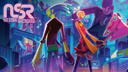
#10 – No Straight Roads
Rarely have I been struck by a single trailer for a game like I was for No Straight Roads. Produced by industry veterans under a new studio, this is a rare game that’s not quite an indie game from a studio full of newbies, but it’s also not produced with the same kind of budget and resources of a Triple-A project. What do we call this? A Double-A game? Single-A? Regardless, I have to give the team at Metronomik some props for delivering a super stylish game in the midst of a very challenging year. No Straight Roads is a rhythm-based action game where two up-and-coming musicians fight to bring back Rock and Roll to the people of Vinyl City. I absolutely adore this game’s presentation, with each major boss being visually unique and having their own feel that compliments the music they bring to battle. There’s some real energy in these animations with character designs that ooze personality, and being a game about music the soundtrack is great! All that being said though, I have to admit I wasn’t a huge fan of the gameplay when all was said and done. It leans way more on the rhythm side of the equation than I was hoping for, and the action felt very shallow. The fixed camera made some phases of some fights a real problem, and the Switch verison, which I played, is plagued with a lot of issues that really brought the game down for me. If the game interests you at all, give it a shot on PC or PS4; I hear those versions are a lot better. Still, I liked the potential I saw in this game and in this studio, so I can only hope they did well enough to continue on. This definitely feels like the kind of passion project that deserves more recognition.

#9 – Streets of Rage 4
OK, so full disclosure: I didn’t grow up with 2D beat-em-ups. I missed out on all of the greats of the genre back in the day. No Final Fight, no River City Ransom, no Double Dragon, and definitely no Streets of Rage. In more recent years I have tried to dip my toe in the genre, as I did in 2019 with River City Girls. However, I came away from that game a bit disappointed by the overall gameplay and wondered if 2D beat-em-ups were for me. Seeing so much praise heaped onto Streets of Rage 4 had me curious, so I knew I had to try it, if only to broaden my experience in the genre. In many ways, this game is the perfect sequel to a franchise that hasn’t seen any signs of new life in years. It retains what made the series beloved with satisfying combat and challenge, but with a modern touch. The overall art style of the game and music work out pretty well, and I found the act of comboing enemies to be really satisfying. It really doesn’t overstay its welcome either, which is very appreciated in an age of endless timesinks. I also struggled a fair bit with the game, even on Normal, and well after some patches that seemed designed for more casual fans like me. Had this game not had online co-op as an option, I don’t know if I could have beaten the final levels. So my time with this game was pretty rough but despite that I can still see this was a game made with care, and if this game DOES do something for you, there’s plenty of reasons to keep playing on higher difficulties, unlocking more characters and even playing online with friends. Let me put it this way; I’m not all that sure I like the genre and I still liked this game, so I think that counts for something!
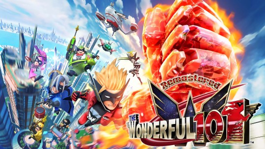
#8 – The Wonderful 101: Remastered
…this one is kind of cheating, I’ll admit! I had a lot of trouble thinking up ten games that really stood out to me this year, honestly. That said, I’ll definitely use loopholes to plug one of my favorite games from years ago. Seven years ago, PlatinumGames launched The Wonderful 101 on the ill-fated Wii U, where it bombed harder than just about anything on the system. For those that gave the game a shot, however, they were quick to discover a deep, complex, and charming action game that plays like nothing else out there. Controlling a team of 100 heroes at once, players form weapons out of the various Wonderful One’s bodies, smacking around giant robots and aliens far larger than them with the power of teamwork! How could you not love that, right?! Now, years later, PlatinumGames is aiming to become more independent and their first act was launching a Kickstarter as a way to get this game on newer platforms. While we may never know why Nintendo gave Platinum their blessing to release this game on non-Nintendo platforms (being as this is still, as far as I know, a Nintendo-owned IP), I’m just glad more people can have access to one of the most unique action games I’ve ever touched.
To sell it another way, this game combines the overall aesthetic of Viewtiful Joe with the shape-drawing action of Okami but with a bit of Bayonetta flair on the side. Basically, this is the culmination of everything director Hideki Kamiya has ever worked on. The Remastered version fixes some issues present from the game’s original release, and while I do think they could have gone a bit further with some changes, it is likely the best way to play the game for many. All those sections that made heavy use of the Wii U GamePad are a tad awkward though, but that held true even back on the Wii U anyway…d-don’t worry so much about that, though! I’d still recommend this game to anyone looking for the type of over-the-top action that only Platinum (and occasionally Capcom) can provide! So please consider joining the Wonderful Ones and Unite Up!

#7 – Paper Mario: The Origami King
Discourse around the Paper Mario series is…more than a little rough, honestly! Many fans have been quite vocal about not liking the direction the series has been heading with the last few games, but I went into The Origami King with an open mind and ended up really enjoying the game for the most part! What the game lacked in a developed storyline, it made up for with some really strong character moments and memorable setpieces. Bobby and Olivia are among my favorite partners in ANY of the Mario RPGs, easily, and the entirety of the Great Sea section of the game was a really fun adventure. I love the highly-detailed paper-crafted enemies and locales, and the soundtrack really didn’t have to go as hard as it did. While the battles against common enemies didn’t quite click with me, the boss battles throughout the game constantly surprised me with interesting twists on the ring-based combat and are a real highlight for me. I know this game is pretty divisive amongst Paper Mario fans, but I think the franchise has a pretty bright future ahead of it!
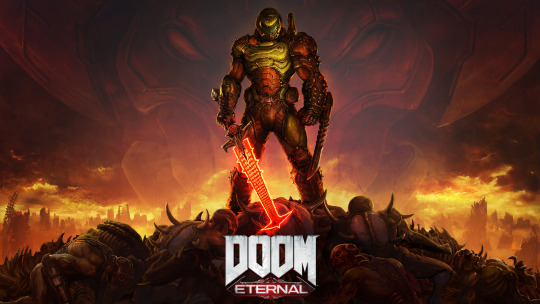
#6 – DOOM Eternal
Fair warning here, but I haven’t quite managed to beat DOOM Eternal at the time of writing this, but what I’ve played so far tells me it definitely belongs here. I think Eternal is hands-down the most intense game I’ve played in a long time. It gets my blood pumping as I dash about, shooting and slicing through demons that are extremely eager to rip and tear me to pieces. I don’t play many shooters in general, so I knew I was going to be in for a rough time, but DOOM Eternal brings it to another level right away. In some respects, I don’t quite agree with various aspects of the core game design that makes the game harder than I think it needs to be at times. The scarcity of ammo, and thus the constant need to use the Chainsaw weapon in order to gain more ammo gets tiring, though that somewhat levels off as more weapons are acquired and players learn of more efficient ways to take out the hordes of Hell. The game’s fantastic soundtrack by Mick Gordon definitely elevates the experience, so it is a huge bummer knowing that he and ID Software had a falling out and he won’t be coming back. I really dig the game’s expansive levels and more focus being put on exploring every nook and cranny for secrets, and certain old-school touches like finding extra lives or cheat codes definitely makes the game feel like it was ripped out of a bygone era and given a modern paintjob at times. Doom is eternal, and with it, so is pulse-pounding shooting action!
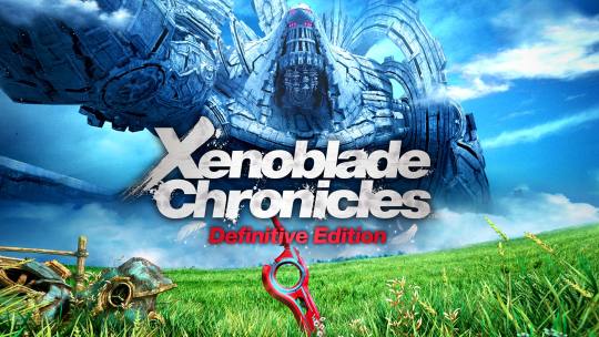
#5 – Xenoblade Chronicles: Definitive Edition
Compared to the other re-release of an old game on this list, I think this particular title had a lot more time and care put into it…and it also happens to enhance one of my favorite games on Wii as a bonus! Xenoblade Chronicles on Wii was a game that almost passed me by but even years later, I still adored the characters and world it introduced, and I’ve been happy to see what started as game that was almost stuck in Japan eventually grow into a full franchise. I consider the first game to the best in the series, though it was held back by a few issues later games would iron out. Chief among the problems was the visuals, particularly the character models and…wow does ten years make a world of difference. The Definitive Edition does more than just clean up everyone’s faces, it also cleaned up the game’s cluttered UI, made it easier to track quests and materials for said quests, and added some fun optional challenge missions for veterans to tackle. The bow that adorns the top of this package, however, is the epilogue story Future Connected that serves to tie up some loose ends and gives a particular character some great closure. If you love massive worlds to explore, a compelling, at times over-the-top story, and a deep, rewarding combat system, I can’t recommend THIS version of THIS game enough. If you’re going to give the Xenoblade series a try, there’s no better place to start.

#4 – Ghost of Tsushima
When Ghost of Tsushima was first unveiled years ago, I didn’t exactly have a high opinion of it. It seemed like a game that put more emphasis on visuals over gameplay, and I was almost certain it would launch as a PS5 exclusive so why bother getting excited when I probably wasn’t going to be an early adopter of the system? To my great surprise, not only was this game confirmed for PS4, it wound up being one of the prettiest games on the platform and well-optimized to boot, even on my old slim PS4. Playing as lone samurai Jin Sakai, players try to repel the Mongel invasion of Japan, but are forced to adopt less-than-honorable tactics to take on this ruthless enemy. Usually when I play stealth games, I find myself frustrated. I feel weak, or limited, and often the games feel overly harsh. If you get caught once, game over and there’s little salvaging being seen. In Ghost of Tsushima however, there’s a great deal more care put into stealth, and at times I’d argue it’s almost too fun to pass up over the sword play. Very few missions in the game force you to go completely unseen, so stealth just because yet another tool rather than a limitation imposed on you.
Swordplay felt a bit less engaging against common enemies (typically just being Simon Says, switching to the appropriate stance for a given enemy), but the one-on-one duels throughout the game were fantastic and I almost wish the game was all about them instead. I can’t overstate how gorgeous this game is either, with a world that feels like it is breathing, as the wind whips through the tall grass, the moon penetrates fog overtaking a creepy forest, or seeing the smoke from an enemy camp wafting over the distance. Hands-down one of the best-looking games on the PS4, and I’m particularly happy that developer Sucker Punch managed to land a hit with a new IP, as those generally feel more risky as times go on. While I’d argue that Ghost of Tsushima doesn’t really redefine how open-world games should be designed, it is an extremely polished experience and manages to do it well, with plenty of opportunities to grow in a potential sequel.
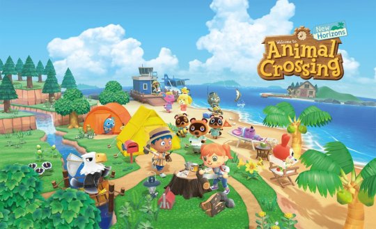
#3 – Animal Crossing: New Horizons
If there’s any one game that people absolutely needed in 2020, it was Animal Crossing: New Horizons. While there are other games of this type, like Stardew Valley or the Harvest Moon (and later, Story of Seasons games), Animal Crossing is one of the few games that gets mainstream attention while simultaneously running counter to most mainstream gaming trends. No conflict, no combat, no overarching story really…just a game that lets you live your live, day by day on your own terms. I tried getting into the series before with New Leaf but just didn’t stick with it, but New Horizons launched at the perfect time in an imperfect world. Being able to escape the uncertainty and dread that enveloped the world as the pandemic spread for even a little while was a necessity, and thankfully New Horizons had plenty to do to keep idle hands busy. Changes like item crafting and eventually limited terraforming of your island paradise give players so much more agency in decorating their homes and building up something they can be proud of.
We all start as nothing but a small tent on a mostly-empty island, but seeing what people were able to do even in the first few weeks or so was nothing short of amazing. We need more unflinchingly wholesome games in the world, and I’m thankful for Animal Crossing for being there when we needed it, and considering how well it sold and how much post-launch content is expected to be added with time, it remains a sanctuary to return to even now. Just…please let us craft in bulk? Pretty please, Nintendo?

#2 – Hyrule Warriors: Age of Calamity
Last year, Nintendo released Astral Chain, a game that no one knew about before release, which was revealed and released with very little gaps between them. It was a game I didn’t know I wanted until it was presented to me, and that trend continues this year with Hyrule Warriors: Age of Calamity. The first Hyrule Warriors was a fun, surprising spin-off of the main Legend of Zelda series, and Breath of the Wild was a fantastic game that shook up the core of the Zelda franchise, so in hindsight it really does seem like a no-brainer to combine the two into one package. Age of Calamity, for my tastes at least, cuts down on the repetition and overall stressful atmosphere of the first Hyrule Warriors and instead focused on fleshing out it’s core combat and crafting more creative main storyline missions. It helps that the game reimagines iconic locales from Breath of the Wild from before their destruction, and really makes you feel like you’re fighting through actual places rather than just a collection of random keeps that most Warriors games use.
Bringing in aspects like the Sheikiah Slate and Elemental Rods allows players to control the flow of combat more directly on top of letting them be more creative. Freeze enemies standing over water with the Cryonis rune or burn some grass with the Fire Rod to distract certain enemies, among many other things. Each playable character is also very distinct, even in cases where I could have forgiven the developers for reusing some attacks or traits. For one, Link has different movesets for his Sword and Shield, Spear, and Two-Handed weapons, but none of his attack overlap with the other Champions who use similar weapons. Some people might be put off with certain aspects of this game’s story and ultimately not everyone likes the overall structure of the Warriors spinoffs anyway, but for my part, Age of Calamity was one of the best surprises of the year, unveiled right at the end of the year in the nick of time. Of course, there was one game this year that surprised me more than any other.
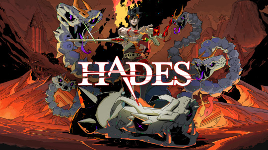
#1 – Hades
I’ve known of Supergiant Games for quite a while and very recently began looking through their catalogue of games. They’re known for well-crafted narratives and satisfying combat, and yet when I first saw Hades when it was released in Early Access I was tepid on it. It didn’t look bad or anything, but it didn’t exactly blow me away and even now, I think a random screenshot or quick clip of the game might not do the game justice in explaining the appeal. I already wrote about the game at-length (as my only real non-retrospective blog post of the year, oops!), which you can read here if you want more in-depth praise, but to summarize…Hades is the total package for me.
Playing as Prince Zagreus your end-goal is to escape the puts of Hell, and more specifically get away from your overbearing father, Hades. It’s a rogue-lite, meaning you’re expected to finish the game in one shot and if you die you lose any upgrades you picked up along the way and have to start from scratch…to a point. Hades does allow you to keep a fair amount of items you pick up which can towards small, permanent upgrades or even gifts for various NPCs that can deepen your bond with them. Unlike most other games of this type too, the story constantly moves forward, even after death. The game is about dying over and over and then dusting yourself off to try again, all the while other characters remark on your progress or lack thereof. I grew to really enjoy this cast of characters, a fun spin on the Greek pantheon, paired with excellent voice acting for the entire cast. From the imposing, if somewhat sultry Megaera, to the nervous wreck that is the maid, Dusa, to the pompous ass Theseus, I looked forward to each new run just to learn more about this world and those within it. For once, death wasn’t really a punishment, but a reward, and just part of the process.
Of course, incredibly satisfying combat is ALSO part of the process and it just gets…addicting; muttering “one more run” over and over as you try out different weapons and boons, discovering what works well together and what doesn’t. While at first beating the game felt like it would never happen, I grew from my failures, adapted and eventually overcame. Multiple times. If you want the “full” Hades experience, this game can really demand a lot of time out of you but at the same time it stays fresh, so I can’t really complain. With new gameplay mechanics unlocking as time goes on, to the Pacts of Punishment players can trigger if they want a bit more challenge (or a lot more), Hades is that rare game that just keeps giving and giving. Before I knew it, I had dumped well over 50 hours into it, and I STILL need to get back to the game if I want that epilogue.
Compared to every other game that came out this year, Hades is the one game that grabbed me from moment one and would not let go until I hit credits. When I wasn’t playing this game, I was counting down the minutes until I could play it again, and let me tell you that is rare for me these days. At this point, Hades is clearly the breakthrough hit for Supergiant and I couldn’t be happier. The fact that this game got to stand shoulder-to-shoulder with industry titans at The Game Awards is kind of surreal, but I can’t think of many who deserve that recognition more. It helps that Supergiant is a studio that actually takes care of its employees, which is way rarer than it should be. I don’t mean to hype this game up like it’s the cure for COVID or anything, but I mean it with all my heart that this was the best game I played this year, and I’d recommend it in a heartbeat. I couldn’t stop talking about it for months after playing it, just ask my friends! So yeah, it’s pretty OK I guess.
CONCLUSION
I’m sure my Top 10 List looks a lot different from most out there, but that’s what’s great about games! So much variety and so much quality no matter where you look! Every year, without fail, there’s always at least a small handful of games that come out that I don’t get to, and try as I might I’ll never trim that backlog down. I want to keep playing games for as long as I can, trying out so many different experiences and seeing what this wonderful pastime can offer. For a good chunk of 2020 I was more than a little down, not just because of…you know, but a lot of games that were coming out weren’t appealing to me. That said, seeing as this was the year of shadow drops and announcing things at the last minute, I ended up loving a bunch of games I hadn’t already spend months hyping myself up for, which definitely helped to lift me up this year. Already, 2021 has a lot of titles I’m anticipating though, so it’s sure to be an exciting year.
Happy Gaming.
-B
#top ten list#gaming#animal crossing#paper mario#xenoblade chronicles#ghost of tsushima#doom eternal#no straight roads#hades#streets of rage 4#thewonderful101#age of calamity
2 notes
·
View notes
Text
A Hogwarts Mystery update...

Hello and welcome back! This might look a little familiar to the regular readers and you would be right. We have touched upon this topic previously and here is a link to the previous article: A Hogwarts Mystery…
Moving on, another update has hit Hogwarts Mystery and there are supposedly some interesting changes with additional content. However, the updated version is 1.1.3.1 and comparing it with the previous version 1.1.2.1, it does not seem like it is a major update according to the version numbers.
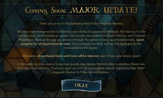
Firstly, we shall take a look at the notification the developers sent out to all players containing information about upcoming content in the above image. A few things that pop up are the addition of Slytherin allies and the rebellious Ravenclaw. It is interesting to see which direction the developers will take: are they going to follow the stereotypical generalizations that have plague Slytherins or perhaps they would move away from that and reflect a better understanding of the different houses? The usage of the word rebellious to describe a Ravenclaw is rather interesting as well. Perhaps a character that is similar to Luna Lovegood will be added to the game.
The only issue I have with this is the absence of the date in which the update will be released. According to the information on the Google Play store, it supposedly went live on 16 March 2018 but I only checked if there was an update on 20 March 2018, so in the gaming news world, this article is considered late.

Now that we got that out of the way, let’s dive into the new update!
A notification from the developers with a good chunk of free gems (as shown in the above image) is displayed and after you collect the 250 gems, you’ll be taken to the character creation page.
As expected, the changes were mainly on the UI (user interface) and as shown above, there are new systems for the Spell Collection and Character Progression. A short side note, there are still a few graphical bugs around but those are totally understandable as the game is still in the development stages. I am fairly certain that they will be fixed when the game is fully released.
The first thing I noticed was the slight UI change in the tutorial section. The instructions are now displayed in a blue banner (that is in stark contrast with the background in some areas) in the middle of the screen, possibly to ensure that the player is reading them through. I think it’s a good change because it is now more obvious that the player is going through the tutorial.


Also, another point about the tutorial, instead of being a whole section on it’s own, it is integrated within the story and the instructions will only appear when the player is doing something for the first time. By using this method instead of teaching the player everything in the beginning, it allows the player to continue to discover more things as they progress in the story. In some ways, it sort of mimics the learning process in a school, essentially having the player learn the game mechanics while the character learns more.
As shown in the above two images, this was slightly further into the story and because this is the first time we see a choice, the tutorial instructions pops up onto the screen and teaches the player.

Also shown in the above image, there are colours given to the different attributes. Green for courage, pink for empathy and blue for knowledge. I think this change does help with the differentiation as it makes it easier and perhaps quicker for the player to match attributes.
Another side note before I delve further into the game: I had not noticed if this was in the previous build but during the sorting (as shown in the above picture), there is a student with pink hair on the right. If this student was not in the previous build, could this be the rebellious Ravenclaw that was mentioned in the major update notification? I have not played far enough to see if I am correct in my guess but regardless, that student looks pretty badass. I hope she is not a filler character and would actually be in the story.
Edited to add: Hogwarts Mystery Facebook page has posted that the student with pink hair is actually a young Tonks! I can’t believe I think didn’t about her! Well, in my defense, I had totally forgotten that the first wizarding war had just ended. I am pretty curious as to how the storyline will interact with her.

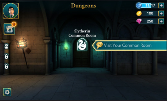
Apart from the UI change in the tutorial, there is another UI change with the mission objectives. It is probably a small graphical change but it is still a change nonetheless. As shown in the above image, there is a golden speech bubble beside the words “Visit Your Common Room”. Before, the update, I believe the speech bubbles were white but unfortunately, I had not taken any screenshots of those so there is a possibility that I am mistaken about this. Also, it appears that the interactable icons that navigate the game are slightly bigger compared to the previous build. However, the settings icon appears to be slightly smaller.
The above image shows the new UI for the objectives. You can see an example of the tutorial as well. The Microsoft Word clipart looking hand points to the next objective, showing the player where they can click to progress to the next level accompanied by the instructions in the blue banner as mentioned above. This is a rather poor example of the contrast with the background as the objectives menu uses a similar colour scheme but even so, I think the new UI makes it slightly more obvious that it is a tutorial compared to the previous build.
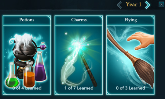
Also in the above image, the UI for the objectives has changed. Before, it was mainly text-based but the new build includes a sidebar that contains the lessons required to move on to the next chapter. An image is also added to represent the type of spell or potion the player is supposed to learn. Besides this simple UI change, I believe it is the Spell Collection change that was talked about in the welcome message.

How it works in the current version is that the player will have to unlock the ability to learn those spells or potions. It is why there is the “Ready” factor in the Lumos part of the lessons and it being blank in the Cure for Boils part of the lessons, although I think it is because that part of the chapter has not been unlocked yet.
The above image shows a little more about what the Spell Collection and Character Progression change entails. In the previous build, the player can choose whether to train up their attribute or progress with the story objectives. In this particular example, the player needs to obtain a total of two stars to unlock the spell Wingardium Leviosa. Once it is unlocked, the player is able to take the class and learn it to continue the story. So in some ways, it forces the player to level up the attribute instead of powering through the story chapters.
I have also noticed a change in certain wand movements for the spells. I think Lumos, Expelliarmus and Wingardium Leviosa were changed. Perhaps the developers are adding a bit more flair into the movements instead of keeping them straightforward.

Another game mechanic change that I have noticed is the energy limit. In the previous build, the player gains an energy limit after every level up. However, in this current version, it seems like the only way you will gain additional limits is through the rewards. This will definitely slow down the story progression or encourage people to spend money if they are impatient. I was able to speed through a few classes in the previous build because I had, at one point, 23 energy limits within the first year at Hogwarts. Now, I am stuck at 18 and it seems like for the first year at least, the maximum limit is 20.
The UI for starting lessons has also changed as shown in the above image. Before, it did not include the center portion (it used to be blank) and the player does not know what reward will be given after completion. So I think this is a good addition and I am fairly certain they will make it look nicer in future builds as at the moment it kind of looks like a placeholder. The addition of the statistics at the bottom is also a good idea. The player gets to see how much energy they have and decide if they can complete the lesson within the required time frame. In this example, it is to obtain five stars in one hour.

The spellbook also has a rather nice change, as shown in the above image. Before, it was just text in smaller boxes and minimal graphics but now, the graphics are much better and would probably get better, perhaps they would become moving ones in the final build.

Speaking of moving ones, perhaps this was already done in the previous build but I had not noticed that the characters were moving as shown in the above gif image. It might be that it only moves in specific story-related objectives but I hope they continue with it as it helps make the game a little more immersive.
Even the graphics for the house points have changed. The house crests are a new addition and they look really crisp and detailed. The gems themselves are also looking a bit more defined and detailed. Also, I believe these were the same crest designs as the Warner Brothers store and even though they are rather small, the house mascots are still quite clear for Slytherin and Ravenclaw. Not entirely sure the same can be said for Gryffindor and Hufflepuff though. I think you can just about make out the animal but the border designs in my opinion distract the viewer’s eye.
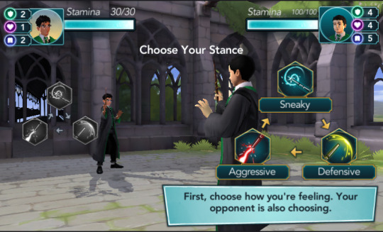
Let’s move on to dueling. The first obvious change is the increase in stamina. In the previous build, the player only has a stamina of fifty while in this new version, the player has a stamina of one hundred. After playing through the dueling tutorial, I think it is a good call to increase the stamina because the dueling seems to feel a little more challenging. I could be wrong and had a bad run with the randomizer but it is lucky that my attributes were much higher and the opponent’s stamina was much lower.
Unfortunately, my progress for this update is slower than usual and therefore I am unable to tell if there are other changes. It is interesting to see the improvements between the two versions although I would like to suggest adding one component. Multiplayer dueling. Hint hint, wink wink, developers. Please?

Regardless, I am still very excited for this game, even though I have been playing it for a while now. The mystery has not been solved and I am dying to know what’s going on at Hogwarts. I give this a I-am-so-excited-I’m-going-to-die out of a oh-my-god-it’-so-pretty.
HarryPotter #HogwartsMystery #JamCity #PortkeyGames #WizardingWorld #MobileGaming #Mobile #HarryPotterGame #RPG #PointAndClick #GooglePlay #AppStore #Android #iOS
#HarryPotter#hogwartsmystery#JamCity#PortkeyGames#WizardingWorld#MobileGaming#Mobile#HarryPotterGame#RPG#PointAndClick#GooglePlay#AppStore#Android#iOS#Snake
1 note
·
View note
Photo

New Post has been published on https://magzoso.com/tech/poco-x2-review/
Poco X2 Review
Like many of its competitors, Xiaomi has spun the Poco sub-brand off into its own company, just in time for the launch of the Poco X2. The brand is of course well known because of the iconic Poco F1, but it has been well over a year since that model was launched. Poco is now on its own, though it will likely share many resources with Xiaomi for the foreseeable future. The new Poco X2 is sure to be noticed, however fans should be clear that this is not the next version of the Poco F1, and doesn’t follow the same formula at all. The Poco X2 is much more conventional and somewhat less path-breaking than its illustrious predecessor.
This phone isn’t made of plain plastic and isn’t trying to prioritise core specifications and raw power over everything else. Of course people are still expecting Poco to take the lead in terms of pricing, and to an extent, it does. Starting at just Rs. 15,999, the Poco X2 takes the Realme X2 (Review) on and somewhat overshadows the Redmi K20 (Review) as well as the Redmi Note 8 Pro (Review).
Will Poco set off another firestorm in the Indian market, and does this mark the beginning of a new era of competitiveness? We can’t wait to get started on our review to find out.
Poco X2 design
While the Poco F1 (Review) is unapologetically plain-looking and made of simple plastic in order to remain affordable, Poco is trying a different approach here. What we have is a bright, colourful glass rear with a gradient tone and an unusual circular design around the vertical camera strip. Our Atlantis Blue unit was lighter on the top and darker going down, but you can also choose Phoenix Red or Matrix Purple. There’s a Poco logo towards the bottom, and no “by Xiaomi” tag like the F1 had. The frame of the phone matches the colour of the lower one-third of the rear panel.
The main bit of design flair is the circular patch. You might think at first that Poco has gone with a raised camera module like what we’ve seen on the OnePlus 7T (Review) and Nokia 7.2 (Review), but it’s just a patch with a smooth finish while the glass around it looks frosted. Also, despite the fact that it’s quite flat, Poco has managed to make this patch reflective like a convex mirror, and we were somewhat able to frame a selfie taken with the rear camera. The vertical strip that actually houses the four cameras sticks out quite a bit and has slightly rough edges.
With a 6.67-inch screen, this is undoubtedly a large phone. The tall 20:9 aspect ratio helps with reachability and the non-slippery rear makes for a decent grip. It’s still difficult to get to all parts of the screen with a thumb though, making one-handed use potentially awkward. Your eye will be drawn to the wide dual-camera cutout in the upper right corner of the screen – it isn’t too noticeable in ordinary use, but definitely is a distraction when watching full-screen video.
The wide dual-camera cutout in the screen is quite noticeable
The power button on the right doubles as a fingerprint sensor, but it’s long and thin, which isn’t ideal. The fingerprint registration process took longer than usual, since the Poco X2 has to make sure it can work with just a narrow slice of your fingerprint. Left-handed users will find this placement awkward, and you’ll need to enrol at least two or three fingers so you can unlock the phone when it’s in your hand and on a table. The sensor is flush with the side of the phone which also meant we didn’t always line our fingers up with it perfectly.
The volume buttons are above the power button, which puts them slightly out of reach. There’s an infrared emitter on the top, like with many Xiaomi phones. Sadly, the tray on the left is of the hybrid variety so you’ll have to sacrifice a second SIM if you need a microSD card, and vice versa. There’s a 3.5mm audio socket, USB Type-C port, and speaker on the bottom.
Poco says it has used Gorilla Glass 5 for the front as well as rear of the X2. A clear transparent case comes with this phone and we’re glad to see there’s no pre-applied screen protector. You also get a SIM eject pin, a 27W charger, and a USB Type-C cable. The charger is one of the bulkiest we’ve ever seen.
Overall, it seems as though Poco wanted to create a distinct identity for the X2 and for itself as a brand. We’re not sure that all the design choices here are for the best, but this phone is at least unique and recognisable from the front as well as the back. We would have liked a neutral colour option, though.

The Poco X2 is available in three vibrant colour options
Poco X2 specifications and software
As we stated earlier, the Poco X2 should not be seen as the successor to the Poco F1, and as such it isn’t trying to offer a flagship-grade SoC at mid-range prices. You do get the Qualcomm Snapdragon 730G, which is pretty much the next best thing. This is the same chip that powers this phone’s primary competitor, the Realme X2, so we can assume that gaming and general-purpose performance will be solid.
You can buy the Poco X2 with 6GB of RAM and 64GB of storage for Rs. 15,999; 6GB of RAM and 128GB of storage for Rs. 16,999; or 8GB of RAM and a whopping 256GB of storage for Rs. 19,999. We have the top-end variant with us for review and if you choose this one, the hybrid dual-SIM tray won’t be much of a problem.
The 6.67-inch 2340×1080-pixel display has a killer feature to boast of – a 120Hz refresh rate. This is a subtle feature but it really does improve the quality of the usage experience, making the Android UI feel smooth and responsive. Poco calls this feature “RealityFlow” and it isn’t hard to see why. Games will benefit the most from this, but they have to explicitly support it and not a lot do yet. HDR-10 is also on the spec sheet.
There’s also a 4500mAh battery, dual VoLTE, Wi-Fi 802.11ac, Bluetooth 5, GPS, FM radio, and all the standard sensors. Interestingly, the design and specifications of the Poco X2 are practically identical to those of the Redmi K30 being sold in China. It will be interesting to see how the two brands segment and differentiate themselves if the Redmi K30 is launched here.

You’ll find a USB Type-C port, 3.5mm audio socket, and speaker on the bottom
Poco’s UI is identifed as Poco Launcher as well as MIUI 11.0.3 in different parts of the UI. It looks and feels like what we’ve seen recently on the Redmi K20 (Review) and Redmi K20 Pro (Review). It’s based on Android 10, and we have the December 2019 security update which is good to see.
Xiaomi’s software strategy has always been a point of contention and now Poco has inherited the same issues. There’s a lot of preloaded bloatware and we saw multiple annoying notifications each day asking us to download more through the company’s own GetApps store, or watch random celebrity-themed videos. There are also promotional messages on the lock screen, which you can disable. You’ll see ads and promoted content in many of the default apps. On the whole though, we noted that all this seems to have been toned down a little compared to what we’ve dealt with in the past.
Among the many preinstalled apps, you’ll find Mi Pay and Mi Credit, Xiaomi’s apps for UPI transactions and personal loans respectively. There’s are of course several redundant Mi apps including a Web browser, photo gallery and calendar, but some others such as Mi Remote, Themes, and Screen Recorder are useful. The third-party selection, including Helo, Gaana, Amazon Shopping, Dailyhunt, Opera, and more, are removable. The GetApps store will try to make you download plenty more, so be sure to look for the ‘Skip’ option.
There are plenty of UI customisation options. Not only is there now an app drawer, but it has tabs that filter various categories of apps for easy access. Nice touches include a search bar at the bottom of the drawer so you don’t have to stretch, and neatly grouped “Special features” in the Settings app. These features include the Game Turbo optimisation mode, Quick Reply panels for messaging apps, and Second Space for privacy.

There’s a fingerprint sensor integrated into the power button on the left
Poco X2 performance and battery life
The Snapdragon 730G is no slouch, and the Poco X2 breezed through all our apps and usage scenarios. We did see some very slight stuttering in UI once or twice but it was only momentary. Multitasking was not a problem at all. Of course, this experience applies to the top-end variant that we are testing, which has 8GB of RAM. The only problem we had was stretching our thumbs to reach all parts of the screen. The phone didn’t get too hot in use either, and we only felt a mild warmth when playing games or using the cameras for a while.
The screen isn’t the most vivid or crisp, but it is fairly bright and engaging, and viewing angles are great. Whether or not the wide dual-camera hole annoys you will be a subjective matter – we found ourselves largely forgetting it was there when watching videos, but then suddenly being distracted by it when a bright scene came on. We also noticed a bit of backlight unevenness around the cutout.
You only get a single speaker on the bottom of this phone but it’s very loud and the sound is impressively deep and rich. Music distorts if the volume level is above 60 percent or so, but anything less than that is fine for personal listening.
A few of our benchmark tests were restricted from running on our pre-release review unit, but we do have some numbers to share. AnTuTu gave us a score of 2,80,912 which is very good. The Geekbench 5 single-core and multi-core scores were 548 and 1,759. 3DMark and GFXBench were both unable to run so we don’t have graphics scores, but we did run some of today’s more demanding games and got some real-world experience with the Poco X2.
PUBG Mobile defaulted to the High preset. The game was enjoyable and ran without any lag. Asphalt 9: Legends also worked very well, not stuttering even when we smashed headlong into other cars, which is typically a stressful visual effect.
We found the Poco X2’s battery life to be decent, and we didn’t feel any anxiety about getting through a full day, from morning to night. During that time we used the cameras quite a lot, played a few rounds of PUBG Mobile, streamed about an hour of video, and spent some time on social media apps. Our HD video loop test ran for 13 hours, 43 minutes, which is not a great result but might be influenced by how large the screen is.

The Poco X2 has four rear cameras including a 64-megapixel primary camera
Poco X2 cameras
The Poco X2 has four rear and two front cameras. The primary 64-megapixel rear camera has an f/1.89 aperture and uses the Sony IMX686 sensor which succeeds the widely used IMX586. There’s also an 8-megapixel f/2.2 ultra-wide camera, a 2-megapixel macro camera with a 2cm-10cm focal range as well as autofocus, and a 2-megapixel depth sensor. The primary selfie camera has a 20-megapixel resolution and is accompanied by a 2-megapixel depth sensor.
Poco’s camera app takes a little time to get used to. You have to use the zoom control to switch to the wide-angle camera (marked only as 0.6x) but going the other way to 2x performs a digital zoom since there’s no optical zoom capability. There’s a separate toggle button at the top for the macro camera. It’s a bit tedious to swipe through the mode selector which has a lot of options including 64-megapixel, Pro, Portait, Night, Short Video, and Slow Motion. Unfortunately, photos are branded with a Poco watermark by default, and we wish all manufacturers would stop doing this.


Poco X2 daytime camera samples (top: primary camera; bottom: ultra-wide camera), tap to see full-size
We very occasionally had trouble getting the primary camera to lock focus perfectly, and stepping back from our subject a bit often helped. Photos came out very well exposed with vibrant colours. When the composition allowed, there was very natural-looking depth of field. Fine details on objects such as flower petals came out well, as long as there was good natural light and they were in the centre of the frame. In shadowy areas and at the edges of daylight shots, details were somewhat lost and we did start seeing some grain.


Poco X2 daytime camera samples, tap to see full-size
The wide-angle camera takes poorer quality shots, as expected, but were were happy to see that warping at the sides is minimal. Macros were completely washed-out and it was often hard to take a shot without the phone itself casting a shadow on our subjects.
Low-light shots were also relatively impressive though of course detail is not as well defined as during the day. You can get usable shots as long as there’s a little lighting around, whether indoors or out. The night mode does make a considerable difference and you don’t have to stand still too long. Using this brightens frames and shows details that would have been lost in the shadows.


Poco X2 low-light camera samples (top: primary camera; middle: Night Mode; bottom: ultra-wide camera), tap to see full-size
You can take portrait selfies and adjust a virtual aperture to vary the intensity of the depth effect. Edge detection is quite good too. However, the overall quality of photo taken with the front camera isn’t as impressive as we would have liked. Backgrounds were overblown in the daytime and details looked a bit artificial. It also takes too many taps and swipes to disable the default beautification.
As for video, we liked what the Poco X2 managed to capture in the daytime when recording at 1920×1080. Video was crisp with smooth motion tracking and reasonable stabilisation. Sadly, when we switched to 4K, colours became overexaggerated and there was a warm cast to the clips we recorded. At night, even mild motion caused severe shimmer and motion was quite jerky. Objects weren’t clearly discernible and bright lights caused exposure issues. 4K video shot at night was barely usable.


Poco X2 selfie camera samples (top: standard; bottom: Portrait mode), tap to see full-size
Verdict
Offering high-end specifications at rock-bottom prices is the simplest way to succeed in the Indian market, and Xiaomi has been one of the biggest forces here for years now. The Chinese giant constantly pushes out new models that raise the bar in terms of value, whether the focus is on style, battery life, cameras, specifications, or attention-grabbing features.
While the Poco X2 doesn’t have quite the impact that the Poco F1 did, it still does everything it needs to, and pricing is its main advantage. The Realme X2 (Review) and Redmi K20 (Review) have dominated the sub-Rs. 20,000 market of late and many recent models, such as the Oppo F15 (Review) and Vivo S1 Pro (Review) have simply not been able to match them in terms of power and features. Now, the Poco X2 makes all of them look a little worse in comparison.
The processor, RAM, storage, battery, and cameras are all strong, and there’s nothing to complain about in terms of build quality or the included accessories. We do, however, wish that the UI eased up on the bloatware and nagging notifications much more, and frankly the rear of the Poco X2 is a little too garish for our taste. Some people will also struggle with the sheer size of this device.
If cost is your main motivator, then the Poco X2 is the new obvious choice in its segment. That doesn’t mean that it’s a clear winner over the Realme X2 though, especially if you can find it at a discount, or if flash sales make the Poco X2 difficult to buy. If you’re undecided between these two models, you can expect a head-to-head comparison coming up on Gadgets 360 very soon.
0 notes
Photo

(Click the image to embiggen. A late-game naval battle. Dozens of capital ships face off with heavy beam weapons as hundreds of small fighters and bombers skirmish in the center.)
Good Bad Ugly -- Stellaris
Stellaris is a 4X strategy game. Developers Paradox will probably not stop working on the game for years, so I figure I might as well review it now (I’m at version 1.4.1).
Metacritic gives it a 78. Read on for what I think...
The Good
Intuitive. No 4X game is easy to learn, but Stellaris is perhaps one of the easiest. The UI is well-designed so you don’t get lost or confused.
Elegant. Stellaris does more with less. From planet management to ship design fairly simple systems can lead to deep strategy.

The tile-based planet-building system is simple and easy to understand; but your choices can have big impacts.
Story Spice. Little story events pop up here there, adding narrative flavour to the dry gameplay of a 4X. A small touch that’s quite immersive.
Many Ways to Win. You should be able to make most strategic concepts work: a warmonger who takes slaves, a pacifist who forges alliances, an isolationist who concentrates on technology. Some are no doubt better than others but all seem viable enough for single-player or casual multiplayer.
Perfect Pacing. I enjoyed the way Stellaris paced out its technology research. Even late game you are still researching stuff to make your faction non-trivially better. And powerful rare techs can pop up any-time.

“I watched C-beams glitter in the dark near the Tannhäuser Gate.” Gigantic fleet fights are a spectacle to behold. A recent patch not only overhauled the way ships worked, but added vivid pyrotechnical flair to the weapons.
Paradox Patching. This is a Paradox game. Already several big (and free) patches have radically transformed the game. This will likely continue for a long time yet. It’s nice to know the game will keep getting better.
Multiplayer Support. Not all 4X games offer this, after all. It’s so easy via Steam. And if the host has DLC all players will be able to use it! Generous!
Moddable. Mods are great. And in the age of consoles we should not take mod support for granted.
Stellar Soundtrack. Sounds a bit like Interstellar in parts, I reckon. It’s good! (Though admittedly, it’s hard for any 4X to have a soundtrack that will stay fresh for all the hours it is played.)

The default species designer gives a lot of choices, but I wanted a richer experience for my own race: custom names for rulers and ships (among other things). Modding allowed me to do this.
The Bad
Anemic Warfare. Warfare in Stellaris is simple. There’s no “complicating factors” like supply lines. Also, tactics like hit-and-run, scouting or entrenchment are largely not worth the trouble. (Well, some of those tactics can work if you push them to AI-exploiting extremes.) So: fleets meet, fleets fight, one wins. The best tactic therefore is to put all your ships in one blob and hope for the best. It’s a shame because I feel the ship design and the combat itself (which is mostly hands-off) is handled quite well.
Tedious Take-over. To the victor go the spoils. But not in Stellaris! Run rampant over your enemies and you only are allowed to take a handful of planets. You then must and abide by a peace treaty for ten years. This is nice because it means only the smallest factions can be totally defeated in one war. But it makes conquest a nightmare when you have to defeat an enemy (and all its allies) again and again over years to conquer them.

I was proud of my Ring World, so I defended it as heavily as I could with battle-stations brimming with mines and fighter squadrons. Here we would fight the hordes! And we did. The stations helped... a tiny bit. The importance of entrenchments pales in comparison to the importance of the mighty fleet.
The Ugly
Big Bugs. And not just the arthropod race from Betelgeuse! Stellaris has been crippled by some very game-breaking bugs in the past. These have disappeared as patches rolled out; but still -- don’t release broken stuff!

“Our Cruisers shall block out the sun!” “Good! Then we fight in the shade!”
Conclusion
Rated Good ★★★☆
Competent, polished, intuitive; and with multiplayer support. It is a very solid 4X game that only gets better over time. It will entertain you. It will perplex you less than most 4X games. But it does not have that spark of genius we see in other, rougher games.
0 notes
Text
Artsanac Are The Kings Of Website UI and UX Wiltshire
When it comes to delivering top quality websites that are laden with UX and UI capabilities time and time again then Artsanac LTD fit the bill. All the jobs are undertaken from the Wiltshire offices and Artsanac are quickly cementing their place as industry leaders in top quality UX and UI website designs. Modern society dictates we want all action information at our fingertips 24/7. Artsanac LTD ensure that every website they design is carefully considered with the right amounts of UX and UI interfaces in order to make them accessible and user friendly. This is all undertaken from Wiltshire. The User Interface (UI) of a website is there to ensure that the product looks good, whilst the User Experience (UX) is in place to ensure the end user has a pleasurable experience on said website. Artsanac LTD is a company well trained in delivering the most amazing UX and UI websites and they undertake every project from their Wiltshire base Wiltshire is a quaint little market country based in the South West of England. From here Artsanac LTD set out to deliver top quality UX and UI websites not only for the patrons of Wiltshire but for the whole of the United Kingdom as well!

To have a successful business in the modern era you need to have an amazing website that will sell your business to the world. Artsanac deliver said amazing websites from their offices in Wiltshire and the websites designed come packed to the rafters with the very latest in UI and UX design. Many businesses will sell you the dream when it comes to maximising sales figures through website design, but here at Artsanac we really do have you, the customer, in mind all the time. We strive to deliver top quality websites oozing with great UX and UI experiences and use the idyllic Wiltshire surroundings to aid our creative processes. UX and UI website design is the next big thing that is here to stay for businesses. With more and more competition going online you really need to be staying one step ahead of the game. A UX and UI laden website designed by Artsanac LTD from Wiltshire will really have you standing out from the crowd in no time at all! Born in Wiltshirethen rolled out across the United Kingdom, Artsanac LTD are a creative design industry you can trust. When it comes to delivering the very best UX and UI websites Artsanac get it right every time. Wiltshire peace of mind, dogged British determination and overall flair and pizazz, Artsanac will deliver the very best UX and UI websites time and time again.
0 notes
Link
The Silver Case is the first game Grasshopper Manufacture ever made. Before Killer 7, before No More Heroes, before Let it Die, The Silver Case showed what GHM would become. A studio where story and visual flair were paramount.
It's an adventure game, in the visual novel style of classics like Snatcher, but with a more realistic setting, posed as a hard boiled crime story. It was originally released on the PlayStation in 1999, only in Japan, the only original Grasshopper Manufacture game with that distinction. That's why the recent PC port, called The Silver Case HD Remaster, is exciting – it brings the entire original Grasshopper catalog into English.
To dig into what makes this game special, we spoke with some of the developers of the game, original and new, discussing character design, story, and the port itself.
What influenced your design style here?
Takashi Miyamoto: The story is set in 1999, but there was an inclusion of near future aspects which came from the writings of William Gibson. Additionally, numerous films have also influenced the design.
Which films? How did they influence the design?
TM: What I remembered from your question is Metropolis, Gattaca, Heat, or Seven. But these answers don't mean I was influenced regarding the character design, it's more like the overall image including the background or scenes.
Of course all those films, since my childhood, are accumulated into my core, but I really don't think I got any direct influence about the character design from them, at least that's what I remember.
However, Suda told me that Morikawa and Kotobuki could look like characters appearing in the Japanese television series Taiyo ni hoero. I didn't search for the actual photos or videos, so still everything is made from my imagination.
Why do you think there's a more western style prominent in detective style visual novels?
TM: Perhaps it would be in the interest or longing to the culture totally different from our own. Also, it might be difficult to make up something new from the cities you've grown up in, I guess.
I’ve never played an adventure game other than “The Silver Case,” though, so I have no idea how many games with Western settings are there or such.
What impressed me long ago was the stylish UI. Was this an iterative process getting there, and can you describe the process?
TM: At the time, the game was made with such a small team; I think the staff’s sensitivity to it was displayed in a straightforward style. The mood of the visual becomes complete with the inclusion of my art and it had to be up to the story to work. I myself was able to sink in the story and it was very comfortable.
Tell me about your most important pillars of character design. How do you craft someone unique, and bring their personality forward?
TM: I avoid the expressions and poses of common symbolic emotions that Japanese animation and manga uses, unless there is a good reason to. At my core, I always want to design characters with a back-story, and I think that suited Suda’s demand for characters at the time.
Can you give some examples of how a character's backstory influenced their character design?
TM: As far as I remember, the process of those character designs were something like; Suda shows me a fashion magazine for the costumes, and explains to me each one’s personalities, then I’d imagine the background (it's not told in the game).
Once my imagination is ready, I’d get the OK from Suda and start drawing and so on. So, no one knows about all those processes other than me and Suda. I guess Suda was doing something similar with the scenarios since he was working on it at the same time.
When writing a detective story, how close do you stick to tropes of the genre?
Masahi Ooka: I personally like to defy tropes, but in the case of The Silver Case I was actually going for a “hard-boiled” story instead of a detective one. I remember writing the story with the mind set of making the writing as “hard-boiled” as possible.
How would you distinguish between a detective story and a hard-boiled one?
MO: The book that rings a bell with the term "hard-boiled" is the Philip Marlowe series by Raymond Chandler. Also Robert Brown Parker is a favorite, too. If you say "detective story," that would be the "Sherlock Holmes" series. In Japan, there is a detective story series called Akechi Kogorou written by Ranpo Edogawa. When I was still in my early teens, I loved detective and mystery stories. Then in my late teens, I was into Sci-Fi novels. Finally in my twenties, the hard-boiled genre came up as a choice among other mystery novels.
That might be why I feel "detective story" and "hard-boiled" are different genres. So in short, there is a big genre called "mystery," and within that, "detective story" is just one category, then another category called "hard-boiled" exists inside my head.
The difference? The writing style, the air, the reasoning and action of the protagonist, I guess. The heroes of hard-boiled stories are all tough, merciless, and stylish. Well, in the era of Robert Brown Parker, those heroes became more humane and somewhat unstylish, I should say. (The game's second protaginist) Tokio Morishima, of course, fulfills my aesthetics but he is a character who is a little unstylish and "poorly-made."
How is it collaborating with other writers? Do you take charge of a certain aspect, like dialog, or do you write whatever and edit each other, or something else?
MO: With the cooperation of Suda, I will receive the scenario once he completes it; we will have a meeting in regards to the scenario, confirm what will be covered in Placebo, and then finally start writing the story. We also had help from the writer Kato Sako, who we also met up with at a café, giving out ideas and then writing the story. As a journalist, I would usually write after an interview, write after research or write with an editor. So The Silver Case was written as an extension of that practice. Of course, there were also times I’ve submitted the scenario and fixed the script so it matches the overall story.
When writing a story like this, do you ever find yourself trapped in your own logic? Sometimes when I write, I have a great idea, and then I realize it contradicts other things I've already put in place. How do you deal with this?
MO: Yes, of course, I was occasionally trapped. The Silver Case is a piece of work which presents the seems-to-be logical answer but creates inconsistency at the same time, and then someone comes up with a new piece of logic from another perspective but it also produces a different inconsistency... it keeps going on like this and ends up with just a chaotic situation. So, sometimes I had to think about "What is the logical consistency anyway?" That was just tough. Or quite simply, there might be some inconsistencies left over intentionally, you know.
Apart from The Silver Case, "logic" is a mere element to construct a story. It is the same even for mystery which has a strong weight upon logic. It is true that if the story has any inconsistency, that might make the user stop following it, but if the work has something more important than keeping the consistency, it is author's choice to prioritize the inconsistency, this is what I think. If any of us come up with brilliant idea, we should rely on that rather than try to make something look good. I prefer a "marvelous idea with some inconsistency" rather than a "logical consistency." Of course we need to balance them well though.
Yes, the balance. A so-called masterpiece is something with a good balance which includes logical consistency. However, that well-balanced piece could be interesting but boring, no one knows. What I like is something that pretends to have the layers of logical ideas and just destroys everything in the end, something that seems to be made upon the unreal logic. Well, it's hard to describe.
Saying that, I, myself am a very bad story writer. Please someone teach me how to create an interesting story.
Is there anything you've changed from the original game, or anything you wish you could?
MO: For me it’s the norm to feel embarrassed at my own past writing, so I don’t really like to read it once it’s written. If I were to start fixing the text, I would probably rewrite the whole thing. However, Placebo was something I’ve written a considerably long time ago and I don’t really remember the fine details of it. So it’s probably going to feel like someone else had written it. Well since I haven’t touched the script in over a decade, I don’t think I would have the urge to change it.
I'm sure you didn't plan for this game to be translated into English from the start? Is there anything that has surprised you about the localization process?
MO: I wouldn’t have even dreamed that The Silver Case would be released in English. Being totally honest, I’m surprised that people still even remember it as a game. Kind of like the living dead. I’ve got no clue how the English audience will receive the game. Suda’s scenarios would likely be accepted outside of Japan, but I’m worried that people might not get what’s going on in Placebo haha.
Looking back at old code, was there anything embarrassing there? Anything you fixed up?
Yuki Yamazaki: To be honest, I still don’t know all of it. We’re rebuilding the source code from scratch, recycling fine algorithms and parameters from the original source.
Can you talk about how you're rebuilding the code base? And with those old algorithms and such, do you feel the need to improve them?
YY: For the basic functions like audio/movie playback or fade-in/out of the screen, I just ignored the original algorithm and designed it so that we can easily use it. Contrary to that, I painstakingly tried to keep the original design for the “film window system” to preserve the coordinated decision or movement timing decision algorithms.
What I had difficulty with was that very original message display system. There was an automatic page break function which worked only a couple times throughout the whole game, so I was checking the code each time with thinking “Do I have to use this ‘automatic’ system? Can we just do this manually?” Then in the end, that function became totally different from the original algorithm and I just ended up regretting my decision to edit that “automatic page break” function from the start.
Did you port to a modern engine, or modify the original?
YY: We are using the latest Unity engine. Using an engine from 17 years ago was out of the question.
What has been updated for modern platforms? How did you deal with aspect ratio issues, et cetera?
YY: We pretty much remade the game from the ground up. For the aspect ratio, were trying to make the “Film Window” functional in a 4:3 environment. We decided not to change anything like forcefully stretching the image.
What are the challenges of working with an old code base?
YY: Since we didn’t have the original data, I’ve decided to make a converter that extracts the sound data from the PlayStation sound data. However since the format is so old and so little of it, it was quite difficult.
Can you go into detail about the PlayStation sound converter?
YY: The sound file for PlayStation had two separate types of music data; pitch data and the musical score data, which is rather similar to MIDI files.
Adding to that, for The Silver Case, the musical score data contained the parameter for background effect manipulation so that the BGM and background effects can be synchronized. So I had to create two converters to extract the waveform data from score+pitch data, and background manipulation parameter from the pitch data.
As for the sound effects, there was only pitch data and no music score. Instead, it was programmed like “Play the C sound with strength of 80!” directly to PlayStation. I was wondering for a while can I extract that… then came to the idea, “Why don’t I just use the converter I just made!” So I made the music score having “one single note with the sound of C with strength 80,” extracted the waveform data using my newly designed converter.
0 notes
Text
Review: Stories Untold (Nintendo Switch)
Stories Untold was released on the Nintendo Switch January 16, and it stands out for me as a front-runner for episodic storytelling.
Stories Untold is about the haunting feelings and stories we haven’t told even ourselves. It’s about unraveling the truth and facing our fears. Without giving too much away, it is necessary to play this through sequentially. Everything comes together in a gratifying and horrifying way, with puzzle-solving techniques mattering in later episodes.
The episodes felt disconnected at first. The game positions itself as a series of unsettling stories—each description indicating something never feels quite right. It is retrofitted with an ’80s gaming flair: text-based adventure games, VHS tapes, and vintage tech. Each episode gets creepier than the last. You feel watched, followed, stalked. Something is constantly haunting you or even attacking you through each sequence.
Each episode starts off simple enough, slowly morphing into something more sinister. The games require little introduction to understand how to play them. The UI (user interface) is easy enough to understand, but I do believe some stages benefit from the player knowing the tech somewhat. That’s not to say younger players couldn’t play this game (keeping in mind the M rating), but I did have a nostalgic advantage.
As someone born in 1990, I was on the cusp of some of this tech either getting better or completely falling off—but in the interim, it was still there. I used microfilm readers in my library at a young age, or had brick-sized computer monitors and traditional dial radios. Yet, even knowing the game’s setting, it felt so strange to see it all again and use it for the purpose of story and puzzle progression.
Eighties-themed content is trending right now, but some media does it so organically that the setting feels intentionally part of the story and acts as its own character. It would have been easy for this game to shoehorn in ’80s pop culture references; instead, the dialogue directly correlated to what was happening in the story and made it feel natural.
The game balances your mistakes and where it wants you to go well. It has built-in mechanics to stop you if you do something incorrectly. It still requires you to pay attention to the instructions to properly navigate what it wants, but it has a reason it’s making you go through this—a reason that becomes very clear by episode four.
By the fourth episode, you’re on your feet and navigating the world in a fully-mobile way. This is the only time I actually got stuck, and in some ways I do think the game sets you up to get rightfully confused.
Stories Untold has the player interacting with heavy equipment and solving puzzles most of the time, but once I was made to move around and explore as the full experience of the episode, I wasn’t quite prepared for the change in gameplay. I missed some items I should have picked up; I missed some clues I should have seen. Nothing is highlighted or seems like completely tangible objects in this episode, so I didn’t always think to try to pick up random objects along the way.
Needless to say, I had to start the episode over at one point. But once I had finished it, the game continued to give me those goosebump-y feelings all the way to the end.
For players looking for a new episodic thriller, Stories Untold was an amazing way to kick off 2020 on the Nintendo Switch.
youtube
The post Review: Stories Untold (Nintendo Switch) appeared first on Pure Nintendo.
Review: Stories Untold (Nintendo Switch) published first on https://superworldrom.tumblr.com/
0 notes